Transcripts
1. Hello !: Okay guys, Welcome to this class. I'm so excited to see you in this class. I will explain to you step-by-step how to take a great picture of color theme for the food photography. Okay, so, yeah, there's many techniques to do. Beautiful color theme like this. What makes me love the color theme like this, or the food photography is because actually, since the color is so simple, and then we'll produce many negative space in your pictures. So when you stood with color, it will be very easy to add copywriting in your picture. So since gets very flat the color. So when you add the tags in the editing, it will be very feasible and very nice, okay? And then the color theme like this, also in the color theme like this, we don't use too many props. We still can produce amazing results. Okay? So, yeah, here's some of picture we produce in this class. Yeah. And then if you are excited to see how the step-by-step with all of this picture, then you have to see through this course from the start and the openness. Okay? Yeah, before I close this, I said and we move to the next section. You have to know that all of the picture with take with the smartphone under $150. Okay. The picture we showed you just now is not taken by the SLR camera or mirrorless camera. We take it with the smartphone. So you also don't have to use the very expensive smartphone. I challenge you to use the smartphone, dare. You are holding right now, okay, we'll start with another smartphone and other more expansive smart won't just use the smart home that you are holding right now. And then with the new technique I explained to you when maybe you will get shock to the result, okay, so I'm so excited and I will see you in the next section.
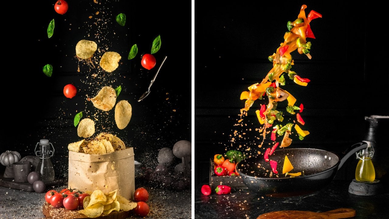
2. Project 1 : Choose Your Props !: Okay guys, Welcome to this section. And then in this section I will give you a demo how we should the color theme photography, okay, So the first, I will explain to you about the props and about the background, and about the planning, okay? So at the first, I will explain to you the first time when I want you do the photoshoot. The first question is, what color story I will apply in this frame or in this photo shoot. Okay, So this time the color story we choose is we only focus on the green color. Also focused with the orange Carmel color. Okay. Yeah, we don't use any other color in our frame, so it will be very focused and our product will be very visible. Okay, So after we choose the current story, the second question is what the texture you want you use? So it will depends on what kind of prompts you use. We don't use many props for this color theme because you add the beauty of color theme photography like this is its simplicity and low cost to the product. But you don't add any prompts may be, it will be like too pale, too simple. Then I will plan to add some that have similar color to our background here. So this is the subject actually for this object, we already have the texture in our copying of our product here because it is popcorn and it's very nice. So the additional texture I will add in this frame is the popcorn itself. And then I have the small pieces of popcorn like this to F, the texture in my background here. Okay? Yeah. So the purpose of this is to add the texture, okay? And then another lecture I will add to this frame is from the prompts. For the prompts, I choose the props with green color. Actually, you don't have to spend so much money just to why the crops that have this similar color to your big groan because yeah, the big grow when you want to shoot many types of colour of the Golden, you don't have to like many types of crops as well. Actually behind I don't have the like glass with green color. I don't have like bowl with green color, but I only have the glass one like this is see-through. Then I fill it with the actually this is green tea milk, okay? When you fill it with the green color, then it will be very suitable. You use if you want to make your colors for a year. Okay, so the one that I invest so much in props as the glass one like this because I can control what color I want to use every time I want to share, okay, and then I also use the green tea powder like this with a spoon so to add more texture also in our frame like this. The background, I will explain to you the backgrounds here. Actually I print this one, but my country blame of this paper. This is paper. I'm not able to actually, this is kind of plastic. And then in my country they call albatross material. Okay. Actually this from here, okay. So we use glue to put it on the MDF board like this. Okay, so, yeah, actually this is just one layer. We put the glue on here, so it will be very straight if you don't put it on MDF board like this. Yeah, Actually sometime it will bend and then it will be very feasible from your lighting. So because it doesn't look so straight, okay. But it's how we print the background. You don't have to worry if you want you print this one because I will give the file to you so you can just download the color file and then you can print to end your printing shop near your home. Okay. So actually I used the albatross one is just because yeah, I got because the color actually, if you don't have the albatross material in your country, you can just print it on the paper as long as it's above, makes sure that you don't bring in a glossy one. You print on the broth media. Okay? So it will be very nice for you to shoot if the surface is done. Okay, so yeah, that's the color planning and the text texture planning. And then the next one I explained to you about the competition planning, I'll plan to put our product on the corner of our horizontal background like this. And then I'll take in the vertical angle, okay, the portrait one. So the technique I use in this frame is the negative space. The beauty of photoshoot using the color theme like this will give you so much negative space for you to put the letter, for you to put the copywriting for selling and to put any kind of copyrighting for the design. Also, if you want to pause the Instagram story, if you want, you pause. If you want you make a flyer, then you don't have to think again where to put the letter because it will give you so much area for you to creatively put any copyrighting in your publishing new in your costing. We get negative space in here. And then I also used the either rule of thirds or the five week for the composition. But if you don't know about the crime rate or the rule of thirds, then in the editing section, I will explain to you more detail about this. So yeah, this the introduction for our Pops, our big gun or planning. And then let's move to the next section.
3. Project 1 : Compose Your Shot !: 00 00 00 00 00 00 00 00 00 00 00 00 00 00 00 00 00, 00 00 00. Okay. Guys, we have already set up or rocks here and then I'll explain to you a little bit the model Compensation Board. And in this picture, we'll use the leading lines. Okay, so you're gonna see the diagonal lines here, who? In my, in our bedroom. And then we also use the color story we choose here as the green most of it. And you can see that there's a distance between this background and this horizontal be grown in these first couple, we're growing our refuel it, right? Yes. So yep. You got to see yeah. There's at least that I used the chair from here. So if you can see that I purposefully zap this, make wrong killed up. So it will be easier to liking to move through here. Be careful if you make your big long like this, then it will be very hard to yap. You set it like this. Maybe it will be fairly hot for your liking to reach the down below here. Okay. So yeah, I killed him up so we can see yeah, the lighting is easily crunch through these areas, so this area will be very low. Okay? Usually if you take like this, the problem is this area will be where radar. Okay. That's why you have to set the lighting is up high and then will come through this area. Okay, So it will be very nice lighting for all of this, okay. And then for this one, this is quite flat for this bag girls. So I tried to find more. Observe how can I add the texture so it won't be very flat then a what's in green here. And then I also add the texture here. So even though it's very small because of the harsh lighting, it will be nicer, okay, yeah, this is how we compose our light. And the color story here, we only use the green ones, so we use the green background, darker green political background. And we also use the props and yep, for our book here we use the normalized buffer colors. So if you see the cars, Connie, we choose here is only white, green, and orange. Okay. The terrible one. Okay, So we don't add any more power in this frame to make sure that our story is very strong and very focused. Okay. Yeah, that's the explanation. I'll move then the next section.
4. Project 1 : Light Your Food !: Okay guys, In this section I will explain to you about the only thing we will use for the NPI year tension for today. Okay? So this is the continuous like being, then if you want to search through the marketplace in your country, then you just type continuous like p, k. Then you will find the model like this, okay? It is already one page. We have the lifespan here. So usually if you once you make the lighting softer, It's just put the Kafir like this. You guys see we have our big gun and then in this section I will explain to you about the lighting position for this one. Okay. I especially for photo-shoot using the begun color like this. Actually the color have no texture at all, right, this big round, it is completely flat with flat color also, and there's no texture at all. So actually for this one, mostly for the most of color theme for those youth that I conduct before, I prefer to use the lighting there is Haas like thing and have the solid shadow on our object. Okay, for me, the solid state also can add texture if we shoot in color background like this. Okay, So I'll explain to you about the direction of the lighting first, the distance between our food here to our lighting is about one meter and the direction between our wood here to our writing there is about 50 centimeters, okay. And they were heck different between our back, our diagram here show our life thing is about 60 centimeter k. And then our explain to you what we do with our lighting to get the solid shadow. As you can see, actually, when you purchase this one, actually you will white clothes or white sheet here to diffuse the light thing, but we take it off so the writing was directly hit our product. And then to make our liking more focus, I also use a paper like this. I cover some areas of the lighting so it can be more focused than before. Okay, So yup, depth the explanation about our writing and then I'm so excited. So let's do the production.
5. Project 1 : Before Vs. After Editing Result: Okay guys, we have already done our photo shoot. I'm so excited and here's the result, and this is the result we pay from this microphone under $150, guys. Okay. So I think I've received a result. Maybe some of you cannot define that it's taken from the smartphone, but yeah, this is the wrong result and the unary that one. Okay. And then this is the heavier the result. Here you are resolved, defined well, okay, is it okay if you don't follow this host, then maybe you don't know that this is that bone can produce high-quality picture. So if you're just curious about the editing process we go through from the raw editing function. Then let's move to the editing section. Then I will explain to you step-by-step how we edit this one into the beautiful return. Okay, See you.
6. Project 1 : Smartphone's Shot: The people who are looking to pursue new people. Okay.
7. Project 1 : DSLR's Shot: Okay guys, In this section, we will try to show using the SLR camera and also we will use the flashlight thing like this. Okay. So if one day you upgrade your gear from the Smartphone to DSLR or mirrorless camera like this. And then you decide to purchase a flask like this, then it will be pretty easy. And you don't have to worry if your room is not dark enough because this one will solve all their problems. Okay? So the first I will explain to you about the lighting position and then this one, actually we only use one Paying, we only use once you do like, like this for the brand we use Go Docs SKA to a 100. Actually, this one is quite affordable for you, and then we only use one color frame like this. The setup is very easy to use because we only use one like thing. And actually we didn't use any salt block or like diffuser. We don't diffuse the light thing. We only use the one likely modifier, standard reflector like this. We only use this one to modify the lighting. So do I think will be very focused you our force here. And because the lighting is so focused, then the shadow will be very nice over this area. Okay. And then for the lighting position, I'll explain to you. So the distance between the light pink here to our foot here, it's about Yeah, Let's see. It's about 35 centimeters. And then the distance between here to here is about nine feet centimeter. And then the Hague different between our big ground shoe, our lighting is about 90 centimeter also. Yeah. Yep. That is the direction of the lighting. Actually, why we have to set it so high. Because we want you pay also this battle area. If you don't set your lighting high than the lighting won't cover this area. So this will be very dark. So if you set it high and then the lighting will reach also in this area. Okay, So it will be brighter. Okay, this actual distance between our background here to here. Yeah, The distance is yap, about like 15 centimeter. Okay. So we don't sell it too close like this or we give a distance here. Okay. Yeah. There is the setting for the lighting and all. I almost forget to tell you about the power of the lighting. Actually, if you only use one like thing like this and you don't have to worry how much power you use. You can use like the middle power of the writing that you use or this one? We use one per a K for the lighting settings. Yeah, that's the power of the Liping reuse here. Okay. Then I will explain to you about the camera. And the first I will explain about the lens, okay, for this lecture, I used the canon 100 millimeter macro lens f 2.8. Okay? Why I use this one? Actually, the more you that you want, you put many diagonal lines here, like here, you want to make sure that your picture is not distorted, okay? There is no distortion to get the minimum distortion for your image, you will have to use 100 millimeter, okay? But if you have an infectious, any of these kind of lands, you don't have to worry because like you can use also like 50 millimeters or 85 millimeter is still okay. And then you will, you can correct the distortion from the Lightroom or from the editing part. The one I would not suggest is if you pick under 50 millimeters, will be, the picture will be distorted and the lines you're born this thread, it will be stored it also. So if you want to like diagonal line and completely straight, make sure you take above 50 millimeters, okay, That's for the lens. And then I will explain to you about the camera setting here. The shutter speed we use in this camera is 125, and then for the aperture we use 9. And the ISO use 100 for the white balance. Actually, for the most of the photo shoot, I use the Kelvin as my white balance and I match between my helping here to my liking. Actually, if you use the flash lighting like this one, the lighting will be quiet. So you don't have to change the Calvin many times for the setting, I use the caffeine 5000. Okay. So yeah, there is how I set the camera and how I said the lighting, then I'm super excited. Lamps knew the authorship. Okay.
8. Project 1 : Introduction of Lightroom Mobile: Welcome to our editing section. Well, here we are going to show an added thing demo using a smart phone guys and you can use your own smartphone. Well here the software or the apps that we use is Adobe Lightroom. Well, I guess the easiest way is to search for it on Google Play Store or App Store or Google Play Store for those who use Android app store for those who use iPhone, guys when you search Lightroom will look like this will show up. Maybe you will find a lot of fashion for Lightroom. You'll look forward logo of Lightroom like this and then you install it. Well, this Lightroom is one of the editing application which is very complete, guys. We can say that it is complete well, but actually it has perineum and free features. Okay guys, here, I will show you a case. If you use only the free features. It can still create goodie majors guys. This time we will start with both free features and paid features. So I will use the free features for some images. And also I'm going to show you what will turn out if I use the premium features. So you will know it if we use a free feature. So we need to use two apps. Usually we use like room and then continue to edit it using other apps. But if we use premium features and the result will be very powerful and makes CMO just by using only Lightroom guys a cake. Well, that is a bit of an introduction about apps that we will use. Let's move to the next section.
9. Project 1 : Set the Light of Your Edits !: Hello guys. We have already signed into the Adobe Lightroom application. And then this is the row image. They can buy smartphone that we have already captured before guy. So here we will do some retouching just to make it more maximal and better. Well guys, some of you might really take a picture using a smart phone, or some others might often take a picture. You will realize that when we take a picture using a smart phone, the colors seems to fade. Like this. The color, our list of lifting, less eye-catching. Well, how can we up leave the colors but not too much, guys? Well, when we take pictures with colorful things like this, it is important for you to maximize it so that the colors look attractive and grade. Okay, So the colors doesn't look bail. Well, it is an important element when we take a photo with a colorful thing like this, k and therefore the editing part. The first thing that I usually do in editing is that I reduce the online. Okay, and then I increase the wide eyes. So the brightness increases and that become better. Well, so when we make it brighter, I prefer to use white. So I increase it because if we increase the wind, the colors become better. And then they're area one b to affect it at all. So it indeed represents the area which is Friday now, the white area. But the interesting thing here is that the picture becomes brighter and then the colors become brighter. So I rarely use dx2. Sure. It is just as Brian part the exposure chance the whole image. When want to add it's something we added it so the colors along and be affected. So we added only the bread area and the dark area. We edited separately. Yes, so that's why we added most of the images in the line park ice. There are a lot of menus here and the most used menus are Highlight, Shadow, why, and leg, we want to add it bright colors. The highlight color are super bright colors. Okay? Then a bright color is why the shadow is dark and black is super car. We added those separately because we don't want to add something like then we slide it all. Dangerous guys. Well, we did edited separately. Well, there's actually a symbol editing model. While we sometimes find a lot of cases when you add it, you don't follow this. All the colors look fail. So we will sharpen the image again. Okay? How much should we increase the Y? Well, annually thing that the brightness is enough, okay? Sometimes if it's too much, you can see from here, it's a bit too much guys. So let's see, well, how can I know I see it from the food? The important thing is that where we can see the full until the brightness is enough. Okay, like this. Well, you can see that if you want, check the before and after in magic inches all the image tap and hold. Well, you can't see it before and after images. Well, the brightest it has increased guys, okay, well deaths from the side. And then here, Let's see the blank part. Well here sometimes the black is in the edit area. Well, don't be mistaken that it doesn't mean the image that we capture with light. It doesn't need Shapiro. Okay? It doesn't mean we don't need our area and the test true or can be seen because there is a combination between bright and dark eyes. So the combination between bright and dark and be like only bride, the immediately the tester appears now my dad, well, so indeed we need Shadow and the dark area too. Well here I tried to check if I reduce the black or dark area, the texture will be increased. Well, let's check it again. Maybe I will reduce it a bit. In this image. I need the dark area to maximize this extra part for this shadow. Well, the color clean usually is not too dark. So we increase the share of OB because I don't want this area to get too dark in our image. Maybe I will increase it a bit here. Well, I only reduced the black obesity because what I need is indeed lie. The contrasts are gay. So I reduced the black. Okay. So I don't want to be halfway. If it's seminar, I will brighten it all. I brighten the shadow, but because the shadow is already done now are reduced the black. So if we don't create a black overall, the image will be even. Well. We want it to have a transition from bright to dark. So drama is needed here, guys. So the bright and dark is needed. It can't be like Albright must be good. It is not necessarily okay. Well, we said this first letter, we will repeat it again. Next, I will go directly to usually I go to the detail. Well in detail we shall need to sharpen the image. And then we use maxkee. Well massing is for you maybe have already done in our courses. Our editing system is indeed quite similar. At least some parts that we added depends on the case. But for showering and maxkee, we always apply it. So almost all of our images. So we sharpen it for masking, is to sharpen all these specific areas. So in one sharpen the area that should be moved slightly so it will make the image look normal. Because if we don't do masking, this area will have too much is. But if we increase the masking, it will be less noise, okay? Then I usually increase the noise reduction here. I increase it, cylinder of area becomes smoother and subtle. So I increase it. Well, you can see that it has already look smoother like this. So the nurse reduction is important, so depending on the result guys, well, so that's why I recommend sharpening, masking and noise reduction in this area. So you can use this setting. There is quiet the same with those we did. Especially for those of you who take photos using smartphones. Well, this is why it is important for you who use smartphones. I believe you use smartphones with different qualities. There are smartphone price above 100 US dollar. There are also a smartphone price only around 100 years now are like the one I use. There are also a smartphone price below seven, the US dollar. But it doesn't mean that smartphone price above 1300 US dollar can get the best result. 30 depends on the condition when we take a 40, but the addition of the roof is very dark. There will be noise is it will be different if we follow us, use his or her price around 100 US dollar par. If the lighting is great enough, maybe there will be less noise. Then those users smartphone price above $108. So bad case by case, because this case can happen in multiple condition. I suggest you do is happening masking, noise reduction. This is something that if we do it, there will rarely be mistakes. It means in the gneiss is too much. It will disappear. If the noise is not too much, it is better. Because maybe some of you realize it and some others don't. Forehead. There's a case when we shouldn't using a super expensive camera or using a $4 thousand DSLR camera. We know these batteries along the image is not so sharp. Why when is zoom in? It is still feasible. But when we bought it on aij, the cause low addresses. Why is the contrast? And now it's obvious, well, it can happen guys. So that's why it doesn't matter how expensive your smartphone iss. One of the key too. Last quality control is the additive. So that's why you have to keep it. Okay, Let's continue again. It was just advice. Okay. And then there are only two remaining is that we usually use the ICR printing, masking and rice redaction. Our explain something there are readily do. So I will explain someday that we often use the most impactful one. So we don't use all the sad days. It is easier for you to use the live room. So you want be confused with the menus.
10. Project 1 : Give the Color Effect to Your Edits !: And back again, LAD said it again. Let's see here. I will check this part, a K letter in the detail. And then I'd try in evac. Well, sometimes it works, sometimes it doesn't. If the color is too faded and contrast useless, I will try to increase the dehaze, okay? So the colors will be more obvious. But for B. Hayes, It is not applicable to every condition. But usually I will try it. If the colors and contrasts are not too obvious, I will increase the haze. Will you like it or not? Well, the haze is one of my favorites. I use it when I added an image and the colors are not obvious. So let's check. Okay, well, I think it is not bad guys better than before. So the colors look attractive, but be careful, don't be too much. If the color is too much, it will look like it is on fire or burn. So be careful. Well well, I usually we'll stop here. Okay. It is good enough already.
11. Project 1 : Adjust the Color to Your Edits !: And then another thing that I might do, I will try to check in the car park guys. Well, in color here, I usually make sure that it focuses on green color. Yellow color. So green, yellow, and white only tree collars, guys. I usually I keep noticing, are there any colors that don't mean to be in hair? So there must not be a red color here. So sometimes we have to check, sometimes if we turn off the colors that don't mean to be there, the court then mostly they are we'll look obvious. Looks more natural. Like this here. Yeah, because of the purple colored part of the purple color must not be here. And so I turn off the purple color body doesn't affect anything. So it's okay. The blue collar must not be here and they're here. I'll turn off the color. There aren't vaccinate. Well, I always take for the color theme like this, if we indeed focus on some colors and we erase the colors that are not important to make sure that we want to show are in need of use. Just for example, here, there's a red color. Well, maybe it's not. So the failed well, we can turn it off actually. So it won't be it so much. This is just a minor example that doesn't affect it at all if you see it here. But in this case, when you add it a certain color in an image, we need to attack it. Do not let other color that we don't need our leaf here. Well, then I will try to check the green color part. Well, here the green color looks, or baby Louise, I will try to slide it here, is used to adjust the gradient color to yellow peas or bluish. For saturation, we choose the green color. We just grieved than there are trees and all the great dollar. Well hue is used to slide the green color to yellow IS or bluish in saturation. Do you want to leap? And our fair that green color to y. For luminance the drink, our rules be bright or dark, so the setting can be ferry. And here I'll try if we said the green colored, so bluish, green color, the yellowish. Well here maybe I will slide the green color to the right because I think the green looks yellowish. Well, so I will change the green color to neutral, green to yellow. Well, maybe I will stop here. Well here I will increase the saturation and B. Well this is a view on so dark in it, but I won't darken it. Okay. Yes. Very good. Very good. Okay. Well, I'm doing this while I'm explaining it, but when you have edited some images, you start to get used to this adding. It will be very fast. Well, let's see the before and after. You can see that the beaver imagined looks very bell. After we compare it. Maybe you have already seen in the image, okay, this is what it like for if we had been buried to yet is the fascia and the color will be different. We can see the editing when compared to the B for an ass remains. Well here maybe for the color I will try to test one on the weight isn't so obvious. Maybe I want to reduce the D. Hayes. Okay. I only like the green color to the left. Yes. Well, this is for editing the eyes you can see the before and after a major. So it's important to edit the quality of the color. If any of you have shot a foreign using a super expensive smartphone and learn the editing technique as a last practicing it for three minutes and daily. There is a little bit better than those using 10000 for the editing will see early, how can you, okay, well here is a lead bluish. Let's try to undo it. Okay. I think I will stay here and go back to the light again. And I will try, well, here I will try to increase the share of guys. I will increase the share of fully, because here I want the color to be bright or dark. For the shadows, I will brighten it so he can see the differences between BRI and our radar. Bright, bright dark. So there will be text on here. I will brighten the shadow, I increase it all and brighten it. So the light will login. And then if I reduce the shadow, well, maybe we'll try it here. Then in your editing guys. Actually you can make an object. It means I suggest you edit it in some type so you can compare. It is an example when you have edited it. Okay, actually I will reduce the wider bead so it want me to a bribe. Well, when you have edited it, you can go through fashion. Here. We can choose versions and then you can select Riyadh a fair chance, okay? Here, I type II course. Well, Riyadh, well here you can choose. So when you have created first, since you can't change it again, you just go back and change it again. Then if you are done and create finishing again. So you can go back to the previous versions, back to the original ferritin, or you can go back to the other versions that had been saved before. So that's a dice. We think that it is quite important for you when you are practicing. Okay, well, this is what we do for editing the color version for these e-mails, you guys. And then we tried to move to the next editing application. We'll, we'll try to clean some areas. So like Rove has every feature and a paid feature. The features in front here, he lays likely if crop and provide our bed features that you must purchase, burn off the features that we use were LeFree one. For those of you whose library Debranium, there are some parts that we need to fix, especially in this area. You can see it there, that was our event. There are bubbles, well, low facing in snaps IT guys. And it includes the crack here. It will be fixed in Snapseed so it will look clean. Well, the editing area like this paths where suggested to use naps in. I think Light Room is the past for color editing rise. Because for the colors like Ruby is very power rule. Okay, Well that's it. We will move into the snap. Say, don't forget to export it. Slack here. Reduce export to camera or wrong. Yes, Well, it's already exported that before. After.
12. Project 1 : Introduction of Snapseed: We can search for snaps it just by typing it here in the App Store or Google Play Store. And you guys can see it, well, this application is popular enough or you added images using your smartphone and also it has been verified. Let's see, the quality of the editing result is grade and quality of the image is not reduced. So it's not problem. Well, after it is installed, you can directly go to the application like this, and then you can just open the image again.
13. Project 1 : Erase the Dirty Area on Your Edits !: Okay, yes, we have already opened this Snapseed obligation. And then guys, what do we do in the Snapseed application? Actually, if you open the Tools part after you import the image, open-ended tools. And there are a lot of many years. But here we won't use all of the menus because most of them are more or less the same as those in light room. Well, so if it's the same as light room, but why should we use Live Room also holding the bass if we use knapsack? But indeed you can use the settings in Snapseed directly. And I have to move to another application. But as far as we know, one of the applications we have, the best color editing is light room. Well, then in Snapseed, the color editing is already complete, but the color editing is easy and our views in light room. In Snapseed the features are more complete. We will fix this pot like this. We select tools and here there are a lot of menus. Well guys, for a certain area of the spot that we want to fix it. Healing guys. Okay. Well, here you can fix some cracked area like this. Well, we tried to brush here. Yes. And then he directly claim IT guy, so we brush it part by part. Well, don't brush it all at the same time, guys, because of course, it needs to analyze the image. So don't brush it so much. Well here. And then for a small area like this, as ingest you to zoom it to the max when you want a vaccine. Okay, Well, you can go back if you make a mistake like this. And you brush it again. And you can brush so little by little so you don't have to brush directly. Let's go back. He has. We tried to go back. Well, maybe it is much better but it must be more. Yes, maybe I will leave. This works so well. Then we can check again. Here it seems that it doesn't fit in now, so we will try to task eight again. Yep. Okay, yes. And then, well, here in the image, uh, lobes are made tax term. So to make the texture or smoother and you can use another feature. We take it first ACEF the previous add things, and then selects all. So we tried to use the demo below. Well glamour glow, the image softer. Let's see. Okay. Maybe I will try to look for another tool. Well, to make the backside look software, we tried to use lactic. Here, that one's for selective. There will be the points like this. And if you use the V inverse, like you used to do for resuming, it will be red. The red here is the area that is affected by the setting. So we can set it. For example, we want to send this area, well, here you just swipe up and down. See it? Well, here, what will we change? Change the brightness, contrast, saturation or structure. Okay, Well here we will try it. Well, here the settings are right, So I will use, it's a bit extra here while we want the background to be smooth. So we reduce the structure, I will reduce it up to here. So you can see the background smoother than before. Here we added down here guys. So I reduce it a bit so it won a vac, other colors. Okay, Well here I will, so I, uh, pops like structure and I reduce it to, so it looks the ID, okay? And then I add it over here. Well, the interesting thing is that when you choose something, you have to be careful not to affect other colors. So even though it is like this, you'd want a vec, another area that perhaps park. Well, oil's swipe up to a structure. Then I slide to the lab. So you can see the structure. How much is the means? So the court looks after. Well, then we'd say good. Yes, you can see the difference is it's the same with light room. We just hold it for the video or image. The upper part seems to be untidy, but the after image is more tiny. Well, we will try to set it once again, which is this lactic part. If I increase it will, it'll be softer. We tried to reduce structure, then reduce it again. I think I need to clean it so it looks softer. Previously there was a difference in the colors. Well, then I will try to play around the healing part. Okay. I think it's him laugh. Okay, here the background is smooth, ER guys. The color are more solid and unlike the previous one, RAF, well, like this raft, but this looks highly well. We indeed need to add it the area like this in the retouch process like this. And no matter how good your smartphone is, if you don't clean it, the image will look untidy. Whereas I added it fast. If I don't explain it to you just to selective clearly the bead done and it compensate for the use of the camera. Previously you have to use tens of million dollars of cameras. Now you only live smartphone to get better quality images. And here for the bright area, we can also slag tools. And then we just elective and misled the popcorn area. And I will try to well, we will try to choose the popcorn area, especially the spore corn that it's a McBride. Okay, Well here we will try to darken it a bit. Just swipe to the brightness, maybe reduce it a bit. Yes. Yes. So the popcorn parties not to bribe? Well, it can also be done so before, after, before, after. Okay. Well, that's it, guys. Okay, guys, before we finish this video, there's one thing that we haven't added yet. It's that we need to export the image is like explored and then choose save a copy. Okay. Well, well here the image Dan, you have added, it can be attacked in your gallery. A var after.
14. Project 2 : Choose Your Props !: Welcome to this section. This section we will take a product. Yeah. Okay, So in this section we will use another color story. Our colors per year is the orange one. Okay, so yeah, this is our main focus, our main color story, and then the second, third color as the green and white color. Okay, So, but most of all, we prioritize the orange and yellow color like this. Okay. Orange and yellowish color. Okay. So this is our main this year, a very fresh house, okay? So for the spouse, actually, if you want to decide which one props to pull in our background, which prompts that you don't want to put in a background. Actually, in our foot here, there is some color, okay? There's yellow, this green, and also white, okay? But you will have to force to put all the color in your foot into the background. Okay, so I decide not to put avocado in our background here just to make sure that the most colorful one in our picture is on display. So you don't have to force to put all the color of your foot into your surroundings, okay. Because it will decrease the focus of your main dish. Okay. So, and then I will also add another texture using this yellowish color. Actually, if you want your shirt like orange color, you don't have to force to have all the exactly same color properties, okay? Yeah, yellow is still okay. And then you can add the texture in your frame, but it's, the color theme is still the same. Okay. So it is okay if you want, you put like bright orange, dark orange, or a little bit yellowish. The current is still monochromatic, so it's okay. Yeah. And then we also fought like we didn't like this. We paint with the yellow color. If you don't have this one, you it's completely okay. Yeah. And then we also have like small bowl like this. Actually, I think it's a sauce dish. Okay. But if you don't again, if you don't have like this yellow dash, you don't have to worry because you can change this one into the see-through and the glass one? Yes, you can change into this one. It's completely, hey, since you take from the top angles. So if you put it here, then it will become yellow. Okay, so yeah, you don't have to worry. I can find this one really fast and then I think, yeah, I'm pretty sure that you can find many forms of this glass props to put in your background here, especially for the color background, okay, and then we also have the yellow paprika. Actually, if you want, you bet your color story, you can just add the yellow paprika here. But Europe, Africa, actually, especially for the paprika, it's quite big enough. And compared to our dish here, it will, even if the color is oh, the same, but the size will make your product shrinking. The size. The big size of Africa will make your product looks smaller. So be careful not to put big items in your frame if you want to make your product stand out or if your product is not too big. So be careful not to put anything that is bigger than your product here. Okay, so I decide to make paprika a different texture. So I decided to cut into three forms of Africa so I can get three different texture of the paprika. So I cut below one like this, and then also I cut triangle like this. And then I have the smaller triangle like this. So we have three different texture of the America. And we can add into our scene here. Okay, So lastly, I also have the small spoon in this film. Okay. So I'll explain to you later about why I add this one. Yeah. Okay. Yes. So that's our introduction for the props. And then let's move to the next section and we will compose this one into the beautiful frame. Okay, so see you in the next section.
15. Project 2 : Compose Your Shot !: Okay. Okay guys, we have already done the competition, okay, as you can see, now, we used the lever arm technique for new companies when we use the golden triangle one day. So we have the main diagonal here or our composition. And then we have the second technique, that dynamic tension. What? Have you ever, have you ever confused? How are you? Your object line? Is it okay? You put it right here. Is it okay, we'll put it right here. Here and maybe like this, like they're okay. So how you decide to put it like this? Same with this one. These PEO, yeah. Okay. Is it optimal policy like this or like this, maybe this one or this one. Okay? So sometimes you can get confused about this kind of things. So actually, this direct pension is quite simple. You see, the main diagonal. We set this one. We've actually been, the frame of this picture is portrayed. So you can connect 11 corner to one corner of your picture. And the main diagonal is our combination here. So after this, if you want, you put this kind of spoon in, tip out I for only this one to mess the main diagonal. Or even if I put like this one, this is not making our main. They're going up at all. And the denim engine, you can choose to put flag something there is crossing your main diagonal. So instead of did I fill it like this or like this? I'm trying crossing our main they're going to OK here. So this is this direct sensor. They are, so the spoon is crossing or main diagonal and then also this one. Okay, I also, to increase our dynamic tension, we also put it like this. So it is also crossing the direction of our school here. Okay? For this one, I use, I choose to make this one same direction as that one. Okay? So yeah, although as you can see, this one in half, the quarter, So instead of putting it like this is enough for living like this, a 10. So I'll try to match our main diagonal quadrants. Okay? So yeah, there is explanation about dynamic engine, so you don't have to worry or confused in the future, even if you, once you put the spoon like this and the object like this. So just consider main diagonal and then you can choose to act dynamic tension in your frame. Okay, so I'm so excited to see you in the next section.
16. Project 2 : Light Your Food !: In this plan, I will explain to you about the lighting before we have already done with the composition. And then for the lighting, I will explain to you about the position of the light thing. After you see some of our settings, then maybe you can try to guess. Okay, if you compare our settings, some of our photo shoots, and we compare the settings, you can see some similarities between our settings of East Asian. Okay, So actually a photoshoot for Hollaback Girl. It's quite simple. And yes, it's that simple actually because we only use one right thing and then we are not using any special treatment for many angles. So it's quite simple. And then for the position, it's quite similar as before. But our expansion you once again for this one, okay, the distance between our foot here to the lighting is about one meter. And then here from our food chew our life thing there. Yeah, it's about also one meter and the Hague different, which in Arabic ground and our lighting is also one meter. That's for the settings for this one. Okay. Then the treatment of our lighting is same as before. We take off the white layer of our soft box. So did liking is directly here. This area? Yeah. Yeah. The treatment is same as before. Okay, that's the explanation of our writing. You can imagine when we set this kind of light being, then the shadow will be offered here. Okay, where are we on the left bottom of all three objects here. And then I keep reminding you that if you want to produce this kind of result, please make sure that you turn off all the right thing in your studio, okay. In your home of all the lighting and then you also cover your windows so there's no other source of light thing other than this one. Okay, So you shadow will be very visible and then the lighting also have no color because the light bulb there, the color is very wide and natural. So the only color in our frame is only our colors story. So the lighting is not contaminated with another color from your room. Okay. Yeah. That's the explanation for the Liping. And then let's do the other shoe.
17. Project 2 : Smartphone's Shot: Exponents. Hi guys. When a firm is true.
18. Project 2 : Before Vs. After Editing Result: Okay guys, we have done our photo shoot. I'm so excited to see you here that result. Okay, so here's the unedited one. And then here's the after editing result. Yes. You see and compare before and after the editing. Actually, how, no matter how cheap your camera, how expensive your camera and lens. Yeah, you cannot escape from the power of the editing, okay, so even your shoot with a smartphone, even use should we very expensive camera. If you see the row picture of the raw result, usually will not. That lies. Remember that pop out the writing all sorts. Now we'll be very dark in some area, will be very bright in some area and the color is not very good, and then it's not like the lighting is not conscious enough. So yeah, that's mainly steps of editing that you cannot escape from. If you want to have the, yeah, maybe that's not perfect result. But if you want, you get the better result you have. You have to master the step-by-step of the editing, of course. Okay. So you didn't have to worry if you get the picture from the raw, but I still feel that I'm not really like this one. You don't have to worry because editing, but you can also fix many things, okay? So yeah, the one that we have to make sure is the composition and the color and the lighting. You can also repair a little bit from the editing part. Okay, So, yeah, if you are curious about how step-by-step editing if then let's, I'll see you in the editing section.
19. Project 2 : DSLR's Shot: Hello. Hello. Hi.
20. Project 2 : Set the Light of Your Edits !: Okay guys, welcome back to the editing section. Well here we are going to choose this image to be added it. Well then what's next? Remember, what is the first editing process? Okay guys? Yes. Okay, That's right. We're gonna go to the Layer menu, light verse, and then what else should we use? First, we will reduce the highlight. Maybe I want to reduce it all. And then we increase the wide so the image will be brighter, okay? And here, because there's a dark here over b, I will increase the shadow for, well, now it's all bride and then I will reduce the black of B. So don't make it also bread there, the texture disappears. So I usually balance it. I resist the plague fall if the shadow is pride. So there must be a darker area of, don't be no dark area and all, well, if the image is lack of black like this, it looks indeed find for the metal acts texture because there is no dark area. So that's why we need the dark areas are the texture becomes more visible. It's bright because there's a dark area beside it. Well, this next story is visible because there's the combination between highlight and shadow. Well, for an image with a color theme like this, I tend to brighten it. It will be different if the image has theme is dark mode. Maybe the shadow will be set differently. Part for colored things like this. I like to use shadow. I brought the need for almost all color theme images. Well, from here we can see the before and after images guys. And for you to think that the image is already great, the editing is that simple guys. Well, well, so that's why you don't have to bring it too complex. But indeed, there are some areas that we want to cover it again letter and let's go back again. We tried to check here in the white part. I will try to increase it a bit. Well, here I will explain a bit about curve, okay? Well, what is the function of curve, guys? Curve is the lines for our image. If we slide it, the brightness will change. If we slide up the line, the image will be bright. If we slide down, it will be dark. If we slide it here, the dark area will change. If I slide this point, the bread area will change. For example, I like to make dots for editing like this, dot one dot pseudo tree. Again, there are the benchmark pint. And that if I slide up, the bright area will be brighter. For example, the bread area will be brighter. You slide down, the bread will be dark. Well here, if the area is dark, this is the dark area in our image, right? If we slide up, the dark area will be brighter. Look at the dark area. If we slide down, the dark area will be darker. Well, this is the middle area, not bright or dark. Middle, if we slide up, it will be bright. If we slide down, it will be dark. Let's see what you like most. The line, the very bright one, and you can set which area that you want to Python. For the color theme. I rarely use curve. Okay? I usually use Curve to edit with dark mode or bright mood, but I will explain it just for your information may be here. I will try to adjust it a bit. I will increase it a bit in the middle area here. So the image becomes a bit brighter apart just a little bit. Okay, Then I choose Done. Yes, and then I will try to reduce the wider be because it's a bit too bright. Okay? And then we will go through the detail part here. We increase the sharpening, increase the masking. And remember that this image still has nicest guys. Because we use smartphone. So it's normal if there are noises here. That's why we increase the noise reduction to make it move. And we can see that the image looks softer. But because we increase the sharpening, the sharpness want change, the sharpness of the image is still the same, okay? Okay, but here I will reduce it again. Well, it's enough, okay.
21. Project 2 : Adjust the Color of Your Edits !: Here guys. Next, I will try to task the color part and then the mixed part. Here we tried to check the green part. Okay. That's the green color. Look fresh or not? Well, I think the green color is still not quite enough. We can increase the green color again, so we increase the saturation. So it will look obvious again. And then in the luminance part, the green color becomes bright green or dark green. Let's test whether it's reached the brain green or dark green. Let's test it. I will write in it a beat and I increase the saturation a bit. Well, the green color becomes more obvious, guys, the interesting thing is that you don't increase the power by using color. There are scholar here, there is also saturation and you increase all of it. Don't edit it all at once. Or editing, we need to see the detail by detail. If there's a lack of green color, we added the green color so it doesn't butter other colors. Well, okay, here the green color becomes more RVUs guys. Okay, Let's compare it. Before, whoa, whoa. After guys. Well, for you within that like the ECM bit too bright and reduce it again. So in editing, It's all about process. So you can't get good at hitting straight away, but it will be best if we continue reviewing it. Let's question it again whether it is okay or not. Well, I think I will stop in the white part like this. So it is in the middle, not so bright but not too dark. Because basically the theme is prime, a bright thing. And in editing it is important to note while the next tab is after the so on. And after we see the image, I think this area is too much debt is to match a bit too bright. It is also too bright. I will darken it a bit. On the other application, snaps it, okay. And here I will directly export it. It's like here. And then we choose Export to camera or wrong. And then let's open it in Snapseed to face the other areas. Again. K, Let's go before after.
22. Project 2 : Raise the Brightness in Your Edits !: Okay guys, we have come to the snapped it application here we will choose those units of me, a lack of doctor, when you see an image, we have to see what we should improve here. When I scan it for a while, I will darken this area a bit because it's not too bright. I will darken these tubes so it won't be too much. And then this area is just ride. This area is a bit dark. We brighten it so the color of the food will be obvious. Okay. What should we do? Lattes, juice dos, and then it means what we should choose. What is it? We use a laxative and I will use it here. That one's and then let's see the covered area. How many? Okay? And here we will try to swipe up, okay, This is the brightness. Then we still have laughed too dark and eat. Well, we darken it a bit. And here maybe I will increase the saturation. Okay, well then we will add it again. Offer here. Well, you can see over here, I will add it again. And then I will to the area that needs to be darkened. And then we choose the brightness swipe left to dark. Annie, the big guys. Just a little bit at K. So it fits not too much. And then I will brighten this area two, which just tools and you're selective. Reaches it, zoom in the ice we use here. Let's see. The red. Here is the evacuated area. Then for brightness, we will try to brighten it. I will also increase the saturation. Then we reduce the brightness a bit. Okay? Oops. Well this, then I will take it first to attack it. Okay, It's a bit of Match Guys. Well, if it's too much and we have already taking it, why should we do to under it? You choose this one? Well, you can choose a few adults here you can choose again. This is the editing process from the beginning and we can readd it by choosing this. And then we just the spark, the sad thing. Well, we can react it again, guys, here, I will try to reduce the brightness k. Well, let's see the before and after image. Well, it becomes brighter, which I get. Yes, it indeed looks up. It still looks too much after we increase it. Let's reduce it again. It seems that the brightness is too much. Okay, let's take it again. We ask, well, it's arrived guys. So it looks trivial if we use the full image, but it's important guys, because when we fix it actually the result will be much patters lowly. Well, that's it. Okay. Well, that's all for the things that need to be fixed in Snapseed guys. Well, for the synapsid part, we fix certain areas that we want to fix. It's where you who's like group is not premium if it's freemium, just do it in Lightroom. Okay, well that's our editing for the image correction in Snapseed. And then let's move to the next section, guys, before, after.
23. Project 3 : Choose Your Props !: Okay guys, In this section we will use the color theme and then the next column you want to use as the pink color. Okay? Have you ever shipped with a pink color like this? Okay. If you have ever shoot a pink color, then maybe you have a question. Actually, we have already shared this kind of thing for a couple of times. And then most of the time before I know and realize it, when I see the result of the photoshoot when I use the pink one, because when I shoot with the pink color like this, actually the pink color has no problem. But for me when I want to shoot the color theme, the pink are two songs. Sometimes when you shoot with pink color, when the foot color is not strong enough, then the frame will be looks so pale. Okay. But you should very dark foot, like cookies, like very brown chocolate cookies in here. You will see that some times when the camera focus on the bar area of our frame, then the pin will be every bright and will be almost white. So it's kind of tricky when you want to shoot not only pink, but specially with the color that is quite bright like this one. Yeah. This car actually not strong enough when I shoot mostly. Okay. So one of the tree I use as at the first, you have to make sure that the ping is not to bribe, okay? Actually, I have another ping them, I have to compare with you. So you have comparison. The comparison actually both of this big goal is pink eye to me my mind. End result is this one. I want you to have the pin there is a soft color and not too bright. But when I use this one as the background, if an up duping as become y instead of pain. Okay. That's because when the lightning hit this one, it will be brighter. So if you want, your ping is more feasible. I suggest that you print a darker pink like this. Yet It's really okay if you feel that the pin is too dark. Because in editing section, when you want to bring up and control the lighting of this spin. Actually much easier than you to make this pink darker in your frame. Because when you ship with the lighting at a CMS that this one is too bright when you want to make it darker, but it will effect all the frame. It will effect the color of your foot, the color of your props, and many things. So it ends up the editing will be very hard. But if you want, you decrease this color of pink, make it brighter, then it will be very easy. And I will explain to you the step-by-step in the light room. So I suggest, no, my experience, this one is better than this one again. So but if you want to try, I suggest you when you have the photoshoot, please at least try to print more than one color again. And maybe you have the alternative, like you have a darker and brighter pink. And then while they're photo shoot, you can pass added with the light robo ball to see is not pink color. You can correct Into the one that you want you. Yes. Actually bet is work on Lee the pink color, but for mostly belt for most of the bright color like this. Well, that's the explanation for our background. And then I will show you our product here is the ice cream, okay, we have rice ice cream here. And then also I have a scoop of ice cream. What like this in a cup and some of ingredients in our plate. And then for the texture, I also used the some crumbs from I get from the call. Okay. And then some chocolate like this. And yeah, and cookies also, I put it in this frame and to match the color story, I also used cloth like this, yeah, for the color selection. Some of my students asked me why you didn't use the pinpoint, why you choose the white instead of paying if you want to make it consistent, okay? Yeah, you have to see that if your product is quite similar to the background, not too strong color, you have to add a layer below this one to separate the colors so you don't want to put it on the pink color and then it ends black, the color is too similar. The end editing section, you will very hard to separate between our ice cream and the background. Okay, so This is the layering technique. So I add one more layer, one layer below the ice cream. To separate this technique, I call this layering, okay? So instead of I use the white cloth, I prefer to use the ping one because if I add a white cloth in this area will be very large. And then I cannot focus specially only for the ice cream again. So I don't want to distract the viewer because there is, the texture is quite rich. And then if I choose the white one, it will be wary, complicated. Okay? So, yeah, and the next I also have the smallest moon like this in our frame. I add some chocolate chip inside. There is the prop selection and the color story, okay, for the color story, for this frame, I'll choose the pink one and then also the light brown like this. Okay. Yeah, there is my cows story and then I don't add any more color in my frame to make sure that the color is well-coordinated. Okay? Yes. The introduction of this section and the crop selection. So I'll see you in the next section. I'll come post all of these prompts into. Let's see, how's the result. Okay, so see you in the next section.
24. Project 3 : Compose Your Shot !: Good. Okay guys, We have already do the corpus, Jen. Okay. I I imagine that all the actions align like this. Yeah, it's look like that. See you at her but flip. So then or the layering, you can see it clearly. If I put it here, then the count will blend each other. We want the picture to focus on our main subject here. So we have to add a layer, the white layer here, our, I think, as very easy to see, OK, and then when you are confused, how many props you want to post like this one instead of, you used to have free will. You use three of them, so people save their role on, okay, so I prefer to use it in the odd number of even care. So, and then the next one is for the adding texture using Chrome like this. When you, once you put the crown like this, you have also made sure that yeah, It's my preference that I don't want you play both in everywhere. I prefer him on the spot like this. Yeah. So we can clearly see the spot of our crowns. And then when you have the decision to choose how this ties of the craft then I prefer if you want you make the focus on this area. So for me, I don't want to use the very large problem, okay? So I prefer using smaller and even molar like this to add the texture. So if I use large prompt in my frame, then it will also effect the size of this one. I want you to make sure that the size of my object here is the largest among all props. Okay? Yeah, that sounds great. I use for this competition. And then I'll see you in the next section. Our introduced the lighting for this one.
25. Project 3 : Light Your Food !: Okay guys, we have already done with the composition. And then here's the interesting part of the light paleo. Okay? So as you can see and compare with the sessions before, you can see that our lighting position is quite the same settings with before because yes, it is the same. And I believe that you can set also this one in your home and then yeah, I'm sure you can also set like this in your home. Okay. So I'll go through again with the position of the lighting. So from here to the right likes 10, there is about one meter. And then our position from the center here to the lifetime there. So the lighting is also one meter. And then the heck given between all back grandchild or like thing is also about one meter. Okay? So if you ask why in this session we always use the high position of the light thing. One must be lighting down to one, the effect. So basically it's my preference, but I have reason for it because when you are shooting the color background like this, usually I prefer the light from each corner all over my frame is well distributed. Okay. I don't want you set like this one. Each shoe growl, but this is area is too dark. I don't want them. So if you put your lighting lower than this area will be awful exposure and this area will be shadow. So I put the lighting high, then the writing quite evenly distributed, even it's not distributed 100% well, but I think it's better. I can correct that one in Lightroom, but it still can be corrected. I haven't introduced I have my assistant back there, so we will do some, say do playing here. Yep. I'll use this artificial leaf here to block the lighting so I get additional texture out of our props here. So, yup. Have you ever tried to block the lighting then you don't get any texture at all. So what happened and why you can have been okay. If you put it too close to the lighting, okay. Then there will be no shadow at all. Okay? Because it's too far away. So if you want to add more shadow, so you just click the live near to our background so you will start seeing the shadow, okay, in our bag ground. And then additional for the additional tips, I prefer that I have the one that I'll put it like this. Yeah. So it well distributed instead of I put it like this. Okay, so if I take like this, then it won't evenly distributed and then this area will produce the black shadow. Okay, so I don't want that because it is like too many leaves here. So I want you put it like this. So I still get the gradation between the shadow and the light, the shadow, the light. So it will be looks more natural again. So I just would like this and yeah, actually you cannot see it very clear, but there's a gradation between the shadow and the highlight set off. If I put like this, then there will be only ones hard shadow and it doesn't look too nice. Okay. So yeah, that's my tips for the lighting and the shadow playing, so I'm so excited to see the result. Okay, so let's move to the next section for the photo shoot.
26. Project 3 : Smartphone's Shot: This year. Since this
27. Project 3 : Before Vs. After Editing Result: Okay guys, we have already build a partnership and I'm so excited will preclude the result for you. And then here's the rub. Each are taken by smartphone. There is $150 smartphone, okay. Yeah. As you can see in the picture, you can see that the pin is not really stand out. And then the contrast is not really stand out. Also, that you don't have to worry because I have the edited version. So here's the result. I know you are curious about how we add it and then how we add the contrast, how we set the ping. So it is not to brag, but it is not true under saturated. And then we increase the texture of the ice cream. And then we also increase the texture of all the crop, all the things here. And then make our background evenly distributed for its brightness. So we don't want you have this area too bright, this area too dark, then we correct this one also in the Lightroom. So if you best excited how we added it step-by-step, then let's move to the next section.
28. Project 3 : Lighting for DSLR's Shot: Okay guys, now in this section, I will try to take this picture from our DSLR camera and then with the studio lighting over there. Okay, so we only use one lighting for it of our frame when we are shifting this color theme. Okay, So it's really this involved because it's all, because we want you to take one beautiful shoulder for each of our object here, you can see, Have you ever see a picture with evil shadow then? But if not, you haven't realized. Yeah. Then for every time you shoot, Please you can see how many shadows inside your frame, okay, make sure there is only one beautiful shadow and there is no 2 or 3 shadow for each object. Okay, please make sure that and then I'll explain to you the lighting position or the setting and truly important, the lighting setting is quite similar. Whip the setting we use for the continous likely. Okay, So listen between our center here to the lighting, there is about 100 pants and Demeter. And then the distance between here should the light is bent, there is also about one meter. And then the Hague given between our begun here sure. The lighting is about 100th pens and the method again. And then you can make the light beam tilt down directly to this area. Okay? So the power of the lighting I use is one per eight. And then I will explain to you about our camera settings here. So the lens I use in this frame is the wide lens because I want you to shoot it on the top angle like this. So and then settings, I use the shutter speed as 125 for its aperture is 9. And then for the ISO, I use 100 for the kelvins since I haven't changed my liking yet. So it's 5000 K. And then I will also try to CDO play for this frame also. Yeah. It will be quite actually I get to you, maybe some of you have question like how to get the shadow and put the shadow, right? Okay. Because usually when you take and you end up like this shadow is drop on the location that you don't want you. Okay. Yeah. Someone that have already done this maybe have this kind of question. Actually, I have to tell you that there's no silver bullet. So this kind of thing. And since we are using the glass-like thing, then we cannot simulate where's the shadow will be. So you have to try it many times. Okay. You didn't have to worry loosely. We have to pick about like 15 minutes, like 20 minutes, just to add more and more alternative. Okay. For me, my friends about it. Yes, the more alternative I hate, the more I can compare. So can compare which one is better. Okay. So yeah, there is the explanation for our life things I said Oh yeah, I forgot. I have 11 other settings for this one. I also put the white board here so to make sure that the shadow area will become brighter. Okay. So I bounced the lighting from there to our background like they're okay. Yep. That's what we do for the live thing. Then I'm so excited to famous shot. Then let's move to the next section. Then I will take the picture and I will show you the result letter.
29. Project 3 : DSLR's Shot: Okay. Hello.
30. Project 3 : Edit Your Image !: Okay guys, well, we go to the editing part again, guys. Well, actually pink color like this is quite popular for color theme images. Being color is quite popular book. There are potential obstacles that we need to know this when we showed the pink color. Well, ping is actually like color, but because it's like sometimes the color isn't quite off views at all. When we showed it a lot cleaner, we use the pink background that is obvious for k. But back to your preference, if you make a mistake in arid thing and you increase the color, it will look pale. If it's increased, it will be too bright. So sometimes paying is a bit sensitive. So it needs a bit of a challenge when you do the editing. So no problem. Here. We will study it, okay? And here I will try either k in what part of guys? In the light part or K. K. And then here we will reduce the highlight and we will increase the wide. Okay? Well here I think it's just right font. You can see that the pink color fades when we start to brighten it. Well, it is what we need. So notice. So specifically for the pink color, you can see in the color part, there is a pink color here and here. So you can adjust the pink color here. Previously we only use green. Well, we can also adjust the pink color or we can manage it. Well. Make sure you noticed it when you added the pink color. Don't make the pink too pale or too much. If it's too pale, we can try to slide the pink color. Well, we can dark in the pink color, in the luminance. Like these guys, we can darken it a bit. So then the pink color is back again. Okay. Well, the pink color is already back. It's not too pale and juice done. Don't forget to choose detail and do our HCl like useful. Well, we increase the night reduction so the quality will be batter. And then we go back to the light. Let's increase the shadows old. There's one be too many dark areas. Because basically it's bright. But because we need the texture, I love we just apply K. Here. I will fade it so it won't be too bright. If it's too bright, I will reduce the wide. Okay, if the contrast is not enough, I usually reduce the black like that. So the contrast is needed by playing around with the white and black. It is especially for color themes, guys, well here I will brighten the shadow, a bean. Okay, Well I will try to compare the before and after image on the simple setting that we did before, before. After. Okay, well, the colors become our views guys again. And remember that color editing is very important. And then why it is very important. And that's why you have to make sure not to miss those areas in added theme. Don't add it only the exposure bright and dark. Whereas the mesh potential to be great is quiet significant. Again, that's for the pink color. And then here I will try to check the effects here. And light years old, we'll sometimes increase, dehaze. Is it too much or not? Well, it's too much like this with zone one, the pink to turn grad. So you'd need to nowadays that did not lead the pink color B you ran. It must be still paying because the pink color is how of color. So if it's too much, it will turn red if it lacks it one loping. So that's why you need nowadays the pink color. Well, as simple as that for color editing guys. The editing for color things is not so complex. Pop this is only the essentials. Don't let the shadow be too dark. This is a common mistake. Most people to increase the shadow for the color theme. So there are a lot of dark areas. So I will try to compare it. Okay, Let's compare it if we make it infections first. I create versions first ideas, for example, Car Swan, and then let's play around with it. Well, let's compare a view use exploits, you're okay, we under all and then we brighten heat by using only exposure. Well, it still looks pale, guys see, the pink color becomes pale. Can you compare E? It is applicable if we added a using the usual way, which mean only express your stocks or we breath in it after dad, we increase the saturation. This is the usual way. Well, let's compare it. Let's choose fashion again. We compare it as usual, okay? Seeing this and these guys, it looks past ball bond, the quality of the image is different in texture. You can see it. The texture and the others looks more obvious. Previously it local ag, an ordinary emails and the texture is not to our viewers. See. When we see this, the texture of peers, we also are Gad the contrast, the pink color is just right. So if we add it as usual, the sharpness is not to our views. Okay, well that's it guys. Although the stabby simple, make sure that you often practice it. So you want for organic, I guess that's all for the pink color editing. And then let's move to the next section, guys. Before and after.
31. Project 4 : Choose Your Props !: Okay guys, I will explain to you how we should work with the color combination. So we combine two color this time, and then we combine this one, okay? We combine the orange, man, I think this one is more red and orange. Okay, so we combine this one. Actually this blue color is quite similar each other. So you see in the color wheel, they are nearby. So it's still suitable if you want to assume and combine this one, I'll use this one as the vertical background and this one as the horizontal ground, okay. Yeah. And then for the products and the main dish, actually, I choose this one. I purposefully set the ball using the white colors, so it will be very thin out if we put it in both color. And then I also use the orange cup like this. Yeah. And also the orange blast like this. Yeah. The property is where this info but you have to know that even using only some afford in your house, Yeah, you can find in your house in supermarket. You don't have to apply some rocket science to us. Should a beautiful picture like this, okay, I think this material, you can find it in your whole okay. I'll put it here and then where? The orange, okay. Yeah, I also choose the O-rings to add the texture, to add the freshness in your our frame. Yeah, it's still adding a texture but not at a color because I used the item that is here in the same color with our big ground. Okay, so, yeah, there's some introduction for our profits planning. And our color story is only two colors. There is red and there is orange. Okay? Yeah, There's our common planning and planning for the prompts. So I'll move to the next section, how we compose and set the prompt, this simple prompts into a beautiful scene. Okay, see you in the next section.
32. Project 4 : Compose your Shot !: Okay guys, We have already do the composition here. Then I will explain to you why we stretch it like this, okay, so our main composition is using the leading lines and then I use the line, the diagonal line like this. Actually I prefer make it like going up instead of going down for the line here. And then I also prevent the line is very horizontal like this because it is, it looks to normal and therefore the line I prevent yet using the horizontal because AS to choose simple. And then so I use the line is going up like this. Yeah. And then I also use them as props in here instead of lie here. Okay. Yeah, you can see the difference. Yeah. I want to like, uh, my object in this intersection. Okay. Yeah. Okay. And then our source of lighting is from over there and then there will be a shadow here in front of our products. So that shadow also adding the texture in our background. So it will be very nice. And then I also prepare the negative space here and the upper of this image and the under of this image. So if you add the copyright thing here or here will be very nice and also very easy to use. Okay, I really like this kind of picture because when it comes to the editing part or the design part, when I want to use this kind of picture, this kind of visa will be very easy to use. And also beside your taking the portrait picture like this, you also can take their landscape picture and it will be also very nice to see again. So that's about the competition and the planning of the negative space. Then let's move to the next section.
33. Project 4 : Light Your Food !: I'm so excited. We have already composed this frame, the colonists no beer. And also we have to do something with our background here. As you can see that there's a distance between our background shoe, our table here. Okay? Yeah, as you can see, there's a distance between our pebbled shore big grounds here. So we put something below here. So if we give the distance between our horizontal and vertical ground a space, yeah. The space is about like seven sampling methods. Okay. The space here. So yeah, this a beautiful shadow here. I don't want to put it like this because if I put it very near like this, then it will get rid of abuse of a shadow over here. So I want to get the shadow between our two of our background here, okay? And then the lighting position, I set the lighting so the shadow will draw in the line of our main diagonals here. So for that position here, so main subject to our like thing about APs and the methods. And then for the distance between here, yeah, chew or like thing is also about a piece of the method and then the Hague different between our big round here to our liking about the seventies and the members. Okay? So I said the living higher, so eat, also come through this space k. And then from your point of view, then the writing is on the right corner of our foot here, so I call it back like thing actually is still the same technique of the backlighting you use before. But for the food photography, it's very important to practice the backlight thing because from this backlighting, even I haven't seen the results of the picture. When I see this area. It already seen where a beautiful texture because of the backlight being so big, I think is very important for photography. And you can also see the incision, the highlight, shadow highlights you do highlights yellow and eat only can be produced if you use beta-lactams for the beautiful one, okay? Actually, you can also use the site like thing, but for the backlight thing, the texture will be more feasible. So please, you can make sure that you also practice this position offline thing. Okay. So there's the explanation, well mean for the lightning and then I'm so excited this part chip, this one because wow, it looks very nice. So left there of authorship.
34. Project 4 : Smartphone's Shot : All right guys. I'll explain to you a bit when I hold and holding a smartphone and when I'm want to shoot the 45-degree like this, this is the view when I'm not zooming at all. Okay? So there's some distortion and the object There's near with my lens, we'll be larger. And the object that is far away from this land, you'll become much smaller. This is what I call distortion. So when you take like this, and then if you take your camera for the end Zope 1.5 times and you can see that these torsion is decrease. Okay? So yeah, you can see this is the Zope one and this is when in doubt zone than our preferred the 1.5 zone for 45 degree angle like this because the phone lens usually is very wide. Okay, So, yeah, let's move through that partnership part. This will be successful. Thank you.
36. Project 4 : Lighting for DSLR's Shot: Okay guys, In this section I will explain to you how we pay this beautiful scene using the DSLR camera and then using the phrase lighting over there, okay, For the camera, actually, for this one, I use the ten on micro 100 millimeter 2.8, okay? Actually this is one of my favorite lens when I want you to shoot like still life when I shook product or food, this is one lands that I go to because this is very mice without this portion. And then the contrast is really good. Yeah, But one of the disadvantage is for you don't want you move your buddy. They hadn't quite troublesome because US 100 millimeters, specially for the 45 angle, if you want to shoot, like if you want to cover a very wide area on the frame, then you have to on top of the chair. Yeah. So far away. But the result is really good. Okay. I prefer using this one instead of i just using the white angle should close like this. Yeah. If you have both of the lens, you can compare. Okay? So yeah, that's what the lens, and then I will explain to you about the camera setting here, my shutter speed is 125 and the aperture is 5.6, and then the ISO is 100. Okay, that's for our camera. And then I'll explain to you about like things are things for this one. Actually for this book is quite high if you see and compare from the one day before, because this is quite high, then we want to make sure that the shadow is not true wrong. Then we made our lighting even higher than before. Okay? So I think I hate between the heck different between our vector on here to the liking is about 1.2 meter or 120 centimeter. And then the distance between here and choose a light thing yeah. Is about a one meter. And then the distance from here? Yeah. Sure. The Liping is about 1.2 meter. Okay. 120 centimetre. Ok. And then I also set our lighting here, closed down so it will face directly to our product here. And lastly, when we should like this, usually you will find that the bird shadow here, so to prevent the shadow is really become really dark. Then I put this one to bounce the light beams. So I put here two bonds are likely, so this shadow will be brighter a little bit. Then in the editing section we can restore with the file we want. Okay, So I'm so excited to take this one then left. Those are the photos euthanasia.
37. Project 4 : DSLR's Shot: Hello. Okay.
38. Project 4 : Edit Your Image !: Okay, guy is 0. We set the bass for the last guys. It's because I really like this image, but look at the image. Actually the product and the color combination are unique, right? Or the color is blue. One of the reasons is because of the ray of light. If we don't conflict with shadow, the image it looks normal. But when we shoot, we cover it with shadow so it becomes bluish like this. And one more thing that I need to remind down V, desperate because we can fix it, guys. Okay. And we will go through it directly. And you can directly see the significant differences are the results guys. Okay, let's do it using the usual way. We select liked and reduce the highlight. We increase the wide until the brightness is just right. Okay. Although I am a bit sad to see it, it becomes purple, right? When we increase the shadow to, as usual in crystal black a bit, I added it using our style with like detail. And many Jews are printing ink wash the mask if we increase the color reduction, well, the quality becomes banner. Now just fix that color and guys, well, here we try the color part of weeks, the colors overall, the color becomes blue is. So I will try here before we go to the color, because it is all a vectored by the blue colors. So I tried to slide to the right depth colors overall to yellow than blue, okay, because this image is blue, so I slide the yellow, I'm sliding it. Okay. Angela, the blue color disappears. Okay. Yes. Okay. Well, can you see the differences? But it's so simple guys. By knowing what it is lagging after we fix it, it will look significant. I want go to the color mix right away to erase the blue. But here because the bull affects all, I slide it to the right. And then I will try the mixed part here because there is a purple color. Well, a transient make the purple color more visible. Here I will increase the saturation for the purple color, and then I will reduce the illuminance so the purple becomes more visible. And then what are we sure we fix here? The red color, right? Color looks a bit already. So while I want the red to be red, Let's choose here. The red colors here still looks bluish. So I will increase the saturation for red color. Yes, we increase the saturation of B. And then here we try the orange color. Oh, no, we don't just the color orange. Okay, here I will play around with the Effect menu and let's increase the haze. We try to test. If it brings a positive effect, maybe I will increase it a bit so the contrast will be batter. And here there's a disturbing image. I will explain it once again. If we use premium, we can just healing and reduce brash it like before. If it's like this, the brush is too small, just go back. We just choose to erase brush again, we choose this verse, we increase the size. If we want to increase the size, just hold it and swipe up. You can see the size 93 here. Then you see the size, the cows. It's red. If we want to erase a big object, I use a helium brass. There is a bit big tube. Now. Okay. Yes, It disappeared, guys. And here it's a bit too much. So I'll reduce it. I just lacked if okay, and then I choose plus year I choose around in the middle and glands, we enlarge it a beat and then what should we do? Just use light with this part is still blue. Okay? While we are choosing light, we can darken it. Reduced the highlight. Maybe the exposure is just a few. Reduce the high line until it runs out. The exposure is just a few. Well, maybe not all of it, but at least it is better guys. Okay. And then we will check the yellow color again. We try the color again. I will choose this and we can open the yellow color. And then yellow color is a big contaminated by red because of the reflection from here. So I will slide the yellow. Well, the yellow is still a bit reddish. So I will slide a bit. So the yellow color becomes more standout. Guy. Yellow is still yellow, the red is still Rad. I will try to go through this part again, and here there is a blue color. Let's turn off the blue Kotler. We turn out this blue color here. So the colors become more real because there is no blue but powerful. Turn off the purple yet, if we turn off the purple here, it will be great. It's bulky, right? Again, well that's just done by using simple editing. We can see, Let's compare it again. Let's see the before and after, before. After guys who are, who are amazing and the differences are quiet, significant. Well, that's the power of editing rice. And one more thing, sometimes I like to check it. It must be straight right? For the glass looks tilted so you can choose crop. And then you'd still did it. So it would be strange. Maybe it will look a bit crop it bad. Let's see it first. Well it becomes more straight. But after we compare it, It's not bad. But it is optional. If you want it to be more steroid, you can crop it like this or you have already like the image. No problem. K. Okay, Well that's it guys. This is the before and after images quite different and the significant editing correcting shows that we only use DS and Cl menus. And one more thing if you want to see the neutral color, because there's the white color here from the mill. Make sure that this is white, okay, well, if it's not, why it means the color is not natural yet. So we still need to fix it, especially in the color part. Well, we were here, right? You can see it normally was lighted answer it's neutral. Neutral means if we can see the wide or not. We see in the white is neutral. Don't let it be yellow. Well, and that's how we assess it. Already neutral or not. Well, for the color editing or the color thing like this, the neutral color is important because we want Africa to pop out. So the red color is yellow is, the yellow color is not radish, but they have their own colors. It is bright. So let it that really come out. Okay, well that's it for our editing rise. Before, after. Hello.
39. Closing: Finally, we have reached the final section of this course. Okay, So I'm so happy. See you in the last video because, wow, you will have seen from the first until the end of the course. And I congratulate you for finishing our course. And then the next part is the practice one, okay? Yeah, for me, yeah, we can read a 100 books about how to push out, but we cannot see the result in all by B before we practice it. Yeah. Okay, for this course, when you practice at the first time, yeah. Maybe you will feel that when you shut your first pen picture, baby, you can see that. I don't think this picture is the one that I learned from this course. Yeah, maybe you can see that I still cannot like this picture. So actually, it's pretty normal. Why I say it's pretty normal. Okay. Yeah. Even the experience professional photographer that have like five years of experience. Yeah. There's also a moment when also a moment, but most of the time I cannot be missed only taking fan first picture. Because when usually maybe for the first 30 picture, I will scrap it again. I will not use the picture that I take, their first 30 picture. Why? Because in the process of water taking also need time and then you don't have to be stressful if you think that you still don't like the picture, even you have taken it likely thin time, No worry. Okay. So we also feel that the one that you have to remind is Another alternative. Instead of you judge you on picture that this is not good, this is all good. Okay. I'll take another alternative and an hour compared to the one before. Okay. So see all of the process as the continuous process. Not like I don't like this one, then I will change everything. I would have been one and I don't want to change everything. So instead of like that, I tried to get the minor changes, like change the position of the lighting, changed, the position of the prompts, change the color coordination. Keep asking, what is my color story? Do I match the clerestory and have I? And with the texture or the, this frame is still a lack of texture. So there's many time that you can challenge yourself and keep asking when the photo shoot is on progress so it's really normal. Okay. And then, uh, while you are taking the photoshoot, yeah, I suggest you to come to login again to this course and then you play this course while you are doing the photoshoot to make sure that you can follow the step-by-step while you are practicing? Yeah. Usually when we are looking at the course, we are only like on our bed and we are only sitting. I'm loving this course, but when it comes to the practice time, sometimes we cannot remember it all again. So you can just see it again from the start, like we are doing the photo shoot together. Okay. So yeah, there's all my tips for you and then I'm very happy. Heavy the seal. If you feel that you are inspired and getting the new perspective from the scores. And then you have the many new learning from this course. Then you can just please leave a comment so you can note the comment in our course. Okay, so I'll see you in the next course. Okay, buh-bye.
 Foodior Class, Professional Food Photography Trainer