Transcripts
1. Introduction: Hi there. Are you looking to get into sketching portraits? What you want is a spontaneous, interesting, vivid way of
capturing people on the page. Perhaps you don't
want to get bogged down in tons of theory, but
just want to get out there, start experimenting
using your supplies, whatever they might be to
create something fun right now? If so, this is the class
for you. My name is Toby. I'm known as Toby Urban
sketch on Instagram, YouTube, and of course,
here on Skillshare. My style of art is loose. It's expressive,
it's spontaneous. I love using most commonly
my ink pen to create these quick sketches on my page before adding
a splash of color, normally watercolors, but also experimenting with brush pens, watercolor pens,
alcohol markers, or other ways of getting
tone and color onto my page. Okay. If you're
anything like me, you don't like getting bogged
down in all the theory. You want just enough theory
and ideas to get you started, and then you want to
learn by doing by making mistakes by reveling in the
process and by having fun. I teach sketching. Sketching is the idea of creating loose art. It doesn't have to
be a finished image. It certainly doesn't
have to be perfect. In fact, for me, sketching
is, well, it's for me. It's all about filling
my sketchbooks with art which interests me and gives me something
to feel good. In this class, we're going
to take those principles in my normal style and
apply it to portraits. We'll have a look at a very
brief overview of supplies, but then a little
bit more in depth, looking at different ways of
using pens and ink to create linework and then also color and tone through
various medium. What I don't want is for
anyone to feel excluded because they don't have a
special brush or a certain pen. This is why we're going to talk about all the alternatives. Well as just covering
those very basics, which means we can get running straight away with
our actual portraits. The other bit I think
is really important is looking at the reference
photo itself and having a think about why I
chose this reference and how that might help you in your experimentation
in the future. Choosing the right
portrait can make it so much easier to produce
something we're proud of. We might not realize how much
harder we're making it for ourselves by choosing the
wrong reference photo or the wrong angle to
look at someone from. And with that out of the way, we are straight into
our four step process. I don't want to give
too many spoilers, but we're looking at
really quick ways of getting linework
onto the page. Then adding a bit
more structure to our spontaneous sketch
with some bolder lines, splashing on a bit
of tone and giving some shape and creating
some real contrast before those bold colors just bring
everything to life and make it so much more interesting and character
than it might otherwise be. What I'd love for you to
do is have a go yourself, and enjoy the process. Experiment perhaps with
my reference photo or use those tips that I give you about reference
photos and choosing the right subject and
have a go yourself. Experiment and then share it in the project gallery and I'll
make sure to come back, give you a bit of feedback
and ask a few questions, start a discussion with you. I'd love to hear your
feedback as well. Please do if you enjoy the
class, leave a review, it means the world and it really helps spread the word about these classes that I produce as well as helping me improve. If you'd like also
connect with me on my socials at Toby Urban Sketch, and most importantly, I hope you have fun and
happy sketching.
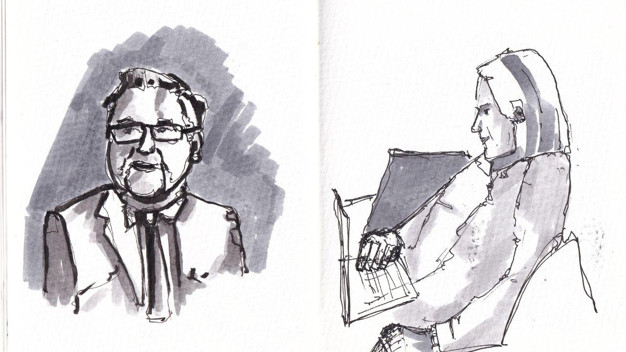
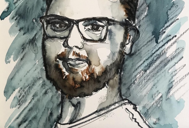
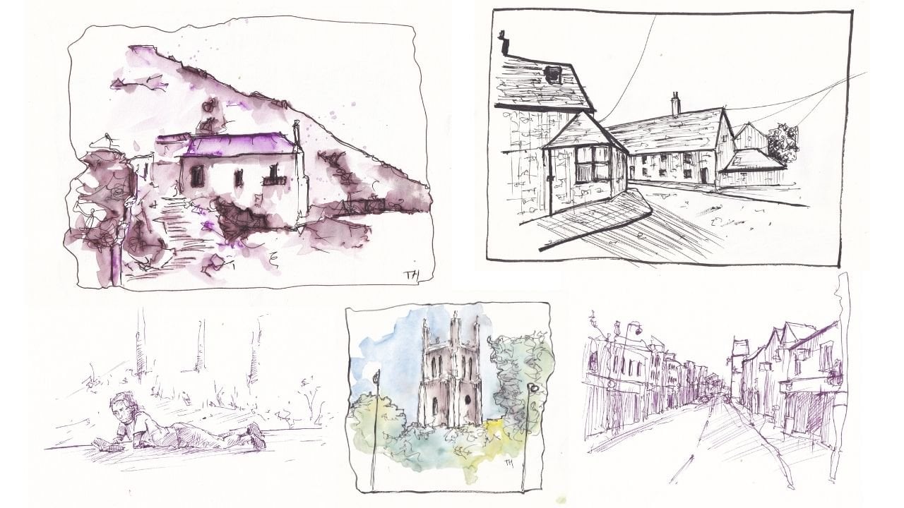
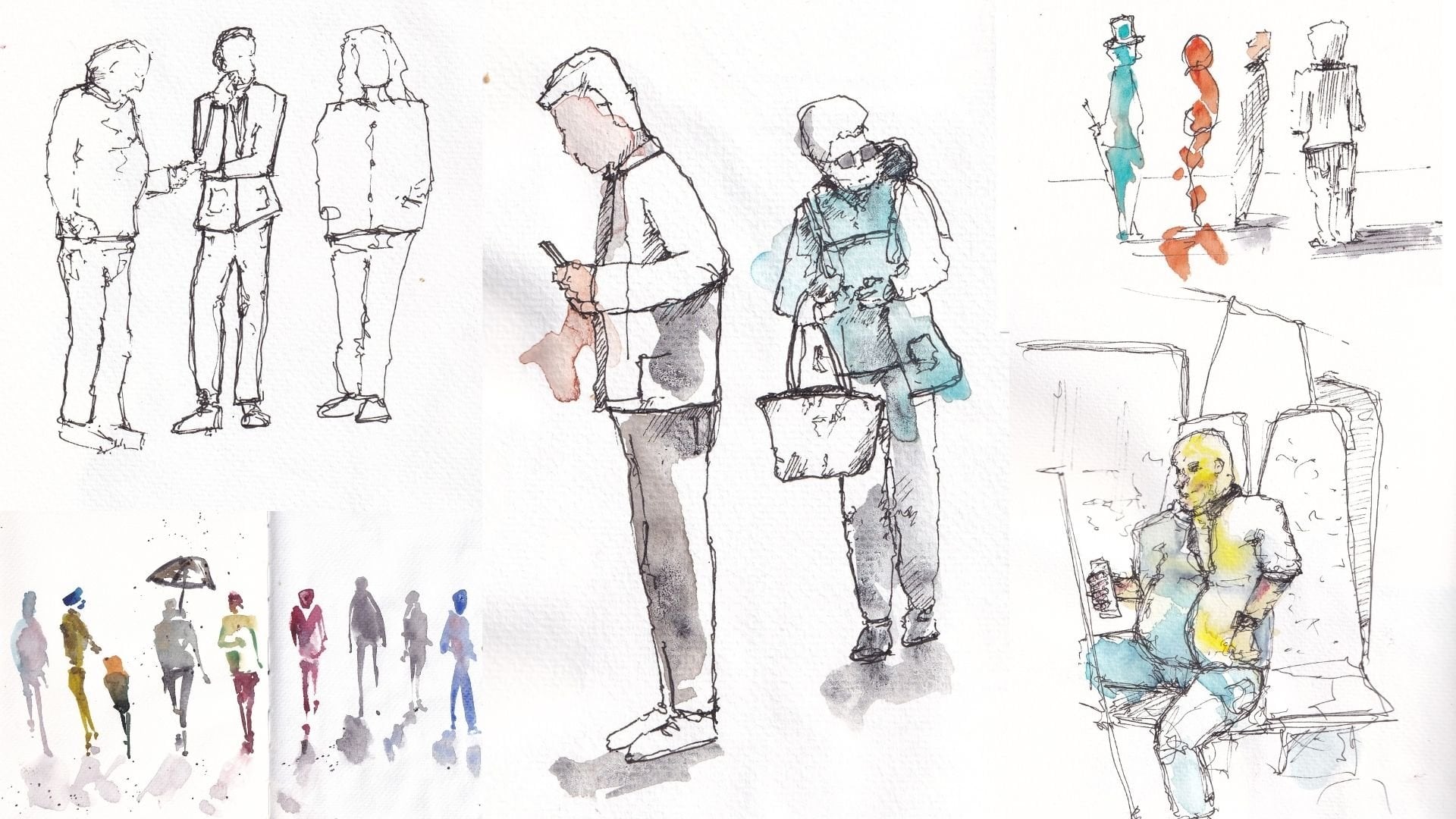
2. My Sketchbooks - Example Portraits: I just wanted to give
you an introduction to the kind of style
that we're thinking. When I talk about quick
sketchy portraits, expressive portraits,
what do I mean? Well, what I mean
is something which is fun alive and interesting. This is what we're going
to be sketching today. This is the exact example that I'll finish during
these classes. You can see is not
a perfect likeness, but that's not what I'm after. If expressing myself. Capturing something
of the person and experimenting with color
with line and with art. This style we can use
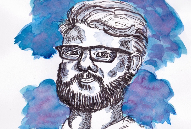
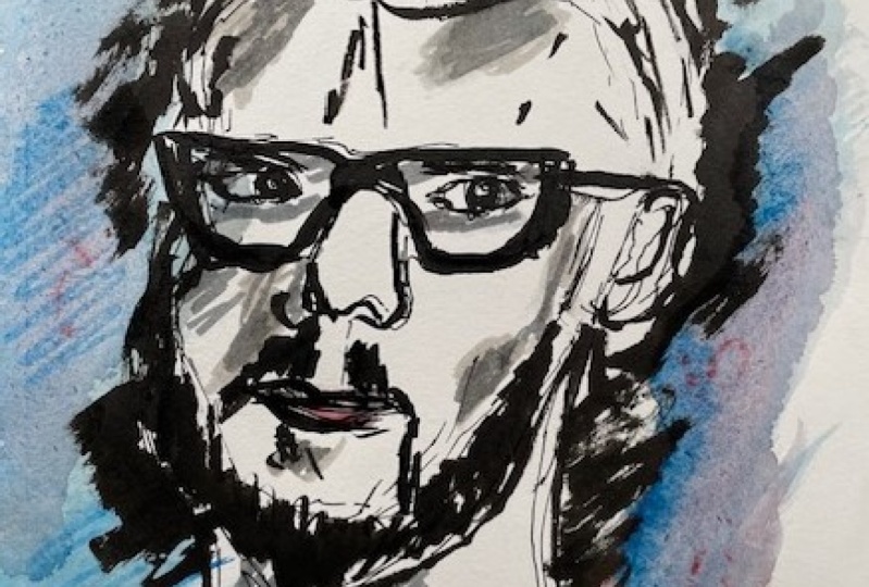
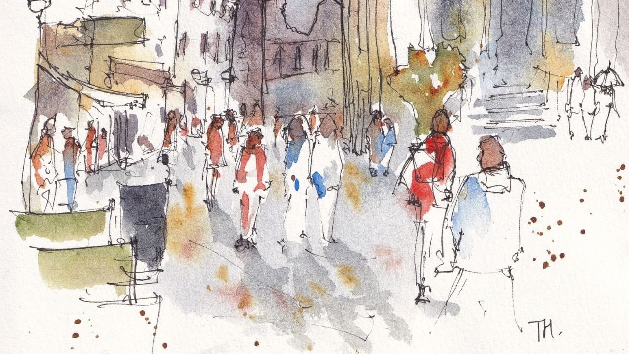
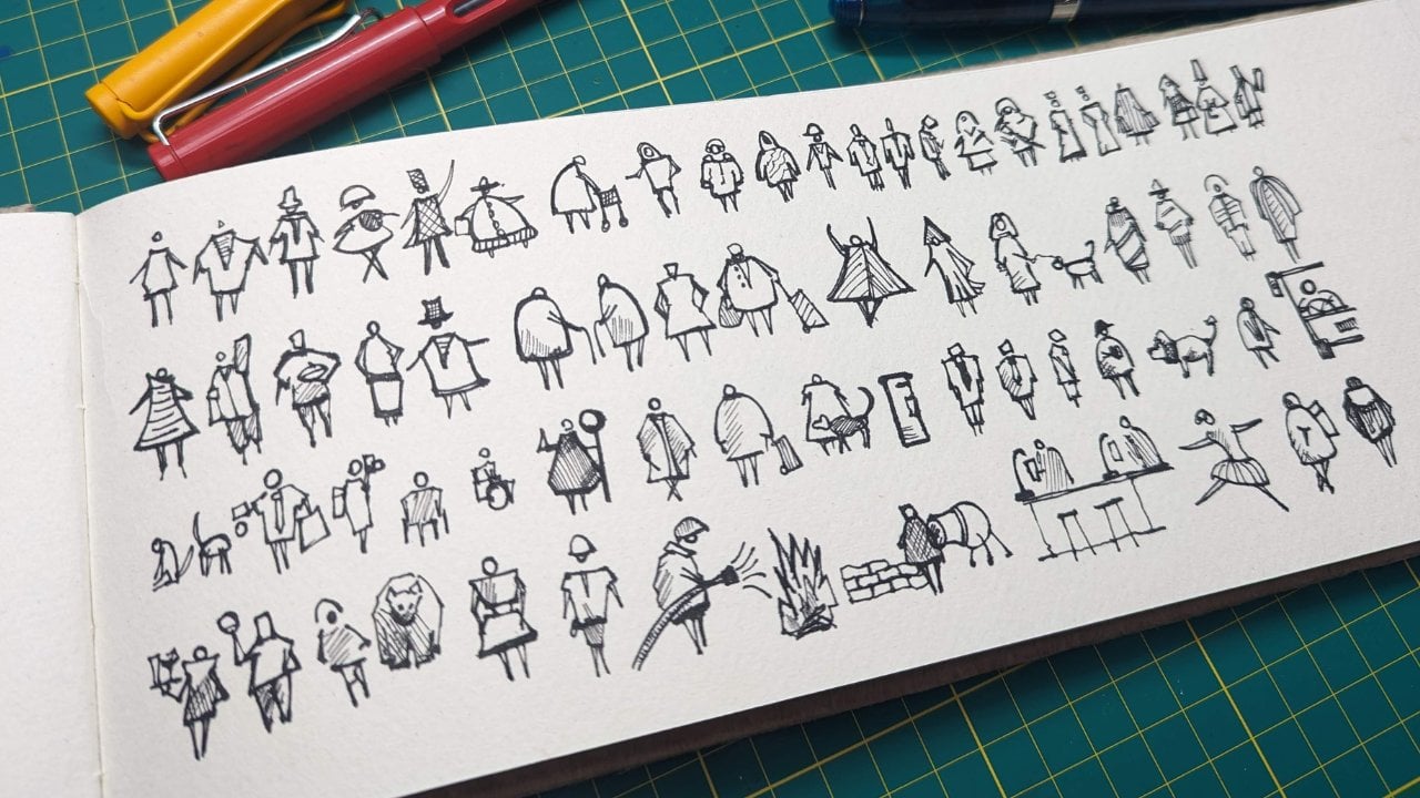
for all sorts of things. In my sketchbook, I've got
lots of little things, this is a sketch from the news, and this is also a
sketch from the news, it's using the same techniques,
the same materials. Amongst other sketches and things you might recognize
from Skillshare, also do just simple linework without so much tone going on. This isn't just something
I do in a big sketchbook, although it's probably my
preferred way of doing it. I also like carrying
around a small sketchbook. If we look in here, we can
see simple tonal sketches. This time, we can flip through as well and
find lots of things. Here's a purely
tonal sketch with a bit of background
which I actually did sat in a park
a few days ago. Here's one in the rain, someone obviously walking away
holding an umbrella. Again, same style, same process that we'll be
talking about today. And lots of really quick ones. These takes two or 3 minutes. Just really quick,
simple things to do, but can produce a
lot of fun and a lot of enjoyment for me and capturing certainly a
likeness of the person. Where can that
lead to? Well, you don't have to stick with people? This dog portrait, for example, is exactly the same technique. I using various bits and
pieces that we're using today. But instead of doing it tonal, I've added a bit of color. I use the same for birds, I use the same for portraits. I use the same for
anything alive with eyes to look at
you in a face to paint. There's lots that we can do with this really
simple technique. Hopefully, you'll take
something from it, use your own supplies
your own feel and develop a fun way of
sketching people, whatever else it is out
there in your own time. Oh.
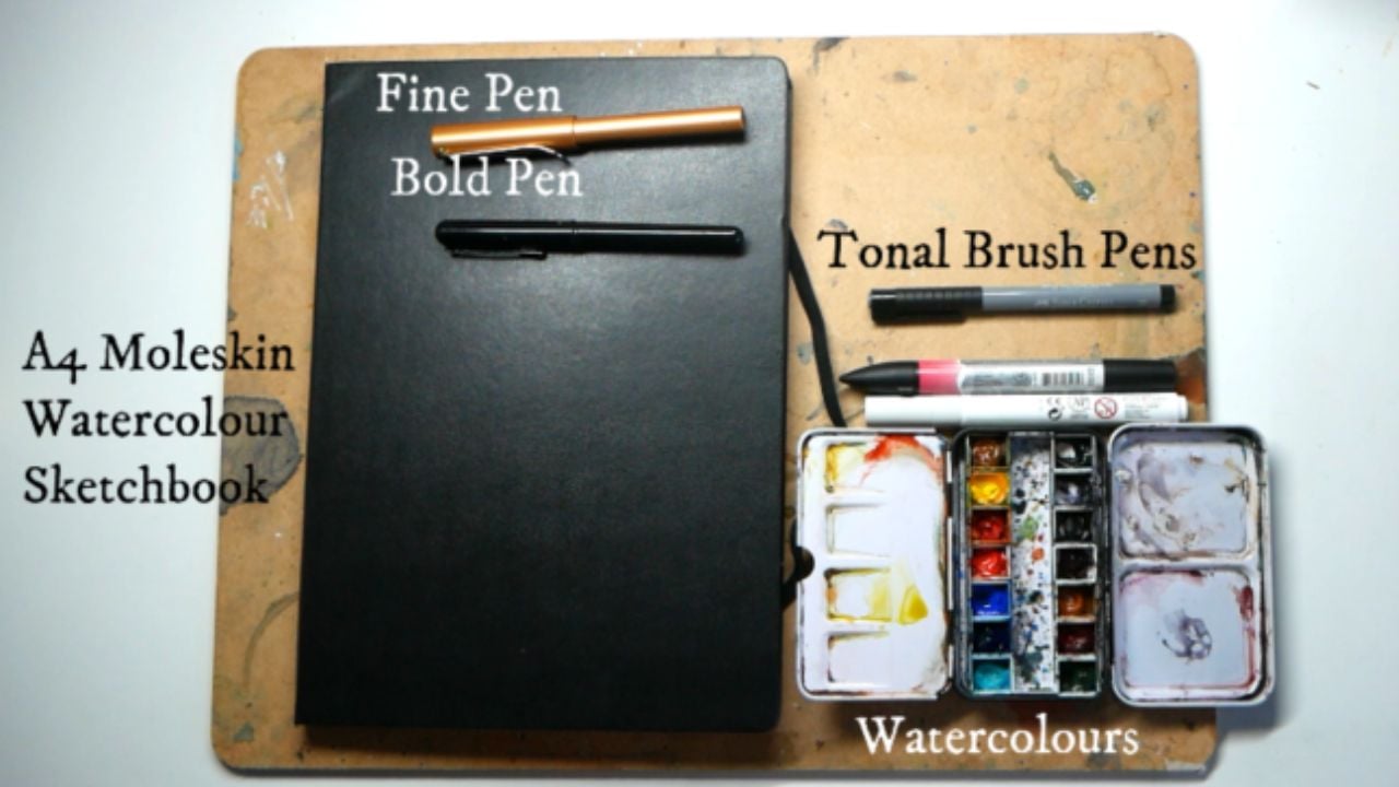
3. Supplies - A Summary: This is the short version
of what equipment you need. The next lesson is
the long version, where I'm going to show you all the different alternatives. I'm also going to show
you exactly how I use it. We'll be doing blocks of
tone and color on this page, and I'll be explaining all the different equipment
that I'll use. But the short version just to make it clear
and clean and bite size is a sketchbook
I prefer a four, a fine fine liner or a fine fountain pen
with waterproof ink. So bold pen. This is a brush pen to
create thick lines. Then something to
create some tone. That might be watercolors, or it might be something
like a brush pen or a faber castell ink pen. Then finally, something to
create color, which again, might be watercolors or it
could be a colored brush pan. That's all you need. But let's go to the next lesson where
I'll talk you through in a lot more detail about
the different bits we'll be using today. M.
4. Supplies in depth - Ink and Pens: The equipment we're after is
something which allows us to paint draw sketch
an interesting, expressive and lively
scene portrait like this. The good news is the
equipment that you need is A, not much and B very flexible. Let's have a look at the
kind of things that we can use to create this
kind of sketch. Firstly, we've got
our sketchbook. Now, this is an A four
sketchbook that I've opened out. This one is by mole skin, and it is a watercolor
sketch book. But it's got very
lightly textured paper. Award to color
sketchbook is great because the paper will
hold a lot more pigment, a lot more working than
just normal paper, but cartridge paper
is also perfectly good for this kind of
fun and easy sketching. I think a four is actually
easier because having more space is easier just to give yourself space
to crump everything up, not have your lines and
things become overbearing. I do like an A four sketchbook
for this kind of work. The next thing that
we need to think about is drawing our lines. Now, I use a few things. What I'm going to
use in these classes is a mi safari or a mi
style fountain pen, which has got some inking called platinum carbon black
ink, which is waterproof. That means when we add pen or water or watercolor on
top, it doesn't run. What we use these pens for, this is a fine nib is
literally just fine lines and doing really quick
gesteral portraits. The underlayer of
our sketch can be in these really
simple fine lines. They're also good for
creating some bolder lines, if you press harder
and if you hatch and things you can get a lot of different tone and
value from it. But fundamentally
we're using the morph, these really quick, really
loose doodles for people. The alternatives to a
fountain pen and there are loads would be something
like a fine liner. There are lots of brands,
Up wind and Newton, state rotoring all
sorts of fine liners. The waterproof is probably the only thing which is
important because it means you can be a bit
free and a bit more easy with your next step. The next thing that I'll be using is something to
create bold lines. For me, a brush pen. Brush pen has got
a ink cart chine. It's got a brush, creates
very thick lines or very delicate lines
depending on how you use it. You can get pre
loaded brush pens. But you could also use
a bold fine liner, 0.8 millimeter fine liner or a really bold fountain
pen or a feud pen, which is a fountain
pen with a nib which looks a bit like that. It's got top instead of a normal fountain pen,
which looks like that. This nib goes up, which means
you can produce bold lines. Without brush pen or
fine liner or feud pen, whatever we've got,
we're going to be using that to go over
our first sketch. And find those
lines which worked, and then just by magic, this boldness lets
us create a sketch, which is very
believable and well, real accurate fun, but with these interesting lines
going on behind it as well, which creates a sense of depth. Do you see how this face is suddenly coming
forward towards us? The other thing that
these lets do is create some textures so
we can suddenly create hair just through really simple
mark making, or a beard. We can create deep shadows, if this chap is create
deep shadow in his neck, stain it's very easy
to create that shadow. Having these bold pens is really effective way of producing all sorts
of useful marks.
5. Supplies in depth - Colour and Tone: The next important things
are well, some total medium. Now, what I mean by
that is something which can produce a range of grays. If we do a little value scale, we can have white to, would be For example, our brush pen coming in
blacking out that area. Anything can produce tone, so we could use a
pen nor a pencil and we could come in
and do some hatching. You can build up that
hatching to very simply and easily produce increasing
layers of tone, which get increasingly
darker and for this, you can create very
effective shadows without any special
equipment whatsoever. Okay. Equally. Many people will prefer to use watercolors. To be fair watercolors is normally my preferred
medium well, for most things to be hot
rather light watercolors. You can again create either through layering or through just different intensities
of pigment, you can create the same
increasing depth of color, increasing gray
scale, and and it's another very effective way of creating tone in our sketch. There are other ways as well, which are really
convenient to carry around and use for
your sketching. So ones I recommend
would be brush pens, which, which are watercolor. Cline or pro marker watercolors. This is obviously a pink one, but they come in all
sorts of gray scales, and these you can use to
create a simple color of tone. Now they do layer a little bit, but not a huge amount. What you actually need
is you need two or three to create two or three
different areas of this tone. Or you can layer it so you
can use the hatching as well, and just by having the hatching
there, it feels darker. The same goes for faber castle. They've got the indi rink, so they're not watercolor and
they're not water soluble. But again, they produce this
lovely clear block of tone. These ones do layer
a little bit more, but still it's far more effective to have just two
or three different grays. That means you can have
this stepwise progression of tone. There's no reason why you can't use these together,
slightly different medias. They produce very similar mark, they just respond slightly
differently to water. Now the last bit that
we'll need is some color. Now again, we can
use our watercolors, so you could use a nice bit of watercolor and we'll be using the color primarily
to create an outline. You could use a bit
of gold or a bit of red or whatever
color you like, I would recommend
using something bold. Equally, you could be
using one of these, misses why I've got
the pink pro marker out because there's no reason you can't use the pro marker to come
in and create that tone. You can also use
it as watercolor. Having put some on the page, we can bring a bit of water out and we can move that color around and we can create
a nice bold outline, very easily just using another
watercolor pen like that. There you go. That is literally everything you could need. I appreciate it might
sound like a lot because I've gone
through it all in this lesson and
I've gone through all the different possibilities. But remember, all I'm suggesting
you need is a fine pen, a bold pen and something for tone and
something for color. The tone and the color could well be the same thing as well. It's just a few things. I just hope that the background will be a little bit
helpful as well.
6. Make it Easy - Choosing a Reference: How can we make life
really simple for us? Well, I've got a portrait
here and a lot of about it is actually picking
the right view, the right portrait, the right reference to the right person. I just want to talk
you through some really key things which explain why I've chosen
this exact reference fate. Firstly, perfect
symmetry is hard. You can see he's
angled slightly, and that instantly
makes things easier. Our eyes are brain are
very good at picking up if the eyes weren't
perfectly level, but you were pointing straight at us, we'd immediately know it. But because he's pointing
away from us at an angle, his eyes aren't level, and we're not going to have
to draw the level. We're not going to have
to get things perfectly symmetrical for it not to
look like a human being. The next thing which
is worth thinking about is having
something like glasses, I would think is a really easy
addition, something extra. It's an easy way of showing what this person is,
what they're about. But it's also a really
useful way of measuring. If you can get these
glasses, suddenly, it's very easy to put
the eyes, the ear, the nose, even measuring
the mouth off the glasses. If someone has glasses or a hat, or something like that, then that reference photo is
likely to be much easier. The other thing is being very clear about the person
and the background. Now you can see
here, the tone of the tone in the background very different, very
clear outlines. We lose a little bit
at the back here, but this is in the hair, so
that's not as important. Having that as a clear
crisp difference again makes life much easier. There are other
things as well about the person and about the
outline which make life easier. Now this man isn't bald, but a bald man, again, can be much easier
because we've got this natural shape of the head. Whereas hair can be all
different sizes and shapes and textures and it can be a little bit
overwhelming to capture. Obviously, he's got hair
and I've even managed to crop the top of his hair
off my reference photo. He's not cropped off in the where I've uploaded
the reference photo, but we don't want to make
it too easy today, do we? We've not chosen
the easiest easy. The other thing is
having a beard. Bard's wonderful because
we can make it big, small, and it still looks right. Whereas a chin if you
make it too small, our eyes will very quickly recognize that we've gone wrong because chins exist in a certain range of
normal anatomical sizes. I think the last thing I have to say about picking the reference. There's one more
tip off to this, but the last thing about
picking the reference is it's much harder to feel happy at least when
you start out perhaps, it depends on your feelings, but I think it's much harder to be happy about sketching
someone you know. The reason is we'll instantly recognize a good image of
them, a good likeness. Even if it's pretty
good likeness, we'll immediately
recognize the nose is a bit wrong or
something not quite right. If we know someone too well, we can get stuck too much
in the details of trying to get them right and not be able to get lost enough
in doing the art in doing the processes
and enjoying that. I did say there's one more tip that tip explains why
I've printed this off. And it's to say that
it's much easier to sketch a person if
your reference is right next to where you're
sketching and about the size of the area
you're sketching. You can see This perfectly fits inside my sketch
book, quite a good fit. So I can sketch this person, this size and not get lost. We naturally want to sketch. If we've got something
big and close to it, we naturally want to
sketch about eye size, the site size, we see it this
big, we sketch it this big. That's not the same with
buildings and things obviously, which are around us because we have to manipulate the size, but with a person, it's just so much easier to have it sketch
it the same size, have it right next to it
so we can measure across. Okay. And there
you go there tips on just how to get started
and make your life easier by choosing
a reference or a person that's going to make
your sketching life easier.
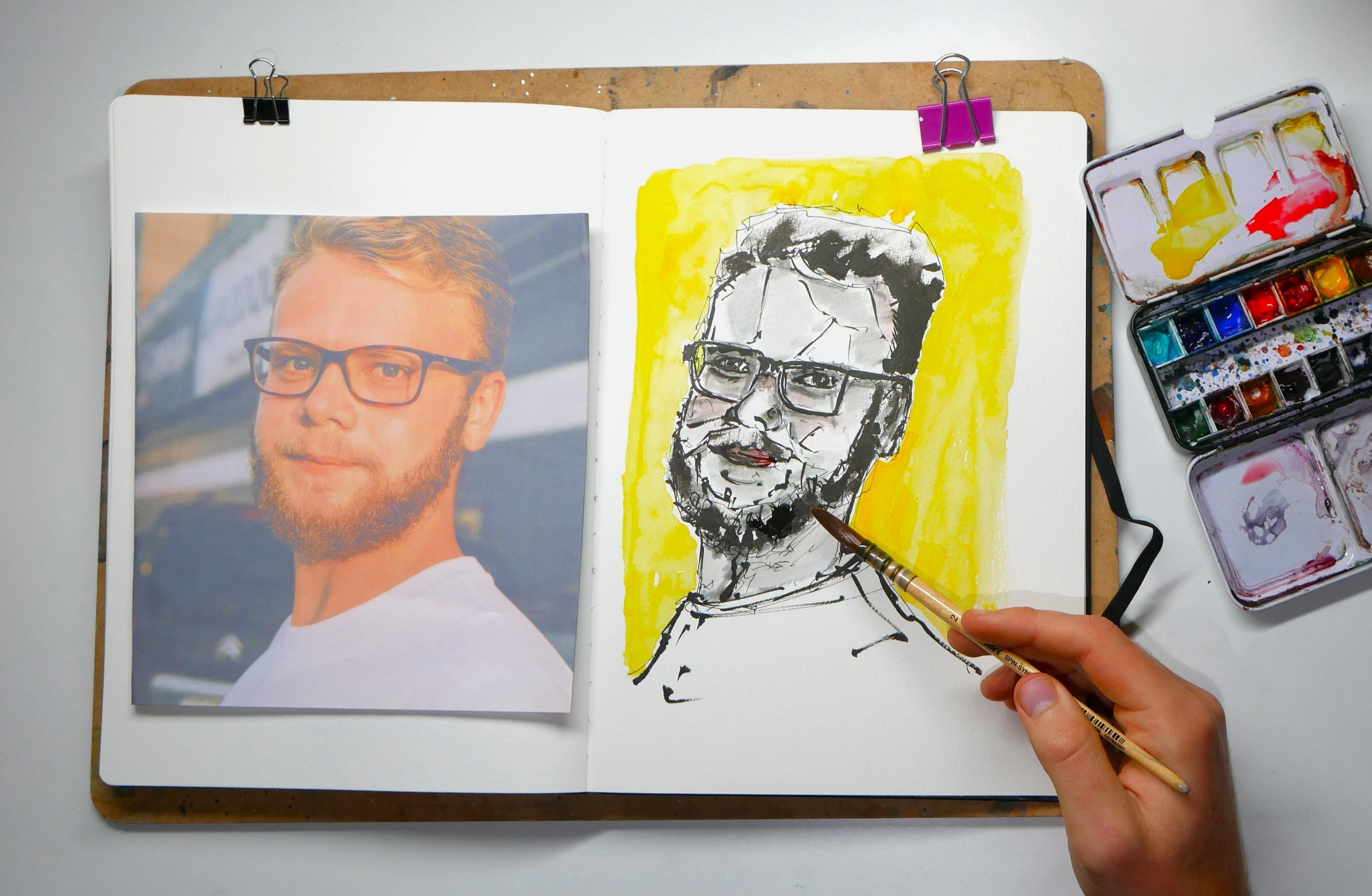
7. Step One - Loose Lines: So here we are. We are ready to start with our final project, our sketching four steps. I'm going to start off with
my fine bed founding pen, got waterproof in here. You might use a fine liner or another fine smallish
writing implement. You could even use a pencil
if you want as well. I like having these
bold black lines underneath the
rest of my sketch. I think it adds
interest and just fun. What we can do really loose
sketch, really, really loose. Don't worry about how loose. Don't worry about
how many mistakes. Because when we
add our bold pen, they all just fade
and disappear off. I'm going to start by just going quickly across and cross referencing where
various points are. We can start here at the eyes. This is why we've got our
reference right here. If we just draw in
really quickly, this is an idea of an
eye, then what's the gap? That's about an eyes gap
and there's another eye. This one's a bit bigger. Then around that we've got these lovely measuring
goggles, these glasses, which base a lot of the rest of the image
of off this one area. Then it's important to
just have a look at things like how big is the gap between the eye and the
side of the head? What are the actual angles? What are the actual angles
we're seeing Because actually, it's all sloping in
this way, isn't it? Then how high is
this, come across? We can just block that in, even block in the
top of his head. We could do these things
in quite geometric lines. I like these geometric lines
to come through at the end, but even if you don't like them coming
through at the end, you can still use
them now because you can still cover them up later. There's always a
little gap here, this little step when
someone's got glasses on. Again, what's this actual angle? It's tempting to draw it
like I have way off here, but it's actually comes
almost vertical and then almost immediately cuts in
a long way, doesn't it? You can sense where his jaw is going as it cuts across here. Then we've got the top of the beard and the bottom
of the beard out there. That gives this line, where the beard is growing
and coming really bushy. Then again, what
are these angles? Just have a check coming
out like this, isn't it? Then curves up. Then we got our nose. If we just put that in, we've got the circle
of the nose here. Little doll there and
a little doll up here. All we're doing is we're finding these shapes of these areas. We can reference them as well. So, the edge of the nose
is level with that pupil, so we could draw in the is
there because that fits, and then the edge of the eye is now level with
the edge of the nose. Maybe we need to move this
eye very slightly across. Then the next point we
need to work out is, where's the ear and it's an eye, one eye, it's an eye and a half, one and a bit. The ear is probably
probably about here. That's disc where
the neck comes in. You see all we're doing is just cross referencing
checking angle. We can check this angle
and the glass is actually come downwards before
disappearing behind our ear, we think our ear
is here, so we can pop that in the neck
disappears behind the ear. It's all fitting together
gradually, gradually. Then we look at the
corner of the eye, we've got the corner of the eye, no, and then the
edge of the mouth. We can now start popping
that in as well. And then we can pop in
these kind of structural, the filter structural
marks for his mouth. Then the corner of this is
difficult to see, isn't it? Just the iris,
probably not here, but here's the corner of
this side of the mouth. Because it is at an
angle, everything's not quite symmetrical. This eye is a bit
bigger, a bit lower, this side of the mouth
is a bit bigger. This is we're just cross
referencing checking, all of this is very useful. You can see I think I've
made this beard too bushy we can come in
and we can change that. We can lift everything up. We can test things and
just move things around. Look, I wouldn't be surprised
if you're thinking, what is this crazy man doing? Not this crazy man, the one wering away and
sketching so loose. But it will all
just come together. We can even add in a bit of text because when we start
adding in these textures, we'll start seeing
if we got it right. If you really want to make
life a bit easier for you, you could even bring your reference across. You
can just double check. You see the ears in
the right place, the eyes in the right place is my hair line in
the right place. If that's the eye, then that
should be the hair line. Things are all in
about the right place, which means that we are
pretty much good to go onto the next step because we don't need
this to be exactly right. We don't need this to
be a perfect ness. We just want it to capture
the essence of our man. The last bit to do, I just do these final touches we started off with the glasses. But now we can get
them really mapped in. And that'll be great for our next section
where we're going to be focusing a lot more on
getting those bold lines, and getting things a
little more precise. Then we get the eyes, the
eyebrows, little details. Don't forget to not do
where you think they are, but just be checking across, checking actually doing
what it is over here? I just inventing things. It's very easy to
just think that you've checked sometimes and not actually have
managed to do so. I just want to have
it look because there's something
doesn't look right here. What doesn't look right to me is that this side of the face looks like it's a bit too wide. There could be two
things. Number one, I think the eye needs
to come over a bit. Number two, I actually the
face needs to come across. We need to just bring
all of this over. This is why we do
this rough sketch. I thought I was almost done, and now I'm bringing
things over again. Then just need to reshape some of the
other areas as well. But again, we're just
going for a gentleness. It doesn't matter
if it's not exact. I think now the failures or intrigues of
this sketch aside, we can move on to the
next stage where we're going to correct some
things and bring some neatness to this
complex madness. A.
8. Step Two - Bold Lines and Contrast: So we're going to take
our bold pen for me, this brush pen for you, whatever it is you
decided to use. We're going to start picking
out the lines which worked and refining our shapes
a little bit more, as well as adding a few textures and a few bits of deep shadow. Now I'm going to
start down here. The reason is I can
immediately see there's a shape here
that I want to refine. I've got the angle wrong
a little bit, I think, and that's just nice to start someway feel you can
immediately make a difference. Then I'm just going
to work around. I can use my finger as well. To smudge and blur
some of these areas. We can come into beard and just bring this shadow and
texture all the way around. Whilst we're here, we can work in this deep shadow
into the lips. I suggest some of those upper and lower
lip details as well. Remembering how far across
that lip really comes. Put a few little hairs up there, so we'll pop those in. With the mouth there,
we can use that to base the angles and
shapes of the beard. Might just smudge a bit
around here as well. By smudging, we are keeping
things flexible, really. Letting our lines
stay softer as long as possible rather than doing
hard and definite line. Now one thing that I
think I spotted as well is I think this neck
is about which is great. We can cross reference things. Again, come down the sage of the lips and we should
get this side of the neck. But I think that this ear needs to come out a bit
and become a bit bigger. These are things that
you just gradually spot as you move around. You just gently gently touch in all these little details and you can start to just
refine the shapes. The same up here, we've got
the eyebrow coming across, but then this forehead
should be more up and then across here with a little bit of hair
coming out the side. Which again, we can add in with a bit of a
bit of a smudge. It's all just fun,
easy sketching this. Then I'm going to come
into the eyes now and just start to get those key
features because from there, we might find some other things that we want to
change elsewhere, bring the glasses
up to the nose. I'm happy with the nose,
so we can pop that in including just
the nostrils and these other curves and shapes
we can see the nose we can blend up join it
into the glasses. Now these glasses
I think need to come across a little
bit more Okay. Because this side should be bigger than that
side because they're closer because we
can see more of them because they're not
hidden behind the nose. Then these glasses, I think, need to come over a
bit more to allow for a much bigger ear
to pop in here. I think as we do this, we gradually just
refining it and getting it closer and closer
to a likeness. But again, we're not
after a perfect likeness. We're after exploring
our own creativity and having a bit
of fun with some, some sketching, and just
creating believable people. Let's get these eyes now. We've got a few lines. We've then got the iris
and we need to leave a little dollp of white just in the middle to
get a nice reflection, and then bring that down. I got a few other lines. We've got the eyebrows
we can.in as well. This eye, I think, needs to come across a bit, doesn't
it, if we look. It needs to end over here. This is an example
of something that we can change quite drastically. But because we're using
this nice bold pen, it's still going to work. You see, we've shifted the eye a long way from
our original line, but it's still perfectly happy because of the
technique we're using because of a loose and
interesting technique. This glasses just needs to
be a little bit bigger. We can just suggest some shadows to these
glasses here as well. There we go no our ear.
We happy with that? I think Getting there, let's just add an ear
label and a center. Then you've also
got an anti helix, which is quite useful
to pop in there. We've got there pretty
much, haven't we? We can start to do a few other
little bits which I enjoy doing just a few suggestions
of hair coming across. Then I like finding some
of the shapes of light. We've got this light patch here, and then a triangle here. This is very much just
what I love doing in my sketches is finding the
shapes and the geometry. By just sketching these in, we can craft this free Dens in a expressive way It's
something I like doing. Let's just leave it at that. If you like doing it as well, I recommend just having a look, where can you find
patches of light? Here in the cheek, there's
a nice patch of light. This will all help
when you come to add in some tone and
things like that. It will really help
that you've already identified the areas where you can add that
tone or leave white. Okay. Now, there's a couple of other fun things we can do. In the background,
we can see it's rather dark high value and he definitely light
and low value. We can just use a
black to cut in here. We can again reshape our man and give that idea of that
dark on light background. It's the contrasts which
build up these shapes. Again, we can do
that around the ear. Just pick out places
where you see this dark to light contrast. And here there's
actually a bit of white, we just leave that as white. Then under the chin, you see the same and we can even blend into the beard because the beard gets very dark and it doesn't have a definite ending point, does it in this foreground here. I just in a few places
we can do that. We can do it around
the hair because then I mentioned negative sketching negative
painting a few times. What we're doing here
is we're producing the blond hair by actually situating it next
to real darkness. We can do that all
along here as well. Just introduce these fun tones. These interesting
sketal marks and ideas. I think that is me done
for this stage stage two, which is the dark pen, and we started to add in
those really bold contrasts. You can see a little bit messy. That is the fun of doing different and expressive
sketching techniques. Next, we're going to
add in some tones. We've done some deep shadows. We're going to do the
intermediate tones now as well.
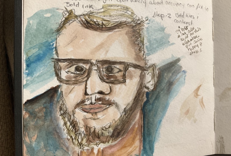
9. Step Three - Tone and Shape: It's now time to
add in our tone, and I'm going to be
using these brush pens, watercolor brush pens. I'd be just as happy
using watercolors. But I think just to
show you something different, we'll have
a go with these. Now, what I'd recommend doing
is just making sure you test your brush pens if you're
using them to one side. So you just know how gray are they we've got different depths, different warm or cold, they can be very different
in their intensity of gray. It's really important
just to know, so we've got two, which one is warm and then
one's quite a light gray. If we start off with
our nice light gray, which is this one here,
what we can do is we can find anywhere with
a basic level of tone. And just give it that
initial bit of tone. We're just trying to leave
white at this point. We're looking for where's the white, and we're ignoring that. Everywhere else can have
a nice bit of tone. What we can do with these
because they're watercolor. We can come in if we
want, we can move them, we can treat them
like watercolor. We don't need to be rigid
in how we use them. We can also pot water on get some lovely expressive
levels of texture by touching the pigment
into that water. Just move this around and don't
forget that the whites of the eyes are very white.
They're in shadow. They're a lot darker than
we often think they are. Don't worry about things
which aren't looking right because it's not supposed
to be a perfect likeness. This is supposed to
be a fun sketch and a perfect likeness takes
a long time to create. I don't know if you've
ever watched, for example, portrait arts of the year they
spend 4 hours and they're still not happy with how they've
produced their likeness. I'm going to move up now,
so I'm going to move to the next level of gray up. Remember we did our value scale in one of those first lessons. This is moving from one, which is the white two to three. Here we can just again pick
out the key dark areas, which want to really emphasize
those darkest areas. Just move around the image, just constantly checking
along the right line. Find the beside this
nose, very dark. The lips obviously got a
higher value than elsewhere. We're not wanting to overdo
it though at the same time. We want to leave some light
and stuff to the imagination. Again, we can come
in and we can move things around taking
this little brush. We can soften and blend
some of our lines. It's also nice to
for me, at least, it's nice to leave
those marks we've made which show the process
that we've been through. Now the last gray, I'm going to use for deepest
deepest shadows. This is slightly different gray. This is a cold gray, the others were warm gray. And we know that just because
of how we've tested it. That means we can just play with having a slightly
different feel to some of those darker shadows as well as building up the value through the layering effect
that we're producing. There we go. That's all it is, the tone done in just
a few minutes using these really loose and
easy sketching markers. I say that, but there's always something else
to do, isn't there? I just realized that we've neglected the tone in his neck. I don't want to
take away from the face by overdoing this. I'm just going to a bit in and then move it around.
It's nice and soft. There's plenty of
light and not too much taking away from the
rest of the portrait. Now we are onto
the very last bit, which is adding in those bold interesting colors
in the background. Move on to the next lesson
and we'll get on with that.
10. Step Four - Bold Colours and Background: It's time to add those bold
and interesting colors. You can do any colors
you want really. I'm going to show you
just a technique. I showed you earlier
with a bright yellow. Let's try something a
bit different today. We're going to do a
combination of a blue red, more in keeping with
this, isn't it? That will also help
because this background is quite deep and dark, for the most part from
these white areas. That will help because
our ch therefore needs to be a lower value. So a lighter color overall to stay relatively
true to what we've done. I'm going to drop in there,
just a nice cobalt and that can move around because
I wetted the page already. I'm going to try to keep this in this interesting
idea of a frame, so we make it nice square, can bring the blue
all the way up to the edges of where we've put
in this dark to already. That just keeps
everything background. Background is going to have
the same hint of blue, even though some of it's got these very strong dark
shadows. And bring it around. What we're doing is we're
negatively painting again. We've got this
lovely blonde hair, and we're negatively painting it by bringing our colors
around to the edge of it. Don't forget little things like just inside
the glasses here. Keeping things
uniform like that. Now, time for a
little bit of red. This is actually a
nacroon magenta. Just going to touch it in
in a couple of places. Just really gently. Then we can come and just
move that around. Just that little
bit of variability, variation that's going to
now happen in our image is, I think, really interesting. We could bring these
colors down if we wanted, even do little splashes and
things to fill the space. We can amp up some of the blue and change the
intensity just by dropping things in or we can keep it just crisp and clear flat wash. The last bit I would do,
whilst with our colors is take some color and do a
couple of touches like a little pink suggestion
in the lips is a nice idea. We could take up blue
and we could use the blue just a hint in
some of those shadows. Maybe a bit of blue
just leaping up here, maybe over the glasses. Things like that,
really simple touches, just to bring a little bit of
warmth to what is otherwise very much a gray scale image. Again, it's all just
about experimenting, having a little bit of fun
and just trying things out. Because we've done it nice and quickly, nice and expressively. We haven't lost too much
if it all goes wrong. But I don't think it has
not a perfect likeness, but a really fun
and quick sketch, really interesting way of
putting together portrait. When I find something which I find enjoyable and interesting, I tend to do it a lot so I
can fill up a sketchbook, enjoy myself using
this technique without having to worry too much about
getting it exactly right. Okay. So that is the
end of this lesson. If we move on to
the last lesson, we'll be having to talk about your final project and having to think about what
you might do for that.
11. Your Project: And now it's time for
you to have a go. Feel free to use my reference
or to use your own. Now, remember if
you're using your own, To take it easy on yourself,
at least the first time. This doesn't take
long, have a go with a nice and easy reference
before you start moving on and trying to problem solve
on something more complex like a loved
one who doesn't quite fit into the
bearded or glass or slightly asymmetrical
and general population that I've been testing on. Other good ideas is I often sketch from the
news, believe it or not, there's loads of lovely
portraits of people with interesting expressions or interesting things
going on around them. You can have a go with
that. When you've done your piece,
please upload it. Let's share and see what we've all done with
this technique and really interesting to see everyone's interpretations
of this chat, for example. Also, if you enjoy this class, please do pop a review up really helps me know
that I'm producing something which is
worthwhile for people and also helps other
people find the class because good reviews spread the word about different
classes on Skillshare. Anyway, that is me done. Thank you very much
for joining in. Please do you find
me on my socials at Toby Urban Sketch
and feel free to tag me on anything you do on Instagram or connect on
YouTube or anything like that. Thanks for joining in
with one of my classes and happy sketching
until next time.
 Toby Haseler, Urban Sketcher, Continuous Lines