Transcripts
1. Introduction : Hi, this is Timothy,
an engineer, artist, and art educator, sharing art tutorials and personal
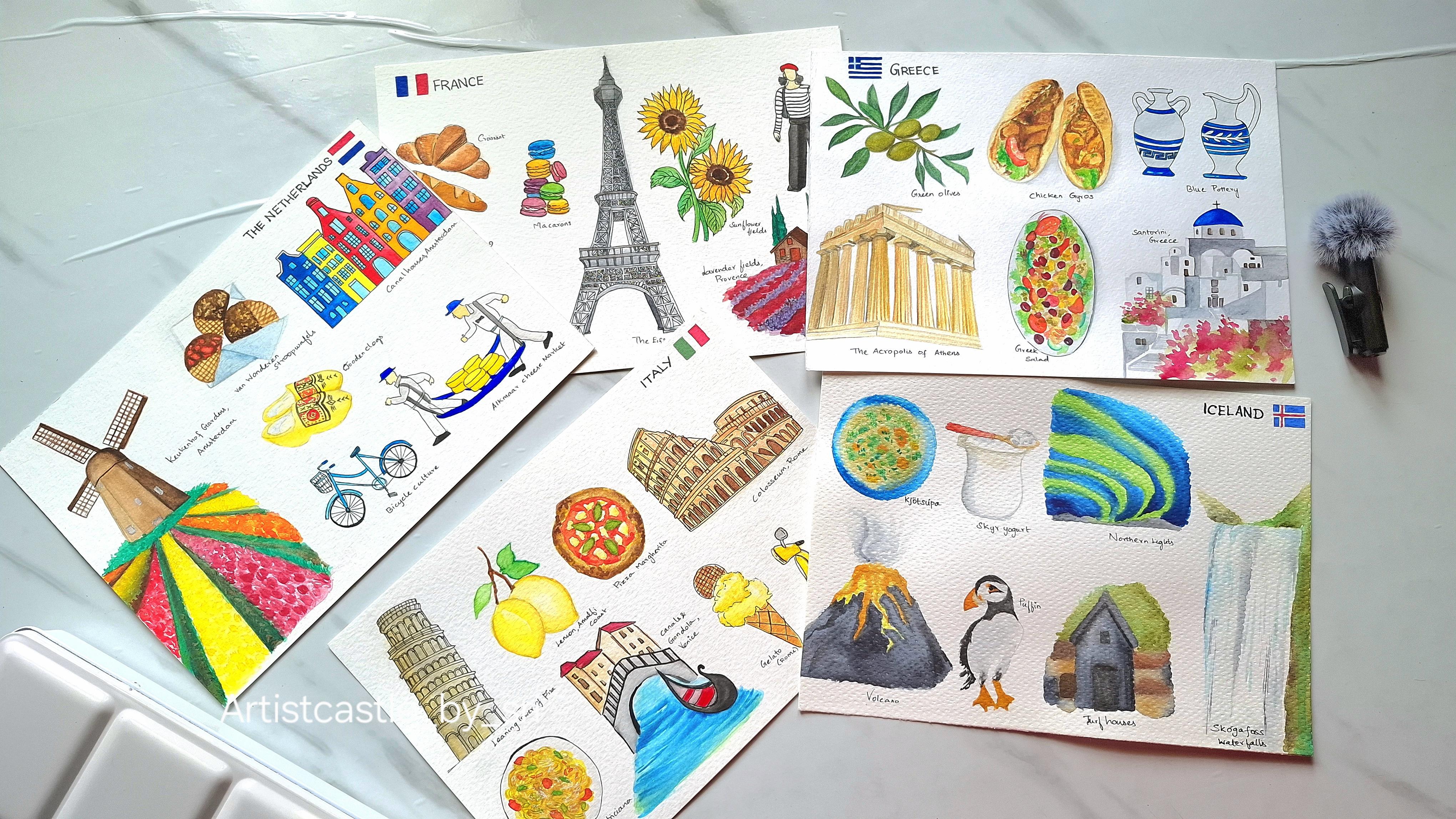
teachings to a online. In this class, we are going to explore Europe through sketching from the charming
effects of France to the colorful tulip
fields of Netherlands, the historic beauty of Greece, the architecture at
cuisine of Italy, and the magical light
center in of Iceland. You'll learn how to create your own travel
sketch pages using simple artechniqs
like composition, color harmony,
architecture drawing, and food illustration,
all inspired by the culture and
beauty of each country. Whether you're a beginner
or an experienced artist, this class will help you capture your favorite places and foods in a personal,
creative way. So grab your sketchbook. Let's take a visual
trip across Europe and turn travel memories into
beautiful works of art.
2. Art Materials required : Here we are just going to get ready with the supplies
that we are going to create for this Europe
series, art sketch series. So the art supplies that are required is like for
watercolor paper, I'm just going to use ans and Brand 300 GSM
Watercolor paper. So this is like AFI size. I'm going to use this one. So it's like a cold pressed
one and has a good grains, and the paper quality is super great to start for the series. So I'm just going to use this and next is going
to be the paints. For paints, I'm using my Himi brand watercolor
half pan set paints. So this set has with a swatch card and
palette on the side. So here we can just mix
up with the paints, and it comes along with a brush. So the mob brush
is super amazing, and we can just go with that for making little flat
washes and details too. So this paint palette
is really very great. So we can just go with
this and you will be ing with a pencil to
sketch and few brushes. So these brushes are
from Brusto brand, and brush ice, it goes with
a flat and round thing. So for round, I'm using number eight and
the linear brush. So this three are the one I'm just going to use
for the whole painting. So yeah, and a little bit of napkins for just wiping out the brushes and two
bowls of water. So one is going to
be for a clear just cleaning up the brush
and the other one for just wetting up, again, a second round of
cleaning of the brush. Excess is going to be with the spray bottle to
reactivate the paints. So one, these are the
things we are going to use for our class and just have it very ready with you so we
can start easily. And I'll be meeting you in the
next session to learn with the techniques and
selection of how we can just start up with
our Europe art tour. So I'll meet you there by
3. Episode 1 - France ?? Sketch Part 1: Welcome to the
very first episode of our Europe art series. So here I have just picked up with five
different countries, and in this five lights, the first one is going
to be with France. And here, as we discussed
in the previous episode, we need to just after picking
up a country for our tour. So we have to just make
an analysis of, like, what is famous it is for and
what we can do on there. So it should be like a
visual tour with our art, so that fills purse with
emotion for the viewer's eye. So we need to just
feed them every happy the productions and whatever we can with our art and
painting skills. So as discussed
before, here are like, we have to just come up
with the favorite things. So it can be like even
our favorites and the major most top visited
places and foods to eat, the culture. So it
can be anything. And we need to just
pick at least, like depends on the paper size
and creativity we have in, we might have just
made with a mind map on how we can just pick a fix with a pix and where to just
put up in the paper. So as we have just A
five sheet with us, and let's make a simple and beautiful
illustration of the tour, I have just picked up
like top five or six. Maybe it should
be at least five. So if possible, if
you just want to make with some six or
seven, even that's fine. No more than that because
we should not put up so many things around
here on the paper. Even that will not
be that great. So I have just in France
picked up a little few things, and they're going
to be province, the lavender forms,
the sunflower fields. So in case of
sunflower feels, like, I'm just going to make a form for lavenders and not a
form for the sunflowers. So just going to make
with two or three flowers to represent the things
that's famous for in France. And next is going
to be croissant, Eiffel, and macarons, and cafe. So the culture, maybe like with a dress
code that's popular for. So I'm just going to put up
here with only these things. And get ready with your
pencil so we can just start making like how we have
to arrange on paper. So that's going to be the
composition of the art. So composition in the
sense as seen before, it's going to be arrangement of all the elements in the paper. So that should be completely
with a good focus to a VSI. So it should just move
it should be like a virtual tour for the VS I
just starting from anywhere. So each element
should not be missed. Everything should be on
focus to the V side. That's going to be
like arrangement of elements. That's
very important. And let's check on that. Now just placing all
the elements with a composition to fill the paper and not leaving
so many free spaces around, and it should not be
even very clumsy. So I'm just going to start
with a split of eifll on the very middle here because this middle place just
focuses the major attraction. So here, this is
going to be like a best store is what stew, so that I'm just going to
place it on this side. And for the baguet I'm just going to place
it on the side. So all the bread
items, the croissant on here and the
cafe on this place, and maybe with the farms the colorful elements
on the other side here. So this side goes mostly with a little browns and this mostly with the colors
this the firm the field, everything macaron so everything goes very colorful on this area. So I'm just going to make a contrast composition
with the colors too. So, yeah, we can start with a very thin
line, linear line. So just here exactly
in the very center, we can just make
a straight line. This straight line is enough. So this place is going
to be for Eifel. And here with this place is going to be for
the croissant. So that should not be
on the other side. The croissant should not
face to the other side, so it should be just
focused inner to the paper. So I'm just going to place this and French girl
style on this place. So because the width on here for Eifel it's going to be a little broader
comparing the top, so I'm just going to
place the girl on here and Baghet on here. So the macrons
will be on the top here and the sunflowers
in the vase. And this area is completely
going to be for Provence, the farm, the lavender farm. So this is going to be
a basic composition for making all the elements appear in the paper of France. And for title, I'm just going to leave this
space on here. We may just make
with a cali laff. That's completely with our
interest and the flags each country's
respective flag should be it's important
and it attracts, like, the most beauty thing. So we can just place it on the place here
or on the corner here. So this is going to
be the composition, and let's start making
with a picture. Starting with the
croissant on here, I have images selected. So in case, if you want to just after completing this episode for
assignment projects, if you want to make with
the same frances and, uh, you can just go with some
different elements like the familiar things that's
not taught in the lesson. You can just select
go through self with some different things
and put it on over the paper. Now for the croissant,
I'm just going to make it like starting it
horizontal this way, and it goes little triangle in the middle for
the roaster part. So this way, it's
going to be like this and from the middle, it has got so many layers. So in the very start,
you should not make it with bold high pressure
values that will be very hard for erasing after
completing action the sketch because we will be like making
with the paints, so that feels a little hard to be careful
with the sketch. And next is going to be a little low in height,
starting from here. So just with this tour, we're not going to
only have a knowledge on the France or
any other country, but we'll be learning so
many things with colors, and we're just througing with different things in different
fields like with the food, the construction,
architecture, everything, culture, colors, so many things. So it's, like, much
knowledgeable, and we are just putting so many efforts and analyzing so many things to
have much experience. So this is, like, I love
creating these types. And it'll be useful
if you're just traveling around if you want to sketch some memories around. So this is going to the
croissant roasted part. The other side, it starts
like from this place. And not only the sketching
is much important. We need to just make
with the colors. So colors play a major thing. We need to make it beautifully. But that's like a
feast to the eyes. And here are so many
crusted rose layers. That all highlights on the
basic depths can be just given us details
with the watercolor. Okay, so Croissant
is completely done. And next is going
to be with the EFL. So here, I'm not going to just focus on each and
every single detail, but it should be with
effortless detail. So I'll teach you how you
can detail with effortless, and that looks very realistic. So this is just starting
and ending point. Here, just we can
maintain this place. So here we're going
to start and end. And you can just in EFL, you can just split with stories like it goes with the
first thing on this place. And the second thing with
a little high on here, and third thing is
the very last one so high on this place. So this are the levelings
and now after splitting, you can just see how you can construct with all
the steel thinking and the arcs in that. So it goes with so many cross on the sides for
making with a steel, and this place is
going to be like a stridline and you're
going to just double it. Like this. And from there
on the other level, you're going to just make
the sketches this way. Now, over here, I'm just going to add up the other
layer of the bar. And, yeah. So our first detailing
of the story is ready. Next is going to be. Here we are just
going to just make with the bottom layer, same as we did on the top. And we're going to connect that with the rectangles
in the middle. It's going to be like
this and in the center, just connect with the bars. So it just makes so
sturdy adding this. Now, from here, I'm
just going to connect this place to the
base on this side. Same way from here
to the other end, we are going to make from
this place and on this side, from here, joining
it to the base. Again, with the light pressure with the same width on
both sides balancing. Now it's time to create
an arc from here to here. You can just roughly make it in the R and check with a
reference whether it work out. So I'm just going to
make it a little top. On the other side view, it's going to be just below it. So this is how you can
make this sketch easily. And on the top, just
make with attachment of a rectangle, sorry, adjust line. And on the top, again, if you want to just
make with the details, you can just go creating
it with the splits. So each slit goes this way. And from here, you can just
simply make a cross in each grid connecting the
other side like a checks. Now we have to just go in
the opposite diagonal way. But when we just make
with inking process, it's going to be completely
different and very clear. So this grid actually continues
to the other side too. And here just going to
section with three lines. Same way on here. Now, if you want to just
make the same grid, you can expand from this
place and join it from here. L. And the closer one is the base one is
going to be so bigger. And one on here, it's with a shape reversed Same way on this side, just start from the bigger one, end with a smaller The one bigger on this side
is going to be. Just split with the
two inner boxes and leave the outer
side little empty. Not much rectangular. And from here it's going to
be with splits like this. Same way you can start from
the middle line and building up the verticals, the
diagonals finally. So this is the way you can build the complete eiffel tower. And the base only here, I have just made
the guidance one. The rest of the
tower is going to be built with a little
faster effect. So you can just have a
reference with this, practice it separately and put up along with me in the class. So it's going to be
a little faster. Also, the other
one, wherever you start on this side should
be same to the other side. So that's important for making
the sketch beautifully. And focus on all the details
can create up in the air. So if you are a little very beginner in
the sketching portion, you feel very hard
stuck in sketching, you can just focus on
my previous episode like you can draw everything
effectively as a sketch. So that's a complete guy like how you can create
it from scratch. And after that, you can just
hit to this Europe Art. And I'm just going to
create it again this way. Add it behind one to make it look like a three
D, and for the second one, it's going to be making the
same repeat in patterns, little lengthy on the top. Starts here, ends up here. So this should be inner to this. Splitting it in the center
from this point through here. Same way as did here, we are going to make
it on the top two. Here you can see just I have added with complete
work of Eiffel. And you can just take
your own time to make this in your own style. So next is going
to be with adding of cafe to create this, it's not necessary
that we need to add a complete hotel
cafe style thing or some building thingy. It's not that necessary. So instead, I'm just
going to adjust a little two chairs in the sky
and a table in the center. So even that's fine and
with the name of the cafe. So on these three is
like my focus to add on. So I have an idea of adding a wooden chair on two sides
and a table in the center. So that's going to be placed
exactly on this place. So for that, I'm just going to make a table in the center here. Just this place is enough. And to that, in the bottom, I'm just going to add with the diamenson to make
it like a three D. Extend for the stand
in the very center. So we have to measure
with the heights. This height for me is enough making with two parallel
lines in the center. Next is going to be
with adding of details. In the base, just add a little curve to
the side this way. And to the base, I'm just going to expand with three different
sections like this. O Yeah. So this is fine for me. I have made with a base, too. And next is going to be just
making chairs on both sides. So starting on this area, so it's going to be with
a side view of a chair. I'm just going to
make a rhombus. So with a rhombus on
here, just like this, we can make a rough
sketch. This is fine. And next is going to be with
the attachment on the top. This way. So the
top, it's again, attached with the comfort here and on the sides for
the legs of the chair, we can make it just equal
to the base like this. So with the guidance line, we have to create it exactly
like a look on the floor. So for making the legs, just draw with the center
portion and from here, just at the other side. So that which connects like this and on the sides
for the balance, I'm just going to add the
wooden connections each side. So this wooden should be
parallel to the above seat. This is how you can
build a wheelchair. And the other side, it's
going to be this side. So it's exactly very same
to the length of this one. So I'm just taking with the
angles for making the seater. And as soon as we have
made with the angles, next is going to be with this. So it's from here,
making up the line. Okay. So this three D effect will only just elevate the dimensions of art
to the realisticness. So that's important to
add exact three D work. And the behind one goes with the upper
portion of the chair. So even that should be length to this till here, making with a U, and this side with a length on here like this to the
base for the legs. So it's exactly with the floor. So it should be parallel
again and adding the arcs. So this is like my
idea of building with the chairs and
table, so for the cafe. And next is going to be yeah,
I just missed something. So if you want to add, with some different styles
and if you have some different
references and which look completely with other
different unique style, you can just go put up with that pieces of chair and
tables, furniture, everything. Or if you feel to
add some kind of a little cross joint over here or some coffee
thing on this side. So even that's fine.
It's completely our choice and our grat. So feel free to work
with your imagination. So next on the top, I'm just going to
add up with a name. So just about here, a design like this. And on here. So it
should be same. This way. And in the
base just from here. So instead of adding
with a building, so that's because we have
a limited space here, and we need to we
should not make it so clumsy with all the
elements filling in, and even that may just overdo the work and
look unpleasant. To make it very pleasant, I'm just going to
add a simple detail. So this looks like okay and not that much heavy with a
paper filled clumsy thing. And on the top here, just making with a spiral, So you can just
make with a font. I'm not that good at
the calligraph thing. So I'm just going with whatever
beauty I can bring out. So if you're so
good at lettering, just go with your own style. We are done. So it's a
simple cafe built with just very easy and simple
properties without buildings. And next is, we have to
add up the other detail. Just the next element is
going to be a baguet and that should be added near the croissant to make
it like a family. So to just adjust the space
and make a good composition, I'm just going to add up the
buguet here on this place. So if you want to add in
some different angles because this is going to be
a diagonal way like this. And if you want to make some different angle,
even that's fine. We can just go with
some different angles. But it should not
overlap over here. I'm just going to make it
just below this. Like this. And on the top, we
are going to just make the details with a curve. This is done, but it will be completely
done only after making the coloring part because this is just a sketch
and we need to add the details after
the coloring is done. So we are just completed
with four elements, and next is going to be with
the other element addition. So I'll just continue
in the next session. And if you have some
different ideas, you can just put up with the compositions and I'll be continuing in
the next session.
4. Episode 1 - France ?? Sketch Part 2: So here in this project, I'm just going to just complete
with the other details, hope you might have
understood with the sketching process
with a reference. So I'm just going to here make a little faster work
for the sketch alone. And next in the
upcoming painting work, it's going to be
completely detail detail. So this is how an
illustration sketch of the Europe country
is going to be. After putting up with
all the four elements, next to add the remaining ones, I have just come selected with
a province Lavender Farm, so I'm just going to put up
it on this place exactly, starting with a firm house in the behind and Lavender
farm in the front. So just you can start up with a little tiny
thing on here. And just making up
with the details. This much tiny thing is enough. And the other thing that I
want to add up on is, like, we may have at
least six or seven in our list to put
up over the paper, but it's not necessary or
condition that we have to draw everything
because in some cases, we may do not have any place. So we should not compromise with the detailings of any element. So just to fulfill
all our packet list, just putting up everything
in the paper and filling up, making it look nasty. So
that should not happen. Instead, we can just kip
some one or two and make the detailings look like a
pro. So that's the key thing. Just with the shapes, you
can make it a little easier. And here and there,
I'm just putting up with the fine varieties. So the farmhouse is
completely done and next is going to be
adding with a form. I'm just going to make an extension
continuously like this. So it starts exactly from here. Slowly just moves to the
other side this way. And the front one, it just goes a little smaller
and extends closer. Same with the other one.
It's like a meadow. I mean, it's not like that, but I'm just mentioning
with the shape, the steeps, everything. So that's it. We are done
with the fifth element, and next is macrons
on this area. So it's just very simple. You're going to make
with some details of biscuits like this using
oval and dumping it up. You can make with
different colorings. Just keep on stacking
with the shapes. That's it for building
up the macrons. So after finishing
with the macron word next is I'm going to add up with a sunflowers on this
right next to the IPL, and that's going to be
starting from this place. Just making with a
simple sketch like this. And on the top, it's
going to be with a seed. Just add with the petals, adding all the details. So I'm just going a
little faster here. And as this is a sketch, it can make it very easily
with your reference. And the leaves finally. And here with the other flower. Here I have just completed
with the second final element, sunflower and the very
last is going to be a woman with France the
style Parisian style. So I'm here just
going to make use of this little space
and make the work. So let's see. I'm
splitting for the body. So the height is going to
be like this much high. And the pants will be till
here, the shirt area. So this is going to
be a small portion of the neck, the face, and here with the Bret
Hart, the woolen beret. Here, this area is going to be completely with the shirt space and the bottom with a
pant on here, the bells. So it goes with a well
structured clothing design and extends still
here like this. On the other hand, in the coquet There'll be so many
stripes on the top shot. I like this and just a little bit, we can
extend with the pants. Here, very little bit. I'm just extending
with the height. And just shoes are wearing. So yeah, we are almost
done with everything. And this hand, it's
a little bigger. I feel so I'm just going
to reduce the size. This is fine. And
we are completely done with the
illustration of Paris. Sorry, France.
Looking on the IPL, I just confused with the name. So we are just completed with the sketch illustration
of France. So after making this sketch,
it's like necessary. We have to colour it. And for that, I'm
just going to use watercolor paints
and get ready with your paints and we'll
be just starting with a palette color palette, and we can make with a
easy quick coloring work. So that's going to be very
simple loose watercolor works. So meet you in the next
colouring session Bye
5. Episode 1 - Painting Eiffel, Croissant : Welcome back to the
coloring session of the first episode
with France. So here with this sketch, I'm just going to remove
the first epis like we have to think like what
we are going to make. So here are fine liners. I have my fine
liners from Brutro. So we are just going to, like, in some places, we can use this for
making the inking works. So we need to just have a
clarity that for some elements, are we going to use
with this fine liners, then paint, or we're just going to paint
without fine liners. So that should be
with a clarity. And whatever the idea maybe what we are
going to do is we need to just take our needed eraser. So with this, we can just shape or reform into any
structure we need. So we can just go
making with any shape. So with this, we need to tap
all over slowly like this. Which removes the excess
blackness all over, and you can just make all the painting works easily without the blackness
disturbance. So this is why it's important to follow this step all
over in each painting. So I'm slowly
removing everything, but you should not
remove completely because we may just get distracted by the
outlines erased. So even that may mistake
with the sketching process. So it's not appreciated to just erase each
and everything. I'm just dapping over
slowly like this. Okay, so this much I
feel it's okay for now. And my idea is, like, for the IPL, I'm just going to take my 0.50 0.05 nip one, the needle one. So with that fine liner, I'm just going to make
with inking process for the eFL and maybe with
a little on the cafe, the chairs, the title, and for this woman. And for the flowers, I have idea like first, I'm just going to aplay colors for the food things
or food and flour. I'm just going to apla colors
first and then check with, whether it's attractive
or we can just go inking after
the color process. So this is a waterproof pen. So even if I apply
with a sketch process and do coloring work will not fade anything
or smudge anything. So it's like we can just
have our freedom in working, and I'm just going
to take my pen. So this is the 0.05. Can look at the nip
how thin it is. This is how linear it's. And we are just going to
make it with a sketch, the inking process slowly. I'll do a little
faster work here. So as this is a simple
inking process, you can make it on your own. For each details inside, I'm just going to work
very carefully this way, adding each single triangle. So this is how I'm
going to work. Here I have just completed with a fine liner pen or
the inking process. And this is not only for EFL, I'm just going to
proceed with the cafe and all the elements mostly. So I'm just going to avoid the food things just only
for now and this form. So maybe later after coloring, I may add with the
inking process, and yeah, you can just
do the inking work. Now we have just completed
with whichever it goes required outlining thing. So after making this, I'm just going to wet my brush. So here are our palette. So on the side, I have
kept my palette open. So with this, we just want
to focus on painting, starting with the croissant. So I have just taken my
colors a little bit ready, taking to a bit. So I'm just swatching it
all over very lightly. Like this. And after it's, like, wet, I'm just taking
a bit of burnt talker. And with that, I'm
just going to make it slowly over here. Mix with the burned tumble. This mix with the roasted part. Like this. Now on wet, I'm
just applying a bit of pons and burnt ocher mixture. So to just make the
croissant look crispier. I'm building the textures here. And with the tip of my brush, just extending with
the textures again. On the opposite side here, I'm just making
with the darkness, and the color should be blended to make it
look realistic. Now, with a bit of burn timber, so this is how I
mix for the breads. So we need to just focus on our color palette,
the reference colors. So with all the reference color, I'm just taking it
on the palette. So just mixing like
whenever it's required, and we can just go over with making textures
to bring the realisticness. So it's like recommended
to make it with a different sized brushes for all the small little areas to be covered and for detailings
that's important. The other one for
sights. Like this. So this is how simply
we can just build it. And finally, with the Earth lo, I'm just making the blending
work a bit with that. So the colors,
everything will get smudged and mixing a bit of ponsu to burn timber
and burn talkker. Mixing all these
three colors, again, taking a bit of burn timber and just going all
over like this. Finally created all
the details wherever needed. And that's it. So for highlights, I'm just
taking a bit of white. So with this dapping
here and there, so the water should not
be over in the brush. Only the paint should be there. So without wet, I'm just
taking the empty dry color. I'm tapping here and
there for highlights. So this is how we
can just select the colors and
make for the food. In the same way with
the same color palette, I have just covered for
the other one Paget. And now it's going to
be with the macrons, and that's a little colorful. So to create that, I'm just
going to take my colors of the rose shade from the shades of rose
and pyral crimson, magnesium violet
and dioxine violet. So a little bits
of all the colors with cool and won tones. So with all that, I'm just
going to uplay the base. Swatching with a base stone. Next with the rose.
Is a spiral crimson. And a single one
with Magne violet. The other one just
with the sky blue. Also this hidden one with
the color it's bleeding. It's good to just take a
little amount of water. So my brush is too moist. The colour bleeds and
I'm going to replay the color after it's
completely dry, removing the colors and
filling with rose again. And this one place goes with
the lightest shade of green. So these are basic
swatches of the macrons. Colors are completely
dry now, and over this, I'm just going to make with the dark estitone to bring out the original color
effect like this. So in middle, if needed, we can just go with the gram and the color a little
bit changes on here. So I'm taking a bit
of Ponsiu mixture and adding it in the middle, just dabbing all over like
this. Even this works. I'm just following it for
the other yellow one. Taking a lighter version. And painting like
this. So same way, I'm just going to
make it for the blue, swings, greens, everything,
and I'll show you the result. So I have just
completed making with the dimensions I have just
elevated with the colors. So we have to apply a
lightest color in the basic. And on the top, I'm
just added with a little bit of the
darker versions of the same hue over
it to bring out the realisticness.
And yeah, that's it. So for this travel
sketch, practice, so it's not that
important to have to make it so realistic,
very hyperrealistic. It's not that important because
we are just going to make it a little faster as
it's a travel sketch. So it's like a memory
book creation, the collections of each
location we are just moving on. Or if, like, without travel, and if you want to
just work on with some different niche
also, it's like, okay to go with at
least a limited, like, a basic color knowledge
is enough for making this. Now, after just completing
with the food section, I'm just going to make with this furnitures and finally with our flowers
and the fun thing. So I'm going with a light wash of the rows here for
the chair, cushions. Just making a values of lighter to the darkest
version with the same color. So we can also paint this way. So it's completely it's
going to be a memory, and we can make it any way beautiful and try out so
many things with the color. The wooden thing in the bottom
goes with this earth tone. Just removing color
only in the middle. And for the table, in contrast, I'm going to make
it a little pale, so it's going to be
a mixture of earth ocher ear yellow
and white sheets, just painting it on the top. And the base is going to
be with a pain spray base. And for the top, this bottle, I'm just going to
use burnt ocher. And over it with a burnt tuger So this simple coloring is much enough for
an illustration. And yeah, so this
is like for IPL, I'm just going to use one
single color that's pins gray. So you can just
take a bit of pins gray on this much
and dilute well. So the lighter areas
are going to be with more diluted portions, and the darkness should be
with a less diluted one. So it can colour that way. So with this pins gray, I'm just painting with
a light wash all over the eifll I'm just focusing on one
single side to make the dark area that's
going to be on this side. So just adding a
little bit of black to bring out the darkness. So here, I'm just going to
make the shadow portion. I adding points gray again. Okay. So the front side is going to be a little
filter with a pine gray, but the behind one here
it's darker potion. I'm just going to
make it with the less diluted portion
of pin's gray. Same way on the
other side. Next is going to be organ diluted area. Making the important
portions only like a highlight
with the dark tones. So it should be majorly with
the blacks and pine spray. So this is how you
can just bring out the realistness in
your illustration. So it could be like
uncolored too. So you can just make
a flat wash of, like, a sky tone behind or
some greeneries around. You can go with simple
wash with that. Even that's fine. It depends
completely on our idea and creativeness to make
the coloring portion. So if that's going to be completely empty
with just a sketch, it will not look
that attractive. So it's good to at
least hatch with a pen even that's,
like, recommended. Now I'm just highlighting with my black for all
the shadow potions. And again, with the pines gray
just moving on over here. That's it. With this come
here, yes, we have done. For just sunflower,
we need a lemon low, cadmium low hue and earth low. So these are for petals. And for the greens,
the stems and leaves, it's going to be
with a yellow green, medium green, and a tree green. So I'm just going to
pick up these colors. And for the seed
area in the middle, it's going to be
with a burnt tocar, sepia, and pine spray. So yeah, I'm just
going to, again, make with a basic
wash using my lemonlo And with the light
cadmium mellow, it's going to be
with the highlights. So I just a little colour
dropped over the wet color, it spreads beautifully and that just makes with a
beautiful blend, natural blend. So I love just dropping
the colors this way, creating its own shade,
flowing very freely. Now, just in the middle, I'm going to work
with burn tumble. And dropping with a
basic shade effect. And it's good to just remove in the middle section like this
or just with a moist brush. I'm removing the colors and
wiping it in the tissue. So this is the
technique how you can remove the colors easily. Now with the sepia, I'm just taking and just dabbing it here and
there, like this. Also around here. Now, you can see
the outer colors, the previous basic colors, yellow is fading away. So because it's a little
moist and diluted, so the colors are fading out. Now I'm just taking my cadmium mellow medium hue again
in a good amount. So with this, and this
is less moist to brush, I'm just making each
petal glow bright. Okay, now next is going
to be a mixture of orange and mixing that with the previous cadmium melo medium hue because we need to, I'm just going to add
a bit of pons to this. So just in the separations,
all this area, I'm just going to drop
this color very lightly, only on the divisions
of the petals. Now just creating with
a base in the same way, taking my light green, putting up a base. So if you want to just go with a base color, even that's fine, or just making with
the details is also like as illustration, we need to just work
with a time constraint because this is a travel sketch, we cannot stay there
for a long time. So with a minimal time,
we need to practice making it a beautiful way. So yeah. Now, after the color
is completely dried, I'm just taking my medium green
and dropping on the side, so it mixes with the previous
light green beautifully. I was making up all over. Now, over this, if it's like feeling to make
with a pigment pen, just blending the color,
even we can make that, or it's good to leave as it
is with just the coloring. I'm mixing tree green
again over the top.
6. Episode 1 - Painting Baret,Provence : Here done with the sunflower. Next is going to
be with the farm, and the house here. So just applying a light wash of the mixture of rose
and earth allow. So mixing different shades
of color as per my interest, and I'm just going to make
a study with the color. So it should be like this is not going
to be a single element, and we're not going to
focus only on this. So with contrast to
all the elements, I'm just going to pick the color that should not be
repeated always. So I have mixed
these two colors. And now for the doors, again, it's going to be with a
ponso and a brown mixture. So that is applied on here. And over in the
sides for the trees, I'm just going to use
with a tio green, a good amount of Taleo green
all over the back portion. So these are the base
colors supplied. And for the firm, the lavenders, I'm just picking my dioxine
violet and the magnes violet. So with the dioxin violet, I'm just going all over in
the front portion like this, making the huge loads
of dark colours in the base making a flat wash. So this is again going
to be a base tone. Now after that, I'm just taking my magnese violet to
apply it on the top. And with the rose. So just making little droplets all over. Like this. So this spreads unblended with the previous dioxin violet. We need to leave a gap
in between the series to show the form effect,
the pathway effect. I'm just going like this. And again, continuing it like this. So this is the base layer. After it gets dried completely, I'm going to make the second wash over
this with the details. And before this gets dry, what we can make is we can
focus on the other element. So here, this style is going
to be with a pant in black. So I'm just going to
make a flat wash first. If you have some brush pin a black brush pen with
a water based one, you can just use that or with
a paint also you can use. That's our choice trying
out with different mediums. So even the shoes, it goes with the black
on the hairstyle The bag. Like this. Now, after the first wash, I'm just going to divide, just layer with a second wash. Okay. Now with this
one on this side, just making it a little
darker in value, distinguishing with
light shadows. Same way on here. And for the shoes with
a good amount of black, and for the bag. So almost for the
clothes, it's done. Next is going to be with a face. So for the face, it's
not going to be detail. I'm just taking a light
wash of No hello. Spreading it all over
for the skin tones and next a pure red
for the peret here. Because L so that's it. And now the other element here
worked is completely dry. So just focusing on
that and taking up the remaining amounts of pyro grimson and
dabbing all over, taking again a little
bit of pyro grimson. So I'm just working
with wet on dry. So when it reaches
to the other end, it should be very
linear and go linear. Now, just to the base, again, taking a bit of Magnes violet and coloring all over
and dioxin violet. Dropping colors here and
there so it could blend. Now this is looking little
dull, just recoloring it. So just started with
the highlights as a third layer and finished
with the form house. So this is going to be the main coloring work
illustration of France. Here you can see, like
I have just made with the fine line of working
on sunflower and from here and there
with the macrons and this bucket and the croissant. So all over is like, it's done. So only one final thing is left, and I'm just going to make it after all the five
episodes are done. And I'll just to make that one final thing
the very last episode. And yeah, just
after making this, we can switch onto the second episode that's
going to be Italy. And I'll be meeting you
there. Bye bye for now.
7. Episode 2- Italy ?? Sketch Part 1: Hello. Welcome back to second episode of
Europe Sketch series. So in the second episode, we are going to just
make with Italy. Basically here,
selection with Italy goes with mostly
the infrastructure. So it goes with many buildings. So that's going to be
Closeum and pizza, the leaning tower of
pizza, and canals. But in consideration
with the canals, it's not going to be with
the buildings around. It's going to be
with a bridge and just a boat and
water reflections. Only that I'm just
going to make. And in the food side, it's going to be with a
gelato pizza and pasta. So this is I have just
made up selection, like all this eight and Italy without lemons
is like not that good. So I have just put up
with lemons and abspa. So all these es going to be in travel with this episode
of sketch for Italy. And now the composition is very much important to
put up on the paper. So in the previous episode
for making France, I just put up with EFL
in the very center here. And on this side and this side, I splitted up making
the arrangements. So each and every element should be focused by
the viewers side. Nothing should be missed. That's important for a
composition, a best composition. Now, here in this episode, I have just selected
two buildings, and in the food area, it's going to be
three and one with Venice kennels and Scott
vehicle and lemons. So this is going
to be like lemons. And now we are just going
to make an arrangement. So let's consider it's going
to be with eight boxes. So I'm just splitting
up in my mind as eight is four columns and
just one line in the center, so that becomes two rows. So with this composition, I'm just going to start up
with a leaning tower here. So let's just make a very simple sketch
of the leaning tower. That's going to be completely with a linear pressure,
not heavy pressure. You should not make it so dark. And just cutting
up at this place, extending the top portion. So because from the base
to the top, it's not same. I'm just putting up
here. Like this. This place is going to be with
a support area like this. So I think I have to
end this up here. Okay. Now, next, it's going
to be making with the story. The first one, it's maybe
like here. The second one. So it goes with six ones. So the first, second, third, fourth, fifth and sixth, we have to make a
partition on the corner. There's join. You can just
put up with the curves. So this is it's not going
to be berries right. I'm just going to make little details and modifications
after the partitions. So now, next, it's going to
be with a detailing process. The bottom one,
it goes this way. So this is land
portion. Earth area. And on the top here, it gets just a little
reduction on each story. So if this floor, the first ground ways, it's started here and ends here. Let's consider or
you can just make a bit wider in the base. The second one,
it goes this way, just a bit in comparing
the first one. This is a second one and third
one is going to be little inner. Comparing the second. Now, the fourth
level, a bit inner. So this is a little
closer and I don't want that erasing it up. And before that, we need
to add it two layers. Now, making again. The divider has to be
little away. Then again. So this is fifth one
and the final one, it's going to be here. Like this. So mostly
the portions are done. The other one is
not that perfect, so I'm just going to make a
direction w. The top layer, it should be a little inner
like this onions here. W? Here just making with each story has now got
with the segments on pillars. So each should be you can easily make it
making up with use. So that's going to be
inverted use in H area. So here it going to starts
like start like this way. All the measurements in between, it should be same. Like this. And here in the gap, just connect with a pillar. Some little lines in and this area with a
doorway like this. As we have just done with
the steps, same way. I'm just going to make it
for all the remaining five. So yeah, I'll just make it with this one and you can try it on your own as a challenge. This is going to be the complete
work of gleaning tower. So you can just make with a parallel lines just here
with imaginary things. So imaginary the sense, it should be with
a light pressure. That's called imaginary lines. So just create an
imaginary line over here, just below each end. And with that as guidance, you're going to create use. So the front use, it's going to be a little
broader comparing the ends, and you're going to
just make a pillars using parallel to strike lines. So this is going to be the
step for the whole building. And with this, the first element of Italy is completely done. And next, it's going to
be with a second box. So in our visual, we just split it in mind
like with eight boxes. So the top row with four elements and the
bottom with four. So the second one, I'm
just going to make with a lemon basket. I have two lemons
and little leaves over that starting
up from this place. So you can just for the space, which to just maintain
with the space, you can just grow with a single
lemon and limited leaves or two lemons with a small size and lesser
amount of leaves. So that's our choice, and we need to think it
before we apply. So the previous one that I
applied was a little bigger, and that may just spoil spaces for these two
elements on here. So I'm just going to make
it with lesser space. So also, I'm just going to
create with a stem portion and leaves it can be with a
basic simple two or three. This is enough, and we are
done with the second element. So thirdly, it's going
to be with pizza. So that's on here, and I'm just going to make it smaller because the
fourth one is going to be the Roman
structure plosium. So for making pizza, it's with a simple circle on here. So it's a circle but not that perfect one
because the dough may be not very proper and in
a perfect circle shape. So to so the realisticness, we have to just make little
bends here and there. We can make the rest
portions around. This is going to be
with improper circle, maybe with dashed connections. And so base portion is
going to be with cheese. So these are cheeses. And the mint leaves will
be over on the top. So we need to add it a little later after making
all the cheese pies. The remaining portions around, it's going to be completely red. Or if you are
interested in creating some different favorites of
pizza with like on the go, you can just go with
any flavor of pizza. So as cheese is special, I'm putting up with that. And here with a mint lease on different directions to
decorate the toppings. That's it. We are done
with the third element, and the fourth one here it's going to be
with a colosseum. The fourth element is going
to be very simple because if you are very clear with
the technique used here, it's going to be the same, but the shape alone it changes. So this is made with two
slanting straight lines. And here it's going
to be, again, lines on both ends like this. On the other side
here it's going to be from this let's make it
with a little bigger length, and this is the base
earth, the ground portion. And here it's going to be only smaller in height,
comparing the other side. Look at the lens different. And it goes with a breakage
in the center here. So the first breakage, let's just make it with an imaginary line
again like this. Now, we need to split with
four elements, partitions. So from here to here,
it's going to be the first floor,
the base ground, the first one, the second, and finally, this is
going to be the third. So exactly opposite to that. This area just misses
this building on here. So we need to just build one this base completen
and the first one and the second, this much. Now we have to make up arc
connecting both the ends, so it should be from
here and it stops here. Then just below this,
on the other side, it goes with the connection So we can just make
the breakage effect. And here you are
just going to make it with a parallel line. And in this side,
it's going to be little in a lower area. Now, just from this place, you're going to just make a
connection again with a line. So these two are like a pair, and this is a single
strand of line. And from here, just make a little rectangles with
equal spaces, distances. Now we have to just
make a pillar, as we did for leaning
toward this way. Now, the open way
should be like this, I inverted U again. So even that should you can draw a single
easy parallel line, and to that top, you
can complete it. So every portion looks
same and similar. It gets narrow when it
reaches the end. That's it. So this is the base ground, and we did that
very beautifully. Now, the rest area on here, it goes with a slanting
thingy this side. And again, here you can just make you need to
show the distance with this and this And again, a little breakage on this
place with the second story. Just continue with
the same pattern, so it's not that
completely visible. The second one, the
third starting one. Now the other side is
completely very little. You cannot see the whole making only with the inverted
use open way. That's it. So bit, you can just increase
with the length here. And the first level is done. So in the same way,
I'm just going to make the outlines
on all the areas, and the inner
patterns is going to be a repetition of
this technique. So from here, just
make a strong line, and from this place,
you are just going to connect it till here. The inner portion it
stops on this place. Building parallel lines
as we did before. Again on here. So it
ends further front. This is the end part
of the building. Gal. Just make with the broken parts and make a
slanting line on the top, show all the brake effects
wherever necessary. And if you have a reference, you can just download
your reference with whatever you feel easy
or you can just follow me. That's your choice. So that's it. And now the task is
like we have to make this technique on all
the three leftovers. And in this area, it's going to be stopping on this place. The structure is
completely different. So you can better make a
parallel line on here. And with this support, you can just build
up the openings. And the very final layer
of this site is going to be even here you are just
going to make with a doorway. So here and there goes with rectangles and some places
with the inverted use. So this three, you can
just take a challenge and complete it with the help. That's how we tried with
the technique here, apply the same on all the three. And the last one alone, it goes a little different. The other two is same as here. So it goes with rectangles. And if you have
just the reference, you can just try
with a reference or I'll show you after
the work is done, and you can just pause the
video and proceed the work.
8. Episode 2- Italy ?? Sketch Part 2: Now we are done with the colosseum, the
complete structure. And if you want to
just go with my style, you can just pause
the video and just complete the picture and
proceed to the next element. Or if you're interested
in just making with R reference, you
can just go with that. The fifth one is going to be
completing the second row. So here I'm just going
to make with a pasta. So you have to again make
with a circle for the plate. Just here, make with a circle. And over here, just proceed
with making curves. So each curve like it can
go randomly this way. And it can be overlapped in
any different directions. If you feel little hard making this, you
can just segment. So this is going
to be one segment and the other segment
on this side, so it can be in any direction. Same way, I'm just going to make it a little faster with
the same technique. Just be focused in where you
are just going to create it. Just add little leaves and
tomato here and there. That's it. So the
pasta lament is done, and this can be made
realistic only with coloring. So I have just made with
only the basic sketch, adding the toppings over, and we can make it colorful
after painting. Sixth element is going to
be with a gondola canals, so nkinals after all the Pi, next is going to be
with a gondPenikinas. So I'm just going to ad
that with a perspective. So it's going to be a
one point perspective. So basically, it just
goes with a bridge. Let's consider a
bridge this way. And on the top, it just goes with a triangle shape. Then just elevate. Add with that lines. And here with other set of
lines connecting the edges, We can little make it flat. Area than necessary. We can just separate the
behind portions with little detail less buildings
and here with a controller. And for making the buildings, it's just going to make
it the straight line. And so this actually goes the building portion goes
with two point perspective. We can build with any style and add a bit of top
portions, the roof area. Like this. After you have to add with
little tiny windows. Everything should be parallel. Same way on this side
for the other building. Now next is going to be with a water area and we can
just make it like this. So here in this portion, it's going to be with a condola that I'm just going
to start it from this place with a good height ending here with a curve. And from this place goes
the behind portion. Now, just erasing up the
unmounted and we are done. Now the second last is
going to be with a gelato. So gelato is easier, if you want to create
just single one piece, even that's fine or just going to make with two different
colours is also fine. I'm here just going to
create one single piece. And the other one on top, go with imperfect lines
and a rifle adhere. So over this, you can just
break with lines, make a grid. So if you want to make
it a closed line, just make sure you have to
create both sides. That's it. Now, the very final thing is going to, I missed one thing. You have to create the crosses. Yeah, done. And the next thing,
it's going to be. So you have to make a
flat area for the road. So consider this as a road. And here it's just
going to start at the center portion like this. Just have a reference
or you can follow me. With the seater area on here. And the behind area
for the second eater. Just make with the cuboids
to show the realisticness. And next, this is going
to be with a handle So this tire portion
alone goes a little away from the road, and that's fine because we
need the exact proportions. So we can just erase and redraw with a road
surface again if needed. And here with a stand. The engines. So you
don't want to worry to make it very realistic
and perfect details. You have to be careful
with the shapes alone. So we need to just put up with a measurement for the
front and the back tire. So here we can just make the road surface and
erase the previous one. So from this line, you can build up the tire. And I feel like this goes a
little up comparing this. So you can just reduce
the engine on here. And complete with the tires. That's it. We are done.
Here goes with the light. So completely done
with the Italy sketch. Next up, with the painting, so I'll be meeting
you there. Bye.
9. Episode 2 - Painting Leaning Tower,Lemons: Welcome back to the
second painting episode of Italy in Europe series. So here I have just
made with two sketches, ink sketches, and that's going to be with the
leaning tower and Closeum. So this rest things are like, I'm just going to make it a
little later after coloring. And yeah, so just discussed
in the previous class before, for here, I'm just
going to start up making with the leaning tower. And as we did for that Eifel, I have just picked up only
the pine gray and mixed up all over with a little wash. But here it's a little whitish. Also, the shadow
potions are going to be filled with a gray tone. So just to make that, I'm taking a little bit of gray. So here with a lighter potion, I'm just going to shade onely on here with a light
wash. And next, it's going to be with the shadow potions inner to the pindars. So the most leftmost is going to be more grayish
comparing this side. And same way here for the
pillars, making little embost the rest is going to
be blended a little bit with water to
the other side. Just here and there, inside
is filled with a pine spray. Now, as this is a waterproof, you don't want to
worry about how it's going to smelge or not. So it's free of thinking
about all that. So I recommend to use all the quality pens or fi
liners, like a smudge of one. And after it's a little bit dry, I'm just going to make a
lighter wash of earth hello. So with this earth hello, I'm going to make to the
base from the base like this Just a dual tone. Finish. That's it. Now, next is going
to be juicy lemon. And for this much of details and the
coloring wash is enough. And if you want to work a little more detail with
the coloring process, you can just add
a bit of blacks. Let me show you that with
a little bit of blacks. As this is just a
travel sketch series, I'm not just focusing
that much with the coloring so realistically. So on the top here, you can just make
light washes of black. And even for the dos, you can just make with a
little details here and there. So all this can be done. And the embost area here on each story can be
painted with black, adding higher consistency. Like this. Okay, so next, it's going
to be painted with a lemon. For making lemons,
it's necessary to have lemonlo and
cadiumlo medium hue. So I'm just taking
colours ready in palette. So with the light wash, I'm just taking
up with lemon lo. Making a lighter
wash of lemon low. So with cadmium low medium hue, I'm adding it on the
corners like this. So with a thick
consistency of paint. Just only on the corners around. Same way to the other side here. So just with the previous
cadmium medium hue, I'm just adding a little
bit of orange mix and just making that color only to the very
side of the lemon. Same way at here. Now it's time to
mix that again with the camiu mellow medium hue to the previous set like this, and we need to blend
that with the water. Same way on here. I'm taking my lemon love just
to come around. Like this, blending with the previous colors and leaving just a bit in the
middle for highlight. Even on this place, I'm washing it with a lemon low. And to lift up the color
for making highlight, you can just go with
a wet brush lifting up like this and
wiping in the tissue. Just a simple lift is enough. Now, to make with a stem, I'm just taking burnt ocher
and a lighter wash on here. And sepia. So with sepia, I can
just go on making on the corner like this. And next, it's going to be with a leaf, just making it simple. I'm taking my medium green, making a light wash of that green without
disturbing stem and lemons. On all areas. The other
side with the light green. Even over this, I'm
just going to make a wash of light green. So with that, again, building up with the veins and the center portions like this. And it's done. So next it's
going to be with a pizza. Here for making pizza, I'm just I have just chosen
my color palette so you can see that's going to be
Earth yellow light cadmium. Or yellow hue, and it's
going to be once you red, olive that is tree green
or olive green, whatever, and the light is
cherry of green, so it can be leaf green, too. So I have just picked
up this color. And finally, for making the roasted parts on
the sides here edges, I'll I'll be later going with the colors
the shades of dawn. It could be with a burnt, burnt ocher or sepia, so it's going to be
around that shades. Now, for making the base layer, I'm just going to pick
up my earth alone with a light wash and just going to make it all
around like this. Very slowly because
we need to bring out the realisticness
that that could make the viewers mouth watering.
That's important. We need to make them
tempt with our art. That's like bringing out
emotions on seeing anything. So that could be done with
building up the colors, giving value with the colors. So after making with
a base, a good base. Now, next is with a
lighter wash of orange. And to that, you need to be careful because there
are so many cheeses floating over this thing and so carefully just drawing
up around all the leaves, making up a crop
work here and there. So you have to use
your tip of the brush. And again just dipping
cropping here. Now, after making this wash, I'm taking my light leaf green, just going all over here. Now, over this, I'm just
taking my tree green. Now with a mixture of pon
siu and a bit of red, mixing both colours, taking
good amount of ponsu. So it should be
tempting juicy thing. I'm adding to that first, I'm building up with
the second layer here. Now, after applying
the second layer, you can see the transition
like how it just went out with making the darkest
thing from the lightest. Now it's not yet done. What I'm going to do is to make the cheese just
flowing all over. I'm just taking a light
bit of the yellow, just a very light wash
and applying it here and there to make it
flavorful and colorful. So just a light wash of yellows around And after applying with the yellows,
it's necessary. We need to blend
that with water, the moist brush, clean
up the brush of paint. And with a white
space of the paper, we need to blend out like this. Again, taking a bit of yellows. Okay, now, is it
done? No, it's not. Now, next it's going
to be with bits of yellow, sorry, earth yellow, just dabbing around
here and there to just bring out the fluffiness of the
pizza, the outer thing. We need to go out around
like this from the edge. So it should be down
from the outer side, and the dark I think
consistency of paint should not be just near to
this inner portion. So I'm just carefully adding
it only on the outer area, and we need to blend
with the moist brush all around to the inner
side like this. Without disturbing the red and oranges because when
water gets added, just met up with a yellow, it gets completely mixed up and starting with a flow
and blends on their own way. So you should not make
the water contact with the unrequired color. Now, it's a little bit moist
over here and not dry. Now, I'm just going
to add a bit of burnt tumber and mixing
it together with a sepia. So firstly, just adding with
the roaster parts here and there like this. Just a bits. And if you feel
little not that oaky, we can just mix a bit of
cadmium low medium hue to the burnt tumber to make it
match with the color tone. So you can just
go with this mix. Adding tiny droplets. Now, we need to add a bit so this area is a
little like it looks ruster. I'm removing that color alone, making it look flat. Now to this, I'm taking a bit of sepia and adding very tiny to the bigger droplets
of the details. Now, in this middle portion, I feel a lack of yellow. So here, I'm taking a bit of
cadmium mellow medium hue, just with a thick
consistency, not watery. I'm just going all
around at this place, blending with the roasted
thin. This works super cool. Now it's time to add
the very last layer. So with a tree green, I'm just taking a good
amount of tree green. And removing excess water from the brush with a damp tissue. Just with one, the paint can add details over
here. The mint leaves. And with a very final touch, I'm just taking a lighter
mix of Ponsio again here. So to the ponsu,
I'm going to take a very lighter mixture of cadmium yellow medium hue and
just mixing them together, going all over on the places. And, yep, we are done. Now, on the side, it's completely dry with a
little bit of burnt timber. I'm adding details
here and there. Also, burnt ocher for
the lightest portion. That's it. So let's move
on to the fourth element. For making the colosseum, I'm just going to
make a light wash with just burnt umber
here, all over. Over this for the other wash, I'm taking lemon low and
applying all over on this side. Blending with a base color, it automatically
just goes blends, and you're just making
it spread all over. Don't worry about the
doors and anything. And this side is a little bit dark portion, showing the depth Now, after making the vase, I'm taking the dark brown. So you can just go with
sepia or burnt umber. So with my dark brown, I'm just going to shade
everywhere inside this doorway. It's better to shade it
after the thing is dry in the doorway area because it may spread if it's
watery and moist. Okay. Keep it simple
in painting, too. No worries with how it's going to enjoy the process and
make with the painting. Now with the same brown, I'm
making it here on the top. Just I can add with the details. And with burnt ocher, so far, I used burnt thumble. Now with the burnt cher, I'm going with a lighter wash
for the detailings here. This much detailing is
okay for me to go with Closeum A next is going to be the other
element. It's pasta.
10. Episode 2 - Painting Canals, Gelato : Here after making the colosseum, I'm going to paint with
pcatini M triciana. Now, for making this, I'm just taking my
paints gray and making it all around for
the plate, just the plate. All around here with a light wash. Now, for making the spaghetti, I'm just going to take my
cadmium mellow medium hue. So this colour suits well. So with this just going to completely make
with the shapes. For making the tomato
slices and the leaves, we can add it a little later. So just randomly, I'm
going all around, making at the shape of
spaghetti like this. Now, this is the base color, but we need to just elevate
it like a realistic thing. To make it, I'm
just taking a bit of light camimello and to that, I'm adding a bit of earth low and a bit of
orange altogether. So with this mixture, I'm going to make it the shadow
portions, the inner ones. So this should be made
with the tip of brush. And again, taking my
Earth going all around. So the deep inner portions are little blended with
the burnt timber and Earth low mix for
the shadow portions, I'm providing it little
with the darker colors. Now to this, I'm taking a bit of cadmium mellow medium hue again and going all over with
the lemon low mix. Now to this, after
it's completely dry, we can add up with the shadow
portions once more with the same color
combination that's cadmium medium hue mix and
the burnt umber both mix. So now I'm just
going to add with the toppings with a light
green on here for the leaves. And over that, it's going to
be with breads for tomato. So instead of taking
the direct bread, the tomato goes with
kind of orange shade, so you can just take
vermilion or ponsio for it. So here I'm using
with the ponsiu Now, on this after all the
colors are completely dry, we can just make the cheese effect by adding with a white
highlighted brand. So I'll show you after
it's completely dry. Until that, we can just go
with the second element on the second row using earth allow for making
the light wash, the basic first layer. And over here, we
can just take a bit of red or pyral crimson to make with the roofs Now, to this in the corners
with a dry brush, I'm adding I'm just going
to add with the strokes. So this you can make directly
with the illustrator pen, the fine liner pen
or just go with this with good amount of sepia, making it for Windows. I'm just made it with
a very simple thing. And for the bridge, I'm just taking pines gray with a lighter wash. Just
reminding the gondola. Over this, I'm going to
apply fine liner pen, so just making only the
washes to the base. I'm adding a bit depth with a black So let the
colors completely dry. Now, adding a bit of just light green
washes on the sides. Over to this, I'm taking the blues to the base portion, I'm adding a good amount of
thick consistency of black. Here to the base
int of the boat, I'm applying a bit of
pins gray for the car, just removing the pines gray on both sides with red
just going over there. So let the colors spread. I'm just going to add the
inking process at the very last and we'll saw
the result of that later. Next is going to be
the seventh element. As I said before, after the
pasta it's completely dry, I have my white highlighter
pen, and with that, I'm just going to
add a bit of cheese, the grated all over
here and there. For the gelato, I'm
just going to apply a lighter version of the
lemon low all over like this. Now, just to that, I'm adding a bit of
cadmium yellow medium hue and just adding textures
here and there. Just a little bit of texture. And if you are interested to paint with some
different flavors, you can just go
with that and arth yellow with a very base with a mixture of cadmium
yellow medium hue. Like this. And that's it. It's simple done. And for the wafo, I'm picking a lighter version of earth allow and just
painting it all over. So this color is going to be made in the
base version also. Now let the colors
dry and we can make the dimension with a mixture of burnt amber and
earth low mixture. So till that, I'm just going to focus on the other element spa. So it again goes
with a basic wash of lemonlo and cadmium
low here and there. So with the cadmium
low just behind, I'm adding it for the color difference and
even this portion with the cadmium melow and with the earth low on the base
and sides to the interior. Now finally, with a bit
of orange and yellow mix, just a bit of orange and
pons and a bit of dn timber. I'm going to apply it over
for the seeds paints gray, adding it over here. Completely make it easy
with colors actually. It's like a well known one. So no need to worry with
the color palette here. And with a pint spray
just with a light portion applying it on this
place. And, yep. So finally, I'm going to add the fine liner
thing over here and red for the light just
getting back to the cone, and the gelato is like for wafl, I'm going to make a mixture of earth orcher and burn timber, both a mix, removing excess water from the
brush and make it damp. To that, you can add a bit of burn timber to burn
timber and burn torcer. So in middle, I'm
just adding a bit of like detailings like this, making it a crispier look, giving it a crispier look. So even we can just build
up in the verticals. And finally, in the base here, just adding up it, you're done. So I'll just show the final result after
applying the fine liners. So this is the final
output of Italy, and I have just applied more
areas with fine liners, as you can see, for the spa, gelato, and the
Venice kennel things. So even for past the plate, the surrounded area, I'm
just added with that. And yeah, so yet, we need to add up the names for each element and
flag at the last. So that task can
be done at last, and I'll show you the
final result after, like, making all the five episodes,
how that's going to be. And now next we can meet
up in the next session of making Netherland
episode. Bye for now.
11. Episode 3 - The Netherlands ?? Sketch Part 1: Welcome back to the third
episode of Sketching Europe. So here I have come
up with Netherlands. So why? Because it's
a little colorful. I feel it's very colorful
with the tulip gardens, kennel houses and
the cheese rolls. Everything looks very colorful. So I have just
come up with that. And we're going to put up
with a composition as that's much important and brings
peace to the eyes of viewers. And we are just going to me with seven elements
for Netherlands. So it's going to be windmill,
wooden clocks, cycles. Why? Because? So culture of Netherlands is basically cycles. Nobody you can see
there with cycle. So I'm just going to
put up with that and kennel houses and cheese rolls. So like two people
carrying cheese, and the other one is like wafs. So only this is going to be
for Netherlands episode. And I'm just back with my
watercolor sheet and sencil. So how I'm just going to
position all the elements over the paper here is like
assigning of all the elements. So this area it's going to
be with million tulip form. And here I have
planned to put up with the wafles and here
with the wooden clocks because this is a little bigger and heavy to fill the space. But what I'm just going
to do is partition like one bigger thing on here and other heavy things
on these two sides, and the middle portion goes
with little smaller elements. So wooden blocks here, the wafles here, and the waist
portion is with a cycle, and the person scarring shes
is going to be on this side, so it needs a horizontal space. And on the top, it goes
with a row of houses, and this is going
to be vertical. So the split is like this
way and a circle in middle. So you can consider
like a circle or a rectangle, even
that's perfect. And we're not going to arrange
it exactly in the same. And let's see. After
completing this portion, I'm just going to
allocate this two. I'm just going to complete
with these two portions, then focus on the middle. So this is my simple
positioning of all the elements to make
it a good composition. So yeah, let's get started
with windmill and tulip forms. And I'm not going to make that heavy and
little hard to draw. So we're going to make
it a little easier. So here starting a
little on the top, or even in this space, I'm just going to make a split
with the horizontal line. So this is like
splitting up it here. And from this place
with a perspective, I'm just going to
split up for the form. That would be fine. So
just from this place. And you're going to make with a high slanting
lines this way ends here because we need space for making the blades for
fan on the height. So it basically goes
with a dome shape on the top, like this. And even in this side, it's going to be with two slanting lines facing downwards, and you can just
make it this way, I have just mistakenly just made with the
semicircle on here, just connect all the three same. And from this place,
just start with making the shape
of Dom like this. And from here on the top, it's going to be with
a plate starting here. So each should be
of same length, and I'm stopping it here. And the other one just with a starting point on this side, like this. And you can make a measurement with this to this. Putting up again. Same
way on the other side. But it's a little behind, and I'm just going to
make only half otion that's exactly opposite to this. I and inner portions are going to get with the grids. So I can split two lines in
the middle and just make with verticals or horizontals
depending on the direction of blades with equal spaces, and just repeat for
the remaining two. Just put up with little
rectangles here and there to make up ventilations,
just a tiny one. So this much detailing
is more than enough. And if you want to, like, add even a little tiny details, like adding up with a
layer behind like that. So that's your choice you can make with the reference
that you have. And I'm just going a
little simple for here. And after completing this, we need to extend
up with a form. So just you can
leave a small space, like around to make the greens. And after this, I'm just going
to start up with a points. So we can start from
the corner like this. From this point for
better perspective. Leave little gaps in between. This is the starting pot, and this is going to
be the ending portion. So this shows the
depth of the farm, and you can see
the distance it's like if we are just
watching from this portion, it's going to be a
little further and that it's going to be
started with a windmill. So to show the depth, I have
chosen with a perspective, and yeah, we can just jump onto the second element
to the other corner. Here I'm just going
to split up with a space in the middle here. So this half on the top is for the houses and the
bottom is for cheese. So just start it from
this place in the middle. So here with a rectangle. And after this right line, it should go little
pyramid shape on the top, then straight. Again, you can just come back in the same direction,
drawing parallel. Now, next, it's going to
be with the other house. It's a little bit high
comparing the previous one. And here it goes shorter So erasing all the
unnecessaries. The next one on this side. So here I'm just
going to elevate a complete rectangle this way. And on the top, it's going to
be with a semicircle shape. So both sides should be equal. And the rest is going to
be of same structure. But here, you can just add with little changes on the top
and continue the series. Now for the space making with the windows and doors here
with the elements here, I'm just going to put up
with three column sections. So consider like this house is going to be split like this. So the line should be
imaginary and on each column, so I'm just going to attach a horizontal line to
make it this way. So it keeps on changing
with each house, not of same distance,
everything. So now, I'm just
going to make it the extensions with a
slight difference, as the tunnel houses
are a series thing. So it's going to be
a little similar. On the top, it's going to
be with the other thing. Now, after making
this, split up with the vertical thing. Like this. Now into this, we can just start building
up with squares and rectangles to make it
for windows and doors. So in the base here, it's
going to be with the doorway. On the other side, it's
going to be same like this. So in some houses, you
can just put up with only the rectangles
without the arc format. For the last house, I'm just going to put up with two Window Tingy on this side. So for this house, I'm just going to build up
with the windows in each grid. So starting from here, extend, leave a little
space on the top. At grid. Same way
on the other side. So it should start
and end perfectly. And it's in the middle, it's going to be a little
lengthier, broader. Your pencil should
be very pointed to achieve all the details. The details cannot be
with that clarity, so we need to have
it very sharp. Now, on the top, it's
going to be with a window of a different style
that's without grids. So it's going to be with one
in the center. That's it. So here, if you want to
add details, you can. So same way, I'm just going
to put for all the houses, and you can just watch the video and add all the
sketching details. This is how the final
output looks of the houses. And in the base, I'm
just going to make the third element
of cheese carriers. So it's just two persons and
cheese rolls in the middle. And let's see how to make it. So the starting and
ending point should be parallel to the
houses on the top, so it starts here and ends
to the end of the page. And now it's going to
be like we need to leave a little space
for a man on here, the other end man on this place. So the middle portion here
it's going to be with a carrier J it should be with a little
g here for the borrow. And this center portion, it's a little thicker. And the end it's not that much. It should go linear. So
this is how it's drawn. And to the other side,
I'm just going to build little later after completing all the chile in the middle. And before that, we can
just draw like two persons. Also, we need to just
measure up the height. So it's going to be
till this place. Same for the other
man on the opposite. Okay, now from here, I'm just going to build up a little rectangle for the body. And from here for the hands, they're in a swing motion. So we need to show
up that motion perfectly just drawing
up the fingers, but that's not detail. So they have attached to the
parros and the other one. So this is important to
show the realisticness. And on the top here it goes with a collar and other
hand in the swing. We need to just build
up with a face. You can just make it
a little flatter. And the area here is going to
be covered with the hearts. So this just goes with the
identification of teams. So each team has some
different colors, I think. And if you were to just
build up the nose, you can add a little
extended triangle to the face, the flat area. Now to build up the legs, it's like from this place. So one leg is like on the floor. The other one just little high. So you can just build this way. And shoes maybe
like it's hidden. C just make it with half sides. And the other leg on here, it's little in the swing, front. So it should be almost
equal. This is fine. I'm the same way, I'm
just going to build up for the other person. We need to calculate
the distance of the floor, so
the road surface. So it starts like here to here. So this is for assumption, I have made it and we
can erase it later. This guy is exactly
on here with a leg. So even the hip
measurement is important, this shoulder thinghat This
is shoulder, hat, the hip. That's it. Okay. So from here, I'm just going to make it. The other one on the front. So this is the left one. On the right side one,
it's on that side. So it takes a little time
to build up the motions. This, you can just build up the shoes Now, here for the face, I'm
just going to build up a flat tingi on here with a
jaw line and for the hat. So we need to build up
it a little high here. We don't need to focus much with the head or that because
it's covered with a hat, and just this is going to be like a silo with less details. And hands in motion
should be like from here. So these are the fingers. So you can just go
with linear person, a lean one, and a
little white one. Even he just hangs up
with a support system to this on the other
hand, that's enough. So if you want to add a
little bow, just make it. And the other side
of the barrow, it should be drawn after
making the cheese wheels. The roll it starts
with a curve this way. Same way in the other one. So I have just stacked up
with the cheese rolls, and the other side
is going to be here. Just a little will be
visible. That's it. So for, like, we are done. Now, just reminding
three things, here, you can just erase
all the necessaries.
12. Episode 3 - The Netherlands ?? Sketch Part 2: Now to build up
the two pay fills, I'm just going to
pick it up with three different flavors
and two packets. So here I'm just going
to add this way. So that's an wondrnTufll. And from here, you have
to build up the top. So it goes with a
waffle in the center, fully packed, a bigger
size like this. So now I'm just going to add up with the toppings
on one side. So let's consider with a peanut one that's
completely chocolate tea. So you have to just put up with all the small tiny details and even that with
a lighter pressure. I'll add with the grits
and the other one, it's going to be before that, we need to complete the package. It goes with other
triangle here. The next one, it's little
slanted built like this. It's a bigger one contains
two straw peples. The first one I'm just
going to start it here. Let's build with a
size equal to this. I'm just going to
reduce the size. This much is fine. And the other ones a little
behind to the previous one. Now we need to just slap. Here, I'm just going to
partition to add strawberries. And again with the grids. And the next side, again, it goes with a little
topping of nuts. So we need to
partition it again. The second asilman cycle
is going to be on here. You can just draw all the
motor parts with a reference. And the very final one is going
to be with wooden cloths, just facing with a complete
view on its sideways. So I'm just going
to draw that way. So it's going to be
here starting up with line on the base portion behind it goes with a
little high, the heel area. So it can add all the details. So if you are just going to make some different dingy
with other designs and color, you can just go with
that selection. Here is the very final view of the third episode in
Europe series Netherlands. And if you have some
remaining spaces and want to add with some
interested elements, you can just replace these
or you can add it too. And that's it. So I'll be meeting you in
the colouring session. So coloring is going to
be a little colourful and you're going to learn
more with the color theory. And yeah, let's meet
up there, bye bye.
13. Episode 3 - Painting Tulip fields: Welcome back again
to the third episode of Painting Europe Series. Netherlands. So here we have just made with
a basic sketch, and I have just inked
over with a fine liner. And to paint, I have just
little color palette, and that's going to
be with burnt timber, burn tucker, sepia. So all the brown sheets are going to be filled
up for windmills. And for the non houses here, I'm just going to make
with something colorful, and the cheese carriers are going to be a little
bit of yellow and bluish. So these are like a major color
palette I'm going to use. So here for the
cheese and this blue, it's going to be like kind of a shades with a yellow that's like cadmium
mellow medium hue, and it's lemina low. So I'm just going orally now and you can just
have the colors. Just check with the
colors you have. And when we just start begin we can just go with the
color names, actual names. So other thing for the blue, it's going to be ultramarine. And for the wooden clocks, I'm going to go
with yellow shades and strew wafles again, with a light shade of
the blue that's could be a Prussian blue and a little
watch of Prussian blue. And for the wafless going
to be with a brown shades. So this is a basic glance of the colors we need
to have and to start, I'm just going to take
my mop brush again. So just wet it and activate
the burnt ocher here. So with this shade
of burnt sienna, I'm just taking it a bit, and we need to make a
flat wash over here, just only for the
windmill, the boy. So I'm just making a
light color shade. So this is going to be for the whole structure
of this building. And at this place, it's going to be kind of a
dark shade of the brown. So even here, I'm going to use we're going to
paint it like this? And to make with
the darker shades, I'm going to use sepia. So this is the sepia tone. And with this, I'm going
to make it on the sides. So all this can be filled very preciously defined within the exact object
shape, we can fill it. Same way just going for
all the other two sites, making it a little faster. Here, we're just going to bring about a little light
shadow effect. So I'm picking up
again with the sepia. So with this, I'm just going to paint it only for this area. Just be cautious because we need to make with
a shadow parts. This is going to
be the dark side. And we need to blend
leaving the windows all the gaps because
we need to fill that with a lighter
version of the brown. Now, even for the other side, I'm just going to
take the top here. It's again going to
be with the sepia. So with this, I'm
just going to make a shape with a dark
gist shade of brown, leaving a little gap in between
and just flowing it over. This way. Now, it's going to
be with a lighter version. So to make a lighter version, I'm just going to
clean my brush. So after cleaning up, I'm just going to change the
color to burnt umber. So this is my burnt umber. And with this, yeah, it's good. And a bit of earth occur. Sorry earth yellow,
mixing both the colors. So with this, I'm going
to paint the middle area, also mixing with a Sapia bit tween This effect is fine. I'm just blending with
the previous sepia. Now, the other side is going to be like with a cleaned brush, just take a little
amount of earth, just make a mixture and go to the sides this way to
complete the building. And after it's completely dry, we can just go make with
the windows effect. So we need a little thick consistency
paint for making that. I'm just going to
allow it to dry. And meanwhile, I'm just
going to take a bit of black so this is like the consistency
again, not diluted one. I'm just removing
the excess water from my brush with
a tamp tissue. So with a black, you can
just make it on here. Also on this place, giving it an old look. So here, my colors,
it's like bleeder. So to correct it, I'm just
taking off the excess color, wiping down my tissue. Perfect. So next is going to be like drying
session for this, and by the time we can just
paint with the tulip feel. So this is going to be colorful. And here I have just
chosen with our colors. Like, I'm just going
to activate my rose. So just taking a bit
of rose this way. And next it's going
to be upright, low. So let's go with a lemon
low shade. This one. So these are going to be like a basic regular
shades for making the base layer and above to make it more detailed and
colorful, look at pop. We need to add a little brighter shades to
the previous shades. So these are the
lighter versions. Annet is going to be
with cadmium orange hue. So just taking it. So on this side, here, I'm just going to paint
a little base shape with the light cadmium orange
hue, one this much. Just wash the brush. And with the rose going all over in the center to
make it more colorful, So in between, I'm just
going to add a bit of muddy colors with
earth tones and the bits of greens for
the grass effects. So it can just take
a bit of to green. So with that making on the sides only with
the teal green. And again, for the
alternating area, So with all the gaps here, I'm just filling
with the greens. So in between in the middle, just leaving it
completely green, I'm going to take a bit
of sepia or burn timber, any tune is fine to
make the earth surface, the mud colors, and more of the green to
make it on this area. Here in the middle just
going with the lemon yellow because yellow is
more attractive color. So I'm just giving a large
space for yellow here for Netherlands all over because
even for the wooden locks, I'm just going to use
the yellow cheese. So all are going to be a
little with yellow tones. Say just alternative
colors should be painted. And after making this, I'm just going to
take a bit of red. Even here with yellow. So on the sides on
both the sides, it's going to be with orange. Now, here the colors
are a little dry, and I'm going to take a
bit of darker version. So with this, you can just
go with a piral crimson. So with that, I'm going to
make little shapes of tulip, just a random curves, just converging at
one angle at the top. Like this, just little here, it goes a little clustered because the faraway objects
are not that clearly visible. So here you need not to
worry with anything, leaving little rose gaps in between and filling
the other spaces. And in the middle space here, we need to just bring
a lighter length with a curve of tulip petals
to make a defined shape. We're only building with the rose or pyral crimson,
the torquesashade, of the basic color and just
going along with the shapes. So just keep it next to each other without
leaving long gaps. So this builds up
the proper order of the growth of two lips. Little faster with the video
because this is going to be the repetitive process
for all the lands. So I'm just going to make
it only for this region, and the other will be
with a darker shades corresponding to the
basic colored light. So I'll just show you after all the firm areas,
it's completely done. So it can be, not
in the same region, just growing in the
same direction. It should be completely
in all the sides. On the sides just on here, very near to the flowers, I'm just going to make with the grass effects like
this with tale of green. So when it reaches to the end, it just reduces with a shape definition and
appears just green. And even I'm just going
to make that detail. It's going to be in the
opposite direction. And with the Sepia just
adding here and there, Same way, I'm just going
to add a little bit of cadmium yellow medium hue over this lemon low for
all the yellow shades. And for this, red, I'm just going to use
pyral crimson over here. And for the oranges,
it's going to be pons. Or if you don't have pons, you can just go with the
shades of vermilion, even that s's better.
And that's it. So we need to keep
it a little simple and so this is like,
focusing part here. So I'm just giving one
little details over there. And after completing all this, we are just going
to move on making the white effects here.
14. Episode 3 - Painting Stroopwaffles, Clogs: Here you can see,
I have just made the complete tulip form with the highest value of
that basic color. So as I have done here with
the previous reference, like making with the basic of the line rose color
and over that, I have just went through
with a Pyl crimson and the rose mix
to make it a bit darker and just build up the higher values
and definition. Same way, I have just added
to everything, every colors. Now, even for the fan here, I have just made with
the burn sienna color. So with that, I have just added all the details using
the tip of my brush. And next is like, we need to just go for all the gaps here. To make it, I just add
with the white color. So you can just take a
bit of white colour, a thick consistency white. And with that, I'm
just going to play it on this place. Everywhere. If it's very light, no worries. We can just go with a
different shade of medium. So it can be with watercolor
whites or you can take a white gel pen or
something with a gouache. Any whites is fine,
but we need to make it look whiter. That's it. So after the previous
layer is dry, I'm applying the second layer
to make it more bright. Completely done with
this first element. And next one, it's going
to be with a spifs. For making the wrapper here, I'm just going to
use Prussian blue. So that's like a little base
layer of the Prussian blue, wetting it and go on
all over this place. We need to just patiently make it with only the front side of the wrapper and
just adding a bit of other color to
the other wrapper. And after it's completely dry, we can just make
the second layer. And here just adding
the dark shade. To paint waffles, it's like, we need to just take a
bit of burnt ocher here. So I'm just taking a bit of
burnt ocher and to that, I'm taking a little mixture of orange that is
cadmium orange hue. Just a bit of
cadmium orange hue. And this shade is fine. And to that, I'm taking a little bit of cadmium
yellow medium hue. So mixing all the three
together and just applying the base layer Oly on this side, because the other side, it
goes with the toppings, and we need to just paint with the details for
strawberries and nuts. So I'm just going
with the base finish. We need to just make it for
all the three. The other one. So this has little
diluted mount and not a thicker consistency
and let it dry. Before that, I'm just going to make the previous applied here, this layer is a bit dry, with a dry brush, so I'm taking again
with a prescient blue. So just a little amount
of prescient blue. And to that, I'm adding the
shadow details over here to differentiate both the
ripers just slowly. And we need to just wipe out and blended with the
previous color like this. That's it. Again, taking just a bit increased tone
of pression playing again. So this differentiates
with a shadow, and we need to slowly
with a damp brush. Mixing up both the
colors, and that's it. So now it's like
a little portion of the previous wafers
is completely dry. Now to the other end, I'm going to add a kind of
chocolate topping over, so you can just take a
bit of burned tamber. So to the burn timber, I'm taking burnt ocher,
mixing both together. Also a bit of sepia to make
a thick chocolate paste, add a bit of water to that. So with this, I'm using my
tip of the brush to just slowly move on over like this. Because the other side, it's going to be filled with the empty spaces or going to
be with the strawberries. So I'm just leaving all that
space for making that color. Same way. So this is going
to be peanut stuffing, with the same base,
adding it all over. And the remaining whites
are going to be filled with a lighter shade of the
brown for peanuts, only the chocolate
base is filled with a darkest of brown. And the next one even it's going to be the
same peanut stuff, taking the chocolate base of burn timber and
sepia burn talker mix, all the three together. Now with this just
filling again over here, Now, after making it, I'm just going to take earth o. So with the earth
low and just a bit of the previous chocolate
color and burnt ocher, little increased
value of burnt ocher. So we need a little damp
brush, more a moist one. So just taking my
tissue and wiping the extra water stuff
below to make it look very pointy because we are going to add details
over the wafles here like this for
the roasted part. On the opposites. Just add it for all the three. Just took my ponso for
making the strawberry base. Can make it like a
cut pieces of it. So over that, we're
just going to add the details and let it dry. So before that to
make with the nuts, the other two are nuts. So I'm taking a lighter
version of the earth lo. So just we can have a earth
low mix on this side. So to that, I'm adding, like, a bit of but just a bit and more amount of also a bit
of cadmium low medium hue. So mixing all the
three together, and it becomes a
little darker version. And so with that, I'm just
going to add it over here, like dots for the nuts. Now, with a base read, I'm just going to add it
on the sides for making it little higher in value and differentiate with
the other strawberries. Now, to show the
difference in value, I'm just taking a bit of sepia, just a sepia and going all over in the
middle of the nuts. So it becomes like a
chocolate and the shadow of nuts over the sauce,
chocolate paste. Dripping it here and there. Same way just making
very lighter potion with the sepia loom below
here and there. That's it. So here just with a simple effect of
making with the colours, adding with the food details. I have just completed for the stropefls and next
is going to be with the wooden clocks
here and that's with the yellow base.
We can just do that. Just taking my lemon
love to make it. And before that, the
pencil color is, like, it's a little brighter, and I need to erase that with kneaded eraser or
a regular eraser, even anything is fine. So this is quite simple. We can just leave the
base completely lemon and low, making a quick wash. Now to this, I'm taking a bit of cadmium
miller medium hue. So with that color, we need to just add the
transition of colors. So I'm just weighing here and a bit differentiable on this side. And with a damp brush, again, we need to just
blend the colors. To the other shoe, repeating
again the same process, starting it dark to
the very next of the previous shoe and blending with the previous color with a damp brush
as we did before, again taking a bit of
cadmium mellow medium hue, adding to the behind side. That's it. So just leaving little white with the inner
side and to differentiate, I'm just taking just, like, we bit of pines
gray and adding to the corner of the shoes,
the inner corner. Same way to the other
one. Just a bit. This is enough. And now we need
to just make with the details over this top. So here I'm just
choosing the red. So with just red
and a damp brush, I'm just going to add with
the details on this side, just going like a swirls
starting from the center. Slowly very focused. That's it. And it's done. Same way. We can just add a
dot all around. Same way to the other side. Now with just black,
I'm taking again, with a damp brush
and a good amount of thick consistency of the black and making
it over the shoes. So this can be done with either paints or we can
just go with a fine liners. Okay. Comes with three elements successfully and just
going to smash this. So for making the canal houses, I'm just going to pick like the warm shades
of the colors. It's going to be
with a red red shade for two houses and upon se. So it's kind of orange shade. You can go with vermilion
or just orange, even that shade is
fine and a blue. So also a lightest
version of the brown, or you can just go with
some kind of yellow. It depends on our interest. So these are my colors. So starting with the red, just leaving all the
windows and the glasses I'm making this a bit faster. It goes with a just red. That's it. Now, for
the windows here, I'm just going to wash my brush. So with that, taking sky blue. So with sky blue, I'm just going to make
with a lighter version and apply it all over for all the glasses, for
all the buildings. Same way. I'm just
going to apply it for the rest four buildings with
different parts of colors. And so with this reference
and with this learning, you can just with
your favorite colors, apply for all the
remaining buildings and just submit the project work and be checking and
giving you review. So after completing this all the building details coloring works,
I'll show you up.
15. Episode 3 - Painting Cheese carriers : So lastly, we are just
going to make with cycle. So because it's
like culture there, everyone has a bicycle. So we can just paint it, and it can be with any color, you can just take
off your favorites. So I'm just going
with the sky blue. So just with the sky blue, we can activate the color, give a good amount
of that color. And as I have just done
with a fine liners already, so I need to just focus
one day on making the paint just flow into
the exact thing like this. Use your tip of the brush. Same with just filling
in every side. For the basket, I just leave it completely
with a fine is one. And for the car and hand baar, you can just hold for
the hand holding place, this area, I'm just
going to add a bit of darker blue so it can
use paler blue here. And even for the seeds, it would be with a pine
spray and a blue mix. It's going to be completely
a monochrome one like this. And for the tires, you
can just make with a black fine liner. It could be with 0.8 nib. Even that could be fine. So that's it with
a cycle and just missed one place
filling up here. That's it. With this 0.8, as I said, I'm just adding
up for the tires slowly. Cheese carrier, the bars could be painted with the
ultramarine blue. So I have that ready
and activated. And same way, just painting for the other side with
good amount of color, so the pigments
get For the belts, I'm just going to go with blacks and before
that for the hats. So here, again, I'm just going to use the
ultramarine blue. So these are uniforms
to identify easily. Same way on here.
And for the face, I'm just going to use a
lighter version of Earth low, a lighter version of it. For the face and fingers, the skin tone could be this, just a lighter one. Or you could just
go with some mix of a light version of yellow
that could be like cool yellow and red mix, tints of both could make kind
of a little fair skin tone, or you can just go
with any color mix. And next, it's going
to be with a shoe. I'm just going to take
my black and paint in there for the
bells in the shoes. Same with just making on the other side and
even for the bows. So I missed something
in Barrows, activating ultramarine again and you need to paint it
to the base here. Now, just taking cadmium mellow and lamello mix
for cheese rolls. Put the cadmium Mello, painting it on the sides here. With a lemon and
love on the top. Then finally, I'm just
taking my pines gray, just a bit of pines
gray and adding it to the shadow cushions on here. On the top over. Same
way on the other person. Just like this,
only the shadows. And even for the bells. I'm just going with a very
lighter shade of pine spray. And that's it. We are
done with the presents. And next is very final
tint to the edges here. Hope you like this, and we are completely
done with learning so many color theory
and light and shadows, like how you could
blend the colors. And after your completion
with everything, just feel free to the project
session assignment area so that I could review and give the improvements feedback. Hope you like this session, and I'll be meeting you
in the very last session of painting episode of Europe. So that's going to be Iceland, and I'll be meeting
you in there. Bye.
16. Iceland painting 1: You see several elements over, and we just practice making this sketches in the
previous episode. Now, we're just going to
have our color palette. So this is going to be
with a food illustration, it's going to be with soup, and it's a famous lamb soup. And next is going to
be with a yogurt. So it's scare yogurt. And this is with
all nature things. So it's like waterfall. We will be going
with mostly a shade of a dark shade of the greens. So I can just have olive
ready, olive or sap green. An Any kind of that will
be very fine for it. And this is going to be with
bright shades of greens and yellow blue mixes for
making northern lights. And obviously, for
this too, it's like, for the puffin and the balkans going to be
with a pin gray black, and little shades of orange, a little bright
orange for puffin. So this are going to be the major sage that required
for our coloring palette. Now with this, I'm just
going to start up with soup, the lamb soup here, and
just we can go with that. So for this soup over, I'm just going to add a
very lighter shade of the tree green to this one
just a very light wash. So it should be like more of diluted thing with
water and lesser paint. This way, I'm just making it
spread all over like this. Now, over this, I'm just going to after it's
completely dry, I'm going to put up with some veggies and the
lamp pieces effect. So I need to let
this dry completely. And meanwhile, I'm just going
to paint around the bowl. Just for that, you can take up the ultramari blue
or some kind of prussian blue, any Othelo blue. So kind of these shades
would be fine to make it and just going on the
sides, the very side. No. Now before it gets dry, I'm going to focus on
this second element, painting with a pine
spray and pons. So for pon siu, with that color, I'm just going to use it
over for the spoon handle. So yeah, let's activate
with a pon siu and go over exactly
on this place. Mining place, it just goes with a light shade of the golden
effect and to make it, I'm using earth a lob
like this, even on here. So this is pine
spray, and to this, I'm just activating with white and mixing colors
together with just a tint. And to this, I'm just
going to make with e shadow eft for the curd here, the yogurt here, just like this with tiny dots.
This much is enough. Next, it's going to be
with the bottle here in. And even for this, I'm
just going to renew a little paint
only on the sides, slowly just painting
with color leftover. You can slowly wash off the
brush and here the love here, just add the lo and
mixing up the gray, the pine gram, adding
it on the top. And the remaining is going
to be completely just white blending up with
the previous color here. And that's it to this, just a tiny drop of the
gray added to the base. For this, I'm just going to take a bit of sub green again, the tree green again and
adding it with a gray mixture. So it produces kind
of different shade. So with that just applying it
over the top of lead here, the top inner to this, just adding shadow
below the spoon. That's it for the other side. And even this dry. So mostly the curd thing, it's completely sorry, the yogurt thing is
completely dried. And even if it's more drier, I'm just going to add
the illustrated inks. So I'm just going to take
my fine diners and apply it all over the element
to make it look pop. Now, here for just
building up with the Aurora Northn lights, I'm just going to take
just black and gray. So with this gray mix, applying it all over the slots
for mountain everywhere. Now, let it dry and
we're just going to make with a mix of h blue,
just like separate. It's going to be
alternatives or Tal blue, and it's yellow green. So it's going to
be a repetition of these two colours for
making arth and lights. Starting with the yellow green. Just moving on here. And with a sequence, I'm just tapping it on here. Just keep it simple. Same way, painting it for the other
missing out things. So with a little zigzags, I'm just making it
blow like this. In the same way on this place. Now with a halo blue, I'm just going like in
the middles like this. And even if the color
bleeds, that's happy, and it should bleed perfectly merging with
the previous color. Balancing the space, just
moving on like this. Just a good thick
consistency of paint. For this series, I'm
going it's a little faster more because you have just learned in the
previous episodes for coloring three different
countries of Europe. And in this, it's going
to be your turn trying it on your own knowledge. So just choosing your
color palette and just painting very easy and
flow along with me. So that's why I'm just
making it a little faster. And there is going to be an assignment for the
course completion, and it's going to
be interesting. So I'll just explain about
that in the upcoming episode. So that's it. We are done
with the northern lights. And after it's completely dry, I'm just going to add a bit of green over the
tree green over and layer it so it
becomes quite bright. And we are done with
three lemons. Hop. The previous soap is
completely dry, and over that, I'm just going to make a
the carrot lamb steps over. So with this bit
of orange juice, I'm just going to
add like carrots. So it's like some dipped. So only the half portion
of carrot will be visible, and some is like a
complete one is visible. Need to paint it in that way. And finally, I'm just going
to add some potatoes, mince, mint please,
and the corianders. So to make everything, firstly, I'm just going to pick up
cadmium mell medium hue. So with that, just
mixing up with the burn tumber to
produce a lighter shade. So with this color, I'm just cleaning up my brush, taking just white,
and adding to this, just cleaning up again, wiping in the tissue this way to the white with the white
mixing up together, taking a bit of yellow, mixing up very well. Now, with this a little mount
of lemon lo again and with a burnt timber this colour is for making the
lemon sorry potatoes just randomly adding
it on all over places. It could be with a cube shape or some square or rectangle. So with a hard edge, I'm just going with
these random shapes and just dabbing here and there for making it like
just in the soup effect. And with just again, yellows mixing up
with a white To this, I'm just going to take
the medium green. So medium green on here, cleaning up excess water from my brush to avoid the bleeding, and now just adding the
colors like this all over. I'm adding again with little pieces of coriander
leaves here and there. So we can just mix a bit
of yellow green to this, mixture to make it
lighter version, diluting it, cleaning
up the brush, just with this color. Blending well produces kind
of parrot that we don't need. So now with a thick consistency
of just yellow green, I'm making up on all over, like dabbing just
a little drops. So you have to just remove the excess water from the brush. So the drops alone, it just doesn't spread
over the paper. And this spreading
and bleeding thing depends completely
over the paper. Now, again with the
medium green and Talo green like this. And it's done. Now here
we are completely done with all the three elements
and just fill it with a four, and we're going to start up
making with a volcano puffin and tough houses
finally with a a four.
17. Iceland painting 2: Fourth element volcano is to be painted with a pine spray. So just adding a base layer
of pines gray over here. So I'm just going to leave a bit here and there, like this. Like this to make
it for the lava coming out of the mountain and the rest in the base space, I'm just going to add
the pine spray all over and paint completely. So here just taking the
consistency of the paint. Just done with the grays. And over the top here, I'm just going to add a
mixture of cadmium orange. So with that orange, I'm just going to make
it the sides like this. So this is going to be
like easy illustration of a volcano this. And if a bit you can add a bit of vermilion for the
darker shade if needed. So I'm just going only
with the cadmium orange. Yes. And to this in the middle, I'm going to make it
with a lemonlo shade. So just washing off
my brush and taking lemonlo in the middle
slowly just moving on. And that's it. It's done. Just taking a bit of pine gray and making on the top here like a patens
and that's it. With this fourth element,
it's completely done. And it is going
to be the puffin. Now here to paint puffin, I have just taken
black, and with that, I'm just going to make it over on the back side for
the feathers this way to the puffin and same way just extending this
painting work all over. Same way you can paint
for all over the body. So this should be
a slow process. Now to cover the face, we need to use our
tip of the brush and slowly just moving
all over like this. We need to fill
it on this place. And for the eyes, just focusing only
on this place. And a bit wherever required, just filling only
on that places. Now, a very light
wash with a gray. So when this wash is enough, and so with this, just painting on here,
only in the side, allowing the colors
to blend with a black on same day on here, So with a just wet brush painting on for the
face with the pine gray. And for the food, I'm
just taking, again, the orange, so it should be
brighter than cadmium orange, taking thick
consistency of paint, and just moving all
over for the peak. And just a bit near for the
eyes. And for the foot. So here, wherever required, after all the colors
are dried up, we can just apply
a beautiful white, a thin layer of white to make
it so, like, highlighted. And the puffin coloring
work is completely done. So after I'm just going
to apply for here, the nail should be
painted with just black, and I'll be doing that
process a little later. Annex is going to be
with a turf houses here. Okay, here for this turf house, I'm just taking pine spray, good amount of pin
spray and painting for this house front face. As we did for the volcano. Dos painting all over one
with this fine spray, making it a little faster. And onely just
make a difference. I'm here adding little
black just under this roof. So here, even on the top, it just goes only
with a pine spray. Hot here. Now, just again the black. So taking good amount
of black to paint in. Also inner to this. Now to make with stones
on the sides here, we can just take a bit of
the brown shades tones of pinsray and earth low and just giving
it on this place. Mixing two varieties
of earth tones. So you can just randomly
go with Sepia or any other color to
make a stone effect. I'm just going with
the leftover colors of this palette or again, you can just go with some kind
of browns here and there. The other one, it's
going to be with gray. Just a bit of gray tone mix. And the other one with the sepia little on the sides
with the gray. Here you can see the rest
spaces on the site I have completed making
with the stones, and next is going to
be over the grasses. And for that, I'm
picking a sap green. So with that just
giving the base, can just go with the
first layer of the green. Like this. And dab it over to make
the grass effect. Just with the tip of
the brush, adding, like, fungus here and
there, also the grasses. Same way on the other
side, the same green. So you can see all this by
the countryside. Nice land. And here, the blackness
is very lesser in amount. So I'm just picking up again
with a black and going over here to make it more darker to differentiate
with the pines gray. Or if you have some
acrylic markers also, that's fine to make with
the paint on this place. So that's it, we're done. And again, with the same black, I'm just going to make
with strikes like this just making the wood
effect of house. That's it. Making the last
element is so easier. Like, you can just take your sap green again, a tree green, just paint it on this
area to make the valley. And next is going
to be on this side, other side of the valley. And next is going to
be with thalo green. I'm just going to
apply a little amount of base like this, just a base and mixing
it with a medium green. And here and there
with the Saphia. So over all this after applying, I'm just going to
use my tree green again and blend all the
colors with the same base. So to make that
activating tree green, just going all over
with this same color. Taking a little
bit of pines gray. And tree green, a bit
of yellow green, too. That's it. Now, for making the fall here, just activate again
with the pines gray. And to that I'm taking
the light blue. So slowly just moving on here. Without a plane,
everything everywhere with just blue can go strokes here and there with the tip of
the brush randomly with hands and just blend, again, with a lighter
wash of the gray in middle and blend
with water, water. In same way, one in the middle only goes with
good amount of gray tone. So this is like
transparency of water. And again, just taking
the leftover blues. So it's completely done. Here. So I hope you all
loved painting this, and fifth is going to be
a great project for you, and I'll be just revealing
it there. So meet you there. And also, I'm just going to
add little changes in here, but it's not going to
be with the paints, but it's going to be
with the fine liners, and I'm just going to add, like, names just
below the paintings. So it could be like
more beautiful. Also, the flags on the side. So I'll just make
it and show it in the next episode for all
the previous three lessons, including this score.
So me too there. Bye bye.
18. Episode 5 - Greece ?? : This is the very
last final series of the European travel sketch. I have just made up
with the Greece. So here you can see
the compositions. I have picked up six elements
with olives, chicken, cayos, Greek salad, and
Athens. So Santorini. And all these are going to be like my picks and I have
just made a sketch of this, and accordingly, I'm just going to make a good coloring work. So I have just
previously colored and showing this up to
you because, like, this project, here
you are just going to create your own
favorite country. It could be anything from
Europe or anywhere else. So that is like you
are just going to consider as a challenge
and take it as a task. You can search for the places, pick up the elements,
apply the composition, all the techniques we learned, put up the color theory, light shadows, everything, and just upload in
the sermon sessions. This is going to
be the fifth task, and you're going to
create it on your own. So I'm waiting for all your
uploads, and that's it. You are done with
all the fi series.
19. Thanks for Watching: Beautifully, we have just
completed all the five episodes of making travel sketch
with Europe series. So I said before, I'm just going to add a bit
of changes in the picture. So this is not going to
be with just a painting, we are going to make with
some fonts and the flag. So here I have just
come up making with the flags of each country. So here you can see
with my acrylic marker, I have just made
with a France flag. So simply I just made with
a sketch basically and just painted it over with the
exact colors you can see, like for all the elements, croissant, book bucket,
macarons, everything. I have just given the name no. And this is not just
with the names. If you're interested to add with the details or history of it, like for the province,
the lavender forms, if you add little details, you can just give little
details about it, fonts. So that could be a great memory
to make a travel sketch. Same way. I have just
made it for Italy. Here you can see everything. And this looks a little more beautiful than leaving it
empty without any names. And next is going to be
for the Netherlands. I have searched
with all the names, and this was so informative and I enjoyed
the process of creating. I hope you would do the same. And even when you travel,
everybody can just carry out a small travel sketchbook and just make memories with that. This is for Iceland.
And finally, this is for the Greece. I so much enjoyed painting the salad and
chicken guys here. So that's it. Hope you all enjoyed this
series really lot. And if you're done with
all the projects episodes, you can feel free to summit in the assignment area so that
I could review everything. Also just drop your feedback on how you felt
with the session, and I'll just review
all the feedbacks. I'm so eager to watch
all your drawings, too. So whenever you
travel next, I, um, I hope you will apply all the lessons like learned
for the color theory, composition, and
the sketch basics. So you will apply
everything and make it a beautiful memory of the travel sketch
with this episode. And I'll be coming
with a great episode in the upcoming classes.
I'll be meeting you there. Bye bye.
 Srimathi, Artistcastlebysri - Art Educator