Transcripts
1. Introduction: My name is Jessica, and one of my favorite favorite things to do in art is to record my life story and my days in my moments in sketchbooks. That's a practice called sketch booking, and I have several classes on skill share in most of them, in one way or another are about sketch booking. If you were going to use a sketchbook to tell your life story, you're going to need pictures to do it. Otherwise, you could just write a book right and often times telling the story of your day or part of your vacation drip or a moment is just about one picture. It might be like an entire page about one thing like this is this was me finding Chloe's for first, um, which were very healthy, and they were also very delicious. I sat down and sketched them in this book. This is about finding, um, weird things in my garden when it wasn't being a garden in the off season. I sometimes go out and look for sticks, and I don't know what have you that sitting around There's a ladder that came from, um, I believe it was ACL Ahmadis apart acclimatise. And these were old, a little baby chairs really made out of sticks. And these were last year's flowers, kind of dried and gone away spent, if you will. And so these have hardly any words and it's all picture, and it's like all one picture. And sometimes there are two things that you want to to show our express. And so this. Also, you know, it is just mostly picture. It's at the date and one sentence and, uh, two illustrations. But I find that most of the time the best way I can tell the story of a day or happening is with a lot of little pictures and more descriptive words, cause this is a story, knots and illustrated story. And so these little pictures that make up the illustration on this kind of a spreader called spot illustrations or spot drawings kind of thing is used a lot in publishing and advertising and, uh, in graphic design, little pictures that show you something. But it's really used extensively in sketchbooks, and it's fun to choose what you're drawing, and it's fun to arrange them. But the thing is, what you got to know is how to draw little things simply because every one of these can't be some masterpiece for a museum, and you would never get done. I get way too close to that idea, and I never get done. Um okay, so that was a shopping trip to Albuquerque, and this was a nothing date. It was gray and depressing, and I had to do something with it. And so I chose the things that that were around me, and I and I chose a theme of greatness. And here we go. These are more nothing days they, you know, I think I've even showed these in some of my other introductions to classes. But, um, these air spot illustrations and they can be vignette ID. We've learned about vignette ing in my other classes so they can be backgrounded a little bit or not. Spot illustration is perfectly legal to be all by itself, sitting there against a white background. Um, see. And here's another day that was ordinary but kind of of yucky, really cause worms ate my tomato on the cats killed a mouse, and the hoses kept blowing up, you know, but each of these is a small illustration a spot illustration down here. I don't have them backgrounded. I have a little bit of grass under the hoses, but these air kind of by themselves up here. This is tied together with the vignette in background, so both of those are good approaches. I'm gonna show you an extreme example of spot illustrating next. This is a really big nine by 12 inch sketchbook. It's another Stillman and burn. That's always what I use. And this is an extreme, um, example of spot illustrations, which all of these are. This is My interpretation is in reading a favorite gardening book called Trawl in Error by Sharon Lovejoy, and she illustrated hers and I picked the tips that I liked made my own illustrations for them. Some illustrations recall iconic because they come with baggage, if you will, but it's good baggage. It's like they suggest something, and so when you use them, you get a lot of mileage. Because they are, they're doing more than just replacing. Some words are bringing all kinds of feeling to it. This spread, I would say the most iconic thing are the flowerpots, because flowerpots mean growth and seeds and gardening and newness and intention and ah, whole lot of things. So our class is about creating spot illustrations. I'm using my ABC and that c is S e ah, longtime method that I used to teach drawing, um, to teach how to sketch simple spots. And so I've just chosen for the class a few iconic kind of things and we will drawn paint them and they will help us to illustrate pages about all kinds of things. Your project will be to spread sketchbook spreads just full of spot illustrations. They won't go together, They won't tell your story and your sketchbook yet, you know, they will be there together, but there will be a reference for you to grab from here and there. I do this a lot. You've already seen it twice in this introduction, the paintbrush thing, and have a go off the pay. Just one of the things that will be drawing. I'm so sort of ah lexicon collection for you to choose spot illustrations that can help tell your story. So here is just a quick look at what I'm talking about. My little imaginary friend won't be part of the lesson, but she showed up when I was doing the painting. But we'll draw some stars and we'll explore the their iconography. And we will, um, talk about male, the incoming and outgoing of male in our lives and and things in envelopes and then another . Another spread. The candle is a great icon and leaves and flowers as decorative elements. And over here, uh, raindrops and and using that shape to do other things, including the paintbrush that I use a lot. So the idea is going to be to learn to draw urges, sketch simple spots by seeing simple shapes and knowing how toe put them together to make things. And so this is gonna be exciting. Let's get going.
2. Oh My Stars: It's a pretty horrible cliches. Started class and ABC class in drawing with the letter A. Because, really, we're not talking about the sequence of the alphabet. We're talking about shapes here, but I'm going to do it anyway because I just want to. So everybody knows how to draw a capital A and almost nobody knows how to draw five Point Star. You never thought of it. Maybe because you don't drone very often causes too hard. When we were little kids, we would do a six pointed, star starved David by using a triangle and then another triangle across set. And that made sense and we could do it of. But it's not a five pointed star. And when we try to draw a five point star, we are a little bit out of our elements. Her going No, that's not terrible, but it's pretty terrible. And if you try it right now with your pencil in your sketchbook, um, you see how you do, you know, and you can go back and you can try and adjust these proportions until the cows literally come home. But this is not easy that here's big clue. It is easy if we know how to draw a capital A and we know how to distort a capital A. When we need Teoh, we start drawing our star with a capital A without a crossbar. And we're gonna put the crossbar instead of about half way now, like we normally do. We're going to move it up to about 1/3 of the way down. So right about here, and we're gonna take it out beyond where it usually goes to about as far as we have going up here. You see this letter V right here, spread apart. Have both parts of that about the same length. And you can check that if you want to with the You know, a little ruler was squares. I'm too long on the outside. It should be just about the same in all those places. And it is just about I just wanted to She s a little short now. All right, So now if we bring that point to the bottom of the leg and if we bring, you can see it already. That point to the bottom of this leg. And then if we go in and re erase thes pencil lines that we no longer need. We have a pretty beautiful five point star. Now, when you've done yours, you can come back and you can do a little tweaking here in there. Like I don't want that to feel quite as high as it is right there. So I'm just gonna Cleanup is we're always cleaning up. Our sketch is going to clean this up, but you don't want it perfect either. You know, when your hand drawing something it should be It should look like what it is. And it doesn't have to be perfect because nothing actually is perfect. So they tell me I keep trying to make something that's perfect, but that's just because I don't give up. So, um, I want you to draw a few stars of a few different sizes on your page and you won't have this that I did. So you got room to do it and we'll be back. So here's a little clue about putting an incline around a star, And the first part of that clue is don't ever sit and do this from one position because it is just an invitation to disaster. Your hand is just not want to go continuously like that. Um, even though everybody in the world says, Oh, Contour drawing out well, you've seen the results of contour drawing, and they're they're pretty wonky. It has its benefits, but this isn't one of them. So, um, the best idea is to draw one segment at a time and to keep your as we always do, keep your hand in the position that it likes to draw. So in this case, I was able to draw this one and this one because my hand likes to draw like this. Now, you might be left handed. You might like to draw like this one never knows, but I am able to dio four of these lines from this position. But you see, to do this one, I would be like doing that thing, which doesn't make any sense at all. So turning the book is what does make sense so that I can draw at my angle. I will draw the best lines that way, and I'm my star will look the best. Just watch your little meeting points of the ink. Um, depending on what you're drawing with, you can get little bobbles but with a fine line or here in pretty good shape. And I'm really raised my messy pencil lines. Now, how about coloring a star? It's a little bit tricky because stars are light, so they don't really have a color. Uh, they also all don't look like this. Can you imagine if you got a spaceship and you went way way out there and they really looked like this? Not probably gonna happen. OK, but is there a lot of people would just color Ah, story yellow, you know, So it shows up or they would block it out from a background so that it remains white and ah , and that's all good. But there's a way to give a little personality to it without giving too much personality to it and leaving the idea of white but giving a little form to the shape. I have a watercolor pencil here. It's like we've been using in my other sketch classes. And I'm just gonna put a single line inside my, uh, my incline on my star. Not too much, because this is a small shape. And when I hit this with the water brush, this is going to spread. So just around the edge like that and then we know use the water brush on it. I'm gonna start not at the color. I'm going to start in the white area and go into the color area so that it's subtle. There's my little paper tall Here, go this way. You know, we've got you know, we're getting a little personality, a little form, a little value and coming up with kind of a nice star. You can also take this definition a little bit further by doing our vignette ing trick with our watercolor pencil, um, on the outside of the incline. And you can take that out as far as you want or just leave it as a little aura around. It's gonna really depend on what you're doing with your star. If it's a part of in, you know, a larger illustration and it's in a big sky and there's a lot more stars. Um, you might want a different approach than this, but other approaches to night sky are pretty tough and, ah, use a darker color, and I'm not going to do it in this lesson because it is more complicated. But it's possible to do. Several stars use masking fluid on them in paint a dark, the dark sky over the top of every move your masking fluid There will be clean up to be done if you try that. But anyway, in a sketchbook, as it just a part of expressing an idea, this works just really well. And with your water brush, you can spread that color out until it disappears. Oh, nice blend into nothing. Okay, so I use a star in your sketchbook storytelling. It's a wonderful icon stands for a lot of things. Follow that star you know, starts. Um, Stanford wishes. So in your draw your day kind of sketch booking or your save the days sketch booking. You can use stars at any time to indicate something that you're wishing for that you're hoping for. Um, you can put words in the middle of stars. Teoh Just say what that ISS are. Give a clue to what that is
3. More Stars: some objects are visual icons, and an icon is something that has such a generally understood meaning. Then when somebody sees that they think of that, meaning that association is just really with it. And and icons are fabulous for sketchbook stories because they represent with one little picture like a whole lot of writing, Um, because they stand for things. So since this stands for wishes, one of the things we could make with a star is Magic Wand, which is used to get your wishes. So they say Again, with a little smaller star over here, I've made myself a magic wand. And how do we know it's magic? Uh, these iconic little lines without those and being on a stick. It probably still would read as a magic wand, but you can put the magic in the glow if you will, um, with just little long and short lines that radiate out from the star. Now I'll point out something that I did wrong here, and you might to. It's a really good idea to start by putting your your lines coming out from the actual points in the same direction, and then the rest of lineup you see here where my my one little Ray seems to be taking a trip to the right, Uh, this guy down here too. So if you wanted to look, you know, symmetrical and cool, then start out with the line to go right straight out from the point of the star. Now I reverse my colors game. This time it's kind of cool light in my in my magic one because I wanted my my magic glow to be gold golden And so this time I'm gonna use this pencil to put in my little vignette ing or on my my glow And you don't have to be nuts with it, you know, just get it a little darker toward the star, and and it's Fred out to nothing because it disappears into light. You know, this is magic. It's not a solid thing. So, like that and like that there we have, like, real magic happening raise and golden light and all of the above and ah, my Stig. Here's another little clue is that when you're going to do something like a stick, you're a lot better off with a marker or pen than with a brush because staying in the little narrow place is tough. It's even tough if you don't have a really find point marker. And if I put even a little bit too much pressure on this one, I'm gonna have a mass tube and I'm gonna take a chance. Now, if you're using a a water soluble marker, do all this first and I'm gonna just try to have the lightest touch. There you go. I got my stick for my magic. One know, What do you do with this icon in your sketchbook story as well? You know, you could add it anywhere where you are talking about something that you want Teoh influence. You know, you these days, the the cove it days. I've wanted to have a magic one to do a lot of things with, believe me, but I haven't been able to make any of that work. I've had to just give in and give up instead. But I would love to do it. So this concertos up in any of your sketchbook stories or your save the day to represent something that you really hope happens. So what else can we indicate with this wonderful little icon of stars. Um, one of the things is falling stars, falling stars or another very romantic idea that people have that they can catch one. And they're fascinating to look at the real ones. They don't look quite as pointed. Is that even? But, um, it just has a lot of meaning to it. You know, following start is bringing luck to you. And so I just kept mine yellow shaded a little bit, and I kept my my falling nous in just inclines. This kind of thing is very similar to the magic lines and lines that indicate that something is going on. And so you would draw these lines just coming from where the stars coming from. It's like a tail on the star almost, and these lines would be very straight. These have a slight curve to them because falling stars air observed to fall in an arc. And so there you go with that now, one more combination of action lines and stars. These are called action lines, you know dot right, So anyway, this kind of a thing there's a famous saying that I'm seeing stars because I just hit my head or I just had a shock of some kind. And so this is also a really good way to use a little star symbols in your sketchbook story . So something happened that just, you know, amazed. You are shocked. You're not. You're off your feet. Where? Something. This would be a really good way to show that. And you could draw your little face here, your head or whatever. If you drew it right, you'd have a little person with hair that has stars in it. That's kind of fun also. But anyway, so we have used a capital A to teach us how to draw star. And then we understood We've come to understand the I cannot Griffey, if you will, of using a star in our sketchbooks stories. So we're gonna move on to the next thing.
4. We've Got Mail: So for our next iconic sketch, we're going to choose a capital you and, um I want to stop and ask you to Please forgive my hands. I've got curly pain under my nails and I just got another cut And I love my hands or my favorite tool. But I am a gardener and they worked with glass jewelry and they just get speed up. You wouldn't even believe it. Anyway, we're going to start with a capital you, and we're going to draw it upside down. But we're gonna draw the best one that we can manage with the sides Nice and street and the whole thing Pretty symmetrical as much as we can dio. Then I'm going to go across the bottom, the street cores on a line and next, we're gonna put a parallel line inside of that one. And again, I'm drawing sketchy. I always do so that Aiken hunt the line as I go. It's the best way to get there. You can correct it as you go. It just works better. And the other thing that works really well is to be watching the line you're paralleling and not the one you're drawing so much, It just I don't know why our brains air like this. It's like, you know, keep your eye on the ball kind of stuff. Um, So you want to keep your eye on the line? You're trying to stay away from it the same distance here, and also watch that shape between that should stay the same, and we're gonna have a line across the bottom as well, and we're going to put a little h up here. We don't even need to put the cross bar because there's two of them already. We're gonna keep him. Okay, Now, you know we're doing I bet if you're in the United States, it's kind of fun to put its always got em bossed or something. Mailboxes almost always have, um U s mail on them. And I'm doing this without any guidelines or anything, so I'm not sure how it's gonna turn out, but I can fix it. So it's all good. So this is a mailbox, and it's a mailbox. We're looking at right straight in the face. And this is a wonderful icon because mailboxes just have other fraught with meaning and feelings and associations and stuff because there there, how things come in and out of your life good and bad, you know, might open this and it's full of bills. You might open it. And there's a surprise check. You know, it was a birthday card. We're a letter from somebody who still writes letters that you haven't heard from in a long time. Um, most days, there's a lot of junk, but I really find the mayor, The Daily Mail, a good source for sketching when I don't, you know, have any ideas. There's I something weird in there. You know, there's an interesting pattern on something or an ad or a sticker that is strange. And, you know, I mean, when there is nothing else, go through your junk mail before you recycle it and there might be something interesting. Okay, a mailbox, if you're putting it in your sketchbook stories, probably sits on a pole, and I always like to put some grass at the bottom of that poll and maybe, ah, flower or two. Now, the other way that a mailbox might be situated is that you're still looking at this from the front and go ahead and draw another one with me because, um, it gives you more practice and parallel lining and making use, and it's a little harder to make a exact match. I must say, I think this one's fatter. Then my 1st 1 No, skinnier her new. Okay, so this time I'm gonna make it open, all right? And I'm going to say that this mailbox sits on one of those, um, shelf things that people dio like. There's a lot of mailboxes next to it sometimes. And I put some legs here, so that makes sense and holds it up. Okay. And then how we gonna have it open? We are going to just reverse what we did right here. So we're going to have this go down because the flap obviously is the same size as the front. And so coming down here are a little hookey. Dio is a test of this part. There is another parallel line down here because and it's not. It doesn't look quite as wide, but there's a new edge or allege or whatever on this inside car. Okay. And there's this hinge e kind of deal. It's not the same line as the bottom of the mailbox. up here and now you've got one. It's open, and it means that you can put things in it. So you might want to go with regular mail, whatever kind of meal you might get. If I were being truthful, there'd be a big box of something jammed in there, so I can't even get it out, because that's what my postman likes to do. He thinks that's a good a good thing if you don't come in the driver and it's round the box in there with all your mind, and it should make customers happy. So maybe there's some smaller letters in here, too, and a package. And maybe your postman's a little nuts, too. And he put a horizontal package there, all very interesting stuff, and maybe something fell out. Maybe there's Remember how we make our boxes in? No, I'm not going the same way we always do, because in the lesson we start with this line I've made about 70 million Box is in my life , and so I'm doing the same thing. I'm just not necessarily doing it in the same order. So there's a box that fell out because he couldn't get any more in there. Maybe he threw it on the ground, left it there. Anyway, there could be so many stories in your illustrated life sketching, you know that involve your mailbox.
5. Getting a Little Perspective: And now we're gonna go for a little perspective, a little bit more difficult. Not too bad, though. We're going to start the same way. Maybe a little smaller with the capital. You and I'm gonna make that side just the little bit longer. So we're not going to be looking at this rate on the nose. OK, so that's our front. And we're gonna take a slanted line. This is a lot like drawing our boxes. Waas take a slanted line back from there and we're gonna parallel it right here. We're not going back far enough into perspective to have to worry about all of this coming together and all that stuff now. But what we need to do is we need to manage to parallel this part of the U back here to make it look right. I turned my books so I can see it better and make a line right back here. That's parallel to that one. Not bad so far. Okay, A fun thing is there is often a flag. If you've got something in there that's ready to go. So this is just brought, but there we go. I'm gonna have this be open. And so that means that we would see the line that is here, which is parallel to this one, because it's the other side of the flat rectangle that is the bottom of a mailbox. So we put that one in there. Now we've got some reality going on. Um, what about having it open? Okay, I'm gonna just take an angle, like shows an angle. We just got to make some sense, right. And here is our our front cover. But now we're gonna see the outside, um, edge of it here. Is that be a straight line there in a parallel line here. And as it comes around the front, it is gonna get kind of thin and disappear, and then magically, it's going to show up over here. Okay, again, We don't share that bottom. And actually, there is a kind of, ah, leave enough space to indicate that there is kind of of alleged back there, too. And we have our are a little thing we open it with. We're going to stand this on a pole. We don't have to. Could be on the shelf. Okay. And again, I always put some kind of grass. Fun things sometimes flowers. You can do whatever you want. That isn't even a good flower. You okay on what do we want to be in there? I think I just got one really important piece of mail. I think it's something telling me I won the publisher's clearing house or something. So I'm just leaning that in there. And then, of course, I got to get rid of the line that wouldn't show. And this is an envelope. You can indicate an envelope by a couple of little squeegees there. Squiggly lines there. And a couple here. The address, the return address. And there we go. We have a mailbox on It's a curve. Vegetation rolling. I sometimes get weird and I'll stick in loves it fell down here, and I'll show you in a second how they easily drawn envelope. Okay, now envelopes. They are another big icon because you can collect them and put things in them and send things to people and organize things in them. And if they are a letter envelope is pretty easy. Treatments is we're gonna start with a rectangle. We're gonna do the front first and the back second, so two rectangles make him, like, pretty much the same size. You see why I work in pencil for a strain? Lots of correcting. Because I know, and that is not quite is thick. It would be the same on the front and on the side. So if you're seeing a hole in low, this'd is the front. We got a return of grouse. We got a little stamp. Those rice fund. You could make that a color and an address on the back. Basically making X. And this is the flap. And you can make that overlap a little bit because it does. It doesn't line up anymore like an axe, because this flap comes down. This is actually a flap, too. And it's folded up and glued inside, and in this flab comes down over it. So there we have the back in the front of an envelope. Um, it's a love letter. You could put a little heart sticker to keep it closed. Too cute. See? Right. So anyway, that is that kind of an envelope. This is a box. Want to put a label on the box? Just remember your parallel. Okay, so we're just making erecting but we're making It's glued to the top of the box. And so that means that we're making it parallel this to this This to this. This to this and this to this. This to this in this to this. And then it's all gonna look like it was supposed to happen that way. All right, now, sometimes you get big envelopes in either packing envelopes or catalogue envelopes. Leads Dio catalogue envelope over here. And they're fun. They always have. Who knows what of them Sometimes important documents and sometimes just more junk mail. Anyway, they are kind of, ah, tall rectangle and they have a flap that comes up here. This is sort of ah, capital D here, you see, and they're divided the back side anyway, is your vital right down the middle? And, uh, if it were sealed like this, it would go through the mail. The bottom has a flap that doesn't really match. It's smaller, it's for gluing purposes. And this is for flapping perfect. This this is for sealing and usually has. It's just open with the gum strips. So the bottom one is smaller and sometimes they are really fun because there is a blood in here and a button here Thes don't usually go through the mail, though. And there is a string that comes down and wraps around and round and then has a tail that just goes off to who knows where. So that is a catalogue envelope, and we can make a postcard. I'm going to make a small one because I haven't got a lot of room here, but a post card can be a big part of a travel journal page or a sketchbook page of any kind . Really? You might get a postcard from somebody, and you want to sketch at that beautiful scene in your in your sketchbook? Or you might in doing a wish you were here kind of thing on a trip of yours. Anyway, Super simple. A little smaller than an envelope. If there's an envelope in the same picture of the rise, it doesn't matter. And there is a dividing thing. And there is a stamp thing and a little address thing. And then here's where you write. Wish you were here. Uh, okay. So if that was big, there's all kinds of story. You can tell it that because you can actually write a whole message. Send it to yourself. You know, this is all pretend, um, and what you can do if you're on a vacation, you can put two of them. Just have the back in the front. I have one overlap the other one, and this one has all the scenery on it. And, uh, whatever is going on there, trees or boats or I don't know, you know, you get the idea wherever it came from. Um, so that's a postcard. And then the other thing is really interesting to use as an iconic device. Sketch page is an open envelope in That is also very easy to do what you start with your rectangle, just like we did all the rest of these. But now you're flap is going upwards. So should it should round out to a point. Here's a letter V SE spread out should round off two point Just about dead center here. You might want to just mark dead center because down here you have a smaller flop coming up that you want to hit the same center spot and then usually what you got going on in something like this where this is usually just below the flap. Sometimes it's up even with it. But anyway, when you get rid of the line, this is a really interesting sketch to use because you now can have a letter coming out of here and say anything you want on. I mean, this could fill a whole page. It could be a letter from you to you or could be about a letter you got from somebody or an old letter that you found in a scrapbook or the sky's the limit. I've been known to do stranger things in that and, like, have I have bunch of flowers coming out of, um, as if they were ah, vase or something just for the heck of it. Um, anything, Anything. You just let your imagination fly and they do make a ceramics. They make envelope vases that hang on your wall. They're very cool. I think that's why the first time I did this, I think that's why I was looking at one of those. So I'm gonna clean up in ink this
6. Burning Candles: another iconic thing that's common in all of our lives. And it has a lot of meaning is a candle and drying candles of all kinds gives you a lot of practice and drawing cylinders and painting them and shading them, which is really good practice. And for those of you take my other classes. Candles not real different from a roll of toilet paper, just has a few things going on that are different. So we're gonna start move simply with a rectangle because looked looking straight on from the side. The candle is a rectangle, even though it's around. We don't know that yet unless we put shading. If we're looking at straight on and they usually sit in a little dish, this is gonna be a weird little dish with corners came from it just did okay and there's a wick at the top for candle and Liz. Usually if a flame and the flame is a teardrop for water drop like we've drawn for other reasons in other places. And if the candle is burning than waxes, probably melting and you're gonna have some kind of uneven thing happening here and sometimes at the edge you're gonna have ah, bump running down from that melting racks. So that's one version, a pillar candle. Um, if we want to switch our angle just a little bit, then it gets more interesting and we just We do that like we look a toilet paper roll. So we're going to start by looking at that oval that is at the top. Indra is loosely as we can to get a nice job of it and then re drop vertical stuff at each side and then we round the bottom to match the top. Since this was a rectangle, we know that's parallel to that. So that's gonna bend. So is this gonna bend? And then we can see that the wick comes out of the center there and put our little flame pillar candles sometimes collect their melted wax right inside. And they don't have all this going on that the side. But you can do it if you want to do it, because it's kind of kind of cool look. And so he got a long drip and then not quite so long of a droop. And then along this side, as it should be, kind of a soft curve there as it's running over, I'm gonna get rid of the edge of the candle. Thes tiny erasers. Air Wonderful. They're made by Tom Bow, Tom Bo zero Mono zero. And they get into the little less places, which just works out nicely sometimes. So as you know, pillar candles come in all kinds of sizes and heights and an arrangement of them. Ice looks good, and so let's have a little taller one, because the top is a little taller than this one. The oval is a little more skinny this way, Um, and so this stands here and we have another perspective thing going on here, which is that if something is behind something else, it's higher. It's bottom is higher now is there's more space of all the thing get smaller as well. But here these are on the same table top, and so this one is just behind it. And it's really important to lift it like that because if you don't and it's right here, it's going like this is chopping into the side of it, and that's not what you want. So a candle arrangement is really nice on any sketchbook page tapered. Candles are very fun, and you can put him into candelabras, and they are basically they start out being a pair of parentheses, but they kind of straighten out at the bottom. So it's interesting to get them even on the two sides. It takes a little bit of practice, and then they sit in a candle Cub Rich guess what? Candle cup is just like a pillar candle. So we're gonna put that oval. But we're not seeing the back of it because it's being hidden. And then we're going to make that parallel to that. And after this, a lot of things can happen and can be on the country on a candle stick, which I guess that's what we'll do here. So there is a a little dish under here and the dishes for catching. Guess what dribbles, which again I love to put on here because they're fun. And once you burn a candle like this, so you're gonna have dribbles. You're also gonna have a top. There's no larger pointed like, uh, we'll put a flame on this one, too, And so this comes down and there's a little dish to catch the melt off. And then there's a candlestick of one kind or another. It could be fancy, not fancy. Whatever you have in your life that you wanted to draw at the candle stuck, Uh, we have votive candles and again, starting with that oval, and the votive candle is usually in a holder night. It could be a straight holder, or sometimes they come in like a flower pot would this one's gonna be straight and this is the bottom of the glass candleholder, and then the little votive would be in here. And because it has around bottom in the round bottom is sitting on this room bottom. Then all of this kind of stuff is the same, so the bottom of that would be sort of parallel to this. I don't have this lower enough, though, because sit too far back. If there was sitting in the middle than this line at the bottom would be lower, like it's in the center of that oval that makes the bottom of the holder. Then, of course, we have the top and aflame flame can be exciting and becoming out of there so I could start a fire. Votive candles, usually or holders usually have a little extra glass at the bottom. That way, the heat. When the hot wax comes down, he doesn't transfer through thin, thin nous onto the tabletop. So votive candles are usually lit for an intention or in a church there lit for prayer. Uh, they're a tiny little safe form of having a candle. If you're a person that forgets or burning things like that, tapered candles can be used if you are. Um, if you're your sketchbook is talking about some kind of dinner that you went to, Ah, fancy restaurant. Or usually these will show up on a dinner table. Pillar. Candles air more about relax ation meditation. Mood there burned Teoh. They could be sent it to change the atmosphere around them so they would be really good if you were doing a page and say you were illustrating a quote about peace and serenity or something like that, that could be the illustration for that. So the whole point of these guys is to be able Teoh help you to tell your story by having pictures that are worth a lot of words. Um, one more kind of candle is the birthday candle, and they're usually pretty lumpy because they usually have a kind of a spinning thing going on around them. They're multicolored and their wick is at the top, and these would be really useful for talking about anybody's birthday. Just you don't even need the cake or anything else. But if you have, like, two or three of these in a group and you put those little striations, actually, it wouldn't be a straight line that's aside when that's going a kind of roundy like that to make some fun and at the top, our little flame. So this gives you a language of candles, their iconic and they bring things to mind, and they're all pretty nice things. Um, you know, to make your environment more peaceful than it is to celebrate your birthday, to have a formal dinner to light a couple candles and read a book or drink a glass of wine or soaking about thumb were really good for all of that
7. Turning New Leaves: Let's talk about leaves as a spot illustration. There really, really wonderful, because you can use them for filler anyplace. They can wrap around things and they can go up the border and they can go in a face and leaves are really, really easy. Leaves are a pair of parentheses like that put together makes that shape of belief, and there's also relieve that there would be shaped just very similar to the candle flame. And this one is the easiest one to do. If you're going to go, you know, for filler space. Okay, so he started with a curved line or a straight line, and you put a leaf on one side of that. That's the stem. And then leaves come in two ways. Either oppose each other, which means that the the other leaf on the other side is opposite that one. And there's usually a little like bud like thing on the end of your stone. And so this is opposing leaves and the vest rated accomplished. This is and you see how quick it ISS is to put one side down and then go ahead and turn your book like we do to make it easy and put the other side so painted green. This is like a perfect thing to stick into an empty space on any of your pages that needs filling with something pretty. Let's do the other type of leaf here and put a little but on the top. And then we'll go down the side groups like so and then having variety. And them, of course, is a wonderful thing, cause they would be so boring if you didn't. So this time we're gonna put the alternate arrangement of leaves, and that is that The other leaf on this side is not opposing. It is occurring between two on the outside. And if you look at the finished product, this is a little more dynamic. Visually, it looks like it house. More action. Um, you can get a lot fancier with leaves, but just adding tiny leaves to the big leaves. And none of this has to foul the rules of nature. But it suggests nature, and it's hard to make it look wrong. But I mean, you can put another baby leaf in there. You get looking more like herbs. When you do this kind of thing, they almost look more like flowers. Uh, you can turn a this guy around this tier, drive around and make a leaf that is rounded on the end. It would have grew in the same stone. This this I'm just showing you. And then when you add little things in even to it gets should look really fun. Okay. Ah, Suppose that you draw of these were even a glass of water and not sure would put in it. When you start out putting some leafy branches in it, you can add a flower or two if you want. You don't have to. You've already got a nice little spot illustration. And suppose you were, um, you were sketching about you took a cutting from a plant in your garden and you wanted to root it. You'd be sticking this guy in a glass of water and you be waiting for beef. It'll things to happen. So drawing what's going on in your life is just so simple. And you've got, you know, some basic things. You can draw basic, simple stuff you can you can make wonderful little spot illustrations in any kind of wording that you're putting, um, leaves can be really wonderful without the, uh, without the color. You're not going to see this so much. What I love them for is colored charts. So suppose that you were playing around with all the greens in your paints. You use a different green. You do it bigger, probably, but you'd use a different green on each one and label of what it waas or you would you would mix. You know this is another great thing when you mixed greens. Some people say that greens, air, convenience, color and the purest and all of us would mix every green of bologna. Green is one of my favorite colors that manufacturers just just take to the nines. I love the blue greens and the yellow greens in the everything between, and you can always make something into him and mixed greens air good, too. I mean, there's a lot of that, but, um, but the ones that come in tubes, there's no reason to, you know, ignore them. Um, leaves change color in autumn. That's another really great thing to represent, um, turning over a new leaf. There's a concept that you could figure out how to draw you know, maybe you have to leaves and turns over, and it's a different color where maybe you have a leaf like this and the edges turned up. Well, that doesn't really look like an answer turned up, but you could divide it and and have two colors. But you could have one color command from here and changing the color of the leaf so all kinds of things you can dio. And of course, you can always add a flower that grows out of the middle of these guys and might look like anything you want to make up. But all of a sudden you got a pretty page full botanicals. And maybe it's not truly about what you did that day you like. Maybe you didn't Gardner do anything with leaves, but if you only have words to say about what you did do, it's a great way to illustrate the words
8. Every Little Drop: So while we have is shaped going on over here, that made us some flames and relief and all of that. We're gonna come over here. We're gonna look at it like it's a water drop. I'm gonna make a big one. Um, but usually you don't use them very large and again, you got symmetry going on. If and you can do it freehand like that, you can also do it by making a circle. It's pretty nice and round bringing a couple of parentheses of that air turned inward instead their back to back instead of how they usually are. And you're pretty darn thin up at the top. You don't have to come to a point unless the drop has been falling for a long time, and then it would. But if it's dripping off of something, it could have just a little higher side, a little lower side, and you clean this of and you get rid of that right there and you have a water drop or a drip or a drop of anything in our color stage. I would be showing you a great way to cut Teoh paint a water drop with its highlight and stuff in it. It really is nice looking. But the shape is a flame over here and a water drop over here. Make them small and their reign. And you have a lot of occasion for that really in sketchbooks because you talked a lot about the weather, and this just indicates rain, but still looks like a kind of a cute little bloom spot drawing. Okay, let's turn it upside down and start with our circle here and then our parentheses, and we're not gonna make very long this time. We're just gonna go that for, and then we're gonna come down straight. That's not straight yet. It will be when I straighten it out and make this kind of Ah, the stick. And then we're gonna bring a line up here because now it's like a square stick, and we're gonna make a mark like that and, yeah, what is it looking like? And you would have a kind of a color to this part right here, and this would be white. And this is a match, and and this is a really good icon to, because you can use it for all kinds of ideas. like setting fire to an idea or lighting a candle. You can have matches laying around in a spot illustration with a candle. Um, and then if we made this a little skinnier, it's still upside down. We just bring it in like this average of it. It just kind of fuzz is out here and we give it a straight skinny little stick. And then we put one down here, try match it as best we can. But if you got got a Q tip, why would you ever want to draw a Q tip? Well, I used Q tips and a lot of, um, art things that I do and I would want to explain. So that would be one way, um, also, I'm told. And it seems to work that no. See, um, bites can be kind of instantly healed by different Q tip into boiling water. I just used hot tap water and then holding it on the bite for a minute. So you never know what you're gonna learn a skill share class. Another cool thing about this shape. Yes, if we put it right side up like this, and we haven't come to a tip and then put a little collar on it. And a handle We have appointed round paintbrush and one of the things that I really like to dio put pain on the paintbrush and then have a color drop we're to dripping from it just for fun. And sometimes I just drip it right off the page. Sometimes I'll make a little puddle at the bottom puddles air kind of weird, but they're kind off shaped like a puddle. And now you have a whole spot illustration of a paper brush with paint dripping off of it. And finally, we can take this shape and we can make it large and round, and we can come down in the neck like this and we can just for a little rounded bottom on it. Here, we're gonna put it a little row of parallel lines here. I don't even have to be too much. I'm making this up as I go first. I'm just put one more You know where we're at with this, right? This is a wonderful icon, and then you have like, and this is the old fashioned kind, cause that is like the old fashioned kind, etc. icon. Nobody's gonna not know what it is cause you got all your coils are are something on the new kind. And then there's a little do dad hair, which is the connector, and you have a light bulb and a light bulb was a great iconic stance. Her ideas stands for enlightenment, stands for lots of stuff. Stands for electric power. Um, the interior in the old fashioned way, sort of went like that, and I love those old fashioned balls that they still have a center like that. But that's how I still lies dropped because that is kind of the Connick way of doing it. And you can dio I've seen wonderful things done with light bulbs and turn him upside down and plant a little garden in amore. I did. I did one where this was a plant, and it was a symbol for green energy. Anyway, that same shape. Get your whole lot of mileage. So I am going to clean up an ink, and then I'm going to come back and I wont have all the color done. But I'm going to do is step through our spot illustrations and talk about choosing the best water media method for coloring small pictures like this and not making a mess
9. Water Media Pt 1: a spot. Illustrations, Air fun just left as they are. I mean, or is there real simple drawings? And so they could be just drawn over a color field or a lot of things you can do with them . But the most fun thing is to get out your water media and to make each of these just a fun little colored, um, picture, little little picture of the world. We're gonna talk a little bit about color and water media now, as it's appropriate to spot illustrations to, in other words, these little small drawings. Um, and I have everything that's on our list here available to me. I have. And this is our sketching spy elicits with every every sketch put class. I have a larger set of watercolor pans, um, at the moment than I had in my other class films. Um, I have a number two round appointed brush, and that's easy to get in small areas with. I have water brush. I have watercolor pencils. I have markers. I'm not bragging here. I'm just This is what is available to me to choose from at my desk, and you don't need to have all of this, you can use any one of them, none of them all of, um um, but I have markers with a flexible brush tip these air water soluble zero. Be careful with that and with a stiffer brush tip. And so I just want to point out how why you would choose one over another in certain situations. Now we already went over the idea of the use of the control color of a watercolor pencil in doing things like having suggested color around the edge of something. You leave in the middle white, so we know that already. And I'm going to speak about what we call her Vignette ing, which uses a water brush and the point of a watercolor pencil. Just like it's a palette and washes color out into nothing like it. Then yet, and this is can be used with any spot illustration. The thing is, though you don't have Teoh, you'll hear people out there that no matter what, you'd rather go. It needs to be grounded. It needs to be on something and used to have shadows. Well, no, doesn't. It depends on what you're doing, and there's a lot of spot illustration in this world, which means there is nothing at all behind it. It is what it is, and it's used to tell a story in the middle of other things and in the middle of type and all of that. So the choice is totally yours. What vignette ing does if you use the same color? If you don't use the same color on a page, it doesn't do that. But if you were to have several spot illustrations on one page and you use the same color vignette ing around several of them, you do tie the page together, and that is a benefit. But you'll notice. Right here we have the golden here we have the blue, and that wouldn't be tying anything together, really, if it that you were trying to dio so not necessary but good option. If you want to do that, it's also good for like ground cover and, uh, other special effects things. So the number two brushes is very good size for using pan watercolor in a small space. But some spaces are so small that you want that itsy bitsy little tip of a marker like this without, um, a actual paint on it. Like, for example, the leaves right here. And I might go back and even pick that up. I like to pick up highlights. I might even go back and pick that up to give a little light area to it, which don't have to, but you can you see what a water soluble marker will do? It'll pick, right. I'm gonna pick this up and show you OK? You see how the light area and it makes the leaf look more three dimensional? All right, so that was that choice. So as we go, we're going to I'm not gonna paint everything in front of you because I don't wanna keep you around for two days. But, um, I'm gonna point out where things work like I just did right here was the best choice for certain areas of things. When I'm doing my grass that I put around the bottom of polls, I like to get a nice grass color, and I like to use the watercolor most often the pan watercolor. Although there's nothing wrong with using the marker like we used on the leaves either. And then with my little pointed round brush, my number two. I just stroked down on the grass like so. And then I went my brush and clean it. And I kind of let this spread onto the ground. Can creating the concept of it being a good, ah, grassy area. I did think that was two yellow, and so I went for a better green, come back and do the same thing. I'm gonna do a little lifting in the grass itself to give it some three d kind of effect and then do the same thing kind of just blur away the bottom, a loose kind of way that makes it look natural. So the green hair is done two different ways. The spot, um, was done with the small brush and the pan color of green, and the leaves were done with that marker with a little fine tip. Both were lifted with the brush. Um, now I'm going to tell you what I almost always do for what would and that is. I almost always use a raw sienna. It just makes a beautiful would color, and again it lifts beautifully, and it gives you a nice finished wood texture. Now it's not like a rustic word would texture and well, look at that in a minute. How we're putting how indicate wood grain. But on this one, I'm just going to say this is nice. Smooth would. And it has been varnished. Even I'm even going to say that so that the raw sienna just gives us that really nice natural would look. So I painted this with the raw Sienna as well this poll. But now I'm gonna take a darker brown, really find tip. It could be a fine liner. It could be a, um, marker with a brush tip. But you're gonna make the finest little squiggly lines that you can, and they can cross each other and even make little knothole things and give a wood grain to it, which is a rougher looking wouldn't a post. I couldn't go at a little shadow area down here where the grass is is on it. So you see the difference between the finished painted, varnished Look in the wood grain. Look, Rossia is ah, wonderful color. But it has a large pigment particle size, and depending on the manufacturer, it could go on streaky. And if this happens to you, only because you're in a very small space of the spot illustration. You can re wet your brush and go in with plain water and smooth that puppy out. Now, you on a big wash or something, you could never do this, and this is still wet when I'm doing it. But because it's a small area, I'm going to come back and I'm gonna lift any problems. But I can get that all those brush strokes pretty much to smooth away. And what's left is kind of the texture of, you know. That kind of paper is not this through this thing in the world, anyway, color wise, but it makes a good color for Manila envelopes as well. But a better color for things like brown paper packages is another really common color, which is wrong. Number and wrong number is just a little dirtier of brown that is golden and but still nice . And if you look at your latest Amazon box or whatever, you're going to see that this color is a pretty good match to most corrugated. She puts her hand right in the Web pain. I'm gonna turn, so I work in this way. Most corrugated cardboard is gonna look real good and again you can get streaks, and it depends on the pigment load, which depends on the manufacturer. Roger in a tiny space. So smoothing that out and lifting it a little should not create a problem for you, and you see kind of getting a good look of either brown wrapping paper or the cardboard that these boxes are made of.
10. Water Media Pt2: So I have. I've used my my raw sienna and my burnt number in a number of places. And, um, now let's talk about what we want to do when we want to use a great for metal. Because my man, my man box is air a grey metal. And there there are a 1,000,000 combinations of colors, complementary colors, particularly that will make graze. They are always, in my estimation, to warm meaning. They're more of ah brown grey than metal is. And so the gray is something I will either use a, uh, Clearwater with the tiniest speck of black in it. Or if I find a good tube color, I will always by degree. That's my favorite. And I'm gonna point out to you what I've used here and what I use in an awful lot of my metal spot illustrations and other things, too, is by similarly a I don't even know how you say that, right, But that is the company, and the color is called light gray. And if you add quite a lot of water, this is the grade that you get. So I always always mix a little wash of this to use it because otherwise you see the color in the pan. Here it goes on really, really dark, and it doesn't pick up very well. It's good for when you need really, really dark gray, Um, but it's a nice blue cold gray. Another favorite of mine is by whole bine, and it's this one right here, and it looks like this in the pan, and it is called grey of Grey. So of all the greys out there, the most neutral and the most useful for 10 and silverware and metal signs and metal mailboxes, etcetera. My favorites after a long time of looking are those two. Now, when you have an item and we talked about this back in the travel journal for staying at home, we were doing, the paper tells and so on. You have an item that's supposed to be white. You don't like to just leave it white. You want some kind of shadow on it. And then that's always some a choice for people between a gray and blue. And so what I've ended up with as my favorite, I use that almost all the time is this is a car in dosh brand watercolor pencil and the color is is 1 45 I think it is called bluish gray as kind of the perfect, uh, go between and I have used it over here. That's what I was doing. My vignette. English. So it makes a kind of a nice, neutral sky thing. Um, but it also is really good on what is supposed to be white papers. So again like I did on the stars, I am putting just a thin line around the inside of the of the line that the defiance e involved and not much because I wanted to look white except for a little shadow. And I'm bringing in my water brush and again as we spoke about before, I'm going to wet from the white middle where there's no pigment into the sides, and I'm even gonna dab and pick up because I don't want to overdo this and make a blue envelope. I mean, you can have a blue envelope, but that's not my intention here. So I want to just add bring the water into it a little bit, just enough to get it to not look like a a pencil mark and look like a shadow. And when you start to get a little bit of too much like it's going along like a bead at the front of your brush, you want to pick that up before it spreads out into the white. If you see any color going on into the white, take your water brush and pick it up, drying a paper tall and pick up more. And there you have a white envelope. But it's so much more interesting than just a plane leaving the paper white to do that job for you. So I doesn't pretty much my clues for this page. Um, I intend to actually do a little landscape on my postcard. I'm looking at color balance. Uh, I added off camera. I added a star in a pocket here, and that's probably going to be a blue denim color. And my imaginary friend, Dear Me, showed up when I was doing this, and she loved this idea because she feels like that most of the time. And she's always a real brilliant yellow, um, with a little orangey added around the edge, wet on wet technique. So I'm going to have that color here and here and here. And there is my balance on that. Over here there will be gray and gray and gray, and it'll be echoed by, you know, the blue gray on these There will be green and green and green and green. So that's all echoed. We have our wood of the raw Sienna and we have our envelopes. So that's echoed. And then our little accents, my little signature birds showed up. Teoh, um, out of the blue. Ah, he's been my signature for all of my life, actually, But, uh, he or she because, well, he's or more for over fancy in the bird world. But all of a sudden, there's these curly tail feathers of stuff happening out. You never know about imaginary friends and little signature birds. They do things because they just feel like it. Um, at any rate, there's gonna be a highlight of red in this Page two. I have apple here. I have the flag on the meal box and I will want to put the red and not all of the flowers. Some of them. I'm going to make a kind of a golden yellow that will bring this page over to this page and these air? Not necessarily. You wouldn't necessarily fill a sketch page with all that mail. That's just because of the lesson. But you might have a number of spot illustrations on a sketch page, and in that case you want to tie the page together with an echo of color. So every color that you use on a page should be somewhere else. At least one other place in the page. The eye sees a color like red and looks for other red. Okay, so it's gonna come down and it's going to see this. And then if I have some red like that heart, it's gonna come over here. And what you're trying to do always is to move the viewer's eye around within your page and not have get bored and go away, go out the edges. So color balancing color echoing is a really big part of making that happen.
11. Water Media Pt3: on this page. I have a few things to point out to you and one ISS how to paint a flame. I was going to say a burning flame, but you really sort of don't need the word burning there. So the flame would be, wouldn't it? Okay, so I've got my thin brush and you can really do this with the markers or anything to you. But you start out by painting the shape of the flame in a nice bright yellow, and it's going to do with this one right here. Now, while it is still wet, pick up any excess yellow that you've got there and while it's still would going to get a little bit of you're not seeing the paint box here, but I'm going to get a little tiny bit of orange and not much cause all I'm going to do is touch the area at the bottom and let that orange spread a little bit of into the ya'll. Gonna pick this up and trying to align and hold still. So you can see. See how the orange is gonna just travel up there a little bit. Okay. And then finally we're going to go to a red, and that is a tiny little bit. But the red is the hottest part of the flame, and it goes down at the very bottom. I guess I didn't get enough to even see there being too chicken about it. It goes down at the very bottom and spread it will spread up into your orange and into your yellow when you have a realistic looking flame that is really what they look like. So that can happen on all your candles that are burning. And I wanted to teach you how to do a water drop. So I'm gonna get my blue water. Any blue will do. But, um, you're greener blues. In other words, the ones that are trending toward turquoise and not toward purple are better because water kind of has that cast to it kind of a light green blue. And so I am going to get she really in here, and I don't want it real dark, so I'm going to make it a little wash for myself. Just enough. You don't want to pale or you're not gonna be able to do this shadow highlight thing that we want to Dio, but you don't want to come out of there that deeper. You're never gonna get your highlights in it. So we want just to be where we're gonna be able to get a shadow, we're gonna be able to get a highlight. We're going to use our are lifting technique to do this. And this is a poor man's water dropping. You confined lessons on YouTube like, Wow, you can really It's paying a realistic water drop, but we just wanna look like it, you know, not gonna run any contest, but we want to look at look like it. So we're gonna paint the whole shape with her wash over kind of trickery she blew. This is like I said, this is surreal, Ian and I think it's ones were Newton. You're Cotman or something? All right. And then where a water drop has a highlight depending on where the lights coming from. But I'm going to say it's coming from over here. So where it has highlight is on the fat part. The part where it gets fat is a part with light hits is not cool, Not already. Looks like a water like a water drop, but we're gonna dio one more thing to more things. We're gonna keep that white because the blue is gonna want to run back into it. And there's a little reflective highlight right there because water is transparent, you know? So we got a reflective when we get a really one. I don't like that piece of blue there. And then when this is dry, we're gonna take some white pain or a white paint pen, and we're gonna put just a riel, um, white highlight just about there. Now, when you're doing your tiny water drops, you don't need any of that. What I do on tiny water drops, I just paint them and hope I don't go out of the lines. And the blue kind of goes to the bottom of the drop, and I blocked my brush, and I just help that out a little Just pig that part up so that it looks a little bit light and dark. Um, but not any detail, because it's so darn tiny. So there's that line in your wash will. Already we want to flow to the bottom of it. And so you just grabbed that and they have rain drops and big water drops. Uh, the stick on your match could be like a yellow looker or a yellow brokers. Another Goodwood color for that kind of light balsa wood. Um, your match had whatever color you want it and that's white at the top. And then these air white. So I'm gonna do the envelope thing on them with just a little blue tench. And then I also I think I would use one of my would colors. Maybe maybe yellow ogre. Here's yellow ogre in this pain box, and that kind of would be a color of a stick on a Q tip or on a match. I'm thinking, So, um, maybe how are you doing that yellow walker is also when I use for the hair on a paintbrush , it's usually natural hair, and unless it you know, unless it's like this, in which it's quite a darker brown, she could make up your mind, but a lot of synthetic brushes. Our have a kind of they call it golden tack line, but really we can fake it with a little yellow ocher and so paint of the part of the brush that does not have the pain on it. Go right up to that. You can do this on pencil leads to the same color kind of works, Okay? And then I'm gonna go in there just like it was a water drop. I'm in a wet and I'm gonna pick up now. Yellow ochre is very granule eating color. It lifts beautifully so you can get your texture there. And you notice that I have added a few little suggested hairlines in my brush. And you can do that too. Um, just remember, this is a curve shape, so don't put straight lines. You always gotta follow the shape of the object with your lines that are telling the shape of the object. So if this line starts like this here and you want more down here, it's got a follow on. Even if there's a skip between the two, it's got a follow on, and then my light bulb is going to be I'm going to use the yellow are a real bright yellow or something with white in the middle. I'm just gonna I think I'm I mean, most of these kinds of of light bulbs are incandescent or were and so they were a very warm light. So yellow is the best thing that could be done with blue, like our star thing could be. But that would be very cool, light and more unusual. They call it daylight now, but to do it mostly with a fluorescent interior. And the only other thing is that we have this Farrell, uh, that holds the brush hairs will be our silver. Um, and we annual pick up a highlight, keeping the light from that side just as a stripe up this, but not a straight line. Because again, it's not the shape of this. And we have to with any highlight or any shadow line we have to pick up along the shape of it. Same thing on the brush in the highlight would be, uh, basically follow on from this. But there is more of a curve to this, so you echo the shape and keep the highlight going in harmony with the shape of the object . So that is pretty much my set of clues for colors for these shapes. And I'll be showing you my finished product and our in our conclusion. And I will tell you which other classes of mine you can go to do a whole lot more of this kind of drawing if you like this kind of drawing.
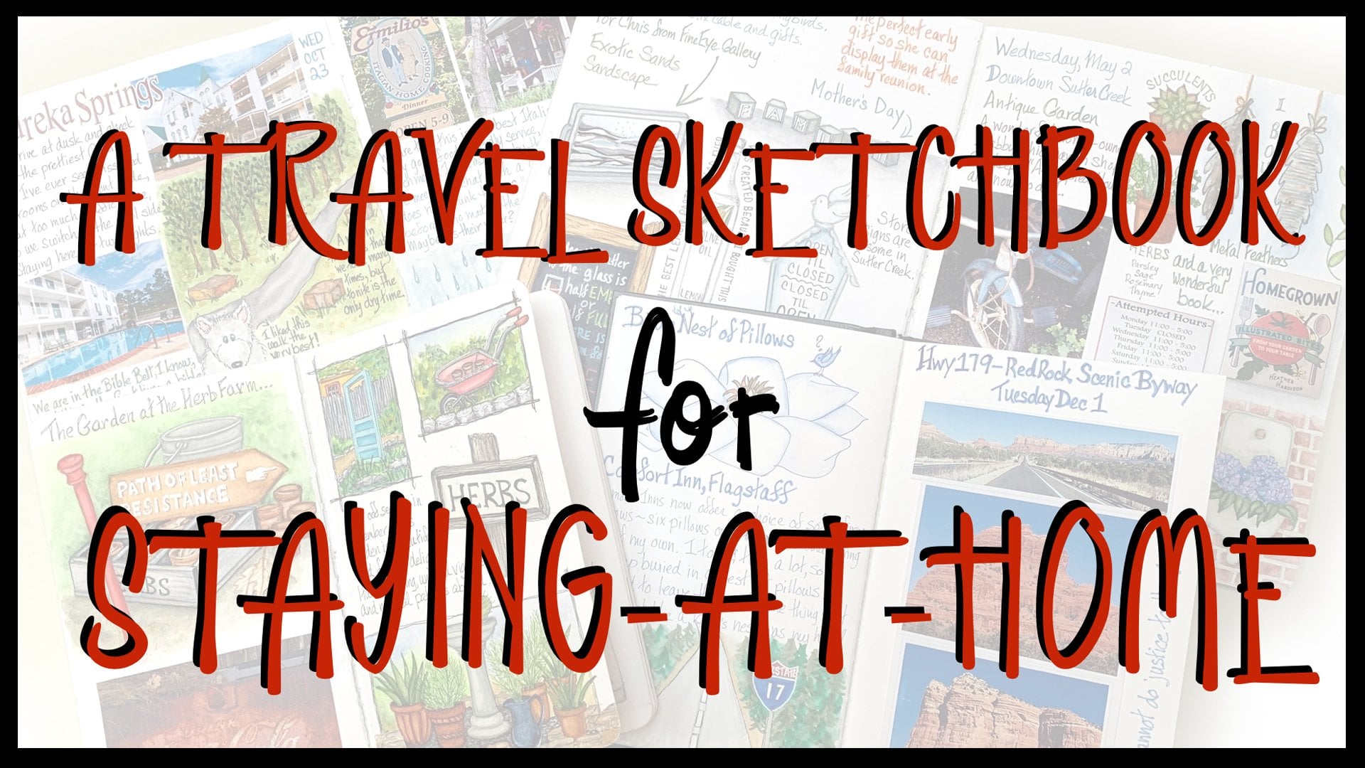
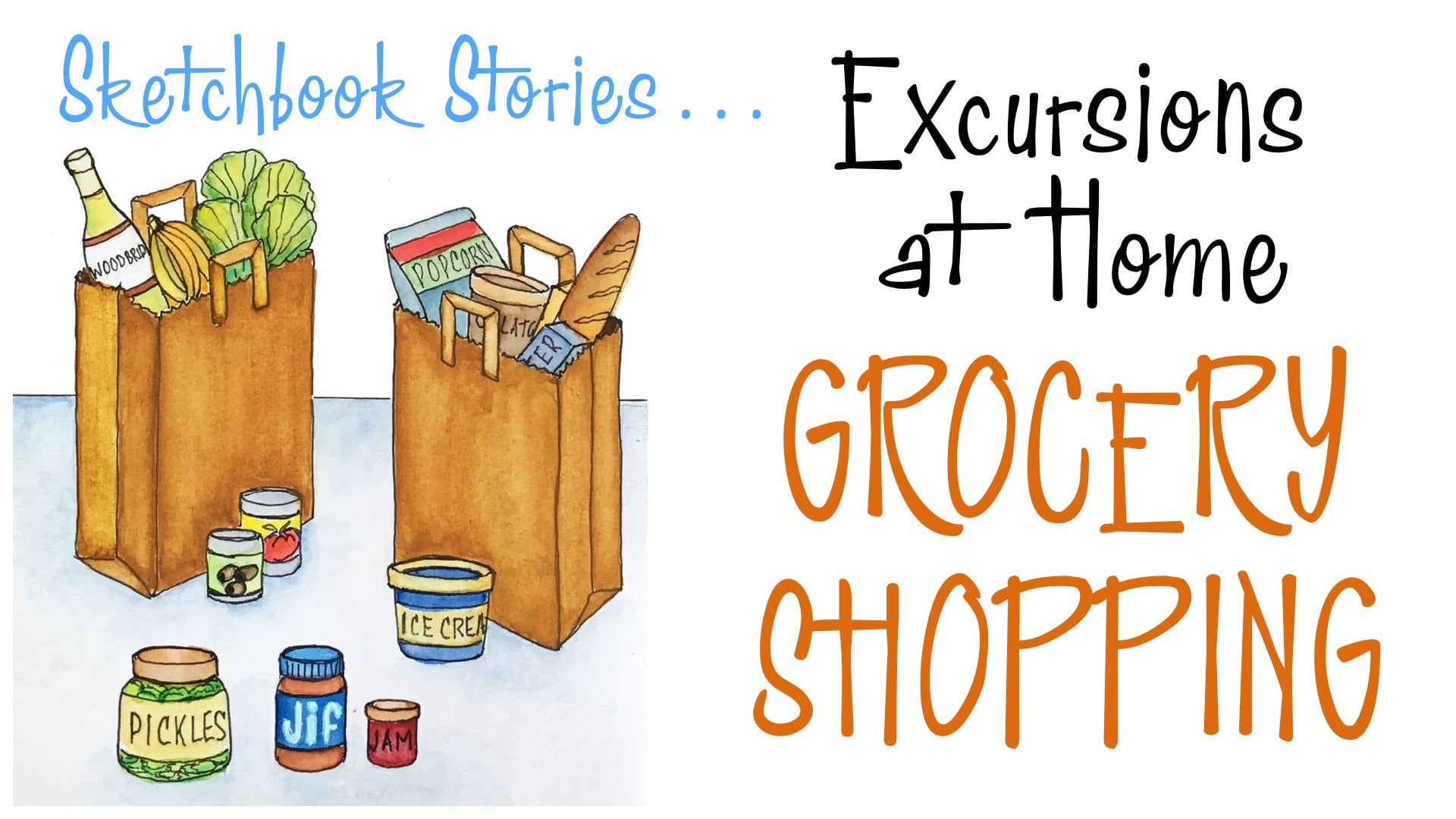
12. Conclusion: I promised to show you my finished spot illustrations, and here they are. I also wanted to point out that as you noticed in the lessons like, I go away to clean up in ink things and I come back and there's other pictures on the page and I want you to know that will happen for you. And I want you to pay attention to that process because when we are drawing and painting, we have a door open to that part of our brain that is creative. And it likes to think up new ideas or new ways to do something with the idea that you're working with and and that is coming in. And don't shoo it away so you can concentrate. Listen to it. You have all the time in the world, really. And so if when you're talking about this, you think of an old song and you think about drawn a star in a pocket, go for it if your imaginary friend, if you have one, if she shows up, she's got stuff to say. This one thing she's a princess. Therefore, speak loudly and carry a small stick she doesn't see. There has to be a star on top of it. So it's a magic one, but you get the drift. So I pointed out the colors that I was using over here. And here's how it all turned out And we have a lot of color echoing blue, blue, blue, blue in yellow, neon yellow, you know, and so on I made these flowers yellow to pull that in. That all helps the harmony of this page. It would be really unusual that you would ever do a page with all of these male type spots , um, together. But you could use parts of this large and small on any kind of, ah pages telling the story of your life. And then over here I didn't vignette anything. I just left everything as a pure spot. And again, I tried to go some color around. I added, with a little whites signal. This is really if you're gonna make little white highlights. This is most people's favorite pen. Um, it is, uh, aside, G. You know, uh, that would him up if I did this. Anyway, it's a white gel pin. It's not waterproof or anything like that, but it is really good for making this kind of little highlight, because if it's too much when it gets on there, you just take your water brush and you can just, you know, basically could make it disappear where you can lighten it up and make it less, you know, obvious and looking more normal. I did do what I suggested I took. One of my paint box is in. Every leaf on hair is a different green from that paint bucks. So that's a great way to make, you know, big color charts for yourself. So that's pretty much it. And I want to see what you do with these in the projects, and I'm going to come back in a minute and point out if you like doing this kind of thing. Several of my other sketchbook classes have this going on, and I'm going to tell you which ones they are. If you want to do more of this kind of sketching and you haven't taken some of these other courses of mine, let me tell you where you might find some of the not drawing the same things but drawing with same method and drawing spot illustrations, excursions at home. Grocery shopping is a great one because we learn to draw and tain every package that food comes in in a grocery store. So it's really good practice for, um, for a spot illustration drawing excursions at home, we visit a pretend bookstore. Ah, and we do a lot of book drawing, and that is a wonderful I can books open shut on a shelf it they can take you forever, uh, in telling a story with your spot illustrations. So that's a really good wine. And we also did recipes in this one, and drawing food is also a wonderful and iconic way to create spot illustrations in the Save the Day Sketchbook stories class. We made a grid on our page, and we did little spot drawings that fit in the different squares of the grid to say what happened during our morning and, um, most of our day one of our ordinary days that we wanted to record and a travel sketchbook for staying at home is fun because that's I often mentioned about drawing toilet paper rolls and paper towels. And that's in here. And the other cool thing that's in here is is pretty extensive about the method of vignette ing using the water brush and a watercolor pencil. So if you haven't taken these workshops, you might They're all on skill, sir. You might want to take a look at them if you want to continue this practice of being able to draw little things in spot illustrations. If you would like to see lots and lots more sketchbook pages with samples of the use of spot illustrations, visit my website at Jessica west loch dot com, and go to sketchbooks, which you'll find right here. I only have three sections up right now. This is this is a paid you on a bookmark because this is really, always be growing. But, um, in both the garden sketchbooks and the save the day, you'll see if you tap him, you get a, um, a slide show of pages and ah, little stories underneath about why I did what I did. Lots of spot illustration and lots of every kind of sketch booking to keep you, uh, really excited about the idea. So, until next time
 Jessica Wesolek, Artist/Teacher