Transcripts
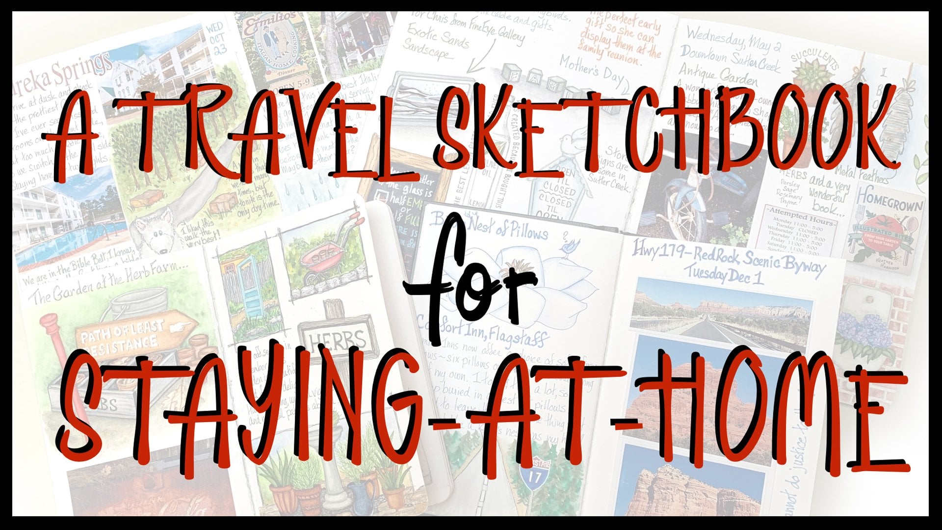
1. Introduction to Sketchbooking: way. Welcome to sketchbook stories. My name is Jessica, and I'm excited to see you here and to share with you a bit of my story. I didn't just fall into my love of sketch booking. It took some time to realize that there was something missing in my art life and to figure out what it waas a long time ago. I made some art and people bought it. That was so exciting that I decided to be a professional artist when I grew up. Though I have never actually grown up. I have been a professional artist ever since that day. I even have my own gallery in Santa Fe, New Mexico. I was pretty happy with all of that until one day I realized that I did not have any of my own art to keep just for me and worse. My life was such a whirlwind that I was forgetting to remember a whole bunch of things that happened. What was it going to do about that? I had tried keeping written journals many times, but I pretty much bored myself to death with them. So that was not the answer. And then one day I had a great idea. What if I didn't use so many words and use pictures instead to keep a journal? It would not be boring, and I would also be making some art that I could keep, and it wouldn't even need to hang on a wall. It would be in a book, Great idea. I started right away and kept going and going until I had piles and piles of sketchbooks full of art. They are about everything I've been doing and seeing for the last 15 years or so, and they're my favorite books. To read every page brings me back to whatever adventure, big or small I chose to put there. I not only remember what happened, but feel the same feelings I did on that day in in that place. Nowadays, I'm telling everyone how much I love sketch booking, and that's the reason I made these classes so you can find out for yourself how much fun this is. This first class is an introduction and a chance to get started without the fear of the blank page or blank book that stops. Many people in their tracks in our project will be to finish our 1st 2 beautiful pages and even learn a few are tricks along the way. So let's find out what supplies we need and get started on this great adventure.
2. Supply List: about our supplies. Many instructors will tell you to use whatever supplies you have. And you can do that, of course. But I will share my favorite supplies and give you brand names so you will know what you are seeing me use in the videos. If you want to get similar results, you will know just what to buy. I have been sketching for many years and have tried just about every tool out there. Eventually, I figured out what I liked best, and you will, too. First of all, we need a sketchbook. There are many types and brands to choose from, but the important thing for our purposes is paper that smooth enough to work well with our fine liner pen and strong enough to hold up to erasing. And some moisture book smart, suitable for watercolor and or mixed media are fine, and the papers should be 100 and £40 weight or so my favorite, and the one I will be using in this class is the Stillman and Burn Beta, which comes in a variety of sizes and in hardcover, soft cover and wire bound. I used them all, but in this class I am using a hardcover beta in a 5.5 by 8.5 inch size in a portrait orientation. Next, we need a pencil, an eraser, pencils coming levels of softness that are labeled with a B for the softer and H for the harder leads, the higher the number, the softer or harder the pencil. The ubiquitous yellow school pencil is a to B and soft enough to be smeary. If your hand rubs over it, where if you paint over it, it is also hard to erase thoroughly. I prefer a three h pencil because it is hard enough to leave a light line, which can be easily erased. There are a few brands. The Tom Bo Mono brand is my favorite because it has a softer feel while still making a light line. And turquoise is probably the oldest brand of drawing pencils, and they're very good, too. You can also get three H lead refills for your mechanical pencil. Mechanical pencils are nice because they don't need sharpening. A soft vinyl or plastic eraser will clean up your pencil lines without leaving residue or damaging your paper. My favorites are the Magic rub and the town Bo Mono Brown's Both are very inexpensive. I prefer to think my sketches with a fine liner, which is basically a marker with a very fine point, many people for further look and feel of a fountain pen, which makes him more varied line. But I like the dependability of a fine liner. That's another thing that you decide as you go along in your sketchbook practice. The most important thing is that the ink is waterproof because we will be using some water color over it. My favorite fine liner is the pit artist pen by favor Castel in a fine point. Another good brand is the micron. The water brush is a great tool. It carries water in its own handle, which means you can easily take it travelling with you without taking a jar of water. I will be showing you how to use this type of brushing our lessons because there are differences from a regular paintbrush. My hands down favorite is the need G brand by current Taki. In the small point size, it is dependable, long lasting and not prone to leaking blobs of water on your art as many of the other brands are appointed. Round brush is one with a bit of a tummy and then a tapered point. You can make very fine lines with the point, or put more pressure on the brush and make leaf shapes or broader strokes. The best kind of brush is made with red sable, but those are very expensive. And if you love animals as I do, you might prefer synthetic. A few years ago, because of a trade agreement, red Sable brushes could not be shipped to the U. S. For a long while, Escada, one of the top sable brush makers in Europe, decided to create a synthetic that was the closest to a real sable brushes. They could make it. The result is over Seattle brand, which many people would guess to be sable if they didn't know better. The's brushes air not cheap but not too expensive, either. When compared to Sable, I most often used a number two, which is a small size but well suited to much sketchbook work, and we need a set of water colors. There are so many brands, and you will discover your favorites over time. If you haven't already The only rule of thumb here is that you do not want paints made for kids or any set that would retail below $20 unless on sale. Of course, the cheaper the paint, the less pigment is in it and the worse it will perform. You cannot learn what watercolor conduce. Oh, unless you use quality paint, preferably labeled artist grade. It is better to have fewer colors than crummy paint. That being said, there is an inexpensive student grade made by Windsor Newton of Big name and watercolor. The student grade is called Cotman. In the sent You see me using in this class is less than $18 on Amazon. I think it is the best quality student grade water color there is Grumbach ER Academy is also good, but comes only in tubes, which are not as convenient for sketch booking. Other student brands may disappoint, and that's pretty much it, except for a couple glasses of water and some paper towels. Gather your supplies and let's get this show on the road
3. Meet & Greet Your New Sketchbook: you know, there is just something really wonderful about a brand new sketchbook. It's exciting. It's pristine. Um, it's expensive. Not really. Not more than a going out to lunch would be. But while it's exciting, it's also really scary to a lot of people in the scary part is, they don't want to ruin it. But the really scary part is that they don't know what to put in it. So we're gonna take away some of that fear of the pristine book by putting something in it right away and something that everybody knows how to do. And that is to write our name and you're right in your net. You can put your address, your phone number and even a little message about a reward in here, because when you get working in your book and it's the most precious thing you have, and then you leave it in a coffee shop, you really, really want somebody to give it back to you. So the first marks we making here are just perfect because they're just writing our name, and we all know how to do that. Now I have Jessica rules of sketch booking and one of them is this To put this this information for return in the front, the other one is to leave this blank. This very first page is a great cover page. But you don't know really what you want to put on the cover page until you get an idea of what's going on with your book. So the third rule the Jessica Rule, is that I call the back page back spread of a journal my back door, and if it goes into more a couple pages, it becomes a back porch. But what this is is a testing area. And so you just got a new color of paint. You're not sure what it's gonna look like. And so you put a little swatch of that back here and now you know what it looks like. And better still, you know what it looks like on the paper in your sketchbook, which is really where it matters, right? I mean, you could test it on a scrap paper or something, but that's not going to tell you what is going like in this book. And if you don't know how to draw cat and you're gonna want to draw a cat. Take your pencil on. Draw the cat at the back door tested out until you got a good cat. Even if you had to trace it onto your good page, you still drew the good cat and it didn't ruin any good pages. So these air really good starting rules. Another thing that I don't do, And this would be up to you. But I do not use my sketchbooks for the kind of journaling that, like records all the angst in your life And the reason that I don't do that is I tried it a couple of times and then when I go back and I read this, I read this like my favorite book in the world. So I go back to these sketchbooks Ah, lot and I go through and I'm all love in this page and loving that page. And then I get to the page where I found a little baby bird who I took to the Wildlife Refuge center and he didn't make it. And all of that feeling from that day comes back because the pages of a sketchbook are like music and they take you right to where you were when you made that page. So it's something to think about. I mean, some people love toe to revisit disaster, but I'm not one of them. And so what goes in here are the moments of my life that I would really like to remember and revisit.
4. Clouded Thinking: Now, as we turn this first page of our sketch book to get to the working area, there are a lot of thoughts going through your head if you've never done this before, especially and they're not that positive of thought. You know, I don't think I'm up to this. I don't have the time. I can't do artwork every day. Ah, bunch of thinking is not that productive of thinking is something I call clouded thinking. But here's a good thing about it. We're gonna use that to make our first page, and it's a no fail page. And so we're going to get rid of that clouded thinking by disproving it. Our supplies for staring this first page are really simple. We're going to start with your color, and then we'll come back and put a title, uh, after the fact here. But it's easier to start with the color because it's kind of no fail, and you're already gonna have something pretty and then you're gonna worry about having something pretty. So what we have is we have the water brush and we have a little set of water color paint here in half pans, and we have our book and a folded. Uh, I usually take two of those half sheets and unfolded that much, so I got a little mattress to soak up water there, and we're gonna have a little demonstration about how water brush works, and there isn't that much to it. But hardly anybody ever understands it. And so we're going to do our tests, though. Where On the back door. So let's go to the back of the book. And a water brush instead is a brush that instead of dipping it in water and an in paint and painting, a water brush has water in the the barrel, and it makes it great because you can go sketching anywhere and just carry this with you. And you don't have to get a glass of water to be cleaning your brush. And so what's happening is that the mechanism in here causes theory Water to wick through this nylon tip at a nice, steady rate. Not too much, not too little. This is I, uh, recommend a small tip. And this is a needy brand water brush which I think are the best because they work that way . Um, you don't you never, ever squeezed this barrel. All those there's little screens, places you don't squeeze it anywhere near your page or while you're painting, you squeeze it to clean it, because when you squeeze it, drops come out and it cleans so easy you won't believe you'll see it in a minute. But if you were to squeeze it and you're over your page and a big drop comes out and you using watercolor, you've got a big problem right off the bat and you don't want that big problem. And so we're going to squeeze and make sure that our brushes wet and then you take it right to a pound of taint. And as you are wedding, the paint water is wicking through this barrel enough to give you like a little puddle. And as you apply the paint to the page, I do like a kind of a phone big circular kind of deal. Water is coming through the tip of the brush as you're doing that, and so is continuing to spread the paint and it'll lighten it out at the edges. Really, until you can kind of even faded away and I do like I do that a lot for little vignette backgrounds. Now, we've got a nice yellow cloud here, and, uh, if you go, if you drive brush off a little bit and you go back in the middle, you can light in the middle of a little more, and I am going to go back in while this is still wet. And I'm going to grab a little bit of the lunge just to make this more interesting and feed it in around the edge of the yellow. And this is wet on red watercolor technique, which I'm sure he's heard off. And the more you blend, the prettier Does it have made it more interesting than just a plain yellow cloud? Now we're calling these clouds. Clouds are using this color, but there are. They are for our purposes. So we're gonna let that dry, and it's a beautiful thing already. So already we have some art in our book that looks really good so we can lose all the rest of that, you know, trepidation. So we're still at our back door here, but I'm going to show you a similar but a little different technique. In case you didn't want using a darker color. Maybe. And you didn't want this much intensity. And so that technique is to start to make yourself a little nice. Damn cloud was just nothing but the water from the water brush. You can't see what you're doing. Get over to the side, because when you tip, I don't think you can see it on camera. But you're going to get shiny in real life, and you're gonna know exactly where you put that water down by. Just tip in the book a little and taking a look. And so this is clear water in the middle. Now weaken. Do a wet on wet technique. I'm going to use purple just to see what happens here. We're only gonna put the color around the outer edge like we did the orange on the yellow. But this time is just on the wet. And so you end up with color around the edge and a lighter, lighter area in the middle. And since we're gonna be writing in the middle of sometimes this is what you want todo, especially if you're using a dark car. So this is kind of cute to spread out the edge a little bit, just plain Clearwater. And then to clean your brush, you just squeeze over the paper Tallinn. Just go just a couple of times like that. And your brushes beautifully clean. Other paintbrushes don't really clean out easily. So these water brushes are really special for that reason to It's important to mention that if you are using a stolen and burn sketchbook, you want a light touch and this whole procedure, you don't want to scrub hard with the web brush. You know, I do that on any paper you can get away with it sometimes on riel heavy and 100% cotton watercolor paper. But in most sketch boards, you're not gonna get away with it in the paper will start to pill up. So what you want to do is you want to have a very light touch, and you want to be paying attention and you want to quit. If you think that you feel some sensitivity in the paper and you're gonna know. I know that sounds weirder than hat, but you're gonna know if you're holding the brush very lightly and you're going like this, you're going to start to feel when the paper is getting ready to not want any more pushing at it, and that's a good time to stop pushing at it. We're back it of at the beginning of our first page again. And what we're gonna dio put six or even more colored clouds on this page and a choice of color is yours. And whether you do one color with a blended color at the outer edge, this is all artistic preference. And so we're gonna just get going and make ourselves some clouds making good progress here with my clouds, my color clouds. If you have started to close to the top for a title area, then as you get down to the bottom, leave without an inch or an inch and 1/2 of along the bottom of the page and we will put a title down there. We'll learn some things about how you get a title on a page, um, in the middle and the right size and on and on. So here are my colored clouds. I'm gonna let them dry, and then we'll talk about how we're gonna add words to this page. But it's pretty already
5. Headline Lettering: Okay, so I finished my colored clouds. And it's time for me to add the title for this page, and I am going to use a pencil. Um, this is a three h pencil, which means the lud is harder than the one you used to that yellow and has a pinky racer. Um, and the harder lead makes a lighter mark, and it's easier to erase the harder lead also could make a big old engraving into your face if you're pushed hard, so you don't want to do that. So we're gonna use a light touch, and we're going to use our best judgment that we learned in grade school about printing our title across the bottom and just do it nice and light in our title, If you remember, is clouded thinking and I'm using all caps just because I am. You don't have to do that. And I'm just kind of guessing at whether it is gonna land in the center here. And it didn't I don't You can't see this light pencil that well, but here's my C and here's my G. So it's not centered like I would like to be that t and the thinking should probably be like a boat in the center of this. Here is the first trick about lettering is that you don't completely erase your first try. Because if you don't and you live a ghost there than it is there to guide you. And so if I could still see this clouded thinking, I'm gonna know how much further over I want to move my new rendition. And I am gonna want the tea to be about here, and I'm looking at that. And that's about 1/2 an inch. And so you could measure it with your pencil, Teoh. It's like about that far. And so if you come over here, you're gonna wanna move the whole thing, this fire. So we make a little mark and I start now with my see here in my l and you can't You can't erase some of that because it's all the pleasure. You don't confused, but I can still see where it waas. And so my l my oh my, you do you e And don't worry about the top and bottom yet. We worry about that in a minute and then thinking starts about here H I in? Okay, I and G And that's centered and just where I want it, it's also a mess. And so before I make a darker or heaven forbid, I add any ink to it, I'm going to show you this second trick. I used to get my lettering straight on the page. I have a little ruler here. I really you can get these on Amazon. I really like this clear ruler with a little little boxes on it because it really helps to align and measure a lot of things. I am going to want to put a baseline under my lettering hair. So to do this, I'm gonna turn my book around and I'm gonna use my little ruler and put it, you know, about where the bottom of one of my letters are kind of the average of the bottom. Here, I'm gonna choose Ah, hype that I kind of like I kind of like the height that I made my l here, and I am going to turn the book around again, and I'm gonna put my ruler at the top, and I'm gonna make another guideline for the top of my letters again. Very light pencil and then I'm going to go back, and I am going to pretty much the race. What was there again? I'm leaving a ghost because I can erase this all later. But I like that, Ellen leaving that as my guide and the placement, I'm gonna be able to tell from what's not erased. I'm going to go back, and I am going to to darken a good form of my letters, going to correct the Kirk. Goodness, I'm gonna make the height exactly between the baseline and the top guys line. And so my letters you'll see are going to be very similar height to each other. So I'm going to do that while you do that. So no. Have darkened by lettering in in pencil and cleaned up a little bit where things aren't how straight there. And for now I'm just going to leave it because we're going to go and get our kingpin and we will be using enough in here as well. And then once we get used to writing with their ink pen of this paper, we will come back down and we'll in car lettering
6. Waterproof Inking: This is a pit pin. It's comes in in many different tip. Size is it's made by Faber Castell. It is a pigmented ink and it drives waterproof. I just really like the pit pin. I've used it for years and makes it last a long time. It makes a nice even line, and it I know how long it has to drive before I paint over it. So familiarity breeds love sometimes and not content a contempt. But anyway, we're gonna put our clouded thinking are not so great thoughts into our little clouds. And so I'm gonna I'm going to suggest that we write them small because after all we are get , we're burying them in color in getting rid of them so that we can think more positively about the whole sketchbook experience. So I don't have a lot of clouded thinking after all of these many, many years, but I did in the first place, and I'm going to try and think of some things and maybe that will help you think of some things unless you've already got it going on in your head. So I've come up with a few things here that I really true of me anymore. I have to say I did this many years ago, and it worked. So I got rid of all of these insecurities about sketch booking, and I love it now, but I remember some of them, and I'm willing to bet that there would be if you could all get together and and figure out what you put on your page would be a lot of repeats, but I have here no time. That's always a worry. When you're going to start a sketch booking, have it if you will. I'm not gonna have the time to do it. But truth is, we have time for anything we want to have. Time for that is all a matter of choice. Um, what to draw? No ideas. Now there's another big fear that everybody faces. I will sit there, no stir at the page until tomorrow, and I won't come up with any ideas. But there are a lot of solutions to that too. So that's not to worry about. Can I stick to it? I haven't. It doesn't become a habit unless you do stick to it at least for a certain amount of time. and so that can be overcome. But it's not automatic. You have to kind of make the decision to stick to it, to devote time, Teoh it and eventually become something that's in your life. And you really like it. You don't want to go away. Okay, here I put I can't draw a straight line. How often have we heard that? And I wouldn't be surprised if you had it on your crowded thinking page. The truth is, we can all draw a straight line because we print something. When we did it in first grade, we were drawing straight lines. So, um, if you're talking about, you know, being able to draw perfect line from over here, it over here. Yeah, well, nobody can do that. So it's okay if you can't, But it's not an excuse not to draw. Okay, Now I'm gonna take please excuses, sunspots I've found in my greenhouse, which is also my watercolor studio. And there's a lot of windows, and so there's a lot of sun and it comes through a lot of things. It makes a lot of different shadows, but I'm pretty sure that everybody can still see. Okay, I'm gonna take the same pin and I'm going to be careful. But I'm going to ink over my clean lines I established for my lettering and after I'm all done without being I'm gonna let the ink dry and I'm going to erase all my guidelines and just have some lovely lettering here. - There we have it. We have created the first page in our brand new sketchbook and we've made something pretty and we've learned something about centering some lettering. And while we're at it, we kind of did away with some of these ideas here that shouldn't be getting in our way in the first place. I'm getting a shadow situation here. There's not wonderful. So I am going to wait just a little while for the sun to move, and then we're going to do page two
7. Drawing a Straight Line: our second page is going to have a title to, and our title is gonna be clear intentions because it's going to be the opposite of our clouded thinking. It's going to be clear thinking, and it's going to be what our intentions are for our sketch booking habit and in what it might bring for us. And so the lettering on this time we're doing are heading first, and I did the very same thing as at the bottom. I took a ruler and I made a parallel line parallel to the top of the page, and I made another baseline, and I made it the same distances I had down here. Just because they're on the same spread, they should look good together. We're gonna have some harmony going on. I also used all caps again, and I'm going to suggest that you do the same thing on this page because I would like to demonstrate another little tip when you're thinking that can help you make everything nice and street. So I have my clear intentions headline on here, and I've already done my ghostie race and move it to get it centered, and I have the heights corrected to the top and bottom guidelines. So really, I'm all set to go in with my ink, and you probably learned thinking this one down here, that it's different using an impending a pencil. There's there's less permission because you can't erase it, and a lot of people say, I'll just go with it, live with it But I'm not. I don't live well with things that look really catty, pompous, and so I tried a preplanned as much as I can so that they won't be that way. Also, anybody who thinks they can't draw a straight line is gonna find out differently right now , because when you write clear intentions and you do it all in capital letters, there's a lot of straight lines in there, and that's what my tip is about for this lettering. I go in with my ink pen and I do all the vertical lines before I do anything else. And there is a There's something there that is really great. I guess that you can watch one vertical line while you draw the next one, which is a great guide for drawing parallel lines and, of course, all the vertical lines in here would be parallel to each other If you're lettering is standing up. But it's just easier somehow, once those air there to go back in and put your little cross pieces in or your slanted line on the end. Um And then you know, we can go struggle with the sea and the O in the S because those air never really easy to draw their nice letters and all but drying curves and ovals and all that not so easy. So we're going to start out just by putting in the vertical lines in that song didn't do the neatest job that you can and keep. It was standing up straight as you can and remember that this book is not glued to the table. And so, at any point that your hand is not comfortable drawing a lying move the book so it iss. So when I do parallel lines, I'm right handed. It would be different if you're left handed, you go the other way. But when I drew parallel lines, it's really easy for me to do this while I'm watching the other line to make sure that I stay the right distance away. And so I am turning my book so that my hand is which I can't detach from my body like I can . The book. My hand can always be going in that direction that it likes, and then it's going to draw more straight line. We're a straighter line, if you will, because it's more comfortable. It's not cramped, and it's not going in a direction that it feels on uncomfortable. They're now. This looks pretty weird at this moment, and I'm noticing that I might end lines. There are a little bit crooked. It's OK, but it's it's funny because that gives you the architecture of the blueprint or that whatever to finish off your letters. So now that we know that we can draw straight lines, we're gonna use straight lines to draw something that's going to demonstrate that we now have clear intentions
8. Easy Drawing: I have been on my three h pencil and my eraser at the ready, and we're going to draw something uplifting for our clear intentions. And it's easy to draw, So you're not even going to be the least bit put off that. So we're gonna draw cross, which is straight lines. But now you know you know how to draw them, right? We're gonna put one right in the middle here, and this is like, kind of free hand, you know, I mean, the for portions and everything. You don't have to be exacting, but that one is going to stand up nice and straight in the middle. Now you notice how, when I draw, I don't draw like that. I feel it out. And that's a really I call that sketchy drawing or fuzzy drawing. And it's a really good idea, because what you're doing is you're just working out placement and you're doing it lightly . And when you know that you've got the lines where you want them, then you can go ahead and make a stronger line. You can just strengthen that line that you're gonna wanna put in kind and again the book moves. It's not glued down. So I have I have three crosses here, and, uh, right now looks a little religious done that, but it's not what is gonna happen. So on each of these, we are going to draw curved lines, and a curved line is just like if we do parentheses when we're writing way down, everything that's hard and a curved line is the same thing. Is that And so I just think parentheses. And we're gonna put a short one that connects those two corners and another that connects the opposite two ends of the line there. It's not two corners, two ends of the line, and then we're gonna do a longer one that's going to come from here and connected that part . You know, we're going now, don't you? And another one right here and we have a kite, quite flies high and is optimistic and ever upward and all of that. So it's a really good icon for us to use, So then we're going to go ahead and make kites out of our other two crosses, too. Kites have tails, and that's going to be a fun thing to we're going to bring the tails down in a curve. You a just kind of balance amount on the page, This one's eyes gonna go like that up near the top of a kite's tail. I usually some ribbons tied, and that's easy to do to, um and we're only gonna put him up at the very top because we have a plan for, um for what we're going to do with the rest of these strings down here. So, uh, right up here making bucks. And if you put a line on the end of both ends of the X, what have you got? You You've got a bow tied on your right to. So let's go ahead. And this will be colorful, too. Let's go ahead and add, like, three or four on each of our kite tails. You can always change your mind when you figure out what you're doing is you go ahead and sketch. And when I decided was I'm not gonna make my kite tails this long. And the reason is that we want to bring the guiding line of the kite down as well, and we're gonna make use of it. And if we have all of these lines down here, it's gonna be more confusing. And we wanted to be very clear. So make that the tales on the kites a little shorter by just erasing the rest of that line . Then the other thing that kite has it has, ah, string that is usually wrapped right around that midsection of, um, sticks right there. Cross sticks. And so we're going to put that little lace, and then we're gonna bring the kites guiding line, which is straighter because it's actually being held by someone. And the kite is pulling out against the wind. And so we're gonna make this straighter as it's brought down, and this one are just gonna balance with I don't like that. This is why you love pencil. Okay, I don't like it that far over a minute. Kind of do this and I put a little curve on the bottom just to make it more interesting. Okay, so I'm gonna strengthen this a little so that I know what I'm doing. And it's okay if this is a mess, because I'm gonna clean it up and put ink on it. So it's OK. Just sketch that until you feel like the curves air nice and balanced. And that's kind of the visa. See, Racer, Because we don't know what something looks like until you know what it looks like. And if you don't like where it looks like, then that's gonna be the time to change it when you're still in a pencil state your So I'm gonna come in further on this one. I just want my page to have pretty curves happening on it because what we're going to do, you think for a few minutes, as Reinking are drawing and our intentions for our sketch booking habit are going to go in here and we are going to print them along the kite line. And so in this case, you might have more kites. You might want to add more kites, But, um, if you have three like I do, then you need to think of three intentions for your sketching habit. You know, like for example, it's going to make me see everything in a different way because I'll be looking at things that I could sketch. So that's a really good intention to have on, and I will learn to draw and I will learn to paint and I will remember the minutes of my life. And I will have a great book when I'm down that I can go back to and refer to on enjoy reading. So those are all intentions, but you think of your own while we go ahead and we think this in it.
9. Clear Intentions: when we have our banking all done and are drawing lines all cleaned up, then we're ready to take the pencil again because we're not going to just write in ink. We can spell things wrong, and we can ruin all the work we've done so far. So whatever intentions you thought up, go ahead and write them along the kite line as if that kite line was guideline like we used on our other lettering. And once you have done it in pencil and you have it where you want it and go ahead and do it in ink and I'll see you back here in a minute, I have my intentions pencil then and I was just picking up my black pen to get him to go over them with ink. And I remembered that I have some colored permanent pens. If you do, you might want to choose to use them. Just add more color to our page, and this page is part of the spread with this page. And so the two of them were gonna want to look good, and so we're going to choose our palate colors for this page from this page, so that in the end, we're gonna have color harmony across the whole spread, and that's always a good thing to have. Wow. Okay, so that was a lot of work, but I think it looks really nice. I picked up the green from over here on the kind of magenta color from here, and this blue is a little turquoise sea blue to put in my intentions. My intentions are I will see things differently. No, these are intentions through sketching through a sketching habit that I am going to maintain. I will see things differently. So I'm in other words, you're going to stop and smell the roses, which we never do. And um, you'll find when you start drawing for a while that you will be walking around and you'll notice things you never noticed before, like little details and little things. And it's kind of exciting. It means the world's got a whole lot more stuff in it than we knew, So I will see things differently. I will be mindful. Drawing and sketching is so mindful to get you right in that moment, concentrating on drawing that thing. So that's very cool. And the result is then you remember your moments of your life Instead of all flying by and some kind of dervish deal, you've caught some of them. You've recorded some of them. You get to go back and be reminded of them. Just think when you're very, very old and you're sitting in a rocking chair on a porch and you can't remember what happened yesterday, um, you'll be able to get your sketchbooks. I wouldn't remember what happened today, anyway. Okay, so I just wanted to be different over here. So I turned it around and I wrote on the other side of the line. So my last one, I will learn to draw and have fun, because drawing is fun and people say, How do you learn to draw? You have to be born with it and all that. That's not true. You learn to draw. Drawing is a technical thing. It's the thinking of what to draw on. So on that you have to dig a little deeper into your creativity. But but making shapes be what they are supposed to be, it is actually a skill eso you get some lessons, you learn some tips and then after that, it's practice. And so the beauty of a sketchbook is if you get yourself going with this sketchbook every day, you are getting a lot of practice and you're gonna just see page to page as you go through , you're drawing getting better and better and better. Okay, so we are excited because where you're going to in the next lesson, we're gonna add some water color in a way that you might find unusual. I think you will. Anyway, I find it unusual, so we have always done it, and it's not the way anybody else does it, but we get a lot of nice, bright color out of it, so we're gonna do it.
10. Painting With Watercolor: this time, it's gonna be a little bit different than what we did over here. We used our water brush over here, and that's a great thing to do. But sometimes it's not quite as good for little tiny areas, and it's not as good for the process that I'm going to show you. So what I am using, I'm using a regular paintbrush. It's a synthetic sable. This is averse Ottavio brand. There are a lot of good synthetics, and it is a pointed round and appointed round. If I get this in the right place over the white and hold still, you should be able to see it has a little Tommy, that olds liquid. And then it comes to a point. And they're wonderful because you can just paint tiny areas with the point. You can flatten it a little bit and make wider areas like leaves, and all of that kind of stuff were also thirsty. If it's a good brush, um, a sable brushes a really good brush. I don't use them anymore because I love animals. But this particular synthetic is made by one of the best brush companies, and so it acts just as close disabled as you can imagine. And so and this is nuts, too. I mean, a lot of people will say, get a jar of water and they just use that. And some people say Get one for clean and one for dirty. And I'm a fanatic and I have one for every color I'm going to use. And I do that because see, my paint box, It's not a big old mess. And the reason it's not a big old message that I don't like pollute my colors. You can if you want to know problems. But I want to show you this this way of using watercolor that is really fun and really intense. And I'm going to to use my purple first. And I have to decide we have, like, only this many colors, and I have used green hair and magenta here, or purple and blue here. I don't want to create the same colors that so the purple kite has to go here or here, and I'm gonna choose over here, and I want you to see this. So I'm gonna take a chance here getting trouble dropping it on my, um my drawing I went my brush and I go into the color gently and I start to make some cream . It's a creamy consistency, more like 1/2 and half, because creamy would be too thick. And as I'm doing that, I'm filling this brush with that really vibrant color as it comes from the pan. And that's OK and I'm getting a little bit off in the corner, and then the other thing I do is just touch my paper toll. And the reason for that is to get any excess liquid off. So it isn't too much when you get to the book. And so I come in with that much color and I paint an area. Now. This is is like anybody would apply watercolor on Lee. I've got a lot more intense of a pigment load because instead of taking the water and making a wash of the paint, I just went in and I am taking it right from the pan in a really intense mix. And this is very cool because of what I will show you in a minute again, turning my my book so that I can stay in the lines and control my brush. So this brush, if I don't push down, has a very tiny tip. It's almost like drawing a fine line with your pen. This isn't number two. It's what I use for a lot of things and sketchbook pages. Okay, so I have now laid color down. It is really intense. And what I'm gonna dio isn't going to go back in time cleaning the pain off my brush. I'm gonna blot it on my paper toe, and I'm gonna come back in with the plane brush, and I'm going to kind of go in the middle of my shaped like this, adding some moisture, and then I'm gonna block my brush, not go back in the water. But I'm gonna take this now thirsty brush over here, and I'm gonna pick up color. You see that? I just created a three dimensional look here, and I cleaned off my brush and I rents did that time. And you want to stop while there is still intensity around the edge. If you keep adding water to keep picking up, you're going to get very washed out. And you may as well have done awash in the first place. I'm going to show you that difference too, so that you can tell and I'm going to do it right next door here. So the other approach and you can choose that if you like, But this one is going to give you really, really high color. The other approach is that we take some paint that we went and we go over to a mixing area which all pallets have them. And you can just use a plate if you wanted Teoh. But what I'm doing is I'm taking that intense color that I had, and I am mixing it with water and mix it very well so you won't be blotchy. But what you're looking for is an even wash. It's called. It's called a wash when you put it on the page two. But you want a good mix, and then you're not going to just go here with this brush because brush has a lot more paint on it from the mixing deal. So you're gonna wash your brush, you're gonna blocked your brush, and this time you're getting all the water off of it, and then you're gonna pick up the paint that you mixed and Now you know that you just have this color that you mix, which is good, and you're going to go in and you're going too smoothly. Start at one corner of the shape and keep bringing the wet edge out brushes letting color come out of of where it's being held there in the bristles, and you're gonna get a completely even color. See, we don't have over here, we've got light and we got dark. Here we have the one color that we put on, and it's a flat color in this, and this is more intense in most people use a wash. It would be more watered down than that. But, um, I always prefer this really hot popping treatment, but it doesn't mean that you have to prefer that. So you have two choices here. You can go in and have a nice flat, even looking. How nice. That's drying. See, once you go from one end to the other, you get out of Dodge. You don't go back in and try to do anything, because that's where people get in a lot of trouble. With watercolor, you go back in with the brush. It's either gonna suck up some color, it's gonna add some water. Either way, it's gonna move this pigment around when you put a wash down. What you've done is you have floated a mix a nice even mix. You have floated it over the paper, and it has put the pigment particles, which are very, very tiny. It has laid them down in a really, even way throughout that shape. And if you let that dry, then it's gonna dry even. But if you go back, some people say, use a hair dryer. Don't use a hairdryer that's gonna move the pigment, um, particles around. If you go back with a brush, you're gonna be gouging into where they're sitting and moving him around. If you go back with a you know, a I've wet brush, it has any moisture in it at all is going to refloat from that area. And so that's maybe more detail than you wanted to know. But that's why you get something down nice and even you're a happy camper and you leave it alone and let it dry, because it's a look I really like. And it happens to also be the look of my style, which, um, has been with me for a lot of years. I went back and I did my heavy cream or heavy half naff and pick up method over the wash that I'd put down Senate like that as much. And I'm going to finish the whole kite in that method. In fact, I'll be doing that on the whole page. So it's good thing kind of make up your mind whether you want light looking stuff on your kites of you want intense. And if you want light, you want to use washes on all of the color space is here. If you want the intense, you're going to use that style. Sometimes they could be mixed. But in a case like this, it's gonna look like, say, you put a light wash on this one and you did these two and they have your color. It's gonna look like there's something wrong about that one. Um, that is just, like, faded out. Of course we won't go there, but it is behind the other ones, and so it should fade out a little, but we're not gonna mix our lessons here, So also, I'm going to suggest that. I know you haven't started yet. And so I suggest that you go to your back porch or your back door, you draw kite and you practice that the two methods that I just taught you and see what you like better. And also get a feeling for what happens when you pick pain up for what happens when you make a wash. And you floated on lightly and you might want to make two kites and be really sure. Then when you come back to this page, you're going to know like I'm more comfortable doing that way or the other way, and so you can go at your good page, having some kind of confidence.
11. Wrap Up: Let's take a look at our finished project and see what we have accomplished. A very important thing we learned is that thoughts are things. Why is that important? Because one of the biggest blocks to keeping up a sketchbook have it is that people feel they have nothing to draw. There is always something to draw because your head is always full of thoughts. People even have to meditate to get away from their thoughts for a few minutes. As long as there is a thought in your head, you can put it on a page and add some pretty color, and you succeeded in working in your sketchbook. We have also learned that we can change our thinking about sketching anyway. We have learned to use a water brush with watercolor to make beautiful, textured clouds that can be used his backgrounds. For anything. We learned to center a headline and how to make our letters the same height. Also, some banking tips and oh yeah, we've learned that we actually can draw a straight line. We drew some lovely kites that actually ended up looking like kite, and we learned a couple of watercolor techniques to finish them off and make them beautiful . The most important thing of all is that we have started a sketchbook and finished two beautiful pages. We no longer have to face the fear of the blank book, and we have hopefully stirred up some excitement for the whole concept of sketch booking as an art future. Classes in this Siri's will be about different types of pages on different subjects, with lots of ideas, tips and easy art lessons so you can continue to fill your book. Meanwhile, if you would like some inspiration, you can visit the sketchbook section of my website at Jessica West loch dot com, and watch some slide shows of pages from my sketchbooks or join me on Instagram to see my latest at Jessica West. Lack links are in my profile. I would love to see how you interpreted our project, so please share your pages in the project section for this class. I'm looking forward to future sketching fund together
12. Bonus Lesson Gratitude Grid: Hello everybody. I thought of this idea of a bonus lesson because it's Thanksgiving week in the year of 2020. And this year is going to be a year that we're going to have to work a little harder to come up with the things that we're grateful for, but they're still there. They're just hiding amongst some things we wish hadn't happened. But I came up with the idea of a gratitude page in a really easy way to create it without having to have a whole bunch of drawing skills. This again, is making something beautiful on of our thoughts. And it's pretty simple. And so I made a note here. I wrote out Thanksgiving in order to figure out to count the letters. And then I wanted to divide them in some kind of a grid that would turn out equally. And it, I'm lucky Heracles or our 12 letters and Thanksgiving. And I can make a grid with 12 boxes and it's all going to be even if it isn't, even in some other day that you're doing, you can do the even part and the leftovers in like a little smaller row at the bottom or at the top. So the idea of this page is we create a grid in each square of the grid is a beautiful color. The letters of the word of the day are going to go in the upper left corner of each of our squares. And then we're going to be challenged because we're going to think of something that we're grateful, are thankful for. For each square that starts with that letter. That may take you a while. And it may, you might be working on this down the road, but we're going to create the page to work with. And so I have a three by four and a grid and I want to fit it on a page. I'm working in the page or the book we were working in, hardcover, Stillman and burn. And this page measurement is 5.5 by 8.5. So that's something to think that this is the planning stage. And so three across would take if I went to inches, each eye would be over the page size, so can't do that. So I back down to 1.5 inch squares and I caught myself template. And the first thing I kinda few of them because I could test it if it's gonna work. So if I started it there, so I'm going to put this weight so it doesn't drive me nuts. And I am going to make I kinda like this placement because I think it's going to fit in. I could put a title across the top if I wanted to. So I'm going to make a mark up or I'm going to start there. And I'm using a tiny, I call this a tiny shiny t-square. They're not avail t-scores are not available this size. I had to make this out of glass and I'm thinking I could make them for the market. I haven't done it yet though, but it's really important with the grid that we get a start that is a true horizontal. Alright, so now this placement, if I have three across and have them centered on the page, then my side marks. We're going to be here and here. Alright, so now this placement, if I have three across and have them centered on the page, then my side marks are going to be here and here. So this is my start and I'm going to basically trace my grid squares cause it's easier. You can, of course, freehand it. It can be walkie if you want, anything you want. But I am just going to do my lines because you see I don't have to T square up the vertical side because by aligning aligning my little cardboard square with the top, I'm going to be sure that the sides are straight tail. I took a ruler and I cleaned up my lines of my grid and I inked, though I used a ruler to ink thumb and a pit pen because they won't run under the ruler. And that's a really important thing, fountain pen or something it would. So, but these have this little metal edge. And so I was able to do that. And the next thing is that I want to put a letter in the corner of each of my boxes and still leave room for writing something I'm grateful for or even sketching it. These little boxes are where our letters will go. And I want to show you how I did this inking because it made it so much easier. I'm showing you right now, I did all of the vertical lines first and it was just short straight lines. It was easy to follow and do I didn't need a ruler. I mean, they're not perfect boxes, but and then I could turn and do the same thing in this direction. And it just made it much easier. All cleaned up and time to think about color. Our next move would be to create three washes, three colors of wash that we can use for our grid. And we're only using three colors because we weren't guaranteed Armani. I have some pretty elaborate instruction on washes in my second class. And this is a little more rudimentary. But the idea of a wash is you're making a diluted pain and we want a pastel for this project so that we can right over it. And so you choose three colors that you love together because we're gonna be switching and those around. And so I chose a cobalt teal and a coin gold kind of YOLO Volcker and something called potters Pink, which I happen to adore because I loved those three together. To make the wash, I used a water brush, I picked up what paint from the palette, and I mix it into some drops of water that I put in here from a little dropper bottle. You can also put drops from your water brush, but then you'll have to refill it sooner. So I continued to add pain and mix it, add pain and mix it and I tested it out. The testing part is important because you don't want to use the Brush you're using to mix color and it'll be carrying pigment. You want to use a different brush that's clean and pick up just the wash color and apply it. And that's going to give you the true value of the colors you're mixing without something coming off of the bristles that you picked up paint with. So three colors look great together. Take a small pallet, mix, a wash of each of them, and then we will return to our grid and fill in our color. Here comes some practice for your left-brain, your figure it out brain. We are first going to put our three colors across in our grid squares. And I'm going to show you how to quickly apply a smooth wash and then get out and let it dry. And the trick to it is to keep a wet edge moving. And so, and I have to move very fast. I have no humidity here, and so I will be moving the fastest. You'll see anybody move. You might not have to go that fast, but it's very important that we move from one side of the space to the other and then we get out. Anything else we do is going to backwash and make roughness and blah, blah, blah. So load your brush with a significant amount of wash. And the great thing about pointing around brushes is that they have a nice belly, they call it that holds a lot of color. And then you start at, and we're not doing the small square. You start at one side and you move it and move it, keep it wet, and get to the other side. Now, you're probably going to have to turn and do that. And this. And now that you're over here, if it looks beautifully smooth, then leave at B. And if it doesn't and you're not too dry where you are, you can take another web pass, but this is really going to be, then you do have to get out. Okay, I smooth that out and Naama there. And we did not. Paint the corner and you'll see why in a little bit. So you're three colors get applied across to your in your second row. Same three colours, but can't be the same as above them. And the third row, same three colors can't be the same as above them. And the fourth row, this is where your left-brain comes into figuring things out. And I'll be back ones I figured mine. And you can work on yours. Because his left brain exercise can be like a puzzle, can be really challenging. I have put a PDF of this right here was just one square filled in in the colors, the three colors. And I've put it as a download in the project section so you can print it out and you can pretest to for your placement. I did a test grid in the back and my in my back porch. And I had also done my test some color there. But I just did a run through so that I my left brain needs a walker or something. I don't know. I just get all really mixed up when I just try to think this, what I have to make it visual. And so I worked it out. And as it turns out, my bottom top have to be the same. And this was my arrangement. I moved the yellow to here and the pink to the middle and the blue to the right. And then the only one that wasn't an acinar yet was the blues, you know, and on and on. But that is really helpful. And then if you have done this, you can go back to your grid and you'll know which squares are going to be what color, and you can work away from the wet one. And that makes that a lot easier to think through. I'm back with my almost finished. Well, not really. This is probably gonna take me awhile. I did the easy ones, but this is my gratitude grid page. I made choices here that there are other choices to make if you want to. We loved these little boxes, white as so that we could have our choice of making them a different color. You could put your left brain back to work and make each one of these different than this and see how far that gets. I loved him white because I liked the look. It made it made them stand out a little bit. I also got a gray marker and I put a little drop shadow under each of these to make them stand out more. And then the job was to think of the things I'm grateful for that will match up with letters. I had a hard time with the age because health of course and home are huge this year. I will be putting 20-20 down here because this is specific to 20-20. And many of the things I'm always grateful for, but a, I am so grateful for my art activities. If I did not have them during this year, I would have gone nuts, especially when the Garden season ended and I didn't have that that I could do. I have my greenhouse down here. I'm speaking to you and recording in that place. It's also a studio and just a lovely place to be. Efs for safety. Safety so important to all of us right now, good health of course, this will take me a while and maybe some of the entries will be more private than I'm going to show, but I want to point out the possibilities. This is a gratitude grid, but the possibilities of this creative page prompt for Sketch booking are endless. You can, let's say at Christmas time, if you celebrate Christmas, Christmas Eve, you could little drawings of the gifts that you get or the gifts that you give or both. In H square, this could be a recipe. You can put the name of whatever the dishes like this. And then the ingredients are the instructions in all of the squares. He wouldn't have to match the lettering necessarily. So anyway, creative thinking for the sketchbook page. I plan for 2021, and I don't know it could start sooner than that. I will be doing smaller skill share classes that will be creative thinking. In the sketchbook. They will be page ideas because if anything cripples a potential sketchbook artists, it is a lack of ideas because we just don't see them, but they're there. And the more that we opened the dude squeaky door in our brain that goes to that creativity room and lets that stuff out the more ideas we get something that grows on itself. So watch for those classes. And in the meantime, take this for a test drive as far as you can take it. And I am grateful for my students.
 Jessica Wesolek, Artist/Teacher