Transcripts
1. Get Started: What if your next vacation wasn't just about taking photos, but seeing, feeling, and
remembering every small detail. A travel sketchbook
helps you do just that. It helps you slow
down to take notice, to remember the color, the turquoise color of the sea, the curve of the temple, or how that food was plated. It helps you take back
more than just photos, but a book and a mind full of little
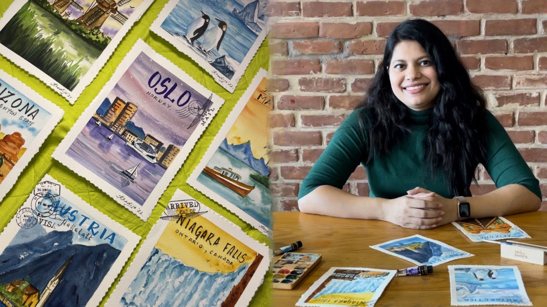
details and memories. Hi, I'm Khadija, a
watercolor artist, and urban sketcher based
in Calcutta, India. For the last six years, I've been traveling
with my sketchbook, and it's helped me slow down, notice the beauty around me, and turn my experiences
into lasting memories. In this class, I'll show you
how to make that positive. We'll walk through three
major challenges that a sketcher usually faces
and how to tackle them. One is when you're
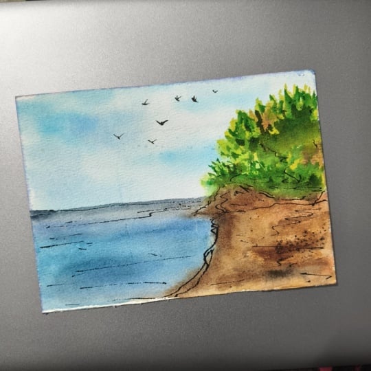
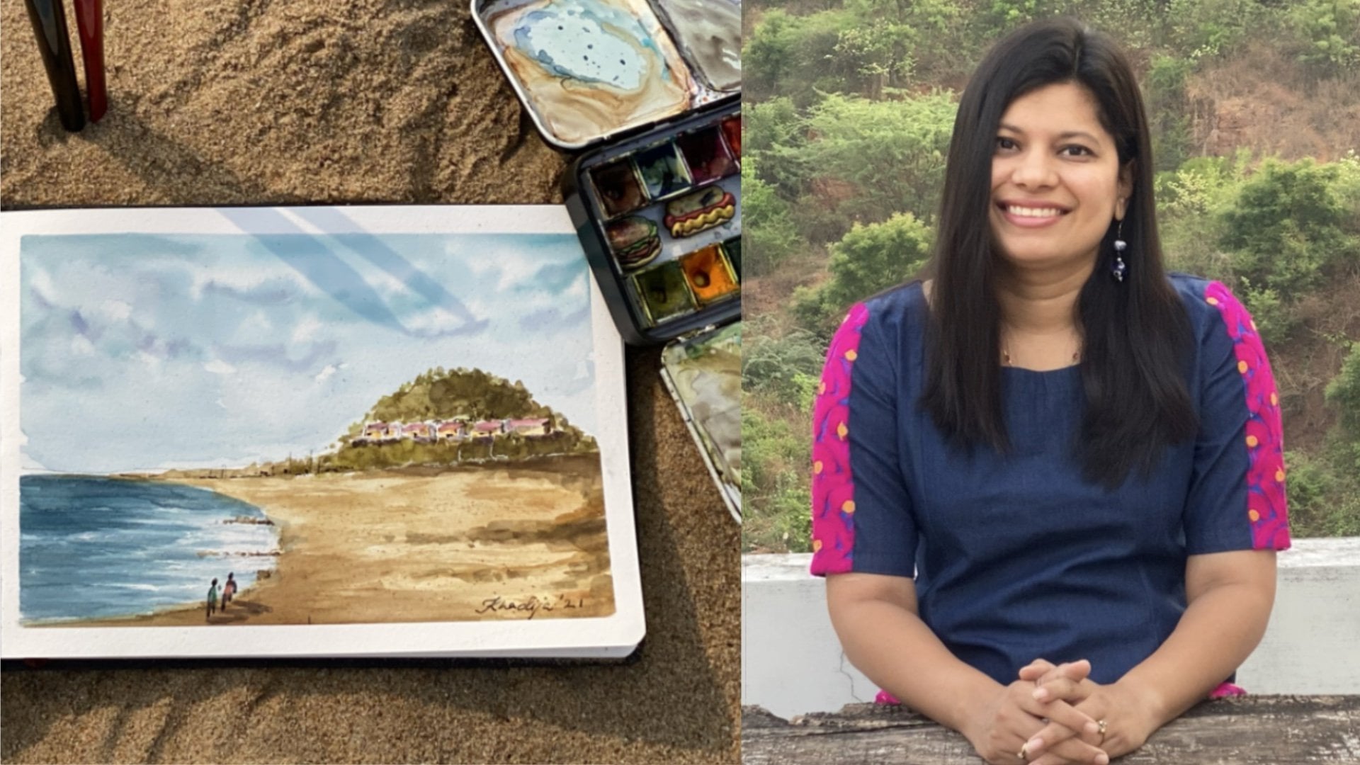
short on time. So we'll do a beach scene where I'll show you how
to create a mood instead of obsessing
over the details in a very short period
of sketching time. Two, we'll be focusing on
suggest, don't obsess. So over here, I'll
be taking a temple which is packed with details, but I'll show you how to break it down in a short
period of time. And three, I'll show you how to paint something
that's splitting, like you went for a dinner or a lunch and
you want to paint that. How do we paint that while still enjoying the
food and the company? All of this while telling you that you don't have to
pack your entire studio, a very simple and portable kit. I'll walk you through
all my supplies as well. Before we head out to
sketch our vacation, it's helpful to
practice at home. Working on simple
elements like landforms, skies and trees,
builds your confidence and helps you sketch faster
when you're on the go. If you want to brush
up before we start, I recommend watching
my previous cars where I simplify landscapes
into easy steps. Watercolor Landscapes Made Easy master the six
essential elements. This class is for
anyone who wants to add creativity
to their travels. You don't need to be an artist, just someone who's filled with curiosity in just a
small sketchbook. After this class, you will feel confident to take
your sketchbook, a little bit of supplies, and paint anything anywhere. So come join me as we
explore and Sketch Thailand.
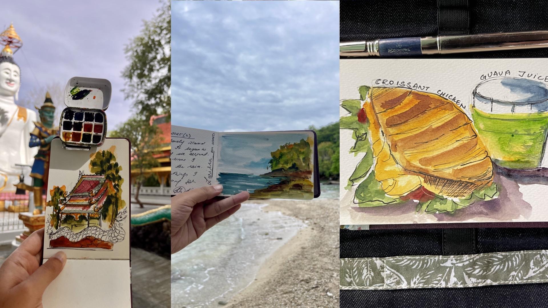
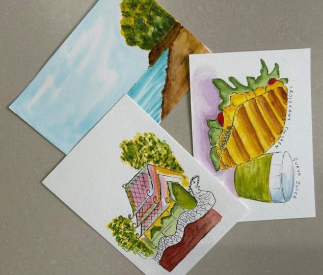
2. Class Project: For your class project, I want you to do all these
three paintings the beach, a temple, and a plate of food. I've added this in
the resource set. But here is what I
want you to also do. When you paint each of them, think that you're tackling
each of these problems. One, where you
didn't do the beach, think that you only
want to do the mode, set a timer and finish
it in 10 minutes. Second, is when you
paint the temple, don't obsess over the details. Just create that frame of the monument or you take
any monument of your choice. Even here, finish it in 10
minutes, time yourself. And third, is for
the plate of food. Take it from the
resource section or whenever you're eating at
home, you paint along. That is something you can do, like, um, in real time. So if you want to do
that, sketch it at home. The best way to feel
at ease when you're painting outside is if
you've practiced at home. So please do practice at home. But the ultimate project
that I would love to see is your sketch
on your next travel. So please, even if
you do it later, please put that in
the project section. But now, please do it
from the resources. I really look forward
to seeing what you've learned from this class and
how you've implemented it. So come, let's start.
3. Travel art supplies : Suit travel sketching is a lot about taking extremely
minimal supplies, enough to fit in a
little bag like this. Let me walk you through the
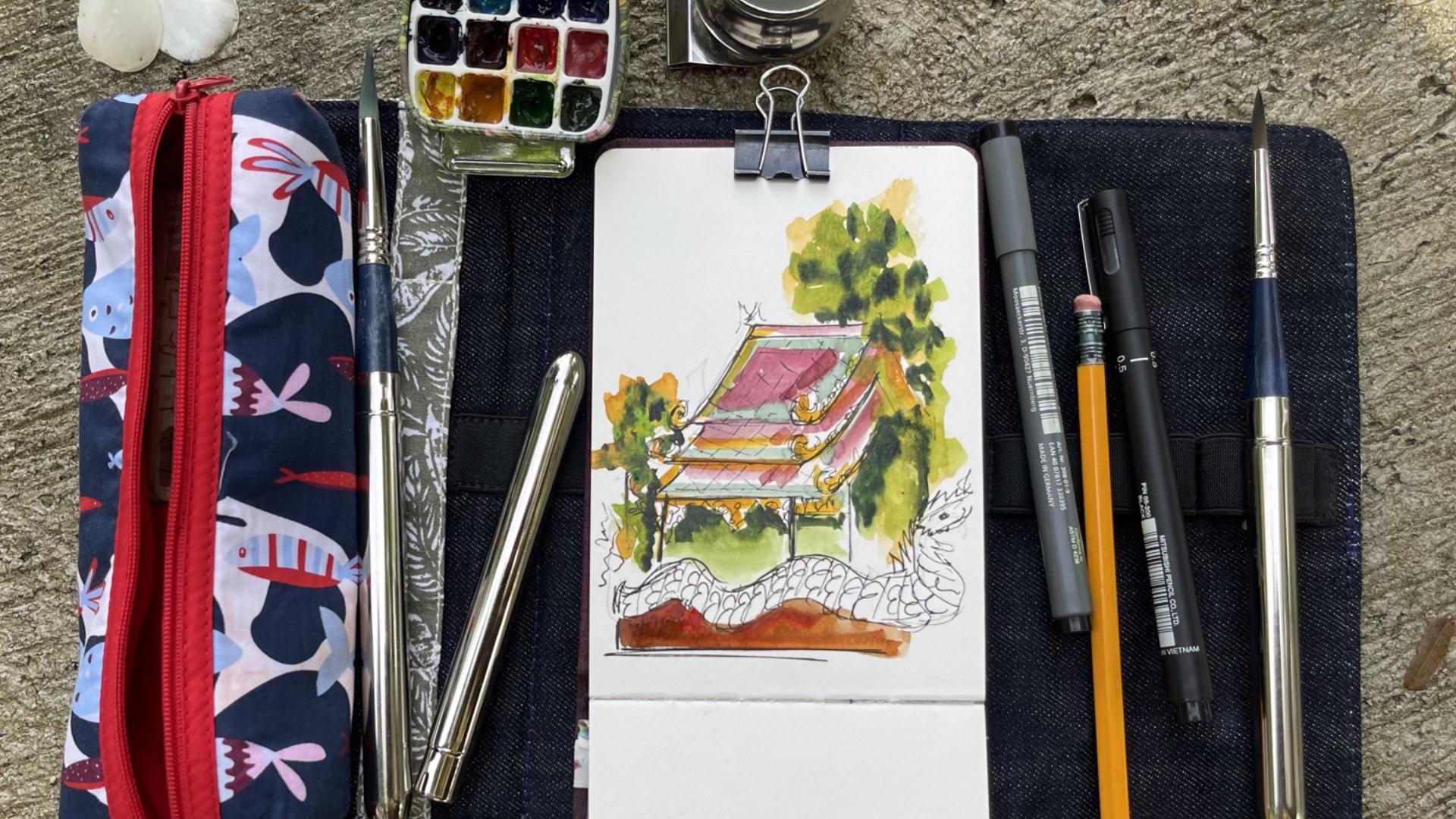
supplies I'll be using. So I have just this and this. This is just what you need. So this is a Nilo Roch pouch that I had taken a while back, and it fits a small ASIx
size Watercolor paper. So use a 300 GSM paper, but just keep it small A
six size. I have two pens. One is a 0.1 liner, and one is 0.5 liner. A pencil, as you can see. I use three travel
Escoda brushes. The beauty of these brushes
is your brush stays covered, so it doesn't get spoiled
when you travel them. So just try and buy
any travel brushes. Now a lot of different
brands have, and they vary in their sizes. So I'll write down the
sizes that I currently have forgetting the exact size, but see, this is
a big mop brush, so it gives me bigger washes. This is a thinner brush, and this brush is
only for details. So these are the
brushes that I use. And in this little pouch, I have a very small palette. This is a side of the palette, but it has good depth. So it feels enough pain that I can go for at least
a couple of crips. Its This comes with this
clutch so you can kick it on, and it comes with
this little pouch of water so you can
store your water. If you're going to the sea, then you pick up the
water from the sea. That's also a fun
way to do things. And this is just
to draw out, like, straight lines if
I'm doing, like, a monument or something, and this is just a clip. So this is all you need a little pouch to hold
things together, an ASIx size sketchbook, three brushes, two pens that
don't leak or anything, no extra, and a
really small palette. If you carry this, you
can carry it everywhere, and it's extremely
convenient and portable. So the trick is to
carry enough that makes you happy and gets
you through the trip, and it's extremely portable, so you don't worry about taking an entire big bulky
bag with you. Hm.
4. Beach Scene Mood over detail: Hi. So picture this. You come for a beach
holiday and the skies are beautiful and the waters calling for you to take out
your turquoise blue paint, but you possibly have
children waiting and your boat may leave and you
want to go to the next site. So what do you do? Do you
take out your sketchbook and paint or do you just take a picture and leave
it for some other day? So in today's
class, I'm going to teach you about
mood over details. All you want to do is in 10 minutes and in
three simple steps, you'll capture a
beautiful beach. I'll walk you through
these techniques. So whenever you're on a holiday, you don't hesitate to just
take out your sketchbook, spend those 10 minutes and
paint that beautiful beach. I'm using my hands
as a viewfinder, so simply put your
hands like this, move around and find the
spot that you want to paint. The first step is going to
be draw out the big shakes. So we'll have the horizon line, the sky, the water,
and the trees. The second will be giving a quick wash to the
entire painting, and the third will be to add a little details of salutes
and shots. So let's begin. Starting with step
one, the big shapes. I'm giving the horizon line, which will demarcate
the sea and the sky, and then I'm putting where the bushes are and where
the stones will be. So these are the big shapes. Now I'm going to give
the watercolor wash. So I'm using a wet
on wet technique because that's the best
technique for skies and for sea. You can also look at my
class that I have on six essential elements
that will really help you. We feel confident and do
this part much quicker. So I've first put a plain water wash. Now I'm
loading my brush with blue. You can use whichever
blues you have. I've used a turquoise
blue and Cerlem blue. So you can see on top, I've put much more color
and on the bottom, I've left a little more white. The white basically is the
clouds that I've left, and now I'm putting
a little bit of shadow to the clouds
that are on the bottom. I walked through
this in detail in my lesson about landscapes. If you see that, it'll
just be much easier. But if you haven't also, go
ahead and give this a try. I'm using the same
technique on the water whereas put a little bit
of plain washer water, and I'm using a deeper blue, so I'll be able
to differentiate. If you're using the
same two blues, just have much more
pigment than you would. You also see I've changed
the way that I'm holding the brush so that I can
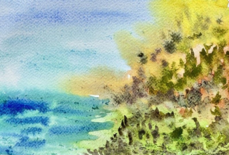
give these strokes. I I the sea, I've put a little bit of green. That's a beautiful little tip where if you put a little bit of green in the see it gives
beautiful rich color. If you notice the sea, you'll see a lot of colors. Here, what we are trying to do is simplify the whole thing, use minimum amount of
colors, and move fast. Now I'm going to move to the
land, the grass section. So here I'm using Burl
sienna and yellow cha. So this time I'm not
doing a wet and wet. I'm just loading my
brush because it's a really small piece
and doing that. And then I'm adding a little bit of layers with pearl sienna. Here, I'm not being too
particular because here I just want to give
mood to the painting. So I'm reiterating that what
we are trying to create here is not the exact exact see, we're giving a mood
because, you know, we are short on time and we need to move
to the next thing. But we want to capture the mod without going
overly about the details. Here, now I'm moving to the bush when I've loaded
my brush with yellow, I've put yellow, and
now I'm going to put green and I'm going
to put a third layer. I usually use three tones. And since the sun is coming
from the left hand side, I put the shadows on the right. I'm just going ahead
and putting in a bit of burnt sienna to be
able to differentiate and give a little
bit of structure to this painting and add to the mood of the
overall painting. Keep looking up and admiring the beautiful sea and sky
that you're painting, and don't get obsessed over
all the things you see. Just keep capturing the mood. So I'm just going to revise
what we currently did. We created three big shapes, which is the sky, the sea, and the greenery along
with the stoves. The second thing I did was give a clean wash, a water wash, and then I put in the
blues in the sky and the blues in the sea and a little bit of
sienna in the sand and the greens in the trees. So you must be thinking
that it went by too fast. How would you do it so fast. So here are the two things
that you need to do. One is you need to
plan it in your mind. So when you see the picture,
you need to say, Okay, I'm going to use these blues, these blues, and these
shades of green. And practice that at home
before you go for the vacation, it'll really help you
do it really quick. So you can see almost in 5
minutes I've finished this, I'll spend another
couple of minutes giving a little more depth
through salutes, through a little more details. I'll bring the entire
painting alive. But I'm happy with the
mood that we've created. So I have two classes. One is talking about
seaside landscapes, and one is talking about different elements
of a landscape. So if you get a
chance, you go look at those classes and do the
all practice exercises. So once you practice
that at home, you'll be able to do
it even quicker than. This part, you can
go a little bit slower because you
already created the mood, and here we just want
to add the details. So what I'm doing
is now I'm loading my brush with a lot
of pigments and just moving it around so that you feel like
there are some trees, you feel like there
are some stones. I'm not getting
into any specifics, but I'm just adding color
in the places that I feel will give much
more structure a little bit of silhouettes, a little bit of shadows. That's what you need to go. It's always useful
to carry a 0.50 0.1 liner and just give
a little bit of lines for the ones that you
missed out with a paint. It gives a lot of character
to your painting. Whenever I paint on location, I like to write a little
something about that place, what I saw or Hawi fell. Obviously, this is
completely up to you, whether you want to add a
little more smaller items or you want to write something.
5. Temple Scene: suggest, don’t obsess: Temples on Kilm and
monuments around the world are backward detaid and
feel very exciting to play. But they also do
fm very overging. In today's class, I'm going
to show you how to simplify these details and just
suggest tone obsess. So behind me you can
see a lot of details. There's a dragon.
There's a Buddha. There's a beautiful little
temple, and there are trees. So when you see all of this
and you're limited on time, how do you approach a sketch? So what I'm going to teach
you in this lesson is to break all of this down and teach you in
four simple steps. Step one is crop your frame. So when you're limited on time, crop out all the extras and
just paint what excites you. That's one, crop and flame. The second one is look
at the big forms. So when you see the temple, you're going to see
all the big forms, the big tangles, the big lines. Third, is we're going to
add a little bit of detail. Not exactly like this, but I'll show you a
simple technique to suggest detail but not
actually do the detail. And four, they are going
to do a splash of color. So this class is very
different approach from how we approach the beach. In the beach, we did
three big forms, and we moved fast
with a lot of color. Here, we are going
to do it slowly, but we are going to
do minimalistic. So let's begin. So first, I'm going to do out
the big shapes. So I can see this triangle. So this is I'm going to focus on the roof because that's
what excites me the most. So you can see I'm just
doing simple lines. I'm not going to overdo it. And there are two or three
coming down like this. And here goes the third one. I'm not even going
to do this, sir. I'm just going to focus
on the left side. So this is the side that
I'm going to focus on. This is how I'm cropping the
frame and making this my do. I'm going to draw
in these lines, but I'm not going to worry
about completing this. And I just want to
show the little bit effect of the dragon. That's it. That's it. This is going to be just as much as that
I'm going to draw. And over here, I'm going to
do a little bit of the tree, and even over here a little bit of the tree
is going to come. One, where I've cropped the
frame and decided that I'm going to focus on
this because the roofs are really exciting. We finished step two, which is drawing all the larger shapes, just the bigger forms. Now moving to step three, where I'm going to use my pen and add a little bit of detail. You can see I'm not really
putting out the details. I'm just suggesting that
there is some kind of a beautiful architecture that's curving in this direction. I'm not deciding, Okay, this
is going to be like this. I'm just moving my
pen a little bit to suggest that there is some
kind of detailing over here. That's just as much as we are going to do when you're
doing a traveled sketch, which is very different if
you're doing this at home. Then you can sit and detail
out things as you like. We're going to do the
same thing over here. And then This has
a beautiful roof with a lot of shapes on it. So what I'm doing is I'm just suggesting that there's
a kind of a design. Now, I'm going to add
a splash of color. So I see a beautiful
little green, which is a bit dark green. So I'm going to try
and create that, which is a mix of green
and blue and purple. So I'm just going to put like one line like
this. That's it. And everywhere that I see it. This one very confident
line, that's it. Okay. Now I'm going
to take the red. I see a beautiful red, and it's mixed with
a little purple. So I'm going to do a
little bit of purple. This is the red
that I've created. I'm going to put
out this red here. I'm not even painting
the whole thing. I'm just suggesting that there is something, there is color. Now I'm taking Indian yellow and doing out this
detailed part. Make this really deep and dark. That's how that
beauty comes out. In all the sections
that it's there. This is I'm trying to create
that golden color that's. This is in the background,
so it's really dark, but I, okay, let's touch it,
and let's see what to do. Let's go with the flow,
whatever you feel like. Um, this is a color I'm adding to show that there's
something in the bathroom. Just pull out this color. Let's pull it out a little
bit to give that darkness. Now, shadows are really important even when you're
doing a very suggestive side. So light is coming from here, so the shadows are
going to be here. So here we are going
to add all the darks. And now I'm going to add out the little trees
here and here. So what I'm doing is I'm
going to take yellow, okay? And just do this. I'm just suggesting that there
are some trees over here. And over here, I'm doing much bigger strokes because this is the part that
I want to hide off. And then I'm taking green. Okay. And not everywhere, but just I'm letting the
shadow light come from here and putting in some shadow. And this will go over this. That's why we didn't
really do much this side because of the
trees that are there. And the last, I'm going
to go and take in purple, or you can take
in blue, as well. And I'm just going to
give you the third shape. If you want to get
into the details of how to do these
trees very easily, I do have a class on
simplifying landscape elements, so you do go and
practice from there. Adding a little bit of
depth, oh, that's all. Part where I'm just adding
and highlighting details. So this is what these are
the things that I can see, so I'm going to
add it over here. Making these things darker. Here, I'm trying to
show that the roof is not such a straight line. I'm holding a very sturdy
line here. Same here. Sharing out the roof here. If you're wondering
where I'm sitting, I'm sitting right on the
floor of the temple, especially where urban
sketching may not find always place to stand
or to be comfortable. You have to get a
little uncomfortable, sit on the floor and
do it. But this is it. This is how we've done it
very minimalistically, just focused on this side, just done the big shapes, not try to put in
too much detail. So if as much time you have, you can put in as much
and as less detail. But this is a beautiful
approach where you really simplify
the painting and complete it really quickly and move on to the next sightseeing
destination that you have.
6. Food Sketch: capture the essence, add the story: Thai food or any food is
a piece for the ants. But the problem, before you
sketch it, it's Ima Dami. So in this lesson, in three simple steps, I'm going to show you how to capture the essays
and add the stove. Step one is going to be big
gestures like the plate or a big egg or a bottle
of a ketchup next to you. The second is going
to be a color punch. Food is filled with a lot
of colors that pop up. So use raw popping color, and the third is going to be
to add a small story elem. So be some where the food is. Let's see what that element
will be. Let's get started. First, let's decide what are
we gonna have for breakfast? The croissants look yum. Maybe let's pick up a croissant. A chicken croissant? Yep. Here we go. I'm going to show you
a magic at the end. As my painting completes,
so will my breakfast. What I want to say
is that we can do got together. So let's start. Now, first step
is a big gesture. So I'm going to draw
the bigger shapes. You can see I've drawn like the shape,
like an oval shape. Sorry, for the Croson, and then I'm going
to just put out the lines where I
want deeper colors. I'm not going to worry about
getting my sketch right. It's just a big gesture of a big shape or what's
going to be there. Now is the second
step, the color pop. I'm going to use raw colors. First, I'm just putting
out a little bit of plain water because I want, like, a soft wet on wet field. And here I've taken
Indian yellow as is. I've not mixed it
with any other color because I want that
raw colour to pop out. And that's the beauty of food. Any food you see, the
colors really pop out. And the way to do
that is to not mix too much color but use
as much in the raw form. Now I'm taking a little bit of burnt sienna and putting out, you know, the curves. I don't know what it's
called off the Croson. And because the first
layer is already wet, they're not hard
lines, but soft lines. So whatever you're seeing, just do that steadily without feeling like you
needed to be perfect, but just getting that feel of the color that
should be popping out. Now I'm putting a little bit of lemon yellow
for the egg part, and I'm just putting a bit
of yellow cha to show, like, the folds of the egg. But it's just to
give you an idea and not you don't have to
get every fold, right. So it's looking nice. We'll come back and we'll put in the details for the whole
thing to come alive. Now I'm putting in some sap
green to get those leaves in. So as you see, whatever
you're seeing, whatever you're painting, I hope you're painting the croisant as
well as a practice, pick up the raw colors and do it very
lightly and try to do it very effortlessly to get that beautiful
feel really quick. Using a darker green
to get those folds in. So this is how you
can approach it. You can use two colors, a lighter color and
a darker color. So the lighter color
will give that raw pop, and the darker color
will give shadow and definitions to the
food that you're painting. Now, I'm also going in
adding a little bit of red to get that
tomato to pop out, and you can see it's loaded with pigment and just a
raw red pigment. O. Going back with burnt sienna and adding definition
to the croisont. So if you're painting the croison whatever
you're painting, you'll mostly end up
doing two or three tones. One will be the raw pop, and when that's wet, you'll add in a little more of depth. And if you feel like it
needs to be a third layer, then you can go in and add a third layer of
a deeper colour. This is an important part, the shadows that mostly
we seem to miss, but it really brings
out the painting. So the light is
coming from the left and you can see the
shadow on my plate. I'm using violet color
to bring out the shadow, and in the shadow, you
can add two layers. Now pulling out my 0.5 liner pen and just
giving out some shape, you know, some outline
and definition. So it gives that
illustrative style of look. And it also, you know, helps give nice definition
quicker to your food sketch. Using that seam pen to add a little bit
of shadow to give that three dimensional effect to this illustrative
style of food. And you saw that magic, we finished the croison both
literally and figuratively. So we painted it and
needed it eight at two. So now the third step is
about adding a story element. So something that you see around that you want to
add, you can add that. I had this lovely guaa juice, so I wanted to add that as well. So I'm drawing, same
how we approach the croison drawing out the
big shapes of, you know, the cup, and then
we'll paint it with a lot of raw popping color
and add the shadows. So let's begin. Putting
in raw lemon yellow, because you can see
the guava color. So it's basically the
first layer is yellow, and the second layer is green. So I'm putting lemon yellow, and then I'm putting
a little bit of sack green, olive green, whatever green you have
a little bit over it, but not too dark a green to
get that beautiful flow. And because it's a liquid, don't overthink it,
it's watercolors. Let let it flow. And now
I'm adding the shadows, which is also a violet color. Going back with my fine liner
and defining the glass, you see, I've not
overdone it at all. I've just put in the basic
amount to, you know, put the entire food sketch together with minimal easy
flowing popping colours. Using a deeper blue, you could also use Pains
gray to just add a bit of the shadows and to give a little more structure
to the guava juice. Like the beach, I like to add a
little something. I rarely remember what I ate. Not that much of a foodie. So I like to write it down
if I liked something. So, you know, creating that story kind of an
element and writing it down. But that's completely up
to you if you want to add words into the sketch.
And that's it.
7. Thank you: Thank you so much for
watching my class. I really hope that
after this class, you confidently take
your sketchbook and sketch all your travels. If you'd like this class, please leave a review so other people can find
this class, too. And please do follow
me on Instagram. My Insta account is quirky cuts, and I look forward to
hearing any questions that you have in the discussion
panel below. I know. Please do share your projects. I'll be happy to
give you feedback. Practice, practice,
practice, practice. That's the only way
you'll feel really happy in yourself and
confident when you're sketch. Since you're in
Thailand. Okun ka.
 Khadija Karachiwala, Watercolour Artist