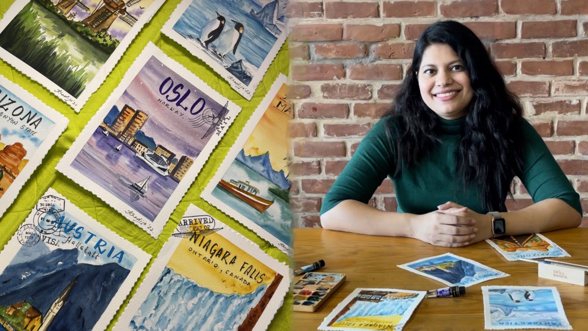
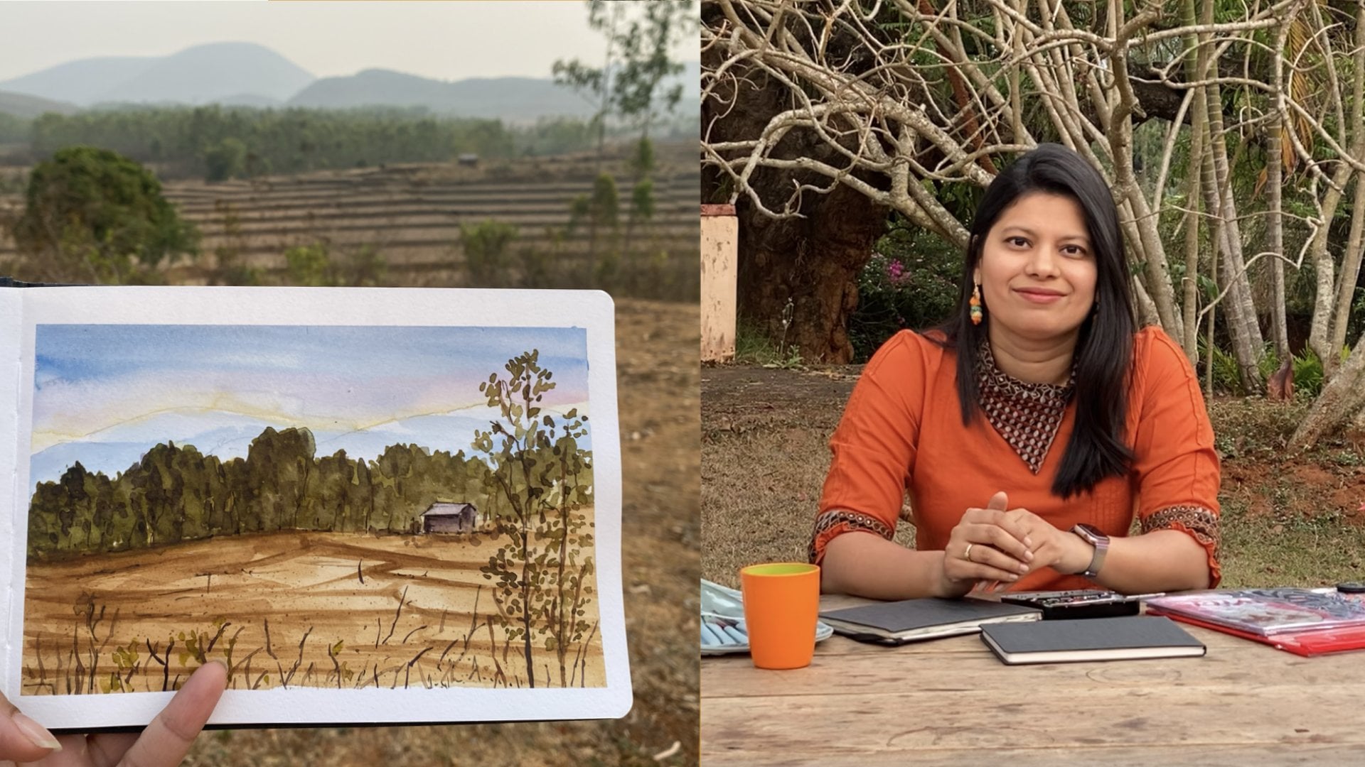
Transcripts
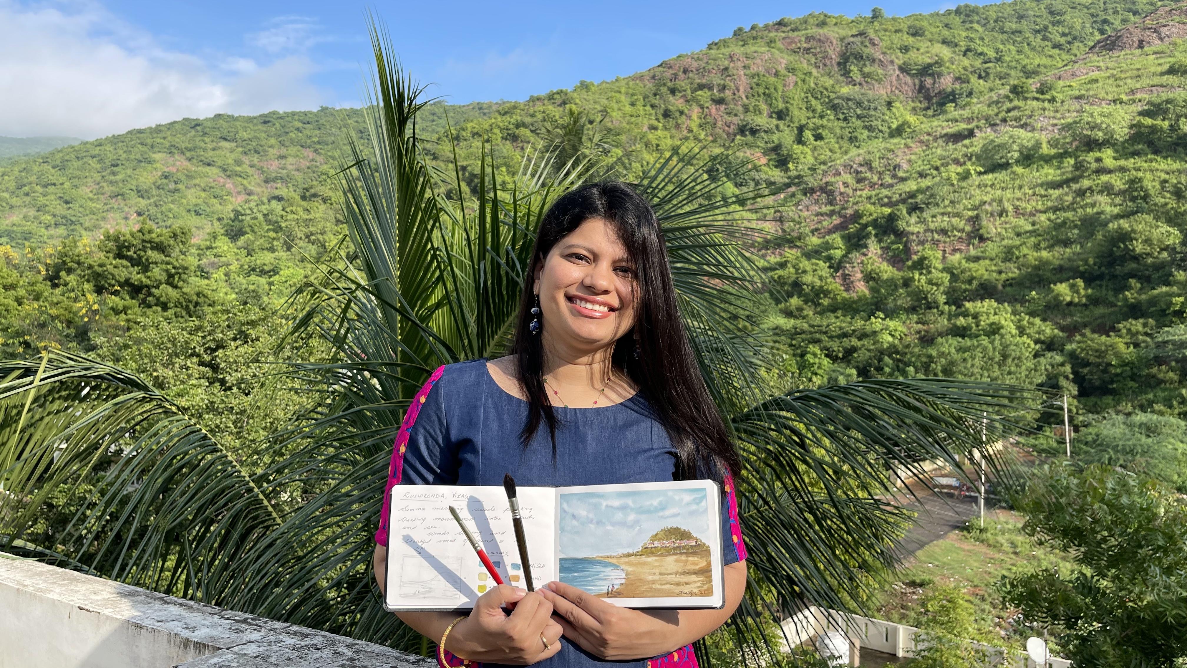
1. Introduction: Have you ever sat by the sea and observed the continuous movements of the waves and sky and thought, how do I capture that? Hi, I'm Khadija, an artist, entrepreneur, and digital marketer from India. I've been painting with watercolors for over four years now. I absolutely love immersing myself in the outdoors and painting nature. I grew up in a small seaside town called Vizag in Andhra Pradesh. I've always been fascinated by the movement of the waves and the shifting clouds. Over the years, I've come up with simple and effective techniques to capture this movement in a painting. Painting natural and dynamic elements comes with three major challenges. One, One surface is still but nature is constantly shifting. How do you capture this movement in a painting? I see in 180 degrees, which is a lot to look at, so how do I capture what I'm seeing? Finally, three, how do I select natural colors on location to enhance my work? Well, this class will help you simplify moving and dynamic elements and create a beautiful seaside painting while immersed in the outdoors. It's perfect for watercolor beginners and anyone who loves painting nature. Throughout the process, I've included practice exercises and helpful tips on the basics of light and shadow, how to add texture to the sun and waves, and adding small figures to add interest to your scene. As a bonus, I'll show you how to take a picture for social media. By the end of this class, you'll not only have a beautiful seaside painting ready for the world, but also the confidence, workflow, and finesse to approach any moving elements in nature. Let's get moving.
2. Your Project: Let's talk about your class project. I suggest you paint along with me, especially the warm-up techniques. Once you're comfortable with it, go outdoors, or find some old holiday pictures and create your own painting. For the final project, we shall be painting a seaside landscape from visor, India. I've attached the reference picture in the resource section. In this class, I shall walk you through the materials you will need, an easy approach to simplify dynamic elements, and we shall do some warm-up exercises of the sea and the sky. Understanding how to select and mix natural colors for your painting. I shall explain different types of compositions such as L and S shapes, and how to create and find your own composition, especially outdoors. Together, we shall paint every element of the seaside landscape, the sky, the hills, the sun, the sea, and little figures to add character to your painting. The bonus, I shall share two easy ways to take a picture of your painting. If you're a beginner to outdoor painting and would like to understand the smaller nuances of watercolor landscapes and outdoor painting, do have a look at my previous class, Experience the Outdoors. After you complete the warm-up exercises and the final project with me, you will feel extremely comfortable to create dynamic elements and make your own beautiful seascape painting. I invited you to post your work in the project section. This is a no-judgment zone to help each other learn and grow.
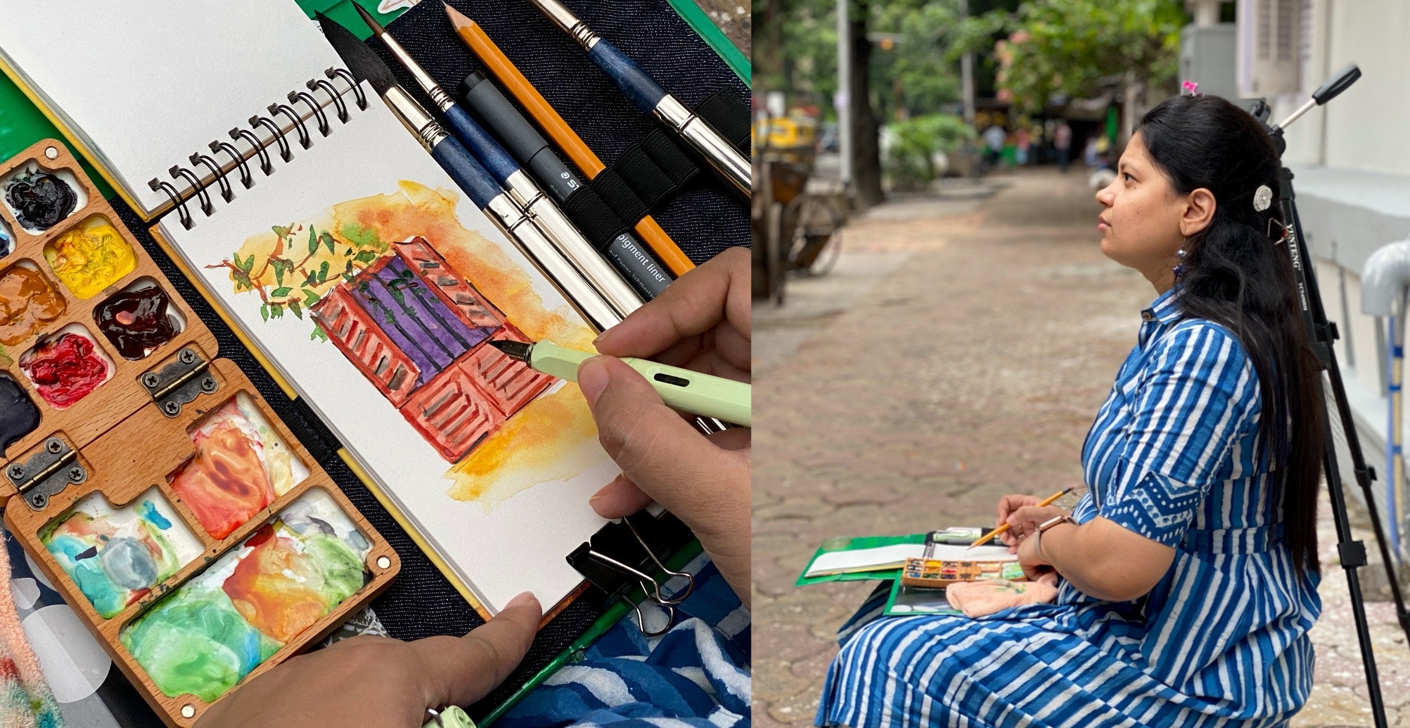
3. Your Materials : These are some of the material you will need for this class. These are just recommendations. Please feel free to use whatever you have. I'm sure you'll create a beautiful painting. This DIY hardboard to hold the painting. This primer watercolor set. This is small and handy, especially when I'm painting outdoors. In addition to the primer colors, I have three mid-yellow colors, which is Payne's gray, cerulean blue, and turquoise blue. This is because I use a lot of blues. I usually don't wash my palette because it helps me to lift color and create different mixes of color whenever I'm painting. A watercolor sketch book. I uses [inaudible] sketchbook, which is 200 GSM and 100 percent cotton. Please ensure that you use watercolor paper whether in loose sheets or as a sketchbook. I'll be using these three brushes. This is a mock brush from Escoda, size 12. This is a Princeton brush, round brush size 10, and this is a size 6. For me, 3-4 brushes are enough while painting. See that you are minimal and adjust with the brushes you have. A water container, a masking tape, a pencil, and a tissue. A fountain pen in which I added sepia ink which is brown color, and a white pen just to add highlights some time to time. Bring out your supplies and join me in the next lesson.
4. How to Approach Dynamic Elements: Here are two things you should keep in mind while painting dynamic elements. That is tonal variation and strokes of movement. Start consciously observing nature around you. When you look at the sea, notice the tonal variation in the waves. Let's simplify this by looking at it in a black and white scale. Now you can easily identify the light, mid, and dark tones. While painting a dynamic element, we need to capture this tonal variation. Doing this is half the battle won. As an example, let's look at this painting. We have left white to show the form of the waves and the reflection of the sun. Towards the end is the darkest tone, and in-between is the mid-tone. Secondly, we need to approach this as a still object, but create movement. Confused? I'll simplify it. If it helps, take a picture. A picture immediately makes a dynamic element into a still element. In this picture, look at the direction of the clouds and the direction of the waves. This is in the direction in which we will do our strokes. Direction of your strokes helps create movement in your paintings. Let's look at this example. When we paint the sea, we don't paint each wave, but a direction of the wave. See how I'm just creating strokes to create direction and movement for the waves. We'll get into the details of this in the next class, which is a warm-up class. Similarly, when I create the sky, I move from left to right or from right to left consciously to create movement in the sky. Again, we will get into the details of this in our next class, which will be a warm-up class.
5. Sky Warm-Up: Brush Strokes: Let's start with the sky. For the sky, we will be using a wet-on-wet technique. This technique helps keep things soft and create movements in the clouds. Let's start with deciding the color we'll use for the sky. I'm using a mix of turquoise blue and cerulean blue. Feel free to use whatever blue you have in your palate. To create depth and fluff in the sky and clouds, I'll be using a second color, which will be a purple color. These are the two colors that I'll be using for the sky. Let's start the warm up for the sky. I'll be using a size 14 Escoda mop brush. However, feel free to use whichever brush you have. Try to use a bigger size, say between 10-14. Now, I'm taking clear water and creating a layer of just clean water on my page. You should see a sheen of water and see that there are no puddles created when you do this. It should be an even tone of water. Once you have this clear water layer, we are going to then put in the color. Right now I'm taking turquoise blue and cerulean blue in my brush. Now, notice how I'm just using only the tip of the brush to create clouds, and I'm not putting the color everywhere. What I'm trying to do here is leave parts white, which will look like the clouds. Because it's watercolor, let the water spread the color, and don't put color everywhere. For the top part, I put an even tone because I don't want to have clouds right at the top, because that's how I observe nature. Also, the topmost part will be darker than the rest of the sky, to create that depth. Towards the bottom, I use the extreme tip to just show very small clouds. Keep observing how I hold my brush, and how it changes depending on the part of the sky I'm working on. Now, I'm going to take a tissue and lift some parts of the color to make the clouds more prominent. Do this gently. Now I'm using a slightly smaller brush, a size 6 round brush, and taking purple in my brush, and trying to add fluff to the sky. Just in certain parts where you feel there is clouds below the white part, add this purple so the clouds look fluffy. Let me do a quick recap of the three steps to create the sky. First, put a clear layer of water, then use a bigger brush, and at a 45 degree angle, add in the sky and be particular to leave white spaces to let the water flow and let the clouds be created. Then use purple and create fluff in your clouds. You may not get this the first time, but don't need to harden yourself, and keep practicing. These are elements that you can include in any of your paintings.
6. Sea Warm-Up: Creating Waves: For the sea, we will be using a combination for wet-on-wet and a wet-on-dry technique. I'll demonstrate two styles of painting the sea. One, will be a shore and waves and one, will be a oceanic view. Currently I'm doing a very basic line drawing, which will include the shoreline and the horizon for the one with shores and waves, and the second oceanic view will just have the horizon line. The colors I'll be using are a mix of turquoise blue and cerulean blue. Feel free to use whatever blue that you have. For the waves, I'm just going to take a little pigment of my brush and do a swift movement of my brush from left to right. How this helps is it show speed and movement and leave some part white which shows the reflection and the form of the waves, and this is how we are going to do the waves. To make it easier, take some pigment, wipe off a little of the pigment on a tissue paper, and then swiftly move your brush from one side to another. This may take some practice. Just practice this a little, and this is called a dry brush technique. Now what we can also do is use a little bit pigment and move it from the other side to show the waves that are hitting the shore and coming back. Also, let's add some deeps towards the deeper end by using the same pigment, that same color combination, but more of pigment and less of water so it creates a deeper blue. I'm just painting the sand quickly so that you can understand the effect of the waves. I'm just using a burnt sienna and quickly making the sand. You can also hold your brush at a 90-degree angle and create some smaller waves towards the end where the water is coming towards the shore. For the second one, we're using a wet-on-wet technique, which means I wet the paper first before I add the pigment. In the part where we have the sea, I'm just adding clear water evenly throughout the section where I want to paint it. I'm using the same mix of cerulean blue and turquoise blue, and just gently adding strokes. In this wet-on-wet technique, the pigment mixes with the water and so it gives you a soft look. Towards the horizon, I'm going to have a darker pigment and towards me, it's going to be lighter. I also on a 45-degree angle add few strokes, so it feels like there are waves in the sea. These are the two techniques. One is a wet-on-dry and a wet-on-wet, depending on what is the effect that you want to create. Now that this is semi-dry, what I'm going to do is I'm going to gently add strokes of the waves. You just add this in a few areas and leave few areas white, so you can see a light, medium, and dark tones of waves in the sea. Now I'm going to add a sky in two shades of purple showing sunrise or sunset, so that you can understand the sky and the sea in this painting. For the first painting, I encourage you to use what we learned from the first lesson about the sky and add the sky on your own for the first painting. Practice both these techniques, so that you can apply it whenever you want to add waves or oceanic view to your own paintings.
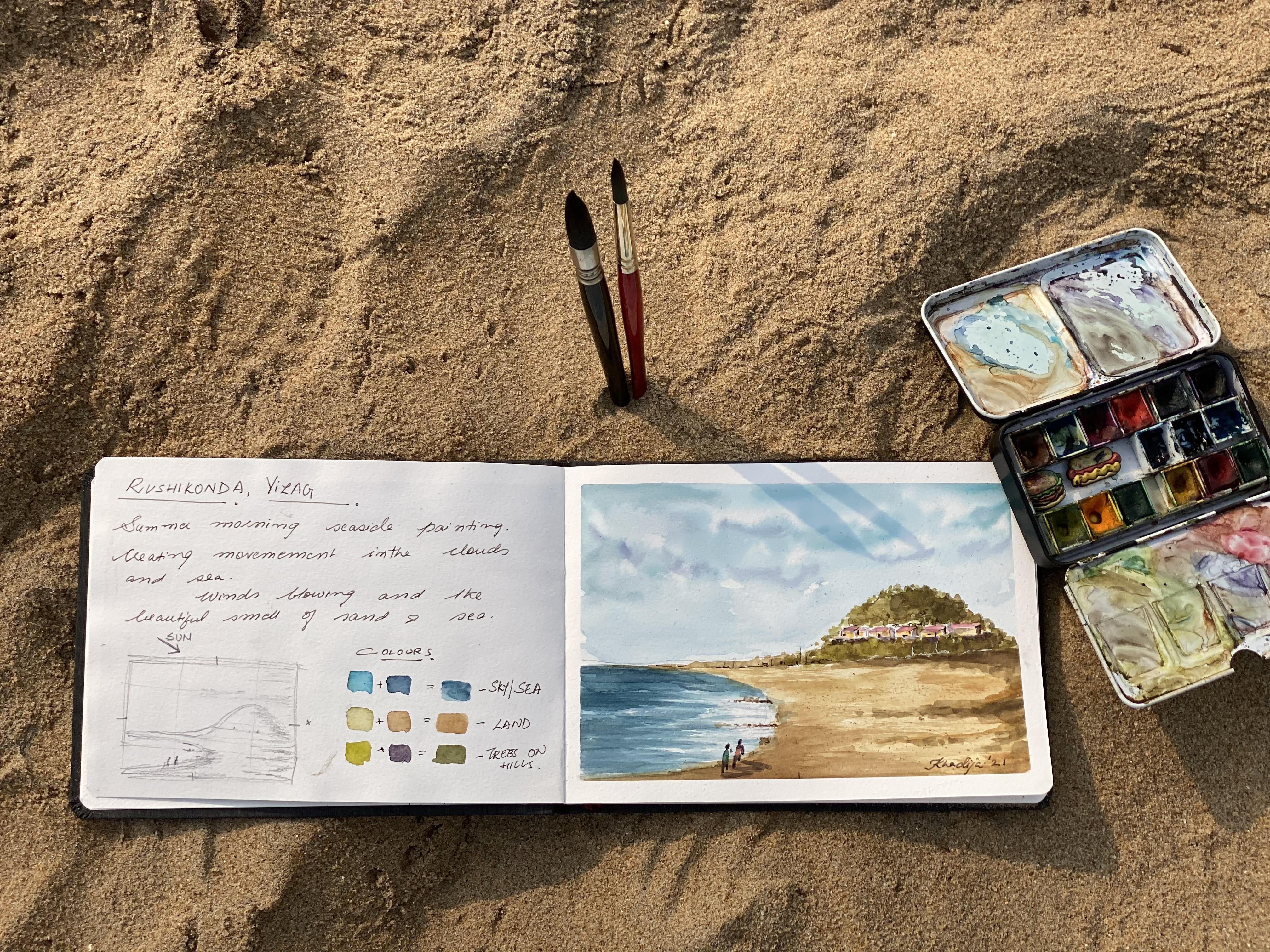
7. Colour Selection: To capture the essence of dynamic elements, you need to choose your color wisely. Don't try to choose the exact elements. Just try to get a feel of the place through your color selection. When you look at your picture scene, what are the colors you notice? When I look at this scene, in the sky, I see not one but a mix of two colors, turquoise and cerulean blue. For the clouds, I see that I would like to leave the paper white, and for the shadow of the clouds, I see purple. Start noticing what colors you see in your scenes. Now study your paint box and understand which colors will go best with your current subjects. I'm very familiar with my pallet, and that's why it's easy for me to identify the different colors that will go well with the different subjects that I'm choosing into this painting. Let me show you how I do this. Now I'm selecting the colors. First, I'm going to take turquoise blue. What you see on the page right now is turquoise blue. See which colors you have from your palette that goes well for the sky. Now what you see is me putting cerulean blue. Now I'm going to mix these two colors in my palette. The third color that I'm putting is a mix of the first two colors. Mixing these two colors gives me a beautiful new shade. Now let's get back to our composition and see the colors that we see for the sand. For the sand, I see mixes of yellow and brown and so I'll use yellow ocher and burnt sienna. Oops. This color has gotten mixed, but what I'm going to do is I'm going to use yellow ocher. See which yellow you have that will go well for something like the sand. This is burnt sienna, which is a brownish color. Now in my palette, I'm mixing these two colors and together they're giving me a beautiful sandy, yellowish-brown color. Again, see the colors you have, what you'd like to mix, and what goes best. Getting back to observing the hill, I see a very deep green. I'm going to mix sap green with purple to make it a deep and dull green. If you have a lighter green just mix more of purple. This first color you've seen me put is a sap green and the second color I just put on the page is a purple. Now I'll mix these two to get this deep green. See how I decide which colors to mix. First, I've taken blues to create a different shade of the same color, and brown is a shade of orange, so a neighboring color to yellow and hence go well with each other. The third is a mix where I've tried to deepen a color. Use similar colors, complementary colors, or something that you want to deepen to create your own mix of colors. I use colors as a formula, and that's why I've written turquoise plus cerulean will give you a new mix of the color. The first will be my sky and sea because the sky is a reflection of the sea, they'll be the same color. The second one is the land or the sand, and the third one is the foliage. Go ahead and select the colors you would like to use for your elements.
8. Types of Compositions: Let's talk about the different styles of composition that you can create. What is composition in art? Composition is a way in which different elements of an artwork are combined. It refers to the key subjects of an artwork and how they are arranged in relationship to each other. Why is it important? The order of the elements in a good composition create the artwork into a unifying whole. It guides the viewer's eye in a purposeful way to create direction in the artwork and meaning in each element. First, we'll cover three composition styles most commonly used in landscapes. Here, you can see I've divided Van Gogh's painting Starry Nights into vertical and horizontal lines. You will see multiple horizontal and vertical lines appear and hence multiple L-shape. This creates a sense of peace and serenity. In this painting by Claude Monet, you can see an S or a Z shaped being formed. The S shape guides your eye and gives the viewers a path to follow. The S or Z shape creates the focus on the composition. Diagonals, this style is great for creating visual tension in your composition. The direction of the strokes, as you can see, are from diagonal side. It works well with dynamic elements. In this painting The Great Wave, you can see how diagonals are used to create tension in the waves. The next four compositions are not specific to landscapes, but they're commonly used compositions in other subjects. Triangles, this is an extremely common composition use in portraits, here in Mona Lisa's painting, you can see how the subject is composed within a triangle, focusing the viewer's attention in that section. Grouping, in this composition style, we create clusters to add weight to the painting. Notice in this painting by Michelangelo, two meet your clusters that direct the viewers' attention. Leading lines, as the name suggests, this style has prominent lines that leads the viewers in a specific direction. Commonly used in one-point perspective buildings, where everything in this painting is moving towards one point. Central composition, commonly used in still life. Here the subject is placed in the center of the composition, notice this painting by Paul Cezanne, and the placement of the fruits. It's placed right in the center of the painting. These styles discussed are commonly used to capture the viewer's attention and create strong painting compositions. Join me in the next lesson as we create our own composition.
9. Finalize Your Composition: For my outlook on position, I'm going to create a viewfinder with my hands. I'm going to put my right hand with my palm up and an inverted left-hand, this gives me a smaller composition or a view of what I would like to paint. I move all around 360 degrees to see what are the compositions that I could have. I have decided on this composition. here, I draw three imaginary lines horizontally and vertically, this is a guidance for the rule of thirds. The rule of thirds is an easy way to create a pleasing composition. Then we place our major elements in the intersection of the thoughts. Here, I've placed a hill in the intersection of the first thought to create a nice and balanced composition. Using your hands is a good way to create a viewfinder for yourself. Also notice that in this composition, you can see an S or a Z shaped. Refer to the previous lesson where an S or a Z gives the viewer's eye a path to follow. Start experimenting with your own composition and join me in the next lesson as we draw [inaudible] drawing.
10. Thumbnail Drawing : The thumbnail drawing is the most important part of either outdoor or indoor painting. This is a space that gives you the lead to add and subtract elements and experiment with your composition. Please don't miss this step. I only start with drawing my thumbnail as a frame in the corner of my page that's not going to be used for painting. Then I mark out the midpoints which act as a guideline. After I do that, I think of where I'm going to add the horizon line. Don't add the horizon line in the middle, add it above or below. The horizon line is the line where the land meets the sky or the sea meets the sky. Once I've drawn this out, now I know where to place the hill. The hill extends a little so that's how I'm going to be doing it. Once I have the hill, I'm going to draw the next major element which is the sea. I'm just going to roughly mark out the area in which the sea is going to be. You could see like we've created an s composition over here. Now I'm just going to add some of the other elements to get a better understanding of what's going to be there on the beach. This is a space where you can understand what do you want to add, what do you want to subtract. Let me add some stones or rocks that are there on the sea and then also just let me I'm going to add human figures. But I can decide towards the end of my painting whether I would like to add these figures or not. Here I'm just experimenting how they look. Now once I have this, I also want to show you how we are using the rule of thirds. I'm dividing the screen into three sections and showing you how I've added the elements in the third column and I've not crowded all my elements in the middle. Another important aspect is understanding the direction of light and creating shadows. In a landscape, there are majorly three directions for light, left, above, and right. Here I'm showing you the difference in shadows based on the direction of light. When the light is coming from the left, you will see the shadow in the right section. In the first drawing, notice the shadows on the hills and the shadows of the people. When the light is from above, say the rising sun, shadows fall right below the object. Notice the shadow of the figures which changes vastly depending on the time of the day or the direction of the light. On the right side, you can see that the source of light is on the right and so the shadows fall on the left side of the other objects like the hills and the figures. Our source of light, in this case, the sun, is on the left side. Things towards the right will have the shadow, and hence when we paint it we'll make it slightly darker. In every section, the shore, the land, the hills, I'm showing you the section where the shadow will fall. In any painting, the beauty comes from contrast, your light mid and dark tones. Which comes primarily from the source of light where you put the light. Even in the sky, I'm going to paint the right side slightly darker to show that the sun is on the left-hand side. Always identify your light source and mark your shadows.
11. Sketching Your Painting: I start with putting a masking tape on all four sides. A masking tape helps secure the paper and it doesn't keep moving when you are painting, once you've completed your painting and take out your masking tape, you will notice a beautiful border that's created and hence it gives it clean and complete look to your painting. Start by putting masking tape on all four sides. The final sketch is very similar to a thumbnail drawing. I'm marking out the middle points, then I start with the horizon line. As we discussed, the horizon line will be above or below the middle point and not right at the middle point. The horizon line is the line where the land meets the sky. Now marking out the hill and the extension of the land near the hill. I'm just marking few things that will come towards the end. Now I'm marking my sea section. The line drawing, the sketch is always a very light pencil drawing and we won't get into too much details. All the details will come when you paint. I'm just adding a little bit of the greenery or fall leaves that's there towards the ground. I remember to do it. Now I'm just drawing two lines to mark out the cottage. The cottage will be really simple like creating small houses, create them as you want. But since we've already done a thumbnail in our minds, we have a very clear vision of how we want the painting to look. For the final sketch, we just do it extremely minimalistically. Here, I'll just mark out the few rocks that are going to be there in the sea. That's about it. Join me in the next lesson as we begin to paint.
12. Cloudy Sky: Now for the fun part, let's start with the sky. I take clear water in my brush. Here, I'm taking a Mach 14 size brush. Notice how I'm holding it towards the end so that I can use the entire brush section to make an even tone on my paper. Just notice that we have no puddles. It's important that there's an even layer of water here. Once this is done, select your colors, which is turquoise blue and cerulean blue in this case. Now, I'm using the edge of my brush, and see how I'm moving from right to left and left to right to create the direction of the wind. You don't add pigment throughout, leave some white spaces between later shape into clouds. Now towards the bottom, I'm going to create an even tone of color. This is because I don't want too many clouds towards the bottom. Now that we have this, I'm going to add a darker layer towards the top. I encourage you to create different tones in your sky by creating dark and light of either the same pigment or of slightly different. This creates depth. Usually, add the darker sections towards the top part of the sky. Because if you notice nature, that is how skies usually are darker towards the point further away from us. In this section, you need to move swiftly. Now, I'm taking a little purple, and adding it towards the bottom parts of my clouds in order to create some fluff in the clouds. This adds a good amount of depth, but be very scarce in this, adding purple. Now I'm adding some clouds by lifting color using the tissue. Once I've lifted certain sections, I'm giving some shape to the clouds. Clouds and skies need practice, and they need to move swiftly before your paper dries. Don't be disappointed if you don't get it right the first time, and keep practicing creating clouds. Once you get the hang of it, it moves very fast. Let the sky dry, and join me in the next lesson to paint the sand and the hills.
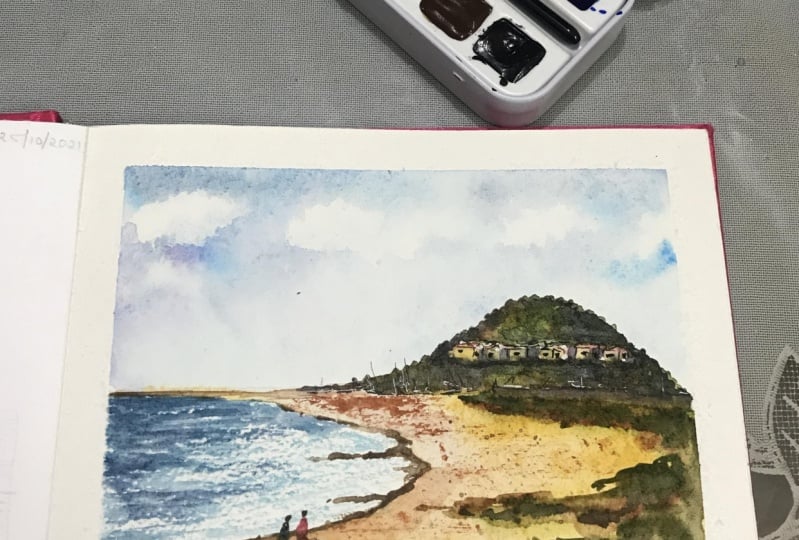
13. Sand & Hill: Layer 01: I'm using a size 10 round brush and the pigment is a mix of burnt sienna and yellow ocher. Now, I put this color, take some water, and spread it to the entire sand section. Just take little amount of water and spread the color. We want the sand to be uneven because nature is not even. Now what I'm going to do is I'm going to take more pigment and put it in different sections and it's going to be little random. So that is this uneven look, that comes. My base layer is already wet and that's why this becomes a wet on wet technique when I put the second layer of pigment. Now we've already identified our shadows sections towards the right of the objects. So that's where I'm going to put darker sheets of the sand to signify the shadow regions. That's it. I'm not want to do too much. I'll wait for the sand section to dry and come back to it. Now let's move on to the first layer of the hill. I'm using a size 8 round brush. I've taken clear water and I'm putting this clear water only in the hill section, leave out the huts for now and just in the hill section with a clean layer of water. Once you have this water, I'm going to use sap green in my brush and add bushes to the hill. What I'm going to do is with the edge of my brush, I'm going to just use a tip to touch it and let the colors spread a little. This touch and lift gives a nice effect of bushes which are on the hills. I'm also going to use a little burnt sienna to give a little contrast in the hills of the sand that is there behind the bushes. We will do this technique throughout the hill. Now that you have this first section covered, I'll take a darker mix by adding purple to sap green to create the shadow regions. There will be shadows near the cottages since this is the shadow of the cottage on the hill. As we discussed, since the sun is from the left, there will also be shadows on the right-hand side. What I do over here is there are two places that I add my deepest tones, which is near the cottage and on the right-hand side of the hill. So identify your shadows in your painting and add deeper tones. Whatever color you have already used as a base tone, add purple to that tone to make it a shadow or a dark tone. Use the same technique by just putting a dot from the tip of your brush. If your canvas is much bigger, use a bigger brush and use the same technique. Now here what I'm doing is I'm adding a little bit to the edges so the hill doesn't feel even and you can feel the little bit of bushes that are overgrowing towards the top of the hill. Just add a little bit that's coming out of the hill on all sides. Now that we have this, we're going to let it dry and come back to put a second layout. Join me in the next lesson as we do the second layer for both the sand and the hill.
14. Sand & Hill: Layer 02: For the second layer of the sun, I'm taking some sap green and adding just in certain sections little overgrown plants that are there. Use big sap green in your brush and I'm now using a bigger size 10 round brush and adding darker greens below the hills and in certain sections towards the right of the sand. Also, take some burnt sienna so that you can add a mix of a soil and plants that are there. I don't want the lines to be too hard, so I'm taking water and just softening the lines that are there. Also, I'm taking some burnt sienna and defining the land portion on top a little bit, but just a little bit. Look at your painting and see where you want to add some depth and darker sheets and use the color mixes that you have. I'm using some sap green and just touching certain sections to show the uneven grass that's there. While I wait for this to dry, I'll move on to the hill. Now on the hill, I'm taking another clear water very gently adding that so it becomes wet. I'm using a bigger size 10 round brush and adding my darker regions. This mix is sap green and purple. Just add depth to the sections by adding your shadow regions a little deeper. I'm adding the other regions, but they are much lighter than my main shadow regions. Watercolor once dries, it becomes 50 percent less in its pigment and that's why we need to keep darkening things. I've come back to the sand and I'm darkening the region that we just worked on, which is the plants that are growing near the sand. I'm going to use a splatter technique to create a sand effect. Here I have taken pigment in one brush, see how I'm holding the brush, and with another brush, I just tap the brush that's below. This will create splatter which looks like sand grains for your sand region. This works beautifully for both sand and if you are creating a lot of foliage also, you can use this technique. Just lift color in one brush and with the other brush, tap the brush below. As we have done in our warm up, for the see we've learned dry brush technique. I'm adding some dry brush strokes on my sun because I want to show an uneven look of the sun. Here I'm just using burnt sienna. You use these two, three things like splatter technique and dry brush technique to give a good effect of the sand. Join me in the next class as we work on the sea and the cottage.
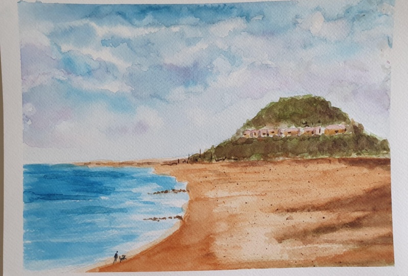
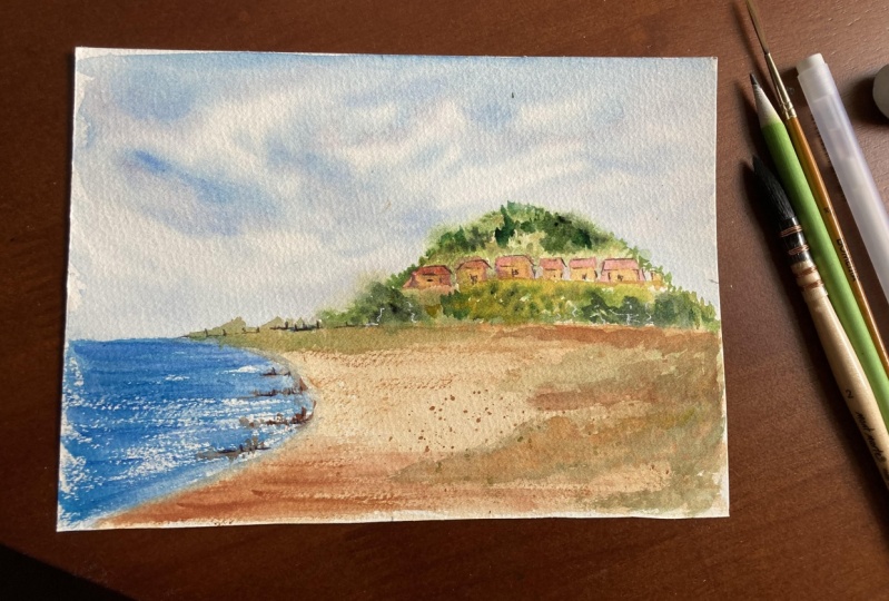
15. Sea & Cottage: Be sure to change your water before you start with the sea. We wouldn't want any browns or greens to be mixed in the sea. Now we shall apply the dry brush technique that we practiced. Swift strokes from left to right, which will help create movement. The color I'm using is turquoise blue, a mix of turquoise blue and cerulean blue, and I'm using a size 10 round brush. Now I'm going to take a darker mix of the same color, and add some darker strokes to show waves and depth in the sea. Try to use the edge of your brush, the tip of your brush so that you get finer and thinner lines so that it looks like waves that are there in the sea. Be sure to leave whites in between. Now, this part that I'm doing is the receding waves, that's going from right to left, so I'm also putting some waves on the right-hand side. Be sure to leave whites, this shows reflection of the sun and also the foam that forms when the sea hits the shore. Add a few darks and create some waves. I'm happy with the way this is turning out. I'm taking a slightly smaller brush size 6 to create some more finer details and I'm putting some darker color towards the top, which is like towards the horizon line. This helps to create depth in the sea that we are showing. Now I'm taking some browns and just touching it towards the end to show little stones and rocks that are there in the sea. This creates a nice contrast towards the sea. Now as discussed, the right-hand side has the shadow, so I'm using burnt sienna and darkening it towards the right side. Now I'm going to work on the cottage a little, so I'm taking yellow ocher and just adding it a little bit to the cottage. I'm still using a size 6 round brush and I'll be using a scarlet or a red color to add the roofs of the cottage. Do this carefully since it's a really small space. It doesn't need to be too detailed since the cottage is very far away, but just a glimpse that there's something on the hills. I'm also now just taking some sap green and adding it to the below part of the cottage to show the shadow on the hills, this creates a nice depth. Also adding the second layer to the rocks, this is burnt sienna. I'm just adding it dab, dab, dab. With watercolors, we need the sections to dry, so we keep coming back to sections for a second and third layer and we don't do the entire part together. That's why you see me moving around and coming back because I'm waiting for it to dry. Now that the sea is also dried, I'm going to add a few more strokes so that they're more defined. You can use this whole process and style to any of the paintings that you create. I'm happy with the way this is taking shape, join me in the next lesson for some finishing touches.
16. Figures and Final Touches: I'm now going to add human figures to the painting. This is completely optional. Human figures are very simple. Draw a round head in a carrot shape or a rectangle shape, draw a body and use brown to draw the legs. Just see that one leg is smaller than the other to show movement like the person is walking. Adding figures adds a lot of character to our painting. I'm adding two people as if they are going for a morning walk together. Same way, a round head, a triangle body which is like a carrot, and two legs, which one will be smaller to show that the person has one leg forward and is walking. I'm also going to use purple color to add shadows. The shadows will be towards the right of the people. I like how this is coming out, and the people look like they've come for a jog or walk in the morning. This is completely optional if you'd like to add. Now I'm using a fountain brush to give a little definition to the huts. I'll be just adding a little to the roofs and a little windows, which will define these cottages, on the hill. I'm also going to now use a little purple and add a little shadow of the huts on the right-hand side of the huts. Very lightly and very little. This just deepens the cottages and gives definition. Also using the fountain pen to define the figures that we've drawn, just lightly. Now take your painting, look around, see if there's anything more you would like to add. Anything that you would like to darken and deepen. I have a few ideas, just a few little touches left. Let's get back. I could see something further away. I'm just going to use my fountain pen to draw a few abstract lines and dots. Nothing very defined, just something to show that there's something further that's happening. I'm also just adding a few darker, deeper shades to the rocks, and towards the cottage. This is a step where you need to see in your painting whether there's anything you would like to add. If you're happy with your painting at this point, then just leave it as it is. I'm using a white pen to just add something on the hills like there's something much further away. I feel like this is giving more definition to my brain game. Looking at my sea, I want to just add a few deeper waves. I'm using the same mix of cerulean and turquoise blue and just adding a few waves. I like the effect of adding these few deeper shades. I feel like it's adding a lot more character to the painting. When I look at the hill, I feel like it's become much lighter than what I would have liked. I'm just going to go back in and add a few strokes. Here, I'm using purple directly and just adding a few strokes towards the right-hand side. As soon as I add it, it makes me feel happy that I've given it a good amount of depth. It's also really important to know when to stop in your painting. I think we're going to stop here because I'm pretty happy with the way it's come out. Now for the most satisfying part of removing the masking tape. You can see how the masking tape gives us a clear defined line like it's in a frame. That's why I always use a masking tape, so my water doesn't overflow, and my paint doesn't overflow. That's it. Now sign the painting, give yourself a pat on the back and just enjoy your creation.
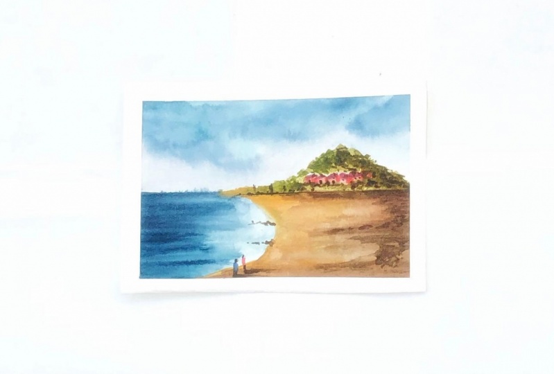
17. Bonus: Take a Photo: I'll show you two styles of how to photograph your painting. The first style is called a flat lay. A flat lay is which way you put your painting flat on the ground and this can be done both indoors and outdoors. Here, the sun makes a beautiful background. I use my paint box and brushes as a prop, and they make beautiful props. Now I take my phone and put it parallel and much higher than my painting, which gives me a beautiful flat lay. I take one horizontal and one vertical, my grid mode is on on my phone and I try to place my painting in the middle grid. The second style works beautifully outdoors. Put your painting in front of your scene and put your phone ahead of your painting. This gives a beautiful vibe of showing what you painted and the fact that you are outdoors. Try different ways to photograph your painting. If you have your own tips and techniques, do share it with us in the discussion section, I would love to hear what you have to say.
18. Bonus: Write A Note: After I finish my painting, I like to write a short note about the take of reason of my observations. It's like my very own personal painting journal. I encourage you to do the same. It could be anything. It could be about that place, the things you noticed that day, or it could be about your painting, the things that you enjoy doing, the things that you found challenging, the places that you would like to improve or practice in your painting, or you could just simply write your color observations. This helps when you look back at that painting and your short note, it brings back sweet memories and little places that you would like to work on, improve, and just small pieces of joy that you felt that day. I encourage you to write a short note every time you complete a painting whether you're doing it outdoors or whether you're doing it in your studio.
19. Final Thoughts: Thank you for watching this class. I hope you enjoyed these techniques and applied these techniques to your own compositions and paintings. Please upload your painting in the project section below. If you have any questions, please feel free to reach out to me in the discussion span. To help me reach out to most students, please leave a feedback of this class. If you upload your work on Instagram, please tag me at QuirkyKhadz. Now go, and get painting.
 Khadija Karachiwala, Watercolour Artist