Transcripts
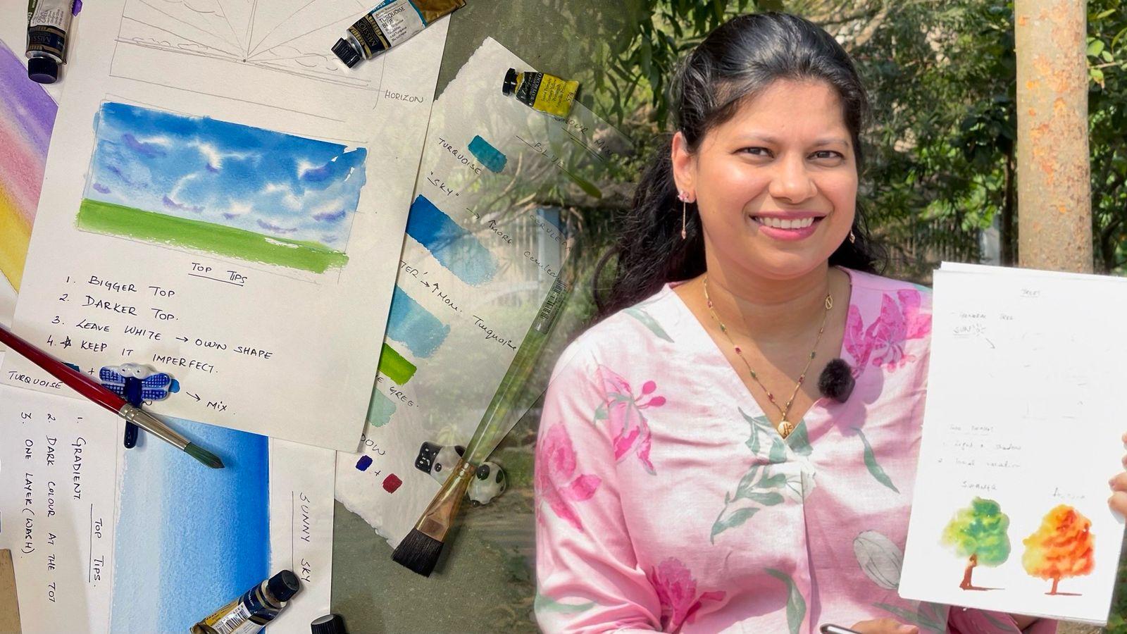
1. Intro: Have you ever looked at a
breath taking landscape, pain rush in hand and thought? Oh, boy. Where do I even begin? These majestic trees,
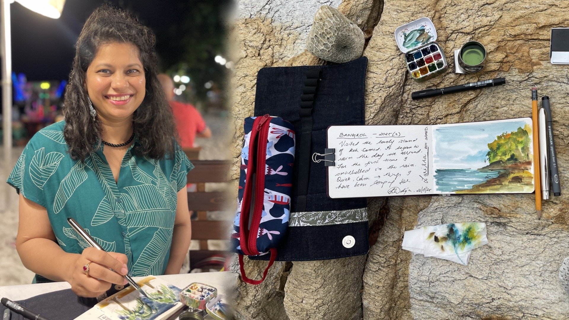
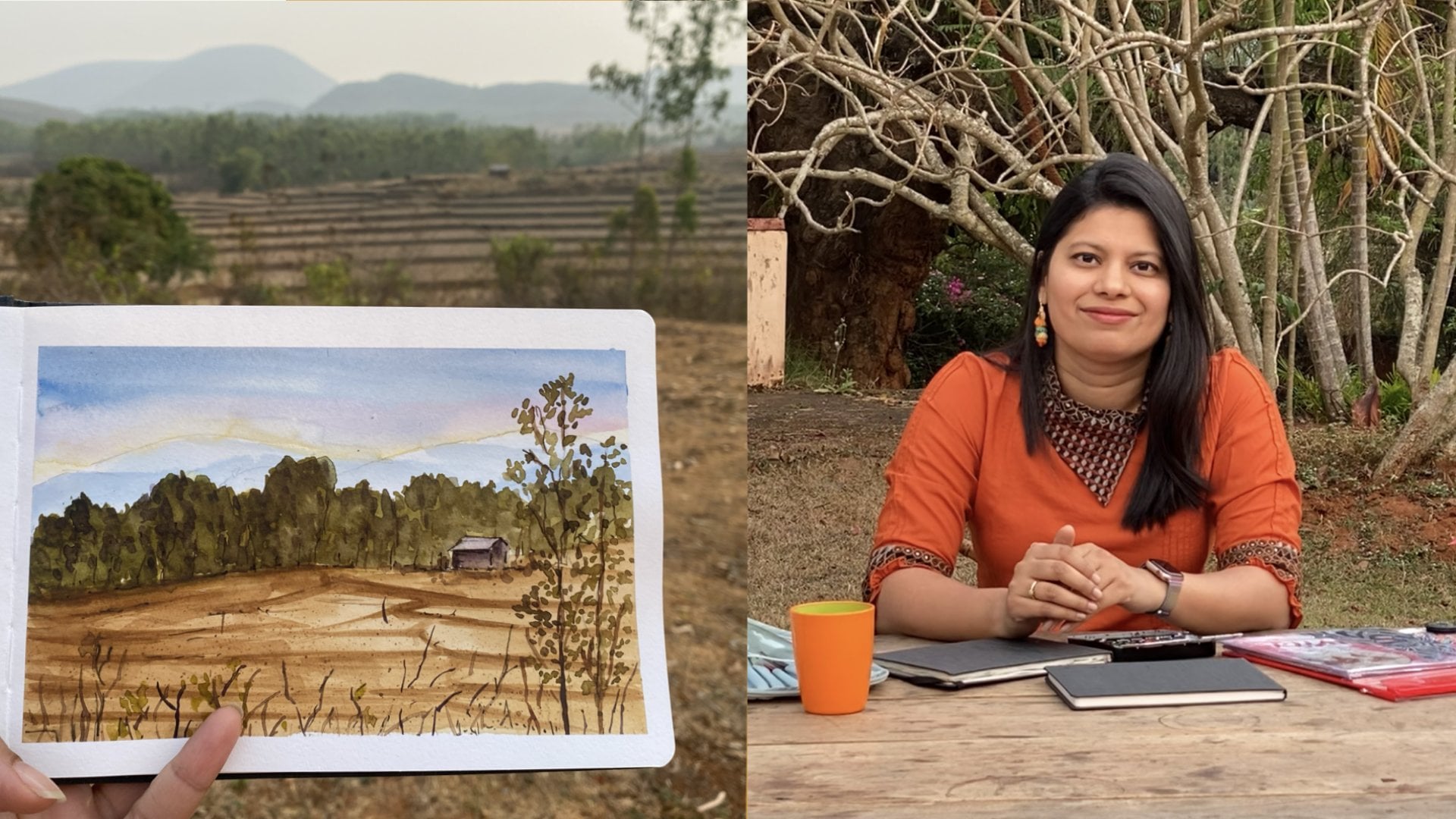
glittering waters, the crystal clear skies. No wonder, some of us freeze up. Hi, I'm Khadija, a watercolor
artist, a digital marketer, a mom of super busy toddlers, and a top teacher
here at Skillchair. I'm not trying to find the
perfect sunset to pin. You can find me observing
how life goes through those different
landscapes and creates those magical shadows that brings all our
paintings to life. Growing up in the
coastal town of Wizag in Andhra Pradesh, India, I understood the game changer to any landscape painting is
understanding light and shadow. Once you understand this, you can take any
landscape in front of you and paint it and create
three dimensional wonders. Let's be honest, landscapes
can be intimidating. I see three major challenges
that make any artist sw. One is, where do I even
begin? Which element? A leaf? What colors
should I use? A yellow green, a blue
green or a green green. What's all this fuss
about light and shadow? How do I find them?
How do I use them? And where do I begin? But
here's my promise to you. This class is about
having fun mastering six landscape elements
in three easy steps. For every element, I'll walk
you through how to create those light and dark tones
in three simple steps, you can transform any of your paintings and add each element to any
landscape you like. Between you and me. My favorite moment is when students have that
ha moment where they understand light and shadow and the otherwise flat paintings turn into three
dimensional wonders. By the end of this class, had the confidence to approach any complex scene,
know where to begin, which colors to use, and how to build down each element and how to include them to bring life
to your pinky. Come, let's break down these landscape,
create those elements, and just have fun understanding each
element of a landscape.
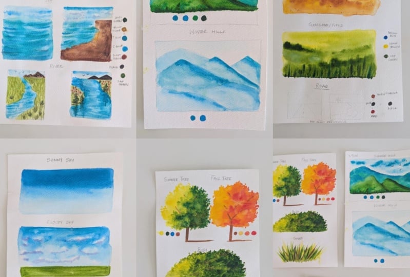
2. Class Project: Hi, there. Let's talk
about your class project. It's refreshingly simple. Just select two to three
elements that you like. It could be the skies, it could be the water, or maybe the hills are
calling your name. Your mission to take these 23 elements and practice
them again and again. No pressure to create a complete landscape
or a masterpiece. This is your playground
to experiment with color, with elements, and with all the different techniques
that I'll be teaching. The best part, I want to see those not so happy
attempts, too. That's where the real
learning happens. So please upload them
in the project section. I'll be happy to jump in and personally give you feedback on how to improve these Elec. You are feeling inspired to mix all these elements and create
a beautiful landscape. Please check out these
classes, we guide you, and you can use these
beautiful elements that we learned today and
create your own lans. But remember, this class
is about focusing on each element and not having the pressure of creating
a big landscape. Enjoy the process of
color mixing of light and shadows and really getting
lost in each element. Get ready to dive into color
mixing and understanding those easy steps and easy brush strokes to create your beautiful
landscape elements.
3. Art Supplies: Art supplies we all have a weakness for
art supplies, right? Let's start with paper,
which is the most important. I'm using a 300 GSM
Canson coal press paper. You can use any
brand that you have, but please see
that it's 300 GSM. The reason being
that this 300 GSM can soak in a lot of water. So it really helps with
your wet on wet techniques. Besides that, I'm really good even you can use handmade paper, but have it watercolor
paper, minimum 300 GSM. Moving to paints, you can use any watercolor
paints you have. It could be cakes,
it could be tubes, it could be anything
that you have. I prefer using tubes because I love the pure pigment
of the tubes, and I'll walk you through the colors that
I'm going to use. But you can use any brand. I'm using yellow Mission gold. I personally love the
way the um pigment keeps its unique properties and doesn't become
diluted in the end, it's very free flowing and easy. So the colors that I'll be
using specifically are red, turquoise blue, cerulean blue, um sap green, olive
green, burn, sienna, Indian yellow, lemon yellow, which I will walk you through in color mixing and at the
beginning of every class. So the way I look at it is
cool shades and warm shades. In my cool shades, I'll
have two shades of each. So two greens, two blues, two yellows, and I also taken two different
browns and red. But feel free to use any
shades that you have. I'll be explaining to you how you can use
whatever you have. But the idea is to mix
different shades of color. Now you need a mixing palette. I have this particular palette. Um, I love that, you know, you can mix
in a lot of color. It is, it's from
magello as well. But, you know, you can
just use a steel plate. You can use a ceramic
plate that you have. Just have a lot of
space for mixing. I prefer using a limited palette and that's why I just
taken two shades. I don't like the 24 48 colors. Um, I would also
encourage you to use a limited palette and mix a lot to create your
own shade of color. Brushes. I'm using
one flat brush. It really helps with
wet on wet technique. It's a three fourths
size Princeton brush. You can use any brand you like. Just have two or three
different sizes. This is the size
ten round brush, and this is the size
four round rush. Use any brushes, any
brands that you have, but just keep two,
three different sizes. And then just keep two
different jars of water. One will always keep for fresh clean water and one
will do our water mixing. Keep a napkin handy, keep a pencil and if you want a masking tape, and I
think that's about it. Just pull out whatever you have because this is
just a practice session. We are not creating masterpiece, so pull out whatever
you and just get started. Don't overthink it.
4. Colour Mixing: Mm. To give your landscapes
that raw organic look, it's important to mix colors. Let's start by understanding
the color wheel. Back to basis, you have
blue, yellow and green. For now, take any blue, yellow and green you may have. Mix your existing
blue and yellow. The amount of blue that you use, the proportion of blue versus a proportion of yellow will change the
color of your green. Colors depend on brand. Don't worry about any brand you have even if it's Camelin, start with it and do
this exercise with me. Mix a little bit more of blue and see how
your green changes. Now we'll mix orange,
which is a mix. We create orange, which is
a mix of yellow and red. Even this based on the amount of red or the amount of
yellow that you use, depth of your orange
shade will change. Lastly, in our secondary colors, we have purple, which is
a mix of blue and red. We have three primary colors, blue, yellow and red, and we have three
secondary colors, which is green,
orange and purple. So mix these shades to just get into the rhythm
before we dive in. For all landscapes that have
trees, grass, and land, we'll be using lemon
yellow, olive green, sack, green, cerulean blue,
red, and burn sienna. You can mix these greens
just like we've shared. But if you do a
lot of landscapes, it's just easier to have
two greens ready with you. Now I want to show you
different gradients of green. First, I'm going
to mix two green, sap green and olive green. Take any two greens you have, load your brush with a lot of pigment. That is your first. Now take clean water and pull this paint and see what
gradient you can create. This study will help you when you're doing
your tree grass, so you know how much water to put and how much
pigment to take. I want to create a
different shade of green. I'm adding blue to the current mix of olive
and sap green that I have. You can see how much change has come just by adding
one more color. This green can also
be used in the sea. So based on just keep mixing your colors and think
where you can use it. If you want, you can mix
a little bit of red into your green to give that
more of a rustic look. And this is a new shade. So by adding blue,
by adding yellow, you can change your
shade of green, and these different
shades will create depth, light and shadow
within your paintings. Now comes to the application
on these greens. Greens are the most
used in landscape. In grasslands, I've
used lemon yellow, cerulean blue, sac, green, mixed it in different
shades to bring my light mid and da.
I've used in bush. In the bush, I've also
added a little bit of red to get that earthy mix because we know
brushes on the ground. I've used it in coconut trees. Over here, I've also added in burnt sienna to give that bark and the look
within the trees. I have used it in summer trees, same colors, but look
how different it looks. Greens have a variety
of applications. Practice these greens, make your own shades or create
completely new greens. Moving to blues, blues
are mostly used in the sky and in water and
everywhere in between, I use as primary in
the sky and the water, I'm using two blues, a turquoise blue and
a cerulean blue. Feel free to use
any blues you have. In layman's language,
you'll call it dark blue and light blue. But make sure to have
more than one shade of Now I'm going to mix
these two blues, but I'm using a much higher
amount of cerulean blue. When you mix this
shade together, you will see how beautifully
it blends for the sky. Right now, I'll do an
exercise where I'll show you gradients of two
different blues. Both have turquoise
and cerulean blue. But the sky has more of cerulean blue and the sea
has more of turquoise blue. So do this exercise with me. Right now, I've loaded my brush with this mix and
more of cerulean blue. Now I'm using water and
pulling this color out. This is exactly how your clear
sky will look where you've just created a gradient of a blue mix with more
of cerulean blue. Now we're going to do
a similar exercise for the sea and this time
we will use turquoise blue. A secret to the sea
is it also has green. Mix a little bit of olive green in this water turquoise
blue mix that you have and you'll see what a beautiful gradient
you'll get a green, blue mix that goes perfectly when you're painting
the depths of the ocean. Do this exercise with me, then use fresh colour
and pull out the color so you can see the beautiful gradient that you can create. Let's talk about the
shadow of the clouds. This is going to
be a simple purple like we've discussed
in our color wheel, where we use the primary
and secondary colors. Here we'll be mixing blue and red to give us a
beautiful shade of purple. This is a purple that we'll
be using in our shadow. Let's do a quick recap
of the sky and the sea. In both, we use two
shades of blue, turquoise blue and
cerulean blue. In the sky, we use more of cerulean blue and
create a gradient, especially for clear skies. For water, we use more
of turquoise blue. The magic mix is green. Add a shade of green to your water to give
that beautiful depth. For shadows of the clouds, I encourage you to mix and
create your own purple. When you paint the sunset sky, I'm going to tell you it's all about the colors and blending. What are these
colors in blending? Top color is purple, middle color is red, and then we have yellow. We are pulling these colors
from our color wheel. Let's get mixing for
you to understand what colors to use for your sunset sky and
how to blend them. The purple in the sunset sky is going to be a mix of
cerulean blue and red. Whatever blue and red you have, mix them together and
see the shade of purple you're getting and if you're happy with that shade of purple. The shade of your
purple completely changes depending on the amount of blue and the amount of red. By amount, I mean proportion. Keep mixing to see
what works for you. I want to show you over here that when I use more of blue, what is the shade
of purple I get? And then I use more of red, what is the shade
of purple I get? Sometimes when you
want to just show a beautiful atmospheric
condition of the sky, you can change the
proportion of red or blue and see these
beautiful shades you'll get. Let's come to sand.
The road mix, I'll be showing you in the class itself, in the lesson itself. For sand, we use Indian
yellow and burn Siena. If you don't have Indian
yellow or yellow occur, you can mix this by
mixing. Red and yellow. Let's mix that and see
how that turns out. If you have yellow
ocher or Indian yellow, please use that directly, and then you'll also be using burnt sienna, so
you'll have that mix. If not, take in the red you have and mix in if you have
lemon yellow, lemon yellow, otherwise, if you
have yellow och, yellow ocher and see, this is the mix
that you will get. Very similar, but that's more on the orange side depending on how much of red that you mix. And then comes brown. I prefer to use burnt sienna and always keep it
handy in my palette. Brown is not always the easiest to get the
right mix because it mixes all primary colors or a mix of secondary colors
and a primary color. But if you are feeling inspired and do want to create
your own brown, what you need to do is
first create an orange, which is red and yellow
and then mix in blue and then keep experimenting with different proportions to
see what works for you.
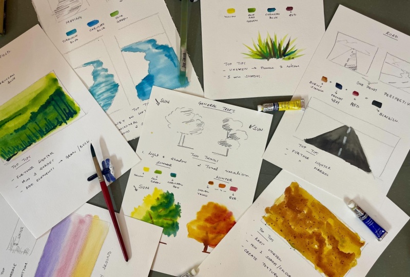
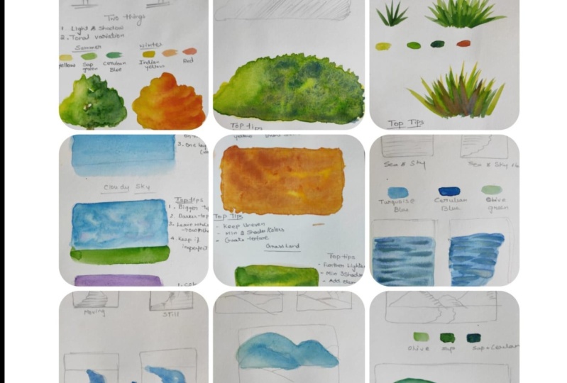
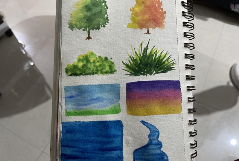
5. Trees - Summer & Autumn: Today we are learning
a fundamental aspect of any landscape trees. I'll be teaching you
the direction of the sun where to add
tonal variations, and then we'll move on to summer and autumn
trees. Let's begin. I'll be drawing two basic trees, keeping the lines very
loose and very natural. So just think of a circle, but just keep moving
your hands in a way to make a tree structure. Why I'm drawing these two
trees is to explain to you where the sun will come from and where
your shadows will be. Trees are all about creating the depth and dimension
to light and shadows. On the left tree, the sun
is coming from the left. So your shadows will be on the right side, just
as I'm doing it. Do this quick exercise. It will really help you out. And on the left side tree, the sun is coming
from the right and hence the shadows are
on the opposite side. So just follow along
so you can get a better hang of where the
light and shadows will be. Recapping wherever the
sun is coming from, the shadow will be on
the opposite side. Two key things to keep in mind are light and shadow
and tonal variation. Light and shadow creates the illusion of three
dimensional form while tonal variation gives our trees depth and
visual interest. Think of how sunlight
hits a tree. Some leaves catch
direct light appearing bright and vibrant while
others fall into the shadow. For our summer trees, we'll work with three
distinct layers. We'll start with yellow as base, capturing the warm sunlight
that hits the leaves. Next comes sap green, which gives us the
rich summer foliage. Finally we la erudian
root to create depth and shadow to
different areas. Coming to autumn trees, we'll use a different but
equally beautiful palette. We'll begin with Indian yellow
as our base that gives us a gorgeous warm glow that
autumn trees are known for. The second layer
will be mixing red with Indian yellow to
create those vibrant tones, and our final layer
will be pure red. We'll first start with a wet on wet technique and hence
I'm using clear water with my round size ten brush and just wetting the section that I
want to create the tree in. So don't need to wet
the entire page, just section where
we'll be doing it and see that it's an equal
amount of water. Then as we discussed
for the summer tree, we'll be using
just three shades, starting with yellow, which
will be our lightest tone. And the same way that
I put a brother, sorry, I use the water. I'll just put round strokes
and put the yellow. Next for our mid tones, I'm using sap green. But I won't be putting
sam green everywhere. Assuming that the sunlight
is coming from the left, I'll only be putting the green tones on
the right hand side, just the way we discussed in our drawing and um
what does this do? This gives that beautiful effect of light falling and some trees, some leaves being a lighter yellow and some
being a little green. Now I'm moving on to cerulean blue for our darkest sheads. So what does this also I'll
not be doing everywhere. I'll just be putting on the bottom right
side of the gray. I'm also trying to go a little outside so that you know
those little little trees or little leaves that
come out to just create that beautiful
little realistic effect. Going back in, taking my yellow and doing
the same thing on the left hand side to create that beautiful organic
look of the tree. Now I'm loading my brush with
a little bit of born sienna and just put in a small
stroke of the branch, and on the right hand side, I'm putting the
shadow of the branch. In a few areas, you'll
create a few sorry, that was a trunk
and in a few areas, you'll create the branches. Now we'll be using the same technique for
the autumn tree, and then the autumn tree will be equally beautiful but
just different colors. Please paint this
along with me because you've already seen us
do the summer tree. So this will be a good practice
to do it along with me. As you see, three
different tones I'm going to take three easy steps. The first step, I'm
taking an Indian yellow. What is the difference
between a lemon yellow and an Indian yellow and Indian
yellow is a more warm color. It has more of red, so
it looks a bit orangish. I put clear water to make it a wet on wet and I put round
strokes of Indian yellow. Now I'm creating a beautiful mix to create that warm glow. I'm mixing this Indian
yellow with a bit of red. And even in this, the sun is going to come from
the left hand side. So on the right hand side, I'll be keeping
this orangish mix. You can even use a deep
orange directly if you like. You'll, you know,
create your own, um, hue of color. For the last tone, I'm
taking red as it is, you can take a scarlet red a deep red to create that
beautiful autumn look. Similarly, to create
that organic look, I'm going to be putting a
few branches in and out. So as I'm doing it, do it with me since
you've already seen me do the summer dream or pause
just class and do it. It's only when you practice,
will you enjoy it. It's very easy technique, three simple steps that
you can use anywhere. Again, I'm using burnt sienna, draw the Trump and the branches. But
6. Bush & Grass: Welcome. In today's class, I'll teach you how to paint a bush and grass in
three easy steps. When you think of a bush, think of the larger shape. So I'm going to move my hand in circular motion
like you can see. I'm first going to draw
in pencil like I always do to explain to you where
the sun and shadows will be. So don't think of each
leaf within a bush. Think of it as a shape
and that helps us break it down into a very
easily digestible format. So if the sun is
coming from the left, the shadows will
be on the right. The bush is just about choosing the right colors and creating that beautiful dance
of light and shadow. I'll be using three colors, which will form a light, mid and dark tone, which also form a step one,
step two, and step three. Super easy to follow
three steps, three tones. So it's going to
be lemon yellow, sack green, and cerulean. Feel free to use any tone of
yellow, any tone of green, and any tone of cerulean blue, you will create your own
wonderfully beautiful. Now I'm using my size
ten round brush, drawing out a line
so that you'll know where the bush
is going to be. And I'm using circular motions. So how do all of these
different elements differ? A lot of them differ in
the strokes that we use. So for a bush, like how a bush is round to get that shape, I'm going to use
circular movement. And right now I'm covering the entire space
with lemon yellow. So that'll be our first layer to just keep in mind the stroke that you're going
to use and creating a beautiful first
layer of lemon yellow. Now I'm loading my brush with a lot of pigment of sap green, but you see I'm not covering the entire space with sap green. I'm going to leave
those spots of yellow to show where the
light is falling in. It creates a beautiful
when you look at a bush, some places are lighter,
some places are darker. This is the easiest
way to create it. In your second layer, just
leave some places empty, which will show the first layer. And we'll do a similar
effect in our third layer, which will create
the deepest shadows. Now loading my brush
with cerulan blue. As soon as you put blue
on green and yellow, they will create a
deeper mix of green. You can also use
red possibly add in I picked up some
red in my brush and adding some red to give
that more raw color, like a earthy color of the push. About, you can see, I'm moving my brush in
a circular motion, and you need to do
it all in one go. So this is it's a wet
on dry technique. Every layer is already wet
by the previous layer. So when you're doing it, you cannot pause too
much or don't dry it in between so that
you can otherwise, you'll get very
deep defined lines that you don't want
because it's a bush. Just enjoy the process and
when the paper is wet, keep adding the next layer. Here are my top tips. It's super easy like you
saw just three layers, three steps, light, mid dark tones, and
you're good to go. So use minimum three shades. So minimum three tones, light, mid and dark, which would
be lemon, sap, green, and cerulin lo keep practicing the circular motion and create those
beautiful bushes. Now, I'm taking my smaller
size for brush and loading it with a bit of a mix of cerulinlu and sap green at the edges, I'm pushing their color out or adding a little bit of color. What this does, it gives a
beautiful natural effect of a little bit coming out and it adds a lot of
character to your push. So when I'm moving towards
the lighter tone, obviously, I'm using the lighter lemon yellow sap green and
in the darker tone, I'm using red and cerulinblu. But do add this. It gives a lot of beautiful
character to your push. Learning how to paint
grass is a game changer. It adds that unique
character to any landscape. And it's super simple.
I'll show you how. Landscape is all
about the strokes. Put pressure and release. So when you put pressure on your I'll walk
you through it. So you take your brush,
put pressure and release. I want you to now pick up any
paint any color you have, don't worry about the color. I'm using a size ten brush. If you are using a smaller
paper, use a smaller brush. Use any color that you have. Right now, I just want to
show you the technique. At a 90 degree angle,
I'm putting my brush. I'm putting pressure
and release. So you saw that
beautiful stroke, put pressure release. Put pressure release. It's just that simple, and it's so much
fun to practice. So take any brush, any
color and practice. Once you practice this, do the same in many
different directions. Because as you know, grass
to create the natural look, it doesn't have to be, perfect. You want it to be imperfect. Then we'll add in tonal
variations and depth. But it's all about the strokes, and I love painting brass, so please paint along, pause this lesson over here
and practice these strokes. If you get these strokes right, you will just enjoy
adding grass to any of your landscape. The colors. We'll be using four colors
the same as the bushes, yellow, sap green,
cerulan blue and red, similar to the bushes, in order to create
that light and shadow, we'll be adding these
three tones of yellow, green, and cerulan
blue and we'll just add red to create
the earthy look. Pull out these colors
and practice with me. I'm going to load my brush
with a lot of pigment. This is a dry on dry technique because you want
those dry strokes, 90 degree angle, put pressure release, put
pressure release. I'm starting with lemon yellow, and like you see, I'm doing
it in different directions. Straight, right, left,
go with the flow. Then I'm adding sap green. The first yellow is slightly damp so you can see they're beautifully mixing
into each other. Now I'm going to add
my third layer of cerulean blue and
then I'll add red. Please pause this lesson, try this, put it in
the project section. I would love to see especially your grass and your strokes, and I'm more than happy to guide you and give you
feedback on how to improve these grass strokes
and you can beautifully add them to any landscape
in any amount you want. You can make the grass
smaller, bigger, make it like a bush
like we've learned or add just a little character
to that bush or the grass. Here are my top tips. Keep it uneven. That's how it looks
beautiful and natural. That's the most important tip. Put pressure and
release to create those wonderfully
beautiful strokes and just three minimum shades, light, mid and dark.
7. Skies - Summer, Cloudy & Sunset: Today, we'll be learning to paint different types of
skies in watercolors, a crucial element that sets
the mood for any landscape. Let's start with the sunny sky. The key here is creating a smooth gradient that captures
the endless summer blue. I'm going to start
with my flat brush. It's a three fourth size flat
brush and I'm just going to create I'm going to create
a layer of clear water. You can see that I have two jugs of which one will always
remain clear water. In skies, we always prefer to do a wet on wet technique and we just give it one layer to create that beautiful
transparent sky. Just see that there
are no puddles. Now I'm going to be
mixing two blues, turquoise blue and
cerulean blue. The darkest part would
remain on the top, and then we'll create
a beautiful gradient where it'll become
lighter as it goes down. So right now, I'm using
a size ten round brush. You can use any brush. Basically, it depends on how
big the sky you're making. Now what I'm doing is I'm taking clear water and pulling
that color down. What this does is it creates this beautiful gradient of a dark to light,
clear sunny sky. Like we discussed,
the top tips to remember is to
create a gradient to go from dark to light and to finish the entire
sky in just one layer. It's really simple,
pause the video over here and paint
this, give it a shot. The only way you
can get good with skies is just to
keep practicing. I've used two blues, turquoise blue and
cerulean blue, mix them both to create my own beautiful
variation of a sky, but feel free to
use whichever blue you have and create mixes of those blues because
you'll create this beautiful new shade
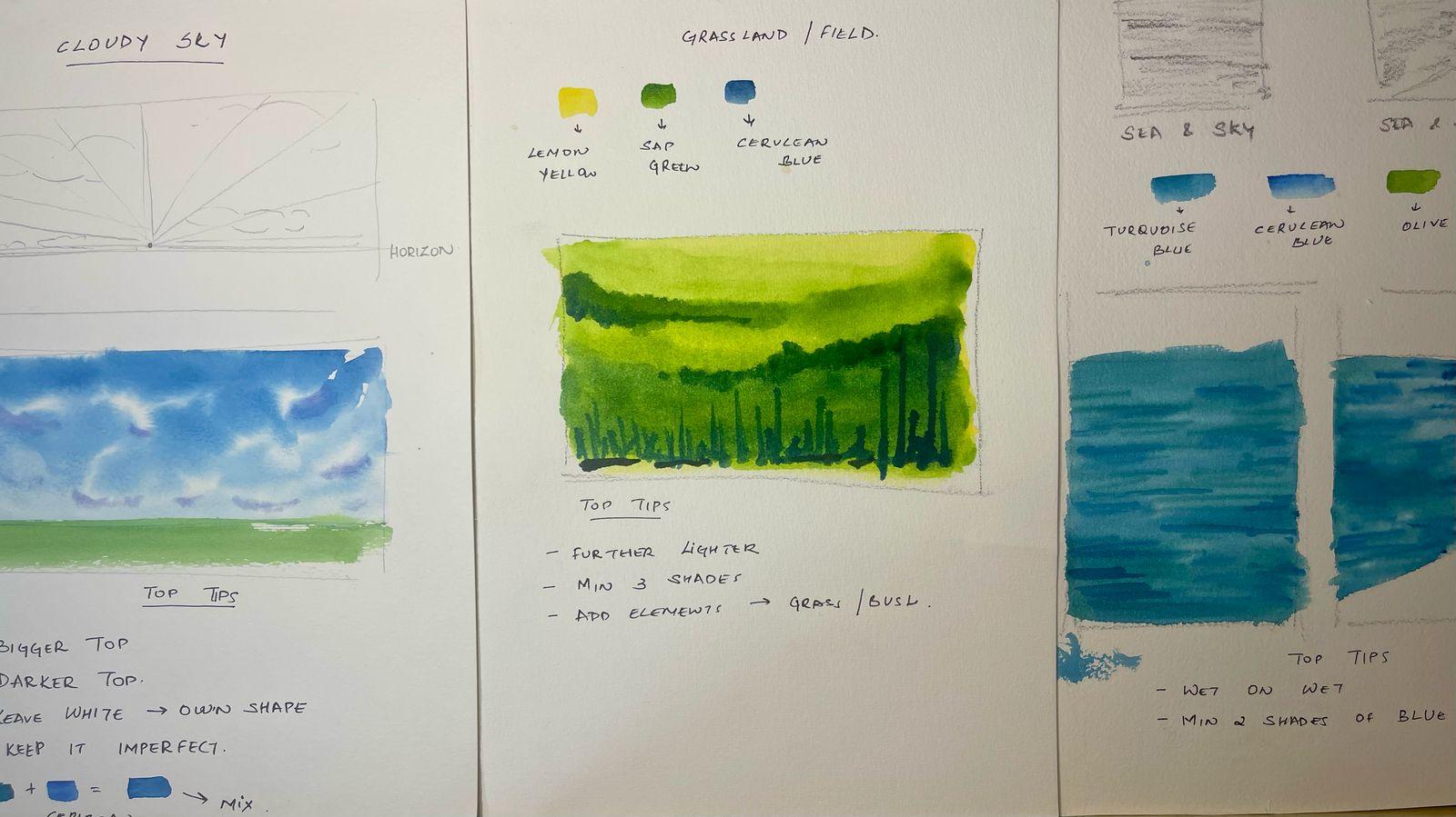
that's individual to you, you'll enjoy the process. Moving on to cloudy sky, here we huge use a slightly
different approach. I first want to show
you how to draw these clouds for them to look natural, organic and realistic. I'm starting with
the horizon line. What is a horizon
line is saline where the sky meets Celan or
the water meets Celan. I've drawn a line
in the middle and then drawn out lines
to the outside, you can see how I'm doing it. Now, this will explain to you how to draw clouds
where you'll make bigger clouds further apart on top and smaller clouds clustered
together in the bottom. Once you do this, once you complete this exercise, and you put in the colors, you will realize how
beautifully organic they look when you use this
really simple approach. Similar to the sunny sky, what I'm first going to do is
create a clean water wash. Again, I'll be taking
my flat brush. Don't worry if you don't
have a flat brush. Just take any brush. The idea is to create a
clean layer of water. Here as well, I'm going
to be mixing two blues, a turquoise blue,
and a cerulean blue. However, now the difference will come between a
sunny and a cloudy sky. Here you can see I'm not
doing a straight wash. I'm just moving my hand very organically and
leaving white spaces. The crucial thing to remember here is to leave white spaces. Those will be your clouds
and that will look organic. Please note what I've done here, I've taken the deepest tone and put it on the top
and use the lighter, less pigmented tones
at the bottom. Also, I've left more
white spaces on the top, which will be a
bigger clouds and less white spaces at the bottom. Now I'm taking my smaller
size six brush and I'm using violet color basically
to create to give this fluffiness to the clouds which make it look
really beautiful. Basically, it's like giving
a shadow to the clouds. But you have to have a very, very light hand and
light touch over here so that your colors
don't get mixed up. Cloudy skies typically will take a little more practice than
sunny skies, please do that. Practice with me,
pause this video, and show it to me
in the projects. I'll be more than happy to tell you how to improve and get this beautiful
cloudy sky that you can use in any of
your paintings. Now I'm just going to take some sap green and just where
I had the horizon line, just put in a green
field over here. The idea is just for you to understand the
beauty of the sky. Once you have that green, you can understand the beauty of it. Let's quickly recap
and get our top tips. Bigger clouds on the top, be darker on the top. Leave white spaces. Let them create their own shape. That's the beauty of watercolors that they'll create
their own shape. Keep it imperfect,
keep it organic. You don't need any
perfect skies or clouds. You just need it to look
beautiful, organic and natural. Like we discussed,
similar to sunny skies. I've used turquoise
blue and cerulean blue, but please just use the different kinds
of blues you have. You want to mix more
than two blues, you want to just
keep it to one blue. That's completely up to you
to create your own mix. If you have these two colors, please go ahead and use them. Now coming to sunset skies. Sunset skies are all about those beautiful
colors, those pink, those purples, those
yellow ochres, those reds, and how to
blend them together. That's what I'm
going to show you very three simple colors
I'll be taking violet, red, and Indian yellow, which is basically
Indian yellow, you could think of it
as a yellow ocher, or you could mix a
little bit of yellow and red to create a bit
of a orangish tone. I'm going to make
it in three layers, top, middle, and bottom. Make it asymmetric. You can put a little
bit of purple, a lot more of red,
a little bit of yellow or change that mix. But the idea is to
create different colors. That's the beauty of sunset sky. When you look up,
you'll be like, Oh, wow, today, the sky is pink. So I'm just drawing
it out for you, roughly, think of it like this. Between each of these two
layers, top middle and bottom, there'll be water that we'll be pulling blending these
layers together. It's about choosing beautiful colors and
blending them well. That's what we will dive into. All three skies start with the same technique
where it's a wet on wet technique and we'll create a clean water wash. That's what I'm doing over here. You can use different strokes. The idea is to see that you
do not get any puddles. Now I'm taking violet color, ultramarine violet, which
will be my top section. I'm loading my brush
with a lot of pigment, and that's the color that I'm adding to the top, you can see. Once you're happy with how
your violet has come out, take red, load it with red, leave a little bit of space between the
violet and red layer, and then take a little bit of water and put it in between. As soon as you put
water in between, they will blend beautifully
into one another. And right now it
looks a bit equal, feel free to put in
as much you want. Again, you can see that
when I started the yellow, I've not started from the top, I've started a little
bit from below. And when it comes to the blend, I've not taken so much pigin. I've just taken a
clear water and die. Please, please practice this. Be easy on yourself. Just do one sky, practice it a couple of times
if you need to, and again, put it in the projects and I can guide you how to
improve those skies. Once you get your skies, you'll feel so excited to do different landscapes
because you're like, Okay, I've learned
this technique. I'm going to apply it here and I know what the colors are here. I'll beautifully blend
it here. Play around. Don't make it equal,
make it unequal. I know minus become
a little equal. But as you practice,
you'll learn. Let's do a quick recap because skies are crucial and
their foundation. For a sunny sky, sunny sunny sunny sky, all we're trying to do
is create a gradient. Use two colors, go
from top to bottom, dark on the top and
bottom on the light, use clear water to
pull your color down. Then let's move to
the cloudy sky. Like I explained, keep this image in your mind
of bigger clouds on top, smaller and more clustered
clouds at the bottom, and put a very loose stroke, use more pigment on top, less pigment at the bottom. Leave a lot of white spaces. You want to pick up
the white spaces, you can also use a little bit of cotton to pick up
those white spaces, and also add a little bit of shadow to create
the fluffy clouds. When it comes to sunset skies, it's all about colors
and blending them, feel free to use your
choice of sunset sky, but do practice
these three skies, practice them as
much as possible. Don't worry about going wrong. See you in the next class.
8. Land - Sand, Grassland & Road: Welcome. Today we'll dive into another supremely crucial
element of a landscape land. I'll walk you through
sand, grasslands and road. If you take any landscape, you will need one
of these three. If it's a beach or a
seaside, you'll need sand, if it's something with the hills and meadows,
you'll need a grassland. Especially if you're
doing a urban sketching, you'll need a road.
Let's dive in. Indian yellow or yellow
occur and burnt sienna. Take out your paints and
do this exercise with me. It's very easy flowing
and a lot of fun. I'll be using a wet
on wet technique. I'm taking my flat three
fourth size flat brush and giving a clear
layer of water. It's best to do, especially when you
have a larger piece, it's best to do wet on
wet techniques because the beauty of this technique is you let the medium do the magic. As I move and I
put in the color, you'll see how the
color easily flows through when we use our
wet on wet technique. A smaller round brush and just see the way my hand is moving.
I've used as a mix. I've already mixed both
the colors on my palette, so that's why you can
see in some places it's a bit moburn Sienna and some
places the Indian yellow. And like you see,
I'm just leaving it uneven, imperfect, organic. So that's the beauty
of sand, right? If you look at sand, it's not a perfect line or perfect piece of like
a little particle. So that's what we
are aiming at doing. Just give an uneven tone. The colors should not be even at all, uneven colors, imperfect. So you have the liberty
to have a lot of fun. So do this exercise,
pause the video, do this exercise, and I really hope to see it in
the project section. Now I'm going to lower
my brush with much more pignin and this
time burnt sienna, like you can see, I'll not be
covering the entire space, but just some sections. If you have seen a landscape and you can
see specific shadows, so then you can do
it towards one side. Since I'm just
showing you overall, so I'll be just moving my brush around to give a
light mid dark tone. This is my second
tone. The first one did was the first
base light tone. Now I'll show you a super
super fun technique. Cover the rest of your
page or the rest of your painting with tissue so that it doesn't
come onto that. Take two brushes, load the smaller brush with
a lot of pigment, and now we are just
going to sprinkle, as we are sprinkling
sand on the sand, but it'll give this beautiful
texture to the sand. That's what we're trying to
do. So with my bigger brush, I'm hitting my smaller
brush like you can see, and it's going to add
a lovely texture. This that you're taking should I just just take
burn Sienna or a mix, but it should be a deeper
color so that you can see it. We'll have to do this
a little and you can see the little
sand particles coming. It's a very satisfying
and beautiful technique. So enjoy it when you
do it. That's it. Look, just so simple and you can create
this beautiful sand. So top tips, keep it uneven, have fun, keep it organic. Next is minimum use two shades. I've been saying
this repeatedly. That's how you'll get that
beautiful tonal variation and in sand, add texture. Moving to grasslands, here
I'll be using three colors, and each of these colors will be my light, mit, and tar tone. There'll be three steps. We'll be using each of these
to add that depth and tone. One is lemon yellow,
one is sack green, and one is cerulean blue. If you don't have
these exact colors, I would just tell you
to choose one yellow, one green, and one blue. Then we are going to be using
a wet on wet technique. Like I've been telling you, this is a very beautiful
technique and take some time to lovingly prep your paper for what's to come and see
that there are no puddles, keep equal layer of wet. Now I'm taking Indian yellow. I'll cover the entire
grassland section with this Indian yellow. I don't suggest you
leaving whites, but you can leave a little
bit of white if you want. Depending on how you want it, you can also use a more orange or yellow
like Indian yellow, but I love that brightness
of a lemon yellow. For a second tone, I'll
be using sack green, and this time, I'm not going
to cover the entire section. I'm only going to
cover certain areas. There's no prescription to wear. But basically what this is you want a light
mid dark tone. In some places the
light will fall more in some places the
light will fall less. Let's assume the light
is falling from above. I'll just leave a little
were of yellow and put in a little way of green so that you can use your own
intuition to do. This is our second layer. Enjoy. For the third
tone and third layer, I'm loading my brush
with a lot more pigment. This time, it's going
to be cerulean blue. I'm going to leave
the top much lighter. Think of it as the top part, which is furthest away from us, it'll always be lighter. The ones closer to us, will be way more
defined and darker. I've put in the deepest
cerulean blue below. Remember, when you put
blue on green or yellow, it will give you a
deeper green shed. And I just put a little bit, as if you can see
a little bit of, uh, you know, bushes
somewhere far away. That's why I'm just adding that a little bit of
depth and texture through um putting it just in a little
places, not everywhere. Now I'm going to
lower my brush with a lot more pigment
of cerulean blue. You could also add a
bit of red if you like, and it'll give a beautiful tone. I'm putting my brush
at a 90 degree angles and just putting pressure
release, put pressure release. These are your closest grass that you can see
from right close. Always remember the things that are closest
to you will have a lot more definition or details than the ones
that are away from you. Since this grassland, these
grass is closer to us, you'll be defining them
in singular strokes. Like I've been seeing it along, top tips further away
will always be lighter, and this is true not
just for grassland even for mountains
and other things. Add minimum of three
shades and add elements like grass or bush,
a little bit here and there. Roads come really handy when you're doing
an urban landscape. They could be different
shapes of roads like a triangle wedge all
converging towards one point, or they could be a
meandering road. Both these I'm drawing our
one point perspective. For the purpose of this lesson, I'm not going to
get into shapes, but how to approach this
in terms of colors and how to add texture and make it look purely realistic and
organic and fun. It's really important to choose the right
color for your rod. You can choose to
use black directly, but the beauty of any road is you never see it
as an even black. You see different shades of colors depending on
whether light is falling, what the material used for the road is and
different things. What we want to do here
is mix three colors, burnt sienna, pains
gray and red. If you don't have pains gray, just use a mix of blue and red. You can see I've got this
beautiful shiny black on the right side
that you can see. So he just pause
it with your hair, take out your colors
and try mixing this color because in the road, the technique and layers are not as important as
getting the color right. So the beautiful black
ish, sort of a color. Now I'm going to load my brush with this mix that we
currently created, and I'm going to put
the first layer. So I'm using a thicker brush
because I want to cover a lot more ground in place
of your area of your road, you're going to put that color. Why are we not using This technique is
called a dry technique. As you saw before, we'll be using a wet
on wet technique, and now we are using
a dry technique. Why are we using a
dry technique here? Because roads are
not easy flowing. You have sand and you
have grasslands, sky. That's a part of
nature, so they're easy flowing, but roads are not. We want to give a deep color, and then that's why we are
using a dry technique. And now I'm going
to go ahead and add my second layer because I
don't want it to be so light. But you can decide how much
you want to add over it. So you can add two
layers or three layers, but let each layer dry. You can see a little bit of
brown where my finger is. That's the beauty of
mixing the colors. To create that road
divider that we see, I'm going to be
using a guash color. You can do this the other way by leaving
that section white, but that's just too difficult. So take a Gauche, white, or you can take a Posca it ten. Use one of your older brushes on use of good brushes for this, and I'm going to take
it directly from the tube and add
the dot divider. Now, even the divider, just keep in mind the
further away it is, the smaller it will be
the closer it is to you, the bigger and
thicker it will be. So that will give you that perspective
that you're looking. The closer they are,
they'll be darker and they'll be more wider and the further away,
they'll become thinner. Whoo. Now you can add land, Skylans, roads to any landscape. Please try it. Just practice one if you like, and please put in
the project section. My top tips for the road are the further away it'll
it'll be slightly lighter, and that's why it's
lovely to mix color, and the further away it
will also be narrower, both the road and the divider.
9. Water - Sea & River: Welcome. Today we'll explore painting different types
of water in watercolors. I'll show you how
embracing imperfection and letting the medium guide you creates the most
natural results. We'll start with the C.
I'll first use a pencil to draw out how the sea is going to look so that you can
understand tonal variation. Here we'll explore two
different kinds of seas. One, where the sky
meets the sea, which you can see on
the left hand side, and you can see, I'm just
drawing out the waves. Over here, it's about
basically creating a tonal variation and creating those deep and light
waves of the sea. And on the right
side, I'm going to be doing land, sea, and sky. So you can understand when you go to a beach or something, you're sitting on the beach, how you will approach the sea. The main difference here will
be the waves towards land, how we will approach them, and how best we can let Watercolor do its
magic with water. Let me first walk you through what are the colors
that you'll be using? You'll be using three colors. Two shades of blue
and one of green. Yeah, I know it's surprising
where am I using green. But once you put in
green into your blue, it will create such a
beautiful depth in your sea. You'll notice how
beautiful it is and then you can experiment with
different types of green. So turquoise blue,
cerulean blue, and olive green are the
three colors I'll be using. First, I'd suggest
you to quickly draw out the horizon line
like we've discussed, Horizon line is a
line where the sky meets the land or the sea
meets the sky in this case. I'm using a three
fourth size flat brush. You can use any brush. The idea here is to
create a clear water wash because you're using a wet on wet technique to
create that beautiful, imperfect organic
watercolor style of water and not
control it too much. Wet your paper, see that
the waters evenly spread. Now I'm loading my brush
with a lot of pigment. This is a mix of turquoise
and cerulean blue, and I'm using you can just
see the angle of my brush. You can see that I'm trying
to cover maximum space, and that's what I
checked over here, see how I'm moving the brush and the angle of the
brush is y flat. I'm intentionally
leaving a lot of whites. The white is where the sun is glittering on different
waves of the sea. So leave a little bit of white, not like the way that you
do in the sky and clouds, but as in where you can. Now I'm adding green to blue, and I'll add in a
deep shade over here. So again, load your brush
with a lot of pigment, mix blue and green together. Now, you see that beautiful
color that's coming around. And now what I'm doing is I'm
trying to create the waves. So I'm not doing a full spread. I'm moving from each side. So either go from left to
right and then from to left and the middle part will
remain a bit of a shimmer. What I did here is I took my
brush and tried to remove some color so that it has
an uneven look to it. Now that you've created
the background waves, we create the foreground waves. See, I'm putting my brush
at a 90 degree angle. I'm using the tip of my brush and I'm creating more
pigmented strokes. What this does is it shows us those waves that are moving. It gives that
beautiful movement. So the technique is
that your background, use a flatter side of your
brush at a flat angle, and then for the foreground, you use it at a 90 degree angle. This is the effect you'll get. When painting C, you just
need to go with the floor, let the paper always
stay a little damp. For a sea meats land scene, we'll use a very
similar technique, but you'll notice how the waves behave differently when
they approach the shore. Similarly, with a wet
on wet technique, we'll take a flat brush. If you don't have
a flat brush, use a round brush, don't
worry about it. All you need to see is that you create an even layer of water, and there are no puddles
anywhere in that section. I'm going to lower my
brush with a lot of pigment and see how I start at the edges of both sides and just how we shaped
out the shore. We're going to use
that same shape to guide us for
the water as well, and towards the shore, it'll always be deeper
and towards the end, leave a little white so that
you get that beautiful, you know, way of how
the sun hits the sea. That's the beauty of leaving the whites and letting
watercolor do its own magic. Now we are going to create
the more defined waves. I'm using a smaller size for
brush and using only the tip of my brush and I'm trying to create that
shape of the shore. I don't do it like a defined
line, create those strokes. Go with the flow
as you see curves. Wherever there are
curves, it'll be darker. Define those waves
through the curves. I'm moving back now
that my sea and sky is a little dry and
adding strokes there as well. For the final defined strokes, you can wait for
it to dry a little bit and then create it so that, you know, but don't overdo it. Just put a little strokes
here and there as you feel like adding more tonal
variation to your painting. Now that my painting is almost
dry, it's a bit semi dry. It's not completely dry. I'm going to go and add
a few final strokes. This you leave to
your own intuition on how many strokes and
when you want to do it. I'm doing it in
three simple steps. My first step was
creating the entire blue. Second was defining
the waves and third is adding these
specific waves. Go in and define the waves wherever you feel could use
a little more of depth. My top tips on this section, use a wet on wet technique. That's the best way to create this watercolor magic and use minimum two shades of blue
to create a tonal variation. Now we'll be moving to a river. I'll be showing you two
different types of river, a moving river,
and a still river. The difference
between them actually only come in the
detailed stroke. Again, I'm drawing this out to show you the tonal variation. Similar to C, we'll start
with the broader strokes, and now you can see the darker strokes are actually the waves. The first layer will remain the same when we move
to the still river, only the second layer instead of us giving the waves
from right to left, we will be showing the shadow of things that are around it. I'll be going from top to
bottom. Like you can see. It's very similar to the sea, so I really encourage you
to put this video on pause, take out your supplies
if you haven't already, and paint the river with me. You all you need
to do is practice. Same colors as the sea, two shades of blue and
one shade of green. If you don't have
these exact shades, take any two shades of blue that you have
and one shade of green and you'll
be able to create a similar kind of magic. If you haven't already, again, I'm repeating myself so
that you actually do it. Go take out the supplies
and paint with me. Now I'll be using a
round brush instead of a flat brush because
the area is smaller. But if you're doing
a huge river, do you use a flat brush. Again, here we are doing
a wet on wet technique. So what we want to do is
create a clean white wash. So see that there
are no puddles. Now I'm taking a mix of
the three colors that we discussed and I'm creating
the background of the river. When here, I'm moving
from left to right, even in the base layer. So you move from left to right. That will be the same for
both moving and still, and now I'm adding
the second layer, which will be giving
it a lot more depth. And this is also very three
easy layers, the background, which will cover more, adding strokes and
then we'll go ahead and add some detailed
strokes a little later. So, um practice with me.
This is very similar. Take out your colors. I'm repeating it again. I would love to see what you've
done in the projects. But please do practice. That's the only way to
get better at this. I'm taking my smaller brush, loading with a lot more pigment and adding my third layer, which will show the strokes. Wherever the whites are there, you see that I'm
letting the whites be. I'm not really
covering the whites, and we give it a natural look. Just go with the
shape that you've chosen and just put a few
strokes here and there, go with your intuition on this. Now moving to the
still river, again, using a wet on wet technique to put a clear layer of water, and then we will do it
in a three step process. Very similar to
the moving river. Only the second step will
be slightly different. The first step is again
the same where I'm going to be mixing the three
colors that we've chosen, turquoise cerulean
and olive green, and put it and start
from the edges, move from left to right, leave a lot of whites in between. The second layer is
also very similar where I'm moving from left
to right and creating depth. It's a third layer where you
would see the difference where the difference will come in instead of moving
from left to right, we'll move from top to bottom, we'll get to that right away. Now I've taken a smaller
brush, put my pigment, you can see how I'm moving I
am moving from left right, but I'm moving from
top to bottom as well. Why am I doing this? There's always what
happens in a still river, there'll always be
something around it, a tree, hut or something for which the shadow will fall on the still river. And that's the beauty that
you're trying to capture. It's a very subtle
difference, but it'll really, you know, create that organic alistic effect
at the end of your painting. So do try it. My top tips, use a wet on wet technique, keep it minimal and take
minimum two shades of blue. If you haven't already, I urge you to take out your supplies and try
the river with me.
10. Hills - Summer & Winter: Welcome. Today's
lesson about hills, Hills form the backbone
of any landscape. So once you learn in these three simple
steps how paint hills, you can add them
to any landscape. First, I'll start with
drawing it out in pencil to understand how we'll be approaching
the painting. So draw your horizon line, and here I'm drawing
it in such a way that a major hero of the drawing or the painting
will be the hills. Like you can see,
there are few hills on the foreground
which are bigger, and then you can see certain
hills in the background. Now I'm just putting
out a little bit of grasslands which
will be in the front. Assuming the light from sun is coming from
the left hand side, you see all the shadows
on the right hand side. Drawing these shadows
out to explain where the darker tones will come when we
get to the painting. Now, when you see hills, you see many different colors. But what we're going
to try to do is keep the colors as organic
and natural as possible. I'll be using two shades of
green and two shades of blue. Now, why blue, you may ask. When you see any
hillscapes you see the farthest ones are
really far away from you. They almost merge into the sky. The further ones
will be in blue. W are these? You can use any two shades of
blues and greens. The shades that I'll be
using are stack green. And olive green, and I'll be using turquoise blue
and cerulean blue, mostly because these are the
blues and greens I have. So, feel free to use any two glues that you want and any two
greens that you want. The greens will be the
hills in the front, and the blues will be
the one at the back. Super. Let's dive in. I'll be using a wet
on dry technique, meaning your paper is dry, but my brush is loaded with a lot of color and a lot of pin. Why am I choosing this
technique over here? Because I don't want
the hills to be free flowing like the
sky and the water. I want them to be a
little more defined. That's why this
technique works better. First, I'm going to give a
base layer of the greens and the greens will be
the ones in the front mixing both the greens
and putting them across. And use different shades. So if you're using
two different greens, put more of sap green in one, more of olive green in one. All your hills won't have to
be the same color because then you want to be able to differentiate the hills
the way you would like. Now I'm using a
shade of blue or a deeper green and putting the
shadows towards the right. If you want your hills to
look three dimensional, it's very important to create
depth to lighten shadow. That's how simple this is. I'm going to put one layer like your base layer and
then one shadow layer, then you put in a
little more highlights. In this layer, just on
the right hand side, assuming my son is on the
left, on the right hand side, I'm putting deeper shades of the same color or you can choose a blue to add
it to the green, which will make it
a deeper green. Adding a little bit of grass in the front so this is just
like dot dot dot, dot, dot, dot, because your pages already wet a little
bit, from your hills. Add in a little bit
dots to get that depth of that beautiful little
grasslands that are there. Now I'm drying out my brush, like you can see, and I'm going to load it with blue color. Now let's do the
hills or the back. For this, I'm taking mixing
the two shades of blue, and I'll also put
in a little bit of green and do this very gently so that you leave the definition of the
front hills as they are, but also add the beauty
of the further of hils. Now, I'm doing the same for
the other hills as well. So please pause this video, pull out your colors
and try this with me. I really would love to see your hills in
the project section. Even the ones that
fail, that's the joy. It's over there that
I'll be able to help you and guide you on how you
could improve your hills. Hills are really crucial. So please practice, practice, practice, practice
them in isolation. They really don't need to be a part of a bigger landscape. Like you saw, you just added in a little bit of shadows
on the abo hills as well. Now you can see the background
on the foreground hills. So once you add in the
sky and the land and all, you'll be able to see
the entire beauty. But like I said, just
keeping in one element at a time to go on and
practice your hills. My top tips for the hills as
we've been discussing are that add shades of blue
and shades of green. Look at the direction
of the sun add shadow. Keep the ones that are
further away the light is without great definition and
the ones that are closer, add a little bit of
details and highlights, select a little bit
of bushes or grass. Let's jump into winter hills. So for winter hills, I'll be teaching on two different
types of winter hills. One are normal, winter landscape and their hills and one will
be snow peaked mountains. I simply love the snow peak mountains because
I'm going to teach you this super easy and
super fun technique called a dry rush technique. So we practice that a lot
before we jump into it. So over here as well, the direction of
the sun is super crucial because it will give
us where our shadows are. So if you've watched a
lot of my lessons by now, you know, it's all a game
of light and shadow. Figure out where the sun
is and the shallows and ala. You have a beautiful
three dimensional hill, grass, sky, whatever
you name it, right? So snow peak. Let's quickly draw that out. These will be sharper
edged mountains and you'll see they
just snow on the peaks. I want to draw it out first. Sorry for all the
background noise, guys. I live in a city. There's a
lot of noise. Can't help it. So yeah. So here is the
snow peak that you can see. So just drawing it out to tell
you where the shadows are and what we'll be doing and now we can jump into the technique. Grab your paint palette and
try this technique with me. In my palette you
can see there's already a little bit of blue. I'm not going to
take fresh blue. I'm just going to scrub
my very dry brush. I don't have any water
on my brush on it, and I'm just going to
put pressure and move. You can't see
anything right now, so I'm going to go back in and take a little more pigment, but just see that it's more
of pigment and less of water. If you need to add
just add a little bit, like a drop or two
and then dry dry out, and then just move
it in strokes. See? Wow. This is what
I was trying to get at. So this will know when it
integrates into your landscape, it's going to look
really beautiful because this will
create your peaks. So in some places, you'll
add a little bit more color. So some places you'd
keep it like this. But overall, the effect
will be beautiful. And heads up guys, like everything in life,
you need to practice this. So it's called a dry stroke
technique. So stop here. Practice it in Lilvet
and then when we get to the actual hills,
you can try it over there. I realize I haven't specifically told you about the color yet, but you'll be using
the same colors, cerulean blue and
turquoise blue. Mix any two blues that you
have with you and paint along. So um, I'll be doing similar
to the summer hills. I'll be doing a wet
on dry technique where my paper is dry, but my brush is
loaded with pigment. You can see over here, I'm
not covering every part. I'm putting it very loose
because since it's winter, we can leave, you know, paper white, like we call it. Was paper white that you let parts of don't put
pigment everywhere. So let that white
of the paper show. And like we discussed
further away the hills are, they'll always be lighter color. Over here, what I'm doing, I'm not using a different color. I'm just putting a little bit of more water and adding that. Now I'm adding in the shadows. Since the sun was coming
from the left hand side, all our shadows will now
fall on the right hand side. You can see and remember, you need to do this
when the paper is wet itself because you don't
want super defined lines. You want it to be
very soft your hills. The paper needs to be semi wet, you need to do this
all in one go. Keep practicing it
and it'll become almost second nature when
you do it a couple of times. I hope you practice the
dry brush technique. I'm using my smaller size four round brush and I'm
mixing two different glues. I don't have much water. It's pretty dry and you
can see I'm just moving my brush in a quick stroke. So you need to do
it really quickly in order to get that effect. At the bottom part of my hill, I'm going to mix a
little bit of water in the blue and let
that be because like, you know, the snow will
be on the top parts. So um, that's how
I'm going to do it. Again, I'll put my shadows
towards the right. To define the
mountains on the top, you can maybe just put a
little bit of definition. But keep practicing
this technique. It looks really beautiful
once you get it, and it's actually quite
simple and a lot of fun. Now for the deeper layers, which will be your shadows, you can use a cerulean
blue, you can use a pains. You can even use violet,
that is gray color, and just on one side of your hills based on where
the shadows will fall, put in some depth over there. I want the hills at the
back to be too defined, but I still want to
show snow peaks. So what I'm going to do is
leave a little bit of white, the paper white in places. And this section has more of water and less pigment
because further away, we don't want them
to be very defined. When I look back at the first
set of hills that I made, I feel like they need one
more layer of shadow. So even though they are dry, I'm going to put in a stroke
of shadow and then I'm using water to so that they're
not defined lines. But this is your fall to
take if you are happy with your um shadow layer. Don't do this. But I'm showing this to you in
case you want to do this. So super easy guys, I'll just need to put
the base layer and then put the shadow layer
to give that depth. And as you put in
the other elements, the entire landscape
comes to life. Um, so please practice this, give this lesson a pause,
and go and practice it. Now coming to my
protein. Keep it soft. You want a winter landscape
to look very soft. Don't give many hard lines. Use minimum two shades of note. And for the snow, like
I've been harping on the dry stroke technique
which I absolutely love, be try it, and then you can even use it not
just on the hills, but any part of a winter
landscape. It's super fun.
11. Thank You: Thank you for coming with me to this beautiful
element adventure. I can't wait to see the
two to three elements that you choose and try
with these techniques. See share your projects
in the project section. Even those just in
attempt, not happy ones. I'll be happy to jump in, provide feedback,
and cheer you on. And if you enjoy this class, I'll be really happy if you
could leave me a review. It will help other students find this little corner of
creativity at SkillSix. Want to know my behind the
scenes, what I'm working on, what colors are mixing, find me on Instagram and follow me so that we can
enjoy each other's journey. Happy painting and
know that landscapes are just friendly
little elements waiting to be discovered, one light, one shadow, and one stroke at a tie.
 Khadija Karachiwala, Watercolour Artist