Transcripts
1. Welcome!: Hi, there. I'm so excited to welcome you into this class
where we're going to be learning all about sketching and painting
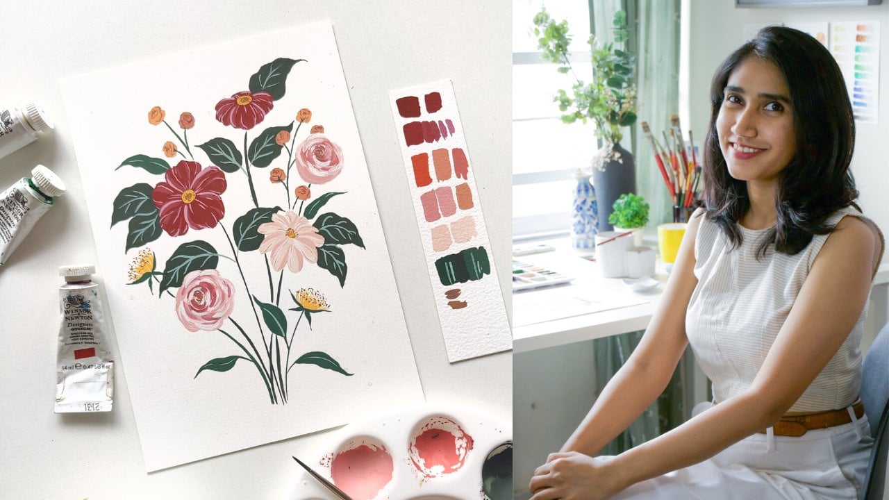
birds with Gouache. But first, who am I? My name is Shivani
and I'm Gouache artist and Naturalist
illustrator based in the sunny city of
Chennai in the south of India. I've been painting
with gouache for over three years and ever since I started
working with it, I absolutely fell in
love with the medium. It has a beautiful
matte appearance and it dries completely opaque. And that's one of the
reasons why I find gouache really well-suited to create
Naturalist paintings. Gouache ended up
tying really well together with my fascination
for the natural world, including wildlife,
bugs, butterflies, birds, and even flowers. While gouache is of course, my favorite medium to work
with and the medium that I'll be choosing to work with through the duration
of this class. You can feel free to work with whatever medium you're
comfortable with. Acrylic paints are fine
too. Through this class, I be taking you through all the basics of
Art and Sketching. We'll start by learning all the basic foundations
of sketching, including lines, shapes, forms, and then we'll move on to
color, texture and space. All of these will
tie together really well as we approach
our final project, where we're going to paint a beautiful
Hummingbird together. This class is going to be well-suited for any skill level. So whether you're a
beginner, intermediate, or slightly more
advanced artist, please don't hesitate
to take this class up. There's definitely going to be something new for you
to learn in here. If you're at a beginner level, then I'm going to guide you through every single
step of the process. And I'm gonna make it
very simple for you to be able to Sketch
Birds of your own. I'm so excited to see what you come up with at the
end of this class. For now, let's dive into the next lesson where
I'm going to tell you few more details about the Class Project
and see you there.
2. The Class Project: Artists who enjoy
Naturalist paintings usually take one of two routes. Either they could go with a very scientific illustration
style where everything is very precise and
they trying to convey details exactly as
we see it in nature. The purpose of this is to
be very representative of the species and therefore
accuracy is essential. On the other hand,
though we have artists who like to paint in a
more illustrative style. And the options
there are endless. When your painting in a
more illustrative style, you're essentially trying
to convey the details of the species that you're
featuring in your artwork. But you're not very rigid
about all of the details. You want to be able to
convey a few details, but at the same time, keep it Fun and playful and expressive. My own painting style is
somewhere in-between. I tried to make my Illustrations slightly realistic,
but not hyper-realistic. So that means that I
do tend to play with the few details or
exaggerate a few details. And I'm not so caught up in conveying things precisely as
they are. In today's class, we're going to be painting
a Hummingbird together. Keep in mind that
I want you to feel free to play with this
and make it your own. There is absolutely no need to be photorealistic
in this class. You can feel free to explore your own Art style as you
go through this project. When we paint this Hummingbird
as the Class Project, you're going to be applying all the lessons and exercises
that I take you through, through the duration
of this class. So it's gonna be very
simple for you to get started with your project. I'd like to repeat here that you don't need to be intimidated by because you can feel free
to play with it as you like. We just want to
convey the species, in a way that it's
recognizable as that species, but there's absolutely no
need for photo realism. So join me in the next lesson
where we're going to talk more about the materials that you're going to need
through this class.
3. The Materials You Need: So before we get started with the juicy bits of this class, Let's talk about
all the materials that you're going to need. Everything is laid
out in front of you and we'll go
over it in detail. Also, please keep in mind that some of these are optional. So if you don't have
them on hand right now, no problem at all. You can still progress
with the lessons. Don't let that deter you from making progress
on your class. The first thing
you're going to need are a couple of good pencils. I've got a mixture of a H-pencil, a
2B and a 4B. Again, you can use
whatever you have on hand. That's completely fine. Don't feel the need to buy something specifically
for this class, but it will be good
to have a mix of some harder pencils and
some softer pencils. Then of course we've
got the Gouache paints. I've got a mix of
different colors here. And what I'm using are Winsor and Newton
designers gouache. Some of my colors
are Holbein gouache, but I mainly work with
Winsor and Newton. The way I work is
that I've got all of my colors that I own laid out this air-tight palette here. So you may see me using
this during the class, but I'll tell you exactly
what shades I'm using. So don't worry about it. You don't need to have
a palette like this. You can totally just squeeze the colors onto your palette
and work from there. Also, if you're
working with something like the himi Jelly Gouache, that's completely fine too. Just expect a slight
different outcome when you work with these
because they're not as high-quality in terms of
the paints and pigments. But if that's all you have on hand right now, that's fine. You can get started with that. And if you don't have
gouache and would prefer to work with a
medium like acrylics, That's okay too. In this class we're going
to be learning a lot of fundamentals of drawing as well. So it's not just
about the painting. So please feel free to work with whatever you are
comfortable with right now. Let's talk about the paper next. Gouache is a very
forgiving medium when it comes to the paper. So you don't have
to worry too much. You can either go with 100%
cotton paper like this, Lanaquarelle one
that I've got here. Or you can use a
cellulose based paper like the Canson Montval. This is a really good
paper for beginners. I would highly recommend
getting started with this. If you don't have any other
paper, you can get this. So this is a cold pressed paper, and this is a hot press paper. You also get this in a
cold pressed version. If you prefer texture
in your painting, then go with cold pressed. If you prefer something
really smooth to work on, then go with hot pressed. But I leave that choice to you. Then we would need
a sketchbook or even loose sheets of paper if that's how
you prefer to work. This is where we're going to be doing all of our practice exercises, linework,
brushwork, all of that. And in fact, if you prefer to do your final painting
also in the sketchbook, that's completely up to you. So you could have papers
and a sketch book, or you could just work
with one of them. The brushes that I
use are largely from the Princeton velvetouch range or the Princeton heritage range. I really loved these brushes
and I highly recommend them. But if you have any other
beginner brushes on hand, you can start with those. So what you're going to need
is a mix of Round brushes, ideally in size 2, 4, 6, that would be a good mix. And then you're going
to need a couple of small flat brushes. I've got these two here. This one is a Size
zero Flat Brush, so it's really small. And this one is a
size six Flat Brush. Finally, I also have a
Filbert brush in size 0. Again, please keep
in mind that none of these are
absolute must-haves. If you have them, that's great. If you don't, that's fine too. But these are just
what I recommend. You're going to need either a
kneadable eraser like this. If you have one on hand or
regular eraser is fine. You're going to need a water
jar, ideally two jars, one for your first rinse and then to finally clean
off the bristles. A scrap piece of cloth to
wipe off your brushes, or even paper towels
are fine. A palette. So you could use
a plastic palette with wells like this one, or you could use a flat
ceramic or plastic palette. I like having a Spray bottle
on hand with some water filled in it just in case I need to Spray and
mist my paints. Then I've got some
tracing paper here. Again, this is
completely optional. If you'd like to trace your Final sketch onto
your final piece of paper, then you can use tracing
paper to do that. I also like having some
scrap pieces of paper like these on hand so I can
swatch my colors as I go. And finally, I like to have
some Colour Pencils on hand. We're going to play
around with these, try to see what kind of
texture we're able to bring in. For these, you could
use any color pencils in any colors that you'd like. We're just going to
play around with them a little bit. In this class, While I will be giving
you all the basics of gouache that you need in
order to paint these birds. I'm not going to go into
too much detail about the medium in case you'd like to dive deeper into
understanding Gouache, I'd recommend checking out
my Gouache one-on-one class, the link of which is
in the description. I'll see you all
in the next lesson where we're going to talk about the different elements
of Art which are going to form really
strong foundation for you.
4. Elements of Art: Depending on who you ask, there are many different
elements of design or Drawing. Many people might say
there are five elements, some people define it
as eight elements. But in today's class
we're going to stick to five elements that are relevant
to what we're learning. The five that we'll be
discussing are line, shape or form, color,
texture, and Space. Line is of course the absolute base element
of any kind of sketching. Sometimes DOT is categorized as another element and
multiple dots from a line. But today we're just
sticking to Lines. We'll be practicing
different kinds of lines so that you can develop your
confidence with your pencil. Then we'll talk about
shapes and forms. Again, these can be defined
as two different elements, but for the sake
of today's class, I've grouped it together as one. Shapes are two-dimensional. But when you add the third
dimension of width to it, then it becomes a form. The next one is color, which is one of my favorite
topics to talk about. We'll be going through
some simple exercises and a few simple rules help you mix color with ease.
Then there's texture. When you're able to use
all of your linework or your brushwork to bring
Texture into your paintings, it can really bring
your paintings to life, especially when you're
doing Naturalist paintings. So that's something that
we'll be discussing. Finally, Space. A basic understanding
of space helps you create compositions that are
well balanced and cohesive. Over the next few lessons, we'll be discussing each of
these in a lot more detail. And we'll be doing a lot of practice exercises to help you get more
comfortable with them. I'll see you in the next lesson.
5. Element 1 : Lines: The first element
that we're going to discuss and practice is Lines. To get confident with Sketching any object or any form
that you'd like to, you need to first get
confident with your line work. So let's just start playing in a sketchbook with a
few different lines. And what I want
you to do through this entire exercise is to
start getting more confident. What tends to happen
as a beginner is, instead of being able to do a confidence
stroke like that, you go really slow and you get little shaky
with your lines. So in case that's
the way you feeling, what I want for you is
to get as confident as possible so that you're able to make confident strokes
on your paper. Try to practice as much as you can till you get
closer to that point. There's no perfection here. Don't get intimidated, just keep trying and you'll keep
getting better at it. So let's start with
a few short strokes. Let's start with some
vertical strokes. I'm using my H
pencil to do this. You can use any good pencils
that you have on hand. Just keep drawing a few
short vertical strokes, trying to get more and
more confident with it. Next, let's do a few
short horizontal strokes. Now we'll try some diagonals. Keep varying the pressure that you're putting
on your pencil, varying the length
of your strokes, just trying to be
more fluid with it. Keep in mind again that this
is just a warm-up exercise. There's no perfection
that we're aiming for. Your lines don't have to be 100% accurate or 100% straight. The goal is only to
gain confidence. Now let's try a few longer
horizontal strokes. Tried to keep your hand
as steady as possible. A good tip here is to
not rest your wrist on the table because then you will be unable to move your
hand beyond a point. Instead, tried to rest
your forearm and keep your wrist free so that you're able to drag your hand
across more freely. This just helps you loosen up a bit when it comes
to your sketching. Let's try some longer
vertical strokes as well. Look at how I'm
holding my pencil. I'm not holding my
pencil here because again, that makes your movement
very restricted. I'm holding my pencil way at the back here so that it's just easier for me to move my
hand along with the pencil. Now let's try a few curved strokes. Try to put more
pressure when you start your stroke and
lift it off gradually. This maybe a little
hard at first. Again, as a beginner, you
might be holding onto your pencil too tight and you may be able to
make lines like this. That's totally fine,
but try to slowly start loosening up and creating Strokes that had
a bit more free. And then we'll create
a few curved lines. In this case, try to maintain consistent pressure
on your pencil across the entire line. Once you're done
with all of these, I would also
recommend picking up a darker pencil like a 4B order 2B if
that's what you have. And trying out similar
strokes with that pencil. You'll see that there's
a lot of difference in the darkness of the stroke and the intensity of the strokes that
you're able to create. The reason we're doing
this is just to get familiar with the different
tools that we have on hand. So try to repeat
this exercise with all the different
pencils that you're going to be using
across this class. Great. Practice this
as many times as it takes for you to get more and more
comfortable with it. In the next lesson,
we're going to talk about the second element, which is Shape or Form. I'm really excited
about this one, so I'll see you in that lesson.
6. Element 2 : Shape or Form: Now that we've gotten
comfortable with lines, let's talk about
shapes and forms. Basically, every object
that you see around you can be broken down into its
basic shapes and forms. That makes it so much easier
for you to then be able to sketch anything that you see and anything that
you want to sketch. What's the difference
between shape and form? Shape is flat and
two dimensional, whereas form is When
you take a shape and convert it into
something three dimensional, let's start sketching
some shapes and forms and try to
understand that better. First, let's start with
a few basic shapes. And the first one that I always like starting
with is circles. Try to just sketch some circles. It really doesn't matter
if they're not perfect. This is just to get
more comfortable with sketching rounded forms and to just free up
with your pencil, just like when we
were sketching lines. Now let's try to sketch
a few boxy shapes. So these can be different kinds of squares and rectangles. Then we'll sketch a
few organic shapes. Basically, when you
take lines and enclose them so that there's some space trapped
between the lines, it ends up forming a shape. Now let's look at the difference between a shape and a form. How do you communicate form and three dimensionality
when you're sketching? Let's take the
example of a circle. Again, the three
dimensional form of a circle is a sphere. To show a sphere, this could be done in
the form of line work. Let's try to draw some
access lines on this sphere. You see how immediately
you're able to perceive it better as a
three dimensional form. Similarly, if we
take a rectangle, we add the third
dimension of depth to it, we are able to convert
it into a cuboid. We're just using parallel
lines to do this, just like we learned in school. Let's look at cylinders. To draw cylinders, you're
just going to use ovals, which is another two
dimensional form. If two ovals were
to be connected by a rectangular tubular
pipe like thing, then this forms a cylinder. Now let's try to
curve a cylinder. You want to keep
your lines padlel, draw a oval shape on the top
and just a curve at the end. Immediately that
looks like a macaroni which is of course
three dimensional. We're able to perceive the
three dimensions of it. We're able to perceive
that it has some depth. All of these are just by how
we create the visual of it. We are, of course, sketching
on a flat piece of paper. And what we're doing, of
course, is two dimensional, but we're able to create
the impression of depth just by the lines and
the shapes that we're using. You can even use shading or access lines to further create that
illusion of depth. Now let's look at a
few objects around us. You can pick any object that you'd like to for our exercise. I've got a few printouts here which we're
going to look at. Let's take this
banana as an example. Again, try to view it
as shapes and forms. Try to see how the
light and shadow is allowing you to perceive
this as three dimensional, even though it is printed
on a flat piece of paper. Just by understanding this, you're going to
improve how you're able to sketch
objects around you. This, of course, can be started
by a very tubular shape, just like we did a cylinder. This again is another
cylinder here. Let's just quickly draw that. Like I said, we've got
quite a cylindrical body, but of course there is a
taper at the top and bottom, but we'll do that next. Let's just start with
a curving cylinder, then let's start to taper that alphabet on
top. Like I said. Again, we've got
another cylinder that has a taper like this
and it has a bulge here. This is just a cylinder
joining with another cylinder and then there are a few
diagonal Ish lines here. Then again, you have some diagonals here and
that ends the banana. It's that simple to be
able to sketch this. Of course, we've picked a very
simple form to begin with, but by understanding this, you're going to
be able to sketch anything and everything
so much better. Then there is the shadow
that's falling on this side, just by adding a few
bits of shading, just by scribbling on it. Even you don't have
to be perfect. You are again able to bring
in that element of depth. Then we've got this
flower, which of course, looks very two dimensional
because it's front facing. But you can very easily use shapes to sketch
something like this as well. We've got the circle
in the center. We can use a circular guideline, almost creating like a doughnut to inform the length
of the petals. This is just a guideline, I'm sketching it very light. Then we have the petals which themselves are very
much like ovals. And you can have some shorter
ones, some longer ones. Then again, we have
a cylindrical stem, which is at first just created
using two parallel lines. That's just lines, but by adding this little curved
line at the bottom, it starts looking
three dimensional. Then once you shade
one side of it, it immediately looks a lot more natural and
three dimensional. Even the center of the
flower is just formed by all of these tiny
little circles. Here we have an orange,
again, very circular. You can start off with almost perfect circle and then start trying
to observe shapes. In nature, usually are
not absolutely perfect. There are imperfections
and there are little dents and things like
that that make up the shape. If we were to treat this
as a perfect circle, it would come somewhere
here immediately. Once I draw that
circular guideline, I can see that this is
going inwards here. There's this little bit of dent. This top surface may
be a bit more flat. Once I get rid of
that guideline, starts looking more natural, more like an actual orange. Let's look at this leaf here. This is very triangular, right? I can take a baseline like
that and I can try to observe the triangular shape of the leaf and then
build over that. Since we're going to be drawing
birds today, I thought. Let's look at another creature from the animal
world as an example, let's look at this
little lady bug here. As you can see, the
overall shape is egg like. An egg like shape is basically an oval but more
tapered on one side. It's like an upside down egg. That's the base shape
we're going to use here. We've got the base shape, then we see that there
is a division here. This portion is very triangular. We'll try to create that. Then we have this separation, and then there's a
central line going down. And then of course
there are these spots which are again, very oval like. That's it, that's your lady bug. Now let's look at
what happens when this lady bug is at
more of an angle. This was flat and everything that we've
done so far has been F and straight up when you
look at it at an angle, things start getting a
little more complex. But again, you can very easily break things down into
their base shapes. Again, here it's
very semicircular. That could be our
starting point. The overall shape is
very semicircular. But we do see that the
head is bending down. This part could be
treated as a trapezium. Let's just make
that division line there and have it go
downwards like this. We've got that head section. Then of course
there are the legs, which could just be
rectangles joining together. I'm not doing a very
detailed sketch here. I'm just showing you
how you could use the different shapes to
create anything like this. Okay, Again, here you can
see that the center line, you can only see
it at this point. After which it's going behind. Once you do things like that, that really helps bring that three dimension
feel to your art. Now we'll just round this off
because that's how it is. We're just changing the shape
to become more rounded. We're adding the spots, which are again,
very basic shapes. Very basic organic shapes
like we practiced. Then there's the antenna. Everything's just a combination
of shapes and lines. Once you learn how to break every object down
into its basic shapes, it becomes really easy. You can just improve your
sketching game just like that. Once you add a little bit of shading into the mix,
it really helps. I'm just using a six B pencil to make some parts
slightly darker. I'm leaving all of
these reference images in the resources section, so you can go download them
from there if that's helpful. But you can use any object that you see in your
room around you, or you can look up any
images to do this exercise. I'll see you in the
next lesson where we're going to use all of these
learnings about lines, shapes, and forms to start
sketching some practice birds.
7. Finding References and Inspirations: Whenever you're sitting down to paint something
or even to sketch something, two things
that are going to need are References and Inspirations. A simple way that I would
distinguish these two things is that your references
might be pictures of your actual birds itself. That is the actual species that you're going to refer to to understand what
it actually looks like to bring that
into your sketch. But as an inspiration
can be something that inspires you in
terms of a composition, in terms of a style of painting. So all of those would be your influence or
your Inspirations. Let's now talk about the different sources
through which you can find both References and
Inspirations to fuel your work. Your references firstly,
could be from life itself. You may have gone to a
park or to a forest, and you may have
seen a Bird in front of you that you immediately
sat down and sketched. That's an observation from life that you can bring
into your sketch. However, some of us live in
apartments in busy cities, and we don't have such easy
access to the great outdoors. So we have to look for
other forms of references. So the next one would
be from photographs. Whenever I go on a
trip where I get to experience nature around me, I tried to click a few
reference photos of my own. It really helps to
build up this bank of images which you can refer to
whenever you want to paint. If you don't have the means
to click original photos, then there are, of course, websites like Unsplash,
where you can find some beautiful stock photos
which are free for use. Another great place to find reference images is Instagram. I follow a lot of Bird
photography pages which clicks some beautiful
images that I can use to refer to
certain species. However, if you are
using Instagram, please keep in mind that even a photographer's
work is copyrighted work. You do not have the
rights to commercially produce reproductions
of that in any form. So if you are using that for practice, that's perfectly fine. But if you are doing it
for commercial work, please try to use original images or come up
with compositions on your own. And if you're
publicly sharing work that's been copied
from a photographer, be sure to credit
the photographer because that's just
good practice. Finally, another way
that I love to do my warm-up sketches by watching YouTube videos or
documentaries of birds. I just keep pausing them at different points and then using that to
inform my sketches. I've done a lot of practice work in my sketchbook
using this method. And it's really helpful because compared to a still image where you're just looking at one angle or one
pose of the birds. This is a lot more dynamic. You can try out a lot of
different poses and postures. And you can understand
the movements of the bird a lot better when you look
at it in a video form. And now let's talk
about inspiration. As you develop your
own Art style and as you develop your own voice
as a naturalist artist, It's good to try to understand
what it is that appeals to you and what it is that you
want to bring into your Art. Following some artists that
inspire you always helps. And here are a few Naturalist
artists that I follow on Instagram whose
work I absolutely love. I apologize in advance if I'm mispronouncing
any of these names. But there's Liz Clayton Fuller, Louise Stigell, Otto Besel, Rachel Altschuler, Holly Storlie, Gillian Bowen-Johnston. I also like looking at vintage Naturalist
Art for inspiration. One particular body of work that I'm drawn towards is John James Audubon's Birds of America. I have this entire book that I love flipping
through to get some ideas or inspiration
for species to paint, or for compositions. I also love looking at Mughal
style naturalist Art. They also did a great job of portraying species in
very beautiful ways. And there are two contemporary
artists I follow who really blend these
Mughal styles into their work beautifully. They are, Laila Vaziralli and Rebecca Campbell. There are also books like this one
called Bird that I have, which just has a beautiful
compilation of how birds have been depicted in Art and
Culture over generations. It's a great place
to look when I want some fresh perspective. And of course, there's
always Pinterest. You can just look up whatever
it is you have in mind. And you can look at a
lot of ideas for colors, compositions, and species
to bring into your work. I hope this gives you a
great starting point. And I'll see you in
the next lesson.
8. Exercise : Sketching Birds: I hope you're ready to
start sketching some Birds. Before we dive in, Just a few things
to keep in mind. Firstly, this is just a warm-up
exercise for us to loosen up, for us to get familiar with birds and how
to sketch them. Please do not worry about
any kind of perfectionism. Also do not worry about
being photorealistic. It really doesn't matter. We're doing this
just to have Fun. Your style could
be illustrative. You could exaggerate features of birds more if you'd like
to like many artists I know. And you can just
have fun with this. You want to be able to convey the essence of the bird
that you're sketching, but it does not have
to be photorealistic. So based on all the
ideas I gave you in the previous lesson about
looking for references. Go ahead and look for
some of your own, and we can start sketching. If you'd like to use some
of the reference images that I collected for this
class from Unsplash. You can download them
from the Class Resources. I've collected a few
different kinds of reference images that we're going to try sketching from. I want you to be aware of a few things when
you're Sketching Birds. Of course, we're
going to be using basic shapes and forms
like we discussed, to be able to understand the easiest ways to break
these down and sketch them. But when you look at birds, there are a few clear
clues that you get from each species that helps you represent that species in
the best possible way. These features are unique to different species or
different groups of birds. These come out in the
form of their bills, their necks, their feet, their eyes, or sometimes even the
crests on their head. So first, try to take note
of all of those things. For example, let's look
at what I have here. You can clearly see the difference between
these two, right? So this penguin has a very
short and stout body. It has really short
legs and it has these flipper like wings. Then it has a bill that's also not very long and
it's quite wide. On the other hand,
if you look at the stark contrast with
this flamingo here, it has this really
nice oval-shaped body. It has a very unique
long neck that you find in many
other Wader birds. Then it has these
really long legs. And if you look at the feet, they have webbed feet as compared to some of
the perching birds, which we'll look at next. And it has a very unique and
distinctive bill as well. Let's look at this Macaw here. This is a perching bird. It has a short leg, and even though the penguin
as well has a short leg, it's very different from this. This curves its feet around the branch and that
look is very different. Then it has this very pointed
and downward facing bill. It has these really interesting
stripes on its face. And sometimes you'll notice differences in the eyes as well. Then we have this Stork here, which has a long bill, medium-sized neck, whereas
this Macaw has a short neck. And it has a body shape kind
of similar to this flamingo. And it also has long legs, but not as long as this. These are a few visual cues that you will get just by
looking at birds. And that can help you bring out the essence of that
Bird in your sketch. Take note of all of these things when
you start sketching. So let's first look
at this Macaw as an example and try to sketch it. Again. Let's break it down
into its basic shapes. We've got this oval head. So I'm going to
sketch that here. It has a very flat top, so I'm trying to
showcase that here. But it's basically
an oval shape. Then we've again got another
oval-shaped section here. So like I said, this
doesn't have a long neck, so we're going to immediately
connect that second oval. When you're doing
this, you also want to be looking at proportions. You want to look at
how big the body is in comparison to the head
and things like that. Some birds may have a really tiny head and
a very large body, whereas some may have a very large head in
comparison to their body size. So these are things that
you want to take note of. Then we have this kind of triangular section
going out here. We have the oval leading
to the triangle. And then we have this
very rectangular section which is its tail. For the purpose
of this exercise, I'm not going to
go into the feet. We're just going to look
at the main body elements. And we've got the
bill, of course, which is kind of curved shape itself gives us a lot of structure to start
building our sketch. So I'm going to quickly
now sketch out over this. I'm going to define
this and start sketching the actual
shape of the bird. So this gives us a really
good starting point. Like I said, feel free
to keep this very rough. Feel free to exaggerate certain features
if you have to. Sometimes it helps to squint
when you're looking at the picture so that
you're just making out the basic forms. That's all we want
at this stage. We just want to get
confident with sketching out the basic forms and get
comfortable with Sketching Birds. Let's try one more. Let's try this front
view of the Stork. I pulled up this image because birds tend to look very
different in the front view. So here you can see that again, there's this kind of
circular section here. And then we have a
triangular section. Then we have this kind of cylindrical section
which you can taper out. And then again, very circular
head and a triangular bill. So let's try to get that together by having this
printed in front of you. It helps you see the
proportions a lot better. If you'd like to
work that way too, you can choose to take a print of the images that I've shared. Here, you can see
that the body is so much larger compared
to the head. And these are the kinds
of details that you can choose to exaggerate
if you'd like to. You can see that these lines appear
where the wings are. You can add that in. You need to add in just enough
detail to make the sketch well indicative of
the bird in question so that it's identifiable
as that Bird, but you'd really don't need
it to be photorealistic. You can start adding a few
style lines like this. If you see any
distinctive features, you can add those in. And then we're just going to
add these long lanky links. Here. You can see that it's basically a long
cylindrical structure, but then where
this knee area is, there's a bit of a bulge. So you can just start with a cylinder and then
just sort of add that little detail in week here we can see
that the leg is lifted, so it's first the
knee that's visible. Then you have that
foot visible as well. Whereas here the foot
is Flat into this sand. Once you're done,
if you'd like to just refine your sketch further, you can take a darker
pencil and just do your main lines over
your guidelines. Don't worry if you're slower with the sketching. If you're a beginner,
it takes time to get used to sketching and get more confident with
your Strokes. So just don't worry
about that at all. Just try to do it to
the best of your ability. Try to practice more, pick up any reference images
from free stock sources or looking at Youtube
videos like I recommended in the
previous lesson. So find some reference images, sketch a bunch of
different birds, get more comfortable with it. And I'll see you
in the next lesson where we're going to start
talking about Colour
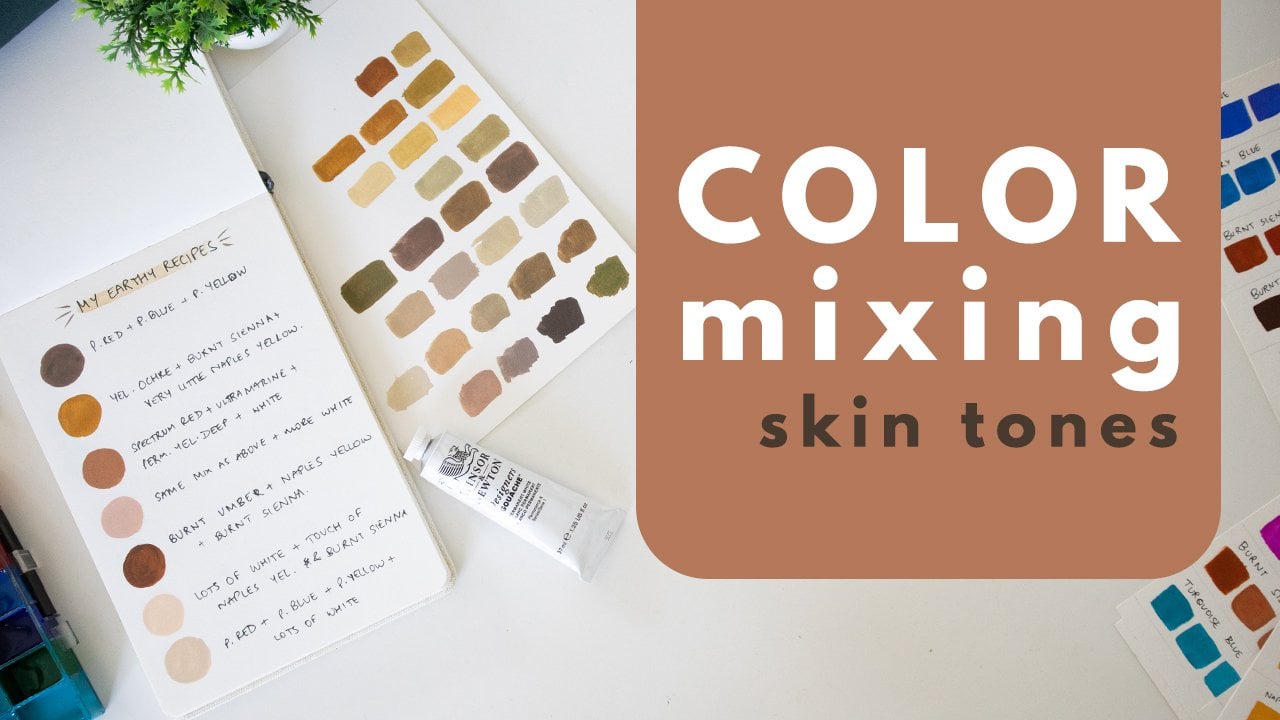
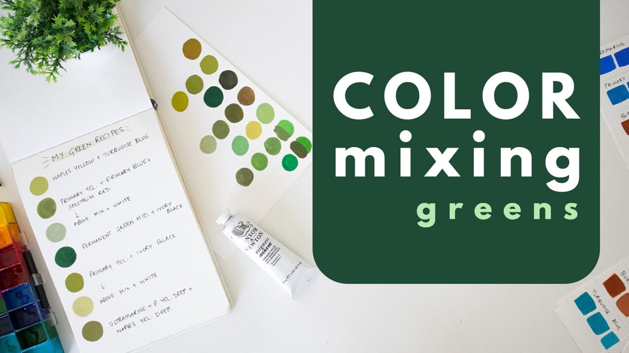
9. Element 3 : Colour: Now we come to my favorite
element, which is Colour. I'm not going to dive into too many details in
this short lesson. If you want to go more deep into the world of Colour
Mixing and color theory, please do check out my other Skillshare class on the topic. The link to that is
in the description. For today, we're just going to explore color a little bit. And I'm gonna give
you some tools and foundations which
are going to make it really easy for you
to be able to mix colors as we move towards
our final project. Learning the foundations of color and learning to see color around us helps us depict
what we want to much better. It helps us be more
realistic with the colors that we
use in our paintings. But even if we're not going for a realistic, illustrative style, it still helps us with the foundation so
that we're able to understand how to exaggerate our colors in a way
that makes sense. Sometimes it becomes
hard for our brain to isolate and really see
colors for what they are. There's this very famous
visual that illustrates that these two squares on
the left and right both have the same colored
squared in the center, but our brain perceives
them differently. That's because the
surrounding color influences how our brain perceives the color
in the center. A useful tool to use
sometimes to isolate color is something really simple that you
can make at home. You can just take any
sheet of paper like this. I'm just going to fall this
sheet of paper into 4. And I'm going to cut a small
square from the center. I'll now open this up. You can go even smaller
with this square. I actually went
quite big with it. But let me show
you how it works. Let's take this
picture for example. So our brain immediately
perceives this as red and this has yellow because that just
makes sense to us. That's how we think
it should be. And we perceive this
entire area as black. But the reality is a lot
more nuanced than that. There's so much more
that's actually happening. When we use this, we're able to isolate
specific colors. And we can see that this area is definitely a lot more red. But as we move here, It's a very maroonish, almost like brownish red. And as we move here, it's getting extremely dark. And similarly with
this yellow here, I should have made
this a little smaller, but so we've got this yellow, orangish yellow here. And as we move closer
to the base of the bug, the part that's falling
in shadow is very brown. It's not even yellow anymore. And similarly, there
are a lot of sections here that are very
grayish or brownish. And in this black
section as well, when we isolate it. Now that I'm not looking at it with the
surrounding elements, I can see that it's
not even black, It's a very bluish gray. A tool like this can just make it a lot easier for
you to isolate color when you're looking at any image or even an
object around you. So given a field or painting the color of
this table, for example, you are able to isolate a particular section and see the colors as
they really are. You can also look at
objects through it. You can hold it up and look at objects and that would be
really helpful as well. As you start mixing colors. Let me give you a small
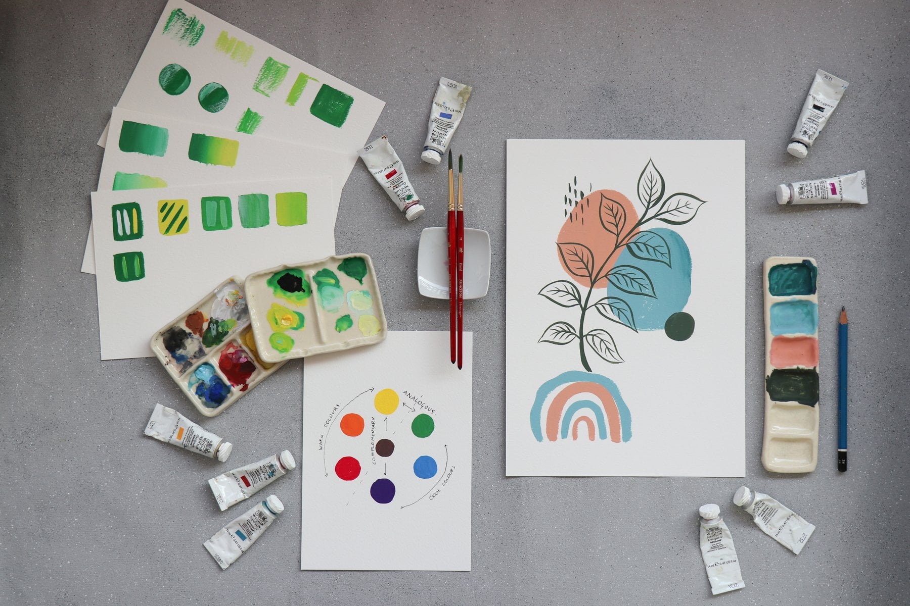
framework that might be helpful. Let's pull up our trusty
color wheel here. When we look at the color wheel, we know that commonly the
colors on the left of it are considered warm
colors and the colors on the right
are cool colors. From yellow to red- violet are warm colors, and from yellow-green, to violet are cool colors. So keeping that in mind, let me give you a few pointers. I'm going to use my sap
green for this exercise. The color doesn't matter. I'm just giving you a small set of rules that might be helpful. So I'm just first going
to swatch the color as it is so we can
see how it looks. In case you're using
gouache for the first time. Don't worry, I'll give
you more pointers on how to work with the
medium in the next lesson, for now, just try to keep it at a nice creamy consistency. The first pointer is when
you want to lighten colors, add white to it. You can add varying degrees of white depending on how light
you want to go with it. I've just added some white here. And that's how you
lighten your colors. Next, when you want to
darken your colors, you can add some black to it. When you want to make
your colors warmer, you can add red, yellow, or orange to it. In this case, I'm using
permanent yellow deep, which is a kind of
orangeish yellow. This gives me a warmer
shade of green. When you want to make
your color cooler, use a shade of blue. In this case, I'm using indigo. And you can see that I
get a very bluish green, which is a much cooler
shade of green. When you want to deepen your
colors, use the complement. So in the case of green, the complementary color
for any color, by the way, is the color opposite
it on the color wheel. So the complement
of green is red, the complement of
blue is orange, yellow is violet, and so on. So I'm going to add a little bit of red into this green
to see what happens. I'm using spectrum
red in this case. As you can see, this gives me a very deep olive
shade of green, which is very
different from what happens when you add
black into your color. And finally, when you want
to brighten your color, you can add any
bright shade into it. I'll show you two examples. For the first, I'll
add some cobalt turquoise into it, which is
a very bright shade of blue. And as you can see, that gives me a really
brightened green, which is a lot more bright
than the original color. And for the second, I will use a bright yellow, which is primary yellow. And again I get a
really bright green. So to brighten the colors, you can use bright shades and ideally shades that are
constituent colors. So green is made by
yellow and blue. If I add red, it will add the complement which
will deepen the color. It won't brighten the color. But I can use blue or yellow in really bright shades
to brighten the Colour. So to recap, to lighten your color add white;
to darken your color add black; to make
your color more warm, add warm shades like
yellow, orange, or red, depending on what color you're mixing; to make your
color more cool, add shades like blue; to deepen your color and the
complement of the color, which is the color opposite
it on the color wheel; And to brighten your color, add any bright hues
from your palette. I'll see you in the next lesson
where we're going to talk about our next element
of Art, which is Texture
10. Element 4 : Texture: When you're painting
a subject like birds, Texture becomes something
that's very important. Bringing in texture to your
painting helps it look feathery and fluffy without you adding too much
intricate details. Just by using your brush
and understanding how to make Strokes that give
the illusion of texture, You'll be able to add so many interesting
details into your painting through this lesson and
the next lesson where we'll be playing with
different brush marks, will understand the different
ways in which you can use gouache in order to bring
Texture into your paintings. Firstly, for those of you who are completely new to Gouache, Let's go into a quick
discussion on the consistency. When you're working
with Gouache paints. You want to be able
to bring them to a nice matte and creamy
appearance on your paper. To do that, you need to
make sure you always have enough paint on your palette
for your brush to lift up. The feel of the paints
that you're going for is similar to melted ice cream. You want the paint to be
thick enough that you're able to freely move it around on your palate and
on your paper. But at the same time
you don't want it to be so thin that it ends up
looking like watercolor. Let's just swatch this paint. This is the kind of consistency that you're going
for with gouache. When you're consistency
is like this, it will dry really matte and smooth and you won't get any
streakiness in the paint. If you're using
lower grade Gouache, keep in mind that you may experience some amount
of streakiness. But if you're using Designers Gouache like
Holbein or Winsor Newton, you should not have that issue. A few pigments, that is, a few colors tend to be more transparent than other colors. If you are experiencing
streakiness, tried to mix some white into your paint and
that might help. Like I said, this is the
consistency we are going for. We don't want it to be so
watery that it looks like this. Although some people do use
gouache like this and we will use it for the Underpainting
when we start our project. But you still need to be able to create this
consistency as well. Now we'll discuss a few
techniques with Gouache. But before we do that, I'm just going to lay out
a few swatches of paint. So I've painted all
these swatches. I'm allowing most
of them to dry. The last one that I painted
is still a little wet. So I'm going to show you a
blending technique on that. So this is a wet
on wet blending. I'm just applying my paint
over the base layer. The base layer is kind of
semi dry at the moment. But I'm wetting my brush and I'm going to use it to just
blend this paint in. I'm just creating a few Strokes. And with gouache,
you'll be able to deactivate your base layer
even after it's dry. So you can utilize that to your advantage when you want to blend and other color onto it. This is a blending technique
that's going to be really useful when you create
Naturalist Illustrations. Now, let's look at
layering. With gouache, Keep in mind that you can layer light over dark
or dark or light. So in this case, I'm
layering light over dark, and here I'm layering dark over light. A thing to be really mindful
of when you're creating layers is the consistency of your paint, like we discussed. You want to make sure
your paint is of a nice thick and
creamy consistency. Otherwise you're not going to be able to create smooth layers. Let's say you're paint or
your brush is too watery, if you try to layer over it, you're not going to
get a nice clean layer and base is going to
show through or worse, the base is going
to get reactivated as you do this. You don't want that to happen
when you're layering. So practice a smooth
creamy consistency to create clean layers. The next technique we would
be using is dry brushing. We're going to explore this a lot more in the next lesson. But just to give you a brief Dry brushing is when you have a good amount of dry paint on a relatively dry brush
and you just brush it over your paper and you're able to create
texture like this. This is a really
useful technique to use when you're
painting gouache. And again, practice keeping your consistency perfect
because you want to be able to create dry brush as layers as well without reactivating
your base layer. One thing you can
do with gouache at a more watered-down
consistency. That is, when it's almost like watercolor is create a glaze. So let's look at that. Here. I'm taking this
yellowish green color. I'm keeping it at a
watery consistency and I'm just going to swatch it here to make sure it's watery. As you can see,
it's quite watery. It's not creamy like this. So I'm going to use
this to lightly brush over one of my swatches
and create a glaze. You need to make sure that
you are not overworking it and you're not going over the same place
multiple times. Otherwise you will
reactivate your base. You want to just smoothly put it over your base
and allow it to be. So this is another
useful technique to just create a glaze
over a base layer. Now, on our remaining swatches of color which have
completely dried, I'm just going to explore some texture with color pencils. You could also first try
it out on the side here. As you can see, Colour
Pencils by itself creates some beautiful
texture on paper. Now, let's use some of the
line making techniques that we learned and apply it with colored pencil on our
Gouache swatches. You can make many
different kinds of marks. Just try to play with
it and have a bit of Fun Try to create a few short
lines that are reminiscent of fur or that feathery
texture that we discussed. Have Fun with this, tried to see all the
different things that you are able
to come up with. Just explore, because
we're going to bring all of this into
our final project. In the next lesson, let's explore the brushes
that we have on hand and see what marks and textures we're able
to make with them.
11. Exercise : Brush Strokes: In this next exercise, we're going to explore the different brushes
that we have on hand and explore
the different marks that they're capable of making. We're going to see how
to bring out as much texture as possible
from our brushes. Feel free to use whatever
brushes you have on hand. There's no compulsion to use any specific brush.
For my activity, I'm going to be using size
4 Princeton heritage brush. This is a round brush. Then I've got a Filbert
brush in size zero, and I've got a flat
shader in size six, tried to use a few different
sizes or shapes of brushes just so you know what your brushes
are capable of. This could also be
a chance for you to explore all the
brushes that you have on hand to decide
which ones would be best suited for
our final project. Let's start with
the round brush. Get some paint onto your palate. It doesn't matter what color. And start by getting it
to the nice, smooth, creamy gouache consistency
that we spoke about. For this activity, even if it's slightly more watery,
it doesn't matter. But try not to keep it
too thick at first. Let's start by just painting
a few short lines and strokes just to see what
the brush is capable of. Tried to also use the fine tip of the brush to
create some lines. I'm going to use my
flat shader next. Then the Filbert brush. The Filbert brush is very
similar to a flat brush, but it has this rounded
tip that I really like. Once you're happy with these, Let's start making
some textural Strokes. By doing this, we're trying to keep in mind that we're
learning to paint birds and keep those textures in mind as we create
these Strokes. Try to emulate those
feathery textures to the best of your ability. Try to also explore using
drier Brush Strokes. And think about how all
this could come together. I will of course be guiding you through it in the final project. But this is just
for you to get more familiar with the materials
that you have on hand. Creating short strokes
like this sometimes really helps give the
impression of feathers. Once we start varying the different colors
that we're using here, you'll start seeing
how it comes together. I also like using my
flat brush for this. You see how with dry strokes you can get these very
feathery effects. All of this will help
your final painting look really fluffy
like an actual Bird. And like I said, we don't
have to be realistic. It's just wherever we
want to add texture, we need to be able to do that. If you just have a
round brush on hand, Here's a technique that I think really helps. Once you wash off your bristles and
they're still a little damp, squeeze out all the extra water and flatten your bristles
while you do that. Sometimes that
gives you this kind of flat brush kind
of appearance. So you can spread out
your bristles like that and you can get
a similar effect. But make sure your
brushes aren't too wet, or the paint isn't too wet. In my case, the paint
was a little too wet. So you can flatten your
bristles and you can try to get similar textures as you would with a flat
or a Filbert brush. Also try to see
what happens when you hold your brush
a little loosely. When we feel a little
under confident or we just are a little scared
to let go of control. We tend to hold our brush really tight and really close
to the bristles. Tried to hold it
a little behind. That's a really good technique
when you want to loosen up and just let your
brush do what it does. Just let your intuition
guide you and create more loose strokes
to see what happens. I hope you're having a
lot of Fun with this. I'm going to see you in the next lesson where we're going to talk about the final
element, which is Space.
12. Element 5 : Space: Using space as an element in a composition gives you
a lot of control as the artist to
determine how we'll viewer is viewing and
perceiving your composition. Space includes how we choose
to position our elements, how we are drawing focus onto our main elements, and also how we use white space
in our composition. For example, if we have two
example compositions here. In the first one, let's say we just have a nice big Daisy in the
center of our composition. That looks very different
from, if we were to, let say, have a stem going
across the entire composition. And we have a flower here. And then let's say we have
some leaves going down here. The viewer's eye goes
in that S-curve. We are utilizing a lot more
space in that composition. Whereas here, there's
a lot of whitespace. Angled eye is immediately
drawn into the center. Each of these have
their own applications, and not just that, it's completely dependent on what the artist wants to convey. It's dependent on
what you want out of that particular composition and what you're trying to
communicate through it. Let me show you a bunch of
examples from my compositions, from my original collection
called the Rain Tree. My collection of 21 paintings
titled The Rain Tree, had a few different types
of compositions in them. There were a couple of headshot kind of compositions like this. Then I had a few individual
species like these. And then I had a bunch of
compositions like these. So let's look at a few
different examples. Here, I used a lot of whitespace, but of course in the form
of a background color. And I've placed the main subject off to the side a little bit because I wanted there
to be some space in front of the eye of the bird. In these, I wanted a lot of
focus on the bird itself. But then I still wanted there to be this element
of space coming through because I
really liked how it would look once it's
framed in a frame. I didn't want the frame to be super close cropped to the Bird. I wanted to leave a lot of
whitespace that there's room and it's somehow just draws your eye into the
subject as well. In compositions like these, It's got a lot more going on. But then I've still
used whitespace so that your eye
is first drawn to the different birds
because that was my main subject of this
entire collection. I wanted the focus
to be on the birds. I do have these supporting
filler elements in these cases, but still, because of the contrast between
the birds and the tree, your eye is drawn towards
the bright birds first. In this case, there was an equal emphasis on the
birds as well as the tree. I wanted the viewers eyes to travel across the
entire composition. And then slowly, as
your eyes travel, you also discover that there's another Bird here
hidden in the tree. This one's quite
straightforward. The focus is on the
Bird, of course, but also on this little
butterfly on its back. And I've used this little
background color element to also draw your eye into the
center of the composition. I've used something
similar here. Where again, your eye is
drawn into the center, not just because
of the presence of the bird with its
outstretched wings, but also because this
background color is kind of framing it in there. So how will you use the
different elements that you put into your own
compositions and how you want the viewer's
attention to travel across your composition
is completely up to you. And a lot of that comes from
space and how you use Space. Of course, there are
artists who choose to use very little negative space or whitespace in
their composition. They liked the pieces
to be very filled. And that gives a very different
experience to the viewer. Again, it comes down
to your own Art style, what you're trying to convey, and how you would
like to convey it. So I hope that gives you a
good understanding of how space can be used
in your artwork. I'll see you in the next
lesson because we're almost ready to start with
our final project.
13. Project Part 1 : The Reference: Hummingbirds are one of the most beautiful
and stunning types of birds in the world. And in today's class project, we're going to explore them. There are so many different
species of Hummingbirds. I think there are
over 300 of them. And so many of them come in these beautiful jewel
tones on their bodies. So they are very fascinating,
especially to artists. I found it really
hard to even pick a species to paint
in today's class. But I narrowed it down
to a few of them. In the description
of this class, I've added a link to a
resource where you can check out a bunch of different
kinds of Hummingbirds. You can pick one to paint in your project. If you'd like to, you can just follow along with
the one that I'm painting. I initially thought of painting the Ruby throated Hummingbird, and I even did this practice
one in my sketchbook. I really love how it looks. It has this beautiful
emerald green body and the bright red
ruby colored throat. But finally, I couldn't
resist picking the Golden Tailed
Sapphire Hummingbird. Its body has this
beautiful array of colors and it
looks like a rainbow. It's just so stunning. And I thought it would
be a Fun wait for us to even explore color
in this class, I'm sharing a lot
of reference images in the resources
section of this class. So you can pick one
that's right for you. Hummingbirds have
quite a small body and they have these
really rounded heads. For the Class Project, I thought we could do one
that's in a side view because that way you can see all of the colors on the bird. And you can also see
the inside of the wing, which is really interesting. The side view would showcase the wing in this kind
of triangular shape. Also, you can see that even when they're
in the side view, there are so many
different postures. For example, here the
birds seems to be curving in this crescent shape. Whereas in this
image you can see that it has more of an S-curve. The body is first leaning backwards and then the tail
is kind of leaning forward. In this image again, we have the ruby
trotted Hummingbird, and the body again is leaning backwards and the tail is
kind of leaning inwards. We see that the entire
body is very straight. The tail is neither leaning
backwards, not forwards. It's just perfectly straight as the Hummingbird is reaching
towards this flower here. And we're able to
see this triangular being able to see the
behind the wing as well. Then we have this one
where we're able to see a more three-fourth view rather than a perfect side view. And the, both the wings are outreached in
different directions. This wing is larger
than this one and the tail is
beautifully fanned out. You can pick a reference image that you find interesting of any species of Hummingbird or even a completely
different Bird if that's what you'd
like to explore. As I said, I'm sharing reference images in the
resources section of this class, including the reference
image that I'm going to be using of the Golden-Tailed Sapphire Hummingbird.
I'd like to remind you that while some of these
images are free to download, most of them are not
free for commercial use. So make sure that
whatever you're creating during this class is purely for learning
purposes and that you don't reproduce
it commercially. I'd also like to mention that
this website called E-Bird is a great source for looking at various species of birds. You can look at so many details and try to understand
the Bird better. When you're creating
your own compositions which you'd like to
create commercially, it's best to look
at a wide array of images and create your own
compositions from them. Try to look at the patterns
from one of the images, the positions from
another image and group it together in a
way that makes sense. This would come from a lot
of practice, of course. But try not to copy another photographer's
work exactly as it is. Now that you have your
reference image ready, let's start breaking
it down into the basic shapes like we
learned and sketching the Bird.
14. Project Part 2 : The Sketch: To sketch my bird, I'm using this Etchr Hot pressed sketch book, and I'm using a H pencil because I want to keep my
guidelines very light. So I'm pulling up my
reference image and I'll start by breaking
the bird down into the basic shapes
like we discussed. The things I want
you to observe are the basic shapes that
form the Bird, of course, and the kind of
posture of the bird, like we discussed, it could
be a more crescent shape, it could be a more S-shape. So try to observe that
in your reference image. Also try to observe the specific features
of that species. So this could be the way the different colors
are placed on the body, the size and shape of
the Bill of the bird, and also the size of the eye. Another thing you want to pay attention to is the proportions. How big is the head in comparison to the
body of the Bird? You don't need to be 100% perfect about how
you're sketching it, but you want it to
be approximately close so that it's
resembling that Bird. I'm using a sort of
oval-shaped for the head. And then I'm breaking
the body down into three different sections. I'm using very geometric shapes for this. I've got the basic shape of
the body kind of blocked out. Now I'll add in the
wing and the tail. I can see that the wings joins the body here around
the neck area. And it forms this very
triangular shape. And it ends somewhere
here before the tail of the bird begins. For the tail, I can see that there's
a section on top where we're able to see
the top of the tail, after which it's the inside
of the tail that we've seen that joins up with the
body is somewhere here. And it has this kind
of fanned out Shape. And now I'll add the
beak or the bill. Again, I'm just trying
to indicate how long it is and the
positioning of it. I'm not trying to be exact. So now that I've got
the shapes blocked out and just looking at it and looking at my
reference image once again to see if there's
anything that needs adjusting. The first thing I feel
is that in my sketch, the body is feeling very large
in comparison to the head. So I may want to adjust that. Look at your own sketch and look at the
reference image you're using and see if you want to adjust anything at this stage. These guidelines are going to form the foundation
of our sketch. So it's very
important that we get this to exactly what
we want it to be. Another thing I'm noticing is
that in the reference image the bill is pointing upwards whereas mine
was more straight. So I'm just trying to
change that positioning. I'm happy with that as
my basic framework. And now I'm going to
start refining my sketch. So at this stage, you
want to be looking more closely at your reference image rather than just the outlines. You want to position the
different elements properly. And you also don't
want to make it too detailed because we still
do have to paint it. So let's not get too
detailed with this. Try to keep it loose. Tried to keep it indicative of the different
features of the bird without getting too
technical about it. If you'd like to lighten
your guidelines, you can just go over
them with an eraser. At this stage, tried to
really observe the shape of the bird and and refine
your sketch accordingly. If you notice,
even at this stage, I'm still using
very basic lines. I'm trying to keep it as
straightforward as possible. I don't want to
complicate my sketch too much and make it
harder for myself. I'm also adding the center line of the bill because that's another important
detail and that'll help you position the eye
and other details. Now let's get into the details
of the wings and the tail. Here I can see that there's a bright green portion on the top with these
very short feathers. Then there are slightly
longer feathers. Again, I'm being
very indicative. I'm not trying to make this
a very detailed sketch. Finally, we have
the long feathers. So when you're drawing feathers, you can keep your
lines very basic. You can have them just be
two strokes like this. And that will give
you feathery shapes. Now, even within that, you can have very pointed
shapes like this. You can have them
be more rounded, or you can have them
be more squared. These are some
different types of feathers that you
may come across. And just creating
these simple lines can help you indicate the
feathers very easily. So let's do that here. This is where your guidelines become very useful
because you now know exactly what shape you want the feathers to fall into, rather than just drawing
random feathers which may end up in a shape that's not
exactly true to the Bird. Once you have your guideline, you have some sort of container
within which to work. I'm just going to indicate
where the feet are. In this case, the Bird has
these feet that are kind of curved upwards towards
the body as it's flying. I'm just being very
indicative about that. I'm not making a detailed
sketch of the feet. And the final thing I'll
do is I'll just create a few zones of
color very lightly. At this stage, you
actually have two choices. Either you could
choose to create a more detailed
sketch like we did in the exercise where
we sketched birds. You can use a 2B
or 4B pencil. You can shade parts of
it just to indicate to yourself how the
shading is going to be. In that case, you can use
a tracing paper like this. You can trace the outline of your Bird and
you can put it onto a fresh page and
paint it there, so that your sketch would be different
from your final painting. Your other option is to paint directly on this sketch itself, in which case, like I said, you don't want to go too
detailed with your linework. You want to keep
your pencil lines very minimal so that you're easily able to paint over it and so that your pencil
lines don't show through, in that case, create
guidelines that are extremely light
and indicative. And you don't want to make
too many style lines on it. I'm just going to make
a few loose lines on the Bird which indicate where
the different colors lie. This is just as a
reminder to myself so that I don't get confused
while I'm painting. The final thing to do
before you start painting, if you're using this sketch, is to lightly erase
over all of your lines so that your sketch
is very light and your pencil lines don't
show through the paint. Once you're done with that, I'll see you in the next lesson, where we'll start painting.
15. Project Part 3 : The Underpainting: Now that I've gotten rid of my harsh outlines by lightly
erasing over all of it., It's time to start painting. I've got my jars of water here. I've got a fresh palette. And these are the colors
I'm going to be using. I've got primary yellow. You can use any yellow that
you have, like lemon yellow. Then I've got spectrum red, which is a slightly
orangeish red. Then I've got Permanent
Alizarin crimson, which is a more cool
red or a pinkish red, then there's primary blue. You can use a shade like cobalt blue if that's
what you have. I've got a turquoise shade here. This is not
completely necessary, but because I want to
add some bright colors, I'm going to be using this. Then I've got ultramarine, permanent white and ivory black. I'm starting with this
flat shader, size six. It's about a quarter
of an inch wide. And I'll be using my colors
from this palette here. I'm going to be starting with very light or watery layer
as my Underpainting. As we build up layers over that, I'll start using
more thick paint. I'm going to start with
all the bright colors on the body of the bird. And I'm taking
ultramarine first. Like I said, I'm going to
dilute the paint with water, but not too much. And I'm going to start
applying a thin coat in the areas where I want the
ultramarine to show through. Try to use the
kind of brushstrokes that I taught you in
the previous lessons. Now I'll take some
of my turquoise. I'm looking at my
reference image and just sort of blocking out
these zones of color. I will be layering over these because as you can see
from the reference image, It's not just these bright
colors, there are also these grayish feathers that
are going through them. So as we layer, all of that
will start coming out. Don't worry about it at
this stage. Right now I'm just blocking the bright tones. The next thing I'll do is
take some primary yellow. And I'll first take a bit of
the primary yellow and mix it with some of the cobalt
to make a greenish tint. This gives us a really
nice bright green color, which is exactly what I wanted. If you look at the
body of the bird, you can see that there are
some of these greens that are more bluish and then there are some that are
more yellowish. So I'm gonna do a mix of those. Then it starts going into
more yellowish feathers. But before that, I'll also fill some green here on the wing. Now I'm going to use some
of the yellow as it is. Without mixing in
any other color. It's completely okay for
your colors to overlap in some areas and even blend. That makes it
look more natural. There's a bit of
this green tinge on the back of the bird here, so I'm adding a bit of it. The next Colour I'll add
is some crimson. I'm going to add a small
touch of ultramarine into this crimson
just to give it this kind of purplish tint. And looking at the tail of the bird and
the feathers there, I feel like it's more
of this peachy pink, but also with
purplish undertones. I'm also taking some yellow
and adding that in. Be careful with this. You want red to be
the main color. You don't want it to become too brownish by adding
the other colors in. But you're just
wanted to slightly mix and modify the colors so that it is closer to
what you're going for. There's also this zone where it transitions from yellow to red, where it's a bit
more orange-ish. So I'm adding a bit more
yellow at that stage. Don't worry about
it being imperfect. Don't worry about it even looking like a
mess at this stage, that's perfectly normal. As
we build up our layers, it's going to start
coming together. So now we're going to work
on the color which goes into the body of the bird and
the wing and the tail. If you look closely, they're all variations
of the same color. Some parts are darker and
some parts are lighter. And what it is is this
very grayish purple So at this stage, I am going to start
mixing colors. And to make this grayish purple, I'm going to take
some primary blue. Primary blue is a cool blue. You can use cobalt blue or
whatever else you have. Anything that looks
similar to this. And I'll mix that with
some spectrum red, which is a warm red. The reason I'm doing
this mix is that these two colors come together to form a very
grayed-out purple. They don't form a bright purple, they form a more muddy purple. And that's exactly
what I'm going for. You can see this color. It's not at all a bright violet. It's a very muddy purple. That's exactly what we want. If you're color is brighter
than how you want it. If you want to make it look a
bit more gray, then you can add a touch of yellow
into it because yellow is the complimentary
color of purple and that will help gray out
your color further. I feel it went a
little to gray. I'm adding back a
touch of blue and red. I'm happy with that. So now I'm going to squeeze out a bit of white onto my palette. And as I'm doing this, I also want to preserve the darker color because I
may need it at some point. So I'm going to take a bit
of this into another well, and I'll mix white into it. I feel like this color is, needs to be a little more red. Mixing colors is
this balancing act. And it's a dance of just
going a little this way, a little that way,
and figuring out exactly what you're looking for. So I keep mixing the colors that I used to create this just to reach a
balance that I'm happy with. I'm happy with
that, and I'm just adding more white into it. Again, I'm gonna leave this, this can be a more medium shade and that's the dark shade, but I need one that's
a lot more light. As you can see, the body portion has an almost white gray. So I'm just going to take
one brush full of this and mix it in a separate
well with a lot more white. I'll start by applying
that on the body. Don't worry if your color
is not perfectly right yet, we can always balanc that. I still feel like mine
is a little dark. So I will be going back. Notice my brush strokes. I'm not just applying color
flatly all over the place. I am also trying to
create these kind of wispy Brush Strokes because this is the point where
I want it to start looking a little bit more feathery as I start
building my layers. So I'm just a little conscious of how I'm placing my
brush on the paper. And it's completely okay even if it goes outside of the lines, as long as you're
conscious of creating these kinds of
brushstrokes where it kind of lifts off at the end. It'll actually give you a
really nice look in the end. Like I said, don't worry if
your colors are blending anywhere or it's
looking a little messy. That's completely
normal at this stage. And it'll all suddenly
start coming together. So we've got a base shade
laid out for the body. Let's do the same for the
wings and the tail as well. You can see from the
reference image that the wing color is a lot
darker than the body color. So I'm going to take
this medium shade first. I'm going to try to create
these long Strokes and just lift them off in the end in this kind
of feather Shape. Again, I'm not trying to be perfect. I'm not even looking at
the image at this stage. I'm going by the guidelines
that I've drawn. And I just want it
to look feathery. For the tail, I'm going to
use an even darker tone. For the tail feathers. I'm starting by just creating
the line on one side. My first stroke is
just going down on one side of these feathers. I'm not filling in the entire
feather because I see from the image that the
other side has this slight reddish tinge to it. So I'm going to try
to bring that in. I also see on the wings, There's this section here with these shorter, darker feathers. So I'm gonna try to
create that zone as well. I'm just using very
simple strokes here. I'm not trying to
complicate it at all. Then I'm creating this short
curved strokes as well. Just to show this
area of shadow here. And similarly on each
of these feathers, I'm also going to create
this line of shadow along the edge where two feathers are kind of overlapping
on each other. I'm just trying to
indicate that. If any of these details are uncomfortable for you to paint with a brush, if you're struggling with it, then don't worry about it. You can do it with
a color pencil. Later on, I'm gonna
show you how we'll be adding final touches
with the Colour Pencils. So if any of these
parts are making you a little anxious so you're not
able to paint it perfectly. Don't worry, you can go over
it with a color pencil. I'm also going to use some of this medium shade
here on the face. We can see that there are these grayish feathers
surrounding the eye. So I'm just going to
indicate that as well. At this stage I'm moving
over to a size two round brush and I'm going
to be filling in the eye, the beak, and the legs. Again, if at any point
of this you finding it hard to fill in the
nitty-gritty details. Don't worry about it. You can always do it with
a color pencil later on. Let's start with some
pure black paint. And I'll just fill in the eye. Then using a more watered down black mixed with some white. I'm using a bit more
white now just to add this little highlight
detail towards the bottom of the top
part of the bill. Then I'll add the
bottom of the beak. I'm looking at the reference
image and I'm adding a slight reddish color here because that's what
I see in the image. I'm just using
some of my crimson mixed with the gray shade
that we used for the body. And I'll leave the beak at that for now and move over to the legs. Now I'm using this
darkest gray that we have mixed and mixing it
with a bit of black. And I'm just going to
indicate the legs here. You don't want to
be too detailed. Just indicate the shape of the legs and
that should be it. So these two toes, I suppose, are from the legs on
the other side of the bird. So it's coming out from behind. And then we have one which
is on this side of the bird. So we're placing that between the plumage of
the bird on the body. And finally we'll just
add these nails. You can choose to do
this with color pencil. I'm just adding some whitened gray just to give
a bit of shading here. Just so it doesn't
look completely flat. And then I'm just
using a damp brush. So I've washed off my brush and removed the excess moisture. I'm just slightly using that to dab at it and blend a bit. And that's it. So the reason we did all
of these is that there'll be a bit of feather
overlap over the bill, as well as the feet. So it's good to first place
these elements and now we can start building our
layers on the body of the bird.
16. Project Part 4 : The Painting: I'm now moving over to a
Size zero Filbert brush. And this is what
I'm going to use to complete all of my detailing. Like I said, I really like the Filbert brush because it gives me these rounded strokes, which are very much
like feathers. So it's an easy way to add feathery details
to your paintings. But if you don't have one, you can use a round brush
and that's fine too. At this stage you're
going to want to start working with slightly
thicker paint. So don't add too much
water into your paint that tried to keep it at a
nice buttery consistency. And now I'm looking
at my reference image and I'm going to start trying
to add in the details. I'll start by indicating
these grayish feathers on the face of the bird. At some points I'm trying
to use more dry strokes. I'm adding back all of these colors that we
used in the base layer. But this time I'm trying
to overlap the colors. I'm using the Paint a lot
thicker and I'm trying to make them look a lot
more feathery by the way I do my brushstrokes. At any
point if you want to blend, you can just wet your brush. Keep your brush free from any paint and wet your brush and just go over wherever
you want to blend. And that's an easy way
for you to blend gouache, even after it's dried. Now, let's take some of
the turquoise. This is the point where again, for the 100th time, I'm going to remind
you that there is no need for photo realism. Don't get too caught
up in the details. That's not the point. We just want to
make this look like a nice Hummingbird and feel free to do that
in your own way. Feel free to use colors where they may not be
in the reference image. If you'd like to
accentuate the color, if you'd like to exaggerate the use of one particular color, feel free to do that, just
play with it and have Fun. I'm doing exactly what we did with the first layer,
but this time, using my paint a lot
thicker and trying to more accurately reflect the
different areas of color. And you'll notice in the
reference image that these areas of color are
not just purely the color, there's a bit of these
gray or neutral feathers going through them as well. So that's something I'll
be adding on later. I'm now gonna take a bit of this neutral gray
color with a lot of white because I want to add some shading in the
feathers of the body. Also, I want to show
a bit of variation. If you see the reference image, even in this body area
which is very neutral, there's actually
so much going on. There is so much of variation in color in
the feathers there. And I really want to
bring that across. Again, just trying to use these very feathery
strokes. As I do this. I'm letting a bit
of this base layer showed through and just creating my Strokes over here, I'm also overlapping where
the feet are visible. And I'm gonna take some of a much darker gray tone
and I'll use that as well. We want there to be a good
amount of contrast, but don't go overboard
with it when you are using a darker tone to add these
more shadowy details, don't use too much of it because then you lose a bit
of the brightness. So keep that to a minimum. Now I'll keep using
some of the light gray, some of the dark gray, and I'll throw in a few grayish feathers
through the colors as well. I'm using a very dry brush
for some parts of this. Because I still want the colors
beneath to show through, so I don't want to entirely cover them and make it look
like these blocks of colors. I want it to be very dynamic
like all of these colors are blending and showing
through each other. At any point, if you
feel like you've covered too much
of the base color, you can again bring
that back and dry brush that over your gray and you'll be able to bring
it through again. There's going to be a lot of
back-and-forth at this stage. So keep working on it till you're happy with the
different sections. But again, try not
to overwork it. Don't overdo it because
it's very easy to ruin it. So just stop at the right
point and keep looking at it from a distance and just correcting
what you want to. In this zone where it's transitioning from the
beak into the body, I'm using a bit of the ultramarine
blue mixed with black. And I can also see that there
are these blackish feathers along the front of the body here and towards the back here. So I'll lose a similar mix of ultramarine blue and
black to create that. I don't want to use too much of stark black that is
plain black because then it can end up looking
a little harsh and it can draw all of
the attention there. But we don't want that. We wanted to nicely blend in with the rest of
the composition. I'm going to leave that at that, and I'll add a bit more detail with Colour Pencils later on. I'm just going over with the
damp brush to soften some of these edges and to make
it more blended in. I'm really happy with
how that's looking. And now I'll work on
the wing and the tail, and we're almost
done. For the wing, I want to bring back
some of the darkness in these more shadowy areas. I'm going over it with my
dark shade of gray violet. I'm just going to
turn the sketch book towards me so it's easier. I'm going to use a bit of
black in this area, which I'll blend into the
green because I can see that there is this bit
of blackish tinge in it. Now I'm using some
green which is mixed with black so that I
can blend it together. Now I'm just using a damp
brush and gently blending. Even while I blend, I try to use these kind
of curved strokes so that it ends up forming
these more feathery shapes. And I'll use this
more whitish gray to add much thicker
details on these wings. So this is in the more
highlighted portion. We use the dark color for
the shadowed portion, and then using the light
color for the highlight. Then I try to soften
those edges again. So I'm using a damp
brush to do that. I'm using a bit more
of the dark tone. If I need to blend it in. This section is a lot more
dark than it is light. So I'm just going to
use little bit of the light color in
a few sections, but not as much as I
did in this section. Here I want a lot more of the dark color. That's
our wing completed now. And we can move on to the tail. For the tail, I've mixed
my red with my yellow to create this kind
of orangey color. I'll be blending it
together with the gray. But let me just lay down
the orange for now. I'm mixing a bit of that
orange with gray and some more white to just
muddy it out a bit. After you're done
painting the tail, you can go in with some of the grays which
we mixed earlier, some lighter shades and
some darker shades. And you can use these
kind of Strokes to overlap the grays on the tail for this
entire rump section. Make sure you're mixing different shades of
gray as you do this. So that it shows
some variation in the colors and it
shows a bit of shadow. And you can overlap this part of the tail and cover up any
whitespaces that you may have. To finish up the eye, I am taking some pure
white straight from the tube without
adding any water in it because I want it to be
really thick and opaque. And I'm just going to add
a bit of shine on the, If you're not comfortable doing
this with a paintbrush, Feel free to do it with
something like a Posca marker. Now you can look at
your painting overall and see if there's
anything else that you'd like to just tweak a bit before we go in
with the Colour Pencils. I'm really happy with that. So I'm gonna pull out
my black color pencil, and I'll see you in
the next lesson.
17. Project Part 5 : The Fun Bit: I've got my black color pencil. You can use a mix of different
colors if you'd like to, but black and brown is probably
what you'll use the most. If you want to use
some of these colors and touch them up
with Colour Pencils, that's totally fine as well. So I'm just going to
use this to create a few stroke details and just
add a lot more interest. Also use it to create some of these darker areas which
I want to highlight. I'll create some of the shadow detailing
on the wings as well. This is The Fun part where
you really get to play. You're doing a mixed
media painting. And you can use the colored pencils in
any way that you want to. I want to create these
curved markings to just add those details of darker
shadows in the plumage, which I didn't choose
to do with the paint. Again, try not to overdo it. Keep it minimal, and use it to accentuate certain
parts of your painting. And you can also use
it to add details or fix details wherever you feel that it needs to be fixed. I'm going to use these
diagonal feathery lines on the tail portion because I really liked doing that
with Colour Pencils. That's it. That completes
our final project. I hope you had a lot
of Fun with this, and I'm going to see
you in the next lesson where we're going to recap
everything that we learned.
18. Summing it up: Now that you've got
all of these basics, you can not just Sketch and Paint any Bird that you wish to, but you should be able to
sketch almost anything. Don't forget to upload your class project to the
project gallery below. I would love to look at
your work and provide my feedback just to recap everything that we
learned in this class. We went through all the
elements of drawing and we learned how to apply
that into our composition. We started by doing a few practice Lines with our pencil and we
tried to loosen up. We then went onto shapes
and we understood how shapes become three-dimensional
and become forms. Using our basic understanding
of shapes and forms, we'll learn how to
sketch any Bird. We then learn some basic
Colour Mixing exercises. And following that, we went into brushwork and bringing
Texture into our work. We then learned about
how Space informs your compositions and how you can direct the eye
of the viewer. And of course, we also
went through how to find References and
inspiration for our work. We brought all of
these learnings together into our final project, which was this beautiful
painting of a Hummingbird. Even in the final project, we went through the basic
shapes as we sketched the Bird, and then we did some color
mixing and we learned how to paint the Bird in
with a lot of texture. We also learned how to
use color pencils to play with our painting and bring some more
interesting to it. So I hope you
learned a lot out of this class and I'd like
to remind you to upload your projects to the project
gallery below because that's where I'll be able to see it and provide my feedback. And it would mean
the world to me if you could leave a
review for this class, don't forget to follow me
here on Skillshare so that you're notified anytime
I released a new class, you can also follow
me on YouTube, but I put out a lot
of free tutorials and resources that can help
you on your art journey. And you can join me over on
Instagram where I share daily progress with my own work and behind the scenes
from my studio. As the next step, I'd recommend taking up My Colour Mixing Class because it's great for me artists no matter what
skill level you're at. Thank you so much for
watching and I look forward to seeing you
in my next class. Bye
 Shivani Patel, Gouache Artist | Creative Entrepreneur