Transcripts
1. Welcome!: [MUSIC] Hi, my name is Shivani and
I'm an artist and designer based in the sunny city of
Chennai in the South of India. I've been painting since
the time I was a kid, and over time I developed
my own unique card style. Currently gouache
and watercolor are my two favorite
media to work with. The subjects I paint
usually include nature and natural elements like
plants, trees, birds. I also love traditional
Indian art forms, so you will find my art being at the intersection of
nature and culture. I know that as the
beginner of gouache can be a little bit tricky
to get used to, especially if you're
more used to watercolor. I'm really sure how to work
with the opacity of gouache. The moment that I started
working with gouache, I absolutely fell
in love with it. Right now, I've
been working with gouache for over two years, and I've developed my
own unique techniques. I've created this class to help simplify all
of that for you. Through the duration
of this class, I'll be teaching you
everything you need to know to get started
with the medium, right from the materials, the paints themselves,
the brushes, the paper, up until the beginner
techniques that you'll need to start exploring
this medium on your own. You'd be doing some
practical exercises alongside me during the duration of
this class to get more and more comfortable
with the medium. Really doing exercises to
understand basic color theory, get used to the medium and
its varying consistencies, and also the
beginner techniques. This class is suitable for
students of any skill level, and you don't need to
have any prior knowledge with painting or with drawing
in order to get started. I can't wait to get started
on this journey with all of you and I'm so excited
to see what you create. At the end of this class, you will have your very first
gouache illustration in the form of a fun project that we'll be
working on together. In the next video, I'll be explaining the
details of this project, so I'll see you in that video. Bye. [MUSIC].
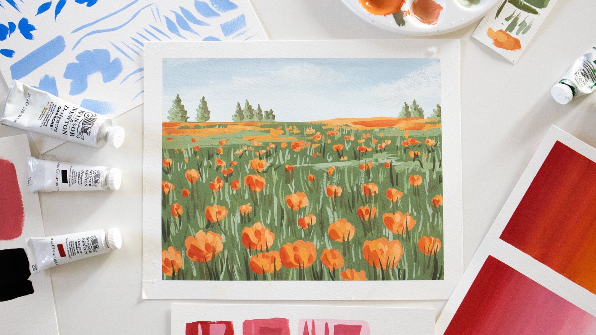
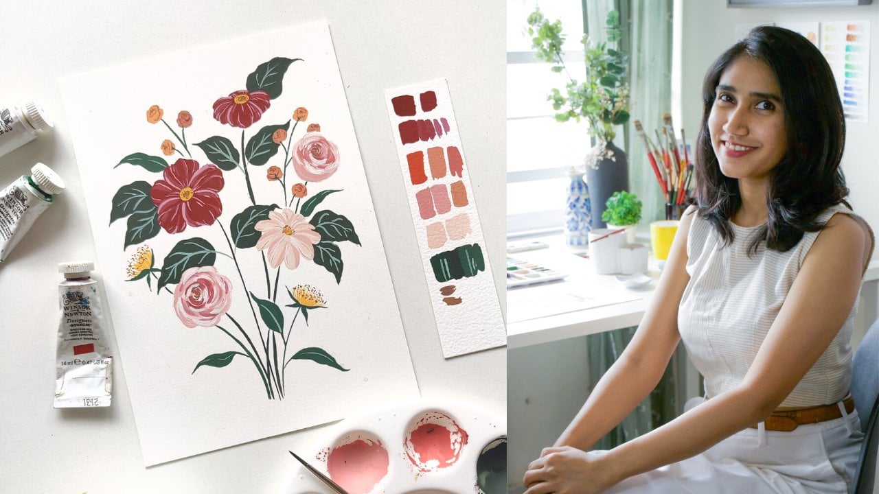
2. Here’s What You’ll Create: [MUSIC] For our class project, we'll be working on a boho-style abstract
painting using gouache. This project will be a fun and simple way for you
to get started with gouache and practice
all the techniques we learn during this class. We'll be going over looking for inspiration for your painting, creating a composition,
creating a color palette, and finally, doing
the actual painting. Even if you're not too
familiar with drawing, you don't need to
worry because we'll be keeping the elements
really simple. The most important thing is to have fun with the paints and do not put on any pressure on yourself by trying
to be perfect. The beauty of abstract
painting is that it's a great way to freely
explore colors, compositions, and foams without there being any right answer. I personally love creating
abstract paintings, especially when I'm feeling
a little creatively blocked because they allow
me to just free my mind, and explore colors, and moods. Just follow the lessons and practice all the exercises
that I teach you, and you'll be ready to
dive into this project. Just make sure you have your
materials ready beforehand. In the next lesson,
we'll be talking about what gouache really is. I'll also be detailing out
all the materials you need, so keep them ready in
advance and you'll be ready to create an
amazing project of your own. I'll see you in the next lesson. [MUSIC]
3. What is Gouache?: [MUSIC] What is gouache really? Gouache is water-based
paint medium, often referred to as
a big watercolor. It was the medium most
used by illustrators and poster designers before
digital illustration emerged. What gouache has this love
the most about this medium is the versatility of it and the richness of the
pigments that it offers, and that's what I
love about it too. There are basically two types of gouache that you
need to be aware of. One is the standard
water-based gouache and the other is
acrylic gouache. Both of them give you
a similar end result, but with some key differences
in how you use them. The main difference
between the two is in the binders that they use. Water-based gouache
uses the pigment along with gum Arabic, which is the same binder
used in watercolor. Whereas acrylic gouache
uses acrylic binders. What this means for you when you are working
with the medium is that it cannot be
reactivated with water. Water-based gouache can be reactivated infinitely
with water, either on the paper
or on the pallet. Whereas you can't do the
same with acrylic gouache. Now, depending on the kind
of illustrator that you are, both of these things could be either advantages
or disadvantages. If you like layering
a lot and prefer not to be reactivating
your base layer, then acrylic gouache might
be the right choice for you. For the purpose of
this class though, I will be sticking with water-based gouache because that's my personal preference. But most of what I
teach you will be applicable to both water-based
and acrylic gouache. In fact, if you don't have the budget to invest
in gouache right now, you could even use poster
paints for this class. In the next lesson, I will be taking you through all the materials that
you'll need to get started. Let's dive into that [MUSIC].
4. Materials You'll Need: [MUSIC] For today's class, I'll be using Winsor and
Newton designers' gouache. As I mentioned in
the previous lesson, you can use any gouache or poster color that
you have on hand. Actually gouache is fine too. But this is just my
personal preference and if you have
the budget for it, I would highly
recommend these paints. I'll just be using these colors for our class so
that you can see the range of possibilities
that you can achieve with the
limited palette. I'll be using the primary set of Winsor and Newton
designers gouache, which comes with primary yellow, primary blue, permanent green, middle primary red
and ivory black and I additionally
have permanent white. Sometimes I like using ceramic palettes like these when I work on smaller projects. But when I work on
large projects, I prefer using my
air-tight palette in which I can mix up a lot of colors
in advance and store them. The advantage of water-based
gouache is that I can infinitely reactivate
them anytime by just adding water and by storing them in an
air-tight palette they also remain dust free. I additionally have
a waste cloth, a paper towel and
two jars of water. When it comes to brushes, I have a mix of brown brushes. I personally like Princeton, but you can use whatever
you have on hand. I have a mix of sizes:
1,2,4,6, and 10. But for this class, I think four and six
should be sufficient. If you have brushes that come to a fine tip, that's an advantage. I also like having a mix of flat and angled brushes
for my background washes. I also keep a fine
liner with me because I do a lot of work with
thin lines and detailing. This is the perfect
brush for that, but you wouldn't need
it for today's class. When it comes to paper, gouaches have very
forgiving medium. You don't need to be too specific about what
paper you use, but it's generally a
good practice to have a 300 GSM paper so that when you do add a lot of
water, it doesn't buckle. I sometimes like using 100 percent cotton
paper from lana. Cold press is good for
texture and hot press is more smooth and that's great sometimes when you
need to scan your work. But for today's class, I'll be using Canson montval, which I have in packs of
A5 and A4 as loose sheets. It's a cold press
cellulose based paper and it's perfect for any beginner
to get started with. In the next lesson,
we'll talk about all the different
consistencies you can achieve with gouache and their applications.
I'll see you there.
5. Understanding Gouache Consistency: [MUSIC] Let's do
a small exercise to understand gouache
consistencies. I'm using permanent green
middle for this exercise. You can use any color you wish. Try to use a slightly
darker color so that you can clearly see it. I'm first taking the
colors straight from the tube with my brush
just a little damp, so you can dip your brush
in the water and dab off all the extra moisture,
and then get started. Don't mix any water in
your paint at this point. [MUSIC] Now we'll slowly start adding water
into the paint. Make sure you're being
very gradual with this. We still want it to be
pretty thick at this stage. You can see that the first
two swatches are very textural and it's not very easy to move the
paint on the paper. I'm now adding a
little bit more water. Now we see that it
starts getting a little easier to move
the paint on the paper. Continue the same way, adding very little
water at a time just dipping the tip of your
brush into the jar of water. If you find that your paint
suddenly becomes too thin, you can add more paint from
the tube to thicken it up. At this stage, we've
seen that it's at a much creamier consistency. It's just easier to move on the paper and it's
still very opaque. This consistency is
like multi-day screen. After this point, you start
seeing that the white of the paper slowly starts
showing through the paint. There's a lot more
moisture in the paint now and it's starting to
get more transparent. By the end of this exercise, it looks a lot more
like watercolor, but the pigment is
still very vibrant. This gives us a
very clear idea of the different opacities that
are possible with gouache. The first couple of swatches are the consistency we would use for the technique
like dry brushing, which we'll discuss
in a future lesson. The three after that are
more opaque and creamy. This gives us nice
flat illustrations. The final three are
more like watercolor, which is useful for
background washes. In the coming lessons, we are going to be
diving a little further into each of these
techniques and applications. In the next lesson, let's try to understand
all the colors in our set and create tints and shades for each and
every one of them. This will give us a
better understanding of our colors and the range of
values possible with them. I'll see you in the next lesson. [MUSIC]
6. Creating Tints and Shades: [MUSIC] I've created a grid here and I've got my
paints in front of me. Let's use these four colors. That is primary
yellow, primary blue, primary red, and
permanent green middle. Let's swatch them all out as is in the center of the grid. Then we'll create tints and
shades for each of them. Shades are created by
adding black to a color and tint separated by
adding white to the color. This will give us a
good understanding of the different values
we can produce using the colors that
we already have. I'm starting by taking all the colors out
onto my palette. I'll start by swatching
the four colors that I mentioned in
the center column. You can do this activity with as many colors that you'd like. In fact, I'd recommend doing it with all the
colors in your set. While you're doing this, try to achieve and practice
the creamy consistency of gouache that we spoke about
in the previous activity. The one I said was
like melted ice cream, where the paint is not too
thin and not too thick. You still want it to
be nice and opaque, but just watery enough for it to spread
easily on the paper. Now we'll start
adding white into the colors and make sure
you do this very gradually. You want to first add
a very small dab of white and then another
dab for the next swatch. Again, we'll repeat this
with all four colors. [MUSIC] Once we're done
with all the tints, let's move on to
creating the shades. We do this by adding black
into each of the colors. I've washed off
all the tints from my palette so that we don't have both white and black
mixing into the color because that will give
you a grayish tint. When you're adding
black, make sure there's no white left
on your palette. When you're adding black be very careful by adding
a very little bit. You can make the
color extremely dark, so be very gradual about it. You'll notice interesting
colors start forming. One of the most
interesting things I found when I started
working with gouache was that primary yellow
and ivory black make this beautiful
olive green tone. It's really earthy green and now I use that color often
in my illustrations. One of the advantages of doing activities like
this is that you'll be able to create colors that
you didn't imagine before and you will understand
the range of possibilities with your colors. I absolutely love mixing
up my own shades rather than buying tubes of paint for every color
that I want to achieve. Sometimes for certain colors, I do buy a tube of
paint, for example, opera pink, turquoise
blue because it's very tough to mix up
those specific shades. But for most other colors, I prefer to mix my own like olive greens and indigos
rather than buying the tube. It gives you a lot more
flexibility on the colors. It just makes you a
better artist overall, when you are able to imagine such a wide range of colors
with a limited palette, doesn't this tell us a
lot about the range of values we can accomplish with just a limited set of colors. It's quite magical,
and this is one of the reasons why I love
color mixing so much. In the next lesson, we're going to dive a little deeper into color mixing and
basic color theory to create a simple color view. I'll see there. [MUSIC]
7. Color Mixing and Color Theory: [MUSIC] For this lesson, we'll be creating
a simple coloring using just our primary colors. I have primary yellow, primary blue, and primary red. I'm switching over to a
round brush for this, I'll be using my Princeton
heritage round brush Size 4. I already have my colors
laid out on my palette. I'm just going to get started. Even if you've done
a coloring with any other paint
set that you own, I'd definitely recommend doing a good deal gouache set as well. It gives you a much
better understanding of your colors and the
possibilities with them. We'll just start out with
the circular blobs of our three primary colors
in a triangular formation. If your gouache set doesn't come with primary colors as such, just pick the closest match. Now that we've got the
three primaries laid out, let's start mixing
our secondaries. We'll start with
yellow and blue, which gives us green. Make sure you keep cleaning
your brush after dipping into one color so that they don't contaminate
the other colors. Try to take equal parts of two colors when you're
mixing your secondaries, and we've got a beautiful
shade of green next step here. We just paint it in. The next secondary color
we're going to mix is purple, which you get by
mixing red and blue. If you're using a
different blend of gouache automorphic budget plan, you might find that your colors
look a little different, especially when you mix them. They may not look as rich and vibrant and that's
completely fine. Just understand that
you're not doing anything wrong it's
probably just the colors. That's why in gouache, I think the most important thing to invest in if you want to take it up seriously is your paint set. Let's mix our final color, which is red and yellow
to give us orange. The final thing
I'm going to show you is what happens when you mix the three primaries
together in equal parts. We'll take some
blue, some yellow, and some red, we're
mixing them together, and we end up with
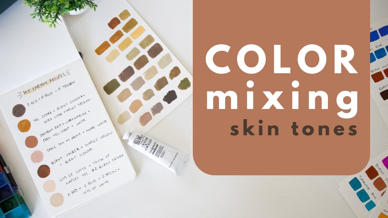
a shade of brown. This is very interesting
because when you read the proportion of
the three primaries and maybe add some
black or white, you can create a whole range of skin tones and other colors. For my first year
of using gouache, I didn't invest in any other
colors than my primaries, and I was just able to achieve so many colors with
it that I was shocked by it. With gouache, the range
of colors that you can accomplish with just the three
primaries is phenomenon. The next thing you need to
know is that colors opposite each other on the color wheel
are complimentary colors. As you can see, mixing two
of them gives you brown because you're
essentially mixing the three primaries together. They help neutralizing
each other out. For example, if you mix a
tiny bit of green into red, you'll find that you
end up with the more other looking read
like a brick red. The colors from green to
purple are cool colors and the colors from red to
yellow are warm colors. Colors beside each other are
called analagous colors. This forms the basis of color theory and once
you understand this, your possibilities are
absolutely endless. You can create color schemes by mixing up a variety of colors that work for the artwork and the more that
you're going for. You can create tints and shades like we discussed
in the previous lesson, and just create a multitude
of possibilities. In the next lesson, we'll
dive into the techniques to master when we worked with
gouache so I'll see you there. [MUSIC]
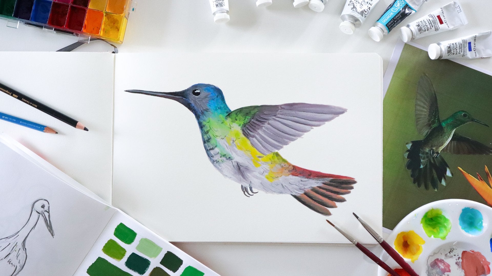
8. Technique 1 : Blending: The first technique
we're going to learn about today is blending. Here I have a couple
of my illustrations as examples to show you how I
use blending in a painting. In this bird example, you can see that I've blended a darker shade of red
into the lighter shade. I've also blended a few
colors into the wings, and in this gail you can
see subtle hints of red. In the back as well, I've tried to add
some shading by blending in a lighter tone. Similarly in this example, I've used blending
to add shadows on the wings as well as
here on the body, so there are many ways you
can use blending in your art, and I'm going to show
you how to do it and how to avoid some
common mistakes. I've got some
permanent green middle and permanent white
on my palette. I'm slightly wetting my brush. I want the paint to be nice
and creamy and not too thin. We'll first blend from a darker shade to a lighter
shade of the same color. I'm gradually adding white in. At this point, the
colors just seem like bars and they aren't
blended together, but we'll soon fix that. I wash my brush and take all
the extra moisture of it, and then I go over the
paint with a damp brush and try to soften and blend the joints between
the different tones. Don't use too much
water at this stage and be very light
with your brush. Don't put too much pressure. It might be hard at
first to get used to, but it will get
better with practice, so this is how you can get a smooth blend from a darker
shade to a lighter shade. Let's now try blending from
one color into another color. I've now got some primary
yellow on my palette, and I'll blend from
green to yellow. This time I first
add in the two ends, that is the green
and the yellow, and then I create a few different
shades in-between them. One of them is a little bit more towards green and one
is more towards yellow. Then I'll go back in and use a damp brush to go back and
forth and smoothing them out. We're able to do this because the paint is nice
and creamy and we have enough pigment on the paper that we're
able to reactivate. Just bear in mind that
with acrylic gouache, it would be slightly
different because you can't reactivate the
paint on the paper, so you may need to work a lot faster with acrylic gouache. I'll now show you what happens when the paint is more dilute. This time, I'm making
the paint more watery and I'm doing
the same thing. Well, this is okay for
background washes. You don't have enough pigment on the paper and it's
very tough to control. You won't get this
rich creamy appearance that we were going for, and it won't work for the kind of applications
that I showed you. Sometimes a lot of artists
like doing blending to create these beautiful
illustrations of skies, and even for that, it's much better to have
thicker applications of paint. Great. You now know
how to blend gouache, and in the next lesson, let's try out dry brushing. [MUSIC].
9. Technique 2 : Dry Brushing: [MUSIC] The second technique we're going to learn
today is dry brushing. Dry brushing allows you to use relatively dry paint to create
texture on your artwork. Here are some examples. You can either use it as is like I've done in this
abstract painting. That I've allowed the white of the paper to show
through the paint. Or you can create shading like I've done
in this painting. If you notice closely, the low doses have dry
brushing as shading. The leaves use it here, as well as in the
interior of the leaves. I've used it on the back of the cow to add a
touch of orange. It gives texture
shading to the piece. Let's learn how to do that. I'm going to be using
the paints that I already have on my palate. As always, you can choose
to use any colors you wish. With dry brushing, it's very important to keep your
paints quite thick. My brush is mildly dump, and it might be tempting
to grab some water, but try to avoid doing that. I'm holding my brush slightly
away from the ferrule, which is the metal
part of the brush, and just lightly
brushing over the paper. [MUSIC] Let's try this once
again with another color. Again dab off any extra
moisture from your brush, keep your paint quite thick and just lightly brush
it over the paper. Try to control the pressure that you're putting
on your brush. Now let's try to create an entire shape with
this technique. If you're finding your
brush a little bit too dry and you feel
you need to wet it, do so very lightly. As you can see, when I'm trying to create
a rectangular shape, I'm finding it very hard
to get good coverage. This could either be
because the paint is too dry or I don't have
enough paint on my brush. This is not what I want. This consistency is
okay if I'm just shading and I don't
need too much coverage, but that's not what
I'm going for. I'll add more water. I'm getting better coverage, but I still need more
water and more paint. Now this is exactly what
I'm going for because I'm trying something similar to this painting where I
cover an entire sheet, but I still have
dry brush strokes and the white of the
paper showing through. Try to make sure you're
maintaining the texture, and not covering too much. I'II now show you
how dry brushing works over another
layer of paint. For this, I'm just creating
a circle as a base layer. Now that the circle is painted, I'm going to show you
the first mistake you could make
with dry brushing. The first mistake is that
the base layer is still wet. I've not allowed the
green to dry completely, and now when I try
dry brushing over it, it ends up blending
with the base layer, even though the paint on
my brush is quite dry. We need to allow that to dry. Meanwhile, I'll paint
another circle. Now let's discuss
the second mistake. In this case I've allowed the base layer to
dry completely, but my brush is a
little too damp. Let's see what happens. Again as we brush over it, we are activating
the base layer. This is not what we want. Sometimes it might be
better to just take a fresh brush if
you're finding that there's too much
moisture in your brush, dip the tip very lightly into the water for
a bit of moisture. I also usually like to keep
a scrap paper by my say, to test the consistency of the paint before going
into the actual painting. I'll do that now and I'll
adjust until it seems right. Once I think it's okay, I'll go and shade it. Here we'll discussed
the third mistake, which is overworking. Even though
everything was right, my base layer was
completely dry and my brush and paint both had the right
amount of moisture, I still ended up with the
beam becoming streaky. This is because I was
overworking it and going over the same
media multiple times. Now let's see how
to get it right. What you want is to lightly
brush over and let it be. Brush over and let it be. Don't go over the same
area multiple times, and learn to
understand your brush, the moisture and the pressure. It'll get much better
with practice. Don't worry if you're not
getting it right at first, keep trying and you
will get there. This is exactly
how we wanted it. That's all about dry brushing. In the next video, I'll
be telling you about the third and final
technique, which is layering. Let's dive into it. [MUSIC]
10. Technique 3 : Layering: [NOISE] The third
and final technique that we're going to
learn today is layering. Layering is one of my favorite things
to do with gouache, and most gouache
artists use layering in some form or another
in their paintings. Let me show you some of the
examples that I have here. In this botanical illustration
if you see closely, I've used layering to
shade all of my petals. In this bird painting, I've used layering once
again to shade the leaves. But more importantly,
I've used it to create these feathers all
over the body of the bird. What I've done is I've
painted the base layer, and then I've used
a different color to create all the
details on the board. As you can see, this
painting uses both light on dark layering as well as
dark on light layering, and we'll be discussing
both of those. Let's get started. To start, I'm just going to
make five swatches. Once those are ready and
dry, we'll start layering. Now we have our five swatches, and the first thing
I'm going to show you is light on dark layering. Let's try to use white to layer on this base of green paint. Make sure your paint is of the nice creamy
gouache consistency, and try to be confident
with your brushstrokes. Don't put too much
pressure on your brush because you don't want to
reactivate the base layer. The second example
I'm going to show you is dark on light layering, so we're using the
darker green paint to layer on the yellow base. Again, keep your paint
thick and creamy, but not so thick that it
becomes like dry brushing. You can see in my first swatch, the second line of white, I did overwork it a bit and end up reactivating
the base layer. But that's not a problem, it can be corrected later, and I'm going to show you how. Now let's talk
about few mistakes. The first mistake you
could make with layering is keeping your paint too
watery when you're layering. I'm taking a bit
of diluted paint, and you can see what happens. I'm not able to get that same
creamy opaque consistency, I'm also ending up reactivating my base
layer very easily. The second mistake,
which I actually unintentionally already made in my first swatch, is overworking. You can see here, even though my paint is of the
right consistency, when I go over the same
area multiple times, I reactivate the base layer. The next thing I'm going
to show you is how you can use watery layers to your advantage for something
like creating a glaze. This is a technique that some gouache artists
use in their work. For this, I'm
keeping my paint to a nice thin consistency, and I'm lightly brushing
over the base layer. But again, you need to
be very off overworking. That way, you can
create a glaze using a second color over
your first color, and create interest
in your paintings. Another way you could
intentionally use thinner layers is when you want to create a
blending effect. We did already discussed
this in the blending lesson. Here I'm keeping my
paint reasonably thin, and I'm then using that to blend it into the
existing base layer. This creates a different effect. Now let's go in and correct that overworked bit
on the first swatch. In fact, sometimes when
you're layering colors like white or very light
colors on a dark base, it makes sense to
do two coats of it because then the color
becomes a lot more vibrant. Now the final mistake
I'm going to show you is when we apply layering
on a wet coat of paint. Let's say we've painted
out another swatch and we haven't allowed
it to dry completely. I'm now going to go in
with some fresh paint over that and you will
see what happens. As you can see, I'm finding it very tough to create a layer. The paint from the
base has blended on my paintbrush and now I'm
finding it very impossible. That's all about layering, and you now know the three key techniques to master when you're
painting with gouache. In the next lesson, I'm
going to give you some of my tips and tricks when
working with gouache posts, which will start on the
project. It's that simple.
11. Gouache Tips and Tricks: [MUSIC] Now that you've learned the three
techniques with gouache, you're ready to dive
into the class project. But before that, I'd like to
share some of my tips and tricks with you that'll be very helpful on your gouache journey. The first thing I'll tell
you is that it's very important to swatch your
colors while you paint. With gouache, colors dry different from how
they seem while wet. This is a challenge that most
beginners struggle with. A simple solution
is for you to keep some scrap paper
with you and keep swatching and
adjusting your colors before you put them into
your actual artwork. That brings me to tip number 2. It's very difficult and
practically impossible for you to mix the
exact same color once again with gouache. When you're painting,
make sure you mix enough paint for your
entire painting. You can store it on
your palette like I showed you and
reactivate it later. Of course, with
acrylic gouache you can't do that because
once it's dry, you can't reactivate it, so you may need what's called a stay-wet palette in case
you're using acrylic gouache. Tip number 3 is
regarding whites. With Winsor and Newton
designer gouache, if you buy either
the primary set or even the introductory
set of 10 colors, the tube of white that
they give you with the paint set is zinc white. Now, zinc white won't give you these opaque and richly
pigmented whites like I showed you in
the layering exercise. If that's what you're going for, what you need is a tube
of permanent white. In fact, that is the color
that I use the most, [LAUGHTER] and this
time I just picked up a huge tube of it because
I used it so much. Zinc white has its
own applications, but it has a slightly
yellow tinge. If you're going for
this very bright white, dendrite white, then you'd
prefer permanent white. Every brand of gouache
and every set of gouache may have differently
named whites, so try out the whites
which come with the set that you have and
see what works for you. The fifth tip that we're going to be talking about after I finish the fourth tip is
regarding correcting mistakes. To illustrate that, I'm just painting a
base layer of black. Let's see that once we
painted our base layer, we by mistake, had this swatch of
white paint go into it. We're going to let this
dry and I'm going to show you how you can correct it. Meanwhile, let's jump
into tip number 4. With gouache, dark colors dry lighter and light
colors dry darker. I'm just going to
illustrate that for you so that it's easier
for you to understand. Now I'm painting one swatch of black and one swatch of
a light greenish tone, we'll let it dry. Now that it's dry, I'm just painting out
a small section of wet paint over the dry paint so that you can see
the difference. I'm not sure if you're able
to see this well on camera, but if you look closely, you'll notice that
with the black paint, the wet section looks a lot deeper and darker and when you
look at the lighter color, the wet section
seems lighter and then it dries up to be
a slightly darker tone. I've often made a mistake when I'm mixing up based on tones, I usually don't add enough white because on the pallet it
seems pretty light to me, but then when I paint it, I realize that it's a lot darker than what
I was going for, so then I have to go
in and correct that. Now I'm jumping back into what I said would be tip number 5. You may need to go
over it with two, three coats if the contrast is very high between
the two colors. I've gone in and
put a second coat, and now it looks as good as new. Now you guys have learned
everything that I had to teach you about gouache. Let's dive into our project
which is going to be the most fun part of this
lesson. I'll see you there.
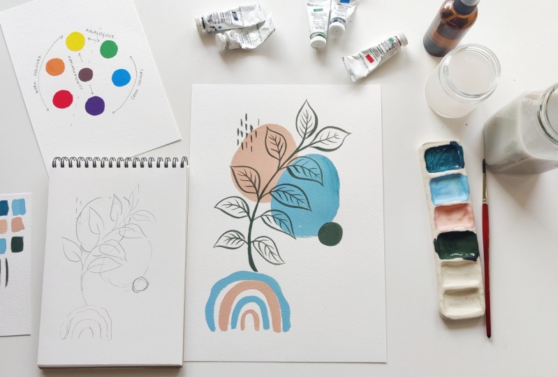
12. Class Project Part 1 : Composition and Color: [MUSIC] Now that you have learned all the
basics about gauche, you are ready to start
the class project. I want to remind
you to keep sharing your progress in the
project gallery. You can even share your
practice exercises and I'd love to look through
them and share my feedback. Today we're going to be creating a boho style abstract
illustration. As a starting point, let's jump over to Pinterest
and look for inspiration. I've just typed in boho abstract and this is so much
inspiration you can find here. Let's look at this, for example, I love this combination of this little irregular
shape blobs and this plant element, these little lines there. I love the colors that we see. This is a beautiful pallet like a terracotta
shade, some olive. [MUSIC]. I love that little
rainbow detail there, and I love how it's irregular
and not a perfect rainbow. Just go through this and
see what details attract you and what colors and composition you're
leaning towards. You can create anything inspired
by these but of course, I would urge you not to copy
any art of any other artist. Try to make it your own. Just look at this
for inspiration. I love this combination of this orange tone
with this blue tone. Those two are complimentary
colors and then it's been balanced out by a
neutral color there. Let's start creating
our own composition. Now that we have our inspiration
for different elements, colors, and composition, let's see how we can
bring it all together. I'd like to start with a
rough sketch of my layout. I have a sketch book here
and I 'll use that to roughly plan out my elements
and the composition. Like I pointed to you, I loved the irregular
shape blobs, maybe I'll use a
couple of those. I also love the rainbow element, especially the imperfect ones, so I'm going to add
in one of those. No painting of mine is complete
without some plants or nature element so
I'm going to add a plant coming out from
behind the rainbow. I'm happy with how that looks. This is just a rough layout
for me to get started. I could possibly add on
some elements later, like maybe a circle here, maybe some line
details, I'm not sure. Let's see how this goes, and I'll take some
decisions on the fly, but this is a good
starting point. You can do yours
exactly like mine or you can completely
change it up. Add any elements that you like, there are no rules here. I want you to feel free
to explore this in anyway that you like and that's
true to your personality. Now, let's talk colors. You already went through
some ideas on Pinterest. You might have an idea of what color palette
you want to go with. I'm living this completely up to you and I'd love to see
what you come up with. You can go with an
analogous color scheme or with a complimentary one. I personally, I'm going to try a complimentary color scheme and I'm leaning towards the
blue and orange combination. I of course won't be using them exactly how they look
in our color wheel. I prefer mode early use. I'll show you how to do that
using the primary colors. I'm going to start
mixing my colors now. In terms of materials I have a scrap paper to
swatch the colors, two jars of water, my palette and I'll be using a size 6 princetone
heritage brush. To mix my colors though, I prefer using brushes that
aren't so precious to me. I have a few budget
brand brushes for mode of rough use and that's what I'm
going to use here. I'll start by mixing my blue. I'll be using primary
blue as the base and adding a slight bit of
yellow for a green tinge. I actually wanted it
to be a more earthy. As I explained to you the
way to make colors earthy is by adding the color opposite
to them in the color wheel. For blue, that's orange, and since we already have a
bit of yellow in our paint, I'm going to just
add a bit of red. I'm now swatching it on
my scrape piece of paper. I do love the color but I want it much lighter so I'm
going to add white. Now if I mix white directly
in to the dark tone, I'll need too much white, so instead what I'm doing
is mixing it in a fresh pan and adding the color into the white instead of adding
the white into the color. I'll save the dark shade
to add some shading later. For the second color, I'm going to go with the
complimentary orange. I want it to be pistel but also quiet earthy so I'm
adding a patch of blue. What I'm trying to accomplish is a pistel sun city orange. I do like how it looks but
I'm worried that I've not mixed up enough paint
and like I told you, it's very easy with gouache to underestimate the amount
of paint that you need. Keep in mind that we needed
it to be nice and creamy on the paper so make sure you are mixing a
sufficient amount. It becomes very hard later on to come in and mix the
same color up again. I'm just going to
make some more. Now, it's looking good to me. I just feel now that,
the two colors, the blue and the orange
are very similar in value. Remember that's the
lightness or darkness of the color that
we discussed and in a painting you want to have a good variation
of values so that it adds interest and it doesn't look too flat or
one dimensional. I think I'll just
darken the blue a bit. Like I also told
you with gouache on the palette it's just so
hard to judge the color. It might look exactly the
same as it looked before but it is darker and when it
dries you'll see that. I'm just swatching
this color out and I'm also adding
a small strip of this darker blue next
to our lighter blue so that when it dries I'm able
to tell the difference. The final color I'm going
to mix is a deep green for which I'll again use
the first blue as my base. Doing this ensures harmony with all my colors
because they all have some similar undertones and they have similar
composite colors. I'm adding some yellow, some blue, and mixing it up. this is still a very
bright green and I actually wanted much
deeper and darker. The first thing I'll do is add the complimentary color
which is red to deepen it. I feel like it became
a little too red so I'm balancing it with some
more blue and yellow. Now I have a nice
deep and dark green. Isn't it interesting
how we created this color with no
green and no black? We just used three primaries
and created this rich, deep shade of green. Now let's get into the fun
part and start painting. [MUSIC]
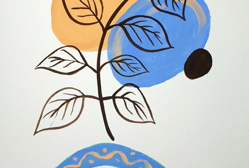
13. Class Project Part 2 : Let's Paint!: [MUSIC] I've got
the spray bottle with me which is
filled with water, which is useful to reactivate if your colors are getting
dry on your palette. You'll see later how I use that. I'm now switching over to my Princeton number
6 round brush and I'll be starting
with this blob here. I'm keeping the paint creamy, but relatively dry
because I want to create the slightest bit
of dry brushing for texture around the edges. I'm just moving my brush
freely to create the shape, not trying to be
perfect about this. I'm not painting the
second blob yet, that's going to be in blue. I'm going to wait for
the orange to dry first because I'll be
layering it over this. Since the rainbow element is independent of the
other elements, I'm going to start with that. The rainbow is going
to have four arches and I'm planning the
first one to be blue. The second and fourth
will be orange. Again, I'm taking my
paint and I'm keeping it a little bit dry so that
I get some texture. I'm not trying to be
perfect about the shape. I'm just freely moving my brush
and I'm creating texture. If you want to go in and
fix your shapes around the edges and improve
on them, just do that. The next layer will be blue and the final one will
be orange again, so I'm going to paint that. I've now allowed
the orange blob to dry fully so that I
don't reactivate it. Even if you do reactivate
it by mistake, don't worry. Like we discussed earlier, you can always go back
and correct it later. I'll now create my blue shape. I'll first complete the
rainbow before doing that. For the largest arch, I'm going to create a squiggle. It's completely fine if the
colors start chart overlap. We're not going for
perfection here and there's absolutely
no pressure. Just feel free to
work as you wish and turn the paper in any direction that you feel
comfortable working in. I'm just creating this
beautifully imperfect squiggle. Now, I'll create
the layered shape. Here you want to be careful
and move a little fast, I'm being very light
with my brush, especially in the
parts that overlap the orange so that I don't
reactivate the base layer. I'm also making sure my paint or my brush
are not too wet. With acrylic gouache, this will be a lot simpler
because once it's dry, you can't reactivate it. But with water-based gouache, you need to be a little careful and don't overwork your paints. I'm again trying to
create some texture and allow some of the white
of the paper to show through. I'm now going to add a bit of the darker blue color
and do some blending. Since it's dried on my palette, I'm going to reactivate
it with the spray bottle. Make sure you are
blocking your painting so that you don't spray onto it. I'll now add some of the darker color here
and blend it together. [MUSIC] Now, all of this is
dry and I'm going to paint my plant element
from there to there. You can really paint any
element that you feel like. For this I made my brush
to come to a fine tip, so I'm just testing the
consistency before I start. I'm keeping my hand steady
and creating the stem. I prefer dragging
the brush towards me so I'm turning the
paper accordingly. Towards the end, I'm lifting my brush up gradually
for a fine tip. You'll see me do this with the leaves and the
veins as well. Now I'm just going to go in and add all the leaves
and the veins. If you're not too
comfortable going in and painting without
any pencil sketch, you can even sketch out your other elements in
advance on the paper. Just make sure you're
sketching them very lightly and erase any parts that are
too dark before you paint. Also make sure your
paint is thick enough so that the pencil lines are not showing through them. I personally like having
some realistic elements, but if you're not
comfortable with drawing, you can completely avoid that
and keep it fully abstract. Just do whatever you're
comfortable doing. [MUSIC] I'm also going to go in and
paint these two details. That is this little circle
here and these line details. [MUSIC] At this point I'm
just switching over to my Princeton round brush of Size 4 instead of 6 so that
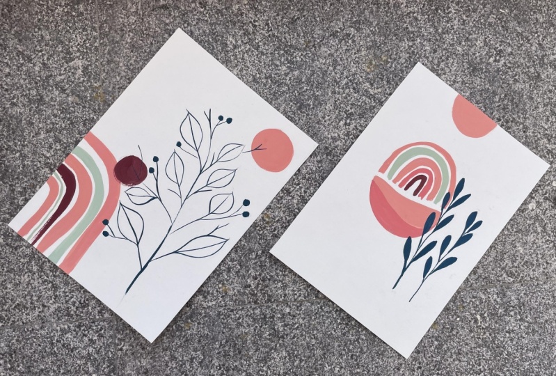
I can get thinner details. [MUSIC] That's our complete project. I hope you had fun
doing this and I'm really excited to
see what you create. Please make sure you share your projects in the
project gallery below. Remember to have fun
with this painting. There are no rules. You can paint any elements you feel like and there's just
so much you can do this. [MUSIC]
14. Summing it Up: [MUSIC] So here we are at the end of this
class and I hope you all really enjoyed it
and learned a lot. Just to recap everything that
we learned in this class; we went over understanding the right materials when
working with gouache. We also understood the
different consistencies of gouache and how they could be applied in different techniques, we understood the
basics of color theory, we understood primary
and secondary colors and how they work with gouache. We also understood
the three key key to master when you're
working with gouache, and we saw how all of these can be applied into a project. We went over how to compose a painting by looking
for inspiration, picking the right eye palette, and finally actually putting
your ideas on paper. You can connect with
me via Instagram and you can subscribe
to my YouTube channel where I share a lot of
tips and tricks when it comes to working with
gouache watercolor, or just starting
an art business. Don't forget to follow
me on Skillshare so that you're notified whenever
I release a new class. I would love to know what you think and if you
have any questions, please leave them in
the discussion box, I would be happy
to reply to you. I'm also really excited
to see your projects, so even as you go along and you're doing the practice
exercises with me, keep sharing them in the
project gallery because I'm sure the other students would love to see them as well, and I'm definitely
excited to see them. Thank you so much for watching
this class and once again, don't forget to share your projects in the
project gallery below. I'll see you next time. Bye. [MUSIC]
 Shivani Patel, Gouache Artist | Creative Entrepreneur