Transcripts
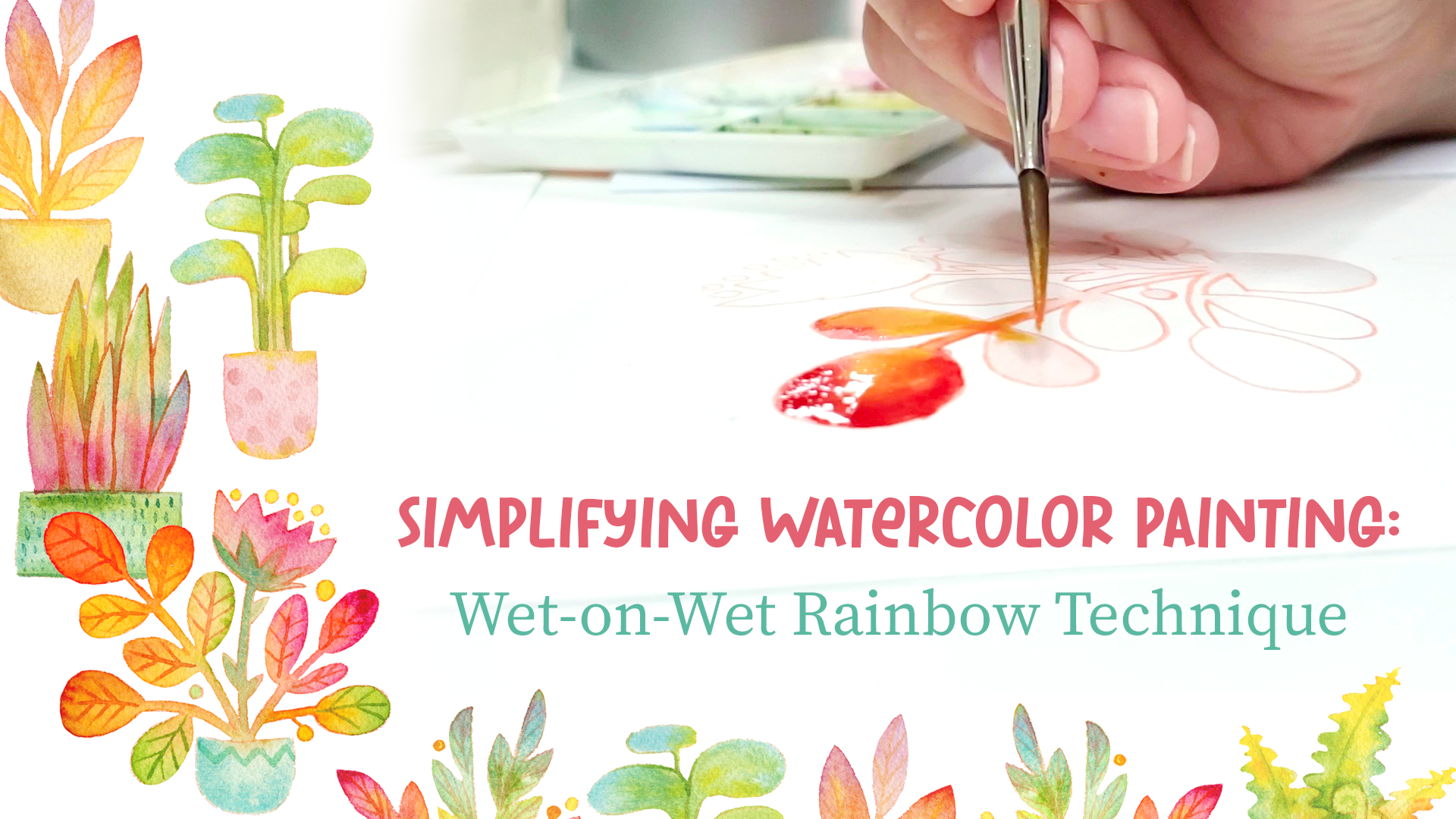
1. Introduction: [MUSIC] Have you ever felt like throwing in the towel with your watercolors, you just get muddy colors and the paints don't go the way you want. Now, what this class, I want you to wipe that frustration away and start new and have fun with watercolor. Hey. My name is Mirka. I'm an illustrator, author, painter, educator, wife, and a mom. I am here to show you how fun watercolors can be. I've done watercolor personally for about 30 years, and I use it as a medium for a variety of projects. I've done picture books, puzzles, home goods, greeting cards, and fine art with it. In this class, we are also going to cover paint and brushes and paper, and other materials that we use in watercolor, most of them which you can find around your house already. Then we will explore one of the most fun and exciting techniques in watercolor, on wet painting. [MUSIC] The reason why I love this technique so much is that you have both control and the bug fun part of the unexpected. You put the water down and you control what colors you want and where you're going to put the colors, but then you have the unexpected part of the colors mixing on the paper and doing what they want. The fun part is you're never going to have two paintings that look exactly the same even if you're trying. We're going to do some exercises first to get comfortable with our watercolors, and then after that, we're going to do a final project where we're going to be painting rainbow plants. It's a fun project, and we have several plants for you to choose from. The finished projects make really fun cards or they can also just be painting that you hang on your wall. If you are a beginner, we will cover the basics in this class, from square 1 step-by-step. Then if you're more of an advanced painter, then you can use this technique as an underpainting, or an underlayer to your final pieces. Personally, I'm a literal thinker. I like my animals to be the color they are and things the way that they are in nature, and by using this rainbow painting technique as an underlayer to my final painting, it gives me a little bit of an unexpected edge and it gives a little bit more whimsy and interests to the final painting. Either way, everyone will be able to walk away from this class feeling more confident in the way that you mix colors and use them in your paintings. I hope you're ready to have fun with watercolors. Join me in this class and let's go.
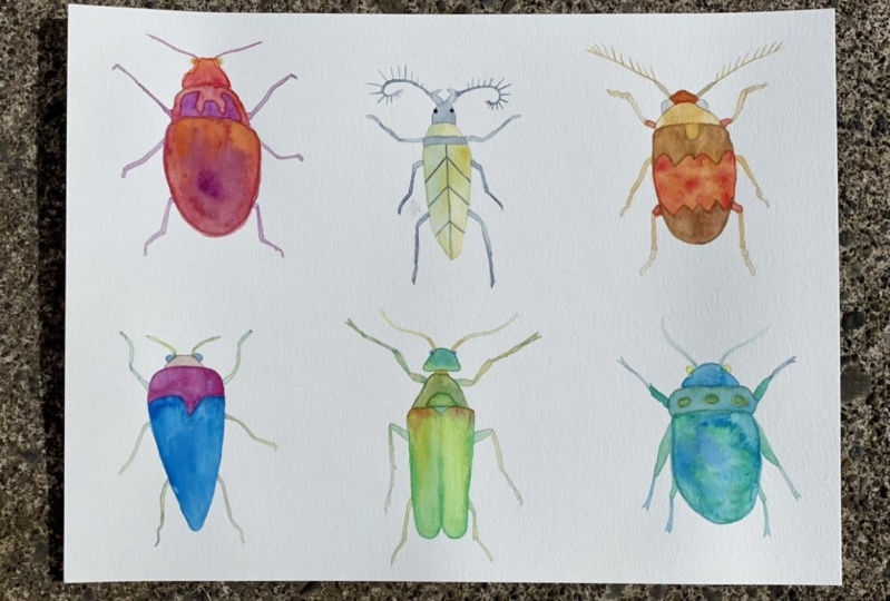
2. Orientation & Paper: Thanks so much for joining this class. I can't wait to jump in. What we're going to do is, in today's class, we are going to learn about the wet-on-wet painting technique. Before we get started and we jump into our main project, we're just going to do a simple exercise just to warm up and get to know our materials, and then we'll be all loosened up to go into our main project. Now, the reason why I chose these plant shapes for this class is because plants come in all shapes and sizes, they come in different colors, and so we don't really have to be tense and worry about what we're going to be painting. It freezes up. In contrast, if I told you that we are going to be painting human faces today with watercolors, you would get really nervous and you would tense up. That's why doing these plants will just free you up. I'm going to give you sketch to work on, so that way you don't even have to worry about drawing, or what plant you're going to do or anything like that. You can just join the technique. Before we get into the actual exercise and getting comfortable with our supplies, I wanted to just go over our basic materials. I have some paper, and I have some paints over here, and brushes, and some other little things that you probably have around the house. I'll just go over that with you really quickly first, just in case you're a new person to watercolor, or even if you're already further advanced in your way, it's always really interesting to see what other people are doing, and what materials they chose, and why. Let's get to it. Let's start with talking about paper. Watercolor paper comes in all different sizes. You can buy them in really large sheets. This is just about half a sheet. You can buy them in pads, also you can get different sizes, and these ones are great if you're doing a lot of traveling. Then watercolor paper also comes in these pads. This is a brand called Stonehenge. With these ones, the watercolor paper is usually glued on all four sides. You can paint directly on here, and then use a palette knife to cut it out here here. Most commonly, I use the pads for myself. If you just want to test something out, it's a good idea just to buy one sheet of paper and see if you like that paper, and then if you like it, then you can either get pads, or you can buy more sheets of it. A little bit about the thickness of the paper, which is usually referred to as weight. Watercolor paper comes in three basic weights. The thinnest one is 90 pound. Let me grab one. This is 90 pound, and you can see it's flimsy. When you paint on this, it buckles. I don't recommend the 90-pound paper. Then the most common paper out there is 140 pounds. This one is much more robust. It's a lot thicker, and so it's just easier to paint on this. This one, if you're going to do a lot of overall heavy washes, it's nice to stretch the paper, but for our purposes of doing these small little compositions, we don't need to wet this paper, but we can. If you buy a block of paper, you can just keep your paper stuck on there and just paint while it's attached to this thing. That's another one. Then the heaviest one is 300 pounds, which it's almost like a cardboard or a mat board thickness. Unless you're trying to do giant paintings that require really heavy washes, you are okay with just sticking to the 140-pound paper. Then the watercolor paper comes with different textures on the top. The main ones are hot pressed and cold press, and nowadays you can also get rough paper. The rough paper, it's just about the texture on the top. The rough paper has a really rough texture. The hot press is very smooth, and there's almost no grain, and then the cold press has a little bit of a grain on it, as you can see in the close-up. Now, for most of my work, I really prefer to work with hot press paper because it doesn't have that tooth. But you're welcome to try both and see which one you like the best, but I'd like to do a lot of details, and a lot of times it's just easier to do that with the hot press paper. The two different brands that I use a lot is, I have a lot of Arches paper, I like Stonehenge paper, and then there's a Fabriano Artistico that is also good. Those are the main brands that I use. Then there's something called sizing, and you might not have heard about that before. Sizing is basically a layer that is on top of the paper that controls how much water sips into the paper. If you have a paper that's not meant for watercolor and you put water on it, it'll just soak right into the fibers, and you don't really have any time to work with it. But with watercolor, it has sizing on it. It's a type of a glue, and so it keeps the water from immediately soaking into the fibers of the paper, and that gives you that open time, like what we're going to be doing in this class for the wet-on-wet painting. Then as far as quality of papers, I feel like between brushes, and paper, and paint, paper is the first thing that you should splurge on. You can get cheap paints and you can get really cheap brushes, but paper is really the one that you want to splurge on. The difference between the paper, it's really the difference between a good and a bad painting experience. The bad watercolor papers that I've tried, they usually have too much sizing in them, and so the watercolor actually doesn't sip into the fibers at all, it just ends up sitting on top of the paper, and so if you want to do another wash on it of a different color, it just all comes off and it becomes all muddy. I would really recommend that you buy a good quality paper to start off with, and then once you get the funds, then you can buy more expensive paint and brushes, but really splurge on the paper to begin with. Now that we know about paper, let's check out paints in our next video.
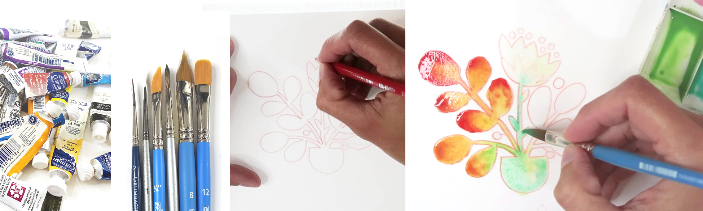
3. Paints: [MUSIC] Now that we have the paper figured out, let's talk about paint. Paint can be really overwhelming too. There's just so many different brands to choose from, and there's a student quality, and the artist quality, and there's different names and you're just confused. Here are some tips on how to choose the best paint for you. Paint in general is just made with a pigment and a binder, and when you put those together, you mix it up like with flour and water, then it makes a paste, and that's what you get when you buy it in a tube. The watercolors also come in pans. These are little things called half pans and you can get the full pans that are just twice as big. It's basically the same thing, but in this one it's just been squeezed out and it's hard to know. Then you add water to it to reactive and paint with it again. It's up to you. Both are just the same. It doesn't matter which kind of watercolors you get. When you go to the store, you will usually see that there's a student line and then there's an artist line. For example, for Winsor & Newton watercolors, they call the student line Cotman watercolors. Then they call the better, more expensive brand, they call that their professional inks. The difference between the professional and the student great inks is that the professional inks usually have more pigment in them if they're a little bit more saturated, so it makes a better quality paint. Then with the student colors, they usually have less pigment or they have a mixture of cheaper pigments to make it appear like the more expensive pigment so that it just matches the appearance. If you can, buy the professional quality pigments, but I started with student grade watercolors and I still use them in some of my work today. Just because they're cheaper doesn't always mean that they're not much worth. If you're just starting out and you're looking for that first set of paint to buy, sometimes it's easier just to get that set of paints rather than trying to figure out individual tubes and then figure out how and where to put them. A good set is the Winsor & Newton Cotman Watercolor, Painting Plus 24 Half Pan Set. I will link that in the resources section. I'll have a whole sheet with the information in it. Then if you want to buy some tubes, you can just start out with a few tubes of watercolor and you can always paint monochromatic palette paintings. Then as you progress, then you can buy more tubes of paint. For that basic set, I recommend these colors, you don't have to worry about taking notes, these will also be in the resources section. For those basic tubes, if you want to buy individual colors, I recommend cobalt yellow, alizarin crimson, cobalt blue, Paynes gray, Phthalo green, burnt umber, raw sienna, and Rose Madder. The Rose Madder helps you mix nice purples. Purples are in general hard to mix. Then if you have extra funds and you want to add a few things to your color palette, you can get Prussian blue, lemon or cadmium yellow, cadmium or pyrrole red, viridian green, burnt sienna. My favorite is cobalt teal blue that I get from Daniel Smith. When you're looking at the paints at the store, sometimes you'll see that there's a little word hue at the end of something. If it says the name of the color and then a hue, that means that that color is more of a manufactured imitation of the original pigment. A hue is a little bit maybe cheaper and less toxic to me. That's why they sometimes make the hues or maybe it's an easier pigment to get. If you look at the pigments, you'll usually also see they will have a little section with numbers on it, letters and numbers, and those are the pigment colors that are inside of that tube of paint. If you get a watercolor that just has that one pigment of paint in general, those are the better colors to mix with other colors to make more colors, like a yellow and a blue makes a green, but if you look at that label on your paint tube and it has multiple different pigments on it, for example, sap green has multiple different pigments in it, then those colors, because they are already a mixture of many different colors, then let's say you want to mix that with the blue, you just end up getting very muddy colors. Just being aware what colors you have if they have multiple pigments in them, then you know that that might not be the best color to try to mix up a bunch of other colors. Whatever watercolors that you have at home and that you choose to use, I just urge that you have fun with our little warm-up exercise. Just mix the colors, see what you get, and have fun with it. Before we get to actually painting, let's talk a little bit about brushes and then our other supplies that we need, and then we're ready to go.
4. Brushes: Now that we know about paper and we know about paint, it's time to talk about brushes. There are a lot of brushes out there. But the great thing is, you just need a couple of brushes to get going. You don't need a whole bunch, and brushes don't have to cost you an arm and a leg. You can just walk to your closest art supply store and buy a set, and you'll be good to go. One of the main things about brushes is just making sure that you pick one that's suitable for watercolor. The way that you can tell if a brush is good for watercolor is that it's usually really, really soft. The brushes that are meant for acrylic and oil painting, they'll be stiff, so they're not really useful for moving watercolor paint around your paper, so just make sure when you're buying brushes that they're meant specifically for watercolor, and then you'll be good to go. Let's look at some of the different shapes of brushes, and I'll let you know what my favorite one is and what you can get by with just to begin with. Obviously, I have a lot of brushes. But in honesty, I really use a very, very small fraction of events. Let's put those away. First of all, we have these brushes that have a rounded edge. The way kind of mark that that makes it's obviously it's the same shape as the brush. This is the kind of marks. Maybe if you were working on leaves, I can turn the brush sideways. If I'm working on leaves or a tree, it makes little teardrop shapes, so that's what this brushes for or a good for. Another shape we have is these chisel-shaped brushes. These ones are great. I like these. Let's say I have a little tree or mushroom shape or something, and I want to paint around that. I really like these for edging, maybe we'll get a red color for change. The marks that these make, is, obviously, it'll make that chisel. You can do pointed marks with it. It's always going to have that triangular angle pointed at the top. But the reason why I like them, is I feel like they're really great for getting into those little tiny spaces and painting around. I can do the edges first, and then I have this big wide area to do the bigger areas. That's what these brushes, in my opinion, are great for or that's how I use them. Then the next thing I have, is I have several round brushes. You pick these out. These are all round brushes. You'll see one is a small one. Then there is one that has really long bristles on it, and then this is just a medium-size one. The small ones are great for details. But sometimes, they run out of paint in the middle of painting, so that's why I like these ones; they're called liners. The paint will just last longer on it, so they're just really fun. See how long I've already been able to paint with just one time loading it with paint, and I could keep going, but this would not be a great brush to try to fill out a big area of color. The ones with the skinny long bristles are great for liners for lining things. This is what is probably going to be most useful for everybody. This one is a little bit bigger. It makes a nice little point, so I can do really teeny tiny lines with it. I can do more of calligraphy-type thing where if I just barely touch it, it's obviously skinny, but then I can push down, and it'll make a wider mark. With this one, if you needed to, you could also fill out a bigger area with it too. We could do the other side. Get some yellow in here too. It'll make green since I hadn't blue on it. This one is a great all. If nothing else, it's good to buy maybe two, or three of these brushes and get them in a couple of different sizes. This is a Size 5, so it's a medium-sized brush. You could get a Size 5, and a Size 1, and then maybe a Size 12, and that would really get you going, and you really don't need anything more than that , so that's done. This is great also if you want to do leaves or anything like that, or for just any kind of stippling like that. My current favorite brush are these brushes that are called pointed filbert or cat's tongue brushes. With the big one, you can see it the best. I'll put the other ones down. It's flat but skinny, skinny and flat, and then starts out wide, and then it comes to a point. These are in the same way as that angle of chisel-shaped brush. These are really great for doing little details, but then also they're able to fill in large areas of color. Let's grab a different color. Do some purple. Oops, it doesn't really have a good point. Let me get the blue. [NOISE] I'll try this again. It's not quite as severe as the chisel. Depending on how new your brush is, it'll make more of a pointed mark. This is also great for if you want to do leaves on a tree or a texture like that. It's great if you want to do thin lines or also do the same thing where you go. The range on this one is more than the range on one of the round brushes, just because of the sheer volume of the size of the brush. In the same way, as a round brushes are really great all-around brush, this is also a great all-around your brush where you can paint around things, and you can get wide areas done in a short amount of time. Because it has that wide middle section, it'll hold a lot of water in there to paint a large area of color too. If you wanted to do variety, you could have a big, medium, and small of these, and then you can have a medium. This is a Size 4, and then I also have a Size 2. You can maybe have a Size 2 and a 4 for details if you wanted, but they do almost the same thing. You can really just pick one, and then go with it or get two about the same size and then paint with them and then see which one you like better, and then get more of that kind of brush. But with all brushes, the more you paint with them, they will wear out after a while. You'll notice, I'll show you a closeup between my two, these are both the same size brushes, but one of them is a lot more. It just looks a lot more raggedy and frizzy, whereas the other ones still looks nice, and the other ones still looks nice and sharp. You'll notice when you're painting with your brushes, when they get a little bit older, that point that it used to make will start disappearing. When they're nice, and new, and fresh, you'll get it wet, and it'll make that nice new point. Once you've been painting with it for a while, just the bristles on your brush will get old, and they will wear out, and then you'll notice that it just won't make that point anymore. At that point, it's probably a good idea to get a new brush. But I usually save all those old brushes anyways because then they're great if you just want to do not so nice. I don't want to do it because this one is a nice one. Let me see. Maybe this one is a little bit of an older one. Well, actually [NOISE] [inaudible] I'm going to get an older brush over here. This is a numbers 3 round brush. If you have an older brush, then you can do more painting to your brushing. Whereas when you have a nice new brush, you probably don't want to abuse it too badly. There is two different kinds of brushes. There are brushes that have synthetic fibers. Let me grabbing a painting brush that hasn't been used. Then there are brushes that have natural fibers. You can usually tell just by looking at the brush which one is which. You can usually tell which brushes are synthetic, and which brushes are natural just by looking at the bristles. If you look at this one, it's obviously a non-natural color, but it's also very even it's just a single orange color, or it might be white, or whatever color or a yellowish color. But when you get the natural bristle brushes, there is usually a little bit of a variation of a color, so it starts with a lighter brown over here, and then it's a different color on the top. You'll see because they're actually from real animal hairs that have been put together, there will be a little bit more of a variation in the colors of natural bristle hair. Usually, when you do buy the brushes, wherever you're buying them, it'll tell you if they're natural or not. Personally, I don't think there's much of a difference between which one you're using. In general, the animal hair ones will retain water a little bit better. They will hold a little bit more water in between the bristles compared to the acrylic ones. But as far as the general sense of painting, I use both. I probably honestly use more synthetic brushes than I use animal hair brushes and that seems to work fine for me. It's your personal preference which one you want to go with. A third category for watercolor brushes are these synthetic travel brushes. They actually come with the reservoir. You can open it up, and you put water inside of it, or you can even go ink inside of it if you wanted to. You close it up, and then when you squeeze it, the water will travel through into the tip of your brush, and then you could use this. They're great if you're going to paint in the field or sketch outside, and then you'll have your water with you. [MUSIC] That was easy. There is so many brushes to choose from. But thankfully, many of them will work great regardless of your experience level. Lastly, let's look at the other materials that are helpful for painting. [MUSIC]
5. Other Supplies: [MUSIC] For this last video, we've already looked at paper, and paint, and brushes, and so let's look at what other things you need. A lot of these you might already have around the house. Whenever I'm painting with watercolors, I always use a large jug of water. Having a large jug instead of a small cup just really helps. Imagine every time you switch your paintbrush in there a little bit of paint gets in there and then once you do it a lot, the water gets dirty but then when your water is dirty and you pick it up to mix a new color, your colors are going to get all muddy. Having a large jug of water just helps me paint for a longer time without having to change the water, get up and go do other things. Then another thing that could be helpful is a little pipette like this one. You can buy them at most of the art supply stores and you squeeze it at one end and then it'll suck water in. Then that way you can put water directly onto your palette if you need to. But it's not necessary, it's nice to have if you're looking to buying a nice little thing for yourself. Then another thing, I have a very dirty one, but you need a mixing palette. These are really cheap, they usually cost about a $ at the local craft store, a couple under five bucks anyways. You can use one of these ones and that's ready, so it has little compartments for all your paints, which is really handy, or then if you don't want to go by one, then you can just use a ceramic plate that you have around the house, and that works just as well. [NOISE] Another thing that you need is just regular roll kitchen towels. The way that I use the kitchen towels is, see I have really dirty ones over here, you use these in the middle of painting just to dry your brush off, and it just makes your painting process easier when you have a right amount of water on your brush. We'll talk about that in the next video when we're doing our exercise. Then lastly, [NOISE] well, a few last things, you need some pencils to transfer your drawing onto your watercolor paper. You can use just a regular leaded pencil, or then I like to use these Prismacolor Col-Erase pencils and they're colored pencils and they come in a little set that has about 10 colors or so. But the nice thing with these is that you can actually erase it, so you can put it down and then erase it if you want to. I feel like a lot of times those lines will show if you don't erase them properly in your final painting and I like having those red lines versus gray lines that are regular pencil mix. That's just a personal preference of mine, but you could use a regular pencil, it works just as well. It's just what kind of look you want for the final painting. [NOISE] Then you need to print out, if you want to draw your own, you can draw your own, but the easiest thing is if you just want to print out the pictures of plants that I have already drawn out. We are going to transfer these onto your watercolor paper and then we're going to be ready to do our final project at the end of our video. Let's do our other exercise first. I almost forgot there's something called gator board and if you ever want to work on bigger pieces of paper and you really want to soak your paper with water where it's going to get worked up, then it's good to stretch your paper and attach it to something. I use this stuff, it's called gator board and it's a thick, it looks like foam core and it feels like foam core, but it's got [NOISE] a plastic front to it and then it's got with a foam plastic middle to it. What I do with this one is I just used to see some paint marks on it. I get my paper wet and then I place it on the top and then I use a stapler and I staple the paper onto this board and then I let it dry. Then that way when I'm painting, it won't work on me when I get a lot of water on it. It's not something you need to buy now, but it's nice to be aware of it so when you continue on your watercolor journey and you want to start painting larger paintings, it's nice to know that something like that exists where it's really easy to attach it on there and then you just pick it off and throw the state goes away. Then I wanted to take a few moments at the end of this video just to show you how I organize my painting space just to make things flow nicely and to make the painting process just more enjoyable for you. Here's what my painting space looks like. I have my painting. I'm right-handed, so it set up for right-handed operations, if you're left-handed, then you could set it up the opposite way. I'll have my paper on the left, that's the one that I'm going to be painting on. Then on the top, I'll have my water cup and so that way I can easily dip my brush in there. What I don't want to do is I don't want to be carrying water or paint over my painting before I'm ready to paint. That's why I can have everything on one side. I'm not dipping my brush on the left side and then bringing it over to mix color on the right side, I have everything situated close together, so that way it's less movement and everything is closer together. Then we have the water cup, and then next to that, I have my big painting where my actual colors are so whatever painting palette I'm using that day, and then I'll have a little mixing palette. Then you'll see there's a little scrap piece of paper over there. It's helpful a lot of times if I'm working on a painting, I'll have the margins that I use for testing my colors out, but if you don't have margins worked into your painting, then you can have a separate little scrap piece of paper to test your colors with before you actually put it on your painting. My recommendation would be to have that separate, that little scrap piece of paper be the same paper that you're actually painting on because sometimes paints behave a little bit differently on different kinds of papers. It's just nice to have both the same stock. Now that we have everything sorted out, we know what materials we're using, we know how to set up our space. Now we can be all sorted out and we can start painting. I'll see you in the next video. [MUSIC]
6. Prepare to Paint: [MUSIC] I'm so excited that we finally got to this part of the class. We are going to grab our brushes, and our paints, and our paper, and finally, get to work. Now, if you are brand-new to watercolor, and you have that set that you haven't even gotten wet yet for the first time or even if you've been painting for a while, but you've never painted a color wheel or practiced how all the colors go together, I wanted to take a moment right in the beginning before we get to anything else, to just explain how the color wheel works, how the paints that I mentioned, how they work together, which colors you shouldn't be mixing. Understanding where colors lie on that color wheel really helps you with getting your paintings to look harmonious and pleasing to the eye. If you have a brand-new paint set, what I usually do first is I always make a little color chart, so I know which colors are where. This one is my very well-traveled chart. You can see it's getting messy. But the basic idea is that, whatever order your colors are in here, that's the order that you paint everything here. This is my basic palette that I use for a lot. Then, this is a little travel palette, and I've done the same thing. That's just the flip out little piece of paper. I just feel that it's important because when the colors are drying down here, it just looks very different sometimes to what it actually is when you wet it, and put it on a piece of paper. It's helpful to have a little reference. [NOISE] Here's another one, where it's just easier to correlate which one goes where. [NOISE] This one is just the last one. It just has a round one. I have most of the basic ones in this one. We'll use this one for right now, just to keep things easy. Put those away. I'll bring my palette in, so you can see me mixing paints over here. I've got my large jar of water next to me. Let's just look at how the basic colors that I listed work. If you have different colors on your palette, just use whatever colors you have. The main three colors for watercolor painting or any kind of painting are yellow, and blue, and red. I'll start with my cadmium red. We'll put it right here. We'll paint a little bit of a circle over here. If it's easy for you as you go, you can also label everything, there. Then the next one, let's get our reds. I'm going to put, [NOISE] in water. There we go. The next one, I'm going to put cadmium red. That red is a warmer red. I think, I am going to put it in right here. Then right next to it, I'm going to put my alizarin crimson. If you don't have all these are paints, don't worry about it, just use whichever ones you have. I'm just going to put those next to each other over here. [MUSIC] Now comes the fun part. Now, let's make some mixes up. Let's start. On this side of the wheel, we are going to be mixing our reds and our blues. Then I'm going to grab my cobalt blue. When you mix these two together, I'm going to paint it here, they make this purply gray color. [MUSIC] There's other colors in your palette, for example, if you have a viridian in there, just by itself, it's pretty bright. It's pretty, almost like a neon green. But let's say, you take that, and then you'll mix some yellow in there. It still makes a bright color, doesn't it? Now, it's super neon. But then, when you think about opposites on the color wheel, so if we're right here, the opposite to this is around the rose madder, or cobalt, around this purply reddish combinations. If I take a little bit of rose madder just a hit, I haven't taken too much and mix it with that. I can tone that green down into a really, really pretty shade of green. Let me mix a little bit more of that color. Adding the opposite color on the color wheel, if you do it too much, it'll make it muddier, but it will help you tone down your painting. When I put all three of those together, well, maybe a little bit too much. Let's add a little bit before that dries in here. You can get a pretty olive color, and I'll paint another square underneath over here. That gives you an idea with, just a few of these colors, a handful of all the colors of the rainbow that you can mix with them. You really can start with just a few. A great idea, if you're trying to do a painting, is just to make a chart like this. If you don't have all the colors of the rainbow on your palette, you just make a chart with it. Then, when you start painting, if you're painting a whole bunch, that's where these come in. What you would do is, let's say, I wanted to do a big grassy green area. I would put some water in here, maybe that's a little bit too much, depending, how big your area is. Then I would just mix my color right in here. I would just make a well of it. The great thing is, you can paint with it. Then, if the paint dries, you can always put a little bit more water in and just rehydrate it back up. I would just have wells like this color for whatever painting I'm doing. Then I would just add more to it. The great part with mixing colors like this and then painting is then, every time you're mixing a new batch of colors, it's usually a little bit different than the one from the previous one. That just makes your painting a little bit more livelier. But if you really want them to be the same, a good idea is to take the original color that you have and make a little swatch somewhere. That's obviously too light, so then I would mix more colors in here. Then when I get it to the right consistency to paint with. See how it's darker. When I get it to the right consistency, I would have a piece of paper for reference and I would put a swatch down. Then, when I mix the set of colors again, next time I can go in there with another piece of paper around it. I can test my new colors to make sure they match with the old collection. This is one way of making a color chart. You just set your colors one way, and then you write them the other way, and then you just keep mixing. As I'm doing this, I'm also trying to mix. This is where the main colors are, so if I'm mixing, let's say, the rose madder and then whatever I'm mixing it with, I'm trying to make in two different shades. Here with the viridian, there's a little bit more rose madder over here, and there's a little bit more viridian over here. There's a little bit more thalo here, and then a little bit more rose matter here. This side should end up being a little bit warmer colors, and this side should end up being a little bit cooler. Now, it's getting a little bit technical, but if you wanted to, you really only need to do half of this chart to get everything lined up. It's up to you if you'd want it to do it this way. But after you finish it, you'll be able to see all the different color combinations that you can make with the colors that you have. [MUSIC] I love exploring my watercolors and doing these kinds of exercises, and seeing how all the different colors mix together to make another color or versions of a different color, different cubes. Now, let's dive in a bit deeper and go into our actual warm-up exercise for a final project. [MUSIC]
7. Mixing Rainbows: [MUSIC] If you did the color mixing exercise on the color wheel that we did in the last video, I hope you're already feeling a little bit more relaxed and comfortable with your paints. Now, I want you to stay in that curious state of mind when we start doing our rainbow mixing techniques. Don't think that there's going to be rights or wrongs. Just mix the different colors and see which combinations you like the best and what looks good to your eye. In the previous video, we looked at how to mix our colors and then how the different colors are placed on the color wheel. Now that we get into our actual rainbow mixing exercise, I just wanted you to keep in mind of where the color sit on your wheel and how you're mixing them. When you're mixing the colors onto with water, the best colors to mix are colors that are next to each other. If you end up mixing colors that are opposite, they make muddy colors so it's always best to stay in one triad of the color wheel when you're mixing colors right next to each other. Then after that, you might start with yellow, and then you mix some green next to it, and then some blue, and then further away there would be some purple. But as long as the purple and the yellow aren't really mixing, then you're not going to get those muddy colors. Using a mixing palette, I recommend having one. It can just be a ceramic plate from home if you happen to have one. I have gotten to liking very simple one like this and the way that I usually fill it up is I'll have, right now, there's a little bit of white gouache in here too that I didn't wash off, but I usually have cool colors on one side. This will be blues that I mix blues on my greens and then I'll mix my yellows, and reds, and oranges on this side. Then, for these colors, because I usually use a lot of natural colors a lot of times, I'll have greens and browns, just more natural grays that I mix down here. But sometimes I'll bring if I need a large amount of, let's say green for a lawn or a tree, then I'll mix a big well of it over here. Then during the painting, if I need to clean a while, I'll clean one out and then put a different color in and you can totally do that too. For me, it's easy, rather than having many of these when I'm working, it's easier just to have one. Let's get to our actual exercise. If you wanted to pre-mix some colors for yourself, you can totally do that too. You can either use either a medium-sized brush or if you have a pipette you can use the pipette. [NOISE] But a lot of times I'll even just go back and forth with my brush but for the sake of this video, I'm trying to go a little bit faster. Let's grab this pipette over here. They don't need to be huge wells of color. Since we're doing a rainbow technique, we want a variety of different colors. So I think some of it's crimson over here. So there's some of that and sometimes, if I want a really strong color, I'll use it straight from my big palette. So let's get some yellow mixed out of here. So just getting these colors ready. [NOISE] I really, really like teal. Let me move this down so you can see a little bit better. I really like these teal colors, so I usually use this in most of my rainbow paintings, and usually, when I'm mixing color, it's a fairly intuitive process. If I wanted to make a spring green, so I'm going to grab some yellow and then actually mixing it with that teal blue makes a pretty pea-green color. Then I really like to have some orange, so I'm going to have some yellow and oranges are hard colors to make it too. Later down the road and your palate might already have an orange anyways. But later down the road, if you wanted to buy an orange color, just like the same way as I have teal, can't really mix that one. [NOISE] Here's, for example, a basic set that I would paint with so there's an orange color. The alizarin crimson, a reddish color, a yellow, a blue, or a teal. Then if you wanted, you could add maybe cobalt in there to you or maybe mix cobalt. I like mixing my colors instead of doing straight from my palette. I usually mix one or two colors. I think that makes a pretty blue oval. It's always nice to test your colors on a scrap piece of paper, so we'll go with them. All right, and I was using a just a medium-sized brush to mix the colors, but I'm going to change [NOISE] into this pointed one. Usually, I like to paint with this one. For this exercise, what we're going to do, I'm going to move these over so we can get our paper. What I want you to do is, basically here [NOISE] I'll make a little square for myself. I'm just making a square. Then I'm going to get [NOISE] wet and I want you to just practice in different ways. Practice one where you make it super-duper wet and it's just glistening on there and you can make one where you're using a little bit less water and just see how the paints mix and match with each other. Now, that I've got it wet, I'm going to start dropping in some color and so this is just an exercise to see how these colors behave. I can start with my green and a lot of times I'll just go damp things around. [NOISE] Some red in here too, maybe we'll go with the orange as well before the edges. Once your colors are on the paper, I'm going to dry my brush up so it's just a little bit damp. What you can always do is, you can always go in here and mix them a little bit if you feel like one area is going the wrong way or it's not mixing enough, you can go in there and stir the pot a little bit. But be careful with doing it too much because sometimes when you end up mixing it by hand afterwards a little bit, then it ends up being more of a mess and things get muddy. [NOISE] There's one and what I want you to do is I just want you to fill a page of these. I'm going to make another square, or they can be circles, whatever shape you want to do. [NOISE] There's going to be a difference depending how much water you load up onto the paintbrush. If I'm just saturating and this thing is just dripping with paint, it's going to behave differently and it's going to put down a difference. If I get it loaded, I put it down, it makes a giant drop. But if I load it with just a little bit of paint, let's go a little bit of a contrasting color. If I get a little bit of color and then I'm going to get some of that paint off. Now it's just barely loaded with color and now I do the same thing. When you have it loaded with more color when the wet has contact with the wet, it just blooms and you will be releasing more paint onto your paper. The less you have on your brush, the less you are going to be releasing. You can control how much color you want in certain areas as you are painting. Now, this is starting to get dry already as I'm talking, so I just grab more water from my water cup and I'm just going to be adding that over here. Washing my brush a little bit, I'm going to be adding a bit more water. Let's grab what color should we do? Maybe just the blue. Maybe this will be more monochromatic [NOISE]. Then depending also how wet your paper is, that also affects [NOISE] where your colors are going to go. There's really no right or wrong with the way that we're painting these. [MUSIC] [NOISE] When they mix, they make a brownish color right here in the middle. Depending how strong your green is and how strong your purple is, you'll get different kind of mixed results. [MUSIC] It's rather wet right now and the way that it's mixing. When we're mixing these colors, they just get muddy and not so pretty. In that sense, that's why I tried to keep my colors a little bit separate. I think there's really no mistakes that you can make with this technique. I think the biggest learning curves that you're going to have are going to be with how wet you have the paper and how much paint you load onto your paintbrush. Once you do these little exercises and get a handle or get used to how the paint moves and how much paint to load on your paintbrush, then it's really a no-brainer. [MUSIC] Now that it's wet, I'll just show you. Now if it's really wet and I'm going to drop just a drop of another color in there and just make a really strong color over here. I'm going to load my brush up early and I'm just going to drop one. When you drop it, or it can even be water. If I drop just drop of water over there wherever there's that extra added liquid that goes down on it, it pushes everything out. Depending what you have, what paper you're using, and how much water. If I drop a little bigger drop of water over there, so it's a bead of water, and depending how wet things still are, it'll make little circles over there. You can see as it's drying and the moisture as it's evaporating is pulling things out. You see where I made those little dots over there. Now we have a nice gradation. I popped a whole bunch of water in the middle accidentally, it's losing out. But if I go and mess with it too much, it's just going to look uglier, so I'm just going to leave it like that. Like I said, there's not really any mistakes that you can make. It's just fun to play around and see what happens. Then when you have a handle on the colors and the pigments that you're using from your palette, you just get used to what things do and what looks pleasing to your eye. Then you just use those color combinations. I'll show you guys one more. Then I hope that you go practice on your own. But then I still feel like the center should be a little bit stronger. I'm going to add a little bit more color on here. If you wanted to take these once they're dry and cut them out or make them regular, you could always take them and then paint little scenes in there if you wanted to if it evokes something in you. But for right now I just wanted to treat these as exercises just so you get used to painting and getting used to your colors. I just wanted to demonstrate really quick. I'm going to make a wet area right here. I'll just show you if I have a really, I'm going to just grab a whole bunch of red. I'm going to have a really full-loaded brush over here. What happens when you put that down on a really wet surface? Now if I have a slightly less wet surface, so a little bit of a less what surface, this is more of a damp. I'm going to have a fully loaded brush. A little bit less of a damp surface with a fully loaded brush, it makes a big blob and it's slowly starting this circle out from there. This is very, very wet and a dry brush. It just makes it a little blooms like that. Now, this is almost dry paper and almost dry brush. It's bleeding just a little bit but barely at all on there. Those are different ways that you can control the paint depending on the look that you're going for. After all that practicing in your full sheet of different color combinations, I hope you found your favorite colors. We all respond to color so differently. If you have a pencil handy, make some notes on the side of those little squares or circles or shapes that you made. Just note down which colors you like the best or which mixtures you liked the best. Then that way, if you forget later on, then that's easy for you to come back and reference layer.
8. Sketching: [MUSIC] Now that you're comfortable with the way your paint behaves and mixes on the paper that you chose, it's time to put those skills to use in our final project. The first thing to get ready to paint, is we need to have some sort sketched onto our watercolor paper. I have provided you with sketches that are in part of this class that you can use and I just wanted to provide ready-made sketches for you so you don't have to worry about what to use. You just paint these and then when you've done a set, then you can go off on your own and pick whatever to paint after that. This is just to practice and to get used to the technique. For sketching, I like to use the col-erase pencils. You can just as well use a regular pencil. It's up to you which one you want to use. I prefer the col-erase, and I like the red one because I like having red outlines. I think they look nice with my watercolor paintings. But you could just as well do a pencil. What you can do is you can always draw it, and then use a kneaded eraser or regular eraser to erase the lines if you don't want them to be too thick. But if you draw the lines and then you watercolor on top of it, then it won't erase anymore, so you have to erase it before you start painting. As you notice, the plants are fairly small. I encourage to work small when you're trying to learn a technique because then it's just less to control. You can put this against the window and then paint through or I have a little lightbox or a little light pad, and so as I turn that on, you can see that my drawing shows underneath. All you got to do is you just trace it. To get back to the idea of working small, I think that's especially important when we're working with watercolors. Where when you're working bigger and you're trying to control large areas of paint, it has time to dry and then you get those edges. When we're working with smaller areas, the paint has less time to dry and so you have more control over how much you're putting down and where it's going and when it's drying, and when it's wet. That way, as your skills get better and you figure out how to control the paint and what you want the painting to look like, then you start scaling up after that. It just keeps that momentum of success going from the very beginning instead of starting with a giant painting and then giving up because it's just filled with swatches and you couldn't control anything that was going on over there. Painting is just like any other skill. It's like piano or rollerblading. It takes time to build that muscle memory and to learn how much water your paintbrush is carrying and how it's going to drop paint down onto the paper and how the colors interact on the paper. Only by practicing and doing these exercises like we're doing right now, can you really internalize the processes and internalize how everything goes down. Then it becomes much more enjoyable when you're not constantly fighting with what you're doing and fighting with the paint. Secondly, by painting small, our paintings are not as precious because they didn't take a long time to make and, it didn't cost a lot of materials and, it didn't cost a lot of effort. Each little painting in itself is less precious. If you make a mistake, it's not going to be the end of the world. You just brush it off as time was spent practicing, and you make a mental note at what you can do differently next time. Then you just paint another one and move on to the next painting and it's not going to be a big deal. That's also another reason why it's great to work small. [MUSIC] Now that we have our plan sketched, let's get ready to paint. [MUSIC]
9. Painting Rainbow Plants: Now we're ready to paint. Just like in the exercise before, we're going to keep color theory in mind when we're dropping in our paint. For in general, when I'm painting these, I like the Princeton, the cat's tongue, or the pointed filbert brush number 4. But if you don't have one, you could also just use a round one that comes down to a point, that's helpful too. Pick the brush that you want to use. In general, I just use the same brush for painting this whole thing. I'm going to wet my brush. I'm just going to go in order over here and pick some colors to mix a green and re-mix this green in here. When I actually start the painting process, I'm trying to go fairly fast and just grab colors and drop them in. Just so you know, reds are treacherous colors. They will usually look really bright when you first lay them down and when they're wet, and then when they actually dry, they will dull down quite a lot so just be aware of that. But that's why it's great to do exercises first and learn and figure things out, and then once you actually get to painting, you know what to expect. Then if your red is a little bit dull and it's not bright enough when you finish painting, then all you do is you just add another layer of red to it second. Since I'm working on six pieces, a lot of times what I like to do is I like to have just an extra piece of paper under my palm. That way when I'm dragging my palm across to paint, I'm not getting the oils from my palm or anything that might be on my hand onto my paper. Also, I'm not smudging any of my drawings. Then the second reason why I like having a paper over here is if I'm grabbing paint in a hurry and moving it over and I happen to drip in between, having something covering most of the painting will help clean up or keep any of those messes off my actual painting paper. One more thing I want to mention is it helps if you plan what colors you're dropping and where you're putting them. In my mind, the way that I'm envisioning it is that I have a purply flower and then the tips of the leaves are shades of orange and a reddish color and then as we get closer towards the middle, they turn to green and then we're going to have a teal pop over here at the bottom. So that's my goal of how I'm going to drop my colors in and so let's see what happens. Getting this wet first. I'm just working on staying within my lines and I have a pretty wet brush over here. The red was the last color I was mixing so you can see there's a little bit of pink coming into my water, but that's okay. [inaudible] So I'm getting it pretty sopping wet. I'll take a video from the side too so you can see. I'm going to choose to do the whole plant first and then as if it dries, if you look at your paper from the side with the light raking just right, you'll be able to see how wet your paper actually is. If it feels like it's drying in the middle of your painting, you can always go and rehydrate it in the middle of getting everything painted. I'm going to do those little droplets last on the top over there on the flower. Make sure I'm just getting everything wet. I think my top got a little bit dry, so I'm just adding just a little bit of water here. I'm going to start with red. Like said, red is a hard color, it'll look a little bit brighter. I'm going to grab straight from my palette just to make it a little bit darker. I'm going to add some here. Oops. See, this is all dry already. Really quick, I'm going to wash my brush and I'm going to re-wet this whole area here. That will still be wet over there. Now I want to drop some yellow in, some orange. We're going to start with this yellow, orange color and then I'm going to drop in, test out how wet it is, and then I'm going to add some red to the tips over here just to work through. Maybe a little bit of purple too, and you can see I started a little bit right there. I'm going to add some more red. Then I'll let stuff mix in and then mingle over here. You can see there's a bigger [inaudible] of water. Everything's floating around over there than compared to over here, there's less water. We need to add a little bit more yellow over there. I'm grabbing a little bit of yellow straight from my palette on the fly and mixing a little bit orange in there just to warm it up. Like said, if after the first try you don't like the colors, you can always go back and add paint, some secondary layer of colors on the top. Then I'm moving on to this next one. In case it dried up, I'm just going to re-wet the paper gently. I'm going to keep this area wet too. I'm going to grab this orange color over here, just moving. That's why it's nice to do these small little paintings you're not struggling so badly with; you're just going one leaf at a time. I think I want to add- actually, well, let's see what happens. We'll add a little bit of green. Green right here. Looks pretty. Then I'm going to move up to the flower and I had a little bit too much green right there. Actually, while we're at the flower part, let me just paint this end too. Now I'm going up the stem of the flower and I'm going to re-wet it first. It's still a little bit damp from the first time when I wet it, it's easier just to very gently re-wet it before. You don't have to start completely from scratch, so I'm going to drop my teal in. I think I want to also add a little bit of green in here. Just to add some variation. Actually, let's put some green over here too. Maybe we'll add both green and some yellow. No. Well, if we're going to do the purple, a purplish pinkish flower then I don't want to add yellow. I'm going to grab this color that I have mixed over here, drop it on top. You can see it makes those sharp edges wherever the dry paper meets the wet paper. Now, I need a little bit more of a concentrated color, so I'm going to grab some Alizarin straight from my palette because I have a lot of water floating around over here, so I just needed a little bit more, a concentrated color than what I had mixed on my palette. I think that looks pretty good to me. It's really wet down at this corner, it's better not to try to dry it. I feel like at this point I'm just going to let it dry and then see what it looks like, and if I need to fix it, then I can fix it with the second pass through. I want these to be really sharp there. I'm pretty happy with that. Let's move on to our next leaf. Just so this doesn't look so lonely, I'm going to add a little bit of purple on these leaves too, just so it all goes together. Usually right now because of the filming, I have my lights setup straight more from the top but when I'm usually painting on my table, I have a window in front of where I paint, and so with the light raking in from the front. It's really easy to see where I have stuff wet, but right now the water is a little bit harder to see. I'm actually going in with a dry brush and drying that a little bit. Let's strap in some color. I'm going to start with that Alizarin on the top over here just so those two go together. I might need to add a little bit more just to make it a little bit darker on the edge, there. Then I'm just fade it down. Let's see. Did we use any of that? We didn't use any of this stuff here. Maybe I'll put a little bit of this in here too, just for fun. [inaudible]. Some red over here. These plants obviously you're not going to be completely realistic, but that's a fun thing. That's why we chose plants because we can just be whimsical and we don't get stuck up in how much it looks like a natural thing. Unlike when I mentioned earlier, if we were doing human faces then it would just be a lot scarier. I chose to do yellow here too, just so we're not completely different from what's happening on the other side. I'm going with this yellowish, orangish color here and then I think we're going to that green with the other tip over there, so it's balancing out the green. There. It's fun. That's ready and then let's just do our little dots all about. While we're waiting for these paintings to dry, let's head on over to the next video and see how we can finish them off with some details.
10. Adding Details: Okay. We have a few more little details to paint. I just wanted to show you if you are unhappy with some areas like over here, I really like these warm tones that I have but I feel like this one when it dried, it dried out really faded. So what I want to do now is just add a second layer to it. I'm going to mix, I'm going to come in with a darker color. I'm going to put down a little bit of color. Then I'm going to wash and dry my brush, and then just fade it out. Then that way you won't be able to see where that color ends and begins. If I show right here, these aren't super-duper thick paints, they're just very thin. I'm just putting a wash in here and keeping an eye as it's drying if I need to feather this out more. Like over here, I took colors straight from the palette and stuck it over here, so these ones ended up turning really dark. But then now my flower looks a little bit washed out next to them so I'm going to go back and add a little bit of color to that flower too in the same one way, making sure I just painted this other one else. Now that I look at it, I see that it's starting to create an entrant here. I'm going to go back in and fix it really quick. Okay, back to this flower right here, just adding some extra color to it. I don't think I'm going to do the whole flower. I'm just going to add some [NOISE] here and some there. [MUSIC] For this plan, I wanted to try something different and do a contrasting thing behind over here. I let the front layers dry and now I'm just going to go and paint the layers underneath and just a little tip. If you want to dry layers faster, what you can do is you can grab a hairdryer and then just blow it dry gently. But with a hairdryer, just be careful as it's blowing air out that the water doesn't spread wherever you're blowing it. So just be gentle as you go in. As I'm going I'm pulling that color with me. As that yellow and the teal mixes it creates a green. Now I have a green on my brush, but I'm going to go on my to my palette and grab some fresh yellow. [MUSIC] Okay. As you can see over here, when I was painting this one. You can see that I had painted this area, and then when I painted the bottom section, they ended up touching just a hair of here, and you can see that since this was wetter, it bled into the drier area creating this bloom. But if you don't like that, then I could go right now and paint on top of that but I don't mind those little happy accidents, so I'm going to let it be. Now for the final part, you can either grab color pencils or you can just stay with your brush. If you wanted to move on to a smaller brush, you could do that. Since we're going to do details. I'll just grab a little round brush. [NOISE] What I like to do is just you can go and outline and just create little details. Oh, actually just noticed that I wanted to add a little bit more distinction right here on the edge of. So I'm going to dry my brush. There. Then I'm going to clean it and dry it and then just feather that out there. Now you won't even know that it's there. [NOISE] Okay. So let's move back to our first one. I believe this is mostly dry over here, so I'm going to grab and wash my brush. Just as a tip, when you're washing your brushes and when you're done washing them, never leave them upright in your water cup. Because with the bristles, when they have them sitting in the water, especially if they're natural ones, they're going to end up bending and then you're going to have a bent brush. So just always make sure your brush tips are nice and clean. Then just set it on the table next to you instead of keeping them in that water cup. You could outline the whole thing. You can see that my color pencil outlines are over there. But what I want to do is I just want to highlight some of the details for the actual plant. Then for the veins on the leaves I wanted to stick with the stronger version of whatever's over there. Since this is orange and yellow, I'm going to go with the red and the yellow I'm going to go with red. [NOISE] Here's just what that color looks like. Maybe it needs to be a little bit more red so it's up to you how many or how thickly you want to layer them on there. Sometimes you think you put it on there well, and it's nice and dark, and then after it dries, it dries really light, so you might have to go over your lines. But I would rather have my lines a little bit light rather than too dark and globby. If you put a little bit too much paint on there, a good way to get some of that paint off immediately is just drying your brush and then touching that area again, and then that way it'll suck up whatever water you have. When I was painting these, I was a little bit hasty, so you can see that I gobbed my paint everywhere. That's totally fine. It can just be like that, or then if you wanted to fix areas, you could go on and fix areas and then what you could do is you could just go around and re-outline things. You could outline either with the colored pencil or you could outline with the brush. But obviously with the brush it's a little bit more tedious. With a color pencil, It'll just have a little bit of a different look. When we were actually painting these, that was our wet on wet technique and now this would be painting dry or wet on dry. This is just a great way to add little details into your painting. So that's that plant and the way that I want it to look. Then if you wanted to decorate your flower pots with polka dots or stripes or whatever it may be. You can do that at this base too. [MUSIC] Wasn't that fun. Now, I love this technique so much and I use it in almost all my paintings. I'm pretty sure you're as excited as I am about finishing these paintings. But before you run off with your piece of paper, just make sure the last ones that you painted are completely dry because otherwise, those little last puddles of water might smudge or drip off your paper if you start shuffling it around. So just let it dry before you run off and do anything with your painting. The finished paintings, if you painted them on little pieces of cards or if you put it on a big sheet, you can cut those out. They make perfect little cards for friends, or you can frame them. If you wanted to frame all of them for yourself in little frames, you can hang those into a little collage on the wall and it makes for a really fun, colorful little accent. Okay, let's look at some examples of where you can use this technique next. [MUSIC]
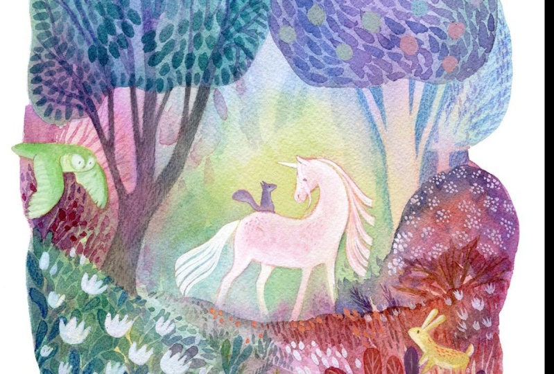
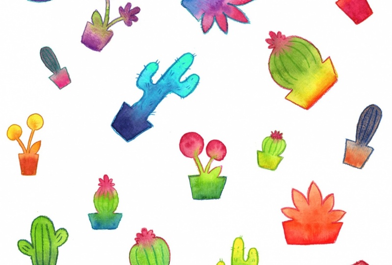
11. Advanced Applications: I love this technique so much and I hope that you've enjoyed painting with me too. I wanted to show you just how I've been using this technique as part of my own painting process to create work for clients, for calendars, for puzzles, and just for personal things that I've done in the past. Mostly the way that I use it is I use it as an under-layer before I start the actual painting process. In the same way as we did with the plants, I wet my area that I'm going to be painting with and then I put down various different colors on the bottom. Depending on what my final project, the way I want it to look, I'll put down really bright colors or I'll put more muted colors, so I always plan a little bit before I put things down, but still leave a little bit up for chance. Then once I have that layer down and it's dry, then I go on top and add actual local colors for things and all the details that I want there to be in my painting. These were a series of pieces that I did where I would put down the rainbow layers and then I would paint progressively dark layers of color on the top to create this really wonderful magical sense of depth in them. In this one, I've just used it for the sky and so it's very simple gradation from a reddish, yellow, orange to a purple to blue blue. This was a large piece that I did for a puzzle. I used it as an under-layer and we'll just get a few details of where you can see the little rainbow layers. Right here you can see it where the grass turns to dirt, you can see a red area right there. Over here you can see gradations of pinks and reds and greens and blues on the tree bark and then also on the leaves, especially on the top of the page over there. These are some pieces that, where I used mixed media and so there's a little bit of white gouache that I've used and pencils on top of the regular watercolor layers. Congrats, we're almost there. Let's move on to our last video.
12. Conclusion: Congratulations for finishing the class and thank you so much for joining me on this journey. Now, I hope that you've had a lot of fun, but also that you've picked up some tricks and tips and that you are more comfortable using your set of watercolors. Painting wet-on-wet, and letting colors mix organically, it's a unique technique to watercolor painting and the great part is, it's really on-trend right now. Now that we've completed the class, you should have all the tools to continue on your watercolor journey from here. We've covered the materials to use, and practicing mixing paint wet on wet, and how starting small allows you to grow your skills gradually, and I also hope that I've given you some ideas on how to take this technique and use it in more complicated paintings. I use wet-on-wet painting on just about every piece that I do and I'm glad that now you can use it as a foundation to build upon too. I encourage you to show your practice pieces and your finished paintings in the gallery below. I love seeing student work. Also, if you have any questions, I am glad to be answering those below as well. If you are on social media, you can tag me at mirkahakkonen and use the hashtag mirkaskillshare. Remember to follow me on Skillshare so you get notified for new classes. I'm so glad you joined me and really look forward to seeing where you go with this technique and how you grow with your skills in watercolor. I'll see you next time.
 Mirka Hokkanen, Illustrator/Author/Printmaker/Educator