Transcripts
1. Intro: In today's class, we're
going to learn how to create professional
illustrations on, in Procreate on your iPad. I love working with Procreate
on the iPad because I have three children and
it just offers me the flexibility to work
wherever I need to. I don't have to be in my studio. I can grab my iPad on my
pen in the living room or on the go If we're at the
library and get work done. Whenever I have a short moment. In this class, I'm
going to show you the basics of Procreate. If you're just a beginner, we'll go over all the tools in the menus really quick
and I'll give you a tour, and then I'll show you some
of my favorite commands that I used that makes Procreate
so fun and easy to use. And then we'll create a
practice illustration together step-by-step. And you can see
what I think when I illustrate and how I organize my layers and how I add depth and interests with
texture and colors. Hi, I'm Erica, and I have a picture book author
and an illustrator, and I've worked with publishers big and small for
the last five years. And I created books for kids, ranging from picture books, graphic novels to nonfiction. I've been using Procreate for
about seven years and it's the program that I
use most for my work. That's why I'm
really excited for this class to show you and share the things that
I've learned along the years. What are
you waiting for? Let's go.
2. Overview: I'm so glad you're joining me. In this class. I'll be showing you
around procreate and teaching you the basics
of how I use the program. After we have the basic
tools and commands covered, we're going to drive into a step-by-step tutorial where
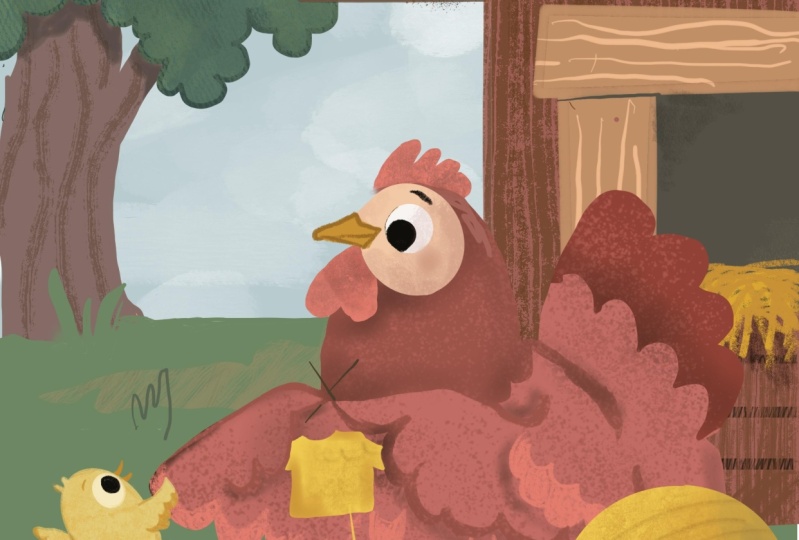
I show you how to create this chicken illustration
from scratch and the thought process that I go through when
I'm working on it. So I'm going to be using
an iPad and Apple Pencil. And if you don't have
an Apple pencil, you can use another
stylist That's Use that works for the iPad. Or you could even
use your finger, but it's more helpful if you do have some sort of a
stylist to work with. If you don't have the
brushes that I do, then you can use brushes from other creators or even
the basic brushes that came with Procreate. And even if you don't have
the latest version of Procreate or the newest
iPad or the biggest iPad, you can still participate
in this class. We're going to be using
very basic functions and basic brushes. And those are available in all
the versions of Procreate. If you want to check if your
iPad supports Procreate, then you can go to the
website below over here. And the website will show you all the iPad versions that are
compatible with procreate. If you're using a
different program like Procreate or again, for affinity, you can still take this class and learn from, learn from it the way that
I illustrate and create my my picture book
illustrations. All the functions
that I am using. Masks, earlier, masks and different layers
and just basic brushes. All those are available in the different programs as well. And you can just skip the
part where I'm going through the procreate tutorials and go straight to the
step-by-step illustration. And then just be aware
of when I am working in Procreate that some of the tools are going
to be same in the, all the programs about some
of the programs might have different names for them
or they might be located. Those commands might be located slightly different
in different places, in different programs
compared to procreate. But all the basic things that I'm doing in
this illustration can also be achieved in
other illustration programs. Alright, Enough with the JibJab, let's get into Procreate basics.
3. Introduction to Procreate: When you open the Procreate app, you get this gallery view and you can see I have a bunch of images over here and I
organize my images in stacks. And so to. Usually those are the
images that have to do with the same project
that I'm working on. So if I have a book, then a lot of my
book illustrations will then be in the same stack. For this project. I just wanted to show you just how to create
a stack so you can either hold an image and
drag it over another image, and then it'll bring it in here. Or you can hit
Select on the top, click the items that
you want to stack. I guess there's not enough
for me to stack anymore. But then you can stack multiple. If you had multiple
things over here, you could stack
them all together. You could also use
this menu to select. And then you could also share, if I have multiple
things to share, I can hit share and that'll give me options of how
I want to share. And then this will
also give you, you can duplicate your
canvas or then delete it. Just be aware if you
delete something, you will not be able
to get it back. It doesn't go into a folder. So for right now, I'm going to just drag. So I made it up just a few
canvases to show again. So another way to do the
same thing as you can also swipe over to the
left on your image. And that will give you
the option to share that image or duplicate
it or delete it. If I hit Duplicate right now, it'll just make two
of that same image, then you can also rename
your image over here. So this could be chick, chicken, sketch and hit Done. And then you could name all
the images that you have. If you wanted to
create a new canvas, you would go to the little
plus sign over here. It'll give you a new canvas. So here are some that
I've already done. Some different sizes. Some are for web. If
you do the screen size, that is the size of your screen, but that's a pretty
low resolution image. And so to start a
brand new canvas, if you're doing picture books, you could do like
an eight by ten. And so you can choose if you
want it to do inches or if you have a specific pixel, a
mountain, you could do that. But a lot of times
I could do e.g. the width could be eight and
the height could be ten. Your DPI? Usually I try to
have it a little bit higher. If it's for a picture
book project, I usually do about maybe 350. And then for our Canvas
That's eight by 10.350. It also tells you how
many layers you can have. Daniel, I don't think
I can bring it bigger. So my Canvas That's
eight by 10,300.50 dpi would have maximum
layers of 50 in it. And the DPI is just how many, how many pixels per
inch are in there. And so the bigger the DPI, the sharper your
image is going to be. But a normal DPI is
usually about 300. But because sometimes
with procreate there, if you move things around
a little bit fuzzy. So I like to have
a little bit of a bigger DPI just to
kind of combat that. Then there's
time-lapse settings. It's nice that procreate automatically does
time-lapse settings. I just have these are the automatic settings
that it came on. Good-quality. And then I have
Canvas properties and I usually don't
touch these either. So usually the only thing that I work with is just
the dimensions. And then you hit Create. And then you have
your new canvas. Okay, So for the
sharing settings, you can come up over here
and then you can share it with however you
want to share it. So if I wanted to
share it as a JPEG, I could share it as a JPEG. And then I would choose
where I want to say save it. I usually save up to
Drive and then I can work on my computer if I
need to resize it. But we can save the computer or save the file right now onto my iPad and I'll show
you how to pull it up on Canvas next. And then if I wanted to
save without a background, my image would just
be the line artwork. I could save it as a PNG. And then that would
save it as just the, just the line work
without the bad on it. So I can save it as a PFK-2. So when you come into
procreate and you have opened up your canvas
to start with, are. To start with our
illustration process. I want you to go to Add. And then over here you can
either add vowels or photos. So I'm going to go
to Insert a photo. And then here would
be your I have a PNG will add that over here. And I'm just going to drag it to make sure it's the same size as my canvas here. And then I'm going to
insert my color palette. I like having my color
palette directly on the canvas that I'm working on because
it just makes it fast. But if you wanted to, you could also call it
copy all these colors into a separate palette down
on the bottom over here. And so you could go to
Palettes and create a new one. Create a new palette. There we go. So now what you would
do is you would go, you can go and hold and see how that it changed
the color up here. And then I just hit it
over there so I can copy all my colors from over here onto a palette that I can then
use with wildlife. If you wanted to delete one, you just hold it and delete it. Then from here I
like to I like to be in here just
because sometimes I, I changed things and so now my color palette is over here. And if I didn't want this here, I could then hide it. E.g. or if you wanted to use a reference image
when you're working, you can go to Canvas
and reference, and right now it's the
image that I'm using. But I can go Import
and then pick. I can pick colors from here in the same way as I could
pick colors if I had my or I can pick
colors from over here. So whichever seems like the most natural way to work
is the best way for you. What I usually do if I'm working on just a
one-off illustration, I usually just do this
because I'm too lazy to export my color palette and then import it
back as a reference. And I don't want to
make a whole palette of just something
I'm doing once. But if I'm working on
a full book project, then I will usually make a palette that then I
use that same palette for every single
page in that book just to make sure that I
get a consistent look. Now that we know how
to set up our canvas, Let's look at our Layers
menu in our next video.
4. Layers and Brushes: And so kind of showing you a little bit more
around over here. So this is your Layers panel. And in here you
can create layers. And when we were creating
the eight by 10,300.50 dpi, it told us that we can
have 50 layers altogether. So that's, that's quite a lot. And so to work with your layers, one thing is swiping
over to the left. And you can lock a layer, which means you can't
mess with it anymore. You can duplicate a layer
or you can delete a layer. And so e.g. this later,
I can delete that. I could, if I didn't want
to mess with this layer, wanted to make sure it
doesn't get deleted, then sometimes you end up
drawing on the wrong layer. So it's nice to, you know, to keep your layer locked in that way you're not going to mess with the wrong layer. You can still make it or
hide it if you need to. And then to unlock it,
you would just do that. Then here, when you click
it again or you click on, you can also click on
it with your finger. You can name your layers, which is especially helpful if, if I'm working on a picture
book illustrations, you can select all the
pixels in that layer. And then e.g. if I wanted to go to
a different layer, while I have all those
pixels selected, I could then e.g. color only on those pixels, but now it would
be on a new layer. So that can come in
useful sometimes. Then I can copy and
then paste the layer, fill the layer
clear if I want to, if I want to just delete
everything that's on this layer, the Alpha Lock is blocking all the pixels
that are in this layer. Another way to turn on the, on and off the alpha layers
using two fingers and swiping over to the right. So swiping once we'll turn it locked and swiping a second
time and will be unlocked. And so let me demonstrate
on a different layer. So let's say I drew something on this layer and then I draw on Alpha Lock. And to demonstrate I can
change a different color. Whatever I do on that layer will only be locked to the
pixels that I already drew. That comes in really
handy if you're trying to fill in areas or recolored things for
just add texture. And so that's the Alpha Lock. Then you can do mask. So we'll talk about
clipping masks. And then you can invert that, just changed it to the opposite
color on the color wheel. You can merge it down
and that merges it down to the layer beneath. But if the layer is not showing, then it's going to delete
the layer underneath. So if I merge this
down right now, then my color palette layer just disappeared because
it was not visible. But if you make a
mistake like that, you use two-finger tap and that goes that that
makes it go back. If I do many times
two finger tap, see how it's changing. It's changing all the
things I've done. And then if I do
three finger tap, then that goes forward. So it's like the back
and the cohorts button. And then combine down is just all of them also
to merge layers. So let's say I have
this layer and I have a differently or
a quick way to merge layers is you can
either merge them like that or I can grab the
layers that I want to merge. So if it's two layers, I can grab two layers
and merge two. Or if it's three
layers or however many I just grabbed and pinch all those together and
that merges all my layers. And so those are just
kinda helpful things. No, when you're working
on on on your canvas. And then just one more thing. I talked about the masks. And so one that we're
going to be using a lot in this class is going to
be a clipping mask. And so if you need to create
a second layer on top, and then you can
click clipping mask. And you'll see this little
arrow pointing down, shows up. And what happens then is anything you do
on that top layer is going to only is
going to show up on the image on the layer below. So I can do the same thing and just
draw on the top layer. And it will only show up on the, the, the layer below. And so e.g. if I release the
clipping mask now you can see what a big
miss, miss I made. And then when I clip it
back, it will only show it. I use this technique a lot to create
texture in my artwork. That's just really useful. And then if I wanted to, I
could also click these two, merge those two together. And then whatever I did on the previous layer now
they're altogether. And so that's some of the commands that we're
going to be using over here. And then if we go
to the Smudge tool, you can use any brush in your library with
the smudge tool. And so this one
just kinda smudges everything together and the effect will be a
little bit different depending what
brush you're using. Same thing goes for your eraser. You can use any tool in your
gallery as your eraser. And the fun thing is
doing really big. So you can see you can
create really fun edges. And you can go really
lightly or hard. Or if I choose a spatter brush, then it would erase. I really like this
about Procreate. And it just makes it
really fun to illustrate. So I'm just going to erase
that double tapping. And then we got your color. Usually I like to use the disk. And so I can move this thing around to get to the
color that I want. And then I can get the
value within that color. So I can move it
all the way up here and get a very kind of a tan color and move it down here and get
a very dark brown. And so this desk and the
circle works best for me. There's other ways of
sliding things around on. You can do harmonies, values, but then your palettes. But this seems to work for me. Within my palette,
underneath the history will show you just the different
colors that you've used, but it'll only show
you the different colors that you've used if you've come up to your
color palette before. And so as you can see, I've got, so we'll do the green and then
we'll switch over here. We'll do the yellow. And I can see all these are
showing up a little orange. As you can see now, all these colors
are in my history. But if I pick colors
from elsewhere in the painting and don't go to
my color palette in-between. Then those, those colors that I did in-between
will not show up. It's only when you come to the color palette that
that color disrupt. So that's just a tip. Just so you know. Okay, now that we've
explored our tools that we can find on
our top right menu. Let's look at what we can find on the top-left in
the next video.
5. Actions and Adjustments Menu: Alright, then going up
to the top of the year, hitting Gallery will
take you back to the previous menu
where everything was. And if you go out of your
image and you come back in, then your back button will not. So you can double-tap
all you want, but it's going to erase all your history up
until that point. So that's also
something get to know. Your your history will only show it as far as that
session that you've done. So if we go over here that
for the Actions menu. So you can insert either a file. If you have something
saved in your files, you can insert a photo. Sometimes when you download
something from the Internet. I'm not sure.
Sometimes it saves in my photo depending
where I'm saving from, sometimes it's saved in files. So if you can't
find something you downloaded in your photos, you can go into your downloads
folder in your files. You can also take a photo and
then insert it over here. The text option is really great. The text will be
whatever color you have over here, so we can make it. So I'm going to double-tap
it by double-clicking it, and then I'm going to change so we can do
how about a brown? And so now my text
is also highlighted. And I can come up over here
and I can show my keyboard. I can type whatever
I want to type. And then we can type hello. And then I can double-tap
it to select it. And then when I hit my A's, that'll give wherever you wrote, it's underneath over here
and you can't see it. You can, you can make your
canvas smaller if it's, if you want to keep this
underneath over here, e.g. or you make it a
little bit bigger, you can see it. So I
can still move it. Then from here you can change
it into a different font. You can change the
size of your font. You can change the kerning. So these are all things you can kind of play around
with over here. You can also make it
just into an outline which in my opinion
isn't the greatest time. And then your paragraph
styles over here. Then we have your canvas options so you can crop and resize. So you can change
your canvas size, you can make it
bigger or smaller. I'm going to cancel here. We don t need to crop
and resize right now. All right, so show the
drawing grade really quick. So I chose the symmetry option. And so whatever I'm
drawing on one side, it'll draw on the other side. And so that's great if
you're trying to do flowers or if
you're trying to do butterflies are other things that you want to be symmetrical. But usually for my
illustration purposes, I don't use the dying, right? The only thing I might
use as the Great, So I'm going to turn
it off for now. Then I already showed
you the reference. And then I can also
flip my canvas. A lot of times if, especially
if you're drawing people as nice to see what you're, what you're drawing
and then you just have this information. So you know what you're doing. Then we have our
share share options. You can share it as a PSD, which is a Photoshop file. So a lot of times I'll do my
final editing and photoshop. And so I did it,
export it as a PSD. You can export as a PDF, which is great if
you're trying to do a picture book dummies, JPEG, PNG, and tiff. And then sometimes if you want to share some
sort of animated things, you can do that too. There's a video on a
timer app left replay, which is really fun. And then I usually don't mess with my preferences a whole lot. I'm right-handed, so right and I have it set
for right-handed. This will change. If I change it to the other way. Let me see. The only thing that
I sometimes that I think the only thing that I missed with a little bit in
the beginning was just the, the, these controls,
gesture controls. In the gesture controls, you can fine tune
some of the commands. And right now, I don't have
a lot of them selected, which is just the
factory setting. Some things annoy you. And so you might look for, you might look for
solutions for them, but I kinda have him at the factory setting and that
seems to be working for me. And so while you're
working, let's see. So that's everything from there. While you're working,
obviously with two fingers, you
can pinch and zoom. You can also rotate it. You usually have to. For me, it works easier if I'm also pinching and zooming as I'm rotating to
rotate something. And then we get to
our adjustments. And which are really great. Sometimes I will
use the Liquify. So let's say we put this
away for just a minute. Let's see, I drew something, but I really want it to be more in shape of the
beam or something I could move that the only caveat with that is it does
make it a little bit blurrier whatever line
you've been moving. And so just be careful
when using the blur tool. So there's all these
different effects that you can play with as you're
moving things around. And they will do
different things. And I usually don't
mess with it too much. The one I usually use
is just the push, but you could play with them and see if you're doing
water ripples or fire or something like that when these things come
in handy for that. Another one that I use a lot is my saturation and brightness. And so I'll use the saturation and the
brightness a lot of times to play with
colors if I'm not quite happy with what they are. And so that's kind of
a nice Then there's a color balance which is kind
of the same thing as above. You can play with your colors. Then we have curves, which is also useful, more useful if
you're working with, if you're working with photos. Little bit less useful
for illustrations, but sometimes you might
want to bump some things that I usually don't
use the Gradient Map. And let's see. And I usually don't
use the blurs because I want my
images to be sharp. And then we have noise sharpen. I'm not going to get into
any of these because they're not usually
things that I use. Alright, we've looked at our actions and
adjustment venues. And in the next video, let's look at the
selection tools which I really liked the way
they work in Procreate.
6. Selection Tools: Then we have the
selection tools. So the Selection tools
are super helpful. And I usually use the free
hand tool so I can get, so it's kinda like lasso tool. So I can grab that tool, I can grab the paintbrush. And I can, it will only
paint inside of that thing, but I can also take that
selection and hit the, the kind of direct Move button and then it will let me move, move that selection over. Then it has the automatic, which is just the tap. And then it'll select
whatever I drew. But as you can see,
it's not 100% perfect. But if I wanted to select, I could then move my cursor over and you
can see what it's. If I move it all the way here, it's barely grabbing anything. I can move over and now it's grabbing everything or most of it left a little bit of
the outline over there. Then just tapping
to go backwards. You can also do rectangle
select or an ellipse select, and then these are,
these are additive. So I can select many shapes. I can also pick up my pen in the middle of
drawing a shape. So it's a little bit
different than Photoshop if you've worked
with that before. And then I can also
do straight lines by just tapping and selecting. And then if I wanted
to remove a part of my selection while
I'm still in here. I can also then go and move, remove an area that's been
selected and I sorry, it's a little bit dark. And then I can also
invert my selection. So now the outside is
selected. Then read it back. I can see hey here. Or I could also click and drag. And that will also
fill those in. And now, if I, if I wanted to
change my selection, and right now I
don't see my menu. If you just hold over here, it'll bring your
everything back. And so I can now copy and
paste everything that I've done that already
made a new one. And so now I have my my copy and pasted
items that I just did. I can feather items. So if I have a selection, see right here, I could then feather it
and see how those were. There's barely a
line that you can see but the line moves. And so remember how
when I fill these in, they were really
crisp and clear. But now when I fill this in, see how blurry that was, the feathering just
makes the edge blurrier. And then there's
also a color fill, which is really helpful. So let's say, let
me delete these. So let's say a bunch of
little, little shapes. And then making sure I have
a color that I wanted. I could do color fill
and then it just fills in everything that I just did. Or I can also do clear, which then clears everything
that I had just selected. The selection tool, in my
opinion, is really amazing. Alright, so lastly, we
have the selection. And so whatever you have on that layer, it will select it. And click that on. Alright. So then we can just
click a partial thing. Click the Move button, and now we just move. And we can also resize things. And then lastly, a copy
and paste options. So if i, I can either
copy the whole layer. So right now I have my
flower layer selected. I can three finger swipe and
that will give me Cut Copy, Copy, I'll duplicate, copy
and paste and paste it in. So a lot of times I will
do copy or I can do, or I'll do duplicate. If I want to
duplicate the layer. I can also, if I, let's say I have a I have
like an eyeball or something. And then I realized, oh no, I put these in the same layer, but I really need these
things on a different layer. And then I could, even now
I could cut and paste, and now these guys would
be on their own layer. And then I could go
back in and fill. So sometimes I make
mistakes and that's how I fix those mistakes. And then the other function, a lot of times that I'll use, let me show you is the copy off and that's when you're working on
an illustration. See how everything is on a
different layer over here. If I just copy one layer, it's only going to
copy this one layer. But if I hit Copy all, it's going to copy this whole canvas instead
of just that one layer. If I wanted to bring
that image over here, then I go paste. And now it just pasted
my whole image. But it will not copy and paste all those
individual layers. It will copy and pasted
just as 11j. Okay? And so hopefully that
makes sense and that gets you used to all your tools. Procreate actually comes
with a lot of tools already. These are just some of
the sketching tools that are really great to use. So let's just look at a few that we can use
for this class.
7. Modifying Brushes: Okay, So if this reference
photo that you have over here, you can always change this to. And so let me put
this back over here. And so you can
change this to this. And it's really nice to have. So e.g. this is great
to have over here. Let's say you're working
on something over here. And you want to see how it looks like in relation to
the whole image. It's really nice to then
have it you can go under here and it won't go on your
reference image either. And so sometimes it
might be useful to see the whole image while
you're working on a detail. So that's one great thing
that the reference can do. You can also pick an image. So right now I imported, you can clear, you can
import a new image. So when I was originally coming up with the
idea for this, I had, I've got some images of chickens so I know what colors I wanted to
have a little red chicken. So you can have that. Or you could use face, which
is actually, you know, if you're trying to tie, you can see my camera over here. If you're trying
to draw yourself, do a self portrait, then when you're done
using your reference. So like I said, you can make reference
image bigger or smaller. You could zoom in really, really close by over here. And then when you're done using the reference image,
you can just put away. You can also move
your reference. Let me bring it up one more time since I really like
using the reference. Once you have your reference
here, you can also, if you're left-handed, you
can move it out of your way. You move it wherever
it needs to be. Then lastly, I'm mostly
using Retro Supply brushes for this,
for this class. But I did make a
special little set. And these are just, these are from mom brushes that already come
with procreate. So I have the mono line, which just makes a
nice, nice crisp line. Then I liked using the pestle. And then there's
the square pencil, which just doesn't
have a taper on it. Then there's a streaky, which is great for
those wood textures. And then I made a splatter, which makes just that
spatter texture. And then this is copper head, which is also a streaky. You can choose which
one you like better. And I use the name of
the original brush. So there's copper
head, copper head. These were all, these
were the same brush but just changing
the brush settings. Also the pencil is
the same brush. I just changed the settings
and this is a different one. And so these brushes were
originally in the sketching. I have the 66b pencil, those over here and
then the drawing, you have the sticks in
the copper ahead here, which I just altered
a little bit. And so procreate already comes with a ton of brushes in it. And you can take some of these brushes on late and
then make a copy of it. Then you can just go in
here and play with it and see if this one has kind of
a fun grading texture too. You can play with the shape. So this is what your
shape source looks like. This one obviously wouldn't
make a little scatter brush. And this is the grain source. So it's using this as kind of the shape and then
this as the inside. So when you're moving around, it'll have this texture
inside of this shape. So that's kinda how it works. And so just by changing
some of these things, you can really changed the way. You can already see how it's changing some of these things. So this is the
actual footage of me changing some of
these brushes in the settings so that I can
include them in class for you. And mostly I am just changing
the pressure settings for the pen so I can get a blunt instead of
a tapered ending. And then I'm changing some other scattered
settings for this brush so that I can get more of a splatter brush instead
of out liner brush. And then the next
thing I wanted to change was the vessel brush. And for this one, I also went for the
pressure settings and changed the taper over
there down to zero. So that way instead
of tapered ending, I can get a flat ending, a square, square brush. I've taken a few brushes and you can download these
in the resources section for free and then install
them in your procreate. And let me show you really
quick how that's done to you. Okay, so I'm going to
tap over here, import. So I have it right here. Me drawing when you click on it. And then imports it,
and then you will find it right here on the top. If you want to move any
of your bushes around, you can always go to, let's say I'm over here. And I really going to duplicate this because I don't really want to
move it over there. But I could take my
brush, tap and hold. And then I'm going to
move it right here. And now I have my brush
in my drawing set. But if you really
don't want it there, then you can also
just delete it. So that's how you can
add a new brush set. And you can use these
brushes for this tutorial. That's all I wanted to show, just my two favorite ways
of changing the brushes. I like to, oftentimes
change the brush size. And then I like to
streamline them to have kind of two
different liners available for me
when I'm working. And so let me show you
that really quick. And then we'll get to
our final project. Like right now the pencil is set all the way up and I
can't get it any bigger, but sometimes I really
want it to be bigger. And so what you can
do is you can tap on your tool and it will actually give you this whole option. In this menu, I can
come up to Properties, and then I can do my
maximum size and see how that changes the
maximum size of my pencil. So I can come up over here. And it'll give you the
minimum size over here to maximum capacity and so on. So usually I will change this and now see how
I got a bigger line. So that's one tip for you. And then a lot of
times what I'll do is I will make a coffee. So I will duplicate this, this pencil and now
it has pencil one. And then go in here. And I usually do the streamline. You can actually test
your pencil over here. So I'll move, change
my streamline. And you can even change
the name of your pencil. So you can go about this brush
and then hit on the top, no streamline as long word. So it'll just so now I know
that this one is streamlined. This one's irregular
so to compare. So sometimes I'll like my lines are just a
little bit wiggly. But then with the streamline, it just makes a smoother line. But it will also, the streamline will also, because it does
smooth your line, it doesn't always want to do squiggly things very
well what I want to do. So I usually have two versions of my
favorite liner brushes. And in the next video, let me just delve
a little bit into, let me delve a
little bit into how I research and come up with my color palette and
reference photos when I start a new illustration.
8. RGB vs CMYK: In this video, I just
wanted to briefly go over the difference
between RGB and CMYK. And you've probably heard
these abbreviations before. And I wanted to clear up
any confusion that you might have between the spaces
and what they're used for. Especially because
with picture books, we are hoping at least
at some point to be creating illustrations for
it to be printed in books, not just to be shown online. So when we're talking about the differences
between CMYK and RGB, the difference really is between the end product where that
image is going to be. And so when we talk about the CMYK color space and those images are going to
be printed on something. And when we talked about
the RGB color space, those images are
going to be viewed, viewed on screens, are
on computers and phones. Knowing that if you
think about a printer, a color process where you
are physically taking, where you are physically
taking color particles and layering them on
top of each other to create colors just
like if you had a set of watercolors and then you
mix the colors together, yellow and blue
would make green. And so in the CMYK color space, you are working
with four colors, cyan, magenta,
yellow, and black. And you are only able to
create colors that are, you know, that you can mix with those four
different colors. And so it's a limited
color palette. In general, you can't get really bright saturated oranges or bright saturated
greens are kind of deals. And so it's better to stay
a little bit more muted. And just be aware of that
when we're talking about RGB. That's red, yellow,
red, green, and blue. And that's going to be
on a computer screen. And the, and they're
additive colors. And where you're adding, there's light coming off the
screen behind those colors. And so they're always
going to be much brighter than
something that's being printed on fabric where you don't have that light
shining through. So here's just one example of, and it looks a little bit brighter here, maybe
on the screen. But in general,
you'll notice that especially with the team
feels that the mixed colors, how the CMYK space, you're not able to
get the right bright, saturated colors, like
you would be in the RGB. So whatever color palette
that you're creating, if you think that the end product is going to be something that's
going to be printed. Like you're creating
something for a t-shirt or print
on-demand mug, or even something
for Amazon kVp, a book that you're
trying to print, it's always a good idea to take whatever color palette
you have and then run it through a RGB to CMYK converter and just double-check and make
sure all your colors work. And if you are able to, The best thing is to always order one sample
of whatever you're doing just so that you can check your colors just to make
sure that they match, depending on what your end printed product is going to be. You can also talk to your
printer or look online if it's a print on-demand
and see what kind of a scarlet color space
they work with. There's different kinds
of CMYK settings. And knowing what
the end result will be is going to help with getting the right
colors to begin with. But if you're just beginning and you are just creating pieces for your portfolio and for social
media and online purposes, then you don't have
to worry about the CMYK and RGB
conversions as of now, you can just work
comfortably in RGB.
9. My Favorite Features: So I just wanted to cover a
few things before we get to our actual final
project that are native to procreate and that make your workflow a lot
faster and easier. And so one thing is it has
really great snapping. So you draw a shape and then you hold it without letting go. And then it will snap
to the closest shape. And then you get this
menu here and you can actually click on it and
it'll give you a few options. So I can do a polyline
and it'll actually give me points to
grab your rectangle. Or I could even do
just do a square. And now I can move things around just the way it is or
the end it will do it for. Let me go back. So I could do some sort
of a circle shape. And then I can choose if I
want an ellipse or a circle. And then grabbing these points, I can change things around. I can also move my item around. And I can do the same for
lines or angle lines. Or I can do for curves. And I could always also
make it different. I can also change my ending points depending
how I want to change those. So those are really helpful
and I use those a lot. And then the second thing
that I wanted to show is just filling in multiple shapes. And so if you've been
working on, I don't know, tree leaves or flowers, just make sure your
shapes are closed. Then you want to fill all
these in with the same shape. After you've created them, you can either fill
them on the same layer. So I can either fill
them like this. And then you get your option
over here, continue filling. And then I just tapped wherever I want it
to fill those in. Or I wanted to just give you the option or
show you so I could use this and make
it a reference. And so you'll see a little
reference popped up over here. And then I could do
either the same color, we could do different color. And then whatever I do
on the second color, it will now do it on a, on the second layer. And so that can be really, really, and that can
be really useful to. Alright, now I shared
my best tips with you. Let's start with our
chicken illustration.
10. Sketching and Colorpalette: So the first thing when I, when I start to work on
a new illustration is I, oftentimes have a color palette and kind of subject matter in mind for the project that we're going to be
doing together today. I thought it would be fun to do fairly simple illustration of a little chicken and
little baby chick. I just wanted to show a
few of the sketches that I did before I got
into the final one. And so this was my
original idea that I had. I thought it would be
fun to do a chicken because I'm already working
on a farm book right now. And farm animals and farms are popular topics in an evergreen
topics in picture books. And so if you can have a few farm related pieces
in your portfolio, then that's always,
that's always nice. But the piece that we're
creating in this class, please don't use my illustration in your portfolio
after you finish it. Create your own. But this is just a good starter, just to learn the techniques
and then you can make your own sketches after that and use that in your portfolio. Then the second idea I
had was the first one, I was going to have some other chicks
and then the one was trying to run away. But it wasn't quite
working for me and I wanted to have the chicken
really big in the chick, but I really needed more
of a horizontal space. And so I decided it wasn't
going to work for this class. And then I came
up with this one. And this one, I
was also thinking about drawing other
chicks in there. But I just really wanted to also keep this
illustration very simple. And all my ideas were a
little bit too complicated. And then this was my third idea. I was thinking the mother hen leading it up
in one running off, but this ended up being, I felt like a little bit too complicated for
this class again. And so the, the illustration
that we actually did, it was the fourth idea
that I came up with. And so it's chicken with a sweater and the
chicken pulling on it. And we'll talk about
that in a minute. And this is the final sketch I did that we're
going to be using in this class because we're working in children's
illustration. I don't just want a picture of a chicken
with a baby chick. I want there to be a
story in the picture. So I've added some
extra props and elements in here to add to the storytelling
of this piece. So It's obviously knitting a little sweater and you can see that the little
trick is pulling and there's something happening
over here that we don t know. I've added some. I tried to keep the simple
because I wanted you to follow me along as
we're working on it. And so I'm providing
the sketch as part of the class and you can download it in the
download section. Let's look at color palette
next. For color palette. Once I kinda have an idea of what the picture is going to be, I use a lot of times I
will go to Pinterest. If it's a book, I'll take a
little bit more seriously. But since it's just a
one-off illustration, I oftentimes I have illustrated Pinterest board called the illustration places. And I can come up here and I
can look at illustrations. And C. As a person, I'm drawn to specific colors.
I like TO a lot. So you'll notice that almost
all the illustrations on this wall will have
some sort of blue. And I like it when
there's a teal and a kind of orangey
red and yellow. Those are my favorite
colors and illustration. So you'll notice that on my
Pinterest wall or board, there's a lot of
those colors in here. And so when I was getting
ready for this class, I went through and I know I'm working on
a chicken and a farm, so I know I want some
greens and things. And so I thought
this picture was kind of a fun, fun piece to use. And this is by Greg pop rocky. And they are actually, we
have some of these books. They're actually
these alphabet books that have these fun kind
of vintage illustrations. And so usually what I do is I'll either take
a screenshot or somehow tried to save this
image onto my tablet. And then when I come up to my, my back to my sketch, I can go to Canvas. And then I'm going
to go to reference. And then I'm going to pick
that image that I just saved onto my computer iPad. Then what I'll do is you can
make this bigger or smaller. I'm making a little bit bigger. And then I'll come back and
I'll get a new layer going. And I'm going to actually put, I usually have my color
palette on the top. So you can, I'll show you how to make a color
palette over here, but a lot of times it's
faster for me if I just have a color palette right on top of wherever
I'm working on. So what I'll do is I'll
you just hold I hold with my my fingernail and
I'll pick some colors. Now you usually try to pick
adjacent colors are colors that are close in
on the color wheel. And I'll kinda put
those together. And I'll pick some, some nice colors that I want
to work with over here. There's a darker
purpley, red over here. Then we have some greens. And my colors might
change a little bit. It's not absolute
that these ends up being the colors
that I end up using. This kid is you kinda have
an idea of how I usually, if I'm using another
illustration as a reference photo,
this is usually done. I go and I pick colors
from their skin tone. I'm not sure which
ones I'll use in this illustration, but this, this gives me this, this pink over here just seems
too much of an outlier. So I'm going to skip
using that in my palette. I have some colors picked
and we are ready to go.
11. Painting the Background: Let's start drawing.
And I brought, I've already
practiced this once. And so I've got my
color palette that I used for the first time
around that I have ready. And this color palette
will also be supplied in the class materials
in the class notes. So you can download it from there if you wanted
to just upload it onto your canvas and
use it on your canvas. And a lot of times I'll just
kinda start with some of the easy parts that I know what I'm going to be working on. And so for me an easy shape
to start off with e.g. is this kind of chicken
coop shape over here. And when I start,
when I'm working, I usually have my color
palette on one layer and then I'll have my
sketch on another layer. And I set my sketch to multiply. And then I'll kinda make
it a little bit faint. And then I'll work on these
layers underneath over here. And so I'm going to
start with one layer. So usually when I'm working, this is a kind of a brush palette that
I've developed that I, that works for me for
illustration and for this class. What we'll end up using
is I have a liner tool, and so I usually do two
versions of the liner tool. There's a regular drawing tool
that just draws normally. And then I have a version of
it that's more streamlined. So you can see that it doesn't do though
it's harder to do those with Deleuze because it wants to make things smoother. It's especially helpful because a lot of times my handle kinda shake when I'm trying
to do lines like so it's easier to do
straight lines. If I have a smoother, It's the same brush, but one
is just a smoother version. And a lot of times I'll just
write streamline on it. And so I have the same thing. So this is my one-liner
that I use this as a second liner and
this is the streamlined. And then I also have this as a streamlined and then
my pencil is a streamline, so it just makes it
faster for me to work in. The brushes that I'll be
using is just mostly this, drawing, the straight brush. And then we will be
using the six B pencil. That is the brush that comes with that comes with Procreate. And then I like to use
the Retro Supply brushes, brushes and three other
brushes that we're going to be using in this
class are from that brush set, the Woodland Wonderland brush set from Retro Supply Company. And so I'm using the grain. And then the, I guess this
is called a gouache brush. And then I'll be using the
pencil brush from over here. So these are the only
brushes that I'll be using for this class. So just to begin with, I'm going to start
drawing this shape out. And so I can draw a line and
then if I stop and hold, it'll, it'll make that
interest rate line. And so draw that line out. And then I will tap and then drag my color to
fill out a shape. And then a lot of times to get some extra texture for
my paint drawings, I will do a second layer on the top and mark it
as a clipping mask. Then I will pick another color. And then I'm going
to be using this. So the sag wash brush. Then I'm just going to be
drawing back lions kinda back-and-forth just to create kind of like a wood texture. So as you can see, whatever
whatever I just drew, the clipping mask will make it only appear on the layer
that's underneath. And I think I'd like
it just the way it is. You can either keep them as two separate layers or
if you want to save space on your canvas and make it easier to scroll from
different layers. You can also merge them together if you're not quite
sure what you're doing, It's always nice to
keep them separate. And then you can always
merge them later so we can leave them right,
like this right now. And so then I start
working either up or down. And so the next
one I could work. The next one thing I
could work on could be the little these
little boards next to the I think I wanted to kinda
like a grayish color. And I'm just thinking, would There's just drawing these
shapes out over here. You don't have to
be perfect lines. And then I'll just drag and
drop my colors over there. Maybe they can be
maybe slightly darker. And then I was going to draw, switch to my pencil tool. And so a different
way to add texture is you could just use your
two fingers and swipe, right? And then that will change it so that the
pixels are locked. So now even if I tried to draw on the outside over
here, it will only draw. So it's a different way of
getting the same effect, but with this way, I'm drawing on the same layer. Continuing on the
layer on the top. So the next thing
I wanna do is just add some wood grain over here. And then I think I wanted
to add a little bit of a darker line just for
the middle right here. So I'm just going
to press and hold. And so now if I remove
the layer underneath, you can kinda see what I
did. Where we are right now. It goes really fast and
it's kind of like magic. So now I've got these two pieces and then I can go on a
layer underneath over there and I'll work
on that chicken coop. And so I can just draw an
area over here that in, and while I'm at it, I think we can also
fill in our sky. And so this guy was picked
from that other illustration, but I feel like it's a
little bit too dark. So what I wanted to do was
just go a little bit lighter. Then get Mike wash. I'm going to see maybe I'll
do it on the second layer. So I'm going to create
another clipping mask. And then just to kinda
like a little AIR, think about it, a little clouds, but just fade things
up a little bit. And just adding a little
bit of texture in there. I'm just going to merge
these two together. So to merge, I grabbed, touch both of them and
pinch them together so it's harder to do it. So if you wanted to merge
layers really quickly, you can merge and they
can be any layers. They can be all these layers can be merged at the same time. Alright, so the next, so as you can tell, I'm kinda going in
order for the year. And so we can work on this
tree trunk over here. And usually things
that I want to be pop in to be in
the, in the front. I use warmer colors for those and things
that I want to recede, I would use cool, cooler colors. So as you can see, there's a lot of several browse over here. These brands are cooler and
these brands are warmer. So we're working on a tree
trunk that's far away. I wanted to pick one of the darker colors are just
making sure my brush, I have this true chunk in and it doesn't really matter the areas that are
not going to show how you block those in because nobody's
going to see it anyways. And so I'm going to
do the same kind of treatment as I did for that other tree bark or the
the tree lines over there. And then I'll try to
pick a darker color. This one. I've got my my SO you can either do a clipping mask or
work on the same one. So maybe we can work on that. And sometimes we have to
draw him a few times. You don't want thick
lines to be because right now they're evenly distributed. And so the nice thing with the clipping mask
is if I would have drawn it directly on top
of my brown tree trunk, they would have
been with the brown and I could have erased it by just taking the brown color
and coloring brown on top. Alright, so now we have that. And then the next one, I'm going to just merge these down because I'm happy
with the way it is. Then the next part
could be our tree. And I'm going to start
with the darker color for the tree and then I'm going to hide that so it's just out of the way
so I can draw over here. I don't want the streamline because it's going to
be hard to do this because it'll try to
layer it on the top. And so I'm going
to come in here. Sure. I'm on the
right layer, yes. And everybody has a
different way of drawing. They're happy trees.
And so it's up to you, however, do you
want to draw yours? And so there's just my way
of drawing those leaves. And then I'll do
another clipping mask. So that's up to you. What kind of texture you want
to create for your tree. You don't want to make it too busy because otherwise it will detract from what's going to be happening here in the front. So so that's that's fine. And then while I'm at it, I'm going to put those
together while I'm at it. I will create a
shadow for my tree. And to create a
shadow for my tree, I'm going to set
this at multiply. And then just grabbing, you can grab the blue is a nice color because you can think the light
that's coming is blue. So just thinking where those lights would be
and then what you can do is you can also make it a
little bit less severe. And so now we've got our
back country and then we got to work on
our on our roof. Okay. So let's see. I'm going to, because I
made this one this color. I think I'm going to try to make this one the lighter color. And I'm just looking
at my layers. So I can probably
sometime a lot of times I'll try to
put things on top. So let me see, are on the same layer
if I can help it. So this just needs to go
in-between now over here. So you have to change my brush. Then just quoting that off
so I can drop my color in there and then get grabbing this color
or make it bigger. Mark my lock my maps. I locked my pixels and just adding units the
same color I used over here. So I figured it's fine. If I use it over there. Then I'm going to use just
a little bit of this to create a shadow on there. So I'm just starting
from kinda farther away. And then also
grabbing my pencil. Maybe it's a little bit too. They're just adding. And then while I'm at it, I'm going to add a little
bit of just making some adjustments over here with the same those splatter brush. I'm just adding a
little bit of dark. Grabbing this color, picking
slightly lighter color, and adding a little bit of highlight over there like that. Alright, then let's do. The next thing we could do is we can add our grass in there.
12. Grass and Background: So grab the selection tool and then I'll just grab
some of these areas. So I have this area right here, this area right here, maybe right there, and then two. So I have this little pieces
of grass coming through. And so I actually
can hit Remove and then go back in here and
then remove those areas. And so that way now I only have these couple
of areas selected. And then I'm going
to go grab my brush and let's grab kind
of a grayish color. I am adding some colors
here as we're going. I'm just kind of gently
going back and forth, just trying to add
a little bit of extra interests to this grass. So it's not all just
plain, plain Jane. So now we're already starting
to look pretty good and we can start working on
our main characters. We've got the chicken
coop by almost forgot. Alright, so let's get
to a chicken coop. So I'm going to do very much
what we did right here. And we can actually, Let's see, make sure
we're putting it, it can go on the same layer. Okay, and then for my steps, they're just going to
be these dark little. So I'm just selecting
these areas. Now. Painting goes in.
There. It's good. You don't have to be 100%
on top of each other. And then I wanted to
add a little bit of straw on here too, just because it's coming
out of the chicken coop. So I'll add that
on its own layer, especially if I'm not
100% sure what I'm doing. So I have this
thin pencil That's also from the woodland
wonderland pack. I like it because it
doesn't, it's not tapered, so it makes this kind of a, just a square mark. So let's pick some yellow
maybe a little bit too. Since I'm doing straw. Let's do. So I like to do usually one
color and then another color. So we'll do another one, maybe one more of their
pinch these two together. And then we're going to
add a clipping mask. And so I wanted to add a
shadow layer over here again. So I'm going to multiply. Unless you aren't really
saturated colors, you can just do kind of
grace, shadow in there. Even if you wanted
to shave those two. Alright, so now we
have some shading, some interests going on
and I'll merge them down. Alright, so let's walk to
work on our chickens next.
13. Painting Main Character: Okay, so to begin with, I thought it would
be fun to have kind of reddish color chicken. And so let's see. We'll go with that
color to begin with. It would be good idea to put
my chicken and a new layer. Chicken gets its own new layer. And so on. I'm just
going to trace my chicken all the way around. There's something
coming underneath. It's not a big deal. I person, if I draw
my shape and I hold, it's going to give me an option to if I press and hold look at gives me
the thing right here. So if you, if it's not quite
the way you wanted it to be, can come up here and adjust them and then just hit
your drawing button again. Alright, So then I'm going
to drag my color over again. And here's my
chicken and this is kinda like the bones
for my chicken. You like I want my chicken beer. I want her to be a
little bit more red. Alright, then we have these
lighter colors over here. And then to work all these
extra details for my chicken, I actually took some looked up some reference photos
for rent chickens. This is just a reference
photo that I picked out. And so if you look
at the chicken, you'll see that they
have darker next, and then they have
some dark colors, maybe around over here and some lighter
specks on the neck. And so that's kind of what I thought I would do
the same for my check. And let's make sure
I'm clipping mask. I'm going to grab wanted
to make a darker color. That's kinda more around when you're under
clipping masks, you are actually drawing in your own. So if I release
this clipping mask, then you'll be able to see every do dad that
I do over here. But once I make it into
the clipping mask, then you can see that anymore. So just know that everything's
there that you're drawing, even if it's not showing
know what you're doing. Then let's see. We wanted to do the neck. And then sometimes
see how there's this line where it
didn't quite fill out. That's actually because
my bottoms and fell down. So sometimes when you especially if you're
drawing with a jaggedy, jaggedy thing and then
you try to fill that in. You'll see the, all these
little marks over here. And so a way to fix
that is by about you hold and then when you move this and see how
that all gets filled in, if you move it too far,
then it goes past. So that's just a little trick. So obviously I didn't
do that over here, so I'll have to go fix
that really quick places. But there have been
times where I've done a lot of the illustration,
illustration already. And then because I
like to work with the Clipping Masks
all notice that, Oh gosh, you know, something isn't
filled in properly. And then I'll have to
go fix all these edges. So good thing we caught
it here in the beginning. There you go. Alright, so let's try
this again. So, yeah. All right, So now
we've already got nice working working
chicken over here. I'm just trying to
clean up. And then to add some texture, I'm going to grab my pencil. And so instead of coloring
everything with a smooth ball, grab my pencil coloring tool. Then let's start adding
some highlights. Something. Few things over there. Alright, and then
some highlights. So I thought this
chicken could be things. Little feather. And instead of filling these
in with the fill tool, I'm going to be
coloring these in with my pencil brush just
because it just leaves all these little areas that are uncolored
and it just gives the drawing a little bit
more texture instead of everything being
clinically the building. So it just makes it a little bit more interesting to look at, to change and add some
texture here and there. So there's one, there's one over here that we can't
quite see it because it's kinda on the
bottom side over there. Then I'm going to
add some texture. Texture. Looks little
feather things over here. And these ones I'm just making
a position as I'm going. I just didn't kinda just
want them to be random and some of them are figure, some of them are smaller. You don't want it
to be too busy. But you want there to be something interesting
to look at. Right? Now. We have a beginning. Let me just zoom in so you can see that texture
just a little bit. So it's not perfect. They're kinda fun. Little shapes. Yeah, I think that looks nice. Let's work on the top. So I think this would
be a good color. Also. There's kind of two
different shades I had picked out over here. Doesn't really matter. Hold on. I need to have a new layer. And I'm going to continue
working with my my pencil tool. And then let's grab. So it's nice when you
have this palette because then you just pick
and choose from here. I'm going to make this
underneath over here. So to move layers, you
just grab it and it sometimes automatically
wants to make it into a clipping mask
because the layer underneath it as
a clipping mask. So I just hit the hit the Clipping Mask
button again to release it. And then we had white over here. So I'm going to pick this color. It's not a pure white,
but close enough. I always want to have my
eyes on their own layer. And then let's see. Then we'll duplicate the
mask or the eyeball. Dark. Grab that one. Sure. She looks like she's
looking at this. I made mine I'd
want to make sure I make it look like she's
looking at the chick. Sometimes you just
have to draw things a few times just to make
sure you get it right. Then I don't want the eyebrows. Dark brown eyebrows. Alright. It looks like I
think I still have room on this layer to add. My beak. Could see
how light it is. It might need to be
slightly different color. Now we have a smiling chicken, will probably have to
outline some things here. Let's see, just to make
sure they don't get lost. And then I wanted to
outline the her hands too. And so let's see, just maybe a darker version
of what we have going on here. Streamlining it. That looks nice. Now my eyebrow looks
a little bit dark. Try this color for
the high ground. We'll see how that
goes. And let's see, I think is very hard to
get in and printed colors. So we'll see how this looks. Let's see. So I'm
getting my pencil, adding some tricky
checks over there. Okay? And before we
do any highlighting, let's just finish our other
characters over here as well. Maybe if the chicken
needs just a little bit more than I probably need die
like this other thing too. Then I need to do my
knitting needles. Let's see, those are
going to be going, let's see what layers
going to be good. I'm just going to draw them in this part. Alright, and then let's
work on our yellow. And so I wanted to
make this ball, or I went to the chicken, the chicken, the sweater to
be two different colors. And I figure if the chick is kind of the same color
as the mom's eye patch, then I was going to
make the sweater kind of a bright yellow.
14. Final Touches: Okay, so now we're working
first on our yellow sweater. And I've created
a little bit of a brighter yellow than what
we had on the palette. And I've created the sweater by just drawing
the shape and then dragging the color and now the shape for
the ball as well. And then I'll create
a new layer for the actual string of yarns so that I can draw it
several times if I need to clipping mask. Alright, then I wanted to
add this little string, but I want to, I
want to put it on a different one just in case. So I'm going to
merge these down. One, my yellow. Now, if it didn't turn right, then it's just easy. If I wanted to use my streamline
tool might be better. Make sure it's likely. That looks pretty good. And now if I wanted to
move it a little bit, you can also go up to the top and go to your adjustments
and then do liquefy. And then I already have it set
how I like it was the size and the pressure from
previous projects. And then you could
move this around just just the hair just to get it where
you need it to go. But I wouldn't use it
too much because it does blur it just a little bit. So just be so
compared to if I look at my string over here, if I look over here, it's
a little bit more blurry, but since it's on a small scale, you can't really see it when you're looking at it this week. Then just to make sure that I can kinda
see that over here, I'm going to lock my pixels. Then grab that darker color. And then let's see how if you want to
highlight over here. If it's hard for you to see
sometimes with your sketch, you can always take
your sketch off out of the way, see if it makes it. That looks good enough for me. Let's work on our
little tricky dude. Let's see, he's in
front of the wing, so I need to make sure I put
them on one of the layers. Junkies are kind of fluffy, so that's why I'm going
with this outline for it. And then that this wing is behind over here and I wanted to add some shadow for it. So I'm going to add
that laying onto a different layer
and also the beak. So I'm going to go
one layer below. All right, and then
on the next layer, again, I can draw
it and then hold. And that'll give me
an oval. I can edit. Fill it in and say here's my pencil brush
for the other one, I'm going to use my
pencil brush for this one to align them to match. And I got to make sure I
get my wing. Let's see. It looks a little
bit doll for me. So sometimes if I want
to adjust a color, I want to look at
everything as a whole. And then I'll go to adjusting my saturation
and brightness. It's kinda feel like
maybe he needs to be a little bit yellower and brighter just so we can see him and now
he's just more visible. If I wanted to, I
could do the same. So I'm going to tag that
color and go over here. I'm going to lock my, my pixels and now I
can color it in there. And then maybe we
can add a highlight. Since Trekkies have some
different color on there too. So maybe it will go
with something like that there and then repeat
that for the other lane. Lock my pixels. So overlapping this up dynein
towards this way gives us a little bit more of a
illusion of depth over here. Look at them a little
few, little fluffy. He's made a little
bit of something for the eye to be something darker. Going to get it
just right there. Let's see. We'll give them a little
bit of an eyebrow to you. Super excited. We'll use the same
colors or chicken. Chicken just highlight or give them a little
bit more edge here. What do you think? It's good? Now, we can see him
off the green grass. Alright, let's see, let's
look at some of our grasp or the front that I think
that's the last thing that we have to work on
over here, some shadows. And so to make shadows, I will go right above my, I have the shadow layer for
my grass layer here and then I have the little
grip for the grass. So I'm gonna go one above that. And then I'm going to turn
this into a multiply. Grant that. And then I usually like to do my shadows with this brush
or the pencil brush, and we'll go with
this one for now. And then we also need to add some shadows for chicken,
I just realized. So let's see. I don't want to go somewhere
above everything right here. And I'm going to keep using that same color as I had before. I think I want to make bigger. So I want to make sure
I add some shadows. Actually, I probably want to put this underneath
my sweater layer. So I'm adding some
shadows over here. And I want to add some shadows. Actually I need, since this is, I'm only trying to apply
it to our red layer here. So maybe my best bet is to have it right
here and have it apply. See it clipped it
down to my red mask. Let's add some interest
for our tail feathers. Going to grab my eraser and
change it to my pencil. Actually, do the streamline. Be a little bit bigger? We can eat an ad. They're not just adds a little bit of
interest and maybe we'll do the same thing. Just trying to get
them just right. Sorry, sometimes there are these little details they
can take the longest, just trying to get them right. And maybe we need to add
a little bit more shadow to the neck area over there. It gets too dark. They're having some interests bringing
it closer so you can see what I did
looking pretty good, just looking at where we need to do our
grasses over here. So then our grasses are
going on top of things. I like it because it'll give it, give it a little bit more. Three-dimensionality over here. I need to erase this
one that's down here. Maybe adding a few more then because they're overlapping and I just wanted to add some of that grass color underneath
over here and assistance. These things are kind
of getting out of here. Maybe they don't need the
shadow as much on them. Now you can just look
at it as a whole and take our planning. Yeah, I think everything,
it looks good. I think I'm happy with it. So now we're done. Maybe one more. I think just more
interested over here. Make sure I'm getting
in my right layer. Just adding some
interests over here. And then maybe we need to have a little cheeky for this guy to the wrong layer. Maybe it needs to be
a little bit lighter. They're cute. All
right, Now we're done. Alright, last things
I hope you liked it. And I will see you
in the next video.
15. Drawing Timelapse: Okay, So I promised this
time-lapse of our illustration. And so here it is.
Hope you enjoy it.
16. Last Thoughts: That was so much fun. I hope you've learned a
lot and are ready to use the new skills that
you learned in this class to make lots
of new illustrations. It might seem like there's
a lot to remember with all the gestures and the
different menu options. But I encourage you to just
keep working in Procreate. And as you keep going, all of those commands
are going to become much more automatic for you
if you loved the class, I hope that you leave a positive review or a
comment or post the project. And then that way, any interaction that you
have with the class, we will also boost it in the rankings so that other
people are able to find it. I love seeing student work. And if you have any questions or didn't understand
something in the class, then feel free to
post your questions in the discussion section below. Or if you're posting
your project, you can also put it in
the project description. And I'll be happy to chime
in and help you out. When you post the project. You can also add your social media link in
it so that other people who might be
interested in seeing more of your work
nowhere to find you. If you post on social media, tag me so I can like and
comment and repost your work. If you have a
friend who just got an iPad and they might
want to learn Procreate, feel free to share
this class with them. The share button just
below over there. You'll even be able to give them a short little
free membership to test everything
out if you want to learn more about
illustrating picture books, this class is part of a bigger series that
I'm working on. And to find out more about
the classes that I'm grading, you can go up above over
here and click my name, and that will take you to my
classes page or you can go onto my website at near go
with an H at the end.com. Thanks so much for joining me. I can't wait to see what
projects you create and post in the project gallery here below and on social media. Until next time, bye.
 Mirka Hokkanen, Illustrator/Author/Printmaker/Educator