Transcripts
1. Intro: [MUSIC] Hi, my name is Mirka
Hokkanen and I'm an artist, an illustrator, author,
and an educator. I've been painting
with watercolors for 30 years and use it as a medium to create
illustrations for picture books, puzzles, hung goods, greeting
cards, and fine arts. In this class, you will
learn how to create a rainbow under-layer using a wet-on-wet painting technique. Then how to use
negative painting to create a magical sense
of depth in your piece. I want you to approach
watercolor with an open mindset. Don't judge yourself and
just have fun with it. The reason why I love the wet-on-wet painting and negative painting
techniques together, is because you can create these magical worlds
that you can look into. There is an element of the
unexpected and of magic, and even if you painted
the same thing twice, you would never
have two paintings that are exactly alike. We're going to start easy and do some negative
painting exercises, and I'm going to share with
you some of the tips that I do to create
negative paintings. [NOISE] For our final project, we're going to put those
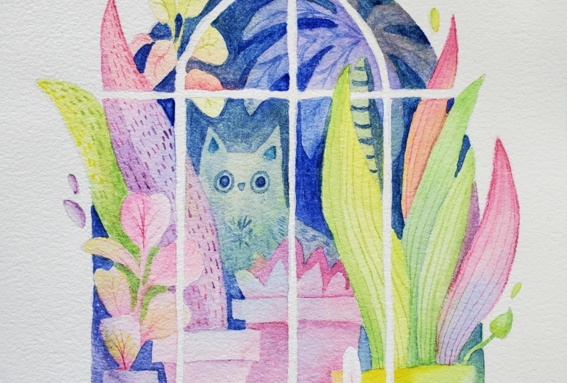
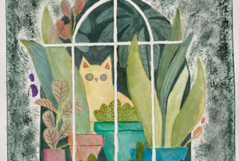
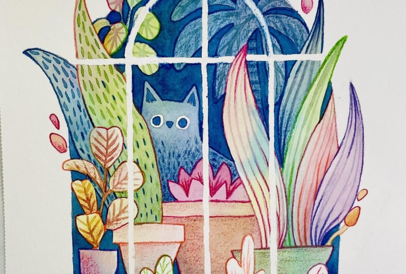
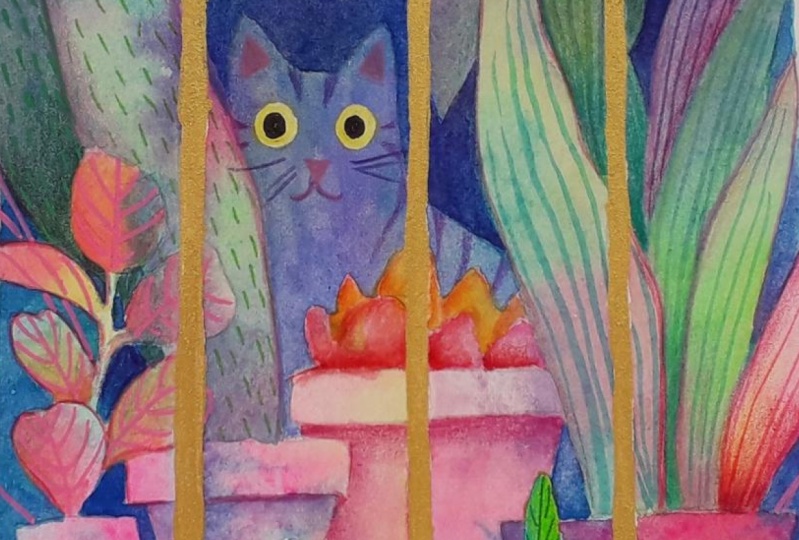
skills to good use and create this magical scene of a
greenhouse with the cat in it. This class is easy
enough for beginners, but if you already have
experience with watercolor, you can take the
skills that we use in this class to create
magical scenes of your own. Either way, everyone will be able to walk away
from this class, feeling more confident
and adding more color to your paintings and trying
out new techniques. Are you ready to have
fun with watercolors? Join me in simplifying watercolor painting
techniques for negative painting
and creating depth. I'll see you in class.
2. What is Negative Painting?: [MUSIC] Welcome to the class. In today's class,
we are going to get comfortable with understanding
what negative painting is. We're going to do simple
warm-up exercises to get used to painting
negative shapes and after that, we are going to dive
into our main project of painting a magical [NOISE] rainbow and
greenhouse like this. The reason I chose this project
is because it's an easy, simple way to learn
negative painting, and at the end of it
you're going to have a beautiful painting
that you can keep for yourself or give as a gift. I'm going to share my
painting and design tips and tricks with you
while we paint together. Before we dive into our
painting exercises, let's look at what
negative painting is, and how it can be an asset in your toolbox of watercolor
painting skills. The subject that we have in our painting is called
the positive shape, like over here, the tree. If we paint the area around it, that is called the negative
shape and we can paint either one of these and reveal
the shape of the object. When we paint the
positive shape, a lot of times we'll paint
all the details in it. But when we were painting the
negative shape around it, you're getting just the
silhouette of the object. In most cases we paint
the objects themselves, so in this example, the trees and the grass. But in this class, what I wanted to
concentrate on is what happens when we paint
the negative spaces around the objects. You can see the difference
between the two shapes or between the two little
thumbnail paintings is when we're painting
positive shapes, usually our shapes
are the darker values and everything that's closer is going to be darker
and when we're painting, the negative shapes usually
ends up being the opposite. Whatever is closest to
the viewer is going to be a lighter color and
then the farther back we get, the darker values become. Before we get to our little
exercises in this class, let's look at the
supplies that we need. [MUSIC]
3. Supplies: [MUSIC] In my previous
Skillshare class, wet-on-wet rainbow
technique, I go over all my choices
of tools in detail. If you're brand
new to watercolor, it's a great warm-up class for this one to get comfortable
with your supplies. Let's look at what we're
going to be using today. First of all, for the paper, I am using hot
press paper that's 300 grams or 140 pounds, and I recommend having that weight of paper just because it's
better with buckling, with the paper warping
once you get it wet, and it usually returns back
to its nice flat self. The reason why I
recommend hot-press over cold-press is because I liked having the option
of using pencils with my watercolor paintings
and using cold press paper, you end up getting a lot of
texture from the pencils, and so using hot press paper, it really enables me to get much more detailed lines in my paintings after
I'm done painting it. That's the paper. I
use Stonehenge brand, but you could also use
other good quality brands. I recommend Arches or
Stonehenge I like, and then Fabriano as well. As far as brushes, I recommend you getting
three different sizes, so large and a
medium and a small. These ones are a size 12, and size 8 and size 3, and these ones are
just round brushes. Then alternatively,
personally I really like these pointed filbert. These are by Princeton and
you can buy this brand at most art supply
stores like Michaels. I like these because
they're skinny on one side, but then they are wide and so the top part will hold a lot of water
and a lot of paint, but then it comes down to a
really, really nice point, so you can paint really
big areas with it, but also get a lot of details. As you'll notice
when we're painting, I really like to just
hold onto one brush. I don't like to keep changing brushes in the
middle of painting, so I'll usually just try to finish one whole area
just by using one brush. Then third, just get
a large jug of water, and this one holds
probably about, I don't know, 20 ounces or maybe even more,
maybe 30 ounces. The bigger the cup of
the less often you have to go and change
the water in it. Then really simple, I have
a roll of paper towels. I just pick one and take a piece off and hold it in
my hand when I'm painting. Then you'll need a
set of watercolors. This set is by a
brand called Etchr, and I have a couple
of other sets too, but today I'm going
to be using this one. Then lastly, if you want to
paint a little bit faster, it's nice to have just
the hair blow dryer. Just as a reminder, if you have wet paint that
you're trying to dry, don't go blowing
right on it with the high-speed because then your paint is going to splatter. Always start from farther away and as things are
starting to dry, then you can bring your
blow dryer a little bit closer to dry things faster. Just for transferring
your first initial sketch onto your watercolor paper, you can either use a
regular old pencil for it. Personally, I like to use these Prismacolor
Col-Erase pencils. I like having the
red outlines on my drawings before
I start painting. If you wanted to, you
could use a little bit of an eraser to erase some
parts of your sketch. But personally, I don't mind
having the red outlines as much as I mind having dark gray outlines
in my paintings, so I personally I prefer to use a colored pencil rather
than the regular pencil, and also the Prismacolor
Col-Erase pencils, are colored pencils
that you can erase. That way if you make a
mistake in your sketch, you can erase it and
then sketch again. This is completely optional, if you want to use some, this is masking fluid and
you can use masking fluid to get the lines on
to your painting. Before you start
painting, you would use the masking fluid and paint these in so that way you can color everywhere else, and then once you're
done coloring, you can just rub this stuff off. But just a word of
caution for it, sometimes I would
recommend that you try it on a scrap piece of paper before actually putting it
on your painting, because some
different brands are harder to peel off than others, some of them might damage
or discolor your paper. Personally in general, I don't use a lot of masking fluid, but because we have these
really skinny white lines, it might be something
that you might want to try and I'm also going to be
using it for this painting. But another option
that you could get around would be you
could use white paper, and just cut that skinny area out and then glue it on the top, or you could use
white gouache or white acrylic paint or paint markers to paint those lines in. It's up to you what
technique you want to use for those lines in
the final painting. Now that we've covered
all our supplies, let's get to working on
some warm-up exercises. [MUSIC].
4. Exercises: [MUSIC] Now that we
have our tools all set, let's start with our
warm-up exercises. While we're going
over these exercises, I wanted to go over the basic
rules for creating depth. Rule number 1 is value. When we're talking about the negative painting technique, in this technique,
the darker shades will always feel like
they're further away, and so the bigger
contrast you have between the lightest area
in your painting and the darkest area
in your painting, the further away from each
other they're going to appear. Rule number 2 is
that cooler colors recede and warmer
colors come forwards. In art, that's called the
atmospheric perspective. For example, if we
look at this photo, we can see that the further
we get from the foreground, the cooler and less saturated
things get in color. We're going to be
taking advantage of that by painting layers of blue paint on our paintings
to make items recede. Rule number 3 is layering. Placing objects in front of each other creates a sense of depth. You want to avoid tangents, so even if you don't have a huge difference in value
between two objects, one that's in the front and
one that's in the back, we know which one is farther than the other because
they are overlapping. Let's look at some of
the easy exercises that you can do to
practice negative shapes. For the exercises
today and to also strengthen the ideas
of the three rules, I have just drawn out a few little thumbnails over here that I'm going
to paint with you. Before I start with anything
with my rainbow underlayer, I like to premix my colors. I love this Retro color palette just because it has really, really bright colors on it, so it's really
easy for me to get really beautiful
underlayers of colors. I'm going to premix my colors, and I'm going to
paint my underlayer for all of these before I actually start painting
the negative layers. [NOISE] I've already lightly
sketched everything, and so to play with my
rainbow underlayer, I'm going to just paint my whole square and then I'm going to go and just
drop in some colors, and because it's already wet, some of the colors are
going to be bleeding. That's good for that. Then I'm going to just
move on to the next one. You can also play just
with different colors and how they mix. Right now, I'm just
making backgrounds. After I'm done
with all of these, I'm going to take my blow
dryer and then blow dry everything dry so that
I can start working on the negative
painting techniques. As you can tell, I'm not really being super careful about
staying inside the lines. These are just exercises,
so it doesn't matter. [NOISE] These are just colors
in general that I like, but you are welcome to make up whatever colors you
feel good to you. You can create different
moods by picking different colors
for the background. If you're not sure about the how strong your color should be, it's always a good
idea to start maybe with lighter colors because
you can always make colors darker in the areas that you want colors
to be darker, but you can't make
them lighter anymore, so always start
with lighter colors and then you can always
paint them darker. If you want your paints
to mix a little bit, you can swish them around. But a lot of times, if you're
mixing opposite colors, you'll end up with muddy colors. I just try to let the water mix my colors
and leave it at that. To work on our negative
painting technique, I'm going to be just mixing a blue puddle of paint
for myself over here. I'm grabbing a few of my, I have ultramarine and I
have Prussian blue in here, and then whatever green
I had in there before. It doesn't have
to be really dark blue because we're going to be doing several layers of it. I want it to be a lighter or a middle-shaded blue,
about that dark. We're going to work on
our negative painting here in a simple way. Over here, I have three lumps
or bumps or humps painted. I'm going to start by just
painting around all of them first just to make sure that
I know where my shapes are. If I paint over the shapes
right in the beginning, then sometimes it's hard
for me to see where my shapes are with
successive layers because I've already
covered them up with one layer of blue and then sometimes it's hard to
see where my line work was. Usually, with my
first layer of blue, I try to paint
around everything. There's one. Then let's do
the same thing over here. Over here, I've grouped
my mountains together, and because we're
doing these washes, they need a little bit of
time to dry in-between, so by the time we
get to the bottom, hopefully these
top ones are going to be already over here. Same thing, I'm just
going to paint. I have these, I'm imagining them to be maybe like little bushes or
something like that. Then over here, [NOISE] I had drawn a bunch of
squares on this one. For this one, I am doing leaves, and so this is a
scattered pattern. [NOISE] The same
way as over here, it's going to be
easier just to paint some of those leaves
in. There's that one. Then for here, I've drawn a whole bunch of
like a jungle scene, and so these are just
imaginary shapes. They could be a forest, but I've never seen
quite a tree like this. But the important thing is just to have these different
shapes that are overlapping. Because these are overlapping, it's easy for me to tell
which layer they're in. Now I've painted all my
negative areas over here, and so to create the depth, I'm just going to paint successive layers and
cover some of my areas up. At this point, I'm going
to cover one of these up, so I'm going to paint the
same as I did before, but cover one up. I'm going to paint
everything that I already painted before. With every layer,
my background layer is going to keep getting darker, and I'm going to be
fading areas in. At this point, I'm going to
be covering this one up. Same thing with our next one. With this one, it's easier to see which one is in the back. With this one, we were
doing a little bit different and we'll just paint squares out and you can just
make this up as you go. Leaves, I'm just going to be adding same way as over here, adding leaves into over here. We've got the second
layer done over there. I'm now moving on to our
second layer over here. You can always make
areas darker afterwards if you feel like things
aren't dark enough, but you got to make sure
things are dry because otherwise you're
going to be lifting your paint up as you're going. Now it's time to
paint a second layer, and my first layers
are not quite dry yet, so I'm going to take my hair drying thing and dry them again. With these first two,
they're very simple. We're only going to
have three layers. When I'm laying my
washes of blue down, I'm trying not to scrub
my underlying layers. I'm just trying to put each
layer down little by little. I'm just making these
shapes up as I'm going. Depending how subtle
your underlying layers, that determines how many
layers you can get going. The darker it gets,
then the harder it is for you to make layers anymore. It's always good to start with light layers and then move up. Or if you need to strengthen layers, for example, over here, it's really hard to
see that initial tree that I painted over here, I can always go and just
paint that in again with some darker color and we'll let it dry and
do the last two. [NOISE] The important thing to remember with this
technique is just values and when you have
really bright brights, they're going to be the
brightest when you put them against the darkest darks. If there's something
that you really, really want to highlight, if you put something
dark right next to it, then for example, right here, these leaves
are really going to pop because they're going to be against the darkest
darks in our painting. Now that I have all my layering, I can go and add
leaves over there and leaves over here and
add details if I wanted to. Then if there wasn't
enough definition for my background where my
first and last layers were, then I could go
back and just add more darkness to my
very first layer here. Now that we're all warmed up, let's get ready for
our final project. [MUSIC]
5. Transferring Sketch : [MUSIC] There's a few different ways that you can transfer your
sketch onto the paper. As part of this class, I'm providing you with
a copy of our drawing. To make things simple, all you have to do is
transfer this drawing onto your watercolor paper and
then you're good to go. A few ways to do this is
if you have a light table, this one is just a
really cheap one that I've purchased from online. As you can see when I put
my drawing underneath, I can then draw my picture on the top or
my sketch on the top. But even if you go onto a window and you just
tape this onto a window, that works just as
well on a sunny day. If you don't want to do
either one of those, what you can do is if
you just color with a graphite pencil on the
back of your drawing, [NOISE] you color
the whole area out. [NOISE] Let me do it on a scrap. Then when you come to the
top and you draw through, [NOISE] you draw your
whole drawing through, and then those lines will transfer onto your
paper underneath. This is probably my
least favorite way to transfer a drawing
just because, when I'm doing it like this, my lines are usually
a little bit, they're chunky and they don't
always line up perfectly. For me, it's easier
if I sometimes I'll sketch on top just to make sure that things line up and
are properly put together. With this technique, it really works best
with the pencil. I don't think the
red pencil would transfer really well
from the backside. You do have to use
graphite when you do this or even a transfer paper, but transfer paper, I don't
think that's erasable. Then you're going to have
dark lines in your painting, that's not the idea. But if you use
graphite and pencil, then at least you can erase
part of this and make it lighter if you
don't want to have dark outlines in
your final drawing. That's three different
options that you can do. Option 1, use a light table, option 2, go up
against the window, and option 3 is tracing your
drawing through your paper. [NOISE] If you're using 300
pound paper for this class, this is 300 pound. You can see how rigid it is. You don't need to stretch
or tape your painting down. Personally, what I like to do is that, when I'm painting, I like to be able to turn my paper around
easily so that I can easily paint into all the nooks and crevices around my paper. If I take my paper down on
a large sheet of something, it becomes harder to turn
around when I'm working on it. If I was working on a
very large painting, then I would probably
tape it down or staple it down on a board. But with these small
little paintings that are eight by ten or
five by seven size, I usually don't
tape anything down. If you chose to use masking
fluid for your painting, then make sure that you
paint that on and let it dry completely before you actually start putting watercolor
down onto your paper. As you can see, I'm
using a quill or a dip pen to apply the
masking fluid onto my paper. You could also use a brush, but I find that the advantage
of the quill is that, once the masking
fluid dries on it, it's easy for me to peel it off and I don't ruin my brushes in the process if I was using just regular paintbrushes
to apply it on. I do find that I get a little bit more control
maybe with my paintbrushes, but I don't like this
destroying them, so that's why I use the quill. [MUSIC] After you're done transferring your
sketch onto your paper, we're ready to move on to the next video and
begin painting. [MUSIC]
6. Rainbow Underlayer: [MUSIC] I'm so excited that we get to start
painting our final project. To begin the painting, we're going to start by mixing
some colors that we want to serve as the base rainbow
layer of our painting. After the colors are mixed, we wet our whole image area up and drop the ready
mixed colors onto it. I tried to think in general what I want my final
image to look like. There's areas that I
wanted to stay very light, I avoid dropping dark
colors on there. For example, I know what my front plants are and where my cat is
and I just want to make sure that those areas
stay the lightest and I don't drop a dark purple where I want the
light area to be. Also, if this is your first time painting a rainbow underlayer, don't worry about it too much. This is an exercise
and I hope that you'll take a few times to
practice this technique, to see all the possibilities
you can create with it and with the exercises
that we already did, hopefully you're warmed
up with the technique already so try to have fun with it and use your
favorite colors. Now between going too
dark or too light, I tried to air between having too little color so that that way you can always go
and add more later, but you really can't
take the paint off without making a
mess afterwards. If you accidentally put
down too much color, you can always dab it with
your paper towel and add more water and use a dry brush to mop up
some of that excess. Then after we're done, we're going to let
our rainbow layer dry and then we are ready to
begin the negative painting. You can see it's relatively wet and the paper's
buckling a little bit. We're going to take our time and let this dry or you can use your blow dryer and blow dry it dry if that's what
you feel like doing. Once your paper is dry, we can move on to the
first layer of blue.
7. Negative Painting - First Layer: [MUSIC] Now that we have everything dry on
our rainbow under layer, let's begin with our
negative painting. To begin with that,
just like when we we're doing our practices, a little practice squares. I'm going to make myself some blue paint here on the side. It's up to you what shade of
blue you choose in general, I usually like Prussian blue. Depending where you want
to go with this piece, you can make more of a greenish
blue or a purply blue. [NOISE] It's up to you. But since I have a lot of
purple colors in here already, maybe I'll add a little bit of purple into my
blue mix as well. [NOISE] You can always
have a scrap piece of paper where you can
test your colors. I'm adding a little
bit of water in it, wanting to make it a
little bit lighter. For our first layer, we are going to start
with the technique or the negative painting
where we're starting out with our smallest areas
that we're going to be expanding
into other areas. For the first layer, I'm going to just be
painting all the edges. We're on the all the outsides. I'm going to be painting around all my plants and painting
just the background. Making sure I'm continuing my lines through the
different panes of glass. I find when I'm working on these a little bit more complicated than painting squares
or rectangles, it makes it easier for me
to see where my painting is if I do the first step, especially where I paint around everything because
that way it's easy to see where everything is. I'm using a medium-sized brush, I'm using my size 8 round. As you can tell over here, I'm just [NOISE] turning
my paper as I'm painting around to get all my little
corners painted more easily. I'm just taking my time
to go around everything. There is our first layer. Even if it's not perfect, you'll notice that there's
some edges over here, like right over here where it dried a little bit unevenly. It's going to be okay
because we'll be painting several other layers
on the top and then that way it'll be less
noticeable when we're done. Now, if you have any wet
areas over here before you start working on the
second layer of blue, I recommend that you blow
dry it in-between right now. [MUSIC] I noticed I had missed a few [NOISE]
spots right up over here. I'm going to paint
those in really quick. I probably should have gone over here so I have to try to fix
that a little bit later. [MUSIC]
8. Creating Layers With Blue: [MUSIC] In this video, we have the first layer
done and we're going to start adding depth
into our painting. So now we start
thinking backwards and thinking what's going to be farther and what's going
to be in the front. So we know that these two plants are going to be in the front and some leaves are obviously farther in the front
than the others. Then we have this plant
is behind this one, and then the cat is
behind these two plants. We know that these
will be the brightest, then this one can
be the next one, then this one will be
the next one, next one. I feel like the cat and this plant with the round
leaves are on the same level. Then we have this palm
tree looking thing that's all the way going
to be in the back. At this point,
we're going to take our blue paint again
and paint everything. This time I'm going
to be painting on top of my tree in the back. I'm going to be
wetting my brush, [NOISE] you just have
to make sure that your layers are completely
dry in-between. I'm painting with the same
paint I did the last layer this time because you can tell I'm going to
be painting on top. Maybe since the cat
is in its own layer, I'm going to paint on
top of the cat too. Now it's up to you
if you want to leave lighter eyes for the cat. But if you wanted the cat's
eyes to really shine, you could paint around
your cat's eyes too. With this window panes, it's
easy to go in sections. When you start working on your successive
layers after that, you don't necessarily
always have to paint around everything. [NOISE] For example,
for the next layer, I know I want this leaf
to be behind this leaf. I'm going to be painting a lighter color
behind over there, the same thing as I
did over here on top. I'm going to do over here, start revealing that
front plant over there. Then we'll have to paint
at least one more layer over here just to make sure there is a difference between this plant and
the plant behind it. This is the first layer to make a difference and
then we'll paint another one after
this side is dry. There we go. I'm
with the same token. Let's paint over this
plant over here. If at any point you
feel like you're starting to lose your
palm tree in the back, you can always paint
an extra layer of blue behind just to pop it
out a little bit more. You can see how
we're starting to get nice layering
going on over here. I was talking about
that greenish color. I think this plant, I want it to be a
little bit more green. I know this is going to be
darker than this layer, but let's concentrate on this for just a
little bit just to make sure we can
get some definition for our leaves over here. I have [NOISE] whatever leftover green I had over here and I
mixed some blue in with it, I have a blueish green. I have a light, green, so let's start mixing. I want it to be fairly light. This is obviously
my darkest leaf, so I'm going to be
painting this first. Then I'm going to let this dry and then paint the other layer. We're also layering not
only with the blue, but also with a greenish color. I'm going to add some in
the back over there too. While that's drying, maybe we can do same thing over here. Instead of fading with
blue all these layers, I'm fading some of these
layers with the green color too just to give them
more of a leaf color. I'm trying to paint these
layers relatively quickly, just glazing these
colors on the top, you can see the fun thing
happening over here there was the underlayer
had yellow and it had pink. Now that I glazed this
green on the top, I'm getting really beautiful fades between the
different colors. While I was painting this, this side is dry
so we could go and paint another layer over here. Let me see. Do I want to add? I want to add at least
a little bit over here. I don't want it to be just
completely yellow leaf. I might just add a
little bit of green, going to wash my brush, and then just fade that edge a little bit so
it's not so sharp. But now even with
that simple layering, I have 1, 2, 3 and 4 different layers
just with my background. As that's drying, we can start bringing in little details all throughout over here. If you feel like you're losing, like for me I feel
like I'm starting to lose my palm tree in the back, I can add one more layer
of blue over there. I'm just going to concentrate on popping out that
palm tree a little bit, just to have a little
bit more definition, and that enabled me to paint a little bit around my cat too. Maybe add a little bit
more darkness in here. You just keep going around your painting and finding
little spots that needs to go, well you can't go lighter, but areas that you
can make darker to make give areas
more definition and work on that layering things that need to
be behind something else and things that need
to come forward more. Maybe there's the trunk of the palm tree so we can make a little bit of a
distinction for that too. As you can see, it's
starting to come together. Then we can start thinking
about what we want the colors of our plants
in the front to be. Since this is a imaginary scene, not everything has to be the color that you would
find it in nature. We could add, for example, if we have some pinks
and yellows over here, we could add a little
bit more of those and just strengthen those areas. This is quinacridone rose. I'm going to wash my brush. I'll just fade. I'm not doing everything at the same strength you could say. I'm adding just a little
bit of red on this end just so it's not all
exactly the same. There. I'm going to do
something similar over here. I wanted to do some fades of pink and maybe add
some red and yellow. Then just with a clean brush, shade some areas out so we get a little bit
of uneven color. Maybe we have these
yellow leaves, so maybe I'll go for more
of an orange over here. I'll start with an orange at the tip of the leaf
and then get my pink. I'm just supporting whatever under layers I have over there. I want this leaf to be
behind this other leaf. I could even have a
darker edge over here, maybe all that a little
bit of red faded in the back and then get
a brighter color too, faded into going up. Do the same thing down here at the bottom or where our pop is. That covers that. Then we'll add some details to these leaves
here in a little bit too. I can tell that
this is still wet, so I'm not going to
touch that quite yet. The next I could just
keep moving on my parts. Maybe let's work on this part
since it'll be in the back. Here, I'm mixing all the
colors in my yellow palette. Just painted my
front pot corner. If you make a mistake like that, then just dry your
brush really quick, then you should be able
to soak up some of that before it completely dries. Then once this area is dry, I'll go back and fix
that up a little bit. Everybody's paintings
are going to be different depending on where you dropped colors before. You have to feel your way around and figure out
what colors you want. Where do you want
purples or pinks, I think I'll add a
darker purple here. I start out with
green and then I ended up with purple
at the bottom. Then we'll have to darken
this corner over here too. At this point it becomes massaging your
layers and sending things backwards with consecutively
darker areas of pain. You just have to go
little by little and carefully and figure out what looks good and what looks bad. That's why I recommend
for people to work small, especially in the beginning once they're still figuring
everything out. Because if you're working
on a smaller piece, then that way you'll have
less time invested in it. If you don't like the way that
it turned out at the end, then it was little time
and little paint and little invested in it and then it becomes a great
learning experience. Then you can paint another piece and then use everything
that you've gained, all that experience to make the next painting
that much better. There I feel like we
still need some darkness in here. Let's see. I still have several
areas that are drawing in this piece that are
not quite wet yet, but I feel like I need
a little bit more. I have some hot pinks down here, so I feel like I need a
little bit more pink in here. What I think I'm going to do is add pinks over here and then fade it down into more of a purple down towards the bottom. Let's start with
those pinks first. You can see it's a
Ronnie light color. I like the color this
one's already at. Then grab my purple. Start adding purples down here and kind of
fading stuff out. I feel like it needs
that some of this shade in there to make
some of that next. Well, this is still wet, I think I'm going
to drop just add some edges just to add some more interest in here so it's not all the same color. I'm just going around
and figuring out where I feel like I need more. Let's see. I know I noticed
that for at least myself. I have a green area right here and it looks
lonely by itself. I might add some green just as a shade somewhere
up over here too. Maybe there's something
behind this palm tree or maybe I'll even just paint
some of it on my palm tree. It's just trying to figure
out where your colors are and balancing things out. Let's see, we have
this part over here. Sometimes I'll even
use just a piece of scrap paper to mix just a little bit of color
in someone that lip. That looks nice. Then maybe I'll add some to the
bottom over here. Then I'll fade that out, rinse my brush and
leave it semi-wet. You'll see once it dries, it'll look a little bit better. Now that we have all of
our layers established, let's start working on some
details for our painting. [MUSIC]
9. Adding Details: [MUSIC] Now that our basic layering is done with the blues, let's start adding some
fun details to our plants. We are starting with
this front plant and adding some lines
into the leaves. Depending what color the
leaves are in your background. You can also change the color
of what your lines are. Since we're doing details
now might be a good time to change into a smaller
brush. Let's see. So since I'm doing details, this is my size three round. Let's see, I was doing green. Maybe for that back plant, I'll do a purple again. It doesn't have
to be super dark, but it'll just give
some visual interest to your piece and see see. Trying to think
what color I want my details to be in there. Maybe I'll make them kind
of an orangey color. These I might do a second round just to
make them slightly darker. For the inspiration
for these plants, I did obviously look at
some plant pictures, green greenery pictures
online and you probably know a lot that you have a catalog in the back
of your mind anyways. As you can tell, these do have
references to real plants, but it's up to you, however, how close you want to stay to reality
in these paintings. I feel because I'm not
really painting super all my colors are really
often not super realistic. It's okay to veer off
from reality and do different things at
different sizes than what they might normally be. While I'm working on this plant, I'm going to also add some outlines to it.
Just very faint. Since I'm on this blue
kind of purpley leaf, I'm just taking the same color and just adding a little
bit of an outline there and just fixing some of those areas ups I've
been painting before. Even if you wanted to add outlines for the
different layers, you could do that too. With my color choices. I'm just trying to
think how I can enhance the colors that I already had
underneath over there. None of these are
really strong colors. But just using colors that are already existing over there. We have this little mushroom. Maybe we'll add some color
just to the top of it. I'm pretty happy with this area. I'm liking the
colors that I have. If you wanted to. Maybe my green is a little bit
faint over there. I'm going to grab a
bigger brush again, glazing your colors is easier
if you have bigger brush. If I wanted to add a
little bit more of just a brighter green on
that. I drew over there. Just to give it a
little bit more on what I was saying earlier. If your colors are a
little bit too light, you can always go back
and add more later. Starting to look pretty good, then we have our little plant. Let's get our layer on
our plant. There we go. That'll create a nice
succulent plant for us. Then once that dries
and we can work on our cat for this plant, I figured because I made
the stripes over here, maybe it would be
fun to do more of a splotchy broken up
pattern over here. I'm going to choose
colors that I already have and just add
these dots over here. There might not be a
plant exactly like this. This is more like a
stylistic choice of how to add patterns
to our paintings. Then for the front,
front one, obviously, I'm trying to enhance
the colors underneath, so I'm going to pick a green. Then it could even be a few
different shades of green. I could do a brighter green on the outside of the
leaf and then do a more reddish
green on this end. I didn't change my brushes, I'm still using that big one. Go in-between, I'll
add some green. But even that add some
visual interests, just having two different colors of dots going on over there. We're starting to
look pretty good. Let's add some
lines to our plant. I'm going with the dirty yellow. I'll add a little bit of this brown to this stem over here. Leaving a little
bit of extra space just to let it breathe. I still wanted to fade this
a little bit on this side since I do have that belief that it's kind of overlapping. Now, we have our cat sitting over here
waiting for us to notice it. For the cat, what
I wanted to do was I wanted to just give it
outlines for the eyes. Obviously we want to paint
the inside of its eyes. Maybe depending what color
your cat you want to be, you could color in the same way as we added
green to these leaves. You could add a color
to your cat as well. But I like my cat just being
I like him being this color. Maybe I won't add
too much to it. Maybe I'll add some, just a little bit of yellow
maybe highlights to it. It is an abstracted cat
rather than a realistic one. Not adding a ton of color to it. Just a little hint of yellow. While it's drying. Let's do some details around over here. For these plants I wanted to do these veins that radiate
from the middle. Maybe for this one, I'll just do a darker
version of it. We've just given everything. I want it to just fade in
the back so I'm not going to give it too much detail. I don't want there
to be a lot of stuff that's fighting for
attention in the back. I'm going to do very light, very light blue details for it. At this point my cat is dry, and let's start working
on those eye balls. Also, I've been using my rag and this is getting
really wet and soggy. At this point, I'm going to put this as high then
grab a new one. For eyeballs, let's
do some outlines and I'm going to turn it where my cat is going to be
the closest to me. I don't want it to
be super-duper dark, but I do want it to show. This you could also
do either with your colored pencils
or you can do it, I'll do it with
hand at least once. Then we might add some colored
pencils over here too. Now to draw the actual pupils, I'm going to turn
it right around so that I make sure that I get
everything in the middle. You can always make
it lighter and then come back and
make it darker. There, trying to
just match them up. Then if you wanted
to add some hairs or some texture to your cat,
you could do that too. I'm going to grab a
reddish grayish color. The same way as we
added over here. I'm going to add some ears
for our kitty cat too. I feel like I need
to go a little bit darker in this part. When I went to fade an area out, I paint up to it and while
the paint is drying, I wash my brush and
I dry my brush. Then with just a little bit
of water left by my brush, I'm just pulling, teasing
that color out from there. I feel I'm ready to grab
my color pencils out next. If you still have wet areas, you can dry your painting first and then we will get
to the final details. [NOISE]
10. Details - Part 2: [MUSIC] In this segment, we're going to be adding details into our
painting with pencils. Now pencils are optional. You can also add details with a small paintbrush
and watercolor, but I like the pencils
because they're a little bit faster
and also opaque, so I can get a little
bit more color into my painting rather than
painting with my watercolors. I've grabbed just a handful, a big handful of
colored pencils, and they're the same colors that I see happening over here. We can use the
color pencils just to shape some of the
edges that we have going on over here starting from one end and
going to the other. It's just nice being able
to add a little bit of definition to some
areas here and there. In some areas, I'll use a slightly different
color than what I have. In the same way, as we were adding highlights with
complementary colors, you can use complementary colors when you're doing outlines too, and even if you wanted to
color areas in, you could. The nice thing is if you are
using hot-pressed paper, then your colors should go
on really nice and smooth. This is just the time
where everything starts. At least for me, this is where everything starts
singing and where everything starts coming
together as you know. Everything will look
just awful up until now, and then at the last minute, once you start putting
those final details in, that's when everything
really just comes together. I need to have a
darker red over here. Here we do have a
darker shape that's in front of a lighter
shape, but that's okay. Adding these extra
line details will help distinguish what is where. It is defining different areas that might've gotten
a little bit lost, especially on areas where you've been painting
multiple times over. I can tell that on
this leaf right there, there's already a pinkish, there's a red outline that
I did in the beginning, so I'm just going to
keep highlighting that. I like the way that it shows up around over here so not all
the outlines are at the same. Maybe we'll add some
highlights over here. For that background, I
will grab my darkest blue. [NOISE] We can do some outlines just to make
sure what goes where. You don't have to shade
everything in the background, but some areas it
might be nice to help define a little bit
further. It's up to you. Even after you do your pencils, you can still go back
with watercolors and add more layers of watercolor if that's what you feel like. I was just looking
at the painting, and I feel like I need
to add one more layer of paint over here to fade this out just a
little bit further. Sometimes you just need to
take a moment and look at your painting and figure out what it needs moving forward. Everybody is going to
be slightly different but I felt with this being so bright and this
being so bright, the middle part
just needed to move back in space,
just a little bit. I still feel like this
one is really bright, so we're going to be adding little bit more
color over there. After your paper
is completely dry, we can start removing
the masking fluid. I've seen people use erasers, plastic cling wrap,
but I usually just use my clean
finger to rub it off. The brand I have seems
to be really sticky, so I take my time with it so
it won't damage my paper. [MUSIC] I can tell that some of my yellow areas are light around
some of these areas, so I'm going to add
just some outlines. [MUSIC] Now, if your masking fluid
was a little globby like mine was and you have these
uneven white lines, you can fix those white areas darker with a bit more
paint or a pencil, or then in reverse, use a white acrylic
marker, gel pen, or gouache to touch up
the white line edges. [MUSIC] We're just about done. It's so easy to just sit there and tweak things
forever and ever, and it's really up to
you when you feel like you've been massaging things for long enough and
you want to stop. [MUSIC] You'll see that I made the decision to paint
the eyes of the cat green, and I immediately
regretted that decision. The eyes were bothering
me because they stood out as too dark, so I decided to take
a clean brush and scrub the eyes gently and
re-wet some of the paint, and then I dabbed the wet
area with my paper towel and then repainted the
eyes with a lighter color. [MUSIC] As I said, it's so easy for me
to sit there for an hour and tweak little
details in my paintings. Now, I sped up this
last few things that I worked on for you
because I did want to show you the complete
process from beginning until all the way to the end when I
was happy with it. You can see that I alternate between pencils and watercolors, and sometimes I'll even use
my jar roller in there, just tweaking little
things here and there until I feel
that it's complete. I felt that it was important for me to share
the whole process, including my mistakes
because I feel that's a great way to
learn from other artists. I just love seeing how other people's brain
works and what their decision
process is as they go through the whole painting
from beginning to end. Now in the next video, I wanted to highlight how I use the wet-on-wet painting
technique with the rainbow underlayer and negative painting in my
more advanced paintings. [MUSIC]
11. Advanced Applications: [MUSIC] I wanted to take a few moments at the end of the class before we wrap up to just show you some of the paintings that
I've done that use this rainbow wet-on-wet
painting technique for the underlayer and then the
negative painting on the top to create
these magical worlds. I have a whole sketchbook of pieces that I've
done in the past, that I've used for
some different classes and we'll look at those a little bit closer
so that you can see what they look like and
what you can do with it. When you're painting like this, it adds a fun life and
vibrancy to your pieces. When you're painting backwards, in some ways you're rewiring your brain to think
in a new way. Instead of painting
the objects directly, you're painting the space around them to
reveal their shape. Creating depth with
negative painting is a great tool to have in your
watercolor painting toolbox. Setting your rainbow
underlayer of colors into a dark background makes
your painting look more vibrant,
magical, and glowing. In these paintings that
we're looking at right now, you can see the
rainbow underlayer, but on many of them, I've taken a little
bit more care to add details and definition to the animals and the
plants themselves. That's a difference compared to the painting
that we did today. But it's always
important to start from the basics and then work your skills up to do
more complicated pieces. [MUSIC] In the next video we'll
be wrapping up our class. [MUSIC]
12. Conclusion: [MUSIC] Congratulations on
finishing the class. I hope you had fun and
you've learned how to paint with water colors using the negative
painting technique. We've learned some
basic design principles and how you can take
those to start creating little scenes of your
own and why working small is a great way to start
building up your skillset. I also hope that I was able to inspire and give
you some examples on how you can take
this technique and use it for more
complicated paintings. All the files that you need to complete your project are in the Project and Resources
section of this class. They are easiest to access and print out on a desktop computer. Please upload a photo of your painting when you
have completed it. You can find the spot for that in the Projects and
Resources page. I love seeing all of them. If you're on social media, you can tag me @mirkahokkanen and use the #MirkaSkillshare. Remember to follow me
here on Skillshare, so you get notified of
new classes coming up. Take care. Happy painting. I look forward to seeing
you in my next class. Bye. [MUSIC]
 Mirka Hokkanen, Illustrator/Author/Printmaker/Educator