Transcripts
1. Introduction: When painting sunsets, did your colors look muddy
or lack vibrancy? And does the fear
of losing control hold you back from
embracing lose watercolors? If any of these sound
familiar, fear not. You can paint sunsets
in just six strokes. Yes. That is right. This class is here to help you overcome those common
challenges and paint vibrant expressive
sunsets with confidence in six intentional
timed strokes. I have spent countless hours
capturing the beauty of loose and expressive sunsets
in these three sketchbooks. Hi. I'm Omar. I'm a skeptic artist, illustrator, and author
of G the Flow Painting. My art has appeared on
greeting Scards, textiles, and packaging all
over the world, and I've had the
pleasure of working with major brands from
the BBC to Unicef. In this class, I'm
really excited to share my top tips for creating expressive vibrant
sunsets with ease. We're going to dive into
the essentials with four warm up exercises,
including juicy brushes, mastering the water
to pigment ratio, and looking at warm
and cool pigments to really make those hues pop. And there was going to be interpreting and simplifying
reference images. I have prepared four
full length demo videos, starting with the basics and moving to more
advanced techniques. So whether you're a beginner or an experienced watercolorist, there's something for everyone. It's all about being in the moment, painting
with intention, and letting the
colors dance on the p. By the end of this class, you'll be able to embrace spontaneity in your
painting process, letting go of that
hesitation and create dynamic compositions that really capture the essence and
beauty of a sunset. Let's get started on creating those breathtaking
sunsets right now.
2. Your Project: Thank you so much
for joining me. I've designed this class to be a springboard and an invitation for you to explore your own sunsets in a way
that truly excites you. I hope the foundational
techniques and insights I'm going
to share will equip you with the tools
and confidence to embark on your own
unique sunsets journey. Use these skills as a
starting point to discover your own personal
style and create sunset paintings that really resonate with your own vision. My approach to painting sunsets
is loose and spontaneous, emphasizing interpretations
of a sunset rather than aiming
for strict realism. I feel this method allows for a more expressive and personal
connection to the artwork, capturing the essence
and emotion of a sunset without being
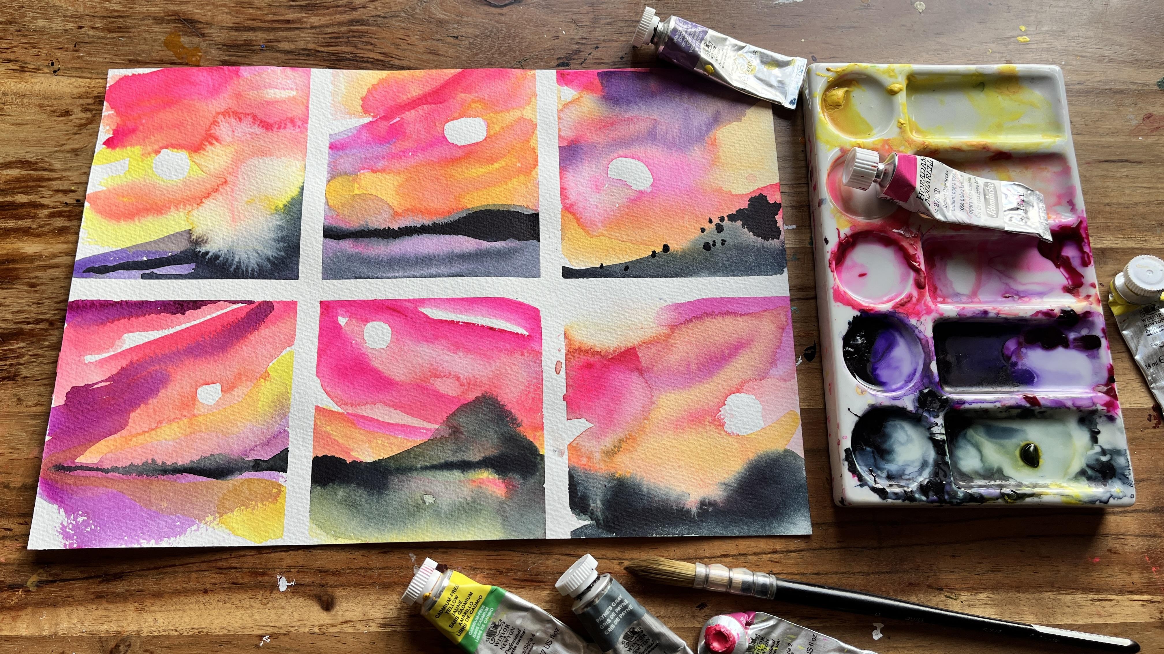
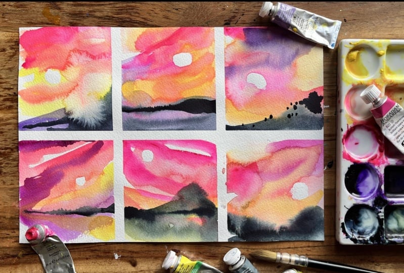
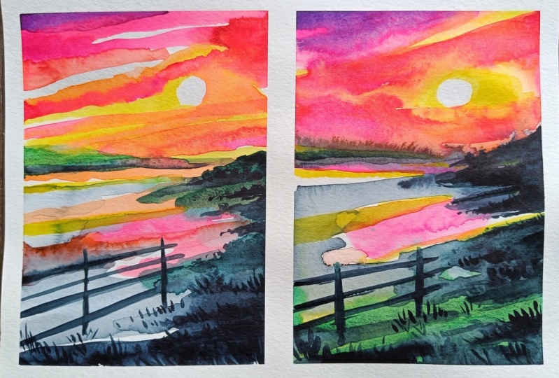
confined by precise details. Six stroke sunset is a game
I invented for myself, where I could create
small quick pieces using just six intentional
timed strokes. In my sunsets game, you can make six
separate strokes, as long as each time it
doesn't leave the paper, that still counts as one stroke. And I want you to view your six stroke sunsets as
a game for several reasons. Ewing this as a game will help reduce anxiety and
take away from the pressure of trying to
be perfect and allow you to enjoy the process and
experiment more freely. Games often involve
trial and error, and it will help you
develop resilience and a positive attitude
towards mistakes. Seeing them as learning opportunities rather than
any kind of setback. The challenge requires careful
planning and execution, as each stroke must
be deliberate, almost tactical,
and intentional. The playful nature of this game can help you stay
focused and present. This practice has been
incredibly useful for me as a way to produce art easily as possible in
a short space of time, which is ideal if you
have a busy lifestyle. Just to be clear,
this class will not focus on copying photos. While photographic
references are provided, you are not expected to
replicate them exactly. This class emphasizes
using them as reference for inspiration
rather than strict guidelines. Instead, I encourage a looser, more interpretive
approach. Perfection. This class is not about achieving flawless
polished artworks. Embracing imperfections
and spontaneity is encouraged as they often contribute to the charm and
character of the final piece. There are no rigid rules about
how a sunset should look. The sunset police are not
going to come after you. This class is not
going to be me saying, use Cadmium orange to paint this part of the sky
and then add red here. Eventually, I want you to make decisions about
which pigments you use and where you use them in order to
interpret the photos, so you can paint sunsets
by yourself in future. Your project is
to create a sheet of six stroke sunsets
in watercolor, using the techniques I'll
demonstrate in the videos. Please upload at least
one or more sheet of six stroke sunsets, at least two or more of
the warm up exercises, and also your thoughts
on the process with lessons learned and any
challenges you faced. It would also be useful
to include the brand of watercolors and
the pigment names you used for the sunsets. For this class,
you can use any of the royalty free high
resolution images that are available as a PDF. This file is called Sunset
references for OMAs class, and is available to download under the Projects
and Resources tab. Just click on
Download Resources. Also available to download is a PDF for watercolor
pigment biases, for reds, yellows, and blues, which you can also access
under the Class Resources tab. This is going to
be really useful when we talk about color theory. When you're ready to
upload your class project, head over to the Projects
and Resources tab and hit the Create
Project button. First, give your project a cover photo and a title to
really make it stand out. Here, you can add the
contents of your project, including your photos and the text to reflect on the process and what
you found interesting. When you finished, adding
your content, it, publish. You can come back at any time to edit and add more
to your project. I know it can be really scary putting your work
out into the world, particularly when you may be using techniques
that are new to you. But I would encourage you to be bold and share so that I
can give you feedback. Please take a look around
the project gallery and drop a few likes and comments on
other student projects too. If you've enjoyed this class, then please leave a review as it helps other students
find this class, and it would really help me out. In the next video, we're
going to go through the tools and materials you're going to need
for this class. So when you're ready,
join me there.
3. Materials : Let's start off by going through the suggested materials you're going to need for this class. So the materials list
is pretty simple, but I do urge you to try and get the highest quality watercolor
paper you can find. You can either use
loose paper like this. I'm going to be using a
mixture of Dala rowi. This is the aquifine range, and I buy it in massive
jumbo sets like this because I often just
do loads of tester sheets, especially for a
class like this. And this is A four. It is 300 GSM and co pressed. Other watercolor paper
you might consider is, let me get rid of these. I'll show you these later. If you look carefully, these edges are gummed. And because we are going to be using quite a lot of water, the gummed edges will keep
the paper flat as it dries. This is the sugarcane
paper from Hanam, and it's 290 GSM, and it's 30% cotton with
70% sugarcane fiber. This is quite a new product. You don't have to go
out and get this. I just really enjoy using
this at the moment. Otherwise, you can work
in your sketchbook. These are various sketchbooks
that I've painted in, and I'm going to show you
these in the next video. This little blue one is
by Stillman and Burn, and I only filled
the last few pages, but I did rather enjoy it. This is their beta series, and it's a soft cover
with 270 GSM paper. And the other
sketchbooks that you saw me use were from Hanna Mul. This one is the
watercolor sketchbook. It's coal pressed,
and I like to use A five because with the sunsets, I've been painting quite small. You can use the 100% cotton
watercolor sketch book. It's coal pressed and A five, and this one is 250 GSM. It's absolutely up to you, whether you want to use
loose watercolor paper or a sketchbook. These are the brushes
that I love to use for almost all my
watercolor sketches. These are by Jacksons. I've got a variety of sizes, but it will depend on the manufacturer,
what size you get. They all seem to vary. And this one in particular
is the S 777 series, and they just hold
so much pigment. I will talk more about
this in a later video. This one, even though it
looks relatively small, it does a tremendous job, and this is the brush that I give out to workshop
participants. I also want to show you
this larger quill brush by Windsor Newton. This is a synthetic squirrel. When we do the larger sunsets, I like to use this
brush because it's just you're going to see how much pigment and
wash it can hold. If you don't have coil
brushes, please don't worry. You can use normal
watercolor round brushes. I would recommend using a brush that is
larger than a ten. This one's a 14, this one's a Cpman, and
this is a dalla rowi. It will still hold a
fair bit of pigment, but please make sure you use
the larger size brushes. For the watercolors,
I do recommend getting a student grade
quality watercolor set. This is by Windsor and Newton. It's their Cotman, and please make sure it has two yellows, two reds, two greens, because I'm going to talk
more about this later. It was really going
to help you out. So you can just have
student quality. This is the
professional version. This mixture of
Windsor and Newton. And also, I've started
using Schinky. I will talk more about
pigments in a little bit. This is my usual
set, but however, I do want to show you
my setup for sunsets. Although I normally use
the pans you just saw. Whoops, I have found that using the tubes of watercolor is
a lot easier for sunsets, and I'll show you why something else you're going
to need is a palette. This is my present one. And as long as it's got a little well and
somewhere to mix it, In this version, you
can use the lid, but I am going to talk
a little bit more about why I've changed
things up in this one. Can just use a palette
like this as well, and a white surface like
this is going to be really, really helpful for one of
the warm up exercises. If you don't have any
palettes like the top two, you can use a large white plate, but you must be careful not to let the pigments
contaminate each other. Other things worth
having is washi tape. I often don't use washi tape, but I found with the
sunsets because I wanted to divide up the
page because we're just trying various sunsets out. This type of washy tape was
just absolutely perfect for dividing up the page
into smaller sections, and I just got these off Ebay. This one's a little bit thinner. And I'll show you how
I use these later. A few odd items is
something round. You can use a compass or
have a small round plate, and maybe a small mug because we want to
be drawing around them with a pencil for one
of the warm up exercises. Other brushes that you
are going to need are very flat or very big brushes. At some point, we
are going to need to cover the paper in
just plain water, and we want to cover that
paper really really quickly. So I've got this one here, or I've got this mot brush here, and just find the biggest
brush, basically. Finally, you are going to
need two jars of water. I've only just started using two jars of water and it's
an absolute game changer, especially for sunsets,
and I'm going to explain a little bit
more about why that is. To keep your sunset
colors pure and vibrant, it's crucial to use clean
water for painting. Here's some simple tips. Use clean water in your
jars and on your brush to maintain the purity of your colors and to
prevent muddying. The two jars of water contain clean water for
rinsing your brush, and the other is for adding
clean water to your paint, and this prevents dirty water from contaminating
your other colors. Using only one jar for
clean water ensures it stays freer from
pigment residues, although it probably pick up
pigments as it goes along. And the other jar can be
used to dilute paint, adjust the color intensity, which I'll talk about, or to wet the paper without introducing any unwanted colors or textures. A separate jar for rinsing
brushes ensures that any excess paint is removed from the bristles before you
pick up a new color, and this will keep your
colors pure and accurate, allowing you to achieve
the desired hues. Keeping your water Giles
separate gives you better control over
all your color mixing. And this clean water
will help you maintain that lovely clarity and
brightness of your colors, which is essential for capturing the mood and
atmosphere of sunsets. And we really want to keep those vibrant colors to
evoke the warmth and brilliance of a
sunset sky rather than using muted or dull tones.
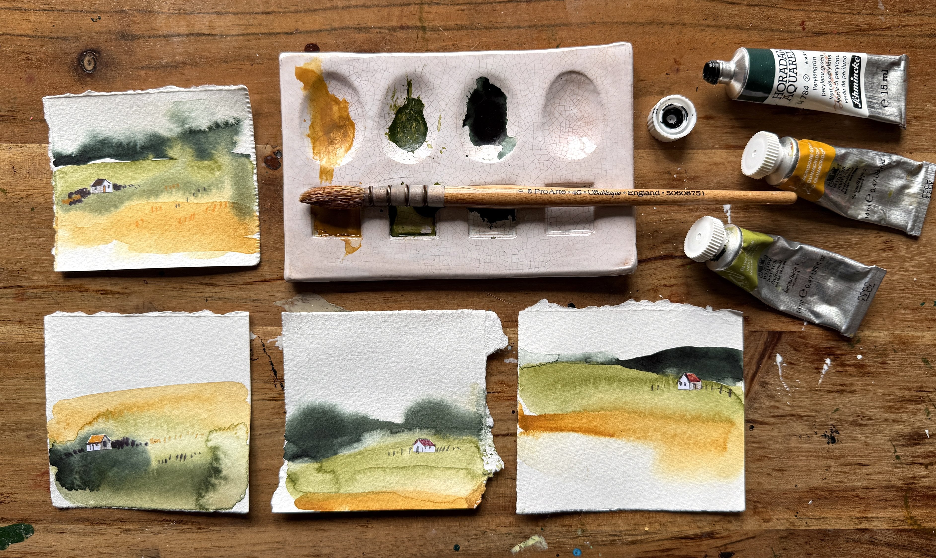
4. My Examples and Six Stroke Sunsets: In this video,
we're going to take a look at quite a few
different examples from my own sketchbooks
and how they've evolved over the
last few months. This is Sketchbook number 34. I started it in December 2022, but I probably did this
about a month later. This is 100% sketch
book by Hanna M. And these two images appeared as prompts
for Landscape art, and you just used
them as inspiration. Personally, I think the
colors are a little bit muddy, especially here. This section, I
think is all right. There's a nice bit of
transparency there. I don't think overly enjoyed it. I think I was too fixated on making sure the sunset
looked like the photograph. And you can tell that
I've overlooked it when I start adding white
posca to stuff. So, that's example number one. Just a few months ago, I had a consultation with
a lady from Florida. And we have an hour together. So we did a warm up piece. She gave me photos of
her daughter in a boat, and then she gave me this
sunset in her locality. And when she presented the
photo, I thought, Okay, L et's find out a little bit
more about painting sunsets, and I believe I think this
one is a much better attempt. If we look at them side
by side like this, I just think the colors
are so much cleaner. There's a lot more
vibrancy here. I like the fact that I
could see this round sun. It gave it a lot more context, and the silhouettes
of it might have been a family with
children playing in the sand against this bush here. It just works much better. At the time, I was
recovering from COVID, but this really
caught my attention because we were able to paint this in about 35 minutes, which I thought was pretty good. And I'm going to show
you some more examples. This is Sketchbook 47. It's another Hanna Mul and started filling this
up with landscapes, but I decided I wanted to
do a lot more sunsets, and these photos
were from Mariana, the lady that I did
that first sunset with, based on her photos that she
sent through afterwards. And I just thought, Oh my gosh, I'm onto
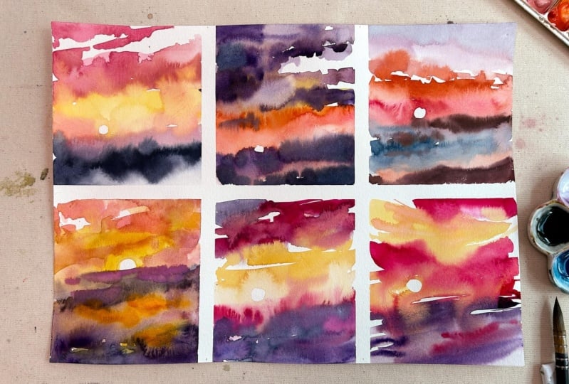
something here. This one, in particular,
I just really love. It just so much more loose than anything
that I've done before. And hold on. I'm afraid my sunsets
are all over the shop. So I did these versions. I've written down here. Harizon Line needs
more emphasis, 25 minutes, all of them. So I've got a feeling. I might have painted
these simultaneously. It is the same scene. And, you know, this is quite early on in
my Sense evolution. There's a lot happening here. There's a lot of colors, and I hadn't really figured out precisely what to
do with my pigments. And you'll notice that I repeat the same reference
image again and again. And this was a
reoccurring theme for me because there was probably
some frustration involved. I was still trying
to make sure that the result looked like
the reference photo. But it's all really, really good to do
several versions, and I'm going to talk a little
bit more about that later. And I would just divide
up the page any old how. And they're just so so rough. And I think what you start
seeing coming through. I mean, look at
this one. You can still tell it's a sunset, but it's so loose. I mean, I was really,
really enjoying this. They were so easy
to put together. I was probably painting
these like two at a time. Maybe they were taking
about 10 minutes. These are from my
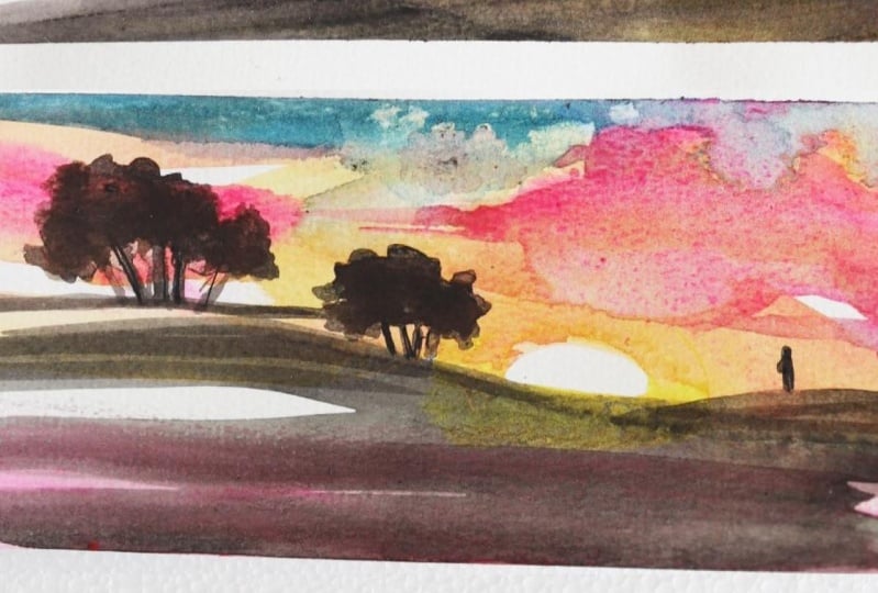
daughter's windows. She took photos, and she said, Mummy, paint these for me. I think these are a
little bit overworked because they were
from her photos. And I go sort of backwards and forwards
between trying to add a lot of detail and just
doing an interpretation. I love the strokes here. They're just doing this, and there's a lot of movement, and I'm was thoroughly
enjoying that aspect of it. You can tell that I'm starting to work a
little bit bigger. I think that's the final sunset in this particular sketchbook. So we've got a variety of
different sizes happening here from long
narrow panels to s, small square panels
to the full page, and we are going to
cover this in the class. This sketchbook, Sunset 50. Hanam is a square one. I dedicated missed
out the first page. I have dedicated
just to sunsets. This would have been
fairly early on, where I wasn't
really understanding how the different pigments
were interacting each other. So you've got kind of this
brown purple thing happening. I am going to talk through
a lot more about that. And I think this one that
it's just too bitty. I don't know how
else to describe it. It just doesn't read
very well as a sunset. I don't think. This
one is better. I like this part of the sunset. I think that I still learning
about reflections in water. These two are quite nice, and this is just of a landscape. Again, two different
versions of the same scene, and I really like the
expressive strokes that are happening in there. This is the same scene
of statue of David, overlooking Florence, I believe. Not sure which one I prefer. Probably this one,
but the purples, I didn't understand
how when you mix purple with Orange is going
to get a little bit brown, so I will talk more about that. But the great thing
is, you know, I've done a lot of this
by trial and error, so I can share a lot more with you than when I was trying to paint these
sunsets by myself. They do become, I
think, by this stage, if you notice that, I'm probably using
less pigments. I'm probably only
using four colors. And I'm able to get the
water ratio a lot better. And I definitely prefer
these later versions. This spread in particular
is one of my favorites. Although I do like
expressive ones like this, this one is particularly
moody as well. And it's not a very
slow graduation. There's still some
expressive elements in that. Well that's actually upside down. Is actually upside down. I haven't added the foreground. It would have been
some sort of hill or this one would have
had a tree probably here. I might go I might
finish that later on. This is when I started
using washy tape. The quicker I was able to paint, the more I just able to
produce pretty much. And they would happen towards the end of the
day once I finished. And I was literally painting these probably
5 minutes each, and I'm going to show you
in my next sketchbook, I started painting
them simultaneously. Before we move on
to the latest one, I wanted to show you the
Steelman and burn version. I would love to paint this
one again because there was a lovely contrast if I can
find that reference image. And I started playing
around with Potter's pink. I'm not sure if I like
that type of granulation, but I just love to experiment. I just love to play
around really. And you'll notice that you'll notice that I'm
working pretty small, and it just means that there's less area for the water colored pigments
to do their thing. It's just so dramatic.
Look at that. And the same here. I do love this piece as
well. This sweep here. And something that is
starting to come through is me leaving white space. And my son actually picked up on this and he said, you know, there's no white
space in the skies, and I said, Well, this
is my interpretation. This is also a
really nice version. Uh, probably of a wetland. And I just love the way the watercolor bleeds into that paints gray it's gorgeous. Obviously, that doesn't happen
quite like that in nature. I quickly want to show
you this one as well. This is handmade. I cut up some anamul paper. This version is pretty early on. And, hold on. Let me go through it. And I wanted, particularly
wanted a small sketch book. You can see, it's pretty
much the size of my palm. I just felt that I could get all these gorgeous
watercolor backgrounds and coolflowers to happen. If it was on a small scale, I could obviously work
a lot lot quicker. I mean, these were
probably, you know, only taking me
three or 4 minutes. I enjoyed this tremendously.
Oh, look at that. Just look at that gray and all those elements
combining together. I just thought it was
absolutely beautiful. And this one. I probably folded the sketchbook when
this page was still wet, but if you look at that, that looks like
some kind of cliff. This movement in the sky there. That's particularly
nice as well. This is based on a picture of Plaston Breed
tour in Somerset, and I thought that was
really effective as well. These are nice as well. I mean, I do leave white space, but I also love this kind of atmospheric effects as
well. Not sure about these. I think I overworked them
with the trees, and this one. Although I'm using a
lot of wet on wet, I used a dry brush here, and that was a gorgeous
bit of texture. And towards the end, I'm
literally painting these, and I think this is
about the time that my six stroke sunset
was conceived. This is probably six strokes. This would have been, and
this would have been as well. So I've only got two pages left. I'm going to fill
the rest of that up. Now, we have another
Amul Sketchbook, and these really are all
six strokes. By this stage. I was quite obsessed with creating sunsets
and six strokes. I wasn't really looking
at reference anymore. I was just making this
up from my imagination. I don't often work
from my imagination. So I thought this was
pretty phenomenal for me. These where it's really
dramatic in the sky, and you've got this bleeding happening in the
foreground as well. It just really excites me. Creating these is
like meditation. Again, it would be at the
end of my working day, I might have had to finish
off an illustration project, and I would just empty my mind by putting six strokes
down intentionally. And you'd be surprised how
much movement you can create as long as you are mindful of how you create those strokes. And we're going to explore
that in this class. These three pieces, I
actually was practicing for a trade show where I was going to be demonstrating
watercolors, and it is on that
sugarcane paper. And they are a lot more diffused compared to the examples that I showed you in my sketchbook. And this is scenes of Venice. They're not based
on my own photos, but I have been to
Venice and seen the sunset with my kids
with apparol sprits. And it gives a
wonderful sense of atmosphere there and there's some lovely effects going
on here and this sweep. I think that's pretty gorgeous. And this is probably Rome. You can see that
I've added a hint of dark blue purple up there. And the contrast of the items in the foreground is pretty prominent compared
to some of my early stuff, so I feel like I'm really
progressing and evolving. And I think these
two I actually might have done in the
show or at the show. So they're only quick because when you're
trying to demonstrate, they don't want to
hang around forever, so I was painting this
really, really fast. And that's probably
why you've got some of these very diffused effects here rather than
if I was at home, trying to take my time
a little bit more. But I hope you found these
examples interesting as well.
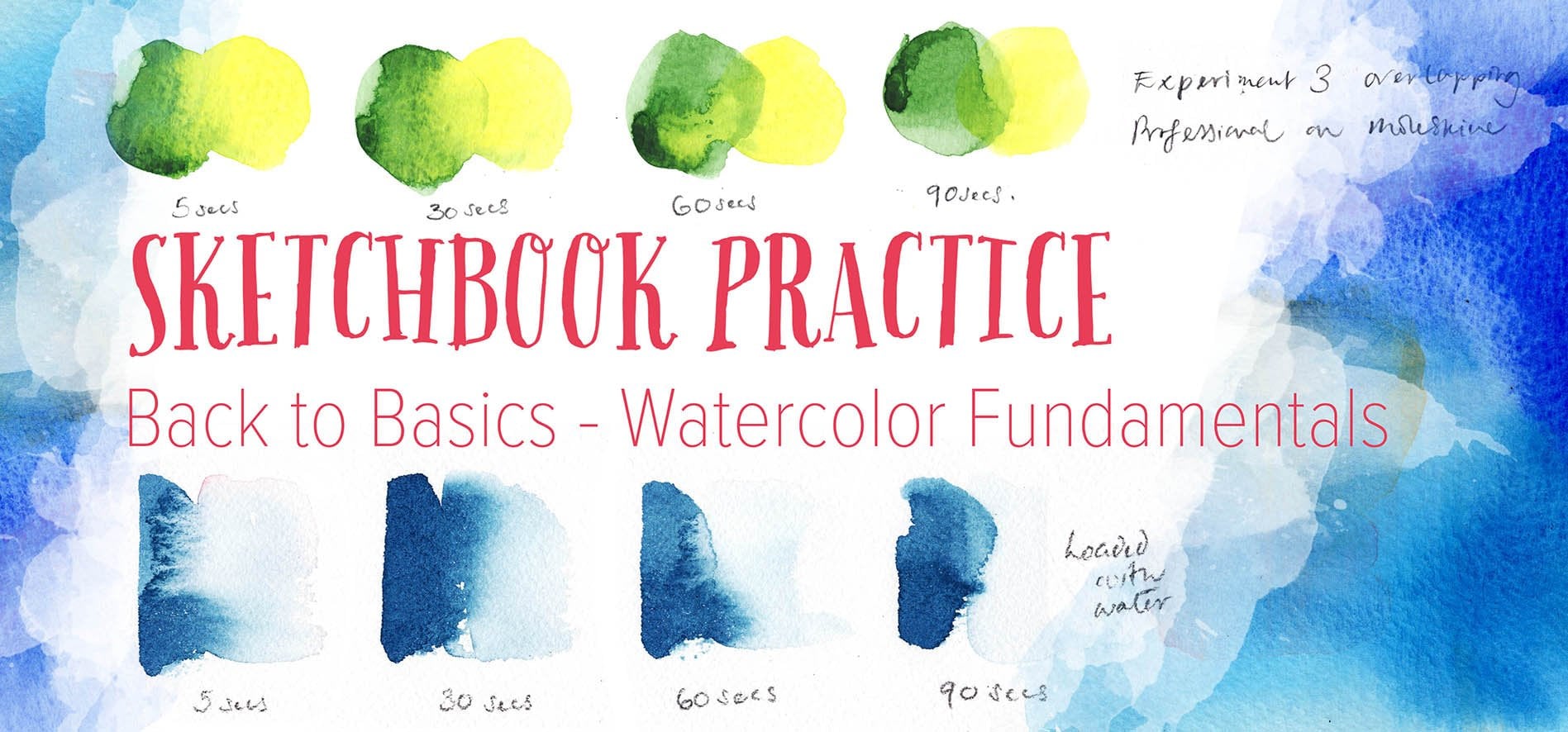
5. Why Warm Ups Are Important : I've structured this class in a particular way with
four warm up exercises. I really want to stress that these warm ups are
incredibly important as they lay the groundwork
for achieving success in six
successful strokes. Much of it is learning how to keep everything
super clean from water jars to palettes in order to keep your
sunset super vivid. Sometimes I see beginners
of watercolor inclined to skip warm ups and
fundamental exercises, and I can actually
tell who has or hasn't attempted warm ups
from their finished piece. It may be because of their
desire for instant results, or they may have high
expectations and be very eager to create impressive
artworks from the get go. And some may
perceive warm ups as tedious or boring steps that delay the fun part
of the real painting. But I really urge you to please please tackle
each warm up as they are specifically
designed to help you develop
the crucial skills, the understanding,
and the mindset required for painting like this. By starting with
warm up exercises, you'll build the confidence in your own abilities and feel far more prepared to
tackle the main paintings. Try not to view them as mundane or routine tasks,
because even for me, preparing for this class and all the extra painting's doing, it's been really beneficial. These proprietary
exercises will help you shift your focus away
from being fixated on that final outcome and instead cultivate a deep presence and
intentionality as you work, and also to be really patient and deliberate
with your strokes, observing them, and seeing
what the pigments do. Furthermore, by consistently
practicing these warmups, you'll build up
the muscle memory and mental clarity needed to execute each brush stroke
with precision and intention, ultimately leading to more compelling and
effective sunsets. Muscle memory allows you to
execute each brush stroke of the sunset with confidence and precision, almost
instinctively. Remember, there are
no undo buttons with real water color. But in the process, I think your mind will
be freer to focus on the creative aspects of your work rather
than the mechanics. So much of the creative
process happens in our minds, so that mental clarity will help you to maintain a calm
and focused state. And as we advance to
the more complex demos, some of these fundamental
skills will become even more important for making deliberate
and thoughtful strokes. Skipping these warm ups would
leave you unprepared for the advanced stages and probably hinder your ability to
create expressive artworks, which is the goal of this class. Even though I've been painting
watercolor for ten years, I assumed I could just whip
up a sunset in no time. But without a
structured practice that you saw in my sketch books, I couldn't have
created this class. Incorporating warm ups in
your routine ensures that you're consistently working on improving your
watercolor technique. So approach each warm up
exercise with a growth mindset. Each practice session is an opportunity to
grow and progress as an artist and set
yourself up for long term success even
beyond this class.
6. Colour Theory and Pigments: This video lesson is a basic introduction
to color theory, focusing on painting
sunsets using ward colors. This is not an
exhaustive lesson as color theory could be an
entire class in itself. I just need you to know enough
to get going with sunsets. But when I understood the
subtleties of watercolor bias, which I'm going to explain now, there was quite a shift
from me as it allowed me to create far more
vibrant sunsets. So that's why I've decided
to include them here. If you remember the
first sketchbook Sunset, I showed you, I mentioned that
the colors were a bit off. And since then, I have
learned a lot about warm and cool pigments in watercolors and how to
use them effectively. I've always found color theory
to be really challenging. I just couldn't understand
the more finer aspects of it. I only had a basic understanding before I started
painting these sunsets. What I'm going to say is, I think this is actually the secret source for
successful sunsets. When you understand how
your pigments work, you can use that
to your advantage. It may seem that I'm
going on and on about it, and I want you to create
the different color wheels, but I would like you to understand how your
pigments work, because that is how I found
out through trial and error. I had a really basic
theoretical knowledge of it, but the sunsets gave me
the practical knowledge. I'm going to try to keep
things really simple. Primary colors. There are three primary
colors, yellow, red, magenta, and blue, and you can mix almost every other
color from these. Primary colors are not pure. Even primary colors as
watercolor pigments contain small amounts of
another primary color. That's why the most
basic watercolor sets, like the cotton set, I give out in workshops, come with two of
each primary color, two yellows, two reds, and two blues, color bias. Most water colored
pigments have a bias, meaning they lean towards one of the other
two primary colors. For example, some reds
might lean towards orange, which is warm, while others lean towards purple,
which is cool. Let's take a quick look
at these pigments. We have lemon yellow, which is very bright
and cadmium yellow, which is a little bit
more orange and muted. Next is cadmium red,
needs a bit more. And then a lizar in crimson. When you mix that up,
that almost looks like a deep pinky purple.
Wh that brush. We have ultramarn on the left and fallow
blue on the right, which still looks a
little bit green to me. Now, we need to see how lemon yellow mixes
with the ultramarn. Mixing secondary colors
in ward color involves combining two primary
colors to create a new hue. Here's a quick runthrough. For greens, you mix
yellow and blue, and you adjust the proportions to create slightly
different greens, and for orange, you
mix, red and yellow. In theory, you would mix red
and blue to make purple, but we are going to talk
about that in a later video. Color theory may take
time to understand, but if you're a visual
person like me, I hope the following
demos and exercises will help by seeing and practicing how colors
interact and blend, you'll gain a deeper, more intuitive grasp of
these concepts.
7. Colour Theory: Warm Up Exercise 1 Part 1: A. In this video lesson, we're going to be making
three different types of color wheels using just
cool watercolor pigments, just warm watercolor pigments and a mixture of warm
and cool pigments. I'm also going to talk a little bit about purples and violets. Do remember to download the pigment bias PDF for
the most common blues, reds, and yellow pigments. It's also worth
noting that there's only one blue that is considered warm and
that's ultramarine. There are a few blues that
are considered neutral, so it's probably worth using them for the mixed color wheel. This exercise is
where you're going to need the small plate or bowl and your small mug or something
smaller to draw around. Just going to pop this over. And I've got a piece
of watercolor paper that is going to
fit both my circles in where we are going to
try out warm pigments on this side and cool
pigments on this side. Hopefully, it will make a lot more sense in just a moment. So just draw around
that really quickly. And on this side as well. Try to place it roughly in the middle of
this bigger circle. Okay. So for the warm pigments, I've got cadmium yellow, Windsor red and ultramarine. Ultramarine seems to
be the only warm blue. I've tried to research it, but that's the only one
I could find easily. And I like to have a palette, either like this, or
let's say one like this. And I like to put the pigments in every other slot, let's say. Again, it is to make sure that
the pigments stay really, really clean, really
something that I'm going to be banging on
about throughout this class. Just keep those pigments
as clean as possible, your palette, your
brush, and your water. I'm going to get
some water and just make this yellow into kind
of a milk consistency, and place it in the top
of this circle here. We are not going to get really beautiful graduated blends here. So there's the yellow section. Wah off my brush. I have got two pots of water, and let's pop it in the red, and that's going to be a
third of the way down here, let's say the 4:00 position. Is just going to be rough. I've seen versions of
this type of chart where it's being divided
up very equally into, I don't know, like, 12 sections, but you don't get
sections in sunsets. So I want them to
blend together, and that's going to give you
a much better idea of what these pigments will get up
to in real world scenarios. Make sure you wash
your brush carefully. Okay, we are going
to mix some of this yellow with some of
this red equal amounts, and oh, that's
probably a little bit more red than yellow
than orange really. Doesn't matter. We're just
going to add a bit more yellow to that. And blend it in. Luckily, that yellow
is still kind of wet. So that's as much blending as we're going
to see happening, which is absolutely fine. Don't try to over blend it. That's going to
be another theme. Just leave things alone, let the pigments do their thing. Now, gosh, I'm going to have to put some
yellow in here because I want to mix up the
yellow with blue. Going to pop it in
this section here. And put that in the middle, between the blue and the yellow. You know, it looks really
rough and reddy, but. I'm just going to add a little
bit more blue to this and blend these two sections
together. It's really rough. Please please don't think
that you are trying to make a beautiful blend because that's not the purpose
of this color wheel. The purpose is just to see
what your warm pigments do. I'm just going to
blend that together. There we go. Good, good, good. Now, we have got some of
this red with the blue. I'm going to have to pop some blue in there
because I've already contaminated that other
blue with a bit of yellow, and that's something that
we have to be mindful of. And you've got this kind
of thing happening. It is kind of a dark purple. I am going to talk a
little bit more about purple in a moment. But that's the
result I'm getting. I'm going to add a little
bit more red to that. Help it blend in this circle and then mix up the rest of
that blue and blend it here. When this is dry, we'll
have a proper look at it. But let's move on this side, which is going to be our cools. We are going to
have lemon yellow, opera rose, and Windsor blue. I just want to show you what my two jars of water look like. They're a little bit murky. I'm going to have to
change them before we go onto the cool pigments. Clean water. Okay, so starting off with
the yellow again up here. You'll see straight away. Well, it's a lighter
yellow in hue, but it's kind of almost luminous
as soon as I put it on. Okay. That's yellow. Et's try this opera rose
in the 4:00 position. I need a bit more on my brush. Oh, gosh, that might be
a little bit too much. Oh, God. Bit heavy handed there. I was going to say, when
you do these color wheels, do have a good puddle of kind of milk
consistency, water color. The ly way I can describe this opera rose again
is a bit luminous. But it has its uses. Now let's move on to
the Windsor blue. Okay. So I think
I'm going to mix up some of that
pink with the blue. Pop it in this section here. It doesn't really matter
which order you did it in. I know I did it in a
slightly different order for the warm color wheel because
they'll just blend anyhow. And that makes a
much nicer purple. I think could do
with a little bit more pink just to blend these
two edges together. Good. Okay. I'm going to have
to use more for rose for the mixing
up with the yellow. Oh, look at that vibrancy. So pop that in the
middle of these two and just blend
these edges in. I'm going to have to include a little bit more yellow
pigment here, I think. And just a little bit more. Okay. Now we have to blend. I'm just going to
pop some in there. Some yellow with the blue. And I place that in the
middle between those two here and start blending this
end into the winds of blue. And other end needs to blend in with a little
bit more the yellow. And you can see the difference even before these two
color wheels are dry. There's a whole load more, I could talk about color theory. But this is just an overview, and we only want to look at the color theory in the
context of making sunsets, especially this end here. You don't have to worry
too much about the greens, unless you want to add
maybe a foreground, but it would probably
be a little darker. Anyhow, you can see
how the warm yellows, if you decide to go with warm or go with cool, is
going to be up to you. They have this half anyway. There is some lovely graduation, and it blends really nicely. However, if you look at the difference between warm
pigments and cool pigments. It is just so amazingly varied. You don't have to use perrose, but I have been using it a lot. And it is just so vibrant, especially when you mix
it with lemon yellow. You've got something
similar here. You might be really inclined to go with a set of warm pigments. And that's entirely up to you. Ordinarily, in my normal
everyday watercolor work, this is the type of hues
that I'm often drawn to. However, when it comes to
doing sunsets, I love this. And it is a personal choice. There's no right or wrong. And I would like you to pick a set of
pigments that work for you. However, we do have to
be mindful of what will happen if we start mixing
cool colors with warm colors. And also, we have to
talk about purple. Let's look at that next.
8. Colour Theory: Warm Up Exercise 1 Part 2 Part 2: I've already drawn the circle
for the mixed pigments. And for this color wheel, we are going to be
using Indian yellow, which is warm, and vermilion, which again, is warm. But the blue is clean
blue, which is cool. It'll be interesting
to see what happens. This may seem like quite
a lot of preparation, and you guys are just wanting
to get on with the sunsets. But I really want to talk about the importance of
trying this out. Please don't skip it as there is still loads to learn here. By trying out these
different combinations, you'll see how warm and
cool colors interact, which is incredibly useful for both sunsets and still
lifes and even landscapes. Exercise is going to help you understand color
relationships, and it will enhance your own connection
with your materials. So just take a few moments to play with your
colors on this wheel. I urge you to please
give it a try because it's a really
valuable step in understanding how your
colors are going to work when it comes to
painting the real sunsets. Remember, this Cotman set. And I said there's a reason why student grade watercolors come with two of every primary color, two yellows, two
reds, two blues. Now, this is the
corresponding watercolor set, but one that I'd been
using in my workshops. So we've got the same again, the lemon yellow,
cadmium yellow, Cadmium red, crimson,
French traarn, and this is fallow blue. And we're going to use this to create a mixed color wheel. You absolutely don't
have to create two mixed pigment color wheels. This is just another
example that I wanted to show you to see what
outcomes there could be. So, I think we are going to
try lemon yellow, crimson. That's cool. And that's cool and the ultramarine,
which is warm. I wanted to show you
what these color wheels would look like with student
quality watercolors. In my previous versions, I was using professional
grade paints. Student quality pigments
still pack a lot of oomph. And I do give these out at my workshops because they're
fantastic for learning. Of course, you don't have to
create another color wheel. But if you did, that is double the amount of info
at your fingertips. You'll see that even with
student quality paints, you can still achieve really
vibrant dynamic results. So don't underestimate
them as they are great for practicing and understanding
those color relationships. Let's see what beautiful
combinations we have got here. Let's take a peek at this
page of mixed pigments. We have Indian yellow
vermilion and Serli blue. There is some weirdness
happening down here. I think the cerlian blue
may be granulating. I don't use it that often. It's a new pigment for me, and, you know, it could have
its uses in a sunset. I'm not entirely
sure I like what's happening with the red, but as I keep saying, we are going to talk about
purple in just a moment. Now, this is the one where I
used the Cotman watercolors, and we have the lemon yellow,
crimson and ultramarine. And they're really
quite nice, actually. The ultramarine is warm. And where it mixes
with the lemon yellow, that's pretty nice as well, and where it mixes
with the crimson. It's not too bad. It's quite I think, you know, it could have more
uses within a sunset than I'm thinking maybe
this mixed palette here. Like I said, it
honestly is up to you as long as you know
how your pigments behave, and we will have
to be mindful how some of the if you are
going to include blue, how it might behave with reds. I do want to say a little bit about using purple
in the sunsets. If you have a quick flick
through this sketchbook, you know, I do have some
purples happening here. I want to show you a
particular example where I didn't understand what type
of purple I was using. I am mixing, a purple with
sort of an orange red, which probably would have
been a warm pigment. And it's become quite muted. And that was something that
got me sort of thinking, what is going on here. And If you look at my later sunsets, I have probably gained a
better understanding about how the purples
integrate within sunset. And I'm now starting
to understand better about putting cool pigments
with cool pigments. And it's, much better here. We've probably got a
a very light opera rose with a purple
happening there. And the graduation is much
more Although subtle, we don't have that sort of
brown thing happening here. I'm going to show
you some others. I know these are probably, I did these in just
a few seconds, and I have a much
better understanding. But something else you need to note when you use purple is, if it starts interacting
with yellow, like this example here, you are going to
end up with brown. Moving on to this one here where there is a lot
of purple and pink. I might have overdone it a bit. But because I had gained
this understanding, I was able to let the
pigments really shine without getting that brown
mutedness coming through. And so in my later
works, not the aurora, I think I am a lot more successful in
integrating that purple, but I do want to give you
some extra tips about purple. Going back to our color wheels. We have the cool and the warm, and you will see that
there really isn't a great purple happening here between the ultramarine
and the winds are red. This is a lot better example where we've got opera
rows and winds are blue. Yeah, you can try
mixing that up. You know, in every sunset, and further examples here, it's opera rose and Teran blue. And vermilion and ultramarine,
you end up with this. It's beautiful, maroon, but I'm not sure it would
make the best sunset, maybe a foreground color. That's something that
could be useful. Same again here. We have the opera Rose and
Winds of blue, and this is Vermilion
with ultramarine. And the purple isn't great. You know, It seems that red
and blue should make purple, but it doesn't always
seem incredibly obvious. So in order to bypass this, I've just taken to buying lots of different
purples to try out. And another thing that I didn't realize was some
of these are warm, and some of these are cool. Right. Let's take a
look at these purples. We have got Windsor violet, permanent move, also
by Windsor and Newton. This one is brilliant purple by Shimin Ke, and Qin purple. This is a brand new one
for me that I've not tried before. Manganese violet. And I want to try these
out because you have to be extra mindful when you are
putting it with a yellow. Before I start this exercise, please don't go out and buy five different purples
and violets like I did. I just think it's
really important to show you the range
that's available, and you don't have to mix
your own purples because that could take a
really long time and you get
inconsistent results. So this first one
is Windsor violet. And I would say that
is a cool purple. This permanent move
is probably warm. I have tried to incorporate
this in my sunsets, and I didn't realize
it was warm, so it gives some
very odd results when you mix it
with cool colors. That one that I've just put down is the brilliant
purple by Schminke. I think it's on the cooler bias. This one next to it
is the Qin purple, and I think that's
quite cool as well. Now, this one is
Manganese violet, and I can't work out
without really getting involved which end of
the spectrum this is on. So we're going to
use some yellow and orange to see how these
purples are going to react. I've loaded up my
brush with yellow, and I'm just swiping it across all of these
purples and violets. And if you observe
this once it's dry, you'll see how
they've interacted, and you can tell already
that some of them are going to create
a murky brown. So the next thing that
we're going to try and do is create an orange using the yellow and pink and see how the
purples react to this. When we come to
paint the sunsets, we are going to have to be super mindful not to
place purples next to yellows and oranges because certain effects
are going to happen. In the other warm up exercises, we are going to put some
of this into practice.
9. Water to Pigment Ratio: Mixing colors in watercolor involves more than just
combining pigments. It also requires adjusting the water content to achieve
the right consistency. Typically, water color is
painted from light to dark, or or from transparent
to opaque. You start with more water for lighter, more
transparent layers, and use less water as you
add, more opaque details. This simple concept is fundamental to
watercolor painting. So let's take a quick look at why knowing about
this is so important. Color intensity. Knowing
how much water to add to your pigment allows
you to control the saturation or
brightness of the colors, ensuring that they are
vibrant and luminous, which is what we want
in a sunset painting. Adjusting the ratio
allows you to achieve that balance between
transparency and opacity, enhancing that impact
of the sunset sky. Control over wetness. The water de pigment ratio also affects the wetness of
your brush and paper. Controlling the wetness is crucial for achieving various
watercolor techniques, such as wet on wet
washes or wet on dry details, fluidity
and brushwork. Adjusting the ratio also influences the fluidity
of your brushwork, which means that the
higher the water content, the more fluid your brush
strokes will probably be as it's able to glide across the paper more smoothly
and expressively, which is really
essential for capturing the dynamic qualities
of a sunset sky. Mastering the water
to pigment ratio is something that many
people struggle with. But it is a skill
that will improve with experience, practice,
and experimentation. A game changer for me was
when I was introduced to an analogy about viewing
water consistency as tea, coffee, milk, cream, and butter. This idea was first
introduced by Joseph Dupwck, a renowned watercolor artist. In his book, mastering atmosphere
and mood in watercolor. He explains how to manage
paint and water to get the desired consistency and
results in your painting. This is one of the illustrations
that he had in his book. He emphasizes the importance of knowing how wet your
paper and brush are. The interaction
between the wetness of the paper and the brush can
create different effects, much like different
times on a clock. He describes the five
levels of paint brush wetness and four levels
of paper wetness. You really need to understand
your particular pigments, whichever brand of
watercolors you use, and how they work
with your paper when you vary the pigment
and water content. Consistency is determined by the ratio of water to
pigment in your mix. So I'm going to be adjusting the water content to achieve
the right consistency. For this demo, we are going to look at the paint brush wetness, which relates to the consistency
of your watercolor wash. So we're not really looking
at value or transparency, although that will
come into it later. I've written down tea coffee, milk, cream and butter, and I'm going to
demonstrate to you how I am going to mix up
this cobalt green, show you the different
consistencies. I keep emphasizing
the consistency. We're not looking at the
value at this stage. Uh, it's really for
you to understand whichever brand of
watercolor that you use, whether it's Schmiky, or Windsor and Newton
Darla Rune to see how your paint
behaves when you add a certain amount of
water to the pigment. Now, this one here, is probably t consistency. I only added a tiny, tiny drop, and you can see the brush move through that pretty easily. So I'm just going to
pop this along here. And you can see it's
incredibly bright. It's probably only about
10% pigment to the water, so we're going to
add a little bit more pigment to this now. You can see the consistency, even in this palette
has changed. And that's one of
the major things that I look out for when
I am mixing colors. And it is so important
to understand how your particular pigment works. And so you get an
understanding for it. I'm using Schminky, but other pigments will
behave differently. And I need you guys to start learning how
your materials work. That's why we are doing
so many warm ups. Now, I've added a
little bit more, I think I might just a tiny bit more pigment
to this because it's milk consistency
is probably 50 50. Sorry, 50 50. So it's 50% pigment
and 50% water. We have this happening
now. Now, cream. This is double cream. I think in the US, you
might call it heavy cream. So the thick the thicker cream. Maybe a little bit
more than that. A lot more than that actually, if I'm really trying to get that double cream consistency. And you can see how much thicker it is compared
to the others. Now, for the butter consistency, it is really what comes
straight out of a tube. If you don't have tubes of watercolor paint,
don't worry about it. Just try to understand
this consistency here. I have got a little bit
of water on my brush, but it is pretty much this Each combination of the
different levels of pigment to water results
in a unique effect, and that is what we're going to explore in our next
warm up exercise.
10. Water to Pigment Ratio: Warm Up Exercise 2: For this video lesson, we're going to focus on
exercises where we adjust the water content in relation to the pigment to achieve the
right watercolor consistency. Just wanted to
point out something M two waters look like this, and this is just too
much pigment in there, so I'm going to go
and change these before I do this
warm up exercise. Start off with the
brilliant opera rose, and we're going to
do exactly the same where we are just
getting a feel for the consistency so that you
know how your brush behaves and how this pigment feels and looks firstly on
your white palette, or your plate, or the lid
of your watercolor pan. So you've got your
lightest value there, and something to
be aware of is how much that wash will move
around in your palette. And that rate of movement will very slightly at each stage. That's the next one. And I
think we're still kind of in the weak T. This one is
very weak at the top. Suppose we're moving
towards coffee now. Probably do with a
little bit more pigment. And not only is the
color stronger, the way your brush moves
through the palette and the way this actually sort of moves in the
palette is different. You can see it is moving at a slightly slower sedate pace. This is probably getting
towards single cream, as we would say in the UK. I had a bit more. I'm just going to
show you see how much this is moving
around the palette. There is some movement, but it's not really
doing too much. Bump that up a bit more. Yeah, this is definitely
getting darker. I'm sorry, thicker. And I do actually use a lot of this opera rows in different consistencies
in my sunsets. You'd be surprised. I will
show you in the demos, how I might often use the heavy cream consistency
in certain areas and when we talk more
a little bit more about the wetness of the
water, how that behaves. And I don't think I'm going
to have room for butter, but Look at that. Okay. This is the Windsor
and Newton violet. This violet, in particular, is just very, very it
seems so concentrated. You only need the
tiniest smidgen. I think that's already
compared to that opera rose. I've definitely needed
less pigment, I think. So that's very, very pale. But look at that consistency. It is very weak tea. It's literally water. I might have added a bit
too much. Hold on. So this is still weak tea. Give that a little boost. That's probably getting
towards more like brewed tea. Already, it just
feels more viscous. I don't know another
word for it. You can see how the brush just moves
through that differently. When you do that to the
wash within the palette, it just moves slightly slower. I'll do that again when we get to kind of the milk consistency. Oh, there again. Okay. And even more. And now, this is getting
towards more like single cream. I'm not even mixing
it in with this one. And I'm not going to do
too much more because I rarely use this violet beyond
this kind of consistency. It's just so intense, maybe I would go that
dark in a sunset. If I show you this consistency
in this palette here, When you put your
brush through it, you can hardly see that white
of the palette under there. So, these are the sort of things I want you to be
looking out for, so you just have a
better understanding because it really is going to be important in the later stages
and the first set of demos. A warm up exercise like this may be a bit simplistic
or tedious for you. But I will say, even
for me to revisit, trying to understand how I
could present this type of information and looking at how well it covers the
bottom of the palette, and if it moves
around the palette, things like that are
really important.
11. Paper Dampness: Depending on whether
your paper is wet, damp or dry, you are going to need to adjust the
consistency of your paint. Knowing the moisture
level of your paper is crucial for achieving
the best results in painting your sunsets. Master watercolor
artist, Joseph Zovich, in his book, Mastering atmosphere
in mood and watercolor, identifies four stages,
wet, moist, damp, and d. Understanding
these stages will help you select the right paint
consistency at the right time. This is just clean water. I'm going to paint four squares
using this and hopefully, you will see the
different levels of water that is on this paper. That's probably
square number one. I'm going to do this
really really fast because they are going to start drying immediately and I
want to be able to catch the different stages so that I can point the camera
in that direction, and you will be able to see what this paper is
supposed to look like. Starting with this
one. This is the wettest that my paper
is going to get, and it's not really going to
hold much more than this. You can tilt this, and the water is going to
flow in various directions. And it will move
very, very freely. And this one has started
to penetrate this paper, but it's not sopping wet. There is still a bit
of a sheen on there, And this is good for
soft edge shapes and dropping one
color into another, and they will mix. Now, this one here is damp. If you touch it, it's going
to feel a little bit cool, and it looks dull, I suppose, and the paint will
basically stick to that. And if you have too much water on your brush
and you add it to this, it will be at this stage that
cool flowers will be made. And this square is the one
that I apply the water first. It's probably still damp Yeah. But it is getting close
to the dry stage. Eventually, it will
dry as much as this, which is going to be free
of moisture allowing for a lot more crisper
and defined edges. And if I slowly pan out, you can just make out what the paper looks like at
these various stages. This is something that is
going to come with experience. You will know when you
look at your paper, when to add the next set of
pigments or your next line, and it is trial and error. A lot of this stuff
is going to be you just working it
out as you go along, if you don't know,
how your pigments behave in whichever part
of the world you're in, you know, whether you
might be in Singapore. I don't know, somewhere really
dry like Arizona, perhaps. There isn't going to be a one
size fits all formula here. We're going to be
testing out our paper for various stages
of dampness next.
12. Paper Dampness: Warm Up Exercise 3: This is where that big brush comes in because we are going to cover this entire piece
of paper with clean water. But before we do that, we need to divide that into three so that each panel is going to be
slightly different. This one is going to be wet, this is going to be moist, and this is going to be damp. I'm just going to write
that down for you. So, let's get this
water on really, really quickly as
fast as you can, because it is going
to start drying. And by the time you start
painting this panel here, it is going to be
at the damp stage, and it is going to behave
se differently to this end, which is where we're
going to start off. So you do need to work quickly, and I don't want you to sort
of hang around too much, just create the stripe. Is really similar to the
previous exercise where we are testing out the different
consistencies, tea, coffee, milk, but we are
now placing it on different dampness or wetness of paper to see how they react. The reason for doing this is
the wetness of the paper, how much water is in the
paper is also going to affect that pigment to water ratio because we got pigment
to water on the brush, and I have been in workshops where students don't
seem to comprehend that. I wanted to include this
exercise because if you didn't know that
already, it's really, really important because if you a paper is
already incredibly, you know, drenched with
water or different pigment. Let's say that you've already
put yellow down there. It is going to behave slightly differently and the
concentration at which you put. So this is probably heavy
cream now onto wet. You can see already that it's
behaving in different ways. So let's move on to this
section here, which is moist. So I'm looking at it. It still has a sheen, but probably, you know, we've been at it
for about a minute. And let's see how this behaves. I'll probably put too much
on that one. It's fine. Do you remember to leave
about a centimeter gap, half an inch between
each one because they could spread a fair
bit depending on, I think I'm running
out of pigment again. You can see that already behaving in slightly
different ways from the wet paper to the
moist area of this paper. And I do often add
pink, in particular, the opera pink to my sunsets
in quite high concentration. So I think this is really important for
me to know, as well. So moving on to damp where I'm looking at I'm
getting down on the side. This area has dried, but this is still a sheen, but I don't want to
wait around too much. I'm just going to go
ahead and do it. Ideally. All of this paper should
have lost that sheen, and it is starting
to look quite dull, but it doesn't matter. I think you'll get the gist. And this, in particular, is behaving completely
differently. The edges, you know, the
edges here are soft. It's no way is it
behaving like wet paper? This is probably getting
towards cream cream now. Okay. I hope this is
making sense to you. Let's take a closer
look. This panel on the left was the
one we started with. It was wet. And when you have a low pigment to water
ratio at the top here, it spreads out
incredible amount, and it diffuses out
very, very nicely, but as you can see when
you add more pigment, it starts to create these type of I don't know how to describe, it's sort of fury type edges. So it's good to understand if you use a different
concentration of pigment on wet, these are the varying effects
that are going to happen. Now, this middle one is moist, and if we start at the top, I wouldn't say they are
diffusing out as much. The edges are still soft, But as we add more pigment, and maybe it was already
getting quite dry down here, the edges are becoming
a lot more crisper. And this one at
the end was damp. And I said to you, this
middle section here was to a little bit
I could see a sheen, and you can see how the edges
are a little bit feathery, but as we get towards the
edge the right hand edge, the strokes are
definitely crisper. So I think it's
worth doing this for all your pigments that you are going to use so that you know how they're
going to behave. So I'm going to carry on and
do one for yellow, I think. When you are learning about
various theories like this, it's very well me presenting
all the information, but it really is up
to you to understand how your paper reacts when water has been standing
on it for 30 seconds. And then what does your paper
look like after a minute? And your climatic conditions is also going to have a bearing on the results that you achieve. So it really is in your
interest to embrace this playfulness and fact
finding mission really, do believe that it's going
to help you loads when it comes to painting the actual
sunsets, please trust me. Being curious about
your own results from this paper dampness
exercise will greatly enhance your readiness
for painting sunsets. By experimenting and observing how different levels of paper dampness will affect
your painting. You are going to become so
much more aware and equipped with the knowledge needed to control your techniques
effectively. And this curiosity driven
exploration is going to prepare you for the expressive sunsets
part of this class, and you are going to be far more confident than if you
hadn't done this exercise.
13. Brushes: Size, Loading, Strokes: I. Quill brushes are my personal choice for all my loose
watercolor work just because they can carry so
much water and pigment. I really love using
them as the shape can change with the amount
of pressure you apply, which gives me a
lot of versatility. They do handle slightly
different from round brushes and may require a little bit
more skill to get used to. But please don't
feel you have to go out and buy one
for this class. It's really just down
to personal preference. Just use a large
round brush instead, number ten, 12 or 14. When painting
watercolor sunsets, larger brush is really helpful for creating broad
strokes and washes. It gives a lot more
expressive gestural marks. And also, there's a lot
of varied line width. By changing the
angle and pressure, you can produce both broad
strokes and finer lines, adding to that variety and
interest to your sunsets. But the two main reasons
for me for having larger brushes is just the
amount of water and pigment. They can hold, which allows for longer uninterrupted
strokes without needing to reload the
brush frequently. And this helps maintain a consistent flow and rhythm
in the painting process. Also, larger brushes can promote a much looser relaxed
painting style, and this can help
us break away from overly detailed and
tight renderings. So I think it encourages a freer and more spontaneous
approach that can really enhance the
expressiveness of watercolors. One of the reasons I love
using pallets like this for my sunsets is there is this well where you can collect
your pigment. And if I move this around, you can see that I'm able to pick up loads of pigment
on this quill brush. And When I do that, you've got something that's
called a juicy brush, where it is glistening. And when I put
this on the paper, it will release a whole load of pigment onto the
paper like that. And that is what's called a fully loaded brush
or a juicy brush. And a fully loaded brush like this is going to be
really important for the six strokes video lesson because you want
to release a rich, vibrant wash of color
onto the paper and then start creating very
fluid and expressive strokes. So it evokes this
idea of a brush being so saturated,
it almost drips. And this allows for a really luscious
application of pigment. I just want to go over some of the basic strokes that I often use when
performing the sunsets. Remember, we need to
load up our brush, so making this puddle, and I'm turning my
bristles around in it. And one that you have to get used to doing is
a stroke like that. That is a fully loaded brush. It's a little bit
scary if you are not used to making big bold
strokes like that, especially not used to using big brushes
like this as well. And It's good idea to
practice strokes like this. This is just really,
really basic stuff. Varying the strokes
of the brush from the lightest pressure
and the thinnest stroke, and then changing it midway so that it is much
heavier pressure, you get a bolder mark. Another way that I like
to use the brush is to hold it perpendicular or
straight up from the paper, and you can get
quite a fine stroke as you're only using
the tip of the brush. Yeah, do take a note of where I'm holding this along the hand, also, bold stroke like that. I'm probably holding it here. But if I'm then going in with a more sort
of detailed stroke, I'll hold my brush a little
bit further up the handle. In the next warm up exercise, we're going to play around with everything we've covered so far, so you really get a feel
for the type of strokes and capabilities of your own brush in relation to the
paper that you use. I think mastering a variety
of brush techniques and brush control can make the
painting process a lot more efficient as you're
able to learn quickly and effectively when you know how to apply your
paint as intended.
14. Brushes: Warm Up Exercise 4: For this exercise,
we are going to divide the paper in half. Just put a bit of washy tape
all the way down the middle. And this is going
to be a combination of all the other warm ups that we've done combined
into this one before we start creating
the sunsets proper. So it's going to be a
mixture of water to pigment control
and brush control. First of all, what I notice
with workshop attendees. A lot of them create
little strokes like this, which is fine for some
aspects of watercolor, but they're very tentative, and they use the tip of
the brush like that. But in order to create some of the sunsets that you've seen
me do, we need to do this. Let's just create
another one for you to see where this is why
I use il brushes. This is how thick my
il brush can get. And let's do a pink one. And I want you to play around with the
thickness of your stroke. That was very controlled. I want you to do
something more like that, or those run out of watercolor. We need to load up our brush, as I showed you, a
fully loaded brush. And let's put one
on top of there. And that's where the dampness
of the paper comes in, whereas, before we
were practicing just on plain paper like this, when you do that
on top of yellow, that's what's going to happen. And you have to gauge that
because that's how I do it. I mix up the pigments
on top of my paper. Let's do a little bit more
So that was just drying. If I were to put stripe of
pink directly next to it, we are going to get
effects like this, and I would love you to start looking at what is
happening to your pigment. I don't know which part
of the world you're in, I don't know what size
paint brush you're using. It's up to you to
really observe, to see, Oh, you know, all the pigment is
running into that pink. The yellows really
merging in there, and it's going to
behave differently once it's completely dry. And that's the reason why I
do these warm up exercises. There's so many variables. You can do strokes like that. You get that. Hold on. I need to bring my
clean water nearer. Another thing you can do, so this stroke here, if we get clean water and we
just push that next to it, you get that sort of effect. And if I use clean water and bring it up to
this edge here, You get effects like that. It's really, really important that you play around like this. It's far more important than you realize to get to understand
your watercolors, not just for sunsets, but for any watercolor
technique, really. I need to add more
pigments to my palette. Leave that for now
because there's a lot of wetness on
there right now, and I do want to gauge
different things. Whoops. That is probably tea
in between tea and coffee. And let's mix up a yellow, which is milk consistency.
Get things like that. And let's pop a bit
of yellow through there and get a milk consistency
pink happening here. And that's another brush move where you vary the
pressure of the brush. You can create things like that. I know sunsets are bands often, but sometimes they're not. So it's good to have
different things going on. If you remember the color wheel, one thing that you have to
remember move most purples, do not try to put it
next to a pink that has a little bit of yellow
because that is going to affect what comes out. That one's all right because
that is relatively pink. But if you were to put
purple, let's say here, You start to muddy the colors, and especially here, it's gone kind of
dark, neutral gray. So it's the type of things we are mindful of when we are
doing these type of warm ups. All right, Let's put
a purple stroke up there and just add
pink. That's nice. What happens if we put
this purple along here? And we're just playing
with the pigments. We're seeing how they're
interacting inter reacting. Interacting, even though we have chosen the cools and the warms, whichever you've gone
with, it's fine. You can still use
this same warm up. If we add another opera rose. Oh, look at that. I love it. And you can see, Oh,
especially here, you know, we did this about 3 minutes
ago? It's doing this. I just love watching
things like that. But what I meant to say
was when you are painting, even if it's a warm up, to be mindful to really observe and take time to see
what your paints are doing. Don't rush into this and think, I've got to fill
this with stripes. We are watching to
see what happens. This area here is ripe for a
little bit of investigation, and here as well. It's just starting
to dry along here. So I'm going to see
what happens if I add water along that edge there. Not much. Okay, but it did
take on that pigment there. How about if I put more water
in this particular area? There's a bit more spread there. Okay. And I just want
you to be playful. I think this is an
overriding theme for this class, playfulness. Just see what happens. This is just a warm up. And I'm putting sort of milk consistency opera rows on that area of water,
I've just added. Let's add some opera rose here. Just in that area
there and see what happens when it's dry.
Something I want to do. I'm just going to put a little bit more water on my brush is to bring
it up to here. And when pigments have
water, they can flow. You can see it's happened there. And I suppose it's
a bit like osmosis. It goes from an area of high concentration to lower
concentration of pigment. And I just want to see what
happens if we continue with water just along
this ridge here. I wonder if what's
going to happen to this area here. It'll
be interesting to see. I'm going to take this
opportunity to ask you to change your mindset about warm ups if you are not used
to doing them. You may think that you
are wasting paper, wasting pigment or
wasting your time, but that is far from the truth. In reality, you are investing in yourself and your
growth as an artist. This age of social media, it is really easy to overlook the countless
hours of practice and learning from failures that experienced
watercolor artists, including myself, have had
to put in behind the scenes. What you see online are
polished finished pieces. But behind each
are many studies, experiments, and
lots of mistakes. So I want you to embrace all of your warmer exercises as an essential part of your
own artistic journey. Really stay curious and be open to what your
brush can handle. Use your brush to create
really thick and thin and varied stripes and layer
the purples and pinks, yellows on top of each
other, see what happens. Something else I want you
to practice as part of this particular exercise
is adding pines gray. I use pains gray mixed up with a little bit of yellow
to add a hint of, I don't think there's enough
on here. Can use indigo. I'm trying to search
for my pains gray. I can only find indigo, so I'm going to have to
show you using indigo. But it's the same principle. Obviously, the paper dampness will affect what the pigment
does when you put it on. And I just want you
to see what happened. This is pretty dry.
I'm just going to put a line of
pains gray there. Nothing much is happening, but if I were to put
a little bit here, let's move that out of the way. Push down a little bit harder
on my brush and do that. You can see it's spreading out. But here, just along here, I can see that it's
really, really. There's standing water on there. You're going to get a
slightly different effect, and you can use that
to your advantage. These potentially, if this
was in a real sort of sunset, could be a row of trees or that, you know, they have
the potential to become it's too dry there. Let's try there.
And I want you to experiment so that
you understand more, even more about how
different dampness will affect the pigments
that you add later on. So this is almost dry. If you pretend there's
a row of trees here, they're not going
to do very much because the paper is
virtually dry there. I'm just going to show you
one more example here. All this beautiful,
beautiful effects here. I want to leave
that alone because I don't want to
spoil it too much, but let's take
this section here. So this indigo is
probably the heavy cream. They look like
bushes, I suppose. But if I did a line here, which is a lot drier, there's not much of a reaction, you can paint the beginnings
of hills or whatever. So play around
with that as well. Now that these are dry.
I want to point out some areas which are going to be so helpful when you do sunsets. We've got things like this where I've put the purple down, and I think I might have added an extra brush stroke of water, and it's created that
feathery type effect and this one here. You could do so much. And you must remember, you know, how some of
these effects were made. There was a lot of
standing water or pigment. Before I added that
stroke of purple. And so you can either make sort of physical notes in a
notebook or mental notes, which is probably
more what I do. And this one here, I think this already
looks like a sunset, pretty much, where
I've added, you know, just to demonstrate the
different dampness of the yellow that was behind the ultra was the
ultra Indigo, sorry? And even here when I said, Oh, I think it's quite dry,
it must have been damp, but so you've still got this
bit of feathering And you really just need to
play, trial and error. Nothing that is going to substitute for experience
that looks gorgeous. Those little clump of trees. I hope these exercises
are going to be incredibly useful for you
going into the next section.
15. Interpreting Reference Photos: As mentioned at the beginning, the reference photos are
just for inspiration. This means they serve as a guide rather than
a strict template. Inspiration is really about capturing the essence
and feeling of a scene, not replicating it exactly. If you're aiming to
recreate a perfect sunset, you're likely to be disappointed
because the beauty of watercolor lies in its
spontaneity and fluidity. These are the same
sunsets that I have provided for
you in the PDF, so please do download it. Of course, you can
use your own sunsets. I just want to pick
out a few of these and show you a few different routes that you might consider doing. For a scene like this, for example, you are probably going to want
to do the whole thing. You want to recreate
this entire scene. But if you're new to this, it's going to be really tough. I'm going to talk you through a few different approaches
that I would consider. And one of them is basically just to
pick tiny part of it. Look at some of that
graduation happening in there. So let's try and
recreate some of this. I've divided up my paper into six sections because these
are only sort of like scamps. These are just studies
at this point. First of all, what I'm
doing is a close up. We have a white area here, which is really,
really light in value. And then there's another
light area just above it, and then over here it's
orange. Let's recreate that. But down here, it's
also very orange. Orange, orange, white section, and then up at the top, it's deeply, it's
getting a very, very deep orange at
an angle like that. I know it doesn't look
like much and over here, we have some more
orange happening, and I think we need to sort of merge some of that
yellow into that. And I know there's a
mountain in the way here. So, I'm going to try
a different part. If we go towards the far right, we are getting a little
bit more sort of into the deep pinks and purples. Really. So let's start off
with a deep purple pink. I'm just applying
a bit of water, and I think I'm going to have to apply some yellow to that. While that water is
standing because it's going to create an orange. Well, that's what
I'm hoping to do. Okay. So this is
still the same scene. This is still the same image, but we need to darken up
that right hand side. So that can be part of
the mountain and here. And let's say the dark goes, now, that's starting to create a little bit of brown there. That's all right. Oh, that looks nice. That
looks really nice, actually. And I can see things
happening there already. Okay, so that's two versions. Now, if we were to
create another version, what I see in this particular sunset is sort
of yellow stripes, really. Up here, it's
really pale yellow. I'm actually going to and
then we have more bands of much more deeper yellow
orange, I suppose here. And then here, you can
add some pink coming through on the right hand
side, leave a gap there. You'll notice that I do
leave quite a lot of white, even though my sun says, that's not how sunsets behave. It's artistic license. So we've got three different
versions of the same scene. Maybe if we were to get
a little bit closer to the horizon where the
sunset meets the mountain, it really is quite a
much deeper orange red. And depending on the
pigments that you're using, you can use that
to your advantage. So I'm going to go in. Hold on. I'm going to create
a little bit of space here. And I've got some
of this violet. Okay. And I'm going to go back in with a yellow,
but be mindful. I'm not going to try and
put it amongst the purple. I just want to touch
that pink there. So we've got four
different sunsets. And all I'm doing is just moving my eye around this piece. If we zoom out a little bit, so we've got a pale tip, and then it goes
very orange here. This is just interpretation, and there's no other
way I can describe it. Sorry. My kids are upstairs. It's the summer holidays
when I'm recording this. I have told them I'm recording, but hey, they are teenagers. And it goes really sort of
dark, pinky purple here. And let's just do
one more version. Again, an interpretation. If we zoom out and it's almost like an
abstract version now, where it's just I'm
just going to do like bands of color almost. Oops. There's some
of that purple coming through from the other
side. That's all right. I'm going to add some water, pick up some of this
yellow and go back to that purple down Yes. I must be mindful that purple
and yellow make brown. I need to just
boost it with some of this pink here,
I think. Okay. And we're going to have to wait for this to dry a little bit. I'm going to use these
two examples just to vary where the
horizon line is. So we can change up
where we put that. And it is wholly your decision. There will be a voice in
your head saying, Oh, no, that doesn't go there,
or that doesn't look like that.
You are in charge. So I've just used some
pains gray, but obviously, I've got a little bit
of yellow on my brush. I'm just going to add a
tiny bit of purple to that. There we go. So
there's one horizon. It doesn't have to be, you know, smooth like that. That looks really
good, actually. And let's do this one here, and we're going to
change it up slightly. I'm going to just add, even though, you know, there's a hefty range of hills there. And that can almost be like, if it is a body of water. Almost like a reflection. And it's not something
that I planned. I just thought of it now,
literally this second. If there is a man on a boat. I just do a suggestion
of it and I look like a bit of a
lock ness monster. I just needed to find
the shape of that boat a tiny bit better. There we go. There's a man on a boat, and maybe there's a few
ducks there or birds. It's the same scene, but I've just changed a few elements up, and you've got two completely
different pictures, and that's pre how I go about
arranging these scenes. This is what I've
managed to do in literally five
extra minutes since the last time you saw me
painting. That's the first two. And then I have just done
the same thing again, changed up where the hills are, changed up where I'm positioning
them, how dark they are. And you can have so many
different variations. And the secret
really is just to be playful. That's my top tip. Don't worry so much about the original image because
it's just a starting point. It's really, really good fun.
16. Why Repetition Helps: I want to say a few
words about why we're painting more than one
sunset in each sitting. As you saw in my examples, I will fill a double page
with four different sunsets quite easily in
15 to 20 minutes. I've actually learned about
four different sunsets in that short amount of time. Practicing the same scene
or sketch multiple times, not just sunsets can significantly enhance
your watercolor skills. It's truly a great
investment of your time. It's great for muscle memory. The repetition
allows you to refine your brushwork and
control over pigment, and also your understanding of the water to paint
ratios, and over time, this type of practice will build tremendous muscle memory, making each brushstroke much
more natural and effortless. Every time that you create a sunset or any other
subject matter, each iteration will deepen your understanding
of the subject, helping you to
capture its essence a lot more effectively
with every attempt. Furthermore, the repeating of the same scene will sharpen
your observational skills, making it far more
attuned to some of the subtle details
and variations. This type of familiarity with your subject is going to
increase your confidence, enabling you to paint a lot
more boldly and intuitively. Each iteration is going to
offer an opportunity for self reflection and growth
because it's always great to step back and
assess what you've done. So it will allow you to see your progress and set some
new goals for improvement. Please think of this
as an investment in your time and
a powerful way to enhance your skills leading to greater creativity and
overall artistic growth.
17. Demo 1: Mini Sunsets Part 1 : These other pigments that I've
been using exclusively for my sunset since I found out
about the warm and cool bias. We are starting
with Windsor Lemon, which I've completely
run out of opera rose, brilliant purple,
Windsor violet, and also Pines gray. And by varying the
water to pigment ratio, I'm able to mix up all kinds of wonderful colors with this
and create gorgeousness. This is how I've arranged
them on my palette so that there's enough room for
mixing the colors together, and they are very limited. There's only five colors. So that's something that
you might like to consider. I am going to leave it
up to you to decide which pigments you would prefer to use from your
own watercolor set. I'm not saying you have to
use the same pigments as me. This is me finding
out from trial and error what I prefer and
how I like to work. So I do hope that you will have a better relationship with your watercolors and understand
how your pigments work. I do urge you to
download the PDF, just to take a look
at the sunset. There's over 40,
and they're not. I don't think they're
too complicated. This one is an image that I
tried in this sketchbook, and with several months and lots and lots of
sunsets knowledge. I want to see if I can do a
very, very quick version, and this is going to be our first warm up demo
of an actual sunset. I talk to you about
interpretation, and you can divide up
this sunset how you want. You could just do this bit here. You could we're going to be dividing up into
a landscape format. You could just do this bit here. You could do this
bit and this bit. It's probably going to be too difficult to try and
do the entire scene. I know it's really tempting
to try and do this, but we are going to tackle
larger scenes later on. So I'm going to stop talking and show you what
I mean in terms of Just using what's
there to launch ideas. I'm going to use this
sugarcane paper. It is gummed. I'm just going
to turn it over like that. Get some washy tape on there. We only want to create
something quite small. I know many of you would
want to launch straight into a sunset that
covered this whole page, but even for me, that would be quite
an undertaking. So I'm going to divide
this up into six, and these are going to
be re, really quick. This will set us up for
the six strokes later on, but we are going to spend
a little bit more time thinking this through. So I'm going to use
the same image, but get six different
versions of it. We are not trying to
copy the exact thing. And I'm going to start
off with the sun. And in this version, it's kind of a peachy Danya I can describe it as a
peach color. Peachy pink. But this first one, it's on the horizon line. O I need a bit more
yellow on that. But I'm going to do a whole sun in this version
that's only half. And just above it,
there's a lot of white. Well, it's not white. It's very light in
value, let's say. So this is probably
like the horizon line, get it to about there. And we're asked to want a bit of yellow,
maybe about here. And now, let's introduce
a little bit of the pink. I'm going to make an orange. And I'm going to keep
it fairly loose, and then I think
I'm going to add a little bit more pink up here. So this consistency is
probably about milk. And there are streaks
of this pale light. That looks nice
already, actually. And I once showed a
sunset to my son. And he said, Mummy, there's no white
streaks in that sunset. I said, it's just
an interpretation. He said, there's no
white in the sky. And he took it to mean,
like, very literal. But I don't know if your
children are like that. Okay. I could add Because this yellow
is quite damp. I don't want to add anything
kind of purply pink there because it's just going
to muck it up too much. So let's try another version. But first of, the next version, I'm going to try with a
sunset maybe more like here. Probably need a
bit water on that. And in this version, there's half a sun peping
up from the horizon. And I'm looking at the other
colors that I can see. No directly above that, but there is already violets
and purples taking place, and I'm going to be it's
in this sort of area here. While I've got a bit
of purple on my brush, I'm going to go back
to here actually. Just add that there. And now I'm going to add the s I am flitting. Sorry. I I don't
like to hang around. Otherwise, we're just
going to be hanging around waiting for
various elements to dry. And this is often how I work. I work simultaneously at
least on two sunsets, and it gets lighter here, so I've just put some water just plain water on my brush,
and that's coming down. And that Alex G just ready
said. I'm going to leave that. And since I've got some of that light blue
wash on my brush. I'm going to add some up
here, see what happens. Now, there is actually because
I just washed my brush, there was a lot of
water on my brush, and it's creating this effect. So it goes back to what we were learning about how much
water is on your brush, how much water is on the paper, what you can do while
I'm talking about paper, I'm just going to
dampen this area here. Oh, that looks nice. And what happens if I were to
put a streak of pink, I think there's kind of
two distinct bands of Oh, chopped a bit of the sunset off. It doesn't matter. I'm
just going to round it down there and maybe here. Mm hmm. That could
be quite good. And actually, if I bring
some of this pink down here, Yeah, that'll do. And then get some plain
water, bring it down. Cool. I do think it's missing some
yellow I don't think it's quite enough um value
contrast happening this. I'm going to add a bit of oops. Didn't mean to
splatter it like that, but that's all part of
what we're learning about all these
unexpected changes. Alex jolly nice. I'm just looking on the side, and this is quite damp. So I think I'm going to have to leave it to sort of
settle in a bit. But while I've got the
yellow on my brush, let's do a tiny wingi
sun up here, maybe. There's quite a lot of yellow
on my brush at this stage. And leave a bit of white
there and here as well. Okay. Oh, look at that. Look at that. Oh, I love watching that happen. It's gorgeous. Really,
really gorgeous. And let's say there's
more pink coming in from this side and
going into the sea. If I add some purple down there quickly, I might actually. I've just seen a cloud, which is got a purple streak. It must be sort of the
upper part of the cloud, which is away from the Sun or that looks
nice already, as well. Can you see I get very excited
about things like that? I might have added a little
bit too much yellow. Doesn't matter. Doesn't matter. If we bring in the purple here, it's quite damp. I'm mindful. I don't want it to touch
that yellow section. Let's say that this
area here is the beach. I'm not going to try and do
the beach at this stage. It it's going to do my heading. And I think it could do with a bit of I've still
got ultramarine on there. Normally, it'd be pains gray. But if we did a swift line across like
that, how does that look? And also, before I forget, that the longer your
paint brush is in contact with the paper surface, the more water color is
going to be released. So, if I it does depend on how much how damp your water is
in the first place. Oh, there's so many variables, but I hope you are
still going to learn a lot by doing
experiments like this. That looks more like
a lake than the sea. But hey, that's fine by me. That's fine. How about if we were to put plain water here or kind of
merges in like that? I think I would like
to go in again. This sun is kind of getting
lost in the version. It's very obvious that there is this round disc in
that part of the sky. I'm just going to
emphasize it somehow. Maybe that's ale
bit to too much Oh. If you have a little
accident like that, you can use kitchen roll. Stab away some of
that watercolor.
18. Demo 1: Mini Sunsets Part 2: Well, I've got that orange. Let's create another
streak up there. That looks rather good. Okay, and I've got a bit of
orange yellow on my brush. So let's do a large
sun about here. And there's not very
much on my brush. Let's get some more on quickly. Just changing the movement
slightly so it's doing this. I think we need some orange as it moves
away towards this side, it's quite orangey, and
this side is quite orangey. And then up here is purple. Now, what I'm realizing
is I'm really avoiding purple because I don't want
it to mix with the yellow, but I don't think I
can get away with it. I'm just going to
leave that for now. I'm going to start on one which we'll have
more purple in it? Can you see what's
happening there? Gold. Isn't that gorgeous? Absolutely gorgeous. A, let's do one here. I'm going to try
and perhaps make this one the closest to
the reference image. You can tell, I am just
picking and choosing. You know, you are entitled as the artist to do
what the heck you want, because this is your
piece of paper. Nobody is standing
over you telling you that it doesn't
look like that sunset. And I'm just going
to repeat again, this is one moment of a sunset that a photographer has taken, and he's probably enhanced
some of the colors anyway, and he's meddled with the levels and goodness knows what
else photographers do. So cut yourself some slack. If you say, Oh, doesn't
look like that sunset. It really doesn't matter. It really really doesn't. I don't think it does anyway. It's just a moment of time. And it's up to you how you
wish to spend your time. And I don't want to
be too frustrated. Right? I've just put
the violet down. This is the violet.
I I'm mindful. Well, I do love what's
going on there, but I haven't really left
very much white space, and that's something that I would like to do a
little bit more of, especially in this
one before I forget. So we got the purple
coming in here. Maybe a little bit too
much, but that's all right. Oh, looks quite good. Could I add purple here in
this Oh, maybe the violet. It might be okay
with the violet. It is getting a little bit dull. I might just leave that one now. Okay. It's all right. It's all right. I just
thought I'd give it a go. If it's not going to
work, that's fine. I'll remember for
next time not to put so much yellow all over
the page to begin with. And I think I'll put
a little sun here. I'm going to get
some water in here. Clean water. And get
some yellow in there. Actually, I might
put some water in here as well. See what happens. Oh You can lift. If you dab your brush
on these kitchen roll. If you have a major boo boo, you can try and lift off
some of the water color. It won't all come off, but
some of it will come off. I'm just doing it here as well. It just tones down what's going on in
that particular area. But you must take the excess
pigment and water off. Okay, sorry, stop talking. Let's get on with
this last sunset. M streaks towards
the bottom, I think. And maybe a streak up there. Oh. Oh, that looks
quite nice as it is. He's got this pink halo. Alright, I actually like that. Now, going back to
this foreground area, I'm going to try some
slightly different versions. Um We've got this violet here and then add the purple. Oh, it does that. That's
Jolly nice as well. I don't know what that
is. It doesn't matter. It really doesn't matter. Let's put the
ultramarine down first. Oh, I thought that was dry. It doesn't matter.
It's fine. It's fine. Darker pigment, much
more pigmented, just here, I think, where it meets the horizon. The sun could do if a little
bit more rounding off. But I know I've I'm not
going to wash this brush. I'm going to just
use a different one. We, if I can if it's
going to be okay, am I going to
completely base it up? If I try to, Yeah, I'm
going to bals it up. Let's leave it.
And now this one. Well, have I got my brush, blue? Alright. Let's go mix that up with a little
bit of purple. Put that down here. Let's finish off down here
and use what's on that brush. Oh, I like that dry brush
coming through just here. Get rid of that really quickly. Because it's a little
bit too stark then. Introduce some of that it was
the brilliant purple here, so it echoes some
of what's going on. And this is like heavy
cream consistency. Oh, that's nice. That's quite moist, I suppose. And we have to wait to see, I'm just I'm going to see
what happens if I do this. You'll notice that I am
very rapid with my strokes. It's very much like this. At this stage, you don't have to be doing
all this business. We're going to let this dry now and take a closer look and
peel off that washy tape. Okay, would I say any of these sunsets really resemble
that reference image? Probably not. But this is just
a springboard to your development in your
understanding of sunsets. If we were to start with
this image and say, we are going to paint
an exact copy of this, there would be so
much frustration, and likely you are
going to give up. But I hope this is going
to be a gentle approach. What I really hope comes across is how playful
we approached the thirst six
squares of sunsets and just observing to see
what happens to that pigment, I just love seeing
things like that. I really do. And this one, in particular, Oh, my gosh, I am just thrilled to see things like that happening
on a piece of paper. It's a low pressure way of creating and
approaching sunsets, which you will take through
to the next few stages. So don't get completely
overwhelmed by, Oh, my gosh, it has to look like what I'm seeing
in front of me. We are visual people, and we can interpret whatever
we want, how we want. And I'm giving you
permission to do that today.
19. Demo 2: Sunset Landscape Part 1: This is the image that I've
chosen for my second demo, mainly because I
have d a version of it in this sketch book
from a few months ago, and I thought it was a
little bit overworked. So I'm interested to see
how far I have moved on. I'm using another
Hannema sketch book. I'm going to put some
washi tape down it, but this is just the
water color version, not the 100% cotton. So the sunset, sorry, the actual sun is about here. And then you have trees
silhouetted against it. It does merge into, like, a night sky, a starry sky, which
I've probably got a feeling that the
photographer photoshopped. Before I start on this one, because we have a
larger area to cover, I am going to use this quill brush, which
is the number two. In the previous demo, I was using this quill
brush, the zero. And you can see that there
is a fair size difference. So that's something to
be mindful of as well. L et's mix up a sort of a coffee consistency
for the yellow. I think I want quite
a lot about here. This is going to
be the grass area. It doesn't really matter. And maybe going up here as well. That does get quite
pink up there. So, let's on a bit of pink. And this is going
to be I suppose, Starting here, I think
I need more yellow. I want it to be a lot more orange does get pinker over
there, though. That's fine. And I want to be mindful
to leave some white because I think that's where I went wrong in my last version. So, even for me, you know, I'm learning just what we talked about in
terms of repetition. The more you Oh, Oh, I don't think I
meant to do that. The more you paint,
the more you learn, I do want to leave
this as it is. I want to start getting
more into the pink, so I am mindful not to apply
too much yellow at all. So I'm going to in this version, I'm going to bring the
sunset down to about here and try something
a little bit different. Alright. Let's fload
up my brush with pink so that I can apply it
to both these versions. And that's probably
a milk consistency. It sweeps up like that. So That looks quite
nice, actually. And if I do the same here, I might need to
blend it in a bit. There wasn't enough on my brush. I just run out of pigment. Yeah. I think I need to there's lovely pink
down here. That's fine. And if we bring that down
to here, that's quite nice. And, I've made that probably a little bit too
orange, but that's okay. I don't want to bring
in that yellow too much because I like
that pink on that side. And if we sweep this
orange up there, that might just be enough. And I think I do
want to use some of that violet in the left
hand side of each of the. That's why I was mindful not to introduce yellow because I don't want I wouldn't have wanted the violet
mixing with the yellow. Oh, yes, that's very nice. And maybe like that. You can see that I'm
trying to practice the movements before I make the actual stroke. Maybe another one here, or that's gone into sort of The territory I didn't
really want to go to. Never mind, never mind. I'm just going to stop
there with that one because I'll just
get frustrated. Okay. But I can make that corner a little bit darker and maybe
another stroke about there. That looks about
right. Yeah, leave that and do the
same here, I think. And it's probably
quite pink down there. Oh, yes, that's the type of pink I was trying
to introduce. Yeah. Okay. Okay.
Good, good, good. I'm going to just take
some clean water. There's too much of a stark
difference just here, so I'm going to use
the pigment that's on the page and just
draw it down here. And you can see that the pigment is following
the movement of that water. I think that's going
to look really good. I really do need
some pains gray. All right, pop some
more on there. And if we mix a bit of
yellow with the pains gray, you're going to get
kind of a green. Oh, it is a little bit
more yellow than that. But we can pop some down like that. And add. More Pines gray. And it kind of rises up. There's a tiny hill. You can see in the distance,
maybe something like that. The trees. Now, I
can see just here, there is dampness,
so it might be a good time to introduce
the tree line. No the tree line, you know. There's probably three trees
there. That's what I meant. Now, that area there where I've just put the last
stroke has dried. So we're not going to
get much movement there. And, that's one of the reasons why I paint so far
sometimes because I want to capture those random,
beautiful, beautiful. I'm going to get myself
a smaller brush. That's quite dry and use the pigment that's
already on there to create those trunks. There is a lot of
water on there. I'm going to dab that off. Might brush. You are going to
have to judge for yourself the right time to add this darker pigment for
that group of trees. Remember the drying rate of your watercolor is going to
depend on several factors, including the warmth and humidity of the room
that you're painting in, how saturated your
paper might be already and how much pigment
your brush is holding. So to make those trees
really stand out, you are going to need
cream consistency and that thicker mixture will ensure that they are going to be much more stronger
and defined in value.
20. Demo 2: Sunset Landscape Part 2 : And in my previous version, I can it's somewhere
in the distance. It looks to be some kind of building or some
kind of structure. But when I don't
have my glasses on, it does look like a
man is standing there. So I'm going to draw as if somebody standing still.
Does that look weird? I think I need to fill
in this section here. Oh, yeah, that has made a real difference
now. That really has. Okay. I've noticed, while I've been chatting
away, this one, I need to work on this
one as well because it's dried out quite a lot more
than these trees here, which in itself could
be interesting. You know, I'm always curious. And this stroke here
was incredibly fast, but also incredibly expressive. And that is why I
had you to practice the warm up exercises
because practicing different strokes will give you better control over your brush. It improves precision,
but also the ability to execute specific brush marks such as this one
more effectively. Just remove. I'm gonna
roll up this kitchen roll. So it gives me a straight
edge and just remove this pigment in a line here 'cause I thought it
was just a bit heavy. Now you've got the texture
of my kitchen roll in there. Oh, that wasn't quite what I
was planning. This is fine. This is fine. I can solve this. I'm just going to work
it back in because what I have done is I wanted
in the reference image, you can see the sunset
beyond the tree trunks. And in this version, it's just this mass of green, which I'm a little annoyed with. So I'm going to try and remove some of that
using a dry brush. You know, I might have
a better chance here. Let's try. Let's try. Maybe it's worth a go. Yeah, I think, that's quite
a difference already. And another one here and up here does need a little
bit of yellow, I think. I think this one's going to
work much better in terms of being able to see the
silhouetted trunks of the trees. Yeah. That's good to know. When you come to do yours, let that sunset behind
dry a fair bit. I think going in like that. You get two different results, and we're going to talk
about this in a minute. Sorry. I crack on before
it dries too much. Let's make the edges a
little bit more uneven. Okay. Okay. Okay. And I do like having that distant hill. It doesn't have to be blue. I might try kind of
a lilac, dark lilac. That's not so bad.
Do I want to add another man to give
context? I reckon so. Yeah. Okay. Do him a little
bit closer to the tree. He's got very thick
legs. Oh, dear. Alright, let's just try again. I think that was a
really good example of when I was getting caught
up in the details, even for a loose
watercolor painting. It's really about capturing the essence and the
mood of the scene and emphasizing the
essential so that you will allow your brain to
fill in some of the gaps, which will create a much more dynamic and expressive
piece of art. It's the overall
impression, the atmosphere, and trusting that
the viewers will understand what is
happening in this scene. It's embracing that
unpredictable nature of watercolor and letting
go of perfectionism. I've decided that these are
a little bit too similar, and I actually want
to lift off some of the pigment here because
it's a little bit too dense, and I've got this paint brush. Try and lift off some of that. Does that make a
difference? A little bit. I think I need to take
even more of this pink off here and another
technique is literally just to take it off using. Ah, now, now, because
I've done that, I feel like I want to take a
little bit off here as well. Oh, let's find a clean
bit of the tissue. Ah, there's a lot more
movement in that now. Oh. Okay. Okay. Overall, I am jolly, please. I think there's some absolutely gorgeous effects in there. I was a little bit unsure
about group of trees. But taking off some of the excess pigment
with my kitchen roll, has done a good job, and I can see that sort of the swiftness of my
strokes in that hill. There is something that I
wanted to point out that I realized I did with my
previous version of this. It looks like I continued the yellow right down
to the grassy area. I'd really like to
play around with that. So I'm going to do
another version. This is also an example
of problem solving because I identified
and wanted to address something that
I had picked up on from a previous attempt so that I
can create a better outcome. Going back to what I
said about practicing multiple times to
enhance our skills. The familiarity with the subject increases
our confidence, and I feel like by this stage, I'm painting it now for
actually, it's the fifth time. I'm a lot bolder and it's coming from a
place of intuition. It probably would
be best if I did this assessment when both
of these two here were dry, but I'm a little bit impatient, and I'm very, very excited
to see things like that. Oh. I love that. D know I'm whispering. So I've now done four
versions of the same. So it's similar to
that first demo. These are just larger in scale. And I cannot emphasize enough, the more that you do, The more you will understand
the subject matter. Understand how
your paint reacts, because I wanted to introduce. It was this area
here where you could see that I had painted the sunset or
the pigments had merged, and I wanted to sort
of cultivate that, which was lacking in
my first two versions. And that's pretty much
how I work all the time. Um, especially as a
food illustrator, I have to draw things
over and over again. I really feel that each
iteration offered me an opportunity for self
reflection and growth. And I can see the progress and set new
goals for improvement. If you've been
following the class, this would have been your
eighth sunset in total. And the muscle memory that you would have built up
is going to make your brush strick so much more natural and effortless.
Please trust me.
21. Demo 3: Six Stroke Sunset Part 1: Okay, I've got my paper ready
for my six strokes sunsets. We are going to do
this with intention. We do have to work
fairly quickly, but we have to make sure that we are taking note of
what's happening on the paper. So, let's just start
this first one. A big difference for
me now is I often do six strokes from
my imagination. You can use any of the
other reference photos, but I don't want to
be too bogged down by any details for a
little game like this. I'm going to start
off by applying a basic round circle
with the yellow. Just a basic one here. Where I'm going to st one
that's still one stroke. I almost took my
brush off the babe, but that's going to be one. So that's my one stroke. Okay. Okay. I almost
broke my first rule. Let's mix up some pink. Tiny bit of that yellow
to make an orange. I am going to place one stroke here and bring it
over up to here. We almost run out. So That's two strokes. That's a little bit, you
know, it's value wise. That's a little bit light. So I think I'm going
to go in with a much deeper, more vibrant pink. Do make sure that you load up your brush because
you want to make sure that you get
as maximum color. So, this is number three. I think I'm going to start here. And that's going to go
off the edge there. Okay. I might just
leave that for now. So I've got three here, and I'm using what's
left on this brush. I'm going to do a another sunset here because I don't want to waste too much pigment, so that's one. I actually I've still got There are ways and
means of doing this. I'm going to add another
sunset because I still have an incredible amount of that
opera rose on my brush. So, I'm doing three
simultaneously. And sometimes, you
know, I work that way. Sometimes I do one at a time. It's completely up to you. I am mindful of how
this is drying. So this is going to
be my fourth stroke, and I'm going to
bring it into here. So this is number two. And this is going
to be number three. I'm going to take it around. Do I want to put
it somewhere else? So that was number
two. I'm going to this also needs a bit of
orange in there somewhere. I'm going to put it somewhere
slightly different. I'm sorry for the banging. It's my son. I've no idea what
he's doing in his bedroom. So we have got three
strokes, two, two. Okay. Okay, Okay, Okay. I'm going to get
some plain water, and I'm going to
just add some water here to diffuse that out. So that's four strokes, and I've got two left here. And I want to add some sort of a hill or some
sort of a horizon. So but once I go dark, pick up a dark
pigment, you know, my brush is going to be prey
heavy, so with pigment. So I need to be strategic. Let's add. I'm going to add a really big
pop of pink here. So lovely directionality
happened there. So that was actually one stroke. I know, I did this type
of movement with it, and that's absolutely fine. I think with this one, I want to introduce pink in
this corner here. And if I use pink, I can probably use
purple up there as well. So this is strike number three. Do I want to take
it anywhere else? Okay. Good, good, good, good. Now, let's go in
with some purple. We can add purple as part
of the landscape down here. This will be number five,
I believe for this one. But I've still got
purple on my brush. So I'm just where I can put it. I have to be mindful,
I don't place it anywhere where there's
too much orange. So I could probably do
it here and down here. Okay. And I really wanted purple
up in this corner here, so I'm going to include that. I want to add some
directionality, so I'm just kind of rehearsing the movement I'm going to make. Yeah Oh, I like that. Okay. We've got some lovely
things happening here. Now I need to go much darker. I'm going to mix up
some pains gray. So the pigment that I am using with this
pains gray is cream, sort of a thick cream. Okay. That's number
six for that one. And I've still got paints
gray on my brush here. I want to do
something different. So introduce a
horizon line there. Mm. Okay, good, good, good. And here, think, I'm
just going to do this. I'm going to reserve
judgment on these two. I may need to go in again, but could be okay. Okay. Let's work on
the bottom three.
22. Demo 3: Six Stroke Sunset Part 2: Just wanted to show you
the state of my water. I am going to have
to change that up before I move on
to the bottom three. Remember these two have got
one more stroke, potentially, I could use, and I
think value wise. This one, in particular, could definitely do a
little bit more pains gray just to pick out this solid body of hill, or rock, mountain, whatever. I'm going to use very heavy cream consistency
of pains gray here. There's already a
suggestion of a hill here. I'm just going to define this line here and press down
a little bit harder there. So, that's stroke number six, and I can do the same here. But I think I'm going to do something a
little bit different. I'm just say, Oh, gosh, I thought that had
dried out, but already, it's like a suggestion of some bushes there on
the side of a hill, perhaps, something like
that. Sort of dotting about. Oh. That wasn't six strokes. Oh, you know, I'm
going to get by. That's the last element
that I'm going to add. Okay. Forgive me. I've slightly bent
the rules there. But five of the strokes
were acceptable. Okay. Let's wash my brush
out really, really well. And let's get to
move on with these. So I think we'll start off
with an orangey version here. I'm going to need
a little bit more m of this opera rose in here. I think Let's create
a nice orange. And I want to start off
with quite a light value. Again, I'm just making
this up in my head. I think we could do of a slightly smaller sun
this time round. Okay. This is still one stroke. That stroke number one, good. I'm just going to
load this brush up. I a bit more pink, and I'm going to add very
directional stroke here. I think I should leave a
little bit of white showing. I haven't done it too much
in these previous versions, but it's something
that really helps. Actually, I'm going to
be more mindful about leaving a little bit of white
space in these two here. While I've got that
pinky color on my brush, let's do another version
where the suns over here, let's say, Okay. And um Do I want to work on this one as
well? No, I might as well. I'm just going to pick
up a bit more water on my brush. Continue this. That is a lot of standing water, but it could lead to some
really fabulous effects. Who knows? Right? I said I would be more
mindful of lead and white, so already filled up
quite a lot there. So Right. Right, right. Let's create a pinky purple now. I have I want to introduce
a little bit more purple. Where's my Brilliant purple? Oh, I've already got some here. Okay. Let's mix some up there. Okay. So this is stroke
number two technically, and I'm going to create some movement here and bring
it down to here maybe. Right. I want to introduce some clean water
to this straightaway. This edge here is a little
bit too harsh for me. So this is number three. And let's add a bit
more pink here. Bearing in mind, I
really want to leave a little bit more white space than I've done in the others. I'm going to One way I've described this to
myself is like a continuous line drawing as long as
you don't lift your brush fully off the paper,
it's permissible. Okay. So that was actually
stroke number two. And there is a bit of white
there. So that's cool. That's cool. Now, what
do I want to do here? I think I want to go
with the purple again, sort of the nice, pinky purple. And maybe I'll introduce
it from this side only. So this is stroke number two. This is a little
bit light in value, but I'm going to have
to introduce it in the next stroke because I'm
not going to take this off. Okay, that will
stroke number two. So all of these have
had two strokes, and now I think I'm
going to have to go in. This one I'm actually
really pleased with. I might just leave
that as it is. I don't have to use six strokes, but I can use six strokes, they're available to me. This one, I think it
needs some yellow. Right. Let's pick
up some yellow. I think just a pale, not anything too vivid. So this will be
stroke number three. Okay. That's three. And maybe I want to take some yellow into this one as well. Where do I want it,
though? Underneath. We bring it here. Go up to there and across. I think I'm going to have to this there is quite
a lot of pigment on there. I'm going to have
to watch that one. But in terms of this, this is how many strokes,
three and three. I'm going to go in with a green mixed up with
the pines gray. This is just made up again. Do I A, A. Let me
think this through. But this one, I think
needs something to balance out that
sun there. Mm. I think I'm going
to have to go in again with a darker value. Since I've still got that
pains gray on my brush, Let's Oh, look at that. Look at it spreading
up there because the pigments are still
running into each other. Oh, they're a bit
gorgeous, I have to say. I think this one on reflection. I think this needs
yellow here and here. So I'm going that's going to be two strokes because if I put
yellow through that blue, I think that's going to
create something quite nasty. I think that was four strokes. So yeah, I'm allowed two
more strokes of this one. And this one, I
think it needs more, actually, let's do this one now. There's this lovely
yellow coming through. So I think if we just determine
where there's going to be like a line of trees or
mountains, Oh, that's gorgeous. Okay, that's great. I'm not going to do
anything to this one. That's really great. And I just wanted to add
yellow this one on the left. Wh that brush properly. Let's load that up. And I think I want to bring
a stroke down here. Oh, O, O, O, look. I went to that outer left edge. Ah. Look at that. That looks like a reflection. Oh, that's pretty cool. Notice there's this rather
jagged, white patch there. So, you know what? I'm I'm just use some water and just
dampen this edge here. And that doesn't
make it so so solid. Wow. You know, that only
took about what 16 minutes, 18 minutes to do
the six sunsets. These are almost
dry, but not quite, but I'm very impatient to tell you my thoughts
on what we have here. Starting with this top three, we do have a
beautiful background. You know, It doesn't work
perhaps in a sunset setting, but I still really adore that. And if you half close your eyes, it looks like some kind of, you know, sun burst or whatever that thing
you get with photos. Pleased with that extra layer of paints gray. I
put at the end. I think that was
the sixth stroke. This one is also
really interesting. There's almost
something a bit aurora like with that
purple coming down. And yes, I did cheat with
those little trees there, but that was the last layer, so I'm going to give
myself some grace. So those were pretty good. And Remember this
lot at the bottom. I said, I must remember to
leave a little bit of white. And I think that extra contrast has
really, really helped. I think my favorite of this three is this
one in the middle. It looks like there's a
volcano rising up from, I don't know, like a swamp. Um It's a beautiful shade of pink, really, really love it. This one is a little
bit formless, and sometimes that happens. Maybe I should
have waited around a bit longer to see what
it was going to do. And I had an extra stroke
I could have put there, but what is coming through really is how
playful they look. They're very free. They are
beautifully expressive. There's nothing over,
worked about them. I am jolly pleased with
those. Seriously, I am.
23. Demo 4: Advanced Sunset Part 1: For this demo, I would like
to recreate this sunset with a bit of landscape in the foreground and this
fence that's leading us in. We've got a bit of misty
hillside in the background. And we are going to be
working that much larger. So I do suggest you change
up the size of your brush. This is the number four. I might also use the Windsor
and Newton Professional, but I also might go back to using the smaller
quill brushes for some of the details. One thing you might
have noticed about the image that I chose is, I think the sunsets quite early on because the sky
is still very blue. So because I'm in charge, I will create a more definite
sort of dramatic sunset, and that's absolutely fine. You can do what you want
because it's your sunset. So let's get some
yellow on there using this big old brush and bring it down because there's
water down here, I'm going to bring
it down a little bit further than
I normally would. And let's get some
pink in there really, really fast because the
day is getting warmer. And I want to make sure
that the pigments keep on spreading and down here as well. Yeah. Okay, I know it doesn't look like
much at the moment. And I want to make the sky
above it a lot more pink. Here. And probably I want to take it into a
violet as well. Maybe a few more
streaks down here. And also, I can see kind of a pinky orange happening within
this body of water, and even in the the hillside. So I think we might
we could probably introduce the
hillside just here. I need a bit of yellow in there. If I can just get this hillside to touch
this area of yellow, and the lamb comes out like
that and then goes in again, then comes out again about here. Obviously, I'm only
doing a part of the I'm making a decision about which part of this
landscape I want to include. And then down here, there's an awful lot of texture. And that's partly why I'm
using such a large brush. So I can cover so much
of the page quickly. And also, there's
so much pigment. I don't want to get too
involved in the texture. I always thought, Oh, I
could add a bit of texture. No, Let's get the
main points in first. This body of water
needs to be added in I think I'm going to use a slightly
different size brush for that. It's a pale blue. So I can still use
the pines gray, but have it really dilute. Oh, probably, not that I
thought I diluted it down. Okay. And um Right.
You know what? You know what, I can add that hillside in
the far distance. It's very, very dilute. I mean, it's very pale. Even though it's a hillside, let's be mindful of
the value of it. And here it's probably
darker towards the bottom. Oh, that looks quite
good, actually, great. So leave that for now. I might add a little
bit more up here. I said I wanted some
purple in there. So let's do that now because it's mid afternoon when
I'm recording this, and I have to be super fast because it's
warm at the moment. Yeah, that's just dried a
bit more than what I hoped. So what I can do is bring
some water into this area. And I don't know if I'll be able to soften these edge Ooh. Oh, I wash that properly. Had I? Let's add some pink
to that brush and see if I can soften
this edge a little bit. You know, I'm just
going to extend that up there. All right. All right. How about if I add a streak of pink here? Or Oh, A. Now that that
looks rather good. Just add some more
pink to define the sun and press down
a little bit harder. So the pink merges with
some of the Ah Ah. That's exactly what
I was hoping for. I think I'm going to have
to let this dry now. There's a lot of effects
happening in there, if I do want to add the fence, but I think I will need to
use quite a high pigment, and it'll probably
go everywhere. So I'm going to do another
version on this side. It is entirely up to you, whether you want to
do a second version. I think you will find
how much easier it is even at this larger scale
and using this large brush, how much quicker this
next version will be. In this version, I have done
the sun slightly smaller, and it's going to have a
lot more yellow around it. Also, I was mindful
that my paint was drying quite quickly
because maybe I was spending too much time
talking things through. So I did a run through where I am now doing
the voiceover so that I could concentrate on really letting the pigments do the work whilst the paper was a lot wetter than the
previous version. And this is something
that I play with a lot. I thoroughly enjoy watching these pigments mingle and
just going with the flow. There's a real
magic in seeing how these colors blend together and they interact on the paper, creating some really
unexpected effects. And while I know I can
control the pigments to a certain extent with the brush and adjusting
the water ratio. And the paper's wetness, there is a point where
you have to let go and allow that watercolor to
do what it does best. And this type of
unpredictability is part of what I love
about watercolor. There's a real charm, but also challenge when
using this medium. So embracing the natural flow of the pigments not only brings a lot of spontaneity
and freshness, but I think it encourages me to keep on exploring
For some of you, this could be a bit scary, and letting go of control is something that you may
be trying to work on. But try to be open to the
surprises and the beautiful, unique results that
could be achieved. I want to point out, I
am adding a bit more green to the foreground
of this particular piece. And painting a scene a
second time allows you to change things up and
experiment with new ideas. Remember, you are in
charge of your artwork, and each version is an opportunity to refine
composition or explore different color
schemes and enhance the overall impact of
a second painting. So don't be afraid to make bolder choices and
adjustments because it's through this type
of process that your own vision
will come to life.
24. Demo 4: Advanced Sunset Part 2: You can see the
variation in these two, how it's kind of the
same but different. And that's why I love creating two because
I'm so curious. And this has to dry because still the pigments
are still spreading out, but there's some gorgeous
stuff happening here. There's a different
type of vibe because I slapped on that final
landscape fast. And the last thing I
did was this area here, and I've actually still
got green on my brush. So I think this is actually
a good time to bring in some more detail in this
grassy area down here, but keeping it loose. Oh, gosh. So this is
Indigo, I expect. I want to just really be very, very quick with this brush, even though it's the
number four quill brush. It's a pretty large brush. I can still create
quite dynamic strokes. And actually, you know what? While I'm here, I'm
going to do that fence. Oh Okay. One, there's about
three that I can see. T three. There's a fourth slat
or panel, I don't know. Oh, there we go.
Brilliant. So this is kind of the edge here, so I'm going to add a
few more strokes there and a few more tus here. Go in slightly
different directions. I think I'm going to have
to change up my brush. Hold on. Actually, no. I'm going to this promontory. I don't know. See, I don't know if
there's some sort of a little hut or sort of bird
watching hut or something, but these little structures. Anyway, I don't
know what they are, but I've added them now. Looks quite good. I always want to leave it
like that, actually. But I do think it would
be good if I just add got my smaller brush
and added details. Maybe a bit of green just to
split up the contrast a bit. Oh, that's not much thinner. And this is the
edge of the water. There's reeds or something. Now, I think this area here is probably kind of a
reflection happening here, but it is incredibly dark, so I can't really
make out very much. I suppose that gives it
slightly better impression. Just add a little bit more
detail down here, I think, introduce a few more grasses
up against this fence. That's probably all
right. Now, let's take a look overall. There's a line. It's not green. It's almost like a pinky purple. And it's quite definite. And I don't know
if by adding that, it's going to help us understand that this
is in the distance, cause there's a
body of water here. I'm wondering if I should
have walked that down lower, that almost looks actually. You know what? That does
almost look like a reflection. T here, I can't really see
a reflection in the image, but just the way
that the pigment had spread, that's not bad. But in order for
this piece of land, For the viewer to understand. This was in front of the area
that we've just painted. I am going to have to
darken it up a lot more. I'm using a indigo mixture
of the paints gray. It's probably kind
of cream cream milk, and also, actually, this
land here coming round. This needs to be darker. I don't know if I've
made it too dark now. Or it's just kind
of very triangular. I think I need to
bring that up there. Make it slightly
bit more irregular. No, there's something. Oh, it's It's just a little
bit too angular. I don't know how
else to describe it. No, actually, that looks quite good as it is, just
by doing that. Do I want to leave
that? I think I just That looks quite
good, actually. Okay, so I'm going to do
something similar on this side. It is drying out. I'm just
going to have to go for it. Very similar. I'm not sure if I I love what's
happening down here, so I don't know that I want
to add too much of the grass. But let's do the gate,
not the gate, the fence. Oh, I'm using a different
brush. That's why. I was thinking, Oh, it's it's
a It's not very heavy duty. I think you know, what I've brought it too far
into the middle. I think let's push
it back a bit. Just dab that off. Go
back to my larger brush. I think I actually, even though it's larger, I had a bit more control over it. Yeah. That's just behaving
a bit better for me. I think that's all
it needs, actually. Um There is a lovely
misty quality here. But in the reference photo, the water goes behind there. So if I had left the paper showing
all the way up to there, that would be a
better indication. But it merges. Once my eye draws
into this area here, it kind of gets lost. So I think we have to
do the same sort of thing I will have to make this area here a lot
more darker in value. So, I think I've still got
that indigo on my brush. I don't want to go in too heavy. I just want to define
Well, there we go. I don't know these little
huts are happening there. All that look, I
think that was it. I think that was literally
all I needed to do. So to let the eye
and the viewer know, this was in front of
this misty section, which was way in the background. Do little things like that. And it's amazing how
much the human eye can comprehend with not what you might think is
sufficient input. You know, it does make
up things for you. And that's how some of the
self talk works as well, because it just
fills in the gaps. There may be uncertainty
about when to stop, and I think this is
linked to confidence. You may still feel unsure
about your skills and try to fix perceived mistakes by adding more paint and
adding more details, and this can lead
to overworking. So faith that you have included enough information for people to understand what you
are trying to convey. Without getting
sentimental, I think of both of these as
like my children. They are similar, but different
in their unique ways, and I actually enjoy
looking at both of them. I enjoyed painting both
of them, that's for sure. And there's elements
that are really surprising in both I really
like the fence in that one. You know, if I was so inclined, I would try to photoshop that fence into this
version on the right. But it's fine, it's fine. I do think there is a beautiful, misty quality in this
one on the right. Much ephemeral. I think that's the
word I'm after. A fleeting glimpse. But there is still a lovely
reflection in the water. And just like having children, these two have taught
me a lot about how I responded to each piece, how I interpreted the
reference image and slightly tweaked each piece to have
slightly different outcomes, but the results, I think, are both really quite fabulous. And I hope you feel the same
way about your sunsets.
25. Final Thoughts: Well, we have covered
a lot in this class. I know many of our sessions were focused on the
warm up exercises, but hopefully, you now see that there was a
method in my madness. Those warmups were not
just for painting sunsets, they're actually applicable
to any watercolor scenario. They help build up
your foundational skills and will improve your overall technique and
confidence as an artist. I know I learned loads by painting three sketch
books worth of sunsets. As a teacher, I truly
want you to succeed. So think of this cars as
an investment in yourself. Remember, creating
amazing sunsets may not happen on the second, fifth, or even tenth
attempt, and that's okay. I have the same issues as well. A one, not a destination. Give yourself grace if some of your paintings don't
turn out as expected. Each piece is a
learning experience, and with every attempt, you are going to gain
valuable insights and improve your skills. Keep practicing, stay
curious, and explore, keep an open mind, and most importantly keep
having fun with your art. Until next time, stay amazing. Bye for now. Ah.
 Ohn Mar Win, Illustrator Artist Educator