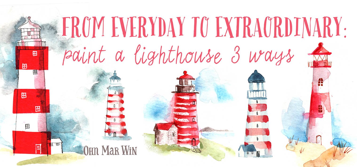
Transcripts
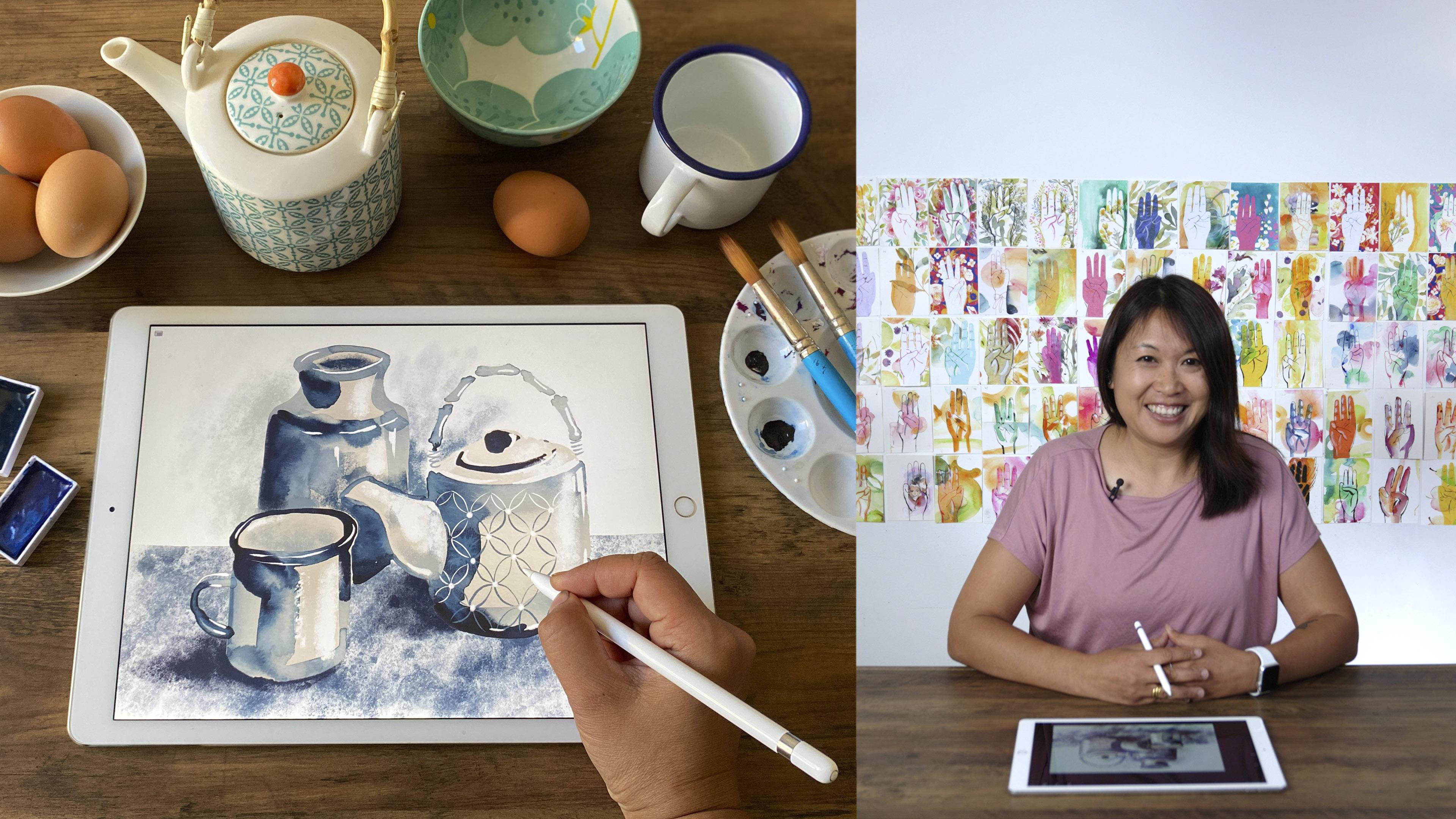
1. Introduction: [MUSIC]. Can you add more contrast to this? Was something I heard often from art directors I worked with in my early days as a food illustrator. Contrast adds depth, form, and that extra pop in illustrations, which helps products stand out on the shelf. But if you're anything like me, this was a really difficult concept and skill to master. Hi, I'm Amar. I'm a sketch brick artist and the illustrator for food packaging, greetings cards, gift wear, and a top teacher here on Skillshare. [MUSIC] In the last few years, I've had to level up my understanding of value contrast, finding fun ways of enhancing contrast in order to apply the key principles to commercial and sketchbook projects. Despite being a major fundamental concept in art, the way I was taught to see and render contrast as an art student just did not excite me and my knowledge was lacking until recently. This class will be useful to anyone who would like to improve their working knowledge of contrast in their art by going back to basics. We will be exploring how we can use simple, dark, and light contrast to create a more believable depiction of the 3D world on a 2D surface using watercolor and the Procreate app. In this first part of a series, we'll learn how to slowly build up your perception of how different lighting conditions affect objects, starting with fun studies, then moving on to a simple still-life, we will combine the freestyle expressive results of watercolor, and then use a few basic tools to remove the background, then build up our monochromatic studies in Procreate. There's no need for art school easels and messy charcoal. Please join me with an open attitude to exploring some key concepts in a fun way.
2. Your Project & Why We’re Using Two Mediums: Your project is to create a series of monochromatic images incorporating watercolor and Procreate to further your understanding of value contrast. We are starting with basic eggs in different lighting conditions. Then moving on to found objects to create a simple still life. I would love to see your watercolor value or gradient chart. One or more monochromatic egg studies using watercolor and Procreate, and a simple monochromatic still life study using watercolor or Procreate. I will explain in a later video why we're sticking to simple monochrome. I'd like you to either scan or take photos of your pieces and upload them to the class project section, which is under this tab. From the first commission food illustration projects in 2015 to some of my most recent projects, one of the most common phrases the art director would use was, I'd like to see a little bit more contrast. To put this into the context of illustrations I've used for food packaging, they have to stand out on the shelf amongst the other competitors' products. Visually they have to pop whilst emphasizing how natural or fresh the ingredients are. When many art directors repeat the same phrase in real-world projects, I had to listen. I feel I've learned more about value contrast in the last few years than during my entire formal art school education when I spent one day a week for almost four years in life drawing classes. I have to admit I didn't learn as much as I could have because quite frankly, I find those lessons very tedious and not very inspiring. I'm sure some of you would gasp, but it is true. At my art foundation course in Cambridge, I remember being sat at an easel for hours on end with dozens of sticks of charcoal whilst the tutor will explain about proportion, form, texture, line, volume, and negative space as well as value contrast. We draw with charcoal, blending areas and achieving highlights by lifting the charcoal dust with putty rubbers. Although I knew it was important to learn, I didn't like the stuffy studios, the sound of that charcoal, or the dust it created. It was so messy and laborious and I was really slow to grasp key essentials probably because I go, board. I'd always be dashing for the train home with a huge pile of sketches, flapping about charcoal swiped across my face and people on the train would just stare at me and I'd be hunched in the corner, just totally exhausted. I've since discovered the way I learn best is when I'm having fun, when I'm enjoying the process, and it often motivates me to explore further avenues. Hence, why I've never appreciated those charcoal lessons until this day, I still have an aversion to using that medium. The way I was taught to consider contrast all those years ago is not the only way we can approach value contrast. With the version that I'm going to show you today after laying down watercolors and when it's drying, we can take a photo of that sketch and import it into Procreate, where we can add further details to support the highlights and the shadows. With the magic of the "Undo'' button, the immediacy and rapid results would have been something I would have loved to see in our college life drawing lessons. We won't be taking away from the learning outcomes using this method or mediums. Let's just say it's a more updated method. We will only use a few basic tools in Procreate and you won't need an extensive knowledge of it for what we are trying to achieve. Most of all, we going to learn in a fun and fast way. We have a few guiding principles. Often the results will be unique. As a working artist or illustrator, you want to achieve unique work. As I have found out, value contrast is in truth an immensely interesting and rewarding subject because it will make your art come alive by adding that illusion of depth, by making your art more dimensional and fresh.
3. Materials Needed: [MUSIC] For this class you will need printed paper, just your standard Xerox staff for the warm ups. As all we're going to be doing is getting used to handling our paint in a certain way to help us understand where to add pigment or when to leave the paper white. You'll be less likely to be precious using cheaper paper when you're trying to familiarize yourself with this way of working. You will also need heavyweight cartridge paper. This is A4 all-purpose paper by Daler Rowney, about 220 GSM and it's quite smooth, or basic watercolor paper. It's not expensive. Again, about 220-280 GSM. Today, I'm using Fabriano, which is cold-pressed. We'll be needing these for some of the warm-ups and also for the still life pieces and you also need to cut some of your watercolor paper into your few strips that are approximately 10 by 30 centimeters. You also need some watercolors. You can choose one color or switch them up through the warm-up exercises, choose from black or Payne's gray or dark blue light ultramarine, or burnt umber or sepia. You will also need brushes. I would recommend a number 8 or 10 round brush. You also need an iPad using Procreate version 5, you don't necessarily need an iPad Pro, but I do recommend having an Apple pencil. Also, you'll need eggs for our early sketches as it's such a basic shape and you can use standard eggs or white ones, whichever your local market sells. Also, it'll be really handy to have a small desk lamp, preferably one with a bendy arm or a small torch and you can pull the curtains in a room to adjust some of the light. Also, a timer perhaps on your phone or kitchen timer type thing, and also a few other small items for your still life. Look around your house and find 6-8 items that are simple in shape, but slightly different. If possible, try to find objects of the same color. I'll be choosing blues as it will give you a little boost to help you understand values when some of the items are placed in front or behind or next to each other.
4. The Procreate App Is A Useful Tool: Fundamentals Still Apply: In early version of this class before this format you're viewing right now, I thought it would be a really simple task to show you how to watercolor something imported into the Procreate app and then add layers of color to make a great illustration. However, as I've been developing this class for a long time, the intervening period allowed me to understand some of the pain points and other frustrations for students when creating art and illustrations. That's why the focus of this class has shifted in order to deliver a much more rounded approach. Knowing how to use contrast is such an essential part of creating effective art, which is sometimes overlooked. As a teacher and working in Illustrator, I felt uneasy that some of my followers seemed to be under the illusion that Procreate was some magic shortcut to amazing results. I would never want to give the impression that I merely using this app, it would solve a lot of our problems. Procreate is a wonderful art that has become one of the most popular tools of the digital art world. It's highly versatile and great for all levels of artists from beginners to advanced. As a digital programmer, I feel Procreate has an intuitive dashboard with quick access to a wide range of brush effects, like charcoal and inky lines, which is amazing for helping artists recreate traditional art mediums digitally. When I started creating illustrations with the mix of watercolor on Procreate and then posting time lapses to Instagram, there was a lot of interest about how I incorporated Procreate into my workflow. What surprised me was the preoccupation with Procreate element. Furthermore, there were misconceptions of how I managed to make the watercolor look so real. I started including the physical painting part in these time lapses to show that I use real watercolor. Procreate is great for beginners, but it's even better when used with strong foundations. I started off as a complete beginner, but slowly incorporated Procreate within my workflow whilst relying on my knowledge of art fundamentals. It's in those foundations, knowing and using the basic guiding principles of art that we can hope to keep growing as artists. Great art follows basic key concepts about portraying how reality looks. The most common principles are line, form, perspective, light, and value. Beyond these four fundamental principles, there are more advanced concepts such as composition and proportion. For this class, I'm only going to raise our awareness of light and value, more specifically how light makes different values when it falls upon anything. We are going to start with a really simple exercise, then a series of studies to help us interpret basic objects using watercolor. Then bring them into Procreate at the end for contrast details. In the next video, I'm going to explain how monochrome painting has a range of benefits for understanding value and studying light and shadows.
5. Seeing Contrast :Understanding Value Contrast: Value Contrast is a huge topic, so I'm going to try really hard to break it down into something that's really simple to understand. As I sure would have appreciated someone doing that for me when I started with watercolors. What is value contrast? Color is often the most attractive quality of a painting or illustration. But believe it or not, value is more important than color to the design and success of a piece of artwork. In a nutshell, it deals with the lightness or darkness of a color. We are able to see things because light reflects off objects and goes into our eyes. Our mind processes the light and rationalizes what we are seeing. So in order to draw or paint in a way that creates an illusion of what we see, we must understand light and how it reacts on surfaces. Value is the key to the illusion of light. A value scale is a tool used to measure value for all colors. Here are the value scales I created for the colors red, blue, and green. If I were to convert this image to black and white, you can see they almost all look the same. In this scale, the light values are called tints, while the dark values are called shades. Highlights in paintings are often indicated by the tints of color, while the shadows are typically indicated by the shades of a color. Let me give you an example using this mug. If we were to take out all the colors, we would still see the mug and recognize it as a mug. In other words, we are just showing the values of this mug. The light is coming from the left and is hitting that side of the mug, as well as some left sections and the handle. If we take this one step further and isolate three of the values. I took the photo of this mug and separated into dark and mid-tone and a white in Photoshop. We can see how it can be broken down into the essentials. The whole point to value is to basically construct the illusion of highlights and shadows with a light source. Remember without light we cannot see. Here is the lights, darks, and mid tones that give a painting dimension and form. If you took my Organic and Expressive Florals class, you may remember that I discussed value studies within the context of painting flowers. However, in this class, I want to present a more wide ranging information concerning an important aspect of value, the contrast. I already employ a lot of contrast in my watercolor sketchbook work. If we were to change these into monitoring or black and white, you can see distinct areas of dark and light. In this version of an octopus, there are two examples on this page that I painted in blues, which worked really well for this theme. Yet, if you take away the color, they still have a lot of depth to them. In this sketch of a diver, I was inspired by a great photo, which gives a real sense of being underwater, diving amongst the giant kelp forests. You can see a lot of contrast happening here. Another good example is this fishbowl. I created from a sketchbook piece, which had to be divided into four colors or three blues and white in order to be printed onto different substrates. There is enough contrast happening in there to make this possible. In order to really understand the concept of contrast, we're going to make quick value scale using watercolor to see a range of blues, all the way from really dark blue to white. So join me for the next video lesson.
6. Seeing Contrast :Creating Gradient Studies: In this video lesson, we're going to paint some very informal gradients scales using your watercolor paint. This exercise will lead to monochromatic studies, which are a great way to experiment with your paints as you become more familiar with how your watercolors work without the added complication of having to make your peace with different colors. You need a number 8 round brush and standard quality wood paper. So no need to use 100 percent cotton stuff for this. There's no need to draw little boxes using rulers either. I've cut my paper up into a long strip, approximately 10 by 30 centimeters. I will show you the reason for this in my next video lesson. Now, we start by choosing one color. I'm going to use indigo blue. Whether you're using watercolor pans or squeezing it out of a tube, start off with a really thick mixture on your brush so you can hardly spread it. Then you will gradually add more and more water. We're just going to create a long rectangle shape, approximately four by one centimeters using our watercolors. Starting at the top with the concentrated pigment, and then gradually working our way down as we add more water. Slowly, we can see it's really starting to become lighter and lighter. Let's carry on until you can only see the merest hint of a blue. Even if it looks darker than expected when you're mixing it, it will probably dry, much lighter, and it also depends on the brand of watercolor you're using and what grade it is. Doing a gradient study is a really good practice to control and manipulate the paint and learn how much water to use to achieve a certain tone. Even for me, it's really useful to revisit, especially if you've bought a new color, just to familiarize yourself with its capabilities. It's also really relaxing, a bit like mindfulness meditation, as you have to be really present and pay attention to the gradual adding of the water. It doesn't have to be neat or evenly spaced out. Some artists can achieve 20-30 shades, but if you can only get 10 in, that's absolutely fine. There's no right or wrong way of doing this, as long as you understand how your paint behaves when you add more water until there's hardly any pigment left at all. Here are a few others that I tried out just for fun in Prussian green and brown. Please don't dismiss this video or skip this exercise as it will be incredibly useful down the line. This is one of the deliverables, so please upload it as part of your class project. Now let's take a look at these gradient studies. The further apart the two values are on the scale, the stronger the contrast between them. So lots of contrast exists between this lightened and here on the opposite end, where we've used lots of pigment. But there is less value contrast between these darker blues and our very first patch, where we apply the paint straight out of the tube. They are very close to each other on the scale. However, contrasting values play side-by-side or accentuate each other, so the lights will appear lighter, and the darks will appear darker. Now place your egg on top of a swatch and look at all the variations of the value and try to match them with the egg. Try squinting. In some small areas where the values match, it will look like they've merged together.
7. Seeing Contrast :Observing Light And Shadows: In this lesson, we're really going back to basics by starting with direct observation. This is where you'll need that gradient that you created. Drawing, painting, sketching from direct observation is a completely different experience to drawing or painting using photographic reference you've printed out all displayed on a screen. When an artist draws or paints from life, they are able to actually interact with the subject first handed. This brings us a wealth of information that will enhance our work in a variety of ways. Observing from life helps with visual understanding, spatial awareness, and remembering the details of an object. To observe and record what you see improves your understanding of your subject and how it could be interpreted. This will form part of your muscle memory that will develop as you move your eyes from the subject to the paper whilst controlling your hand and your paint brush. A common error for many of us, including myself, is attempting to draw things the way you think they should look rather than the way they actually do look. It's time to get out your eggs and use the lamps or a flashlight to shine light on the object from various angles. To be able to add the correct highlighting and shadow to your artwork, you need to understand the basics of how light reacts with the objects it hits. You should be aiming to observe your subject at least 50 percent of the work in time when trying to paint or draw it. This is where we take our gradient strips and hold them up to the egg and see all the different values that are happening here. Pay attention to where the light hits the object, where it is brightest, and where it is more diffused. Here we have my really simple and basic setup, but it's exactly what we need because the light source is coming from my upper right and it's hitting this side of the egg, which is causing the highlight. We have the cast shadow here and the form shadow here because the bulk of the egg is creating the shadow where the light can't get to it. Just underneath, I'm going to tell you a really great tip, is if you squint, you are able to filter the light much better, and I can see because of that, there is a reflected light under there, so it's quite light under the edge of the egg. Now we're going to bring in the strips that we created earlier, our gradient strips. If we move all these different gradients along the side of the egg, we'll be able to see how much pigment we're going to have to mix when we paint parts of this egg. Under here, it is so dark, it's literally this end of the scale. But if we look at the highlight, if I turn this over, you won't need any pigment there at all. When we come to paint that, I think we're going to leave the paper white, and I'm going to show you how to do that in the next bit. I want to show you just a few more examples so you really understand how many variations of light and shadows can be achieved using just one egg. I hope it inspires you to create your own setup. Here we have the egg on a dark background with a strong light from above left. This is the highlight, the form shadow, the cast shadow, and here's the reflected light. This is the egg on a white background using soft light from the right. Again, there's the shadow, the highlight, the cast shadow, and reflected light. Learning the basics of value will significantly improve your painting. This is what enables you to paint an object and give it the illusion of being three-dimensional instead of just being flat on your paper.
8. Study 1a: Egg In Watercolour: In this section, we are going to start with the study of the eggs we saw earlier. This may sound deceptively simple, yet it will present us with many areas of learning, from shape and form, to the all important understanding of value contrast. It's a great idea to first learn to paint simple subjects before moving on to more difficult projects to build up our confidence and awareness. Not only are we going to exercise our observational and rendering skills throughout the process, we're going to have to visually interpret what we're seeing. Our brains play a big part, in why we see things in life the way we do. To keep it super simple, we're only going to use a single color. In other words, we'll work mono chromatically. If you are new to working with contrast, then color can be a distraction and actually hinder your thought process in the early stages. Creating art is a blend of shapes, values, edges, and color. Removing the color, means you have one less thing to worry about. Monochrome painting has a range of benefits. It makes your painting process simpler, by removing that uncertainty about color. It also eliminates the complications of color mixing, choosing a color scheme or thinking about color theory. It will also help you to become familiar with how to produce different values. As mentioned, you will learn how much water to use to achieve a desired tonal value. Monochromatic sketches are a great way for studying light and shadows, to differentiate between the highlights, mid-tones and darks, and recreating them in your watercolor sketch in their appropriate locations. Please note, I will be following up this class with another, where we will introduce color, but just not at that stage yet. We will start with some short warm ups on printer paper. First of all, we are going to paint the shape of our egg, with some form shadows. Then we're going to paint the shape with cast shadows. Then we are going to paint them on heavy duty art paper or watercolor paper, before taking them to Procreate for the amendments and further details. If you watched a few of my previous classes, you know I'm a great fan of printer paper because we tend to be less precious about ruining it and making a mess. If it doesn't work out, we just throw it on the recycling pile. Remember, these are just really fast ideas to help us familiarize ourselves and are not meant to be masterpieces. We have an open-mind. Let's set up the eggs for our studies. It's up to you, to choose the direction of your light from above, from the left or the upper-right. It's totally up to you. Also whether you want your egg on a dark background or a light surface or a mid-tone background and a dark surface. Play around until you find one that interest you. For this first warm-up, we are just using printer paper and we need a very light wash. So whatever you're using, whether it's watercolor from a tube or using a pan, we just need to create a mid to light wash. To begin with, we are just going to create the shape of this egg. We're not going to concentrate on any other features just for the time being, we just need to understand how our wrist movement, or how our paint brush will behave, trying to recreate the shape of that egg. This is just an exercise so you familiarize yourself. That was my first one. The second one is better and it's just shape. You can fill it in if you want. I might fill this next one in. It's a bit more pointy this end. If you get the shape right, then everything else will fit into place later on. This is a really great warm up exercise, you might not think it is saying all this is just so basic. But if you haven't painted it before and I haven't in a little while. This is a super way to start and that's all I'm going to do. I'm going to move on to the next part. This next stage, we start again with the egg, but we have to be mindful of where that highlight is. Get your egg shaped right. We are going to leave a space for where that highlight is. Again, this is really quick and simple. I'm going to work really fast because I'm going to show you what happens next. The highlight is roughly here. I'm just going to show you using these two examples. Go back into your watercolor and we are going to start adding the form shadow of this egg. Looking at the dark as part of this egg, it's here. Again, we're just getting used to adding pigment to the dark areas. It goes there and also if squinting again, it probably comes all the way around to the back, like so. I'm just going to do a few more. This is just practice. Shape. Leave the highlight area and add more pigment where the shadow is on the actual egg itself. We're not looking at the car shadow just yet. This is just to get familiar and comfortable with the next stages. We're building up that experience, rather than going straight in because we probably won't understand as much. Going into that dark pigment again. I just love watching all these things taking place. It probably needs to be a little bit more pointed just here, which is fine. Next stage, we will be adding the cast shadow. Again start with the shape of your egg. Leave the paper white for the highlight. Just to demonstrate the car shadow, again, squinting, the car shadow is very, very dark just here. It doesn't matter if the pigment goes into that. Remember, it's just printer paper and we're just testing things out. Actually, I should have started a little bit further in because the sharp car shadow is actually going to extend way beyond. Now, I realize that this section of the egg is the darkest rather than the shadow underneath, so that's it. That's good. This is good information for later on and the shadow next to that egg is actually lighter. These are really quick and fun studies. That extra layer of information has just made me realize, this part of the egg is also dark. Let's try another one. Working really fast. In the next bit, we are going to put the timers on because I don't want you to labor over any of this. This is supposed to be really fun and free. Looking again, the car shadow begins halfway down this egg. I'm just creating this sweeping movement. It's really good practice for me. If you look really closely, it may be surprising, but this part of the egg, again, is darker than the actual car shadow. Some people, you might be under the impression that all shadows are the darkest, but if from looking really carefully, it's actually the egg that is darker than the shadow, just under there and I'm just going to do one more here just for practice, just for fun. I'm going to leave plenty of room to include that car shadow. The car shadow starts under here. You can see the pigment that's left I've got on that brush. This is absolutely the darkest section of shadow. Now I don't want to perch line like that, I'm just going to add more water. That's pretty much it. I think we've now got enough practice and information from doing these very quick studies to move on to the next stage where we're going to add a lot more detail. We're going to spend a minute just assessing what we've created. Remember this was fast, fun, and loose. This was the first one that we did where we concentrated on the shape, and the last one I created is my favorite. Really really loved that one. This is the second version where we started adding the form shadow of the egg on this left-hand side. Beautiful effects happening there and the highlight has worked so well because the pigment can't spread where there is no water so that's really encouraging to see and this is the third version where we added the car shadow and the form shadow and beautiful effects happening with the watercolor. I'm going to try and embrace that in the next section. Remember to keep everything loose and don't tighten up and keep on working fast. At this stage, I'm going to be using the smooth heavyweight paper. It's my personal preference. You can use watercolor paper if you like. I also want to set four minutes on my phone because I don't want to start over obsessing over some of the details, so we want to keep it fun and fresh and fast so let's start that. It's going to be exactly the same as the process we've just been through and try to keep it as spontaneous as the other pieces that we've just completed. Leave space for the highlight. We're concentrating on the shape of the egg first and now I'm going in again with the car shadow here underneath the egg and you can see it's touching already. That's fine because we're taking it into portrait, we can change things about and the car shadow extends much further than the size of the egg, maybe all the way out to here. Now I'm going to go back in and add the form shadow of the egg which takes place on this side. Squinting again. I think most of it is happening here, and against that shadow as I saw from last time, it's much darker. That looks good already and I'm just going to fill that bit in. I don't want to let them touch. I think that's just enough for now. I'm going to do another one because I've still got time and it's always good to have several to choose from, so let's start another one about here. The shape, the highlight is about there and I think this time I'm going to add the form shadow upon the egg first. If you drop the pigment, it can only follow the places where you have applied water before, so it will do this beautiful spreading, which is fabulous. Exactly what I love to see, and that is what will make your pieces unique. Now we're going in for the car shadow again. Now, curves around like that, and as I said, if I look carefully, this particular shadow is lighter. Not all shadows are the same. It sweeps all the way around like so, maybe even further than that about there. I've actually got 57 seconds left and that is how long I'm going to spend on this. I'm going to just wait for this to dry and once it does that, we can photograph it and we'll take another look at it once it's dry. You'll see just now, I was doing a lot of this business where I'm looking at the egg, I'm looking at my page and that's to build up a relationship and the egg is your point of reference. You have to spend at least 50 percent of your time observing what is happening on the egg in order to understand how to transfer that information onto your piece of paper. You can repeat this as many times as you like. The more you do it, the better you'll become, the more you keep on observing and when they're dry, you can make a choice which one you want to take to procreate.
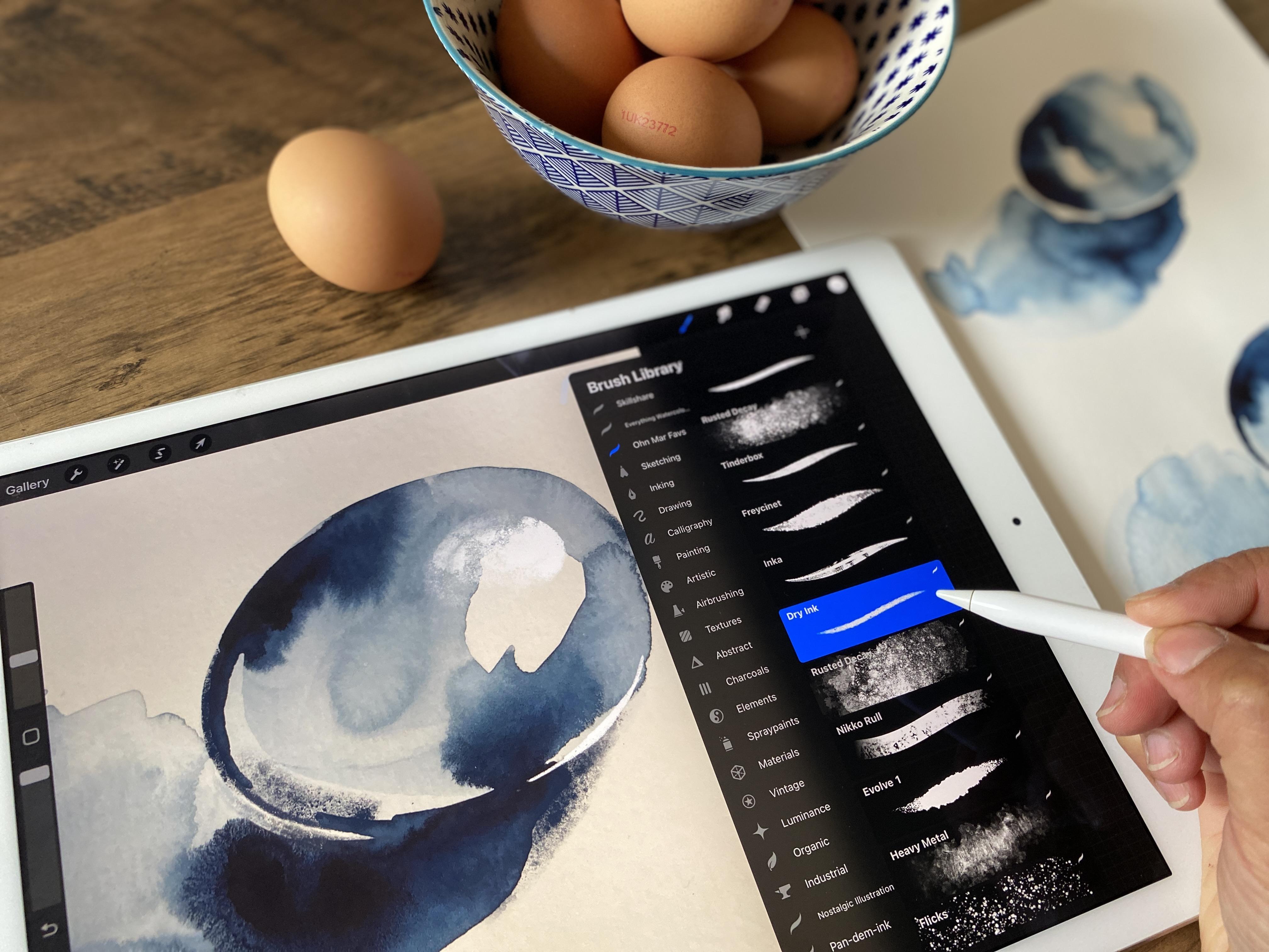
9. Study 1b: Egg In Procreate: [MUSIC] In this lesson we'll be taking clear photos of our sketches, importing them into Procreate, and using the basic brushes that come with the app to build up our contrast further. I suggest placing your sketches on a flat surface close to a window for natural light. A slightly overcast day is ideal for an even light. You can either use your iPad or phone to take photos of your sketches. You must make sure to spend a little bit of time to make sure that they are in focus otherwise your art won't look as good. I also suggest turning on your grid if you haven't done so already. It's best to take several photos and choose the best one. Here we've got the four eggs I painted earlier. Now that they've dried you can see all the different effects that are happening within the different paths that the core shadow and the foreshadow and out of these, I think my favorite is this one at the bottom because there is the most contrast happening at the very bottom of the egg and this is really dramatic results which can still incorporate when we take it into Procreate. The easiest way to do that is put your camera on your iPad. We are going to make sure that our grid is on and I will tell you how to do that in just a moment. When those crosshairs right in the middle, I'm going to take a photo take several and we're going to choose the best version. There may be one more there and now we can take this straight into Procreate. If you want to switch on the grid function on your iPad you go to settings and then scroll down until you get to camera and on the right here it'll say grid and you can toggle that on and off. When you toggle it on you will see that when you have your camera switched on there is a grid and in the middle is the crosshairs and that will help you to make sure that you position your camera so that it's parallel to the surface that you're taking your photograph of and that should help you take much clearer and sharper photos. Now we are going to import the photo of our egg into Procreate. Open up Procreate and go to this plus sign on the top right. We're going to create a new canvas using this icon again on the very top right in the black box. What we want to do, let's say 12 by 12 inches. Here is already decided for me 300 DPI which is exactly what I wanted and it tells me that I can have 37 layers which we absolutely won't need for what we're going to create today. Here we are this is our Canvas and now we have the wrench tool top left next to the gallery. We want to insert the photo of our egg so click on that and let's choose any one of these. That one looks good. It will place it right in the center of the Canvas press the "Blue arrow" and if I zoom out, you'll see that it is quite a contrast between the pure white background and the photo. I'm not going to adjust this I could but this is actually really great for us to be able to add the highlights because when we add the white is going to show up so much more on this slightly Basie gray background. Let's add our layers now, I usually click on several using this plus button in the same section as the layers. First of all, I want to add the darks. I'm going to click on that and do rename. Let's type in darks. Look at my egg and as I said when I was painting this, this section right underneath the egg is the darkest. I'm going to pick that as the color and I want to extend it just a tiny bit more. Press down hard with your finger and that will select the color and now we need to select our brushes. I actually only use three or four brushes at the most but I use them at different sizes. I've got my own brushes called oma mar favas and the ones I use the most are rusted decay here, dry ink, and Nicole that's probably the three that I use the most. These are all brushes that come with Procreate I haven't imported any of these, I haven't had to pay extra. It created the layer for the darks which will be for both sets of shadows starting with this cast shadow underneath the egg and I can see that it actually extends a little bit more I'm using the rusted decay and I think I needed a little bit smaller just where I get tied into there and I'm going to increase it again as I make up this section here. Let's zoom out and you can see where I've created that tiny bit of reflection that the light's hitting the underside of the egg from the paper. Looking at the egg this section of the egg the form shadow again I'm just going to decrease the size of my brush still using rusted decay and I'm just going to extend that just to give that egg a little bit more form and increase it again the brush size again there we go. That looks really nice. Let's do that again so that it looks more confident great. I could use another layer for this car shadow. If I'm going to do that let's choose that color and I'm just going to extend it right up to that egg. Let's decrease the size of that brush again. You can see it's merging to under here it does get darker again. Select a darker color, so this shadow is much darker on the egg that's where the darker shadow is let's be mindful of that, that's great. I'm just going to make that shadow very definite select that dark color again and I might use the dry ink brush just to complete that section there that looks fab and now we can go select a new layer and this is going to be our lights. If we go to this circle, if you double-tap towards the top it should turn immediately to white, and looking at my egg again most of the highlight is here and you can see already let me increase that brush size using rusted decay and that white against that photo I'll show you how lovely that contrast is it's really showing up. I'm going to make that a little bit more directional it's more of a flattened oval there we go and most of it is here. The reflected light again is just a tiny weeny strip underneath the egg and that's what we're going to try and add here probably the brushes a little bit too thick just decrease that there we go. That looks really nice I love it and I think this side of the egg just needs a tiny bit more dark. Let's select something probably about that color I'll make sure I use the right layer. Rusted decay make it tiny bit smaller. I think that's all my stuff but this one I feel this line is a little bit too harsh, so I'm just going to diffuse out a little bit by using the same color and it almost look like I'm blending it, and honestly let's zoom out on that. I really think that is all I need to do to understand where those core shadows were, where the form shadow were and I've just used Procreate to enhance those elements especially the highlights. If you make it really small it gives you a better idea of where you might need to add more stuff I'm really happy with that.
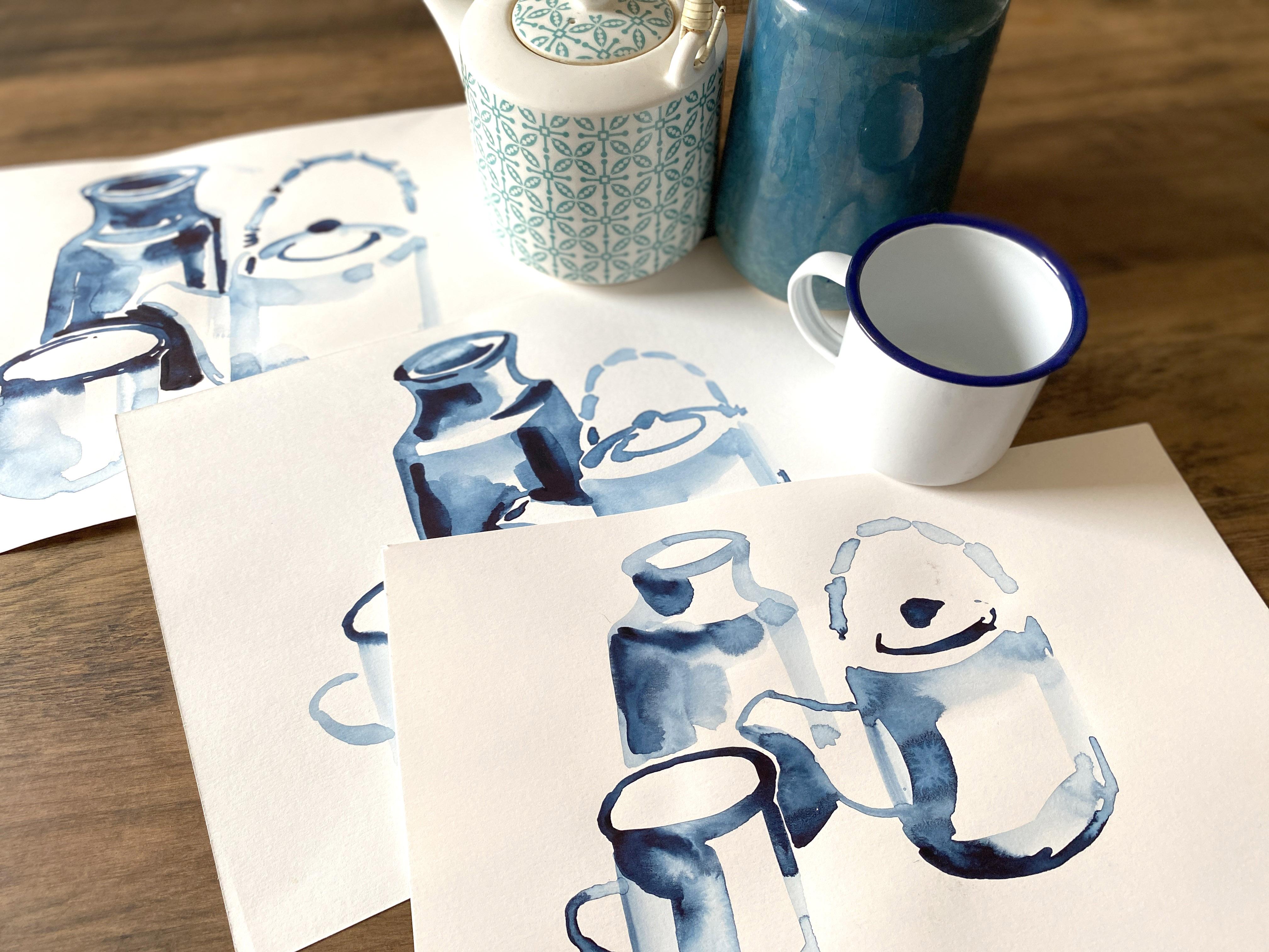
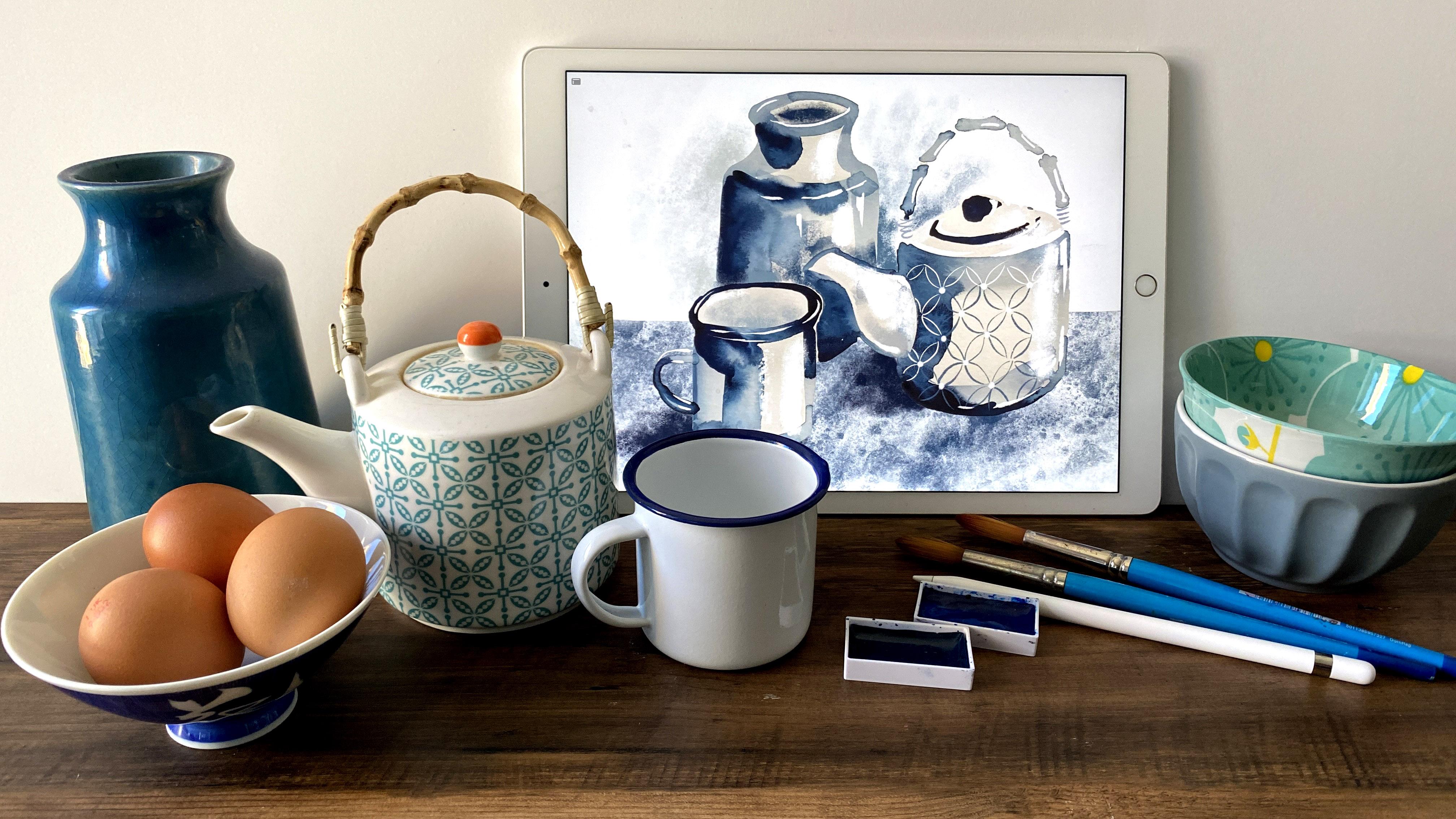
10. Monochromatic Study 2a : Still Life In Watercolour: Now we're going to move to upper level by using what we've just learned and applying it to a simple still-life. Gather your items and start to arrange them in a small group of three. It would be really beneficial if you overlapped a few of these items, so there's an object in front and one behind. Swap and change them around until you have an arrangement that appeals to you. Now you have to consider the lighting aspect. Maybe you want it straight on or from the left. Again, play around with it until you find something that's really exciting for you. Maybe it's very dramatic or something a little bit more subtle. So we don't get too caught up by the extra complexity, we'll start with super-fast warm-ups to practice the shapes of your chosen objects on printer paper just to familiarize yourself with their structure and give your confidence a little boost. Do one at a time on each new sheet. This is the still-life arrangement that I'm going to paint now and my light source is coming from the upper right again which means that the top of this teapot is very bright. This is bright on this side and our shadows along this side, this edge of the teapot, this edge of the cup, and this edge of the vase. Another thing to be aware of is because we can see the depth of the vase and the cup. That's something we need to be mindful of because it gets dark in there. But also there are a lot of really bright highlights. Just real points of light and we're going to be adding those aspects in Procreate. We're not going to try and capture that in bold color. First of all, because we are presented with objects that are a little bit more complicated than the egg, we're going to practice the shape once again, very far studies. I'm going to start off with my little enamel cups. I'm just going to take away the vase and the teapot and we're going to start with the enamel cup, just where it is. Just like we did before with the eggs, we're starting by making up the shape and then we're going to drop in the areas of dark pigment. The rim of the cup, I can see quite far into it. Probably similar to that and then I'm going to add this edge. It is almost white but because it's on the very dark background of this table, I'm going to include that here. As I mentioned before, this edge is pretty dark. I'm just going to add a tiny bit more pigment, not much more about there and also the underneath here is very dark. Let's add that handle. This handle is more of a mid-tone, so there's not very much happening in there. That's my first version. I'm going to do some more really, really quick studies just to familiarize ourselves and also remember that the watercolor can only flow where there's water so be mindful of where you apply that initial watercolor. I'm going to add some dark pigments here. I think this first one I added the rim first but I'm going to add the rim last now. Just see how it comes out and when I take it to the more detailed piece I'll remember that handle isn't that dark. Under here is dark where it meets the table. That's great. I'm really tempted to add the shadow but I don't need to. I'm really happy with these little enamel caps and I'm going to move on to the vase now. If I take a look at this shape, initially I thought it was quite slender but it's actually quite fat. Start off with that edge and the whole of the left side is really dark. But before I get into that let me just sort out the shape. This is supposed to be really quick just so that I understand the structure of it before I move on to a more detailed piece where we have to start overlapping some of these objects. The vase is going a little bit skewith. No, it's fine. It's fine. This edge is really dark. The interior here is dark and this is almost like me making a note of where I need to be mindful later on on this edge and under here as well actually. It needs to be darker in general, so I'm going to add just more water here just to darken the edge. Let's start another one. I'm going to leave that. I've got enough information for myself going into the next phase. I left this teapot till last because it is that much more complicated because we have the handle as well but if we keep things simple, it's basically another cylinder. It's a squat cylinder, you can see the top of it with a handle and a spout. It's that little bit more complicated but it doesn't matter. We can still handle this. Let's just keep it simple. Again, it's going to be a mid-tone think cylinder. Think, we've got a short cylinder happening without getting too bogged down. We've always got a spout. Even for me, I'm not sure about this, I'm thinking that right now but I can do this. That is your basic shape and on top of that is all this light section here. All I need to do really is where the lid is going to come out, that is the darkest section. It's the edge of that lid with the little knob at the top. If you squint, that is really what I'm seeing and now it's the spout on this side. It's actually quite light against that dark section of the teapot which makes my life easier. It does have a little wave in it like that and that's the spout. It doesn't matter the spout interior. We're just trying to gather information about this before we move on. Now let's go on to the handle. There's some fiddly things happening but we can add those parts in Procreate. I don't know if this is fake bamboo or if it really is bamboo that's been bent into the shape of that handle. Again, trying to work as quickly as I can, not getting too bogged down. The other thing that I've just noticed with further observation is the very bottom of the teapot. That was enough for me. I'm not going to start adding too many details in watercolor. That's where Procreate comes in and that's where the details. I'm going to do one more, just even quicker because I've left off half the spout. Now let's move onto watercolor paper. We're basically going to do the same again, but now we have overlapping objects. We have to be mindful of this. However, remember, because we can't take it to Procreate, it doesn't have to be perfect at this stage. Now we put afterlife packed together, we need to take another really good look and observe all the different values and contrast happening. Starting off with the enamel cup, it is white with blue rim. However, I'm squinting and I've noticed that the blue rim is as dark as the left side of this model. That's something to be mindful of. But in general, the vase isn't as dark as the blue rim, so that's one thing. The spout of the teapot overlaps the vase and that is very bright. It's more of a cream than a white, and that's something to be mindful of. There's a space between the edge of the vase and the beginning of the teapot. Again, that's a good way to gauge the spacing and some of the spatial arrangements that we've got happening here. I mentioned about the pattern that we've got on the teapot. I'm not going to add it in watercolor, there is no need because we can add some of it into Procreate. Another thing to point out are the real the sports of amazing highlights. When I show you in Procreate is going to look amazing. We're going to do the watercolor version now. I'm going to start with that enamel cup exactly as we practice just a few moments ago. Start with the shape, and on the right side it is very light. That's a good shape to begin with. I'm going to add that rim, which I mentioned was absolutely one of the darkest areas we've got happening in this still life. That's good. There's a slight shadow happening. I think it must be caused by the teapot, so I'm not going to include that at this stage because the watercolor is just that little bit too wet, but let's add that handle really quickly. You can see how fast I'm working because I really want to include some of those gorgeous watercolor effects. That's one of my little thrills. That's the bottom of the underside of the handle of the mug. Now going into the vase which appears behind this enamel mug. Remember I said this is lighter than the rim, so let's load our brush with a mid-tone wash and again, just fill in the shape for now. The edge of the vase starts about there. If you gauge the enamel, it goes up just a little bit more and then we've got the neck here. Let's quickly get that shape in. That's the rim. On the other side, it might actually updating. I've done the net quite long enough, but it doesn't matter too much. Now we are going into the same territory as the spout of the teapot. It doesn't matter because we can use Procreate to reconstruct part of this, but I know I've added too much of the vase. Now I'm adding the negative space that the spout has left behind. I know this sounds very strange, but that I'm painting now is the bottom of the vase. This is the age of the spout. That's it. That's the shape of the spout there. Now I can fill it in, leaving a bit of the highlight here, and under that rim, the top rim of this vase is also very dark, so I'm going to add that now. This is the darkest section and all along this left side is very dark. That's perfect. Now let's carry on with the tea pot. That spout probably extends to here, and the teapot starts here. In relation to the mug, probably this is the edge. I just made a tiny little mark to tell me that's the edge of the teapot rather than filling in because I could have been wrong. That's that looks about good. That's a good point. Now we've got the spout. Now we use this edge to gauge how far up the outer far edge of the rim of the teapot. Let's fill in that shape as exactly as we did before. It's pretty much as why does that vase, so that's good. This edge is dark, especially under here is very dark. Now remember I said the darkest section in this top it was where the lid of the teapot sits. There we go. The knob is about there, and now the bamboo handle. Something woven there. I think that's too dark for the handle. Let's take some of the pigment off the brush. This is just a rough estimation of the shape of the handle. We can add and subtract things in Procreate. I'm just going to define this edge of the teapot just here. Now I'll show you a few things in Procreate just to emphasize that. But I think overall, we're pretty much there. I'm going to let that dry now. Once it's dry, we're going to take a photo of it and then import it into the Pixelmator app to remove the background.
11. Monochromatic Study 2b : Removing Background In Pixelmator App: Now that we've got the still life and it's dry, I'll be taking a series of photos of it, again using the crosshairs. I'm so pleased with how it's turned out. There were so many dramatic watercolor effects. To be aware that in Procreate, I'm not going to try and cover them up, I'm just going to enhance what we've already got there and embrace some of those lovely imperfections. Now, I've taken these photos, I'm going to be taking them to the Pixelmator app, where I will remove the backgrounds. Downloading the Pixelmator app is optional. It's a one-off cost of $4.99, and it makes removing the backgrounds or sketches that you photograph really easy. If you don't want to download it, just take your photo and work on top of it, just like we did with the eggs. Now we're going to go to the Pixelmator app, where I can remove the background to our still life. This is the Pixelmator app on my iPad, and we want to press on the plus button and that will help us select the photo that we took just earlier. Press import on the top right. There we go, and it's just bought up the photo as is. We're not going to change the Canvas or anything at the moment. There is a brush icon. It looks like a drip of paint coming off it and you click that and we're going to go to select, which has a square icon. You click on that and there's a series of different selection tools, and the one we're going to use today is Quick Selection. If I zoom in, you will see what will happen. You can see it goes white first and we also have to look at the selection mode. I am creating a new selection, but also I want to select all the background, so we have to then press add to selection which means we can add this and this and then we'll just keep on adding everything. Don't forget the insides and especially areas like, the handle of the cup, inside that handle. We have got that background selected. I know that the lid of that teapot is a little bit skewy but I'm going to show you how to deal with that in Procreate. Now, you press done and we go back to that brush icon and now, we want to go to Paint and Erase at the top. It's already set on Soft Eraser but, these are all the eraser settings, you can have and I really like to use Soft Eraser for what we're going to do today, but you can play around with all the different settings. Press done and also this is the size of the eraser, so you can have it really small, but because we're removing the background, I want it too large and this is the strength which I suppose is like opacity. Say, press done, and now you are now erasing that selection. That's great, so you press done. Now, we want to import this into Procreate. There's a box with an arrow pointing upwards and you press that and you can open in another app and you want to save it as a PNG, so that there is no white background and it will come up as Choose the App, so we want to send it to Procreate. It says it's sending now and that's done.
12. Monochromatic Study 2c : Still Life In Procreate: We're still going to keep things as simple as possible. I really don't have a fancy method. What I show you might seem pretty basic, but it's the way we use them. After what we've learned about careful observation and how to apply value contrast, we're going to take things to the next level. During the demo, you'll see I only use a small selection of brushes, the eraser, group my layers and sometimes the free hand selection tool. One very handy tip is the layer mask, which is what we're starting with. This is the version that I've just removed the background too. There we go, we've got this jagged outline on the teapot. There's a really simple way of making some of these edges a lot neater. I use layer mask. So this is on its own layer and if you press it down, there are several functions come up and the mask one is the sixth one down. You can only use black, white or gray with this. I've got my brush on dry ink and I'm going to make sure it's on black by double tapping and that will go to the black. The dark is part of that palette. If I show you, you think, she's deleted it, but I haven't deleted it. If I turn off that layer mask, I'll show you it's still there. This is called a non-destructive way of removing certain outlines. Now I want to just make sure that this, let's reduce the size of that brush, is nice and smooth. There we go. Also some of these edges could do for little bit of smoothing down as well. I know that the neck of this vase, we saw it compared to this side is a little bit off, so I'm just going to take away this section here. The bottom of this enamel mug is also very off. I'm going to make sure that this is a lot smoother, and if you want to undo, you just tap it once. Let's zoom out a little bit. I do tend to paint a little bit skewy, so I'm not going to try and make everything immaculate. I'm happy with the way that looks. Now I'm going to add more layers. I think we shall start off with the darks again. We select the darkest part, which is probably here, or the rim of that enamel mug. We're just going to go around adding the darkest sections. I'm going back to my beloved rusted decay. Especially this central area where the rim of the mug and the top of the spout of the tea pot meet, it's a little bit awkward. There's two ways you can approach it. You can do this and then go to the erase tool and work at it like that. That's one method you could use. I'm just showing you as an example. Let's just undo that. Another way you can do it is to go to the selection tool and make sure that it's on the freehand setting and add. We are going to draw around the sections here. Sorry, I just moved the iPad. I'll show you that when I go back to my brush setting, only this section that I have selected will be that we can use the brush on. That was the edge of our selection but that's just too dark, so let's choose a different color. I want a mid tone color, that's working well. I think that goes a little bit too dark there. Looks good. I just pressed the selection icon again and that's turned it off. When I looked at the still life, the rim of that enamel mug is one of the darkest areas in this still life, so I just need to extend this down. You can use either method. Just select your color. I'm going to use the erase method here. We need to extend this dark section down. That is lovely. The inside of this mug was also to show that there is some depth to it. That was dark as well. You can employ either method. Let's use the selection and select the inside of that mug. Go back to our brush tool. I'm just going to concentrate on that. In the rim I think that color was a little bit too dark. Let's just choose light. Maybe that one would work better, that's better. The inside of the handle of the mug. There is actually a really, big highlight on that, so I'm going to leave that white. The light catches the inside of the mug just there. I might come back to that again using white. The teapot is very light, but I'll work that later. It's something that I'm mindful of because I'm just trying to add the dark sections at the moment. The inside of that vase was also dark. Select a dark color. No, I don't like that brush. I like my rusty decay. I use rusty decay so much but at different sizes. I'm just going to use the erase tool. Again, just rusty decay at a fairly small scale. There we go. I know that there's not very much contrast at the moment, but when we add the highlights, it's going to look so much better. You saw that I didn't really adjust this photo when I bought in because I'm using the slight grayness of the paper as a mid-tone. I'm going to leave that as it is. Now we're going to go to a new layer and add the highlights. There was two versions of the highlights that I saw. It was more subtle, graduated highlights and ones that were really that the light was bouncing off it. I'm going to keep those two separate. Starting off with the gradual ones, I'm going to go back to rusty decay and just hitting this side of the mug. I made a mistake, when I painted this, I extended that vase down too much so I can now add that white on top and it will disguise it. You can't see it now. It comes round here. The way that the spout is added onto the tea pot also creates a highlight. Along this side of the vase, the right side, there are series of highlights and also extreme highlights where the light's hit it. Down here is very dark. Let's just add a few more highlights on the right side of the teapot and here as well. I know the teapot has a pattern, but I'm not going to bother with that just yet. I'm just going to get the main highlights and low lights happening. I just need to adjust this down here. There is a bit more. I'm going to create a new layer. The spout underneath, there is a little bit of a shadow, the form shadow happening. I just want to add that because it will bug me if I don't. Just there. That's all I needed. Just to create a bit more information. Now, on another layer, I'm going to add the really bright highlights that I'm seeing where the light is so bright and they just teeny weeny patchy. I'm going to move back to my dry ink. The most obvious ones are on the rim of this enamel mug. Sorry, I need to change this back to white. It's not like a circle that's on the rim, is just hitting random. That's a little bit too high. It's just hitting various sections. That's made all the difference and again, on the rim of this, far as well, on the inside edge and also here, and at various points along this color. Some reason I can see some lovely highlight there and also here. Along the teapot, it is on this particular edge. Let me just add those in. It's more here. Lovely. There we go. Now, I could leave it as it is, but I think that the handle is just floating. I want to add a few more details, but it's just going to be the smallest details. This isn't a detailed study. If we plan out a little bit, I already think this looks great. We do need to add the background, but when I say we need to add a few more details to the handle, I'm just going to select like a mid-gray and add this bound. The handle is bound to hoops on the teapot like this. I haven't even included the hoops. Is just my impression of what's going on there because I don't want to complicate things too much. Now we need to add the rest of the background. These are all the layers that we've got at the moment. I need one more layer for the background and I need to move it so that it is now underneath our original, the imported photo. My objects were sitting on a quiet and dark table. I'm going to try and include that, and we go back on the background layer. Go to selection, and you can do rectangle, or you can do it free hand. Now we've got this selection here. Again, I'm going to use rusted decay on a dark. Let's see how that looks. I think it's the right color, but the brush needs to be just that little bit bigger. Bigger again. That's lovely. That's a nice base to work with. We are going to be adding a bit of shadow here. Has already loved these things happening here and here. We don't need to do too much, but I think that the enamel mug needs a little bit of help. Let's deselect that. I'm not going to work on this layer. I'm going to add another one because this shadow is going to be related to the mug. Select your darkest color or maybe the darkest color on this mug. I think the brushes too big. Let's turn it down a little bit. I can add more to it. But that bit of information is really useful to let you know that it curves around. I think the viol is doing fine on its own. I'm wondering if this underside of the spout needs a little bit more information to just help it along. It's just merging too much with that surface of the table. The shadow was doing this. That's great. I think I missed something there. I'm good. I've just seen something. I'm going to go back to that layer mask and just get rid of that. There we go. Let's see how it's looking at the moment. I don't like the fact that it's bright white. Again on a new layer, I'm going to add just a hint of, let's say the wall. Let's choose another mid-tone color. I need to increase the brush size a bit. I think I need to make that a little bit darker. Hold on. Let's choose a slightly darker blue because the lead of that teapot is merging too much into the background, so I just need to show you where the edge of that lid is. That's better. Look at it from a small-scale. See what it needs. I said that the handle of the enamel mug had super-duper highlights on. Let's add that now before I forget. Wrong brush.Here and here. There's even a few reflected light there. That looks nice. I think I've made a decision. I am going to add a little bit of that pattern on the teapot, but I'm not going to cover it in that pattern because it doesn't need that information. Let's just select. I'm just going to add it may be in this bottom section here. We need a new layer for that. Again, it's a very simplified version, I'm not going to do exactly what's going on in there. I don't like that. The colors to a dog. This looks really nice. That's all I'm going to include. It's just enough information happening. I wanted to just do a simple version of that still life. I think I've really achieved something. I'm really pleased with looking at this. I really love this combination of watercolor and appropriate, because you can still see all those beautiful creations that happened when the watercolor was drying, and we haven't covered it up on. All I've done is enhance it with some of those highlights have really pulled it all together. You can do your own version. You can do as many different still life as you want and post them and I'll just be so thrilled to see whatever you come up with and let me know how you feel about producing your art this way and what you've learned. Even for me, I've learned a lot in the last 10 minutes. I'm really thrilled with this.
13. Final Thoughts : I know technology has really moved on since my art school days, but the guiding principles still remain the same. There was a phrase that might art tutors used, 'value does all the work, and color gets all the credit and I really didn't understand why back in my college days, but I've now fully grasped its importance. Color is the most attractive quality of a painting, but if you understand value, is actually more important than color, then you have more successful sketches and paintings. Learning how to see tone or value will help you create paintings and illustrations that hold the viewer's interest. The monochromatic studies that you've created may seem pretty basic, but it's actually one of the foundations in understanding how your highlights and shadows give your artwork depth and dimension. Taking it from a flat, lifeless image to a more three-dimensional object that attracts the viewer's eye, creating that monochrome version of a painting first, even if it's a small one, will really help you when it comes to painting your color versions by planning out your areas of light and dark ahead of time, as well as building good composition skills, it will pay dividends as you continue with your contrast journey. I honestly can't wait to see your egg sketches including any warm-ups and of course your own still-life versions. Be sure to upload them to the class gallery so I can give you proper feedback and advice. If you'd like to post your art on Instagram, then please use the hashtag, ohnmarskillshare so I can re-post it on my Instagram feed. I'm really excited to see and hear how you feel about this approach. As mentioned, there will be [NOISE] a follow-up class where we'll be moving on to more colorful items, but using the same methods. When it comes to color, we have to take on board another layer of learning and complexity so please watch out for that class.