Loose & Luminous Sunsets
I had shied away from painting all colour sunsets in the past as they just didn't glow in the way that I hoped they would. It wasn't until I started practising them that I realised I could push the luminosity through the pigments I used.
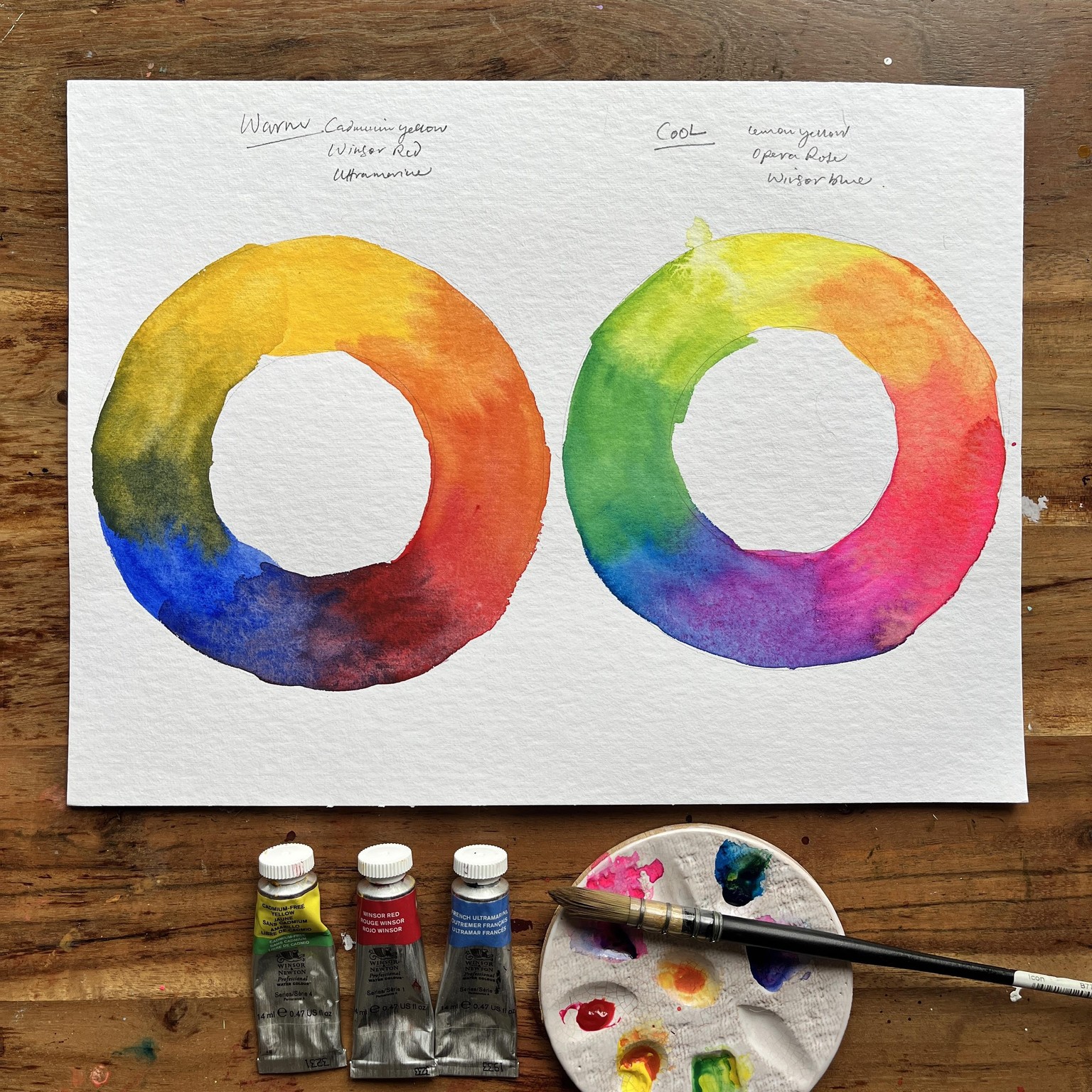
I only had a theoretical knowledge of colour bias as part of colour theory, however it was through the practice of painting sunsets in watercolour that I truly understood how warm and cool pigments could affect outcomes. This was a real game changer for me, and my sunsets really started to look radiant.
The pigments I used were:
Winsor lemon - W+N
Opera Rose - Schmincke
Brilliant purple - Schmincke
Winsor violet - W+N
Paynes Gray - W+N
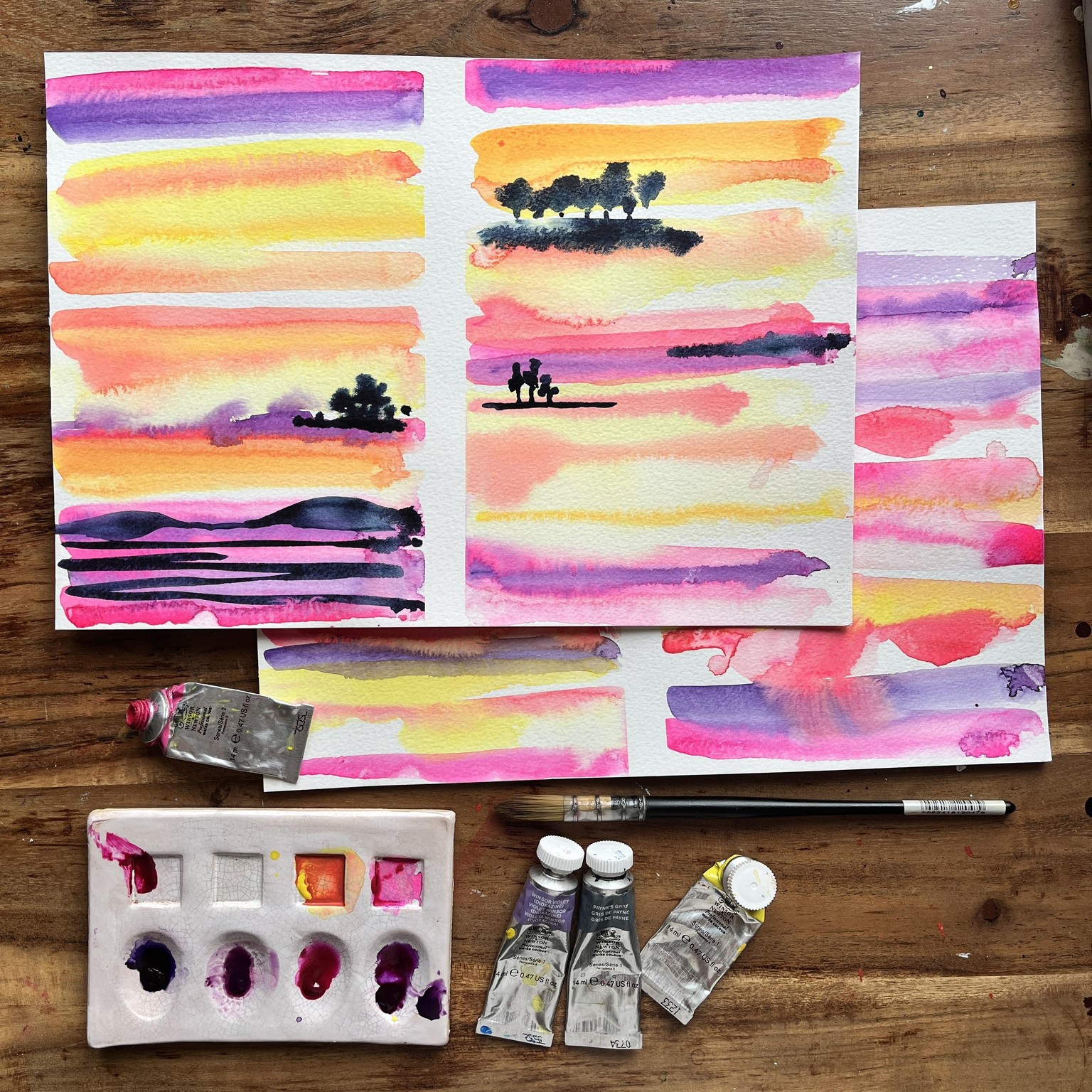
Playing with water to pigment ratio is another area where I really boosted my learning and factoring in the dampness of the paper, really levelled things up for me. Observing how the pigments react when the paper is very wet...they spread out loads & the dry lighter... meant, I could use that to my advantage when it came to painting the sunset.
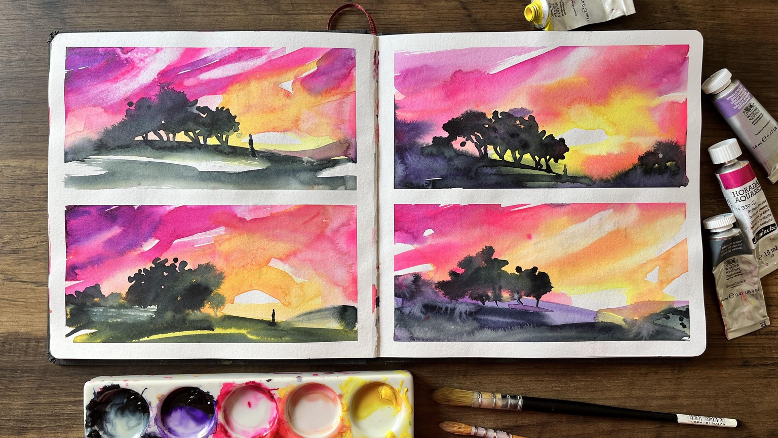
I thoroughly enjoyed painting these four landscapes with the trees silhouetted against the sunset. Repetition is something that I really embraced throughout this project as I'm so curious to see what each outcome will bring. And the win/win is, I have four times more experience now.
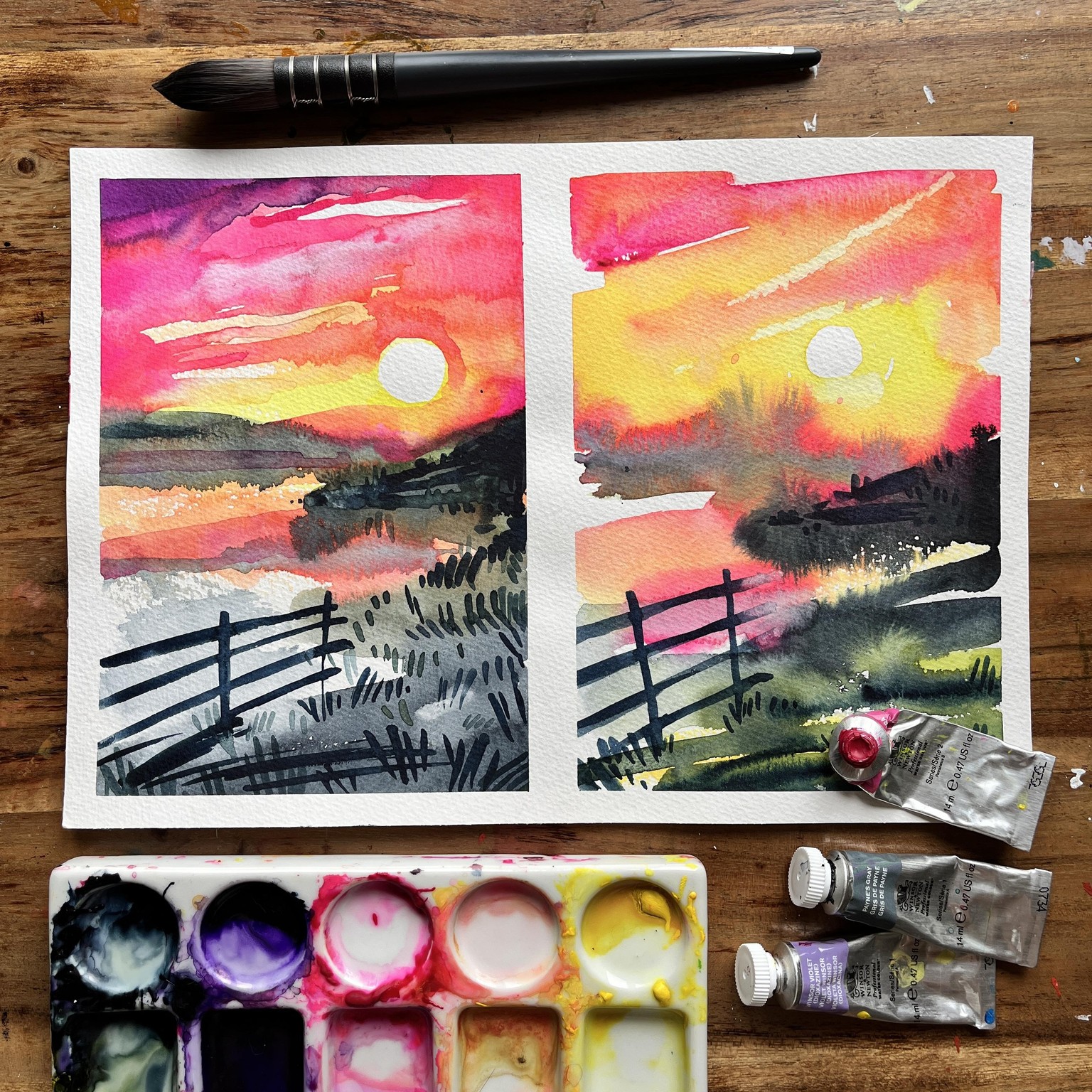
I found it fascinating to observe how two paintings, created from the same reference, could be both similar and distinctly different. I believe painting sunsets offers a safe and low-pressure way to experiment with watercolor techniques. The luminous colours of sunsets allow for quite a bit of creative freedom, while the forgiving nature of the subject matter helps to build up confidence with each stroke.