Transcripts
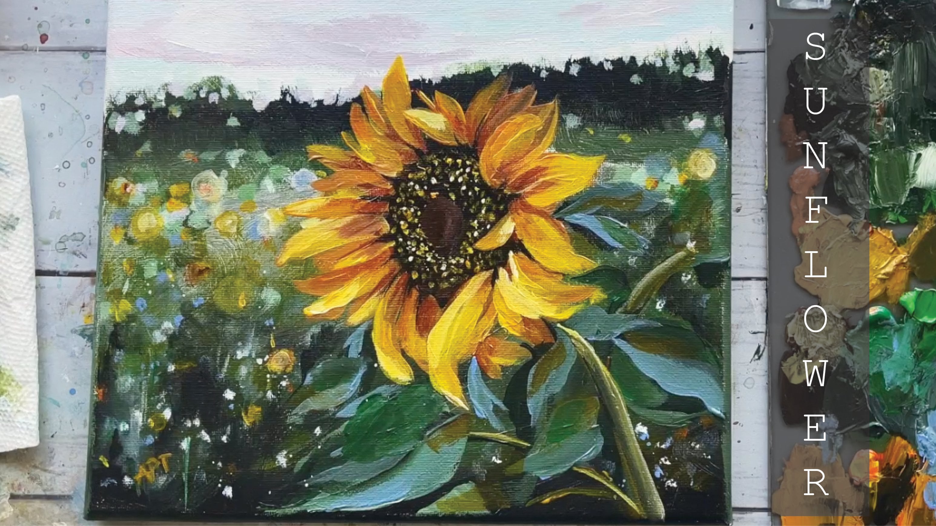
1. Introduction: Hey everyone, my
name is Alicia and I am an artist here in
San Jose, California. In today's class,
I will show you how to paint this fun and easy somewhere flower landscape, following simple techniques. So we're going to go through all the materials
that you will need. Color mixing techniques,
brush techniques, and how to understand
dimension and form. You will then paint this
loose landscape step-by-step. This class is great
for all levels. So let's dive right
in and begin.
2. Exercise - Color Mixing: In this color mixing lesson, I will walk you through some
colors and show you how to mix colors to get a variation
of darks and lights. This technique can be applied with any color of your choice. So we will begin with
these four colors here, and black and white. I'm going to make
four columns here, one with the plain color
right off the tube, which will be in
the first column. And then I'll show you the different variations you can get by just mixing white
and then black. The last column will be a combination of these
colors amongst each other. Let's begin with
this darker green, which I believe is because green acrylics Liquitex basics. So here's what you get when
you mix in some white. As you can see, there's
a huge jump between the original color of this
green and then this one. And of course, you can
control the lightness of your green depending on how
much white you mixing. Mixing in some black can really give you some really
nice dark tones. And again, you can
totally control how much dark you want your
colors to lead to. So depending on how in
which black you add, you will, you can change
up the different tones. And if you want to mute
this color a bit more, adding some white and black to the screen can
give you just that, which I have on my absolute
favorite colors to mix. So remember if you want
to tone down any color, mixing some white and black to any original color can just can give you that
really nice muted tone down version of the
existing color. Here I'm adding
some more white and just a tiny bit
of black but more white to show you the difference you can get
in this version as well. Alright, so I will be repeating the same steps and
all of these colors. I'm going to just speed
this up a little bit, but I just wanted to
point out how you can get so many different colors by not using that
many colors at all. To begin with, the
variations that you can get from each
color are endless. These are just a
few basic examples and I'm able to show you, but feel free to practice with some color mixing techniques if you are an absolute beginner, these can be super
useful and handy. And before you know it, this will be second
nature to you. When you've only need to
reproduce a certain color, you will know
exactly off the bat what makes an order to
get that exact color. Alright, so, so far we
have only introduced white and black to
an original color. But now I'm going to show you even more deviations and
options that you can get by mixing our original
colors that we have together. For example, what happens when
you mix both these greens together or mixing the
slide queen and raw sienna, or maybe even raw
sienna and blue. You get the idea. So let's try some of that
to see what we can get. So here I'm mixing in both these greens with
some white and black, which creates this grayish tone. Then if you mix more of the
darker green hookers green, you'll get an in-between
green from the top. Here you can see mixing
the light olive green with why sienna gives you this
really nice warm tone. Whereas mixing some
black to that will give you a muted cooler tone. Roseola and tailor
blue will give you a somewhat sap green color
with some warm tones in it. And then mixing white that
gives you a muted olive green. But I'm hoping this exercise can help you understand the depth of colors you can get
by mixing them together and just playing
around with them. These next two colors are some of my absolute favorite
colors to paint in. And I often use these colors quite a bit in all my paintings. So if you're interested,
I got this color by mixing in hookers, green, pale blue,
some white and black. And then this next one. If you take that
exact same color, I'm mixing a little bit
of raw sienna in it. You will get this muted
version of the one on top, which is just so beautiful. Here's an example of these
colors applied to a painting, and you can tell how some of these colors have been
used in this landscape. So in order to build
dimension and depth, you need to have these
variations of colors in order to make your
painting not look flat. So play around with color
mixing beforehand to give you a sense of colors you can get from a limited
color palette. And this will really
help you visualize how you can use these colors
in your painting.
3. Exercise- Brushwork: Alright, so now let's dive
right into some brushwork. I'm going to show you the
different marks you can make with my most commonly
used brushes. And I'll show you how
I apply and use them. Let's first begin
with the flat brush. This one's super
basic and clean. I use this one for the sky and you can get simple
flat washes with this one, but extremely thin lines if you use the tip
of it as well. Hello Lee, the smaller flat
brush works just the same. And I use this for simple
flat washes for my landscape, especially when I block off
colors in the first step. Like mentioned, these
next two brushes are my most used and amongst my favorite
to paint landscapes. They are very versatile
and are great for that loose style landscape
paintings which we love. You can get really great, clean like flat
strokes with this. I love painting this. When I am painting
like huge mountains are just going to
block in shapes. I love using this brush to
block in the initial stages. This brush is also
great for layering paint on top of one
another as well. If you change the direction of the brush and
hold it vertically, you can get arch like shapes
that can be used for bushes, trees and loose objects. Because of the brushes
arch like shape. It is great for bushes and hence really great
for landscapes. Using the side of the brush or its tip can also be very useful to paint faraway
trees or houses, etc. And overall, it's just
really great for detailing. The smaller size. Full brush is great for smaller bushes and
objects far away. I use this long, thin brush in every
single painting, which I mostly bring up
at the end for detailing. So whether I'm painting
florals or landscapes, I always bring this
out at the end. This brush can really add some visual interests with
just little tiny marks. Today's painting, I use
this brush for the grass. I gave it some highlights and just little tiny marks far away. This can also signify and give impressions of little
objects far away. So maybe even houses or animals. I even actually assigned
my art with this brush. If you are wondering
how I assign them, it's always with this
brush at the very end.
4. Exercise - Dimension & Form: In this lesson, I'm going to
go over dimension and form. A form is a
three-dimensional figure as opposed to a shape being flat. And how would you add
a fall onto an object? Well, in painting, you can
do that by adding color. In this example here
we have dark tones, mid tones, light
tones, and highlights. This is exactly what
you need to turn a flat object and give it
some dimension and form. I'm going to show you
how I'll be using red, black, and white to
demonstrate this. So first, I'm going to block
in the shape with just plain red so that we can
have a base to start from. This right here is an
example of a flat 2D object, which we will now turn into
a three-dimensional shape. Now, I'm going to start
adding in my mid tones. So I'm going to add
some black and whites to the red to create that. To get my dark tones, I'm going to add some more
black and fill in that edge. So now we're going to
take these two colors and blend them in-between. You can already see how
this is forming a shape. Okay, now let's add in some light tones by
mixing in some white. Notice how I'm painting in
the direction of the ball. Not just painting
this up and down, since this is a round shape, you want to kind of
paint in that curve. I'm just going to
go back and forth in between my dark tones, mid tones and light tones until I'm satisfied and I
feel that this looks good. I'm just giving it a
rough background so that it doesn't feel like
this is just floating around. Alright, and then
for the highlight, I'm going to take a lot more
white and a tiny dab of red. So a quick recap. Dark tones are
achieved by mixing your original color
with some black. And then the more
white you mix in, you will get a gradient. So you can see how
you can move from a dark tone to a mid
tone to lighter ones. And then your highlights.
5. Materials: Okay, So this is all the
materials that I've used, a gesso to prime the
canvas beforehand, along with any big flat
brush that you have. For the canvas, I've used
a ten by ten Canvas. You can use any
size that you like. You can also use paper if
you would prefer that. Alright, so these are all
the brushes and these are, there are quite a few brushes that you use for this painting. But I'm going to simplify it so you can see all the
different sizes here. So as you can see, I have four different flat brushes
ranging from small to large. And then my filbert brush, again, filbert is a brush
that has a curve at the edge. As you can see, there
are super handy when it comes to flowers and mountains and stuff like that. So again, small to medium, one round brush to really
thin, long brushes. And then I have a
rough bristle brush. You will also need a pallet. And then for my paints, again, these are all the
paints that I've used and all the links. I mean, the names of every single paint is
also listed below. But a bunch of greens
ranging from light to dark. Two different kinds of blues. And then all these different order magentas and the pinks and the yellows are mainly
used for the flowers, but you can use any
color that you like. And some of them have
used in the sky as well.
6. Prep Canvas: Okay, So start by prepping your canvas by using
an acrylic gel primer. This will give you a paints, a little more grip to work on, evenly coat the entire
canvas and allow it to fully dry before
moving on to the next step.
7. Painting - Sky: I'm just getting a
quick placement for the horizon so that I just know where the
sky I should stop. So just use any
pencil or whatever you need to sketch
that out slightly. And that's all the
sketching then we're going to do
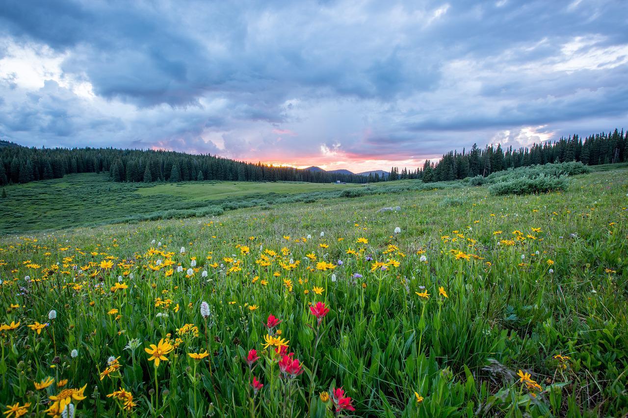
for this painting. So the reference
pic for today is a copyright-free pick that
I found from pixabay.com, which is basically a copyright free website for inspiration. So feel free to download this peak and use it
for today's class. It is linked below as well. So for this guy, I'm using cobalt blue. You can use any blue that you like in black and
white to begin with. And I'm using a big flat brush. So using that blue directly, I'm starting from
the very top and gradually lightening the
color as I move downwards. So just adding a bit
more white to the blue, rinsing off that color. I'm now trying to get some
of that light orange, pinky color that we
see at the horizon. So I'm using a
combination of magenta, light orange, red
and brilliant red. So they're basically red, orange and a pink if you're
using a different insight. So adding a bunch
of white to that, I'm adding simple horizontal
strokes to the horizon line. I'm just blending the
color a bit upwards so that it matches with
the blue sky above it.
8. Painting - Clouds: Alright, so now let's tackle
a bit of those clouds. I'm getting the midtone
of the clouds first, which means it's not
the lightest color or the darkest tone, but those middle colors
that we see in the clouds. So you can get that by simply adding a bunch of white
to the cobalt blue. I'm using a medium-sized
brush here, but you can use any round
brush if you would like. Simply dabbing a
few strokes here to get the base of the clouds. Now adding a bit of black
to this will give you some of those darker
tones we seen the PEC. And again, I'm just
applying that to certain areas underneath
the mid tones. As you get closer to the horizon and make sure
to keep your brush marks smaller and thinner to give their perspective
of distance. With a smaller brush to
those areas, if that helps. Nobody knows. Going slightly darker and
adding Taylor blue now to the cobalt blue with some
white and black to give me that deepen too dark tone that I see in the reference pic. So I'm just adding
a few strokes of that color wherever I see it. No. Going in with some
highlights now with plain white and adding that to
places I see in the picture. Just to brighten
up the sky a bed. Last but not least, I'm taking a bit of that light pink color we
made earlier and adding a few tiny strokes
to that to only some of the clouds to
make it all blend well. Let's give the clouds
arrest and move on to the exciting parts of this
flower field landscape.
9. Painting - Landscape: It's now, I'm going to be using three different greens here. So starting out with
chromium oxide, green, with a bunch of black
to start our landscape. Using that same color at
the bottom as button. Now, using light sap
green and yellow, green, I'm going to fill out
the middle ground, starting with light sap green forest at the top and
then at the bottom again. Now, taking that yellow, green, white and a bit of the light sap green
all mixed together. I am covering the middle
portion of this foreground. Do not forget to blend the
edges when you are all done.
10. Painting - Grass & Background: I'm taking a smaller
filbert brush. Let's add some texture to the landscapes so that
it does not look flat. Just a few little markings and color variations
will do the trick. So I'm getting some
white and black to the green base that we
already have on my palette. And just to kinda give me
this muted olive tone color. And I'm using that
color for us to add some grass to
the foreground. Holding your brush
straight up to create those vertical lines
for grass movement. Using that same color in
the middle ground as well to add some variety of
shapes in the distance. Going back to the
horizon part of the landscape and
using that same oxide, chromium oxide green
with some black to get distant tree-like shapes. If filbert brush
is great for this because it already has
that curve to the brush. So it helps to get
that tree-like shapes. I like using different
sides to the brush to get thinner and
more flatter shapes. So using the side of the brush will give
you that elongated, thin, thinned out to kind
of brush tree brush marks. And using the front
of the brush will give you more like
flat, big shapes. Using some white to
that oxide green now to give a variety
of impressions to the distance For
someone interests of time using some flat
horizontal strokes. A few watercolor
strokes here and there. Using that same color
mixture and adding thinner, longer, grass like
shapes in the front. So I've switched my
brush to a mall thin, thinned out, long brush. And I'm just adding a bunch of grass marks in the foreground. So really swift
movements here tried to kind of go quick with
your hand movements and just make quick little marks for grass like
impressions in the front. Here I'm using some
really dark green to also create some grass
movements in the front. Same thing here except using
a lighter green now for some variation in color
and depth to the grass.
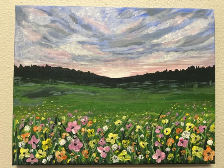
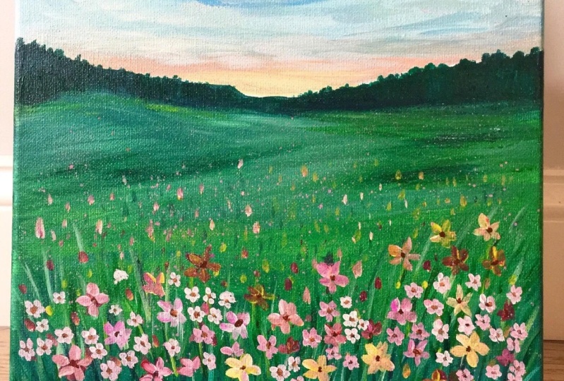
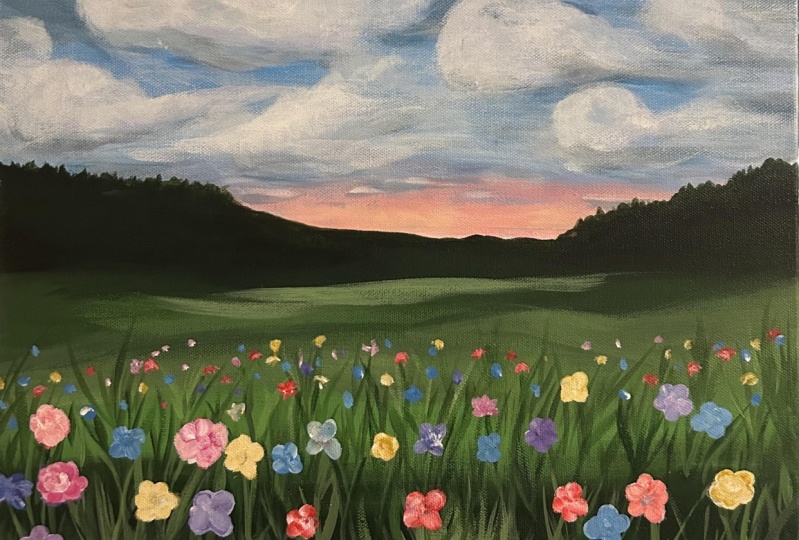
11. Painting - Flowers: All right, So let's begin adding these colorful summer flowers
into our landscape here. This is a lot easier
than it looks, and you will see
why in a minute. So I'm taking magenta
pink with some white and adding one stroke marks to
make these wild flowers. I'm using a tiny filbert
brush and make sure to hold your brush from the back handle to keep your brush marks loose. And then just keep adding short, simple quick strokes
to form the flower. When you take the white
along with the pink, do not mix the
colors completely. So ideally, you would want
your brush to visibly have both these
colors so that we can translate that
way on each petal. All right, So this
is basically it. I will repeat the
same process with different colors and just
move around the Canvas. Keep some of your flowers
small, while others bigger, especially keep them tiny
as you move further back towards the horizon to get the right
perspective in distance. So I basically add
a few specks when I work with these
flowers far back. And that will give
the impression of far away flowers,
little dots. So same exact process but
with a different colors. So now I'm using yellow and white to add a variety
of colorful flowers. Feel free to use
whatever color you fancy and just have
fun with this process. It can be quite therapeutic because this process
is so repetitive. So take your time and enjoy. Just to add a different
shape of flower here, I wanted to add some
dandelions to the painting. So using a white directly
and a pre-sold round brush, I'm simply tapping
on the canvas in a circular motion a few times to give the impression
of these flowers.
12. Final Details & Class Project: Using a long, thin brush, I'm filling in tiny black dots in the center of each flower. Lastly, I'm just going back
to the landscape at the back and adding some highlights
with a lighter green. Last final details are some splatter paint
in the foreground to give a more additional
lose feeling and impressions of
tiny, tiny flowers. This to me as a slightly
more natural approach and it just makes the
painting more unified. So using any rough
brush that you have taken some paint with more of water consistency and flick off the principles to
get the splatter effect. Do it carefully so that you
do not get this everywhere. And I will show you
how to clean up in case you get it in places
you do not want in a bit to fix or take away any of the scatter in places
you do not want. Simply go over that section
with the original color. Alright, so now that
we're finally done, Let's clean this off by
painting the sides canvas. This is a really important step and we'll pull your
painting together after. So I usually like to bleed the color of my painting
onto the sides. So you will see me switching my colors to blues
and greens mainly. This completes our lives
acrylic landscape for today. And I cannot wait to see what you guys come up,
share your projects. I would love to see them and do not forget to leave
this class in preview. If you've enjoyed this class, make sure to follow
me so that you do not miss out on future
painting classes from me. Follow this class
up with another one of my favorite landscape
real paintings. I have linked below
and I have tons of other similar projects
and classes like this. So do check them out. I do appreciate all the love and support I get from each and everyone of you from all my
orders lately. So thank you. And to shock my arts, to visit my website, to keep up with the latest news, and to follow me on
Instagram where you can stay up to date
with my new launches. Thank you once again
and happy painting.
 Alifya Plumber, Artist | Acrylics, Watercolors | Painter