Transcripts
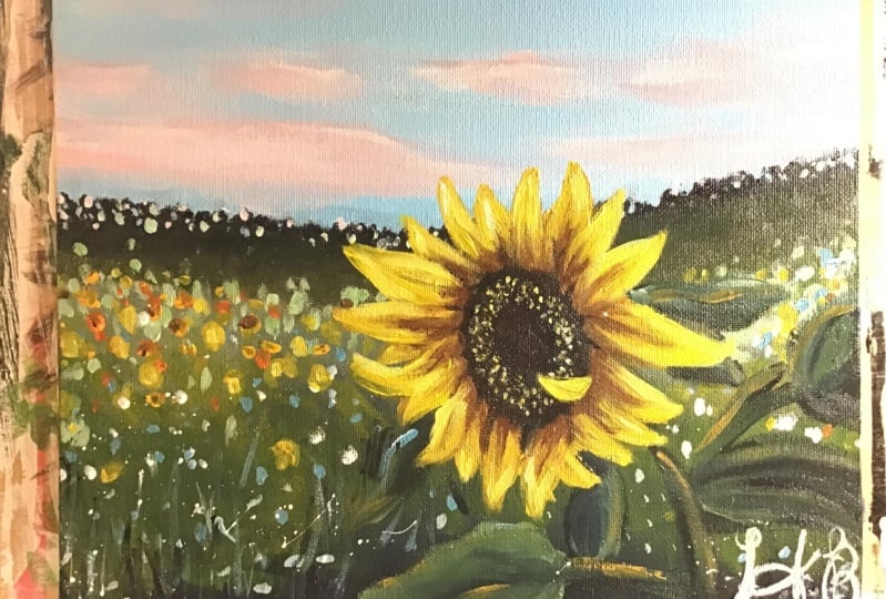
1. Introduction: Hello everyone. My name is Alicia and I'm an artist here in San
Jose, California. Today's class is all
those sunflower lovers. I will show you how to paint this lovely acrylics
and cyber painting. Following simple
steps and techniques, will show you all the
materials that you will need. Color mixing techniques,
brush techniques, an exercise on
dimension and form. We will then paint this acrylic
landscapes step-by-step. This class is great
for all levels. So let's dive right
in and begin.
2. Materials + Prep Canvas: Alright, so these are all
the materials that I've used able for water in napkin you need just so to prime your Canvas
before painting. And then some sort of pallet. Then I used an ten by
ten acrylic canvas. But you can use
whatever you have. As far as the brushes. Again, I'm going to zoom in
here so you can see better. I'm going to be
listing all of them in the project and
resources tab below. I'll try and link what I can, but there's an angled
brush, a flat brush. If you bristle brushes, and if you round
smaller brushes. Alright, and these are all
the paints that I've used. I know it's quite
a few, but I've mixed different brands here. I've used the Liquitex
acrylic basics, as well as the RTs are paying
palette set that I have. So again, I'm going
to list all the names of each of these pains in the project and
resources tab below. Alright, so like always, I'm first starting out with priming the Canvas for that extra
grip and paint application. Apply an even coat all over. Wait for it to completely dry before moving on
to the next step.
3. Exercise - Color Mixing: In this color mixing lesson, I will walk you through some
colors and show you how to mix colors to get a variation
of darks and lights. This technique can be applied with any color of your choice. So we will begin with
these four colors here, and black and white. I'm going to make
four columns here, one with the plain color
right off the tube, which will be in
the first column. And then I'll show you the different variations you can get by just mixing white
and then black. The last column will be a combination of these
colors amongst each other. Let's begin with
this darker green, which I believe is because green acrylics Liquitex basics. So here's what you get when
you mix in some white. As you can see, there's
a huge jump between the original color of this
green and then this one. And of course, you can
control the lightness of your green depending on how
much white you mixing. Mixing in some black can really give you some really
nice dark tones. And again, you can
totally control how much dark you want your
colors to lead to. So depending on how in
which black you add, you will, you can change
up the different tones. And if you want to mute
this color a bit more, adding some white and black to the screen can
give you just that, which I have on my absolute
favorite colors to mix. So remember if you want
to tone down any color, mixing some white and black to any original color can just can give you that
really nice muted tone down version of the
existing color. Here I'm adding
some more white and just a tiny bit
of black but more white to show you the difference you can get
in this version as well. Alright, so I will be repeating the same steps and
all of these colors. I'm going to just speed
this up a little bit, but I just wanted to
point out how you can get so many different colors by not using that
many colors at all. To begin with, the
variations that you can get from each
color are endless. These are just a
few basic examples and I'm able to show you, but feel free to practice with some color mixing techniques if you are an absolute beginner, these can be super
useful and handy. And before you know it, this will be second
nature to you. When you've only need to
reproduce a certain color, you will know
exactly off the bat what makes an order to
get that exact color. Alright, so, so far we
have only introduced white and black to
an original color. But now I'm going to show you even more deviations and
options that you can get by mixing our original
colors that we have together. For example, what happens when
you mix both these greens together or mixing the
slide queen and raw sienna, or maybe even raw
sienna and blue. You get the idea. So let's try some of that
to see what we can get. So here I'm mixing in both these greens with
some white and black, which creates this grayish tone. Then if you mix more of the
darker green hookers green, you'll get an in-between
green from the top. Here you can see mixing
the light olive green with why sienna gives you this
really nice warm tone. Whereas mixing some
black to that will give you a muted cooler tone. Roseola and tailor
blue will give you a somewhat sap green color
with some warm tones in it. And then mixing white that
gives you a muted olive green. But I'm hoping this exercise can help you understand the depth of colors you can get
by mixing them together and just playing
around with them. These next two colors are some of my absolute favorite
colors to paint in. And I often use these colors quite a bit in all my paintings. So if you're interested,
I got this color by mixing in hookers, green, pale blue,
some white and black. And then this next one. If you take that
exact same color, I'm mixing a little bit
of raw sienna in it. You will get this muted
version of the one on top, which is just so beautiful. Here's an example of these
colors applied to a painting, and you can tell how some of these colors have been
used in this landscape. So in order to build
dimension and depth, you need to have these
variations of colors in order to make your
painting not look flat. So play around with color
mixing beforehand to give you a sense of colors you can get from a limited
color palette. And this will really
help you visualize how you can use these colors
in your painting.
4. Exercise - Brushwork: Alright, so now let's dive
right into some brushwork. I'm going to show you the
different marks you can make with my most commonly
used brushes. And I'll show you how
I apply and use them. Let's first begin
with the flat brush. This one's super
basic and clean. I use this one for the sky and you can get simple
flat washes with this one, but extremely thin lines if you use the tip
of it as well. Hello Lee, the smaller flat
brush works just the same. And I use this for simple
flat washes for my landscape, especially when I block off
colors in the first step. Like mentioned, these
next two brushes are my most used and amongst my favorite
to paint landscapes. They are very versatile
and are great for that loose style landscape
paintings which we love. You can get really great, clean like flat
strokes with this. I love painting this. When I am painting
like huge mountains are just going to
block in shapes. I love using this brush to
block in the initial stages. This brush is also
great for layering paint on top of one
another as well. If you change the direction of the brush and
hold it vertically, you can get arch like shapes
that can be used for bushes, trees and loose objects. Because of the brushes
arch like shape. It is great for bushes and hence really great
for landscapes. Using the side of the brush or its tip can also be very useful to paint faraway
trees or houses, etc. And overall, it's just
really great for detailing. The smaller size. Full brush is great for smaller bushes and
objects far away. I use this long, thin brush in every
single painting, which I mostly bring up
at the end for detailing. So whether I'm painting
florals or landscapes, I always bring this
out at the end. This brush can really add some visual interests with
just little tiny marks. Today's painting, I use
this brush for the grass. I gave it some highlights and just little tiny marks far away. This can also signify and give impressions of little
objects far away. So maybe even houses or animals. I even actually assigned
my art with this brush. If you are wondering
how I assign them, it's always with this
brush at the very end.
5. Exercise - Dimension & Form: In this lesson, I'm going to
go over dimension and form. A form is a
three-dimensional figure as opposed to a shape being flat. And how would you add
a fall onto an object? Well, in painting, you can
do that by adding color. In this example here
we have dark tones, mid tones, light
tones, and highlights. This is exactly what
you need to turn a flat object and give it
some dimension and form. I'm going to show you
how I'll be using red, black, and white to
demonstrate this. So first, I'm going to block
in the shape with just plain red so that we can
have a base to start from. This right here is an
example of a flat 2D object, which we will now turn into
a three-dimensional shape. Now, I'm going to start
adding in my mid tones. So I'm going to add
some black and whites to the red to create that. To get my dark tones, I'm going to add some more
black and fill in that edge. So now we're going to
take these two colors and blend them in-between. You can already see how
this is forming a shape. Okay, now let's add in some light tones by
mixing in some white. Notice how I'm painting in
the direction of the ball. Not just painting
this up and down, since this is a round shape, you want to kind of
paint in that curve. I'm just going to
go back and forth in between my dark tones, mid tones and light tones until I'm satisfied and I
feel that this looks good. I'm just giving it a
rough background so that it doesn't feel like
this is just floating around. Alright, and then
for the highlight, I'm going to take a lot more
white and a tiny dab of red. So a quick recap. Dark tones are
achieved by mixing your original color
with some black. And then the more
white you mix in, you will get a gradient. So you can see how
you can move from a dark tone to a mid
tone to lighter ones. And then your highlights.
6. Painting - Background First Base: So let's dive right into
paintings or I'm using Liquitex basics here and
getting out to black, hookers green, yellow Oxide, and
white to begin with. Using a medium-size
bristle brush. I'm starting at the bottom
there directly with black. I wanted the bottom
section to be slightly more darker than what we
see in the reference. I'm being very quick with
my brush marks here, making sure to add application
on both directions. I'm moving my brush in both
directions quite a lot. This is going to
need the backgrounds that won't be too much in focus. I want all my attention
to be on the sunflowers, so I'm intentionally
keeping the background rough and somewhat blurred out. I've mixed in a bit of green and white and added that in here. Now I'm getting in some green
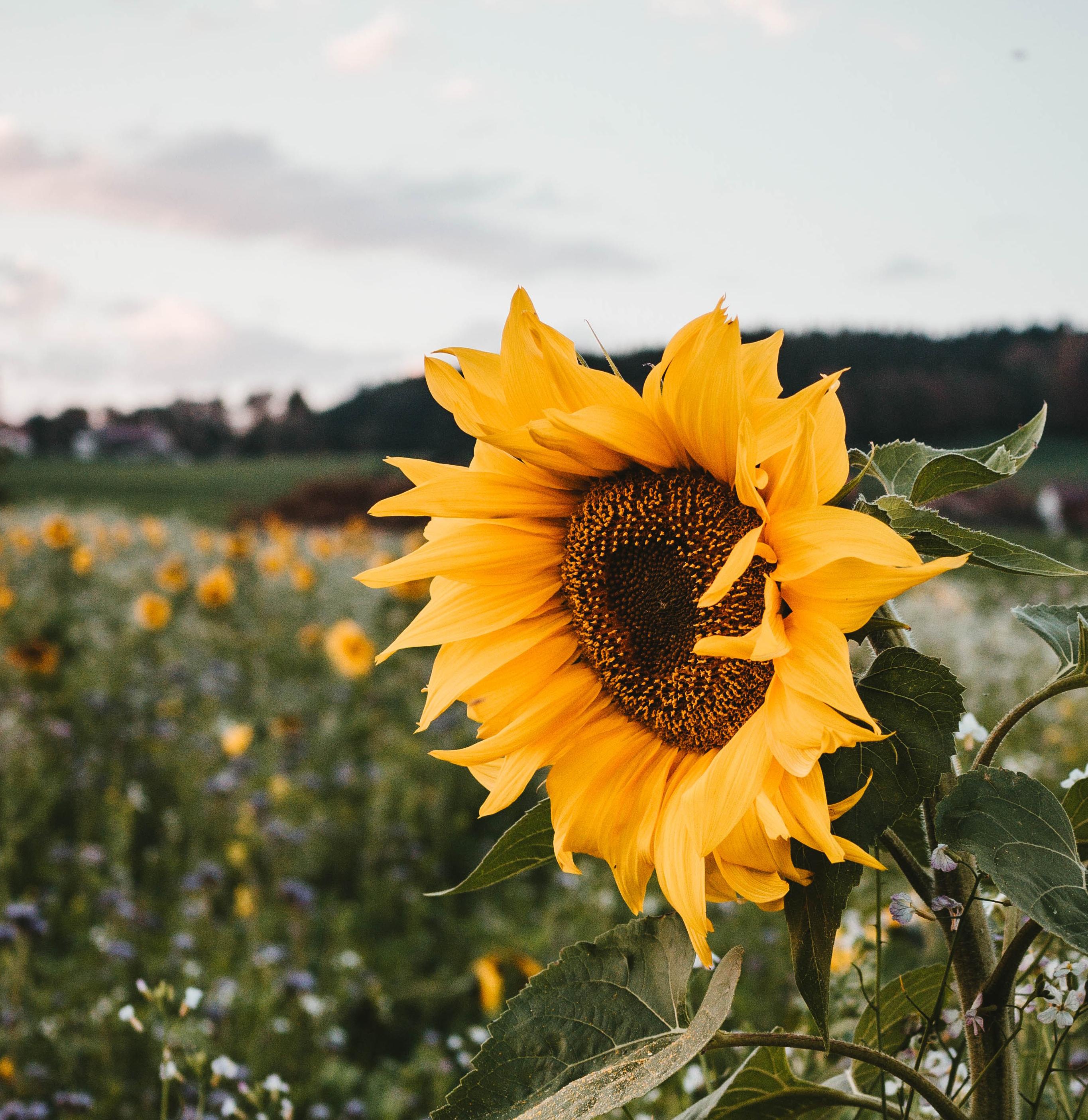
and yellow oxide as well. The reference pic is provided in the projects and
resources tab below, and it is if we pick download, so feel free to
use it as a guide. I'm progressively going a little dark to light as I move upwards. So adding in some white to
the green now for the top, rinse off that brush
and wipe it clean. And now we're going
to start with the mountains or the hills
as we see at far back. I'm taking in black and
Hooker's green and using the same brush and making a slightly slanted
line across there. I love using this bristle
brush because it gives me that uneven outline of the mountain
that I'm going for. This will enhance that far
away blurred out visions. So I'm using the flat side of the brush directly and
dabbing it likely. You I'm just using
the side of the brush to give impressions of
taller trees or bushes. Alright, so now
I'm going in with green and white and
a tad bit of the yellow to paint directly
underneath the black mountain. Same brush technique
here is using it straight on from the
flat side of the brush. I have switched my brush to
a filbert bristle brush. Alright, so now I'm taking in the color light green
and I will be mixing that with the hookers green
along with the yellow Oxide. Make sure to hold the brush from the back handled to keep
your brush marks loose. So I'm still using both sides
of my brush and applying this evenly so that we don't have the
background in focus. Because I don't want it very
smooth line on the top here. I'm adding that same color to
the edge to make it blend. Some, applying it quite dry
so that the lines blur out. I'm going to be
using a few colors from the RT is a
pan set as well. So I'm taking in yellow and deep yellow and just loving and
deep yellow directly here. And just random places to
fill up the middle ground. Remember, the goal here is not to have the background in-focus. That's the reason I'm not
painting smooth lines or giving it too much,
too much detail. It will make more sense once the background is
completed. I hope.
7. Painting - Sky + Background : Let's give the background
a bit of a break. We will come back to its own. And let's now move on to the sky so that we can just fit
more pieces together. So here I'm using the color sky blue with lots and
lots of white. And I've also switched out my brush to a
medium-sized flat brush. I'm just getting in and even
flat code to begin with. I want to keep this guy quiet, clean and minimal and mainly just have all my focus
all in the sunflower. I will be getting just a
few clouds here in a bit. Alright, so I'm using a small round brush now and
the same color for the sky. And I'm dabbing in
that color around the edge of the mountain
in a few spots, keeping this in a somewhat
circular dot shape. So what this does is that
it gives the impression of blurred out objects and gives you a perspective
of distance. Just make sure to
keep these dots small since it is
the furthest away. Adding in a few dots off this light green color mixture here that I have on my palette. And I'm also adding in those
little dots downwards. You can vary in your sizes. So some of them can be small while others slightly bigger. And feel free to also be in slight color
differences as well. But nothing too drastic. Yesterday was beauty and
I'm also adding these dots to the middle ground as
well as the discard. Something. Please go on a tip toe. Beyond, grab the castle. Reaching further or craft. Checkout. Agents beyond draft. Alright, so now I'm switching
up the color and I'm getting in some yellow and adding a few dabs of that
to the middle ground. This will give the
impression of flowers in the background that
are not in focus. We go agent, doing the same with
the color orange, yellow, which is
basically an orange. And adding that into
the painting field. But I'm only adding in a speck
of this color to some of the yellow dots just to give impressions
of the flower bud, as you can see in the
reference as well. And to enhance that, I
will be adding in some orange and black mixed in
together to make a brown. And I'm just going to
add those little specks in the center of some
of the few orange, the orange, yellow dots. Alright, so I'm going
back to the sky. I'm pulling out this color
called scarlet red and adding tons of weight to it with my medium flat brush again. So I'm keeping the clouds super
simple and less dramatic, but only adding enough
color for interests. Adding in a few streaks
back-and-forth. Just to add in some dimension, I'm mixing in the tiniest
dab of black into this mixture to create the
shadow part of the Cloud. Adding in a few streaks of
that to the top here as well. I love adding a bit of the reflection of the sky
and to all my paintings, I'm just getting in that same pinkish cloud
color and just randomly, only in a few places. I'm adding those circle dots that'd be made earlier as well. Helping the clouds
off with clean white for that extra highlights
just in the center here. And we are officially
done with this guy.
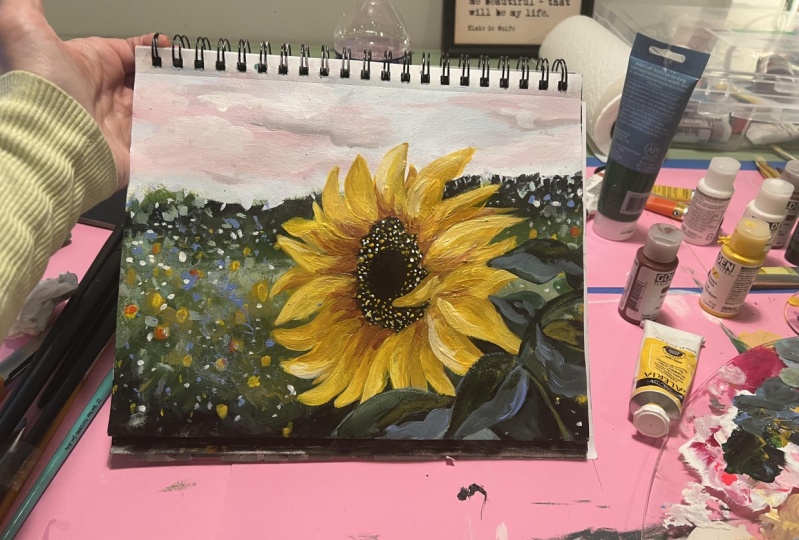
8. Painting - Sunflower Base: Ready, so now to the fun part, the part that we've all been
waiting for, the sunflower. We are not done with
the background yet, but we will come
back to it later. But first the sunflowers. So I am using a angled brush
for this and taking out burnt sienna with some black to start with the
center of the flower. Starting with a bug
puts your shape in place and it's easier
to go around it. I know some people start
with the petals first, but I found this
way a lot easier. It acts as a nice guide to surround your petals around so you can get the right shape. So let's begin the base color
of the flower petals here. So at this point, I'm mainly focusing on the shape
and not so much color. I'm mixing any other oxide
with a bit of that red. And looking at the
reference carefully, I am using that to paint from. If this feels overwhelming
and take it one petal at a time and simply
work your way around. Oops, I got some paint on
my sky, but not to panic. I've always said that
acrylics are very forgiving. You can paint over layers
and take care of it. I made sure to get a
clean bowl of water, the napkin, and I just wipe
that off. Okay, Great. And I'm gonna go back into
painting a sense hour. So again, carefully
following the reference, I am picking up
from where I left off and following the shape. I didn't like how that second
petal locked in words, so I decided to only
add one instead of two.
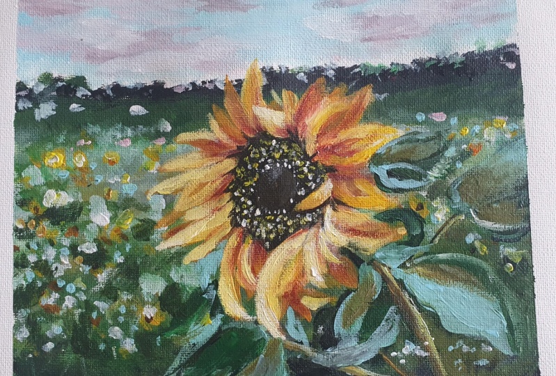
9. Painting - Sunflower Details: Perfect, So now that we have our main shape down
and our base color, the hardest part of
the South Tower, in my opinion, is dealt with. So we now only need to
spruce this up by giving it a three-dimensional
look and adding in more color and
layers step-by-step. So here I'm using
deep yellow and white and adding that
color to each pedal. Not completely covering it up, but making it an
addition instead. Time to introduce
another color in here. So I'm taking in orange, yellow, and a small round brush. I'm mixing in the orange, red, brown to get this warm buoyancy. And I look, and I'm using
that color to define some of the edges as well as
the bottom of each petal. So getting that color
at the base and then pulling it upwards
to make it blend. Again. Take your time with this. Take it one petal at a time. What this does is
that this color specifically will
help to separate each pedal and it'll give it
like an individual shape. Okay, so now I'm
pulling out that angled brush again
and taking in some yellow now to mainly add to the tips of the petals
as a highlight. So even if you look
at the reference, you will notice that the
tips of each petal on the sunflower is like a light yellow compared
to the base. Here. I'm also
simultaneously using a small round brush to blend the yellow
color that I added. I find that easier at a time. That's convenient to you. You can hold two
brushes and then as soon as you apply
your big stroke, Use your desk, the round brush to kind
of blend the edges. Child can ****** or for the bad in the chat. How much stronger? Don't give up. Just hold on. Be nice view of trying to be a good answer. Did everything matches? Jewish? Did send it to you and it has snapped. They just don't give up. On the chat. As a last highlight
to the sunflower, I am taking in white and yellow this time
and I'm being very selective with this
color and applying just a few strokes to
only a few petals. Cleaning off the center. But here I'm taking
in black and brown to go around the edges to
define it slightly. I'm also using the
brown color to go in-between the base
of a few petals. So I'm just going
in between there and pulling out
that color upwards. Alright, so now I'm going
in with my fine brush again and adding a
cluster of small dots, specs to the center with yellow. Topping it off with a few
specks of plain white as well.
10. Painting - Leaves: Now it's time to get back
to the background and add some leaves and foliage and just bring
everything together. So I'm starting with the
stem using black and green. I'm just getting the base shape. I have all my leaves. I'm just using a plain color. And just kinda looking at the reference and
following the shape. Using that lighter
green color to define some of the
edges and shape more. I'm pulling out
light blue violet in the Liquitex basics
sense and adding this color as gay muted pop and to pull the piece
and background together. So I'm still using
the angled brush. And I'm mixing in the blue
color with hookers green, and adding that to the
lighter parts of the leaves. I don't usually have
a very strict regimen when it comes to the
leaves and foliage. I really just go with
the flow and use these colors and shapes
as an expression. So I'm looking at the composition and
placement of things. And I add colors loosely, two places I think
compliments one another. I hope that makes sense.
So feel free to add your own flavor to your
leaves to make it your own. Here I'm just giving my
stems and the use of that sunlight glow by adding
some yellow Oxide.
11. Final Details + Class Project: Using my round bristle brush, I am using that light
violet blue color directly now and adding a
few dabs of that, the background for impressions
of tiny blue flowers. I'm not sure if you can see that in the reference as well, but I can see a very light sort of like bluish purple
flowers in the background. Tapping my brush
like so we'll give you a tiny splattered
paint effects. So I'm just adding that
to the foreground here. Adding some dots with white now to create this
beautiful flower field. To blur out some of the flowers, I'm adding a watered
down version of the white paint
and circular dots. Last few steps here to bring
the background together. I'm taking in a
watered down version of the black and just bringing out some of this shadow beds that I wanted my
background to have. So I'm using a thin long
brush and almost like scribbling that onto the
canvas in a few places. Last but not least, I'm
accentuating some of these blurred out flowers in the background by making
some of the shapes bigger. So I'm using deep yellow but with more water
and less paint. And I'm just adding in a few circle like shapes
to the background. From the place bending
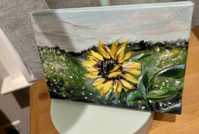
with somebody. We cannot finish off
this piece without painting the edges
of the canvas. This step is really important. I will surely just
clean up your painting and making it look a
lot more appealing. I usually like to
paint the edges by dragging out the dominant
color of that side. And just painting
it's dark color. To make the stems
pop a bit more. I'm adding a light
yellow to the edges. There. There we go. This completes our acrylic
sunflowers for today. Hope you enjoyed, and
I cannot wait to see what you'll come up with,
share your projects. I would love to see them and to not forget to
leave this class. It will ask me any questions in the
discussions tab below. I invite you to explore the different classes
I had created for you. Classes and
watercolors, as well as acrylics are available if
you want to learn more. So do consider following
me so that you do not miss out on future
painting classes from me. Follow this class
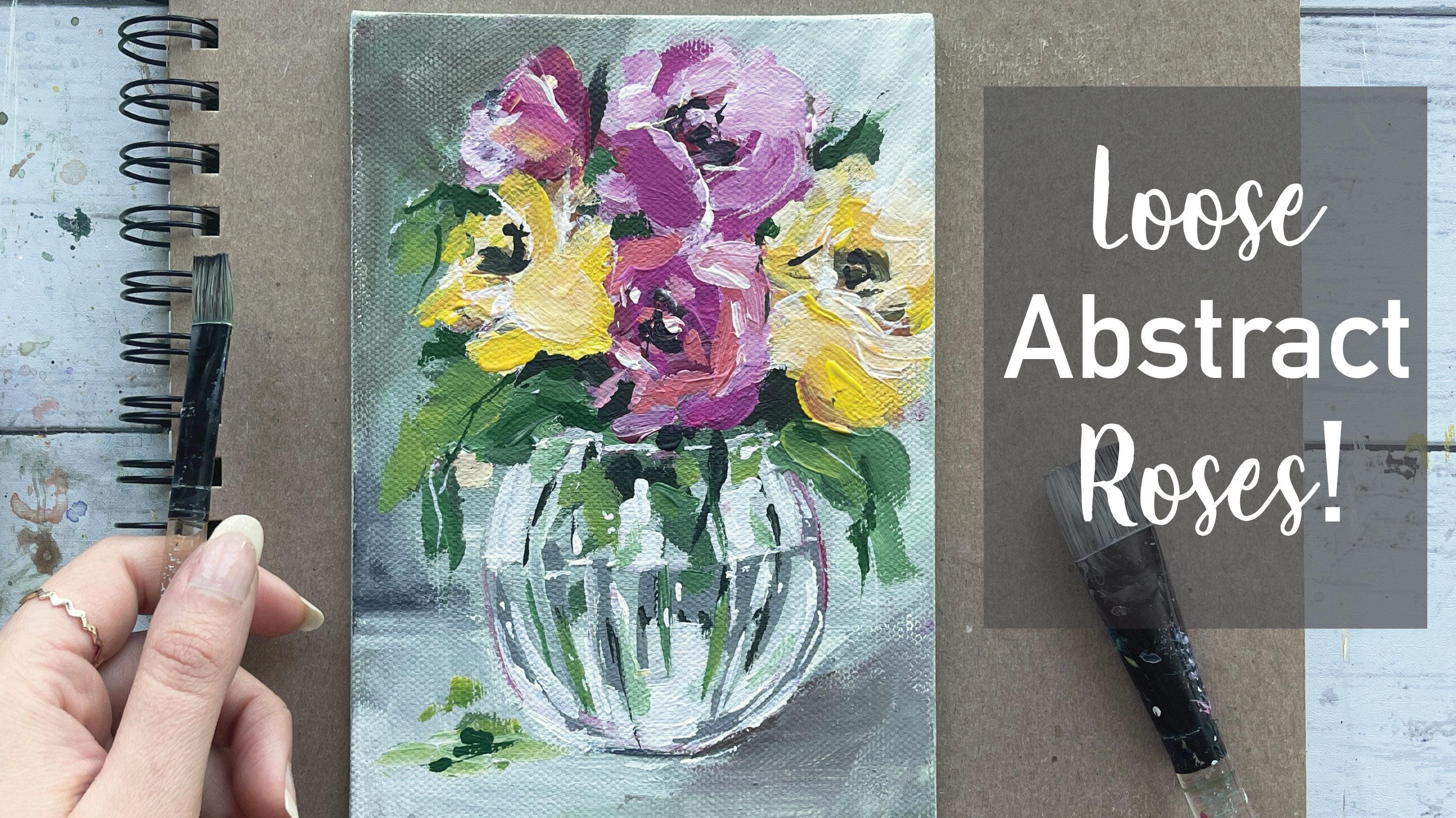
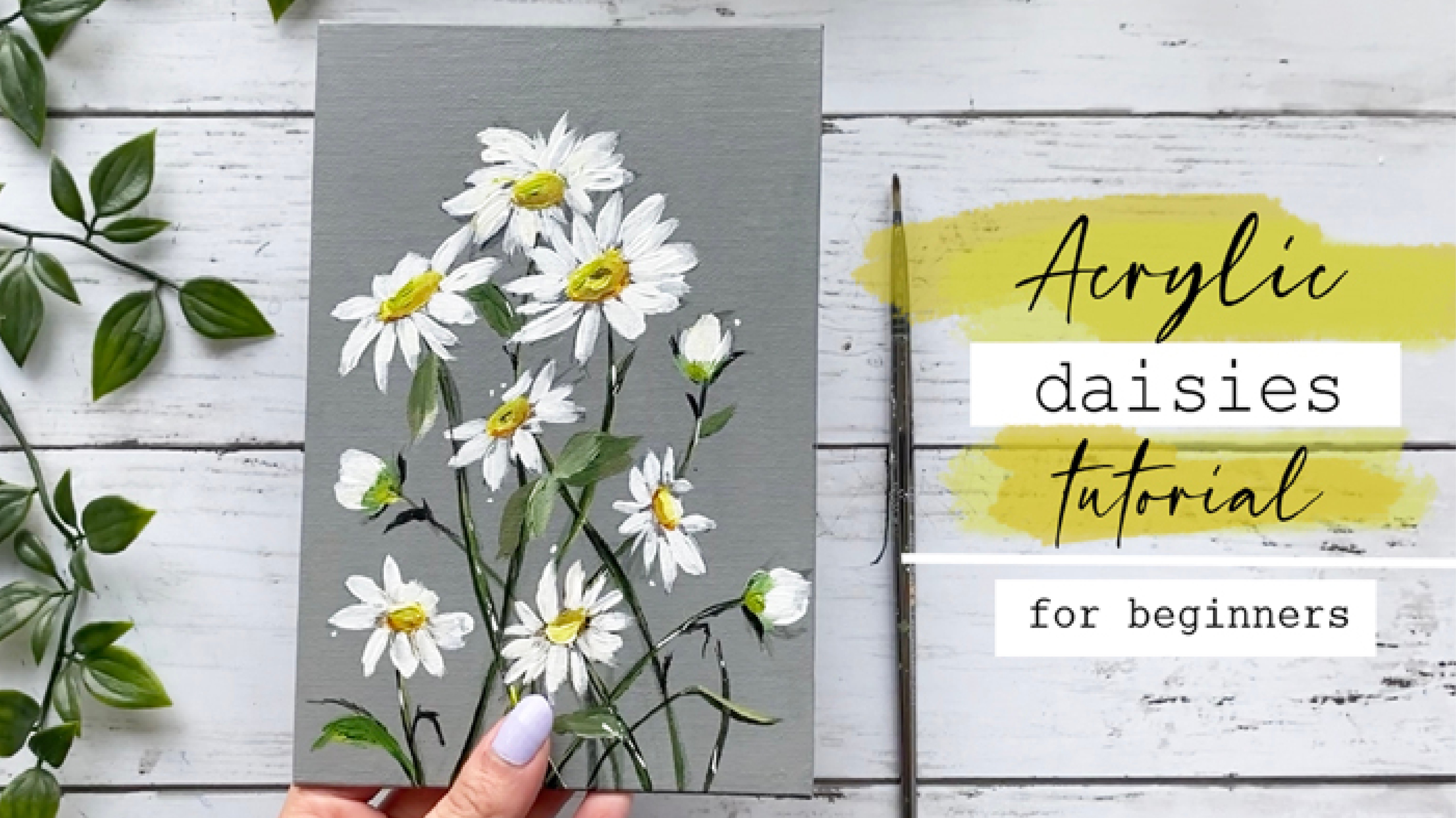
up with another rose painting that
I have up already. I also have some few
Daisy paintings. I'm going to link some of
my flower classes below. I do appreciate all
the love and support from each and every one of you
from my orders like these. So thank you. To shop my
art to do visit my website. Follow me on Instagram to
keep up with latest updates, giveaways and all
that fun stuff. Thank you once again.
And happy painting.
 Alifya Plumber, Artist | Acrylics, Watercolors | Painter