Transcripts
1. Introduction: Hey everyone, my name
is Alicia and I'm an artist here in San
Jose, California. Moving along our fault
addition painting series. In this class, I'm going
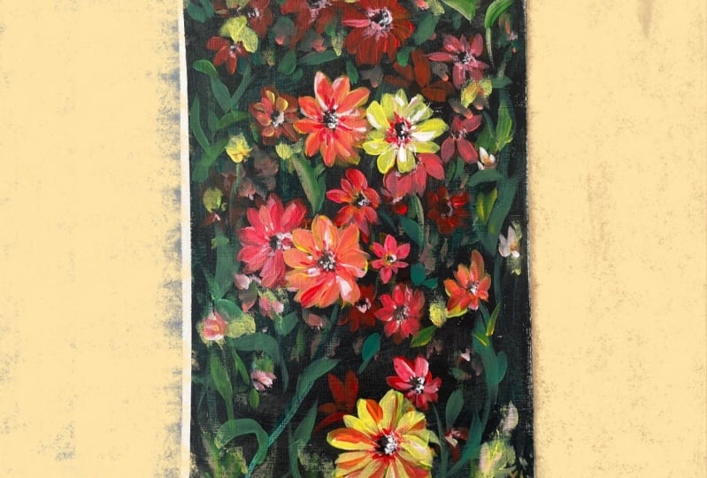
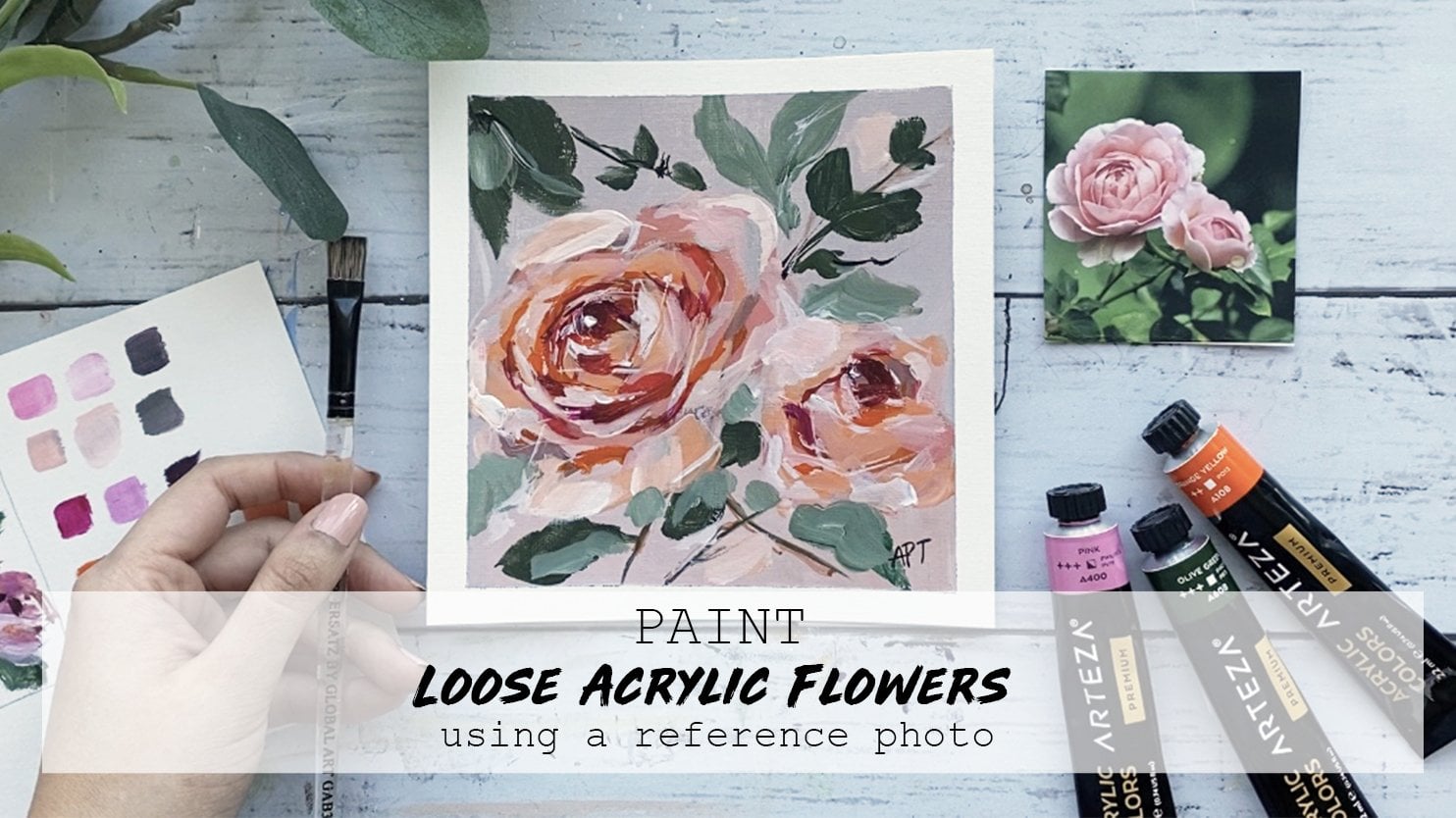
to show you how to paint this loose acrylic flowers following a lovely
reference photo, will walk you through this
painting step-by-step, will show you all the
materials that he will need. Color mixing techniques,
brush techniques, and an exercise on
dimension and form. I love how these Moody
had cozy colors are so fall appropriate and I'm so excited to paint
with you all. So let's dive right
in and begin.
2. Exercise 1 - Color Mixing: In this color mixing lesson, I will walk you through some
colors and show you how to mix colors to get a variation
of darks and lights. This technique can be applied with any color of your choice. So we will begin with
these four colors here, and black and white. I'm going to make
four columns here, one with the plain color
right off the tube, which will be in
the first column. And then I'll show you the different variations you can get by just mixing white
and then black. And then the last column will be a combination of these
colors amongst each other. It's, Let's begin with
this darker green, which I believe is
called it goes green and acrylics Liquitex basics. So here's what you get when
you mix in some white. As you can see, there's
a huge jump between the original color of this
green and then this one. And of course, you can
control the lightness of your green depending on how
much white you mixing. Mixing in some black can really give you some really
nice dark tones. And again, you can
totally control how much dark you want your
colors to be two. So depending on how
much black you add, you will, you can change
up the different tones. And if you want to mute
this color a bit more, adding some white and black to the screen can
give you just that, which I have on my absolute
favorite colors to mix. So remember if you want
to tone down any color, mixing some white and black to any original color can just can give you that
really nice muted tone down version of the
existing color. Here I'm adding some more white, just a tiny bit of black, but more white to show you the different variations you can get in this version as well. Alright, so I will be repeating the same steps and
all these colors. So I'm going to just speed
this up a little bit, but I just wanted to
point out how you can get so many different colors by not using that
many colors at all. To begin with, the
variations that you can get from each
color are endless. These are just a
few basic examples and I'm able to show you, but feel free to practice with some color mixing techniques if you are an absolute beginner, these can be super
useful and handy. And before you know it, this will be second
nature to you. And when you really need to
reproduce a certain color, you will know
exactly off the bat what makes an order
to get that exact. Alright, so, so far we
have only introduced white and black to
an original color. But now I'm going to show you even more deviations and
options that you can get by mixing our original
colors that we have together. E.g. what happens when
you mix both these greens together or mixing the
slide queen and raw sienna, or maybe even raw
sienna and blue. You get the idea. So let's try some of that
to see what we can get. So here I'm mixing in both these greens with
some white and black, which creates this grayish tone. And then if you mix more
of the darker green, hookers green, you'll get an in-between green
from the top. Here you can see mixing
the light olive green with why sienna gives you this
really nice warm tone. Whereas mixing some
black to that will give you a cooler tone. Raw sienna and tailor
blue will give you a somewhat sap green color
with some warm tones in it. And then mixing white that
gives you a muted olive green. But I'm hoping this exercise can help you understand the depth of colors you can get
by mixing them together and just playing
around with them. These next two colors are some of my absolute favorite
colors to paint in. And I often use these colors quite a bit in all my paintings. If you're interested,
I got this color by mixing in hookers, green, tail blue,
some white and black. And then this next one. If you take that
exact same color, I'm mixing a little bit
of raw sienna in it. You will get this muted
version of the one on top, which is just so beautiful. Here's an example of these
colors applied to a painting, and you can tell how some of these colors have been
used in this landscape. So in order to build
dimension and depth, you need to have these
variations of colors in order to make your
painting not look flat. So play around with color
mixing beforehand to give you a sense of colors you can get from a limited
color palette. And this will really
help you visualize how you can use these colors
in your painting.
3. Exercise 2 - Brushwork: Alright, so now let's dive
right into some brushwork. I'm going to show you the
different marks you can make with my most commonly
used brushes. And I'll show you how
I apply and use them. Let's first begin
with the flat brush. This one's super
basic and clean. I use this one for the sky and you can get simple
flat washes with this one, but extremely thin lines if you use the tip
of it as well. Hello Lee, the smaller flat
brush works just the same. And I use this for simple
flat washes for my landscape, especially when I block off
colors in the first step. Like mentioned, these
next two brushes are my most used and amongst my favorite
to paint landscapes. They are very versatile
and are great for that loose style landscape
paintings which we love. You can get really great, clean like flat
strokes with this. I love painting this. When I am painting
like huge mountains are just going to
block in shapes. I love using this brush to
block in the initial stages. This brush is also
great for layering paint on top of one
another as well. If you change the direction of the brush and
hold it vertically, you can get arch like shapes
that can be used for bushes, trees and loose objects. Because of the brushes
arch like shape. It is great for bushes and hence really great
for landscapes. Using the side of the brush or its tip can also be very useful to paint faraway
trees or houses, etc. And overall, it's just
really great for detailing. The smaller size. Full brush is great for smaller bushes and
objects far away. I use this long, thin brush and every
single painting, which I mostly bring up
at the end for detailing, whether I'm painting
florals or landscapes. I always bring this
out at the end. This brush can really add some visual interests with
just little tiny marks. Today's painting, I use
this brush for the grass. I gave it some highlights and just little tiny marks far away. This can also signify and give impressions of little
objects far away. So maybe even houses or animals. I even actually assigned
my art with this brush. If you are wondering
how I assign them, it's always with this
brush at the very end.
4. Exercise 3 - Dimension & Form: In this lesson, I'm going to
go over dimension and form. A form is a
three-dimensional figure as opposed to a shape being flat. And how would you add
a fall onto an object? Well, in painting, you can
do that by adding color. In this example here
we have dark tones, mid tones, light
tones, and highlights. This is exactly what
you need to turn a flat object and give it
some dimension and form. I'm going to show you
how I'll be using red, black, and white to
demonstrate this. So first, I'm going to block
in the shape with just plain red so that we can
have a base to start from. This right here is an
example of a flat 2D object, which we will now turn into
a three-dimensional shape. Now, I'm going to start
adding in my mid tones. So I'm going to add
some black and whites to the red to create that. To get my dark tones, I'm going to add some more
black and fill in that edge. So now we're going to
take these two colors and blend them in-between. You can already see how
this is forming a shape. Okay, now let's add in some light tones by
mixing in some white. Notice how I'm painting in
the direction of the ball. Not just painting
this up and down, since this is a round shape, you want to kind of
paint in that curve. I'm just going to
go back and forth in between my dark tones, mid tones and light tones until I'm satisfied and I
feel that this looks good. I'm just giving it a
rough background so that it doesn't feel like
this is just floating around. Alright, and then
for the highlight, I'm going to take a lot more
white and a tiny dab of red. So a quick recap. Dark tones are
achieved by mixing your original color
with some black. And then the more
white you mix in, you will get a gradient. So you can see how
you can move from a dark tone to a mid
tone to lighter ones. And then your highlights.
5. Materials & Prep Paper: These are all the
materials that I've used a role for water. I've used Gesso
Primer like always, and the same tape
that I always use as well to tape the edges. Acrylic Strathmore paper, I cut mine into a five by seven. And then these are all
the brushes you just need any flat brush to paint
the background, doesn't. It's not really that important. This brush though I use for pretty much my entire painting. It's a number three
Princeton round brush. Then these are just some
other brushes I use here and they're flat brush. And then, and then
a number to round brush for fine details
along with a filbert brush. Again, I have listed and named all of them in
the description below. Alright, and then you obviously need some
sort of palette. And I use a glass
palette, the scraper. And then these are all the
paints that I've used. The top three are the ones
that I use for the flowers. So a brilliant red, orange, red and yellow along with
burnt sienna, Taylor, blue, and green, and of
course white and black. So to begin, I am prepping
the paper down which ISO, which is basically a primer. And it just perhaps your
Canvas before painting. You can choose to thin this down slightly
if you would like, or just use it directly off
the tub, which I prefer. Then maybe dab
your brush once or twice in the water to
make it spread better. One or two, even coats
should be enough. And once you're done
with this step, we will move on to
the taping section. Like always, let's begin
taping down the paper and its edges to leave
us a clean border.
6. Painting - First Base Layer: So let's begin painting
the background first. And I'm using mainly black, but also a bit of Taylor Green with white in places
just so that it isn't too stark
black and we have some slight variation in color. Use any flat brush
that you have. And I'm just adding in some
dabs of black randomly. And then I'll be filling in the remaining gaps with
the green mixed in white. And of course blend all
these colors together. It does not have to be
extremely clean or neat. This is just a background that will mostly
be covered anyway. Taking a filbert brush
now and I'm using yellow, I'm diluting the colors just
with water a bit and using this for solely for placement purposes
of all the flowers. Try and follow the shape of the flower as best as you can, but it does not
have to be perfect. We will be adding in tons
of layers on top of this. So it's okay for now. I'm just going to look at the reference photo
and then follow the yellow flowers and place the base layers of that
wherever I see it. Some fingers, same
exact technique, but this time with orange. And I'm just going
around my painting and adding that color flower
to wherever I wanted. Lastly, I'm adding in
some red and adding just basically goes to
these flowers where I see the red and the
reference photo. You certainly don't need to add all the flowers
you see in the pig. But just do it as
much as you like based on your composition
you've come up with. Try and follow the
position of the flower and the size of it as
closely as you can. Here, I'm just filling
in the buds of these flowers with one
sienna and black so that we have a better visualization of the way these flowers
are supposed to be facing. This will really help
us with our next layer. So just get that center portion
of each club we're here.
7. Painting - Second Flower Layers: I switched my brush two and number three,
Princeton round brush. And we're just going
to be building layers on these flowers,
petal by petal. So I'm mixing in the
orange and yellow. And I'm just adding
that color to the orange flower
in the center here. So try and follow the shape of each petal as
closely as you can. Looking at the reference photo, It's okay if you can see some of your existing initial
layers underneath this. I actually liked the look and
it gives it more dimension and also builds to the loose abstract field
that I'm going for. Alright, so I'm doing
the same exact thing to the bottom flower here. I'm just building on
that second layer. I decided I wanted these two flowers to be
more on the orangey side. The top one on the
bottom here that I'm painting is gonna be
on the orange side. So take your time and just paint these flowers petal bipedal. You'll see me
adding these colors randomly to the background as well to pull it altogether and just to give the impression that these flowers in the background. Now, not every flower you
paint needs to be in-focus. So the ones in the
back are gonna be painted lighter and
with lesser details. So adding inspects of that color here and
there will do the trick. Okay, so for the last color
combo of these flowers, I'm going to take
the red and orange, and I'm going to build on
that as my second layer. So the red ones I see. You'll notice that this
process gets a lot easier if you take
it layer by layer, painting each flower
petals step-by-step, and just building
on each new layer with a new variation
of added color.
8. Painting - Third Layer To Build Structure: Alright, so I'm going back
in with a third layer now, and I'm building on each flower
bit more with more color. So I'm taking in some
yellow and orange, and I'm adding that
to each petal, to this yellow flower right here and also to the bottom one. And then this will help in
pulling out the colors a bit more if the layer underneath
is still translucent. So just go around and add an
additional layer if needed, to. All your flowers. Don't forget to add these
colors to the background. Just look tiny little specks
of it here and there. This will really help pull everything together at the end. Alright, so in the next few
layers you will really see this painting come more to
life with each added layer. So at this point, I would say we have a really strong
base and foundation, but we are still missing
some structures. So I'm adding in some
more definition in color and details will
bring that all together. Here I took in and I'm mixing
some red whites to get this beautiful pinkish
red tone to bring out some of those brighter reds
me see in the reference. So this is where
you can also add in more definition to
the drawing aspect of your flowers to make
it look a little bit more realistic and to
add some dimension. But I'm still
keeping the overall feel of this painting loose. I'm going in and adding
in a few petals of these red flowers
carefully by looking at the reference for
the position of it. I'm going in with
a light yellow, so I'm mixing in
yellow and white. And then building on
this with another layer. With every layer that you add, it is not necessary to
completely cover the old layers. In fact, that kind of
defeats the purpose. So always leave a
slight peak through your old layers to give you fibers more dimension and form. For the orange color
flowers, the side here, I thought it would
be nice to add a bit of a peachy tone to this. So adding in orange with the white and yellow will
give you that color. Sprinkling a bit of that, THE tone to the
background as well, to merge everything together.
9. Painting - Background Leaves: Before we add our final
details to our flowers, Let's finish off the
background with some leaves. First, I'm using a
bit of pale green, white, and a tablet of yellow. And I'm just using the same brown brush that we've been using for all the flowers. And I'm adding a few stems and just random leaves to fill up the space
in the background. Have fun with this
process and add simple leaf-like shapes
like you see me doing. So wherever you feel like it and keeps them off the stroke
small while others bigger. So just change them up so
that they look more organic. Just, just As mentioned. By a phase remains in the trees.
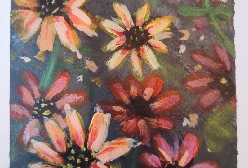
10. Final Details & Class Project!: Alrighty, So we're
almost near the end. But like always, fine details are immersed
in all my paintings, which I believe is the
most important aspect, which is the last added touch that pulls a piece together. So I'm taking a fine
detail brush, number two, round brush and
mixing in some red, orange and white to add little fine details
to each petal. So I'm starting at the base of the petal and just
pulling it upwards. So go ahead and add that detail to the main flowers
in the front. This is great to add
separation between each pedal. If some of them look all
clumped up together. Wow. Hello. Taking in some brown and
black to the center. But again, just to define
some of the edges a bit more, I'm also pulling those darks in some of the petals
upwards as well too. Again, this will add
in the separation a bit more with some
lights and darks. Last but not least, I'm
going to finish up with adding final highlights to
the flowers and background. So I'm taking in some
light yellow and adding it to a few petals
for that extra pop. I'm adding that pop of color to the background as well,
just a few specks. Similarly, taking
in white and orange and adding that pop of color
to the orange flowers. And I will be following
up with few specs and daps to the background
too, to mix it all in. Getting those little
spikes we see in the middle of each
flower bed with yellow. And we will be done. Time to peel off this tape to
reveal our final painting. If you followed me
so far. Well done. I can't wait to see
what you came up with. There we go. This completes
our fall edition, acrylics hours for today. Hope you enjoyed, and
I cannot wait to see what you'll come up with,
share your projects. I would love to see
them and do not forget to leave this
class interview. Ask me any questions in
the discussions tab below. I invite you to explore the different classes
I had created for you. Classes and
watercolors as well as acrylics are available if
you want to learn more. So do consider following
me so that you do not miss out on future
painting classes from me. Thank you so much for
your support over at my website and
also my Etsy shop, you can find original art
prints and much more. The links are below. As always, follow me on Instagram to keep up
with latest updates, give obeys and all
that fun stuff. Thank you once again.
And happy painting.
 Alifya Plumber, Artist | Acrylics, Watercolors | Painter