Transcripts
1. Introduction: Hey everyone, my name
is Alicia and I'm an artist here in San
Jose, California. In today's exciting and
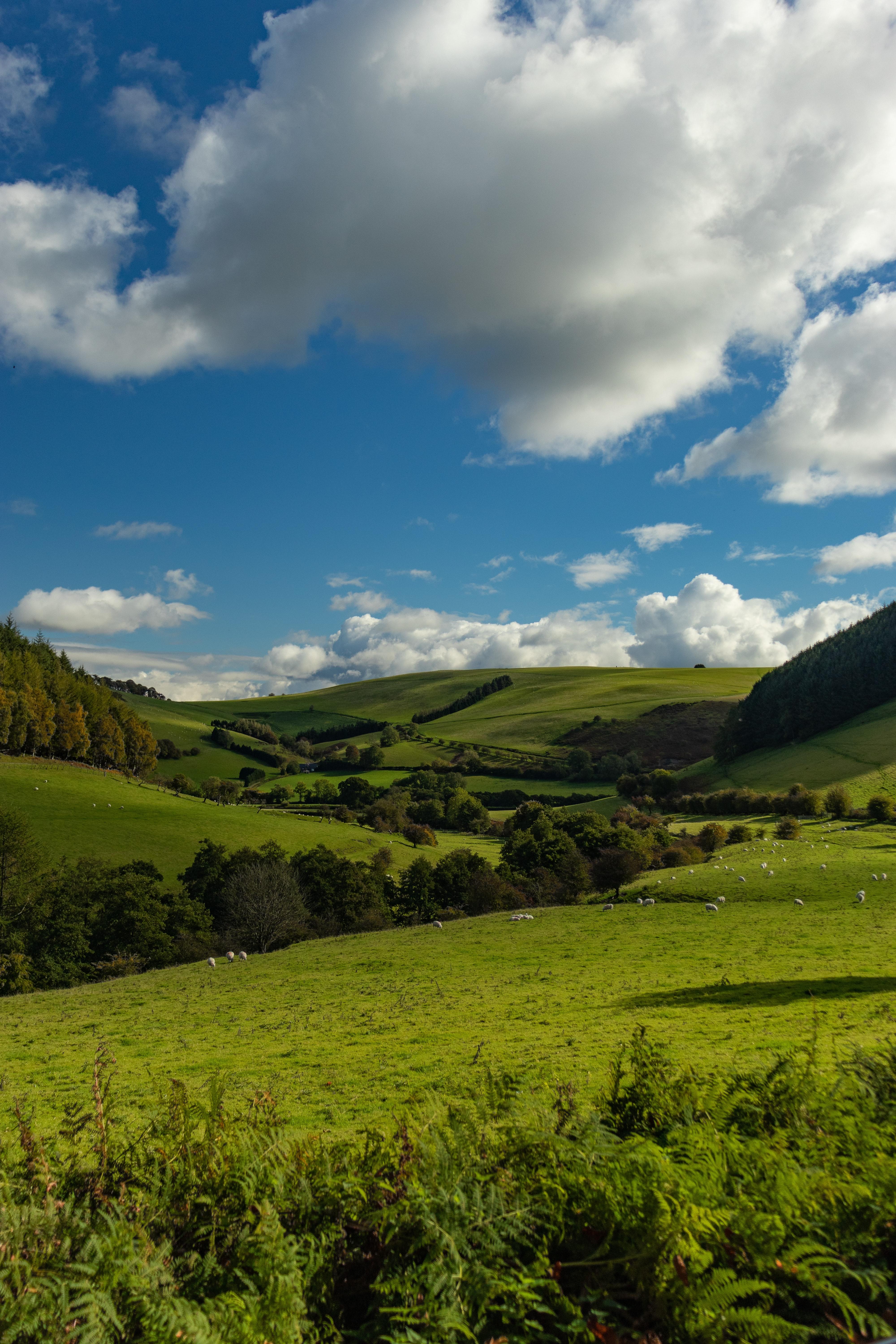
fun painting class, I will show you how to paint in a loose acrylic landscape using a reference photo while
still making it your own. Learn valuable skills and
breaking down shapes, great for beginners and beyond, will walk you through
this painting step-by-step will show you all the materials
that you will need. Color mixing techniques, brush techniques as an exercise
on dimension and form. Alright, so let's get started.
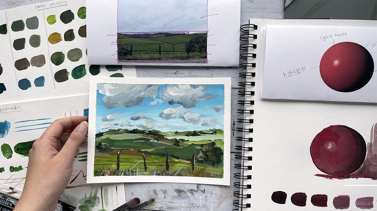
2. Exercise - Color Mixing: In this color mixing lesson, I will walk you through some
colors and show you how to mix colors to get a variation
of darks and lights. This technique can be applied with any color of your choice. So we will begin with
these four colors here, and black and white. I'm going to make
four columns here, one with the plain color
right off the tube, which will be in
the first column. And then I'll show you the different variations you can get by just mixing white
and then black. And then the last column will be a combination of these
colors amongst each other. It's, Let's begin with
this darker green, which I believe is
called it goes green and acrylics Liquitex basics. So here's what you get when
you mix in some white. As you can see, there's
a huge jump between the original color of this
green and then this one. And of course, you can
control the lightness of your green depending on how
much white you mixing. Mixing in some black can really give you some really
nice dark tones. And again, you can
totally control how much dark you want your
colors to be two. So depending on how
much black you add, you will, you can change
up the different tones. And if you want to mute
this color a bit more, adding some white and black to the screen can
give you just that, which I have on my absolute
favorite colors to mix. So remember if you want
to tone down any color, mixing some white and black to any original color can just can give you that
really nice muted tone down version of the
existing color. Here I'm adding some more white, just a tiny bit of black, but more white to show you the different variations you can get in this version as well. Alright, so I will be repeating the same steps and
all these colors. So I'm going to just speed
this up a little bit, but I just wanted to
point out how you can get so many different colors by not using that
many colors at all. To begin with, the
variations that you can get from each
color are endless. These are just a
few basic examples and I'm able to show you, but feel free to practice with some color mixing techniques if you are an absolute beginner, these can be super
useful and handy. And before you know it, this will be second
nature to you. And when you really need to
reproduce a certain color, you will know
exactly off the bat what makes an order
to get that exact. Alright, so, so far we
have only introduced white and black to
an original color. But now I'm going to show you even more deviations and
options that you can get by mixing our original
colors that we have together. E.g. what happens when
you mix both these greens together or mixing the
slide queen and raw sienna, or maybe even raw
sienna and blue. You get the idea. So let's try some of that
to see what we can get. So here I'm mixing in both these greens with
some white and black, which creates this grayish tone. And then if you mix more
of the darker green, hookers green, you'll get an in-between green
from the top. Here you can see mixing
the light olive green with why sienna gives you this
really nice warm tone. Whereas mixing some
black to that will give you a cooler tone. Raw sienna and tailor
blue will give you a somewhat sap green color
with some warm tones in it. And then mixing white that
gives you a muted olive green. But I'm hoping this exercise can help you understand the depth of colors you can get
by mixing them together and just playing
around with them. These next two colors are some of my absolute favorite
colors to paint in. And I often use these colors quite a bit in all my paintings. If you're interested,
I got this color by mixing in hookers, green, tail blue,
some white and black. And then this next one. If you take that
exact same color, I'm mixing a little bit
of raw sienna in it. You will get this muted
version of the one on top, which is just so beautiful. Here's an example of these
colors applied to a painting, and you can tell how some of these colors have been
used in this landscape. So in order to build
dimension and depth, you need to have these
variations of colors in order to make your
painting not look flat. So play around with color
mixing beforehand to give you a sense of colors you can get from a limited
color palette. And this will really
help you visualize how you can use these colors
in your painting.
3. Exercise - Brushwork: Alright, so now let's dive
right into some brushwork. I'm going to show you the
different marks you can make with my most commonly
used brushes. And I'll show you how
I apply and use them. Let's first begin
with the flat brush. This one's super
basic and clean. I use this one for the sky and you can get simple
flat washes with this one, but extremely thin lines if you use the tip
of it as well. Hello Lee, the smaller flat
brush works just the same. And I use this for simple
flat washes for my landscape, especially when I block off
colors in the first step. Like mentioned, these
next two brushes are my most used and amongst my favorite
to paint landscapes. They are very versatile
and are great for that loose style landscape
paintings which we love. You can get really great, clean like flat
strokes with this. I love painting this. When I am painting
like huge mountains are just going to
block in shapes. I love using this brush to
block in the initial stages. This brush is also
great for layering paint on top of one
another as well. If you change the direction of the brush and
hold it vertically, you can get arch like shapes
that can be used for bushes, trees and loose objects. Because of the brushes
arch like shape. It is great for bushes and hence really great
for landscapes. Using the side of the brush or its tip can also be very useful to paint faraway
trees or houses, etc. And overall, it's just
really great for detailing. The smaller size. Full brush is great for smaller bushes and
objects far away. I use this long, thin brush and every
single painting, which I mostly bring up
at the end for detailing, whether I'm painting
florals or landscapes. I always bring this
out at the end. This brush can really add some visual interests with
just little tiny marks. Today's painting, I use
this brush for the grass. I gave it some highlights and just little tiny marks far away. This can also signify and give impressions of little
objects far away. So maybe even houses or animals. I even actually assigned
my art with this brush. If you are wondering
how I assign them, it's always with this
brush at the very end.
4. Exercise - Dimension & Form: In this lesson, I'm going to
go over dimension and form. A form is a
three-dimensional figure as opposed to a shape being flat. And how would you add
a fall onto an object? Well, in painting, you can
do that by adding color. In this example here
we have dark tones, mid tones, light
tones, and highlights. This is exactly what
you need to turn a flat object and give it
some dimension and form. I'm going to show you
how I'll be using red, black, and white to
demonstrate this. So first, I'm going to block
in the shape with just plain red so that we can
have a base to start from. This right here is an
example of a flat 2D object, which we will now turn into
a three-dimensional shape. Now, I'm going to start
adding in my mid tones. So I'm going to add
some black and whites to the red to create that. To get my dark tones, I'm going to add some more
black and fill in that edge. So now we're going to
take these two colors and blend them in-between. You can already see how
this is forming a shape. Okay, now let's add in some light tones by
mixing in some white. Notice how I'm painting in
the direction of the ball. Not just painting
this up and down, since this is a round shape, you want to kind of
paint in that curve. I'm just going to
go back and forth in between my dark tones, mid tones and light tones until I'm satisfied and I
feel that this looks good. I'm just giving it a
rough background so that it doesn't feel like
this is just floating around. Alright, and then
for the highlight, I'm going to take a lot more
white and a tiny dab of red. So a quick recap. Dark tones are
achieved by mixing your original color
with some black. And then the more
white you mix in, you will get a gradient. So you can see how
you can move from a dark tone to a mid
tone to lighter ones. And then your highlights.
5. Materials: Okay, so these are all the
materials that I have used. You will need a bowl for water, a paper towel, just O4 prime
in your Canvas beforehand. And some sort of Canvas. I've used a five by
seven or teaser Canvas, but you can also use paper
or a different size canvas, just whatever you have. Alright, and then for brushes, these are the brushes
that I've used. I, let's go ahead and start with the round
brushes that I have. I've just used two different
kinds of round brushes. Again, I will try
and link them below. If I can. Then I have a fine
detailed round brushes, but this is just a small round brush
I use at the very end. This is a rough bristle brush. I think it's by Princeton
Art and company. And it's a full board brush. And then we have another
filbert brush bys and art. It's a number four and then a flat brush,
which is a number six. And then four panes. We've stopped with a
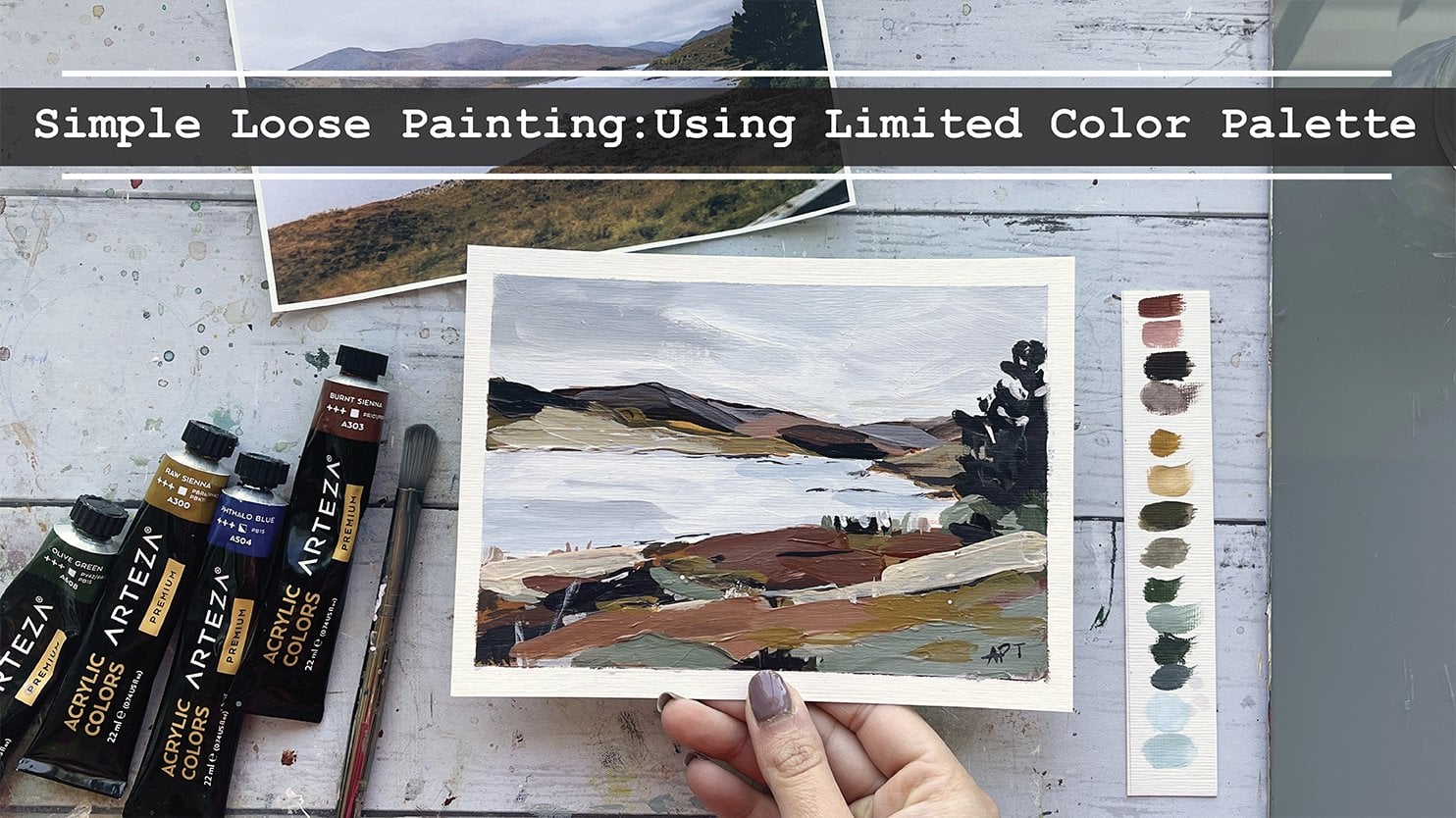
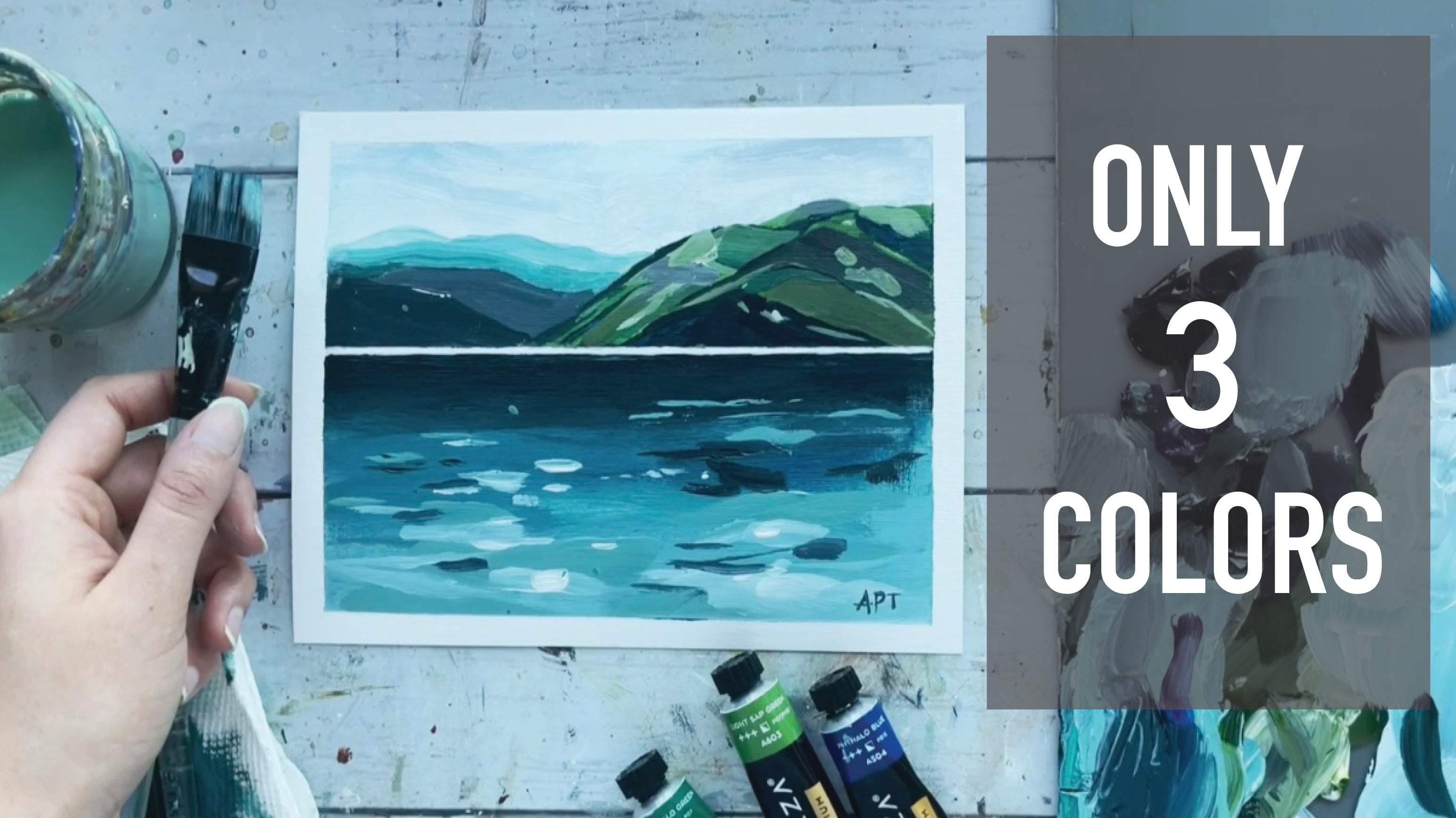
limited color palette. We've just got raw
sienna, sky blue, and light sap green from
their teaser palette, along with white and
black, of course. And then of course you'd need
it some sort of palette.
6. Prep Canvas & Sketch : Priming my canvas beforehand. Most canvases do
come primed already, but I like giving
it an extra layer. So wait for this to dry completely before we move
on to the next step. Alright, so let's begin by just roughly sketching out the
outline for our landscape here. I'm trying to keep a minimal, there's no need to draw
out every single detail, just sectioning out in layers that you want
your color difference. I'm also going to roughly draw out some trees and
sketch them out very roughly. I just, again, you don't have to do every
single tree, right? Because there's a lot
in the reference. Feel free to change it
up here on there and add how many ever you
think is necessary. Unless you know that your
intention and you want to copy it exactly
like the reference. Okay, and then once you're
happy with your sketch, we'll move on to painting.
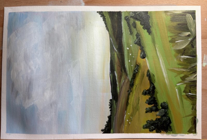
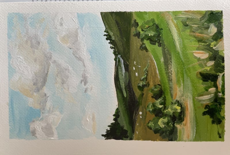
7. Painting - Sky & Base Layers: So I'm pulling out sky blue here with some white, of course. And to add a hint
of some warmth, I wanted to also mix
in some raw sienna. I didn't want my sky to be as blue as you
see in the reference. My intention was to kinda dull
that a bit with some warm. I'm also using a rough
filbert bristle brush here, but you can use any, any brush for this guy part. I'm just going to
mix all of these in. And I'm painting the entire
sky with this color. While I'm at it, I'm also
going to be painting the sides as I go
along, if you prefer. You can also do this step. At the very end. I'm taking a little
bit of that sky blue color and just
adding this up, just a tiny smudge
of that color to the top and bottom for some variety of color and
texture difference to this guy. A little can go a long way. We will come to the
sky to add some towns. But that's gonna be
a little bit later on once it's
completely dries up. Until then, we shall move on
to the landscape portion. I'm using some light sap green
now and mixing that with some raw sienna and black using that color for the
Fordist of the mountains. So my goal here was to have my base color is dark to
light from top to bottom. So dark is closest
to the horizon and lightest as we
come near and closer. Alright, so for my
second layer here, I'm making it slightly
more warmer by adding a tinge bit more
of that raw sienna. Now, mixing white in this
mixture for the next layer. Here, I'm making it
even more warmer by adding just a little bit
more raw sienna with white. As you can see, how
lovely and easy it is to get so many colors from
a limited color palette, which often creates the best
of paintings, in my opinion, it creates a more
mature color palette that's easy on the eye. If you need to
reference the color mixing lesson that I
have listed above, please do so because that
will truly, truly help. For my last and final layer
that's closest to us. I am mainly just gonna be using light sap
green with white, with just a little smudge
of the raw sienna.
8. Painting - Trees + Building Dimension: Okay, so now I'm using a novel for filbert brush from Senate. And we will be adding in
some details on trees. So do the step after your
layers have fully dried. I'm just doing this base
layer for the trees, forests and I'm making it dark
for the shadow part of it. So I'm mixing in light sap
green with some black, raw sienna and a bit of white. And I'm using that color to paint this
tree-like bush shape. Use different sides to your brush to make
it look organic. So keep changing your
breath direction. So go ahead and add how many of the trees that you would
like for this painting. And just keep in mind
to make them smaller. Far back. Why the tree is dry up a bit. Let's add some details
to the background hills. Um, you can do that by adding
in some stroke of color to certain places so that the
layers don't look flat. So you're not taking
in that same mixture that we made for the bushes. And I'm adding some
white and extra green to this dark colors to make
this muted green color. And adding just simple
yet confident strokes to the far back. Keep in mind to play around
with thickness as well. So keeping some of your
strokes large while some thin. For the foreground,
I'm taking in that same muted green
color that we have. And I'm roughly getting a few strokes in
different directions for a more texture and uneven look to give
impressions of grass. I'm adding in some raw sienna
and white to that as well. Again, just to build
some dimension, you don't ever want to just
leave one color as flat. You kinda wanna keep building
up just a little color here and there to build
dimension and form. So I'm just getting a
bit of that shadow part of that grass is I'm adding some darks and creating a
few quick, messy strokes. I'm giving some dimension to
the middle ground here as well by adding in some raw
sienna, white and queen. Highlighting some of
this foreground and middle ground with just
raw sienna and white. Remember a simple short, quick strokes to keep it loose. Alright, so it's time to
go back to the bushes and add in some light source. I'm keeping my left side
of these trees darker and we'll have some light source coming through the right. So you want to make a light green mixture
here is going to do the green with some
white and raw sienna. I'm adding some small strokes
to the right of the trees. Only. Keep in mind to
change up your direction of brushstrokes and also play
with the thickness and size. For the highlight part, I'm getting in raw
sienna and mainly white. And I'm just adding that
to only a few places. I'm just building on the
shadow part towards the left. I'm going back in with
green and white for my last stroke to the right. I'm basically just
adding my strokes until I'm happy with the trees. So just follow your instincts
and stop whenever you feel like you've
had enough layers and strokes to your trees. But the goal here is to go
slow and somewhat beat for your layers to dry
or just a tiny bit because if you just pile on color on top of one another, It's just going to end
up looking really messy. If you feel like
you need to wait before adding in a new
color, then you can do that. So here I'm using the side of the same filbert
brush and I'm getting some darker trees
far back as well. Again, be mindful of
keeping them rather small. I'm just adding in a bit
of shadow to the trees. So I'm just kind of
elongating the sides of the trees along
the foreground. Or actually, excuse
me, middle ground.
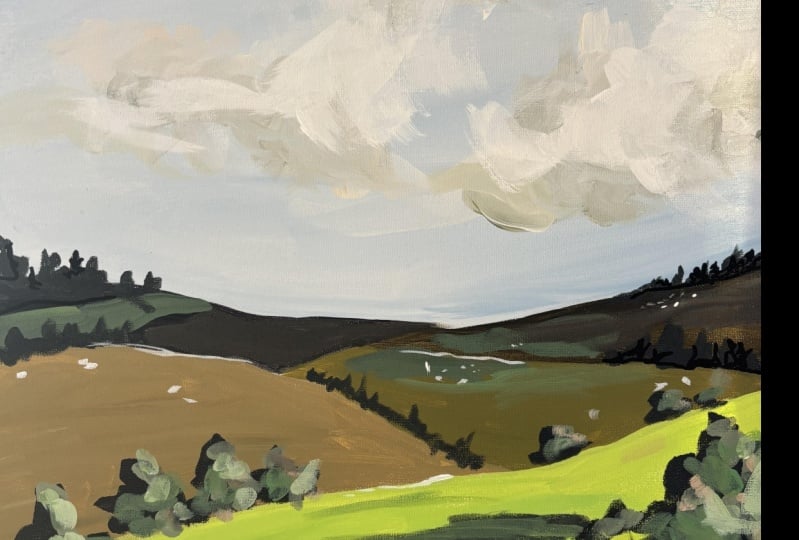
9. Painting - Clouds: Okay, so now it's time to add some big chunky
clouds to the sky. So I'm going to break this up into three different shades. We will have some highlights, which will just be all white, some mid tones, and some shadow. I'm using a number six
round brush and forced. I'm just going to simply just get the shape
of the clouds here. I'm taking y directly
off the tube and I'm adding in some nice juicy
texture to the clouds. Keep the brushstrokes going
in different directions. And keep your shape organic. Okay, so now that
we have our base, it is time for some of those
mid tones and shadows. For my mid tones, I decided to add some warmth to this guy. So I'm going with raw sienna
and white, of course, to tie in the entire
painting together. So I'm just going to
be placing that color, the mid tone color in
the middle of the clouds to blend the color and just to kind of soften up
some of that edges, you can dab your brush and then just blend the color in-between. Lastly, for those shadows, I'm taking in a light gray and I'm just adding
that beneath The, the mid tones that we've made. So just some black and white. And to top it off, just to add a little bit
more highlights, I'm taking in pure
white again and just adding that above the mid tones. I'm applying nice thick layers here for some
interests in texture.
10. Final Details + Class Project!: Okay, for final details, I'm getting out my
thin small round brush and I'm creating some rough, messy, quick vertical marks for some interests and give
impressions of grass. Small little details
like this can really pull your painting
together in the end. And actually this is
something that can also draw a viewer's attention. And that's sometimes
the first thing that people do see
you in a painting, even though it's like
the most simplest thing that you can do at the very end. Here I'm taking in white and
adding in little details, inspects across the painting, again for some interest
and to also give impressions of objects or
farm animals far away. This also creates
perspective of distance. But remember to not overdo it just a little
goes a long way. Speaking of Richmond, I showed my husband at this painting at the very end after I was done. And the first thing he
noticed was the sheeps. And he goes, I like
those little shapes. So it just goes to show
that the viewer can notice these tiny little details that you just added
the very end. They are really,
really small and they may seem like
not important, but they really truly are. If you followed me
so far, Well done, I can't wait to see what you
came up with your projects. I would love to see
them and do not forget to leave this
class overview. Ask me any questions in
the discussions tab below. This completes our loose acrylic landscape
painting for today. I invite you to explore the different classes
I had created for you. Classes and
watercolors, as well as acrylics are available if
you want to learn more. So do consider following
me so that you do not miss out on future
painting classes from me. Thank you so much for
your support over at my website and
also my Etsy shop, you can find original art
prints and much more. The links are below. As always, follow me on Instagram to keep up
with latest updates, giveaways and all
that fun stuff. Thank you once again. And happy painting.
 Alifya Plumber, Artist | Acrylics, Watercolors | Painter