Transcripts
1. Introduction: Hey everyone, my name
is Alicia and I'm an artist here in San
Jose, California. Carrying on with
our Fall Series. In this class, I will
show you how to paint this cozy acrylic
bonfire painting. Will walk you through
this painting step-by-step will show you all the materials
that you will need. Color mixing techniques,
brush techniques, as an exercise on
dimension and form. We will then paint
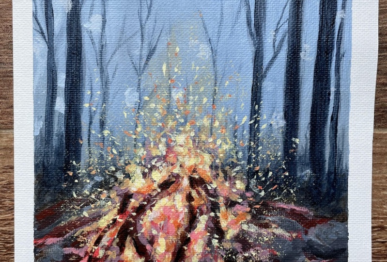
this step-by-step following a reference. So let's dive right
in and begin.
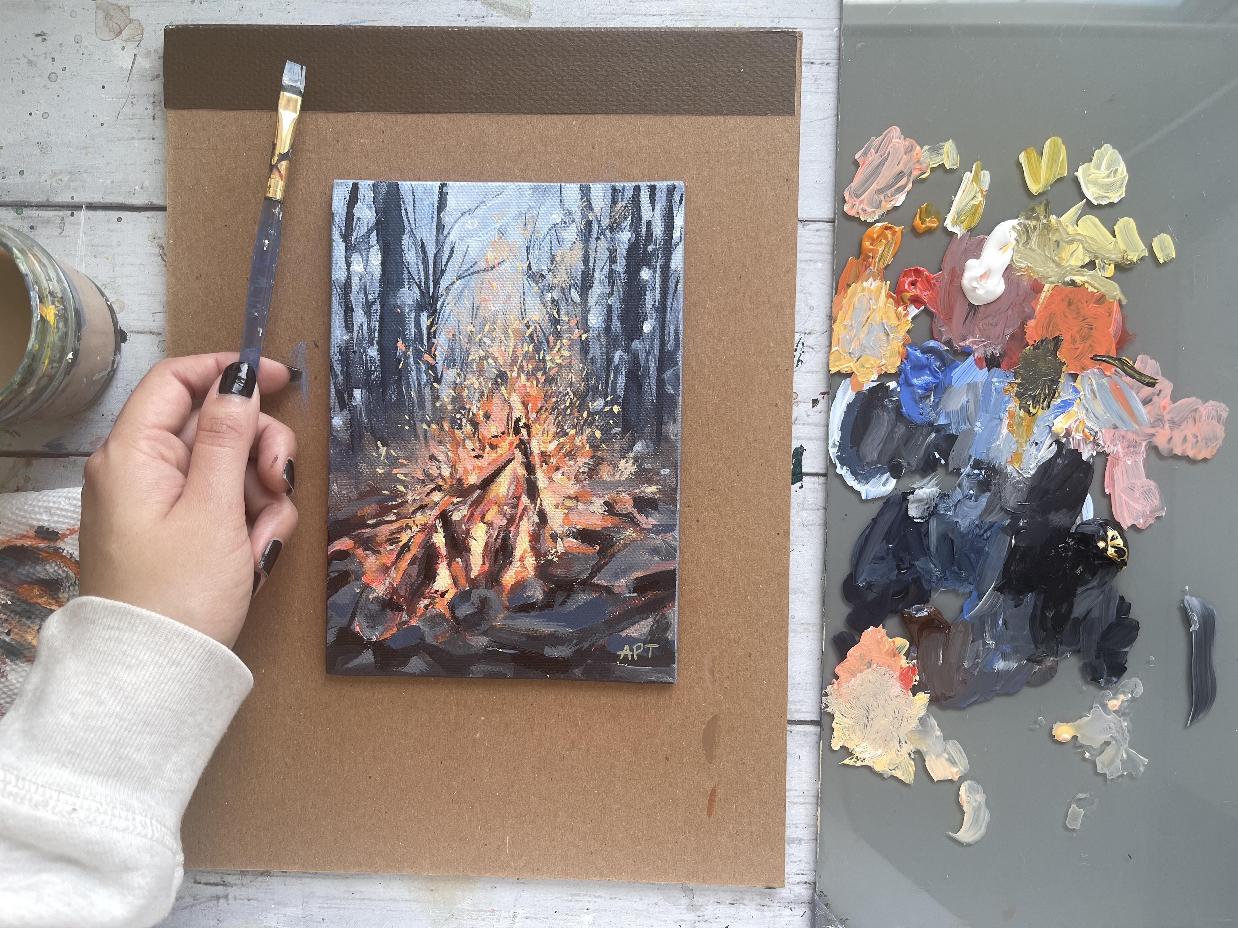
2. Materials: Alright, so these are the
materials that I've used. You need a bowl for
water and a paper towel. Just sell to prime your canvas. And for my canvas, I've used the RTs are five by seven panel. I have listed them below. And then a glass palette
like always and a scraper. And then these are the five
paints that I've used, of course, with black and white. So I'm going to zoom in a
little bit so you can see the colors are right. And for the brushes, so these are the variety
of brushes that I've used. Again, these are
the two craftsmen, bristle brushes, one
medium and small. Then again, a medium
and small flat brush, which is by artist loft and
number four and number eight. Then these are my round brushes. So I have a number
three Princeton brush, which is a round brush. And then I've used another number two round brush
and a fine rigger brush.
3. Exercise - Color Mixing: In this color mixing lesson, I will walk you through some
colors and show you how to mix colors to get a variation
of darks and lights. This technique can be applied with any color of your choice. So we will begin with
these four colors here, and black and white. I'm going to make
four columns here, one with the plain color
right off the tube, which will be in
the first column. And then I'll show you the different variations you can get by just mixing white
and then black. And then the last column will be a combination of these
colors amongst each other. It's, Let's begin with
this darker green, which I believe is
called it goes green and acrylics Liquitex basics. So here's what you get when
you mix in some white. As you can see, there's
a huge jump between the original color of this
green and then this one. And of course, you can
control the lightness of your green depending on how
much white you mixing. Mixing in some black can really give you some really
nice dark tones. And again, you can
totally control how much dark you want your
colors to be two. So depending on how
much black you add, you will, you can change
up the different tones. And if you want to mute
this color a bit more, adding some white and black to the screen can
give you just that, which I have on my absolute
favorite colors to mix. So remember if you want
to tone down any color, mixing some white and black to any original color can just can give you that
really nice muted tone down version of the
existing color. Here I'm adding some more white, just a tiny bit of black, but more white to show you the different variations you can get in this version as well. Alright, so I will be repeating the same steps and
all these colors. So I'm going to just speed
this up a little bit, but I just wanted to
point out how you can get so many different colors by not using that
many colors at all. To begin with, the
variations that you can get from each
color are endless. These are just a
few basic examples and I'm able to show you, but feel free to practice with some color mixing techniques if you are an absolute beginner, these can be super
useful and handy. And before you know it, this will be second
nature to you. And when you really need to
reproduce a certain color, you will know
exactly off the bat what makes an order
to get that exact. Alright, so, so far we
have only introduced white and black to
an original color. But now I'm going to show you even more deviations and
options that you can get by mixing our original
colors that we have together. For example, what happens when
you mix both these greens together or mixing the
slide queen and raw sienna, or maybe even raw
sienna and blue. You get the idea. So let's try some of that
to see what we can get. So here I'm mixing in both these greens with
some white and black, which creates this grayish tone. And then if you mix more
of the darker green, hookers green, you'll get an in-between green
from the top. Here you can see mixing
the light olive green with why sienna gives you this
really nice warm tone. Whereas mixing some
black to that will give you a cooler tone. Raw sienna and tailor
blue will give you a somewhat sap green color
with some warm tones in it. And then mixing white that
gives you a muted olive green. But I'm hoping this exercise can help you understand the depth of colors you can get
by mixing them together and just playing
around with them. These next two colors are some of my absolute favorite
colors to paint in. And I often use these colors quite a bit in all my paintings. If you're interested,
I got this color by mixing in hookers, green, tail blue,
some white and black. And then this next one. If you take that
exact same color, I'm mixing a little bit
of raw sienna in it. You will get this muted
version of the one on top, which is just so beautiful. Here's an example of these
colors applied to a painting, and you can tell how some of these colors have been
used in this landscape. So in order to build
dimension and depth, you need to have these
variations of colors in order to make your
painting not look flat. So play around with color
mixing beforehand to give you a sense of colors you can get from a limited
color palette. And this will really
help you visualize how you can use these colors
in your painting.
4. Exercise - Brushwork: Alright, so now let's dive
right into some brushwork. I'm going to show you the
different marks you can make with my most commonly
used brushes. And I'll show you how
I apply and use them. Let's first begin
with the flat brush. This one's super
basic and clean. I use this one for the sky and you can get simple
flat washes with this one, but extremely thin lines if you use the tip
of it as well. Hello Lee, the smaller flat
brush works just the same. And I use this for simple
flat washes for my landscape, especially when I block off
colors in the first step. Like mentioned, these
next two brushes are my most used and amongst my favorite
to paint landscapes. They are very versatile
and are great for that loose style landscape
paintings which we love. You can get really great, clean like flat
strokes with this. I love painting this. When I am painting
like huge mountains are just going to
block in shapes. I love using this brush to
block in the initial stages. This brush is also
great for layering paint on top of one
another as well. If you change the direction of the brush and
hold it vertically, you can get arch like shapes
that can be used for bushes, trees and loose objects. Because of the brushes
arch like shape. It is great for bushes and hence really great
for landscapes. Using the side of the brush or its tip can also be very useful to paint faraway
trees or houses, etc. And overall, it's just
really great for detailing. The smaller size. Full brush is great for smaller bushes and
objects far away. I use this long, thin brush and every
single painting, which I mostly bring up
at the end for detailing, whether I'm painting
florals or landscapes. I always bring this
out at the end. This brush can really add some visual interests with
just little tiny marks. Today's painting, I use
this brush for the grass. I gave it some highlights and just little tiny marks far away. This can also signify and give impressions of little
objects far away. So maybe even houses or animals. I even actually assigned
my art with this brush. If you are wondering
how I assign them, it's always with this
brush at the very end.
5. Exercise - Dimension & Form: In this lesson, I'm going to
go over dimension and form. A form is a
three-dimensional figure as opposed to a shape being flat. And how would you add
a fall onto an object? Well, in painting, you can
do that by adding color. In this example here
we have dark tones, mid tones, light
tones, and highlights. This is exactly what
you need to turn a flat object and give it
some dimension and form. I'm going to show you
how I'll be using red, black, and white to
demonstrate this. So first, I'm going to block
in the shape with just plain red so that we can
have a base to start from. This right here is an
example of a flat 2D object, which we will now turn into
a three-dimensional shape. Now, I'm going to start
adding in my mid tones. So I'm going to add
some black and whites to the red to create that. To get my dark tones, I'm going to add some more
black and fill in that edge. So now we're going to
take these two colors and blend them in-between. You can already see how
this is forming a shape. Okay, now let's add in some light tones by
mixing in some white. Notice how I'm painting in
the direction of the ball. Not just painting
this up and down, since this is a round shape, you want to kind of
paint in that curve. I'm just going to
go back and forth in between my dark tones, mid tones and light tones until I'm satisfied and I
feel that this looks good. I'm just giving it a
rough background so that it doesn't feel like
this is just floating around. Alright, and then
for the highlight, I'm going to take a lot more
white and a tiny dab of red. So a quick recap. Dark tones are
achieved by mixing your original color
with some black. And then the more
white you mix in, you will get a gradient. So you can see how
you can move from a dark tone to a mid
tone to lighter ones. And then your highlights.
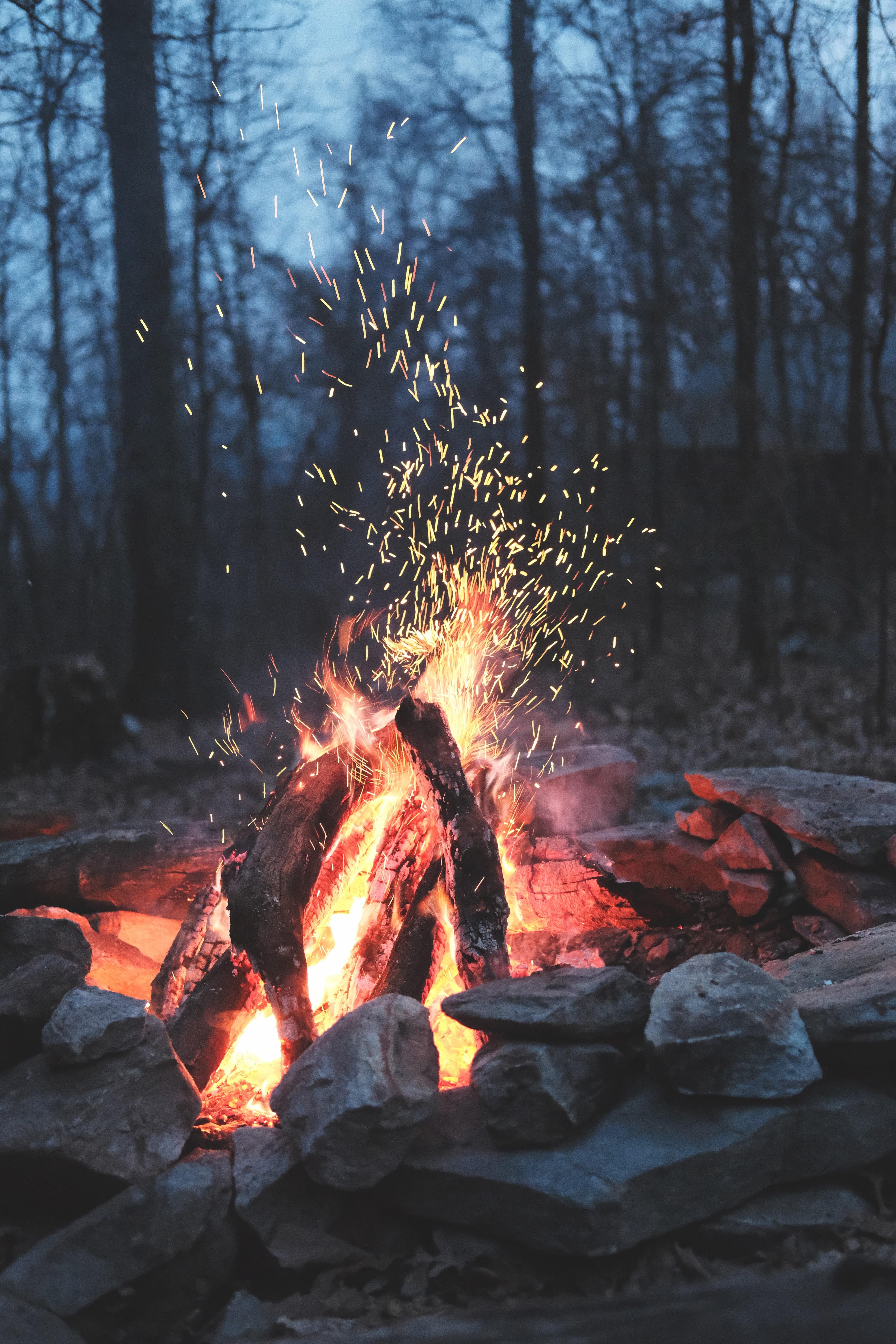
6. Painting - Sketch: First things first, I'm going to lightly sketch out my scene so that we have some sort of understanding and just
placement of things. You certainly don't need to
draw out every single detail, but I like to think of it as drawing whatever
will help you to paint, which can be very
subjective to each person. So it starting with a
little fire pit forest, which is in the front. And I'm just getting, getting the outline of
things for the stones. On this side, I'm
simply drawing out the rectangles and cube like shapes for placement as of now. The fire I'm not
really going to be dry that out obviously, but I'm just kinda
getting in the outline of the length so that I know
how high it will be. Moving on to the background. Just draw out those
tree-like shapes. Again, not all of them just enough for
visualization purposes.
7. Painting - Background: Alright, so moving onto
the painting part, Let's begin with the background
of the tree is first, I'm pulling out cobalt blue, white, and Payne's gray. I'm using a rough bristle
brush to start this out. Now, I don't want my background
to be too much in-focus. I'm going to try to
blur out a tiny birds are sometimes using a rough
brush can help with that. I'm starting with
cobalt blue and white, and I'm getting an uneven sort of layer on top with that first. Then mixing in some
of that Payne's gray to the mixture we already have. And I'm just adding that to
the next layer below that. Getting in more Payne's gray at the bottom of the woods here. And I will blend the edges
in between each layer of it. Alright, so now I'm getting in, in number eight flat brush. I'm just gonna get the ground that we see in the reference. I'm using burnt umber, quite a bit of Payne's gray
and cobalt blue all mixed in. I am painting that
portion at the bottom. Using my fingers.
I'm just going to blend that color upward. Sometimes your
fingers is all you need for that. Easy, bland. So don't be afraid to get
dirty and use your hands up it using a number
for flat brush. Now, I'm getting in the silhouettes of the
trees in the background. Using Payne's gray make water-cooled strokes to get
the trunks of the trees. Get a variety of thickness
here to make it look natural. So branch out some smaller
branches from each tree trunk. I'm using a fine small
rigger brush for that. So any tiny brush
that you have will work to get to these thin lines. So make sure you are
using the tip of the brush and just
pull them out. So make sure to branch them out in all different directions. Again, add some variety
of shapes and lengths. At the bottom, I'm
using the belly of this brush to get
this lake rough, dry texture to add to the
blurriness of the background. So get some of that dry
texture at the top as well to give impressions
of far away twigs. Now I'm getting in a lot more white and a little
bit of cobalt blue. And I'm using that color to add some highlights to the
sky in random spots. Simple, short, quick strokes. Now I'm using my
small rigger brush. Again, I'm going to
make tiny dot like circular shapes to give
that extra blur effect. If you've watched my
sunflower painting class, then you will know that I use the same technique for
the background as well. Make sure some of you
are circular shapes, big, while some being small. Going over some
of the darks with Payne's gray just to pull out some of that a tiny bed because I felt like
it kind of got lost. So I'm just bringing
out the dogs again.
8. Painting - Rocks + Wood: Alright, so now
let's move on from the background and jump
to the foreground. So to start out, I'm using black and
a bit of Payne's gray for my shadow
regions of the rocks. And then I will keep
adding in some white to the mixture for my midtone
visions of the rocks. So as long as you
keep that in mind, just know that each
rock will have both those shades
for the most part. Now, you could do this
in two ways, right? So number one is you
could paint all the darks first and then the mid tones as what you see
in the reference. Or you could do
what I'm doing and I'm painting each rock, darks and lights before
moving on to the next. I'm just completing
one drop at a time. I found this method easiest
and less confusing. Remember, we are painting
more of a loose style anyway, so don't be locked down in
adding in too much detail. But you just want the viewer to get impressions
of these objects. So each stone of break, we'll have some lights
and some darks and look at the reference carefully
to help you with that. Some of these rocks,
you will see me adding some cobalt blue to the
black and white mixture. Because I can see some of the skydiver flexion onto
the rocks and the reference. So this will help in blending the entire painting as a whole. So you can add this color
to certain corners or top surface of a few
of these bricks. Just as far as the inside of the fire pit. In the reference,
you see a ton of warmer tone colors in
the woods section, but just for now, get the base color with the darks and lights we've
been using so far. And we will slowly buildup on the fiery warm section that
we see in the reference. Here. I am getting in some of that burnt umber color onto the rocks and certain
sections just to add a variety of color and also give that slight warmth that
we feel from the firearm. Wow.
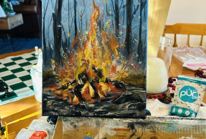
9. Painting - Fire Base: Okay, so onto the
part that I'm sure everyone's been waiting
for is the cozy bonfire. So I'm using a number three
Princeton Brown brush. And I'm getting out
vermilion red with a bit of white as my base
using that color. So here I'm just using my finger to kinda spread the color out. I just wanted to get
some of them grads onto the outskirts to extend that warmer color onto the rocks and
the background. Using a watered down
version of this red, I'm also adding a slight
sheen of that color onto the top surface of the
closest surrounding rocks. Adding some black to
the red and white. I'm adding in that
color to some of those wood pieces and some of the surrounding
rocks next to it. Getting in some whites
to the same mixture. Now I'm toning the color down a bit to give this like
deep or pinkish tone and adding that color to the surrounding rocks and a
bit to the fire edge as well. Now if you haven't already taken the lesson on color and mixing, this is the perfect time to do that because in that lesson, I go into detail about
how adding in blacks and whites can help tone down a color or add
some brightness to it. This painting in particular, especially the fire section, is all about adding
in layers bit by bit, and using the help of white
and blacks to give you a variety of colors within the same group to make
it look more natural.
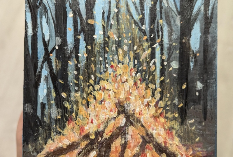
10. Painting - Fire (Second Layer): Now I'm taking out
Indian yellow, which is the yellow,
orangey color. So I'm using my
small rigger brush and I'm mixing in that, but some of the red and white, I'm just going to be adding in a few dabs of that
across the fire, starting at the base for us and then just working
my way upwards. So the only rule to remember
is that whatever colors you add on top of this to
build all these layers, just make sure to not completely covered the existing colors. And there's, so as I'm
adding this new color, I'm still leaving a bit of that initial red color
showing through. I'm getting some
of that color in the in the wood logs as well. Don't forget to add a
little color of the yellow to the surrounding
rocks as of the fire. A little goes a long way so
you don't have to extend it completely to the
front of the painting, but just really
around the fire box. Here. I'm just adding
little specks of that color at the top of the fire as well. Again, using my fingers to
spread the edge of that fire a bit to kind of get
that smoky effect and the hue of that color
to the background. Alright, so now I'm going in
with more white and a bit of yellow to introduce
another color to this fire, you may have realized by
now painting this fire is literally painting it
in layers step-by-step, with each new color being
added with a new layer. Again, keep in mind
to not paint over all the existing colors
and layers already added. Notice how I'm applying my application with
one stroke dabs and small short strokes to keep the painting
loose and textured. Especially when I will get
to the top of the firearm. Yes. The beauty and something in Spark.
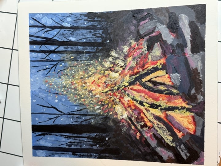
11. Painting - Fire ( Lights & Darks): So slowly building
on the highlights, I'm going to add
another layer with more white and a tiny bit of
yellow and red this time. So I'm looking at the
reference and I'm paying attention
to where I can see those stronger highlights
and those brighter colors in the core of the fire and
also a bit on the tip of the firearm graph. Reaching for the checkout page in the gravel. Hello world and we go Page again to get that hazy smoke in
the background. I'm just blending the paint with my fingertip to sort of
give that smoky effect. Alright, so now it's time to
add those little fire specs. Me see crackling. So I'm using a fine
tip brush and I'm getting in a mixture of
white and yellow and adding tiny clusters
of spikes at the top at them in different
directions and space them out while keeping others doing the same thing here. But this time I'm just
taking in some red and white and adding in a few
specs to the fire crackle. Here I'm taking in a
rough small brush, any old brush that you have who were perfect
for this next step, I'm using a bit of that
white with that yellow, make sure that we already have. And I'm getting in that
color and dabbing, kinda like scratching
the tip slightly to give this fire
sparkling impression. It is somewhat subtle, but it does look nice. Okay, great. So now in the last few layers, we're going to just be
warming up and bringing out some of those lights
and darks for the fire. I wanted to bring out that orangey warm color
that we see in the reference. I'm taking in some of that
Indian yellow with red. And I'm just adding that
color to wherever I see some of those fiery orangey colors
in the reference photo. So try not to go overboard, even though it may be tempting. Just add a few strokes
here and there, and that will be enough. I see some of these
really subtle pink tone to the reference as well. So I'm just using
white and red now. I'm adding a few layers to
that too where I see it. Don't forget to keep
adding in a tiny smudge of these colors to the
surrounding rocks as well to make it
all flow together. Coming back to the rocks. And I'm just adding in another layer up is existing colors to bring out
the colors more. Some using some cobalt blue, Payne's gray and white, and getting in a layer of
that to certain rocks. Right now, pulling out
those darks that we see. So I'm adding in black to
this mixture and I'm using that color to bring out the
dark tones of this painting. So wherever you see
your blacks and the reference that
is where you can add this color to make
it all stand out. Adding a bit of these
highlights to the rock. So those gray colors that
we see in the reference, just getting in a few layers of that to the rocks as well. So just black and white will
give you that gray color.
12. Finishing Touches & Class Project: Last but important detail is painting the
sides of the canvas. If you are using one, I like to bleed out the dominant color of that side of the
painting onto the sides. So I'm just going to slightly speed this process up for you. Last and final
finishing touches here. This is where I look at my
piece from a far and see if I need to add any highlights or directs to bring the
painting to life. So I'm going back
in with some of my light tones to bring out
any lights that I want. And I will be also doing
the same with my darks. So just a tiny bit, but we'll just bring out some
of these darks in the rocks and the fire to finish
off this piece. Now, if you are in a position where you're
completely happy with your peers at this point and you feel like you don't need to add anything else, then you're done. But if you feel like you want
to maybe bring out and just pop some of these highlights are just push some of
these darks forward. Then feel free to do
that in this step. There we go. This
completes our fall series of a cozy bonfire
painting for today. Hope you enjoyed, and
I cannot wait to see what you'll come up with,
share your projects. I would love to see
them and to not forget to leave this
class overview. Ask me any questions in
the discussions tab below. I invite you to explore the different classes
I had created for you. Classes and
watercolors, as well as acrylics are available if
you want to learn more. So do consider following
me so that you do not miss out on future
painting classes from me. Thank you so much for
your support over at my website and
also my Etsy shop, you can find original art
prints and much more. The links are below. As always, follow me on Instagram to keep up
with the latest updates, gigabase and all that fun stuff. Thank you once again
and happy painting.
 Alifya Plumber, Artist | Acrylics, Watercolors | Painter