Transcripts
1. Introduction: Hello everyone.
My name is Alicia and I'm an artist here
in San Jose, California. In today's class, I will
show you how to paint this simple yet effective
acrylic sunset landscape, following simple
steps and techniques, will show you all the
materials that you will need. Color mixing techniques,
brush techniques, and an exercise on
dimension and form. We will then paint this acrylic
landscapes step-by-step. This class is great
for all levels. So let's dive right
in and begin.
2. Materials: Alright, so these are the
materials that you will need, a bowl of water
and a paper towel. I use acrylic Strathmore paper. And you will need a palette. Any sort of palette, I like
using a glass palette, which also comes with
a grass gray bars, so that's really
easy to clean off. I take my edges with
this artist's tape. And you will also need
a pencil and eraser. And then I use a gel primer
to try my canvas beforehand. This is optional,
but if you have a gloss medium like these, I'm going to use
this for glazing. So again, I'm going to leave
all the links down below. Alright, And then
as far as brushes, these are all the
brushes that I've used. So this is a
three-fourths flat brush. It's just different
sizes of flat brush, mentioned from medium to small. So any flat brush that
you have can work. It doesn't have to be
the specific brand. I use this angle brush quite
a bit. It was really handy. So this is a three-eighths
angled brush. Then the remaining three
brushes are round brushes. So again, medium-sized
round brush along with if small and then
a final round brush. Alright, and these are my
Payne's, the teaser pallets. They come in 60 pain set colors. I've used a sky
blue, persian blue, orange, yellow, deep yellow, yellow, pale, and violet. And then I'm also used
the Liquitex basics, white and black, and then the fluorescent orange
again, that's optional. You can just use
regular orange, right? And that's it. So gather all your
materials that you have and we'll move
on to painting.
3. Exercise - Color Mixing: In this color mixing lesson, I will walk you through some
colors and show you how to mix colors to get a variation
of darks and lights. This technique can be applied with any color of your choice. So we will begin with
these four colors here, and black and white. I'm going to make
four columns here, one with the plain color
right off the tube, which will be in
the first column. And then I'll show you the different variations you can get by just mixing white
and then black. The last column will be a combination of these
colors amongst each other. Let's begin with
this darker green, which I believe is because green acrylics Liquitex basics. So here's what you get when
you mix in some white. As you can see, there's
a huge jump between the original color of this
green and then this one. And of course, you can
control the lightness of your green depending on how
much white you mixing. Mixing in some black can really give you some really
nice dark tones. And again, you can
totally control how much dark you want your
colors to lead to. So depending on how in
which black you add, you will, you can change
up the different tones. And if you want to mute
this color a bit more, adding some white and black to the screen can
give you just that, which I have on my absolute
favorite colors to mix. So remember if you want
to tone down any color, mixing some white and black to any original color can just can give you that
really nice muted tone down version of the
existing color. Here I'm adding
some more white and just a tiny bit
of black but more white to show you the difference you can get
in this version as well. Alright, so I will be repeating the same steps and
all of these colors. I'm going to just speed
this up a little bit, but I just wanted to
point out how you can get so many different colors by not using that
many colors at all. To begin with, the
variations that you can get from each
color are endless. These are just a
few basic examples and I'm able to show you, but feel free to practice with some color mixing techniques if you are an absolute beginner, these can be super
useful and handy. And before you know it, this will be second
nature to you. When you've only need to
reproduce a certain color, you will know
exactly off the bat what makes an order to
get that exact color. Alright, so, so far we
have only introduced white and black to
an original color. But now I'm going to show you even more deviations and
options that you can get by mixing our original
colors that we have together. For example, what happens when
you mix both these greens together or mixing the
slide queen and raw sienna, or maybe even raw
sienna and blue. You get the idea. So let's try some of that
to see what we can get. So here I'm mixing in both these greens with
some white and black, which creates this grayish tone. Then if you mix more of the
darker green hookers green, you'll get an in-between
green from the top. Here you can see mixing
the light olive green with why sienna gives you this
really nice warm tone. Whereas mixing some
black to that will give you a muted cooler tone. Roseola and tailor
blue will give you a somewhat sap green color
with some warm tones in it. And then mixing white that
gives you a muted olive green. But I'm hoping this exercise can help you understand the depth of colors you can get
by mixing them together and just playing
around with them. These next two colors are some of my absolute favorite
colors to paint in. And I often use these colors quite a bit in all my paintings. So if you're interested,
I got this color by mixing in hookers, green, pale blue,
some white and black. And then this next one. If you take that
exact same color, I'm mixing a little bit
of raw sienna in it. You will get this muted
version of the one on top, which is just so beautiful. Here's an example of these
colors applied to a painting, and you can tell how some of these colors have been
used in this landscape. So in order to build
dimension and depth, you need to have these
variations of colors in order to make your
painting not look flat. So play around with color
mixing beforehand to give you a sense of colors you can get from a limited
color palette. And this will really
help you visualize how you can use these colors
in your painting.
4. Exercise - Brushwork: Alright, so now let's dive
right into some brushwork. I'm going to show you the
different marks you can make with my most commonly
used brushes. And I'll show you how
I apply and use them. Let's first begin
with the flat brush. This one's super
basic and clean. I use this one for the sky and you can get simple
flat washes with this one, but extremely thin lines if you use the tip
of it as well. Hello Lee, the smaller flat
brush works just the same. And I use this for simple
flat washes for my landscape, especially when I block off
colors in the first step. Like mentioned, these
next two brushes are my most used and amongst my favorite
to paint landscapes. They are very versatile
and are great for that loose style landscape
paintings which we love. You can get really great, clean like flat
strokes with this. I love painting this. When I am painting
like huge mountains are just going to
block in shapes. I love using this brush to
block in the initial stages. This brush is also
great for layering paint on top of one
another as well. If you change the direction of the brush and
hold it vertically, you can get arch like shapes
that can be used for bushes, trees and loose objects. Because of the brushes
arch like shape. It is great for bushes and hence really great
for landscapes. Using the side of the brush or its tip can also be very useful to paint faraway
trees or houses, etc. And overall, it's just
really great for detailing. The smaller size. Full brush is great for smaller bushes and
objects far away. I use this long, thin brush in every
single painting, which I mostly bring up
at the end for detailing. So whether I'm painting
florals or landscapes, I always bring this
out at the end. This brush can really add some visual interests with
just little tiny marks. Today's painting, I use
this brush for the grass. I gave it some highlights and just little tiny marks far away. This can also signify and give impressions of little
objects far away. So maybe even houses or animals. I even actually assigned
my art with this brush. If you are wondering
how I assign them, it's always with this
brush at the very end.
5. Exercise - Dimension & Form: In this lesson, I'm going to
go over dimension and form. A form is a
three-dimensional figure as opposed to a shape being flat. And how would you add
a fall onto an object? Well, in painting, you can
do that by adding color. In this example here
we have dark tones, mid tones, light
tones, and highlights. This is exactly what
you need to turn a flat object and give it
some dimension and form. I'm going to show you
how I'll be using red, black, and white to
demonstrate this. So first, I'm going to block
in the shape with just plain red so that we can
have a base to start from. This right here is an
example of a flat 2D object, which we will now turn into
a three-dimensional shape. Now, I'm going to start
adding in my mid tones. So I'm going to add
some black and whites to the red to create that. To get my dark tones, I'm going to add some more
black and fill in that edge. So now we're going to
take these two colors and blend them in-between. You can already see how
this is forming a shape. Okay, now let's add in some light tones by
mixing in some white. Notice how I'm painting in
the direction of the ball. Not just painting
this up and down, since this is a round shape, you want to kind of
paint in that curve. I'm just going to
go back and forth in between my dark tones, mid tones and light tones until I'm satisfied and I
feel that this looks good. I'm just giving it a
rough background so that it doesn't feel like
this is just floating around. Alright, and then
for the highlight, I'm going to take a lot more
white and a tiny dab of red. So a quick recap. Dark tones are
achieved by mixing your original color
with some black. And then the more
white you mix in, you will get a gradient. So you can see how
you can move from a dark tone to a mid
tone to lighter ones. And then your highlights.
6. Prep Paper & Sketch: To begin, I am prepping
the paper down, which also, which is
basically a primer. And it just perhaps your
Canvas before painting. You can choose to thin this down slightly
if you would like, or just use it directly off
the tub, which I prefer. And then maybe dab
your brush once or twice in the water to
make it spread butter. One or two, even coats
should be enough. And once you're done
with this step, we will move on to
the taping section. Like always, let's begin
taping down the paper and its edges to leave
us a clean border. So I'm starting here
with sketching out the landscape and
outlining the mountains. You can add as many
layers as you like. So even if you want to add
just two or three layers, if that's what you're
comfortable with, then feel free to do that. Sketch out these lines, and we will then move
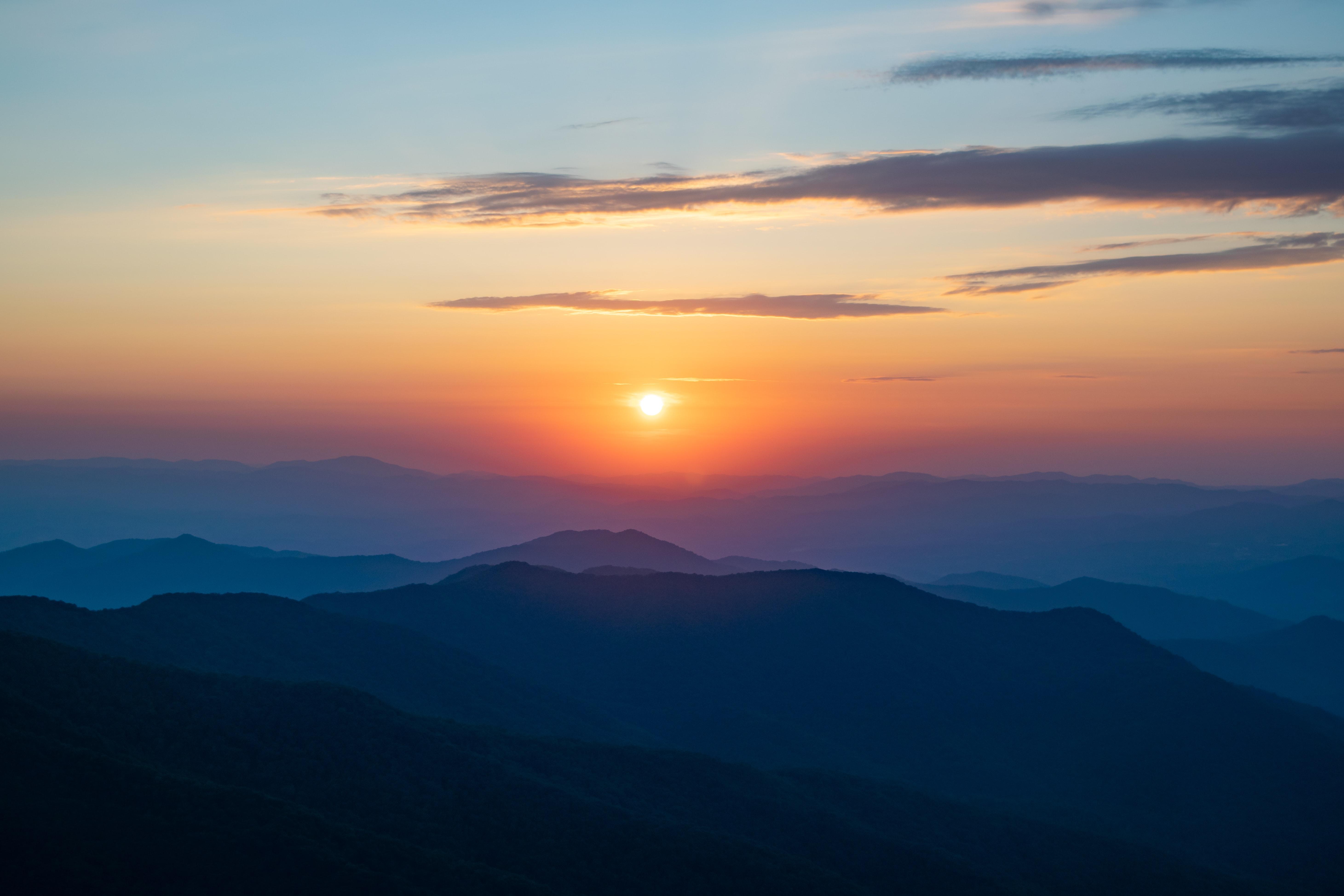
directly into painting. The reference pic is provided in the projects and
resources tab below. It is not a link,
it's just a picture, so you just have to right-click and save it on your desktop. And you can either print it or then just use it
directly from there.
7. Painting - Sky Base: Let's tackle the sky first. So I'm bringing out
sky blue, white, deep yellow, orange,
yellow, and violet. And all of this is from
the RTs are palette. Again, the names of
the paints that I'm using are mentioned in the projects and
resources tab below. So all these colors that
I think we will need for the sky is what I'm
starting from the very top. And then the problem would be at the way towards the horizon. Alright, then I'm pulling out my three-fourths
flat brush here. And I'm starting at the very top with the blue and white mixed in and just laying a flat wash there about an inch from
the sky at the top. Taking in more right
with the blue, but this time also added in a
tad bit of that deep yellow to blend the colors as simply go over the lines
in between back-and-forth. Sometimes adding more color
in-between those two lines helps it to blend better or
even clean water can help, but be careful because that
can thin out to your paint. So I prefer adding
color instead, like you see me doing so. Now I'm pulling out
a smaller flat brush for the bottom half of this guy. I'm taking in a deep yellow, white and a bit of
that orange, yellow. And we'll just lay
out one flat layer. They're dipping my brush water and blending those
lines in between. Mixing in a white, blue, and yellow combination
that we just made to kind of blend
those lines in between. Your I realized that I
need a lot more white, so I'm adding that
into blended morning. Not washing my brush yet so that it still has some
of that blue in it. I'm taking deep yellow, white and some orange to add
one more layer over this. Oh, by rinsing off my brush now, adding in white and
orange with a bit of the yellow and adding in a
layer of that color. So you probably have noticed
by now that paintings guys are all about a
gradual color change. That happens bit by bit. Lastly, I am taking in
some wireless with lots of white and a tad bit of
black and some orange. And I'm just getting a thin
layer of that at the horizon, again, making sure to blend
the colors in between. Okay, This color is optional. You can totally use a
orange if you have that, but I'm using a
fluorescent orange, which I'm gonna be
using a bit later, but I'm just taking
it out for now. And I'm taking a round brush and I'm also adding some
yellow pale to my palette. I'm mixing yellow, pale, yellow and lots of white
with a bit of orange. And I'm going to be
adding that color right in the center there
around the sun. This will give that
beautiful sun glow. I'm making sure to stretch out those lines a bit across the
sky on both sides as well. Adding in more whites into this and extending that
color to the sidelines. Rinsing off my brush. I'm still using the round
brush and I am taking that fluorescent
orange color with white and kinda giving that semicircle sun globe we
see in the reference. Your, I'm blending
the edges outward, adding in some more color
there for some more pop. And again, blending it outwards. I am making that same violet
mixture we had earlier. So I'm using violet, white and some orange
and bringing out that lines near the horizon
more with a flat brush. Taking the round brush
again and adding in yellow, pale, and white, and a tiny bit of that
fluorescent orange. And I'm going right
in the center again to intensify that's Anglo. While pulling some
things tweaks up that color horizontally
as well on both sides.
8. Painting - Clouds: Using my angled brush again, I'm taking in violet, white and a bit of black, but also now introducing
Parisian blue into this mixture. We're going to use this
color to paint the clouds. I'm getting the base color
of the clouds force, which is that dark,
purplish color that we see. The angled brushes
really helpful to get any sharp edges and
lines you may need here. The clouds get a little
lighter towards the left side, so adding more white
to it and pulling it outwards towards the left. Spacing that light purple color out in a few random
places as well. Just make sure to get
really thin lines towards the horizon to show
the perspective of distance. Cleaning off the brush.
Now I'm taking in white, yellow and some orange to add as an highlight underneath
some of those clouds. So thin lines underneath
those shadowed counts. Now I'm taking a thrombus
and orange and white. Again, you can use
regular orange if that is what you have. And I'm adding a thin
strokes to a few of those highlighted
areas so that we can get that sun kids
glow to the sky. Now I'm taking and planned
and any small round brush and just adding that color directly in the
center for their son.
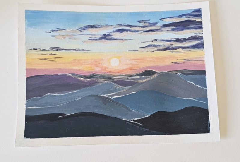
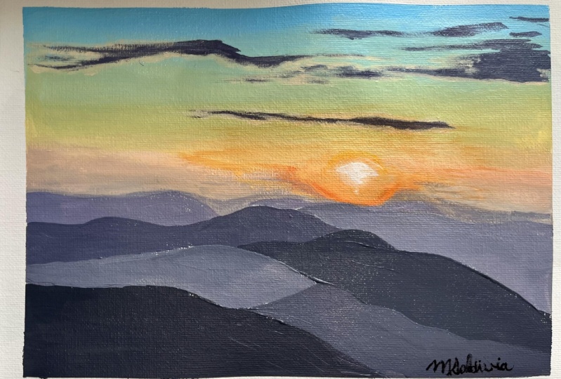
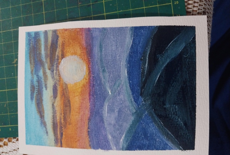
9. Painting - Mountains & Details: Alright, we may come
back to this guy for just last-minute details, but let's move on to
the landscape portion, which is the easier
part to this painting. This would also be a
great time to take the lesson on color mixing
if you haven't already. Because for the most
part I'm going to mainly be using two colors
with white and black. So the two colors that
I'm going to be using, our Prussian blue,
violet, black, and white. Alright, so I'm taking the
angle brush and I'm mixing violet black and
some of their biter, along with Prussian blue. I'm going to use this color
for a different mountain, but I'm forced focusing
on the mountain bike underneath or the layer
right underneath the sun. So I'm getting a bit of that
orange and adding that to the purple mixture I just
made along with some white. I'm going to put that
right underneath the sun to give a bit
of that sunset glow. So basically you
just have to play around with Persian blue, violet, black and white. And each layer up the mountain being a slightly different
color to the next. To do that, you either add more Prussian blue or more violet, or then more black
or more white. Again, the lesson that I have on color mixing is super-helpful. So please do watch that
before you do this. That's all you'll see me
doing in the next few layers. I'm just going to
keep the mountains closest to us, the darkest. And I'm going to keep the
mountains behind that at different tint or shadow
of the original color. I'm just adding clean, bold, simple strokes to
each mountain layer. I have drawn out with a slight variation in
color for each of them. I don't know what
Sonia no way I can. I try to make you choose and choose. One. Choose. To be stronger for shoes. We can wait for God. You'll see me leaving some
mindful whitespaces, really, really thin ones in-between
some of the mountains to sort of break up the
shapes, add more interests. And maybe to some, it can also give
the impression of a loose impression of a far away Lake
between the valleys. Little small, tiny
details like this can really add a lot of
interests to a painting. And it can just bring. The viewer's eye to specific points that you
need them to look at. And it's also really
handy to break up really large, big shapes. Time to take off this tape so that we can see
what we've got here. In case you get any
paint outside the edges, it is easy to fix. I like using Gesso Primer, or you can also use white
paint if you don't have that, but just so it's preferable. But before that, I
wanted to take away most of the color
with plain water. Using a clean bowl
and a clean brush, simply dip your
brush in water to try to take off
some of that paint. So you can see here that a lot of the paint has
already come off. And with what's remaining, I'm just going to go over that with just a primer
to clean that edge off. Last minute details here, I'm just bringing
out a little pop to some of those
highlights to the sky. So I'm using a flat brush. I'm taking white, yellow, and a bit of that fluorescent
orange and adding that color to only a few places for that extra highlights. So thin, short,
and long strokes. I'm getting that same
color right around the sides of the sun to
add that evening Globe.
10. Painting - Glazing & Class Project: Okay, so this part
is totally optional, but if you want a slight evening glow tent
to your painting, then glazing is what
we're going to do next. So to glaze here, I'm using
a gloss medium, varnish. You can also use a gloss
medium directly as well. So I have linked the medium in the projects and
resources tab below. Also, please only do this step once you're painting
has fully dried. I'm taking in a
bit of that medium and the fluorescent orange, you can also use
plain orange, red, or even yellow and
mix it with a medium. So this will thin out
the paint and add a very thin layer on
top of these layers, slight color to it. I'm just going to
go over the area around the sun and a bit
on the mountains as well. It's a subtle
change, but it does add a slight sheen on top of your painting with that tint
of color of your choice. It's almost like adding a photo filter on this if you want to
think of it that way. Any parts that you feel
like you did too much, you can repaint that area with the original color
like I'm doing right now. Since this is a varnish as well, I'm also going to be adding the varnish all
over the painting to, to add that shine all over. And this, my friends completes our acrylic sunset
painting for today. Hope you enjoyed, and
I cannot wait to see what you'll come up
with your projects. I would love to see
them and do not forget to leave this
class interview. Ask me any questions in
the discussions tab below. I invite you to explore the different classes
I had created for you. Classes and
watercolors, as well as acrylics are available if
you want to learn more. So do consider following
me so that you do not miss out on future
painting classes from me. Follow this class up
with my latest acrylics and final painting I
have linked below. I do appreciate all the love and support from each and everyone
of you from my orders, likely. So thank you. To shop my art to do
visit my website. Follow me on Instagram to
keep up with latest updates, giveaways and all
that fun stuff. Thank you once again.
And happy painting.
 Alifya Plumber, Artist | Acrylics, Watercolors | Painter