Transcripts
1. Introduction: Hey everyone, my name
is Alicia and I'm an artist here in San
Jose, California. In today's class, we are going back to basics
and painting. A simple, loose and abstract acrylic mountain landscape will show you how to
break down shapes to simplify it using
a reference photo. Great for beginners and beyond, will walk you through
this painting step-by-step will show you all the materials
that you will need. Color mixing techniques,
brush techniques, and an exercise on
dimension and form. So let's dive right
in and begin.
2. Exercise - Color Mixing: In this color mixing lesson, I will walk you through some
colors and show you how to mix colors to get a variation
of darks and lights. This technique can be applied with any color of your choice. So we will begin with
these four colors here, and black and white. I'm going to make
four columns here, one with the plain color
right off the tube, which will be in
the first column. And then I'll show you the different variations you can get by just mixing white
and then black. And then the last column will be a combination of these
colors amongst each other. It's, Let's begin with
this darker green, which I believe is
called it goes green and acrylics Liquitex basics. So here's what you get when
you mix in some white. As you can see, there's
a huge jump between the original color of this
green and then this one. And of course, you can
control the lightness of your green depending on how
much white you mixing. Mixing in some black can really give you some really
nice dark tones. And again, you can
totally control how much dark you want your
colors to be two. So depending on how
much black you add, you will, you can change
up the different tones. And if you want to mute
this color a bit more, adding some white and black to the screen can
give you just that, which I have on my absolute
favorite colors to mix. So remember if you want
to tone down any color, mixing some white and black to any original color can just can give you that
really nice muted tone down version of the
existing color. Here I'm adding some more white, just a tiny bit of black, but more white to show you the different variations you can get in this version as well. Alright, so I will be repeating the same steps and
all these colors. So I'm going to just speed
this up a little bit, but I just wanted to
point out how you can get so many different colors by not using that
many colors at all. To begin with, the
variations that you can get from each
color are endless. These are just a
few basic examples and I'm able to show you, but feel free to practice with some color mixing techniques if you are an absolute beginner, these can be super
useful and handy. And before you know it, this will be second
nature to you. And when you really need to
reproduce a certain color, you will know
exactly off the bat what makes an order
to get that exact. Alright, so, so far we
have only introduced white and black to
an original color. But now I'm going to show you even more deviations and
options that you can get by mixing our original
colors that we have together. E.g. what happens when
you mix both these greens together or mixing the
slide queen and raw sienna, or maybe even raw
sienna and blue. You get the idea. So let's try some of that
to see what we can get. So here I'm mixing in both these greens with
some white and black, which creates this grayish tone. And then if you mix more
of the darker green, hookers green, you'll get an in-between green
from the top. Here you can see mixing
the light olive green with why sienna gives you this
really nice warm tone. Whereas mixing some
black to that will give you a cooler tone. Raw sienna and tailor
blue will give you a somewhat sap green color
with some warm tones in it. And then mixing white that
gives you a muted olive green. But I'm hoping this exercise can help you understand the depth of colors you can get
by mixing them together and just playing
around with them. These next two colors are some of my absolute favorite
colors to paint in. And I often use these colors quite a bit in all my paintings. If you're interested,
I got this color by mixing in hookers, green, tail blue,
some white and black. And then this next one. If you take that
exact same color, I'm mixing a little bit
of raw sienna in it. You will get this muted
version of the one on top, which is just so beautiful. Here's an example of these
colors applied to a painting, and you can tell how some of these colors have been
used in this landscape. So in order to build
dimension and depth, you need to have these
variations of colors in order to make your
painting not look flat. So play around with color
mixing beforehand to give you a sense of colors you can get from a limited
color palette. And this will really
help you visualize how you can use these colors
in your painting.
3. Exercise - Brushwork: Alright, so now let's dive
right into some brushwork. I'm going to show you the
different marks you can make with my most commonly
used brushes. And I'll show you how
I apply and use them. Let's first begin
with the flat brush. This one's super
basic and clean. I use this one for the sky and you can get simple
flat washes with this one, but extremely thin lines if you use the tip
of it as well. Hello Lee, the smaller flat
brush works just the same. And I use this for simple
flat washes for my landscape, especially when I block off
colors in the first step. Like mentioned, these
next two brushes are my most used and amongst my favorite
to paint landscapes. They are very versatile
and are great for that loose style landscape
paintings which we love. You can get really great, clean like flat
strokes with this. I love painting this. When I am painting
like huge mountains are just going to
block in shapes. I love using this brush to
block in the initial stages. This brush is also
great for layering paint on top of one
another as well. If you change the direction of the brush and
hold it vertically, you can get arch like shapes
that can be used for bushes, trees and loose objects. Because of the brushes
arch like shape. It is great for bushes and hence really great
for landscapes. Using the side of the brush or its tip can also be very useful to paint faraway
trees or houses, etc. And overall, it's just
really great for detailing. The smaller size. Full brush is great for smaller bushes and
objects far away. I use this long, thin brush and every
single painting, which I mostly bring up
at the end for detailing, whether I'm painting
florals or landscapes. I always bring this
out at the end. This brush can really add some visual interests with
just little tiny marks. Today's painting, I use
this brush for the grass. I gave it some highlights and just little tiny marks far away. This can also signify and give impressions of little
objects far away. So maybe even houses or animals. I even actually assigned
my art with this brush. If you are wondering
how I assign them, it's always with this
brush at the very end.
4. Exercise - Dimension & Form: In this lesson, I'm going to
go over dimension and form. A form is a
three-dimensional figure as opposed to a shape being flat. And how would you add
a fall onto an object? Well, in painting, you can
do that by adding color. In this example here
we have dark tones, mid tones, light
tones, and highlights. This is exactly what
you need to turn a flat object and give it
some dimension and form. I'm going to show you
how I'll be using red, black, and white to
demonstrate this. So first, I'm going to block
in the shape with just plain red so that we can
have a base to start from. This right here is an
example of a flat 2D object, which we will now turn into
a three-dimensional shape. Now, I'm going to start
adding in my mid tones. So I'm going to add
some black and whites to the red to create that. To get my dark tones, I'm going to add some more
black and fill in that edge. So now we're going to
take these two colors and blend them in-between. You can already see how
this is forming a shape. Okay, now let's add in some light tones by
mixing in some white. Notice how I'm painting in
the direction of the ball. Not just painting
this up and down, since this is a round shape, you want to kind of
paint in that curve. I'm just going to
go back and forth in between my dark tones, mid tones and light tones until I'm satisfied and I
feel that this looks good. I'm just giving it a
rough background so that it doesn't feel like
this is just floating around. Alright, and then
for the highlight, I'm going to take a lot more
white and a tiny dab of red. So a quick recap. Dark tones are
achieved by mixing your original color
with some black. And then the more
white you mix in, you will get a gradient. So you can see how
you can move from a dark tone to a mid
tone to lighter ones. And then your highlights.
5. Materials & Prep Paper: Alright, so this is
everything that I've used for today's class, able for water. And you will need a paper towel, a pencil and eraser. Just though primal
gesture to Jess, all your primal
Canvas beforehand. And like always my artist's tape that I use to tape the edges. I've also used the
Strathmore acrylic paper, which I cut to a
six by eight inch. And these are the
brushes that I've used. So let's start
from small to big. So we have a fine brush here. By Zen art. Again, I have linked
some of them below, so just go ahead
and check them out. And then a flat brush and
number four, flat brush, the next three brushes
or filbert brushes. Again, this one is from
standard in number four, filbert brush, pretty
nice and small. And then to medium-sized
filbert brushes. I don't know. I don't have
the name for this one. As you can see, I'm
trying to find it, but it's completely
painted over. And then the next one is a
number eight football brush. And then you will need
a pallet of some sort. I like using a glass
palette with a scraper. And then these are all the
pains that I've used again, I have linked and named
all of them below as well. So you can check them out. But mainly five different
colors with black and white. So to begin, I am prepping
the paper down which ISO, which is basically a primer. And it just perhaps your
Canvas before painting. You can choose to thin this down slightly
if you would like, or just use it directly off
the tub, which I prefer. Then maybe dab
your brush once or twice in the water to
make it spread better. One or two, even coats
should be enough. And once you're done
with this step, we will move on to
the taping section. Like always, let's begin
taping down the paper and its edges to leave
us a clean border.
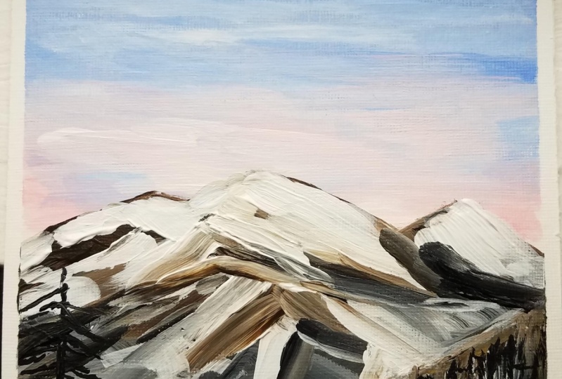
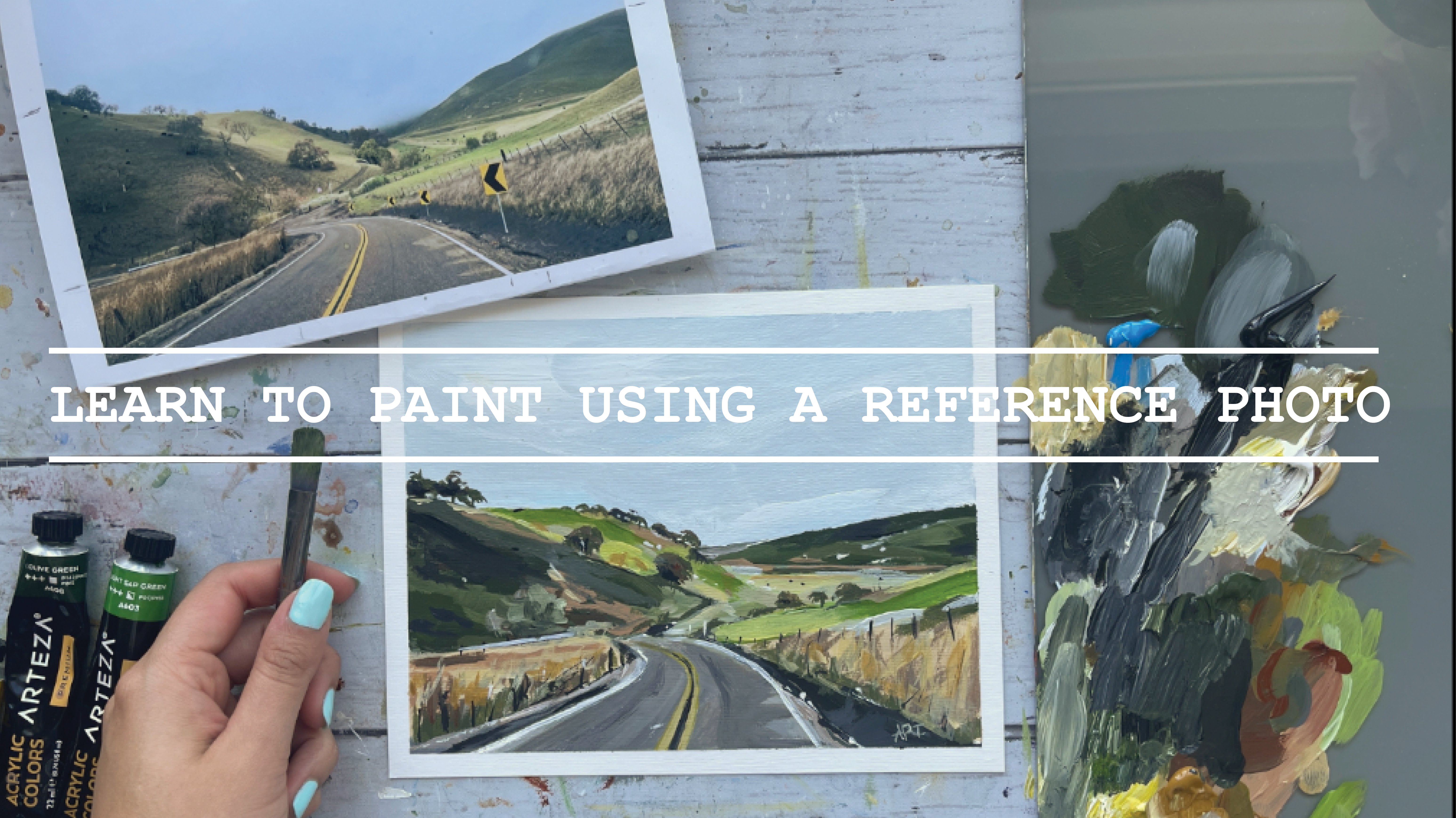
6. Painting - Sketch & Sky: Alright, so let's
begin by roughly sketching out the outline
of our landscape here. Try and keep it minimal. There's no need to draw
out every single detail, just section and
out into layers. You want your color difference. So I'm gonna do three
layers to start with. Speaking of the
reference, again, it has been linked in the projects and
resources tab below. You can just simply
right-click and open it up. You can save it on your desktop, or you could even print it
out if it helps you better. For this guy, get out any
light blue that you have. I'm using the color sky blue from the artist's palette,
along with white. Any fat brush will also work for the step I'm using
a filbert brush, but use whatever
it's handy to you. Just mixing the two
colors together, start from the very top and
just work your way down, getting lighter in color as
you go towards the horizon. Once you are done, let this
layer dry almost 80 to 90%. Before moving on
to the next step. Now we're going to go
tackle the peachy is Sunrise sort of look that
we see in the reference. But before we begin with that, I wanted to just kind
of draw back some of the pencil marks
that I painted over. So that's what you
will see me doing. So right now, for
the peach color, I'm using a light portrait, pink from the Liquitex basics. But if you have any
sort of pink or page, you can mix up with white and it will still
look really nice. Alright, so then using that
pink color that I have, I am mixing it with white. And I also switched my
brush to a smaller brush. I'm simply adding few horizontal
strokes to the bottom of this guy for the beautiful
sunrise look that we see. Not too much, a little
goes a long way, so just add enough
to make you happy. Switching my brush
to a number for filbert brush now
to paint the moon, I'm using white directly and I'm getting the half shaped moon, keeping it lighter
as I move inwards. I'm blending that outside of it to get a slightly faded look. I can just use plain
water to do that. This completes our simple sky. In the next steps
we will be moving on towards the mountains.
7. Painting - Mountain Base Layers: Okay, so to make things easier, we are going to
start with painting the base layers of all
these three sections. Keep it light for this back. And as you get closer, increase the
saturation of color. We're going to keep it
really simple, right? So this is the first step
of learning how to break down shapes into abstract forms. I'm using burnt umber here and with a
little bit of white. And I'm just painting over
the shape for this back. I'm also using a feel
what brush for this. As you can see, I'm
pretty much using filbert brushes for
this entire painting, but a flat brush will also work. Adding a little black
to this mixture. And I'm just painting the
middle mountain shape. Adding a little bit of blue to the mixture that
we already have. And I'm using that color to
paint the foreground shape. I'm just naturally
leaving a little bit of white space between the two
mountains, as you can see. Sometimes that visually helps me section out the
shapes as well. So if that makes
it easier for you, also it adds interest to
the painting as well. It also goes with entire
like snow theme anyway. So if you want, you can leave a little bit of
gap between the mountains.
8. Painting - Adding Snow: I'm going back to my number for small brush and we're going to tackle some of
that snow in the back. Now, remember, we are keeping
this abstract and loose. So think of minimal shapes. You can do that by looking at the reference picture and
they are breaking down those shapes into larger shapes. So for now I'm simply using plain white and I'm
painting in short, simple strokes in
different directions to get that snow like effect. So keep your brush moving and try and paint in
different directions. Most of the snow in the middle
mountain is at its peak. So I'm getting some
of that white. They're using the same
method of breaking down my shapes into
smaller, shorter strokes. Now, taking a step back
and looking at this, it still looks too
detailed and complicated. So let's break these shapes
down more and simplify it. So I'm taking some
of those darks. I'm going in between
the whites too. Break that down and take
some of that right away.
9. Painting - Simplifying Details: I'm adding in some
fallow green to sort of add some different
variation in color. I'm mixing table Green, burnt umber and some white. And getting that
color to some of the light portions that I see in the reference of this
middle mountain here. Going back to the mountain
at the back with some plain white to intensify
some of that snow obit. I see it a bit more
brighter in the reference. Hey, I'm just adding
in some of that brown to break up some of the white. And I'm just adding little specks in-between
some of that byte. So after looking at it, I realize again that it is
too detailed for my liking. And I wanted to simplify this mountain shape
a lot further. So I decided to just add some larger strokes to
the back mountain here. And just to make it
like one big shape, I feel like this adds
a better balance to the middle mountain and
does not look too chaotic. So when you are making
abstract and loose paintings, it really comes down
to you as a painter to decide how much information
you want to provide to a viewer in
simple shapes that translate into meaningful
shapes if that makes sense. So shapes and color
that are abstract, but still have to make
sense in the end. So that's when you as an artist will have to
make a judgment call.
10. Painting - Adding Trees: For the mountain shape
in the foreground, I decided to go with a grayish tone to add some
variation and interests. And also it will break up all the other colors in between, leaving it slightly uneven
at the edge, at the bottom. That's where I'm going
to add some trees using my small brush. And adding pine tree
shapes with black. Using the side of the brush
will help with this step. I'm also getting a much larger, taller pine tree
towards the left here. So start with a
straight vertical line, thicker at the bottom. And then just keep adding
in a few branches coming off from the center
in both directions. I'm getting a bit of
that gray mixture and I'm just adding a few specs to the trees in the front
for some highlights. Child, I can echo
the ****** or fall. The bed and I tried so hard. He's now how much conquer? Don't give up? Just hold on. Be nice view of trying to be a good man
inside edges. Jewish.
11. Final Details & Class Project!: I'm adding in last-minute final darks and
highlights to just kinda bring out some
of the shapes and push back some of the shapes. And we will be done so that they just don't give up oh, than the child. So it's not just how much? Don't give. If you want to fix any sort of bleeds that you may have
gotten with your paint. My all-time favorite trick
is to get the primal jostle. And just take a really fine small flat brush and
just use that pain to use digest so
directly and then kinda just go over
some of those lines. If you feel like you want
to clean border like look, that pretty much takes away
any bleeds that you may have if you followed me so far. Well done. I can't wait to
see what you came up with. Share your projects. I would love to see
them and to not forget to leave this
class interview. Ask me any questions in
the discussions tab below. This completes our simple, loose abstract
painting for today. I invite you to explore the different classes
I had created for you. Classes and
watercolors as well as acrylics are available if
you want to learn more. So do consider following
me so that you do not miss out on future
painting classes from me. Thank you so much for
your support over at my website and
also my Etsy shop, you can find original art
prints and much more. The links are below. As always, follow me on Instagram to keep up
with the latest updates, giveaways and all
that fun stuff. Thank you once again.
And happy painting.
 Alifya Plumber, Artist | Acrylics, Watercolors | Painter