Transcripts
1. Introduction: Hey everyone. My name is Olivia, and I am an artist here
in San Jose, California. In this class, I will
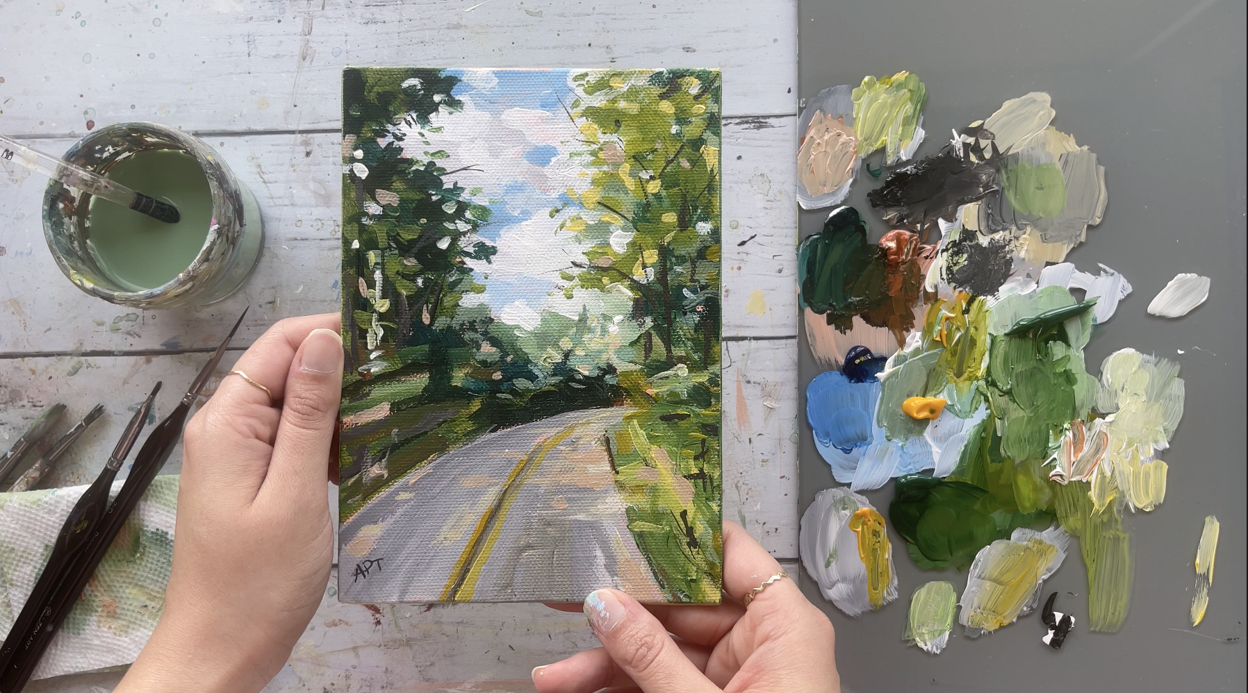
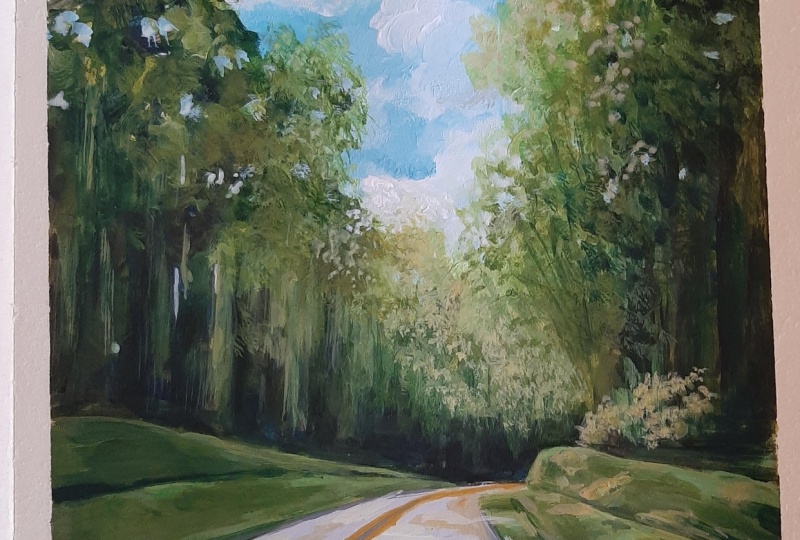
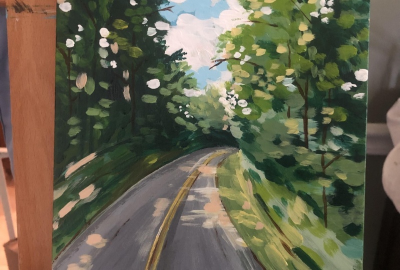
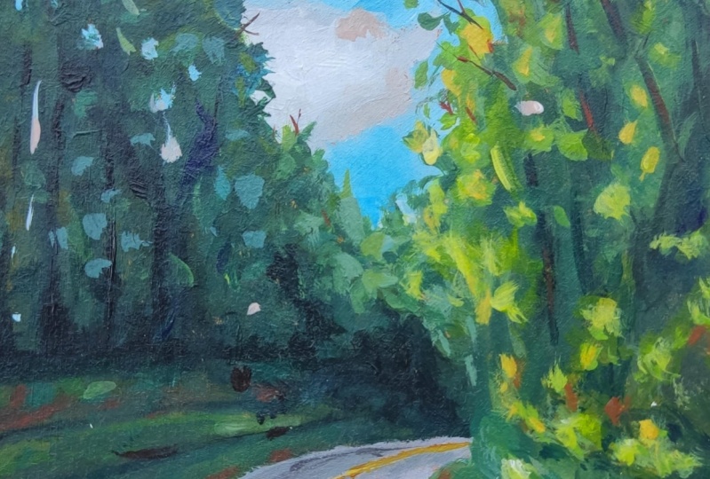
show you how to paint this loose acrylic landscape
using a reference photo. We're going to go
through all the materials that he will need, color mixing techniques,
brush techniques, and how to understand
dimension and form. Along with going over an exercise in
understanding value, super important, so
do not miss this. We will then paint this loose
landscape step-by-step. This class is great
for all levels. So let's dive right
in and begin.
2. Exercise - Value: So value in art is
essentially how light or dark something is on a
scale of white to black, with white being
the highest value and black being
the lowest value. So as long as you can see your reference or wherever
it is you're painting from in terms of value
before you even see color, that is when you can wholly
achieve successful paintings. It really helps break down
shapes into light and dark, it is as simple as that. Here, I have an image
of a landscape, which I convert it into
a black and white image. There are various apps
these days that you can just turn the image into black
and white on your phone, or if you have Photoshop,
that would be best. So using only black and white, I'm starting with
my darkest dark, I've seen the reference
and just getting that out of the way because
that's the easiest. Try and squint your eyes to
make it easier for you to notice only shapes and
color at this point. This is a great practice
that you can do with all your paintings before
you even begin painting. It will make applying color that much more easier because
now we've already established the core
of the painting and have someone mastered
lights and darks, which will then add to the
overall feel of the painting. [MUSIC] Now, adding in some white, I'm bolding in on the value of the lighter tones
I see on the right. Now, looking at the reference, I'm already aware that the
right side of this painting is much lighter than
the left trees. And I see that similar value of gray to the bottom bushes, and then also at the center
of the painting far back. [MUSIC] So now I'm getting in some of those mid-tone
values I see towards the left side trees and painting that entire area
with that value. [MUSIC] Next up, is getting the road and the sky, a highlight value of this painting is
obviously the clouds, which is a stark white, so I'm just going to
leave that line for now. [MUSIC] Once you've got
your base colors, it is time for you to assess
what color needs to get more dark or light in relation
to everything around it. This is the main reason I
always tell my students to never stay too long
on one side of the painting but instead paint all parts of your
shapes to keep on moving so that you can keep adjusting your color based
on your surrounding. Imagine spending way too
much time on one section only to realize that the color you've laid down is
the wrong value. So keep a habit in moving
around your painting instead of lingering on
one section for too long. I really hope that this exercise made understanding
value a bit more clear. You can now translate these values into your
painting when using color. You've already established
what parts need to be the darkest and lightest, and everything in between. Quick practices
like this before, painting can really help you
break down color and shapes, which like I've
mentioned before, is what painting is all about. It's simply understanding
shapes and color.
3. Exercise - Color Mixing: In this color mixing lesson, I will walk you through some
colors and show you how to mix colors to get a variation
of darks and lights. This technique can be applied with any
color of your choice. We will begin with
these four colors here, and black and white. I'm going to make
four columns here, one with the plain color
right off the tube, which will be in
the first column, and then I'll show you the different variations you can get by just mixing white
and then black. Then the last column will be a combination of these
colors amongst each other. Let's begin with
this darker green, which I believe is
called hooker's green and Acrylics Liquitex Basics. Here's what you get when
you mix in some white. As you can see, there's
a huge jump between the original color of this
green and then this one. Of course, you can control
the lightness of your green depending on how
much white you're mixing. Mixing in some black
can really give you some really nice dark tones. Again, you can totally
control how much dark you want your
colors to be too. So depending on how
much black you add, you can change up
the different tones. If you want to mute
this color a bit more, adding some white and black to this green can
give you just that, which are some of my absolute
favorite colors to mix. Remember, if you want
to tone down any color, mixing some white and black
to any original color can give you that really nice muted toned down version
of the existing color. Here I'm adding
some more white and just a tiny bit
of black but more white to show you the different variations you can get in this version as well. I will be repeating the same
steps in all these colors. I'm going to just speed
this up a little bit, but I just wanted to
point out how you can get so many different colors by not using that many colors
at all to begin with. The variations that
you can get from each color are endless. These are just a
few basic examples that I'm able to show you, but feel free to practice with some color mixing techniques if you are an absolute beginner, these can be super useful and handy and before you know it, this will be second
nature to you. When you need to reproduce
a certain color, you will know exactly
off the bat what to mix in order to
get that exact color. [MUSIC] So far we have only
introduced white and black to an original color, but now I'm going to show you even more variations and
options that you can get by mixing our original
colors that we have together. For example, what happens when
you mix both these greens together or mixing this
light green and raw sienna, or maybe even raw
sienna and taylor blue. You get the idea. Let's try some of that to see what we can get. You are mixing in
both these greens with some white and black, which creates this grayish tone. Then if you mix more
of the darker green, hooker's green, you'll get an in-between green from the two. Here you can see mixing
the light olive green with raw sienna gives you this
really nice warm tone, whereas mixing some
black to that will give you a muted cooler tone. Raw sienna and taylor
blue will give you a somewhat sap green color
with some warm tones in it. Then mixing white to that
gives you a muted olive green. But I'm hoping this exercise can help you understand the depth of colors you can get
by mixing them together and just playing
around with them. [MUSIC] These next two colors are some of my absolute
favorite colors to paint in. I often use these colors quite
a bit in all my paintings. If you're interested,
I got this color by mixing in hooker's green, taylor blue, some
white and black. Then this next one, if you take that
exact same color and mixing a little bit
of raw sienna in it, you will get this muted
version of the one on top, which it's just so beautiful. Here's an example of these
colors applied to a painting. You can tell how some of these colors have been
used in this landscape. In order to build
dimension and depth, you need to have these
variations of colors in order to make your
painting not look flat. Play around with color mixing
beforehand to give you a sense of colors you can get from a limited
color palette. This will really help
you visualize how you can use these colors
in your painting.
4. Exercise - Dimension & Form: In this lesson, I'm going to
go over dimension and form. A form is a
three-dimensional figure as opposed to a shape being flat. How would you add a
form to an object? Well, in painting, you can do that by adding color. In this example here
we have dark tones, mid tones, light
tones, and highlights. This is exactly what
you need to turn a flat object and give it
some dimension and form, and I'm going to show you how. [MUSIC] I'll be using red, black, and white to
demonstrate this. First, I'm going to block in
the shape with just plain red so that we can have
a base to start from. [MUSIC] This right here is an example of
a flat 2D object, which we will now turn into
a three-dimensional shape. Now, I'm going to start
adding in my mid tones. So I'm going to add
some black and white to the red to create that. [MUSIC] To get my dark tones, I'm going to add some more
black and fill in that edge. Now we're going to
take these two colors and blend them in between. You can already see how
this is forming a shape. Now let's add in
some light tones by mixing in some white. Notice how I'm painting in
the direction of the ball, I'm not just painting
this up and down. Since this is a round shape, you want to paint in that curve. I'm just going to
go back and forth in-between my dark
tones, mid tones, and light tones until I'm satisfied and I feel
that this looks good. [MUSIC] Here I'm just giving it a rough background so
that it doesn't feel like this is just floating around [MUSIC]. Then for the highlight, I'm going to take a lot more
white and a tiny dab of red. [MUSIC] A quick recap, dark tones are
achieved by mixing your original color
with some black, and then the more
white you mix in, you will get a gradient. So you can see how
you can move from a dark tone to a mid
tone, to light tones, and then your highlights [MUSIC].
5. Exercise - Brushwork: Now, let's dive right
into some brushwork. I'm going to show you
the different marks you can make with my most commonly
used brushes and I'll show you how I
apply and use them. Let's first begin
with the flat brush. This one's super
basic and clean. I use this one for the sky and you can get simple
flat washes with this one, but extremely thin lines if you use the tip
of it as well. Literally, the
smaller flat brush works just the same and I use this for a simple flat
washes for my landscape, especially when I block off
colors in the first step. [MUSIC] Like I mentioned, these next two brushes
are my most used and amongst my favorite
to paint landscapes. They are very versatile
and are great for that loose style landscape
paintings which we love. You can get really great, clean, flat strokes with this. I love painting this when I'm painting like
huge mountains or like just to block in shapes. I love using this brush to
block in the initial stages. This brush is also
great for layering paint on top of one
another as well. If you change the direction of the brush and
hold it vertically, you can get arch-like shapes
that can be used for bushes, trees, and loose objects. Because of the
brush's arch shape, it is great for bushes and hence really great
for landscapes. Using the side of the brush or its tip can also
be very useful to paint faraway trees
or houses, etc. Overall, it's just really
great for detailing. The smaller size
filbert brush is great for smaller bushes
and objects far away. I use this long thin brush
in every single painting, which I mostly bring out
at the end for detailing, so whether I'm painting
florals or landscapes, I always bring this
out at the end. This brush can really add some visual interests with
just little tiny marks. Today's painting, I use
this brush for the grass. I gave it some
highlights and just a little tiny marks faraway. This can really also signify
and give impressions of little objects like far away so maybe even houses or animals. I even actually sign my
art with this brush. If you are wondering
how I assign them, it's always with this
brush at the very end.
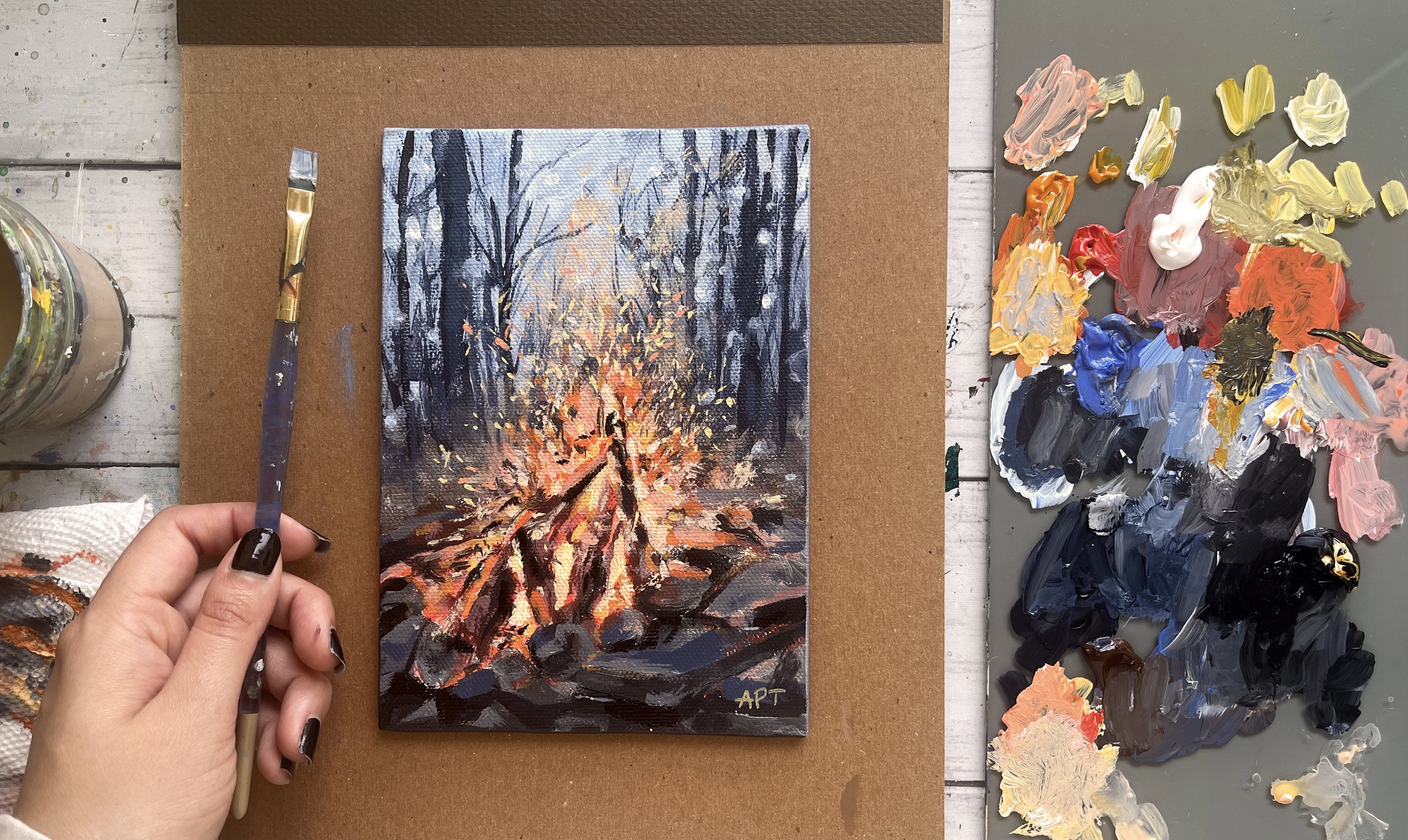
6. Materials: Project, you will
need a bowl for water and then a paper towel, a Gesso Primer, two
primer canvas beforehand and any brush for that will do. Then for my canvas, I'm
using our teaser palette, it's a five by seven inch. Then you'll need a pencil
maybe for sketching, a glass, any palette and then
I have a scraper with it. Then these are all the
brushes that I've used. Again, everything here has been linked in the description, in the projects
and resources tab, so you can check that out. But a couple of flat brushes, some fine brushes, and some filbert brushes. Then for paints, these were the main four
paints that I've used. Phthalo green, phthalo
blue, and mid yellow, and mars orange, along with hookers green and
black and white.
7. Prep Canvas: I like priming my
canvas beforehand. Most canvases do
come primed already, but I like giving
it an extra layer. So wait for this to dry
completely before we move on to the next step [MUSIC].
8. Painting 1 - Sketch: [MUSIC] I'm first
going to tend to the entire canvas to begin with. This is optional, but I
sometimes like to have a base color instead of
just the plain white. It just feels less
intimidating and also makes the white paint
application easier like the clouds and all
the other highlights. I'm using Mars orange from the Artesia palette
and a bunch of white, but you can also use Burnt
Sienna or any brown and white. [MUSIC] Next up let's roughly sketch out this landscape to make the
painting process easier. Try and simplify your
sketch and only draw things that will help you in
identifying shapes and color, so focus on the big shapes. Squinting your eyes can
also help with that. It will blur out and eliminate all the small details which
we do not need at this point. So starting with the wood
forest and then getting the overall outline of the trees that we
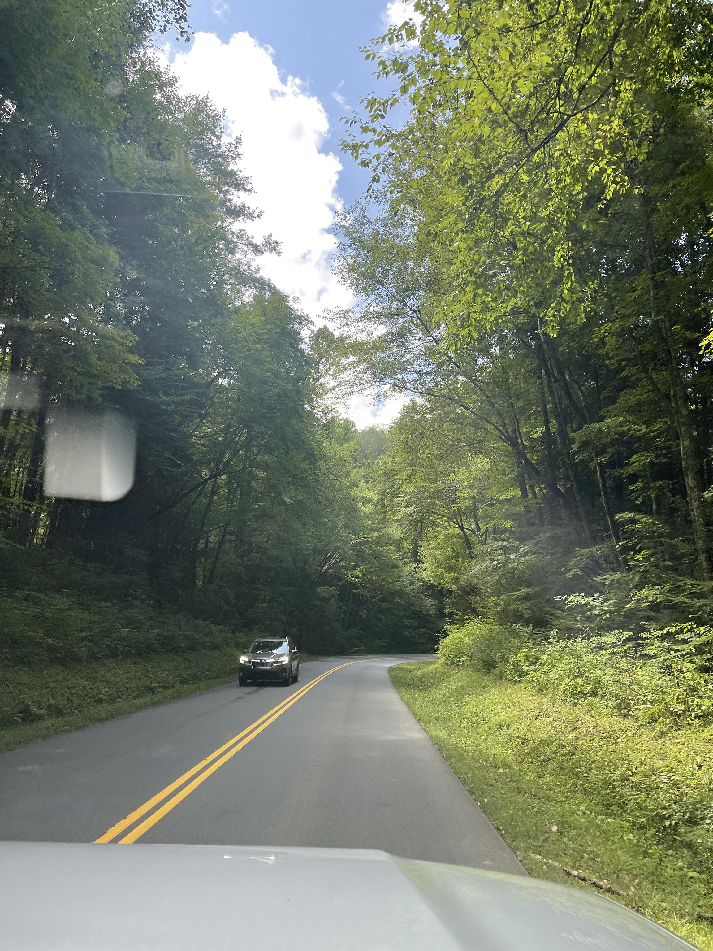
see on both sides. I did take this picture on my way to the Smoky Mountains
on a travel trip once. You can see the front of my car, which I'm not going to be
adding to this landscape. [MUSIC] Here I just put a reference to the car that we see on the other side just in
case I wanted to add that, but I shortly decide
to not put that into my painting and I just
wanted to focus on the landscape part of
my painting instead. Just a reminder,
the reference pic is in the Project
and Resources tab, so if you want to pull it up on the side as you paint,
feel free to do that. You can also right-click and save the image to print it out.
9. Painting 2 - Base Layers: Let's start with the sky and
get some base layers first. I'm using phthalo
blue and white, and I'm using a filbert brush. You can find all the links to everything in the project
in Resources tab below. I wasn't too happy with the cloud composition or
the shape in the reference, so I do change it up
a little bit here. This is also a reminder
that you do not always have to match everything exactly like the reference, and definitely do not add
every small little detail that you see because our
aim here is to paint loose, and I always say less is more and it always gives a
much stronger impact. Hold your brush from the
back handle and apply quick, short strokes and use different sides to your brush to get a variety of brush marks. I'm leaving those gaps in
the middle there just to add plain white for the clouds. [MUSIC] Rinsing off that brush, I switch to a smaller flat
brush to paint the clouds. Here, I'm using white and
a tiny bit of black and blue to get this grayish tone as the shadow part
of the clouds first. It's always easier to
paint from dark to light. That way you can have that extra white highlights to the clouds on the very top. [MUSIC] Apply your strokes confidently and just
lay them there. [MUSIC] We will come back to
the clouds in a bit, but let's move on
to another section. I like getting in
my darks first and sectioning out my value. I'm using phthalo
green, phthalo blue, and some Mars Orange to get this deep green for my shadows. Again, look at the
bigger shapes here. Really squint those eyes and all these shapes will
break down in value. So you will then notice all
these darks and lights. That's what we want
to focus on right now to just get the value
down completely. It'll just make the
painting process on top of this a lot easier. I'm not trying to focus
on any details here, but I'm just laying out
the shapes based on value. Speaking of which, if you
haven't already gone over the exercise I have
above on value, please pause your lesson
right now and just make sure to complete that
before you move further. Trust me, it'll help you tons. [MUSIC] Now, let's get the portions that are like the midtones
of this painting. I'm using Hooker's green from the Liquitex Basics
paint set and just using that color directly
to fill the left side. [MUSIC] Laying horizontal strokes for the side grass in the
bushes towards the left. Always make sure to
apply the strokes in the direction of the shapes that you see in the reference. [MUSIC] Here, I'm adding some
white to the green to get some lighter values
towards the right side. [MUSIC] I'm seeing a slightly
different value of green right below the
bright greens above, so I'm making sure to add
that towards the right. You always want to
constantly look at your reference and
then your painting to make sure that the colors
that you're adding next to each other makes sense
to the overall painting. [MUSIC] I'm bringing out
some deep yellow to this green
mixture to brighten up the lighter greens that
I see towards the right. [MUSIC] Now let's get the road
part of this done for us, like just getting the base
layers at the moment. Here, I'm simply
taking black and white and laying vertical
strokes here for the road. [MUSIC] Going back into the sky with
a smaller brush and adding those stronger highlights of
the clouds with plain white. [MUSIC]
10. Painting 3 - Building Lighter Values: [MUSIC] I'm going to get some negative
painting here and have some sky peeking through
the trees on both sides. This will break up those
big tree shapes and allow for some openness
and some interest. Just a few small specks
is all you need. [MUSIC] I'm using Hooker's
green and white to add some of the lighter greens
I see on the right side. Overall, looking at
the reference and understanding the overall
gist of the value, you can clearly see
that the right side is a lighter green
compared to the left. Just keep that in mind while you paint and always
make sure to compare the colors around you
so that you don't stray away from what you initially
had for your base layers. The minute you feel
like your right side is getting too dark, then that's your cue to lighten
things up. [MUSIC] When it comes to loose painting, understanding the
value and shapes of color is the most
important thing. Once you get that
and stick with it, it conveys the right feel without looking like
you've added too much. When in doubt, always
remember less is more when it comes to adding
brush marks and color. Peel back layers, and only provide information as an artist that you
feel is important to illustrate in your painting in order for the viewer to get the impression of
objects and shapes and the landscape in general. Definitely do not
feel pressured in adding every small detail you
see in a reference picture. Decide what do you think
is important and needed, and only add color and
brush marks to that. This is why I always feel
like loose painting, they're just much
harder in general because you, as an artist, you're responsible
in figuring out what needs to be pushed back
and pushed forward, and what value and shape is
enough to give impressions of objects without making it
look too busy or chaotic. Just some general
tips here since I touched upon pushing
things back and further. When you want things to seem
further back or far away, apply cooler tones to it, so more blues, purples, etc. When you want things
to come more forward, warmer tones does the trick, so more yellows and warm reds. This is just how things
appear in real life too. Pay attention to
when you're looking out at landscapes,
or just in general, pay attention to how things appear and why
things are further back and pay attention to the
value and color of objects. Another tip is to use horizontal strokes when you
want things to be pushed back and then vertical
strokes when you want to bring things to the foreground or for them
to be much more closer. Getting back to
the painting here, I added some of those darker green bits to the right side before getting in those light green leaves
on top of it that we see the sun shining through
to the right side. I'm using yellow and green mixed to get that light green
color to the right. [MUSIC]
11. Painting 4 - Building Darks & Lights: Going back to the
dark green to enhance the shadow areas
towards the left side, be sure to keep
checking the direction of how the leaves are placed in the reference as well
and then make sure to apply your brush marks
in that same direction. Then also use different
sides to your brush, so using the front of it and at then the
side of it, etc. Keep a habit to constantly
be moving your brush around and use all
the sides to it. That way it adds a variety of brush marks and interest
to the painting. [MUSIC] Getting in a much
smaller brush marks here towards the
edges of the trees, as you can see in the reference, they are pretty
tiny and far back, so I'm adding some brush
strokes to that on both sides by keeping the dark and
light value in mind. [MUSIC] Since we lost some of
those negative sky marks we added to the trees. I'm going back in with a few spikes of that on both
sides so that we can have some light peeking
through the trees and just break up the
big chunky shapes. [MUSIC]
12. Painting 5 - Road: [MUSIC] Coming back to the road, let's enhance some of those
values by going over some of those areas again with
some light and dark values. [MUSIC] Getting some yellow and adding those two striped lines we see
in the center of the road. [MUSIC] Now it's time to add some
of that extra warmth to this painting to the sections that the sunlight's
hitting to the pathway. Here I'm adding in some yellow-white and a bit of
Mars Orange mixed together. [MUSIC] Roughly adding in brush marks to the sideway of the road
where the light touches. Using any set small flat brush will help in that direction
and make sure you're adding your brush marks in
a sideway direction like how the sunlight's hitting. Make sure it's not
vertical strokes, but they're horizontal ones. But towards the front of
the road you will see light shadows that are elongated like more
vertical stroke. Make sure you just follow the direction of the reference and how the light's hitting. [MUSIC]
13. Painting 6 - Highlights & Details: Mixing yellow and white now, I'm really enhancing
those lighter values to the leaves on the right and then also to the
grass at the bottom. I'm using a smaller
brush here to get smaller brushstrokes to
those leaves on top. A reminder to hold your
brush from the back handle to keep your
brush marks loose. Try and switch up
your brushstrokes and brush marks by using different
sides to your brush. [MUSIC]
14. Final Touches & Class Project!: Using a fine thin brush, I'm adding in some
impressions of branches by using a dark brown. [MUSIC] I love the combination of warmer tones and
green landscapes. You know those terracotta
warm brown palettes, so I'm using Mars Orange, which is basically like
burnt sienna and white here to bring out those warmer values to the sunlight a bit more. I'm adding that value
to the road and a few bits on just to the trees. Remember, less is more. So do not overdo it, but just add enough for viewers to notice that subtle
change in warmth. [MUSIC] Once your painting has dried, go ahead and paint those
edges of the canvas, if you haven't already, to add into that
clean finished look. [MUSIC] This completes our loose
acrylic landscape for today, and I cannot wait to see
what you guys come up with. Share your projects. I would love to see them, and do not forget to leave
this class a review. If you enjoyed this class, make sure to follow
me so that you do not miss out on future
painting classes from me. Follow this class
up with another one of my favorite landscape
road paintings. I have linked it below
and I have tons of other similar projects
and classes like this. So do check them out. I do appreciate all the
love and support I get from each and every one of you
from all my orders lately. So thank you. To shop my arts, do visit my website. To keep up with latest news, do follow me on
Instagram where you can stay up to date with
my new launches. Thank you once again
and happy painting. [MUSIC]
 Alifya Plumber, Artist | Acrylics, Watercolors | Painter