Transcripts
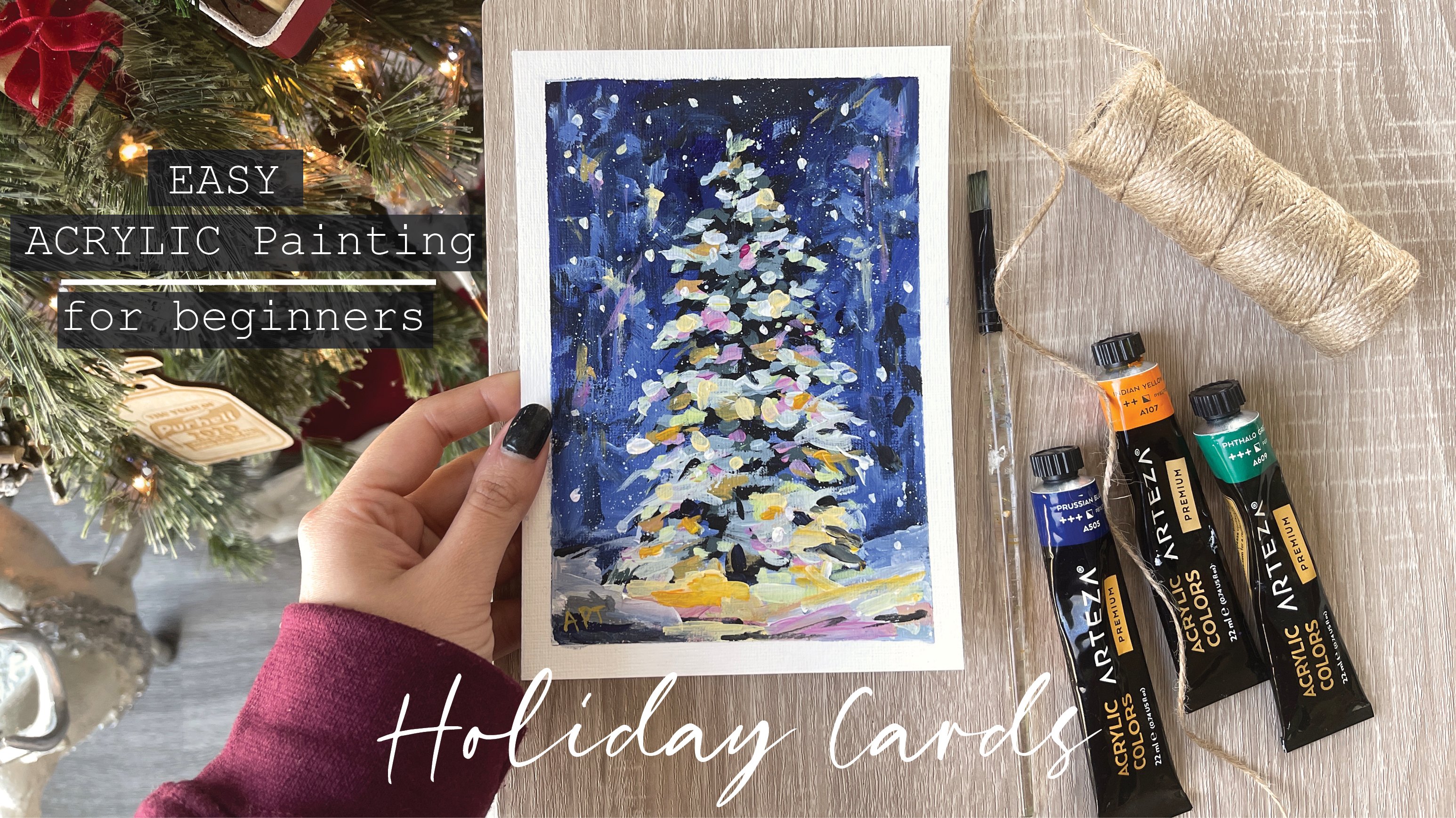
1. Introduction : Hey everyone, my name
is Alicia and I'm an artist here in San
Jose, California. Get into your holiday spirit because in the next few weeks, I will be teaching
you how to paint quick and easy holiday
ventral paintings that will give you
all the cozy vibes. Today we are going
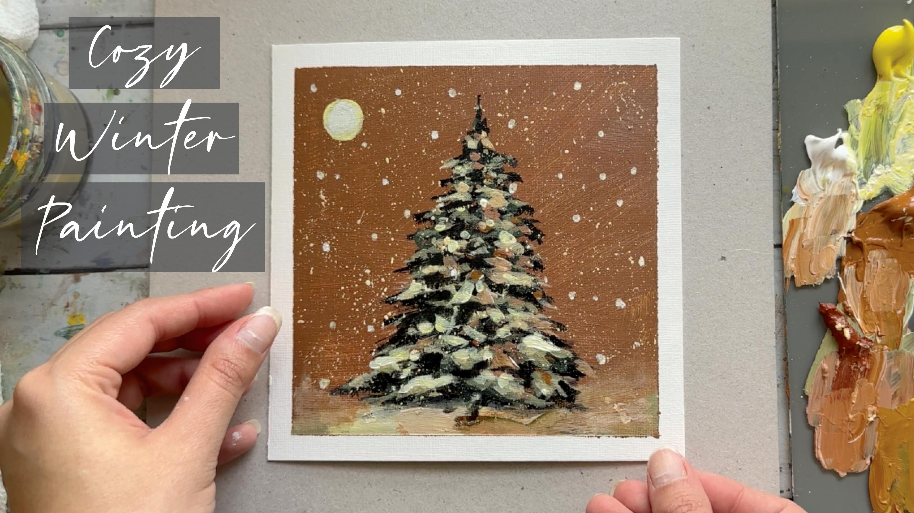
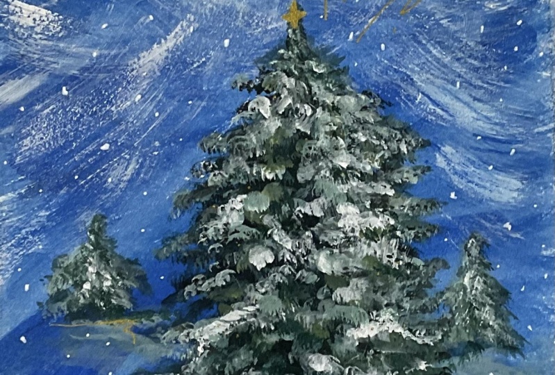
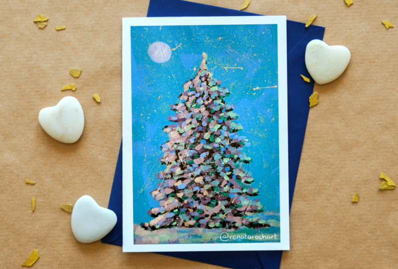
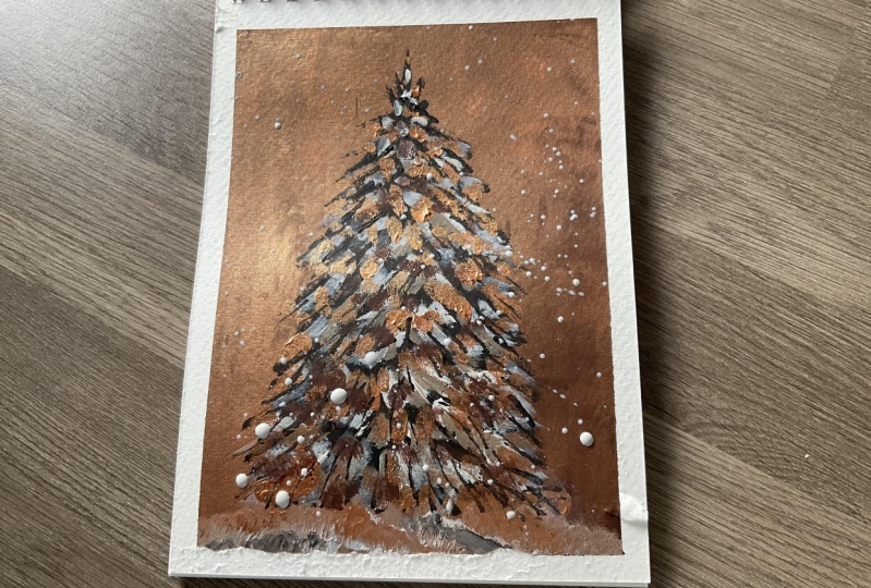
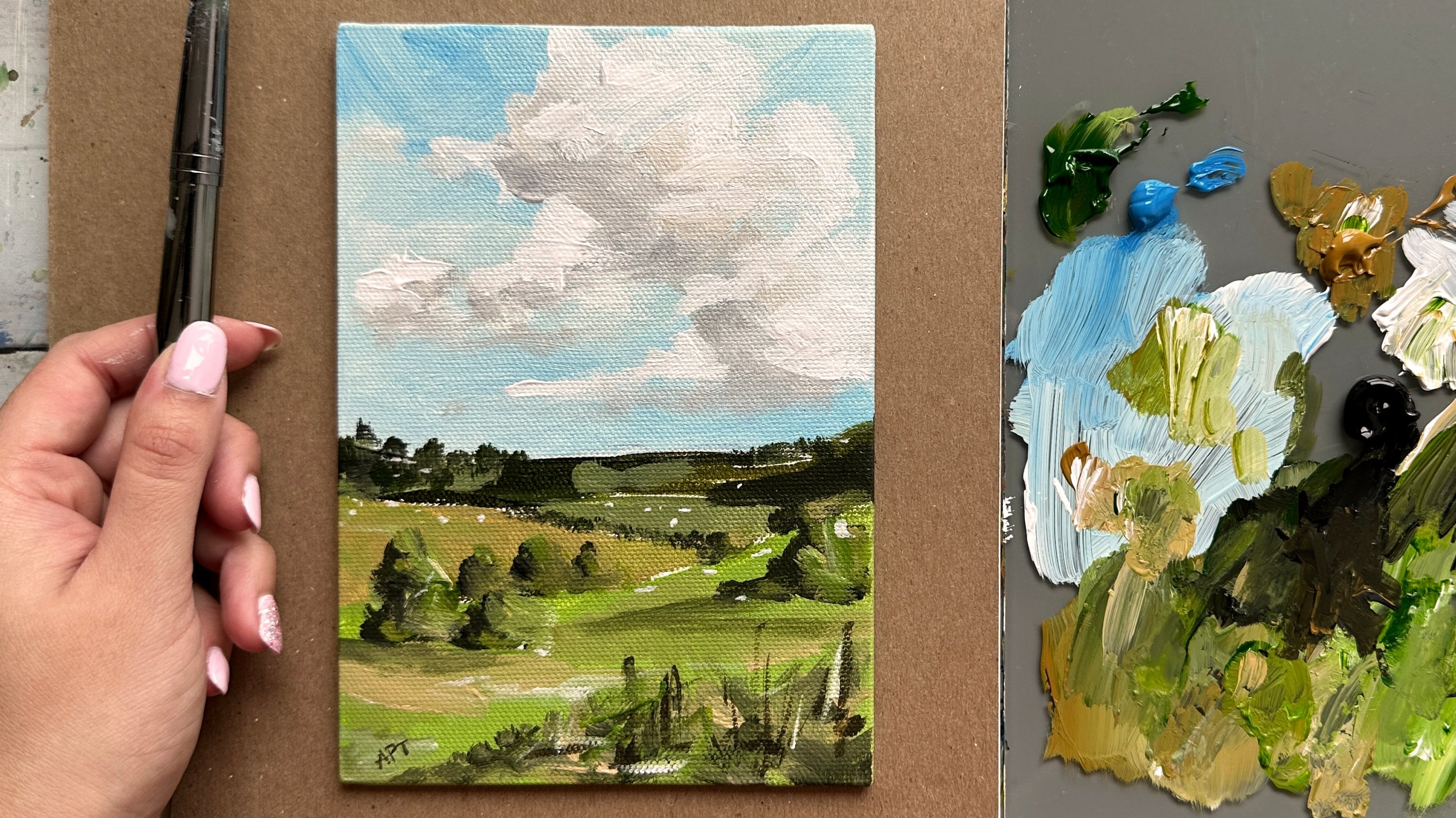
to be painting this EZ went to a
tree landscape. They can very well be turned into a greeting card as well. So let's begin. We'll show you all the
materials that you will need. Color mixing techniques,
brush techniques, and an exercise on
dimension and form. So let's dive right
in and begin.
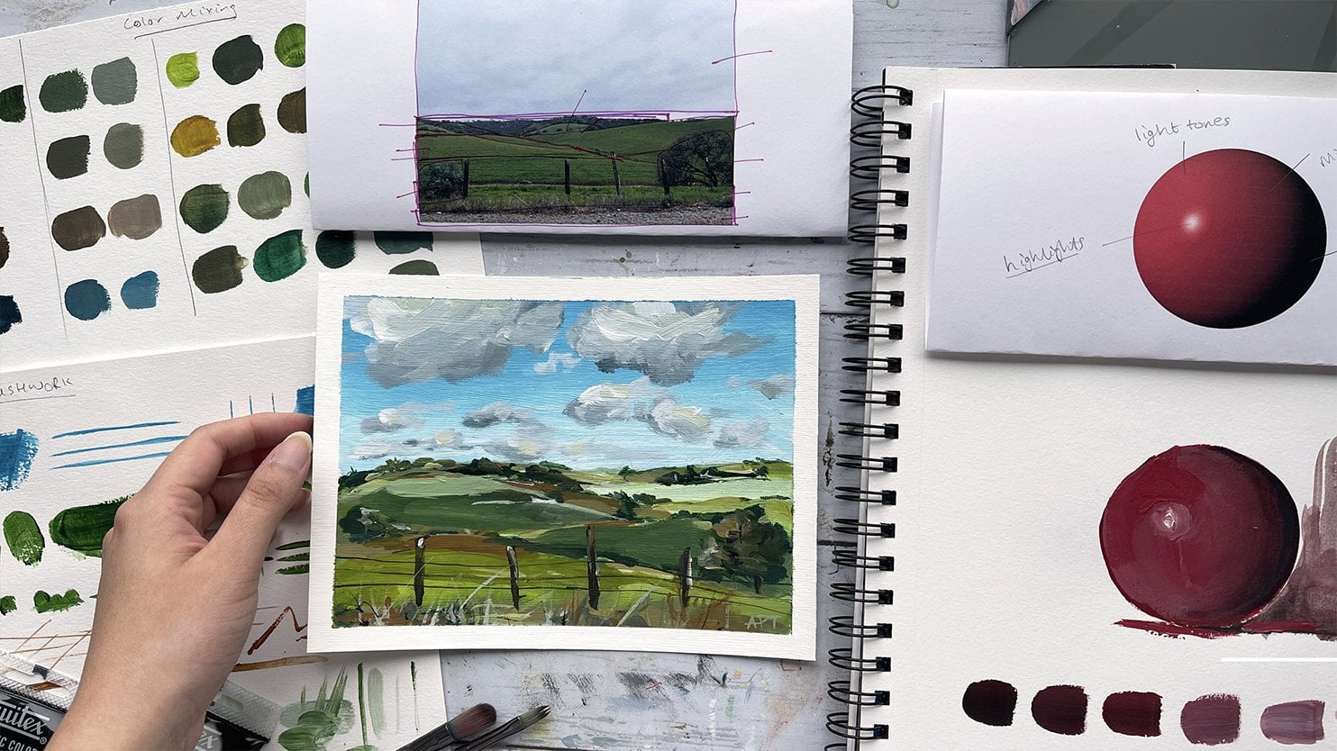
2. Exercise - Color Mixing: In this color mixing lesson, I will walk you through some
colors and show you how to mix colors to get a variation
of darks and lights. This technique can be applied with any color of your choice. So we will begin with
these four colors here, and black and white. I'm going to make
four columns here, one with the plain color
right off the tube, which will be in
the first column. And then I'll show you the different variations you can get by just mixing white
and then black. And then the last column will be a combination of these
colors amongst each other. It's, Let's begin with
this darker green, which I believe is
called it goes green and acrylics Liquitex basics. So here's what you get when
you mix in some white. As you can see, there's
a huge jump between the original color of this
green and then this one. And of course, you can
control the lightness of your green depending on how
much white you mixing. Mixing in some black can really give you some really
nice dark tones. And again, you can
totally control how much dark you want your
colors to be two. So depending on how
much black you add, you will, you can change
up the different tones. And if you want to mute
this color a bit more, adding some white and black to the screen can
give you just that, which I have on my absolute
favorite colors to mix. So remember if you want
to tone down any color, mixing some white and black to any original color can just can give you that
really nice muted tone down version of the
existing color. Here I'm adding some more white, just a tiny bit of black, but more white to show you the different variations you can get in this version as well. Alright, so I will be repeating the same steps and
all these colors. So I'm going to just speed
this up a little bit, but I just wanted to
point out how you can get so many different colors by not using that
many colors at all. To begin with, the
variations that you can get from each
color are endless. These are just a
few basic examples and I'm able to show you, but feel free to practice with some color mixing techniques if you are an absolute beginner, these can be super
useful and handy. And before you know it, this will be second
nature to you. And when you really need to
reproduce a certain color, you will know
exactly off the bat what makes an order
to get that exact. Alright, so, so far we
have only introduced white and black to
an original color. But now I'm going to show you even more deviations and
options that you can get by mixing our original
colors that we have together. E.g. what happens when
you mix both these greens together or mixing the
slide queen and raw sienna, or maybe even raw
sienna and blue. You get the idea. So let's try some of that
to see what we can get. So here I'm mixing in both these greens with
some white and black, which creates this grayish tone. And then if you mix more
of the darker green, hookers green, you'll get an in-between green
from the top. Here you can see mixing
the light olive green with why sienna gives you this
really nice warm tone. Whereas mixing some
black to that will give you a cooler tone. Raw sienna and tailor
blue will give you a somewhat sap green color
with some warm tones in it. And then mixing white that
gives you a muted olive green. But I'm hoping this exercise can help you understand the depth of colors you can get
by mixing them together and just playing
around with them. These next two colors are some of my absolute favorite
colors to paint in. And I often use these colors quite a bit in all my paintings. If you're interested,
I got this color by mixing in hookers, green, tail blue,
some white and black. And then this next one. If you take that
exact same color, I'm mixing a little bit
of raw sienna in it. You will get this muted
version of the one on top, which is just so beautiful. Here's an example of these
colors applied to a painting, and you can tell how some of these colors have been
used in this landscape. So in order to build
dimension and depth, you need to have these
variations of colors in order to make your
painting not look flat. So play around with color
mixing beforehand to give you a sense of colors you can get from a limited
color palette. And this will really
help you visualize how you can use these colors
in your painting.
3. Exercise - Brushwork: Alright, so now let's dive
right into some brushwork. I'm going to show you the
different marks you can make with my most commonly
used brushes. And I'll show you how
I apply and use them. Let's first begin
with the flat brush. This one's super
basic and clean. I use this one for the sky and you can get simple
flat washes with this one, but extremely thin lines if you use the tip
of it as well. Hello Lee, the smaller flat
brush works just the same. And I use this for simple
flat washes for my landscape, especially when I block off
colors in the first step. Like mentioned, these
next two brushes are my most used and amongst my favorite
to paint landscapes. They are very versatile
and are great for that loose style landscape
paintings which we love. You can get really great, clean like flat
strokes with this. I love painting this. When I am painting
like huge mountains are just going to
block in shapes. I love using this brush to
block in the initial stages. This brush is also
great for layering paint on top of one
another as well. If you change the direction of the brush and
hold it vertically, you can get arch like shapes
that can be used for bushes, trees and loose objects. Because of the brushes
arch like shape. It is great for bushes and hence really great
for landscapes. Using the side of the brush or its tip can also be very useful to paint faraway
trees or houses, etc. And overall, it's just
really great for detailing. The smaller size. Full brush is great for smaller bushes and
objects far away. I use this long, thin brush and every
single painting, which I mostly bring up
at the end for detailing, whether I'm painting
florals or landscapes. I always bring this
out at the end. This brush can really add some visual interests with
just little tiny marks. Today's painting, I use
this brush for the grass. I gave it some highlights and just little tiny marks far away. This can also signify and give impressions of little
objects far away. So maybe even houses or animals. I even actually assigned
my art with this brush. If you are wondering
how I assign them, it's always with this
brush at the very end.
4. Exercise - Dimension & Form: In this lesson, I'm going to
go over dimension and form. A form is a
three-dimensional figure as opposed to a shape being flat. And how would you add
a fall onto an object? Well, in painting, you can
do that by adding color. In this example here
we have dark tones, mid tones, light
tones, and highlights. This is exactly what
you need to turn a flat object and give it
some dimension and form. I'm going to show you
how I'll be using red, black, and white to
demonstrate this. So first, I'm going to block
in the shape with just plain red so that we can
have a base to start from. This right here is an
example of a flat 2D object, which we will now turn into
a three-dimensional shape. Now, I'm going to start
adding in my mid tones. So I'm going to add
some black and whites to the red to create that. To get my dark tones, I'm going to add some more
black and fill in that edge. So now we're going to
take these two colors and blend them in-between. You can already see how
this is forming a shape. Okay, now let's add in some light tones by
mixing in some white. Notice how I'm painting in
the direction of the ball. Not just painting
this up and down, since this is a round shape, you want to kind of
paint in that curve. I'm just going to
go back and forth in between my dark tones, mid tones and light tones until I'm satisfied and I
feel that this looks good. I'm just giving it a
rough background so that it doesn't feel like
this is just floating around. Alright, and then
for the highlight, I'm going to take a lot more
white and a tiny dab of red. So a quick recap. Dark tones are
achieved by mixing your original color
with some black. And then the more
white you mix in, you will get a gradient. So you can see how
you can move from a dark tone to a mid
tone to lighter ones. And then your highlights.
5. Materials & Prep Paper: Alright, so these are all the
materials that I have used. You'll need to go for water
and some sort of rag. And then the my artist's
tape and then Jess, so for priming the
Canvas beforehand, and I use my acrylic
Strathmore paper, which I cut to a
six-by-six inch. And then these are the brushes. So use any kind of flat brush
to paint the background. And then I used three
different flat brushes. Again, they have been mentioned
down in the description. So you can look over that. So two flat brush and one
breath-hold flat brush. So number four and number
six, smooth flat brush. Then we have to round brushes, like a fine round brush. And then in number five,
round brush as well. And then some sort of palette
of course, of your choice. And then for paints, these are all the pins. Again, I have mentioned
that below as well. So Yellow Oxide raw
sienna, cadmium, yellow, black and white, burnt
sienna, and hookers green. There we go. So to begin, I am prepping
the paper down which ISO, which is basically a primer. And it just perhaps your
Canvas before painting. You can choose to thin this down slightly
if you would like, or just use it directly off
the tub, which I prefer. And then maybe dab
your brush once or twice in the water to
make it spread better. One or two, even coats
should be enough. And once you're done
with this step, we will move on to
the taping section. Like always, let's begin
taping down the paper and its edges to the
west, a clean border.
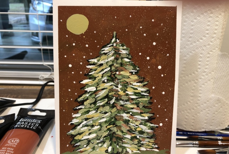
6. Painting - Background & Base Layer: So I wanted my background color to be a bit different than what we usually see in a
open to tree landscape. So I decided to go for a
neutral brown, beige color. I'm using raw sienna and some white and
black to start with. Use any size brush that
you have at this point. And you can just paint
the entire background with this color. To add some more warmth
to this painting, I'm bringing in burnt sienna
into this mixture as well. So once you're fully
done with this layer, allow it to completely dry before we start
painting the tree. I'm using a number
six flat brush and taking in black directly to
start the base of the tree. This will work great to get
the initial shape of it. All I'm doing is
dabbing very lightly. I'm just dabbing the
tip of the brush on either side of the tree to create this for like shape of the tree.
Simple slow depths. Sometimes I like to
get the outline of the shape on one side
of the tree forest. This helps with making
sure that you have the right shape and
it's not lopsided. So this will help in making
sure that it's not too thick or thin from either side. So sometimes just working
on one side for us just to get the outline of
the shape becomes easier. Then I'll do the same
on the right and then I'll just fill in
the gaps in between.
7. Painting - Adding Greens & Browns: Alright, so now I'm going to
be taking in some Hooker's green and I'm mixing that
with some white and black. And I'm getting a few
strokes at that in my tree. So the general rule
here is to try and get your stroke slightly bigger
or thicker at the bottom. And as you work your way on top, you can be mindful of just
getting smaller brush strokes. Switching my brush to a
smaller number for flat brush. Now, the goal here is to get some of those
small brush marks. We are only going to be building in one color after the next. So we're going to stick to
the same color palette. We already have mixing
in some raw sienna, Hooker's green and white. I'm starting at the very top and slowly working my way down. Try and use all
sides to your brush for a variety of brush
marks and thickness. Remember to keep them smaller at the top than at the
base of the tree. I am very lightly dabbing
my brush, as you can see, using the tip at a time, sometimes sides of the corner. Just make sure to
switch them out, keep them small at the top to get the bottom if you'd like. And this is basically all
I'm gonna be using for every single brush technique
that we add onto the tree. So once you get the hang
of it, it is pretty easy. So using that same color that'd be added on
the tree just now to kind of fill in the bottom as well for the snowy effect. I'm getting in some of
that bond sienna again. And the goal here is to get
that background color to reflect off the tree so
that it can all blend well. So even if you choose to not
do this brown, beige color, just make sure you stick with the same routine as far
as adding new colors. So you just want to get some of that background color onto a
tree to reflect off of it. Mixing in raw sienna and
burnt sienna together. And I'm using the
same technique, but this time only
using this color, mostly on the right
side to have more of that light coming
through the left. I didn't watch CNN
directly now to get a few specks of
that on the tree.
8. Painting - Highlights & Snow: Alright, so now I'm going
to get in some cadmium yellow mixed with white and a tiny bit of
that burnt sienna, raw sienna to get this
glow to our tree. And I'm still using the
same brush technique from the very start. Getting that same color
to the base as well, but only to the left side. Because remember, we want the light source to be
coming from the left side. I decided to add a little sun
or moon in the corner here. I couldn't decide which
one it ended up being. I think either has an
abstract dawn or dusk effect. But you let me know in
the discussions tab below what you think
this looks like more. All right. Getting in a
rough bristle brush and the same watered down version of
this yellow, white mixture. And I'm just clicking off
the bristles to give me this splattered snowy effects. Using a round brush, I'm getting the snow falling
all over in the background, and also a few dots
on the tree as well. Using that same
white yellow combo, getting that at the base
for this highlighted look, as well as some last minute touches to the tree
for final highlights. I'm just muting this
color a little bit and blending that
out with some gray, taking into raw
sienna and white. And I'm adding a rough edge
look to the snow there. I didn't want a very clean line. I want it to blend with
the background above. I've just thought of
messing up that edge there.
9. Final Details & Class Project: Lastly, if you feel like you are missing some of those darks, feel free to add a tiny
touch of that in-between. Just a few places where you feel like you can bring out
some of those darks more. I'm taking black
directly and adding that to just a few places where I
think it kind of got lost. All right, Let's take
off this tape to reveal our final painting. You could totally leave it as is as a finished painting piece. Or you could turn this into a
greeting card or some sort, and maybe some
handwritten words on it. For fun. I decided to write Happy
holidays with a pencil first. And then ideally, you would want a white fine pen to
go over those lines, but I didn't have anything, so I just decided
to use a fine brush and white paint and I went over the handwritten
words instead. But if this makes you uneasy
than totally skip this step. But if you do try this gift, this to your loved ones and I'm sure they will
appreciate it. I hope you guys enjoyed and this completes our easy and quick holiday winter
painting for today. Share your projects.
I would love to see them and do not forget to
leave this class interview. Ask me any questions in
the discussions tab below. I invite you to explore the different classes
I had created for you. Classes and
watercolors, as well as acrylics are available if
you want to learn more. So do consider following
me so that you do not miss out on future
painting classes from me. Thank you so much for
your support over at my website and
also my Etsy shop, you can find original art
prints and much more. The links are below. As always, follow me
on Instagram to keep up with the latest updates giving Bayes and
all that fun stuff. Hope you guys are having a
great start to your holidays, and I will see you
in my next class.
 Alifya Plumber, Artist | Acrylics, Watercolors | Painter