Transcripts
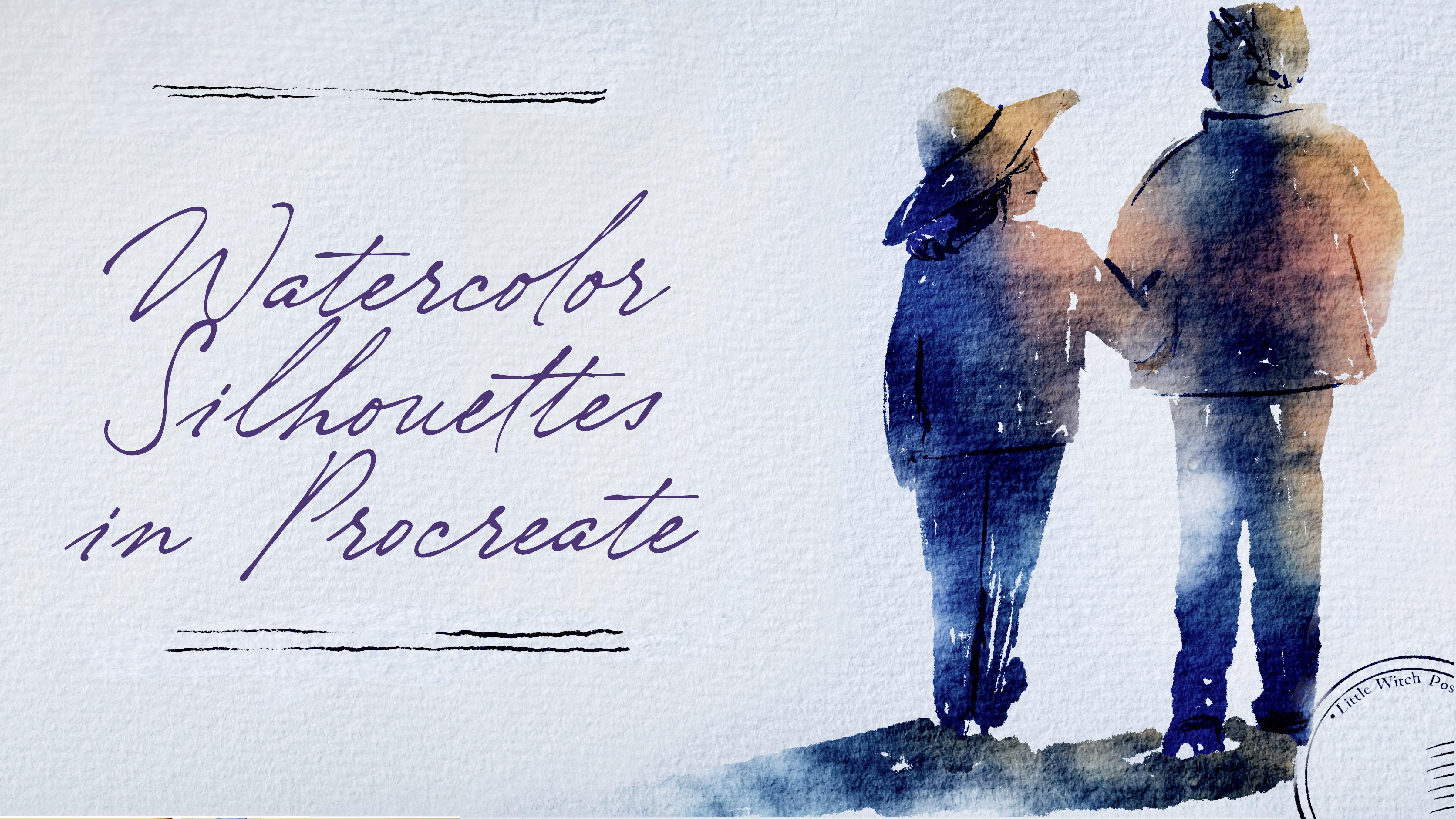
1. Introduction: Hi, guys, I'm Iga
freelance illustrator. I have been painting
for 15 years, so I have a bit of
experience in this field, and I'm obsessed with procreate, watercolor, magical
things and cute stuff. And during my classes, I constantly share the
knowledge that I have about the procreate and how to create lovely watercolor
art digitally, so no one would see
the difference. And this class is about
one of those topics. So welcome back to my class, and let's dive into
watercolor art and paint together
lovely silhouettes. At the end of my class, you will learn more
about procreate, especially improve our
sketching technique, and I'll show you how to
sketch in a fast way, how to use layers, click and sk, and how to create
watercolor texture paper, and how to add volume and
color variations to your art. And most importantly, you will learn how to create
watercolor silhouettes in procreate using digital
watercolor brushes in a fun and simple way. I'll show you where
to find the freebies and how to input them
into the procreate. Along with creating
texture paper, of course. Our next step will
be talking about reference pictures and
creating sketches. And finally, we'll start adding colors, shades
and highlights. And today, I will show you pretty secret technique how to make silhouettes
in a very fast way. I will show you how to
create human shuete from the simple shapes and how to
add more and more details. So we will make our painting
process more advanced. It won't take a lot of time, so it's perfect as a daily
sketching practices. So if you want to improve
your sketching technique, feel free to do it
and feel free to use the tips that I give
during today's class. And as a bonus, I will share with you my own custom brushes, paper, color palette, my own
pictures that I created. This class is great
for beginners. Also can be useful for
intermediate level, actually for those
who are interested in digital watercolor art
and sketching techniques. And one more thing that
I want to mention, your opinion and your
feedback is crucial to me. So feel free to tell me
what you think and feel about my class in discussion
or review section. I'll be glad to reply to you. My dear Artres, I can't
wait to start this class, and definitely I
can't wait to see what you upload to
project section. So let's grab your iPad
with Apple pencil, or you can just use regular
watercolor paper and paints, and let's paint together.
2. About Class Project: So your class project
will be next. You can follow my steps and create lovely
silhoutteillstration, the same that I chose or use your own sketches
that you made and then paint it using the tips and brushes
that I gave you today. I will use Procrit
for this class with iPad and Apple pencil, but, of course, you
can follow my steps and paint everything
in procreate. Like I said, you can use regular watercolor paper and paints or some other drawing pads and just enjoy painting process. In today's class, I will paint
silhouette illustration, and we'll start with simple shapes and then add
more and more details. And in the end of our class, we will create lovely
silhouette postcards that you can print and share
with someone you like. Once again, you can choose completely different topic
and draw something new. Try experiment and enjoy
painting process together.
3. About Freebies and Textured Paper: In this class, we'll
talk about resources and where to find them.
It's pretty simple. Follow the steps, go to
projects and resource section, then download freebies,
go to Files app, and then import all the
freebies into the Procreate. Also, it's hard to create watercolor illustration without
watercolor texture paper. So we're going to
fix this issue. Let's talk about in detail. So when you open my class, please do it in browser. You can do it in home or Safari. Need to do it in
browser because if you open my class through
the Skillshare app, my freebies might
not be visible. So you go to browser, then you open my class, and then you need to find
projects and resources section. And in the right corner, under the headline resources, you will find all my freebies. Then you download them
and you go to Fils app. Great. So the next step
will be we need to find all the freebies in Fils app and then we have
two options what to do. You can simply touch the object and then press share and then
here you have procreate, so just simply press it. When you're done with exporting all the files from Files app, we are ready to open Procreate. And here, let me show you the way how you can
create texture paper. So we need to tap plus, and then we need to
press Plus again. Then let's switch from
pixels into inches and let's write 13 pair 11 ". And here you need to make sure that you have 300
DPI resolution. And depending on your iPad, you will have different
number of layers available. Then tap grid Among
the freebies, you also can see texture paper. So we're going to use it today. Let's just create a
couple of new layers, and then we are on layer three. Then we need to tap action button and then
press inserted file. Again, go to Files app and you need to input your paper
into the Procreate. Great. Now, rotate and feed
to Canvas. Great. And my suggestion, also, you can move it a little
bit to the sides. Like that. So that's all paper. Then we need to duplicate it. And now where the magic starts, we need to make our watercolor paper textured watercolor paper. So when we use our
watercolor brushes, we will create this
natural feeling when color bleeds
into the paper. Let's do it. So like I said, we duplicated the
paper two times. If you want to actually
can do it three times. And we need to set the
top layer as a multiply. And let's turn it
off for a while. Then we need to go
to the second layer, and here we change blending
layer mode to color burn. The last one, same
we will change blending layer mode
to linear burn. Here, you need to remember
what we need to do next. We will go to linear burn layer
and we will duplicate it. Great, and then then then we will select two layers color
buurn and color burn. How I select the second
layer by swiping right, I can select or deselect
this layer. Color burn. Then we will merge it two. So now we have one layer. Now we will lower the
opacity till 85%. Now, let's come back
to the layer that is invisible now with multiply
blending layer mode. And here we need
to tap it visible. But you see, it's
a little bit dark. So here we also need to lower
the opacity till 50, 40%. Maybe even 30. Let's recap what we have. We
have three layers. First is multiply
with opacity 30%. Second is color burn, opacity 85%, and linear
burn, opacity is 47%. Then let's select
all three layers. And now we need to press group. Next, we will rename
it and write paper. Now we have a couple
of layers underneath. So first, I will write sketch. Great. Now I go to
one more layer, also rename it and
write paint here. Perfect. Now I will duplicate, paint here layer three times. Great. So now
everything is ready. We have paper layer
group, this one. We have sketching layer and
paint here layer where we're going to use our inking
and watercolor brushes. Guys, make sure
that you're gonna paint under the
paper layer group. Please don't draw above
because if you do it, you will lose this
authentic watercolor look. So as you see, we have
our color palette here, I press three dots and here. You see that as a default. So then when I go to the disk, we're going to have our
color palette here. So those we have
just six colors, and that's pretty much enough
for our today's class. Let's go to the blue
color again about the brushes that we have today
is we have plenty of them, and I just want to give
you some freedom in choice which brushes you can use and
what texture you can add. So first is Blue HB
pencil. This one. Pretty lovely pencil. Then we have Runny inker peek the one that
really can help us. Create those silhouettes. This is our main brush today. Then Bu Runny inker brush, that can help us to
add tiny details. I like the running edges. Then Bu salt texture brush. Also, it can help us to add
some tiny accents in the end. Bow watercolor silhouette. Perfect. If you want to
use this brush alone, also if you want to create
some forest or whatever, it's very gentle
watercolor brush. Po texture, we're going to
use this brush when we're going to apply clipping mask
plantar mode and offal. Both of diffuser, we're
going to use this brush as eraser and also to add some
of the color variations. And we have some stem brushes, handwriting and stem
brush that can help us to create lovely postcard
for our final project. This is the end for
this part of the class. Now, let's jump into next
part where we'll talk about the inspirations and
we'll start sketching. And also, we'll talk briefly
about reference pictures.
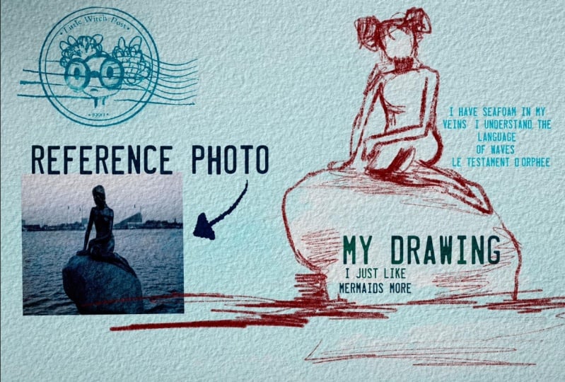
4. About Inspiration and References : So now I want to talk a little
bit about the silhouettes. Why I decided to
choose this topic for our todas class is that when I'm looking
at some artworks, especially from artists
from Renaissance, I really like the way how
detailed the artworks can be. And then I might look
at the paintings of, like, artists of 20th century. And at this time, not
everyone paid a lot of, like, attention to the details. And I was thinking maybe it can be a good
practice for us, like artists of 21st century
to try something new, like try to combine those two painting
techniques together. So what I'm planning to say is that I think practice
is very good teacher. And if you want to become
better in sketching and in painting silhouettes,
painting humans figures, it's really important to find time and creative
way of painting, staying at home and
just looking at some pictures that's what
we're going to do today. Or you can just go outside. You can grab your
iPad or you can grab just notebook
or just paper and pens or pencil or ink and
just start sketching process. So what I'm trying to say is
that my today's aim is to show you that by using
just simple shapes, we can add more
and more details, and we don't need to spend too much time on painting
those human fingers. We actually can do it like
within five to 10 minutes. And today, we're
going to practice, and we will learn a few
ways how we can do it. By using different media, we can achieve
different results. But what can unite all of our silhouettes is don't really need to spend
too much time on that. You can go to website
like packsals.com. It's where I got my
reference pictures that are free for personal
and commercial purposes, and just find the
pictures that you like and start practicing.
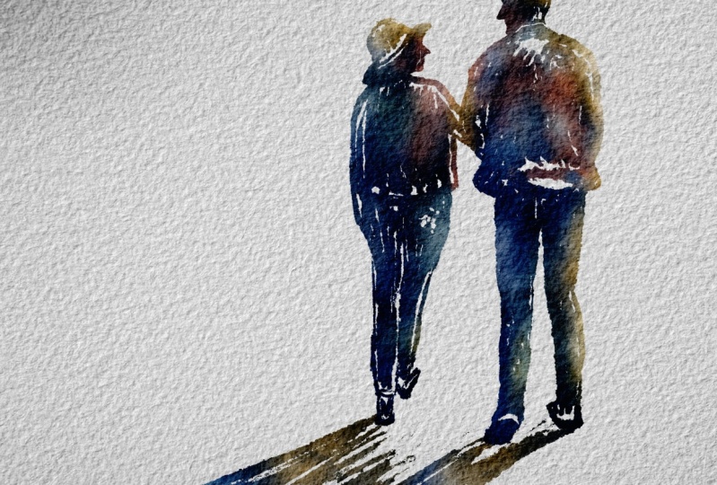
5. Painting Process: Pencil Silhouettes: And in this part of the class, we're going to start our
painting process finally. And first of all, I want to try to experiment with pencil. It can be some kind of base for our painting, our artwork. And then if you want, you can
add some watercolor brush, watercolor touch to
your sketching process. Then we will jump into next
part where we're going to use inkin brush and that's the most important
part, like I might say. And then we're going to
use another Iken brush, and we will start adding
more and more details. But what's most important
is that we need to show basic shape
of the human body. And then, like I said,
we're going to spend a little bit more time
adding some tiny details. And after that, I will show
you some painting techniques, some tricky ways of turning your illustration into a little bit more what
the color wants. And I will show you how to add different color variations
to your painting. So let's start our
matrix right now. And if you want to find
reference pictures, again, the Emans of freebies and how to actually use them during
our painted process. And if you don't want to put all your reference
pictures as the layers. So in this case, we need
to go to Action button. Then we're going to have Canvas, and then we need to
press reference. This picture I'm going to
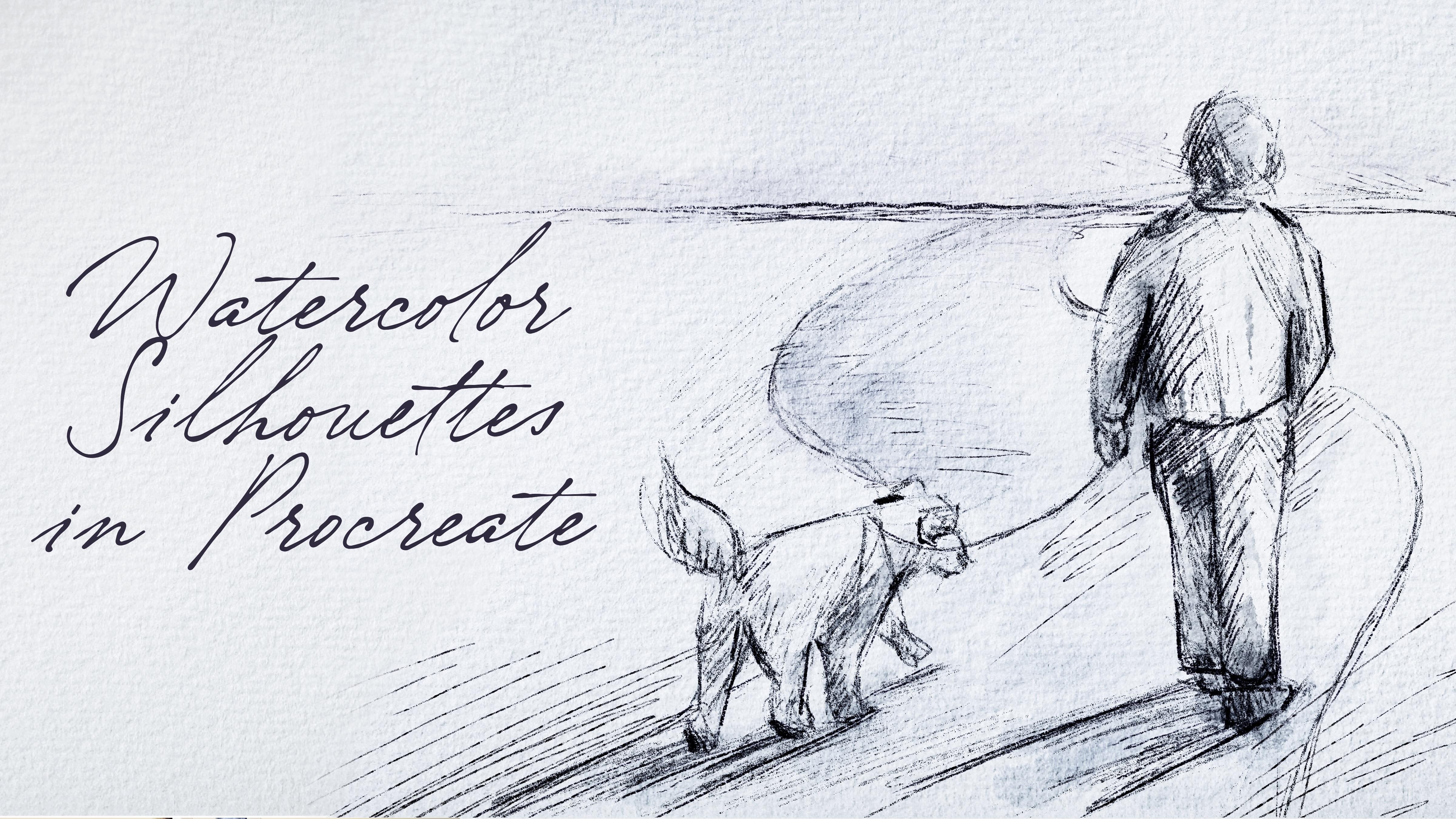
use for my inking reference. So I want to go to another one. And I think this man with
Dk is very, very good idea. So let's go to pull HB pencil, then I will go to
the dark blue color, navy blue, like, yeah. And then let me show you
how I will sketch it. So, of course, first
and tricky ways that I was talking about is
actually you can put this picture among the
layers and then create one more layer above that and just trace the
illustration like this. It can help you to
save some time. Okay, and now let's start. And I don't really want
to remove the lines. Like, we're going to have first sketching lan, the second one. So I just draw head and
then shoulder line. And like I said, I don't need to be too accurate
in proportions. And you see, I already
chose pretty big size. So now I can try to
scale the proportions. And then we need to
show the movement. See the person is walking? We need to show that this leg is a little bit closer to us. And this leg goes front. Like it? And then we
need to show the dog. If it's hard to do it at first, you can just break the objects. Remember I told you in my previous classes,
we have the dog here, but we can imagine dog as serious combination of
squares and like ovals. So here we have an
oval over the head, a big oval for the main body, and we have some kind
of rectangles as a leg. I decided to paint a
little bit behind the man. I like it. Bit more volume to this part. And also, we have some shade, which is super important today, try to show the shadow
from the dog and man too. It also helps us to create
some specific composition. So those tiny practices
really can make a difference if you talk
about the sketching, like fast sketching, ways This is very good way how
you can actually learn. So I just go ahead and just exaggerate some of the
elements, show the lines. Press harder in some areas
and show the pencil strokes. Again, depending on the
time that you have, you can spend less
and more time on the sketching. Now about dog. Also, if you talk
about the shades, we need to find the source
of the light in order to show accurate shades
because even in sketching, we need to show like we
add shades and highlight, and when we do it in, correct way, it will help us to make our
art more realistic. So about the source
of the light, I think it hits people from, like, in a face, like
person and a dog. That means that the
back will be in shadow. So you see, that's why
I paint like back of dog darker comparing to the front because
exactly in this part, you're gonna have
the shading part. And also in areas where we have two objects
next to each other, we're also going to
have some shade. So when we have dogs
paw and ground, we're also going to
have the darkest areas. And also, thanks to
lines that we show here, we can also show the direction and we can create some
kind of movement. Ting d d ding ding. It's good. And then if you can show
some sketches here, you can show some road or you might not show
the road it's up to you. When we add a
little bit of road, I think it can
create very, like, lovely and metaphorical meaning. Also in the end, because like objects that a
little bit far away, they will have less details. So we can show the road a little bit less visible, like that. Okay, so say this
is our idea that we have now my suggestion,
what else we can do. Let's add a little bit
of watercolor touch. Okay, so I'm on new layer, and then I will go to
multiply blending layer mode. And here my suggestion to
go with is gray shade. About the brush, I was thinking about boo watercolor silhouet. Add some color to
the road, tiny bit. So the lightest color is
for the surroundings. Then you can use soft
diffuser as a blending brush. Let's return and go to
the dark green color. To show the silt, again, you can go beyond
the lines is totally fine. Remember, even
though dog is white, we still need to
show tiny shades. Remember, if you
want to exaggerate the color, in this case, you can duplicate the layer, and that can really help
us to make the difference. Or we can just lower the opacity of one layer and
mix it together. Now if we don't need
reference picture, we can turn it off. And this is the first way of creating silhouettes by using pencil or watercolor brush. So let's jump into next part
where I will show you how to use inking brush and how to turn this inkin painting
into watercolor.
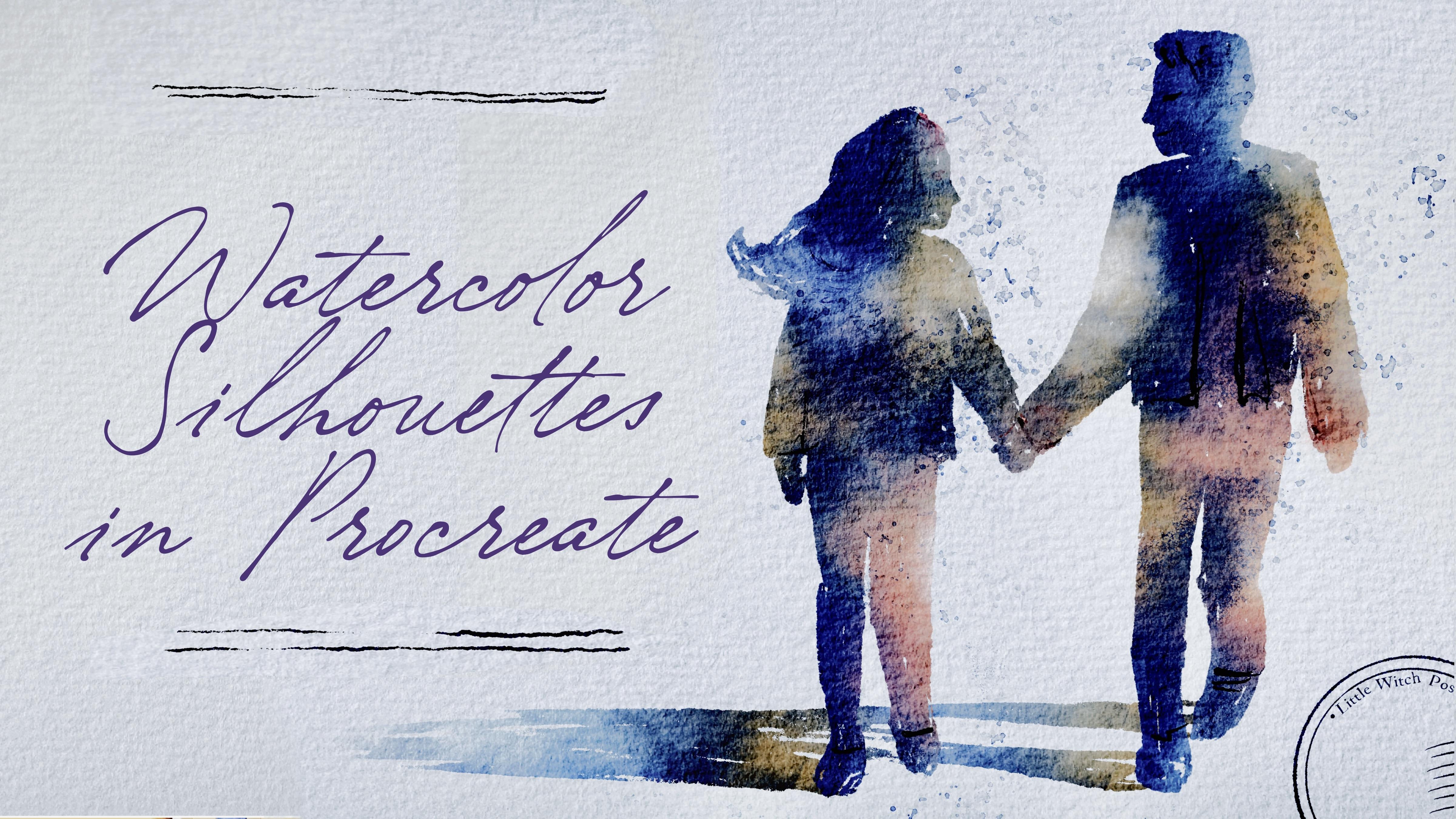
6. Adding Colors: Turning Ink into Watercolor : Now we are ready to jump into painting process.
Use the brushes. I provided Emma the freebies or native procreatuls
or your own brushes. Don't forget to paint on layers that are under
the texture paper. That's very important.
Let's not wait, and I will show you
everything right now. So here we have our
reference picture. I decided to use this couple, and also I will use
Buran Inker Big as our basic sketching brush. And also the tricky part here is that we're going to
use this brush as a sketching brush and as
a filling color brush. So our basic main color will be filled piece
exactly this brush. So we're going to combine
like two steps together. That's why I like this way of painting
because first of all, it gives you a little bit
of freedom and creativity, so you don't really need to follow those
proportional rules. And on the other hand, it can save a lot of time. So Buron inc big
sketching layer, and then schematically
let's show boy, You see, I made a little
bit slender legs. And if you want to
change something, just call select
the area freehand, then transform to free form. And here you can think about
the proportions and so on. So now let's fill this area
with some specific color. So we have the boy here. But he has his hand in a pocket. Two hands. Now let's draw girl. Talk about girl. Let's do it on a new
layer just in case. If you need to adjust to
move it back and forth. I start by painting her
arm and now shoulder line. Remember, try to stay true
to the real illustration, but also don't forget you
can add anything you want to your And espeger comparing to the boot. That's why I told you to
draw it on new layers. It really can help us to
each the proportions. And this part should be higher. You can redraw it. Well,
just do what I just did. Mm hmm. Like it. And head. So when we feel everything
with some one colour, it's really hard to
understand what is going on. But like I said, later,
we'll add more details. As an eraser, I'm using
Bani inker brush. So you can add more details. You can be more precise
and draw everything, like, very, very
true to life or, like I said, try to be a little bit more
like can't expect. Here we can show
part of boys jacket, Lexi. So they are walking. Now, neckline, I want
to show it better. So you see I changed
the hairstyle a little bit so it really
can show us a girl. So this is a shutt that
we have my suggestion to create one malare also and show the shadow like shadow
where people are walking, and shade will be
somewhere here. Okay, cool. So now let's move to the most important
part where we will add some color variations
and we will make our illustration like
what color illustration. Okay, let's just make our reference picture a
little bit smaller like that. And now remember we need to
find the source of the light. And here, source of the light is heating from the top
right side here. So my suggestion to make this part a little
bit sunnier, warm, and on the contrary,
in another part, we're going to add some
small, dark, cool tones. Let's add some color variation first and then we'll
add tiny details. Then what I will do is
I am on sketch layer, and then I need to
press Alpha lock. Alpha lock helps
us to draw just on area where we were
painting the silhouette, so we can go beyond the lines, and that's very, very useful. So what we're going to do now
is we will change the brush too soft diffuser
brush. This one. And now, like I said, I will go with pretty
warm yellow tone. And we can it's
pretty big sides. We can just little by little tap and create those sunny elements. So sun is heated from this side. So here we're going to have
the lovely sunny elements. Then I want to go
with a peach color. Then let's go to a little
bit lighter blue colour. And in some areas, I still want to keep
this blue look. Like I said, I don't
really want to have our illustration
to be that dark. So I'll go to more
pleasant colors like that. Then we'll go with blue colour and see where we can use
blue colour. Somewhere here. So you see it's already
a very watercolor look. Then go to yellow color, maybe a little bit brighter
and add some sunbeam sunbur. Perfect. Now let's go
and do s with shades. Alpha look. And then we're going to have
some reflections. And my suggestion,
the shade that is far away will be
more transparent. So let's go with
light blue color and show the diffusion of the
color of the shade subery. Little by little washing away. Now it's going to
go to the eraser and grab Boot diffuser as eraser to increase the size and
remove a little bit. Same we're going to do
with our silhouettes. Let's come back. We
still have the eraser. We can maybe lower the
size a little bit, and we can just erase tiny bit to make it look a
little bit more realistic. And my suggestion, select those two layers
and just move them somewhere to the right side, also create some
lovely composition. If you want, you can erase
more, whatever you like, play with the size of the
eraser, and then you can just, like, have barely seen
looks like I said. It's up to you the amount of texture that you want
to keep and wait. I forgot about one more thing, and it's about final details. So I will go to the blue color, then I'll create one
more layer above. I will press multiply. And I will go with
Bu Rani inker. And here, I can add
those tiny details. So I can show the headline. I can show a little bit of
the check it, just emphasize. But if you want to, like,
it's not necessary. Then I can just separate and show the way how she's
holding the boy's hand, maybe show some
hairline over there. And about the girl, look at
the colors that we are using. So it should be harmonious. Like that. And if you want, you can blend something. And yeah, this is a
good way of adding tiny details and making
your art even prettier. Now we can move to the
final project. Let's do it.
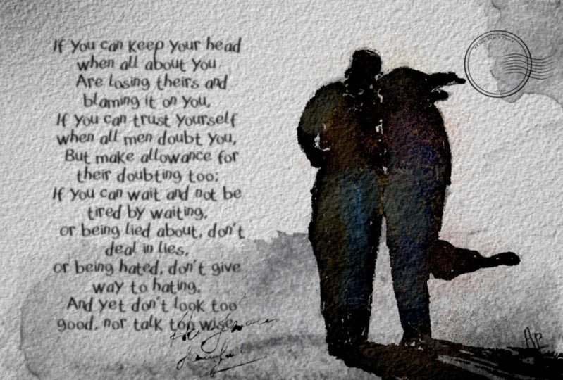
7. Final Project : So it's almost the
end of a class. We will add shades and texture
and tiny small details to our illustration together with text and lovely postage stamp. Well, that's our last
illustration, our final project. And like I promised,
we're going to turn this illustration into postcard. Boo Runny in your big. Sketch. And now
let's do the same. Let's schematically, be careful. It should be dark blue color. Thanks. Remember about portions. One new layer for girl. And she has beautiful long hair. Maybe I will you see? I was that I painted
on a new layer. I will not draw the fur hood because it would be hard to understand,
like, what's going on. Boron Inker. So the girl should
be a little bit far away? Not far away, but she
should be behind the boy. Which means that
probably I will make our boy a little bit taller, like he's tall already, I think. Still, I want to make
him tiny bit bigger and girl move closer to the boy. And their hands I think the problem is
that should be lower. So, like I said, now we can fill it with
some not with some. Now we can merge together
and fill it with the color. So let's just make
sweater for girl. Like, pretty long sweater, and I just made the hand
a little bit longer. Okay, do same what
we did previously. Try to fill this area
with just nav blue color. Like that. My suggestion, why don't we do it a
little bit slender. So now that in a center, let's move the reference picture a little bit to the side. Okay, that's the minimum. And let's do the same
what we did previously. Let's try to fill our silhouette with some specific color. I think we don't need
to erase anything. It already looks very good. And for the boy, Okay. Ready. Now let's go with
feeling color part. Okay? So what we're going
to do is press Alphao. Let's do the same steps. We will go with soft
diffuser color. Same thing about the
source of the light. Source of the light
is hitting us in a middle right
side. You see here. So yellowish color here. So we're gonna have pretty
bright illustration. I forgot about the
shade. Let's come back. Paint your layer dark
and boron in your beak. Let me think. What if we
make our illustration? Make sure you switch to
uniform a little bit smaller. For the postcard, I think we can extend and for more
beautiful composition, we can extend the size of
our canvas a little bit. So this clase, we'll go to
the action button, canvas, crop and resize and
move a little bit to the side like
this. Maybe more. I think it will be very good
composition and press done. And then we need to move the
paper texture to the side. Press the paper, and
then move button. You can move to uniform. Or freeform is also fine, and keep it this way. Yeah, I like the
composition that we have. So we moved our couple a
little bit to the side. So this is rule of thirds, where we will divide
our paper into nine rectangles and it's
intersections of the rectangle. This is the perfect
position of the objects. And our brains
really tend to get excited when we see the
objects not in the center, but a little bit to the
left or right side. That's what I did. I moved
them to the right side. The sun is heating
from the right, middle side, so the
shade is going this way. Far away it goes, less
visible the shade will be. So this is a shadow
that we have of log. Yellowish color, tiny bead. Wait. Don't forget to switch the boos over
to fuser brush. Here, choose middle blue. And then soft blue. Baby blue. And then, remember what we did, we go to the eraser and use
Busftiffuser as eraser. To make our shadow less visible, but don't delete it entirely. Blue colour. Then add more
shaded here. More shades here. We still can use very
dark blue colour. And this peachy cup, which I like so much probably will be my favorite
color combination. Okay, fine. Now it's time to add some final detail and about the texture.
What else you can do? You can go and grab
texture brush, then go and grab
dark blue colour. And here, if you want to add some watercolor
texture to add more shades like this to
exaggerate some of the lines. Tie a tiny bit, maybe to the shoes,
like to separate. Tiny details pan in your brush. Then blend if you
don't like something. We can show, like,
ice a little bit. Here, we can separate, shoes, and jeans and whatever. We want to. My suggestion
to go to different colors. Again, if you like everything, we can keep it this way. We also can go to the Bos brush, grab middle blue color. My suggestion do it a
new layer because we can just want to
delete something and Bosov diffuser is an eraser and just
delete some overlaps. Experiment with
blending layer mode. Think which one you might
like more. I like linarbrn. And then merge together, create one more layer
above, dark blue color. We don't need our
reference picture anymore. So let's add some
postage stamp and final words. Like that. And you can keep it that way, or if you want, you can add one more postage
stamp like that. Or another way is pour on inker and here
you can draw a line, a couple of lines. And keep it that way, guys. I hope you enjoy this class and you learned a lot
about painting silhouette. You learn some
tricky ways how to do it in a fast and
interesting way. And before we jump
into conclusion parts, I just want to say a
couple of words to you. I hope, again, you enjoyed
this painting process. That was something new for me, and usually, you know, I spent a lot of time on
painting process. But I was thinking we
need to experiment. We need to try the new things, and then it will help us
to shape our personality. It can help us to shape our style that can really distinguish us
from another artist. And my suggestion
is to practice, but practice with fun and
when you have free time. So I wish everyone
great creative journey and see each
other in next time. This is the end
of today's class. I hope you like it and you
enjoy our painting process. Now you know more
about procreate, where to find inspiration and how these layers
clip in mask, how to create watercolor
texture paper, and how to add color
variations to your art. And most importantly, you'll learn how to create
watercolor silhouettes in procreate using digital
watercolor brushes in a fun and simple way. Guys, I will be happy to
see all your artworks in project section and give
you my own feedback, and I would really appreciate your opinion about my class. You always can do it
in review section or discussion section. Let's see each other
in next class, and next time we
will paint sky on postage stamps with traditional watercolor
medium. See you.
 Inga Yoon, Digital illustrator and teacher