Transcripts
1. Introduction: Hello, my lovely artist. Welcome to my class,
and let's dive into digital watercolor and gouache art and paint together cute characters in
two different styles. Get ready to learn fast sketching technique
for Procreate too. And the most important, how to create characters
step by step from image in our head
to finalized art. We will have a few achievable
steps, how to do it. And in the end of my
class you will decide which style you prefer more
watercolor or gouache. My name is Inga.
I'm here to show you that digital
watercolor is magical, and you can create
magical world with all those cute characters and whimsical nature
with your own hands. For that, we will need Procreate and a little
bit of inspiration. In this class, I will start by telling you where
to find freebies, where to find tools
for the class, and how to get ready for
painting process like creating watercolor paper in Procreate and exploring all the
layers that we have. Then we will prepare sketch
in fast and simple way. I'll show you how to draw
from the reference picture and also how to draw without
reference photo at all. And finally, we'll move
to painting process. Our first illustration
will be in watercolor style and
second in gouache. I'll show you how to add colors, shades and highlights
to our art. In this class, we also will explore the blending
layer modes. And the most important
in the end of my class, you will pick digital
style that suits you best. You easily will be able to
create cute characters, a girl and a duck in Procreate, using different watercolor
and gouache techniques, I prepared for you simple and
achievable steps that can help you to complete the final
project with a lot of fun. During the course,
I will slow you move you throughout my workflow, explaining every
step and describing procreate features and
painting techniques. So what do you
learn how to paint in watercolor and Guar style
digitally in Procreate. Second, how to create
watercolor paper texture, also how to sketch in
easy way and how to draw sketch from reference
picture and without it. How to create characters
step by step from image in our head
to finalized art, and how to paint in more detailed way reach
traditional look, how to paint background
in different ways a watery and more opaque look, and how to use layers,
blending modes, and add shades and color
variations to your art. So what you will
need for this class? I will use Procreate with
iPad and Apple Pencil. You also can use Procreate or
some other drawing pads or just regular paper and
watercolor and gouache paints. About course
resources as a bonus, I will share with you all
the digital tools that were mentioned in a
class texture paper, custom brushset, color palette, sketch, my own picture
that I created. So who is this class for? The class is great for intermediate level and for
advanced Procreate users for those who is interested in digital watercolor and gouache
art and cute characters. And one more thing
that I want to mention your opinion and your feedback
are super important to me. So feel free to tell me
what you think about the class in discussion
or review section. I will be glad to reply to you. My dear, art fellows, I can't wait to
start this class, and definitely I can't wait to see what you appload
to project section. So let's not wait, grab your
iPad with Apple Pencil, and let's paint together.
2. About Class Project : Now let's talk about
class project. Just follow a few steps. Create an illustration
of cute character in what color and gouache style
that will bring joy to you. Of course, don't forget to use the tips that
I gave you today, explore different painting
and sketching techniques, and choose the ones
that suit you most. And then create a
beautiful artwork. It can be cute girl and duck or something
totally different. Anything that helps you to feel happy during the
painting process, and to understand your
own style better. I will use Procreate
for this class with iPad and Apple Pencil. You also can use them, or it can be some
drawing pads or just regular watercolour
paper and gouache and watercolor paints,
whatever you want. This class is easy and fun
and has clear structure. Steps that can help you to
reach achievable results in fast way and understand yourself and your
art style better. Also, it covers a lot of subtopics like
sketching techniques, variations of painting styles, using or not using
reference pictures, and what are the ways of
painting background in our art? Also, color saturation and shading takes an
important part, too. So I'm ready to experiment with different painting techniques
and learn some new tricks. Once again, you can choose completely different topic
and draw something new. Try experiment and
enjoy painting process.
3. Tools and Resources: In this class, we will talk
about resources and tools and where to find and how to use
them. It's pretty simple. Follow the steps, go to
Projects and Resources section, download freebies,
go to Files app, and then inport all freebies
into the Procreate. Let's talk about it in details. Hello, my lovely
Skillshare community. During our today's class, we're going to have special
aim for today's class, and the aim is to help us to spend less time and practice
more and in the end, get some achievable results
that will help us to understand what style
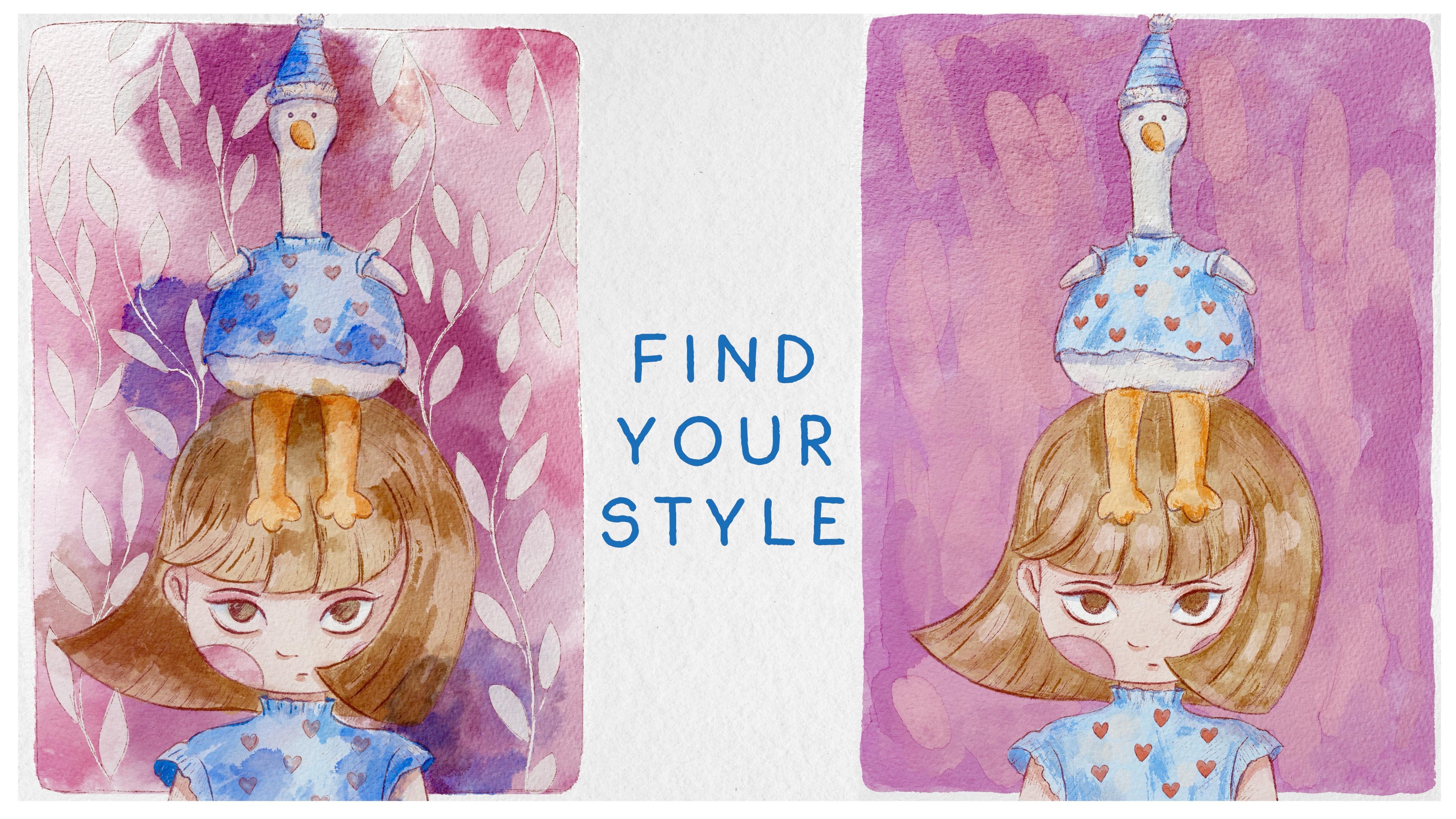
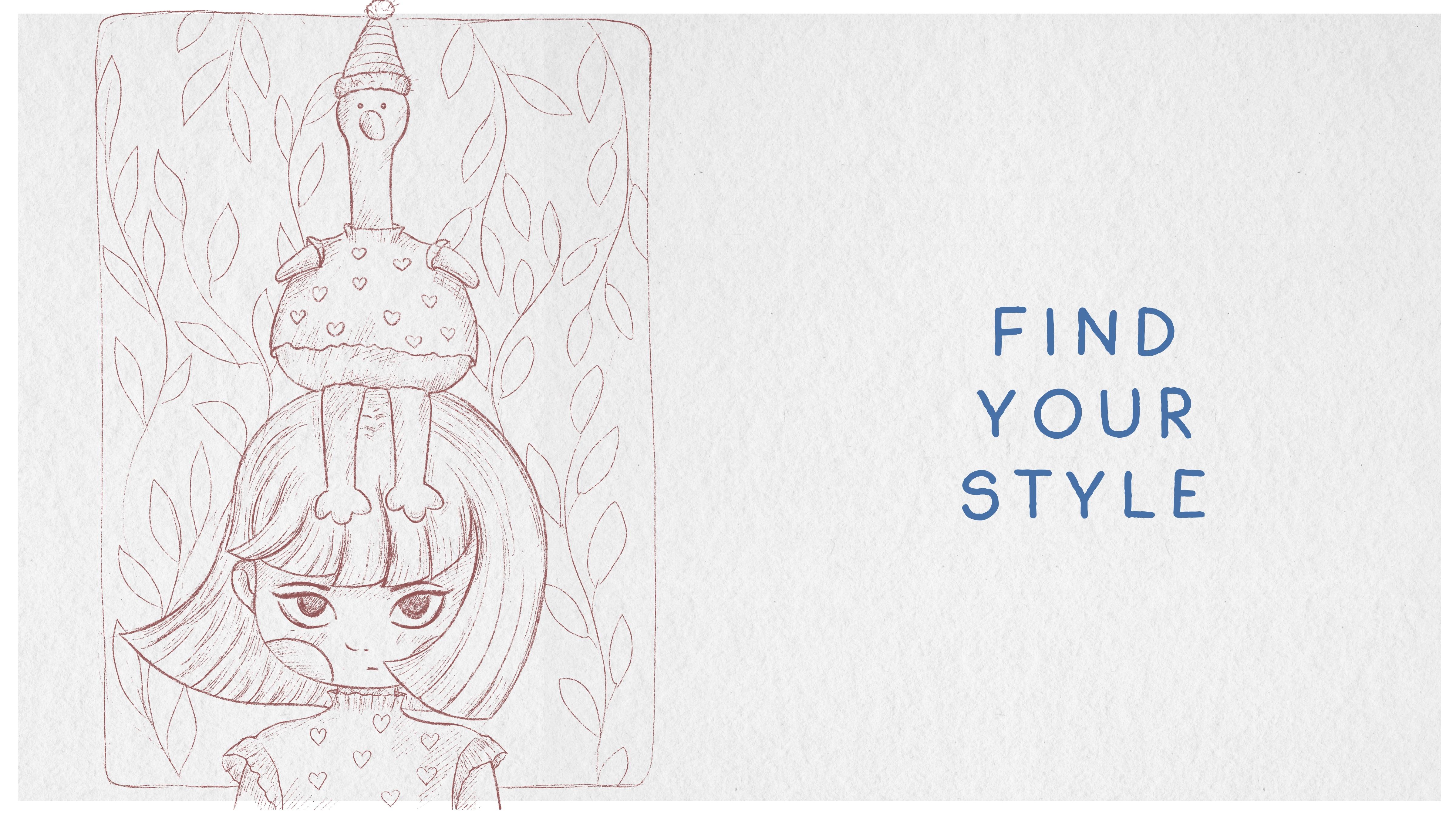
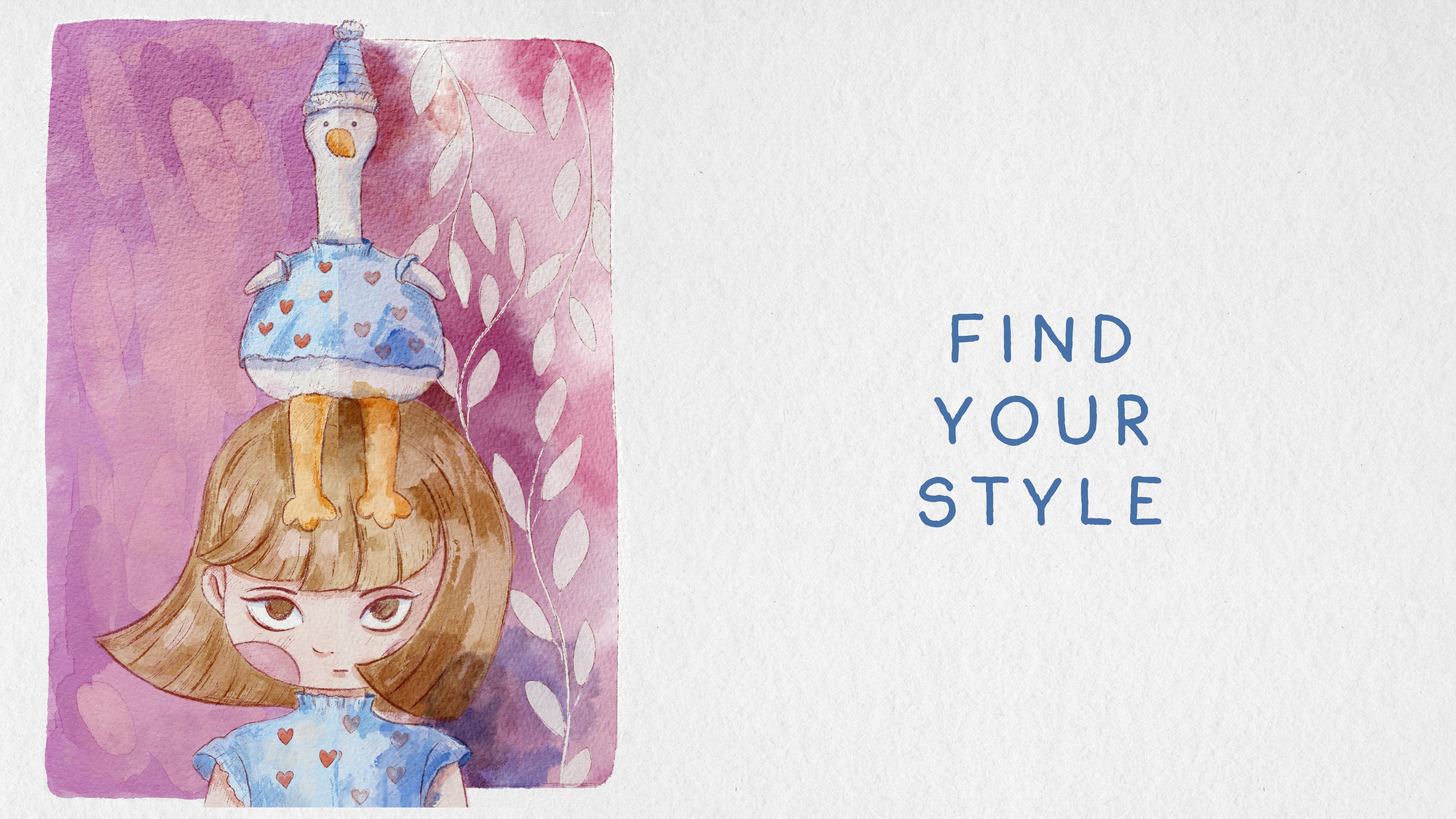
we would like more, what matches our preferences and what works better for us. This is a sketch that I
prepared for today's art. And in the end, we're going to paint
an illustration in watercolor and gouache styles. So what's special
about this tutorial is that we don't need to create texture paper. I
already did it for you. So what you have to do
download our freebies. This is a paper. Art Nova paper. By the way, this is one of
the papers that I have in my five papers set
that I sell on Etsy, and I was thinking that
for today's class, we need something special
and we need special paper that will work very well for watercolor and gouache
in the same time. And with this paper, we have a couple of
layers that I prepared. Then what we have to do is
to split the screen and invert all our freviews from
Fils app into the Procreate. So what we should do, let's go to the sketch layer. We have actually sketch
without background, this one. If you don't want to
have background layer, it's totally okay. And we also have sketch
with background. Like that. So it's up to you what you would like to use
during your classes. Again, I also will tell
you how we created sketch. So let's just write sketch base. That's what we have, and
I'll show you what are the steps I followed in order to create this simple
sketch, by the way. I didn't spend too
much time on that. Also, we have
swatches, brushset, and paper art noo. I already have them, so
I don't need to move them from files app
into the Procreate. Also, you can drag and
drop color palette, and you will see it's
called cute girl and Duck. You can just step with three
dots and set as active. I already did it.
So when I go to disc my cute girl and
duck will be here. About the brushes, we
have cute girl and duck and here we have the brushes that we're going
to use during the class. We're going to have HB pencil, Runny incur that we're going
to use for two styles. Then we will have
watercolor brushes, which is both in
artistic watercolor, blue, toothy, red, wool bloom. And for gouache, Bo wet gouache
and Bu unpredictable ink. As blenders, you can use Boat
reblender for watercolor. And my suggestion for gouache, use gouache as blender. How to use blenders. So we, for example, chose gouache as a brush. Then we need to tap lawn tap on blending to thin
and automatically, you see it switched to the blue wet gouache brush
that was our painting brush. I want to use background
for the watercolor, and I don't want to use background for our
gouache illustration. So let's create a
couple of new layers. Pain here, it's our main layer where we're going to add colors. We will add shades and details. Now, what I want to do is
I want to make groups. I think it would be
easier for me if I do so. So in this case, I
will go with a sketch. First sketch, this one, details shades, paint
here and background. By swiping right, I selected the layers and then
I'll press group. And I will write watercolor, then turn off for
the second sketch, detail shades paint here
background group gouache art. And let me just duplicate
sketch in our next class, I want to explain how
I reached this sketch, what I did in order to paint it. So let's move to our
next part of the class.
4. Sketch: Now time for sketches. We will explore a simple
way of sketching. With this technique,
you don't need to spend hours on sketching, and it's time to talk
about painting without a reference and creating
our own character. What do you think about it? The first step in creating character is to have
some ideas in your head, what it will be, what
is the purpose of your art and how will
the character look like? And then we'll start creating. Break the object
into simple shapes and draw details
little by little, slowly turning your
character into something very
special and unique. If you watch my
previous classes, you probably hurt so many times. When I told you, if you want to start painting illustration, you need to start
with simple objects. You need to break the
illustration into simple shapes. Let me just make smaller sketch
notes that visible, yeah. Run inker or the sketch later, I'm going to use Blue HB pencil. But if you want to just show
basic shapes, schematically, run incher would work better because this brush is thicker. So, for a girl because I started painting
illustration with a girl. I was thinking about a head. So I created a shape, like regular round head. Then I knew that I want
to show some dynamic, some movement
things to the hair. And as you see here, I was thinking about the
hairstyle a lot, and then I was thinking
maybe her hair can show the direction. I just show schematically with a line that we're going to have approximately
beginning of our head here and ending of hair here. And if I want to
show the movement, I want to show it with
this hair, like that. Then I was thinking, we need to paint
neck and the rest. The neck will be here
and from this side, we're going to have
shoulder line, and from shoulders, we're
going to have arms. That's it. We also had to schematically show where
we're going to have eyes. So this is the center where
we're going to have nose, and eyeline will be a
little bit lower because her hair will cover
part of it and mouth, nose and mouth, like that. That was my plan for the girl. About Duck, it was a little bit more complex because I needed to know how Doc actually
would look like because, you know, there are different
ways of painting ducks. For that, I went to
the Internet and I simply typed duck soft toy. And then I just
scroll and see what actually works for me and like that one. I
like this ducky, see. It's very similar to
the one that I have. Once I look at this
reference picture, I'm happy with everything. I see Doc has long legs. Doc also has this
very long neck. I made it a little bit longer, and I also wanted to have
some kind of cute outfit, like matching outfit with
a girl that I died later. Very fat belly. So I remembered that, and then I went to
Procreate to keep painting. Okay, about Duck here, we'll go with orange
color, for example. Same I painted a circle
not that big like this. Then from circle, I painted two rectangles that
I knew would be leg. And then long leg, long neck. Not leg, long neck, and a head. Same here. And also, I shouldn't
forget about wings. So wings, I knew the
approximate shape. So I just painted Lexis. And that was it. Eyes
will be somewhere here. Don't forget about beak. Back was the most complicated
part because, again, the way how you paint
Back will define how actually your
duck would look like. And that's it.
That's what I did. After that, I went to HB Pencil, and I created one layer below. I lowered the opacity
of our rough sketch. We can just go with the
ones that I already have like this thing. So I lowered the opacity because I wanted to create my own art, and I don't want to
be distracted by the sketch based rough lines. And you see if I turn a sketch, that's what we have as our base. And after we gonna
have wood with pencil, then I will go with this. You can go with purple or a
little bit reddish color. That's what I like to use. And then little by little,
wait, it's too thick. You can start
defining the shape. See how it would go for us. Here we have neck. Again, if you have more lions or if your lions
are messy, it's also fine. You can just, like,
be very strict and solid in your lions, or you can just,
like, paint like that and be a little bit messy. I actually like to be messy. I want to I tend to
keep more lions because they show imperfection of
your painting, sketching. And it's totally okay. You see? So lions I just need to erase. Or, if you don't want,
just don't erase. And then you paint
this part of hair and just show lines more and more. And then you can go
to thicker pencil and make some of the lines more defined. You see like that. Where we have more shades, you can press thicker. I do like to play
with this pencil because it gives you, like, a feeling of f Pencil, like graphite pencil,
not mechanical one. And then eyes for eyes, I have thick liner because I
want to show her eyelashes. Try to make them
the same eyebrows. You can make eyebrows this way, or you can make
eyebrows like that. See which style you prefer more. With a pencil, if
you press harder, you will have thicker
brush stroke. Once you finish with a girl, it's like she's
kind of not happy the duck is sitting on her head. Just see where your
shoulder would go here. And in this area, she
will have a sweater. Ding ding ding ding
ding, ding tinting. I think it's very lovely
childish style for the sweater. And I like to paint pitches. Checks like that, like
that. And then you can start adding
those tiny details. The one that I have at
the original sketch. Ding ding ding ding ding. See where do we have the shades. So the sketch might
take us some time. That's why if you
don't want to spend this time on painting an actual sketch, you
can just use mine. Also have brush with hearts that we're going to
use for the sweater. So girl and duck will
have matching sweaters. Again, the more time you have, the more shades you can add. But I really like when we don't use black liner
for the pencil, we see we have this brownish
shade which looks softer. And when you use
watercolor or gouache, for both tiles, it would
be very, very nice touch. We're going to do
the same. I want to have thicker pencil. And then I just need to connect my lines and create one duck. The duck would look like this. And I also wanted to add some cute head
that will be here. Ding ding, ding, ding, ding, ding ding. Maybe likes it. A rays over lappins and some
cute head, ding ding ding. Maybe a little bit fluffy. Same sweater that the girl has. And eyes and be. That's it. That's
our base later. We're gonna keep
adding more shades. We don't need our
rough sketch anymore. If you have duck and
girl on the same layer, you can merge it together, and then just grab eraser
and erase overlapping. And as you see, I
got a lot of lions because I do like to
add those tiny details. They really work very
well with watercolour. That's what I have
for my sketch. Okay, I hope you are happy. Now let's go to the
painting process. And finally, let's practice
our watercolour first.
5. Project 1: Adding Colors: Now we are ready to jump
into painting process. Use the brushes I
provided Amaze freebies, or native proc ritals
or your own brushes. Don't forget to paint on layers that are under the
texture paper. We will have very special
painting techniques today. So let's not wait. Go to our first illustration, and I will show you
everything right now. Let's start with
water color style. So we are here. Now, let's turn off the sketch. I think we don't
need that because we have our own sketch here. And then let's go to
the background first. Then I want to use a
reference picture, the one that I showed you at
the beginning of the class. So Canvas, reference. So now we're going to use watercolor brushes,
those three brushes. I'm going to use Bo bloom first. And as a blending brush, I will use boo watery blender. You see, at the reference, we have more reddish color, but I would prefer pink one. So this brush is super cool for adding those lovely
unpredictable splatters. Now I'll go to a little
bit darker color. And as a blender, let's just blend some
sharpness, I would say. You can play with shades later, add a little bit of
color variations. Now pink color, very, very pale. Just want to add some
color here and there. Okay. My next step will be
let's just grab rectangle, and we need to make
this rectangle shape. The one that we have here.
And then invert and cut. Then grab Buran incur and just erase the parts that
went behind our frame. I'm pretty happy
with what we have. Our next step will be I'll
create one layer above normal. And then I'll go with white
color, and for that part, I'll grab a pu wet gouache brush because I want my
color to be opaque. And I briefly go through the leaves and just fill
them with white colour. If you want Bond's line, it's not a problem.
It's totally okay. We set a timer 30 minutes
for each illustration. Of course, if you
have more time, you can keep adding more shades, keep painting more
beautiful elements. But our base is 30 minutes. And within this time, you
will be able to create an illustration that
is watercolour. Well, now what we're gonna
do is duplicate this layer, so our leaves would become very, very opaque Now B inker to
draw the line.Te smaller size. And again, you don't
need to be precise. And the love leaf and branch. Now what you can do, I show you the way how to
intensify the color. Are at the background layer. Now you can go to curves. And here you can play
with the color intensity, make it more or less brand. Another way, hue saturation
brightness, go to hue. Wow, I like this color
and look at the color. This color is also super nice. So that's what you can do. Background leaves, we're
going to keep it here. Now we have paint here layer. Let's just duplicate. I
still keep white color. And Blue red gouache
it will be my like, not a base color, but
I just don't want to be my watercolor
too transparent. So I want to use a white
color as our base, you see, and it will stand out comparing
to the background. I won't make it totally
not transparent. No, I will keep
the transparency, but not that, not 100%. So you see, I still
have some shades from the background that is
coming through the paint, and it actually helps to
make our art very realistic. And now, Doc. And my dark, I'm going to
make a little bit whiter, comparing to girl because it should have like
white feathers. For my base color, I'm going
to use boot with outt and I will go with this
pretty beige color. Now this is our white base, and I'm going to go to the
layer that is about that. Later, we're going to
merge it together. So let's just go and add some
beige color to the skin. Now pink color for chicks. We can go beyond the lines. It's also nice. Now blue colour. Ding ting, ting, ting, ting. If you overlap with the color, the same color, it's okay. You're going to blend it later. So blending brush and softly
blend some imperfections. Now Dak will have the same
color for her sweater. Well, what about feet and beak. This brush actually has
very toothy edge lines, which is very nice
and now he and ice like she would have
chestnut colour ice. And for her hair, I will go with lighter colour. Mm. And as you see, I'm trying to paint
everything like each of our tasks on a new same layer. So that means that we will not be confused with the amount of steps that we need to take. So for example, for watercolor, we have first step for background
and then adding leaves. And then we will need to add some color to
the main characters. And the next step would
be adding shades, and the last is adding DDS. And that's it. So we basically have four steps for completing our illustration. And that's it. The done with a basic shade, with a basic color,
and not done. I also have this part white. You're going to add some
white color to this area. This area, make it a little bit whiter than an actual dog. And then once you are
happy with the results, merge together those two layers. Now we have just one layer
for our main characters. Now let's jump to the next part of the class where
we're going to add shades and tiny details.
6. Project 1: Adding Shades: Once we finished adding
colors to our final project, the second step will
be adding shades. Different technique will require you to use different brushes, and shades will look
differently, too. I hope you are ready for
the creative process, and let's not wait any longer
and keep working together. Okay, for the shades,
I'm going to go to the first shades
layer, go to multiply. Then I will go to both thin
artistic watercolor brush. After that, let's
go with dark color. Let's just add some shade. And you can blend some parts. Try to make lines
not too perfect, I think, darker blue. Same with Doc. Just like here
and there, a few shades. Then pink and beige color maybe a little bit
brighter for the rest. So in areas where we have two objects next to each other, we're
going to have shade. So part with hair will be
in a shadow under nose, under eyes, but make sure you
don't go beyond the lines. And under eye here, Maybe it's too dark,
so you can lower it up in opacity and make
it slightly lighter. Then we'll go with bluish
color to show the shadow. Now let's go to grayish purple shade and show
the shadow from the dark. Super cute. Now orange color. You can blend if you want. Show some shade in this
area and blue color here. Here and pick. Now, I think it's
time to show hearts. For that, we'll go
with B funny hearts, grab this reddish color
and make sure that it's not like it's maybe
20, 30% opaque. That's our shape. Now, what
you can do same curves, and you can intensify
it a little bit. I want to keep it darker. Maybe a little bit
more saturated.
7. Project 1: Adding Details: This tiny part of the class
is all about details. We almost completed our
first final project, so let's do it together. Okay, it's time to move to the second little part
of adding shades. Multiply. But out. Look at the edges. So lovely. It's the most important, try not to go beyond the
lines of your background. As a blender, use boo Bloom. And spread a little bit
to the surroundings. I think it might look very nice. Reddish color. So it just, like, tap, you tap, and then the color would
bleed very naturally. But make sure you don't
draw on our white leaves. Actually, we can just move
them above everything, but below the sketch. And just try to play
with the intensity. I like the bleed here. 'Cause I want to show
the shade from the duck. I like that. Now blue colour.
I want to do the same. Same with duck. Can you see
we have two shades of blue. Muddy, orange color. So you actually can keep
some defined lines. I think it would look pretty. Just lower the intensity
a little bit and just show some flow of color that is bleeding from
one color to another one. And now I will go with my
final step, which is details, go to multiply and go
with Purani inker brush, crap, slightly reddish color. And then show some parts. Not everything will be
underlined with a liner. Some. Some areas might
look very lovely. Then slightly lighter and show the lines from
the body parts. This part is my favorite. It's like final touches
where you need to define the most important lines. I want to show the
shade from her sweater. Now I can show some
lines here and there. Not everywhere. But we need to show a bit of
contrast in our art. So the more time you have, the more details you can add. But if you don't want,
it's also totally fine to keep it this way. And a purple shade. And for duck Mm hmm. You see, I don't add the
lines like everywhere. I leave some gaps, 'cause I want a pencil
to go through it. That's it. Okay, now I slightly
darker color. For hair. Remember, you also can control the thickness of your lines. Especially if it's
hair. That's where you can have a lot of freedom. We have less highlights here. Those we're going to say
for the quash technique. In watercolor, mostly
it will be a pencil or liner and our color that, like, blends, blitz in another. I think that's what's
the most important. We don't need our
reference picture, so let's turn it off. That's what we have for now. But again, I think we can make our art a little
bit more dynamic. Okay, so what I'm going to do is I will go to the background, and here before we make all
the colors more saturated, we need to realize what background we would
like to keep for ourselves. And if you want play safe, let's just duplicate background, turn off one of the options, and then go to he saturation
and brightness again. And then here you can see
what you would like more. Go to warm way. A little bit saturated,
a little bit. Maybe a little bit
more saturation. That's what I would prefer. And that's it.
8. Creating Watercolor Background : So now as a bonus, I want to show you what we
can do with a background. Let me show you my final
trick, what else we can do. So now we are on
background layers, the ones that we duplicated, and then we go to gradient map. And now, look, it
constantly became so, so saturated, which I
personally like so much. And here, you can just, like, adjust the intensity of the color and see whether
you like it or not. But in this case,
my suggestion you can just make the
leaves a little bit brighter and then duplicate
our duck and girl. So they will also stand
out and they will be not set transparent because the
background is pretty bright. And another option,
you can just lower the opacity of our
background color. My lovely students.
Now let's jump to the second part where we will practice how to
paint with squash.
9. Creating Goauche Background: Now we can start
the second part of the class and try second
painting technique, Illustration in gouache style. Color saturation
and volume will be super important part in
this way of painting. Okay, go to the background
layer via in gouache art. Then let's go to our reference picture Tinting
tinting Canvas reference. That's our reference
for the gouache. For the background, we will go with blue wet gouache brush, go bright pink color,
increase the size. Make sure that opacity is 100%. And then just paint. You see, it's very,
very, very authentic. And use this brush
as blender, too. Let me show you how
it looks later. So by controlling the opacity, you can make your gouache
more or less wet. I think bovedquah is a blenter. Dak. Okay, now I'm going to
show you a very cool trick. So if you don't like the way how your rectangle looks like, go to liquefy, push. And then maybe 50 or 60% and just push the
edges to the way you like. Thing, ding, ding, tiny bit. Cool. And then I want
to make it a little bit lighter because I'm going
to add more patches later. So I'll go to curves and desaturated slightly.
So that's what we had. That's what we have
tiny difference. We are on the same
layer for gouache, it's important to paint
on the same layer. Colors, you see, they will
layer one on another. Peachy pink color, same brush. By the way, if you make the
passage slightly lighter, the gouache would be
more transparent. Let me show you the difference. If you create one layer above, when you paint, you see you
don't have this layering. This color doesn't
look supernatural. Lower more in opacity, se and then come
back to pink color. Then blending tool. Great. Okay, amazing. I like it. So that's our
gouache background. And now let's go to our girl and start adding
colors layer by layer. Same brush. We're gonna go with a pretty beige
color like that. Let's continue adding colors.
10. Project 2: Adding Colors: Let's keep painting. Next part, pink color. Now, arms. And what I like about gouache brush
because it's opaque. So you don't actually need
to remove the transparent. Now, next step is, let's go with some
ice transparency. So painting gouache is
more like a therapy. It's very, very relaxing. Here you can lift
your Apple Pencil from screen. It's totally okay. Go to the background. Just want to blend tiny bit. T. Um, now let's come back and
keep painting. This part. And if you beyond the lines, if you just paint not in the area where the
paints supposed to be, it's also fine because, like, every painting,
it's not perfect. Balow colour. What about white color for
heat and feathers? Look at the brush strokes. You have this very authentic
and realistic feeling after you use this brush. And I intentionally lift my Apple Pencil because I want to have this texture
to be present in art. Now lovely orange color. So, you see, unlike the color, I try to fill the gaps, all the gaps that we have. I try to put color everywhere. Ding ding ding a hair. I'm going to merge background and our skin color together. As you see, I mistakenly
painted on background layer. So we won't separate it and we won't change the
color of background. But I didn't plan to change
color of background. I like the spin
color in gouache. Just if you still plan to
play with color variations, please paint on a
separate layer. But I really tend to paint everything on as little
amount of layers as possible because
that helps us to imitate the reality of painting
this traditional medium. With gouache, it's easier
because you can just layer on top of the
color another color, but with watercolour,
it's harder. Okay, done. Done with adding colors. Now the second step, we can start actually, we already can add color
to the heart. Why not? Same color, same brush,
little bit thicker. And the funny thing
you can just layer second time and you see we
have very realistic blooms. Good. Now, jump in the next part you're gonna start
adding shades.
11. Project 2: Adding Shades: It's time to move to
adding shades part, and we will use so many
blending layer modes and different brushes too. In this part, we'll spend more time and paint
way more details. Let's not hesitate. Second step. Blue unpredictable ink. Let's use this brush
for adding shades. And then for the shades, we'll go to multiply
blending layer mode. Now let's grow with a
little bit darker blue. And you see here I have
imitation of dryness. So it's like we will
create a feeling like our gouache
is slightly dry. And also, it's very nice
because it's brush, also layers very
naturally like gouache. What about orange? So I want to show
some sharpness here. Shades in this area. Slightly purple shade. I think shading brush is the
easiest step that we have, because you don't
need to be super accurate and just
do what you can do. Um, pink color, Biji pink. I want to show color
here. What about ear? So quash is more contrast. If you compare to watercolor, What else do we have? Shade
and the nose, and the lips. And then I forgot about
big and purple shade. Same forehead. Done. Now, uh, hair, this is probably the
most difficult part because we have a lot of hair, and we need to add shades, but not too much, you
know, keep this balance. Okay, now, what I was thinking, maybe we would like to add here a little bit of brightness. So let's go with
this beige color, Bu wet gouache brush. And I want to add S so cool, a little bit of warm tones. I forgot because
this is multiplied, we actually don't
have white color, so we'll create a
separate layer for that. But I still like,
I'm gonna keep it. So we've softened the
Hes a little bit. So even though we have
pretty dry brush strokes, I still want it to be a
little bit more watery, tiny bit, not like watercolour. And what if we do same
with blue colour? Same we can do a little
bit with a duck. So if you grab white colour
and use it as a multiply, when we add white color, we have beautifully
blendable parts elements. Example, here, so the next step, I forgot about ice. We're going to come back
to unpredictable ink, and I want to add ice. Make ice a tiny bit darker. Done. Now let's go to the new layer and grab almost white
colour, Bu wet gouache. And now you see if we
can add white colour. What do we do? Just
blend if you want, so. Some parts. Not too much. What if you add some white
spots here and there? If you want, you can use unpredictable ink
brush if you want. But I would be happy with
gentle gouache brush.
12. Project 2: Adding Details: It's almost the
end of the class. Now it's time for
the final touches. We will add tiny details to our gouache painting.
Details part. For the details, we're gonna grab, remember, reddish color. We're gonna use B Runny
ink or same brush. And don't forget to
switch to multiplies. That's what I forgot to do. This brush is very similar
to unpredictable ink. Maybe a little bit runnier. Now, slightly
lighter. Some color. So you see the principles of
painting are pretty similar. But thanks to the brushes, we could reach totally
opposite effects like watery or more
opaque filling. And it all depends
whether you want to have this opaque
filling or you actually want to let it be like semi transparent,
very airy. I prefer two styles. That's why I decided
to show you what I do when I'm painting with
watercolor and with gouache. It's just sometimes you
have different mood and you would like to paint
things differently. And it's totally okay. We are here to experiment and
just show our creativity, show what we have in our heart. What about D? Here I try to use less outlines
because for us, the most important is to
show how the colors blend, how the colors mix together. And as you see, I'm trying to make the contrast a
little bit more vibrant. Then now let me show
you my final step. So if you're happy
with everything, just merge everything together.
You have just one layer. B to reference, turn it up. And now let's just
brighten it slightly. Let's go to curves.
How to show it to you. And thanks to curs, you can make it more
saturated or less saturated. I made it slightly brighter.
That's what we had before. My lovely students,
let's see again what we have achieved
during our today's class. So first of all, you know
how to create sketch. What are the steps that I was following in order to do that. Then we tried ourselves
in watercolor art. We used the same sketch, but we use different technique. And I hope this project
was achievable and you were able to finish it
within 30, 60 minutes. And the second step
is gouache art, which also has very
beautiful feeling. It's a little bit different thanks to trying
different styles. You realized which
one works better for you and you might
experiment more, try different sketches,
and just try to define for yourself
what is your own style. And you became more
professional in two painting techniques in
watercolor and gouache. Congratulations. This is
the end of our class. And now you definitely
should be proud of yourself. You learned some useful things and created beautiful painting, and in future, you
can create more. So what we have learned
and why we did it. So now you know more about
painting cute characters in watercolor and Guar style
digitally Procreate. You also learn how to create
watercolour paper texture, how to sketch in simple way, and how to draw sketch with
or without reference picture, how to create characters
step by step from image and our head
to finalize sketch, and how to paint in more detailed way reach
traditional look. How to paint background in different ways,
watery and opaque, depending on the mediums that
you use, how to use layers, blending mode, and also how to shades and color
variations to your art. So why this class was useful? Now you can experiment
with your style, you gain some inspiration
and creative ideas. What's more important, we
can create digital art that is so similar to traditional watercolor and gouache medium. And also, you have
learned more about your own preferences and
your own painting style. Guys, I will be happy
to see your artworks in project section and
give my own feedback. And also, I would
really appreciate your opinion about this class. You always can leave a
review in review section. Thank you so much.
So what's next? In my future class, we will keep exploring
watercolor and gouache and keep adding
magical atmosphere to our art. So let's see Chazy in
your class. Bye bye.
 Inga Yoon, Digital illustrator and teacher