Transcripts
1. Introduction: Do, do, do. Hello,
my lovely artist. Welcome back to my class, and let's dive into digital watercolor art
and paint together. Cute fireflies into
different watercolor styles. Get ready to learn a couple of new sketching techniques for Procreate and the
most important, how to create characters
step by step from image in our head
to finalize sketch. My name is Inga Yoon
and I am here to show you the digital
watercolor is magical. And you can create
this magical world with these cute characters, lovely whimsical creature,
nature with your own hand. For that, we'll
need procreate and a little bit of inspiration. In this class, I will start
by telling you where to find tools for the class and how to get ready for
painting process, like creating
watercolor paper in procret and exploring all
the layers that we have. By the way, I prepared
for your source where you can get some
inspirational photos too. Then we will prepare sketches in two ways fast and simple
and more detailed one. I'll show you the
way how to draw from the reference picture and also how to draw without
reference photo at all. And finally, we'll move
to painting process. I will show you
how to add color, shades and highlights to our art from the sketch to
detailed illustration. So we will make our
painting process a little bit advanced. In this class, we will explore the blending layer modes a lot. And the most important
in romic class, you will pick digital
watercolor style that suits you best. The end of my class,
you will be able to create cute
characters, fireflies, particularly in procreate using different watercolor techniques
in fun and simple way. During the course, I will slowly move you throughout my workflow, explaining every
step and describing procreate features and
watercolor painting techniques. I think this is important. So what do you learn in
the end of my class? First of all, how to paint in watercolor style
digitally in procreate. We'll try to reach this
traditional watercolor look, how to create watercolor
paper texture, how to sketch in two different
ways how to draw sketch, from reference picture
and without it, how to create
character step by step from image in our heads
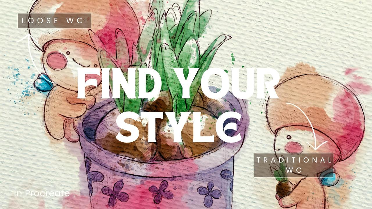
to finalized sketch. How to paint in loose
watercolor style, how to paint in
more detailed way, reach this traditional
watercolor look, how to show the glow, how to paint background
in different ways, watery and opaque looks, how to use layers,
blending modes, and how to add shades and
color variations to your art. So what you will need
for out this class? As you know, I will use procreate with IPad
and Apple Pencil. You also can use Procreate or
some mother drawing pads or just regular way colored paper and paints. That
would be enough. So about course
resources as a bonus, I will share with you all
the digital tools that were mentioned in a
class texture paper, custom brush set, color palette, my own pictures that I created. So who is this class four? The class is great for intermediate level and for
advanced procreate users, for those who is interested
in digital watercolor art, cute characters, and
magical illustrations. And one more thing
that I want to mention your opinion and feedback
are super important to me. So feel free to tell me
what you think about the class in discussion
or review section. I'll be glad to reply to you. My dear our fellows, I can't wait to
start this class, and definitely I can't wait to see what you upload
to project section. So let's not hesitate. Grab your iPad
with Apple Pencil, and let's paint together.
2. About Class Project: Now let's talk about
class project. Just follow a few steps, create an illustration
of cute fireflies and put in watercolor style
that will bring joy to you. Of course, don't forget to use the tips that I gave you today. Explore different painting
and sketching techniques and choose ones that suit you most and then create a
beautiful artwork. It can be cutter or just a pot or something
totally different. Anything that helps you to feel happy during the
painting process. This is the most
important in our class. I will use Procreate
for this class with IPad and Apple Pencil. You also can use them or it can be some other drawing pads or just regular watercolor paper and paints, whatever you want. All today's class is
pretty serious and covers a lot of subtopics,
sketching techniques, variations of watercolor style, using or not using
reference pictures, and what are the ways of
painting background in our art. Also, color saturation and shading takes an
important part, too. So I'm ready to experiment with different painting
techniques and learn some new useful tricks. Once again, you can choose completely different topic
and draw something new. Try experiment and
enjoy painting process.
3. Tools & Resources: This class, we will talk
about resources and tools and where to find
and how to use them. It's pretty simple
follow the steps. Go to Projects and
Resources section, download freebies,
go to Files app, and then import all the
freebies into Procreate. Hello, my lovely
Skillshare community. Welcome back to my class, and I know it has been a long time since I
published my last one. I was a little bit busy with my books that I'm
currently working on. So I hope pretty soon I will be glad to share with you
the results of my work. So today's class will be related to watercolor,
digital watercolor. And maybe many of you are struggling with finding
your own style, whether you want to draw in
watercolor style or you want to try more detailed
way of painting. So today, we will experiment, and I hope in the
end of my class, you will define for yourself what type of watercolor
painting suits you most. So we are at the gallery, and then we need to tap
plus and tap plus again. And here we will go from
pixels into inches. And let's write nine. Pare 11 ". Make sure that you DPI is 300 and depending on
iPad that you have, you might have different
amount of layers. Then tab create. Thing. Next, let's just split our
screen into two parts. From one side,
we're going to have Procreate and from
another files. Then what we have to do
is let's just drag and drop all our freebies from
files into Procreate. As you see, I already have my watercolor
fireflies, brush set, and here on the palettes, I have my watercolor
fireflies, color palette. Again, what you have to do just drag and drop it
into the palette. And then with three dots here, we have set as active. That means that this color
palette will be our main one. Now we have watercolor fireflies as our main active
color palette, and then we will go to disc, and at the bottom of our disc, we're going to have
all our colors that we're going to use today. Same what we do
with a brush set, we will drag and drop
it and you will find your watercolor
fireflies brush set at the top of your
brush library. So go and just tap on
one of the brushes, and then you'll
be ready to draw. Next, we have a reference, one of them, we have
watercolor paper. We have the illustrations
that we're going to draw a little bit later and
we will have sketches. My suggestion first, let's
create watercolor paper. We have paper, watercolor, drag and drop it
into the Procrit. Now you see the size is
a little bit smaller. It's not a big deal. You have two options what you can do. You can just adjust it to
the edges from two sides. Or if you don't want to alter the paper,
there is another way. Let's just go to Canvas
and press crop and resize. Thing and then
adjust the size of our canvas accordingly to
the paper that we have. Then press done. I'm going to choose
a second option. Okay. After that, once
we have our paper, let's just rename paper. And then let's
duplicate a couple of layers and then drag and
drop our reference first. And then firefly sketch. Then pop sketch. Here, turn off, duplicate and final
project sketch. D like that. So later we're going to
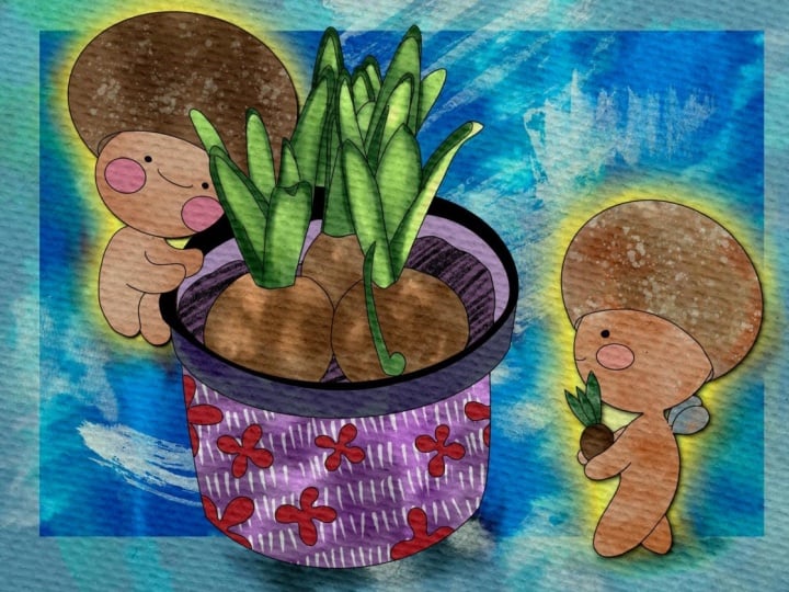
use this tiny picture, loose watercolor as
our tiny reference. So we will know what type
of colors we're going to use or what exact
way of painting, loose watercolor
style to choose. But again, you might not use this loose watercolor tiny
illustration as our reference. One, you can just, like, trust your feelings and create it the way you would
like to paint it. Okay, this is our
final project sketch, and we're going to come back to this one a
little bit later. Now it's time to create paper.
4. Creating Paper: Also, it's hard to create watercolor illustration
without water colored paper. So we will fix this issue, too. Let's talk about it in details. Now, what we're going to do next is let's just rename
some of the layers. So for the layer with
reference picture, we will just write reference. Second one is dragonflies,
dragon flies. Next pot. Here, final project. Then about the paper, let's make it visible. Let's turn on the visibility
and the next thing, let's tablicate it three times. The top layer,
here we will go to the blending layer
modes and we will go to the multiply,
make it invisible. Now second layer, here we
will go to color burn. Same, turn it off. Now let's go to the third layer, and here I'm on the
blending layer modes. We will choose linear
burn blending layer mode. Now let's do the next part
of creating paper process. We will go to linear burn layer, and then we will swipe left
and press Duplicate. Lex it. After that, by swiping right, we select the two layers
where we have linear burn, blending layer modes, and the next step that we need
to do is merge it together. Lexis. Thing thing. Now let's turn it off. Go to the layer where
we have color burn, blending layer mode,
make it visible. Then do the same.
By swiping left, we have duplicate option
and we need to press it. Now by swiping right, we select two layers where we have color burn
blending layer modes. Next, we need to
merge it together. Like. Next step, we will come back to the linear burn blending layer
mode and make it visible. Then we will go to multiply
and also make it visible. The last step, we need to adjust the opacity in each
of the layers. Let's go to linear burn
blending layer mode, and move the opacity till 60%, 65 60 is fine. Color burn, 85% would be fine. And multiply, maybe
we can make it 75%. So now our paper is bright. And it has watercolor texture. I will show you a
little bit later. Let's select all our
paper layers by swipe and r. Then we need to press
group button. Thing group. And then last step,
let's rename it. Di dt and write paper. Like that, that's it. Now we can press this arrow, and we grouped all our
papers into one group. Next step, let's just it. Why we did it, we
just don't want to accidentally draw
on paper layers. Where we have to
draw will be here. Now, what I will do next
is just write paint here. Like that. So I'll
paint here layer. I think we are ready to go. Now, let's jump into next part where I will show you
how to create sketches. Oh
5. Creating Sketch: Pot: Now it's time for sketches. We will explore different
ways of sketching fast and simple way and
longer more detailed one. Feel free to follow my steps
or use your own sketches. Be creative. Now let's
talk about sketches. This is the second
part of our class. And I think, first of all, let me show you how I
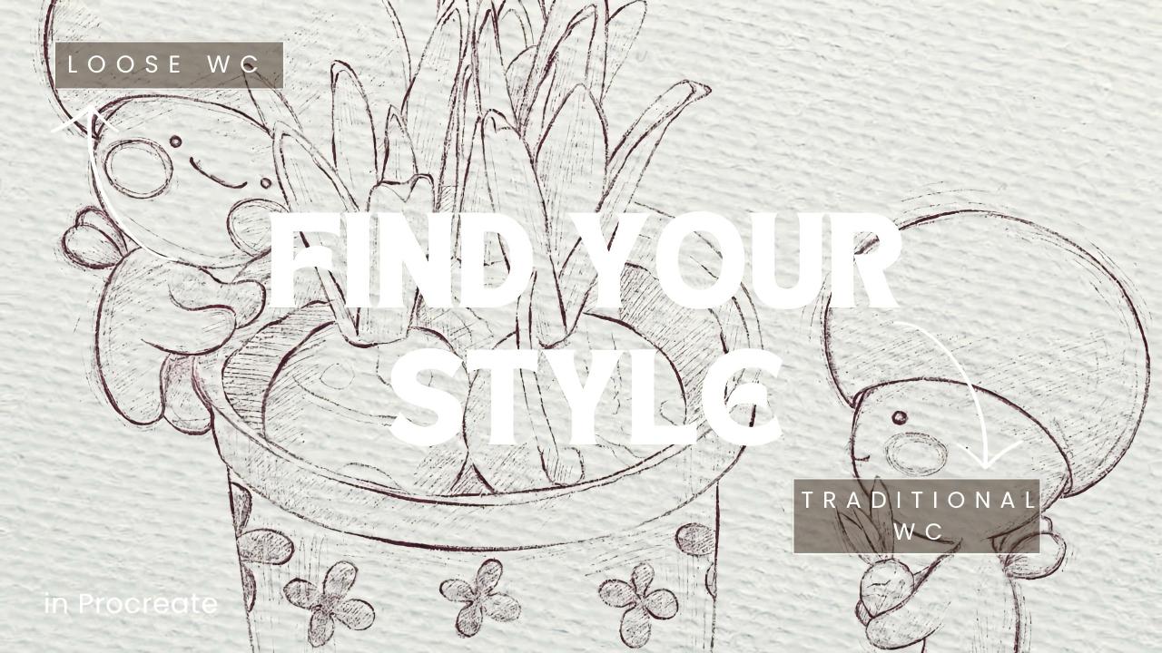
created this sketch. Here we have reference. Let
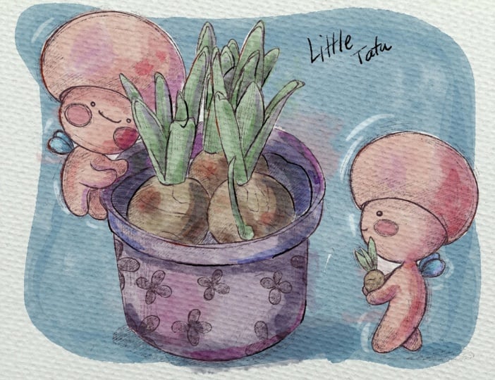
me just move it to this side. And this is our tiny pot. Let's make it a little
bit smaller. Okay. So about the ways how you create sketch,
you have a few ways. First of all, is by
looking at the picture, you can create
similar illustration. And the second one is tracing. Let me show you the first one. So paint here, let's
just rename it sketch, and write pot Li. So if you have our
reference illustration, let's move it a little
bit to the side. And here, the first thing
we have to do is to break our illustration
into simple objects like rectangles
and ovals circles. That's what we're
going to do. I'm going to draw rectangle first. This is our rectangle where
we're going to have pot. Then what I'm going to do
next is divide this pot into smaller shapes and start
adding more details. Here we have an oval. Next thin inside
of this rectangle, we're going to paint an oval. This is where our
onions will grow. I want to tilt it a little bit. Xis. This is the first step of creating lovely
beautiful illustration. We're gonna do it
in a few steps. First, we will just paint some kind of like sketchy lines. But during the second part, we'll just refine them and paint it better
with more details. Here we can have
like circles too, one circle, then another one, and one more behind Lexis. And then we're going to
have some small triangles. Here, like I said, just
very, very simple shades. It reminded me like
pineapple, a tiny bit. Triangle and one more
triangle behind. For the last onion. Okay, so that's it. This is our first step
of creating sketch. Now, what we'll do, we'll
duplicate our sketch pot, then tap and press clear. Now the second
layer is clear now. My suggestion we can lower the opacity on our
first sketch layer. And another thing, let's
just change the color. I'll go with purple, and then I will
press Fill layer. Wait a second.
I'll press Select, and then fill layer. Make sure you're at
sketch pod where we have actual drawings. Then fill layer. So as you see, now our pot has purple shade. Let's return to
the grayish color, and let's go to the sketch pot. This one. By the way, I'm
using Bo HB pencil once again. A new layer, it's normal. And let's just carefully
paint the objects. If you like some messy lines, you can actually start painting everything
on just one layer. It's also totally normal. Sometimes I like to keep
those messy lines too. So depending on your style, you might not need to erase our previous sketchy lines
that we made with the pencil. It will also create
very lovely look. So see what suits to your style. I'm going to erase the parts. My suggestion uses
a pencil eraser, same as a pencil, BHB
pencil as eraser. In this case, the lines
will be more natural. Then what we're going to have, we will paint our onions. As you see, I made the size
of the pencil a little bit thicker 'cause I want the
lines be visible and opaque. I constantly keep looking
at our reference picture. And now here we need to draw
leaves like some tiny ovals. Like this. Mm hmm. You have tiny root, a root. Also one more leaf and
erase the overlappings. This case, it would
look more natural. We have one more
leaf here and here. Like that. Next, we already
have circle like that. Let's create our
leaves in this way. Ding, ding Wait, xi. Just look at the illustration and see where do we have
the leaves? Like that. Again, we have the
overlappings with the pot. So let's just erase it. The last one, we have the
last leaves the here. You see the direction of
them is also different. Yeah, cool. Then we need
to add some kind of mud. Like soil. Ting ting ting ting. So I can paint dots. So my pot will be slightly
different. Style. By the way, for the
reference picture, where did I get it and
where you also can search for some of the
inspirational illustrations. So I went to the
website unsplage.com, and there I found this
lovely pot with onions. So that's it. If you want, you can add more
details, keep painting. You can keep the first sketch or you can turn it
off. It's up to you. You see, I also change
a little bit the angle. If you don't like this way, you always can alter
it by going to adjustments and press
liquefy, increase the size. And here, you can just control the angle and like
way of painting. Again try experiment and see
what suits your style most. So this is the first way how
we can create this sketch. It takes some time and practice. But if you want to practice
actually painting sketches, creating sketches, this is very good way to
practice your skills. The other way, let me show you. So here, if you are
happy with everything, again, you can keep
the previous sketch. You might not keep it.
I'll just delete it. This is our sketch.
Way of painting. Then let's just applicate it. I'll go and do the
same tap and press clear and turn off my
sketchbod the previous one. Now let's go to the reference. Maybe I want to make
it slightly bigger, and then I will lower the pasity and place it underneath my
sketchbod layers, this one. Now, make sure that you
are on empty layer. You have our HB pencil brush. My suggestion minimize
the size of the brush, make it slightly smaller. And here, you can just
trace the illustration. So if you want to reach
those detailed look, if you want to add all
those tiny details, and it's just your style, you also can trace
the illustration. You can see what
you prefer more. Sometimes I like to trace. Sometimes I would
just spend more time on painting tiny
details all by myself. Like I said, d, d dt. So we are tracing,
predict where do we have aliens and just go through
every detail existing dt. I So let's do it very quick. Take your time. You can stop my class and just keep tracing. Or you can just return to
the first way of painting. Just look at our reference
picture and keep painting all by yourself with more or less
details it's up to you. Additionally, my suggestion, you also can add tiny shades. For that, you can
actually make the size a little bit smaller
and you can just, like, do some kind of
shading, you see, in a way where we
supposed to have shades. Lex is more shading will create more dynamic and
powerful istration. Always, more details is better, even though you decide to paint in loose watercolor style, but like pencil sketch will add additional volume
and better look to your so my suggestion
keep adding more details. Okay? Let's just keep painting. Once you like your illustration, you can keep our reference
art for the colors. My suggestion place it
about our paper layer, so now it's not affected by the watercolor paper
texture and move it slightly to this side here. So it will not interfere
with our lovely pot. This one. So you can add dots. You can add some lovely
flowers all around. And you can, like I told you, you can add more pencil strokes. It can be like in
different direction. You can put it this way. You can add it here. I also Chrissy I created some
kind of shade from the pot. Like again, just showed some natural way and
also try to alter the size because I think if your lines will be
thin in shading, it would be better
like the sketching and shading like Okay. So we've done with
sketching of pot now, let's go to the creating
illustrations of fireflies.
6. Creating Character: Firefly: Once we finished creating sketches from reference picture, it's time to talk about painting without reference and
creating our own character. What do you think about it? The first step in creating
a character is to have some idea in your
head, what it will be? What is the purpose of it and how will the
character look like? And then we can start creating. Break the object into simple shapes and draw
details little by little, slowly turning your character in something very
special and unique. Okay, so I'm showing you again two sketches that
we prepared today. This is detailed tracing sketch with different
tiny shadings, and this is the second way
of creating sketch where we need to look at reference
picture and draw a similar one. We reach this picture by breaking illustration
into small shapes, like simple shapes
like a triangle, oval or circle,
rectangle squares. It really can help us to
ease our sketching process. Now, let's just turn
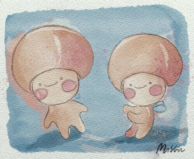
off our sketches and let me show you the dragon Okay, and for dragonflies, we don't actually have reference picture, I just create them. I just thought, What
is a very good way of creating lovely dragonflies,
how they might look like? Oh, I know my
friend told me that they look like
mushrooms, kind of. But this is my way, how I draw dragonflies. It's characters for my book. So you can create
something else. You can create maybe, like, fairies or some tiny spirits. Whatever suits you. Maybe it can be just like
character, like a person. So see what suits you. What was the process of creating those lovely dragonflies?
Let me show you. Duplicate paint here
layer on, go to the top. Then we have our dragonflies. I will lower the opacity. Same what we did before. Make the opacity 100% again. The head is actually the same. So while I was creating the
illustration, Okay, let's go. I just painted circle, same. And then I created one more circle on top
of that like this. After that, about the hands, what I did, I just
painted one more circle. And I was thinking, Okay,
now we need to draw hands. So I just painted oval from one side and oval
from another side. And here I just extended a circle and I
just painted legs, tiny cute legs.
That's what I did. I hope you can see
it clearly now. Let me lower the opacity
of our previous layer. And then what I did again, I created one layer
above empty one. Let's just change the
color to purple one. Yeah, increase the
size of our brush, our Bag B pencil brush, and here I started to
paint tiny details. So I polished the shape of the head by looking at my previous sketch,
and then I thought, maybe it's a little
bit too thick, but we just need to see
what was the process of creating character
without any references. So as you see, we have two ways of
creating illustration. We might use reference or
we might not use reference, just our imagination
and our creativity. So this is what I
was doing while I was creating those
tiny dragonflies. About the head, obviously, I cannot keep it
this way because I want to also paint eyes. I might change the direction
of head like this. It's also one of the ways, make it a little bit and maybe if the shape
is not too round, I can go to liquefy and adjust it to the way
that I might like it. Like I said. Then I was thinking maybe I need
to show the face, so head would not cover
the face of our dragonfly. Mm hmm. Likes it. And
then let's move to body. I didn't draw
anything on face yet, and about body, we need to
connect the ovals with body. So I just thinking maybe
because it is a dragonfly, so it will have wings. It will just float in air. And I also showed
that direction. Now let's go with green color. Let me show you and create one more layer that I
can delete later as is. You see a curve, especially, you can see it in a body. So Dragonfly is curving. It's not straight. You see it goes to
this direction. So thanks to Carvin
the character, we can add some kind of life. Show that dynamic in
our illustration. If it's just straight, it
would not look very nature. So while you are
creating your character, think about first position
of it and second, how you can show the movement while painting
your illustration, while painting your character. My suggestion also to create a few illustrations
of the same character, so you will see how it will look like from different ankles. So here, like I said,
we have the volume. Same here with this character. The other one is
tilting a little bit, towards the pot, I will
add him to the pot later. So it's tilting. It goes to this direction. It's not straight, too. And you see I was moving my arm, so the character should
do some actions always in your art if you want
to make it look alive. Okay. Delete this green line. Again, let's make our sketches
a little bit less visible. Let's delete this layer. Now we don't need that anymore. Let's just delete it
and then add ice. Of course, I add smile because
I want them to look happy. So here, o White's green
color. A purple color. I want to add ice and a
very, very big smile. Well, maybe you can draw like,
Okay, this is not happy. By just simple strokes, you can create the mood of
your art significantly. And the final step,
I wanted to make big rosy checks because I think it might help our character
to look cute like this. So this is the way what I was doing while I was
creating character, and it has tiny wings
behind its back. But because we show the front of our characters
and wings are small, obviously, you cannot see them. So probably you need to draw the second illustration where
you will show the wings, like all of the elements
that your character has. In order to save some time, you can use, for example, head for our second
illustration. Selection tool free
hand and select head like this and press
copy and paste. The next thing, you
can just use head. Now, you can tilt a little bit because you
don't want to look at exactly the same as
our first art, of course. In this illustration, we're
going to do the same. Let's create one more layer. Let's go to the gray color. And here we need to
show schematically the size of the body and where
our character look like. We need to have
approximately the same size of our second character. So I just paint a circle again. And then I want to show the action where the
characters will move. Like I told you previously, this character will carry
some item to the pot. So I just need to show hands. You can show, actually also
by lines like this thing. Or you can start painting something like
that. Even shorter. So if you are happy
with everything, again, lower the opacity. You already can turn off our dragonflies
layer. The first one. We don't need that anymore. Let's return to the layer
where we have had same brush, purple color, same size, and let's just polish
our illustration. So like I told you during
the previous class, always try to break the
object into smaller shapes. It can help you to see clearly what you
should draw and how. So here our dragonfly is
just combination of circles, and it's totally okay. Okay. If you are happy with
it, delete our sketch. And now we have this
cute, lovely dragonfly. But again, like I told you, we forgot about one
tiny thing, tiny wings. One, and maybe second
one will be two. Like this. So this is a process of paint and
our lovely dragonflies, like from the idea in our head, do actual sketch
without any references. I hope now you are
happy with everything. Everything is clear
about creating sketches from references and
without references. And now I think we can jump
into our final projects.
7. Fireflies in Loose WC Style: Adding Colors: Now we are ready to jump
into painting process. Use the brushes I provided, mons and freebies, or
native procreators, or your own brushes. Don't forget to paint on layers that are under
the texture papers. We will have very special
painting techniques today. Let's not wait and go to
our first illustration, and I will show you
everything right now. Let's start with loose
watercolor style. Okay, I think we are
ready to move to the next part where we going to paint in loose
watercolor style. And as you might see, I
rename some of my sketches. I keep our final project
sketch here at the bottom, and let's just change blending layer mode
to multiply here. And then lose watercolor stems. I will duplicate it three times because we're going
to need a few stems. And then we have
detailed watercolor, colors, detailed watercolor
shades, and that's it. Let's move to all loose
watercolor first. And now let me show you about the reference pictures
that I was talking about. So let's go to Action button, press Canvas and
press reference. That's our reference
that we're going to use for the colors. If you want, you
also can choose some of the colors right
here or again. Just go to our watercolor
fireflies color palette. And then let's go
to the library, and here we have a few options. My suggestion, well
watercolor drops you might use as
at the beginning, and I will go with this
lovely beige color again, via Atos watercolor
colors layer. I just started to add some
lovely shades all around. You can increase the
size if you want. Let's place our final
project to the top. So in this case, our sketch will be at the top, and you will not cover
it with the colors. And also make sure
that the paper layer stays on the top, too. So you are painting
underneath paper layer group. In this case, you will keep
those watercolor texture. The watercolor colors. Then let's go to the second one. Okay, you can go
beyond the lines. That's totally fine. About the blending tool, you also can use B watercolor
drops as a blending tool, which I think looks very lovely. Okay, the next thing, let's go with a peachy
color, even pink. And I'll just
increase the size of the brush and add
some color here. Then lower the size and add a little bit of pink
color here and there. This brush is perfect for spreading color for
blending colors. You see? When you just tap, and then you need just
to move back and forth. Don't lift your pencil
from the screen. This case, you are able to
blend the color beautifully. Pitch light pink color. And I just want to show
some pink colour here. Mm hmm. A little bit darker peach color. Now I can start adding shades and define the shape
of our objects, you see? Then let's come here. You might leave
and blank spaces, leave like white gaps. That would add some
natural look to our illustration, pink color. Lights. Now, let's go with
the brown color again. This one is slightly darker
because this color is way behind our main
beautiful onions. Like that. And then green colour, start with light green, and it's where we can
add some green shades. You don't need to be precise. Like that. You see, we
left some white gaps, you blend some colors
if you think they're not natural enough.
Dark green color. So in an area where we have two objects close to each other, we're going to have
the darkest shade. Then we will have this
dark purple color and show some kind of soil. So also can be brown, but because onions
are brown already, I don't want to make
it too similar, so I decided to change
it a little bit. And here, as you see, we're going to have
a brown color like sat and light green
color for tiny onion. And wins. What we shouldn't
forget blue color. Like I said, you can go beyond the lines and blend
it a little bit. So lose water color paint, and it's all about natural
blending of colors, so slight semi transparent look and just lovely
diffusion of colors. What else you can
do? My suggestion if you think you want it to be
a little bit more saturated, you can duplicate the color, and in this case, it will
become more saturated. And I think it
looks just perfect. Maybe we can lover the pacity tiny bit like 50% of one layer, so it will not be
too saturated and then merge together those
two layers like that. If you think that some layers, some lines are too sharp, you always can blend them.
8. Fireflies in Loose WC Style: Adding Shades: Once we finished adding
colors to our final project, the second step will
be adding shades. Different technique will require you to use different brushes, and shades will look
differently, too. I hope you are ready for
this creative process, and let's not wait any longer
and keep working together. Hey, now, what we're
going to do next is what if we start
adding tiny shades. So let's go to loose
watercolor shades layer and change blending
layer mode to multiply. You see, I'll lose watercolor. Colors is normal. I'll sketches multiply, and I'll lose watercolor
shades multiply too. So here I will go
with nasa brush, which is Blue, dark,
watercolor edges. This one. And here, if you would like, you can see it clearly. We're going to show
some of the shades. Go with pink color. And just separate some of the elements and
blend if you want to. Like set. Then in this area, like a set, where we have two shades
next to each other, or where we have the area
that is hidden from us, it's not on the sunny side. So we can just imagine that the sun heat somewhere
from the top right, for example, or top
left, probably top left. So this area will be
under the sun and the opposite area like this one and this one
will be in a shade. So you also can control the
opacity if you want to have more natural blending or more sharp blending.
It's also up to. Okay, now we're going to go with this purple color,
light purple shade. I want to show the
shadow somewhere here. Then this area. And don't worry. If you
think this is too dark, I'm going to adjust
the opacity of this layer a little bit later. And from this side,
we're going to have the shade and the darkest part. And also, I want to add some
kind of a shadow here. L. Now it's gonna go
with darkest color, and I'm going to show
shade with soil. Brown color. Okay, shadows here and there. I think it looks very nice. Now dark green, maybe a little
bit more to bluish side. So in areas where we have two
objects next to each other, we're gonna have the shadow. But again, don't you don't need to be too precise because, like I said, this is
lose water color. You shouldn't be
too detailed here. Plant some of the lines. Ting. And I think I'm going
to go with darker blue, and I want to show
the shadow on Wix. Now, we don't need our
reference, turn it off. And I want to add some shade
with the same purple color, maybe a little bit brighter. I'm going to add the shade
to our lovely flowers. You can leave some white gaps. It's totally okay. And here you also can go
beyond the lights. So if you are happy
with everything, you can play with
blending layer mode. You can stay with multipl
It can be darken. You see a little bit lighter, it can be color
burn, liner, burns. Here are the options. So what I'm going to do is
I will stay with multiply, but I will lower the acid
until 75% like this. And final touches, right? Let's just a couple of stamps. So let's go to loose watercolor stems and go to multiply again. I'm going to go with pink color. And here you can look at the stems and see which
one you might like more. So increase the size, and I want to add
some pink splatters. I think it might
look super cute. Like here in this area, then some purplish
shades in this area, maybe not too dark
and brown ones. See where it might
look more suitable, I might say, over the
size of splatters. And I want to show some magical
wipes to those tiny wings like to show the tiny glowing from the wings and
greenish shade. A little bit more sparkles. So by controlling the
size of the brush, you can control the
intensity of it, too. I think it's fine. The next one, let's go with different stems and see which one you would like to I think I will go with pink color again and
add some wipes here. You see, I intensified
the shades in this area. And also, I added
some to this area. So I added a bit of
shades to this area, and I think that's it. This is our final result of our lovely loose
watercolor illustration. So let's try this style and see whether you
would like it too. Now let's jump to the second way of painting in watercolor. And here, we're going to spend a little bit more time on
painting many details. Let's do it.
9. Traditional WC Style: Adding Colors: Now we can start
the second part of the class and try second
painting technique, more traditional one
with many details. Color saturation
and volume will be super important part in
this way of painting. Well, now let me
show you how you can export your illustration. You need to tap to the action
button press Share and press hipeOPNG depending on which format you
want to save it. If it's hipecFle and then you can see where you
would like to save it, save it as an image, or you can save it to file as you decide. Again, if you like everything, we can merge together all
our layers like that. Thing. So now, this is
our water color layer. If you want, you
can duplicate it, and by duplicating, you see the colors will be
super exaggerated. Okay, so we've done this
our first way of painting. Now let's go to detailed
way color layer. It's where we're going
to add the colors, and it's in normal
playing the layer mode. For this type of painting, we're going to use
another two brushes. It's dark, watercolor edges
and BuhartEedges brush. See which one you
would like more. This brush has very sharp, dark edges, and another one,
it's precious sensitive. If you press harder, it has pretty thin edges. But if you press harder, it will have also some
dark shades from edges. For now, I think I'm
going to stick with our first brush,
BuhartEdges brush. Again, you can come back to our reference picture
and look at the colors. Okay, let's keep adding
colors to our art. I'm gonna go with
this purple shade. I'll start adding colors. Try not to lift your Apple
pencil from the screen. So I'm going to stick
to the new brush. You see, now it's very opaque and it looks
beautiful, too. A light brown color
for the onion. Again, if you want to look at the reference picture to refer to the colors,
you can do it. You can use your own colors. For example, I remember the colours that we were using during our first illustration, and I will just stick to the same colors in
our second art. Now, light green color. You might leave some white gaps. It's also acceptable, and
it will be beautiful, too. Now it's time for soil. Again, it's not brown because it will look very
similar to the onions. It's time for lovely fireflies. We're gonna grab this bright
beige color, same brush. In the area where we
have overlappings, let's just grab blending brush and blend those overlappings. Say I'm going to do here. Ten beach. Oh, not beach, pink color. And pink color here. And then blue for the wins. Don't forget this is fireflies, so we're gonna have a soft, beautiful glow that
we will reach here. Slightly lighter. And let's add shade here. Tran Okay, next
step, adding shade.
10. Traditional WC Style: Adding Shades: It's time to move to
add and Shades part, and we will use so many
blending layer modes and different brushes too. In this part, we will spend more time and paint
way more details. Let's not hesitate. Well, for the second
part of our class, we will go to the shades layer, change blending layer
mode to multiply. And here I'm going to
grab B artistic brush. And the next step, I'm
going to use clipping mask. What should we do? Tap
and press clipping mask. Again, make sure that
our blending layer mode is set to multiply. Also, because this is watercolor brush, it's
semi transparent. So if you want your
shade to be visible, try to use darker shade. For example, if you use
the slight purple color, it's not that visible. But if you move to darker shade, you see it has very
opaque feeling. So just keep in mind that our original detailed
watercolor color layer is a little bit
semi transparent. Okay, brighter brown color. Again, about the
brush, it's artistic. I like this watercolor
feeling that this brush has. And I press gently. I don't want to have
two sharp shades. Remember, in an
area where we have two objects next to each other, we're going to have the darkest. Brighter purple color. L. Same color, and we will go with the shadows. I'm going to use Bartistic
as eraser here and lower the opacity a little bit because I want it
to be more natural. Remember, from our
previous class we you have source of the light, it's at the top, a little
bit to the left side. So the right side
will be in shape. It's very beautiful how
you build up the shade, like little by little,
layer by layer. What is the speciality
of clipping mask is that you don't go beyond the lines of
our original layer, this detailed watercolor
colors layer. It means you cannot
draw here just in area where we already painted,
colored our elements. And that's super convenient
because you know that you will not go beyond
our original lines. Okay, now I want to grab
this dark purple color. I want to make it a
little bit more vibrant. So we added some
kind of shades here. And in this area, be careful. Next, let's go to the peachy color a
little bit darker shade. Why, wait. That's where we're
going to have the shadow. This brush is super beautiful. It's soft, and you need
to adjust pressure. If you want it to be more
vibrant, just you press harder. And if you want to just gently
tap on our illustration, the shade will be very gentle, like, semi transparent, too. That's what I want
to reach right now. I don't want to have
too sharp shade. And green color. Thin about this
type of painting. And you're going
to use this style, like when you have more
time, most of the times. Then as my suggestion, you can go with blue
color a little bit darker and also keep adding
these tiny blue shades. Blending tool if you want
to blend some of the lines. I think it's just beautiful. We didn't have any shade here. Okay, cool. Next, oh, I forgot about this tiny, teeny, tiny onion here. Mm hmm. And wings,
dark blue color. And we add, even
though it's a firefly, we still have shades
here in this area. Maybe a little bit blue colour, like color spreads a little bit to the surface of the
beach color. Mm hm. And now I want to play a
little bit with those flowers. I think the illustration
itself is a little bit dark, so I'm going to make
those flowers brighter. And here is the magic
trick, how we can do it. So we're going to
go to the original detailed watercolor
colors layer. Then I will select go grab selection tool
and press free hand. And I'm going to just select the shape of the
flower one by one. Again, free hand and you select the flower and then
press this plus button. At go with another petal. So during our painting process, I'm going to show you
different magical tricks what we can do in Procreate. Then add again. Add. Add
dunk this flaver right? Add this one. Add and two more, right? Add. And the last one. Ed. Now look carefully what we do. Go to adjustments and press hue situration
and brightness. All curves, you
have two options. If it's curves, it
can be like that. And you can adjust intensity. I want to keep this bright, almost white color
because I think it looks very
beautiful in this way. Let's jump into next part
where we're going to add a little bit more shades
and final details, okay? So let's do it.
11. Traditional WC Style: Adding More Shades: It's time to add
more shades now. We will make them
mobile brand and sharp. So let me show you a
few ways what you can do if you want to
exaggerate the shades. Same what we did in our
previous loose watercolor style by duplicating the detailed
watercolor shades layer. Our illustration
is mobile brand, and it's more dynamic, which is beautiful.
I'm going to keep it. I lower the opacity in
one layer till 30%, and then I will
merge it together with the previous layer. Then I will duplicate
the layer again. It's clipping mask mode, and then I will tap on a
screen and press clear. So now we have one
layer with shades, which is totally empty. As you can use B
running in your beak. If you want a shade
to be more visible, more like crisp, sharp. This is another option
for doing that. You can add some use
B watercolor drops brush to add those
color diffusion. Same what we did in the previous loose watercolor style option, let me show you. So B watercolor drops, pink color, and let me
just make it bigger. So diffusion of colors. I just don't want to
paint on my petals. So I'm going to erase some
of the overlappings here. So I want to petals keep white
as white as it's possible. Let's come back here and erase parts where we had
shades on output. In this case, we will keep
it more clean, I think. Lacee different brushes,
add different shades. See what you like more if you
can mix different styles. Like said, I'm gonna I
think it might look a little bit better, bright color. And I want to add this
pink shade because I think it might
look just beautiful. Maybe some pink wipes here. And in this art and
some pink color. On leaves, I think
it's also beautiful. So, for now, I like the way
how everything looks like. And because we used
Bo water drops brush, I need one more layer. Duplicate. By duplicating,
you make it brighter. Again, if you like, you
can keep it this way. Like it, Lovers up
past it till 50, 40%, merge together
again, duplicate it, and then I will clear the layer. So now I have detailed
watercolor shades also clipped to our
original layer. Finally, put dark
watercolor edges brush. And here I stayed
with pink color. I want to add some visible
with clear lines shades. Very similar to previous
painting style, but here we have more shades. So we need to create volume. This is our aim in this type
of watercolor illustration. Like that. That's
why it might take a little bit more time
to finish this art. I said, it takes a little
bit more time here. But it's totally okay. E as overlapping. Now, brown color. And in this detailed
watercolor style, I want to make the
shades lighter. On the contrary, I will
make them brighter. Later, once we finish
this shading part, I want a shade to
be as visible as possible. So green colour. I think that's it. Now, let's see what we're going to do next. You can do the same by
duplicating the layer. We make it with movi brand. Another way, curves. And here we can play with
color intensity, I think, Lin. Now, let's jump into
next part where we're going to add stamps
in final details part.
12. Traditional WC Style: Adding Details: It's almost the
end of the class. Now it's time for
the final touches. We will add tiny details to our traditional
watercolor look painting. Okay, stems, go to multiply, change it from
normal to multiply. Then let's go pix the color. I will go with pincan
and go with splatter, same what we did earlier. Then we can do the
same with tiny, tiny wings, add some
glow. That's it. Next, what I'm going to do is I want to go with Butter
Color stamp seven, and I will go with
pink color too small. Erase overlapping. You can add them to every new
layer, but I won't do it. By the way, now our
layer is not clipped, so it can go beyond the
lines because I want to have some glow and some soft
lines around our objects. Mm This one water
colors stand four here. Perfect. Erase overlapping here. I like this dark green shade. Purple color. Mm hmm. Likes it. Again, what you can do, curse and play with intensity
of the colors. I want to make it a little
bit more saturated. The next thing is you can
create some details first. Later we'll talk
about the background. For the details, we're going
to go with B Rani Ica Brush, grab this purple shade, and just go maybe a
little bit bigger, go to the darkest parts. Oh, yeah, I forgot. Move to multiply. Always move to multiply. Don't worry if you
think it's too dark. So this is the most
important part where we will exaggerate the
darkest moments, the most important parts
by using darker and brush. So alone with pencil, you're going to have very thin
brush strokes, like that. I decided to grab
this purple shade because it's universal. It suites to every color, almost every color that we have. You see with those
tiny white gaps, it looks very beautiful. Super realistic, and it
gives some air to our art. You see, I don't add lines everywhere, just
like here and there, where I feel that we need
the sharpness, the darkness. And also by pressing
harder and lighter, you can control the thickness
of the brush stroke. Same about the wings. For our lovely fireflies, I will go of a
slightly beige color, maybe darker one,
like reddish one, cause I want fireflies to be too dark because
they're supposed to glow. So here, area around head. And head. You see, by shading some
of the darkest elements, we create volume in
our illustration. So our elements look
very vibrant, very deep. I don't want dark shades to ice. I want them to glow too. The ding. So as you see, we have details and we don't have them with detailed Lear, it looks way more beautiful. We've done with
painting details. And now, as a bonus, I'm going to show
you how to show the glow from the dragonflies. If it's not enough, if you don't want to keep
white background. So let's finish our class
with tiny background tricks.
13. Traditional WC Style: Creating Background: And now as a bonus, I want to show you what we
can do with background, how to paint it in
a different way, how to reach more
watery or opaque look, you will decide which
one you like most. Okay, at the bottom
of our illustration, we created two layers. First is background
and second is glow. Background, we chose multiply
as a plant layer mode. Now, you have a few options. You can use actual brush. Or you can use stem brushes
to use for our background. For example, our lovely creatures, our
lovely dragonflies. They're somewhere in the forest. So I'm going to use watercolor
stamp nine, you see, and it has very
distinctive edge lines. I will duplicate it and
then flip horizontal. Like that, so I will make. By the way, I turn on
snapping for me is just easier to control the position. Merge together two
background layer, duplicate again, and
now flip vertical here. And we created our
background color. Now I'm going to use blending
tool and I will blend some of the elements because you
see they're very similar. I don't want it
to look the same. So I'm going to just simply
blend it. Like that. The next thing, I will merge together two background layers. And now what I have to do
is just erase overlappings. How to do this? Again,
by selection tool, I will select our
lovely creatures, 'cause if you do it by hand, it might take edges to finish and to erase
everything step by step, then press d. It
shouldn't be too precise. Now, three fingers
down and press. Yeah, cut. If we do
have some of lappings, just erase it by hand. Okay. Again, what you can do, you can just change the color, feel saturation and
brightness and see which color you think
would look better. And next, you can go
with saturation color, grab a bluish shade if you want to botistic brush and
show some kind of glow. You might see it here from
our lovely character. And I think my suggestion, let's just play this
layer above everything because we will be able to
paint on our characters, too. So like you see, the surroundings will
be more vibrant. And thanks to the glow, like elements, you see they
also become very saturated. The color is not too vibrant, but we shouldn't make
it like rainbow. Just very soft go
would be enough. Exist. This is one of the ways. Another way, let me show you. We will keep this
saturation layer, and the background, we're
going to do another one. Duplicate by duplicating. You can make it more saturated, but I want to keep the
color more opaque, I think, clear,
one of the layers, turn off previous
background layer. And here I will stick
with more artistic brush, and I will go with dark
blue color, for example, increase the size, and I just schematically show like
this dark background. Same what we would do
with stem brushes. But I think with
actual brush itself, it would look way much better. That's to my mind, everything
is super personal. So you can do the way how
you would like it to be. Liquefy if you went
beyond the lines, and if you don't want to do it, and then eraser and
with the same brush, erase some of the things that don't match to
our illustration. Next, let's just erase our pins. Same what we did with our
previous background option. We don't want it to
be too dark, right? Add and then three fingers
down the press cut. And look, it looks cute. Again, I think those shades
are too white to my mind. So in this case, what we can do, let me just paint here,
erase overlapping. So what we can do is next, we'll just make the shades
here a little bit darker. Let's return to our shades
layer. Know this color. Selection tool and I
just want to select this area and make it
slightly darker add. And Curves. Here and desaturate here. And if you want, you can
create shade all by yourself. It might look more
realistic if it do lexis. And now we can go
to our glow layer. And if you would like, you can go to Divide and
see how it would look like. And I think it looks
very beautiful, super beautiful.
Go to the eraser. I want to go to
the glow layer and erase some parts that
don't look very realistic, very natural blending tool
and make the soft glow. From our lovely care. So we have D white layer because for this
dark background, I think it's a perfect
choice blue color. D white layer, the color that I chose is not
peach, it's blue. And because fireflies
are glowing themselves, we actually can add some
glowing around them. Guys, I hope you enjoyed our different variations of
painting in watercolor style. Now you know how to paint
in loose watercolor style, how to paint in
more detailed way, also how to show the glow, how to create
different background. And again, add more
loose watercolor wipes, where you have a lot of, like, water in background or
how to make it more opaque and show beautiful
glow from our characters. I hope you enjoy today's class, and let's recap
again what we did. Then this is loose
watercolor style. I wish you luck with
all your illustrations. I will be happy to
see what you created, and if you would like, you can post it in projects
and resources section, and I will be glad to give
my feedback. See you. Congratulations. This is the end of our class, and now you definitely
should be proud of yourself. You learned some useful things and created a
beautiful painting. And in the future,
you can create more. So what we have learned
and why we did it. So now you know more
how to paint fireflies in what color style
digitally in procreate, how to create watercolor
paper texture, how to sketch in two
different ways and how to draw sketch from reference
picture and without it, how to create
characters step by step from image in our head to
finalized illustration, how to paint in loose
watercolor style, how to paint in
more detailed way, reach traditional
watercolor look, how to show glow and how to paint background in
two different ways, watery one and opaque look, how to use layers, blending modes, and color
variations to our art. So why was this class useful? Now you can experiment with your own style with
character design. You gain some inspiration
and creative ideas. What's more important, we
can create digital art that is so similar to
traditional watercolor media. Guys, I will be happy to see all your artworks in project section and
give my own feedback. Also, I would really appreciate your opinion about the class. You always can leave review in review section. So what's next? In my future class, we will keep exploring
watercolor and keep adding magical
atmosphere to our art. Laurels will be
our next project. So let's see has
in Class. Bye bye.
 Inga Yoon, Digital illustrator and teacher