Transcripts
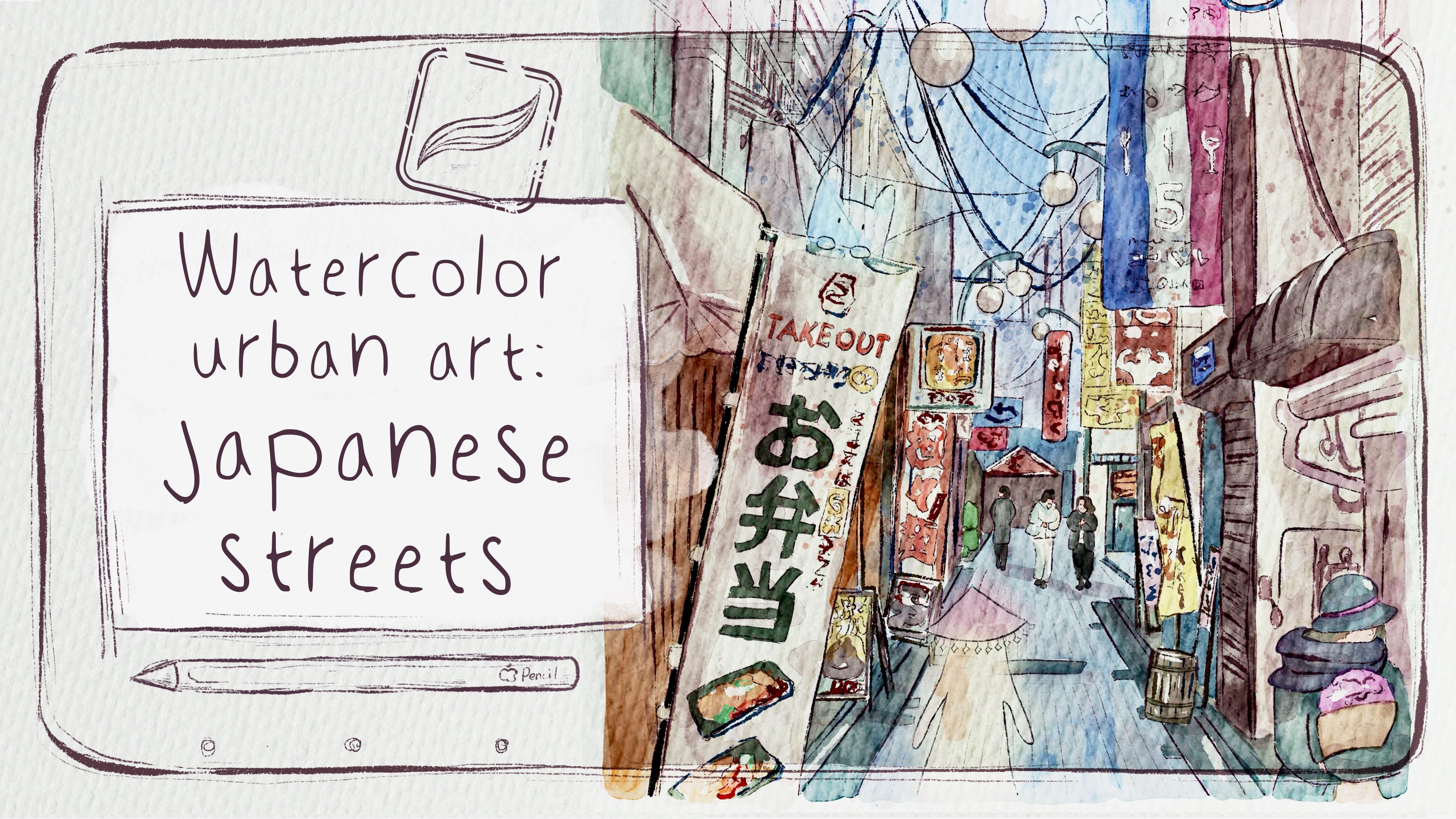
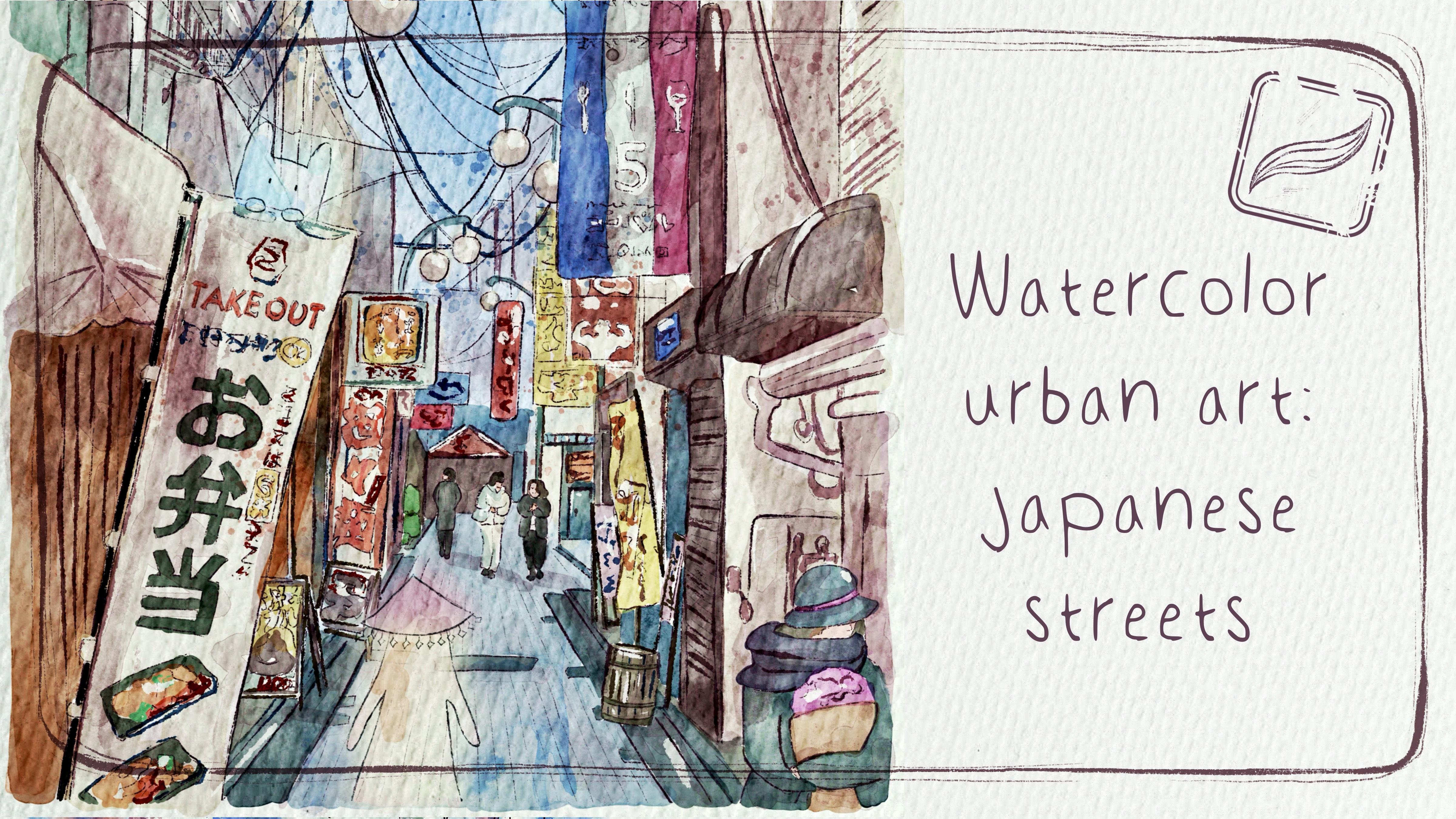
1. Introduction: Hello, my lovely artist. Welcome to my class, and let's dive into digital
watercolor art and paint together
urban art Japanese treat with cute spirits. Get ready to learn a couple of new watercolor painting
techniques for Procreate. My name is Igayun
and I'm here to show you that digital
watercolor is magical. And you can create
magical world with all those cute characters and whimsical nature
with your own hands. For that, you will
need procreate and a little bit of inspiration. In this class, I will start
by telling you where to find the freebies and how to get ready for the
painting process, like creating
watercolor paper in procreate and exploring all
the brushes that we have. I think it's hard to create good art without
inspiration and references. So I prepared for you a
small video of Rome Japan. This part takes an important
role in our taste class. Then we will prepare
sketches in two ways. And finally, we will move
to painting process. Two beautiful streets
are waiting for us and two different ways
of painting digitally. I will show you how
to add colors, stems, shades and highlights
to your art from the sketch to
detailed illustration. So we will make our painting
a little bit advanced. And the most important thanks to a couple
of cute details, we will add magical atmosphere
to our realistic drawing. By the end of my class, you will be able to create
urban illustration, Japanese trees
specifically in procreate using digital
watercolor techniques in a fun and simple way. During the course, I will slowly move you throughout my workflow, explaining every
step and describing procreate features and
watercolor painting techniques, and what you will
learn during my class. Me about procreate, more
about sketching techniques, how to create watercolor
texture paper because it's important today, how to use different
watercolor painting techniques and how to apply those
techniques in procreate. Next, we will learn how to use layers and blending
modes and how to add volume and color
variations to your art. How to create urban
art in procreate using digital brushes and what you will need
for this class. I will use procreate with
iPad and Apple pencil. You also can use procreate or some other drawing pads or just regular watercolor
paper and paints. And about course resources that I prepared for
you as a bonus, I will share with you all
the digital set tools that we mentioned during
the class texture paper, custom brush set, color
palette, of course, references and my own
illustrations that I created. Now, who is this class for? The class is great for intermediate level also can be useful for beginners if you have basic understanding
of procreate features for those who is interested in
digital watercolor art, cute characters, and
urban illustrations. And one more thing that is
super important and I need to mention your opinion and your feedback is very
important to me. So feel free to tell me
what you think about the class in discussion
or review section. I'll be glad to reply to you. I can't wait to see what you
applod to project section. So let's not wait. Grab your
iPad with Apple pencil, or body coolor paints, and let's paint together. So if you are ready to create the art that you are
proud of, let's do it.
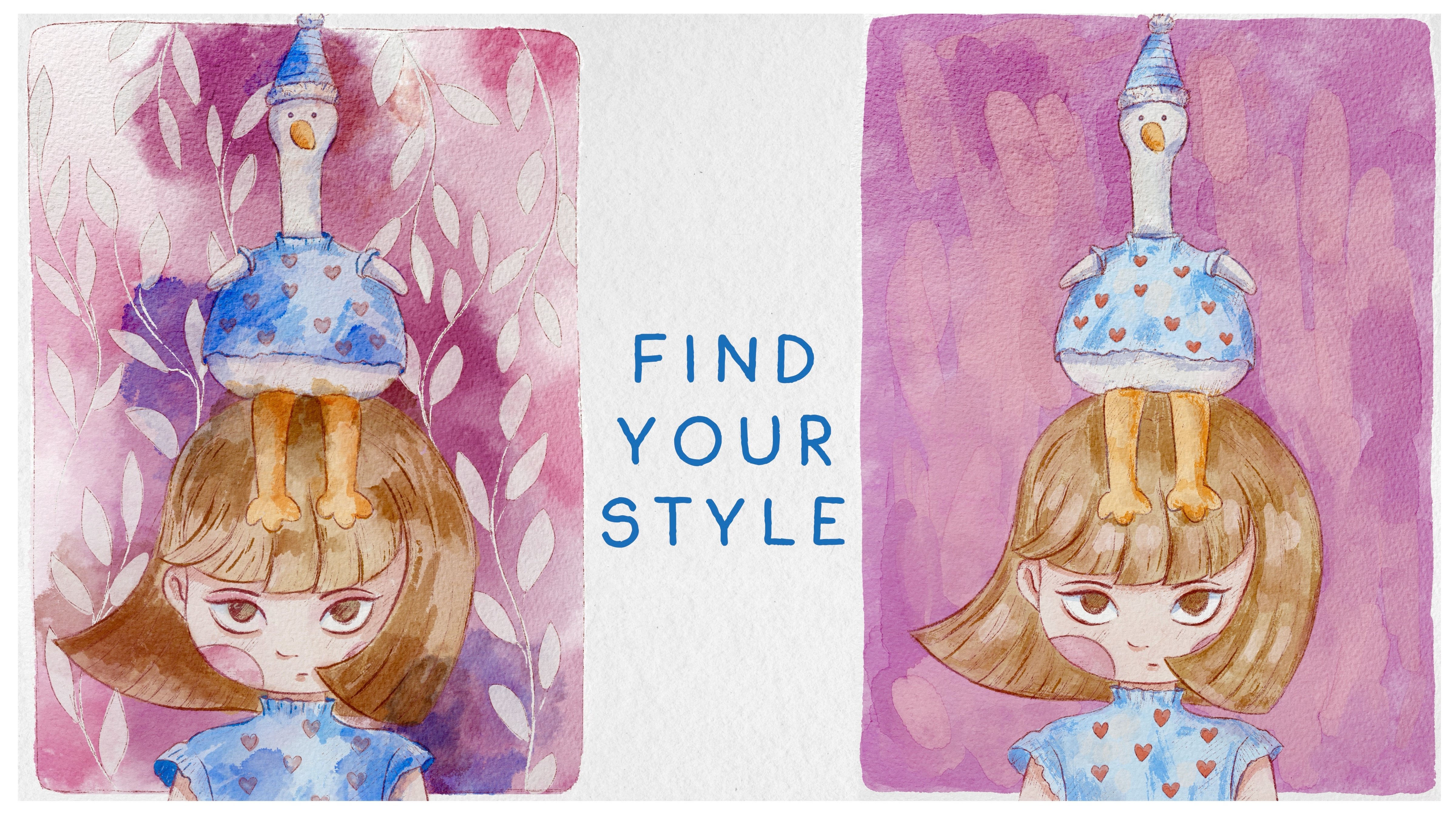
2. Class Project: Now let's talk about
Yo Class project. Yo Class project will be next, create urban Illustration
with magical elements in watercolor style that
will bring joy to you. Of course, don't forget to use the tips that I gave
you during the class. Follow my steps, explore the
new painting techniques, and choose the style
that suits you most, and then create
beautiful artwork. It can be Japanese street or maybe the street of
your own hometown. About the materials. I'm going to use brocre
today and we will paint in two different painting techniques,
watercolor techniques. So you can use traditional
watercolor paints or procreate Epp or some other drawing
pads, whatever you want. In today's class, we will
paint urban illustration. We will paint two artworks of two Japanese treats with
cute magical characters. Also, we will experiment with
true painting techniques. Once again, you can choose completely different
topic and draw something you try experiment and enjoy
painting process together. So you can share with
me your final project and step but pictures with me. I will be happy to see it. Just click the submit project
button. It's so easy. And if you have any questions I need more tips,
please let me know. I'm here to help you.
3. Tools & Resources: This class, we will talk about resources and where
to find them. It's pretty simple
just follow the steps, go to projects and
resources section, download freebies,
go to Files app, and then import all the
freebies into the procreate. Well, my dear
Skillshare community, let's jump into preparation
and then painting process. So first of all, we need
to open Procreate here, and then we need to
create a canvas. For that, we need to tap plus
and then tap plus again. After that, I would
like to switch from pixels into inches and write 13 per 10 ". Just make sure that your DPI is 300 and depending on your iPad, you might have different
number of layers. I have 85, my iPad is
2024 and let's tap grade. That will be our papers. Right now, let's just
talk about resources, where to find them, and then how to import
them into the programe. So first of all, when
you open my class, please do it in browser. It can be Home or Safari. Why browser? Why
not Skillshare app? Because if you do
it through the app, freebies might not be visible. And then you go to
Downloads folder and you can find all
my freebies there. I will add them to
the freebies as well. Then we're going to have our
texture paper in GPAC form. Apart from paper, we're
going to have two sketches Japanese treat Ink and
Japanese treat pencil. Then Japanese treat in
watercolor swatches. So what you need to do
is to drag and drop them into the procret
like this. Ding. Then we need to do the
same with pencil sketch. And let's create one
more layer in sketch. Like that. And when you transferred everything
into the procrete, let's just close our files app. Dan sketch. Pencil. Sketch ink.
Okay, wonderful. Now let me show you where to find all the freebies
in Procreate. So this is a brush that
we're going to use today. We have Bigbee pencil. That is good for
sketching. Borni incurrent that is very good
for sketching, too. Borni ink bk for more details, and it's very good if you want to emphasize some of the things, some of the details
in watercolor. Bore artistic, very good
watercoloring brush. Bow water drop. This brush is amazing
if you would like to mix colors together. Later I'll show
you how to use it. Bow dark watercolor edges. Our main brush when we
talk about watercolor. It's semi transparent
has watercolor edges, and it has watercolor texture. Then Bu hard edges watercolor. This brush is
amazing as a shader. If you want to add
lovely watercolor, shades that are very
clean and transparent. Bu natural stains
brush and blender. It's very good if
you want to add some natural watercolor
bleeding strokes, or if you want to use
it as a blender itself, it's also very good brush. You can see it. Bu soft diffuser. This is a blending brush. And but transparent watercolor
to add soft gent shades. This brush is
pressure sensitive, so try to play with
theplorrs and see which way of painting
you would prefer more. Blap is lazuli to add some
tiny accent is like splatters. Boo, what a colour stem. Salsa stems and new stems that I prepared for
you that are really, very lovely and suitable
if we talk about effect. Boo, what a colour stamp eight. It's very good to use
them in clipping mask. Oh, if you want, I use them as some additional
watercolor elements. This one is one of my favorite. I like this bleeding feeling. Another favorite one with sharp edge lines very soft,
watercolorly, strokes. And another one.
Another good brush. Like that. So you just saw all of the brushes about
the color palette. We're going to use Japanese
treat and watercolor as our main color palette. And if you want to use this color palette as a default one, you need to tap three dots and then press set as a default. Then when we go to the
disc here underneath, we're going to have
all our colors. And I think that's it for
the explanation about the freebies and all of the tools that
we're gonna use today. So now let's jump into
next part where I will show you how to create what
colored texture paper.
4. Create Textured Paper: So it's hard to create
what color illustration without what color
texture paper. So we will hick this issue. Let's talk about that right now. I think we need to
rename our layers. So we have sketch ink
sketch pencil here. If you don't want, you don't
need to transfer them. You can create your own sketch. Or just simply follow my
steps in a class and again, create the sketch that
you would like to use. And here you're going
to write sketch base. One, and then rename
sketch based Wow. Let's play this
layer on the top, and I will write paper like it. After that, we need to
create one new layer and place it underneath and write paint here and on those layers,
we're going to draw. About the paper, now we need to import watercolor paper into the procreate. How to do that. Let's go to Action button then let's press Ed and
then insert a file, then go to Downloads
folder and then find out watercolor paper and then import it into
the procreate. Rotate, rotate, fit
the screen. Let's see. Okay, perfect. Then I just want to duplicate
it three times. And now be careful. Our next steps are
very important. So in the first layer, I need to change blending
layer mode to multiply. Then turn it off. After that, I'm going to go to the second layer with paper, and here I will change blend layer mode to color
burn, and the last one. Let's go to linear burn here. Then I need to go to
color burn layer, and then I need to
duplicate it one time. Now we have two layers with
color burn blending mode. After that, I need to
select those two layers. I selected one layer and how to select the second one
by swiping right. So now you see I
selected two layers. Then let's just
merge them together. So now, again, we have one
color burn blending ermo. Then let's go to linear
burn and duplicate it too. Again, by swiping right, I selected two
linear burn layers and then I will merge them
together too. Why I did it? Because by duplicating,
we enhance the texture of the paper and later when we apply
watercolor paint, watercolor filling will
be more authentic. Pay attention because we duplicated the layers and
then merge them together, especially with linear
burn blending layer mode, the color of the paper
became a little bit darker. So in order to avoid it, we can lower the
opacity till 60, 50%. Yeah, 60 form is good. Then we have one paper selected, and let's select the
rest two layers with multiply and color burn
blending layer modes. But this time, we don't need
to merge them together, which need to create group. Then I want to rename
it and write paper. Why I didn't merge the
layers together because I wanted every layer
to keep this effect, blending effect that
each layer has. So now I keep them
together on the top, and my suggestion, let's
just lock those layers. Why I did it Because I
don't want you or me mistakenly paint on paper
layer. So okay, cool. We have our paper,
and now what we need to remember,
all our sketches, all our watercolor paints
should be on the layers that are underneath
our paper layer group. Okay? Tintin tint. I think
we're ready to go. So let me just show
you the difference. For example, if you take brush, Blue dark watercolor edges, and if you want to paint, so you see when
we use the brush, and then let's apply
another color. And then when we use the paper, it helps us to create very realistic watercolor
filling, you see? Oh, for example, if
you use a brush, like patural stains,
brush and blender. And then when we grab, we want more pink color, you see the way how it
bleeds is so realistic. It's like water that
you add to the color. And you might also crap, I don't know, like green color. So thanks to the paper, all of the brush strokes that we were using
is very natural. And when we turn off the
paper texture layer, you see the feeling is a
little bit less realistic. So that's why I try
to make sure that your paper layers
are on and that you paint underneath
because if you place our paint above our
paper layer group, you see you lose this
watercolor feeling. Like that. Now, when we are done with creating
watercolor texture paper, let's finally jump
into inspiration part.
5. About Inspiration: Finally moved to
very important class where to find inspiration. What about reference
pictures and how to create unique art with
some magical wipes? Let's talk about it now.
6. Rules of Perspective: Well, before we jump
into sketching process, I will explain your rules of perspective that
we're going to use today a lot in our
tooth sketching techniques. What are the rules
of perspective? When we want our flat
surface, have some depth. So thanks to rules
of perspective, we actually can reach
those results easily. The rules of perspective
is some kind of mathematical formula
that can help you to count like the perfect angle and the correct
position of the object. We want to understand how to create one point perspective, this is one point
perspective composition. We need to paint a horizon
line and then paint a.in a center usually
of this horizon line. Obviously, the horizon line
can be lower or higher, depending on your composition, and then our dot will be the meeting
point of all the lines. That means from all
of the objects, we need to draw
very straight lines right to this meeting point. And then at intersections
of those lines, we're going to start
painting all our objects. Objects that are closer to us, like at the edges of
the illustration, the size of those
objects will be bigger. Further the objects go, the size will be smaller. Objects that are closer to
meeting point will be smaller. So let's try to create our own mathematical formula
in our illustration. Let's find Horizon line. It's not in a century as you
see from the illustration. It's somewhere at the
bottom, the building. A, be careful. Try to paint straight line. We can start painting
lines little by little. And that can help
us to understand the correct position
of the objects. Something like that. Here
we also have the buildings. So we need to remember one
more building over there. Okay. So that's the rule that
we're going to apply for our painting style here. But again, we cannot use our reference picture ernie
for this sketching technique. So now what we need to
do is just to delete our reference and turn our
lines into more visible ones. So how to do that? Let's tap a window here and
then tap Select. So now all our
lines are selected. Now I want to change the color. Let's go to which one? Probably bluish one. And then when we selected another color let's come
back to the layers again, tap again and press fill layer. So now our lines are not
white anymore. They are blue. Great. So the next steps
that we're going to do is to actually have
reference picture. For that, let's go
to Action button, go to Canvas Tap reference. And here we have our
reference illustration. So what you need to do is you
need to go and press Import and then go to Gallery and Import our
reference illustration. Dunk. Next step will be
painting, actually. So what I will do, I'm going to keep the
lines here on the top. And then I will go
to Burni inker brush and go to this brownish color. And that will be our
color for the sketch now. Then we have our horizon
line that can help us to understand why we need to paint our
buildings and people. So the next step that
we're going to do is actually start creating sketch.
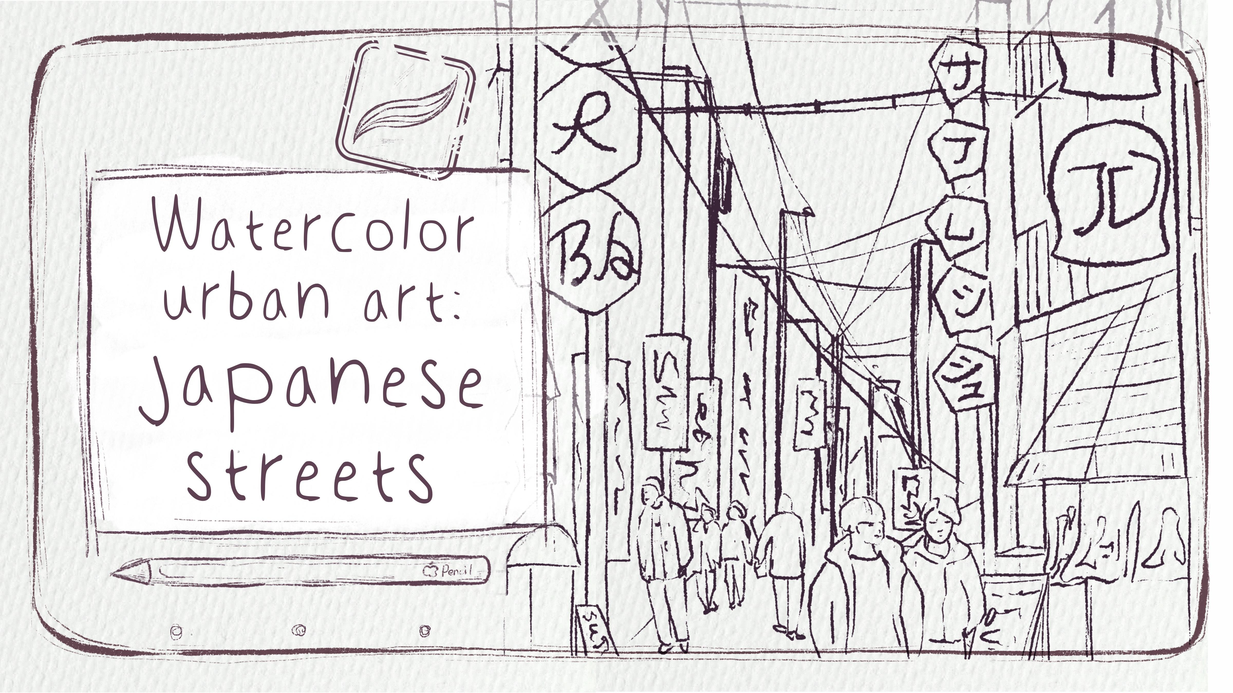
7. Create First Sketch: Now it's time for sketches. Pencil part is super
important today. So I decided to show you two ways of sketching
a tricky way, how to sketch in a fast way, and more traditional one. Depending on free
time that you have, you can keep adding
more and more details. Feel free to follow my steps or use own sketches.
Be creative. Make sure that you're
on sketch base layer, that you have
Burani inker brush, and let's start
painting buildings. With this type of sketching, you don't need to
be too precise. Maybe just lowers the opacity
of the lines till 50%, 'cause I want to
see my own lines. And let's try painting
illustration. Tank. We're gonna
have line over there. And we're gonna have
line here and here. And then we have the sign. Let's just start
creating the signs. Again, you can skip
this part and just grab the sketch that I already
prepared. It's up to you. And for this type of sketching, you don't need to
be too detailed, too precise, or too accurate. That's the benefits
of this style because it's just sketching like
the way how you like, work, and then you would like to sketch very fast something. All your lines wouldn't be like, perfect, perfectly accurate. And that's totally normal. The most important will
be actually combining our inking brush with
watercolor brush strokes. Like that. Then behind, as you see, we have another
building or there. Eras your lappinsTing ding ding. And you just need to
follow the lines. Those lines will
be just straight, but the other one will
be tilted accordingly to our horizon line and
to the meeting points. So be careful about that. So what I mean is that when
you paint the building, you paint the line and then
follow the lines here. Then again, one more building, one more line, and so on. Building, tinting and make sure that all the lines
here are super straight. Mm hmm. So something like that, and this
is the meeting point. Here, let's do the same. We see just part
of the building. But here we also have the sign, the name of some of
the I don't know, like store or hotel
rooms, d d d. Like hexagon shape. Cone is not hexagon. Like something strange. And the remove overlap in
like a set over there. Yes. So here we
have grand Lounge. Ding. Like three. I think this is a sign of three. Ding ding ding, ting ding. I forgot about one more sign. Here. Here we have the entrance to the hotel. Over there. Let's just show
it with some lights around. And like I said earlier, like, just keep painting buildings. Like that one. Follows the
line line here, straight line. Line line again.
Straight line here. Building. Building here. Line here. Building. What I like about
Japan is, like, all those wires,
about the wires, just try to take a little
bit thicker line, like, increase the size and paint those in a sky wires in the sky on the top
of the buildings. One dug here, that
connected somehow? Some of them can be thicker,
some of them thinner. I think that creates a lovely
composition thanks to that. And then we have so many signs like
over there, like sign. No, not here, sign
here. Over there. And there's written
something on it. Just removal lappins
but not the wires. And just like if you have
more time, of course, you can actually write the
actual words, or you can just, like, pretend having
something written on a board. And about people, I think
just schematically shows a face and just like basic movement
where people are moving. Exos to friends. So let's just paint them here. So you can keep painting, keep creating more details, adding more and more elements, depending on time that you have. Remember about rules
of composition that all lines go to
those directions. Like that. So I don't need
my reference picture. It's like, you can
keep painting. I'm going to use the
illustration that I already painted
earlier this one. Because here I spent a
little bit more time and I had more
details, but again, feel free to keep painting, keep creating your own art or just use the sketch
that I prepared. So now let's jump into
second sketching technique.
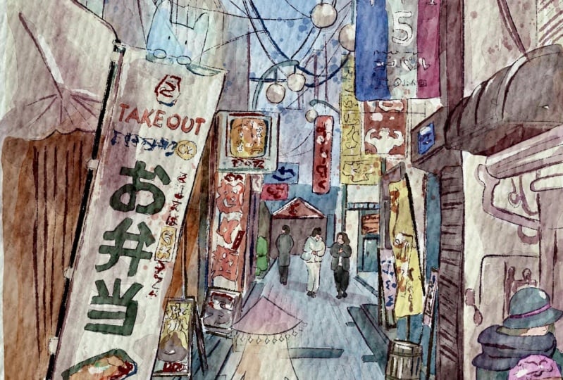
8. Create Second Sketch: Let's talk about our
second composition here. This illustration is beautiful. Also, we have
linear perspective, and we have our
lines over there. Let's go to the rep. And
then we just need to move our meeting
point over there. Yep, Line should be straight, not the wavy one like
what we have here. But approximately, we can see what to expect
from the composition. It's like this. Here, we're going to have this
is a horizon line. Over there, this is
a meeting point. And yeah, all of the
lines go from this point. And thanks to that, we can actually understand where
and how to paint our lines. But what I want
to tell you about this sketching technique will
be a little bit different. And to tell the truth,
we don't really need our lines for this
type of illustration. But of course, if you
want to practice, if you want to keep creating
your own composition, and use your own style, use our previous style,
feel free to do it. For this type of illustration, I'm going to use Bu HB pencil, and then I will lower the
opacity of our sketch here, and I'm going to use
tracing technique for the second style where we have our reference
illustration, and if you want to keep our
proportions true to life, you can use second
technique where you just paint on top of our
reference picture. So turn off the lines.
You can keep them. You can have them
if you want to try our first painting
technique where you look at the illustration and you
paint it by yourself without actually referring
to the actual proportion, size, and position
of the objects. And this type of illustration
is good when you have time, when you want to keep it as
true to life as possible. So, yep, why not to try it. And what we need to do is just lower the size of
the brush a little bit, and let's start tracing
all of the elements. This sketching
technique is longer. It requires you to
spend more time, paint more details because if
you trace without details, it will not look finished. So let's start tracing
all of the elements. Let's try to show them on
your own illustration. Make sure that you paint
on a layer that is new and stays on top of your
reference illustration. If you don't like this pencil, you can use six pencil,
native procreate brush. Or you can use ink and brush, depending on style that
you would like to have. Inky Brush is more by brand, and of course,
it's very visible. So I'm going to use
pencil because it really is muted and it helps me to create very
harmonious composition. If you talk about the color, about the brush strokes, how bright or less bright
the illustration is. And also don't forget we lower the opacity of our
reference picture. So now we can clearly see
what we are painting. You can control the
size of the brush. Some of the details
are very tiny, so you can lower the
size of the brush. Or on the contrary,
some of the lines like, for example, wires
will be thicker. So on those parts, you can increase the
size of the brush. So you will create some kind of volume variation
like some thickness of the brush strokes that will help to create some
kind of dynamic in your Every street in Japan is very unique, and it was really hard to make a decision which reference
illustration to use. Or maybe you can
actually be detail, but don't paint all
of the elements. That's also possible. Okay, depending on which
am you want to achieve, you want to show everything
as realistic as possible, or you just want to
create this feeling of movement and just, like, presence and help viewers to be present in
Japan in a moment, like in your illustration, to have the same feeling
from the atmosphere. So like I talked
about the wires, we can increase the size, and some of the wires
can be thicker. Some of the thinner. Mm
hmm. So keep painting. Or you can just grab the sketch
that I already prepared, and you can save some time. Or, you can create totally
different illustration. Use maybe Japanese street
or maybe another street that maybe you saw or maybe
you found on Internet, or maybe some other pictures
that I took in Japan. Of course, feel free to
use any picture that will, you know, help you to feel the spark when you are painting. Here, I decided to paint
three people like one, two, and three because this
person in the center, if we paint four
people altogether, it might feel a
little bit messy. Or, if you want, you can change the color of the pencil too. Black or blue. Okay. So like I said, you can use my own sketch that I prepared
or use your own sketch. This is a sketch that
we have in the end. It's almost black,
but, of course, feel free to use any
other pencils you have. Okay. And you see in some parts, we still have some a little
bit thicker brush strokes, so a little bit thinner. Like that. Tag, now let's create one layer. And now I want to add some magical elements
to our illustration. Again, it's not necessary. If you want to keep it very
realistic, you can do it. So for this part, I will use Sixbey pencil. And I just want to create
some lovely magical creature. I want to add some
to our illustration. So they will look
very realistic. Now I add them separately
on a new layer because, again, I want to
make some changes. And second, if you don't like, you might just not paint it. Dear. I like some spirit rabbit
spirit, like that. Maybe I want to
add one more here. So, the creatures, our magical creatures should blend naturally into
the environment. So try to practice and see where they like how they look and how well they
fit into the background. Because this is,
you know, Japan, like country of spirits. So this I think the
best place where I can add like this in
these two spirits, and maybe I will paint
some spirit over there, like in the center
of our attention, and it will be a little bit
inspired by Miyazaki movies. Because I'm a huge
fan of Miyazaki, so maybe some ghost to walk in head with those tiny hands. And in the head, what if we add some heat? And also a coast will
be semi transparent. That's why you don't
actually need to erase the surroundings because our creatures will be
not entirely visible. Like the spirits. Some people see them, some people don't see. So this spirit will be walking. You can use liquefied tool and push the spirit a little bit to the sides and add some elements to it. Now still, I will
go to the sketch, and I will grab both
diffuser as eraser, and I want to erase some of the brush strokes from
the original sketch. Like I said, our creatures
are semi transparent. But still, they covered like, partly in the background. So I want to make
it less visible. So both of diffuser as eraser. Grab it. Don't erase
everything entirely. Just make it less visible. Well Okay. Yeah. We've done with
adding those lovely, magical creatures
to the background. And let's just merge together our magical elements
and sketch pencil together, and also do the same. Let's create one more layer. Switch, go to
Burani incur brush, Lovers size, of
course. New layer. Magic spirits. Magic rename. And here we can start creating
those lovely spirits. I think they can look
a little bit cute. It's also fine. Maybe smaller. And I don't want them to be perfect. Like that. So cute, lovely spirits, like maybe, like, protector of the city or something like that. You can push them. Maybe he'll
be sleeping for this part. Then you can tweak
it the way you like. Maybe you'll be over there. Like a little bit chubby cost. And we can copy
pay them, rotate, reform, make some changes
and move one here. With this spirit, I
might want to delete some parts, cut something. Cut. And this one will be
just sitting over there. And the last one, I probably would like to
put him somewhere here. Like Happy Ghost. Then years smaller size. Hmm. Like cutie. And same,
we're gonna grab erasor, go to our sketch ink part,
and erase overlapping. Like not erase entirely, but just makes them barely see. D. Okay, our lovely elements
are added to this part two. Okay, and now we've done with this lovely magical atmosphere. Now let's jump into
painting process. And like I said, I
also will show you two different
painting techniques, and in the end of my class, you will decide which
one you like more.
9. About Painting Techniques: Let's briefly talk about two different
painting techniques. And first one will be
a little bit more like loose watercolor
style where we will spend less time on
painting details, but on the contrary, we're going to show some air
freedom in our illustration. We're going to have
a lot of splatters, some unexpected blooms,
and I think that can help you to create very
dynamic atmosphere. So speaking about the
second painting technique, here we will spend more time, we'll paint all
those tiny details, but I will keep more or
less muted color palette. And I think since the second painting technique where we will play
a lot with colors, we can have more harmonious
atmosphere in our art. And then you can decide which
one you would prefer more. Also, what I want to tell you for our painting techniques, I will lower the size of the
sketch a little bit because, like I said, I want to
have this airy atmosphere, and that means that we will have some borders around
our illustrations. That's why it's very
important to leave some space around art. So first one, as I
said, we're going to have inking illustration, and I think before we jump
into painting process, we need to rename
some of the layers in order to see clearly where we
need to paint specifically. So first, we will
add adding colors. Second one, we have shades, then platters after that stems. So those are the steps that
we need to follow in order to create a lovely illustration. And what I would like
to do is to group that as the layers, and then I will duplicate it. So and rename, first one, I will write clustration and second one
pencil illustration. And we will see clearly where we are and
what we should do. So first of all, we need to
be at adding color layers. So let's get started.
10. First Art: Add Colors: Ready to jump into
painting process. Use the brushes that I
provided EZ freebies, or native procreators
or your own brushes. Don't forget to paint on layers that are under texture paper. We will have very special
painting techniques today. So let's not wait, and let's go to our
first illustration, and I will show you
everything just right now. About the brushes,
I'm going to use pull water drop first and
about the color palette, let me tell you what is what? And for the first illustration, you're going to
first row of colors. And the second row as you see this one is for the second art. And the last color is
for the sketching. Then don't forget about adding
our reference restration. Yes, this is the one. Because we need to paint under
the sketching layer. So we are at adding color layer. We have blue water draw brush, and I think we can start
with this blue color. Let's just add some color. Control the size. And also, you can go beyond the lines and it's
totally normal like this. Also about the sky, you see, it's a little bit brighter
than actual blue colors there. Same, I still have
my blue color, same brush, lower
this size tiny bit. And you can use the same
brush as a blender here, but control the size, obviously, likes to have this lovely
harmonious feeling. Also, you can use Batural stains as a brush, blending brush. I also can give you
very lovely results. Okay. Here and there. Wonderful. So let's
keep painting. Brown. You shade here. Overs size. Brown color here. Reddish color. I want to add
some red colour over there. Purple one and about purple. I want to add it here.
Bluish color here. Let's see where else
we can add blue color. So our main colors will be
different shades of blue, some dark red color,
and also yellow. Now, reddish color. I'm going to add
it here because of the lights and some
yellow sheets. Now road will be fresh. Now, let's go to water
drops as a blender. And I just want to do
it like this. You see? Is this blending feeling.
It's absolutely amazing. Let's see what else
we need to do. Let's go to this
dark blue color. Saying water drops and I
ad too dark. Lines here. Dark blue. Maybe a little bit more red. Over there. Purple color? Okay. And I think we need to add a little bit of
shades in this area. What if it's blue color? And spread it. So
what about people? I think I need to add some
colors to people as well. Grayish or maybe almost
black. Too much. So as you see, I don't
spend too much time on painting those tiny
details in this style, and it's good for those people who don't really like to spend a lot of time on painting
those tiny details. I forgot about this part? I think we've done with first part of our painted
process with ding color. And now I think let's jump
to the second parts. Well,
11. Add Shades: Stop adding shades, and I'll try to add details and
shades little by little. Laxes. Brown shades. And by the way,
about the shades, my suggestion changed
blending layer mode to multiply because
in this case, the color would blend
more naturally. Dak about a blending tool. I'm gonna use natural
stains brush. You can keep the brush strokes. I think they might look
more or less natural. I'm now same with those boys. And don't forget about
shades from people. And also we're gonna
have shades from this special building system? I don't know how to
even describe it. It's really special.
Here we can bland. Underneath, we gonna
have some shade? Like something there. And also, as a shade shader, you can use this purple shade. I think it also might look good. Or even the color of our sketch. Hm, then. Now, this co. Be careful, yeah. Brown shade. Some shades here. But also
don't forget we still have highlights that we later
apply to our illustrations. L it. Okay. Wonderful.
My suggestion if you want to
exaggerate the shades, you can go to cures
and then play with intensity and color
variations of the shades. If you want to make it a little bit more saturated or brighter, lighter go saturation,
and just play with it. I just made it a little
bit staged and lighter. I don't want our
illustration to be too dark. Another option, you can
just duplicate the layer, and thanks to duplicating, the illustration will
be more dynamic. I'll just duplicate one layer, then I will lower the
opacity till 40%, and then I will merge
our basic layer here. Already there. But you
also can do the same. You can go to curse and make it slightly lighter, or
slightly saturated. That's what we had. We made
it a little bit lighter. Okay, so we've done
with this part. Now let's jump to
Edin Stems part.
12. Add Stamps & Highlights: Oh, I forgot about splatters. So let's add splatters
and then stems. Change plainlaar mode
to multiply on stems. I will grab this bluish color, and I will go to Blais latush
and I'll just tamp it. Le this thing. Then what
about this reddish color? I want to add it here
and add it here. Like it. Cool. That's it. No need more. Stems. About stems, I will
duplicate it a few times because I want
to add a few steps. So my suggestion,
what if you take, again, bluish color, maybe
a little bit brighter. And I would like to have my
favorite what color stem for. And I want to use it as you
see the line of the wire. Like the direction
will be like wire. I think it looks great. I'll just have it here. I'll just rotate it over there. And if you want to
make it brighter, same what I told you, go the curves and increase lower the size and make
it more or less vibrant. Saturation, make it more saturated and a
little bit brighter. Wonderful. Same, I want to also use the same stem
brush for this wire. That's why I have one
more layer or I can just duplicate the exact same layer. I just two exes. Great. Let's merge together two
stems that we already have. Let's go to the new one, and here I want to go
with reddish color. And what about my favorite
watercolor Stem three? And that one I'm gonna apply
flip vertical probably here. Now, you can use freeform
tool and actually change the size and
style of the stamp. I think I will keep
it here. Part. Doblgate one more time. Same stamp, where is it? And now I would like to place it somewhere else where it
might be most suitable. Here. Also, merge together so stems, merge together with Nazi stems. Duplicate. What about? Let me think which stem
would be suitable? This one? It's pretty good with
splitting edges, and I'm just thinking
where to add it. So let's just place it
here in this area. List. Now we need to think which color might be suitable for this type. Of stamp. So we went to hue
saturation and brightness, and now we are
experimenting with colors. It definitely shouldn't
be blue because we already have a lot of
blue color shades. Also, not red. What
about these colors like pink and saturate
or desaturate? Probably will saturate
it a little bit. And I truly like this color
shade. One more layer. Here I will go and
grab bluish color, and I want to add
some stem to the sky. Dublict. Make it more saturated. So in it, you see
color just like blends from one
stemp into another. Like. Also reddish color. Plant this tip. Now it's time
for adding some highlights. Okay, we can merge
all stems together, and let's just rename my right highlights and
go to normal layer, grab white color, and let's come back
to Buran inker brush. So now we need to show
some highlights and show the brightness
that we have. And later, I'm going to
add more yellowish shade. Me some reflection. If you want, you
can use Boony ink your beak to
exaggerate the shade. X. But again, depending on the mood that you
would like to create, you can alter or skip some of the part
or on the contrary, add more highlights, depending on the atmosphere
that you would like to have. Okay. So highlights
part is good, too. Now, what I would like to do, like I said, to add
some yellow color here. And let's create one layer. Duplicate. O Clear. So we have highlights new layer, normal blending layer mode. And now we can start adding more shades,
more color variations. We This layer actually
will not be normal later, we'll change it to Nins
some of the lights to our art on my thin. And we also have our
creatures a little bit yellowish 'cause
they need to glow. Just some color, make
it semi transparent. Maybe just blend it
a little bit more, and then our creatures
will fit perfectly. And then now let's go and change layer mode to
screen if you would like, or to add, or you can just keep playing and see
which style you would like, lighting color is also nice. And also, you see helps
you to blend naturally. So I would stay
with overlay layer. Bartistic 'cause I want to show some of the red
colors here and there. Red color adds some kind of
form feeling to the art. Also, some people have also this red reflection on the clothes from
the colors around. Just paint them on
objects around you. Some bluish color?
Bushes, bushes. We don't need our
reference picture anymore. Now let's jump into
our final step there. I'll add some colors to our lovely magical
creature and we will add some magical
atmosphere to the art.
13. Add Magical Atmosphere: Hey, magical atmosphere. Let's go with this radio shade, artistic brush with still
on adding colors layer. It's You can draw it separately, or you can just stay on
this layer, like I said. Now let's go to
highlights layer, and we still have the
same brush, yellow color. Io. Here highlights. Add here and there
some yellow shades, and then some red colour, so you can add a little bit of some red glow around
your lovely spirits. Sees barely seen because we
used blended layer modes. But they still can
create this feeling. Also, my suggestion create totally new layer
and spirits Glow. Here screen. Bula is lazly bright color, like yellow or something, and just a some
glow around them. Maybe try with another
blending layer mode. Add is good, too. So you see you have the glowing
effects around there. So it's up to you see
what works best for you. And also, if you would like, you can tweak the
intensity of the colors. You can make it more saturated, less saturated. How to do that. If you want to keep the
layers and then in case maybe you would like to change something, let me show you. Let's go to Action button
share GPAC and save tration. Then we need to
create one more layer above of everything. And let's just import our illustration into
this procreate file. This is our illustration
on a paper. It says separately. So when you do some alterations, it will not affect
the other layers. So let's go to curse, but it will affect our
whole illustration. S. I don't want to
change it too much. So for me, it's totally okay. And also, you can go to color balance and also play
with color balance here, too. Also change the atmosphere
and mood a little bit. I like these type
of changes here. And then we've done our
first illustration, first painting technique, which is more like a loose
watercolor painting. And then I think it's time. Now it's time to jump
into the second style, which is very gentle to
my mind. So let's do it.
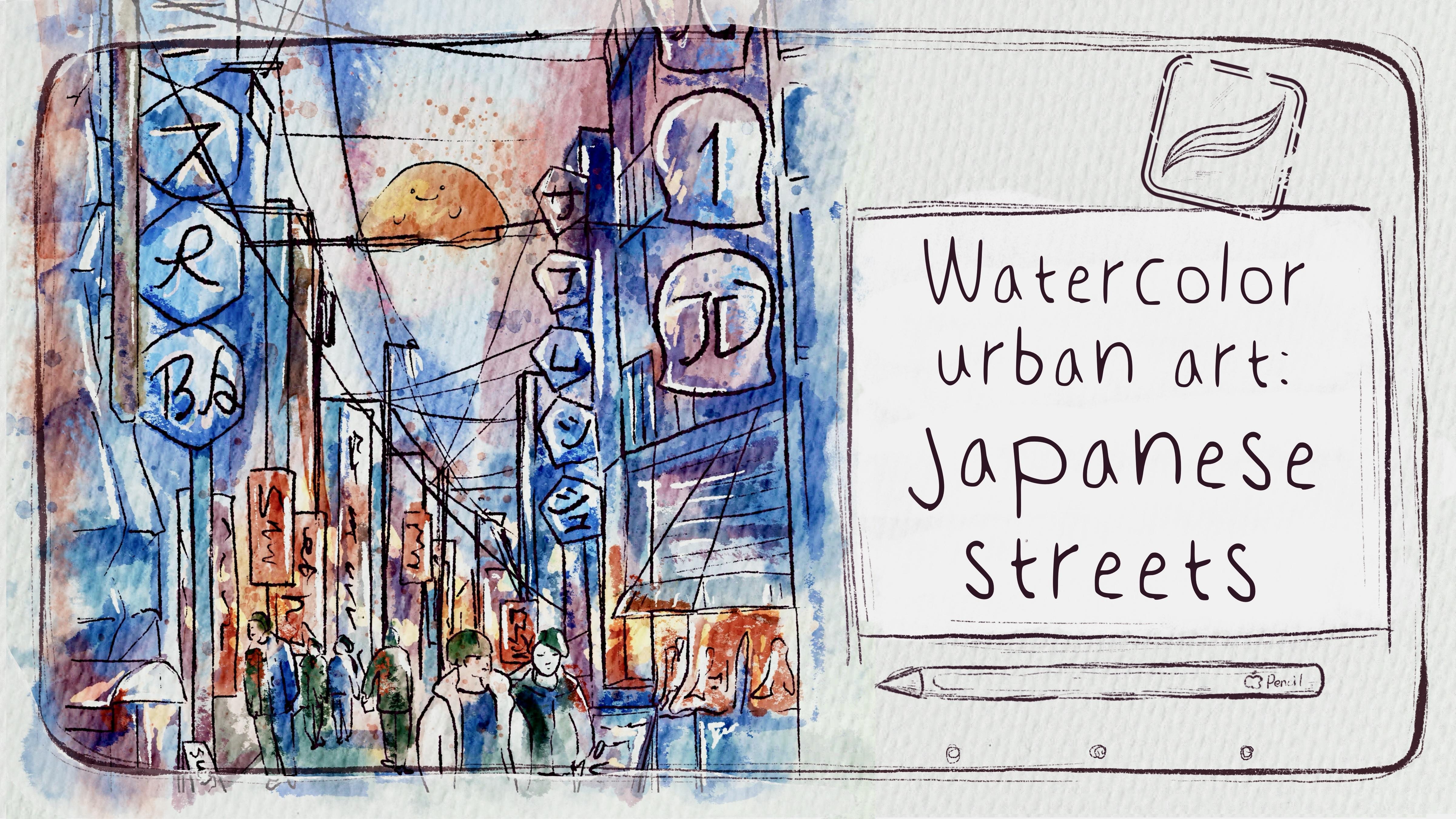
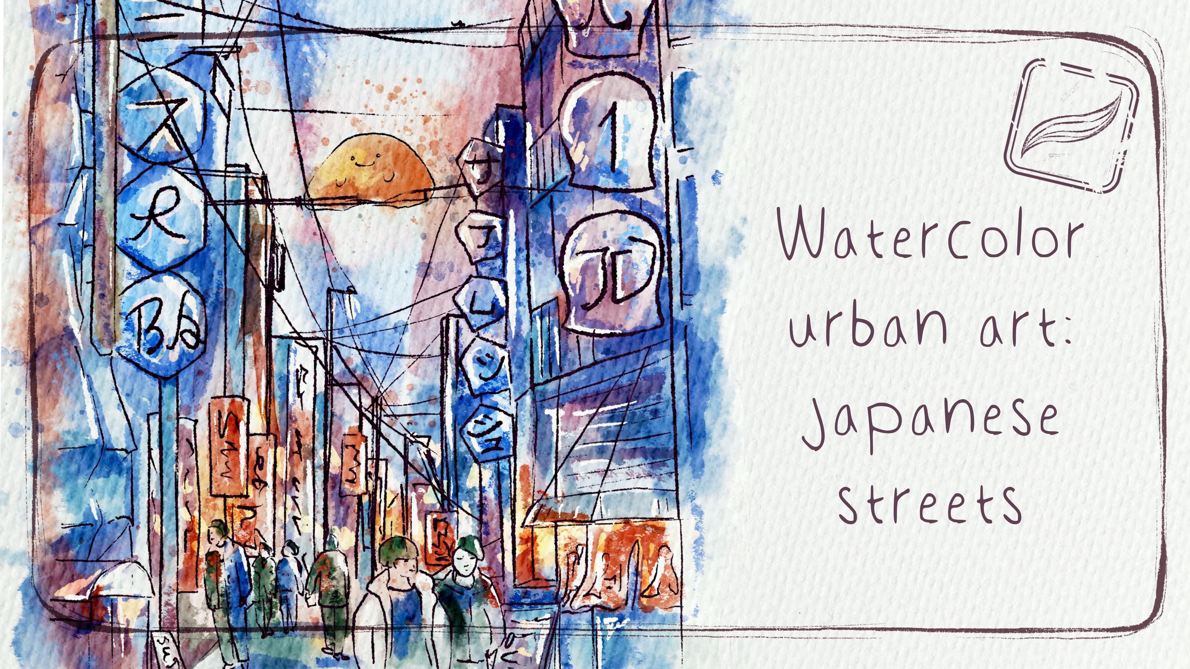
14. Second Art: Add Colors: Time to move to the
second painting and explore second
painting technique. In this part, we will spend more time and paint
way more details. So let's not hesitate. Well, I think we are ready for the second part of the class, where we're going to explore the second painting technique. And like I said, earlier,
with this technique, which is more gentle
and harmonious, we're going to work a lot. And also, depending on
free time that you have, you can keep adding
more and more details. Another thing that you
can play with colors too. Later, I will show
you how to do. About our main brush, you're
going to use blue, dark, watercolor edges
as our main brush and about color palette. You see the second layer that will be our colors for
the second illustration. Let's start with creche color, and let's paint road. Make sure that you are
staying on 18 color layers, which has normal
blending layer mode let's start Tint, tinting. Try to try not to go
beyond the lines. And don't lift your Apple
pencil from the screen. Otherwise, you will have
overlappings, which is okay. You can always improve it
by using blending brush, but it just saves more time. And remember that I goes to semi transparent so you can paint. Yeah, actually, you
can paint on it. Okay, cool. Done with
the road over there. Now, let's grab a
little a darker color and paint the second
part of the road. Always, you can look at
the reference picture over there and see what type of
color you would like to use. Mm hmm. If you want, you can
change the style a tiny bit and have some tiny, like, white, blank
spaces. It's also okay. You also can do it
Dacord Darker road. Here and here. Let's see what's next. Here. And let's grab tine a bit of brighter color and look
at the illustration. We still have some
gray shade here. And also, remember, we're gonna use linear
perspective here. Let's see what do we have?
And because of that, what is it? The background. We're gonna have part
of the road here. You actually can do
something like that. No, I don't think like Mm hmm. Oh, great. Like I said,
it might take us, like, a lot of time to finish painting this art step by
step. Same brush. Let's go to bluish color. You see at our illustration, it's almost white, but
I want to make it blue. And about blue colour
we have we can't have overlay paso. It's very gentle. Just parts where the
colors almost white. Try to keep it white. Mm hmm. Likes it. Wonderful. Now, let's grab
almost white color just with yellowish tone and add some shades like fill
it with some of the object. Here, I think we also have
this yellowish shade. Oh, maybe not. I
think this part. And here, Lucy, I already started leaving some
of the white spots. Don. Okay. Now, let's see where else. We're gonna have some of
this yellow **** over there. And probably in those
buildings far away. It's pretty suitable. And this building now gray ****. You see, I have some
of our weapons, and I push it too
close to the edge. Like that. Just remember I told you don't go
too close to the edge, leave some air around the edges. So for me, this is good. Thing, ding duck. Tiny bit. Now, let's keep
painting and see. Maybe this color is
slightly lighter. You're gonna add more shades? And this part for the
lantern goes here. So the difficulty that you
might face in this type of illustration is that we
have so many details. So first of all, it might take a lot of time
to finish the illustration. And second, you might
just get a little bit lost trying to
understand what is what? Let's make it slightly bigger and paint it
like step by step. So I think in this area, we
can add some brown shade. It's not that light, but
I want to keep it light. I don't want to make
this art too dark. 'Cause it's pretty sunny. It has some amount of contrast, and you will create
the mood for the art. So I don't want it
to be too gloomy. I just want to
create this, like, lovely inspiration of feeling. Then we will have some
brown color here and here. Okay, so it will be
our first storefront? We've done. This one? Okay. Now, let's go further. Wait a second. This part. He's not finished
yet. Let's finish. Here. And then room, Bram, broom. Aka down here. And about the stick, I'm thinking we have dark color. Let's go with
almost black color. You can grab Burani inker brush. You can use the same brush
that I used earlier. Oh, use this runny inker brush. It's a little bit more opaque. If you like everything, let's come back to dark
watercolor Edges brush. And here Wait. What's your name for
this thing is it bucket? I forgot its English name. D brown color. Left some white spots. We went beyond the lines. Ding ding ding ding. And some here. Perfect. Now,
let's keep it in colors. About this part, I think
we can make the color. Let me think. Yep.
Me like pomegranate, but like darker one. So I chose the color that we
were using for the sketches. Maybe tiny bit brighter, 'cause I don't want
it to be, like, the same. No, not brighter. Later, I will add some
stems and color varish. I lifted Apple pencil
from the screen. Now as a blender, I'm
using Bonatural stains, brush and blender, same that I was using in
my previous class. Like that. Now this part. So, guys, I think now I will
just be quiet for a while, and I'm gonna spit up the video. To ton to even blue colour. I took blue colour
from our first class. We don't have a lot
of blue shades here, so I didn't create a special
color for this part. I decided we can just
take par color from our first painting technique. Okay. What about adding blue shade here. I
think that's not bad? Next, go with this
dark purple color and fill this area with color. So like little by little, that's the way how
you are painting and creating beautiful art. And I think for this part,
what do we have here? Behind, we also have dark shade, but everything in maybe it still will be more grayish part. A little bit with blue tone. 'cause, like I said, I don't
want to be too saturated. That's why I don't want
to make it too vibrant. But on the contrary, I will add more color
variations later. Now, let's see. In the bottom, we're going to have
some dark sheades Here. So it's like umbrella. Okay, but over there, we're
gonna have which color? Henan likes it. Let's see whether
we filled all of the area with some
specific color. We still need to add
some brownie shade here. And behind, we have blue shades and I think also
something like brown color. Let's grab gray shade. Which is almost white
because you see the tone, the hue of those store fronts
is a little bit different. And same here, let's
go with bluish shade, tiny bit, and greyhone. To fill this part of the
building with special color. So we need to differ one
building from another. We have many wires here later, we will add the shades
to those wires, but tiny bit later. And we have one more building
which is also gray here. Let's see from this
area, bluish shade. Also, we can add some
gray color here. And I blend the line
that went beyond m Lanterns that we're
gonna have almost white, but they still have this
yellow shade. Cool. So what's left? Store
fronts and people. Not storefronts, like those ads. And let me see what else. This part is a little bit not finished. So let's go with it. So what I want to do is
just to grab purple shade. Same color, and I just want
to exaggerate this Yeah. This part is yellow.
This part will be? Not yellow. What about
some other yellow shades? Where is it? So,
about store front, if you have time, you can paint as many
details as you want. But if you don't have
time, it's also fine. Just paint it schematically. Okay, enough yellow for me. Mm hmm. I think this part
is not finished though. So I'm gonna have
darker shade over. And let's grab brown, note brown, like
dark brown color. And we need to add
more lines here. If you want, gobs
Purani inker brush and paint it with more details. Now, let's finish with people. I can emit a bright red color. We can add red here. White? Uh, Now, people and about the girl. So I changed the
picture a little bit. I decided to add some flowers. The girl is walking
and holding flowers. I think it can add, like, very warm feeling to
our illustration. She will have brown color hair. Of course, you can paint
any color you like. And about her outfit. A. I was so surprised
that people in Japan, they're wearing
usually some muted and dark colored clothes. It really impressed
me, like, a lot. I expected they would, you know, wear something colorful because I was raised on Japanese
cartoons and animation. But what I saw, people are very stylish
and they tend to wear, yeah, some dark colored outfits. Okay, wonderful. Done
with the first girl. Now, second. Dark brown hair. So sheats and then
maybe this part. Also, we're gonna
have some details and some colors here. D, d, d. So we've done with the first
part of our illustration. And now let's jump to
adding a tiny sheet part.
15. Add Shades: We've done with the
first part, now I think we need to
start adding shades. And about the shades, I
will create two layers, and I will change layer
mode to multiply. Now, let's go ahead and grab B transparent watercolor brush. And about the
blender. This time, I'm going to use Bosb diffuser. I set the brush to
maximum, as you see. And now I will grab the
slight purple shade. Remember, this brush
is precious sensitive. So if you press harder, you're gonna have more shades. And I just want to show shades
on this part of the house. Same some part here, then shade in this area. After that, shade on the floor. Then I will add some shade here. And, of course, on
the store front part, we're going to have
some shades underneath. So thanks to using this
very soft and gentle brush, we can show the shades
and on the other hand, add some color variations,
which is important. Be careful don't too much. And if you think some shades
are not too beautiful, you can just plant them. And let me show you
some magic trick. W, first, let's just at
some shades on lanterns. So the magic trick is next. If you want to exaggerate
the shadow, how to do that, by duplicating the layer, we can enhance our shade
lexis. That looks good. What about lowering the
opacity till 50 and then merge two shading
layers together? So when you finished with
the first shading layer, let's go to the second one. Here, let's go to
the layer above and switch to the multiply
blended layer mode. And then I will go to
BuhardEdges brush. So this brush is very
special because you see, it's sharp. Don't worry later. We're going to
lower the opacity, but it can give you very
distinctive shades. And if you worry
that it's too dark, so in this case,
we can just lower the opacity of our
shading layer. And it will not be that obvious. And like I said,
now here we can add more details and show
more shades to this part. Same about the
window. This part. Why we chose those
purple shade because it's perfect and suits
really every color. That's why I don't need to
change it, like, every time. Same about I think
it's barrel, right? And we have some
buildings far away, but because they are far away, we will not spend too much time and paint a
lot of details for them. Just synthesize them briefly. And because it's a spirit, it has no shade, so we won't
add any shades to this part. And again, if you want to have darker shades, like I said, what we can do is
actually increase the opacity and make it a little bit more saturated. Lexis. Always saturated, again,
whatever you want. For me, 50% would be good. I don't want to
make it too dark. Okay, once we've
done with this part, we added tiny shades
to everything, like our people the custom
shade on the floor, and we added some
color to the outfits. So the shades are
pretty natural here. We can jump to next part
and start adding stamps.
16. Add Stamps & Details: And for this part of the class, we don't really need our
reference pictures anymore. So what I'm going to
do is I will go to splatters layer and I will switch bland layer
mode to multiply. Same I will do the stem layer, duplicate, and create one
more layer and write details. Well, we will add some elements that will help us to
increase the contrast. So let's go to the splatters. And what about bluish color? Bula is lazily. And I just want to add some
splatters here and there. I think it will look good. Yeah, place stamp here. The first one, and I
will move it over there, rotate, place it here. Now, let's go with brownish, maybe even orange color. Create one Musta
same stamp brush. I like its orange filling. Maybe this one I'll
put somewhere here. Now we need that stamp first. Yeah, I want to put it this way. So try to rotate it and see
where it would look better. Now we have the second stamp. Also, we can see
where to place it, free form, and I
want to use it here. So, what about blue color? Because I think we need
to add some shades to our lovely sky. So let's merge together all
the stems that we have. Have new stem player, multiply blending layer mode, be sure that you are using it. And use this beautiful
stem for this kind. And I think we can blend
this edge tiny bit. So diffuser is
really good brush, and it can help you to
blend it very naturally. And if you like everything, like I said, merge together
with the previous layer. Duplicate stem brush
one more time, Stem layer, one more time. Using I'm thinking
this stem brush. It's pretty natural. And I want to show some
of the color variations. So thanks to the
stem brush, you see, we can reach those different and very beautiful color variations for our illustration. Then if you like
everything again. And the last one stem brush, let's use this purple shade. And I just want to add tiny
soft feeling to our last art. What do we use this stem brush. And now we can see
where we would like to use it, maybe even brighter. I think I would like
to use it somewhere here and have this
beautiful watercolor look. Then if you are happy, merge
stems layers together. Cool for the tiny details
we're gonna apply. Boron inker Brush have
new layer details, multiply blending layer mode. Let's go with dark, maybe even bluish color.
What do you think? And we need to add
some colors to wires to some tiny
details that we had, and we just didn't use. Also, to barrel. So all the elements
that we can enhance, let's just enhance because those tiny details
can help us to add some contrast to
our illustration, and thanks to that, it will look So I can write down
something like that. Right here. Let's see. Same what we did
with our sketch, we're going to do the
same with illustration. So we just took thicker
brush and we just emphasize some of the lines
because I think without that, it might look a little bit pale. Dan. Now it's
lovely brown color. Almost Brown shades here. Write something like
a name for the store. Okay. Now that's what
I was talking about. Let's see what else
we're gonna need. Then slightly lighter. More details here. And you see, thanks
to this brush, we added so many details that help us to brighten
the illustration. Later, I'll show you the
difference. Where else? Gonna need to use
these lines? And here. I think it this part. And I think we've done
with this part two. Almost. What about white color? I think we still need to add some detailed white
color, clear, switch to blended
layer mode, normal, double tap crab, white color, and increase the size. Maybe let's crab
running in your peak. Not too big. And I still think we need to
add some white shade. Dare gonna have white color, too. White or purl? And then so if you don't
want to have it too bright, obviously, you still
can just lower the opacity till
75% or something. So the color will be
bright but not too bright, so it will look more
or less harmonious. I'll have it till 80%, ding ding ding t
something like that. Here, we've done. We coloring
our lovely Japanese tree. Now let's add some
magical elements.
17. Add Magical Atmosphere: About magical
elements, we're gonna use dark watercolor edges, blue color, and our lovely creatures
will have blue colour. I like to paint them the spirits everywhere in my paintings. So they My head will be light purple and
body, I think yellow. But what I would like to
do is to add some glow. And let me show you
how to do that. First of all, green colour. I want to add some
color to those. Maybe it'll be rubies. Well, not rubies, emeralds. So now let me just
duplicate magical elements. And then what about
changing the color? The blend the remote
screen or even add? And oh, I like lighten color. And then I will go to
adjustment and Gach and blore and move to 23% Lexis. And if you want, you
can just tablicate it, and the glow will be even
brighter. Merge together. So if you turn off
our normal layer, that's what we're going
to have. Pretty glowy. And then let's go to layer where we have normal
blending layer mode and see which blending layer mode
we would like more. White. And I like pin light. Look
at this. It's transparent. Shows some glow, but on a Wow, look at this. So scary. Okay, pin light, I'll
stick to this one. And let's go to magical
elements and also press normal. And here I just want to add
a little bit of color to our cute creatures blue colour, maybe brighter, a little bit. Here, purple. Color and some orange shade, and then just blend it. Tiny bit. And you can go to curves and you
see play with intensity. Maybe like that and
duplicate it again. So our creatures will
be very super magical. Let's just merge it together. Ring. And if you want, you can go to adding
color layers. Also go to curves and play
with intensity with a color. And then thanks to that, our lovely creatures
will be even brighter. I do like the way how it looks. And remember, I wanted to show you that the details
layer is very important, too. So let me show you. So here we have
layer with details, and then when we turn it
off, look how it looks. It's a little bit dull and you don't emphasize
the most important thing, so it's really hard to see
the volume in a picture. And then when we add details, it looks way better. We're done with the second
painting technique, and now you can
decide which style, which technique you
would prefer more. And I hope it can help you to maybe change your style
to some extent or maybe open some new doors or maybe
just get more inspiration. And now the new creative ideas, you can create more and
more beautiful artworks. Congratulations. This is
the end of the class, and now you definitely
should be proud of yourself. You learned some useful things and created beautiful paintings, and in the future,
you can create more. So what we have learned during our today's class
and why we did it. Now you know more
about the procreate, about sketching
techniques, about how to use different watercolor
painting techniques, and how to apply all those
techniques in procreate, how to use layers
and blending modes, how to add volume and color
variations to your art, and how to create
illustrations in Procreate using digital
watercolor brushes, and also how to add some magical touches to
your watercolor art. So why this class was useful? Now you can experiment
with your style. You gain some inspiration
and creative ideas. What's more important? We can create digital
art that is so similar to traditional
watercolor do. Guys, I will be happy to see all your artworks
in project section, and I will be glad to
give my own feedback. Also, I would really appreciate your own opinion
about this class. You always can leave a review your thoughts in review
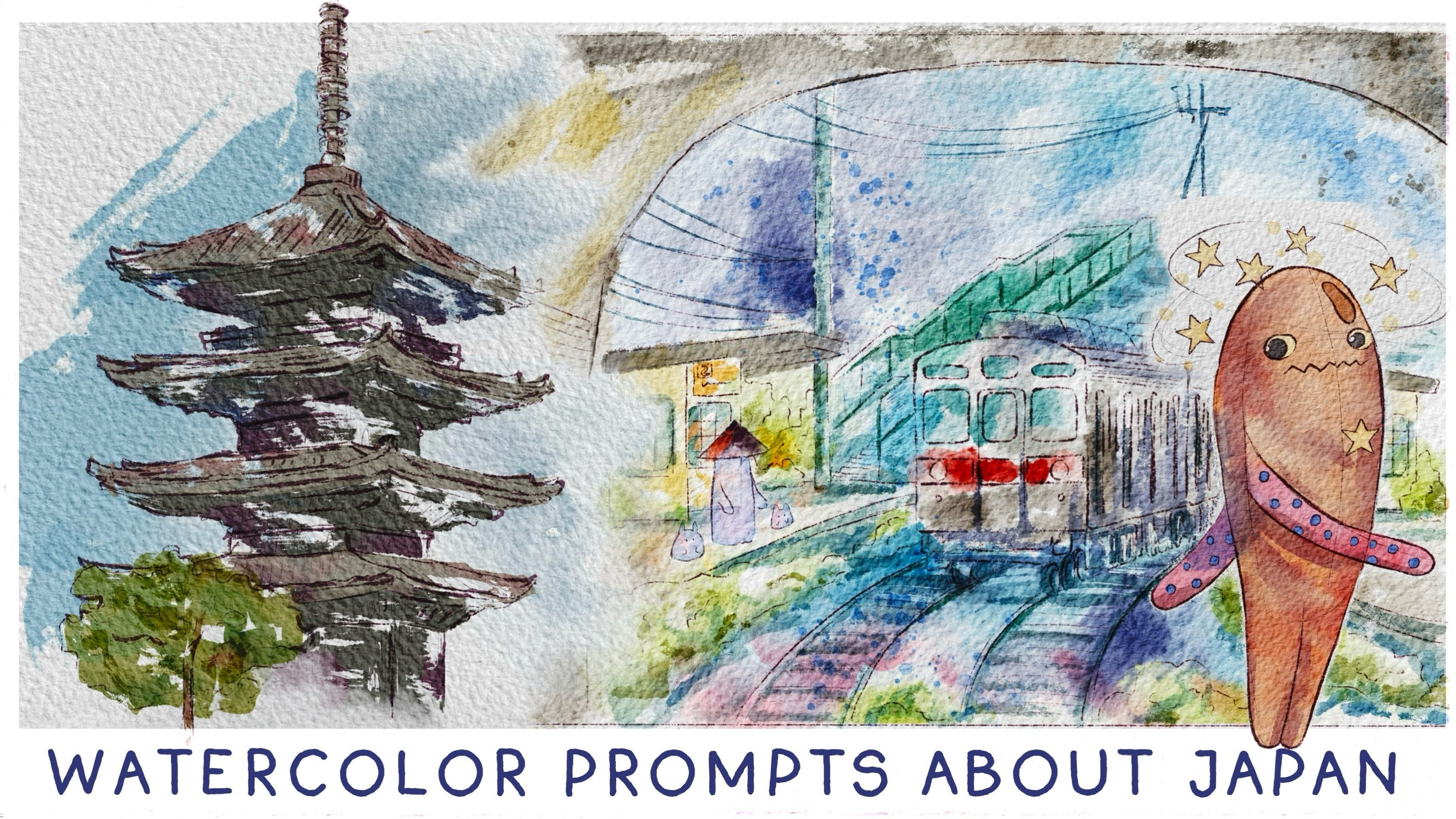
section, and what's next? My future class. We will have very serious and
interesting topic. Japan in digital watercolor, seven prompts that will
help you to explore Japan and level up your
digital watercolor techniques. So let's see each other
in my new class. Bye bye.
 Inga Yoon, Digital illustrator and teacher