Transcripts
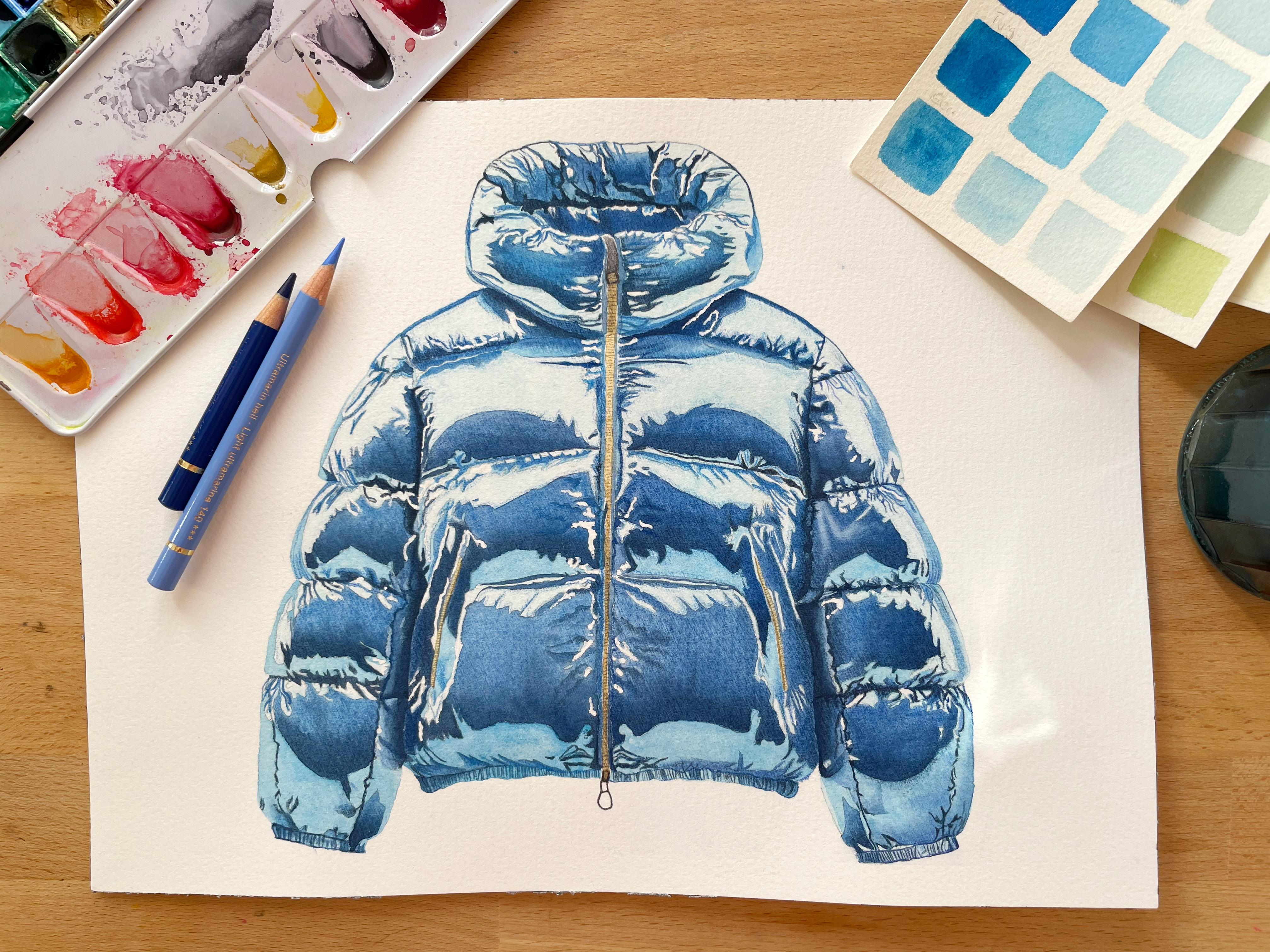
1. About this Class: H. Hi and welcome. Thank you so much for joining this class. My name is Sophia. I'm a watercolor and Mixed Media artist from Munich Germany. Today, we're going to paint
this lovely winter jacket. The main thing I'm going
to teach you today is how to paint light
and shadow and how to make an object appear three dimensional on your two
dimensional piece of paper. I'm going to guide you through
everything, materials, everything you need to know
in the coming chapter, so you can just follow my
instructions step by step. So I hope you're going
to enjoy this project, and I'll see you in
the next chapter.
2. Materials: So materials is pretty
straightforward. This is my outline on my
cold press watercolor paper. Then I have my set of watercolors and a
couple of brushes. You don't have to use
the exact same sizes of brushes that I use
for this illustration, make sure that you have
a bigger mop brush for larger washes and a
couple of detail brushes. But I always say that you
should use the brushes that you're comfortable with and also the sizes that
you're comfortable with. I'm going to show you the list
of materials in a second, and then you can hit pause and make sure you have everything. As you can see,
nothing too fancy, just your usual supplies. So you can get everything
ready on your desk, and then we'll continue with mixing the
colors in a minute.
3. Colour Mixing: Alright, so let's
mix some colors. As you can see, this is an
almost all blue illustration. I'm just pulling up my
reference here so that I can get the colors right. This is pretty straightforward. We're just going
to need a couple of blues, light to dark. For my medium blue, I used cobalt blue. I could have used ultramarine. If you don't have cobalt blue,
you can use ultramarine. Just bear in mind that
ultramarine is quite granulating, which is why I didn't use
it because I wanted to have a super smooth surface
for this kind of fabric. So what I'm mixing up right now is cobalt turquoise by Schminke. Everything else is
Windsor and Newton. It's just that Shiminki has this super light blue Kobal
turquoise, which I love. So that's the only color by that brand that
I tend to buy. I'm mixing up a lot because
I'm going to need a lot. And like I did with materials,
in a minute or two, I'm also going to show you a
list of other mixes so you don't have to stress and
write stuff down right now. You can just observe me mix and then hit pause when
I pull up the list, and then you can
make your own mixes. Second one is a light
to medium blue, and also the very lightest
blue cobalt turquoise, mixed with a bit of cobalt blue. If you don't have
this light blue, the cobalt turquoise B Schminka, you can also use Cerulean
blue or Manganese blue hue. I'm just going to swatch them on my little piece of
scrap paper here. I'm mixing up big petals
because I don't want to have to mix up again and again
while I'm painting, adding a bit more light blue
and a bit more cobalt blue. Yes. So as you can see, this is the very lightest blue, and then the other one
is slightly darker. And then we'll use
pure cobalt blue. And then moving to
the dark blues, I'll mix cobalt blue
with a bit of indigo. I'm just looking
at the reference. Trying to decide if
I'm happy with that. Looks like I am happy. And then also pure Indigo
for the darkest blue. Okay. And then we'll just
need some pure neutral tint. You can also use Paine's gray, if that's the gray that
you have in your palette and some yellow ochre for
the details on the zipper. And then the color pencils are a match to the
watercolors that I have. So go to your sets of color pencils and just pick
out all of your blues, I guess, and use
the ones that match your watercolors because
we're going to use the color pencils to
enhance the watercolors. We don't want different colors, so we're going to try
to find the same ones. This is just a bit
of yellow ochre. And some neutro
tint. And that's it. So like I said, I'll show
you the list of the mixes. There's some whitewash
that I didn't end up using, so don't
worry about that. So these are the colors. You can hit pause, you can
mix up your own colors, and then we'll continue with
masking fluid in a second.
4. Applying Masking Fluid: Before we start with
the actual painting, we're going to need to put down some masking fluid to protect the whitest
highlights of the paper. Here, I'm just rubbing
out some of my outline, which I feel like is a bit
too dark because, of course, I don't want the pencil to be shining through when the
painting is finished. You don't have to do
this if you think that your outlines are
light enough on the paper. It's just what I'm
doing right now. But I also don't want to
rub out too much because then you won't be able to see it anymore through the camera. Okay, so I'm all done
with my outline. Now we need to put down
some masking fluid. Masking fluid tends to give
me a bit of a headache. I recently bought this one by
Daniel Smith because it has this super tiny applicator that you put on top
of it like that, and that's supposed
to help you to put masking fluid for the smallest
detail on your paper. What I've learned, do
not shake the bottle. For some reason, I
tend to shake bottles. Um it's kind of a reflex.
I don't know why. But when you do, you create
like 1,000 little bubbles, and then you end up putting
bubbles down on your paper, which is a mess. You can't use it, so
you need to let it dry, and then you need
to rub it off and reapply Lala, la la la. So don't shake the bottle. And there is, however, still some air inside there now. So from now and again, like, I need to really
watch my applicator, and whenever I see
air coming through, I need to stop and
I need to take my paper towel and
get rid of the air, and then I can go
back to my paper. So it's better than the masking fluids that
just come in a jar, like the Windsor Newton ones. Here, I'm just letting out some air of that
bubble, the bottle. Sorry. Yeah, so it's
a slow process. It's it's not ideal. If you have a masking fluid that's better or that's
easier to use for super, super small details,
please let me know. I'll buy it in an instant. This is going to take some time. I'm just looking at
the reference photo, and I'm identifying all
the white little spots and highlights of reflection
that I have on this jacket. When the masking fluid is dried, it's a bit more yellowy, and then you'll be
able to see better. So maybe when I'm
done with this, hit pause and identify all the yellowish
little bits and pieces, and then you can
apply it as well, or you just follow me
as I'm continuing. I want to add that you don't need to stress
about this part too much. If you end up putting
your masking fluid in slightly different places and you use slightly
different quantities, maybe here, a bit
more, maybe there, a bit less, that's totally fine. These are random reflections of light that hit
this metallic fabric. So the reflections are random. They don't really
make a lot of sense. So even if your masking fluid ends up in a bit of
a different place, no one's going to
notice because there's no right or wrong
reflection on their jacket. So a bit fidgety, but even if yours end up different, like,
no one will know. It's totally fine to get this. You can't even get this wrong,
is what I'm trying to say. There's not much more explaining
that I need to do for this step of the painting. I apologize for being
left handed because I start on the right side of my illustration and if
you're right handed, and you now also start on the right side of
the illustration, you maybe need to watch out
a little bit more that you don't smudge the masking
fluid while it's still wet, so apologies for that. Otherwise, I think
I'm just going to continue for a couple of
minutes and finish this, and then I'll be back with
more info when I'm done. So I'm almost done with this. You can already see that the dry masking fluid
is much more visible to the eye also
through the camera than when it's still wet. So in a minute, I'm going to zoom out again and show you the
whole illustration, and then you can hit pause and see if you've
missed anything. And just apply what
you haven't yet. And then just make sure
that everything is really, really, really dry before
you start painting. It shouldn't take
too long because it's just little areas, but really make sure
it's completely dry. Go make a coffee and let
it sit for 10 minutes. Otherwise, it's just going
to ruin your whole painting. And then we'll continue with the first layer
painting wet and wet. So here is everything
zoomed out, and I'll meet you in
the next chapter.
5. Base Layer 1 in Watercolour: So we're ready to start
our first layer of paint. I just have some dust
on my paper here. I'm using my mop brush, and I'm starting with clean
water on the right sleeve. This brush is especially good because it holds a lot of water, but it still has
a very fine tip, so I can use it and paint carefully and make
sure that I don't accidentally apply my water outside the lines of my illustration where
I don't want it. And since you're not
a complete beginner, you probably know that areas of wet paint
create hard lines. When it dries, and I am going to use the stitching of this jacket for the placement
of those hard lines. So this is why I'm painting
the first sleeve and not the whole jacket all in once because I actually
do want hard lines, but I want them in
specific places. So here, I'm going
to have them on the outside of the sleeve, where the jacket naturally ends and on the stitching
at the shoulder. So here I'm just
making sure I have enough water on my paper. Not too much and not too little, is always the very useful tip. And then we're going to use the pure cobalt turquoise or the cerulean blue or
Manganese blue hue, whichever lightest
blue you have. I really do take my time
with the water. I apologize. Actually, this is
already speed 1.5, because that's how
slow I am at painting. Here, I'm zooming a bit
in so you can see better. So this is quite
concentrated color. And I'm applying it all over. This is going to be our latest And here I have my brush
pointed towards the outside of the illustration that makes it easier not to draw
outside the lines. Also free feel free to always turn your paper
whenever you need to. I try not to because I don't want you to get dizzy watching me turn my
paper all the time. But when I'm painting
and I'm not recording, I actually do turn it
much, much more often. I am almost done with
this first sleeve. I'm just making sure that
I have a super even wash. I love my first base wash
to be completely even, and if I do want any type
of texture or gradient, I'll apply that in
the coming layers. So I'm going to let
this dry and move on to the what do you
call it Mod scarf. Let's call it the
top of the jacket. And I'm going to do
the same thing here. So here I have water. And then it'll be another
wash with the lightest blue. And this is how I'm going
to paint all of the jacket, except for the zippers, everything will get this
even light blue wash. I'm going to speed up a little bit because
you know what to do, and then we can both meet
again when we're done with it. Okay, so now I'm almost done. I'm just pushing the
pigment around to make sure that I have an even
wash everywhere. And then I'm going to take my little travel blow dryer
and blow dry the whole thing. Because I want it like
extra, extra dry. Sometimes I don't blow dry it, and I'm thinking, Oh, yeah, yeah, this is dry enough,
and then it's not. And then I create blooms, the color lifts,
I get hard lines. Then I'm thinking, Okay, I
can save it. I can save it. I try to correct it, damage
everything even more. So for this illustration, I thought this needs to be
completely dry because if I have to redraw this
outline again, I'll be mad. Because there's a lot of detail in this outline, and
it took forever. I hope it didn't
take you forever. And well, you're
obviously still here. Sook, I'm digressing.
First layer done. Low drying it, like I said. And then we'll continue
with the medium blues. I still called it base layer. I called it base layer too. Oh, yeah, I forgot
this middle part. I'm drawing this on dry paper because it's such a small area. All right, so you
finish yours as well. And then in the next chapter, we'll begin with
the medium blues, blocking in some
of the highlights and low lights and bigger areas, and that will give us already a sense of orientation
of what goes where. So I'll see you in a
second and do make sure that your first layer
is completely dry. Two
6. Base Layer 2 in Watercolour: Welcome back. Before I continue painting, I thought I would take
my regular eraser, which means not the
kable one and rub out all the outside outlines of this illustration because the first layer is already down, so I don't feel like
I need it anymore. And if I can still
rub it out now, I'll take that opportunity, and that will make it look
more polished in the end. The less pencil, the
better I always find. Okay, so I'm doing this.
You don't have to do this. I'm doing it. Cleaned
off my paper. And now, for this whole chapter, all I'm going to do is take the next darkest
mix that we made, which is the light blue, which is my cobalt
turquoise and cobalt blue. And here I have my
can't really see. I believe it's my
number two brush. I always look at brush
sizes as more of a loose recommendation
than a must have for materials for
a certain painting. I obviously included the ones I used in the
material list here. But you should always pick
your tools and utensils based on your preference and your
style and level of painting. So if I'm using a number four
brush here, for example, and you feel like your number
four brush is too large and you don't have enough control with it,
use a number two brush. So always pick the
tools that you're most comfortable with regardless
of what the teacher is using. Sometimes that's a
better way of doing it. So yeah, like I said,
for this chapter, I'm painting on dry paper using oba Turkos
and CBA Blue mix. And you can just I mean, there's not much more
for me to tell you. I hope I zoomed in close enough, and I'm just looking
at my reference photo. I'm trying to identify the next darkest color
and where it goes. And then I'm
painting it in here. I'm switching to
a smaller brush, and I'm taking off a little
bit of paint because there is some reflective light on the
outer edge of the fabric. I'm here. I'm taking off a bit more with my
eradicator brush. If you don't have an
eradicator brush, I mean, you don't
have to get one. I got this one a while ago. This is a I believe rosemary
brushes is the brand. I think it's also the
only one I found online. That's called an
eradicator brush. It's basically just a very
stiff brush, and it helps you. It's like an eraser.
It helps you erase color when
you've made a mistake. It helps you lift color
when you want highlights. So it's quite useful. And here I just used it to take a bit more color
off the edge so that it looks like there's
reflective light bouncing off the
edge of the jacket. And then I'm just
moving up here, continuing to do the same thing. This is also my
number one brush. So I'll keep switching
my brush size according to the size of the area that I'm
painting, obviously. When it's quite small, I
use the detail brushes. If it's larger, I'll switch to the round two or four brush. So I think I can speed
up the video a little bit because what we're
basically doing, well, this whole illustration basically is just
paint by numbers. That's all it is. And
that's what I'm doing here. So I think I, I think I can increase
the speed a little bit. I don't want to
bore you to death. And then if there's something
else I need to point out, I will let you know. Now I'm moving down here. The outside of this bottom part of the jacket are going to
be a bit more in the shadow, so those will be darkened at a later stage because we do want to make it
appear three dimensional, so light and shadow is the key to making this
illustration come to life. But again, it's the same medium light
blue mix on dry paper. So the way I thought I'd record this video because
it is suited for intermediates is I paint the first half of this
jacket for this layer, and then I'm going to let you paint the second
half on your own. So this is why with the next mix or the
next darkest color, which is pure cobalt blue, I'm continuing on this right
hand side of the paper, and I'm not jumping over
to the left side as well. So again, I'm going to paint
on dry paper, always very, very closely looking at
the reference image to see exactly where I need
to put down my mix. And I increase the speed
a little bit because my natural pace of painting
is incredibly slow. And this tutorial would be 8
hours long, I'm not kidding. I think my raw material, when I recorded it was like
8.5 hours or something. But I'm aware that I'm
a very slow painter. Also, I was watching Dexter
while I was painting. I know I'm super
late to the party. I've never watched
Dexter before. And there are moments
where I'm just staring at my iPad screen
because it's the season finale, and I'm wondering if he he killed the other
serial killer or not. So anyway, sorry.
Yeah, like I said, here is pure Kobablue
on dry paper. The only thing I was trying to be careful
with here is not to paint into my other layer because that's going
to create darker, hard painting lines,
and we don't want that. We do have high contrast
in this illustration, like from dark blue
to light blue, but we still don't want those hard painting lines because that's going
to distract us. We do want to
create the illusion that this is a smooth fabric. So, yeah, take your time. I'm going to speed up
a little bit again, and I'll meet you in
a couple of minutes. So this area is a tiny bit larger and I decided to
paint and wet and wet. I could have painted
it on dry paper if I was fast enough, but I decided I don't
want to stress. And also looking
at the reference, this is going to be a very smooth gradient
from bottom to top. So that's why I decided to put down some clean water first, making sure I stay away from all the tiny little
details everywhere. And then I'm coming in
with the cobal blue again, and I'm making sure that I get an even coverage
throughout this section. Y Moving up here, I'm doing the same
thing, painting this section wet and wet. So I'm applying some
completely clear water. I have a separate water
container for painting wet and wet so that I don't put down
some pigment accidentally. And again, I'm using
pure cobalt blue, placing it in the middle
of the section first. And then pushing it
towards the outsides, making sure I stay within
all of my outlines here. So in a second, I'm going
to skip ahead and show you the already finished
left side of the jacket. And I did this intentionally. You can hit pause when
I do and then paint in everything that you've maybe missed on your own right now. And right now, I'm just
looking at my reference photo, and I'm realizing
that I actually missed a couple of spots
on the right side, so I'm painting
those in as well. I skipped ahead because my
own experience taught me that if you want to get ahead with your painting skills and generally your
skills as an artist, at some point, you have to stop painting after
the paintings of teachers and instructors and start painting
after reference photos. Think I waited a bit too
long with that step. I wasn't aware that this
is going to just elevate my skills tenfold at the
speed of light more or less. Not that I'm that good, but it felt like I progressed much, much faster when I started painting after reference
photos on my own. So like I said, I just showed you the other half of the jacket at this stage, so you can hit pause
and paint after me, but I encourage
you to paint after the reference photo as an exercise for
intermediate painters. So this layer is almost done, and in the next chapter, we'll get started on some of the details that will help us create a
realistic painting.
7. Detail Layer 1 in Watercolour: So in this chapter,
we're going to start in to paint
some of the detail. And as the outline
already suggests, there's quite a bit of
detail in this painting, but we're still going
to have the paint by numbers approach and just do
it step by step very slowly. It might be a bit
time consuming, but it's not a very
difficult process, actually. So here I have a zero or a double zero
brush. I'm not sure. Pick your fine detailed brush, whichever you're
comfortable with. This is the medium
blue mix again, cobalt turquoise and bal blue. And I'm painting on dry paper. I'm going to alternate
between this one and the pure cobalt blue depending on what I see
in the reference image, and I'm starting to paint in all the little creeks and folds that are visible
in the fabric here. The key to making an image like this appear
realistic and three dimensional is to pay attention to the reflections of light and the general
light and shadow. For me, light and shadow is what makes or breaks
a good painting. So we're going to
pay close attention to the hues and tones. Here, I'm just smudging my
color out a little bit. And yeah, painting
those details in on dry paper step by step is
going to get us a long way. Now, this is the
pure cobalt blue. I don't know if I need to
mention every time I pick a different mix or colour because I'm sure you can see the difference
between the two. I was thinking about
adding music because there are quite a few times when I
don't need to say anything. But then I'm never not sure. People seem to be divided whether or not they like
music in the tutorials. I don't like it personal. Personally, I still
also do a lot of tutorials from time to time, and music in the background is usually like license free music, which means it's kind of boring. And then it's repeated
every couple of minutes, which makes it even more boring. And then I'm thinking, Okay,
I'm going to mute completely because I want to listen to an audiobook or watch
your show on this side. So yeah, I don't know. I decided not to add any music, but if you do prefer music, please let me know
in the comments because I'm always interested to know what you guys think and how I can improve
my tutorials. So any feedback is very welcome. So this is the medium
blue mix again, cobalt turquoise
and cobalt blue, slightly more concentrated,
and you can clearly see how it's different
from the pure cobalt blue, which is just above in
the darker section. I cleaned off my brush and smoothed out the
edge a little bit. Here I'm adding more
pure cobalt blue. Like I said in the beginning, we're trying to make
this three dimensional, which means these curved sides are going to be a bit more in the shadow compared
to the front. So we're going to
make those darker on the sleeves is
the same thing. Here I'm painting
on wet paper again because it's a
slightly larger area and I want a smooth gradient. So this is pure cobalt blue, and I'm dropping it in at the bottom of
this little section. And then I'm just using
my brush to kind of, like, push it upwards and make it fade out
towards the top. All of these, again, please look at the
reference photo, and you'll see that all of these slightly larger
sections that are dark blue are much darker at the bottom and
lighter towards the top. So I'm going to paint
all of them wet and wet, and, I mean, we will have another watercolor
layer after this one. Where I use Indigo and the
darkest blue that we have. But here already, I'm dropping the color in the lower
part and then yeah, painting wet and wet so that
I don't get any hard edges. So same thing up here. Again, I'm putting
down some clean water. And then I'm using
our next darkest mix, which is cobalt blue and Indigo. Cleaning off my
brush and dabbing it off on the paper towel
because I'm going to lift a fold that's visible in the fabric
in the reference photo. So I'm just using my clean brush to take off
a bit of pigment here. It seemed easier to lift the color rather than paint
around this highlight. And this works pretty well, using the paper towel to
soak up some of the pigment. Oops. Happens. Usually that happens when I have
a really dark color on my brush, so this was lucky. And while this section
is still a bit wet, I'm using more koba blue
to darken this bit here. A coming up here, there's a shadow created by
the top part of the jacket. So on dry paper, I'm right away coming
in with a darker mix. And then I'm cleaning
off my brush, just dabbing it on the paper
towel, I'm not washing it, and I'm picking up
some of the pigment here so that I don't
get a hard line. And with the smallest brush, I'm dropping in some more color because I can see I'll
need it much darker, and then I can go with a
darker color straightaway. O. Y darkening the section here. I am using pure cobalt blue. This has no indigo in it. Again, this is a larger section. So as we did before, this will be painted
in wet and wet. And I'm using the Indigo
and Kobal blue mix, making sure I have
much more pigment on the bottom than the top. H. And while this area is still wet, I decided to drop in even
more dark color down here. This is pure indigo, and I'm dabbing off my brush on the paper towel and smoothing out the
pigment a little bit. While that's drying, I now have pure cobalt
blue on my brush, and I'm painting
in this section. I'm leaving a very fine line in between those stripes
of cobalt blue, and then I'm going to drop in some of the Indigo
and Cobalt blue mix. Just a tiny bit.
If you don't get the tiny details
right right now, it's not the end of the
world because you can do a lot of correcting and fine tuning with
the colored pencils. All you need is a good sharpener because you need to
keep them really sharp. But this is why I love combining watercolors
with color pencil because even when your watercolor layers don't end up exactly
the way you wanted to, you don't have to sweat
it because you can fix so much with
the color pencils. Even more so when you paint on hot press paper, by the way. This is cold press paper. This is not like super, super ideal for color pencil. But because many more people paint on cold press paper
than hot press paper, I decided to do this tutorial
on cold press paper. Hot Press, it's just different. Many people say it's harder.
I don't think it's harder. I think it's just
different and it takes some getting used to. So this is the medium
dark blue mix again. Now, with the Indigo
and Cobalt Blue mix, I'm starting to paint in some of the creeks and folds
of the jacket. And those are those details that are a bit more
time consuming. But I'm still while
I was painting this, I painted this I think about
maybe three weeks ago. Back home in Munich. Right now
I'm in California editing. And while I was painting this, I just thought, Okay,
this is paint by numbers. It's going to take time, and I was just super
relaxed while I did it. And yeah, so even though
there's lots of detail, there's no reason
to stress about This section next to the zipper is going to get
another layer of Cobalt Blue. So even though we're
far from done, it already looks like it's coming together, I
think, a little bit. Again, this is a larger section, so I'm painting wet and wet. This is clean water.
And then I'm going to use the indigo
and Cobalt Blue mix. Again, dropping it
in at the bottom, right here, and then creating a smooth gradient
towards the top. Just by dabbing off my
brush on the paper towel, there's no need to actually clean it out in the water jar. You can just dry it off a little bit and then push the
pigment towards the top, and that should help you
create a smoother gradient. Then moving down to the bottom, this is Indigo and
Cobalt Bluemix again on dry paper to add some
more of the details. Okay looking at the reference, this needs to be much,
much darker, of course. So straightaway, I decided to give this
another coat of paint. I'm rewetting it again. It's completely
dried, by the way, rewetting it again, and
this is pure indigo. And this is my number two
or number four brush. Drying it off on the paper towel and smoothing out the
pigment a little bit. Added some more water, and now I'm adding some more paint. This already makes such
a difference, I think. And then I'm going to do
the same thing over here. Basically, I was
looking at the painting and I realized I need to
match the middle part. So the lower part
and the top part for the bigger sections to the darkest blue needs to
be the darkest blue that I painted in the middle section. So I'm just adjusting here. So there are some folds
next to the zipper, clearly visible when you
look at the reference photo, and they have the
whitest highlights, which we've blocked off
with masking fluid. And then they have
because the fabric folds, they have darker sections. Of course. So now this
is Indigo and koba Blu. And I'm starting to just
map out these darker folds. H so I'm adding color in the shape that I can identify in the
reference photo, and then with the bigger brush, it has no color on it. I'm just smoothing
it out a little bit, so I have a hard paint
line on one side, and then a smooth out
paint line on the other. And I'm hoping that this will create a realistic looking
fold in the fabric. If it doesn't right
now, like I said, we can do a lot with colored pencils
at a later stage. But I think this is working. This is also pure indigo
that I'm dropping in here. I'm just making sure
I'm not painting into the highlight
sections there. This is a slightly more
complicated shape, so it's good to size down
with your brushes, maybe. Y These sections on the inside are quite small, so it's not a good idea
to paint it wet in wet, or I mean, you can, of course,
but it's not necessary. So I'm painting on dry paper, and whenever I need a smooth gradient or
a soft paint line, I'll just smoothe out the wet paint with a clean
brush, like I did before. So this is the indigo
and Cobablumx. So I'm adding the color here. And then with the bigger
brush that's damp but clean or the same brush. Sorry. I'll just smooth
out the color like that. Dropping in some more dark blue. And then I think
I'm happy with it. Two. I'm continuing inside
the top part here, and I'm using pure Indigo. I'm pretty sure this
is. These sections are going to be quite dark, so this is Indigo. Coming down here, I want to match the color of
the right side, and I'm painting on dry paper, dabbing off my brush, and then smoothing out the
paint edges like this. And just below it, I'm continuing
with pure cobalt blue. Now for the slightly
larger section, I'm going to put down some water first and then paint wet and wet again with the indigo. The only important thing
right now, I think, is to match the tone of the
other side of the jacket. Otherwise, it would look off. And again, I'm
starting to paint from the bottom to have a
smooth gradient that goes dark to light dropping
in some more indigo, and just making sure
I don't paint over the highlights that I want to preserve the light
blue areas here. And then with the bigger brush, I'm smoothing up the edges. A Now, on the section on the
left sleeve here, I'm going to do the same thing. And then also I'll come
back to the middle part of the jacket and also paint wet
and wet with indigo again. Now I have the Coba turquoise
and Oba Blue mix again. I And down here, same procedure as every time
clean water to paint wet on wet and then dropping in concentrated indigo at the
bottom of the section. The left side also needs those folds next to
the zipper, of course. Here's a different angle
to show you how I paint indigo on dry paper and then clean up my brush and
just smooth out the edges. A a coming down to the very
bottom of the jacket, I have pure cobalt blue, and I'm painting on dry paper. I Now I have the Indigo
and Kobal blue mix. And I'm applying
that same color on the outside edge right here. Like I said before, this
is going to help us make the jacket seem
three dimensional. There is some more
detail here with Kobi Blue and Indigo
mix on dry paper. And then just beneath it, also on dry paper, I'm
going to use Indigo. While that is still wet, I'm dropping in some
concentrated indigo because this section needs
to be super, super dark. And the darker I make it now, the easier I'll have it in
when I paint the next layers. So I'm dropping in
some more color here and then smoothing it out. Now I'm painting
wet and wet again, like we did many times before. So this is clean water. And then, again, the indigo. Making sure I have a smooth
gradient and then it's much darker on the bottom
part of the section. Now there's more detail because there's more folds
in the fabric. This is the same color
like I just used. I'm painting on dry paper. And for the last remaining
two slightly bigger sections, I'm also going to paint
wet and wet again, so clean water first, and then the indigo and then making sure I have
a smooth gradient. Down here, I'm painting in cobalt blue and
indigo on dry paper. Smoothing it out towards
the top a little bit because there's also a
gradient in that section. And then while it's
wet, I'm dropping in some quite
concentrated pure indigo. And here I'm just making sure that I don't get any hard lines. And then this is on dry paper. This is the cobalt
blue and indigo mix. And with my smaller brush, I'm painting in
some indigo right away just because
I'm already at it. And then this will be
it for this chapter. The next chapter is the
last layer of watercolors. It's just going to
be more details. So I'll see you in a second.
8. Detail Layer 2 in Watercolour: Welcome back. I'm thrilled
you're still here. In this chapter, we're going to use watercolors
one last time, and we're going
to do two things. We're going to add interest, which means adding detail, and we're going to
create contrast, which means darkening
our darkest colors. So here I just wetted the
bottom part of this sleeve, and now I'm dropping in some
cobalt blue to add a shadow, and that's going
to give the sleeve a three dimensional shape. Now on dry paper, I'm going to use some indigo to darken this already
dark shape here, and then I'll clean off my brush and just soften
the edges a little bit. Now I'm just rubbing off some of the masking fluid.
That's in this area. You can do this with
I think it's called a rubber cement or something
that I have there. I bought it because I've seen
people use it many times, so it seemed like it's a super
practical thing to have. But whenever I use it, I feel like I could just as
well use my fingers. Now I have the
smaller brush again. This is the 20, and I'm using Indigo to add a bit more details and to darken the details
that I already have. And I'm going to do this for the next couple of minutes for the lower part of this sleeve. A So if you look at the reference photo, wherever the body of the
jacket meets the sleeve. So basically, along the
inside seams of it, there's a really, really,
really dark shadow. So these areas need
to be, like, much, much darker in order to make the jacket become
three dimensional. So I just put down some water there and I'm dropping
in some indigo. I probably could have
done this on dry paper and just soften the edges
again, like I did before. I don't know why I
did it wet on wet. You can do both. So here, I'm just darkening
these stitches and creases. Remember, we still have a layer
of colored pencils to do. So I don't know how much color you've already used
with the watercolor, how much pigment you
put on the paper. If you feel like your
paper is already a bit saturated and you start lifting the color when
you paint over it, then I mean, it shouldn't happen because
this is just a third layer, especially not if you're
using high quality paper, which I always recommend you do. Um, but if that happens,
it's not a big deal. You can just leave it and then darken everything
with the color pencils. That's a really good way to get more shadow and
more contrast in. Now I'm putting in some
detail with cobalt blue, the lighter mix that we have. I don't know if I
need to mention every time I change the color. I think it's pretty
obvious which one it is. So this is the lighter mix. This is cobalt blue
and oba turquois. And then I'll go back to the darker colors and
the Indigo again. With my smallest brush
still and Indigo, I'm just continuing to give the creases and the
shape a bit more depth. I This area here also needs to be much darker. One of the last things we're
going to do is to make sure that all the darkest
color are the same, because that's what sometimes makes a painting not
really work out. Sometimes you do a painting and you look at it
and you're like, I don't know, something is off. It doesn't really look good. It doesn't really look natural, but you don't know
what it is because you did all the shapes right and you got all
your colors right. So one thing that's
usually a pretty easy fix, and that can just
elevate your artwork, is to have all the shadows the same value and all your lightest highlights
the same value as well. So when all of that matches, it's just a much more natural looking and coherent
illustration. But that's something I'm
going to do at the very end. When I'm done with a painting, I always maybe step
away from it for five, 10 minutes and then look at
it with a semi fresh eye. And then I identify
areas where I need to darken my shadows a little
bit, just to adjust them. And then, that's
the final polish. So all of this is still just more detailed work on dry paper with
the smallest brush. Whenever I use a lighter
color than the indigo, it's the pure Kobal blue. And whenever it's really
dark, it's Indigo, obviously. So still, there's no special technique
involved right now, and you can just paint
after what I'm doing. A Now I'm going back to Indigo, and I'm going to darken the dark area of
this little segment. So I'm painting it on dry paper, and then I'm cleaning
off my brush on my paper towel and I'm
softening the edges. I'm going to paint this
inside area with cobalt blue. This is not actually Indigo. So this is Cobalt
Blue and Indigo mix. And we're going to move down
the zipper a little bit and just add more detail and more definition
to the fabric. But I think already now you
can see that it's really coming together the
more detail we add. I think it's a bit
of a tricky business when it comes to details. So I try to paint realistically, and I do so by
adding almost all of the details that I
see that I see in my reference photo
into my painting. And usually I find that
that works out pretty well. But then there are some artists who paint really hyper realistically in
their watercolors, and I'm looking at
it, and I'm like, Oh, this must be the
reference photo, and it's actually the painting. Then I zoom in to their
work and I realize they leave at least 50% of all the detail
that's in the photo. They just leave it out,
and it still comes across as this photo realistic
hyperrealistic painting. I'm wondering, how
do they do it? But I guess knowing what
to put in and what to leave out is what separates
me from the masters. So that's a skill that I'm
still trying to learn. In the meantime, I think the jacket is working
out pretty well. Here, I'm using indigo to work on those little
creases that we have there. And I think it's looking
pretty good actually. So down here, I'm
just continuing to deepen those shadows, those hints of a
shadow a little bit. One could have maybe done this in one go and not in two layers. But then again, even
though it takes more time, I prefer to paint in my shadow slowly and in different layers because once it's
overdone in one go, you can't really go back
and the painting is ruined. So I'd rather take my time, even though it will mean
that I and also you, if it's a tutorial
that you're watching, will need to paint
an extra layer, but better safe than
sorry is what I always. This is a cobalt blue, and I'm just putting in a
detail that I haven't so far. Softening the edges here a
little bit, like I always do. So like I said earlier, all our shadows will need to be the same value,
the same darkness. So because I deepened it on
the other side of the jacket, where the sleeve
meets the jacket, I'm going to do the same
thing here on the left side. And I'm painting
on dry paper and then softening the
edges a little bit. So now we've arrived
down here and we're almost finished with
our watercolor layers. I'm just going to put in the last little details
in dark blue here, and then we'll paint in the
zippers with yellow ochre. If you look at the
reference photo, you can see that it's kind
of like a golden brownish, bronze looking color
for the zipper. It's a bit hard to define, so I decided to go
with yellow ochre and then paint the details in
with the colored pencils. So this is yellow
ochre on dry paper. Pretty straightforward. And then there's two more
pockets on the side here. So this is also yellow ochre and then on the
left side as well. Just a little stripe of color. Looking at the reference photo, you can see that there
is color variation and light and shadow
along the zipper as well, because that's where the
puffer jacket kind of bends. So I'm darkening
this little bit, and then I'm darkening
the top part of the zipper just so that I don't have to do it
with colored pencils. And then up here is also
a little bit darker. And then using neutral tint, I'll paint in the actual
zipper of the zipper. But before I do that, I'm adding more yellow
ochre here as well. Just a fine line
alongside there. And then we're basically done
with the watercolor layers. Whenever I paint in mixed media, I'm always so happy when I'm
done with the last layer of watercolor because that means I've done 85% of
the whole painting. And colored pencils is just one more very quick layer of intensifying the colors
that are already on the paper. So that's always the easiest, breezest part of it all. So right now, I
have a neutral tint on my brush, like I said, Alright, so I hope you're happy with your
watercolor layers. I'm going to let
mine dry completely, which should not
take long at all, and I'm going to sharpen
all of my color pencils, and then I'll see you
in the next chapter.
9. Definition in Coloured Pencil : Welcome back. I hope
you've picked out all of your blues from
your color pencil set, and they're sharpened
and you're ready to go. This is my second darkest blue, and you can see how
I'm painting in very small circular
motions with just, like, a medium
amount of pressure because I don't want
to get it too dark. And then I use the paper smudger to soften everything over. And then I come back in
with my very darkest blue, and I deepen the
shadows even more. And I find that this technique
gives me a very smooth, natural looking
gradient throughout any area or subject that I'm
trying to paint in this way. So as you can see, I've speeded up the
video a little bit. Like I said earlier,
my personal way of painting is a bit slow, especially slow to watch. So this is speed 1.5. You should still be able to
see everything I'm doing. So yeah, this step is matching the blues
that are already on the paper and just
increasing the depth, increasing the contrast, and working on the
three dimensional form. That's pretty much it. It's not too time consuming. Very easy. There's not really
a technique that you need to pay
special attention to. The only thing I would suggest
is that you don't apply too much pressure too soon because it might give
it an unnatural look, and then you can't
really erase it. It's hard to take off the paper. So if you're still fairly new to color pencil, paint
with caution, and you can add
as many layers of those colors as your paper
is willing to absorb. So this is my medium blue. I don't know the brand name by Faber Castel for this
particular pencil. It also doesn't matter.
It's a pretty good match for the cobalt blue, so
that's why I picked this one. And yeah, all I'm doing is defining and
refining the details, and I'm just
constantly looking at the reference photo
and identifying areas that need a
bit more shadow to create the three
dimensional form. And I'm always using my
paper smudger in between to make sure that I have super
smooth and even gradients. Y So for this slightly bigger area, I'm building up the
shadow a little bit. So I'm going in with my
second darkest blue. Again, like medium pressure,
small circular motions. And I'm painting
a layer of that, and then I'll smooth it over
with the paper smudger, and then I'll come back with
the very darkest color, the indigo again to really deepen it and create the contrast that we see
in the reference photo. So when painting a
slightly bigger area, it's okay if your
pencil is a bit dull. But when I want to paint the smallest fine lines like this stitching that
I'm going to do next, I always sharpen my pencil, even though it looks
sharp enough to the eye. I always sharpen it to, like, the sharpest that
it gets, basically. And then I'm confident
that I can get my details without
messing it up. So I'm already super
happy with the tones and values that I have on
the dark blue areas. Now I have the very
lightest blue, which is not an exact match to my watercolor light blue,
but it's good enough. And I'm giving the
lightest areas just a very thin, careful coat. Of color pencil just so that
it matches the overall look because I don't want
to have one part of the illustration
with color pencil, and then other parts
are just watercolor. If you look at it,
if you look at a photo of the illustration, it probably won't be
visible to the eye, but if it's in front of you and then there's
one part that has a different kind of like
texture, it just looks weird. So I'm giving everything
a coat of color pencils. And here again, I'm working
on the dark radiant, which means lighter color first, then smudging, then contrast in shadow with the
darkest color. This is such a beautiful color. This color pencil. I think
it's my favorite blue. It's so deep and vibrant.
I really love it. And now you can see, while I'm painting around the
white highlights how the white highlights that we in the beginning
preserved with masking fluid really start to pop when we put in
the darkest colors, and it's the stage of a painting when all of a sudden the
whole thing comes to life. And that's when you know that you've done your lights
and shadows correctly. So because this is one of the biggest areas or
the biggest segments, visually speaking
in the painting, I'm extra careful with the pressure that I apply
with my color pencil because the visually biggest segments usually draw the most attention to themselves when
you look at it. So I'm painting with very
light pressure drawing, sorry, with very light pressure. In circular motions
and so light that I know that I can really smudge it out nicely
with my paper smudger. And then I'd rather
add another layer than use too much
pressure and then mess up the slightly
bigger segment. So I think I'm going
to be quiet for a couple of minutes and
let you paint on your own. You can put on music or a
Netflix show or whatever, and I'll be back with instructions in a
couple of minutes. So again, it's the same story. I've said it before, but I'll say it again because this is a fairly
symmetrical illustration, meaning one side of the jacket should pretty
much match the other side. This is where you need
to make sure that your shadows and highlights
match the other side. So only go as dark as you did on the right
side of the painting. Otherwise, you're
going to have to adjust all of the
other sides as well. So make sure it matches. So we are more or less done. We just need to
paint in the zipper. I have a medium warm gray here, and I'm going to keep the
zipper fairly simple, actually. It's not the main star
of the show here. We just want it to
look like a zipper. But yeah, I'm just going to
block in the color here. Basically, that's all I'm doing. And on the sides here as well, I'm painting little stripes that just suggest the
structure of the zipper. So when you look at it, you
know what you're looking at, but that's all I'm going to do here and for the main one
in the middle as well. So this just takes
like 10 seconds, just a few tiny lines here. Just make sure they're
all the same space apart. I think that's the only
thing to keep in mind. And then now this is a dark
gray for the bottom zip. And I'm really just
painting like painting over the outline that I
painted in in the beginning. So there's not much detail. So, like I said earlier, when we did the watercolor
layer for the zipper, there's a bit of light
and shadow there because the zipper is curved. So where it's curved
like downwards, it's a little bit darker, and then when it's
curved upwards, it's a little bit lighter. So that's why I added gray in those two areas
and not the rest. And then with the
dark gray as well, I'm just painting and
here light gray as well. So the areas of the zipper that are more in the shadow
get dark gray stripes, and the ones that are in the light are with
the light gray, yeah. Right. So I'm just doing this. This is also super, super quick. Just going over it one
more time to make sure I have the definition of the outline that
I want in the end. And then we're done
with the painting. I'm so happy that you
watched until the end, and I hope you also
painted until the end. And, yeah, I hope you're
happy with your painting. Thank you so much for watching.
10. One last thing..: Thank you so much for
completing this class. I hope you enjoyed
it. I hope you had fun and you're happy
with your results. If you like, you can
take a quick picture of your finished painting
and post it here in the discussion
section on the platform. That way, I can
give you feedback, and it's also always fun to see what other
people are doing. And if you have another
second to spare, please do give this class a
rating here on the platform. It helps the course to stay online and me personally
more than you know. Again, thank you for joining and I hope to see you
in my next class.
 Sophia Neumeister, Watercolour Artist. Published Author.