Transcripts
1. Intro and Materials Needed for Note Card Project: I'm Chris Carter.
In this course, you're going to be working
with ink and watercolor. And our focus is on shape and
a specific kind of shape. This class is focused on
negative space shapes. And in order to clarify, to make it easier
to understand and to observe and identify
negative space shapes. We're going to be
looking at the blue, blue sky, which is
available to all of us. In making these cards, you'll also improve your
eye-hand coordination. And you'll be putting to use pulling the peddle
technique in watercolor. I want you to feel
free to either keep it real simple or to make it
very complex for yourself. It will depend on what your level of understanding
is to begin with. Now you may already know what negative spaces and you've been using negative
space shapes. So just jump right in. You don't have to take a
photograph and use a photograph. You can just go outside and set up a chair or
stand there and sketch the negative space shapes of the blue sky without
taking a photograph at all. That's perfectly fine. I would love it if you did that. But there are a lot of you
that maybe aren't that competent in sketching outside
this class is for you to, you can easily take
some photographs of a tree against the sky or
buildings against the sky, as long as you have some sky
shapes in your photograph. You can then either
trace the shapes or you can look at your
reference photograph and draw them without tracing. Again, that's up to you. You could be a beginner and intermediate or an
advanced artist. And you can adapt this
class and the project. For the level of expertise. I'd like to go over the simple materials that you'll need to make the note cards. All you need for this
class is folded card, stock, watercolor paper,
a reference photo, a fountain pen or
permanent marker. Double-sided tape,
or glue stick. If you're using
double-sided tape, you may need a pair of scissors, watercolor and a
watercolor brush. Along with water. I also used a file folder
that I cut into a template. And you may want to use tracing. Let's get started.
2. What is Negative Space?: I've found that a
very easy way to simplify looking at
our complex world, especially outside, is to
look at negative shapes. I have three examples here. All of these compositions
are based on the same scene. And what I looked at
was the blue sky. And I'm inspired by
the blue sky because of all the many walks that
I went on with my father, Where he would stop, put his hands on his hips, lean back, look up at the sky, smile and say, look at
that blue, blue sky. And I learned to
look at that blue, blue sky all the time. And when I was confused about shapes and simplifying
landscapes, I found it was very easy, much easier to draw trees,
tree branches, buildings, all kinds of outdoor scenes, whether they be rural or urban. If I just looked at that blue, blue sky and drew the
shapes, a blue sky. These are the pictures. These are photographs
that I took that I thought would be easy to
illustrate. This idea. What I love about these trees in Luxembourg Garden in Paris, is that they are so ridiculous. They look like giant
cubes all in a row. I mean, they're just the
most ridiculous Alice in Wonderland looking trees. And I want it to convey
the shapes of those trees. So I looked at the sky, forgetting about the clouds, and make this easy for yourself. If you want to. You can simply trace
over it like that. Let's take a look at which one of these
you might like better when it comes to painting
planner or sketching from life. You may just be going for the
subject matter, the scene. But look at how
different it can look. Which one, which
one of these photos conveys my feeling about
the trees in the best way. Well, that's only for me
to decide because I'm the one who has some sort of
feeling about these trees. I want you to see that it
makes a huge difference in the composition as to where you put your chair
to sit and sketch, where you aim your
camera to photograph. To make this much more fun, rather than just going
out and shooting the sky. We're making these
into note cards. And in the process of making
these into note cards, using these as reference, you will not only learn to recognize what we
call negative space. Negative space is the
space between objects. It's the space and the shape created by
that space that isn't any object at all or is
something other than the object. In this case, the statue. The space between the legs
of the lion isn't sky, it's tree, but it's not lion. You can draw the lion
much more easily. If you draw the space
is around the line that aren't the lion getting
ahead of myself. So let's go back just to
the simple blue, blue sky. I'd like to clarify two of
the things that I've said. I mentioned how the composition
is extremely different. These are these three photos. They aren't maybe
extremely different. They do look quite
different to me. But you might be looking
at these and saying, well, what is she talking about? Talking about the
fact that here, this top shape really goes
in a very horizontal way, bringing your eye across there. This one, because of
the greenery here. This dips down for one thing where this takes a
while to dip down. This dips down right away, goes over these mounds, dips down, and then goes up. So your eye, It's
really going up. This is a composition that has a little bit more movement
to it than that one. However, though I generally go for compositions
with more movement. In this case, what appeals to me about the trees is the linear, geometric, formal, almost
static nature of the rows. So I prefer this one over this one to express the way
I feel about the trees. Now this one is a
lot more like this. But for me, it has a bit more interests
because it dips down. So why did I pick this one? I just arbitrarily picked one. To create the example
of the note cards. You're going to be using
your own photograph. So I picked one that
was very, very simple. Well, all of these
are very simple. To detect. The blue sky. There's no question
about what the shape is of the blue sky in
any of these three. In this example. I think it's clear how different
the composition can be. Now, am I interested
in the shapes of the trees or am I
interested in the palm tree? I think in all three of these, you might say probably
the palm tree. And this one, the palm
tree is off to the side. But the trees are a little bit more important
except that they're so small. Now, this one, the
shape over here, is pretty strong
and I like that. And then if I'm looking at the lights and darks
of these shapes, I might go with this one and then just eliminate
the palm tree. But what I want you to
see is that the shapes, if you're looking
just at the blue sky, you really clarify what you're looking at and what
the shapes are, okay? This is very clear what that shape is and whether
it's a strong shape or not. The other thing I
want to clarify is how I'm looking
at the blue shape. And I'm not looking at these
shapes because in this case, they're really only two shapes. And I could be drawing
along this line. And you don't know
if I'm tracing the green trees or if I'm
tracing the outline of the sky. So I'm going to show
you another example of actually tracing out
something more complex. In future classes, I will be making note cards out of more
complex negative shapes. I'm going to use these branches
and leaves as an example. I'll slip this underneath
my tracing paper. Now, I'm going to
trace the blue shapes. I'm not going to trace the
branches and the leaves. You say, I'm capturing
the shapes of the leaves by drawing
the blue shape. This is the blue shape. That's what I'm
drawing with my pen. I am not drawing
the green leaves. And this is a much
easier shape to see than the complexity of the leaves
on top of each other. And these are the
negative spaces between the shapes
of the leaves. Just easy because it's
all against a blue sky. So you just have to look
for the blue shapes. And once you start to
see the blue sky shapes, then you'll be able to also see negative shapes everywhere, like between the people
walking on the sidewalk. And maybe the negative
shapes there will be shapes that are sidewalk or
shapes that are building. But they're not shapes
that are the people. And you'll end up with a busy city street full
of walking people. Because you drew the shapes, none of the people but of the buildings and the
sidewalk around the pupil. Be much easier now
to go back and draw the shapes of the individual leaves
because you have, you have marking points of
where the leaves belong. In doing this, you also get
to verify whether you like your composition
or not because it shows you what shapes
you're dealing with. And then you may have
to change some of the values of the
shapes are combined, some of the shapes to
get what you want. But at least you have a
very strong foundation of the starting point. You may find you have just far too many
little tiny shapes to have a good balance between the little shapes
in the big shapes. And this might give you
a little bit better of an idea for when you go
out with your camera, what kind of photograph
you might want to take? You want an image that
has simple sky shapes? Or do you want a
complicated when like this? Look at how important these
little blue shapes are. Now you can use charcoal or anything you want paint
to fill in like this. If you want to. But I I would I would definitely either darken
in your blue sky or darken in everything that's not
your blue sky so that you can see the shapes more clearly. Otherwise you're just looking at possibly confusing outlines. You can see why I picked the
simple one to start with, with making a note cards. But these more complicated
negative shape drawings really make for
wonderful images. You can say to you could
cut the shapes out of different colored paper and
glue them down as a collage. That would be really fun too. I'm not sick. What we have, there's
the negative shape, see nice big shapes in there, but I think that there's a good balance of big
shapes and little shapes. This is drawing the
blue sky in black. I'll show you another
example of drawing the negative shapes
and then darkening in the plant rather
than this guy. This is an example of some pond plants and the reflection of the
plants in the water. So here, the negative
space is the water. This was also water up here. I don't have the photograph
that goes along with this. I did this many, many years ago, but it's always been one
of my favorite drawings. So what I did was the same
thing that I just showed you. I drew all the
negative shapes and then I filled in where the
plants were with a soft, I think it was a six
B graphite pencil. And I really love
the effect of it. It's strong. It doesn't have detail
about the plants, but it reads well to me, it expresses the way that I felt looking at the plant
and its reflection. I just loved all the
shapes that it made. I hope that clarifies how you go about determining
your negative shapes. If you've done this before, just go ahead and work
from the photograph. If you haven't dealt with
negative shapes before, then trace it so that
you're not confused by any of the objects you see
here that are not sky. So you're going to be
working from this line, trying to copy this
line onto your paper. And we'll put this way. If you know what negative
spaces you've worked with, spaces and shapes
and you just want to move right ahead
to making your card. I challenge you, instead
of tracing it first, just go straight
from the photograph.
3. Paper Dimensions and Ink Line Drawing: Here are the dimensions
on using the card. Is five inches by seven inches. The paper that I'm
going to be working on is 4.5 inches by 6.5 inches. Okay. 4.5 by 6.5, so that I have a
board are there. And then I cut a template for myself out of a file folder. I made a double
thick so that if, if a little sturdier. So I use the fold. And this measures for an
eight by six and an eight. And you'll see that it's just inside the paper
I'm working on. And you'll see why in a minute. I dropped my template, placed it into the center,
traced lightly around. With my number to
mechanical pencil. It's a five millimeter
and very, very lightly. I'll use this to rest my hand on so that I
don't get oils from my hand onto my
watercolor paper or on type printmaking paper. Now I'm going to go following the pencil
line all the way around. I liked doing this without
a ruler because it, it looks more hand-drawn, which is what it is. Because it's platinum carbon
ink dries pretty quickly, but I'm still very careful. I place the
protective paper down flat and I don't rub it
along the paper underneath. That way I don't get my chest. I ended up smudging it. I would just invent some way to fix it when I started painting. Alright, so now I'm
going to draw this line. And I'm going to start not quite at this edge
because you'll see, I want this to be all
were like a road, all connected without
clothes being closed off. Start here. We're getting a little freer
with it each time I do it. Which is okay. Well, okay, I'm gonna be
doing that in black anyway. I went all the way
over, I shouldn't have. So this is how it looks so far. Now I'm going to paint
the sky in blue.
4. Painting Shapes and Borders: To paint this, and
I will be using this color which is transparents
trillion by a Gallo, This one right here. And I'll be doing what I
call pulling the puddle. That's another course that
you may have already taken. It is the technique
I use most often, just about every
single day in both my abstract and my representational
work in watercolor. And the way that I prefer
to do it is on a slant. So just a little bit
of a slant so that the gravity is pulling
the puddle down to, and it doesn't back
up and make a blue. Sometimes I liked blooms, but in this case I don't want. So I'm gonna make a big
enough puddle that I won't have to go back and remake it. I need to make big
enough mixture puddle over here to make it
all the way down. This soaks up a fair
amount of paint. I would rather have too
much paint and run out. So I will start at the
top and pull it down. I keep it moist all the time. Keep adding to the puddle. I don't go back up
because then I would be pulling the paint
off of the paper. The paint will flow along
the fibers that are wet so you can pull your
puddle around corners. To me, this looks
more like a thaler, Joe's blue and cerulean. But it's one of my
favorite books. Keep the puddle wet all the
way down to the bottom. And then we work it up. Keep this coming around. Okay. Then wick it up gently. You're hardly touching
the paper at all. And this is a I did go back
up because there was a bit too much of a puddle up there but it was
still nice and wet. So it won't cause a streak. I pulled it around the corner. There we go. When that dries,
I will go around this outline. This time. I'm going to make
it a much lighter, paler, lighter value mixture. The other way I keep my
hand off of the paper is by resting my pinky down here. And then I keep my hand up and also tip it to have
it flow to the bottom. See how it's making
a puddle there. And then we'll get dressed
up in that corner. Then let it dry and see the
difference in the value. This is a combination of
midnight blue and Payne's gray. I wanted a much darker value. Keep the puddle going. Even after doing
this so many times, I worry that I haven't
made enough of a puddle. Look at how rich that washes. There's that one that's
a little bit of a block. I can just pretend that
maybe it's a bit of a cloud or a puff
of urban smoke. So now I'll do the same thing and we'll
see how different it looks with the sky being a
little less contrasty. I don t think I like it as well, but let's see what happens. Sometimes I'm hardly
touching the paper, just manipulating the puddle. So I'm going to add this into this blue and then I'll
paint it into there. Pretty nice. Now, I'm going to paint the
outside of this a dark blue, trying to keep my
head out of the way. Holding this in the
air and keeping the poet guy a little
tricky holding that, I think it will look smashing against the white card stock. There we go. This value is not dark enough. It doesn't stand out as much. It looked better before I put the blue around the outside. So I'm going to
put another layer of glaze over the green
to make it darker. Okay, Much better. And it is a nice forest green. For the next step, you're going to want to
wash your hands before you handle the card stock and
the tape and the cards, but let these dry
completely first before you use
double-sided tape or glue, if that's what you're doing, to glue the paintings
onto your card stock.
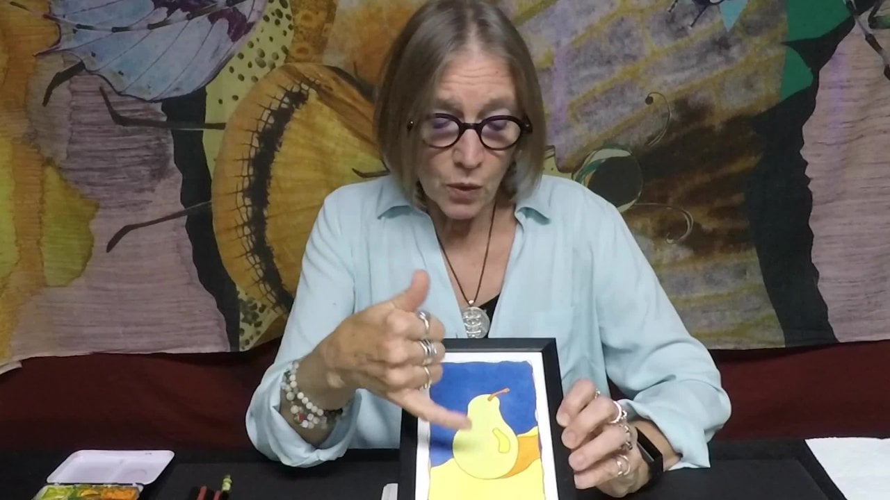
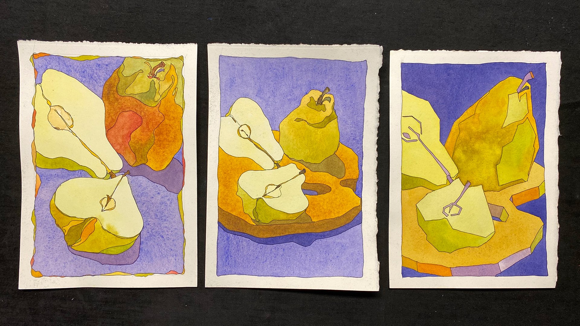
5. Mounting Paintings onto Card Stock: Now the last step is to attach
these to the card stock. And I like to do that
with double-sided tape. There's your note card. Here are the three
completed cards.
6. Lessons Review: Congratulations
for going through the mini class on
negative space shapes. Let's review what I
presented in this class. As we were making
the note cards, we used either a fountain pen filled with permanent black
ink or permanent marker. And part of the purpose
of that was to create a barrier so that when you
applied your watercolor, fibers that had absorbed, the black ink would not
absorb the watercolor. And that way you
could more easily stay within the black
lines of your ink. We also learn to look at the sky and to see
the blue shapes. Rather than draw the leaves
and branches of a plant, you drew the shape
of the blue sky that was surrounding the
branches and the leaves. Now it didn't have
to be blue sky. And the example of the Lion, it was the shape
between the lions legs. That was the negative shape. And that happened to be the
tree rather than the sky. So it was just an introduction
to thinking about drawing. What isn't the object
you're looking at rather than drawing the object
that you're looking at. Then we moved on to a watercolor technique that
I call pulling the puddle. Or you make sure that
you mix enough of a puddle to last for the entire shape that you want
to fill so that you don't have to stop and makes more and it dries and
then it's streaks. And you keep that puddle wet. You keep adding
from your puddle on your palate into the puddle
on your watercolor paper. And then you draw it down. I like putting it on
a bit of a slant. That way gravity helps
to pull it down to. And we talked about value
a little bit because the first time I
painted the tree part, which was the positive
space and negative space. When I painted that in green, it was too light. The value of it, the light or dark
event was too close to the value of the sky
and it just kinda look, yeah, you know, nothing
dramatic at all about it. So I put another layer, another wash or another glaze, green, a darker green on top. And you saw how that punched it up quite a
bit and made it better. Then we also mounted paper
onto our card stock. So we really covered
quite a bit. I talked a little bit about
eye-hand coordination. When I showed you how I
rendered in the darks by parallel lines
with my fountain pen. I was showing you a great practice for
eye-hand coordination. You also learned how
a complex landscape or rural escape can be
simplified into basic shapes. And those basic shapes can have detail added
to them later on. But we just stuck with shape, which was the point
of this class. And looking at
negative spaceship, please post the note
cards you've made. I would love to see
them and I think that we'll all learn from
your experiences. Thank you for joining me. I'm Chris Carter.
 Chris Carter, artist, illustrator and explorer