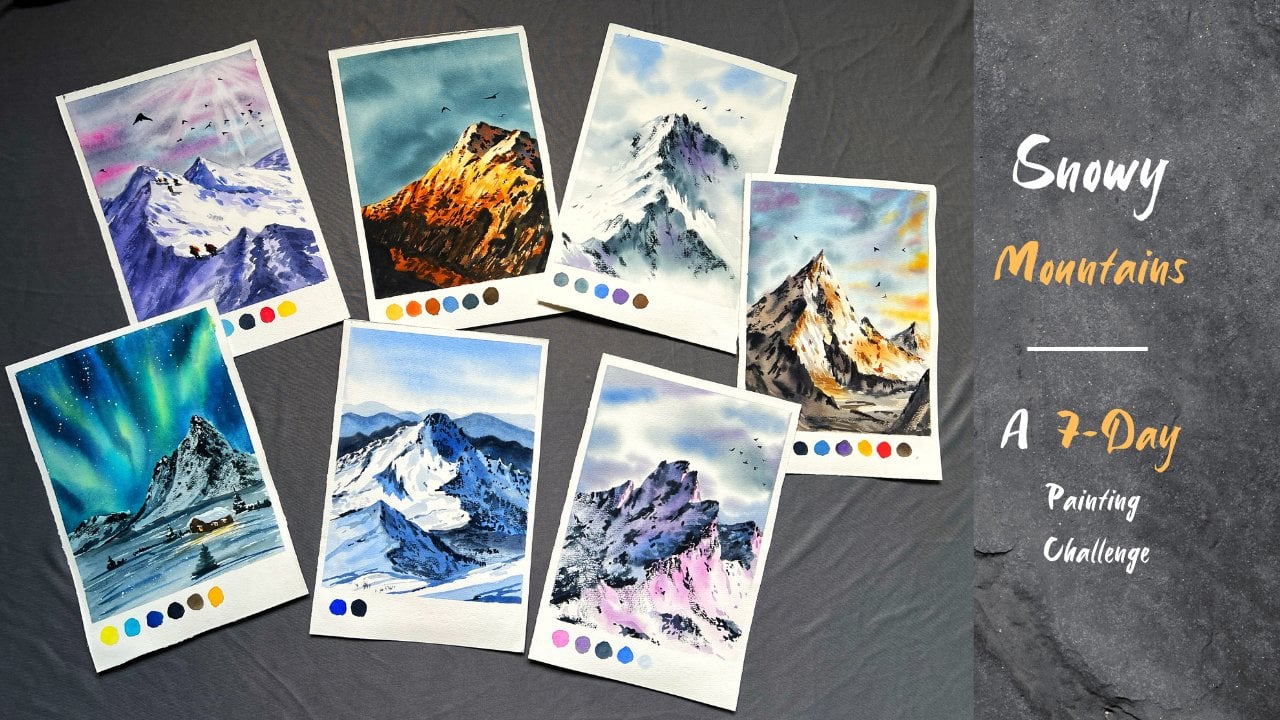
Transcripts
1. Introduction: Mist is the soft blanket
that gently hides the world, inviting us to see beyond the obvious and find
peace in the subtle. In this class. We will embrace the tranquility of
misty landscapes, capturing the calm
and subtle beauty that mist brings to our scenes. Let's explore how to translate this serene atmosphere
onto our watercolor paper. Hi, everyone. I'm Shannon Cuban an artist and art educator
based in Bangal India. My paintings are
inspired by nature, you'll see a lot of landscapes
in my Instagram page, watercours. Do check it out. In this class, we
are going to learn two beautiful serene paintings. I'll walk you through all
the techniques that will be needed for this
class and we'll have some practice sessions as
well in order to boost your confidence before moving on to the main class project. We will cover all the
essential art supplies needed for this class. While the class is designed for intermediate level it or those with some
painting experience, beginners are welcome
to join as well. I will guide you through
every technique, explaining each step in detail to ensure that everyone
can follow along. Remember, every
painting tells a story, and together we will create
art that speaks to our soul. Without any further
delay, let's get started.
2. Art supplies: In this chapter, I will discuss the art supplies that I
have used in the class. You can take a look
at the supplies and use any similar ones
that you already have. First, let's talk
about the brushes. I have Bohng, 300
GSM, 100% paper. This is of co pressure, which is neither smooth no ugh. So I had bought a bigger
sheet of a A one size, and then I've cut it into smaller sheets of
around A four size. So the size of this paper is around 28 centimeters and
28 by 19 centimeters. I like Bohng papers for
landscape artworks. It is excellent for
the price you pay, and it's touch and feel is nearly as good as
premium quality papers. Since this paper is 100% cotton, it retains water for a longer duration that helps to build depth in the painting. Next, let us talk
about the brushes. I'll be using these four
brushes for the entire class. I have these two
similar sized brushes. This is silver ato
quill brush of size 80, and other one is Princeton Neptune mob
brush of size four. Both are similar in sides, but I used them for
different purpose. This one is for color
washes and the other one is for water washes to keep
the painting neat and clean. The next is for smaller to
regular medium brushes. I'm using silver black
velvet, size eight brush. Next is a fine liner brush. This is a silver black
velvet, size two brush. This is for the
fine line painting detailing at the
end of the artwork. These are the four brushes that we will be
using for the class. Next, let us talk about colors. I have stored my paints
in this palette by Mago. I'm using artist gray
watercolor paints. We won't need these many colors. We will just use a few colors
that I'll mention now. The main colors for this
painting is this is paints gray. I've put it here. Then there is this greenish yellow
which I've put your. Next is burn siana by Min gold. These are the main
colors for the class. Apart from these, I'll
also use permanent yellow, yellow, cer and shadow green. Then I will also use crimson and some shades of blue
in very small quantity. Next, we would
need some napkins. I use around two to three
napkins when I paint. One napkin is to place the wet brushes during
the painting process. Another one is to
wipe off the paints from the brushes and to
clean the palette as well. The last one is a clean napkin
just in case I need one. Whenever the mixing
area gets dirty, I use a damp napkin to clean
them for the next mixing. This way, it is easier
to keep your palettes clean rather than running
back and forth to the sink. To provide support to the paper during the
painting process. We need something
to pack the paper. Hence, we will use
a hard object like a clipboard or any hard surface
to tape the paper onto. This will prevent it from
buckling or curling up. It will also keep the paper and allow us to move it in any direction to let
the paints flow. And to secure the paper. Of course, we would
need a masking tape. If you tape the paper directly on the table or on the floor, you will be restricted in your movements and won't be able to move
your paper around, preventing water and colors from flowing in
different directions. Since watercolor is a very unpredictable
and beautiful medium, you need to explore different possible
results rather than sticking to one
fixed direction. Next, we would need water for mixing the colors
and wetting the paper. Here I would be using two small jars of water
and one big jar of water. Earlier, I used to use
two jars of water, but I always end up
using both of them. Now I've started keeping
a separate jar of clean water just in case I need clean water
during the process. You can also have a napkin
handy so that you can wipe off the extra water
in the same napkin. We will also need a
water spray bottle. I'll tell you why in
the upcoming chapter. If you're storing the
colors in such palette, you can either use a spray bottle to wet the
pains or you could use a pipette like this
and drop water. And if you have a hair dryer, please keep it ready so you can paint along with me as I will be drying the paper several times during the
painting process. If you don't have one,
it's totally fine. You can pause the video, allow the paper to dry and then come back to resume
the painting process. And you can keep some small watercolor sheets
handy while you're painting to test out colors or practice before starting
the main painting. All right. These were all the supplies that I'm
going to use in the class. You can go ahead and grab all the similar supplies
that you already own. Let's get started.
3. Tones and Values: In this chapter, we
will discuss about the tonal values in
watercolor painting. Tonal values are the key because they add depth and
move to your work. They help us create
the illusion of distance and bring different
elements into focus. It creates a separation between background and
foreground elements. A this is achieved
by just one color. Here we have a
darker green color. By gradually adding
water to the color. You can see we have achieved
different tonal values. I'll combine them
together making one single strip so that
it is easier to explain. This watery tone is called a diluted tone or
water down color. This is created by mixing watercolor
paint with more water. Next, we have mid tone color, where it falls between the lightest and darkest
tone in the painting. Next comes darkest or
concentrated tones. You could also call
it as thicker paints. This is referred to as
deep or shadow tones, mostly concentrated and intense
color in your painting. During the class, if you
hear me use terms like thicker consistency or
diluted consistency. Mid tone consistency. I'm referring to the
tonal values of the pain. These terms describe
the varying lightness or darkness of the
colors we're using. Let's have a closer look at the consistency
of the paints. You can see it is very
thick and concentrated. It has more paints
and less water. Next, for the
midtone consistency. It is 50% paints
and 50% of water. This tone partially reflects
the whiteness of the paper. Lastly, we have diluted tone with less amount of
paints and more water. Since this has more water, it reflects the
whiteness of the paper. Next, let us paint the pine trees using the
corresponding tones. Let's start with
most diluted tone. You can keep a napkin handy so that you can wipe
off the extra paints. Lighter tones in
painting are used to create a sense of depth
by simulating distance. It adds softness and airiness. Lighter tone highlights
key areas and set a specific mood or
atmosphere in the painting. In our painting projects, the lighter tones will
be used to depict mist or a sense of
distance in the painting. Next up is meton colors. Mton colors are used
to create a sense of balance between darker
and lighter tones. Imagine your painting only
has darker and lighter tone. Then how do you create the transition and balance
between the colors? To create smoother transitions
between different tones, we use mid tone colors. Now they help define shapes and give structure
to the painting, making it more
realistic and cohesive. Next, we have the
darkest tone where we take more amount of
pigments and less water. Dark or concentrated tones are used to add contrast
define shapes, create depth in the painting. They make foreground elements
stand out and enhance the overall dramatic
effect of the artwork. To sum it up, lighter tones are used for background
elements or misty effects. Mid tones help create midground elements or
smooth transitions between light and dark colors and the darker tones are for
the foreground details, emphasizing proximity and
adding depth to the scene.
4. Techniques: Primary focus of this class
is to paint misty pine trees. Let's learn some
techniques that will make the painting process
smooth and simple, helping you achieve a more natural and harmonious
look in your artwork. Let's start with a very
basic watercolor technique, which is wet on dry. Here I am using wet
paints on dry paper. Notice how I'm painting
the tree shapes, first adding the trunk, and then applying random
zigzaggy brass brokes, saving a little space, I'll paint another tree. With this technique,
you will get Crisp and the detailed trees. This is. It is wet on dry. We're using wet
paints on dry paper. In the next technique, we will first paint the
trees using wet on dry, and then to soften the edges, we will apply water on the
lower part of the trees. You could also apply water first and then
paint the trees. As filler elements, you can simply apply some
vertical lines, making it look and dee. Let's call this technique as wet on partially wet
paper or surface. In the next technique,
we are going to spray water on the paper
using a spray bottle. Just tray two or three
pumps, no more than that. Now, on this slightly wet area, we will paint the trees. The colors will spread into
the damp areas creating a soft feathery effect that results in a beautiful
textured tree. Let's call this technique as a sprayed wet surface
or sprayed wet paper. Next is a very
familiar technique, which is wet on wet.
We'll apply water. Soon after applying water, will directly paint
on the bet surface. This will result in a
smooth blurry trees. The next technique is to apply wet paints
on a damp paper. First, we will apply enough water so that the paper absorbs good amount of moisture. Now, using a dry brush, I'm going to lift off the
excess water from the paper. This will leave a damp paper. Now, on this damp surface, I'm going to apply
the wet paints. This gives us a slightly
diffused result. Since the paper is damp, we would be able to control
the brush movement. In wet on wet, the paints flow very freely and wet on dry, the paints appear
crisp and hard. But in this technique, you will get a combination of both where you'll see
a soft diffused look. That was our wet on damp. For the next technique, I'll go with the same
method of wetting the paper and then lifting
of the excess water. But this time for the paint, I will use thick
concentrated paint. Let's take thick and
concentrated paint. I'm going to paint some
vertical lines and then give them the
shape of pine trees. This approach will produce
more intense defined edges while still benefiting from the subtle diffusion
of the damp paper. This technique was thick
paint on damp paper. The next two techniques will primarily be used to
create background effects, resulting in runny, flowy,
and seamless effects. So we'll apply water
very generously and then apply thick paints in
whatever shape you like. Move the paper in different direction and
see the paints flowing. This can be used
on a larger scale to get flowy and
seamless backgrounds. Let's name this as thick
paints on wet paper. Similarly, for the
next technique, I'll be applying water
generously and this time, I'll be using diluted paints. Add water to the paints and
then apply it on the paper. Now move your paper around
in different direction, let the paints flow and
create their own effects. This can be used to create a soft atmospheric effect
in your paintings. Here, both water and
paints should be in runny consistency in order to achieve the seamless effect. The only difference in
these two techniques are the consistency
of the paints. I hope you had fun experimenting
with these techniques.
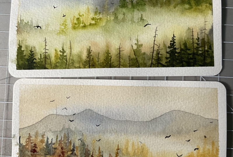
5. Practice Mist - 1: In this chapter, I'm going to paint a few mini landscapes. I recommend watching the process first to better understand
the flow of the painting, then you can paint
along with me. This exercise will help you implement the
techniques learned, which in turn will boost your confidence before
starting the main projects. Let's start our first
practice painting, read the paper thoroughly. Next, we will take yellow cer, mix it in a diluted form. I'll apply this diluted color on the lower parts of the paper. This will suggest a warm sense of undertone in the painting. Make sure the paint
is very watery. Next, let us take paints gray or you
could also take indigo, and I'll paint the pine
forest in a distant area. To build distant area
or aerial perspective, we need to use cool colors. Paint vertical lines
on this wet area. This will suggest
the pine forest. Now take a clean brush and blend the color
into the paper, creating a seamless transition. Leaving some gap, I'll
paint another tree line. This was our first layer. Next let us paint another
layer on the same area. By applying multiple
layer of colors, you will see a sense of dense
appearance in the forest. Once you have
applied the colors, next step is to either use
a damp brush or you could even use water spray to blend the lower
ends of the trees. To avoid any sharp edges, you can apply the spray water and use a napkin or a tissue to wipe off the excess water. Now the paper is watery. In order to lift the excess
water from the paper, I'm using a damp
brush and a napkin. I'll repeatedly run my brush over the paper to
lift off the water. Next, let us mix paints
gray and burns a. With this color, I'll be
painting the midground elements. L vertical brushes repeatedly
into and from motion. Now blend the color. For the rest of the area, I'll use diluted color to
create the tree line effect. Next, we will be
painting another layer. This time we will paint
some detailed trees. Make sure there
are no hard edges. Adding in some
darker colored trees to bring a sense of variation. Using a clean dam bruh, blend the lower ends of
the trees into the paper. Next, I'll use brown and a mix of violet to introduce
a different color. You could use any other
color of your choice. I'm adding in some trees. And make sure to blend the
hard edges at the lower part. For blending, I'll
first clean my brush and then using a damp brush. I'll pull the paints down. I'll paint some trees
on the left side as well. Blend them well. All right. We'll leave
it here for now. This looks quite
minimal and serene. Let's move on to
the next artwork. Here I'll partially apply
water only on the lower area. I'm applying this in a
slightly curvy shape. Let the paper absorb
good amount of moisture. Meanwhile, let us mix the paint. Now, hold your paper in
a tilted position so that the water and the colors
that we apply flows down. For the upper area of this box. I'm going to spray water. It would look
something like this. Now on this partially
sprayed area, I'm going to paint the trees. Hold the paper in a
ted position itself. Let the gravity do its job and
make the colors flow down. I think I should have the
paper on a clipboard. I'm roughly painting some trees. Here my main intention
is to show the flow of colors and the hairy texture that you get around the trees. Wow, look at that beautiful flowy effect
that we are getting here. You could use a clean brush
to pull the paints further down and then move it in different direction so that
it appears very seamless. I'm roughly painting this area. Next I'm going to spray some
water to continue the flow. Using a napkin, you can
wipe off the extra water. On the left side, I'll apply
some darker brown color. Even on the lower
parts of the paper. Let's add some trees
in the bottom area. This is the foreground part. Here we have done wet
on wet technique. We can see the edges
appearing very diffused. The second one was a very. These two are done.
Now let us move on to paint some more
mini artworks. M.
6. Practice Mist - 2: Let us practice a few
more mini landscapes. L et's paint within these boxes. First, apply clean
water thoroughly. Let the paper absorb
the moisture. Now, I'm going to
take paints gray. And we'll apply the paints depicting the distant tree
line in the background. To suggest the
shape of the trees, you can apply vertical lines. Now I'm applying another
layer of darker color. This adds a sense of depth
and blend the lower area so that there is a
smooth transition from the blue color
into the white color. Next, you can take
any green color. I'm using this
green and brown mix like olive green color. I'll apply this for the
mid ground elements. First layer is some
rough patch of color. For the second layer, I'll apply some vertical lines
depicting the pine trees. Next, I'll add shadow green to the same color to make
it darker green color. Applying this over
the same area. This builds a sense of depth. Now on the lower part, I'll
apply some diluted tone, and you can see there
is a wide space in the center between the
midground and the foreground. Next, in the foreground area, I'll paint some tree shapes. Let's go back to
the midground area to add some pine trees. This will add a definition
to the artwork. You can leave it here for now. Let us move on to the next one. Here, I'm not
applying any water. I will directly apply wet diluted paints
on the dry paper. Paint any shape of
trees you want. Once you're done, use a clean wet brush to
pull the paints down, creating a smoother transition. Now, to make the trees appear denser and add a sense of layer, I'll add darker color trees. Blend the colors well
into the background. Don't leave any sharp edges. Moving on, we'll add
midground tree line. For that, I'm using the green on my palette and a little
bit of bird sienna. I've a mix of two colors here. Then pull the paints
down using clean brush. You could also lift the extra paints that
remains on the paper. I'm holding the brush
in a slant position so that the colors flow
down in lower direction. Next, I'll add another layer of trees using darker green color. Next I'll switch to burn Cana. Then blend the colors
using a clean damp brush. You could also introduce
some colors when blending. We will leave it here for
now and come back later. Next, let us paint
another mini landscape, I'm marking a rectangular
boundary for this. Let's prepare the paper
for wet on wet technique. You could use a larger brush
as well to wet the paper. Here I'm sticking to my size eight brush and that is
taking a lot of time. All right, the paper
is thoroughly wet. I'll start with the
distant tree line. Adding second layer of trees. Use the pointy tip of the brush to paint
the vertical lines. Once you're done, blend it into the paper using a clean bruh. Make sure there
are no hard edges. I'll apply another slopey
area on the left side. Also, adding in some
detailed tree shapes, just to give a realistic
sense of appearance. Next I'll take a
diluted yellow color and apply it on the lower part. This will give a warm
undertone for the painting. Next I'll take a brown color. You could take any brown and
paint the midground trees. We'll paint most of the mini artworks in
a similar fashion. There's no major difference. Adding in some detailed trees. To add a sense of variation, you can use a
darker brown color. This adds a sense of depth and extra character
to the re line. The important part is to blend the hard edges so that
it does not appear. Having a smooth and
seamless transition is very important to
effect in the artwork. Now using a diluted color. I'm going to paint the
tree shapes one by one. Next, going back to the
first mini artwork. I'm going to paint some trees. This is wet on dry technique. The paper has dried there. Let's add some trees. I'll also add some trees
in the midground area. This will define the
appearance of the painting, making it look
slightly realistic. Again, you have to blend
it with the clean water. You cannot leave any hard edges. First, I added trees
with diluted tone. Now the trees are painted
with the darkest tone. You could add in any number of trees you want.
It's your choice. Next, we'll go back to
the second mini artwork, adding details in this time. We'll go with wet on dry technique using wet
paints on a dry surface. Paint the tree in whatever
shape you want and then blend the lower end
of that tree so that you create a
smoother transition. Around that area, apply some vertical lines
with diluted paints. This will create a
filler elements. There is no fixed
shape I have in mind. Here my aim is to
build another layer of trees to build a sense
of depth in the artwork. The right side, I painted
trees with burnsana. Now on the left side, I'm using darker green color. Once you're done
painting the trees, you can blend the lower ends to create a smoother
transition of course. Apply water and allow
the paints to flow down. In the foreground area, I'm applying some
color in midtone, we'll leave it as it is. If you want, you can add some dry bare trees
once it dries. Coming back to our
third mini landscape. I'm going to build another
layer over this area. Using burn siana and
painting the trees. You could use whatever
previous color you have used. The approach is quite simple. You paint the trees in
any shape you want, and then you blend the lower ends to create
a seamless transition. By practicing these
mini landscapes, you will gain the confidence needed for the main
class projects. The purpose of these exercises was to build that confidence, ensuring you're well prepared
for the final challenge. The simplest way to
create a tree line is to start by applying
vertical brushtrokes, then add in some pine trees
here and there in between. Blend them together
smoothly and voila. You'll have a neat and
natural looking tree line. Next, I'll spray
some water to allow the colors to blend and
create a natural flow. Next, with the remaining space, I'll draw three
rectangular boxes and together we'll paint some
simple and easy landscapes. In the first one, I'm
applying diluted bca, very diluted paints
inside the box, next will take slightly
midtone color. Apply the paints and
create a gradient effect. Next, I'll take a mix
of green and brown. Apply it on the lower area. Here we are preparing for
the base of the tree line. We will let the paper absorb the paints and come back
once the paper is damp. Meanwhile, let us
paint the next box. I'm applying diluted paints
partially on the paper, and then on the dry area,
I'll paint the trees. The colors when they
touch the wet area, it will create a
smoother flowy effect. This is a very
beautiful technique to create naturally
misty effect. Moving on to the next box, I'll apply diluted brown
paints on the entire box. Then I'll take thicker paints gray and drop it
from the top part. Keeping the paper in a
slight tilted manner and allowing the
paints to flow down. If it doesn't flow, you can use the brush to
guide the paints. Going back to the previous one. Let's take darker color and
paint another layer of trees. I'll also introduce
foreground layer. Going back to this mini box, the paints here are damp. This will create a nice soft yet crisp died edges
if we paint the trees. We have the paints and
paper become damp. In the last box, I
add smaller trees. The graded effect we created
will act as the dark sky. Let's go back to
the rectangular box and paint the foreground
elements here. I'm using a shadow green color. If your paper has already tried, you could spray some water, making it damp or wet. Here we are painting
soft blurry trees. The diluted color suggests a sense of mist in the
foreground as well. All right. We have finished painting these mini exercises. I hope you're feeling
much more confident about painting the
misty forest now.
7. Calming Greens - Painting the base Layers: Let us begin taping
down the masking tape. Tape down all the sites giving about a
quarter inch border. I recommend you to watch the
entire class project first, maybe in a faster setting. Once you watch it,
then you can come back and paint along with me. This way, you will understand
the flow of the painting in a better way and you will be able to judge
your own progress. Once all the sits,
run your finger over the edges to make sure
it is tightly sealed. Before we begin, I'll use a water spray bottle
to moisten my colors. They are quite dry
at the moment, making them difficult to
reactivate when needed. All right. Next, let us
wet the paper completely. I'm using my clean mob brush and applying water
throughout the paper. As an alternative, you
could use water spray. Run your brush over the
paper multiple times to ensure it absorbs
good amount of water. Next let us start
mixing the colors. Let's take cerulin blue
and also paint gray. I'm going to paint the sky. I'm going to load my
brush with a mix of these two colors and swiftly apply the colors starting
from the top part. Leave some tiny gaps in between. Since the paper is, it creates a n effect. Next, I will mix yellow
in a diluted tone using permanent yellow deep
and a bit of yellow cer. I'll apply this diluted
mix to the lower parts of the paper to create a warm
glow in the painting. This will serve as an undertone. There is no need for
any particular shape. Just apply the paints randomly. For the next layer, I'll
mix crimson and yellow in a diluted tone and apply
it around the mid section. This will be the
undertone for the trees. Next, I'll apply pines gray
right next to the pink shade. This will serve as the undertone
for the distant trees. Once the colors are placed, move your board around
to let the colors flow smoothly and blend nicely.
8. Calming Greens - Painting the Distant trees: The paper will be still damp or wet. We
are not drying it. Now let us move on to paint
the distant tree line. Take paints gray, mix it
in midtone consistency. Here, I'm using a size
eight round brush. I'll mark the basic shape that I want for the distant area. Once you have marked
the desired shape, then you can go ahead and
add the vertical lines, suggesting the pine trees
in the background area. These vertical lines are just rough depiction
of the trees. Now to add a sense of
realism to the background. I'm giving shape to the trees, my applying zigzag
brakes one at a time. Adding in some darker trees in the same area to bring
a bit of variation. Next, let us take burn Cana and mix it in
a medium consistency. Here, my paper is still damp. If your paper has dried, then use a water spray bottle. Next on this damp area, I'm going to apply the paints as the base layer for the trees. I'll also apply paints
as a slight variation. Paint some vertical brush
strokes, suggesting the trees. The lower part of
the background trees appear a little
sharp and patchy. Let's blend it
using clean brush. I'm applying water
to smooth it out. You could also use
a water spray. Using a slightly darker
tone of paint gray. I'll paint another layer of pine tree in the
background area. I'll paint some pine
trees and I'll add filler elements using
vertical lines. Since it is away
from the viewpoint, it need not have that detailing. Next, I'm going to mix
a brownish green color. The complimentary color of green in the color wheel is red. I'm mixing a little bit of
red with the green color. This will give me a
brownish green color. Now, take this color
mix and apply as the next layer of trees
in the foreground. First, I'll dab
the color and then paint the vertical brush ropes. You could also paint
the trees directly. Next, we'll go back to
the background area and apply some green
in diluted tone. This will create a
smooth transition from gray to greenish color, like from background
to midground color. We'll have a nice transition. Using clean water, try
to blend the colors. While the paper is still damped, let us paint the
mid ground trees. Here, I'm using a
slightly brownish green. You could add the bird Ciena
to the existing green. Paint the trees and again, blend it into the background, create a smoother transition. Moving on, we'll paint some trees on the right
side midground area. You could use any green with
a warm undertone for that, you could add orange
or warm red color. Next, I'll take yellow
green and shadow green. Create a mix of it. Now, paint the trees. You could either directly
paint the shape of the trees individually
or apply vertical lines. Both would work perfectly fine. You don't have to follow the exact same shape or
method that I'm following. You can just follow the
idea of the tree placement. Currently, we are painting
the midground trees. Blend the lower part with clean brush so that there
are no sharp edges. The smoother blends
create a misty effect. If you feel there's extra
water or paints anywhere, then you could use a damp or a dry brush to
lift off the paints. I'll add some more
vertical lines giving a sense of character
to the midground area.
9. Calming Greens - Painting the Trees and Mist: For the next layer of trees, we will use darker green color
and paint the tree shapes. Some trees, I'll use
vertical brush rokes, and for some I'll apply
exactly brush rokes. I don't want the individual
trees to pop out, so I'll try to blend them
into the background. Take a clean damp brush
and pull the paints down. Next, let us move on to
the lower midground area. I'll paint another
layer of trees. Use a slightly
darker green color to distinguish it from
the previous layer. My paper is still damp. If your paper has dried, you can use water
spray to ret it. Next, we'll return to
the background area and lift the paints using
a clean damp brush. This technique will create
a separation between the background and this
green midground area. Now to create the
impression of the leaves, lift the paints
in zigzag motion. Next, let us move on to painting the background
trees on the left side. In this method, I'll
show you how to paint the distant
background on a dry paper. Your paper doesn't need
to be wet in this case. Let's begin. First,
I'll use diluted paint gray and apply it with
angled brush roe. These vertical
lines when grouped together will resemble a forest. Now, using the tip of the brush, I'll define the shape of the forest to make it
appear more organic. Now clean your brush and
load it with clean water. Apply it around the lower area, blending the colors into
the white of the paper. If that is not sufficient, you could use water spray. Blend the colors well. Make sure there are no hard
edges or patchy areas. Moving on, we'll apply another layer of trees
on the same area. Below this, I will
apply the paints using motion to create the impression of
mist in the forest. Apply water mist in order to spread the paints
and avoid hard edges. In watercolor painting process, one often go back and
forth between steps. Sometimes you may need to erase certain elements
and add new ones. That's why I recommend watching the entire painting process
before following along. This way, you will
understand when adjustments are made and when the course of
the painting changes. I had initially planned to leave empty spaces between the background midground
and foreground. However, I've now
decided to connect them to create a
more cohesive scene. Adding more colors around
the midground area, experimenting with
how to blend them seamlessly with the
background green forest. S. I often find that my painting
style evolves as I work. I might start with a
specific plan in mind, but by the end, the painting can look
a bit different. During the process, I sometimes
change my approach or adjust the reference to
improve the outcome. This will be reflected
in the painting videos, which might seem a bit
confusing at times. I recommend watching the videos
and then following along. This way, you'll be prepared for any changes and you can enjoy the creative
journey with me. Now in the foreground, I'm adding another layer
of trees using color. You can see we have
built multiple layers. This is a third layer of
trees in the foreground area. I'll again add some trees
around midground area by just the brush and applying
some vertical brushes. Oh Moving on, we'll take yellow ocher
in a very diluted tone. Apply it below the
midground area and right above the
foreground area. Don't forget to leave
the white space empty. This is to suggest a warm
glow in the foreground part. Now to blend the colors, I spraying some water. You might wonder,
why are we spraying water after just
painting the trees. Trust me, this technique
helps us build multiple layers and create a sense of depth in
the foreground area. Since this area is
closer to the viewpoint, it demands more attention
and detailing work. I'm going to paint
the trees again with the same level of
dedication and detail. S. I'll apply some
lines and taps as filler elements to avoid having empty spaces in the
foreground area. Adding more trees
around the left part. To bring variation in color and enhance the warm
tone of the scenery. I'm adding burn Siena. O dabbing burn Ciena on the right side as well to
add a dash of warm color. Applying darker green color to the base or the bottom
part of the painting. This will make the area
appear more dense and ima. Now, if you notice
the midground and the foreground areas on the right side are
already connected. This happened because I sprayed
water over those areas. That allowed the colors to blend and merge with
the background. If your three areas are still separate and distinguished,
that's perfectly fine. Next, I'll flick the
brush in upward motion, trying to create some pine
trees on the left side. Adding some paints in this empty area to build
a sense of continuity. Let's add some definition
to the background as well to create a
sense of separation. Moving on, I'll paint the
tip of the trees with the diluted and I'm going to blend the lower end of the trees
into the darker area.
10. Calming Greens - Defining the Tree shapes: In this chapter, I'll focus more on adding
four ground trees. Adding the trunk of the tree and then applying zigzaggy
brushstrokes, depicting a beautiful pine tree. Let's add some more. I'll
keep wearing the color. Here for the next tree, I'll use more yellowish green color. You can also add some
brownish colored trees. Wearing the tonal values. For some trees, I'm using
very diluted tones. As filler elements, I'll simply apply some
vertical lines. You can paint as
many trees you want. There's no restriction
on the count. I'm not quite happy with how these center trees
have turned out. I'm lifting the paints and
then I'll repaint the trees. Taking a fine liner
brush and painting smaller sized trees in a
slightly diluted tone. Adding some more trees in the foreground area
using a retailer brush. Next, I'll go back to
the background area to add more character to the
distant background area. Although it is far
away and doesn't need more detailing work, I would still add
further layers to it. This is wet on dry. I'm directly applying the
paints on the dry area. Once I'm happy with the
trees that I've added, I'll then add the water spray and covering the lower
part so that it doesn't interfere with the other
paints in the mid ground area. H. When you spray water, the paints are going to flow
in different direction. You can try to manipulate it by changing the
direction of the boat. If you're not happy,
you could lift off the paints using a tissue paper. All right. I'll just let this be and not add any
further layers. You could let it dry
naturally or use a head dryer to speed
up the drying process.
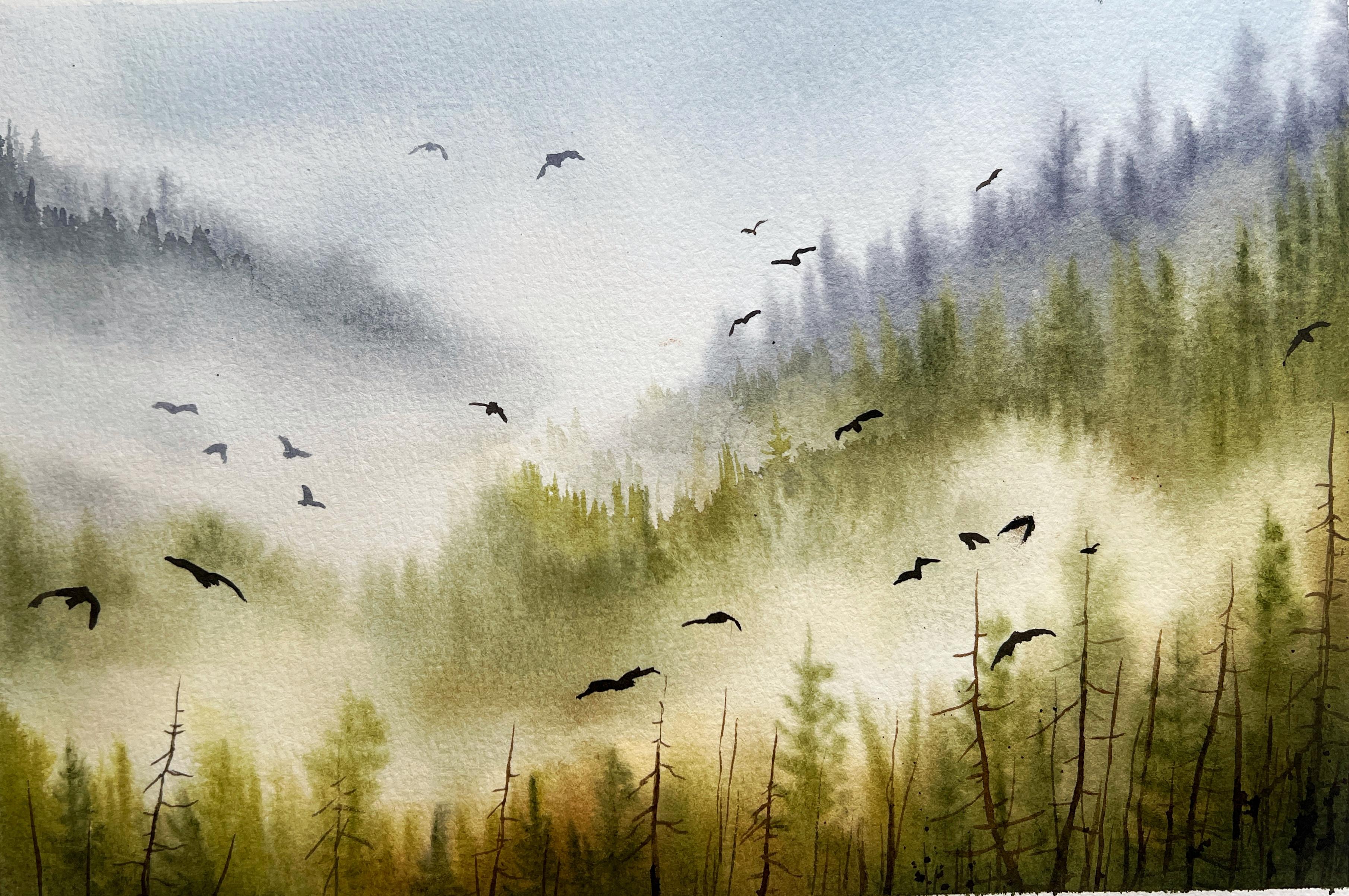
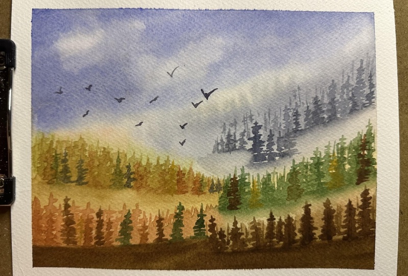
11. Calming Greens - Painting Birds & Final details: All the paints have
dried completely. Now let us add the
final details. I'm going to paint
bare and dry trees. I'll use brownish color. First, we'll mark
the vertical lines wherever we want
to add the trees. Using the tip of the brush
to get fine straight lines. Then to add the branches, you can switch to a
fine liner brush. Now add the branches in
a very irregular manner. Make sure you're not creating any symmetry in
the tree branches. The trees should appear organic. That's why you try to paint
them in different direction. Paint the trees of
different sizes. Add some vertical lines
as filler elements. There is no fixed count
on the number of trees. We'll add as many trees we want. Splattering the panes, creating a sense of
noise in the atmosphere. Now, let us add some
birds. To add birds. I'm using brown and paints gray. You could use darker
brown or black color. Paint the birds with very
minimal pressure on the brush. To control the brushes, you have to apply less pressure. There is no restriction on
the placement of the birds. You can place them
anywhere you want. Now on the left side, I'm painting birds with
slightly diluted tone. This will depict a sense
of mist in the atmosphere. Again, around the same area. I'm painting the birds with
the slightly darker tone. I love adding birds
in my artwork. It is so difficult to stop myself from adding
more and more birds. You don't have to add these many birds just
because I'm adding it. You do whatever you want to do. All right. So I'm done
with this painting. Now, let us remove the masking tape and reveal the final
look of the artwork. There you go. This is how
the painting has turned out. I hope you enjoyed
painting this with me. Do share your projects
under the projects, Galore. All right. Now let us move on to our
second class project.
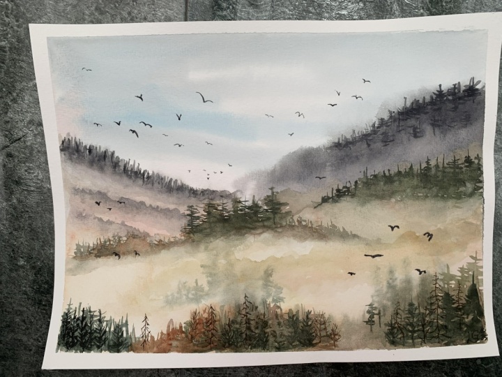
12. Gentle Brown Mist - Painting the base layers: I have already taped
down the paper. Now, let's get started. Apply loads of water on the
paper using a clean mop rash. The wet paper is
to perform wet on wet technique for
upcoming layers. Apply multiple layers of water
so that the paper absorbs good amount of water and remains moist for
a longer duration. If you're applying just
one layer of water, then the paper will
dry up very fast. Wipe off all the excess water
on the sides of the paper. All right, we'll
stop applying water here and move on to
mixing the colors. First, I'll take paints gray. Next, I'll take yellow cer and mix it with a tiny
bit of crimson color. Mixing it together, we'll
give a peach color. Brush with this color
and apply it on the top part to paint the sky. Followed by the paints gray. Next, we will apply
diluted tone around the midground area as the base color for
the misty forest. Moving my brush into
and from motion, creating a zigzag pattern. This helps in even
distribution of paints. I'm trying to form the
shape of the hills while leaving some blank
spaces for the mist. For guidance, you can refer to the final picture
attached in the screen. Take a yellow cer and
make it in diluted form. I'm applying this over
the midground area? This will add a sense of
warmth around the misty area. Next take paints gray in diluted form and apply it
in the foreground area, which is the bottom
part of the painting. Next, I'm adding paints gray around the
background hill area. This will create a sense of balance between warm
and cool color. I'm adding some yellow on the sky part because I felt on the left side
it was quite blank. T. Next, let us take permanent yellow in a mid tone consistency and
apply on the misty hill area. I want this hill to have a
warm and harmonious undertone. I'm adding hints of yellow and warm tones
in the background. Applying multiple layers
creates a sense of depth. Gently blend it into
the white area. You can use a clean
dam rush to lift the excess pains and create
a sense of transition. I'll also apply some yellow on the upper area where we
have the distant mountain. All right. The base
layer is painted. Now, let us dry the
paper completely. I'm using my head dryer to
speed up the drying process. If you don't have one, then
you can wait for the paper to dry and then come back
and add the next layers.
13. Gentle Brown Mist - Creating the distant trees: All right. The paper
has dried completely. Notice the soft and warm glow. Next I'm going to mix
a warm gray color, for which I'll use paints gray and a little
bit of yellow ca. Now, paint the mountains
using the belly of the brush. Once the shape of the
mountain is painted, next, we will apply clean water
and pull the paints down, creating a softer transition, which results in a misty
effect in the mountain. Switching to a larger brush to create a softer blend
into the background. You could either
apply water till the bottom part or use
a water spray bottle. Applying water like this
ensures a seamless transition. Next style makes
ultramarine blue in diluted consistency and apply some brush strokes on
the mountain area. This will create a sense
of atmospheric vibe. Blend it well into
the background. Make sure there
are no hard edges. Next let us paint the
background pine trees. Here I'm using permanent
yellow and burn sana. Take this color mix and apply
it in up and down motion. This will suggest the
background pine trees. Pull the paint down, creating a seamless effect. I'll repeat the same for the mid ground part on the
left side of the paper. Apply repeated vertical
lines suggesting the pine trees and don't forget to blend the lower
part using clean dam brush. Take paints gray and a
tiny bit of yellow occur, mix it together to
form a blackish color. Now applied in the background to suggest darker colored trees. In order to not have
any sharp edges. I'm using clean dam brush to blend and create a misty effect. Right next to this, I'm
applying burn ciana. Blend the colors well
using a clean damp brush. Move your brush in
a circular motion, creating a nice blend
into the background. Next, I will add some trees
on this area by moving the brush into and fro motion,
creating vertical lines. Make sure there
are no hard edges. So blend it well
using a damp brush. I'll repeat the same
on the right side. Adding some more vertical
lines, suggesting tree shapes. Use the tip of the brush. It will be easy to
create these lines. After adding these
vertical lines, let us switch to a
fine liner brush to paint more precise trees. I'll use my size two round brush as it
has a very fine tip, perfect for detailing work. Paint the tree in irregular
shapes and sizes. Moving on, let us paint the trees with a
slightly darker color. I've taken Berciana. There is a separate
chapter in this class for painting trees and
learning the techniques. I hope you have gone through it. Additionally, I'm
applying a darker color to create nice
variation in the trees. I'm blending these hard edges
with a clean dam brush. Creating this transition is very important as it will produce a misty effect
in the painting. Again, I'm adding
this blackish color to create variation
in the set of trees. You have to make sure you
don't have any sharp edges. Blend as long as you
see no hard edges. Here's a trick. You can
use a water spray bottle to disperse the tiny
light edges on the paper. I'm spraying water on the
left and around center part. The right side of
the paper is still Oly wet the areas where it
is absolutely necessary. Now, on the dry area
on the right side, I'll paint some pine trees
using diluted colors. This technique will
create the impression of misty trees and enhance the atmospheric
mode of the scene. In this painting, I want to show that the foreground is
covered with the mist. You will notice that the trees
appear lighter in color. You could also switch
to another color. For all the trees here, I will use diluted color itself. And around the center, I'll have some darker color, this blackish color and try to blend it with
the background. After adding this color, you will notice that the area is enhanced even
more than before. To create a misty effect and a sense of depth
in the painting. We need to work in
multiple layers. Hence, we will be painting
the trees a lot of times. So now, I'll add
another layer of trees. And to blend the hard edges, you could either use damp brush or your
fingertip, just the colors. Painting some more diluted
trees in the foreground. I have used paints gray and burn siana for painting these
lighter color trees. The paper over here is wet. Hence we get this blooming
effect in the pine tree. All right. Now
let's the paper. H
14. Gentle Brown Mist - Painting Midground trees: The paper is completely dry. Now let us move on to
add further layers. Let's take paint gray and mix
it in midtone consistency. Using my fine line of brush, I'm painting trees in
the foreground area. For previous layer, I have used lighter diluted tones
and For this layer, I am using mid tone color. I lift off the paint
using my napkin, leaving behind a
lighter colored tree. Next let paint a
slightly taller tree. Use the napkin to partially
lift off the pains. Go back to the
midground area and add some detailed trees around here. To prevent the hard
edges on the lower part, I spray water covering
the upper area. Start painting the trees
from the dry part. You can see as I move
to the lower part, the paint naturally starts blending into the paper
due to its wetness. You can repaint the
same technique and paint multiple trees
around this area. Here, I'm using a mix of
paints gray and burn siana. This will create a
darker blackish color. If you feel the colors you
don't blend into the paper, use your fingertip and
dab it onto that area. Let's moisten the paper again
using water spray bottle, and I'll cover the upper area around the pine tree
to keep it dry. Paint some trees on
the damp area as well. This will appear as though there are trees inside the misty area. Adding a partially
visible tree on the side. Moving on to the
foreground area. I'll paint some pine trees
using a slightly darker color. Rest of the layer around
foreground area will be lighter. Only few trees I'll paint color. This is to enhance the misty
effect in the foreground. A few more tiny pine trees. Additionally, I will
add some bare trees. Next, I'll add some darker
colors to make the foreground appear dense and add
a sense of depth. Use clean water to blend the
colors into the atmosphere. It should have a
smooth transition. Adding some more trees to build visual interest
in the painting. Let's try to have a mix of lighter and darker
colored trees, mostly lighter color to depict the mist in
the foreground area. Oh. Now, let's add some branches to the bare trees. You can paint any
number of trees here, but make sure to have a balance of lighter
and darker trees. I'll go back to the
midground area and add some trees using
diluted colors. You could also apply
some filler elements. It's up to you. Oh.
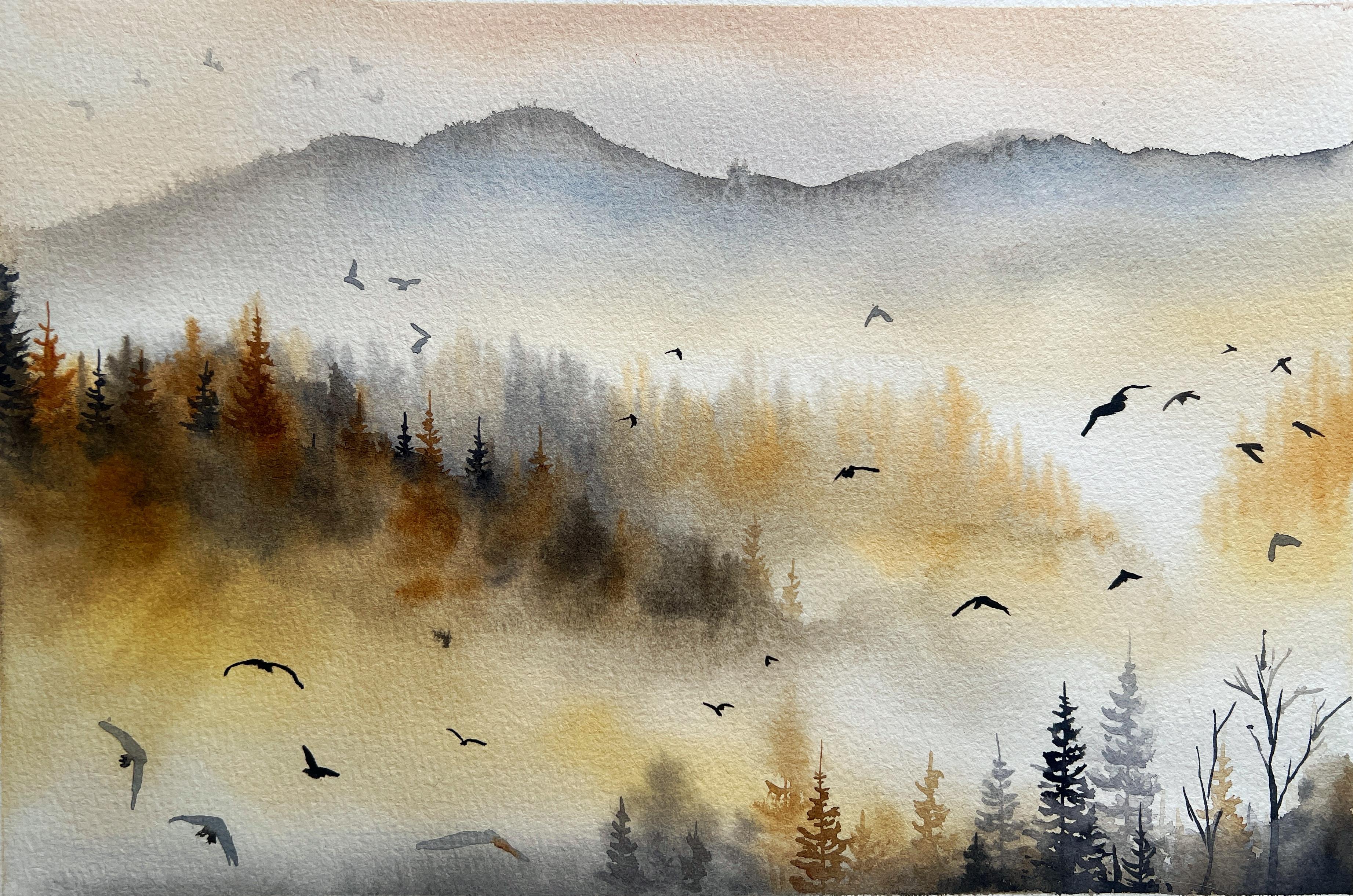
15. Gentle Brown Mist - Painting Final trees and Birds & Conclusion: We are done painting the trees. Now let us add some birds. For that, I'll mix
paints gray and bircana. Mixing these two will create
a darker brown color. Now let's paint the birds, freely flying in the sky. Press your brush
against the paper, creating these
angular brush ropes. As always, I'm going to add a
lot of birds in my artwork. I'll paint mostly
bigger birds in the foreground area and smaller birds in
the distant area. I'll also paint some birds with diluted color depicting
the sense of mist. Here, on top portion, I'll add some birds and
then lift off some paints, making them lighter in color. All right, we are
done with this. Let's feel of the masking. There you go. This is how
the painting has turned out. I'm really happy
with the outcome. Do share your artworks with me under the
projects gallery. I really look forward
to see your artworks. Thank you for joining my class
and showing your support. Your encouragement
means a lot to me. I'll see you in my next
class until then, bye bye.
 Shanan Subhan, Watercolor/Gouache | Art Educator