Transcripts
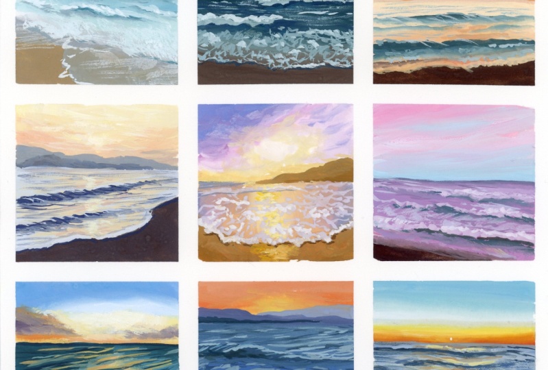
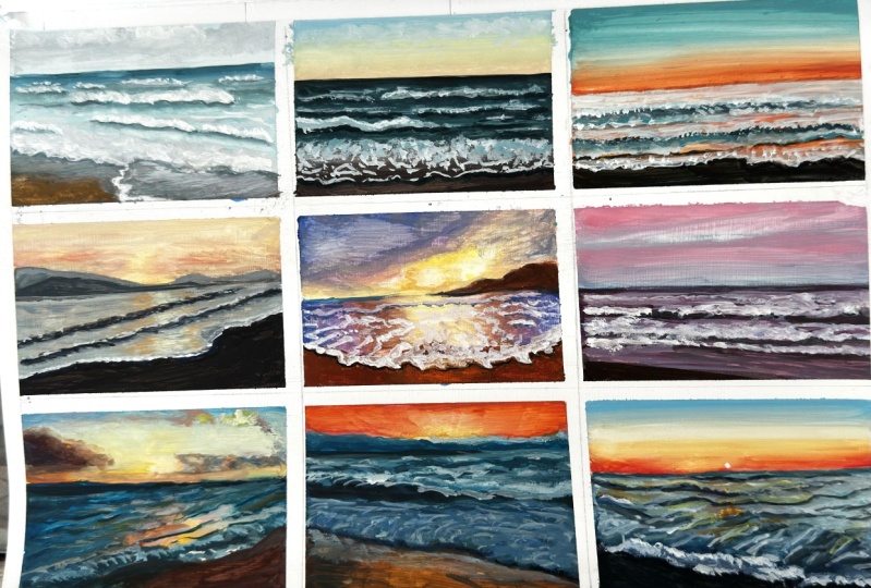
1. Introduction: In this class, we'll break
down the process of painting sea scapes by doing nine
small square studies. Each small study will take
no longer than 20 minutes. I'll go over the essential
things to pay attention to when painting realistic
seascapes in Guash. Then we'll apply the
principles we learn from this process to paint two
largest sea scape paintings. I'll be taking you through the entire process in real time, so you can see
exactly how I work and paint along with me
at a comfortable pace. Since we'll be working in Gach, I'll also share some
helpful tips along the way to help you learn
and understand the medium.
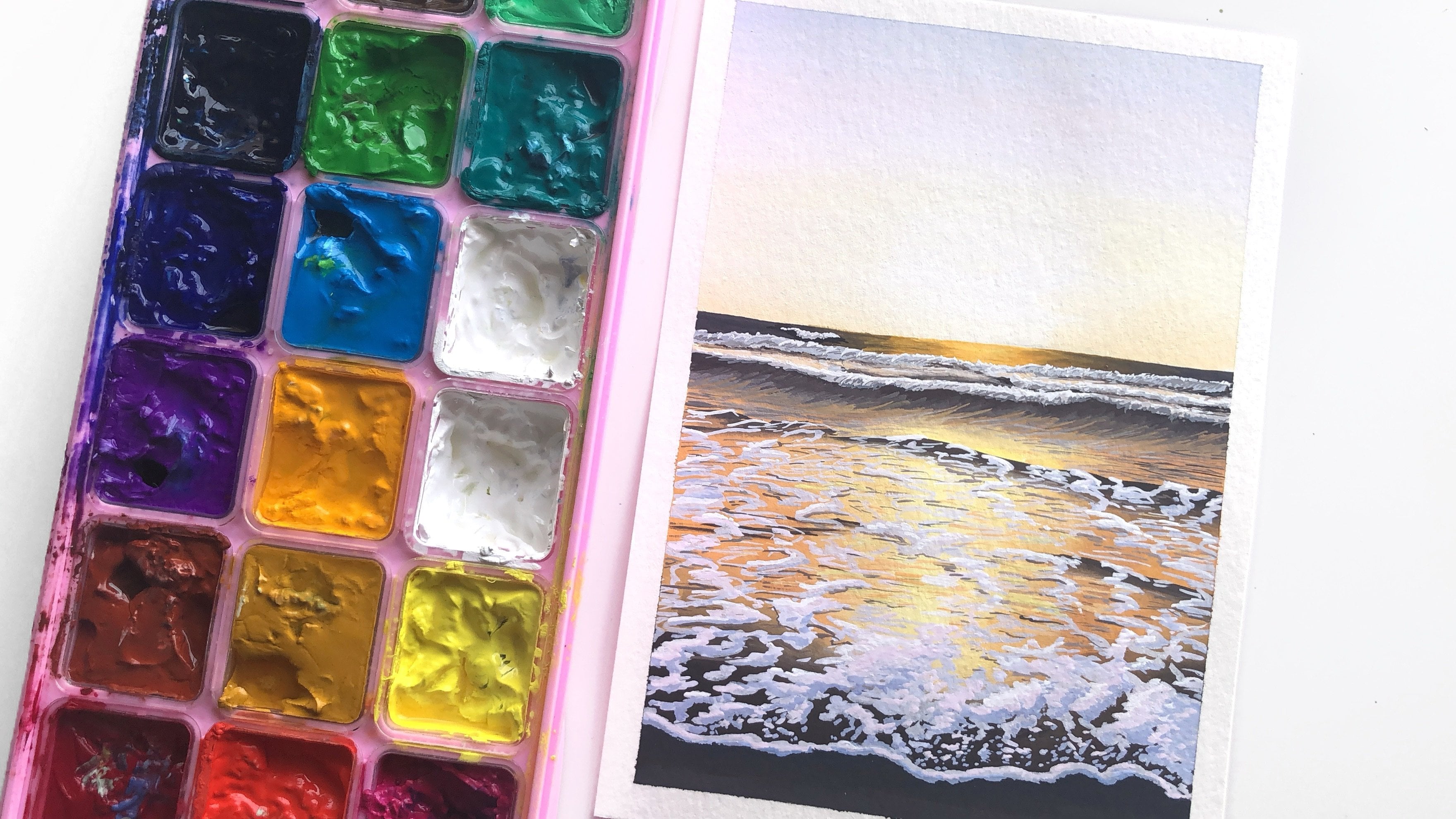
2. Materials: Let's take a look
at the materials that we'll need for this class. Starting with ache paint. I'm using various brands
of artist grade gouache that I've squeezed out into
this airtight palette. So it's a plastic palette
that comes with 24 wells, and it comes with
the silicon lid, so it keeps it quite airtight and I find the gah stays
very fresh in here. In terms of the colors that
you want for this class, I would recommend having the cool and warm
of each primary. So a cool yellow, a warm yellow. A cool red warm red, cool blue warm blue and a
burnt umber, black and white. We can mix pretty much every other color
from those colors. You don't need as
many as I have here. One last thing about
using a palette like this with Gach is if you
don't use it frequently, you may find that it
starts to grow some mold. For that, I would
recommend using the imi Mal juice spray. I find that it has
worked really well in keeping my gah mold free. I don't use it that often. I just spray it when I
close the immi guash. And usually, I have
a spray bottle with just regular tap water that
I missed the paints with. Feel free to use any
gash that you have. You don't need a lot of colors, just the primaries in the
cool and warms and a black, white and burnt umber. Then for my palette, I'm just using a porcelain
tray For my paper, I am using watercolor paper that I've just cut
down to a square. The original paper
was eight by ten, and I've just cut
a little bit off, so it's about eight by 8 ". Each little square is about
the length of a finger. These are going to be
very small studies. I've taped it down with
masking tape around the edges, and then because I want a
thin border between them, I've used a really
thin washi tape. For my water, I have
a water tank here, and it's got two wells. If I need clean water, I can keep one clean and the other I can use for my
dirty colors or I can keep complimentary
colors separated or keep my light and
dark colors separated. Then I've got a towel here
for drying my brushes. You can use a paper towel, tissues, anything
that works for you. I prefer something like this because I can use it over and over again and it can just
take a lot more water. I find if I use paper towels, they get soak through
really quickly. As for my brushes, I have picked three
brushes to use. I'm going to use a
half inch angle brush. I find angle brushes to
be really versatile. And you can do a lot with them. You can use the point
for thinner details. You can use the
straight flat edge to do thin lines as well, so it's very versatile. Then I've got a size
six round brush with a pointed tip and a size one rigger or line of brush for a
couple of thin lines, especially since we're
doing really small studies, sometimes we may need a
couple of thin lines to indicate some of the water and
the waves in the painting. These brushes, they're
all synthetic. I really enjoy using
synthetic brushes for ash, and these one specifically are my collaboration brush
set with raft ammo. They come in a set
of five and I'm just using three of the five
brushes for this class. Then you also want a pencil and a netable eraser to do
some quick sketches. So how this class
is going to work as we are going to
do three by three, nine quick and small
sea scape studies. I hope each one takes
no more than 15, 20 minutes, ideally even less. The point of them is to just get a understanding of how to approach painting sea
scapes in this way, and then we'll do two larger individual seascape
paintings afterwards. I'll just go through and
paint them one by one, so we'll complete each one
before we move on to the next.
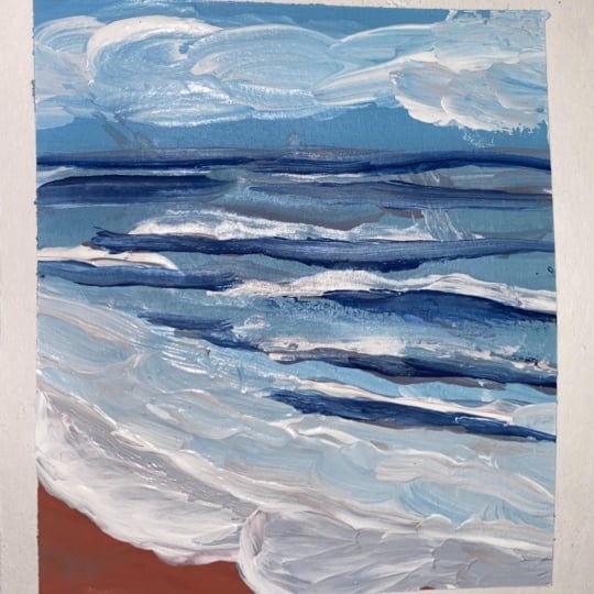
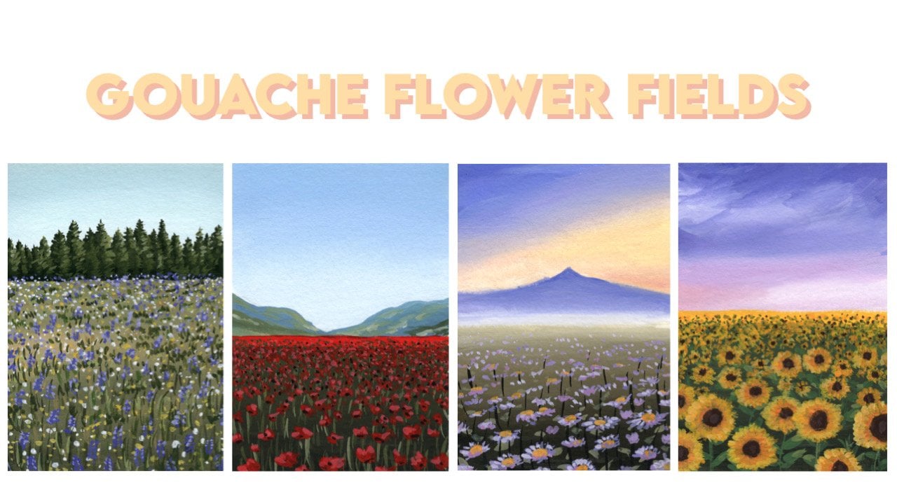
3. Study 1: Blue seascape: So Let's start with our first
a little sea scape study, and we're just going
to do a sketch. These should all be pretty
straightforward and simple. For that sketch, you'll
want to just place in the horizon line first, and I'm going to keep
that quite high up, so maybe about a quarter
of the way down, and then just indicate
where the water is. And that's all we need
to do for this sketch. We can start painting because once you start
getting the paint in, you're going to cover these
lines really quickly anyway. There's no point putting
any effort into this. If the pencil line is very dark, it will show through parts of your gash
that are really light. If you don't want
that to happen, just make sure you lighten
your lines with a eraser, and I like using a netable eraser for this
reason because it's good at lightening the lines without
completely taking it off. I'm going to start with
the half inch angle brush and I will probably start with this brush for
all the paintings, and then as I move
down to some details, I will use the round brush. To be honest, if you wanted to keep the paintings really loose, you could use a half
inch angle brush for the entire painting
for all of them. Maybe we will experiment with
that a little bit as well. For this first one,
let's start with the half inch angle brush and you're just going to want
to pick up a little bit of water just to wet
the brush a little. For the sky, I'm going
to start with some white and just a touch
of your cool blue. That could be a primary blue, it's realan blue a cyan. And I'm just going
to drop that in. Pick up some more white. And the horizon line, is just a little bit lighter, I pick up some more white
and I drop that in there, and then to indicate
some clouds, what you can do is just a bit of burnt umber and
just drop that in. While the paint is wet. We just gray down a
little bit of the blue. You can grab a little bit of ultramarine blue to
mix with burnt umber, which produces a nice gray, and just drop that in. While the paint is wet, get some soft bleeds. Then I will clean off my
brush and pick up some white. I'm just using the
corner of my brush. I really like using the tip. It's very versatile. And just drop a little bit of that it into some of the
lighter areas in the cloud. I'm doing this really quickly
because I want to get it all in while the paint is wet, so you get really
soft transitions and then clean that off. If you need to
clean up anything, just using a clean brush, you can soften some things out. The point of these studies is not to be too
precious about them. I'm going to try and just let things be natural and loose. Then for the water, what we want to do is ignore all the details and just
look for the big colors. I'm seeing a blue transitioning into more of a
lighter bluish green, into the sand color. I see hints of a purplesh color. I want to ignore the
white sea foam on top and just look for the color behind it
or underneath it. And just block that in. Starting at the top, we
can see the blue here. It's much darker than the sky, so we can use that as reference. I'm going to start with
my cool blue again. I'll just mix a little
bit of burnt umberin. I found that if you mix burned
umberin with a cool blue, it pushes a little
bit towards green, which in this case is what we want because the water
is a little bit greenish. I'm going to start with
that, just test that out. For the horizon line, I'll just pull a line
across with my brush. Straight line across and then I'm going to start
mixing in white as I can see. It grows lighter and lighter. I'm also going to add in a touch of yellow
as I come down, so I'm going to grab some more white and just a tiniest
little bit of a cool yellow, just a bit to slowly push it towards
more of a blue green. At this stage, I'm going
to clean off my brush. And using a clean brush
that I've partly dried off. I also like to use my fingers to feel the moisture in
there and just take off any excess moistures needed
and blend out that line. You might want to pick
up some darker paint to place back in there. Then I'll clean off my brush regularly when
I'm blending out things, so I'm not placing too much
paint onto the paper as I go. Then I'm going to pick up some
more white as I move down. I'm keeping this paint
nice and creamy, so you'll see I'm
using a lot of paint. And I'll just bring it down
a little bit more while also picking up a little bit of the paint that I had
previously on the palette, so I can transition this nicely, so that's about as
low as that goes. Then I'm going to
get in the sand. The sand is a tan color. I'm going to go for
burnt umber with a bit of the white and I
would do some yellow ochre, but if you don't
have yellow cha, we can do a little
bit of yellow. And a touch of blue. I'm using ultramarine blue, and maybe a touch of red, but just the tiniest little bit. Then I would just block
in that lower corner. Then it's a bluish purple. I'm going to clean off my brush. Maybe go for some
ultramarine blue mixed with the white and everything else we
have on the palette. It's a bit of a muddy ish
color and just mix in a bit of that red that we have and
just block in this area. Now my paint is a bit
runny, which is good. I want to glaze a little bit, how you glaze is you just
use thin down paint. And wash it over the top. That's my block in stage. What I might want to do is
just grab a little bit more white and just transition
that out a little. There's our base layer. Now we'll switch over
to our round brush. Again, I'll start just by picking up a little
bit of water, just wet the bristles a little. Then we'll go in and just get in some of the waves
in the movement. I'm going to start
with a darker line. I'll pick up a little
bit more of blue. The color I was using for the sky and mostly
for the water. I'll just mix a bit more
burnt umber with it, which will just
darken the color. And I'll grab a touch of yellow. With this darker color, I'm going to paint in some of the waves and the
bumps in the water. I just keep them nice and thin. And then I'll add a little
bit of white as I see some areas are a little bit lighter this area closer to us. Then I'm going to
clean that of and I'm going to go into a white, just picking up some white and you can pick up a
little bit of the blue, so it's a pure white, and we'll just paint on some of the foam
that's coming up. A lot of times that shadow, the lines we were
placing on before, they sit just underneath. This foam. You can also just do a couple of thin strokes with
this white paint as well. Then I also like to just drop in a bit of
sea foam at the front. Grab and highlight
a couple of areas. I'm just stippling
in a little bit of the C foam now and then
just shaping it out. So I just tapping that on. Then I think I want to just quickly go back to my dark
color before and just emphasize the shadow a
little bit under some of the W. We just painted in
because when the comes up, it creates a shadow underneath. Then to soften out that color. You can either grab
a lighter color and place it underneath, or you can also just use a
wet brush and soften it out. If I just clean off my brush
and I use a wet brush, I can just go in underneath and soften out that dark color. It's not too dark. Then looking at the reference photo again, I think I want a
little bit more Sfoam, maybe running along here. Then I also want to
outline this area. You can also run a little bit of a dry brush across
here for some effect, and just use your finger
to it out a little. Then a couple of
finishing touches, I just want maybe a little
bit more transition in there. I'll go into a color that's not quite as
dark as our dark, but just a bit darker
than the water and just drop in a bit more
shadow here and there. Again, with a clean brush, I can go ahead and just soften out what I just placed
in if it's too harsh. Just to accent some of
the really dark areas, I'll go back into
my darkest color, the blue and burnt umber and
just go right underneath. A couple of the main waves and just accent that darker line. And once again, if needed, just slightly soften it out, so it's not too harsh. That's pretty much our
first seascape done, so we're keeping these really
lose and quick and simple. Just to get the idea
for how to approach it. If you wanted to do
a painting of this, you take the same approach
and you just blow it up and put a bit more
into the details. Let's move on to our second one.
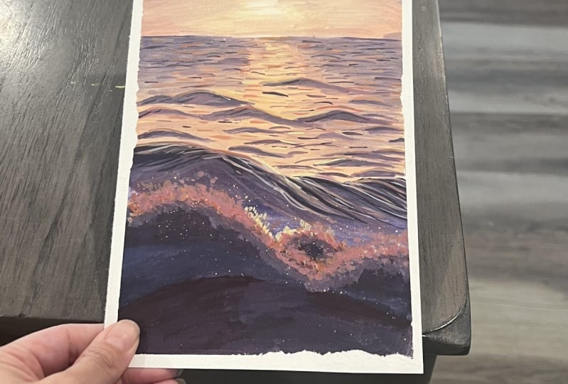
4. Study 2: Just after sunset: The second painting we're
doing is actually based off a reference photo that I
took myself at the beach. For this, we're going
to do basically the same thing as we are
for every other painting. We'll start with a
very quick sketch where we just place
in the horizon line. This one, I'm going to have
it a little bit lower, and then maybe just
the water line. I know where the sand starts. And we can go ahead
with the sketch. One thing you want to be
careful of is if you're setting up your
painting similar to me. I've used really
thin washy tape. If you're not careful,
the paint could go over to the other side if
you're using a big brush. If you want your paintings
to come out nice and clean, just be careful not to
paint it over the edges. Once again, starting
with the sky, I'm going to go for
a transition from blue to yellow to a pink. Starting with blue, I can use what I have on
the palette already. Start a bit of white into there. And just sweep that
along the top. Keeping the paint nice and
creamy is very blendable. Then I'm just going to quickly clean that off
because our papers, our working surface
is very small, so even the tiniest bit
of contaminated paint can can really change
up your colors. I've mixed in a little
bit of yellow as I'm trying to transition
to a yellow wish green. Place that in bring it down a little and then I'm
going to clean that off. Go back between the two
and just blend that out with a clean brush with not
too much moisture in there. If there's not enough paint, just grab some more paint from your palette and just
blend it out like this. If you want while it's wet, you can grab some white
and just drop in. Hint of some clouds in there. And then moving down. I'm going to grab a b
and a bit of my red. Maybe actually a
bit of warm yellow. Warm yellow is the yellow that leans a bit more towards orange. I've got a b bit of
orange or warm yellow. Drop that into there. And just bring that up, mix it with some of the
color I used before, which was a yellowish green. Clean off my brush again and
just soften out that blend. Then we can block in the water, so once again, ignore
all the details. Just look for the
big blocks of color. It's a little bit
more of a dark green. I'm going to start
once again with my cool blue and
some burnt umber. S. And a touch of yellow. This time I'm using
a little bit more burnt umber in the
mixture to keep the color nice and
dark and toned down. I'll add a little bit of
ultramarine blue in as well. I've got a bit of primary
blue ultramarine blue, and a bit of burned
umber and yellow. For the horizon
line, once again, I'll just pull it across. A I'll bring it down a little and then I'll
start to add some white into the paint as I keep
bringing it down. And then a little
bit more white. Then I will clean this off. A The good thing about painting water is you
actually don't need a smooth transition there because a lot of it gets covered up with details from the waves. We don't actually have to worry about there being a
smooth transition. Now we can do the sand which I'm going to
use burnt umber. It's a little bit more of a dark brown compared
to the other painting, which was a bit more
of a yellowish. I'm just going to mix it with some burnt umber and
a touch of white. And just a little bit more bent a little bit more
ultramarine blue. And a touch more white in there. I'm going to get that in and then a little bit more
white once again. As I find the transition
point between the two, you can go into the
previous color. And then just clean off your brush and soften it out slightly
with a clean brush. Then I will switch
to my round brush, and we're going to
do the same thing. Going into an even darker
color than the base layer. I'll use a bit more
ultramarine blue, a little bit more burnt
umber, a primary blue. Actually, I think what we'll do we'll start with the waves and then we know where to place the dark
accents underneath. Let's start that again. Starting with white because this photo was taken around
sunset, so it's much darker. The white is not a pure white. Just grab some
white and you want to just mix it with
some of the blues and the grays that you have on your palette just
to tone that down. It's not so bright and start
placing on those waves. If you want it to be
less transparent, just make sure the paint
is a little bit thicker. Otherwise, a light paint
like this can dry to be quite dark on top of
a dark background. I'm just indicating where
the main waves are. Then I'll darken it
a little bit just to lower the
contrast and just do a couple of lines to indicate some highlights in there without making
it too light. Now that we've got
those waves in, and then we can go back
to our really dark paint, and we can go just
underneath the waves and get that shadow in. Then just here and there, you can place in a
couple more lines, add a bit of detail
to the waves. Just going to clean it off,
maybe grab a little bit of lighter paint to do
a transition out, or you can use a clean brush and soften that transition like we did in the previous painting, using a clean brush,
soften it out. This works best when the paint you first lay down
is nice and creamy, you're just touching
it slightly and just softening out that color while picking up minimal
amount of paint. Then I'm going to go
into some white and just highlight a little
bit along the top edge. Where the foam would just be receiving a bit more
of a highlight. That way, it just looks a bit more three D like
it has a bit more form. And then going back into a little bit of the bluish
greens on my palette, just to darken and just
gray it down a little. I'm going to paint on
some of the sea foam. I just do this loosely
using the tip of my brush, just doing squiggly motions. Okay. Add a little bit more white as we
approach this area, and I'm going to place
in the water line. Goes up to about there. My consistency of
paint is not too. Maybe a bit more towards the dry side so I can
dry brush if needed. I'm just getting these
squiggly lines on. Cover all of that. Then I
want to grab a little bit of white for a couple of
highlights around here. Just start in some highlights. And Then just underneath this line, there's always a
bit of a shadow. Grab a dark color and just
place in a shadow under here. As that sea foam comes in, has a bit of height to it. It's maybe not so obvious in
a small painting like this, but it does create a
shadow underneath. The second piece
is now finished, let's move on to our third one.
5. Study 3: Orange sunrise: We'll start the third one
once again with our sketch. This time, horizon line is a
little bit lower once again, more towards the halfway line. Then I'll just place in
the line for the sand. And we're good to get started. The sky this time, it's
more of a teal color. I won't mix in Any burnt umbis. I want to keep the color
a little bit more pure. I'm just cleaning out my
brush thoroughly beforehand. Also reminded to mish paints, just to keep them fresh
so they don't dry out, especially on hot dry days. This time, I'm going to
start with the same blue. Though if you have athalo blue, you could use that instead
as that's been more of a saturated blue and would really work nicely
for this teal color. Starting with that, I'm
going to mix in white. And just a tiny touch of yellow. As I slowly push it towards teal without making
it too green. I'm keeping the paint nice
and creamy as always. Starting with a darker
blue up the top. I'll bring it down a little
and then very quickly, I start to mix in white. Then I'll clean this off. And first, using the clean brush and taking off some moisture with the towel in my fingers, I'll just soften
out the transition. Then I grab white. Touch of water, and
just go into here. Leave a gap for the orange as I don't want that to blend
too much with the green. Pick up some paint. Clean off the brush once again, and soften out that transition. Maybe bring a little bit
of the blue back in. I think it's a bit
too washed out. For the orange down the bottom, I'm going to grab a bit
of my warm yellow and a tiny bit of white and
my. I only want a little. I've grabbed a bit too much.
I'm just taking it off. You want to just sweep that
across the horizon line. As you bring it up,
add a lot of white, I'm going to clean that off
and just pick up some pure white and just soften
out the transition. Then for the water, it's a really pale light
color light orange, that's reflecting the
beautiful orange in the sky. Grabbing some white and
some of the orange. I'm going to drop that in
gets a bit more intense, a bit closer to us, so I
pick up a bit more color. Then I'm just going to drop in a little
bit more of the warm yellow closer to us as it's intense or just a bit
more intense over here. While it's wet, I drop it in, so it's nice and soft. Then for the sand, it's very similar to
the previous painting, so I'm just going to go into
the same mixture of burns umber and some ultramarine blue. And just drop that in. Again, this looks like sunset, the sand is a much darker color. That's our base color done. Now we'll go to the round brush. I just want to make
sure that this is dried before I start
with the round brush. This time, I might start
with the dark as there isn't lighter C foam. That dark is similar to the
blues we've been using so I'll go into my blue
with burnt umber. Starting with that, I'll place
in the main waves I see, there's a main patch over here. I'll just block that
in to start with. Then there's also one that comes up in the back over here. Then I'll add some
white to the mixture as I come down and try to
soften out the transition a. I'm just adding more
and more white. I will do what I usually do, which is soften out with
a clean brush as well. Cleaning all of that
off with a clean brush. Just go in. Soften that
out. Same with here. If it looks like I'm
lifting up too much paint, then I will pick up a bit of paint on the palette
to drop that back in. That way, there's no patchy
areas on my painting. Then picking up some
of this lighter blue. I'm just going to
do some strokes to indicate movement
of the water in the distance and close up. Hopefully by now by
this little study, you're starting to
see the pattern in creating these seascapes. It's more or less
the set of steps and the things to watch out for. Over here, I notice a
little bit of a shadow. I've just picked up some of
the burnt umber mixture. I'm just going to lightly
drop it in over here. And then maybe just soften
it out with a clean brush. And also just drop in
a bit more orange. Then for the lighter colors, you want to pick up some
lighter blue, same mixtures, what you've got on the palette, just a bit of white and just
paint a little bit of that. Foam In the distance, you can add a bit of highlight. The foam is definitely not as light as in the
previous paintings, so I keep it nice and dark. So the contrast
isn't too strong. Then I do want to push
this part down a little. Using some thick paint. I'm just going to
bring this down. And you just want
to paint a bit of a dark line underneath. But our sand is, so it might be hard to do this, in which case you
can just leave it. So I think that one
looks pretty good. I might just add a
couple of light lines. Here to indicate some
movement in the water. And this one is done and we can move on to our fourth one.
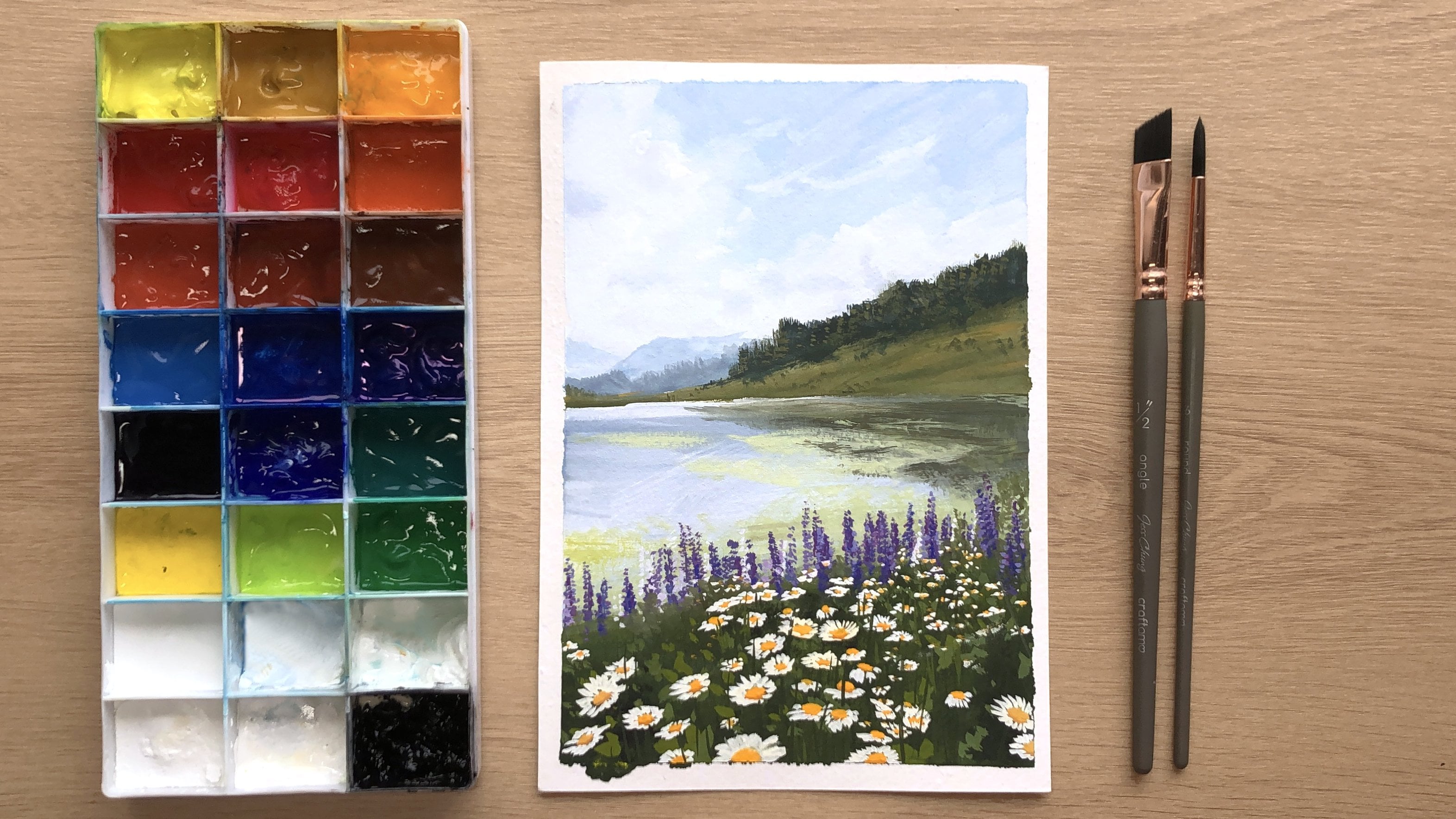
6. Study 4: Distant mountains: For our fourth one, this
one is quite beautiful. We've got a little bit of
mountains in there and a little bit more details in
the sky, so that'll be fun. I'm going to keep
the horizon line just a little bit above halfway. Then just get in that line
where the sand starts. To be honest, we could actually go ahead and do the sketch for the rest of these in one go because they are just so simple. I'll just go ahead
and do them more now. The horizon line
for the next one. I'm going to keep
that about the same, maybe a little bit lower. Got some cliffs along there, some mountains, and
then the next one. Again, similar similar height
again for the horizon line. This one down here, I'll keep the horizon line a
little bit higher. And the water reaches
down the bottom. This one, Horizon
line is very high. I've got some mountains. And the last one,
horizon line is about one third of the way
down, and there we go. So we'll just get the sketches done and
out of the way with. And let's start our painting. Once again, going in
with the flat brush, you can also use a
round brush if fat fiel a little bit more
comfortable for you. With the flat brush, I was
just cleaning it out a little. Now I'm going to
start with the sky. I'll start with some
white and just go into a bit of this orange
mixture we have here. Then maybe mix in a little
bit of cool yellow. And drop that in. And then I'm just going
to mix in a bit more of the warm yellow as I move down and keeping the
paint nice and creamy and wet so I can get really
soft transitions in there. I'm going to move it down, add in a little bit of red. I'm going for my co
rele bit more yellow. And then there's kind of
a hint of a purply gray, so I'm going to go for a
bit of ultramarine blue, which will just gray
that color down. Then I'm going to
clean off my brush, go back into some of
the lighter yellow, just soften that out. I'm also just going to go back into the yellow and the white. Mostly the white and just
drop in where the sun is. While blending out some
of the color again. Picking up a little bit of the cool yellow with the white, and just dropping that.
Right in the center. That's the sky and then
we've got the mountain. I'm just going to let
the background dry. Shouldn't take too long. For the mountain, I'm going
to grab a little bit of ultramarine blue and just
mix it with a bit of burns. There's two layers
to the mountain. The one behind is a little bit lighter and the one in
front, is just a little bit. I'm the point tip of my angle
brush now to get this in Then I'll just mix in a
little bit more blue with the burnt just to get a
slightly darker color. Ideally, the previous layer
has dried before we do this. I'll just give it a
minute to let it dry. In the meantime, we'll
talk about the next step. Water is very pale and light, very light, bluish orange color, and then the sand is quite dark. It's very similar to this, so we'll keep it nice and
d, similar color to this. So I'm just painting in
closer mountains to us. It is still slightly wet, so it's a little bit hard. Trying to get a clean edge. It's just a small study, so it's not a big deal,
so we can leave that. Then for the water, I think
I'll do a really light layer, grabbing some white and
we'll go into this area, which has a little bit of
hint of orange in there. And I'll just pick up a bit
of blue ultramarine blue. And just drop that in. I'll clean that
and for the sand. I'll go for bent umber
with ultramarine blue. So that's done. Then now switching
over to a round brush. So I want to f in orange colors into into the grabbing some of
that from my palette. And make sure that blue is
dry before you do this. It's got some warm yellow and some pinks in there and
I just drop that in. We get a little bit of
warmth feeling of warmth coming from the
reflection of the sky. Doing this really
lightly so as to avoid mixing with the blue. Because then you'll get a green. I just drop it in lightly and
soften out a bit as needed. Then I'll start with the dark. Go into a nice dark blue, I'll do ultramarine blue
with a bit of burn t umber, but more blue than
burned t umber. And we'll find that main. Just make sure your
background is d, so mine's a little bit we still, so I just means that the
blue won't be as dark going on as it is
going to try to blend with the light
color just laid down. Ve and I'm going to lighten it with
some white and just do a couple of strokes
as we've been doing, so just showing the
movement of the water. You can also use a
lighter color underneath here to that transition. I'm sort of dry brushing here
as I put the strokes on, which just means my paint is very or it's quite on the brush, and I'm just across
very lightly. Now I want to get a bit more of that sun effect glow of the sun. Going into some
white and yellow, I'm going to tap
that down right in the middle where the sun will be reflecting
down into the water. Maybe I'll grab a
little bit more of my warm yellowish color
and a bit more warmth. This way it also contrasts
against the light yellow. Then I want to grab
a little bit more white mixed with some blue, so it's not too bright and I want to paint on that
sea foam layer here. I just runs along the edge and also add a little bit of
highlight to these waves. As the water splashes down, it curves over the top. Then grabbing a
really dark blue. I'm just going to add that shadow underneath
the sea foam. What I'll do is
I'll add a bit of a darker blue just before it so that the lighter white
color can stand out a bit. Then I'll go back
into the dark blue. I just want to accent some of the darks and maybe pull
out a couple of strokes. It looks like it's
flowing flowing out, grab a little bit
more lighter blue and just transition
that a bit better. Grabbing a clean brush
now, just soften it out. Just as an added touch, maybe I want a bit
more along here. I'm just adding some
more warm yellow. This next one is done, let's move on to our fifth one.
7. Study 5: Moody sky: The next one, we've got a little bit of a
different color palette, got some more purples
and pinks in there, and the sand is a little
bit more golden yellow. I've cleaned my palette so that I'm starting with some
fresh colors this time. Again, I'm going to start with my flat brush, my angle brush. For the sky, I'm just
going to drop in some purple to start with. For the purple, I'm going
to go ultramarine blue. With some red, I prefer a cool red for some
more vibrant purples, and I'll just mix in a little
bit of white in there, I might start with a
little bit more blue, and I'll start to drop
that into the corner. Not too much. Then I'm going
to very quickly move more into my reds and my
white as I drop that in. For this one, I'm going
to mostly use the point of my brush to drop in
the colors like this. Keep things soft. Then again, going to go into more
white and more red. This is my cool red,
which is the pinkish red. I'm just going to
quickly clean off the brush and just
go into more white. Clean off the brush,
whenever I want to soften out the colors, I just clean off my brush. Now I'm just going to go into
some cool red and white. It's quite pinkish. I'm working to the
lighter areas. I'm trying to save the
really light parts of the white yellow e parts for
now and not work into it. As purple and yellow
complimentary colors. If you mix them together, things can get a
little bit gray, which is not necessarily
what you want. Now I'm ready to start
working into my yellows. For that, I'm going to
grab some white and some cool yellow and just drop that right into
the center where the sun is. Then grab some more yellow
as I make my way outwards, and drop that in, then a bit. Then I'll start mixing in a
little bit of warm yellow. I say grabbing some
of my warm yellow. Cleaning off the brush
and with a clean brush, just soften out a couple
of the colors in there. Then maybe just drop in a bit more purple
clouds over here. Okay. And once that's dri, we can paint in a little
bit of the cliff. For the cliff, I'm going to go for I would use
a yellow ocher, but maybe you don't have that, so I'll just mix the color. It'll be some yellow with
a bit of blue and red. With some white. So I just dropped that in. Then for the water, it's mostly a reflection of the sky with lots of
warm yellowish colors, which is similar to
what we've mixed here. Maybe I'll start with the
center and work my way outward, so I'll start with white
and a yellow yellow. I'll just drop that
down the center to get that bright glow in there. Then I'll work my way out. I'll go into a bit
of this mixture, which was just the sand
mixture from before. I mean the cliff mixture. Then I think we want
some purple in there. First, I'll just soften out. Transition a little bit. Then going into
some of my purples, I'm going to drop
the outer edges. And also some pinks
as we move in here. If I just look past
all the details, these are the colors
that I'm picking out the color of the sky
should give a big clue. Then for the color of the sand, we can mix that up if we
don't have yellow cha. Yellow. I'm using warm yellow, warm red, and a touch
of ultramarine blue. Maybe a bit of cool
yellow as well. And a touch of white and just bring that in clean that off again and using that clean brush just soften
it slightly ad the edges. Then switching to
our round brush. Once the background has dried, we can start getting in some
of the It's mostly sea foam. I would grab some white and it's got a pinkish purply hue, so I'll just go into the
mixtures on my palette. Grab a bit of everything, and start dropping in. Some of the leaves. I'm doing those quickly
lines again to indicate the s foam and they move or converge towards the from the perspective we're
looking at it from, I give them a little
bit of direction. So I drop that in.
Then I'm going to grab a bit more in this time. Maybe not mix it with any and drop in a highlight
around some lighter areas. We've got the highlight in and that's looking pretty good. Then we just need a little bit of a shadow underneath here. Just going to that sand
color, but this time, I'm going to darken it
with a little bit more blue and a little
bit of burnt umber. A bit of ultramarine blue, little bit of burnt umber. Go under the sea foam here and do a little shadow
line in there. A Then to help add to that sunlight effect, I want to drop a little bit more golden yellow
onto the sand, so grabbing some warm yellow and a little bit of cool yellow. I'm just going to drop
it down the center here. Lines up with the
sun. Maybe grab a little bit more cool yellow. And maybe a little white with yellow and just drop
it down the center. I think we just need a little
bit of a darker accent along the horizon line there. Go into some of my blue. Let me just accent that line a. Just looks a bit. And there may be
a bit of a shadow underneath some of the
waves in the distance. And be a little bit of
a shadow along here. There we go, the
fifth one is done. So we're a little more than halfway through
on to the next one.
8. Study 6: Pinks and purples: For this next one, we've got an overall pinkish tone
to the whole painting. For the sky, I'm going
to start with some of my red and white. We're starting with
a pinkish color. There might be a bit
of a purple hue in these pinks just because I've got some purple
on my palette, so the color is a little
bit contaminated, but it's no big deal. Now, I'm just going to
clean off the brush. I'm going to grab
some more white, mix it with a little bit of cool blue and go
in at the bottom. Also going to drop a bit into the sky and mix it
with some more white. Then maybe go back to the pink and just soften
that out a little. Clean off my brush
one more time. I'm going to pick up atle
bit more of the red. That's the sky. Then moving down into the water, it's a purplesh pinkish color, sticking with the,
mixing it in with. I think I'll go are blue. Getting that horizon line in. Then I'll just bring it down. And I add a bit of water just
to keep the paint running. We only see a little bit
of sand in this one. I clean up the brush and just picking up some burn
and ultramarine blue, and I'll just block
in that corner. Then let's do this one
without a round brush. We'll just keep using
the angle brush, see how far we can push it. So far, I haven't used
my liner brush at all. I actually don't
think I will need it. My round brush has a pointy enough tip to do all
the thin lines that I need. Now I'm just going to pick up some and I'll probably
mostly use the tip. Again, the corner
of the angle brush to do a lot of the details. With the white, I'm just
going to go into some paint I have on the palette just
so it's not a pure white. And then I'll start to
paint in the waves. There's a couple layers and I'm just marking out where they go. Then we'll go in and paint
the shadow underneath them. And then let's get
the shadow in. I'm just softening
this out a little as I think I painted it too. For the shadow, I'll just go maybe a bit of blue
and burnt umber. The bluish, green color. Just go in. Underneath, I'll mix it
with a bit of white. I don't want it to be too dark. B open Uber in there. I can also see on
the horizon line, there's a bit of a darker line.
I'm going to get that in. I just mixture with
a little bit of red. Usually, I have noticed that the horizon line is
a little bit darker. Now with a clean brush. I'll just soften
it out a little. It looks a bit more natural. Then as always, I
will soften out this blend a bit just
using a clean brush. Then I want to paint in
some of the sea foam, so grabbing some white. And I'll just scratch
it in with a dry brush. Then taking a look. I think I want to just
soften this line here. Maybe a little bit
of the pink over the sand and a bit of red into the water. And maybe just drop some
more purples and reds in. I just want a little bit
more variety in there. There's another simple one. It's a little bit
messier because I'm just choosing
the angle brush. But you can see it
can be done and it's just about getting
the idea across. Not trying to paint
something perfect. I'll just grab a
little bit more white and highlight a couple of areas. The top of the foam. Okay. And that one
is pretty much done. Maybe just a tiny bit more
accent under some areas. And then we can move on.
9. Study 7: Sunset seascape: For this next one, we've got a really beautiful sunset
sky, some beautiful colors. I'm going to start with
some bulue up here. I'll probably grab a little bit of ultramarine and
mix that with white. Maybe a bit of cool
blue in there, so a bit of your
primary or cyan blue. Then very quickly, I am going
to start mixing in white. Cleaning off my brush. Make up a drop that in and maybe just
quickly lend that out. Then I want to work
from the bottom up, starting with the yellow. I'll grab a little
bit of warm yellow. Then some white and yellow. Then just going to fill in these spaces
with some more yellow and some white. And then we'll paint
some clouds into it. So that will cover up some
of the messiness of the sky. For the clouds, I'm going
to grab a little bit of blue and some red. I'll use a red. It's a bit more of a dull color, and I'll mix in ale
bit of warm yellow. It's grayish. Drop that in here. Then
mix it with lots of white, Trop in a couple of clouds. Then soften these out. Maybe a bit more white. I've got a bit of
blue on my brush, and that's just
contaminating this a little. You can use a clean brush and just lift that out carefully. For the clouds over there, I'm going to drop a
bit of orange a it. A bit of war yellow, and a bit of mixed together. Probably do a better
job of the clouds, but I guess since this is just this is more focused
on seascapes than clouds. I'll switch to a round brush just for a bit more
control in this area. If you're not careful with this, the colors can start
to muddy and get dirty and a bit
ugly quite quickly. What I'm trying to
do is just to create that sun glow effect. I'm going to grab a bit
of white with the yellow, and that ad the cloud. Ring in a bit more
of the warm yellow. Let's move on to
doing the water. Back to my flat brush, let's block in the water
with a bluish green. I'll use my co blue. Next twist burnt umber
and a bit of yellow. And then I'll add a bit of
white and some more blue. It's a bit more colorful
in this corner here. An. Then I'll clean off the brush and soften
out those colors. Clean it off again. Now I want to drop ale bit of yellow and white into there. Grabbing some white, a
little bit of warm yellow. The colors are getting a little bit muddy because I've got blue on my brush and then if I mix that with
yellow, it becomes green. It's best to clean your brushes so that this doesn't happen. Then I will grab some
yellow and I drop that in. Then I'll mix it with some
white just to tone it down. That's the base layer upon
which we can then build. For the sand, I'll just go for some of the colors on my palette that's
already there, some of the sand
colors I already have. Maybe a bit more yellow, a bit of red. There's a shadow on the side. I'll just go into some other
blue and just get that in. I may as well paint in the
shadow now for the water. Then cleaning off my brush. Just make sure everything is
dry before the next step, which is, I'm going to go
in with some dark binds. I'll mix up a dark color. I'll just use cool
blue and burnt umber. Fine. Maybe a bit of ultramarine blue in there. I can see a bit of a darker
line at the horizon, I'll just get that in. Then I can start placing
in some darker lines, which is just the
ripples in the water. And it flows in a motion. H. Then I think I want to switch
to doing some of the waves. Cleaning that off
because it's quite dark. The waves and the foam
are not very bright. I pick up a bit of white
and I'm just going to go into my blue green mixture. I'll add a tiny bit of yellow and a tiny
bit of burnt umber. I'll use this for my waves. Oh, right. Then I'll just grab a slightly
slightly darker color to get into the waves over here. Just that in. I lost some of the shadow, also that back in. Very ilse and because we're just trying to
get a understanding of how we can approach painting seascapes without
painting all the details. Then with this lighter color, you can go ahead and add in a few more strikes
here and there. Then I want to add a little bit of warm yellow or orange in. When you do this, try not to
disturb the paint too much. Glaze it in because I don't want it to
mix with the blue or lift up any of that previous
paint because it can get. Okay Now I'm just having a look. Maybe I want to get on a
bit of that C foam here, so grabbing some white. Just going into some of
the colors on my palette. I can just maybe
glaze it on a little. First I'll find the motion. Then you can glaze it on like this and use your finger to pick
up some of the color. So we're just about
done for this one. I'm just going to finish up with a few more
finishing touches. I think maybe I want a
couple more highlights. So I'm just going to
play some highlights. And maybe a couple more waves. Go into my blue color. And just softening out
with a clean brush. Okay. And let's move on
once again to the next one.
10. Study 8: Complementary colours: This one, I'm just going to stick to using
my round brush, I think. I want to paint in the sky, which is a war pinkish orange. I'll grab my warm
yellow and my cool red. And mix with some
white on the palette. Maybe a little bit
more white in there. I'm just going to bring
it down slightly. Then I'm going to add in a
bit more yellow and red, a little less white. Then work towards the
area where the sun is. For the sun, I will
grab some yellow. With some white.
Put that in there. And just work my way
outwards from there. And then the mountains are blue. Grabbing some white and also just remembering
to mist your paints. Grabbing some white
and blue bite. Keep that first layer light. I can paint this in
once the sky has dried. The second layer, less whe, more blue, and a bit of
burn umber in there. Just to turn it down. Then for the water, I'll go to my flat brush so I can block it
in a bit faster. Overall, it's bluish color. I'll just pick up a
little bit more cool blue and mix it with some other
blues on my palette. Block that in. The lower
half a little bit. I'm going to mix in
a bit more blue. And then for the sand. Kind of orangish purple. I think I'll just block
it in with a warm yellow, which is a little bit more
orange with a bit of in the. And a bit of white. M That's the base color. I didn't let this touch too much because orange and
blue is muddy. I'm just going to
that be for now, details over the top after. Going back to the bruh, I'm going to mi up a bit more of a darker blue using my
blues and my burnt umber. A and just go over that horizon line a little. I'm seeing a third layer
of something there. Just going to get that in. Maybe I'll lighten it slightly. And I will use it for the w. And also the thin finer
waves going up and down as well as some
details in the foreground. And then I can go
into a lighter color. Before I do that,
with the dark color, I'm just going to go in
to do the line here. Then with that same color, I'll take off some of
the paint either on the palette or on my
towel and I'm going to dry and dry brush in a little
bit of color over the sand. Brushing means minimal
moisture on the bruh. You get a look. This also works better on rough and cold press paper as the tooth of the paper can pick up some of the
paint, but not all of it. And I might grab a bit more
white and a bit of blue. I just add a tiny bit of water because it's
just a bit too dry. I can see some of the light
of foam color coming here. I just try brush that on. Then with a lighter color, grabbing a bit more white. I can get in some
of the highlights. I want to highlight
just above this. And then a little bit over here. I also want to get
the waves in here. So I just do a little
rounded motions to show movement in the water. Then maybe go into some
darker blue once again, just to get a little
bit of shadow in there, so doing rounded motions. Then as for this wave, you just want to
soften out that edge. Looks like it's blending in, and then maybe you want to
act in the darkest area down here and just make the
or the top bit lighter. It looks like the
water is c over. You know, I. Then I'm just going to soften some
of this out a clean brush. Maybe a couple more
highlights over here. And a bit bit of yellow and
orange down the center. Okay. And onto our last one now.
11. Study 9: Final seascape: For our last one, we've got a sky transition from blue all the way
through to orangead. I'm going to do this with a round brush for a
bit more control. For the blue, I'm just going
to go for my cool blue and white As I move down, I am just going to keep
adding white to the mixture. Then at a certain point, I like to stop and work upwards from the yellow or the orange upwards because I find that the color just stays a little bit cleaner
if I do it that way. I'm going to grab a
little bit more white, just pure white and
just lay that down. Having that strip in
between helps me to transition the colors together without it mudding too much. Now I'll clean off my brush and I'll move
from the bottom up. I'll start with my warm yellow, and it's a purply orange. But I think I'll just start
with a reddish orange. And I'll just bring it
all the way across. Then as I move up, I'm going to add more
yellow and white. I'm going to add a
bit of cool yellow to my mixture and bring
it up a little bit. And then ale bit more cool
yellow. Bring it up a bit. Then my brush off and go
white with cool yellow. T. Clean that off,
and I'm just going to smooth out this blend first, clean that off and then
smooth out the blend above. Then I'm going to pick
up some more yellow, drop it into here
where the sun is. Then when this is dry, we
can come in with white and just do a little dot
to indicate the sun. Now for the For the water, I'll switch back to my flat
brush or my angle brush. I'm going to block in the color, which is a light
bluey green color. Grabbing some white,
going into my blue, which is what I use for the sky, and maybe just mixing a tiny
bit of yellow into there. Then as we move down,
it grows darker. I'll mix in some
ultramarine blue. Also up here, there's a
little bit more blue. I'll just block this
part in darker color. Then I'll go back into some lighter color
to blend that out. Clean off my brush again and I can see my
lines a little bit. I'm just going to
straighten it out. And then for the sand, it's just a really
dark dark color, so going into some burnt
umber and ultramarine blue. Our base color is in, now clean off my brush again. I switch to my round brush. I'm going to start with
a dark color once again, just blue and burnt and I'm going to get in
some of those distant. Then there's some waves
pulling in this way. I'll just lightly indicate those as well as adding bit of bumps and
shadows along here. I might even just darken this area with a little
bit more ultramarine blue. Using a clean brush, I'm just going to soften
that color in there. Then grabbing some lighter blue ultramarine blue and white. I'm going to paint on sea foam. Adding some white
to make it lighter. Paint on some highlights. Might want to wait a little
bit for this to dry first. Then what I also want
to do is get some of the sky color into the water, and I also want to
paint on the sun. Grabbing some pure white. I'm just going to dt that
right in the center. Now we know where the center is, we can grab some of the warm
colors from the sky and just glaze it on lightly
down the center. Then I'll need a
bit more detail. I think I'll grab some
more lighter colors, so white and blue. I add a bit more
highlight to the foam, and then some more highlights. Then going back to
a darker color. I'm going to go underneath
what I just painted. Have a d. And just soften out a
couple of transitions, so it's not too harsh. A bit more highlight. Little bit of a
shadow along here. H. Just dry rushing in a bit of texture to
keep it interesting. Maybe a bit of a light
yellow highlight, so just some white
and cool yellow. A couple of highlights to show a bit of the
glow of the sun. I think we're done
with our final one. Now for my favorite
part of the process, which is taking off
the washi tape. This one, I think
will look extra good because we've
painted this in this grid style with really
thin strips of washi tape. I'm really looking forward
to taking all of this. If you ever have trouble
with your paper ripping, when you're taking off the tape, you can just use some heat, so a hair dryer along the
tape and that will help. I'm usually quite lazy,
so I don't do that. Another thing to do is to
away from your painting, that will also help reduce it or if it does into
your painting. And the last one. I hope doing these nine little
seascape studies helped you understand my thinking behind how I approach seascapes. These are a little bit
rough and that's because they're small and I don't
want to work on details. But you can take the
concept and the idea behind each of them and turn
them into a bigger painting. The next two classes
we're going to be doing two separate scapes
in a larger size.
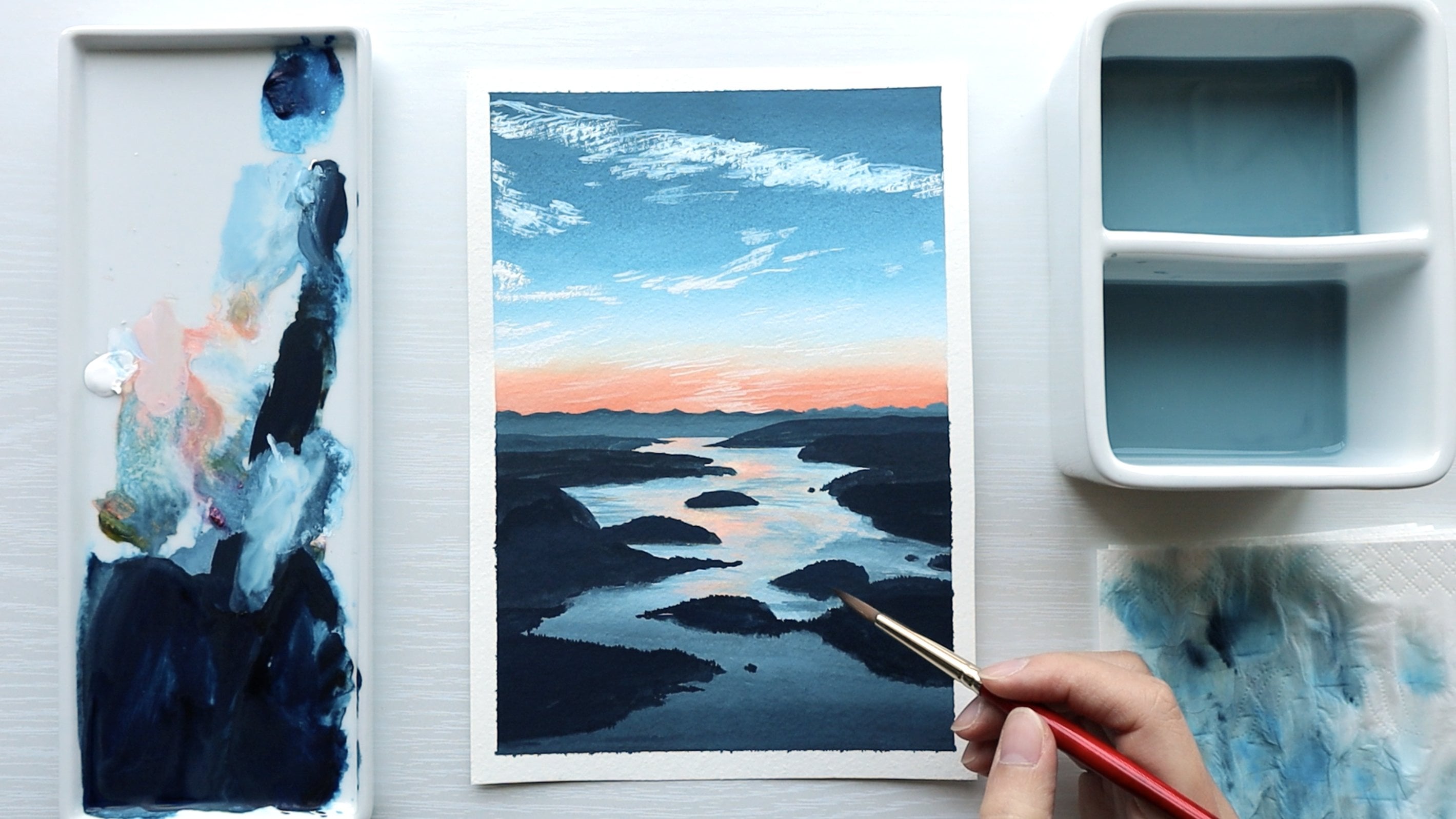
12. Sunset Seascape 1 - part 1: For this first scape, you're going to see how
we put into practice, all of the things we learned from doing
the small studies. The process is
basically the same, but we just spend a little
bit more time painting the details and since we're working on a bigger
piece of paper. The paper I'm painting on, the size is a bit
smaller than A five, but bigger than A six. For my brushes, I have
picked out four to use. I've got the half
inch angle brush four the block in of
the sky and the water. I've got both my size eight
and size six round brush and then a size one liner brush for a couple of thin lines. As usual, we're going to do a really quick sketch this one. I'm just going to place
in the horizon line. I'll keep that at about maybe
a quarter of the way down. And then just to kind of get an idea for the
placement of everything. I will just lightly
sketch in some things, but I don't have to stick
to it while I'm painting. This is just to get an idea
for how much space I'll have. I'm just lightly
penciling in some of the big waves just to see
if I can fit everything in. I'll probably reduce the amount of space dedicated to the sand. It's all very dark here, so it's a bit hard to see where the sand starts or ends and where
the water starts. Sometimes you have to
adjust your sketch because the reference photo is not the same dimensions as the
paper you're painting on, you make small adjustments
to accommodate for that. But I'm pretty happy with
the placement of this. I just lightly erase some of the lines there because
the sky is quite light. And we can get started
with painting. For the sky, I'm going to use my half inch angle brush and I just wet my brush
a little to start with. What I'll do, I'll start with some purples around the edges and work in towards a
pinkish orange color, and I'll try and leave
this white area, leave it white of the paper, and then I'll go in with
white gh to work into there. To start with the sky, It's a muted purple. I'll start with some white and then I'll grab a little
bit of ultramarine blue. And a little bit of red. When it comes to red,
I have two choices, I have a warm red which leans more towards orange
or a cool red, which leans more towards purple. Mixing a cool red with blue will produce a more saturated purple. That's what I'm thinking when I decide which red
I want to go for. This purple is actually
a little less saturated. It's a little bit more gray. I'm going to go for my warm red. I want to keep the
paint nice and creamy. In order to do
that, I'm going to just mix up a little bit more. Just white ultramarine
blue and a touch of red. We only need a little bit
of purple for the sky. We need it more maybe
for the water later. Then I'm going to add in more
white as I sweep across. I want to add in more red. I'll add in a bit more red, but to make it pink, I'm going to add in
more white once again. Then it very quickly transitions to more
of an orange color. There is a bit of difficulty
trying to transition purple and orange or purple and yellow because
they are complimentary. You do want to be careful to avoid making the colors very gray when you
mix it together. I've just roughly
cleaned off the brush and I'm just going to
soften out this area, and then I will
pick up some more white and grab some
of my warm yellow. And mix it with a little
bit of re this time. Maybe I'll just start from the bottom and work
my way upwards. A bit of cool red with my warm yellow produces a
really nice peachy color I want to start to
blend out the colors. I usually find adding a little
bit of white can help to just neutralize any
mudding that happens. I bring that down a little
and then I want to add in more of cool yellow and a
little less pink in there. I just clean off my brush
again and go into some of the pinky purple just to
soften out this area a little. And then go into some white
and some warm yellow. And I'm using the tip of my brush here to do
some sweeping motion to get some soft blend into the sky because it looks a little bit stiff
at the moment. Then I'm just going
to clean this off and now just going
into some white. I'm going to try and lay in some white right in the center here and
then bring that out. I think the sky
would look nicer if everything was a
little bit creamy and wet so you could work into it. Then I've picked up
some cool yellow to mix with the white. T. And I'm just going to
still using the corner of the angle brush to just
sweep that color in. Then I want to go
back to some of my purply pinkish color and
just do the same thing. I know the paint has
mostly dried on the paper. It's a little bit hard to
sweep in things softly, but I'm going to give it a go. I just try to sweep
in the paint. Cleaning off my brush and maybe just cleaning up any areas. I'm just saying if
there's any other areas, I can soften now add a
little bit more color. I'm going to get a little
bit of purple into here. Now the paint consistency is
more on the thinner side as I'm over some of the colors. I think the top corner need
to be just a tad bit darker, so I'm just going to go in. Just a bit of the purple. Maybe it's a bit too purple, so I'm going to mix
it with some orange just to bring down
that purpleness. Then before I start to over it, I'm just going to smooth out a couple of
things and move on. Moving on now to the water, and we're going to
do the same thing as what we did for our studies, ignoring all the
waves and details. I'm looking for that.
So in the center, it's looking a little bit more Of a light pinkish color, and I can actually
split it off into this section and
then this section because the blocks of
color are quite obvious. For this section up here
without the big waves, it's more of a pale
pinkish color. On the outside, it's
a little bit more of a pinkish purple. Then closer to the horizon, it's a little bit more purple. Down here, base
color is quite dark. I'll start with more of
a purple base color. Let's start with that
pinkish base color first. I'm going to mix up a nice
big batch of that color. Lots of white because it's
quite light and then just a little bit of warm
yellow and cool pink. You can compare that
base color to the colors in the sky and determine is it very similar to one
of the colors you see and is the lightness and
darkness about the same? I think the color is quite
similar to over here, maybe just a little
bit lighter in value. I'll mix up a little bit
of re with my warm yellow. I think it just needs to be
a little lighter than that. I mix in a bit more white. Maybe I'll mix in a touch
of cool yellow as well. Now I want to just go in
and block all of that in. The paint is nice and creamy. The outer edges a b, ale bit more pinkish purple, so I'll just go into the
mixture on my palette over here and just pick up some of that and then sweep that in. Maybe a bit of I noticed the horizon line
is a little bit darker. We can paint that in later with a round brush or line of brush. For now, I'm just blocking
in that base color. Once again, it doesn't
have to be too smooth in transition because a lot of
the waves will cover that. Soften that out and then
for the part down here, I'm just going to
clean up my brush so we can mix up a
much darker color. I will go with a purple, starting with ultramarine blue. Again, going to keep the paint nice and creamy
and you can mix up a big batch since we'll be using this for a lot
of the painting. Then once again, I'm
thinking if I want it to be a vibrant purple or not, and I think it's less vibrant. I'm a re. You can also use a
combination of boats. If I put in warm red and I
realize it's a bit dull, I can add some cool red
just to experiment. Bring up the saturation a bit. I'm going to add a bit
of burnt umber into it. Then I'm going to start
blocking the base color. Maybe I'll mix with a
little bit of the white on my pallet or the base color. Actually it's a little bit
pinkish in some areas, so I'll mix in a
bit of cool red. It's a bit. It's a bit lighter up the top here and then much
darker down the bottom. For the bottom part, I'm going
to mix darker color here. I'm going to mix in b m with the ultramarine blue and red. That should get me a color. Then for the sand
down the bottom, it's more of a reddish. So a reddish purple. I'm going to mix in my
red and ultramarine blue. That maybe a bit more cool red in there and then some burnt. That in. There's a little
bit more re in that mixture. Okay. So we've got our
base colors blocked in. Now we can start working
on the waves on top.
13. Sunset Seascape 1 - part 2: I want to start
working on the details starting from top
to bottom, I think. I've switched to a
size six round brush, which has a fairly pointed tip, should be able to do
some thin lines with it, but if not, I'll switch
to my line of brush. Starting with the horizon line, I notice it's a
little bit darker, a little bit more purple. I'm just going to
start with that. I'll just pick up some colors I already have on my palette. And I just try to keep my hand steady while I draw
this line across, and it's a little bit
darker on the outer edges. So I keep that in mind. I move lighter as I move
towards the center. Then starting with
this darker purple, we can start to paint in some of the ripples of the water. Just like what we were doing before with the small studies, you want to start with
these thin strokes to indicate the movement
of the water and the further away
in the distance. The water, the
smaller, the ripple, so I should actually keep
them nice and thin and short. Then as we move
towards the waves, they will become
bigger, wider, longer. I keep all of that in
mind as I'm doing this. If it's easier for you, you can always switch
to a line of brush. What I like to do is flatten
my brush on the palette so that I use the side
that's flat and thin. I can a thin lines
even though my round brush that point and not that s. Another thing I keep in mind is down the center. Everything is just a little bit lighter because the sun is shining down and everything further out is just
a little bit darker. I know we're not
going to be able to paint in every stroke. The idea is to just just
paint the gist of things. I might move on to a
bit of a darker purple and get in a couple
of the bigger waves. I have a better sense of
what I'm working with. For these, you just
paint a little peak. It looks rough to start
with and very harsh, but we will come in and soften it out and make it
look soft like a wave. And I'm even coming into
this darker section to paint in some of the waves over here to get an idea for this
placement of everything. I'm getting some darker
waves into here. I'm actually seeing
that it's maybe a little bit more darker purple on the outside the base
color than I had painted in. I might need to color
or I could just a it. If you had to it in, you would use really thin do paint and just wash it
over the top like this. And by washing it in like this, you don't have to blend too much with what you
blad down underneath. Your paper will start
to buckle a little, especially if you're using really thin paper or paper
that's at least 300 SM. Because when you glaze a lot of water going onto the paper. I I just glaze that in so I could just
darken that base color a bit, now I'm just sweeping
back and forth. I'm thinking about
how I can create the look of the water without spending too
much time and effort, trying to paint every stroke in. If I just do ale bit of this, sweeping back and forth with
thin paint on my brush, I can get a little bit of detail in without using much time. Then I'm looking and
I'm thinking that maybe I will work on this
part a little bit as well. I work on the shapes of all
the waves and then I'll come in and start to
highlight all of them. I'm going to just pick up some
more of the paint I mixed, or if you've run out,
it just mix a bit more, ultramarine blue with a warm red and maybe a little
bit of burnt umber. I'm going to shape
out this main wave which goes up like this. Then you can see the flow of the water
flows down this way. I just indicate it for now. Then we've got another
wave that falls like this. And then the main or the big
was up here which really. So I just block out those
shapes to start with. This one goes down here. Then I'm seeing if I can use
this dark color to do any more was to maybe
just a few strokes. Big waves. Over here in the
distance, I see. We'll keep threading
the colors through. We'll use some pinks, we'll use some oranges, we'll highlight some colors
and just keep threading the strokes to bring
this all together. Now might be a good time
to maybe just to move on to a different color. I'll start adding a little
bit of a highlight. Not a highlight, start to add some light in between the
dark so we can get an idea. The light color, it's a
litle bit more pinkish, I'll use warm yellow and
mixed together with white. What we do is we
just place that on top and we indicate the flow of the water
with these strokes. For example, this one here, I can see the water flows
over the top like this. I just place a bit of that in, then it flows down. I move with the way
the water moves. Because what's happening
with the wave is as the water comes up and rises. You get the darkest
shadow underneath here, and then the brightest
light just above it, and then a smooth gradation
or transition out. That's what we're
trying to mimic when we're painting waves like this. Above all those dark
waves, I just paint it in. I'm going to place ale bit
of this light line in, and I'll also just thread
it throughout the water to. We're going to add a
little bit more things in. So I'm going to just
start threading it and just adding a little bit of
this color all throughout. Then I'll probably
realize that I want a little bit more
dark waves in this. This process is back and forth. I keep moving between
the light and the dark while also
transitioning out the color. I'll add a bit to these
waves to just to indicate, but they're a little
bit different because the water is actually
splashing up over the top. The effect is a
little bit different. Next, I want to
clean off my brush and start to work on the
gradations a little. Right now, these peaks all look a little bit
harsh and awkward. I'm going to actually, first, I want to paint in a
few more darker lines. Now that I've started
to fill up everything, I feel like I need a
few more waves just to keep this looking
busier and more natural. I bring these waves
out a little, make them a bit bigger. And just add a little bit
more things going on in here. Then how I start to build in the gradation of the waves is I just gradually
lighten the color. I'll start with a bit
of white mixed into this and I'll just
go underneath the w. I just look at the wa it's
falling falling off this w.
14. Sunset Seascape 1 - part 3: I think I want a little
bit of red in here, mixing in some cool red. Maybe a bit more.
Getting some red into here and just tapping it on
a get some texture in there. You just want to smooth transition out from the
darkest shadow color. Then I can see over
here, it's even lighter, so I'm going to paint
some strokes in there. I'm mostly just using the
colors on my palette. You can see this is my darkest. This is in the middle and this is my lighter
highlight color. I just dip my brush in to
each pile as I move around. But by doing this, I have a nice color harmony
on my palette because the colors are coming from
similar set of colors. I'm just adding in
some more cool red, make the color a little
bit a little bit nicer. Then Just taking those
few as an example, I'm going to clean
off my brush and you can if the lay down
was creamy enough, you can soften out the edge just by using a
slightly wet brush. When you do this, you want to regularly just wash
off your brush. So there's not too
much paint in there. You can use your
fingers to take off any excess moisture or just to feel how much
moisture in there. You're in control
and then just sweep underneath and you should
be able to soften out. If you're having
difficulty, then next time, lay a gash on the so that
when you go to soften it out, there is enough creamy gash
there for you to do that. The other option
is just to pick up a bit more paint and instead
of just softening out, the blend, you can
drop in a bit of paint while softening it out. And now this wave looks a
lot more soft and natural. You just take that idea and
do it across everything else. You don't have to
soften out everything. It's more just the
main or bigger waves. Then once you've done that, you can go ahead and maybe
paint in some more waves, just keep keep adding to this, so it doesn't feel empty. If you see a certain area, maybe it's a little bit darker, you can glaze a color
in like we did before. Maybe I'll try glazing
in some of this pink. Into here. Maybe I'll paint on another bigger wave there and
now I know how to soften it out and how to add
a highlight to it. At the same time, I'm working
on these waves down here. I want to darken the darkest
part a little bit more. I'm going to mix a little
bit more burnt umber into the mixture and get in a couple of those dark lines and place them just underneath here at the darkest
point of the wave. You'll notice with gas
that dark color is dry lighter and the more runny your paint is when
you lay it down, the lighter or the greater the value change once
the paint has dried. Even though right now it looks really dark when
I'm laying it down, I know that it's going
to dry much lighter. I'll just let it dry and see what happens or how light it dries to and then
I'll work with it from there. Then I'm just seeing how I can fill up a little bit
more of this empty space. The has mostly dried and I
can see it's quite dark. Now I can start to get a bit of gradation in by going
in with a color that's not quite as just to step down and value in
that just underneath, so I can transition that out. Then I'll move down and I'll work a little bit on
the waves down here. So with this one, I think it needs that
really dark area as well. I'm just shaping
it out a little. And then What I'll probably do to paint
on this effect is stipple on the colors, the water flying up. I'll save that for a bit later. What I will do is maybe paint on some of the lighter
foamy colors here. I add a bit of white to
the purple mixture and I just tap on some of the
famines. Same with here. I love the pinks in the foams, so I'm going to mix in
a bit more cool red. Hey, I leave those at
this stage for now. Just cleaning off my brush
and with a clean brush, I think I'll just try
and soften some areas. So the brush with
some moisture in it. Now, I'd like to add a bit of a pinkish orange glow
or a color throughout. I feel like it's missing a
little bit of that warmth. I'm just going to mix a bit more with my warm
yellow and white. And just test out that in there. It should be a nice warm
peachy color that you can just thread throughout
throughout the water. I think it will just warm
up the colors a little bit to help convey
that setting sun look. I'm just threading
that color throughout. I noticed a little bit
more in this corners. I'm going to place
a bit more here. I'm going to add a little bit of white These thin highlight strokes over the darker waves is a great way to indicate
the flow of the water. If you want it to flow a w, just indicate that the movement
of your bruh make them. Then I'm just going
to clean that off. I feel like I need a
couple more main waves. Just a bit more of a dark
purple in the distance. I'm doing a slight
brushing where I just brush the texture
of my brush on there. I notice a little bit
more of an orange glow. We can work on that when we
work on the center glow. For now, I'm just
picking up a bit more of my dark purple and I'm
adding a bit more strokes. So you can see how
layer by layer, we are starting to build up the details and
the body of water. I'm just adding a little
bit more over here. It just feels a bit empty.
15. Sunset Seascape 1 part 4: Then if you want, you can just soften out the blends
of those darker waves. You just placed it in by placing a slightly lighter color
just underneath them. Then I like to maybe do
the glow down the center. There's a really bright orange just under here
along the horizon. I paint that in first. Then we've got a bright
yellow whitish glow. Before I do that, I'm
going to do a couple of pinky purple streaks down the center because when
I place in the white, it will stand out or will look white if I have some darker
contrast against it. Now going into my white and
a bit of my cool yellow. I can just do these
strokes down the center. I try to keep it a bit
thicker so that way. It can be quite
light in value and I won't be reactivating
any paint underneath. Then you can use this highlight
color for a couple of areas just to add that little bit of extra
highlight on the waves. I might mix a bit of
warm yellow into there. We've got that nice glow effect. I'm going to clean that off, and then I will start to work more on this
area down here. For these waves, I really love the beautiful
pink colors in there. Maybe I'll start with that. It's a mixture we
were using before, which was just,
yellow and white. And to paint on the
splashy texture, I'm just going to
tap with my brush. As the water flies up, I'm just going to
tap upwards and just get the idea of the
foam flying up. You can also dry brush
on a little bit of that flying flying water. Later we'll actually come in with some paint and splatter
on, which will be fun. I'm getting on most of
this pinkish color, then I'll probably move
down to a more purple. I'm just going to mix with
the colors on my palette, move in towards the purples. And to paint the
gradation of the water. You just have to
find the darkest point and gradate outwards. It's a bit hard to see where
the water starts and ends. I'll just keep it vague. I'll need a slightly
lighter purple for working the gradation. And I'll just grate it down with some bent tumba and
just tap tap that in. Now I'm going to get a little bit more of this
yellow splatter in there. So grabbing some whe and
a bit of and cool yellow. What you can do is you can
splatter on the paint. You'll need I'll try it
with this round brush, but you'll want to cover any areas of your painting where you don't want
it to splatter. I'm being a bit lazy, so I'm just going to go for it. You can see the paint
has to be somewhat wet, so it can fly off the brush
and you can just tap either with your finger or
with another brush. If it's not wet enough, the paint won't fly off. You can see some of the
splatters coming off. Ideally, you might want to cover a little bit
of this section, so that not too much
of it gets in there. And then I'm going to pick up some other pinks and
splatter that on. You can use a different brush. That probably works a bit
better than using your fingers. And then for the main ones
I'll just tap on a bit more. So that sputtering just
gives it more natural. I look. Going back to my bright yellow And then my dark purple. I'm just going to cover
some of the splatters. Now I'm just working
on some final details. I want to add a couple
more highlights. Using white and yellow. I'm thinking I'll
highlight around here because this is
towards the center. It's catching a bit more of the sun rays as it comes down. And then I'm also
just taking a look at everything and seeing if there's anything
I need to adjust. I might just go back
into a darker purple and just we in a couple
more lines here and there, to build up the texture
in the water once again. So just adding in some
finishing touches, just looking at my painting
and seeing what it needs? And I've just got some reddish
purple on my brush just seem I can add in a
final little bit more of color before I finish
off the painting. Last bit is this water
or the sand down here. I've kept it loose, and I think I'll just
let it remain that way. Could maybe add a bit of a lighter highlight
down here as the water. As the sand catches a bit of
the a bit of the sun rays, but also a lot of it is
covered by the w coming up. Hey. One last look at the painting, see if it needs anything else. I think overall, it looks good and I'm happy
with how it turned out. I'll leave that one as it is. We'll take off the
mask and then I've got one more for this class
that we're going to do, and the next one is actually a little bit
easier than this one.
16. Seascape 2 - part 1: The second sea scape that we're painting is easier
than the first, and it's very similar, I'd say to the small
studies that we did. Let's just jump right in and get started
with the painting. I'm going to place
in the horizon line, I think I'll just keep
it in the middle. About halfway down,
maybe I'll just dedicate a little bit
more space to the water. Above halfway. And then I want to
also just sketch in where the water goes up to comes down at an
angle and then it comes out in and then
we've got a main wave. I just the slightly bigger
wave in the foreground here. They're all very small. The water is quite calm. And so that's going to be
the extent of my sketch, and I'll just slightly
just lighten that. For this one, I'm also going to start with my half
inch angle brush, and we're going to paint in a gradation from blue to pretty much almost a white into
a pinky purple color. I'll start with the blue
at the top and I'm going to start with a lot of white
because it's quite light, and I'm going to mix up
some nice creamy paint so I can blend the sky nicely, and I'll use a cool blue like a primary blue
starting at the top, I'm just going to block that in. As I move down, I just
mix in more paint. I add a little bit of water
to make the paint flow nice, but I'm also bringing
in more paint. It's nice and creamy
and then I'll add a bit of a little bit of
pink or a cool red. I accidentally
picked up too much, so I'm just taking
it off and then just adding the tiniest bit of it in as I start to transition
down a little bit more. Then I'm just going to
clean off my brush, and I'll just pick up
some pure white paint. I find that that helps me to transition colors that
might otherwise muddy. Then I'm going to start from the bottom and work
my way upwards. It's a bit of a pinkish purple. I'll just grab some of that. I'll mix it with the blue. And I'll start at the bottom. Then as I move up, I'm going to add more of
the red and more white. Again, I like to use the
corner of this angle brush. I bring it up slightly, then I think I'm going
to clean off the paint. And go into a b of
warm yellow and a of my cool red and just get
that pink part in here. Still using the corner of the brush because that
works really well for getting a thinner
stroke while blending it out and then grabbing some white and a bit more
yellow bit more white. Paint is still nice and creamy. I work it up a little bit more and then I'm going
to clean off my brush for more time and
using a clean brush. Mostly clean brush. I'm just going to
soften out over what I just laid down and because
the mixture was creamy, so there is a good amount of paint on the paper
for me to blend out. Otherwise, you'll find
that you'll start lifting the color and
become really thin. I didn't leave the center part. I didn't leave the part
where the sun is white. I'll come back later with really thick white
paint to paint that in. Now I'm just looking and seeing if I need to add in any color. I'm adding a little bit more
of pinkish glow into here. And then cleaning off my brush. That was a just nice and
soft sky transition. Then once that's dried, I'm going to pick up we, just pure white, and
I'm just going to it in where the sun is
right in the center. And just make sure your
gouache is nice and thick, so you can just layer
it on very thick. Then around it, I'm going to just add a tiny
bit of cool yellow. Just add a hint of
yellow around it. So just a slight yellow
glow around the sun. And then we can start to paint in the base
color for the water. I'm seeing a bluish
color in the center, it's a bit more
pinkish and over here, the sand is a dark brown color, and then I know we'll probably need to do a
little bit of glazing or something for this area where the water has
made the sand wet. I'll start with a blue and it's quite light about
the same as the sky. Starting with my cool blue and white I'll get a touch of in there, so it's a bit purply. Maybe a touch of
burnt umber just to tone down the blue a little. I'll just go right
across the horizon line. Then I'm just looking at the color seeing if
I need to change it. Think I'm going to
go a bit purplesh. I'll go into this part. It's a bit pinkish purple. And just sweep a bit of that in. It is quite pink in some areas, using white and my re. I just sweep that in and
because the paint is a bit wet, it just blends nicely. I'm getting the base color down. It's also pinkish down here. Then it's a bit here. I'm thinking we'll go back
to the blue with a bit of burnt and a bit of white. So it's like a grayish
blue down here. A little bit more
b umber down here. Then I'll just soften
out the blend a little. So it's not too harsh. Whenever you're blending
two colors that are very different and you
don't want it to muddy, you just have to constantly
clean off your brush so that you go in
with a clean brush when you're sweeping
back and forth. Now I'll do the dark
sand in the corner. Actually, I'll lay on some
of this pink over here. Lay on a bit of that color. There has a bit of
that bluey pink color here. Purplely pink. Then for the sand, I'll go with a burnt umber and
the blue we've been using. Then for this section, I'll just add a bit of
white to the paint. Then if we need to
do any glazing, I'll do that once I
painted a bit more. For now, I just want to
make sure every bit of the paper is covered
in some paint. After this, I can switch
to my round brush. I'm going to use my
size six round brush as I was doing for the
previous sea scape. Once again, I'll start
from the horizon line, which is a little bit
more of a dark blue. Starting with some blue, just mixing it in to the
colors I have on the palette. And I'm just going to get
that horizon line in. Then with this dark color, you can start laying
in the waves. I might just start by
getting in the darkest. The biggest one here. I'm using the same mixture of burnt umber and my cool blue. Just by varying the ratio
of blue to burnt umber, you can get a different color. The more burnt umber you add, the more gray it becomes
and the more blue you add, the more bluey green it becomes. Same steps as what
we've been doing for our previous
seascapes marking in the dark waves with a dark
color and then we'll come in and add the light and
also soften out the waves. I do my best to not make
the waves very rigid. I try to make them
different sizes and shapes and to not have too much repetition of
the same wavy shape.
17. Seascape 2 part 2: In the distance, same as before, the lines are thinner and. When you first lay them down
on the paper like this, it can look very harsh. But as you build up the
details and layers, then it doesn't look
so out of place. Oh. I'm just going to keep adding details. Maybe I will dry brush a little bit of the
distant waves on. Basically, it's using the
shape of my brush hairs. I flatten it out on the palette. The paint is not too
wet and I can just do some quick sweeping lines
over the paper and that helps me to just cover
some of the area without having to painstakingly paint on every bit of detail. By fanning my brush out on the palette as
I pick up paint, then I can drag across
and create some textures. So I just want to cover a
little bit more ground. I want to cover a bit
more of the water. That's looking
pretty good so far. Then what I'll do
is I will just add a little bit of white to my mixture and I'll start transitioning
out some of the waves. That just means placing on
that lighter color underneath. And then I can come in with a clean brush to soften
out the transition. Now that things have dried, I can see it's probably a little bit lighter than what I'd like the darkest part to be. I will come in and with
a darker color after. I'm also going to take the
slightly lighter blue and just in, scatter that as. Again, looking at how the water flows across these waves and I paint paint my brush strokes
in that same direction. Also going to use
this color just to out where the foam starts. Just going to add
a bit more to it. We've got that line in. Now, I just clean off my brush
and using a clean brush. I'll just go in and soften a. But I do feel like I need a little bit more paint
on the paper to do this. I add some paint, then I go back to softening. When I start to soften, if I feel like I'm lifting
off too much paint, then that's a sign that I either didn't lay down
enough paint to start with or it's just a little
bit more tricky because the paint has dried since
I first laid it down. It just means you need to
lay down a bit more paint before you and
soften things out. And then Then as I said before, I'm just going to darken
the darkest part a bit. Mixing some blue and bent
umber without any white in it. You can add a little bit of
black to help you darken. That's totally fine. I'm just going to go into
the des part of these waves. Mm. By adding in some of the
darkest areas in here, it just adds depth and helps the waves to
look three dimensional. Again, I like to just paint
them with a bit of a flow. M. Then I'll clean that off. Actually, I could use that for the shadow
underneath the foam. Using that I'm going to go in underneath the foam we painted before and just get
that shadow in there. Comes out over here as well. And then I'm going to clean
that off and I'm going to go into a light blue with some
white and some of my blue. This is going to be a bit
of a high light color. I'm going over the light. Just the top where the light
would s over the wave. I'm just adding
that highlight on to while spilling it
over a little bit. You can also work
some lines into this area and just
throughout as well, wherever you want to add
a bit of a highlight. On top of the dark w, this is where I'm going
to add the highlight. Then I will clean off my brush. I want to soften out this
dark transition a bit. Just with a clean brush, you can go into some of
the dark paint and just work it in and soften out. I think I actually want a
little bit of the co here. Then I'm just working
in a bit of textures into this area with just a dry brush and
I'm going to add a little bit more waves and
details into that front area. Still using blue
and burnt umber. I'm going to paint on
a couple of strokes. You also want to add a highlight
and shadow to the foam. So we can do that
in a little bit. I'm just dry brushing on
a little bit of texture. I can dry brush on some
of the reflections. When the sand is wet, it has this gray reflective
look and you can use a bit of dry brushing to help with
that or a bit of glazing. This corner over here
is a bit darker, a little bit more brown, so I just add a bit more
bent to the mixture. Then I can just blend it out by my brush and softening
that transition.
18. Seascape 2 part 3: For the foam, which
bumps up here, you want to add highlight. Maybe we can do the highlight
down the center now. I would grab I'll start with some pink using
white and my red. I'll mix a little
bit of warm yellow into it to give it
that peachy color. Then if you just follow
the sun down the center, you can see it picks up
that nice pinky color here. And then I'll just add
a little bit more whe, a little bit more yellow. Actually, I'll mix
in a bit of blue. I want a bit of a
purply color to just add a little bit more of the sky color
into the water. With this purply color, you can do a couple of
strokes in the water. There may be some
more blue strokes. It just helps with the contrast. Then going into a yellow, I'll use a cool
yellow and white, and you just want to tap
that down. In the center, Using these colors, you can highlight a bit on
the sea foam as well. Then clean that off. For this transition, it's a little bit harsh
at the moment. To paint on that
reflective quality, I'm going to go into my pinkish color and
just glaze a bit on. Then using a clean brush, just soften that out and also just soften
out the side too. I'm trying to soften it
out without making it. I'm going to glaze a bit
of the blue and then bring a little bit of that
sand color into there. That's the gist of it, then I'll grab some
other colors and just drop that in there. It has some of that
reflective quality in there. Then I want to clean
up the sea foam, grabbing some white
and some of the blue. I'm just going to go around and re outline it because
some of it got lost. And then just add
the shadow back in underneath as well where it may have got a little bit lost. Then I just want
to add actually, first, I want to glaze a little
bit more blue over here. And then maybe add a
bit of a highlight. Then I just want to work on a bit of details
here, and that's it. I want to show a bit of
the movement of the water. I'll just do squiggles. Okay. Almost done. I'm just going to go into
the highlight again. So the pinky color and just
had a bit of highlight to some of the dark lines I ped in. Then grabbing some of
this dark bluey gray. I'm just going to stat
in a bit more dots and squiggles just
to make it look. I might just push this in a bit, push this bit up a by bringing in some of
that darker paint, which I'm just in and
softening out with my brush. Just very softly
pushing that up. So the shape looks a
bit more natural to me. Then just if I need
anything else. My bit of a shadow here. Dry brush or glaze that in. Hey, I might grab a little
bit of a lighter blue and just do a couple more lines. I think this painting
is also finished. Now I'll just take
off the tape for this so we can see what the
finished piece looks like. I hope you can see how we use those small studies to get an understanding
of the approach, and then you can see how
we can just easily apply the same thing to
a bigger painting.
 Jess Chung, Gouache Artist