Transcripts
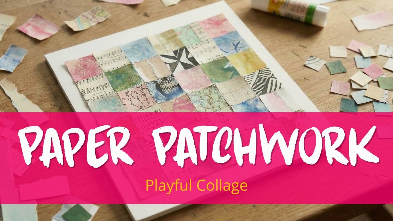
1. Paper Patchwork Seascape: Have you ever looked at a landscape photo or a seascape photo and
actually seen it? I mean, not the details, not the bits and pieces of
sand or the individual waves. I mean the big shapes, the lights, the
darks, the textures. That's actually what
this class is about. I'm Anna Birn Soluna. I'm a mixed media artist, and I'm a teacher
here at Skillshare, and I love working with paper. I love the way it feels, and I love the way you glue
it down on your surface. And I love that you
have to simplify your reverence in
order to make it work. In this class, I'm going to
show you how you translate a reference image from a C scape into a paper patchwork collage. First, we start off with
choosing a reference picture. Then I'm going to show
you how you have to read it and how you can
find those big shapes. And then we're going
to start first with our base version. And that base version, we're going to build just simply piece by piece square by square. And then if you want to
take it a bit further, you can go to the
organic version and really follow those
seascape lines, filling in each
section just like it's painting by numbers,
but then with paper. And then we are going
to fill and cut, fill and cut, repeat, and building it all
together like it's legos. And for the papers, you
can use magazine papers. You can use scraps from your recycling bin or
your own painted papers. It doesn't matter what you use, just use what you have on hand. And then you have
your class project. That could be your base
version of a Cescape in paper patchwork or the
organic version or both. I'm just thrilled to
show you the method that I found and the way I work
with my paper patchwork, looking at reference pictures. So I want to show you right now, and I think we're just
going to dive in.
2. Class project: For this class project, I invite you to upload your paper patchwork
seascape collage. That could be just
the base version. That could also be
more organic version. And the way you do it, you're just going to find
your reverence picture. You're going to translate
it into simple shapes. You're going to build it with your tiny, tiny paper squares. And then we are going to naturally turn it
into a seascape. Please upload it to the class project section
so I can comment on it, and your fellow students
can get inspired.
3. Materials needed: Okay, before we start building, let's talk about materials. And the good news is
you don't need much. You probably have
most of it at home because we are
going to use glue, a glue stick because
the glue stick is easy. You probably have it.
It sticks pretty nice, but you can also just
take it off if you don't glue it down the way
you're supposed to or want to. You are going to
need some scissors. This is a small
one, but you could use just a regular one. We are going to use a pencil, and that doesn't matter
what kind of pencil, it's just for tracing your image because you're
going to need some images. I will include my images,
so you can use them, but you could also use your own in order to transfer them. You are going to
N tracing paper, this is the whole
roll but you can have simple tracing paper. It doesn't really matter
which one you choose. And the same goes
for the substrate. I'm using mixed media
paper because it's a bit thicker and I prefer if
you use mixed media paper, but it could also be cardstock, because that's thick two
or watercolor paper, just don't use it too thin. Well, you do need to
use some thinner paper. I'm going to use some
printer paper as well, have that handy because you're going to use
to sketch on it, you're going to use to
put your sections on it. When I say sections,
you probably have no idea what
I'm talking about, but you will know
during the lesson. So printer paper too. Since we are going to make
those fun little squares, you're going to need something to make
these squares with. I already told you
you have scissors. You could do it with a
knife and a cutting board, for example, but I prefer
to work with a punch. If you want to see more
about the different methods, how you can make squares because it's the patchwork is
all about the squares, then you can check
out my other course, paper patchwork
because then I'll show you different ways, not only by using the punch, but how you can do
it with scissors and how you can do it with
a knife and a cutting mat. But in this course,
I'm just using punch just because they have
a consistent output. I have this one and
if I would punch another whole sample from
here, punch another square. I have the same size. It makes it easier to
build your patchworks up. That's why I'm using a punch. But if you don't have one, I like for you to
use what you have. So just use your scissors or use your knife and
your cutting board. And then we are going to use need some papers to
get those squares made up. And there are a
variety of options. You could use, for example, old magazines or just
some leftover paper from your recycling bin. That's absolutely fine. Actually, I'm going to show you one of the projects
with these papers. The other one I'm going to show you is with painted papers, but know that you can
mix and match them. You can actually use this
with painted papers too. Just find the papers you like in a color palette that you
like for your project. Because I know a lot of
people aren't like me. I love making painted papers because making painted
papers is so much fun. It's almost addictive and I could just make paint
papers all day every day. It's my mindfulness. But if you've never
done it before, you're scared of doing it
or you don't have the time, you don't want to, please use your magazines
and your scraps. Because in this course, I'm
not going to show you how you can make these painted papers. No, not Because there are a lot of courses
here on Skillshare, there are a lot of
videos on YouTube that will show you exactly
how you can make them. Because you can make
them, for example, with just using your brush
and painting your papers. You can roll your paint. You can use your jelly plate or you can use some stencils. You can use mark making
tools like household tools. You can use Baby powder. You can use whatever
you want to make the perfect painted papers
you like for your project. And I say perfect. But that's a fun thing
with painted papers, they don't need to be perfect. They're actually better when
they're not perfect at all. We are going to mix
and match them. But the reason why I like
to use painted papers too is because I can
make a cohesive palette. Because sometimes when
you make a collage, yes, you have a sandy
color, a sea color, and a sky color, and
you think, like, it's fine, but still it
doesn't look like it's a hole. It's just all those teeny, tiny squares just stuck
on a piece of paper. I want to have it
look more cohesive, then I would choose a limited color palette
of your paints. These are the colors I use. I use the grayish blue
and the raw umber, and I lighten them with white
and darken them with black. I like the muted color palette
because the Dutch beaches have that muted color palette usually because it's not always
the best kind of weather, but if you rather do
a tropical seascape, just pick colors
that suits that. For example, just
take a primary blue, like the cyan and more or less a primary yellow and mix that up and mix that with black and with white and
see what happens. You could also add a
third color if you like. But don't make the choices
too complicated for yourself. Keep your color palette limited, so it will suit your whole. Now all your papers will just have a cohesive feel to them. When you make your
papers, the only thing that I ask you to look for, just make a variety in
the dull papers and papers with just more texture or pattern you can create
more texture and depth, for example, what looks
nice with the beach. And also look for the
darker and the light. Because when I use
the raw umber, I use I mix it with white to make it
really the sandy color. But when you look at the beach, you have those hums lumps of sand and the top looks
really light and at the bottom, you have the shade,
so it looks darker. That's why I want you
to mix and match. You have the darker shades, the lighter shades and
when you have the sky, you maybe have the clouds in the sky and when you
have the sea, it's blue, but your sky is also blue, but is that the
same kind of blue, you still need to see
the different sections. I would really recommend
for you to play with your painted papers and mix
and match quiet busy papers, light and dark papers just
for depth and texture. But again, you don't need to use your painted papers because your scrap papers are perfectly fine and they give such a fun and
quirky character to your landscape or
to your seascape.
4. Choosing a picture: Do you know that feeling when
you go through your photos, anything like, I want to
make something of that? Well, that's actually the
starting point of this class. And for this class, I'm not
going to use my own photos. You could, but I'm using
them from Unsplash. And the reason why
I'm using them from Unsplash instead of PintreSt, for example, is that photos from PNTRSt or Instagram or just Google belong
to someone else. Yes, someone else also made
the photos on Unsplash, but you're free to use
them in any way you like. And like I said before,
we're going to use them as inspiration and we are
not going to copy them. But still, I want to be
rather safe than sorry. So let's go check out my
unsplash board and see what things you have
to look at to see if they are going to be a
good photo for this class. Here you see my collection
of seascapes in Unsplash. And I'm going to show you this so I can show
you the difference between a good picture or a
bad picture or maybe not bad, but not really a
helpful picture. If I open this one, this one is the way a lot of people draw seascapes if they would just draw it
on top of their mind, a band of sand, sea, and sky. This one would be
perfectly fine for the base version that we're
going to do in this class. But the colors are just
a little bit dull. It would look lovely as
a minimalist painting, but we just want to
have a little bit more. I'm not really sure you would say this, but just
a little bit more. But what I like is
those straight lines because if you go to this one, this one could be
perfect if you do this after this class
because then you know how to work
with organic lines. But if you're still going to
start with a base version, please don't go with
these organic things. Just go with the simple lines. But even with simple lines, this one has simple lines, but there are two figures in it. You can skip those two figures. You can just go with the beach, the sea, and the
sky, for example. But if you think it's just too hard to
simplify your picture, that's something I'm going to show you in the next lesson. One of the things that
I like to do instead of just grabbing this picture
because it has lines, I'm just going to
see what it looks like when I see
it in gray scale. But I can't see it in gray scale when I'm here in Osplash, so I will go to my photos. Over here, you see my photos, and this is a picture
that I just showed you. But over here, I can go to settings and I go to my filters. I'm doing this on my iPad, but you can do this on
any phone with any brand. And over here, you see three
clear separate sections, the beach, the sea, and the sky, yes, you still see that there's less of a difference between the sand and the sea, but still there three
clear sections. If I would go, for example, to let me see, this one, this one has three
clear sections, maybe four if you count
the mountains in the back. But if I would move
this to a gray scale, you don't see a difference
between the beach and the sea. You have three sections, but you have the
beach Sea section, and you have the
mountains and the sky. If I were you, I would go for simple sections
and you can find those sections with your
grayscale filter if you want to. And with the base version, we just go for three
simple sections. Oh, I love this one, by the way. This one is really nice. It still has three sections. It has the beach,
the sea and the sky. But you see it kind of sloping. You see that the
horizon is straight, but the beach C isn't straight. But that's okay
because if you see the three sections
with the simplifying, you can always make the Sea the beach and the sky is
three separate forms. With a simple version, we're not going to work with
organic lines. I'm going to work with straight
lines. But you know what? I think I might take this one for the more organic version, but we'll see later on. For now, I'm going to take this one. You
can use this one too. You can search on
splash because you know what to look for and otherwise, use your own pictures,
and if you use mine, it will always be your
interpretation of the photo. So always look different
than what I make, and that is absolutely fine.
5. Building the base version : Okay, now that we know
what we're looking at, we are going to start building. And we begin with the base
version three clear areas, the sea, the sand, and the sky. Well, not in that order,
but you know what I mean? It's not complex. It's
just the foundation. And as we saw, we had three areas that were more
or less equal in size. So that's what
we're going to use. I decided we're going to go with the scrap papers and
some magazine papers, and you see where that takes us. And over here, I got a
textured and non textured, more or less in the same color. So this is something we
could definitely use. And the same goes
with the beach. And I'm going to use, like, the different tones
because with the sand, you have those
bumps in the sand. I'm not going to
take it literally. It's just my interpretation, but then you have
the shadow side of the sand and the
highlights of the sand. I'm not going to overthink it. I'm just going to combine
it, as you'll see. But first, I'm going
to grab some papers. And actually, I
start liking this on front of this
magazine already. So I'm just took some of this out so it's
easier to use my punch. And I'm just going to take
a couple out of here. And, you know, I don't
mind if it has some of the letters on there
or this stripe. I'm just getting them out. And let me see what I can do. I like this one. I'm not really sure
if it's going to be sea or the sky yet. I think it's going
to be the sky, but I'll be taking
this one, too. And again, I don't
mind if it has some of these white or some of these letters
because they can represent clouds or the
foam you have on the sea. So just take them randomly. And later on, we'll see
which one we'll use, and it's okay if we just
decide not to use them. I always like to
have a little bit more than I actually need. What is this cute picture?
Well, this cute picture could be sand, actually. And when I'm doing
this, I'm right. A sorting them by color a bit, so this one won't go into here, and when they're upside down, I cannot really find
the ones I need. I guess I'll take a few
of those for the sand. This would look fun
sand. And it snows. I got a It looks weird, maybe the hairs, but
it's fun as a sand. Add some more blue over here. You see, I'm not
overthinking it. I'm just trying to find the
colors that I might need. So some of the blues
over here. Let me. Is there anything more I can use with this kind of magazine, you sometimes actually
have sky in them. So if I can find sky in here, oh, this is not sky, but this is a beachy look. It is sky, but I'm
going to use this sky as part of my beach color. Tearing it because
now I don't really want the white borders too much. And, you see, I just
went rope with this one. I'm going to toss it out
cause I don't only want to have full squares because that makes the
puzzle a lot easier. He's got a mind of his
own, this punch. Okay. The more beachy colors.
And you know what? You could really try to find the same colors that
your picture has, and you can do that
when you paint your paint your papers. But I don't mind if it's
not really precise. It's my interpretation. So if I have, like,
the darker blue, debasous color, and
Oh, this is sky. And I have the beach color. That's fine by me. Okay.
Well, this is just just one. Maybe usually I'm not as
sloppy as I'm doing it today. But being this bit sloppy shows you that you don't have
to focus on perfection. Focus on fun. Focus on making your own C
shape, scape. Ooh. It's a hard word. Let me see. Ooh. And actually, this one, it looks white, but
it is light blue. I like this for my sky, too. Still my sky is going to have multiple kinds
of light blue. Why? Because when you
look at your sky. It has multiple types
of light blue, too. Maybe this is even snow, but snow could be like
a cloud kind of thing. And we have clouds in the sky. Use this for the sky, too. I'm going to just keep on punching until I have
enough different colors, and I'll get back to
you when we're going to build our base seascape. This is actually some kind
of seascape is beautiful. You should see it in real life. I actually looks like
this in real life, but we're not making it,
but we can still use it. The beach I'm not
going to use as beach I'm going to use as C. Okay. Well, we got some
to start off with. So I see there just
a bit out of frame. I'm a bit more so you can see my different piles you see
I have the darker blue, the lighter blue, and I have my sand and that's
what I'm going to use. I just cut out a piece of paper. And this is about a five. You can do half and you
have postcard size. This is just a nice
size to start off with a little bit big maybe when you do it
for the first time. But it's fun because you
can see how I built this. And since I've drawn on the
photos in the last video, I'm not going to
draw on here again. That's what I would do with
a more organic version because with the picture we saw that it had three areas and they are more or
less the same size. So I start with a beach
because that's at the bottom. And when I start gluing, I just grab them
randomly from my pile. The only thing is,
you don't have to, but that's something
I like to do. Take a bit outside. I like to vary a
bit with the tones. Like I said, with
the gray skill. This one is lights. You have the lights, the darks, you have a mix of
the patterns ones, you have a mix of
the plain ones. I just do a bit of everything. But I'm not going to
do if I have one, I have to put no one next to it because these are both plain. It's just more or less
it's kind of Yeah. Kind of. Sorted, kind of. Uh not thought over process. Could you think a bit about it. But not too much because
it still has to be fun. Who? This is the nose on my dog. Well, not my dog, but the dog. That was in the magazine. I really liked that one.
This is a dark one. I think I do it at C. Agassi, I'm just
gluing them down. I'm going to speed
this up for you. Do you know now how I glue, and so you can see my second
band just at faster pace. Well, there you have it. That's my beach. And I'm
going to do exactly the same with the sea
and with the sky. And I'm not looking
at the picture that the tide is
coming in or anything. No, I'm just gluing them down because the
picture was my inspiration. But you could, if you want to. That's almost getting
more elaborate and more like the organic
version that you do, like, first you do the
lighter dark blue, if that's worth a
lighter dark blue. Like the tide coming in, and you have the darker blues
go the skyline. But on the other hand,
I should take notice of it just a bit
because when I use, for example, this one,
it's pretty light. And when I have the sky next to it, that's pretty light, too. You won't see the gray scale. So if I have this darker
than I would have it here, you can see the
difference better. So you have the beach,
the sea, and the sky. So one thing that
I'm going to think of that's when I'm putting
down ones over here. They're not going to be
the lighter one like this. It's going to be more
like the darker one like this and the first
band with the sky, it's probably going
to be a bit lighter. So yes, there is, I said, there
was no thinking involved. Yes, there's some
thinking involved. But it depends how
abstract you want to go. And that's a good thing of using glue glue stick because when I think this one might be too light because I
have a white band, I can still peel it off
because it's stuck on there, but it's not too much,
just a little bit. And I take, for
example, darker one. This is really dark, but
it's just an example. I can just glue it on top
and nobody will notice. And now we are going to
the lighter version. See if there's enough difference between this layer
and this layer. But again, I think
with the base version, don't think too much about it. I'd rather have
you think about it with the organic version. And now you have your first
version, the base version. Done. You have the
three separate areas, the beach, the sea, and the sky.
6. Organic: tracing & plannig: Okay, when you look
at this base version, you probably think, well,
it's a bit too abstract. I mean, I see the sand, the sea, and the sky, but that's just because I know
it's a seascape. I want to take it a bit further. Well, you can. That's what we're going to do in this lesson because not
every seascape is, like, with divided in straight lines, 'cause you saw me having this picture when we were looking at our
reference pictures. I really like this one because we'll show you that this
line isn't straight, and I like these clouds and these clouds are
definitely not straight. Well, we are going to use
this photo in this lesson. I also took liberty to make a black and white version because with the black
and white version, you sometimes see the
shapes more easy. With this one, we're
still going to simplify it because if
we won't simplify it, we would also take all those what's the white
piece of the waves? It's the tight
coming in, I think, if you draw this tight
two and if you make this shape and this shape because the clouds
have so many shapes, it's going to be
a hard challenge. It's absolutely fun. But if I were you, I would just first start
with the larger areas. For example, if I take this one, I have this shape. That's the beach
divided by the water. I have a shape over
here, that's the water. Yes, I do have the cloud
and I'm going to make this in one shape. And you know what? This
pole is standing here. Should I Yes, of course. I'm going to. I don't have to, but I want to take
this pole, too. But I consciously not
taking the shadow. I'm just taking One? Two, three, four, and
this one is number five. It's really simplified, but
I think this will work. It's up to you if you take
this poll, it's up to you. Maybe you want to have those
white lines because you see the contrast on this
picture. You can take it. I'm just going to do
those four, five shapes. But now I want to
have those shapes. On my paper, the paper
which I'm working from. So what am I going to do? I'm just going to use
my tracing paper. And if you think these red lines are really disturbing
you or are in your way, just take a clean picture because this was the
actual picture you have. So I'm taking this, and
I am just going to take? I'm dropping my papers. I'm just going to
take my pencil, and I'm going to
make the shapes. You know what? I'm taking it
all the way to the end of this paper because though
the picture isn't, that's just because I'm using a paper that's just
as wide as this one. Because I printed two
pictures on an A four size. So that means picture is a five. And the paper that I'm
going to transfer it on or that I'm going to put my
patchwork on is also a five. But take any size you like. Make sure that your pictures are same size as the paper that
you're going to transfer on. And I'm going to take this. Cloud. And again,
it's not too precise, but it's I want to have
it more or less precise. And I'm going to have this pole, and I'm not going
to draw this pole with all its dimensions at the
front, the side, the back. It's just a pole. I have to ignore this little
line, but it'll be fine. And I'm going to do two things. This is something
that I can lay over my paper and see the
sections that I use, but I'm also going
to put this aside. Grab a piece of
simple printer paper. So this is not the end result, the paper, the substrate
that we're going to put the total collage on. This is just where
we're going to put our different sections on. So what I'm going to do,
I'm turning this over Yeah. And it has exactly where
I want to have it. And yes, I know when you do it, you have it all mirrored. It's not the image
that I drew it, but you'll see why
it could be helpful. And I'm just tracing these lines because when
I'm tracing these lines, the image that I drew on this tracing paper
will be on the paper too. This And I don't mind if it's really too straight or isn't
straight enough, it's okay because it's
just the picture. It's just my reference picture. And you see, I have it on here. This is where we're
going to work with. Finish this shape because
I see the indentations. Okay. This is what we're
going to work with. And since we have Section one, Section two, I'll
say Section three, four, maybe it's easier and
this is going to be five. I need to have five
different colors of paper or at least I need
to have more colors, but I just need five shades
or tins I see might say. For the beach. Take
this image here. The beach, you can choose a
sandy beach a sandy color. And I'm going to use my
painted papers for this. Yes, you see some darker areas, but it's not that much contrast. Not as much contrast as
we did with this one. So I'm going to choose mainly
the lighter colors and just a bit of darker colors or texture to make it look more interesting. So
it's not too flat. And I made a lot
of painted papers. And I made a selection
of it because I think this would look
really nice for the beach. And I made, of course, some darker papers, but I think this would
be just too dark. So I decided to do a
few lighter papers. Well, I have them here. And then besides those papers, I'm going to have a
bright blue, I think. Or bright? Yeah, you
can do it bright. I think I'm going to do
it a little bit more tone down more more muted because
I like muted colors. And I think I'm going to use
sample these kind of papers. It's not exactly the same color, but this is the color I want to go with because I
like these colors. Again, it's your interpretation. But this is white. The clouds are white.
But when you look at this, it's never
really white. It's just really light gray. So it has some color. I'm going to choose really light papers and
I made some papers. For example, this one's really
light gray or this one. I if I take these two, this is the lightest from
the blue of the sky. It has to be darker than
the darkest from the cloud. Otherwise, you won't
have contrast. Otherwise, you won't
see the cloud. And yes, when you
look at the cloud, it has a dark shade
and light shape, but I think I'm
going to use it as one cloud and keep
it fairly light. This could be an extra
section that I could do just another time when
I want to push myself fur. But now we're going to go
with the four sections. So the lighter colors. So I'm having a pile of light. I'm having a pile of
a little bit darker blue and the sand and this
is actually the darkest. So for this, I can use, for example, or maybe
this is a bit too dark. It's almost black. I could use, let's say these papers because you still see the blue,
I want to keep the blue. But again, this is going to be the lightest color from the sea. And this is going to be the
darkest color from the sky. There still needs to
be enough contrast. So you would actually see that
there are different areas. Otherwise, they would just
all blend in and you don't even notice that it's a seascape because if it's all blue, it's just going to
be beach and blue. And that's not what we
would like to have. So if you want to see the
difference between those two, just take a picture, bring
it back to grayscale, and you see, Okay, these are different enough.
I can use these. And with this one, I could
also choose just this side. That's a lot lighter. So we're going to play with this
and see what works, and if it doesn't work,
we're using a glue stick. We can take them off
again. So don't you worry. I just make different piles, and I am going to start
with Section one.
7. Organic: building & cutting: And when I'm going to
start with Section one, I'm going to make
all the squares and you could use your knife, your scissors, I'm
going to use a punch. I am going to stick them
down or glue them down on this copy paper because we're going to get
those sections, fill in with the squares
and then assemble them on your final substrate. But this one is backwards, and I did it on purpose
so I can turn it over and start gluing my squares on here and fill up this section. First, I have to
make some squares. And because you've seen me punch those squares in
the previous video, I'm going to do this really quickly and speed this
part of the video up. I think I have about
enough right now. So there's a variety in texture, there's a variety in color, but still it's all light sand. What we're going to do
is just exactly like we did with the base version. We are going to get
our glue stick out. We are going to glue this on here because I'm going to
the edge of the paper, I can make these shapes
really straight. Again, I'm not really thinking
about where I'm placing them as long as there is
enough variety in the beach. Over here, I'm just
still gluing it down. I'm going over the
edge, but that's fine. We'll take care of that later. That's why I can still use these that have the white
edge from my papers. Okay. Now we have
to start paying attention because I can
see this indentation. You probably won't see it now, so I'm going to grab
my my tracing paper. That is probably underneath my whole pile of papers.
Yes, of course, it is. And I can see that when I put this down, yes. This part is already there, but here it isn't it doesn't
mean that I'm now going to cut down those
squares to the size. No, I'm going to it still
needs a little bit over here. It needs a lot over
here. I'm still going to glue down the full squares. I'm going to fill up
the whole of this area. I'm going to put down
the full squares. I'm not going to cut
them down just yet. But I think I'm
going to start with this area and work my way back. Okay. Put them all down. And I know they fit. I know it fits over
here too. Yes, it does. What I'm going to do now and that's why I have my
shape at the back, I am going to turn it over and I'm going
to grab my scissors. Grab the larger scissors, but I'm thinking
the smaller one. I'm going to cut off this shape. Shape number one. The way you see here,
it's shape number five. So what I'm going to do is I am going to cut off number
five. You don't have to. You can keep on
cutting here and place number five on top of the collage later if
that's easier for you, but I am going to do this. It's really small, so
hopefully it will work. Get stuck somewhere. And I am going to cut shape number one. And that means cutting
these sides too, because I only going to
use shape number one. So if you have those
ss sticking out, go pear gluetick,
stick them down, and your beach is ready. And we're going to put this shape aside because
we don't need to shape. Now. And put back. And now we have all those
pieces sitting here, and that is for a reason because this part is actually
going to be the sea. So that's going to
be the dark blue. But I want you see actually to fit the beach perfectly so that
all the squares, it's going to be
a real patchwork, all the squares are
just sewn together. I don't want to put my new
squares on and it would look like this because maybe
that's my autistic brain. This would look
disturbing to me. I want them to fit perfectly.
What I'm going to do? I am going to punch
put this glue aside. Punch my darker papers, and then I'll show you
what I'm going to do. You know what? I'm going to show you with a few I already have, and I'll punch this later because you don't need to
see me punch all the time. Let me take a few more. Okay. What we're going to do we want the darker
papers on here, but we want to have them
exactly the same shape. So I am going to take
this one off or actually, I can put one here
in this corner. Just take a whole one. Line this up with the previous one. So it's saying perfectly. Yeah. And now we can take this one off
because it's a glue stick. We can peel this one off. I don't mind if it takes
a bit of the paper, and I'll just take one of
the other dark harm ones. And put it where the
previous one was. I think there's just a
bit too white over here. But if it's white, it doesn't
matter because that could be could be the wave coming
in, the tide coming in. I peel this one off. That's why I just do this in sections and
that's why I'm not doing it in different days because
I want them all to fit here. Yes, and I can still
peel them off. And this is exactly
why I'm going to do. I can cut this off later, but I just want to
fill up number two. So you know, the drill by now, I'm going to punch
a few of those and put them on here and
speed up the video for you. And now we're going to
do the same thing at the back. Scraps aside. I'm cutting these pieces off, and it looks like a waste
of all your papers. And yes, that
definitely could be. I actually made fun
playful collages with the scraps
that are leftover. You could throw them
out whatever you like and otherwise
used to recycling bin. I'm actually going
to put this aside. S And I'm going to cut number five out of here. We can always fit
number five in later. But this is a small piece, so it's still going
to be a challenge, but who doesn't
love a challenge? Look, and this is RC. And just to see we're not going to pile them
together just yet, but I'm just going to show you
what I meant why it was so important to connect
these edges. Okay. Because now you will see that this is almost
a perfect square. Well, none of them a perfect, but more or less perfect square. And it's all going to be
one nice flow of squares. Now you know what
you're going to do. I am going to do
this. For the sky, I am going to do
this for the cloud and I'm going to do
that for the pole, but I'm not going to
do it in real time. I'm going to speed this
up for you so you can see how I'm going to assemble
this in a later video. I decided this is going
to be such a small piece. If I do this with squares, it's possible because I
know where the squares end. This is where my
last square was. But it's hard. I think I'm just going to do
a piece of paper. Take this off. It's perfectly fine if you just take a pull out of one edge, but you know what? I'm just I'll take this. For the sake of the exercise, I'm just going to
put this on here. I'm going to take this aside. Shall I just take
that really dark. Now, I'm going to do
a brownish version. Or this one is really dark, too. You know, this is not the way the exercise is supposed to be, but it's still your
paper patchwork, and it still needs to
be fun at the end. So you do you. If you get those really teeny, tiny pieces, you
could do all the way. You can just find
what works for you. Oh, I have to cut this
out. It's not straight. And for me, making squares
isn't going to cut it. So I'm I have to put I'm going to make the effort to make
two different colors. This is why simplifying
is so important too. We have our pole, put it aside. You know when these
pieces are too large, I'm cutting them off like
you saw me do before, and I could use them
in a next project, but I could also reuse
this in this project because we still have a few
of these darker pieces. And I could just
glue them on there. And the same goes for this one. If I can take it off,
yes, it's possible.
8. Organic: puzzle & glue: Okay, now you've seen me do
the fill, cut and repeat. It's almost like
painting by numbers, and we got all these
different shapes. And now we have to make
them all come together. That's what we're going
to do right now and see if our plan worked. So I am grabbing my
final piece of paper. If you want to glue them down, you could actually use
the glue stick again. You could also say, Well, I don't want to glue them down. With gluesi I want to have
them more firm on there. You could also choose
them at medium. But I think I'm just going to do the gluti because
that will here fine. Well, we had the beach. First of all
painting by numbers, now it's going to be like legos. It's like building blocks. And see if it works. This is the most exciting part. Remember, like I said before, it's just glue and paper, so we can fix
everything we glue. Put it on here. Okay. Now we are going to take number two and
number two is R C. You know what? Instead of going to number three,
when we've done. Number two, I'm going
to do number five. You have number five. The largest area of all. I'm going to down
number three, the sky I love it when the building
looks bit. Well, so far. Maybe that's why
I love Lego too. Well, that's there. And
now we are going to glue down number four our Cloud. It fit? Will it
fit? Will it fit? And it actually fits. See this. I mean, I like the base version. The base version is
perfect for just get Oh. Should be. I'll be talking and doing
things at the same time. I mean, that's what the
whole lesson is about, but that's really hard. So I have to glue this back. Oh, I took this off
with my finger. And like nothing happened. Now, I like the base version, but that's really more like
an abstract landscape, and that's really good to
get the feel on the vibe of using paper patchwork with your seascape
or a landscape. But look at this. This is our final
piece. I'm loving it. This is one photo
simplified into shapes, filling it in, like,
painting by numbers, building a piece by
piece like lego. And now we have a
complete image. That's the whole process, and now you know how
to do it yourself.
9. Final Thoughts: And then you just translated your own seascape picture into
a paper patchwork collage. Wow. I hope you're just as proud
as I am and I hope you love this process because this
is so fun to repeat it. Maybe next time, take landscape, take a forest,
take a still life, because you can
repeat the steps in this process with so many
other reference pictures. Just simplify the pictures, look at the big shapes, look at the variety in
texture and in tones. And you can make your own
paper patchwork collage. And if you like this class, please leave a review. That will not only make
me a better teacher, but others will find
this class more easily that way and
don't forget to upload your project because
I can't wait to see them even if you've used exactly
the same pictures I had, you used your own papers. You turned your
reference picture in your own paper
patchwork collage. And that way, I cannot
only comment on them, but your fellow
students can also get inspired to make their
own next project. So I hope you had fun and I hope to see you in next class.
 Anna Berends van Loenen, Professional Messmaker