Transcripts
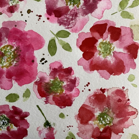
1. Welcome!: Welcome to Rosy Posy. You knew I couldn't stay away
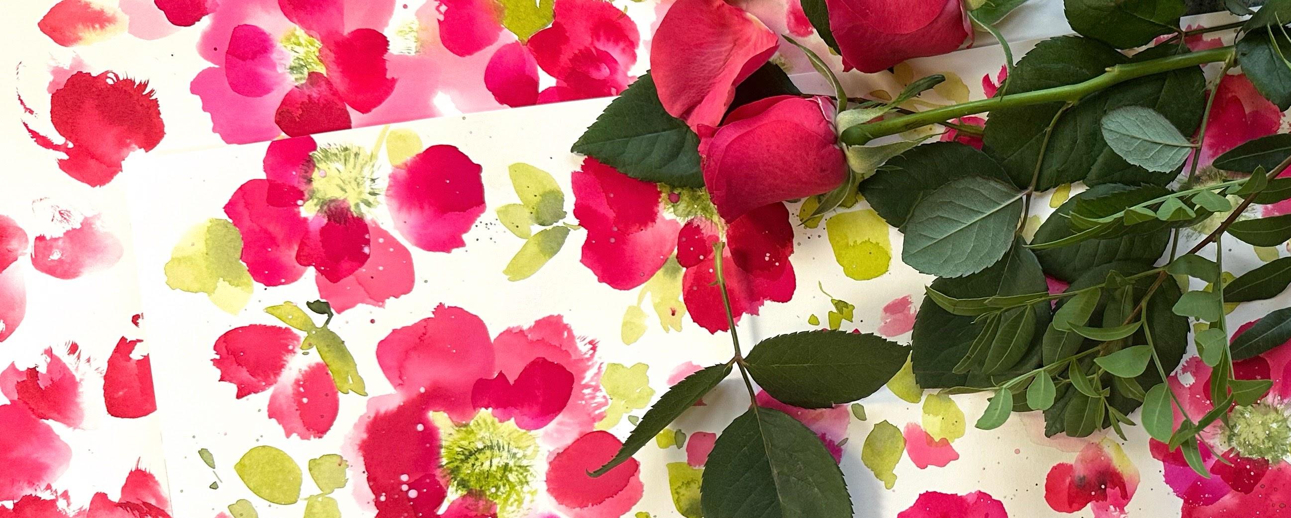
from roses for too long. I had some roses actually
arriving at bouquet, and although they weren't even close to the colors
I wanted to use, namely pinky reds, they
did serve as inspiration. Before we move on, I'd just like to take the
opportunity to say hi. My name's Holly and I live
in the Lowlands of Scotland. There's so much inspiration from panoramic views of
Belhaven Bay, White Sands. And Barnes Nest. Through to the
smaller details in the hedgerows and woodlands. So back over to our
class now going to be experimenting with the
simplest flower center. Using a stippled brush
or any old brush or a few tape together to create
some textural stamens. We're using inks and watercolor to create beautifully
loose and unique roses, each with their own character. We'll be choosing
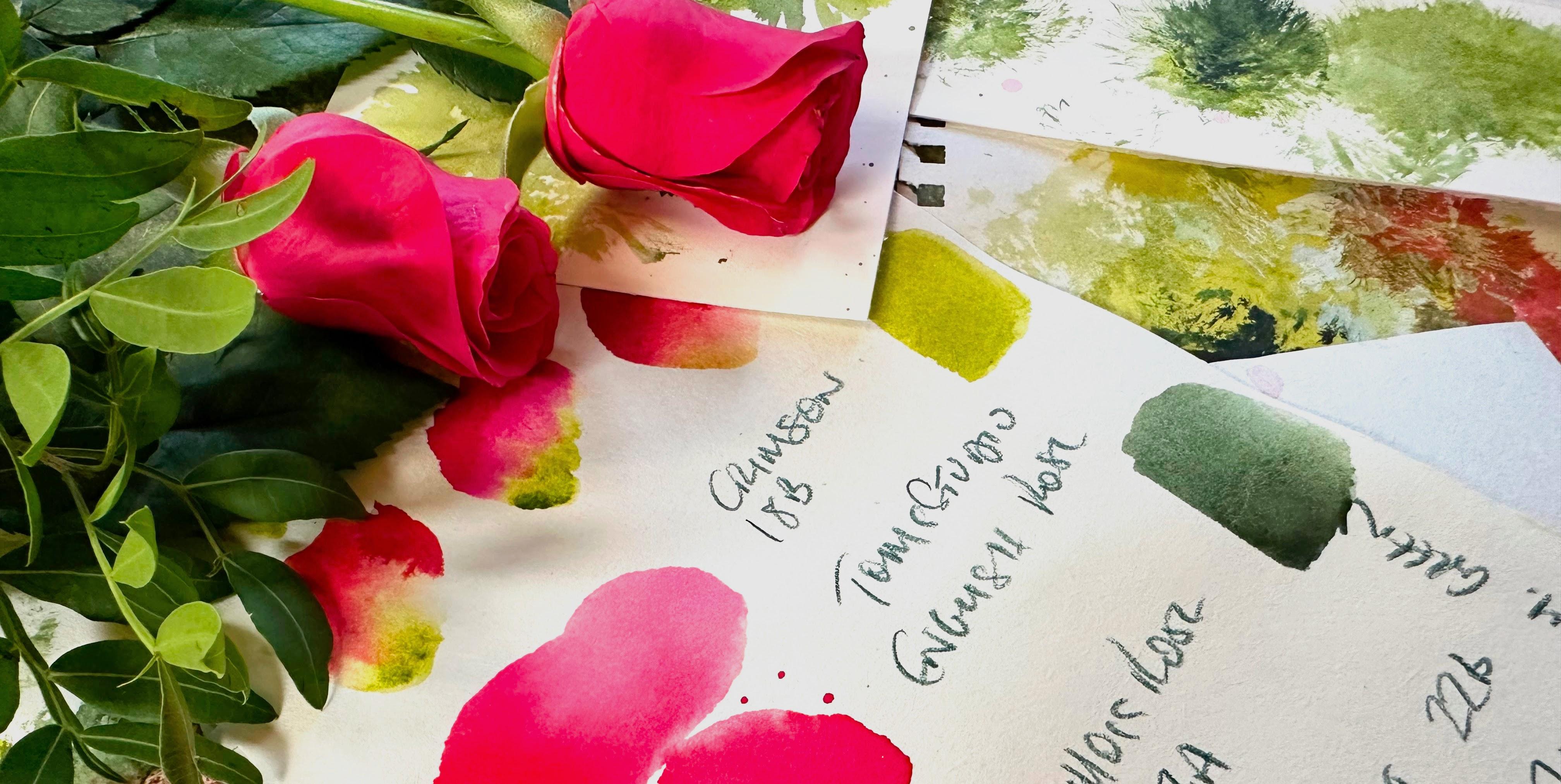
our favorite pinks through to gentle reds. I chose Moss Rose, Crimson and English Rose with green gold and
Perylene green. You can do this class
with all watercolor, all inks, or a mix
like I chose to. And you can choose your
favorite watercolor paper. I chose hot pressed, but cold pressed would
be great for this too. I've left a full list of materials in the about
section of our class. We'll be working with
a limited palette, choosing vibrant pinks and reds, using the 70 2010 principle. And in this class, we're
going to be applying that principle to the
size of our elements. So 70% large flowers, 20 leaves, ten small
leaf and petal accents. We're using ink and watercolor mixed with some water
for base layers, then moving to neat ink
for our final layer. Although we're working on a larger scale with our florals, this class is designed
for beginners. When I started out
with wood color, I found it really hard to get beyond a five size
piece of paper. So I really want to encourage
you and take you along on this gentle journey into
discovering larger florals. If you'd like to access
subtitles for the class, it's just here under the video
next to the volume button, and subtitles are
available in English, German, French,
Portuguese and Spanish. And there's also
a full transcript of the class available. Don't forget that you can upload your project in our projects
and resources section, and you'll find the M project
section on the right. It's a wonderful way to tap into the Skillshare community and a great way to share
tips and feedback. And I'm also on Instagram
and following a lot of you, so please tag me in any
work that you post, as I don't want
to miss anything. So when you're ready, let's immerse ourselves in
these vibrant reds and pinks.
2. Practise | Stippling Our Rose Centres: Let's start off with our greens, and I have green gold. And Perylene Green, which
you can already see. I've got a couple of blobs of
that from other paintings. Okay, so we're going to start
with a really fun thing, and that is stippling. So this is a makeup brush, and I'll leave details for this. You can buy a very cheap makeup
brush in a stipple shape. You might have an
art stipple brush, or you could just get
a really old brush. Maybe if they're small, take them together and just play around and see what
shapes you can get. A lot of fun. I love doing this. So let's just go straight
in and create some shapes. Now, there's not a lot
of water on my brush. We're looking for a dry effect. So you can see
that I'm preparing the brush before I put it down, making sure that there's paint
on it, not a lot of water. You get these fabulous shapes, and they're all different. So each time you place that
brush down, it's unique. Such a lot of fun. And why
wouldn't you want to do this instead of spending ages trying to recreate a really natural effect like this when you can do
it with a stipple brush. So you can see we've got quite a few different textures there. And then what we can do is go in with the second layer
with our Perylene green. So again, preparing
the stippled brush, and I want this even drier. I found that it creates better texture if the second
darker layer is dryer. Just have a practice
and see which styles, which technique works for you. I think you'll find it hard to stop once you start on this. It's such a pleasing
thing to do. I really love the texture that it's going to bring
to our class project. So now to your soft brush, and putting down some
Moss Rose seven A. So Crimson, 18 B. And Tom's Ink, English Rose. Thinks is my favorite. So we've got our range
there of red to pink, very limited palette, really. So lots of water on your brush. And then we're just
going to slide sweep up. So for the purposes
of this lesson, I'm just using very
simple petal shapes. I'll be going into more
detail in our next lesson about the brushstroke that we're going to be using in
our class project. We can drop in
little bits of ink. Et's do that again. And then dropping
in whatever ink it is that you want
for that petal. Bottom and top, if you fancy. Dropping in some of that
lovely English Rose. What we can do then, you have a choice
of going in again with your stippled brush
whilst the petals are wet. So let me demonstrate that here. I do love working with ink. And then let me show
you that you have the choice here to do
your petals first, then splattering your texture, so the paint will move
out into the petals. I'm going to show you
with green gold now. It's such a confident color
and often spreads easily. So if that's what you're
looking for and you're wanting blooms and
merging of colours, then green gold is a good one. It's very solid for that. You can depend on it. In with
the Perylene Green again. Over the green gold. I think they work
together really well. That's because we have
a very warm green gold leaning towards the yellow, and Perylene Green is a little cooler leaning
towards the blue.
3. Practise | Rosebuds & Inner Petals: So just experimenting
with color. I'm not worried about
the shape of the petals. And isn't that a gorgeous mix? I think that's my
favorite so far. The doctor PH
Martin's Moss rose, and the Tom's Ink
English Rose. Love it. I love this, as well. I think that looks
like a strawberry. I'll have to remember that
and come back to that. Okay, so now we're going
to do double dip method, and we've done this together in a previous class
in joyful florals. So I'm just going to tidy up
my palette because we want a straight line of
the green so that we can pick it up at
the base of the brush. So I'm just creating a line of green gold or
whichever warmer, lighter green you've chosen. I found this to be
the easiest method. And then we're just
going to bounce up and down in the paint at
the base of the brush, pick up some ink, and then scrunch our
brush into the page. So let's do that again. So it's quite a
forceful movement. And the more that we do this, the more that the
brush shape changes, we get these lovely
broken edges. Love this texture. I think this with the soft brush strokes is
such a lovely combination. So just get used
to the brush that you're using and noticing how much water and paint
works best on your brush. So we've got these soft
petals underneath, and we can now go over
those and start to create some inner petals with
a little bit of texture. Topping up my English rose. Even though this is a
very pigmented layer, you can still use your ink very neatly and it will show up. We're now starting to create the petals that we're going
to be doing in our class. See here that choosing
a soft brush means that the brush is very malleable and starts
to change its shape. The bristles start to
form gaps in between. And we can really take
advantage of that to create these delicious
textural petals. You can't go wrong, get
used to your brush. Do it over and over again, and let's just now practice
some inner petals. The base of the brush
is pretty much stay put and I am moving the
top of the brush around. It's a beautiful way
to create petals. And you can just mix
your inks intuitively. Done all three there. And
each petal is very unique, and that's what I love
about this technique. So I'm just practicing some
half opened flowers here. Just showing you very,
very slowly there, the movement of the brush. So we're kind of
bouncing up and down. That creates these
slightly scalloped edges. So obviously, the less water and pigment you
have on your brush, the drier it's going to be. So let's just move this
page out of the way now. So here I am again, very slowly, just showing
you the movement. Doesn't that create
a lovely texture? Just a bit more quickly there. And now showing you
taking off some of the ink creates that texture,
dry brushing effect. So you can look at the
texture of your actual brush. So if you're using a soft brush, which I think would
be the best for this, you can see that it starts
to get its own shape, and we can take advantage of that and really start
to use the brush. And just to show
you quickly here, you can do this
with a round brush. I chose my mop brush
just because it's soft and I know it very well
for when I'm painting roses, let's just practice some
inner petals there. So you can see how
the texture and the softness work
together so well. And we're also getting particularly actually with
the Tom's English rose, a lovely white center
on some of these. So you can see just a very
pale pink there at the bottom. I love doing this.
It's really fun. And now I'm watering
down the ink. And just going back to
our main brush stroke, which we're going to be
taking through to our class. Now, there I was using mainly the tip of
the brush outwards, but you can do it the other
way around where the tip stays in the middle and the base of the
brush moves around. I also think it
would be lovely to bring in some paler petals. So we're using different values. It would be nice, I think, yeah, to do some nice soft, pale pink ones amongst
much more pigmented ones. You can see how they
can flow together. I really love the Tomsk. To me, out of the three inks, that seems to be the
closest to a rose petal. And we can also create some softer petals around
more pigmented ones. I think it is freeing to
have the space to do this. And then I'm showing
you here how we can go in with our stipple brush
after the event as well. So earlier, we did the stipple brushing first and then put the
petals around it. You can do it the
other way, too.
4. Practise | Leaves: Moving on to leaves and then putting down
some green gold. I'm just going to keep
it really simple. So just choose the two
greens that you've chosen. I'm using perylene green
for the darker green, which is also slightly cooler. So I have gone over to my
size ten scora round brush. You could also continue with
your mop brush for this. It's entirely up to you and what you feel
is working for you. So I'm adding lots of
water to the green gold. I want to keep this really
nice and water colory, if you know what I mean? And I want things to
be too pigmented. We want quite a lot of flow. I love the color of my
water at the moment. That looks like
strawberry ribena. Do you have ribena
where you live? I wonder. Okay, so picking
up some of this lush green, and we're going to just put down a very quick stem with
the tip of the brush, and then we're going
to do a side sweep. Tip down, goes down
the whole way of the brush there to
create a nice big leaf. You know that I love these
side sweeps because to me, they just create really
organic looking leaves in perfect shapes, which I think is really attractive when we're doing
loads of leaves like this. And then dropping in your darker green to the base of the leaves. So let's do another one. Here I'm just showing
you in slow motion, as it were, how to
do the side sweep. Tip down, and we're going to use the whole side of the brush and then
bring it up to a tip. So down again, the whole
brush and up to a tip. And let's just do a few of those so we get really
familiar with that movement. And just drop in a little
bit of your darker green. I just want to show you
the tip, belly tip. You could also bring
some of that in. That's the more familiar way, I think of painting leaves. And you will have seen that
a lot in other classes. So you could definitely go
for a variety of shapes. Let's give them
some little stems. And I'm varying the size, and this is also something that really makes
them look appealing. I love adding tiny little
leaves to the stems. So changing shape,
changing size. G two thirds of the way down
for these smaller leaves, so not the full brush. Just play around with how much of the brush
you want to use. But I really find it hard
to beat this brush stroke. I use it all the
time for leaves. I love it so much. I found this really difficult
to master at first. I just couldn't tell
what was happening. So I really want to just
take my time over this. And then why not just drop in a little bit
of the perigreen? Another way of creating leaves is with this
little zig zagi movement, another leaf shape that I adore. I'm just going back to this page because I think it
would be nice to practice that around these little buds
like we did earlier. Let's create some sepals
around these buds. And this is a tip
belly tip movement. And I'm using a mixture really of slow and quicker movements. A little bit of a
wiggly movement there, zig zag movement. And then back to our side sweep. What we can do now is
work around a petal. And the way that I approach this is not to think of
them as leaves. At first, I'm just going around shaping the green
around that petal. And then I think about
shaping it into a leaf. You can leave a tiny
bit of white space, if you like. Let's
do that again. So there I've left
some white space, and then I'm shaping
that into leaves. So we've got these two
approaches now that we can use. Let's do that again
over this flower here. So just following round, not worrying about
the shape and then just thinking about that after
I have gone round a petal. And it almost paints itself really if you're not
worrying too much about, does it look like a leaf? And we're just creating a spldge of green
around the leaves. If you look on it that way, it's much more free,
very effective, pushes the flowers
towards us and creates a more three D effect. A
5. Practise | Inner Petals, Splattering & Flower Centres: Let's delve in a little bit
more to our inner petals. So I have water on my brush. I've taken the excess
off and just dipping the top of the brush into
those two roses again, English rose and moss rose. We're doing the same
movement as we did with the larger outer
petals and moving the tip round with the base
pretty much in the center. And let's practice those
broken lines again. And also, the speed. Sometimes I like to
work more slowly. And to get these very
textural strokes, it's often best to
press the brush right into the page
quite quickly. This is definitely neat
ink now at this point, as well, for the most part. Just trying some of those
more forceful movements. And I'm just wondering
about these centers. I've picked up a size
five round brush. And I have an idea. I just want to see if it works. And I do like that. Yeah. So what I decided
was to go in with some watered down green gold and softly paint in the center. The layers underneath
won't move, so we know that they're
going to stay put. And what this does is it shows the texture coming
through from the stipple brush, but we can also soften
it where you want. You don't have to do this
on all of your centers. But I thought I'd just
show you because I really liked the effect
and just dropped in slightly more pigmented areas there and maybe a little
of the darker green. Just have a play
around with that, see if it's something
that you would like to do in your class project. Cool. So now I want to move on to some
really fun splattering. And I'm using some
white gouache. I like to do this
when I'm spattering because it's slightly
more opaque, obviously, with using the white, and I really like to add a
more opaque color to our inks. You don't have to. You
can just stick with your inks and just add a
bit more water to them. But I thought I'd show you
this as well as an option. And what I'm doing is
just trying to pick out areas around the
flowers themselves. And using a size five gives me a little bit more control than if I was using the
larger mop brush. Again, it's a
tactic which allows a little bit more
dimension to come in as the splattering
comes towards us, the flowers are more
in the mid background. And just demoing there, just watercolor without
the white gouache added. And for the centers
and the leaves, we can go in and just
splatter some green. I love this. I really
do love splattering. I don't use it a lot. And when I do, I know that I have
to control myself. I may be some of
the dock aperolin.
6. Practise | Small Accent Leaves & Petals: So with our size five, let's do our little
side sweep leaves. So it's really just
a small version of the leaves that we did. And let's add some little
accents, sweet little leaves. And we can add
some little stems. I tend to do the stems with only a small amount
of water on my brush. Certainly with
leaves this small. Now, back to my size ten. And let's just do some really loose
finishing touches in the form of some lovely
expressive petals. I'm holding my brush
right at the top, because I want these to be more about just the
movement of the brush. I don't want them
too controlled. And what I'm doing
really is what we did earlier with the mop brush, that kind of slightly squashy
move rolling of the brush. And these could be our last
minute kind of final details. So you can see there's
just a twisty move. And just keep dotting
these around. So that you get a feel for
the brush that you're using and achieve these very
expressive little movements. You could always use
your mop brush for this. You don't need to
switch over to a round. And I was using English Rose there and lots of water added.
7. Class Project | First Layer Roses & Centres: So let's start by
getting the majority of the water off
our stipple brush. And then we're going
to do as we practiced, bounce up and down
with the green gold. So I just did three
little bounces there. And I'm going to start off with the Moss Rose and Tom's
Studio English Rose. I do like a petal where the brush has just
got water on it, and then I dip it into the ink. Just really makes it much
more realistic as a lot of roses have that pale area just before they get
to you the stamens. And then I'm just dropping in the same mixture
but almost neat. I thought I might just add a little bit of peri
green in this one. We are going to go back in
and do a darker green on top, but just wondered what it would look like
to start with that. So there's that Moss Rose
and English Rose again. Oops, oh, dear. Let me just show you how we can pick this up really easily. So fresh water, just a slight
rubbing with the brush, and then blotting with some
kitchen roll or cloth. Now, because it was ink, there is a slight
kind of stain there. If it was watercolor, it would lift completely. So some inner petals here, which I love to do in
a very rich colour. And we can always
come back to petals, so keeping it simple
at this stage, I think is a really
good approach. So a bit of both of the
greens with this one. And I wondered what it would
be like if I scrunched that up and did a smaller
flower center. And then I want to
get in really quick, so I've just picked up
some water on my brush and kind of just allowing that center to move
out a little bit. And because it's got
green gold in it, it will want to do that. But it's very, very
warm here tonight, so things are drying
up really quickly. And then I'm just
dropping in water down ink in various places. I quite like having a softer, paler flower in amongst these very rich, ready pink flowers. So another smaller
flower center there. Just trying to allow it to move out a little
bit by catching it with the base of my brush and then swooping up
water to the center. So that's just basically
the water from my jar. Then maybe do some textural
brush strokes into there and also the
other pale flour. Now I've got the Perylene Green, and we're just going in with a second layer to the centers. Less is more just one or two
pushes down on the brush. And then this is Tom's
English Rose again. I do think that's
my favorite color. Okay, apart from the Moss Rose. And in again, just with
a double center there, green gold, then Perylene green. So I like these paler ones, and I thought I'd do
a third one here, kind of poking out
behind that rose there. And I want a very gentle
watered down color. So I'm dropping in Crimson at the base and on
some of the petals. And then I want to get in quick to allow it to
disperse a little bit, so the centers are not divorced from the petals
on all of the roses. English Rose, and I purposely not got loads
of water on my brush, but enough to create
that white center. And that's because
I made sure I had really clean water on my brush and then just
the tip into the ink. Because I want these roses
all to be different, you know, to have
their own personality. I'm having a go at all
three there. Why not? I like to see what comes
up. It's a lucky dip. Oh, love that. Love that color.
That's gorgeous. A little bit of Tom's ink now, and I just want to scrunch
in some grungy petals. Because texture here
is part of this class. It definitely brings a kind of a real feel to the rose petals. This is a little blobby sum. I'm just going to
add some texture into that one, a
little bit there. So we're actually working
with the brush here, and that's why I chose
a very soft brush because it stays in this
kind of splayed state, and we can use that
to our advantage to create these kind
of broken petals. So I'm just looking
around and I want to keep the composition fairly random. So I'm preparing my
stippled brush again. I think I need a little
bit more green gold. So in with the stipple brush. Always have a little practice
before you put it down. And then let's do on here. So that has a bit
more paint to it, and I wanted to see if I could pull
that out a little bit, so the center bleeds
out into the petals. And you can, of course,
always add a little bit of color to the base of the petals just to
make it travel more. Into the moss rose. Kind of doing an
inner petal here. A little bit of Crimson as well. Just to keep that variety so all of the flowers
are different. I thought I might just add a little bit more paint
to the center of this one here and some perigreen over the green gold
on that stippling. How simple is that technique? I love it a lot, and you can either do it in the two ways that
I've demoed here, starting with your
stippling and then doing your petals or putting in your
petals and then stippling. And that way around, you will get some
bleed into the petals, and that might be something
that you're aiming for. So now I want to demo that double dip technique that
we used in joyful florals. So just bobbing up and down in the green gold or your
choice of light green. So it's at the base of my brush and then just the
tip into the ink, and then pressing down and kind of scrunching
the brush around. So what we get there is a green base and the
pink at the top. It's just a really neat way of creating partially opened
roses or rose buds. I love how that works. So again, trying to zoom out and have a look at
where I want these petals. And I was thinking,
if I put some here, I can bring out some
leaves in that direction. And I think that would
look really cool. Maybe just one extra
little flower here. And then let's move on to
our inner petals and leaves.
8. Class Project | Inner Petals & Leaves: Let's move over to
some inner petals. What I found works
the best is to not feel you have to do inner
petals on every outer petal. So kind of just doing
maybe a couple, even just one on
some of the roses. And we're generally going for more pigment here, more ink, so quite rich and colorful centers so that
they really stand out. Remember in watercolor and ink, we're generally working
from light to dark. So, how about this one up here? Have you seen some
Tom's English rose? I'm in my happy place right now. I also use this
brushstroke in Briar Rose. It's a lovely organic, semi dry brush effect, which I use quite a lot. Now I absolutely
adore it because it brings so much
character to your work. I love those broken lines. A lovely pink one here, I think, with the moss rose. I do love this range
of pink to red. I'm really now also changing
my mindset almost to be a lot freer and throw away very quick movements
rather than the slow, more considered ones that
we started out with. So now I'm going into
the Perylene green, and I want it to be
darker to show up. This is a challenge for me because I always
overcomplicate things. But these are really simple. And I actually prefer the ones like the top right one there, where there's hardly
any texture at all. It's just a hint of the
center of a flower. But you get such a lovely
look for your centers, which if you were trying to
do that with single strokes would take your ages and not
look as organic and free. So my favorite bit or one of my favorite bits
over to our leaves. So I'm watering down some green gold and our Perine
green just so we're ready. To touch more green gold
down. Lots of water. Because our flowers
are so delicate, we don't want to go in with
a really pigmented color. It's always best
just to start off anyway with a lighter value, and then you can always
add in a bit more paint. And let's just see
what that looks like before we
commit to the page. I've also chosen green
gold because it's so bright and
really compliments, especially the doctor PH
Martin's moss Rose ink. So it's very important, I think, to kind of get the
balance between the nature of your
florals and leaves. So side sweep and then just
some little details around. For these leaves, I've taken the inspo from my peony class. So we have done
these slightly on a smaller scale and
with a thicker value, but it's very similar
to that movement. Also, at this stage, I am looking already at the
direction of the leaves. So as you lay them down, what we're trying to do
there is have them aiming in different directions so that we can create a lot of movement. Having our leaves going
in different directions, I think is always a good move. So I think I'm just going to do some leaves around this
half open flower here. And drop in a little bit of the perigreen and maybe do the odd little
leaf or two in that. Very loose, side sweeps and also the tip belly tip movement. Dropping in some perigreen. The perigreen
doesn't travel a lot because green gold is
such a dominant color. It kind of stops
it in its tracks, but that's good because
we're just really using the pelean green as an accent
to the base of the leaves. So let go here and aim to create leaves that
are all slightly different, some scribbly, some
larger than others, some a little broken, some perigreen at the base. So there, I actually
worked around the petals and then added that deep green
right next to the petals, which allows that
flower to come forward. I love this perloin green with the green gold.
It's so sweet. I don't want to get too
fussy around these buds, so I'm not going to put
myself under pressure to do perfectly formed
sepals or anything. I'm just bringing some
leaves up to it very gently. Now, I want to bring
these buds into the fold. These little leaves and little dots and
gestural movements. It's such an easy thing to do, but it really elevates your
work because it's so pretty, and it also has that
lovely 70 2010. Now, that's often used
in interior design, but I also use it for
the size of my elements. 70% flowers, 20 leaves, and then 10% are going to be the little tiny throwaway leaves and maybe some tiny
petals later on as well. I'm using my size ten round, but just use your
favorite brush. Doesn't even have to
be a round brush. You could use the fill bit here. The most important
thing is that you're comfortable with your brush,
and you know it well. In with some perigreen. I haven't used it for a while, and I don't know why because
I absolutely love it. I love Perlein colors. So this is really
coming together now. Adding that lovely spring green really complements
the pinks and reds. It's taking my time dropping
in that darker green. And then to my 10%, where I'm just adding some very simple, tiny little leaflets. Oh, just loving this. Really enjoying doing these. You know how much I love Roses. And I know you do, too, so happy to oblige. Just some little details around these so they're not
out there on their own. A little bit of the peri. And I'll maybe just do a
little bit of a sequel there. Right. A little pause. Take a breath in. See where you're up to and what you
would still like to bring in.
9. Class Project | Soft Roses, Inner Petals & Gentle Wash Over Stippled Centres: So into Tom's c and the Crimson, just to vary the petal colours. And I'm putting this here just because it felt like there
was a big gap there. I'm thinking I can incorporate that bud and make it
into a whole flour. A little bit of stippling. So I'm just gonna add
a tiny petal there, and that's it. Love that now. So another gentle one
down here in this corner. I do love mixing up
the different values. It's another thing which brings character to our paintings. Just adding a little bit of green gold to the
center there of those. I'm pausing every now
and then because I know I get so into the
joy of painting. Sometimes I paint too much, so I'm just trying to keep this so it has lots
of room to breathe. So I'm just really defining and adding some
textural petals now. Moss Rose and Tom's ink. A bit of everything there.
Crimson, Tom's ink, and the moss rose. The thing that I love
about moss rose is that it creates such beautiful
translucent layers. So really slowed down now and trying to keep the
whole picture in mind. Picked up a little bit of blue there. I'm not gonna panic. I'm just gonna put
some Crimson over it. I just wanted to soften that
it's quite a dark color. And this is another thing
that moss rose is good for. Back to our stippler and going into the
perigreen this time, I want to take most
of the moisture off. So I'm not gonna
push down too much. Just one movement into the
center with this darker green. I'm so tempted to do more, but simple is best. I didn't like the
texture of that. Just a tad too textural, maybe. So whilst it was still wet, I just went in with some water to smooth
out some of that. And then I thought, Oh, well, it looks quite nice. So why don't I try that on
some of the other centers. I really like that.
It kind of softens it without losing
any of the texture. And then just adding in
slightly more pigmented areas. Do you know what we could
use this for is thistles. I think this would be a great
technique for thistles. And I know that one of you
did ask me to do thistles, and I've written it down on my list of your
favorite flowers. So just gently adding some
very watered down green gold. It's very watery. I don't want to make
these too heavy. So nice. I always looks good if you do a little bit of
shadowing on one side, and that brings it into a
dome shape a little bit more. Very delicate manures here with not a lot of
pigment on my brush. Always best to go in with a more watery look if
you're a tall unsure, and then you can always drop
in extra bits of paint. A bit of perry there in that
soft flower in the corner. I could faff around
with these more, but if I did that, I think we'd lose the nature of the whole flower because
these are very loose. So I'm now aware that
some of the flowers, the centers look kind
of divorced from them. So I just wanted to add a few more petals closer to that center just to make it
look part of the same flower. So that lovely mix
of moss rose and Tom's English Rose for
some further inner petals. Just where I feel that the centers are just
looking a little bit lost. So there's pressed in kind
of scrunchy movements there. We've got all the softness, and now we just want to
bring in a little texture. Just neat ink there so we can really go in
quite vibrantly now. Very hard at this stage
not to do too much. Right, little pause.
10. Class Project | Splattering & Finishing Touches: So I've picked up my size
five round brush and adding a little bit of water to
that green gold area there. And then let's just splatter some painting
around the leaves. So it's mostly green gold with just a touch of
the perylene green. I love splattering, but I
try not to do too much. I do think that just a
few little splatters is better than it taking
over your whole painting. Again, something that's
so enjoyable to do, and I know I need
to restrain myself. So that's a little bit of green. How about some pink? Now, I do love this moss rose, as you probably gathered by now. I think that's my favorite
color out of the three. But I'm going to bring in something that I do
when I'm splattering, and that is some white. I'm using white guash, but you could use
white watercolor or dot pH Martin's
bleed proof white. Or just stick with
your favorite pink. Just going to squeeze out
just a little bit more there. It's needing a
little help there. I want it fairly light
and like a baby pink or pastel pink and adding
a little water. So it should be just
for splattering. I I'm just gonna have
a little trial run. Yeah, that's nice. I like that. And I'm going to try and aim that at some of the
darker sections. And it just allows that darker value to
come into balance. Plus, it just looks so cute. Oh, my gosh, I could do this
all day. It's so dangerous. I so tempted to just do
this all over the place. But I'm kind of trying
to target the flowers. And yeah, less is
definitely more. Little darker, crimson here. Don't want too much. And I find using a
small brush for this is much better than trying
to do some splodges with, say, my size ten
or the mop brush. It would just be uncontrollable, and I'd get really big drops, which would be hard to lift
because we're using inks. So happy with that. Having another look over, seeing where there are spaces. Now, I did want to do a
kind of a random placement. So I don't want to get into my old habits of when I was
doing surface pattern design. I want to keep this as
a very loose painting, which has a lot of
room to breathe. So I realize that the bottom
part of this painting, it's not going up to
the edge as the top is, so I just want to
kind of bring out these leaves and
conquer that border. And that's looking
better already. I just wanted a bit more
movement around the edges. Now, what I'm doing here is
another of my favorite moves, which is to draw
your brush around the edges of your flower and just then bring
it out into a leaf. So whilst you're going around
and outlining the flower, don't think of, Oh, this has got to
look like a leaf. Just place down your green
around areas like this, and then you can
stop to shape it. And the dropping
in a tiny touch of the dark green allows the
flower to come forward. We get that three D look. So doing that again here. And I love this combi because we've got most of the
leaves coming out on stems. And what we're doing here is
just softening that look by suggesting some leaves which
are underneath the petals. I love it. And again, very enjoyable. And you can start to actually define the petals
doing this as well. So that pale petal, now we can see it. Very slow movements. With the addition
of the paring green at the base on some of them. So I'm leaving a tiny, tiny bit of white space. I'm so glad I did this because
it's really softened it. Plus, it's a joy to
do. Always a plus. So adding that green there, that darker green just starts to create that
dimension very subtly. I've got a little
blank space up there. You don't have to fill it, but I think I'm going to just add maybe a half
open flower or two. And pressing the brush, you see me doing this a lot where we're just using
the shape of the brush, really, and printing with it. It makes very lovely buds
and half open flowers. I love it as a brush stroke. Like a mini version
of what we did when we were creating
the larger petals. Yeah, it's looking
lovely. Happy with that. So I realize, obviously, I put some white
in the moss rose, so I'm just going in
with some neater moss rose a little bit of green, just to tie that together. And what you get with
the printing method is you can see in
the top left there, the two buds, you get a lovely cup shape where the sepals would be
supporting the petals. So now just adding tiny little touches of leaves as if they're blowing
around in the breeze. And I'm just using my size ten, but you could go down
to a smaller brush here if that felt
more comfortable. So just where there are white gaps adding these
tiny subtle leaves. And then why not tiny touch of very pale pink around them. This is definitely our 10%
now that we're working on. I love 10% finishing touches. So I'm actually going
to stand up here. I am disabled, and I can't
stand for very long. But I just wanted to zoom out and really loosen up
my brush strokes. So I'm stood a little wobbly with my size
ten round brush, holding it right
at the top and not thinking of them as anything really other than little
moments of color. You can see by adding this 10%, it almost feels like the flowers are springing out towards you. And I'm loving these
little features. It's a lovely aerial
view of our rosy posy.
11. Thank You!: Thanks so much for
joining me in Rosie posy. I hope that you can take away a newfound confidence in
painting a little larger. Also mixing and using a very limited palette to
create lots of different hues. I try to bring in brush strokes, which we've done in other
classes so that you get a real confidence and start to build up your glossary
of brush strokes. So in this one, we
used our mop brush again to create lovely
textural marks, as well as soft
watercolor petals. If you have any questions, don't hesitate to get in touch. You could create a discussion. You could also get in touch
when you upload your project. Or, of course, over
on my Instagram page, Holly Thomas Art. Thanks again. Take good care of
yourself. Bye for now.
 Holly Tomas Art, Watercolour | Gouache | Mixed Media | Scotland