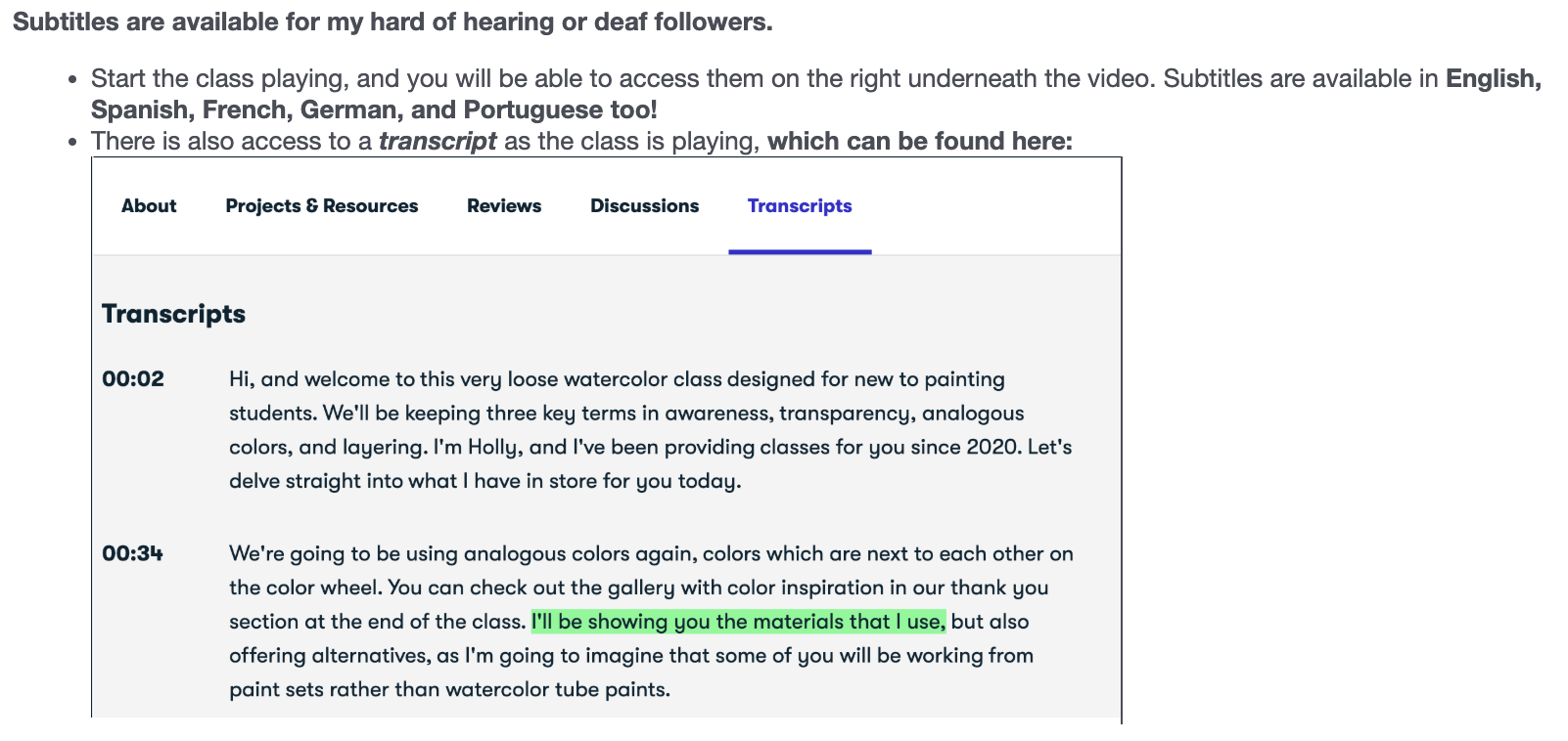
Transcripts
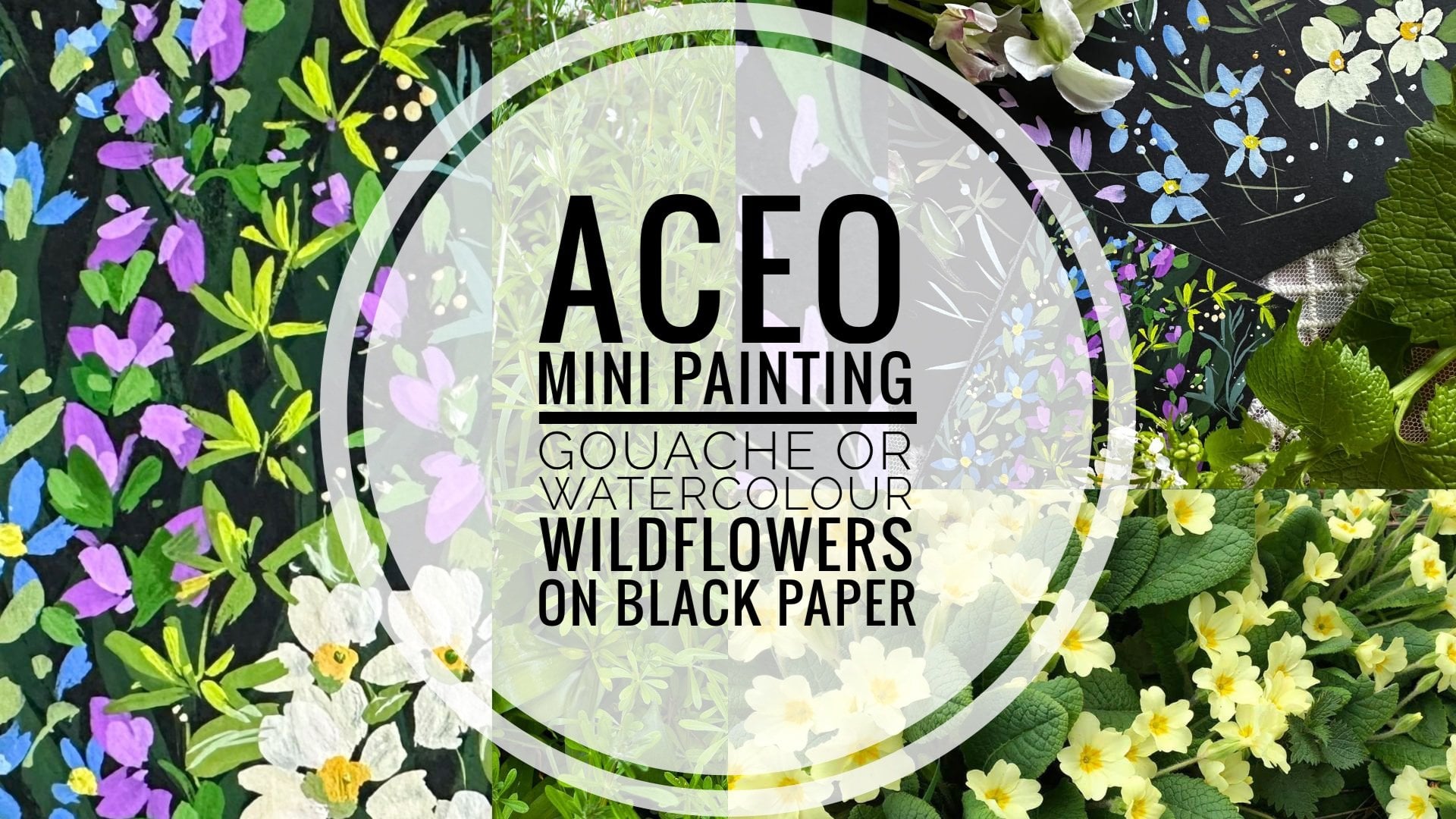
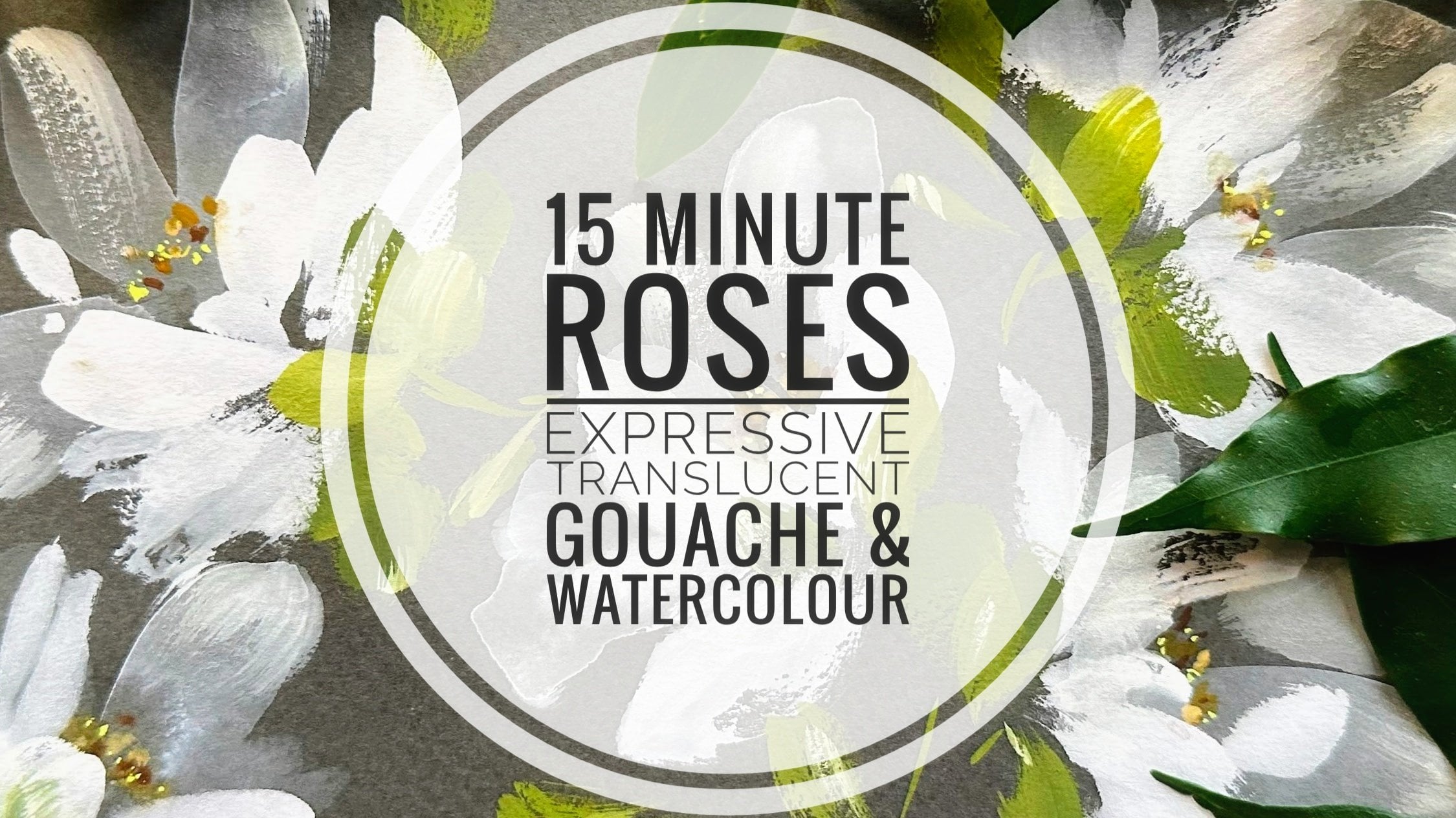
1. Welcome To The Class!: Welcome to this class switches centered around Rosa Rico. So this is planted and Malone and of Scotland and many pumps the weld along the coastal areas. It acts as a natural wind break and also office feed forward. Like I said, we're going to be using book today and just two brushes. One for loose floral shapes and long detailed brush. Now roses and loved the world over. And that one of my favorite flowers too. But I want to approach it in a slightly different way today. So what we're going to be doing is including lots of different techniques and are going to start to build up layers this way and lots and lots of texture. So we'll start with these very loose petal shapes. And we'll create some negative space in between the flower hats. Trump Kingsley chain like this, immediately makes it look like colors and mucosa. Using the light green in the background makes the piece look backlit. And then adding the texture details with my detail brush. And he starts to bring their plans for what will you send a topic to fs graffito? If it's a blotchy. And then finally, we'll finish with little details. Adding field league therapy may be shaping on petals. So let's move on now with the class together.
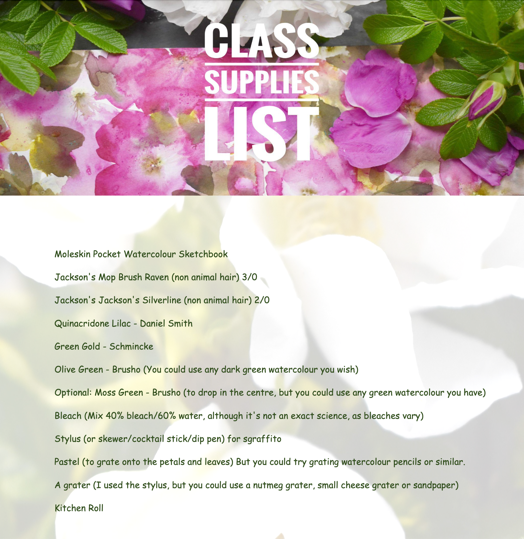
2. Materials : Running through materials, you'll just need two brush really And this could be any brush you feel happy with. And these are very loose shapes, so it doesn't necessarily have to be a similar Bush to this. And this is a three or 400 rave and from Jackson's small month brush, which can be made into a point and a fine detail brush. This one I got is two, our viscera Silverlight from Jacksons. The payment for the roses themselves, just one color and I'm using Quinn lilac. And but any pink or even yellow, which is apt to be the same color. And, but I just love this color at the moment. A few greens, but really only need two greens and a paler one, which we're going to be using for the background leaves. I've got here a green gold, but I mixed it slightly with the darker green amazing, which just happens to be a brochure. It can be watercolor, it doesn't have to be cautious. And I've just chosen an olive green and the green gold. Now I'd like to drop in on limits of mosque green powder into the center of my roses. But again, you don't need to have brush. You can just drop in a little bit at the water cooler greens that you have. We then got a stylus. We could use cocktail stick or a skew going on and depend just relative scratching detail when the center Little drop bleach may be two drops, make sure the Cambrian and swell ventilated on that. It's going to be a tiny, tiny amount, which is going to be easier for the center of the flowers. This is diluted and 40 percent bleach and 60 percent want. And then only the data up to that really is some kitchen roll. And if you want to, you can add some nice into the center. And this is just hostile and it can use a stylus side lightest use there such. But you could also use a little not migrate terrible sandpaper.
3. Mixing Our Palette And Swatching: So I just wanted to show you on my palette. So here I've got to forgive the odd bits of paint left over from previous paintings when I found out she using a big palette like this. This is just very cheap plastic tray and helps me a lot because I like to use brochure in different forms is in powder. Just gives me little bits of gray mix. And I found it really helpful. So this is the Quinn Laila. So I've got all of that water down. But I also want to be using it fairly neat. So I'm going to put the exposure that there. This is the darker green I've chosen. This is olive green. Quite dark. And again, this is Prussia, comes out orange, but it's bringing any green that you have, anything, watercolor, gouache. So that's my green, dark green. And then I'm going to use and paler green. And the one I've chosen is green gold. And really liking Ashaninka paints, actually buying them recently. Russia. This is a lovely bright green. We're going to be using that as a background. Background leaves. Now it's slightly too bright. So what I'm gonna do is just take a little bit of fat, makes 10. So that's the part that I have going. And it's really only those three colors, a darker green and light green, and whichever pink or orange or anything like that you're going to use for euros is. And if you have mosque green, Prussia, then we can drop that into the center of the flowers. You can also mix that with the olive green. And I like coffee, it's a powder sharing. And then I just kind of bring that out a little bit. I'm not mixed with that's quite nice. So you do not meet the half portion. And it's just that I use to the colors. Just pale green, a dark green. And if you want another green to add into the center, but you could totally use one of these greens for the center of the petals. Tap, tap, tap. B. Hi.
4. Practising Techniques; Rose & Leaves: So let's have a little practice room. And we might as well do this in our sketchbook because then we're familiar the paper and we know all about the timings and which is going to be important in S. So let's start off by just putting some very loose. And I'm using quinoa I like here. My green gold and it says my olive green. And there are three, only three colors that we're going to be saying. So very much heavy, heavily pigmented paint. I'm just going in to do another three petals. Then we're going to do a magic trick with the laparoscope would bleach on the end of a very fine brush here. I'm just going to drop that in. Now very quickly. Let's drop a little bit too green. It's actually panels it because it cries out paper, but he gets him quickly. It does still take and that's just my olive green. And then a little bit of pressure pounder. Most screen as well, the center. And it's kind of like to do is create some negative space between roses. And it also is going to be helpful to help or technique would be leaves. So I'm just going to draw some clear water to some of the patterns. And then you can come this side. Two similar shape just with water. And a model that's too wet to append some pressure or whichever green Yong USA. And once you've done a few more petals around this PMOS, is these little white pops kind of really add to the piece. It allows the, allows the eye to rest on top of it. So let's put down our first layer of green and wrinkled, but I'm mixing a little bit just to make it a little darker with my darker green which are chosen is on a break. So you really want to just throw these down. But just wanting an impression in thing to particular. So once the triangle that we can go back to our sentence and if we're not happy with spread of the pressure in the center, can go backup just to break it up a little bit, bring it down to the rest of her. The pattern. And that's just with clear water. And also Monsanto here. This is dry, mouth dry. That's just do a little bit of a dry brush technique. So he just dragging a fairly dry brush. So it's often nice. I've put paint on my brush, adapt the excess on, start here and then just bring it home, burn it starts a little better. Texture. It's dry brushing. And he can just wake. So it looks like it's turning to. Another thing you can do then is you can just scrape the central little bit, says a stylus. Still a mess to perpetrate out a bit more. Spatter. Screener do the same here. They just fiddle about until you're happy. And there's lots of room to go back in if you're not sell. Turn up toward too much Patna saying, let's do some dark leaves down, squaring, be seeing green and start to have parent green to me. It's very effective and dreamy. This is not since it won't be when we do our pay something for the both both the pages. And because I'm having to think connects plane, so it will be a lot quicker knee, so a material piece together. So what we could do then scrape shapes into leaves, veins to stay alongside. This has already dried and this is one of my favorite. You can just hold it. You have seen Chris is why you have a very pale color flowing into a dark color adult that when that happens, I can't really seem to make happen but enjoy it when it does. Say, you've done leaves to catch some erroneous here. Just keep going back to this. Anything inappropriate with this feels like it's not really connected to the center. So I'm just using water to bring it back home. Opener quite like a wave. Going into this deeper color hand making a shape. So then we can also migrate some custom size and pace. And I'm just chasing the stylus. You can use send pink variable. I'm integrator note neck greater or something like that. Pink in the center here. It just gives you an impression of stamens and make the episode lying about. So that's the basic design. And we're now going to just do this. So two pages and what can quickly, but also knowing that they can come back and you can change something. So if you're not happy, all the packets look the same. You can go in and drugs small paint over. It cannot leaves. So let's move on down to multiple two-page spread.
5. Our Class Project!: So let's move on to
our class project. We'll start off by laying
down the petals to our roses. Quite watery, because
we want to create some flows and to pull the
petals out with clear water. I'm just adding some
water there to that one, and you can see the paint
moving around the page. I've got quite a
lot of pigment on my brush for that one
as well as water, and then adding the water
to pull it out again. And you can see that
we're placing our roses, leaving some space in between that we can then
fill with some leaves, some background,
and some texture. And creating a big
flow there between the two top flowers by
adding water between them. And let's add touches of
our moss green brocho. That tends to push pigment away and kind of creates this
dry area in the middle, which is wonderful for
creating rosaugosa. Now let's continue to build up our roses by adding a
layer of thicker paint. This is the quin lilac still. It can all look a little
bit messy at this point, but it will actually
resolve itself. Here we're dropping in
the water down bleach, and you can see what
an immediate effect that has on the
center of our roses. It's a much more
explosive experience than using the brocho even. It tends to move out
and bleach the paper. It's perfect for wild roses. And I'm just dotting in some moss green brocha
with my liner brush. What we want is that 50 50
mix of brusho with water. We don't want to water
it down too much because we want that
kind of grainy effect. Adding a little bit of water
to the middle of that rose, and then adding the
moss green brusho. Now let's do that technique
where we start to pull up the paint using our
line of brush on its side. This creates beautiful texture. So we're brushing in the paint from the outer petals
to the center. And already, we can see
lots of texture forming. This one has a lot of pigment in it, and that's lovely because
it's behaved very differently to the other roses. Now let's add our green gold. Just using the
shape of the brush. A small mop brush
is lovely for this, but you could use a round brush. Green gold has a lot
of yellow in it, and that gives us a very
big contrast really between this bright yellow
green and soft roses. I do like to use it in paintings because it always
looks very back lit, and that's what I
really wanted from this project was to use a really bright color
for the background, which sounds counterintuitive. But actually, I think it's really joyful
because it really looks like the sun is shining through the
roses from behind. And now it's time to add our darker green,
whatever you've chosen. Now I'm using brusho olive green watered down to an
ink consistency. But you could use any of your
favorite watercolors here. We're just really
wanting a contrast between the very
bright green gold, just to create some depth. And everything is still watery enough for it to be
moving together. I think it's time to get
our liner brush again. I'm making sure that
it's very dry when I'm going in and just creating these lovely
textured lines from the outer petals
to the center. It's something that you
can't quite control, but that's what I
like about this. It's really lovely and adds another layer and texture
for the eye to find. Adding a little bit more brusho moss green into
the center there. And a little more
watered down quin lilac. We're still very much at the
experimental phase here, so try to remain nice and loose. And then just bringing some more brusho moss green into the center
of that flower as well. Bit more up here. I do like creating little flowers just with the brusho moss green, adding water, and then just
dropping it into the center. So moving round to
our other page. And look how, although we're moving on to different areas, the watercolor is still moving. I love that that it's
all kind of carrying on its little journey
as we move around page. And when we look back,
something magical has happened. So just creating a
little bit more texture there with my liner brush. A little bit more moss
green in the center. And then this is an
alternative that we can do, which is to use the
liner brush for its purpose and
paint some lines. I'm drying my brush off there, and I'm going to add quite
a thick layer now on top. So this rose has three layers. This is very pigmented. It's probably 80%
pigment, 20 water. Let's not be afraid to just lay some very thick
watercolor down now. You can see that
all the roses have very different characters
from one another. Et's bring in our blotting now. And it is just the kitchen roll. And I just want it
on certain areas. It doesn't have to be on
every rose or on every petal. And now let's do
some scratching. So I'm using my
clay modeling tool, and I'm pulling out
the moss green, but I'm also creating little circular marks in the center. Do that again here,
just pulling the brush out and creating these little
circles and scratches. A little bit more blotting. Isn't that a gorgeous texture? I really love it. And now let's turn our attention
to the leaves. Some of these have
dried already, but that's okay
because we can still pull through the
little pools of paint. It's quite warm
here, so obviously, drying times are going
to be different and respond differently wherever
you are in the world. And I just created
a little leaf shape there in the bottom left. And isn't that yellowy green lovely mixed in with
our darker choice? So now a second layer
of olive green leaves. And again, just using the
shape of the mop brush, which I always think
of as friendly. It creates friendly leaves. And what we want there with
the leaves is not to go over exactly where the
leaves are underneath, but to go slightly off kilter, so we're keeping it fairly free. So there I've gone over
half the dark green and half the light
green underneath. Starting to get
real character now. And at this point, we
can start to seize up just a little bit because
we get a little afraid that we're going to
do something wrong. I would just advise you to
stay very loose with it. This is a sketchbook, and sometimes it can take two or three attempts to
get to where you want. So really adding some
more pigment now. And you can see that the
earlier roses have fallen into the background and creating
real depth for us. So some more slightly watered down moss
green in the center. And then I'm just using my
clay modeling tool to scrape in pastel just as we practiced. This always gives the feeling of pollen flowing around
in a summer breeze. It's a beautiful technique. I love it so much,
and it's so easy. I just chose this because
it's such a bright color, very contrasting to the
pinks and the soft greens. I also wanted it to show
up when I sprinkled it in, so it needed to be a
fairly bright color. So that's our pastels. We're on home stretch now. I'm just going to add some
more dark leaves up here. It's got to the point
now on my painting, at least, where there's
still a little bit of flow, but it's mostly kind of dried, and I can start to put
more defined leaves down. This corner down here
looked a little bit bare, so I put some water in, and then I added
some of the brocha. You I'm just going
to gently blot. And then that's that. Don't want to get too fiddly at this stage. So just a couple of areas
here I felt were a little bit bare and I just wanted
to add a couple of petals. So let's cast our eye over our sketchbook
practice project, and I think it's done.
6. Rosa Rugosa Gallery: See you again Soon!: Thanks so much for joining me and I hope you've really enjoyed it. And you're going away with some techniques that you can use a nephew turn your sketch books. Putting some time aside. I love to do the sketching is really important because it's a no pressure way of developing your style. Single leaf, you know, with the rest of the food terms of these beautiful Muslim, the GFC. And I hope to see you again really soon. Hello.
 Holly Tomas Art, Watercolour | Gouache | Mixed Media