Transcripts
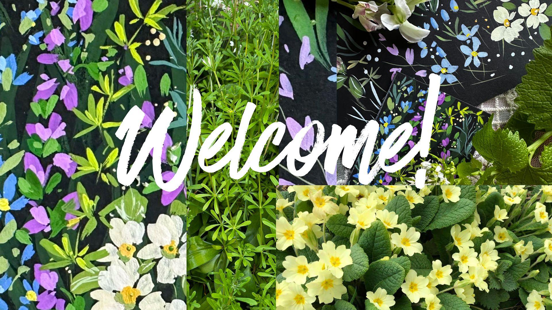
1. Welcome!: Hi, there and a
hearty welcome to this introduction to Mini
paintings ACEO style. So before we get started, what the heck are ACEO? It stands for artist cards,
editions, and originals. The beauty of ACEO is that it makes art
affordable for everyone. They're highly collectible, and there's a thriving business on trading places
like Ebay and Etsy. There tends to be
only one guideline, and that is that each painting
is measured 2.5 by 3.5 ". They can be any medium. From Watercolor acrylics, Mixed Media or
collage and beyond. ACEOs differ from
artists trading cards in that they're designed to be sold rather than free traded. I love that they create
an opportunity to relax. As it reduces overwhelm because of the tiny size
of the piece of paper. They can fit around a busy
schedule or health needs. You can paint one in
a matter of minutes or do multiple cards on
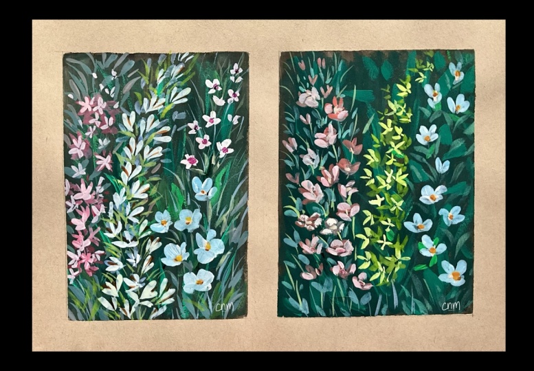
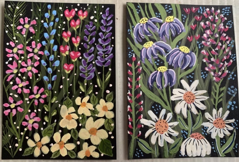
a theme all at once, like I've done here. They're adorable
and so much fun. I think once you've
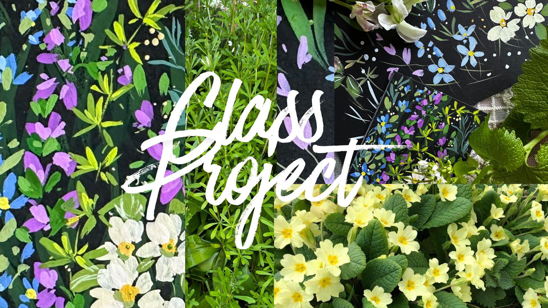
caught the bug, it will be hard to stop, and why would you want to? So to our class today, we're going to have a
little warm up practicing our leaf shapes and florals. Before moving over to
our class project, we're just going to focus on one mini painting today
just to get us started. As always, if you would
like to share your work, I would really encourage
it because you can make connections
with other students, share tips, and get feedback. Subtitles are available and also a full transcript
of the class. So when you're ready,
let's get started.
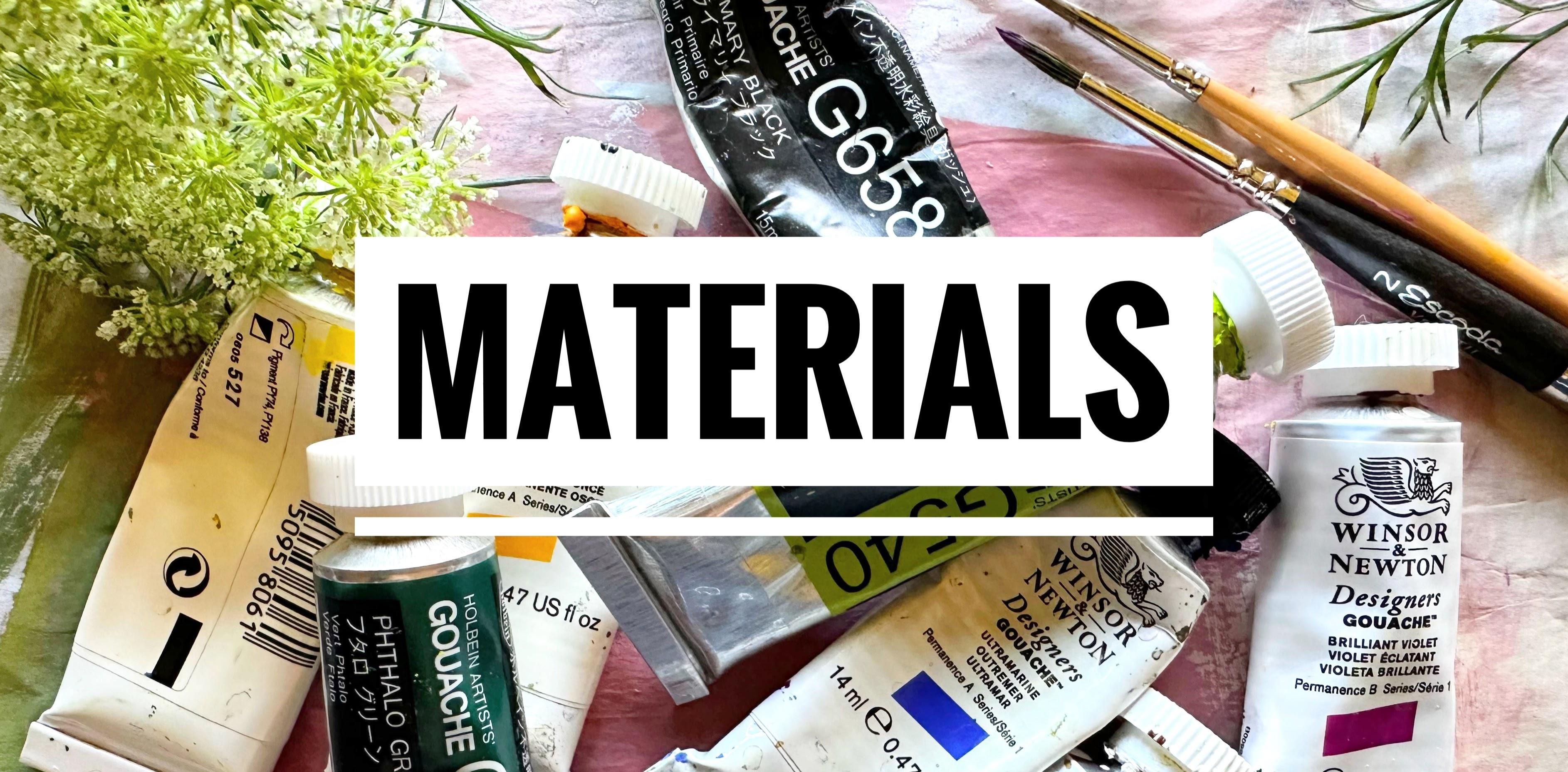
2. Materials: Jumping straight
in with materials. And I used Artway and Vro
285 millimeter square, and this is black,
kind of like a card. And then I'm going to
cut that down to size. This is really affordable, and you can also buy
pre cut ACEO cards, which I've done for
future projects. I've got primary yellow
and primary yellow deep fallow green and
black, Leaf green. Ultramarine, white
and Brilliant Violet. As I always mentioned, you can use Watercolor
for this class. And what I recommend is
just buying one tube of white gouache and the
mixing of watercolors to that. That's just a good way
to transition without spending lots of money
on tubes of paint. Then I am using my
size two Escoda. This is a round travel brush. It's really great
because it goes down to such a small size if you want to take it with you
on your travels. And then if you wanted
to do some detail, you could use a detailed
brush like this. This is a Billy's Shoal brush.
3. Cutting Our Paper To Size: I so we know that ACEOs are 2.5 by 3.5 ". I'm going to save a
little time here and just draw around an artist
trading card that I have. I really detest measuring. And this is that black card, which is very inexpensive. You don't need to have
really good quality black Watercolor paper
or anything like that. And then it's just a matter
of cutting these down. And I think I'll cut a few extra so that I can try out
paints on the side.
4. Practice: So I have an off cut
of the black card, and I'm using my size too. We just need any green
really for this practice. So I just mixed a
very quick leaf green with thalo green and
white and yellow. And then let's
practice our leaves. So what we're doing here is slow and quick movements
and tip, belly tip. Let's try some elongated leaves. So tip flare a little, and we're moving it
further along the page. Now, let's do our side sweep. I do this in probably
most of my classes, and it makes a
lovely organic leaf. I really love it
for a brush stroke. I use it a lot. So
we're kind of going from the tip down to maybe
two thirds of the way. So not right down
to the full brush. Any round brush will
create this shape for you. Let's move on to our cleavers. You can either put
the stem first and then do the leaves or
the other way round. So this one, I've
done a stem first, and it's a very similar movement to the first leaves that we did, but not pushing down
on the brush as much. And they tend to be fairly
horizontal looking at them. So just moving up the stem So we're going down from the tip to
maybe halfway down the brush. This brush, in particular, is really versatile, and
it's one of my favorites. It really is reliable. It's got a lovely
shape for leaves, and you can get all sorts of
different shapes with it. So the size two Scudder. Let's try now with
a liner brush. So nice and slow, let's just practice
tip, belly tip. This is also a
really lovely brush for creating Wildflowers. You can also add tiny little details like the little dot on the
end of that leaf. So let's practice stems. I have very shaky hands, so I tend to do my
stems quite quickly. Let's get a little
movement in them. A little curve. And then trying quick and slow. With a fine liner, you have a lot of versatility
of movement. And then let's try the same with the size two round brush. So you get a very similar feel. I would just say if you
want very tiny details, then a liner is the
best brush for you. And again, just trying
out different stems, quick movements, slow movements, slight curves or straight. I'm just going to add
a little white here. Let's practice our
yellow flowers. And I suppose I have in mind
that these are primroses, let's just start out by doing
some heart shaped petals. Just consists of
two brush strokes. We're pushing down a
little bit more on the brush to get fuller petals, lovely rounded shapes and moving out the way
there and then in. So either direction, whatever
feels comfortable for you. And there's a half
opened one there. And let's do some blue flowers. I love that kind of a
blue tint with that lovely almost 1950s
buttery yellow white. I'm using the same brush, but just not pushing down as
much as with yellow flowers. And this is the same movement as the leaves on the top there. Yes and practice just some tiny, tiny, little florets with
just the tip of the brush. So pretty and very easy to do. Now I've mixed a kind
of a pinky purple. And for these flowers, let's use the same brush stroke as we did with the blue flowers. I tend to like doing a larger
one and then a smaller one. And using the tip
of the brush again, we're going to add some little filler florets towards the top. This color is so gorgeous
with that yellow and blue. And then let's add some
here amongst the leaves. So nice slow movement
pushing down halfway along the brush
and doing these little Vs. They're really simple, but
look how pretty they are. Maybe some little flyaway
florets around the main stem. Et's do some centers
for the primroses, and I'm just going to get
out my primary yellow deep, handsy yellow deep
or any warm yellow. And I've just
remembered that this is quite a translucent paint, so I'm adding a little bit of white to make it more opaque. And why not add a different
yellow for the blue flowers? This is primary yellow. You could use a cooler yellow
like handsy yellow light. And again, very simple
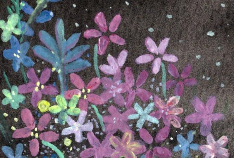
little centers. I love painting on black. It makes the flowers
look so pretty, makes them really three d. Now, here comes one of
my favorite things, which we've done a lot in
the past with other classes. And that is to use a
clay modeling tool, one of the ones with
the bubble on the end. And I'm just adding a tiny
bit of water to that. And then that's just
dot very handy, very cheap to buy, and I use them a lot for
all sorts of things, really, just for
dotting or scratching. Let's try some
darker yellow ones, and maybe even some green ones. You can see when you get onto your project,
what you want to do. Very simple again, very
quick, very effective. If you don't have
one of those tools, you can always use the
bottom of a brush. So this is my fine liner. Slightly bigger dots, but
as you run out of paint, they gets slightly smaller and very comparable to the
clay modeling tool. Finally, let's do some fleshy
leaves for the primroses. So I'm just waking that up
again with a little water. And these are two stroke leaves.
5. Background Layer: Let's start off by creating
a lovely background layer. And I'm using the fallow green
with some primary black. And then I have some leaf green. Use any warm light green
like green gold maybe with a little bit of
handsy yellow light and a couple of areas of white. And this is primary yellow. And primi Yellow Deep. Ultramarine and
brilliant violet. And then just for this layer, we're concentrating on the
hallow green and black mix. Maybe bring in a little
bit of the leaf green. So let's mix those two together. And we want this to be in the background but
not completely lost. That feels a little dark, maybe. Give that a good swirllround,
a bit more water. And maybe a touch
of a lighter green. Let's see what that looks like. I think, even a little
bit more. Bit more water. That's looking much better. Yeah, I liking that. So we're going to do those long strokes
that we practiced. I like them running
off and onto the page. And these are just
random strokes. We don't need to worry about
them being perfectly formed because what we're doing here is creating an atmosphere for
the rest of the painting. And that's sinking in
a little too much. Added a little bit more
of the leaf green. And then doing some curved. Just alternating Oops. To light. Don't worry. You can go over that. Yeah,
alternating the strokes. So they're going off
to the left, right, center and overlapping
going off the page.
6. Blue & Yellow Flowers: Onto our blue and
yellow flowers. And I'm using my size
two round brush. And let's mix our
French Ultramarine. So I'm doing a darker one here, which is mostly the blue
with a little bit of white. Adding a bit of water. And then let's mix a lighter one so that we
can add highlights. All we need to pay
attention to is whether it's bright enough to show
up on the black paper. And let's start to make our
flowers in a way that we practiced using the tip
belly tip movement, creating five little petals. I want them to have
this upward movement. But I just want it to
stay a little bit random. So let's add some little dots and extra half open
flowers around it. And I guess these could
be forget me nots. And then let's add white to
your chosen warm yellow, and I chose primary yellow deep. I went a little too yellowy. It's such a bright colour, so I'm adding more white. I think I'm thinking primroses, so I want them that kind
of buttery yellow white. And then what we're doing is kind of little two stroke heart shape petals
for this first one. I've got primroses in one of my window boxes at the moment. So pretty. And then maybe
a smaller one here. And I'm drawing out to in and also on some
of them into out. And to create slightly
larger petals, I'm using that slide
sweep that we practiced.
7. Violet Flowers & Cleaver: So we have blue, we have yellow. I think it'd be
really nice to bring in either a pink or a purple. I am going to be using
my brilliant violet. You can choose any purple, pink, red, and mix it with some white. And again, let's create
two different tints, one darker than the other, thick enough for it to move, but not too thin that it settles back into
the page too much. And then, these are all
very similar strokes to the blue and the
yellow flowers. This time, just creating one main stroke and maybe
another to the side. And let's imagine
that we will be adding a stem and
leaves to these. This is such a pretty color. I've only just bought it. But I can see that I'm going to be using that quite a lot. It's a Winsor and Newton color. If you feel easier
doing the stem first, you could go ahead and do that. I like to do my flowers first just because it keeps
it a little bit more random. I'm not kind of
too tempted to do them either side of the
stem in a regimented way. So now we have those down. Let's start doing our cleavers. We can get our leaf green
could be green gold. Then using the mix that we
had for background leaves, let's bring some flat
over to our leaf green. That's a really pretty green. I like that. That was
a little bit dark, so I'm just going to make sure that it's bright
enough to show up. Oh, that's better.
Very simple strokes, just pushing down a little bit. And we can add the stems
to these afterwards. I'm doing them slightly smaller
as they get to the top. I really want the feel of them
trying to escape the page. I love that color
because it comes right forward from the
black and the dark, cool green leaves that we
have in the background. Let's add a little stem. You could go down to using a fine liner for this
if that feels better.
8. Flower Centres & Leaves: So moving on to our centers, and let's mix perhaps a warm
yellow for the prim roses. So I'm using primary yellow deep with a little white ring
towards the yellow. And let's use a different
yellow for the blue flowers. So I'm just mixing some
white to my primary yellow. Or a handsome yellow light
would be great for this too. And just the same as we
did with the primroses, little circles of paint, and then maybe some dots
on the half open flowers. So let's now do some leaves, and I'm using a little
bit of everything, the prime yellow
deep with white, the background color that we
mixed with some leaf green, and let's couch our primroses
in some lovely leaves. Just that two stroke
leaf that we practiced. I'm pushing down on my
brush a little bit more. And some of the leaves
can go over some of the flowers and maybe
a little stem or two. Those look so lovely now with that beautiful natural green. Let's mix a slightly
lighter green and putting down a little
bit more leaf green. And let's do some
highlights on the cleaver. Nice, bright green. And, yeah, that's
looking really nice. It's going over the slightly
darker leaves really well. It doesn't have to
be over every little strand, here and there. And as you know, when
we use brighter colors, they come even more
into the foreground. So it's a lovely way to make your flowers and leaves a
bit more three dimensional.
9. Leaves & Flower Highlights: Let's mix a lighter
version of the purple. So I'm just adding a
little bit of white, and let's take up some of the previous mix to create
a lovely pastel pink. It can be quite
delicate here and just go in and add little highlights. I'm just placing them over the
previous petals or around. So pretty. I love this color. Let's do the same for our
little ones over here. It's such an easy thing to do, and yet really makes
things come to life. Just mixing one color and then making a little sister
colour with white. Let's just add a
little bit more leaf green to this mix
that we had before. And that looks lovely
on the black paper. And now let's create leaves
around our blue flowers. Just a smaller version of the leaves that we did
for our primroses. Two little strokes and not forgetting our little
extra half open flowers. And I'm growing smaller on the leaves as we go up the stem. I love how the top leaves of both flowers there almost
become impressionistic, little dots of color mixed
together side by side. Just putting in tiny little dots now around the main stem. Little filler leaves. And then let's do some
highlights on our blue flowers. And again, just adding white to the Ultramarine mix that we
used for these base flowers, either over or around. Cute.
10. Leaves For Our Purple Flowers & Primrose Detailing: Let's do a quick mix
of fallow green, a little bit of primary yellow
or handsome yellow deep. So with this one, it's
a lovely, bright green. I think it's too dark. It's not showing up so much. So I'm just gonna add a little
bit more primary yellow. Let's see what that looks like. Yeah, I like that. Just dotting them around. We won't need a lot
because the page is now getting quite busy.
But you know me. I like a busy garden painting. Just adding a little bit
more yellow white mix. That's better. And then around our other front
of purple pink flowers. I'm so happy that I
got this brush again. I lost my old one, and buying
a new one has just given me I can have a boost because I love it for
leaves and flowers. It's, it's just so nice a shape. What I'm liking here
is how that bright, fallow green complements that larger dark leaf
in the background. I love those together. So we can go back now
to the centers of our prim roses and maybe just add a
little bit of shadowy. I want to mix a neutral that's not going to
show up too much, but just adds a little shadow. So I mix that fallow green with the primar yellow and white mix and just little sea curves. I've got some white here. And what I'm going to do is just mix up a slightly more watery, white with a touch
of yellow in it. I just want to add
some little highlights to our primroses, with that mix of
white and yellow ring on more of the white.
11. Finishing Touches: Let's move over to
our detail brush. And just utilizing all of the colors that we have
on our palette now, so that's a mix of the fallow green mix,
yellow and white. And let's do some little
details on our leaves. If you don't have a liner brush, you could always use a gel pen here or a dip pen to
add these details. Primrose Primrose leaves
are very grooved. That's why I just want
to lean towards that to suggest that they are
very complex leaves. Doesn't have to be a lot, just a few little lines veining or outlining
of the leaves. It feels like we have a
slightly empty space here. And I have some leaves here
from a bouquet of flowers, and I really love
the shape of them. And I know that a liner brush
is really good for this. I've painted this style
of leaves before, and it's perfect for this. And I think it would
be nice to go even cooler just checking out if
that's showing up enough. So a green leaning
towards a blue here. And then I'm just using that as a little prompt to create these very
delicate, long leaves. This colour is
really working here because it's not taking over. It's not coming too far forward. It's in the middle ground,
if that makes sense. We've got that initial
layer way in the back. We've got those bright small
greens in the foreground, and these are sitting in
the middle somewhere, which I think is really lovely. And whilst we have this mixed, why don't we just add some little leaves around
the edges of the page? Making some of the
leaves a little larger. Now, let's go over to
our clay modeling tool, or anything that you know is going to create some
really nice dots. And let's do some dots around these leaves that
we've just put down. I am dotty about dotting. So, of course, it can't
stay on just one plant. I have to go around the page. And you can vary
your color here. I'm just sticking with
that yellowy white mix. But you could use green or
the purple or even blue. They're so cute these stuffs. And I like to add them
because it's almost like pollen being blown around
gently by a breeze. And there we have it.
12. Thank You!: Thanks so much for
joining me in this class. I saw a random post on Tik
Tok one day about ACEO. Before that, I had no
idea they existed. Since then, I've been
painting them non stop. And actually put up a series
of 18 mini paintings on Ebay recently as my
very first venture into selling on Ebay. And they all sold. So if that was one of you,
thank you so much. I really hope that this class has inspired you
to start creating your own ACEOs as someone
who is chronically ill. I found these so accessible, really fun and very low stress. And, of course, if you want to, you can start your own
little mini business by selling them on Ebay or Etsy. If you have any
questions at all, you can contact me
through discussions underneath the class
or over on Instagram. I'm Holly Tomas Art. If you enjoy my
content on Skillshare, please consider hitting
the follow button. In that way, you'll
get updated about any new classes and
notifications about posts. So I hope you've had fun, and I'll see you
again really soon. Take care. Bye for now.
 Holly Tomas Art, Watercolour | Gouache | Mixed Media