Transcripts
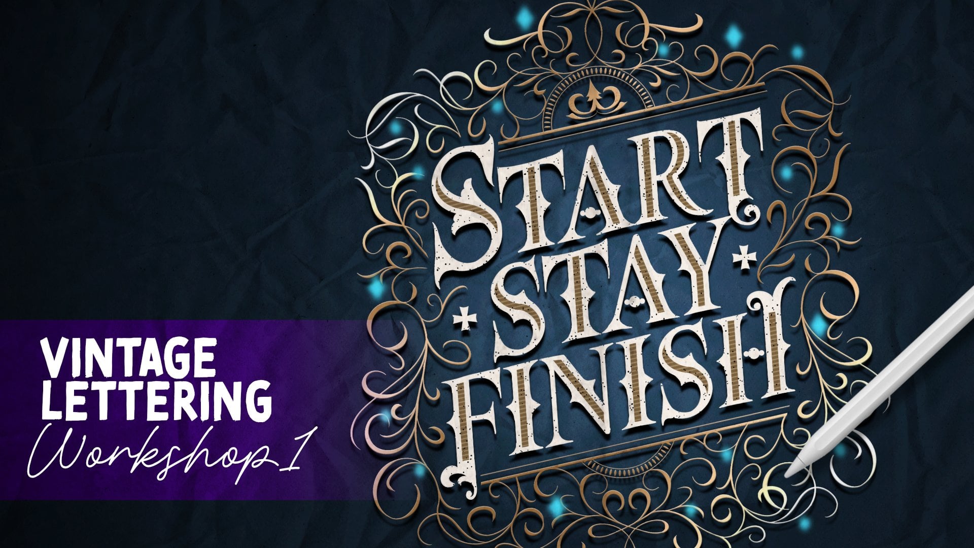
1. Skillshare Intro 2 Retro Sign: Do you want to
learn how to create a stunning retro sign
design like this? Hi. My name is Niko Nang. I am a lettering
artist designer, and educator based in Manila. I have been lettering
since 2014, and throughout the years, I have been sharing my love for this craft through
workshops, online courses, my analogue lettering tools, as well as my digital
lettering packs to help creatives like you learn lettering and to help you create beautiful and stunning
designs much easier. In this class, I will walk you
through the entire process on how to create a vintage
metro sign like this, starting from building
the structure to arranging the
type to coloring, designing it, and
adding patterns. So if you want to create
client projects or your personal projects or
products in this style, then this class is for you. I'll be using my ultimate lettering toolbox,
the Retro PAC. But don't worry if you
don't have this PAP because all of the
design assets that we'll be using for this
class are going to be included in the
downloadable files section. So don't forget to download them before starting
the first lesson. I'm super excited
to start working on this retro sign
design with you, so I'll see you in
the first lesson.
2. Designing the Circular Panels: So let me just hide this if
you Okay, sorry about that. I want to hide this. I mean, I want to delete this, but you can actually
export this as JPEG first so that you can create a reference
where it is reference. Here on actions, Canvas, turn on reference, image, import the image of the final artwork so that
you have a reference on the side to check and see if you're still
doing things correctly. So we already have that. I'll just remove this so that I have more, what
do you call this? Me space, an obstructive
view of my canvas, okay? So you should have
all these layers. So the names of the layers
are actually the names of the brushes or the
stamps that we used. So let's just hide all of these except for
the color guide, okay? So the very first step is to start creating
the circular panel, which is for the word find. Okay, there you go. So if you have the brush set, you can go ahead and create a
new layer, change to black. So the shortcut that I did
is because black I mean, there are a lot of
different blacks here, like, different dark grays
that look like black. So if you want to get,
like, the black color, you can go somewhere
near or point your pencil near
the darkest color and then just tap twice. And it's going to lock
you to the black color. I mean, that's just a little
tip in case you didn't know. So let's open up our retro composition
ULT retrocmposition, because this retro pack has two brush sets, the
retrocmposition. I mean, the ULT
retro coomposition, and the ULT retro lettering. So all the panel shapes
are under composition, and all the sketching patterns, textures are under the
lettering brush set. So here, under this
retrocmposition, you can scroll all the way down and then we have here
straight circles. So we're going to use
straight circles. And then you can resize it. I think I used a preset here. I can tap it like this, tap tap or a horizontal
line like that. So difference between
the straight and the floating circles
for the floating, if you draw a horizontal line,
I need something bigger. It's not a line. Basically, that's
just a difference. But anyway, you need the
Wait where is it again? Okay. Straight circle
here. Let me just erase. And then tap, tap, tap, tap. I want everything to be aligned. So I'll just tap one
and another one, and I'll just manually,
position this. Maybe like this. So I want the first
letter to be lower, second letter a bit higher, third same height, and the
fourth is a bit lower. Like this. Yeah. We'll just position it, name it like that. I'll duplicate the entire thing, flip it horizontal and
move it horizontally. Just try to give it some
even spacing like that. And then I'll merge
everything like that and center
everything with that. Okay. Actually, the panel is already here straight circles like here. So you can go ahead and
use this if you want. So I'll just bring this
higher still like that. Okay. So it's a bit
too light for me. So I want to duplicate this
a couple of times and merge everything just to darken
it and fill it a bit more. So all of these layers,
I'm going to duplicate it. Now it's a bit darker, which is easier to work with, and it's going to be
a bit more visible. Okay. So as you can see from the guide right here,
let me just zoom it in. Okay. So it's circles, and we want to fill
in with words. So we want to use a font. So under actions, we're
going to add text. We're going to type in Fine. F I N D, all caps, right? Fine. And then we want
to change the font, too. So click on Edit Style. And then I think the font
I use is Havener next. Heavy, the heaviest font size. Then I'll just bring it down and increase the size until it looks like it's going to fit
into that shape right there. So as you can see, the
layers are going to fit in here and it's not
going to be too tight. I think I want to increase
the size a bit more. Increase a bit more and make
sure that it's going to fit There you go. And then once you're
happy with that, you can now rasterize it so that it's no longer, as a font, you can edit and
move things around individually so that you
don't need to I mean, so that it's going to be
easier to move things around rather than if
it's in a font itself. So we want to position
everything to the center, and to easily do
that is I want to, like, separate these circles
into individual layers. So I'm going to
select that layer. Use rectangular marquee
to seg and cut and paste. I select two, cut and paste, select one and cut and paste. Now each of these panels are in separate layers so that
when I move my letters, it's going to snap
to the center. So I'm going to select
one letter at a time, like letter F, move it here, and as you can see, it's
going to snap to the center. And select the I, move it
here, snap to the center. Next is the letter
N. Move it here, snap it to the
center, sing Oops. Same with the letter
D, select it, move it. Oops, not rotate it. Oh, man, why do I keep
on touching that? Snap it to the center
like that. There you go. And you can merge all of these
circular panels together again because it's easier to
work on them in one layer, and that way you don't use a
lot of use a lot of layers. Okay. So let's now start
to color the panel. So as you can see, the ring is going to be in
the teal color, and the background or
the inside is going to be in this lighter
reddish color. And then there's going to
be like a three effect. So it's going to be
this darker color, and then the patterns
are going to be in this yellow color. Okay? The text is going to be white, and there's a drop
shadow that's black, so that's what we're
going to do together. So is create a new layer below the circular panel and select the circular panel
and use it as reference. So make sure reference
is turned on so that even if we're
working on a separate layer, it's going to lock
into that layer. So because if this
layer is bland, and if we added a color fill, it's going to color the
entire layer, right? But we want it to use the
circular panels as guide. So to do that is using a click
or set that to reference. We turn on reference
on that layer. Now let's go back to our
new layer and let us select color pick list color, and then we can
now just drop it. In filling, tap the rings. There you go. It's colored. Next is create a
new layer below, and we're going to color
it this darker red color. Okay? So, same thing. Just color drop it inside, continue filling.
There you go. Okay. And then we're
going to duplicate this and change it to
the lighter red color. So color pick that.
Turn on Alpha lock. Fill layer like that. And then we're going to
move it lower right. You see that? Okay, lower right. Do you see that? It's going to add that nice shadow effect. So it's like it's
gonna be there's, like, a depth to it. Do you see that? That
looks nice, right? Next is, as you can see, if the circle isn't really
going outside the shape, we can just leave it as is. Next is to add some
patterns, right? So, create a new layer, and then using the circle, we're going to use
a pattern brush. So if you don't have
this zigzag brush, which is under retro lettering, and then just look
for the zigzag brush. Thin zigzag pattern. If you don't have this brush, you can just use a
thin marker brush, draw like zigzag and then duplicate it a couple of
times by moving it downward. I'll basically have
the same pattern. But if you have this brush set, you could just brush
it like that. Okay? So if you zigzag is because I feel like I changed the size a few times already. So if the zig zag is very big, what you can do is just
fill it and reduce the size or you can modify
the brush a little bit. So just tag the thin
zigzag pattern. And under grain here, you can adjust scale. So, for example, if it's at 15, it's going to be too big,
right if you compare it here. So need to reduce the scale. So I just tap that brush again, reduce it to maybe 11. Let's see. So it feels
a bit big still. So let me undo that and
adjust the brush again. So maybe the scale
can be about 9%. Yeah, I feel like nut
looks good, right? The size looks closer to this. So what you can do now is
turn on clipping mask. There you go. If you want to
make it thicker or darker, just duplicate it a couple of times and merge
it. There you go. Easy, right? So you now
have the panel almost done, like the first circular
pattern panel almost done. Now for the words, they need to be in white, right? And the drop shell is black. So what you can do is
you can just duplicate fine and the top
layer just invert it. Now it's white. And
for the bottom part, select that layer,
and then just move it a little bit to the
lower right, like that. There you go. You're almost done
with your panel. What you're missing
is this black drop shadow right there. So it's super easy to do that. What you can do actually is for the layer with
reference or the outlines, let's just duplicate that. And let's remove the reference because we don't
need that anymore. And then for the bottom layer, we're going to drag
it all the way down. Okay, you see that? And then let's just drag it
to the lower right. Maybe like this, okay? And then what you can do is you can choose black and then
color fill it manually, okay? Or you can just go the
selection on automatic, select the outside, hit
invert and color fill. There you go. So you don't need to color
drop each panel one at a time. So there you go. We're done with our first panel, but let's just organize
everything, okay? So let's just select
all the layers and group them so that the fine
pile is just in one group. And maybe we can
rename this to make it easier, find, okay? So just one tiny note. I know this is mask,
right, clipping mask, but the actual layer is like
a lot, like, really huge. So what I want to do
is I want to, like, confine it to, like, the actual size of the space. So I'm going to tap
on this orange, I mean, the red
one, the light red. Select that layer, and Oops. Okay. We need to turn
off color fill first. So I'm here on select, I'm going to turn off
color fill first. And then go to the
light red layer, click on Select and click
on this orange pattern and add mask then merge the layer with a mask
layer like this. There we go. So it's now confined
to that size. Anyway, that's just
a little detail. Now we can move on
to the next step, which is creating an outline
brush for us to easily sketch our script lettering
like this one right here.
3. Creating the Outline Brush: Okay, now let's start to
create our outline brush. So basically, an outline
brush is, let me show you. I think I've already
created one. Yeah, I've already
created one here. So, whoops, I'll just
create a new layer. We'll create a new layer. So it's something like
this. Do you see that? So it's just a round brush, but it draws the outline. That's basically the brush
that we want to create, and I'll show you how easy it is to create an outline
brush, okay? So on your brush set, we're going to
create a new brush. Let me just delete, I'm
going to delete this. Let's just create a new brush, tap on the plus sign, create new brush like this. In your step. Let me
increase the size. So you want something like
a solid circular brush. We don't want pressure to
change the opacity or size. So first is, once you
create your new brush, you want to bring the spacing down
because as you can see, it looks like the
circles are ghosting. Ghosting as you can
see, it's overlapping a lot of lighter circles. So to remove that, let's just remove or
lower the spacing to maybe about 5%. There you go. But you can still
see the fading part because for the
lighter pressure, opacity changes with pressure. So you just want to turn that
off by going to properties. No, I mean, Apple pencil. And you see this opacity. We don't want opacity
to change with pressure or opacity of the strokes to change
with pressure. So let's set that to none.
Okay, then that's it. This is the brush that we want. But of course, you want
some stabilization, because if your hands are
very shaky like mine, you'll see that
it's super shaky. So let's just change that first. So I click on or tap on
that brush again to edit. We're going to go to
stabilization or stabilization. And we're going to increase
the amount a little bit, maybe to four or
five. Here we go. It's important that you
change the setting right now. So let's just test that. Okay? I think it's
smoother now. That. Okay. So going back to our brush, you want to duplicate
this brush, okay? Because for outline brushes,
it's not just one brush. It is a combination
of two brushes. So it's like we have
a bigger circle and a smaller circle on top, and the smaller circle is
erasing the one in the middle. So it's like making
it hollow or empty. So you just get like a ring. So to do that, we're going
to duplicate this brush. And then we're going to
select these two brushes by swiping it to the right,
making sure blue. I mean, both brushes
are highlighted blue, and then click Combine. And then we're going to
tap that brush to open it. As you can see, you have these
two brushes already here. Okay? Now we're going to
click on secondary brush. And here other properties, we're going to move the
maximum size a little bit, maybe to 90 and then
tap on the brush, the secondary brush, combine
method, shoes difference. There you go. And if you want the
outline to be thicker, you just move the
minimum size smaller. So you can adjust this based on how thin or how thick you
want the outline to be. So maybe 85? No, let's make it. So make sure adjust
the second one, okay? Make it thicker. So maybe about 80 or 81. Yeah, I think this is perfect. Let me reduce the brush
size a little bit. I feel like it's
too thin. So let me just but just the maximum brush, again, of the second
brush to maybe 72. Yeah, I think this looks better. Now, I think sorry. I'm being very
particular with this, so select the second brush, and I'll increase it
a bit maybe about 77. Yeah, I think this is
a sweet spot. Okay.
4. Sketching the Script Panel: Okay, now that we have
our outline boots, where our outline brush,
create a new layer first. Now that we have
our outline brush, we can now start to sketch
our script lettering. So let's start with the B. So you want to, like, try to
create a smooth B like this. If that's too big, so let me just do it again. Like that. I think
that looks nice. So you can create
like several Bs Okay. This isn't my usual script. That's why I kind of
need a few tries. But yeah, just keep on making
the script B like that. So you start with a diagonal
with a look below and two bowls and then curve
it inside like that. So you want to, like,
practice it a little bit and try to get it
in one smooth flow. Feel free to repeat this
process until you get a nice B. I think
this one looks nice, so I'll just erase
everything else, select them and free finger
circular motion to clear it. Okay. Just move this to the
side right here and create a new layer to
finish the rest of the word, which is EAUTY. Since I want to
create everything in one's consistent stroke,
continuous stroke, right? So I'll just try that here. Like that. For the
T, I want it life. There you go. As you
can see, I tried to repeat it multiple
times again and again. Okay. So feel free to do that until you get
a nice smooth flow. So I did that in one go, but don't feel pressured
to do it in one go. I mean, I was just
lucky with that one. So normally I would just
do it several times. Oh, sorry. Make sure it doesn't Okay. Like that. Okay? Now I
have two to choose from. So I think I'll go
with the second one. I'll go with the first one. So just keep on trying and then erase the ones that
you don't like, Okay? I think I'm happy with that. I'll just move them
closer together. But nice I'll just merge these two so
that my B script is just going to
be in one layer. Then I'll just cater
this a little bit. But maybe I'll
bring out the word find so that I can
position this nicely. I'll hide the word fine again. Now let's continue to work on
this script lettering sign. So first of all,
just erase that. Oops. I'll just go
to regrow lettering. I have a funky eraser here. So just erase the overlap. There you go. Okay, so looking at this, you can see that Oops,
just zoom this in. You can't zoom in if
layer piles are open, so you want to close the layer piles first
before you zoom in. You can see that we have
light bulbs here, right? So to do that is we
actually have a stamp. For that, so create a new layer. So under retro lettering, you have this shadow
circle in line. So it's like a liner
brush like that, but I'll just tap it. You can do it like this, but if you don't do it perfectly, then you're going to
hit the edges a bit, so I don't want that. So you can adjust the
size if you want to. Or you can just tap, tap, tap, tap. Manually space them. I do. Just try to
avoid touching. Like, I just like that. So if you don't have
this, you could just just try to make
the spacing more even. If you don't have this brush, you could just tap like a
circle any circular brush. And then, I mean, tap it
with a color wrap first. Then we're going to
recolor that later on. So I'm just focusing on coloring everything inside the lines or tapping or adding light
bulbs inside the line. This step may feel
like too manual but. It's all right. There we go. Like that. Nice, right? So the next step is
to color it, okay. So make sure you're
on a new layer, okay? So we're going to use
that as reference. So tap that layer and
turn on reference, and then create a new
layer below it with that. Okay? So we want to color the
inside white, but for now, let's just color
it black because our background is white, and if we color
the inside white, we won't be able
to see it, right? So just drag the black color there and then continue filling. Then just tap the insides. What so just tap the late top layer like this
to fill that with color. And then we can just
invert that later to easily colored white. Whoops. Make sure you can just zoom it in to make it easier for you to color things
correctly or properly. So this can be a bit time
consuming, but, you know, it's these little details
that elevate your work. So you can spend a
little bit more time and effort with the details for the sake of
your final project. There. Done. Okay. Now we want to color the shadow or the
bottom layer red, but there is a
shortcut for this. Okay? So we're
going to color pick the red color and then we're
going to duplicate this dot. The bottom part, we're
going to turn on Alpha lock and we're going to click on fill layer and then transform, then just move it
to the lower left. There you go. You don't need to color everything from scratch. Okay? So we want to color
the background teal, right? So let's color pick
the teal color and create a new layer below
the beauty outline. And then we're going
to set the beauty outline set it as reference. Make sure reference,
you can see reference, and then select the layer below and color
drop. Here we go. And then for the light bulb,
it has to be white, right? So look for the black layer and then tap on it
and click on Invert. You now have the right coloring. Okay? And then we need to add like a drop shadow to the
lower left like this. They see that. So we want
to duplicate the beauty. Reference layer, I mean, yeah, the reference layer
as well as the light blue one or teal colored. And then we're going to move them closer together like this, merge them together,
and change it to black by going
to adjustments, hue saturation, and sliding
brightness to none, and then transform to, move it to lower
left, like this. There you go. We are now done with our script
lettering sign panel. So let's just select all the layers and then group
them together like that. Rename it two BEAT like that. So the next step we're going to or the next panel
that we're going to create is the main shape panel, which is this diamond
with rounded ends.
5. Building the Main Sign Panel: If you don't have this pack, you already have the wait, let me just hide these layers. We already have the main
sign here mean sign three. But if you have the packing, if you want to choose your own main shape or if
you want to use that one, you can go to the
ultimate lettering tool loss redo compass
position brush set and look for it under
the main signboards. Is it main sign?
Yeah, I think it's the main signboard three. Just tap it in and
then just erase the top and bottom markers. These are just centering
guides. There you go. Okay? And you want to modify
this a little bit so we want to select this inside because I feel like
this is a bit too thick. So let's just make the
space a bit smaller. So I'm slagging that
shape transform with freedom
freeform tarried on. I'll just move this
a little bit to the side here as well, up a little bit and
down a little bit. So I'll just adjust
this a little bit. Try to keep things
keep the spacing even. It's not going to
be perfectly even, but just try to keep it as
even as you can, like that. So I think this looks good. Let me just open this a bit. Okay. Tie up again. I'm just checking
the size, okay, because the main shape has to be bigger than the script beauty, which is, so we're
okay with that. So now let's start
to design this. As you can see, there
are no text inside here. Basically, the inner ring is going to be red and
white circular dots. And the inside, it's going
to have that three D effect, and the base inside layer
is going to be yellow with red horizontal
line pattern. So that's what we're
going to do together. So first is we're going to well, I'll just I'll erase the main sign three because
that's from the template, and I showed you how
to create a new one. So I'm going to create
reference or add reference to this layer by tapping the layer and
selecting reference. You should see
reference there, then create a new layer below, and then start to color.
So first is the red. So I'll color pick red, and then color drop
it here like that, and then create a new layer on top to create the white dots. So if you have any round brush, solid round brush, just like tap tap tap, tap, tap
tap it like that. But if you have the retro pack, there is a brush for that. So just select white. And then under retro lettering, you have this single
circle in line. So you can just, like,
draw it like that, especially with a curve. You can just curve it like this. They can edit the arc just
tubes and curve it like this, hold it, then edit arc so that you can
position it better. It doesn't need to be perfect. So do that for the
left side as well as the right side. Let the arc. Like that. Perfect. Tap here
at the center, cap here too. Tap from here, draw
like a line, fold it, so you can position it nicely. Tap it. Hold it in the
position it nicely. Like that. Here, as well. Just draw the line.
So it's going to be a straight line because
this part is straight line. You can see here as well. Edit the line. There you go. Easy. Okay? Next is create
a new layer below it, and then select the
yellow, color drop it. There you go. We're
going to duplicate this. Let me just double check the reference. So
it's like this. Do you see the black one it's like you shifted this
to the lower left. So you have two
orange layers, right? For the bottom one, we're
going to recolor it black. So color or choose the color
black and color drop it. So you now have a bottom
black and a yellow top. Then select the yellow top, and we're going to move it
lower left a little bit. Maybe like this. There you go. Let me bring it
down a little bit. Yeah, nice. Okay. And then we want to add the
red horizontal pattern, so let's call your pick
red. Mainly the stark red. Okay. And then under
the retro pack, you have horizontal bars here. So minium horizontal
bars like that. Hold it and use your
finger to lock it to a horizontal shape. And then we're going
to align it like this. Okay. And then turn on clipping. Oops, sorry, it's supposed
to be on a new layer, so let me just undo everything, create a new layer, then do the horizontal
thing again. And just move it around here, turn on clipping mask. There you go. So if you
don't have this path, you can just draw one
line, horizontal line, and then just duplicate
it a couple of times until you fill
the entire thing. Okay? So you should have
something like this. And like, always, I just
want to clean this up a bit, so I'll tap on the bottom layer, click on Select, go back to the horizontal pattern
layer and click on mask, then merge the layers together. There you go to clean it
up a little bit, okay? And then this has to be
black, as well, okay? The three effect
has to be black. So I'll just go back
to the top layer, select black and color
drop it like that. There you go. We are now finished with the
main sign panel. So let's just group everything, but make sure you
remove reference, okay, before you group
everything. Group? And bring out everything, you'll start to see
it come together. Slowly come together, okay, which is really,
really exciting. Now we're going to move
on to the next step, which is creating
this pill pattern and this arrow pattern. So I'll see you in the next
part of this workshop.
6. Adding the Arrow and Pill Panels: Okay, let us hide
everything again. And then if you have I mean, if you look at your template, the procreate template file, you'll see it already here. But let me show you how to create this from scratch, okay? So, create a new
layer on top and then under rental composition, you're going to go to
mini sine stacker. So we have a lot of shapes here, but I think the
shape I use is Mini sine 11 because that's
what it says here. So just like that and tap
that and have it right there. And you can just select these top and bottom bars
and erase them like that. Therefore the arrow,
create a new layer, and then the arrow boards, you have a lot of
arrows to choose from. And I think I use
arrow board three, so I'll just grab that and
tap that here like that. As you can see, it's quite long. So what I did was I use
rectangle marquees like that, and then I move
that horizontally, but I want to lock
it horizontally, so it's going to
match later on when I pull it to connect them. So you can use magnetics and
then slide it to the right. I think about here. I mean to the left.
Then we want to select a part of the
horizontal part, Transform and pull it to the right side and
pull left again. I mean, pull it to the left into the right side. There you go. Okay? And I think I
shortened this arrow a bit. So I'm going to use my free hand to cut it
in the middle like this. And then using transform, I'm going to, like, move
it 45 degrees upward. Da da. I think I did that,
if I remember correctly. And lastly, it's going
to be tilted a bit. So since Magnetics is turned on, it's going to lock
into 15 degrees. So I'll just tap the green one
and manually put maybe 3%. Where is it 5%? Yeah,
I think it's no. Is it 3%? No, it's 7%. Yeah, it's the angle is
seven degrees. There you go. So yeah, so that's
how I created this. And maybe I think I just
centered everything like that. Okay. So that's just how I
recreated this. There you go. So let me just, I think
I did one more thing. Since those are thicker, I
think I duplicated this a couple of times and merged the duplicate
to make it darker. You see that? This is
thicker now this one. For the arrow, you
could duplicate it a couple of times as
well. Then merge. There we go. It's now thicker. So yeah, I think
that's what I did, and you should have something similar to arrow board
three and mini sine 11. So let me just delete
what I sketched and use what we
have here so far. Okay, so we now have those
two panel guys ready. So let's work on one at a time. So maybe the mini sign first. So for the mini sign,
as you can see, we have some text over here, the words in the. So same as last time, add text, edit style. I think this one is Avenue next condensed, and then bolded. Here we go. So going back to the keyboard in
the there you go. Then just put it here in the
middle and increase the size just to fit into the
space nicer like this. And then once you're
happy with the size, you can rasterize it. Make sure you rasteize
it after you resize everything because while it
is still in a font format, you can increase and decrease the size without making
it look pixelated. But after you have
rasterized it, if you change the size, it's going to get pixelated, okay? So after that, you want
to center it like that. So I'll just select it with we call the shape and
center it. Perfect. So as you can see, the words in there is red
and underneath it's black, so I'll duplicate this, move the top part to the upper
left a little bit like that. And I want to select the dark red color and color it by going to Alpha Lock and film
layer. Here you go. So let's start to
color the panel. So this mini sign elemon let us turn on reference and create
a new layer below it, just like the step
earlier, color pick, gold, and color drop, and
create a new layer below color pick
the golden color. Call drop it inside, and
you want to doblicate that. And for the top one,
that's color pick white, color white like this, and move it to the lower right to give it that three D effect. And then we want to add that what do you call it this
square tile pattern. You actually have it here
under retro lettering. Square tile, yeah,
square tile here. Let me choose red
color like that. If you want to resize
the size of the pattern, just tap on the brush, go to green, and
adjust the scale. Lower it if you want to make it smaller and increase
it if you want to big. I think it was at 12, right? Let me just erase it again. Whoops, undo. Make sure you're on a new
layer, okay? Like that. I'll just move it so
that it cuts nicely, like the mine and then
cupping mask there. Okay, let me just get
rid of the excess. So I'll remove clicking mask, select the oval, the white oval, select that layer, go to layers, go to the pattern, turn on mask, and merge
those two layers. There you go. And then we need to do like a
three D shadow here. So we're going to duplicate
this mini site 11, remove the reference,
move it down, and move it to lower right. Like this, go to
black and color drop. Like that. There you go.
We're done with Ida. So maybe we can group this like that and work
on the arrow board. So for the arrow board, it's basically something
simple and easy, create a new layer below
it, turn on reference, and on the new layer, that's called drop
the teal color. And then on a new layer, the red color inside like that. And then create a new
layer on top of it, switch to white, and
then we're going to create a checkboard
pattern like this. So again, you can increase
and decrease the scale. I think I want to make it 8%, a little bit bigger,
like that nice, right? So if you don't
have this pattern, you can just use the
same checkboard pattern or the square tile pattern, and then just drop or color feel the alternating tiles
to get this pattern. So since this is white,
you don't see it, but let's do the same thing. Let's clean it up by tapping
on the red arrow layer, select, go back to layers, the tile pattern, turn on
mask, and merge them together. There you go. You now have
a nice nice clean layer. And then the black one. So we're going to
duplicate this, remove reference, drag
the arrowbard down, and move it to the lower left. Like that, switch to
black, then color fill. Oops, color fill. There you go. Let's group these
and bring everything out like this and
arrange the layers. Hoops. As you can see, this is below the script layer. So these two layers
are going to be below the script
layer like this. Then let's just move
all these up but de. Let me bring whoops with that
expat. Let's rule snapping. Look this. Okay, I think
the spacing looks nice. Now, we're going to move
on to our last panel set, which is for the word process.
7. Designing the Floating Letter Panels: Now to our last panel. Okay. So let's hide
everything again just to have a
clean clean canvas. So you already have it here, straight pill shapes, but I'll show you how I
created this, okay? So on a new layer, if
you have the brush pap, go back to retro
Composition brush set and look for the
straight pill shapes. What I did was I resize it to, I think, yeah, this is 50%. I just made four.
Like, maybe five. Whoops. Shirt's black. Yeah. I mean, seven. How long is this one,
two, three, four, five, seven, three, four,
five, six, seven. Hold it until it's
align and yeah, so that it can move it
around like this, like that. And then what I
did was I chose or selected the alternating shapes. And then just move it up
a little bit like that. So, yeah, that's
how I created this. But of course, I duplicated
this a couple of times just to make it darker, merge them right away like this. There you go. So
that's what I did. Let me hide that. So we now have the straight
pill shapes. So we need to fill it
with the word process. So going to text, add text. And for this one,
let's use demi bold, okay, because I feel like
bold is too thick for this, and the word is process. Now I think bold. Let's just
keep it bold. There you go. Check. Now we're gonna
bring it down like this and try to size
it appropriately. Maybe the size. Okay. Once you're happy with the size, you can now rasterize the layer, and I want to select
or separate them into separate layers like every other letter cut and paste so that RC and S is going to be a
separate layer like that. Okay? So for this one, let me just center it
vertically to this. I think that's good.
RCS, let me center it. I think that's good.
I'll hide that and work on one
letter at a time. So I'll bring a here. Just try to center it there
to that pill pattern, this two, and O,
leave it inside. Perfect, right? I
think for the O, I'm going to make it a bit narrower, just
slightly narrower. Like that. Okay, I think. And then RC and S on
a center that I bet, whoops select S centered
here on that panel, C as well, centered. There you go. So if you're
happy with the placement, you can go ahead and
merge them together. Okay, now that the style, I think the peeing
moved a little bit, so I need select that and
move it up a little bit. Yeah. Yeah, it looks good. So as you can see, white
on top and black shadow. So super easy. Let's just duplicate this and then move it up
just a little bit. And then invert it
invert, like that. So the text is white and the
shadow is black like that. Now let's start to
color our panel. So the straight pill shapes select reference and
create a new layer below it. Okay? Now let's start to color. So the red light red
for the outlines. Select continue
filling so that you can just tap to color. You don't need to color
drop every single one. Next is create a
new layer below it. Let me just create a
couple of layers so that I don't need to keep on
drying the layers, or rearranging the layers. Next is the darker red color. We're going to fill
the inside next. Like that. Okay? And then
we're going to duplicate this. And for the top layer, we are going to recolor it
into this yellow color. Oh, no, this steel color. So turn an alpha lock and
fill layer and move alpha o. That's the easier way to, like, color that entirely, so we don't need to
color drop each one. Then move it down a
little bit like this. I kind of want to
bring the text down a little bit because it feels
too close to the top. We just down a little
bit like this. Perfect. Then for that, for the pattern, it's actually like
a horizontal line, but starts thick and it becomes thinner and
thinner as you go up. So we want to color pick
yellow on the new layer. We actually have
a brush for that. It's under retro lettering, and it is light to heavy H bars. There you go. So if you
draw a horizontal line, just hold it and lock it. There you go. That's
what we want. So let's just create
horizontal line like that. And then let's just lock
it to inside the panels. And then let's resize
this maybe up to here. Like this. Nice, right? Then if we turn on clipping
mask, there we go. It locks there. Okay. As you can see, some
of the teal is, like, showing the low. So let me just not that. The teal color, just
move it up a little bit, just to make sure it doesn't
go beyond it like that. Nice. Okay. Then lastly, we need to add the bottom
sheet right there. So here at the bottom, let's just read what do you call this duplicate the reference
layer, the outline, remove the reference,
move it down here, and then using the selection
tool on automatic, select the outside
invert color field. And then let's bring it down. But now it's still that color, the yellow color because, yeah, the color is yellow. So let me just remove color fill now so that I don't
make any mistakes later. Then change it
completely black by adjusting brightness
to zero. Okay. The feels too low,
so let me just bring it up a little
bit. There we go. Let me just group everything like that and then
bring everything out. Okay, for this one, I think
I'm going to move it up, whoops and do, make sure I
don't sell like anything else. Move this above the arrow, clear let me just the pop a bit. Very low. Fine
beauty envy process. Okay, I forgot to rename
them, but anyway it's okay. I'll just adjust everything and just try to vertically
center everything. Make sure you try stepping on. There you go. Perfect. I'll just hide the color guide. So, yeah, we are done
with all of our panels. So it's almost time to finish up by adding
a little bit more. I mean, for the next
step, we're going to add the background and then some decorations
like the sparkles. And then we're going to
add some textures and lighting to finish everything, which is super exciting.
8. Background and Decorations: All right. Now to adding
backgrounds and decoration. So for retro design,
I don't know. When I think of
retro, groovy retro, I think of these funky, like, really nice and, like, bold patterns, like
wallpaper designs. So in this brush back, you have a couple of those. So under retro lettering, you have some rustic
wallpaper patterns. So if you don't have this pack, you can use any
pattern that you want. I feel like unsplash.com. It has a lot of stock photos of retro wallpaper background. You can just download those
and add it to the background. But if you have this pap, I like to use this geometric
pattern nine, like that. And on a new layer, you can choose the color
peach, the peach color. I have the value here,
the color value, so you want to edit the
hexadecimal, erase that. And it is FF d2c2. Then with that brush on, I'm
going to color it like that. Then for the
backside, we're going to change the color
to a darker peach. The color code is MFA
is FF E three, DC. Then a cold drop like a a, that is our background,
easy as that. So if you're a little
bit os like me, if you want it to
be like symmetric, if you want the pattern
to be symmetric, just select a pattern, and then we uniform, just try to, like, resize it. Until both side looks the same. Like that. I now looks mirrored. Yeah. If you're just a
little bit for OC, like. Okay. So that's
super easy, right? You now have your background. Next is to add some sparkles. So if you don't have
any sparkles stamps, just draw the sparkles easily. But if you have this pack, you can easily add sparkles
by creating a new layer. Let's choose white
for the sparkles. Then you got some sparkle stamps here several ns choose from. So I'll use sparkle in line one and stamp a couple
of large ones. Maybe like four there, and then reduce the
size and add a couple of snaps around this. And then duplicate that. And for the bottom part, we want to color it maybe red. So choose red color, create Alpha lock
and fill layer. So the bottom part is our red. Let's just move it down a
little bit. Maybe just down. Bad. Now, we need to move it diagonally like
this, just a little bit. Yeah. That looks nice. So you know me. If you know me, I'm a supper for, like, centering everything. So I'm just selecting the
layers of the sparkles, but let me just remove
everything so I could easily center this
perfectly like that. Then I'll bring out
everything again. Let me just select everything, make sure this is
centered, as well. I think I already
centered this, right? Yeah. It's centered. Okay. Fine beauty
in the process. So we're done with
our decorations. Feel free to add other
designs for the decorations. If you want to try out asterisk, molecule, star, feel
free to do that. But I'd like to keep the sparkles or the
decorations white so that it won't draw it won't drag
the attention away from the actual lettering or like
the retro sign designs. Next, let's add some textures
and some lighting effects.
9. Texture and Lighting Effects: All right. Let's add some textures and some
lighting effects. So let's start with some which one do we start with
Lighting effects, okay? So for lighting effects, I need to delete
this extra layer. For lighting effects,
you want to create like a spotlight underneath. So let's create a new layer
on top of the patterns, okay? And then choosing white, let's use any brush,
like a round brush. Maybe like this retrograph. And then we're going
to draw like an oval. Like that. Let's
just center this. Oh, let me just do
something real quick, okay? I want to hide everything except for our retro lettering because
it's in a lot of layers, so it's going to be a bit messy. So I just want to have a
layer with just the design. So with everything hidden, except for the actual lettering, copy canvas and paste, make sure it pastes on top and
then just hide everything. So it's not just in one layer, and bring back your backgrounds. Okay. Now we have let's
go back to the oval. So let's just can reduce
the size and center it? Can you see it at
the background? So it's basically, it's just
an oval that's slanted. Let's color fill that. And then it's just
Gashimblur add Gashimbur. So it's just like a glow
going effect like that. Okay? Then let's change the blending mode to
soft light. See that? It's just like a This is before. Now with soft light
blending mode, it's just like like a
soft glow underneath, which is what we want, okay? Next is we want to add some
shadows. Do you see that? Like a vignette effect. So to do that, let's create a new layer on top
of everything. But now we're going to
switch to lack, okay? Same thing. We're just going
to draw, like, an oval. You can edit the
oval if you want. And I'll just center
that. Where's the center? I think this is the
center. Then I'll just cover the
outside like this. And then caution blur. Around 40 this. And then I'm going to
change the blending mode to multiply and reduce it to about 30%. Let me increase the size now. I think this is soft light. Soft light, like this. And the opacity is around 42. Do you see that? So it adds, like a dark glow. It's not just black.
It's something darker. Then duplicate that, and we
want to increase the size. Before that, let's change to
multiply first like that. You see that the glow
is too dark, right? So I just want to, like,
bring it outside just to the to the what
do you call this? The edges. Then let's reduce the size a little bit to
maybe, like, three, two. So this is before and after, right? Really nice, right? Okay, we're done with lighting. So let me just show you
without the lighting. If we delete the lighting
layers, it looks flat, right. If you bring it back
up, do you see that it adds like some sort of like a dramatic feel to
it, which is what we want. Okay? So let's start to add some textures now,
some greedy textures. So below these two
lighting layers, let's create a new layer. And while it is
still colored black, we're going to use one of the
textures here in this pack. Let's use mild greedy texture. So it's just like
a paper texture with all these, like, dusts. So if you have any,
like, grainy textures, you could use that as well. But for this project, I'm going to use mild
grady texture under the ultimate laratolo
retro lettering brush set. So let me just brush
that in like that. In black and then change
the blending mode too. Mainly colorbn, color burn. You see that and reduce the opacity to about
50%. Do you see that? It's before and after. So it adds that
old fashion, like, grainy texture, and it makes the colors a bit more
vibrant. You see that? Really nice effect. And it's something
subtle because we don't want something too
much right away, okay? So after that, let's
create a new layer below. And let's add the same texture, but now in white. So normally, when I add textures using the
same texture brush, I don't want it to be
the exact same one and the exact same position because if you brush it again, it's going to be the
exact same position as the previous layer, if you understand what I mean. So I just want to rotate
it a bit when I apply it. Okay, let me just
apply it again. So let me hide everything. So this is before, and now
it has that white texture. Okay. Let me show
everything again. This is before the
white paper texture. Now it's like this. Okay. So for this one, let's change the vending
mode to soft light again. This is before and after. So it's just super
subtle change. If you can't see the
why is it zooming out? Oh, no, I take my procrt hand
10. Final Project & Closing: Okay. Sorry about that. I think my procrt hand just
for a little bit. Sorry. Okay. I back. Okay. So I think what
I did was I changed the blending mode of the
wiped texture to soft light, and here is the effect. It's just subtle. If you want
effect to be more visible, you can just brush it
again a couple of times. There you go. If you look
at here before and after, just something
super subtle, okay? But it still adds to
the overall effect. And then let's add
one more time, just to make sure that
it's still visible. There you go. So basically, two of those layers. And yeah, I think I'm
super happy with this. I hope you like what we've come up so far. Okay. So, yeah, here we have our
final project a beautiful retro sign beautiful vintage
lettering retrosign design. I don't know how to call this. But anyway, as you can see, it is like a combination of different different panels of different shape
panels of signboards. And that's what we use to
contain our letters in. So we're able to create this beautiful composition
of these retro signs. And yeah, if you have any
questions about the process, feel free to let me
know the comments, or feel free to ask me if
you have any questions. And yeah, if you want
to share your work, if you tried a
different color scheme or if you tried the
different quote, or if you created
more projects with this retro sign style of design, feel free to share with me. Tag me atnicnong.co. I would love love,
love to see your work. And yeah, if you want me
to give you some feedback, let me know in our
little community, I would love to give you my thoughts and share some tips on how to improve your work. So yeah, this is the end of our retro sign
lettering workshop. And I have a lot more
workshops coming, so stay tuned for more updates
on my upcoming workshops. I would love to share more lettering project
ideas with you guys, not just the actual, how
to draw the letters, but beautiful theme
design like this. So yeah, make sure to follow
me or stay updated with my announcements on when
new classes are coming up. I'm always open to suggestions. So if you have any suggestions on what classes
you want to learn, on what styles, design themes, techniques, let me know. I love to hear from you guys. So yeah, this is
our final project. I hope you saw how easy it is, even if with all of these
different elements, it's really easy to put
everything together. You just have to
do it one step at a time so that we don't
overwhelm ourselves. So don't forget to grab the ultimate LarnTolbox which
contains the retro pack, which is one of the six packs
included in that bundle. Order to create other
retro sign designs because you have
so many options, as you can see earlier, this is just this is the
composition pack. You have a lot of
different shapes for your main signboards, mini sign stackers, arrow
boards, and a lot of, like, floating letter signs, a
lot of different options, which allows you
to create a lot of different creative
retro sign projects. Also, you have this
lettering pack, which has a lot of
brushes and patterns. Patterns, patterns, textures, stains,
effects, patterns again, and a lot of, like, other little details
that allows you to create a lot of different
styles of retro lettering. So don't forget to check
that pack out, and, yeah, I will see you in our next
digital lettering workshop. Hope you have a great day. Hope you have a creative
week ahead. Bye bye.
 Nico Ng, Lettering & Design