Transcripts
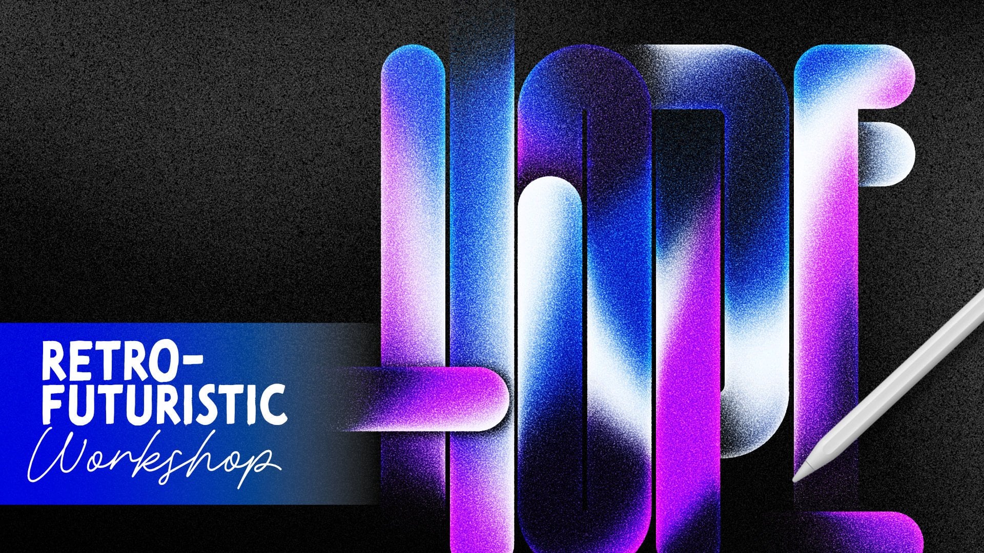
1. Introduction: Do you want to learn how
to create designs with this dreamy soft
gradient glow effect? Hi. My name is Nico Na. I am a lettering
artist, designer, and educator based in Manila. Lettering and teaching are
two of my biggest passions. That's why I really love creating courses and
workshops like this, as well as lettering tools and digital brush packs to help creatives explore and create different styles and
different effects of lettering much easier. In this class, I'm going to walk you through the
entire process on how to achieve this
glowy gradient effect, starting from how to design your letters
to coloring them, and to the effects that
gives it that really nice, bright and beautiful effect. So if you want to bring
more life, color, and charm to your
lettering or type designs, then this class is
perfect for you. There is a downloadable template
included in this class, so be sure to
download that first, and I'm super excited to work on this project with you
and see what you create. So yeah, I'll see you
in for this lesson.
2. Sketching Playful Letters: So, for the first
step of this project, we're going to create
the hand lettering. So we're going to hide the color palette and
show our font guide. But let's bring the opacity down so that it's
not too distracting, and we could see the letters that we're building
more clearly, okay? So for our letters, we are going to create them. Okay. I mean, we're gonna create them in just one layer, okay? So create a new layer,
switch to the color black. And then you could use any drawing pen that you
have that's fully solid. So I think here I have, like, a solid brush. So I'll just make it
really small like this or even smaller
like that, okay? And then, like I said, earlier, this is not like a
super strict and super um correct or super strict or super correct or
formal lettering style. We're going to make it super
fun and funky and informal. So we're just going to try
to redraw the letters, but in a very uneven way. So for example, the H, I
could just do like that, hold it, so that procrts
going to turn it into a line, like a pooling line. That way I can play with it, adjust it a little
bit like this. Just make sure the ends are
nice and clean, like that. Okay? Next is A. Okay. Just adjust it a little
bit to make it readable. Just try not to, like, overlap them because
we're gonna move them close to each
other later on. So just color drop.
There you go. For letters with curves, I always start with the curve. Hold it, so it's going to
be a nice and clean curve. There you go. Just
as you can see, it's not like super
clean or anything. Funky looking letters like that. Okay. That's why I like
this project because it's not like one of my technical,
very technical workshops. It's more fun and free for
you to do whatever you want. Here we go. So it's better
if they don't look alike. For the Y. So like that? Then the autumn part right here, and then just color drop to
fill them in that happy. Okay. But for the birthday
for the word birthday, I think let's just create it
in a separate layer, okay? Same thing. So for
procrt for the shapes, you need to do the curves
separately like this. And then I'll just do that part. And then just try to
connect it smoothly. That's it go. Then one here
and another curve here. Co stack. Cool. It looks messy, but once you color fill it, it's
gonna look nice. To like that. Okay. Next is R again with the curve,
do the curves first. And then try to
make it a smooth, easy cam Great go. A. Next, so just do
the top part first. Try to oops, make sure
you close it so that you can just call it
drop it like that. Okay, I feel like I
don't like lab part, so I'll just undo this and
redo this again or redraw it. Hold it till it turns into like a smart shape like that. Okay. C, it's not horizontal. It's slightly tilted, which
makes it really nice and fun. Baty pie. Just fix it a
bit, make it more readable. Almost done. For D whoops. The two more letters
A. That's it. So for appropriate,
you don't need to do one line at a time. For example, this, you
can make like a V, hold it, and it's going
to be a polyline. So you don't need to do
everything one at a time. The Y, the bottom parts of this, fill them, fill it.
And there you go. First step is done, which is creating a fun
little hand littering. So as I mentioned earlier, we don't want to trace the
letters exactly, okay? Just use them as a guide
to create this fun, funky, playful
letters like that. Okay? So yeah, that
is the first step. Next step is we're going
to combine them, like, swish them together so that we can so it's like it's
one strip of paper, and then we're going to add,
like, the folded effect.
3. Combining the Letters: Okay, so if you're like me, you want to preserve
your layers, so I would duplicate these, so I select those two,
drop it to the center, the hide all the
other layers or yeah, layers except for those two. And then we're now going
to piece them together. So go to the happy layer first. Using selection, use free hand, okay, then select the
first letter like that. Okay. And then I'm going to move I'm going to
turn on magnetics, okay, move it to
the side like this. Next is the letter A, so
I'm going to select that. Make sure I select
just the letter A, and move it a little bit
until they touch like a Okay. Select the first
letter P. Move it until they touch Oops. You can select this better. Transform it, to move it. You don't want them to, like, smoosh together too much. Otherwise, it's gonna
be hard to read. Bad. It's all connected now,
and that's all we want. I'll just bring
it to the center. Okay. Next is birthday. We're gonna do the
same thing, okay? So you're gonna set, I move it. Like that. For R, okay. Since I and R are the same, so you don't want to
smoosh it like this. Otherwise, you aren't
going to read it, or it's gonna be readable. So you want to, like,
keep that separation. So Zinm in and just make sure it touches maybe just a
little bit like that. Okay. So that the I and
R are still separated. I mean, not smooched
together as one letter. Now for the T, move it
closer. There you go. Next is H. Move it. Okay, D, again, both sides
are like vertical bars. So just try to find a way
to add some space to it. Or I mean, you can
just combine them but make the D lower. Like this. So it still looks
like two separate letters. And then the A, let's bring
it closer. Like this. Touch it a little bit. And then for the Y, okay. Top. I just want to center
it like this. Okay. Make sure to make sure that it is still
readable at this stage, because if it's not readable
now with the letters, like, smooshed together, then it's not going to
be readable later. So if you need to
do any adjustments, make the adjustments
at this stage. Okay? So you'd have
something like this by now, and now we can move
on to the next step, which is the folnth effect.
4. Creating the Paper-Fold Effect: Okay, so let's
preserve layers again. I'm going to drag these to
the center to duplicate them, hide the original so that I
have the duplicates left. Okay. So we want to
select happy first, the happy layer and
go to rectangle. Okay? So as you
can see from here, the first fold is the
yellow fold right here. So we just need to do some
selection here like that. Okay. But before that, I'm going to explain to you what
we're going to do today. So we want to make
sure that right now, it's in one layer, right? We want to want to separate
them, like, cut them. Okay, remember the
fold the fold thing. Okay. This is going to be in layer one.
This is layer two. Layer one, layer two, layer
one, layer two, layer one. So we want to
alternate the layers. So we're going to
select like this one, this is one, layer one, and the H is going
to be layer two. And the next fold is going
to be under layer one again. So maybe select this Repeat like this. So the H folds like that. The A is going to
fold like that. The next layer is the P. P
is going to be on layer two. The second P is going
to be in layer one. So we're going to select
maybe up to here. And maybe up to here. So it's okay if some
part of the next letter or previous letter overlaps
is completely fine. So for the end of the Y, I think we can fold
this one, too. So the Y is like this, but the Y is like this and this
top part is, like, folded. And then once you set it that, use three fingers, swipe
down to cut and paste. Now, we try to, like, reduce the
opacity of that. Layer. There we go. So you can see the H is
going to fold like this. The A is here, fold, fold. Yeah, that's what we want
to do to make it easier for us to do the process. Okay? Next, we're going
to do the same thing for the word birthday,
select that layer. And then, using
selection with re Cango, we're going to start to select. So I think we can fold here. This is going to be a
bit trickier because B, there are two curves. So yeah, I'm just going
to select cut here. Just make sure you don't
like, select that part. Okay. Next is the I is
going to be layer two. This layer, layer two, there is going to
be layer one again. So maybe we're going to
get some of the Is okay. So R, going to select this
and maybe up to here, fold. We're going to imagine the
fold is going to be here, but let's just include
the tail of the R or the leg of the R. Next is
the letter T is layer two. The issue is going
to be layer one. So let's just go up and grab
that, fold it like that. And then maybe it includes part of the
layer Is layer one, layer two, layer one
for the letter A. So let's just select
that maybe up to here. And maybe like
this. There you go. Let's not fold this one anymore because the word
buffet is longer. So swipe with three fingers
to cut and paste and bring the opacity down There we go. So as you can see, we've already separated the layers
one and layers two. That's the first step
into, like, folding this. So if you want to
preserve layers again, but I don't think we need to. So let's now start
to create the folds. So what are we going
to do is we're going to select one section at a time, move it to the side, and
distort it, like warp it, like sliding the
edge up or down, just to give that like that effect so let's
start with this one. So on the whoops, using selection,
let's select that. Move it to the side. And
then using this sort, you mean selection on distort, we're going to cool
this down like that. And then using
freedom, we're going to shorten this a bit
like that. You see that? Okay? Next, switch
the next layer, select that, just the
black one, move it. And then same thing using
dstort the opposite direction. Earlier, we like skewed it down. Now we're going to
move it up like this. Using freedom, you have to
shorten this because visually, if it's flat, for
example, it's flat. It's ten CM. If you tilt it, visually, it's going
to look narrower. That's why after we distort
it, distort like this, we're going to make it
narrower like that. And then after that,
you just want to make sure that you attach it correctly together. That. There you go. Switch back to the first layer and select the next letter
or the next fold, which is letter A, like that. And then do the distort, pull it down again this time, free form, make it narrower. And then just connect it there. Okay. Nice, right? Next is P, the first P, select that on the other layer, and whoops distorted up warg. So it's up to you,
how much angle. You want to change the angles a little bit just to make
it a bit more playful. So I reduce the width, and now I'm going to
attach it to the previous. Just make sure you
don't change the scale. If otherwise, it's not going to match perfectly
like this one. Switch to the P
again, select that. Bring it closer, distort
it downward, freedom. Then just connect
those two. I got. Then the Y to the other layer, moves the bite closer. But they start it
upward, free form, transform, narrow it a bit, and just attach it like that. There you go. Select the edge like that. I think
this is down, right? The start it downward, make
it narrower and attach it to the very end. There you go. So you now have the word happy. Let's bring it to the
center in folded form. We're going to do that for
the word birthday too. So for the letter B, we're going to select that, Transform, distort this upward this time, upward, but make sure
you make it narrower. Just a little bit. Switch to the next layer so you can
transform the next fold, which is Is like
that, and distort, bring it down, freedom
to narrow it a bit and then just try to
match it perfectly like that. Next is a letter R, switch
to the other layer. Distorted upward. Free form, narrower,
and then just try to, like, connect it. There though. This process is
quite repetitive, but it makes a lot
of difference. I mean, it's a simple process, but yeah, the effect is
going to be worth it. Next is H ellipse
selection, try selection. This upward freedom narrower, you just connect those two. Night is D. So the word
D, this word freedom. Okay. Connected like that. Almost done, two more
letters to co order A, distorted upward,
narrow it a bit, then just connect it. You can zoom in
closer just to help you connect them better. And then last ops be this layer, layer four, select
the Y, distort it. Just have a bit free form.
And then it's connect. There you go. Let's
select these two. And there you go. Okay, I think I'm
happy with this. So once you're happy or you're done with
your folding effect, we can now move on
to the next step, which is coloring it with a really cool soft
glow gradient.
5. Coloring & Gradient Blending: All right, let's start coloring. To do that. Let's bring
back our color palette. So just tuggle the visibility so you'll see the
layers and your colors. And then we're going to
color it one at a time. So we're going to use this as
a guide for coloring, okay? So we're going to work
with one layer at a time. So let's just hide the
birthday layers for birthday. And for this gray color, we're going to bring the
opacity back up like that. And then next is we're
going to turn on alpha lot on both layers
so that when we color, it's just going to be
like within those shapes. So the first one,
if we look here, we have yellow and then pink. Ignore the overlap, okay? So yellow, let's color that
yellow and color pick pink. And that increased
the verse size so it can col her faster. Like that on an angle. And then Gashi blur. Let's try this Goshen
blur. There you go. Okay? So that works. So let's continue to color all of the layer one folds oops. Okay, make sure you get out of Goshen blur and you don't apply
the Gausmblur right away. You just undo that.
So this is the fold. H is layer two. A is layer one. So let's follow this. So we're going to start with
a light blue top, so color pick that and just color just color
the entire thing, that color first so I
can see it more clearly. Then you have pink on the base, so color pick that
maybe like this. Next is green. Color this
green like that and yellow. Color pick that, and add some yellow to this
side. There you go. First P is going
to be layer two, let's color the second P, which is start with the pink. Then we have some yellows here. And we just have
some green here. Like that. I think
we need to add more yellow. Like that. Okay. Next is So we start with this blue color the entire thing,
the deep blue color. And this light
torpoisatel colors gonna be like curve like that. And then I think we
have green here on top. Okay. So try to avoid the same angles for all and also the same colors
beside each other. Okay? For this P, let's
start with pink. This is a middle color, and they have this light blue here on the top
edge right there. Okay. And then this
deeper blue here. And then I think there's some
yellow here with a base. Here we go. Doesn't
have to be exact, okay? Then for Y, it's I think it started with
this dark blue here. And then the light blue color tile. Looks Carpek that to that side. And then blue for this and then yellow Carpek
yellow here on the side, like that. Okay, it's done. So before we blend it, I just want to work on the next one so we could
blend them together. So next is the word birthday. Bring the opacity all the way to 100 and add or turn
on Alpha lock. The shortcut is using two
fingers to slide the layer, or you just tap the layer
and switchbd Alpha lock. Okay. For the B, you started with light blue. So let's card this light
blue and dark blue on the upper left. Just Whoops, just a little bit. Like that and teal on the base. But a curve shape that. It doesn't have to be
straight line all the time. Next is gltter R F R is
yellow, start yellow. Then you have green.
That's a chip. Then you have teal Like that. For each, you have
yellow again. Pink. Like the base. And Teo then green. Oh, I think it's dapple
green, the bright green. There. Letter A is teal green. I just want to color
the entire thing so I know I just make sure that
I didn't miss anything. The next is this bright green. M is a light blue. Oh, no, the light
teal, at the corner. And then some apple green in
the corner again. Like that. Okay, let's switch to the second layer of
the word birthday. For the Y, we're going
to start with pink. And then you have this
dark blue right here. So make this. And then yellow. And an ankle like
that. Okay. Next is letter D. D is
yellow. I see yellow. I color this yellow
first, then the blue. And then the light blue color. Just light blue color. Then
for T, we're almost done. I'm going to color the
blue again, the dark blue, the strong blue, and
then the apple green. Then I got light blue at
the tip and some pink. Here at the corner and
finish light blue here. For the last letter,
the letter I is the deep blue color again, which I really like and pink. I like it when it
blends with pink. There you go. And maybe
some yellow acento it. Okay. You should have
something like this. By now, let me hide
the color palette. And yeah, we're now
done coloring it. The next step is to apply the Gausha blur to turn
it into a gradient. So I want to
preserve everything, like I mentioned earlier, or, like, what I keep on mentioning. So, let me just zoom
out my reference. So I'll just select
all of these, drag them to the center, hide the originals, and merge, I'm not going to merge it yet. Okay. So I'm going to
start by adding Gausmblur. So I'm going to
select the layer one of happy caution blur. Don't increase it too high. Otherwise, all the colors are just going to
smudge like that. So just slowly blend with it until you get a nice
gradient, maybe about 8%. So for this one, I'll try 8% to. Yeah, I think it looks nice. 8% is a sweet spot. For birthday, same thing. A Gaumbler about 8%. Yeah, nice. Next
Cashion Bler A 8%. Nice. See that? The
super nice going color. So we're done with the step. The next step is to add some lighting and
some gradient effect.
6. Adding Light and Grain Effect: So let's add some lighting
and grating effect. But before that, I kind of
want to increase the size. I think by now, we can merge, we can merge them. Like the word happy right now
it's in two layers, right. We just need one, so let's merge that and birthday as well. So we now have just
two layers, okay? And I kind of want to
increase the size. So if I increase the
size on P grade, it's going to do some low res. It's going to make
your image less sharp. So I'm going to duplicate those again just so I preserve
the original layers, select those two and increase
the size a little bit. Make sure it's on uniform so that it's not distorted. Okay. And then, let me just
change a blending mode to multiply for the first happy, and for the word happy, and bring birthday up a little bit. So they're going to, like,
intersect a little bit. Yeah. Then let's just center this message and then move it a little bit high so
that it's visually center, even if it's not because we're going to add something
below as well. So yeah. You should have
something like this by now. Next is let's add
some grain effect. Let's create a new layer on top. Just add gray there, and then adjustments, add noise. So yeah, maybe about
halfway there. That's okay. And I don't
know if you can see, like, some grid happening. So like the previous session, what I did was rotated it. Maybe just 5% is
going to be enough. Then I had to increase the
size a little bit like this. There you go. For my noise. And then let's change the
blending mode to opacity. I mean, overlay to
maybe about 65%. So this before, everything's
like, very sharp. Now with grains, it's starting to look
more like more rustic, more retro, which is what
we want to achieve. Okay? Next is you just want to add some lighting effect
to this, as well. So create a new layer on top, go back to the white pen
or maybe just black pen. So you'll see what
you're sketching. I'll increase the
brush a little bit. I'm using, like, a
pressure sensitive brush, so thin thick strokes like that. So anyway, you're just
going to add some, like, swiggles squiggles like this. And then we're just going to add Gausha blur just a little bit. And invert, switch
bath to white, and just change granule to
overlay and reduced capacity. To maybe let's try 50%
for now. See that? So it becomes it as that,
like, dreamy effect. So earlier it was
like this, very vibrant and, like,
lightening it, but inconsistently as like, gives it the dreamy look. I know it's a bit too,
what do you call this. A bit too bright right now. So if you want, you can always, bring the opacity down
or let me do it again. Okay. But this time, I'm
going to make it smaller. So let me switch back to normal because I feel
like it's too big. Like that, something
more irregular. I'm going to do that again.
Add some gaussian blur. Maybe just about lower, nine, and then invert. So it's white. Turn on overlay. There you go. Yeah, I
think that's better. So we added the grain effect
and the lighting effect, which gives that, really
nice soft and very, like, raw feel to it. Okay. The next step we're going to do is
we're going to add some textures and add
some decorations.
7. Decorations & Final Texture: Okay, so for the texture, we're just going to add, like, a basic paper
texture underneath. So underneath your lettering, just create a new layer and maybe switch to
gray if you want. And just pick any paper
texture that you want. I think I'm going to use this. No, I don't like this.
Maybe Spetle paper texture. Yeah, I think this looks nice. Yeah, I'll stick
with this for now. Okay. And then we're going
to add some decorations. So create a new
layer, maybe on top. You know, let's
just do it on top. And then I'm going to
use the same brush. Same brush with, like,
what do you call this? With thin and thick
strokes. Like what you saw. So I'll just make it
smaller like that. And I'm going to edit that brush and add
some stabilization, so it's going to be more smooth. Heck that. Add a little bit. So and then we're just going to Just feel like that. Like, what do you call this? Regular wave like
that, okay. Like that. Okay, I think that looks nice. Like, thick and thin strokes, combination and
different, like, heights. And then let's remove the
what do you call this? The lighting NP green first, and we're going to color this. So turn on alpha lock and
bring back your color palette. And then we're just going
to color this ourselves. So, let me just remove
the texture first. Yeah, remove the texture. So when you color
pick, we're going to color pick the right color. So basically, just,
like, grab some colors. Then just try your add randomly. Okay, let me just hide
the happy birthday first. All we see this don't just randomly add these colors. Sorry, add that. Green necks. Just randomly add them. Make sure you fill
up all these spaces. Paint. Now, feel free to, like, add a bit more. Maybe blue because it
like overlap out of blue. Then when you're
happy with this, just turn on Goshen blur. 25. I feel like looks nice. That's writing this, so
I'm going to duplicate that and turn overlay, so it's going to make it a
bit more vibrant like that. And then we're going to
merge these two layers. Now we now have like,
our decoration. So for this one, since
I want to keep this, because if we move it outside the frame, it's going
to crop it, right? So I'm going to
duplicate that. So I save the original layer, original design, and
then I'm just going to bring this down a little bit. And maybe push a little
bit, change the height. So it overlaps a little bit, just a little bit with
our letters like that. There we go. I feel
like that looks nice. Okay, let me hide the
color palette again. Oh, no, show the color palette, and now we're going
to add some sparkles. So on the new layer on top, we're going to add
some sparkles. So if you don't have
any, any sparkle stamps, feel free to redraw them. It's super easy to
draw them anyway. Let me just adjust
the brightness. The camera so it's not too dark. Perfect. Anyway, so I actually have some if you have my
retro lettering pack, there are some sparkles
that you can use. So yeah, I'm using
one right now. This is the big one. So I'm going to tap three
and then I'll just move them a little bit. Okay. Like, I think it's position. And then I'm going to add
another sparkle design. I'm going to make it snller. So right now, I'm
just using one color, but we're gonna
recolor this later, so it doesn't matter
what color use for now. I think four when we're
here. There we go. And lastly, some tiny tiny sparkles. There you go. Then I always like to center it. I know, I just
want to center it. There we go. Okay. Now
let's try to recolor these. So same thing, turn
on Alpha lock, and then we're going
to start to color, make sure you go back
to your original brush. For this one, let's color
it green with some yellow. Like that because we're
going to blur it. So for this one,
it's going to be light blue mixed with pink. I like the combination, but
you blend them together. For this one, it's just
going to be green. This one is just gonna be pink. You don't need to have, like, blending for everyone
or every sparkle. For this one, it's
going to be orange. I mean, it's going to
be yellow and pink. This one is going
to be like green. This one is going
to be like blue. It's going to be
blue with some pink. I like the combo. And this one is going to be green or this one
will be yellow. And then this one,
it's going to be the light blue with yellow
on the side like that. Gonna have green
and pink This one, pink and blue again, just like this
color combination. To maybe green and yellow. For this one, that blue and yellow and
pink, yellow and pink. I'll bet. And for this one, maybe just this teal. Yeah, maybe I'll make this teal. This one, too. Yeah. Okay, once you're happy with the colors, you can go ahead and add
Gaussian blur just a little bit. 9%. Okay. So let's finish everything. So let me just hide
this reference for now because I hate it
when there's something there, and let's hide the
color palette. Let's show the green layer and the texture layer,
which is right here. Let's lighten the texture layer because I feel like
it's too much. So maybe about 60%. There you go. I think
that looks really nice. Oh, sorry. For this one, for the effect is
overlapping, right? So we want to change
this to multiply. There we go. But for
the overlapping part, let's try something different. So for this one, we're going to select birthday, tap the layer, hit Select and click on our what do you call this Our
decorations, the wave. Click. We're going to
create a mask like that. And then we're going to
intp the mask, invert. There you go. We're
going to duplicate this, and we're going to
invert the mask. And for the top part
for the top layer, we're going to change it to
maybe soft light, soft light. So before, if it's Okay. If it's normal, let me
show you if start up. It's going to be
too harsh, right? So if you just make
it soft light, so the glow is going to be
light when it overlaps, which is what we want. And for this one,
let's just bring the passive down for this one, the bottom part because
it's too harsh. We wanted to
complement the words. So maybe about 75%. And also the sparkles,
that's about 75%. Are we done? Yep. I
think we're done.
8. Closing & Project Wrap-Up: So, we now have our soft globe, dreamy, optimistic,
charming grat lettering. I hope you had fun
creating this. Let me just bring
the biting down. Yeah. I don't know. It feels
too vibrant on the screen, but I hope it's not as vibrant. I mean, my screen right now, it's not super super vibrant. It's a bit pastelly. But I don't know about
this video because I'm looking at the
screen for my camera, and it's a bit like super neoni. I hope I mean, it's not supposed
to be super neon. It's gonna be, like,
soft pastelly, but still with a combination of, like, strong colors
like the blue. But anyway, alright, if you just follow the color
palette that I use, you're gonna have the
exact same colors as mine. So, yeah, I hope you follow along and you
enjoy this tutorial, I really, really enjoy
creating this piece, creating this style, it's
such a new style for me, especially when I don't do
a lot of colorful designs. That's why I really,
really like this one. And yeah, so thank you for staying with me and for
taking this workshop. I do want to see your work, so feel free to share
them with me and tag me if you share your
work on social media. And if you have any questions, feel free to let me
know any comments, and I will be more than
happy to assist you with any help that you need
in terms of this project. So yeah, if you want a
little bit of challenge, try to create a different
at in this style, or maybe try a
different color scheme that's still dreamy
and charming. So, yeah, that's it
for this workshop, and I plan to share
more workshops, so I'll see you in my next digital learning
workshops. Bye bye.
 Nico Ng, Lettering & Design