Transcripts
1. Intro: Do you love the charm
of retro designs, the vibrant colors,
the playful shapes, and the expressive lettering? In this class, we're
diving into the world of midcentury style to create our own unique
lettering designs. Whether you're a beginner
or a seasoned illustrator, this class will help you bring a unique and vintage flare
to your illustrations. Midcentury design isn't
just a nostalgic trend. It's a timeless style
that continues to influence modern design,
branding, and illustration. For illustrators and designers, exploring expressive
midcentury style is also a really great way to improve your digital
lettering skills. Plus, this style is
so fun to work with. It allows you to experiment with expressive forms and colors that really allows for
a lot of innovation. We'll start by breaking
down the iconic parts of midcentury design from
textures to letterforms. We'll then practice
our lettering skills in a series of
warm-up exercises, specifically expressive
and bold serifs. And lastly, I'll guide
you step-by-step through making our own
lettering design in Procreate. Because there are multiple
exercises in this class, you get to decide what
you want to work on. What you'll need
for this class are an iPad and Apple
pencil in Procreate, and you'll receive
my brush back and other resources that I'll be using for this class to
make things a bit easier. A bit of knowledge in Procreate would be helpful for this class, as I'm not going to cover all the tools that
I'll be using. This isn't retro lettering
101 or 201, by the end of this class, you'll be an expert
in everything midcentury and retro
lettering. Let's get started:)
2. What is Midcentury Modern Design?: So let's start with, what is
midcentury modern design? This movement is mostly known
for basic geometric shapes, clean lines, and an emphasis
on function over form. It had a big impact on
graphic design, print, media, architecture, and more, and is still really
relevant today. Designers and
creatives have tapped into midcentury modern
aesthetic for decades. And we now see this
style as perhaps more vibrant and bold. But during that time,
especially after an era of lots of frivolous
Victorian visuals, this was a really
welcome change. During this time, there was also a massive influence
by new technology. There was a new era
of advertising during this time and printing
on a big scale to off, so mass production of posters and billboards
was finally possible. Due to this economic boom, there was also a lot
more opportunity to enjoy pop culture, movies, TV, music, and animation really took
off in this era, as well. That's why the 50s
and 60s are also known for the Golden
Age of animated TV. There are a few big
characteristics during this era. So geometric shapes,
most importantly, they were a main
choice for designers. So mixing basic forms to create a full composition that led
to a more minimalistic style. Designers were exaggerating
shapes and proportions, perspectives, and
also expressions. So when you look at cartoons, they have quite
exaggerated shapes and expressions as well. And this started also a diverse range of
different movements. So for example, in architecture, you've got Googie architecture, Tiki, atomic age, space age. Midcentury illustrations
are also very distinctive, simple lines and brush strokes with a typically
limited color palette. Advertisements were very
fun and quirky and hopeful. Color palettes during
this time kind of vary from decade to decade. It started a bit more
desaturated and monochromatic, and they later evolved into more saturated and
playful and vibrant, but still often a
minimal color palette because printing was
still pretty expensive. So designers tried
to find ways to use that minimal color palette
with textures and, for example, half
tones to be able to expand what they
can show on paper. And then in the 60s, you start to see
more earthy tones like oranges and brown. Typography during this era was quite minimalist
in the beginning, especially when compared to the typefaces that
were used previously, which were very frivolous. So it started off
with more sans serifs, a bit more conservative
and, again, function over
just looking pretty. And then the 1950s
and 1960s, again, there was this boom in
consumerism and advertising. So designers started
to play with bold eye-catching
typography in logos, signage, advertisements,
and more. You start to see more script fonts during this time, as well, slab serif typography, typography started to get
more playful in this time. And then, towards the
end of the 1960s, you've got a surge in more experimental
typography, as well. So designer started to really
break away from the strict, like grid-based layouts and typography becomes a lot more expressive and artistic. So this kind of era of
experimentation in typography, it becomes really
important later on. We still look at a
lot of typography and fonts from that time and
use that as inspiration. You also see a lot more
combining of contrasting fonts. The use of expressive and
exaggerated bold shapes, you're going to see
that as well in the serif typography
of that time. So you've got these
bold, sharp edges, and this worked really
well in advertising, again, and cartoons
in animation. So if you look at the title pages of comics and cartoons
of that time, you see a lot of those like expressive serif fonts as well. Because of all these
new opportunities for typography in animation, in posters, et cetera, there's just a lot
of opportunity for really fun letters that are combined with
illustration, as well. A lot of these intros of animations have a
very cartoonish look. They're very inviting,
very playful. And so this golden
age kind of of experimentation
and typography is still really important
to this day. And I think it's also part
nostalgia of that era. We still, as designers, seek to kind of incorporate
graphic designs from that era because it brings us back to this inviting, familiar feel, but can still also be used to capture
the viewer's attention. And recreating
these characteristics of typography and
shapes of that time, I still use that a lot
in my designs as well. I've used that a lot in the past for menu designs for
restaurants as well, because it really catches the viewer's eye, it
still has such an effect, but it also has this familiar
feeling at the same time. And playing with these
bouncing letters, the angle of letters, geometric shapes is something that still works so
well in design. So there's a lot of inspiration
to take from that era. In the next lesson, let's have a look at a couple of
designs from that time, and we're going to look at specific characteristics
that make them stand out.
3. Warmup I: I'm going to show
you a couple of examples of midcentury
lettering designs, and we'll see what really
makes them stand out, and you'll be able to identify unique lettering works from
this style very quickly. I added my Pinterest board of midcentury designs in the
resources tab as well. And on this Pinterest board, you've got lots of examples. Most of these are actually
from the 50s and 60s, but some of them are new as well that kind of emulate
that same style. So the first one, this is
an album cover, I believe. And this is a great
example to start with. Firstly, what really
stands out here is those geometric shapes
in the background. And those are very iconic
for midcentury design, the geometric shapes,
the graphic shapes, and they're not
perfectly straight. Some of them are at
an angle as well. They kind of feel
like they're cut out by hands a little bit. And they create
these boxes to kind of divide the design up. And then our title, 'Madison', you can see how the letters are not all on a baseline
and a cap line. They're not all
perfectly placed. They're kind of all, they're
slightly different sizes, and some of them are placed
at an angle as well, and that gives them a
much more playful look. You can also see that the serifs in these are very different. So the M has this
kind of slab serif, which means the ends are
like a sort of block. But then the A again, has serifs that are very
pointy, so an actual serif. So more of a classic serif. Another thing here that makes the letters a bit more playful is playing with the length
and the sizes of the serifs. And so the letters kind of feel like they're
bouncing a little bit and they're using whatever space they have for the serifs. Then, for example, that O, instead of a classic serif O, which would have the
oval sort of vertical, this one is actually a
little bit different so that shape just makes it
a lot more playful as well. Again, playing with sort the
graphic elements of letters. Let's look at another design. This one, one of my favorites, Pink Panther, the cartoon is so iconic from
that time as well. And especially the title
covers of cartoons from this time are really fun
as inspiration to look at. And this one is from
a short cartoon. Even though it might feel a little bit like
an afterthought, they're very playful, so this is such a great source
of inspiration. You can see here that every
letter is quite unique, and it also uses the idea of basically the letters are just using whatever space
they have and filling up the space that
the letters occupy, if I'm explaining
that the right way. So for example, these Ts, if you've got two letters, but two of the same letters
next to each other, they'll be intentionally very different and taking up a lot of space by scaling the letters
up and down a little bit, and again, playing
with that baseline. So one letter a bit more
up, one a bit more down. And because you've
got quite a bit of repetition in letters
in this title, basically, no
letter is the same. And the Is, for example, have little stars on them. And the serifs here are not
like classic pointy serifs, but a little bit more playful and a bit more organic
the shapes that they have, but still sharp corners. And you can see, as well here compared to the illustration, the space that the letters occupy is interesting, as well. Like so this composition
is quite dynamic. You can see that
the illustration is pointing in the direction of our title, which
is really fun. I'd also really suggest to
look at a couple of cartoons, Pink Panther especially, also, for example, Disney and look at the lettering that's
inside of the cartoons. For example, on,
like, shops, facades, little details in pots and
pans and products and stuff. Sometimes it might feel
like an afterthought, but that lettering is very, like, iconic of the time and just lots of
interesting details there. And lastly, let's look
at one more design. This one is I think this was
actually a matchbook cover, which is something that a lot of restaurants used at the time to advertise their restaurants. So this is actually really on this really small scale,
a really small piece. In terms of the composition, we've got these
like wavy shapes, basically, or wavy baseline, and that's where our
most important letters, the fried chicken is placed on. And it shows a little bit like
the smoke that it follows. And again, you've got
the letters here, they're all placed at
a different angle, which makes them look
a lot more playful, and it makes the composition
a lot more dynamic, as well. And then if you look
at the serifs here, they're all quite different
and not perfectly placed. And that's also just such a plus of this kind of serif style. Even if you're not an expert on this type of serif, you can play around
with the letters, and every letter will look different, but
that's kind of the point. The playfulness and the
sort of naive look of these letters is kind of what you want to achieve that makes
it look more interesting. And the script you see here
at the top and at the bottom, it creates a nice contrast
with the serif letters, the title in the middle. So as a first exercise, have a look at
other inspiration. You can look at the
Pinterest board or look around at some interesting midcentury
designs and pick between one and three images that you can share in
your class project.
4. Warmup II: Now that you know a little bit more about midcentury design, let's do a couple of warm-ups
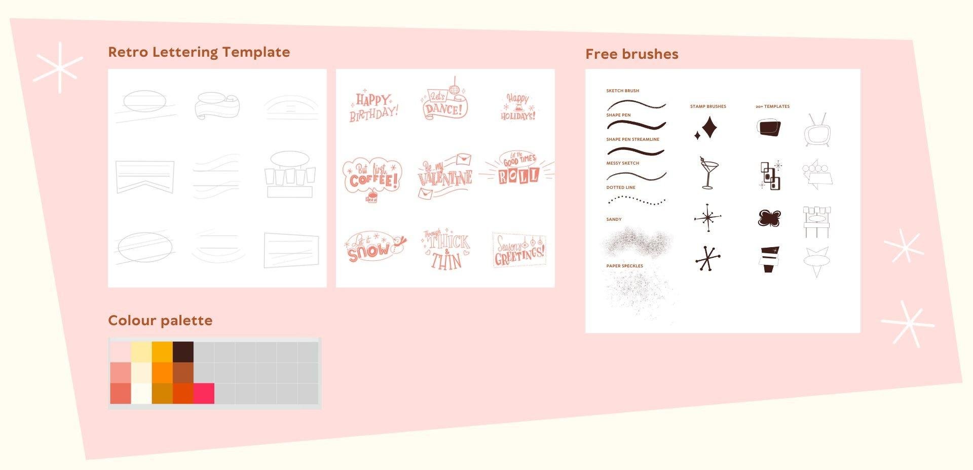
sketches to get loosened up. If you want to follow along, make sure to download
this template for Procreate and make sure to
download the brushes as well. For this exercise, we're just going to use
the sketch brush. But as you can see,
if you scroll down, you've got a bunch of options here for other brushes that
we're going to use later on. So here you can see,
you've got a layer with different templates
for lettering. All of these are perfect for phrases that are no longer
than two, or three words. We're going to practice
our lettering skills, specifically the
serif that we want to create with small phrases, stuff like happy birthday, happy holidays, warm
wishes, that kind of stuff. You can use the baseline and the cap line for the
height of your letters. What we're going to start with is the skeleton of our letters, and this will be the basic
framework of our letters. Then on top of that,
we'll add thickness to our letters and lastly,
the serifs as well. Let's start with the one on the left and let's start
with happy birthday, for example. Happy at the top. And let's just start
with the skeleton first and then I'm also right away just applying a simple midcentury technique
of bouncing the letters. Basically every other letter instead of using the baseline
for all of our letters. If you're completely
new to lettering here, spacing can be really difficult. You can, for example,
start in the middle. With the first P, put
that in the middle and then work your way
out from the center. Creating lettering this way, it really helps to make sure
that you don't run out of space when you're working on
a longer word, for example. Then for birthday, I'm
doing the same thing. Every other letter
a bit higher up. Since we've got two words here, maybe we can do two different
styles and maybe a serif and then a slab
serif for birthday. Now that we have our skeleton, let's add thickness
to our letters. I'm using the shape pen, but you can keep using
the sketch brush as well. Here you can see once you add the thickness to the letters, how important that spacing is, you really do need
it if you want to add more thickness
to your letters. This is such a fun way
to come up with lots of different ideas and practice your lettering skills
really quickly. Instead of making
one giant piece, these little sketches just help you improve really quickly. And here, a difference between a normal serif and
a slab serif is that the slab serif means
same thickness in all of your lines and no sharp
edges on your serif. They're basically just
all the same width. Then just add a
couple more stars to make it more interesting. Next up, let's use
another phrase. Maybe, how about 'let's dance'? Feel free to use another
sentence. We're just practising. Since this is such a short word, maybe let's try a script. Then with dance, it doesn't
need to be perfect. We can make it really playful. Following, kind of the angle of this banner, which
is kind of fun. And then we can turn
that into our serif. If you have letters
that are much thicker, you can maybe add an
inline and that just basically means adding a line to the
width of your letters. Then to every little piece, you can add one or
two extra details and you can practice adding
filler elements as well. And lastly, let's try
a 'happy holidays'. A really nice way to
kind of change the style of your letters is by
cutting off the edges, and that makes the letter
seem a bit more intentional. I really liked the O that we
saw in the previous lesson. So I'm going to try
and recreate that here by changing that
oval in the middle. And then we've got
some space for a little illustration as well. These little stars
with the dots on the end are so iconic
for midcentury style. So once you add those,
you're really setting the tone for your lettering,
which is really fun. We're going to just do
three of these exercises, but feel free to use
the other templates to create more little pieces, and you've got other
template options in the brushes as well. You can just use those
as stamps, select those, tap on a new layer in your canvas and use
that as a template. And once you finish these, don't forget to add them to
your class project as well.
5. ✨ Update: Student Spotlight ✨: This is a quick update I wanted
to add to just highlight all the amazing student
projects that have been rolling in since the class first launched just
a few months ago. The student projects so
far are really inspiring, and I hope that they'll
spark your creativity and motivation, too. Thank you so much to everyone who has taken this
course so far, and thank you for
sharing your project and your process with the world. If you haven't done so already, I would suggest
to have a look at the projects and resources tab to check out all of these
amazing student projects. The illustrations that you see
here are just a selection. You can go directly
to the projects by going to the project
link in the notes. Just hover over the menu bar,
and the notes will come. And if you're browsing
through students artwork, consider leaving a kind
comment or a compliment. I will really brighten
someone's day and it keeps the
creative energy flowing. Make sure to share your project with us by
the end of the class. Whether it's a polished
results or a sketch, I would love to see
what you're working on. If you're here because
you like lettering, all things retro and procreate, here are a few courses that
I think you might enjoy. One of my recent
favorites I published is about vintage
Sardintin designs, which I had so much
fun working on, and it seems to be a
favorite with students who like all things retro
as much as we do. Lastly, there are a couple of ways that you can stay up to date on my new classes
and brushes and freebies. You can go to my
profile and click on Follow or subscribe
to my newsletter. That's it for now.
Thank you so much for being part of this
creative community. Seeing your work is honestly the best part of
teaching on Skillshare. Now, let's head back
into the next lesson.
6. Project Time: Sketching: We're going to start on our final project in
which we're going to incorporate the serif lettering that we've practised so far, and we're going to make
a greeting card design. We're going to start
with a pun or wordplay. This works really well
in combination with the sort of naive retro theme
that we're working with. And if it's perfectly on a Valentine's Day card or a
birthday card of some kind. You can follow along
with my inspiration, what I'll be doing, but you
can also pick your own ideas. I would suggest picking a
pun that isn't too long, not too many words that
you need to letter, and perhaps something that
you could combine with an object or food of some kind because that
would be easiest. We're going to work with
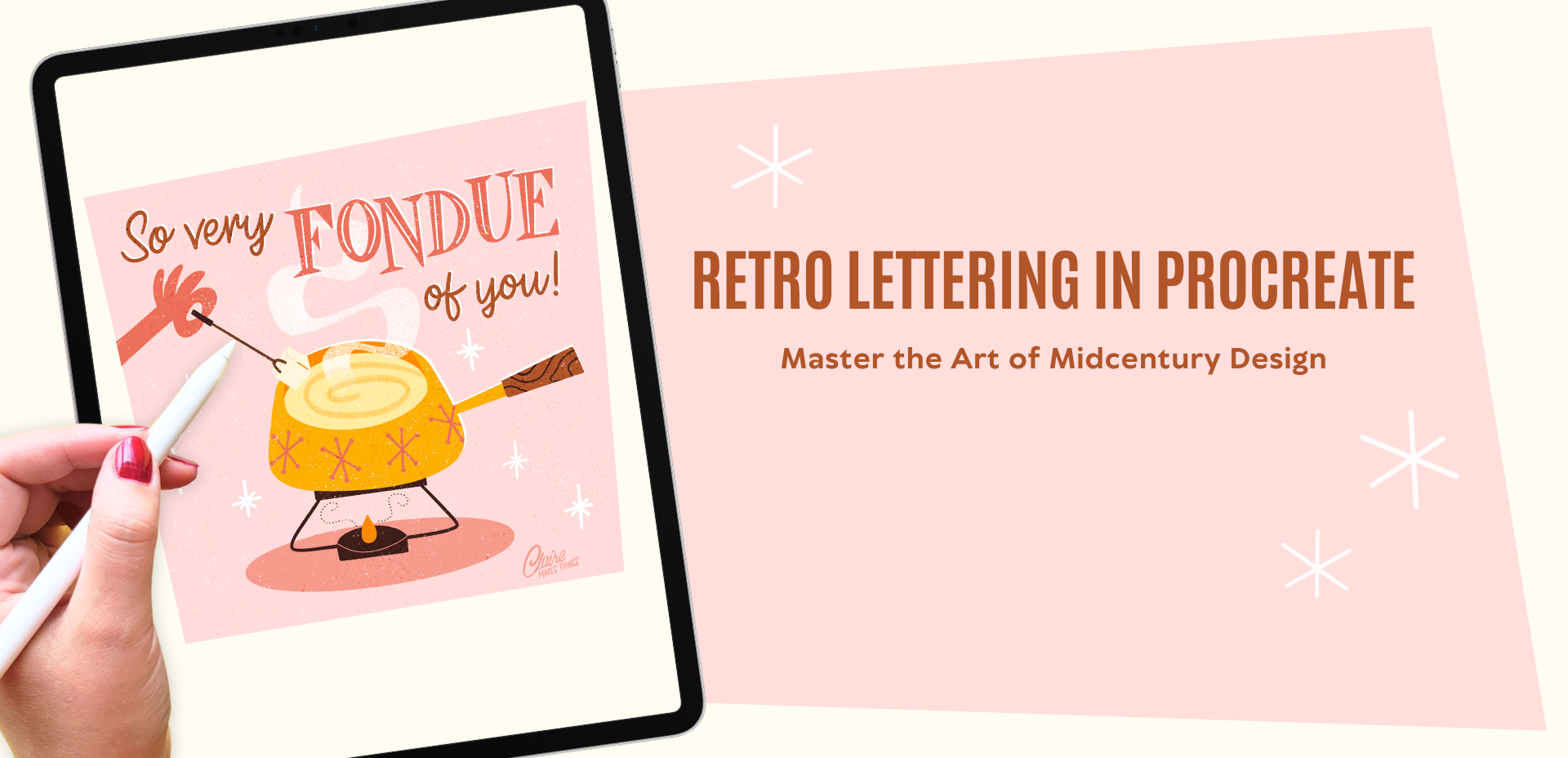
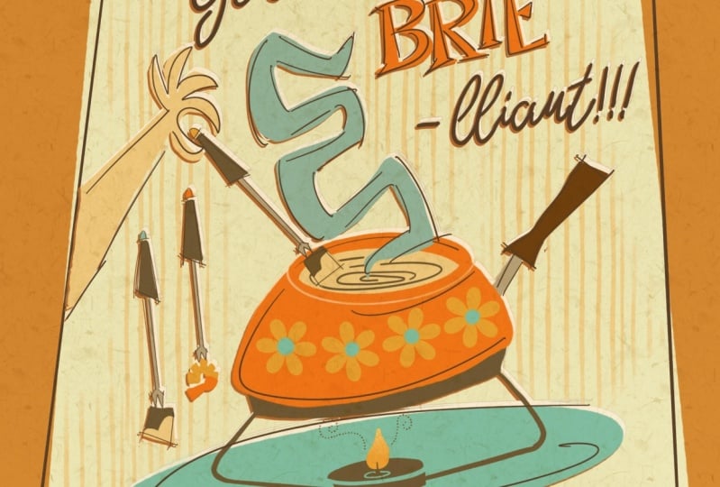
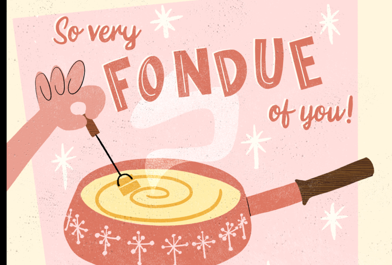
'so very fond of you' or 'fondue'. In that case, we can combine
it with a fondue pot, which is also very retro,
so it works perfectly. Let's start with our Canvas. This is a pretty big size, 3,000 by 3,000 pixels, but it's always best to
work bigger than smaller. You can always use this design on a larger
scale if you want to. Let's start with a
little thumbnail sketch just to work out
our composition. We're going to keep
it pretty simple, but feel free to make it more
complicated if you want to. I've already added
that geometric shape in the background right away. That's going to be the
frame that we'll be using, and it immediately sets the
tone of our design as well. This is already very unique
to midcentury design. Most important here is fondue. Our emphasis is going
to be on that word. So we're going to create
fondue in our serif lettering, and then the rest can be
in something contrasting, maybe a script of some kind. This is just a thumbnail sketch. Everything is really simple. So the lettering is
at the top half and then the bottom half we're
going to use for illustration, which is going to
be a fondue pot. If you want to find inspiration, Pinterest is a really good
place to look for fondue pots, and you can immediately see
here the retro fondue pots, which are really fun and just match the theme of
our design perfectly. Here you can see you've done
a couple of sketches of cookware from the 1960s and
70s I found, which is so fun. And you can see the
details that you can add. So these little flowers
and stars as well. Going to keep it simple, but use these flat
exaggerated shapes. Then I'm also adding this
hand that's dipping in the fondue pot with some bread just to add some more diagonal shapes
in this composition, make it a bit more
dynamic as well. Then, of course, that serif
is what we're going to use for our most important part, which is the
lettering of fondue. Here you can see what elements we've added to this
thumbnail sketch. You've got 'fondue'
separately and then 'so very' in script, 'of you' in script as well, and then our
illustration at the bottom, and all of that is
combined in this shape. Then perhaps we can add
some smoke or steam, some details, those little stars to set the tone of
our work as well. Feel free to experiment with
different compositions here, especially if you've
chosen another pun, for example, the
thumbnail sketches are really important to see what composition fits best and that will make everything
later on, much easier to do. When you're ready, you can either make a more
refined sketch or blow up this thumbnail sketch and then make a more refined
sketch on top of that. As you can see, my second sketch that I've made is
a little bit messy here, but it's just a way to refine
the lettering a little bit more. I've basically just used the same technique as
in our previous lesson. Putting the serif
on top and just tracing the illustration and making it just a
little bit neater. The script isn't
as important yet. We'll work on that later, so you can just keep
that very simple. You can ignore all these
colors on the side. I was just experimenting
with a color palette here being inspired by the colors of the fondue pots
that I found online. What I like to do is make
a little color sketch, just to see if
the colors that I picked actually
work well together. I'm going to be, in
the next lessons, using that as my reference. But of course, you can just use the color palette that
is in the resources tab. Especially with this orange
and brown combination, it immediately feels a little
bit more 1970s as well. But if you want to look for perhaps another
color palette, just have a look
around on Pinterest. There's a lot of inspiration
when you look for these fondue pots and 1960s cookware as well,
which is really fun. Make sure that for
the next lesson, your sketch is ready. You can either use your thumbnail sketch or maybe a
more refined sketch, and then we can start on
coloring our final design.
7. Colouring : So we're ready to start now with coloring our
final illustration. As I mentioned, I'm going to use this color sketch
as my reference, but you can use
the color palette. Every time I'm using a new
color and a new brush, just look at the
top right corner and it will show what I'm
actually using in that moment. Let's start with our
background shape, and it's going to be
in our lightest pink. Then we actually don't
need these guides, I'm just going to turn this off. Then to actually change
that background shape, I'm using the distort tool to
make some changes here. That's also just
a really easy way to exaggerate shapes
if you want to. Let's add our sketch on top. I'm also just going
to clean this up because we don't need
all of these colors. We're going to start with
our illustration and we're going to do everything in flat shapes and
use the shape pen, which is just a
simple smooth brush. You can use any smooth
brush for this. We're going to use that to just fill in all of those shapes. Then later on we'll
add texture and details to this
and make sure that everything is on separate
layers when you do this so that you can make
changes later if you want to. As you can see with
this fondue pot, to make that perfect oval, you just draw an oval and then just hold
your pen a little bit longer and then Procreate will actually help you to
create that perfect oval. Especially in this case, we're creating all
these flat shapes and exaggerated forms as well, it's really helpful
to use that tool. Also to create these slightly
smoother shapes in general, instead of the
regular shape pen, I'm using the shape
pen streamline. This basically just means to this brush I just added a
bit more stabilization. With that version of the brush, you just have a little
bit more control over your curves and that
makes it a little bit easier. And with this handle, you
can see how we've got this slightly lighter brown for the handle and then
later on we'll use that darker brown
for other details. Actually, in this color palette, even though it looks like
there's quite a few colors, they're basically just different
tones of the same color. In one of the previous lessons, I mentioned that in illustration
during this movement, designers use a lot of
different textures to add lines and to add interest to
their designs by using, for example, dotted
lines or blurred lines. And so we can use that
dotted line to, for example, show this steam, and it just makes it look
a bit more interesting. Let's add some details
to this fondue pot. You can easily do this with
the shape pen, for example, but you can also use this stamp brush.
To use a stamp brush, just tap once and then
you get that shape once. In this case, they are
all different sizes, so I just select them and then just make
them a bit bigger, so they're all the same size. Next, to create the steam
that comes out of our pot, we're going to use a texture. Firstly, let's just start by
actually creating the shape. As you can see, this
is very exaggerated because this is an opportunity
for us to actually make this crazy exaggerated shape. And then just make
sure that shape is completely filled with color. I'm actually even using
the transform tool to exaggerate the
shape even more. Next up, we're going to
add some texture to this. There are many
different ways that you can do this, a mask, a clipping mask, eraser, but I'm going to
create a new layer, select the steam, turn that layer off and then on that new layer
with a texture brush, for example, the Sandy brush, just fill in that shape again. Now we've got that steam shape in texture on a separate layer. And then we can delete
that shape layer underneath so that
our texture is the only layer that will
be left for that steam. Then we're still
missing our hand. We'll just go back
to the shape pen. In case you're using
a different color palette for your illustration, just keep in mind that
you use each color in your color palette in at
least two different places. This includes the lettering. This way, no color feels out of place and your illustration is going to feel more balanced. You can use the boldest
color in your palette for your most important
parts or words, and then the softer or
more subdued colors to de-emphasize
certain parts as well. And that's it, our Illustration part is done. In the next lesson,
we're going to work on our lettering and
then later on, add a few more details and texture on top of our entire piece.
8. Lettering : Let's create our lettering. Let's start with
'fondue', most important. And if you have a refined sketch, then you can just trace your letters and then
fill in those shapes, or you can use the technique
we used in the exercises, start with your skeleton, and
then build it up that way. We're going to use the
regular shape pen for this. And to create these straight
lines as per usual, draw a line and
then just hold the Apple pencil so Procreate creates a
straight line for you. And then with the O, for
example, the same thing, create an oval, hold your pencil down so that you
create a perfect oval. Now that I've actually
traced all these letters, I would actually like the
letters to all be just slightly longer or a bit more narrow and I'm just using the
transform tool for that. With your final layers, you don't want to transform
and scale things up too much. But if it's minimal, then you
can keep it under control, you won't create too much noise. Just make sure that you have the bicubic setting
turned on when you transform this at least reduces the amount of pixels and
distortion as much as possible. And then you can simply fill in your letters with the
color drop tool. Once your letters are filled in, it will be a bit
easier to see what is missing and where you
need to make changes. I would suggest to
zoom out and just have a second look
at your letters and see if you're happy and
everything is in place. Because especially
with letters here, it's really important that
they're legible and balanced. Even though obviously
this midcentury style, you've got all these
exaggerated serifs and your letters are bouncing. Maybe they're even at
different angles and you really want to make sure that
it's really easy to read. Because this is also potentially
a greeting card design, in that case, you really
want to make sure that your letters are legible
at a small size. Next up, let's create our secondary letters
with our script. For that, you can just create
the script from scratch, just like we did
in the exercises. But I want to show you
a really simple tip, especially if you're
a beginner with lettering. This is really helpful.
We're going to use the text tool in
Procreate as a reference. I'll go to the wrench icon
and then go to Add Text. Then we'll start with the
first two words, 'so very'. Once you tap on your letters, select all, you'll see this
little text menu pop up. Here you can see
you've got a bunch of different fonts from
Procreate already. But you can also
import your own fonts. I found a great font, a script that works really
well for this design, and you can download that in the resources
if you want to use the exact same script and then
import it into Procreate. You'll find it all
the way at the end. It's called Westhouse. There you go. You've
got this perfect script and then just place
it in your design, and then we're
going to duplicate that layer and then
just change that text to our last two words 'of you'. You can actually use this
font in your design. This is free to use, but you can also trace your letters on a new
layer with the shape pen. So this is just a
really easy way to add script lettering
to your design.
9. Details: Now we're going to add
just a few more details, and we're going to
start with our letters. We can delete those text layers. We don't need those anymore. And let's start with 'fondue'. We're going to add an
inline to these letters, so that means
basically a line in the middle and that just adds a bit more interest and breaks
up these bigger shapes. I'm using the shape
pen for this, the streamline
version, just to get a bit more control
of those curves. If you're coming up
with other ideas to change the personality of your
letters a little bit here, stick to limited details. Don't do too much. You don't want to
overcrowd the letter to the point where you
can't read it anymore. We're pretty much finished
with our lettering. I'm just merging all
the letters together. Then we're going to add a really interesting little retro effect. Just duplicate that layer of our letters and turn
the bottom layer to Alpha lock and then fill
that layer either with white or the off white
color in our color palette. And then just zoom in
so that you can see, and then just move that
bottom layer slightly. This makes it seem like the
paper shifted while printing. This is really iconic
of the 1950s and 60s. Traditional printmaking
during that time, would experience these
slight shifts in printing from layer to layer because colors were printed
in separate layers. This little error was called a registration
error or offset. This is just a really
quick and easy way to recreate that traditional
effect in your digital art. I'm going to repeat this
also with our fondue pot. I'm duplicating those layers, Alpha lock and then fill with white and then just
move it slightly. You don't want to shift
the layers too much, you just want to
shift it slightly so that when you actually pay attention to the design and zoom in so you can
actually see detail. Next up in that empty space
around our fondue pot, we want to add some
filler elements. This is optional, but I
really like using this because it helps to
fill up that space, make it a bit more interesting, but also set the
tone of our work. In this case, I think
it's pretty obvious that we're creating a retro design, but in case you want to
add more retro elements, you can add little stars or little dots and you can
use a stamp brush for this, for example, but you can also just do it with the shape pen. Let's say you're making
a festive design, adding those little
filler elements like little sparkles or stars immediately gives your
design a more festive tone. Lastly, we're going
to add some texture. Because we started with smooth
lines and clean shapes, we can now add a texture on top, which will add to this
retro tone of our design. I'm using the paper speckles and then on a separate
layer with black, I'm just tapping to fill this entire canvas
with those speckles. Then I'm creating a second layer and filling that with
speckles as well. And then we're going to
change the blending modes. I'm setting one layer two overlay and
another one to divide. So overlay and divide, they're just two options of
these blending modes. Feel free to experiment with different blending modes here. Then I'm just changing
the opacity slightly of these layers to change the intensity of
the texture on top. Basically, they just saturate the colors and
lighten the colors. They look like all these little
speckles if you zoom in. Again, this makes it feel just a little bit more
handmade and retro. And when you're ready, lastly, make sure to add
your signature as well. And that's it. Our final
design is finished. Here you can see what it looks
like as a greeting card. You can see the difference that all of those
details have made.
10. Final Bits: We've worked on
quite a few things, including analyzing
existing lettering pieces, sketching different
compositions, and creating our own
final lettering design. Thank you so much for taking
the time to follow along. I hope this class gave you the confidence and
inspiration to incorporate this
timeless aesthetic into your own creative projects. Taking an existing idea
or inspiration and creating your own
unique spin with it is a really important skill
to have as an illustrator. Don't forget to
upload anything you created to your class project, even if it isn't finished. As a perfectionist, I know
how difficult it can be to start creating and also
share your work with others. But the best way to put
what we've learned into practice is by
starting and sharing. Coming up with ideas now
and sketching them out will also make it much easier to revisit this project and
pick it up later on. For more inspiration, there are a couple of helpful
links in the discussions tab and in the notes that I've added to the lessons
for extra ideas. And for Procreate
brushes, freebies, tutorials, and more,
subscribe to my newsletter. If you enjoyed this class, please leave a review or send it to someone who
might find this helpful. This really helps me to keep making classes on
skillshare, as well. Let me know what else you
would like to learn in your review or in a
discussions post, and don't forget to check out my Procreate brushes on Skillshare as
well. See you soon! :)
 Claire Makes Things, Illustrator | Lettering Artist