Transcripts
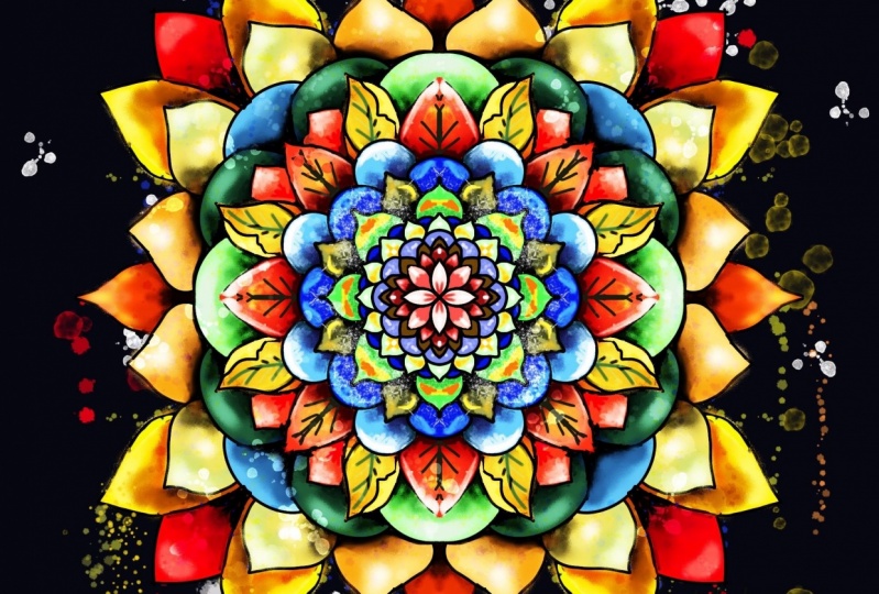
1. Introduction: Hello, my name is Jennifer Nichols. I am an artist, a teacher, and a fabric designer. I've been drawing all my life. But a few years ago I discovered Procreate and it has brought so much more daily art back into my life. I just love it. I have 36 classes on Skillshare. All of my classes focus on Procreate and most of them focus on beginner and intermediate level. In this class, I will show you how to complete a beautiful painterly Mandala from the sketch, all the way to the finished painting. This class is great for anyone who wants to learn a relaxing art technique to de-stress and simply play with color, brushes and shapes. I provide all the brushes since sketches and 25 palettes. If you're new to Procreate, you can check out my class for beginners and then you'll be all set. No art skills are required for this class. By the end of class, you'll know all you need to know to create your own symmetrical sketch using radial and rotational symmetry. You'll also know how to turn your sketch into a gorgeous painted Mandala in a relaxing technique, which is perfect for those times when you either don't know what to draw or when you simply feel like creating intuitive art at the end of a long day. I can't wait to see what you make. Let's get started.
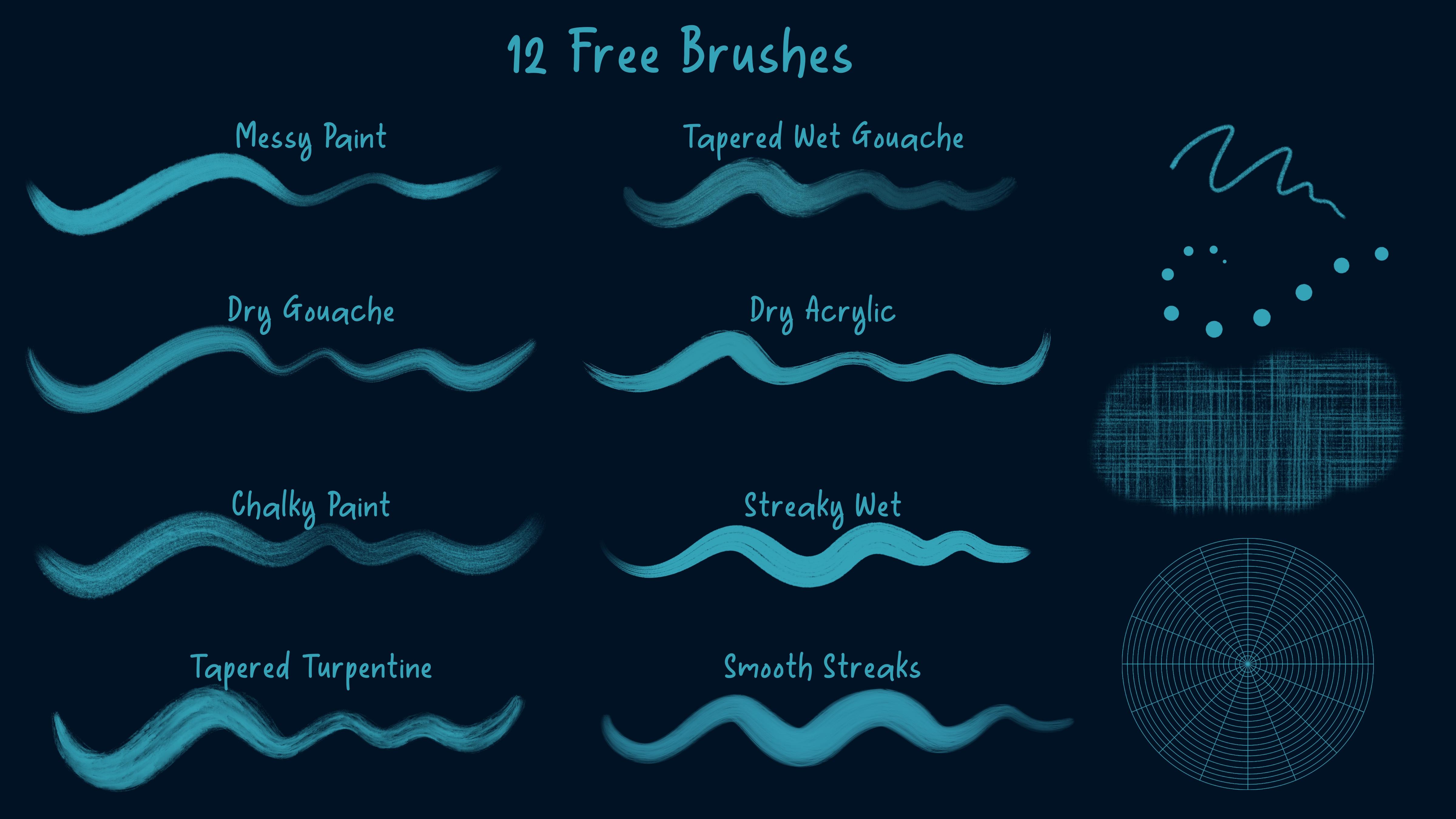
2. Class Resources & Preventing Pixelation: I'm going to quickly walk you through how to download our resources here. Then I want to talk to you about the brushes. If you already know how to download resources, definitely keep watching so you can learn a little bit about how I use the brushes. The first thing you need to do is make sure you are in a browser, not the Skillshare app. In landscape mode. I use Safari, so different browsers might be a little bit different for this step. If you have problems with the downloads, you might try different browsers. Go to the projects and resources of the class. I first want to point out that I have a couple of links here that has some interesting information about Mandalas. I thought that, that would be fun for you to check out. Then over here are the resources. Sometimes you need to tap this, See more, sometimes that resource list is longer than what you can see. For today, we just have the PNGs that I've provided as finished sketches for you to get started right away. Just tap Download and you can see it download right there. The pallets download, the brushes and then just a simple JPEG for a couple of simple ideas for you. Once you've tapped all those and downloaded those, you can simply go here and tap on one of these. That's an image. It just opened up. This is just some really quick different styles here, like a pointy leaf, almost a round leaf, a teardrop, and then different ways you can draw those skinnier and wider and rounder, and adding extra lines, combining them. Just some simple ideas for you to just hold onto and refer to. You can tap this up arrow right here and save it to your camera roll if you like. If you tap on one of these other things, it'll bring it over to your files. I have mine now so that they are ordered by date. If you tap the little squares here, you can have them ordered by date. Then they're easier to find because they're the most recent things that you downloaded. I like it to go ahead and split screen with Procreate. For the brushes, since it's not as if to file, it will just go ahead and import right into Procreate and it will be the very top of your brush library there. For pallets, it's a zipped folder. What you need to do is tap on it and it unzips. Now this is where all your palettes are. You can just tap on each one of those. They'll go right in to the very bottom of your palettes list and then you can reorder them. For the sketches here, again, it opened the zip file to this blue folder. These are my PNG sketches. Let me try that again. There they are. These, you can just save to your camera roll, just like we did with the other thing there. You can bring Procreate into maybe one Canvas. But go ahead and save those if you want them. I'll show you how I have them in one canvas. For me, I like to keep everything in Procreate because if I keep those in the camera roll, they're just going to get lost. I'm not very good at organizing all my files in a way that will help me find them later. I don't rely on that either. I just have them all here. That's all you need. These sketches are actually for, if you want to get started right away once we talk about how I do this painterly style and you don't want to draw your own Mandalas, you can just use mine. I'm going to go ahead and just come to a fresh layer that doesn't have Drawing Assist turned on and just talk about the brushes really quick. We're going to talk about Drawing Assist in the first lesson. I have eight painterly brushes that you can play around with and decide which ones you like the most. One or two of them have a little bit of color variation so you can tap on them. Go to Color dynamics and make sure all of this is turned off if you don't like the color changing parts of a brush, and then just tap done. The mono sketch high streamline is a pencily brush, but you don't have to use any pressure on your pencils. It just makes it nice and easy. I have high streamline, so it makes nice smooth lines. You can see how it's a sketchy brush. We'll be using that to create a sketch. Smudgy dots. It's a hard to tell that they're smudgy when they're tiny. This is pressure sensitive. That's an easier way to see it. It's a little smudgy. I just don't like to have the clean and crisp, monoline brush, especially on a painterly style here. If you don't like how it's pressure sensitive, you can go into it and go to Apple Pencil and turn this size to zero and then tap Done. If you don't like the spacing between the dots, you can go to Stroke Path and change the spacing right here. The rough grid is a texture brush that I've used in the background on some of the ones that I've already done. I provided that. I really like that brush. This is the grid brush that we're going to be using a lot for our guidelines. Depending on your canvas size, you're going to want to find a size for this brush that is as big as you can make it without going over the edges. Then you're going to select it and tap Fit to Screen. That is how we're going to use this particular brush. Then we're going to go ahead and decrease the opacity and then you can two-finger swipe to alpha lock that so you don't accidentally draw on that layer. On this, you're going to see dotted lines and you're going to see solid lines. The solid lines represent where the symmetry lines would be in Procreate. The dotted lines are exactly halfway in between. That is exactly at 22.5 degrees. That's a number we're going to use later, to get things to rotate to that position right there. The other thing I want to talk to you about before we get started is pixelation. If you have something that you want to duplicate and rotate, it's going to look fuzzier when you're done. Procreate suggests only moving things once. You can move it around and rotate it as many times as you want without deselecting it. But once you de-select it, that's counting as your one time. If you've taken some classes of mine, this might be new information for you. I have not talked about this a lot because I didn't know that that was important. You can't really tell about the quality difference when you're just looking at it at a normal size. But when you zoom in after moving some paint around many times, you can really see a difference. Let me show you that difference right now. I've just moved this duplicate once. If we zoom in, they look very similar. If I move it again and de-select it, that's three times, four times, five times, and I'm just going to put it right up here next to this one so we can really see side-by-side how different those look now. You can see how blurry this is compared to this. The same thing happens even on a monoline brush that doesn't have any texture. I don't know if you can see how fuzzy this looks compared to this. Zoomed out it looks okay. But what we're going to do is do all of our rotating and moving in our sketch phase and then we're going to paint without doing any rotating. Then we'll have a beautiful result in the end that is consistent and no fuzzy areas. I think we're ready to get started.
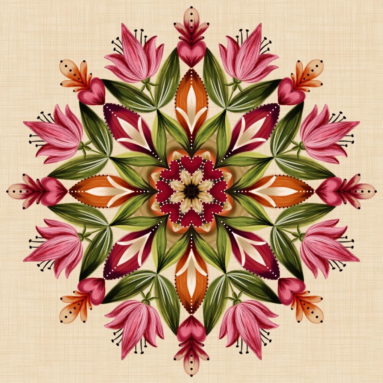
3. Your Class Project: For your class project, please post when completed painterly mandala. The whole point of this class is to have this painterly look. If you look really closely, you'll see a lot of painty strokes, which just sets it apart from the typical line art mandalas. I'd love to see a finished painterly mandala posted in the class project section. If you don't feel comfortable drawing your own, I've provided several sketches and you're welcome to use those instead of your own. We're not really going to look too much at inspiration right now, because this class is intended to be more of intuitive drawing where you're just doodling and adding lines that connect and form shapes. Flowers and hearts some some other fine symmetrical designs will end up popping up when you least expect it when you're using symmetry. So it's going to be exciting to see how everybody's turns out and they'll all be unique, even if you're using my sketches, your color choices and your painting technique is going to make it unique, even if other people are using the same sketch. So go for it. If you do feel more comfortable going ahead and thinking of a theme like this is a little bit of space theme, I have got the sun and the planets here, you can go ahead and add any specific shapes you want as well. I'll be showing you how to use regular radial symmetry as well as rotational symmetry. We can use both in the same mandala. So this one uses both. All of these areas up here are all using rotational symmetry going around. The whole center is using regular radial symmetry. So we'll talk about that as well. It's really fun to play with both. All right, let's get started with a sketch and then I'll show you how to paint it.
4. Canvas Set-Up & Symmetry Basics: We're going to tap the "Plus" sign, and the Plus sign again. I go to Inches and I'm doing 12 inches by 12 inches at 300 DPI. Depending on your iPad, you might want to go to a smaller size. I would just make sure it's square. When you're done, we can copy and paste it into a file that isn't square, but it's just easier all around if you're creating it in a square. Once you get some experience, then you can start playing around with different sizes of canvases. I have 60 layers with this setting. If you have a different iPad that has fewer layers, you do not need 60 layers for one, but you're probably going to want 20 or so. Decrease your file size until you get about 20 layers and tap "Create." I'm going to go ahead and do our Mandala Grid. Tap right in the center, make it big so that it's close to the edges but not going over the edges and then select and tap fit to screen. That way we know it's perfectly in the center. Reduce the opacity, two-finger right swipe to Alpha lock that, and then we're going to add a layer on top. We need to turn on symmetry, so go to the wrench actions menu to canvas this turn on drawing guide, edit drawing guide, symmetry options, and then go to radial symmetry. This is where you can toggle rotational symmetry on and off. For now, we're just going to leave it off. Most of these will automatically put assisted drawing on for the layer that you're currently using. You can change the color of the drawing guide there, and also the opacity and thickness. You don't really need the drawing guide. I'm going to tap "Done", and then this grid gives us our drawing guide so you don't really need it. But it doesn't hurt to just leave it there. Then when you want to go in to change into rotational symmetry, all you have to do is edit drawing guide. If you turn the drawing guide off, then when you want to go in and edit to go to rotational symmetry, you have to turn it back on and then edit. It's whatever you prefer. The drawing guide is going along all of these solid lines. You probably can't really see it for this particular line, but you can see it on these diagonals. Then we're going to switch to the mono sketch, high streamline, pick a size, any color will do. There's no special distancing between all of these rings. It's very random. I just wanted a lot of them so that you have a lot of options while you're creating your Mandala. Then of course the dotted lines are at 22.5 degrees. Right now this layer says assisted because we were on this layer when we turned the drawing guide on. We need a whole bunch of those assisted layers. You can just duplicate like this, or you can swipe right on a few of them and just drag them to the canvas and it duplicates them. It does put them at the very top. If you had other stuff going on, then it would just keep throwing them in at the very top. Now, we have a whole bunch and they all say assisted. Remember we're thinking about just some fun flowy shapes and everything on the solid lines is going to do a mirror image repeat. Anything that you have, well, keep it zoomed out so you can see all four. Anything that you have here is going to duplicate in all four of those spots. Anything you have here is going to do the same, all of those four spots. If you want something that has eight points, you have two options. You can do something here and then duplicate it. Remember, we're only duplicating the sketch layer, so that's okay. We're on the sketch layer. If you go past this dotted line, then there's going to be some overlap when you duplicate. So you can play around with that, or you can just go straight to the dotted line. I'll show you this really quick. If we duplicate and then select and then make sure magnetics is on, not snapping, just magnetics, it's going to rotate in 15 degree increments. You can rotate exactly to the other solid line here. That's a nice way to get an eight pointed perfectly symmetrical shape. Then you can join those together by pinching those layers. The other way to do eight shapes is to draw within around the dotted lines, so in between the two solid lines. But you're not going to get the mirror image across the dotted lines. If you want it to be symmetrical, you'll have to try to eyeball it like that or you can do one side just like that, then do the same thing where you're duplicating that and rotating it and it snaps right into place. Merge those layers and you have the eight pointed flower or shape, where the points are along the solid lines, or where the points are along the dotted lines. Now let's say you have a shape that you want to be repeating along this line. Let's say you have a shape like this and you really want it to be repeating right here, I'm going to draw that a little bit better. In that case, you would duplicate it, select it, and since you can't snap right to that dotted line, you need to just tap this green dot and it says rotation. If you tap the blue dot down here, it won't say rotation it's for something else. Then you can tap 22.5. It's going to rotate that direction. To get rid of this menu, don't tap the screen, it will nudge your selection, so you can tap the brush menu. Then you have the same duplicated set of four, but it's along your dotted lines now. You need to keep doing that. Well, what I like to do when I want a lot of them, I have a duplicate of this one right now and I want to snap it to this number, to this solid line here, so I have eight. Then when I merge those two, so those are all in one, and duplicate that, then I could rotate that one 22.5 degrees to have those petals be on every single one of these dotted lines. 22.5 isn't a magic number, it's just how many degrees it is from here to there. The magnetic snaps to 15 and 30, 22.5 is right in between those. You can really get a whole bunch of things. Gosh, you could even duplicate this. You don't want to be too busy. Now we're starting to look like a spiral graph. I'm just going to delete all the things that we had and get started with a full sketch now that you know those couple of tricks there.
5. Creating Your Sketch: When I make a circle, I keep symmetry on and I just follow one of my lines, because when I don't follow one of these lines, it ends up being a roundy square when I do that. I'm deciding how big I want my center circle to be, if you want a center circle at all. Then I'm going to a new layer with each shape that I do. I'll show you really quick if I overlap, if I'm having a petal that comes out past this, so I'm not keeping it within the dotted lines, right here. If I have a petal that comes out past the dotted line, then when I duplicate it, then there's overlap. That's something that you might want, something you might not want, and you can of course erase the overlap on one of the layers so that it looks like it's behind the other one. I'm going to turn my layer down, this layer down a little bit more, and I'm going to go ahead and toggle off my drawing guide. That way I can see better. You can do that. You can have that still showing if you want it to still show, and whatever you want to do. I merge along the way and I go to a new layer. When I do this one that's going up to the dotted line, I can start anywhere over here. I'm just making sure I end on the dotted line, because I'm going to duplicate that, and rotate so I can get that symmetrical on both sides. I'm being very precise with this symmetry during my sketching phase, but that all goes away when I start the painting phase. When I look at it like this, even though I'm not necessarily going for a flower, I'm going to merge those and go to a new layer. It doesn't matter if you're going above or below, we're just sketching. I think I want to do something down here too. This is small enough down here, then I might just draw it without duplicating it, draw both sides without duplicating, merge, and go to a new layer. The other thing to think about is that everything is going to be painty. Thin lines, if you wanted to do some curly Q, are going to be a little thick because we're painting. You might want to dry it either with a thicker outline or just make it thick like this. I do not have a plan. I'm just playing around here. Duplicate and rotate, merge, go to a new layer. One thing I am thinking about is I don't want to have huge sections so I'm doing some dividing up of having these littler spaces. You can also, make little shapes within your spaces like that. I might go ahead and add, see how that ended up being squarish. I'm going to show you an example of what to do if you want something that's not right on the lines that are on the grid, and you can't quite draw it freehand. I want this ring to be a little bigger and it's on its own layer so I'm going to turn off the other shape there. Well, I can leave it on while I'm trying to figure out what size I want it. I want to make it bigger like this, but I need to make sure it's centered. To make sure it's centered, I need to turn everything else off, and then I can select it, and turn on snapping. When you center it, it should have the gold lines in both directions. Then you can turn snapping back off and turn your other things back on, and now you've made sure that that ring is centered and you can merge it. Think about bigger shapes and smaller shapes and darker and lighter areas and have variety. I've spent some time designing this section right here before I duplicate it. Once I'm happy with that, I can duplicate it and rotate it and I'm going to merge all of those layers. You see my thicker lines here? I want some that are thicker down in here as well, but I think I'll wait and just do that when I'm painting. You can also add all sorts of little details later as well. You're just getting the basic sketch. Now we're going to switch over to rotational symmetry. Just go back in and turn the drawing guide on if it's off. Edit drawing guide options, and turn on rotational symmetry, and tap "Done." Make sure you're on a new layer, and now rotational symmetry is applied to all layers that say assisted. Whatever your current symmetry setting is on, that will apply to all layers. Rotational means there's not going to be any mirror imaging happening. How we have the mirror imaging happening here, nothing like that is going to happen. Everything is just going to look like it's rotating which is the point of calling it rotational symmetry, I guess. If you have something like that, goes that way or that way. When you go from a regular radial symmetry layer to rotational symmetry, it's easy to figure out where you want your shapes to go just fine, but when you switch back to non-rotational symmetry, after that, it gets a little tricky. I'll just, do a quick example here, of some teardrop shapes. Let the circle snap and put your finger down to get it to be a perfect circle. Now if you go directly back to regular symmetry, so we go back and turn off rotational, then the problem is if I want to do something that's right here, it's not lining up to anything over here, or maybe I've started over here, and it's bumping into the objects over here. That is something that you just need to watch out for, and what I like to do is have a circle, which is a nice stopping point, and then I can finish off. I'm going to go to a new layer, turn on Drawing Assist. I could have used these two, and then now I can finish off and make sure that my regular non-rotational symmetry is lining up just fine because it's just bumping into that circle. I hope that makes sense. Just watch out for any overlap when you're switching between the two. Although I'm liking that circle just as our finished thing here, and then maybe have this on. When you're drawing over here in the corner, make sure you're not going past the edge of your grid, because then if you're going to duplicate it, it won't show up over here. It'll go off the edge of your paper. I am going to duplicate that, rotate it, merge those, duplicate that, select it and tap the rotation green dot 22.5. Let it switch and tap this two times to deselect it. I'm going to go ahead and merge all of that actually. Let's see, there's a lot of blank space in here, so I want to think about that and that was the rotational symmetry area. I need to go back to rotational symmetry if I want to add anything in there. Let's do that. Turn rotational symmetry back on. I'm trying to go through all the possible scenarios for you while you're doing your own sketch. Now, this is looking like an underwater and bubbles in water and splashing here, which is fine. I can merge all of that, go to a new layer, and I'm going to turn the rotational off again. I'm thinking about this ring. I might want to add some dots inside of there. I think I'm going to add actually some diamonds. Some swooped diamonds curved up and curved down. Put it in these four sections so I can duplicate that, select it and rotate it to the diagonal sections. Merge those, duplicate that, select, and then tap the 22.5 to get it to these dotted lines sections. Now I can merge all of those layers. I'm going to duplicate in one of my assisted layers here just in case I need another one. I don't think I can make a circle that big, but maybe I'll make up enough an almond shape, like that. For that one, it duplicated here and here so I need to just duplicate that one time, and rotate it right to the diagonal. Merge all of those. I'm really liking that I think when I paint, these might become something that's more thicker and thin down here, thick up here, maybe more rounded, something like that. But I don't need to have all of those details in the sketch layer.
6. Rough Color: I really enjoy having color refs. It really helps me just, be able to freely paint later without really putting a lot of thought into color. At this point, I don't really need my grid on in the background or my drawing guide. I'm going to just add a layer. I'm going to play around with color for a minute. I'm going to turn this off and, I have a layer that's not assisted. Your palettes that you downloaded will be way down at the bottom. You can drag and drop these and rearrange them so you can drag them way back up to the top. You have the mandala, cool and warm, which is one giant palette, and this is intended to be the background color. It works really well with these, but you can do whatever you want. Then each of these sets are mini palettes. There's 5, 5, 5, 5, 5, 5. There's six pallets in each of these sets. This is a good time to go through and decide what colors you want to use. I really like a lot of these. I've been playing around with them. I'm thinking this one might work too. I'm going to set the default to this one, this teal green blues and this orange. Then I go back to disk. Then I'm going to remember these five colors are my palette. Then you can play around with blacks and whites to join in your palette. You can go with different tints and shades of these colors to add to your design. You're not limited just to these five colors. The first thing you're going to want to do is choose your background color. Well, let's put a little bit of color on our page. I'm going to go to messy paint. Definitely play around with all of these and think about which ones you like the best. I'm just going to blab some color on here. Then I'm going to look at background colors. If I go to orange and I go much darker, that could work. Maybe the blues, since we're going for an underwater-ish, well, I am. I was thinking about underwater. I might go with a blue or maybe even the teal. No, I think the underwater. I'm going dark. I tend to go dark on backgrounds. It's something you can change later. But to know approximately, and if it's going to be dark or light before you start is a good plan. Right Right I'm looking at this green. It's not standing out too much with a dark blue background. But like I said, I can change and go with some different hues, different tints, and shades of that green. I think I'm going to start with the dark blue. Just for filming, I'm going to go a little bit lighter, so it doesn't look black. I can just get rid of that layer. I know my palette now. I know my background color approximately. Now my sketch is dark, and I can't see it. I can Alpha lock that and choose a lighter color and fill layer and, now I have that and I can reduce the opacity. I'm just going to duplicate a bunch of assisted layers. I need to see if rotational symmetry is on. It is not. Now I'm just going to try to rough in some colors with symmetry turned on. I'm going to fast-forward this part. I think I'm happy with my colors, although as I zoom out, I think I went a little bit more of this brighter teal in the center. Remember that it's going to have more color variation than just this. This is just the base colors roughed in. Time to do a nice job adding our base colors and then get a painterly look.
7. Painting The Base Colors: I'd like to merge everything on my rough colors to one layer and move it above my sketch layer and then I can just toggle it on and off when I want to know which color I need to be choosing. Again, I just need a whole bunch of these assisted layers. I'm not going to do the drag and drop into the center thing to duplicate because it'll put them all above these other layers so I'm just going to duplicate several. I don't know if I mentioned, any time you add a fresh layer it doesn't say assisted on it and you can just tap it and turn Drawing Assist on right there. You can turn it off the same way. I like to start in the center and move my way out. You need to just find what works for you. In that case, I start at the top and work my way down and that's because I want to be able to hide certain things under the previous layer. For example, lets see, I'm going to stick with this messy paint brush. Also when I'm in the very center like this, I like to turn Drawing Assist off because it gets a little bit weird using Drawing Assist where all the lines merge. I'm trying to keep a painterly look and with the shape and get this colored down. It's good to know if your background is going to be light or dark because it's going to make a difference how you add your painterly layers here. Now I have that and I have another ring I need to do before I show an example of hiding your layers, your ends underneath, but I'll just show you a rough example that doesn't follow our sketch. Now I can go to a layer underneath and let's say when I choose this light blue and do something like this, then my ends are hidden underneath this layer. That's why you work your way down, when you start in the middle and go out. I'm not going to have all of these be on separate layers. Since this is a nice painterly look, you can really play around with having fewer layers and that lets you blend easier and things like that. I'm just going to stay on this layer here for my ring around here, which is going to be orange. Again, I'm going to turn symmetry back on, see if that works in a little bit further away from the center. Anytime you merge right at one of the symmetry lines, it gets a little weird-looking if you're not lined up perfectly. I'm going to keep a painterly look going and think about paint strokes. I am going to be adding more colors on top of everything and the texture itself will keep getting layered so you may not end up seeing too much of the background. Might toggle this back on and remind myself what color I chose here. I went to a dark blue for some things and it's still up here in my history. If you don't have a history, just go back. It was one of the hues that I have in my palette and then I just darkened it. I am going to go to a new layer for this. That doesn't seem much darker. Here we go and I can go up in size now. Just to remind you we did duplicate and rotate when we did our sketch. That's why this is not filling in all eight petals here and we're not going to duplicate and rotate for the final painting because of that blurriness that it can cause. Right now, that's not super obvious with these particular colors, but it's just a good habit. I am going to switch layers for this green, hide it behind here. I am going in the direction of the petal. Light blue, dark blue, orange. I'm going to turn my sketch down quite a bit because I really want to be able to see what I'm doing here. I think I might do those all on the same layer as this green. I'm going to go to a new layer for this teal, which is under these colors. I'm going to go down a couple of layers and do that teal. These little designs on top, well, we can just go down one layer for now and do these designs on top, these ones right here. The dark blue, light blue, mid blue there. Go to the layer under that, for that teal. You can be switching brushes too. I'm going to go back up to the layer that has this orange on it to add the orange around the edges here. Now, I'm seeing something that I didn't do in the color rough. I skipped these little sections right here and these dots. Let's just keep going with our base coats. Now we need to switch over to rotational symmetry. I'm going to go down below everything and I basically picked the blue and went almost to black here, for the background here. I'm not worrying too much about painterly strokes with this background section here. It's really not going to show up much. I did light blue every other one, middle blue. I need to bring that down, go to a layer above this dark layer, and do my light blue. This is looking fun. I think we can switch off Rotational Symmetry. I'm going to bring a layer above those two that we did rotational symmetry. You know what, I can actually go back to one of these other layers that we already did. I'm going to do that. We don't have to keep adding so many layers. I'm going to go to the layer I did this bright teal on, this layer right here and I need that green. As long as you're on top of the layers that you just did, we just need to hide those underneath. I'm hiding my messy edge from that rotational layer underneath this green now by going above that layer. I can keep doing that. I'm going to go above that layer to add my designs on that here. I have orange for the little diamonds, teal for the little almond shapes, and teal for all of these out here. I'm going to touch these up later so I'm not too worried. Then the bright teal and the bright teal up here. Then we go ahead and stick to this same layer. I might regret it later. Now we can turn our sketch off. Now we have the base colors of our final illustration, not our color rough which was super-duper rough and messy. Next step will make it much more interesting.
8. Painting The Final Colors: It's time to really add all of that yummy, painterly, colorful texture on top of what we have here already. I think I'm good with the layers. I don't think I have anything on this layer, so I'll just drag it back down here. I only have seven layers in the design, and you can use clipping masks if you have a lot of layers, there's no problem doing what we're about to do right on top of a clipping mask. I like to just do it right on the layer itself. What I'm talking about is making the color variations on each layer. If you want to do it on a clipping mask, you just add a layer, tap the layer and tap Drawing Assist and also Clipping Mask. That will be a clipping mask on top of whatever is underneath it here. In this case, it's this one. The benefit to doing that is, whatever texture you have right here is going to remain. If you spent a lot of time making this exactly the texture you want it to be, then anything you do on top of this with a clipping mask is going to not fill in all of this texture. If I went like this, you can see that texture remains the same, because a clipping mask only shows above the pixels that are underneath on that main layer. Any pixels that are on the clipping mask won't show up if there's no pixels underneath it. Those gaps are pixel gaps. The texture just will remain. I'm not doing it that way, but you can, and instead, I'm going to just keep painting right on top of each one of these layers, and it does end up filling in some of the texture you see here. But because we're using textured brushes, you're adding texture on top of it anyways. It doesn't matter which one you start with. I'm going to go ahead and start with these dark blue petals. I'm going to that layer, and I can just select the color here. Now I know where my starting point is, that's the base color. This also if you're not using the clipping mask, it also lets you tidy things up a little bit like this is a little messy up in these corners. I can change that right now as I add more colors. I'm going to go ahead and go to the lighter version of that blue. Whatever you do on one, make sure you find all of the repeating spots where you need to do that same color and design on the other repeating elements. Maybe go to the lighter blue down here. This is the part that takes a little time. You can smudge. I tapped and held this smudge tool and now the same brush is selected. I haven't been changing brushes. These are just all for you to play with and decide which ones you like best. I tend to lean towards this messy paintbrush. You can smudge, but just be careful not to smudge it so it's super smooth. You want to keep texture. I don't want to just smudge that darker blue until it's completely gone either. As far as smudging goes, this is where it's fun to do analogous color schemes because if you're choosing colors that are close to each other, three colors in a row like green, blue, purple, then when you smudge, they're going to make cool colors. They're not going to get muddy. If you're doing blue and orange way over here and you smudge them, they're going to get muddy. Since I'm using this specific palette, I'm just staying within tints and shades of these colors. I'm not worried about any sort of analogous color scheme here for this one. But if you were using the palette, that is the really big palette, the Mandala cool and warm palette, this one, if you're choosing a pink, you can go over to orange and yellow. I don't have any specific orange. These might be dark oranges. If you're using a blue, can go over to some greens and some purples all in the same section, and then smudge them and they'll still look good. That's what I do for every single layer.
9. Gorgeous Finishing Touches: We're going to do the final steps to finish up this illustration and get some more shadows and highlights in here with one, well maybe not just with one, but you can use as little as one layer on the top of everything, so you don't need to worry about being on top of the sketch or your color ref. But if you come up here to the top of all of these final things here you can tap Drawing Assist and turn Drawing Assist on for that layer. Then you can either turn it to color burn and choose a gray for your color, or you can turn it to overlay and choose black and white. I'm going to stick with the brush I've been using and I'm going to just test what this is going to look like on top of all of my colors here. You can see that makes the orange quite saturated, you can play around with some other colors, some slightly lighter gray, that's much nicer. I just went a little bit lighter, I went straight across, but then up little bit towards white, super light gray. If a look at the value here, I'm at 69 percent for the brightness, and I'm liking that. I'm going to undo. Now, if you're just using a color burn layer you are only going to be able to get some shadows. You can go through and add some really great painty details, darkening everything. Now I'm doing it all on one layer. When you overlap, like I have overlapped right here, the gray that I'm using overlapping onto a different section. It is going to impact that section too, which is a neat thing if you want it to be, so right there it overlapped this blue and this green. You can get some nice, fun, darker areas. I can dark in my joule here. I'm going to turn off assisted. Darken this side. This gives it a little bit more or something. Then you come around, darken the edge. Darkening that edge will make it look like it's deeper in a little crevice, like that. I need to turn Drawing Assist back on. Remembering that will all able to really do anything to the layers that are not rotational symmetry. Just come around and have some fun getting some more variation here with your color burn layer. It's not showing up so well, the medium, or I should say the light blue but I'm still enjoying what it's doing to it. Then I'm going to come out here to these outer pieces, being careful not to go off the edge on the outside here. I think I can go ahead and go a little bit darker with make gray for these lighter blue areas. Then I'm going to need that same darker gray for these lighter blue areas. I just need to change to rotational symmetries. I need to turn drawing guide back on, add it Rotational, it's going to zoom in on one here. That's essentially what you want to do all over the place and it just really makes a big difference. Let me toggle this on and off so you can see off, on, off, on. If you're limited on layers and you want a type of layer that you can do shadows and highlights on the same layer, then you can do an overlay layer. An overlay, I'm going to turn off the color burn layer. An overlay, if you use black, you get a darker color but also if you use white, you get a brighter color. These blend modes behave differently with different colors. Depending on your palette, you can play around with blend modes and see what works best for you. Then if you use a gray, you get a little bit of in-between there. For using one layer for highlights and shadows, this would be the way to do it. You would go around with, I have rotational symmetry on. You would go around with, I still need to turn on Drawing Assist. You will go round with the one layer with black or dark gray to get those shadows like we just did. They're going to be a little different than the color burn layer, but you go around the whole thing doing your shadows with dark black, dark gray. Then you could go around switch over to white and get some highlights as well. Since I already did the color burn layer, I'm just going to use my overlay layer for my highlights. I'm just going to think about if I want to add any brightness here and there. That's looking great, I love it. I'm going to turn the drawing guide off. We did just a quick review of that. We did color burn for darker areas with gray, and we did overlay for the lighter areas with pretty close to white. You could use overlay for dark and light to get it all on the same layer. That's something that you can just really experiment with and see what works best for you. You can play with other blend modes too, those are my favorites. Those are the ones I recommend. I am also actually going to go to a new layer on top of everything except for those two that have the funny blend modes. Turn on drawing assist, and just come around with white. If you want you can actually choose one of the colors from your palette and then bring it really close to white, so at least it is just a tint of a color that's in your palate. Then you can go around and make little changes that aren't overlay necessarily. You know you can predict what the color is going to be. You could do this on top of your overlay layer as well. But this is a nice way, if you have leaves, you can get some veins in the leaves. If you want something that's nice and solid, this is a nice way to do that as well. It doesn't have to be white, it doesn't have to be this close to white color that I'm using either. But it's just going over the whole thing on one layer and getting some little highlights here and there. We have not used the dot brush. That's another thing that's fun to go over with some lights and darks and get some real fun contrast in there with the dots. For example, it might be fun to do the dots right along here and then I'll show you if you want to do them right along a symmetry line, where it's going, we don't have symmetry. Yeah, we do it must be on rotational. If you have a symmetry line and you're having the doubles like that, if you try then start at right on the line and just let it snap. Then you can adjust this way and get it to line up just how you want it, like that. I would do that on a separate layer so you can take it off if you change your mind. I'm not going to go overboard with the dots, but those are fun to add as well. I'm just thinking about anything else. I think I'm really happy with this and now I want to look at the background.
10. Background Ideas: Background. Let's turn the drawing guide off. You might not be able to see that, but it was still on. I'm going to turn off the background. I have a transparent background. I'm going to three finger swipe down and tap "Copy all." Then you can turn the background back on. Then somewhere down here, we don't really need these layers anymore, you can three finger swipe down and paste. Now you have the whole mandala on one layer. That's nice to hold onto. You can go ahead and group all of these other layers. It's not a ton of layers, so that's nice. You don't really need to group the color rough or the sketch into that. You have all of those and now you have this one. You have all of the group here and this one. I wouldn't flatten that, so you can still make changes. Also, because you use different blend modes, if you try to flatten, sometimes those blend modes do weird things. Also I realized that on my sketch, remember, I almost forgot w, had these details at the tops of these that I was going to come back and finish. I decided that when I came through with the whiter color here on the overlay layer that, that was enough detail for me on those. That's another thing you can check though. Bring your sketch opacity back up sometimes and make sure you're not forgetting. I did forget these little circle dots here too. But again, because I added these other dots, I don't want to add any more dots in there. It's fine, just like this. We have this one all on its own layer. I'm going to duplicate that and Alpha Lock blend and turn it to a dark gray and fill. You can see how painterly that all is, the other one's on underneath it. It's pretty cool. Then I'm going to turn that blend mode to Multiply. You can take Alpha Lock off and blur this. Tap the Adjustments menu, go to Gaussian Blur, Layer, and just slide. You can see the blur amount right there, 5, 6 percent. Play around with that. This is just an option, you do not need to do this. Then you have this layer back here, that you can move around and have a bit of a shadow underneath. It might work better even with a darker color. You can Alpha Lock that and change the color again to a darker color. Or you can go into the Hue, Saturation, Brightness, darken it right here. That's something fun to do. I don't always do that layer. This one, I'm just going to hold onto, in case I want to paste that whole layer into a different canvas. Then another thing that's fun to do, let's go ahead and just delete these, and turn the Drawing Assist off on this one, and choose our grid brush. For now, before I do the grid, I'm going to decide how I want this background to look. I'm going to brighten it a little bit. Then for the grid brush, I'll choose a darker color. Now I have the background a little brighter blue. I'm going to select that blue and then just go a little darker. Choose a grid that is the size you want. Then try to get it all in one stroke, without lifting up your pencil. Just around the corners, the edges here. That's a nice background. You can then erase some of that with a texture brush so it's not just a grid. Let me show you close up. Then you can also change the blend mode on that. Another thing you could do is go above everything and do a grid layer on top, and change the blend mode of it. I'm just going to do a quick example of it. If you change the blend mode and change the opacity, then you're just adding some texture to the top of your painting. I'm not sure that particular brush works well for that because you have this painterly texture, unless you're really looking to get a canvas look for it. It doesn't really do much for me personally, but that is another thing that's fun to do, is add a texture right on top. You know how much I love texture. I would consider this finished. You can check it with this blurred layer that we made. I'm going to turn the opacity down on that blurred layer too. The blurred layer, you need to be careful, it will make it look like it's floating. If you blur it too much or if you move that blurred layer too much over to the side, it really is a good example of it, really looks like it's floating. You're going to want to sign your work too. Come to a layer on top with no drawing assist on, and just find a sneaky little spot to put your signature. I'm going to pick a dark green and put, just my initials right there. You're finished. Come back to the next lesson and I'll go through the other mandalas that I've done, and show you how they are similar and different to this one.
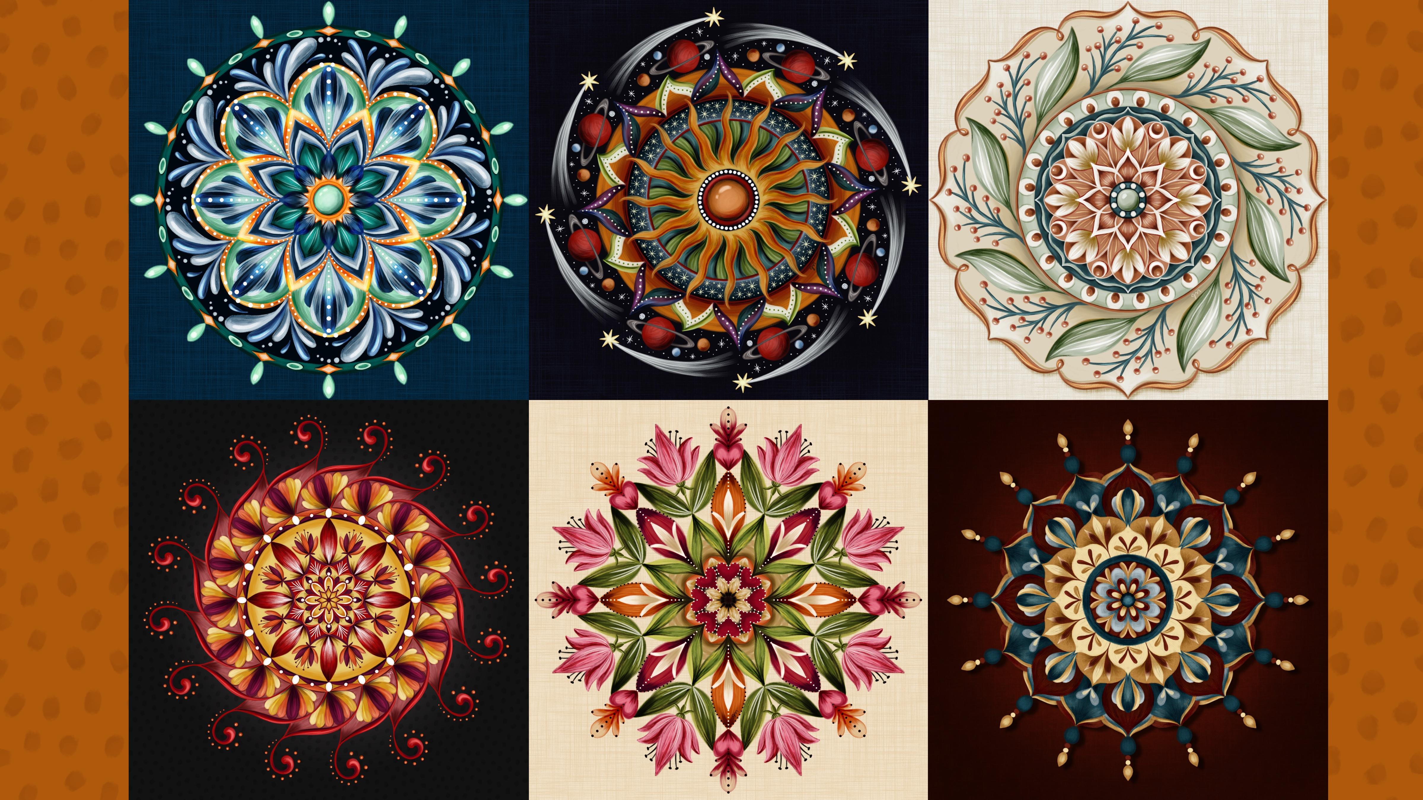
11. Taking a Look at Completed Examples: For this one I used the big palette, the Mandela cool and warm palette, and I tried to stick with some cooler colors within each space or some warmer colors within each space. Then when I blended, they didn't get muddy. This one alternates between regular radial symmetry and rotational symmetry, and then back to regular radial symmetry. This one's quite similar to the one that we did in that it's just a limited color palette with some tints and shades of each of those five colors. There's no rotational symmetry on this at all. All of it is regular radial symmetry. This one does not have any rotational symmetry on it either. I used the taper turpentine brush for most of it, so it's very painty. This one does go between regular symmetry and rotational symmetry for this whole outer area. I really love this color scheme, and this one is, let's see, these colors are from 6 Palletes A, and it's this bottom one right here, that the teals and the rest, and then I did some much darker versions of the rest, as well as this creamy color here. I have some learning curves on this one too, where I feel like these dots ended up looking like fried eggs. I was focused so much on trying to keep them from looking like eyeballs and now they look like eggs. The palette for this one, is let's see, which one? It's this really bright one, 6 Palletes D. It's this red, pink, tan, orange, green. The palette for this one is in 6 Palletes C, and it's this very top one, light blue, maroon, brown and cream, and this teal. Finally, I have this one. This entire one was made with rotational symmetry so there's no mirror imaging going on with any of these things here at all, anywhere. This is another one where that color burn layer really made a difference. Here it is without the color burn layer and I really loved it. I thought it was done, and then I decided to add the color burn layer and I went through darkening some areas, and it looks like that now and I love it even more. I didn't realize that it was missing something until I did that layer. I really encourage you to play around with the color burden or overlay layers on top of everything. Feel free to practice all of these techniques on either your own sketch or the sketches I provided.
12. Thank You!: Thank you so much for taking this class. I hope you enjoyed discovering how relaxing painting mandalas can be and how many possibilities there are. Please leave a review and post a class project for all of us to see. I can't wait to see the results from this class. There's going to be such a variety, even if you choose to use those sketches I provide, we're all going to be choosing different palettes and different brushes and have our different techniques for creating these painterly mandalas and they'll all look different. Be sure to head over to my Skillshare profile. You can follow me there so you are alerted when I post new classes. You can also find the links for where I am online, including the link to sign up for my newsletter where I send out Procreate freebies once or twice a month. I have a wonderful Facebook group with fellow Skillshare teacher, my art sister, Brenda Baker. Our Facebook group is a safe and kind place to share your art all skill levels are welcome. It's all for Procreate art so it's perfect. Thanks again, and I'll see you in the next class.
 Jennifer Nichols, Artist & Teacher, Procreate