Transcripts
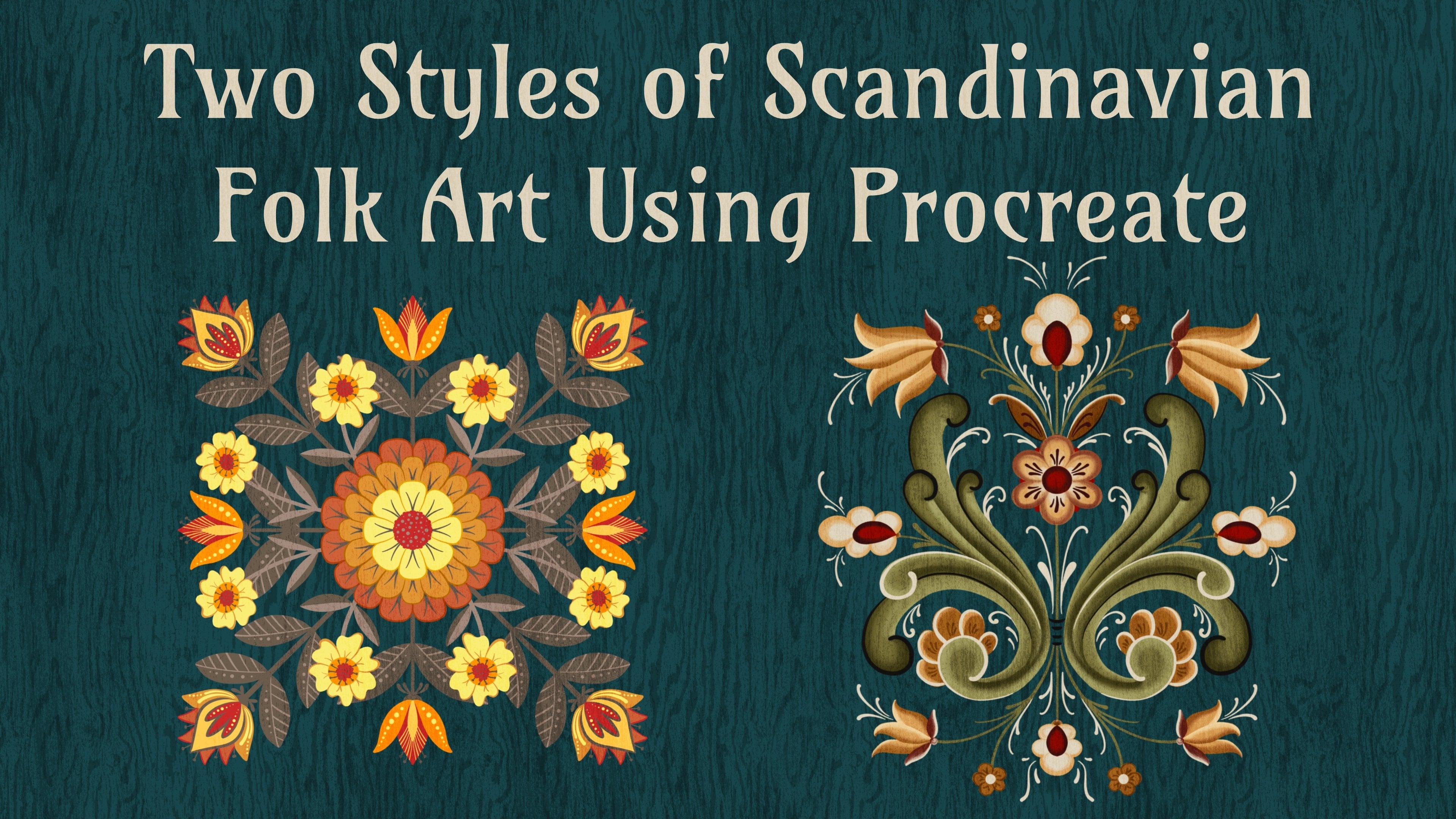
1. What’s This Class About?: The results for my negative painting class in Procreate have been outstanding. This class is intended to give you some additional tools to level up your negative painting skills in Procreate. You will love the results. I'm Jennifer Nichols, I'm a teacher, an illustrator, and a fabric designer and I'm so excited to show you a few more techniques in negative painting. Be sure to take the previous class first or this class will not make sense. I've also included a beautiful watercolor line art technique that has the most gorgeous results. In addition, I've included a speed draw from start to finish, a bonus lesson and more free brushes to add to your brushes from the first class. Be sure to check out my Skillshare profile where you can find links to everywhere I am online, find me on Instagram and more. See you in class.
2. Important Download Info: To get to the class resources, go to the Project and Resources tab. Sometimes you need to tap this little, see more and then here's your list. You need to be in a browser in landscape mode, not in the app. I have three herb outline drawing PNGs for you. I'll just show you how to do one. You can tap it and download it. This is Safari and we just saw it download right there. Do that to all three. The reference pictures are just more herbs from Unsplash and Pixabay, so they're free use photos. You can download that zipped file, the brush set. If you're having a hard time with these, then it might be your browser. Try a different browser. We're back to this. Then this is a new Canvas. It is just like the Canvas from the first class, except it's a seamless repeat pattern. Anybody who does seamless repeat patterns is going to be able to use this Canvas to make patterns for Spoonflower or whatever you want to do. Once you get all of those, go ahead and go to "Files", "Recents", and they should all be at the top, zipped file. Remember the name of it. It's Refpicks because it's going to hop down to the Downloads option here once you tap on that. The easiest way is to split screen with Procreate. Then for this Canvas, I'm in the Stack right now and it's not going to show up in the Stack, so I'll let you see that. It's importing, and then it came to the very first spot of my gallery. Sometimes when you're in a Stack, it doesn't hop out of the Stack to do that so you'll have to go out of the Stack to look for it. The same with the brushes, they'll just import right in. They'll be in the very top of your list up here. The herb, PNGs, those you can do whatever you want with. Tap on it and you can just go like this and Save Image and it'll save to your camera roll. Go ahead and get all of those. Then the reference pictures are really just for your reference if you want to draw more herbs. It popped over to the Downloads probably here, I'm going to exit out of that. Right here. It's in the downloads and it was called Refpicks. You can see it here mine are in alphabetical order. The zip file opened up an unzipped folder right in front of it. You can tap that. These are all just images from the web, from Unsplash and Pixabay. You can even trace them if you want. You can view them and see if you want to save any, and save them by tapping this little up arrow. Save them to your camera roll or keep them here in files. We don't necessarily need these for class. Those are just for future reference for you to draw more herbs if you want to. Of course, there's all sorts of other inspiration out there. One thing I want to tell you about the brushes is it is easiest if you just go ahead and drag them into the original negative painting class brush set. This class is part 2. If you haven't taken the first class, then you probably don't have those brushes yet. You need to do that, and this class will not make sense if you haven't taken that class. I have an initial negative painting class that you need to start with. Here's those brushes. We're just going to go to the ones we just downloaded. I know mine that I just did is up here, but this is the one I've been working on and just swipe right on all of them and drag them out and then tap that negative painting class and figure out where you want to put them. I'm just going to put them right here under these other. Well, it ended up going to enter the studio pen. I can drag the studio pen back down there. I can grab this crazy salty texture and bring it down with these others salty textures. Now I have the stamps from the original class and some more botanical stamps from this class. Then this Bloomy brush, I will show you later. I'm going to go ahead and drag that down to near the salt sprinkles. All right. I can just delete this. Now you have all of your brushes in one spot. Of course you also have your Posca and Micron brushes that we used in that class, is the original class as well. As far as the Canvas goes, you can use the repeat Canvas that we just downloaded or the original one from the other class. Okay, see you in class.
3. Advanced Tips: 1: There's two big things I want to show you today and then something that's completely separate as well. The first one is that we can get this nice watercolor edge around every single element without doing it by hand. It is a bit complicated with layers, but I promise you can do it. I'm going to show you this simple illustration with pumpkins that'll help you understand what we're doing and be able to see it more easily. The second thing that we're going to be doing in this class is to be a little bit more cautious with how much color we're adding on each layer. It doesn't have to get super dark each time. I've got my pumpkin layer ready. I did shrink it because I know I'm going to put those tape lines around the edge and I need to duplicate it. I have these layers labeled 1, 2, 3, 4, and that's in order from top to bottom. This is the top layer. It's 1, 2, 3, 4. Now I need another group. We can turn those off, it doesn't really matter. But I need a group that's layer 1, layers 1 and 2, layers 1, 2, 3, and layers 1, 2, 3, 4. Let's go ahead and do that. I have one and now I need 1 and 2. I'm going to duplicate the one and merge 1 and 2. Now I need 1, 2, 3. Let's rename this. We'll call it lips 1, 2. Now I need one of those and merge that with the three and we'll call it 1, 2, 3. Now I need one of those and merge that with the number 4 and we'll call it 1, 2, 3, 4. If you have five layers, do it again and have one through five. However many layers you have, you need one in this order like this. We have both of these groups now and we're going to use them all. In the last class, I had you set aside a group that isn't going to get merged. We've already done our merging down here, so we're good to go. We're going to set this aside still, but we do use it again. Now we're going to just use these for the illustration. We're going to turn them off one at a time. This part is just like the first class, we need to get a base layer. I'm going to stick with my yellowy oranges and let's see. My favorite brush has been this one. This is a good time to get a couple of colors down. Keep it very light at this stage. Now this layer 1, Select and Invert. Make sure you're on free hand here not automatic. Then I'm going to go down. This is what I started doing. I started to just do most of my layers on a multiply and just keep it on one layer. This first layer, we've got the selection. I'm going to turn my selection visibility up a little bit so you can see it. Now I'm going to still stick with my nice light oranges and just add a little color right around the edges of the pumpkin. In the last class, we did a lot of color on the whole layer for every layer and things got really dark. I do have my cut edges because we're covering it with a tape blind later. Now, look, we already have our layers merged. We already have what we did in the last class, is we then merge 1 and 2 and use that one. We already have it. We're going to select it and invert it and come back down to this same layer we were just on. You can even stay with the same color. I'm going to go a little bit more orangish red. Again, I'm just coming around and then come down here. I have a little gap down here. I'm coming around the tops of the pumpkins. Now I'm going to 1, 2, 3, Select and Invert. Back down to the same layer instead of switching layers every time. I'm going to go a little bit more gray, it could start looking a little darker. It's up to you. Still, I'm just staying down here close to the pumpkins, not going way up. Finally, 1, 2, 3, 4, Select and Invert, come back down to the multiplier layer. This went a little bit more saturated and darker. Then once you're happy with your final illustration here, the next lesson, we're going to do that very defined watercolor edge around everything. Before we move on, I'm going to go ahead and just make life a little bit easier and go ahead and add our tape line. Now just Alpha locket with two fingers swipe to the right, double-tap in that white area, and fill. I'm not sure I'm going to keep it super-duper white, maybe I'll go a little bit over, a little bit orangey white. I might change that backup to a brighter color later. This is basically what we did in the last class, plus adding the layers with the salty sprinkle and some textures if you want. But in the next step, I'm going to show you how to get those outline edges around everything.
4. Advanced Tips: 2: Here's where it gets a little tricky, and we're going to come back and use these 1, 2, 3, 4 as well. Let's just keep them all open right now, we can come back and add our salty sprinkled layers later. We need a layer that's on Color Burn, and I'm going to go ahead and make four. Since we have four layers here, we're going to pick a gray that's right in the middle there, straight over, and right now we just need an outline around this first layer super simple. I need layer number 1 select. I've got these pumpkins selected, and now I need to feather, and then if you watch the feather line, it's expanding out past the selection, and I've been going to seven or eight or nine percent. You need to play around with that, and it depends on your illustration. Now, this election is these pumpkins plus a little bit of feathered on around the edges of those, and we're on that middle gray. You might need to play with how dark or light to use that gray and then a Color Burn layer, and we're going to fill. This is going to look bad just to warn you, fill the layer and what we've done is we've filled the whole, entire selection. All we need is that edge that we just got right there. To get rid of this part of the selection, we need to go back and select that first layer selected. Then come back down to that layer we just filled, tap it, and clear, and it cleared the pumpkin area, and it left that feathered outlined area. You can see it if I zoom in, and I'm going to toggle on and off. Now we need to do that to the second layer, but just the second layer. That's where we go back up here and just use the layer that has the number two on it. Select "Feather". Try to be consistent on all your layers for whatever you decide for your illustration. Come down to the next Color Burn layer and Fill. Now here's where we're starting to get tricky. When we erase the center of these pumpkins. We need to erase it with this layer 1, 2. We're going to select that one and come down to this and clear. Here's the reason for that. We didn't just use number 2 to clear and that is because that outline on that number 2 layer, that outline extended down here, where we can see it on top of this, we could see that. We could have seen it right here. In fact, I can go backwards and show you if I had used number 2 select and then clear. You can see the outline on top of these other pumpkins. Because we needed to clear from these pumpkins too. That would be clearing layer 1, 2, go back down, and clear. Now we don't have that outline edge of those pumpkins on top of these pumpkins. Hopefully, that's not too confusing. You might need to write down the steps. Here let's do it again. Now we need layer 3. We need 3. Select "Feather", come down to a new Color Burn layer and Fill. But then we're going to select 1, 2, 3, and clear. Now layer 4, select "Feather". Come down to a new Color Burn layer and Fill. Select 1, 2, 3, 4, and clear from that same layer. Now your whole design, and we can actually merge these Color Burn layers. Your whole design has little edges around. Just like a real watercolor wood. Now that those are done, you can merge them. Those are the two big takeaways from this advanced class is not having to go so dark with your color and then getting this Color Burn, look around the edges of everything. The other thing you can do with Color Burn is, do a little color burn edge around the whole taped area. I just added a Color Burn layer and I might want to go a little darker on these lighter areas. You might need a darker gray and just little Color Burn where the paint pools around the edges of things. That's it. I won't spend a bunch of time doing this. That's all I did, and I'm going to zoom out and look at contrast and think about if you want anything else, this very first layer is still pretty light down here. I can change that. I can come back to the first layer. I can pick an orange on my favorite brush, so I can just add that might be a little dark. I can add a little more down here and then the rest is the same embellishing that we did in the last class. You can just go on top of any of these layers. I like just to remind you, an overlay layer with white and black with the salty sprinkles and black. I'm not going to spend a bunch of time doing that. Turn the opacity down a little. Use the shimmer and glitter pens, the palette. There's a great palette in the last class. This Bloom brush, this is a great brush to use on a Color Burn layer. The one I just did this border width, I wouldn't use it on this one that we spent so much time doing all those layers just in case you want to erase it. The Bloom brush is not with black. It's just a fun way to get some more texture. I didn't intend it to be seen as a whole shape. I'm just using it here in there. Just to add a little bit more texture. It's like the texture of the canvas itself and the same with this, this crazy salty sprinkled brush or crazy salty texture brush is it's like this Blotchywash. It's all over. I'm not sure. It's going to look great on this page. On this illustration. Play around with what shade of gray to use if you're going to use that. I have it going all over the place. You can just add it here and there and if you want to add it to a layer like just the background, you can do the 1, 2, 3, 4, select, invert, and then come to a layer. Let's do the Color Burn layer, and it'll just add to some of the background areas. Maybe down here too, and it's not adding to the pumpkins. I like that. Here is a finished when I did, I didn't spend a lot of time with textures, but I used the shimmer brush and also the inky fountain pen. One more thing I wanted to show you about that Color Burn layer is you can also change how dark that is. I see it's a little light. I might darken it, and they'd be the same as just having used a darker gray. Here it is really drastically. Here is what we had it set to 50 percent. I'm just going to darken it a little. I've gone down to 44 percent. That's just what it would have looked like had I chosen a slightly darker gray when I did all those layers, but I don't have to redo all those layers. Let's get to the next one.
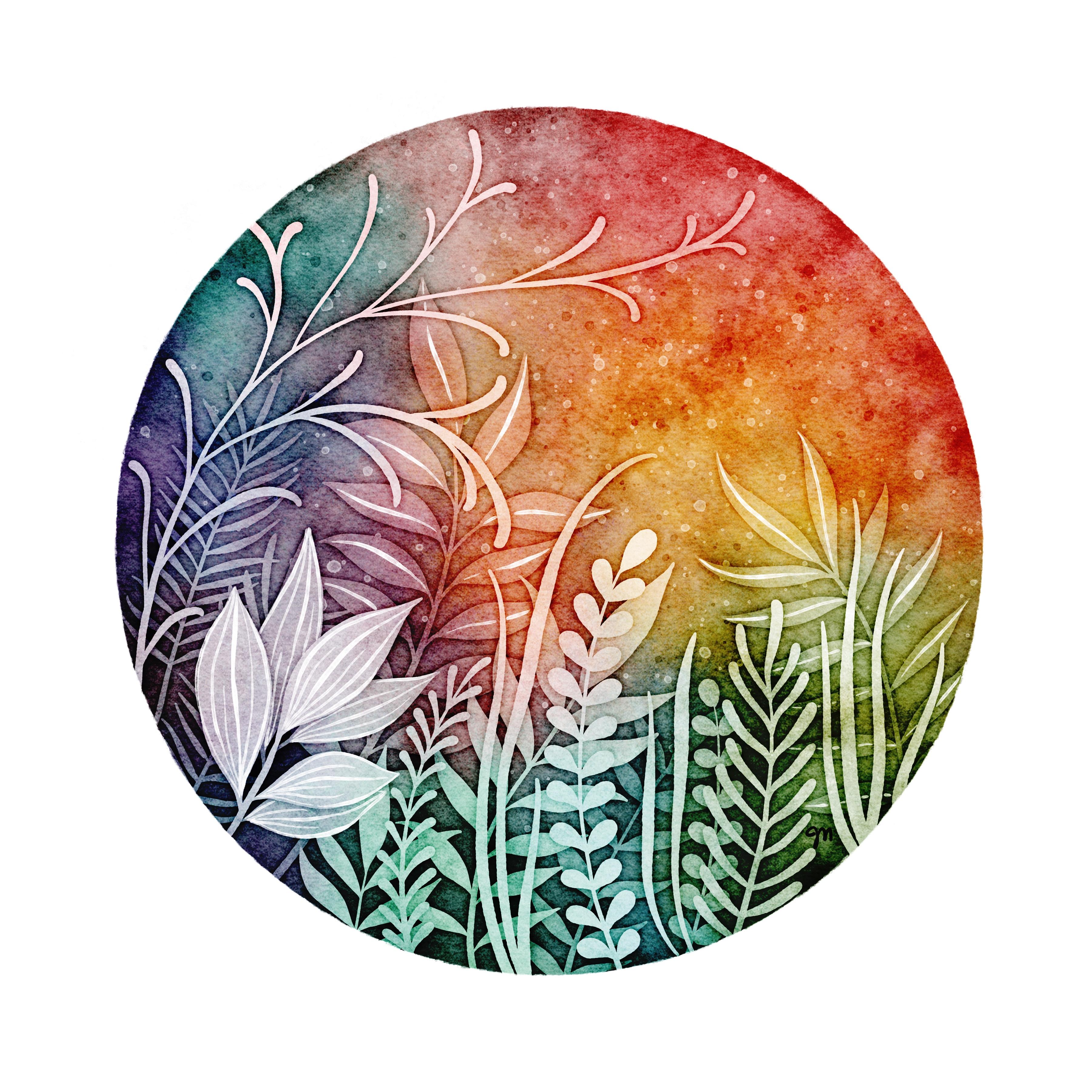
5. Leaves in a Circle: I wanted to show you the pumpkin one as a way to really be able to see what we were doing with all those layers, but now I'm going to walk you through this one. I wanted to show you how I get set up. Just so we don't make this class super-duper long, I'm not going to go through all of the illustration parts, but I provided this stamp brushes so you have all the things you need plus this solid leaf grass pressure used as well. I have my circle I did with the tape brush. We did that in the last class as well. The masking tape brush. I made it a little gray so I could see it. Then I stamped layer one. I probably stamp them on different layers and move them around and then merge them into one, layer 2. That one grass brush, I just drew those on really quick. I worked one of the stamps. You just select it. Then once it's selected, you can select warp and then move things around. Having just one selected at a time, not the whole layer. Then the third layer, I made them different colors so I could visualize which item was on which layer. We talked about that in the first-class. That's it. I have 1, 2, 3, I've already labeled them. I'm going to duplicate that group and turn it off. Then for this group, I need to make a 1, a 1/2, and a 1/2/3. I need to duplicate the 1 and merge 1/2. Change the name of it to 1/2, duplicate the 1/2, and merge that with the 3. Change the name of it to 1/2/3. Now, we're all set. We have 1, 2, 3, 1, 1/2, 1/2/3, and we can turn them all off. I have my masking tape layer way up here. It doesn't matter where it is, as long as it's above everything else that you're doing. If it's easier to just keep these layers at the very top, you can bring this down and just work down here on your illustration. Here's what things look like without that masking tape layer. I like to have it on for these types of illustrations so I can really see where I need to focus my color. We just need to get our base coat here. I don't know about you, but I have been really enjoying this Blache wash color change. That's dark. Remember to start with a lighter color on your base coat. On this one, I'm not going to focus on keeping things really light like we did on the pumpkin. You can though. We can either do this number 1 or this number 1, they're the same. We need to select 1 and invert. We have the outer area of the leaves selected. Then we need to go down to a multiply layer. Although, we did a multiply layer for the pumpkin, let's go ahead and stay on normal layers. Just to remind you of what we can do with adding multiple normal layers, it's a nice way to build up layers and have color on top of color. When you stay on one layer, you're really replacing color. When we add color each time, you're just turning one color into another color. Really play around with both ideas. So that in pumpkin one, we kept a base layer and then a multiply layer, and we just kept adding to the multiply layer. But let's go ahead and add a few normal layers and go back to how we were doing it in the first-class and have multiple normal layers. Layers number 1 and 2 and invert. Again, let's go to a new layer. Make sure you don't get too muddy if you're mixing colors that don't look great together. You can always two-finger tap to undo. It's really just experimenting. I'm seeing this dark section on the textured canvas layer that I'm going to go back and show you what I do with that one. It's in a bad spot. This orange is pretty saturated. That's better. Let's stop really quick and see what we have here. I'm going to show you real quick how to get rid of this. We need to unlock our texture layers. It's this layer right here. It has this dark spot on it. You can either just rotate the canvas so it's in a better spot, or you can freehand select this whole little section, maybe feather it a little bit, and then just lighten it. Definitely feather it if you're going to lighten it. I still might want to go ahead and flip that. It's not as noticeable over here. So we had 1, 1/2. We didn't get a lot of shading in here in the center. I think I'm going to select 1/2 again, and invert, and come back down to it. Let's get some more purple. Let's go back to this purple. That purple looks really good with some turquoise mixed in. Smaller amount than that. Little muddy right here. I might want to fix that with a brighter color, a little bit better there. Now, 1/2/3, Select, and invert. Then come to a new layer. A gold here. More blue in here. Just got that muddy again. We talked a lot about sticking with an analogous color scheme last time. I'm not really sticking to that right now, but I'm liking how this is turning out. Just watch for muddy colors. You don't have to follow those rules. It's very bright right here. I want this to be pretty dark, just in this area, just for some contrast. In fact, I'll take care of that muddy area by just making it super dark. I don't have to worry about it. Some nice contrast down here, even darker down here. I like that. One thing to be careful about is try not to make it look like you just stamped that purple layer on, and stamped an orange layer on, and stamped a red layer on. You have lots of colors going on and you can really tell that it looks more like watercolor. Now, let's get our watercolor edges. Remember our watercolor edges, so I need a layer 1, select, and feather. I'm going to just bump it up to about nine percent. Then we come down here and we can get color burn turned on. We need three of those because we have three layers to do. We'll come to the first one and fill the whole thing, of course. We need to select number 1 again and go back down to that layer and clear. All we have is, I forgot to choose the gray. You can just go ahead and Alpha Lock and find the gray you need and fill. That did not work so well. It's a little too light, you can barely see it. Maybe darken and fill. That's better. You can turn Alpha lock off there. Now, we need a layer 2, so we come up here to just layer 2. The reason, again, is I already did layer 1, I don't want to do layer 1 again, so I don't want to select 1 and 2. Just 2. Select and feather, nine percent again, come to a new color burn layer and fill. Now, I do want to clear it from 1 and 2 because I have, you can see right here, this number 2 layer is overlapping, the number 1 layer here. I need to clear from 1 and 2, select and clear. Then again, layer number 3, only, select and feather. Come down to a new color burn layer, fill, layer 1/2/3, select and clear. Now, we can merge those. If they're too dark, you can go to hue, saturation, brightness and lighten them or darken them, anything you want. Looks good. The rest is embellishing. Again, maybe an overlay layer or a soft light layer and some white or light gray. Some of these sprinkles. I just love this brush. I'm just going to use the white today because it's a dark image. I want to go back down to the color burn layer and add another color burn layer above it, just to keep my color burn layers together and pick a gray and go to the bloom brush. There's new blooming brush is nice for adding some texture where maybe it's of lacking. Whether the textured Canvas has texture lacking in certain areas, or if your color additions are just blow. This is a little blow for me. I might see if I can do something with this bloom brush and get a little bit more excitement going on. Yeah, I like this. I don't want to necessarily see a stamp of this. Trying to hide parts of it. But yeah, so that's hidden a little bit. If you only want that to be showing up in these background layers, not on the leaves themselves. You can of course select 1/2/3 and invert. Now, anything you stamp is only going to go on these background layers. If things are a little too saturated, you can play around with hue, saturation, brightness. At this point, you could merge all your normal layers and just treat it as one and maybe desaturate it a little bit. Then make sure you get your initials on there somewhere. I've been using the inky fountain brush and just coming in. Putting some initials. I like to zoom out and see if I want to change anything. Then I'm just going to get the wash brush on a little bit darker of a gray small size and makes you go around the edge a little bit, just a little bit, maybe darker gray. This get a little concentration of color around your whole edge. Doesn't show up as well on the lighter areas. Beautiful. Don't forget to use your embellishing brushes, glitter, shimmer, inky fountain pen, watercolor brushes to add any other details that you wanted like little leaf veins and all things. That's it. I hope you enjoy it.
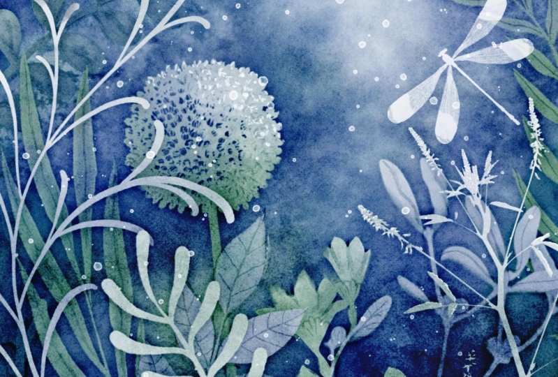
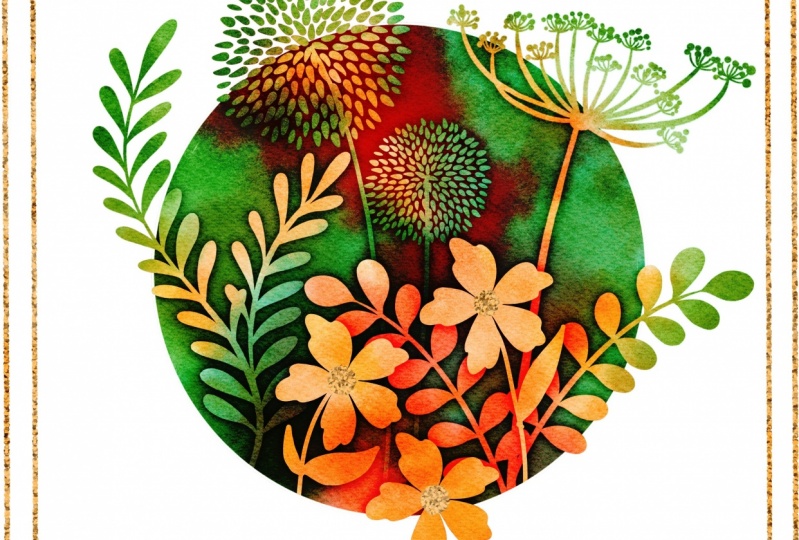
6. A Few Examples: Here's another example of doing the same thing. I had hardly any color on the first layer on the foundation. These were very, very bright, this first layer, and then I started adding more color after that, so I have nice outline on everything and around this. I made a more organic edge to this. Same with this one, just with a crazy edge here instead of super straight lines like tape. But all the same things we did. This is also very similar to what I did with the pumpkins, where I didn't add very much color on each layer, just around the edges of things for each layer. It didn't make the whole thing is so dark. Here's another example of what we already worked on. It does have some embellishing with the little leaf veins here and there. It's much darker. Went crazy with darkness on this one. In the next lesson, I'm going to show you how to do this. This has an entirely different step, but it's using all the same brushes and the same idea, so see you in the next lesson.
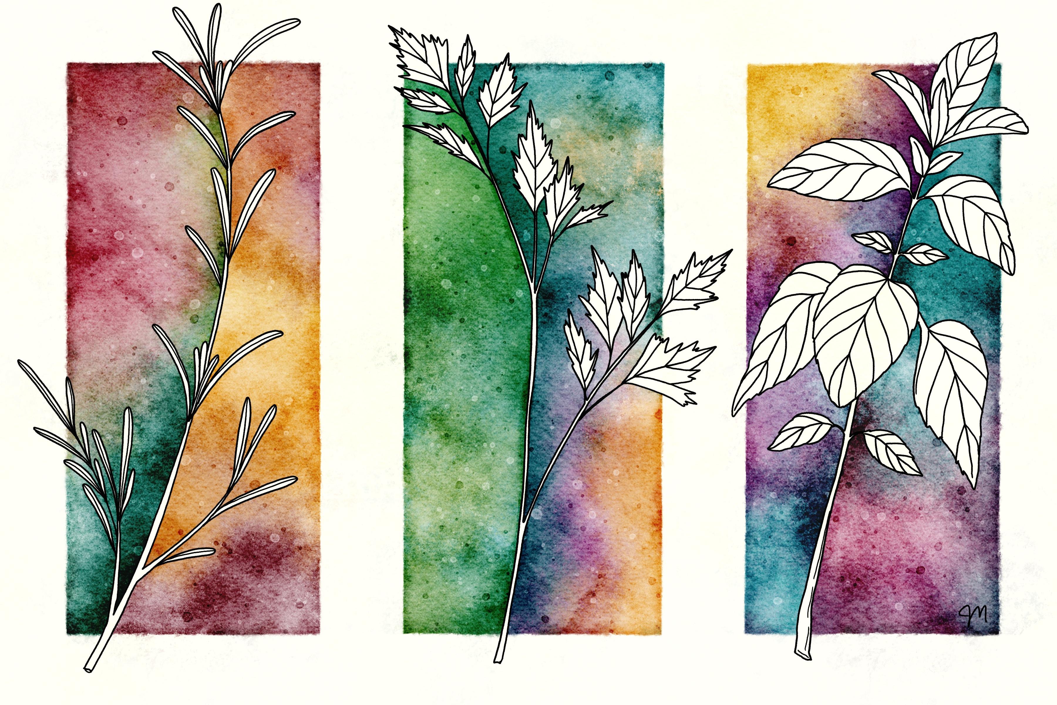
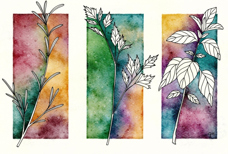
7. Herb Art: Part 1: It's time for this really cool botanical Illustration. Go ahead and go to either the repeat or the other from the first-class Canvas and we're going to just change the size. Now this part is up to you. If you want to do four corners of something and you do not need to use the botanical illustrations, you can have some other theme, think about what you want. I'm just going to show you the three, so I'm making a shorter Canvas. I'm going to crop it by going to the Actions menu, Crop and Resize, and then Settings and this is actually width and height. I'm going to change the height to eight and tap "Done". Now we've got this 8 by 12. Now I want to have a grid on here, so I'm going to turn the Drawing Assist on, Edit Drawing Guide. That looks like it was centered if it were still 12 by 12. Let's see. I want three sections. You could do the math and figure out. It's probably 1,200, in fact, it is. You can do that and 1,200. I just tapped that and you can type 1,200 in. So 1,200 pixels is exactly a third of our Canvas because we actually made the Canvas 3,600 pixels when we chose 12 inches. I chose 12 inches at 300 DPI, so that's 3,600 pixels. I'm just moving that around so that I have the grid just like this. The line through the middle isn't as important, I just need these sections here just as a guide. If you ever move this around and back to the center, you can tap it and tap "Reset," just so you know. Now I need my tape lines, so this is our guide for the tape lines. I'm just going to get some layers on here. I'm going to just keep a color of some sort so I can see what I'm doing and go to my Masking Tape. I'm going to do a fairly wide tape line because I want those illustrations to overlap it. I'm going to come down the middle of where that line is, dividing these sections here. I'm not going to do a full width over here, I'm going to do a half width over here and over here. I think I actually want a wider line on the bottom. Tapping my finger to get it pretty straight and we can add more later if this isn't wide enough tape. We don't need those grid lines anymore. There we go. If you have the photos saved in your camera roll, you can easily just Add, Insert photo, and find it in your camera roll. If they're in your files, you can insert a file and then find it from there. Then let's move these around. Remember, I just want to move them once if any. I am trying to get them to overlap my masking tape a little bit just because I like the look. Let's get that final one parsley. Just do yours a little differently than mine, as in, put them in a different order or use different colors just so everybody's don't look identical. Now once you have them placed where you want them, just merge them to one layer. We need to hold onto this layer, but because I used the micron pen, it has a bit of a transparency to it, so we need to duplicate this, just swipe, Duplicate and merge. Now we've made it nice and opaque because we're going to be doing some selecting and things like that, so we need it very solid. I have not added the line detail of any of these because it will make this next step much more difficult and you'll have to add that later. I need to duplicate this so I have one just to turn off and hold on for later. Then I have this one right here that I'm going to select all the spots inside. You select and be an automatic. Go ahead and tap on when and make sure your threshold is high. Once you tap on it, tap on the blue space and slide your slider, you can see the threshold up here. You're going to get as close to 100 as you can and then come down a little bit until it's now filling the whole page, and then you're going to zoom in and get every single, little T tiny space. This is why I didn't add all the line detail yet because you would have had to tap a lot more spaces. Look at this one I have to tap all of these spaces. Why isn't working? There we go. Tap all of these spaces, even this little stem in here. If you accidentally tap the line, you can two-finger tap to undo. This is what happens if you tap the line, so just two-finger tap to undo that and get all of these little tiny leaves. The parsley is not so bad. You have all of that selected and we're going to go on a layer underneath and tap "White" and "Fill." You can see what we've done now. We still have the outline layer separate from the white, but we filled it. You can merge those and then all the detail that you want to add. I would start on a new layer, go to black and go to the micron pen, one of the two micron pens, make sure you get down to a good size and then you can draw all the details that you want to draw. We're not going to do that part. That part you can do later. The reason I do it on a separate layer is in case I goof, I can erase without messing with this layer here. I'm just going to clear that and now I need to use this one we've set aside. We can go ahead and turn this one off, turn that when we set aside on. I don't want to use micron because it's not fully opaque. I'm going to go to a monoline brush. I have one. Just find any super solid brush. What I need to do is divide each one of these into two parts, one side and the other side. The first thing I'm going to do now on the layer that has just my outline layers on it, all the lines we're going to see right now are not going to be visible, but I need to separate my herbs with a line that's underneath the masking tape still. That part you do need to be careful about. Now I can separate this side of this herb from this side of this herb by drawing a line straight down from the bottom and straight up from the top. Just make sure you have closed shapes, so straight up from anywhere on top, anywhere that's up under the masking tape and anywhere on bottom. Now we have this whole section is its own section and this whole section is its own section and so on. Down here, we need 1, 2, 3, 4, 5, 6 six layers down here. I'm going to choose white, but I'm going to just change that background color a little bit so you can see what's going on here. Now, I'm going to turn that outline layer into a reference layer by tapping on it and tapping "Reference." What that means is, anything we do on these layers down here for dragging and dropping color, it's going to reference that layer. If I drag and drop color over here, it's going to think I'm on that layer and it's filling just that section. I'll show you. This is just filling that side. Now, the pink layer is making it hard to see what is actually going on here. I just went to a new layer to fill that side then I'm going to go to a new layer to fill this side, and a new layer to fill that side, and new layer. Now the parsley is a little bit more tricky to fill that side. You can see we have some spots in between, some leaves that we also need to fill and a new layer to fill that side. That's all we needed this black outline layer for, is just to use as a reference layer. We can turn that off. We can turn back the masking tape layer on. We can actually Alpha lock it and make it white and then we can turn back on our finished herbs. That's the layer that's filled with white, so that can be on. It's hard to see what we're doing here with the masking tape layer, white. I'm just going to make it a little bit of white. That's more than a little. Make it little bit visible. Hopefully, you can see that. Now you are all set up. Now if it's easier to label all of these, you can do that. I just have a 1, 2, 3, 4, 5, 6. You can group them if you want. This is grouped, this is grouped, and this is group two layers at a time, but it's not necessary. Each one of these needs a clipping mask though. We're going to add a layer above each one and turn it into a clipping mask. Now we are ready to start adding color and we're going to do that next.
8. Herb Art: Part 2: This part is no different than all the other stuff that we've been doing. Go to your negative painting brushes, your favorite ones that you've been using. The biggest difference is we're able to keep things separate here. That's nice because if you were using real watercolors, that's what would be happening. You would be painting one side and then painting the other side. They wouldn't be touching right here where they're divided here. You would be able to get very different colors on each side that don't bleed over to the other side. We have that and now we can go to the next clipping mask. Think about your colors a little bit carefully so that they go well together. A lot of people have asked how I get the texture that I get. I really just play around with color quite a bit, and just experiment. I'm not liking this part right here, so I'm going to go back to yellow. Get a little more yellow in there. You would just go through and do this on the whole piece. We'll just do this one right now. This is pretty pale right here. I'm going to come back up here, go back over to some pinks. You would continue to do this for all three sets, and then you can go above everything. Let's see. Not above your masking tape. Have a layer that's not a clipping mask and it's above all these color layers. You will be able to just maybe set it to color burn and have an overlay layer and do all of the embellishing that you do on all the other negative painting things that we've done. For color burn, I would go to a gray, you can get some more concentrated areas in here. I haven't tried it, but you could even do the trick that we just did with the blur. You could select this layer, select and feather. You need to be on free hand. Then fill. Let's go to a new Color Burn layer. Fill. That gave us a little bit of an edge around. We don't need to erase because of the white here, the color burn is not showing up on the way. But you could do that step to select and erase, clear. It does look a little light so you can go ahead and darken it. Looks good. Go back to a different color burn layer or the same layer, play around with more texture. This is all looking very orange now, so I might come back and change some of that to pink. This is the process. What you saw at the start of class, this is what I did for the whole thing. Now things are just getting really saturated. I think I might clear that and start over. I think I'm ready to make the masking tape layer white. I'm going to go to the other color burn layers, I have the one where we did the feathering. I'm going to down below that back there and just pick another textuary brush and see if I like. I add that on here and skip some. I'm really just playing. If you don't like it, you can erase it, start again. This is the whole thing. All you have to do is add color to the clipping masks. Then the ones that aren't clipping masks, you can keep coming back to those layers to add more and more textures and color burn thing or another overlay layer with salty sprinkles. Because of the way we've divided the clipping masks, this little piece is on this one instead of this one. That's another thing to watch out for. I'm not sure where this is coming from. Is it in the canvas itself? It is. I don't like that. I'm going to come to that layer and unlock it. I'm just going to get liquify on push. I'm just going to push that and hide it under the masking tape. There we go. Then definitely make sure you get some more details in your leaves or whatever you're doing because that'll definitely look better. If you go into files, into the photo references, that particular image was this reference, so this right here. You can see the veins and get an idea of how to draw the veins. The rosemary was probably just based loosely on this one, and then the parsley was based on this one. You know what? We forgot our little edge too. That's just another thing on a color burn layer. Go around on a small size with one of my washing brushes. You can do it all on the same layer. The only things you do on separate layers are these clipping mask sections. I guess you could do them all on separate layers, but there's no need to. That's it. Did I do my stamps yet? I did. Bloom stamps. This add nice texture. A little lighter gray maybe. This add a nice burst of texture randomly here and there. Those are nice. There you go. Not complete, but you get the idea. I didn't want this class to be terribly long, so I'm not going to go to full completion on this. I just wanted to show you the steps, and I can't wait to see what you do with this.
9. Speed Draw: Hi. Okay. Hello. Good.
10. Bonus! Invisible Edges: Here's a little bonus lesson. I have not practiced this very much, but it is something definitely to play with. That is to not completely cover the edges of your selection. If we do the first layer. Select an invert and find a layer that we want to add to on the right brush. Let's go down to a smaller size. When you're adding color, don't go all the way around. Have some, I think it's called invisible edges. Let's play with that for a second, and then let's go to 1/2, and invert, and a new layer or a different layer. I'm going to stay with the same color. Then whatever edges I didn't cover last time that I left invisible, I'm going to leave those invisible again. That's hard to keep track of unless you're really changing colors drastically. Let's just do this really quick and see what it looks like. Select an invert and on a new layer or the same layer, let's do this again. Oh wow, that looks really cool. It looks like pumpkins floating. Here we have the edges of these pumpkins down here, this pumpkin and this pumpkin down here, and this side over here, where I didn't add color after I did the select and invert. Then when I did the next layer, I made sure I didn't come down here and add more color or it would expose those layers and it wouldn't be invisible edges anymore. I mean, it would expose those edges, not layers. That's definitely a cool look given some of the edges letting them fade off. We have this one fading here. This one disappears down here and over here. This one's just barely noticeable at all. Let's go ahead and do the final layer and see what happens despite adding. Let's go ahead and expose all the layers and see what happens. Oops got to go to the right layer. If we add all the way around, we can't expose some of these interior wins because they're now masked. Their blocked from us. But we can come down here and that will expose those. That's interesting. Now let's see what we have. We've exposed these edges where they were exposed down here, but not where did they were part of that layer 1, 2, 3, 4. Anything that was within that big layer of all the layers merged, we couldn't add color to that because of the selection. That's cool. I like that. Or you could just leave these invisible and not do the color added down here on that final layer. Pretty cool. Can't wait to see what you guys do.
11. Class Project & Thank You!: For your class project, pick a project, anything you want where you're applying the techniques we learned today to darken the edges, maybe even to use a less amount of color on each layer or create one of these botanical illustrations. Be sure to head over to "Projects and Resources" in class and tap "Create Project" for you to add your own project and all of us can see it. You can also head over to my Facebook group. I run a Facebook group with Brenda Bakker, another Skillshare teacher, and it's a very safe place to share your art. But definitely still add your art here since there's a ton of people who don't use Facebook, and then we can all see each other's projects. If you enjoyed this class, be sure to go to my Skillshare profile and see what else I have to offer. Thank you so much for taking this class, can't wait to see what you do.
 Jennifer Nichols, Artist & Teacher, Procreate