Transcripts
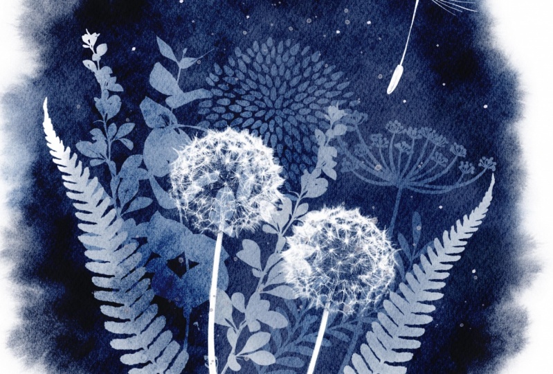
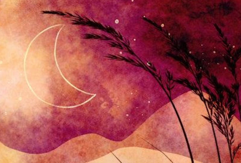
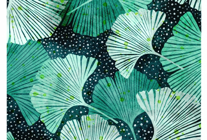
1. Introduction: Hello, my name is Jennifer Nichols of Leila and Po Studio. I'm an artist, a teacher, and a fabric designer. In this class, I'm going to show you how to get a negative painting, watercolor look in Procreate. Here's just a few examples of what I've come up with so far. Honestly, I've been having so much fun drawing these that I haven't wanted to stop and make the class. I finally forced myself to stop making art so I could record this class and I'm so excited for you to learn this technique and see all of the different ideas that you come up with. Negative painting is when you paint around an object instead of painting the object itself, we will be painting by hand like this. Instead, we'll take advantage of Procreate's tools to speed up the process and still get beautiful results. You'll get all the brushes you need to create the looks you've seen in all of these examples. Included in the free brushes are all sorts of embellishing brushes. So you can add lovely details on top of your negative watercolor painting to finish it off. We'll be going through three lessons from easy to more complicated. By the end, you'll have the hang of it and be able to draw anything you can imagine in this style. Be sure to hop on over to my Skillshare profile, sign up for my newsletter, and get all sorts of fun freebies, check out my other classes and find me on Instagram and Facebook. See you in class.
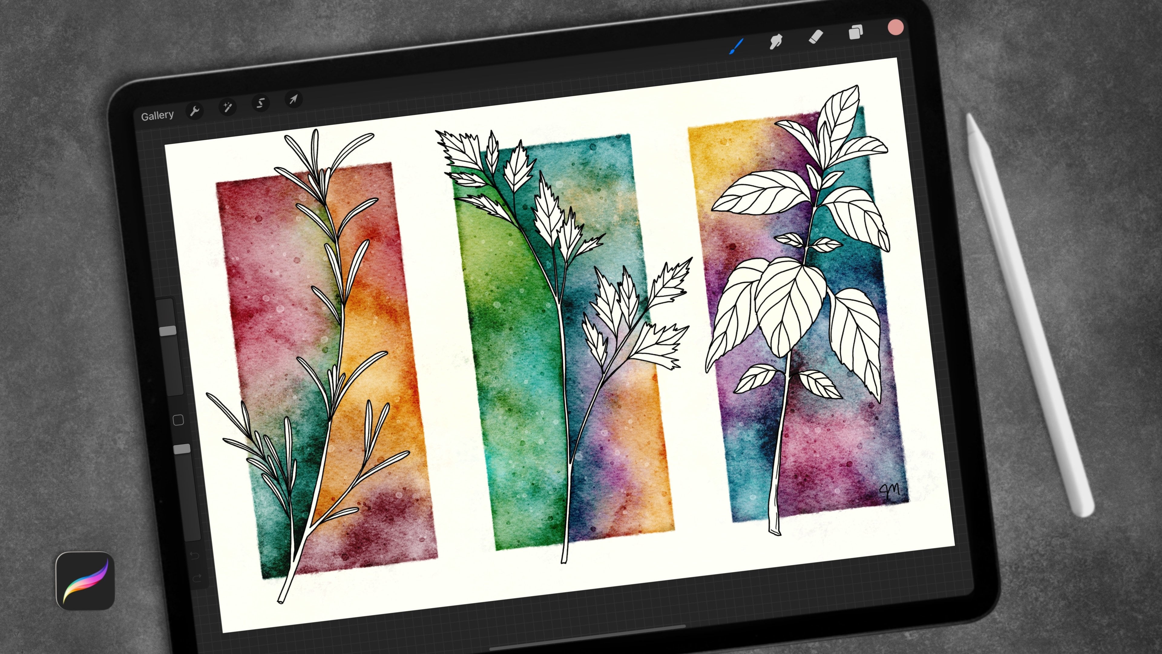
2. Brushes & Canvas Info: If you go to the Projects & Resources tab of class, you will see all of my downloads. You can't see them if you're in the app, at least at this time, and you need to be in landscape mode on your iPad. I use Safari for my browser. Sometimes certain browsers struggle with the downloads. For example, I've heard a lot of problems with Firefox. If you struggle getting some of these things downloaded, I would try different browsers and some other troubleshooting, but they should be pretty straightforward. Always check for this little See more tab on Skillshare. If the download list were longer, there would have been more hidden behind that. But for this class, there's just these five things. There's two brush sets, two canvases, and a pallet, which is the dots swatches. The two canvases are the same except for the size. I did a 10-inch canvas, which is 3,000 pixels at 300 DPI here. For iPads that are not iPad Pros, they will have fewer layers to work with, and so I wanted to give you a smaller canvas. Then if you have an iPad Pro or an air 4, you should be fine with the 12-inch canvas. I'll go ahead and show you how to download these really quick. You really don't need both of these. You're welcome to take both of them, but you don't need both of them. For brush sets, if you sign up for my newsletter, you already have the Posca/Micron pens, so you don't need that again. Some of you might need both brush sets, some of you might just need this negative painting brush set, so I'll just do this one. Tap on that. In Safari, this is what it looks like. When I tap "Download", you're going to see a little arrow right there, and that downloads. You can go through and download the things that you need, tap the canvas that you want. It's downloading right there. Tap the swatches that are there. This is the case for all classes. Then you can just go right here and there's a list and you can tap, all of them will bring you right to your files app. This is what your files app looks like in case you're not sure. If you don't remember the name of it and it's all hidden in here, you can go to Recent and it should be right there at the top. Here they are right there. It's interesting to note that right here, see, they're zipped. But they actually don't come in as zipped files as you can see here. If they were zipped, you would tap it. It would actually pop you back down to Downloads here, so you would need to remember the name of it so you can find it. Then it would open up a folder like this. There's that July one I just showed you. If you tap the zipped folder, opens up a regular folder and then you tap that and go into there to get what you need. Since these are not zipped, you can just tap them right now and they go right into Procreate. You can split your screen with Procreate if you like, to make it a little bit easier, and then just tap, it goes over there, tap, it goes over there. I forgot when download before I recorded this, so I'm coming back to show you this jpeg to download. For jpegs, all you need to do is download, and then from here, you can tap on it, it'll open up, and you can tap this little up arrow and save it to your camera roll or however you want to save it. That's it. Now, in Procreate, you have your new canvas. With your canvas, I would recommend just duplicating and keeping a blank one and just keep using a duplicate every time you want to start a new piece. You have your brush sets that will be at the very top of this list, and you have your palette, which will be at the very bottom, and you can grab it and move it to wherever you want to. On your canvas, the only thing you really need to know is that you need to draw on layers that are under the Textures. Now, we will have some experimenting using the glitter pens on top of the Textures because they will look a little bit different and you can just play around with those. They are locked so you don't accidentally draw on them. But you can unlock them and play around with the opacity and make some changes. Sometimes I like to rotate this particular layer. There's a certain corner on that layer that has a certain mark on it that's very recognizable. So if I have a whole bunch of pieces all with that same mark in that same spot, that might not be preferred, so you can go through and rotate the layer by just tapping on it and rotating it like that. Then you can lock it again, anything you want to do. I decided that instead of talking about all of the brushes right now, I'm going to just talk about them as we go. We're going to use all of them. I have one leaf stamp brush. If you want to learn how to make stamp brushes, I have a whole class on making stamp brushes. It could come in very handy for this particular class. Some other drawing brushes, and then the watercolor brushes, and then some embellishing brushes. We're going to go through all of those in class. Let's get started.
3. What is Negative Painting?: In traditional negative painting, it's usually done with watercolor, and a sketch is made and then the artist will paint by hand around every single object. Painting around an object instead of painting the object itself is what negative painting is. Then another layer will be added and everything will be painted around including painting around the initial layer. It is beautiful when it's completed. In Procreate, we're taking advantage of the digital abilities and we're doing this in a much more simple way. We'll still be painting around all of the objects and we'll be mixing colors in a beautiful way that will give us gorgeous color palettes. I can't wait to show you. At the end, I'll also show you how to make a full masking tape look around the edge of your painting and it'll look just like you've peeled off masking tape on a real watercolor painting. The quick sped-up video you just watched is, I missed a spot. If you painted by hand just would take a really long time. It's beautiful by hand when you've spent a lot of time and done nice detailed work but I am really excited that I found a way to make this less tedious and I just love it. Here's the Procreate version of that same illustration and it took a fraction of the time. It does have a clean crisp digital look and depending on the illustrations that you do, you can change that. Here are the levels of the layers and how they look as you go. We're going to start with a nice light wash and then I'll show you how to select the layers as we go and do add darker and darker around each layer as we go. Getting darker and darker and darker. I chose different colors for this one but you get the idea. Honestly, the most time-consuming part of it is thinking about the order of your layers so we'll talk through that and that's the reason why I have it go from simple to more complex in our lessons. Definitely watch those in order and you'll really get the hang of it and you'll really be able to just come up with all sorts of ideas on your own and you'll know how to make those happen.
4. Finding Inspiration: You can go to my Pinterest board for some inspiration or you can Google search negative painting images. But just go ahead and go there if you want some quick access to some inspiration. You can see this one's actually a sketch, but it uses the same technique as negative painting, and you can see a lot of different ideas. Don't copy anything, just get inspired. Sometimes you can do positive painting on top of your finished negative painting. A lot of people do that just for watercolor. We're going to do something similar to this. Here's some positive painting on top of the fish here to add some color, that's a really fun idea, I love that. Here is some additional painting all over the top of this. There's some that have beautiful, glittery, shimmery painting on top. Here they've added some white dots as well as some watercolor stripes. I've included all of the brushes that you need to do these little additional elements on top of your finished piece. This one's more like a finished piece with no embellishments at all. So is this actually, this one's got a few line details. This looks like it has no embellishments at all. It's really just up to you. This is a nice basic one, we'll do something similar with the leaf stamp brush, and there's no embellishing on this and it's just gorgeous. I hope you enjoy the inspiration you find here, and of course, with everything you tap on, there's going to be more ideas underneath. Not all of those are negative painting, but you'll get some great inspiration, of course, on Pinterest.
5. Color Info & Tips: I'm going to talk about the color wheel very briefly, just for some beginner artists. Basically, all you need to know for this class is that we're going to use most of the time an analogous color scheme, and analogous is basically just three colors in a row on the color wheel. It always includes at least one tertiary color. I just wanted to talk to you about what that is. Primary colors are red, blue, and yellow, and with those three colors, you can make all the other colors. With red and blue, we mix them together and you get purple, with red and yellow, you get orange, with blue and yellow, you get green. Those are the secondary colors. Up here you can see you have red, yellow, and blue as your primary, orange, green, and purple as your secondary, and all of the tertiary colors are in-between a secondary color and a primary color. Over here, you have red and orange mixed together and you get this very red-ish, orange-ish color, and so on. Over here you have yellow and green to get this lime green. All six of those colors that come in-between all of the primary and secondary colors are the tertiary colors. On a color wheel with all 12 colors like this, you are going to be thinking about analogous color schemes. You don't have to stick to analogous color schemes, but those are the colors that will help you not get a real muddy look because we're going to be layering and layering. Just keep that in mind. In Procreate, when you go to the palettes, I usually go to the disk here, you can go to harmony, and you can choose analogous right here, and then whatever color you're on, you can do the brightness here, it's going to show you the colors that are combined with that color to have an analogous color scheme. You can use tints and shades of each of these colors. You're not restricted to just these three super saturated colors. You can do some brighter ones and darker ones. Maybe a pink down to a super dark brick red, and you can even just stick with one color and do different shades of the one color. That is just something I wanted to share with you really quick before we get started. That's why our color wheel palette is the way it is. It's showing all 12 of these colors. I just had it going around the corner here. I have some black and white, a couple of shades of gray, and then these are sort, orange-ish, gray-ish, and those will come in handy later when we use our embellishing glitter pen and shimmer pen, those end up making nice gold and copper tones, so I added those as well. Just in case some people don't know or if they look online and see other versions of color wheels, Blue will be referred to as indigo sometimes, and purple will be referred to as violet sometimes. Also, the names of the tertiary colors always start with the primary color name. This color right here is when you mix red and orange together, so the name of it is red-orange. This is when you mix yellow and orange together; yellow is the primary color, so the name of this one is yellow-orange. I thought that was fun when I learned it. So I wanted to share that with you, and that's all I want to talk about for color wheel. Let's get started.
6. Please Watch!: Okay, I'm adding a little video just to clarify some of those Selection Tool things. Couple of things. Make sure when you select on your layers, you use this Select right here, and then this Invert down here. Don't try to select over here. And then have to manually select. By using this, "Select", you're selecting all the pixels on that layer. That is what we use for this class. The other thing is once you do have a selection, you need to make sure Color-Fill is not on. This is my nemesis, and I need to always remember in my classes to mention this because this is always a problem. Turn Color-Fill off. If it's on, it's blue, so turn it off, and then make sure you're on free hand. All right. I think you're good to go. Enjoy.
7. Lesson 1: I'm going to use a duplicate of my 12-inch canvas and I'm going to go ahead and start with several layers. That's just my workflow. It's up to you if you want to start with a lot of layers or not. To start out, we're going to just do a basic landscape. We're going to go to the bumpy studio pen. There is nothing special about this pen except that it has a little bit of a bumpiness along the outside edges and it is fully opaque. If you want to use a different monoline pen that's a favorite of yours or any other of the inking pens, not all of them. They need to be really opaque so that they fill in all the spaces. The colors are not super important at this stage. We're really only thinking in silhouettes. I'm going to start with the very basics, I'm going to go through three levels of difficulty on just the basic painting and layering. For this one, I'm going to start in the front and work my way back. I'm just thinking about a hilly landscape and just making lines. They can be mountainous and bumpy or whatever you want and I'm going to drag and drop color. That's a pretty dark color and that's mostly because of my textures here. I'm just going to start out actually with a lighter color and you'll see why in a second. Just so in my mind, I can see the progression. I'm going to go darker and darker with each layer. I'm also going to go under the first layer since we're working our way from front to back, I'm just going to keep going back. Let's go to a slightly darker color and another. I don't like that hill. Just make sure your line goes across so you can drag and drop. I'm not a super big fan of that one, but that's okay. Keep going down, go a little darker. Drag and drop. I'm going to add a couple more layers down here and go darker. Drag and drop and let's just do one more. We have five layers, 1, 2, 3, 4, 5, and we're going to get started. In order to have a lot of flexibility with your work later, you can just go ahead and use these layers and not worry about duplicating them. If you have a lot of layers to work with on your piece, depending on your iPad, I would recommend grouping them together, duplicating the group, turning one of them off, and keeping it in case you goof and you need to come back because we're going to be committing to merging some layers at this point. We're going to turn all of these off and we're turning them off one at a time because if you turn the whole group off, then when you try to turn just one of them on, the whole group comes back on, so just turn them all off. We're going to start with a wash on the whole canvas and we're going from light to dark. Just like in a real negative painting, in watercolor painting, you can't paint light on top of dark. You go darker and darker as you go. I think I'm going to stick around the bluish teal, it's up to you what you want to do, and the brushes that you can choose from for this step are all of these brushes right here. These two have a bit of color-changing with pressure and they're going to stick with analogous color schemes so that works too. This wash brush is just a nice watercolor look, no color changing. Then this too, just have a slightly different look and if you press, you're going to get some color changing. The colors are going to go clockwise. Whatever color you've selected, with pressure, it's going to go a little bit in that direction. If you're on an orange, with pressure you're going to go to pink. We have some orange and then pressure, we go to pink because it's going this direction clockwise and this one is just slightly different. It's a little bit blotchier, it still has some color changing. Let's get to a color we want to start with, and a wash brush you want to start with and get some color on the page, it doesn't have to fill the whole page. Let's get it nice and light and play around with these. These are all really cool textures. Once you have a wash down that you like, we're going to select the first layer. We do not need to turn it on, just need to select it, and then invert it because we don't want to color the selection. Remembering negative painting is coloring outside of the object, not the object itself. We need to invert and now all of this is where our paint will go. Now that that's selected, we need to come down to a layer above our wash. You can do this on the same layer. I'm going to delete some of these layers up here and then I have my group there that's turned off. Now I have this wash layer and I'm going to come on a new layer. If you're low on layers, you can do all of this part on one layer. You just don't have as much flexibility later, just experiment and practice and you decide what workflow works best for you. I'm going to go to a little bit darker. I can change colors within the analogous color scheme here, blues and greens here, and pick a texture if you want a texture. I'm just going to stick with the blotchy wash. I've got it all the way up to max and it's just going to go a little bit darker. That's a lot darker, but I'm going to stick with it. Then right along the edge, I'm going to go even darker. Maybe turn it down, just get a little bit more concentration of color around there. That's it. Now I need to turn on the layer that we did, just to work on and turn on the next layer and merge them. This is why we've kept a separate group up here. If we goof, we've got all these layers merged, will have to start all the way over at the beginning unless we have these to back up our work. Now we have those two layers merged, turn it off, do the same thing, select it, invert it. Choose a new color, choose a new brush if you want. I'm just going to stick with this one. Now I'll go to the bloomy salt brush and go to the right layer. Go to a layer right above the one we just worked on. Concentrate a little bit more color down here. We have another layer here. The reason why you needed to merge those two layers is because with the selection and the inversion, we needed all of that to be selected so that we could invert and color up here. Turn that layer back on, turn the next layer on and merge them, turn them off, select and invert. Pick your color, go to the next layer up from these washy layers that you're doing. Pick your brush, add your color, you do not need to fill the whole thing every time. There you go. Turn that on, turn the next layer on and merge them, turn it back off. I like turning it off so I can see what's going on down here. You don't have to turn it off, select and invert. You can also see the selection mask, all the stripes. You can change the visibility of that by going to the wrench tool and prefs and right here, selection mask visibility. If you have it up high, it really blocks what you've already done. You want to have it somewhere where you can see the lines, but you can still see the work behind it so that you know how dark to go or you know if your colors are working, and so on. Let's go to another color and another brush if you want, and another layer, and we're going to add some more. That's pretty dark, I'm just going to stay down here with that. I'm not going to go up there. Turn on the next two layers and merge them. This is our final one, turn them off, select, invert, go to a new layer, go to a new color, go to a new brush if you want. I think I'm sticking with this brush. I went to a much more blue color this time. I really like that. I'm thinking about night sky. I'm not getting a lot of texture on this dark of a color with that brush, but you can experiment with that. That is done. We're going to talk about embellishing and all of that stuff later but this is just the basics. Light to dark, top to bottom. That's the part that really is something that takes practice, wrapping your brain around, just thinking into layers, and what goes on what layer. I'm thinking also in silhouettes. In the next one, we're going to come back to this, but in the next one, we're going to up the difficulty level a little bit and do some leaves.
8. Lesson 2: I can duplicate my canvas again and start a fresh canvas and add a couple of layers. Let's go to some greens this time. Just for our layers at least, I'm not sure I'll choose a green for the final colors. Just as an example of the leafy look that we saw a lot of in the Pinterest board. We're going to choose this stamp brush here and have fun with that, just as a quick way to show you this method. This solid leaf grass brush is really awesome. It is a duplicate brush from my creating scenes with depth class and you can do a lot with it. You can do really cool big blades of grass. You can go ahead and do a stem and then do different types of leaves coming off of that, spiky leaves, or with some pressure sensitivity, you can do some really cool leaves. Just practice and try to be consistent depending on the leaf type that you choose for that brush. But for now, let's just use this stamp brush and we're going to do, if you think about the overall look that this gives is that the lighter layers that are on top of the darker layers, they look closer to you as a viewer and the other layers look farther away, darker, smaller. We're going to do bigger on top and then get darker, darker as we go back. Now with a mountain scene, we started with the light layer and we went backwards. You need to figure out what way works best for your brain. If it works best to start with the lower layers and work up, then do that. Maybe we want to start with a darker green here, with a smaller brush size and we're going to be stamping on different layers and merging them later. Pick a smaller brush size. I'm making sure that edge goes off the edge there. But we could also cover up that end stem with other layers later if we need to. Need a stamp first. You can, of course, flip the stamp so you get some different looks out of it. You can use the liquify tool to move them around a little bit to get slightly different looks so that they don't just look like all the same stamp. That's good for now. Let's just merge that and call that our lowest layer and start working with a lighter color on top of that in a slightly bigger stamp. Then we're going to move them away from the center more as well. You can see here that I didn't overlap any of those. That's just my preference. You can overlap stuff. You just experiment. I'm really, really encouraging a lot of experimenting with this class because that's what's going to help you really start to think in this kind of reverse way. For me, at least it's a real backwards way of thinking and it was a real struggle at first and I got used to it and it became really fun. I encourage a lot of practice with this. Rotate that a little bit. You don't have to keep all the sizes consistent on each of these layers. Now we have that layer and that layer and we're going to do just one more. We're going to get a little bigger. Should we go max? That's really big. We have three layers of our branches. Let's go ahead and group those together, duplicate the group, turn one off and turn these off manually. Start down at the bottom layer, pick your color and choose a wash. I'm going to choose some magenta here and I'm going to do a nice blotchy, I forgot to choose a light color, so we need to choose a light color for your wash. That is going to be very visible. You might want to add just a regular wash first and maybe even a lighter one actually, and then switch to a texture brush, something like that. Now we need to do our leaves, our first layer. Select, invert, pick another color. Let's see. You can stay with just one color, or you can play around with your analogous color scheme, slightly darker and I think I'll just stick with this blotchy brush and see how it goes. We need to choose the right layer, right above the last layer we did. You can de-select and see if you like it, it is quite blotchy. I'm not sure I'm going to like it at the end, but I'm going to keep going with it. If I don't really like how different those two colors are, I can two-finger tap to grab that selection again and add a little more, maybe some darker areas. Maybe come over to some less saturated purple. Get some darker areas, you can really do lights and darks all in the same layer. Get some depth. Now we need to turn on that layer and turn on the next layer and merge them and turn them back off. Select and invert. Choose a new color. Choose a new brush if you want and get onto another new layer here. I'm just sticking with this brush. I'm going to see how this works, not going all the way to the edge of my canvas here. Turn on that layer, turn on the next layer, merge them together, turn them back off. You can't merge them when they're not turned on, or they just disappear. Select, invert, choose a new color, go onto the right layer, pick a brush if you want a new brush. I like how dark this is getting in the center, you can go even darker. There you go. So you can see because I didn't go all the way to the very edge every single time some of the leaves fade out. You can't see the sharp edges of them. Like down here, over here. Again, experiment, experiment, experiment. I'm not sure I like the blotchy brush for this whole thing, but now I know that I probably won't do that again. You can also do a clipping mask or just a layer on top of all of your layers set to something like color burn or overlay. If you do overlay and then choose black and do one of these brushes, let's see. This particular piece, it's hard to see that texture, but this is another way to play with texture. That is difficulty level number 2. Next step we'll do a slightly more complicated version and then we'll come back and do some embellishing.
9. Lesson 3: When I started recording this class, I changed my mind about how I was going to do this lesson. I've now included stamp brushes for all of these items as well as one little berry Branch stamp if you want to add that. I'm going to show you how to do this all with stamp brushes, but I want to remind you, just like we did in the landscape, you can hand draw anything on these illustrations. You do not need to rely on stamps. The only reason I'm using stamps is to save time, so this class isn't super long. Let's get to a duplicated Canvas. For this one, we're going to think about going from top to bottom. I'm just going to start. I have a few layers here. I'm going to start on top. It works out in my mind, I know that the top layers, they are lighter in color and then it gets darker as we go down. I'm going to start with a light color and go darker as we go down in our layers. Let's go ahead and just pick any color. I'll just stick with a really creamy yellow. Let's start with the Wild Wish brush. On this same layer, I want to add a couple of other things, but I might go ahead and choose a different layer just so I can easily move this next stamp around and then merge them in a minute, like we did with our lesson 2. Now I can move it around, see if I want to put it in a different spot. I'm going to keep my items not touching. They'll blend into one if you do so that's up to you. On another layer, I'm just going to do another stamp here. Let's do the flower stamp. I'm trying to remember what my original illustration look like. I know that these are in different orders. That looks good. I can merge those together. That's just going to be layer number 1. I'm going to leave it on so I know where things are and I'm going to go down a layer and I'm going to go to a darker color or just a different color anyway, you want to look at it. For the flower, I'm just going to take that same flower stamp. I'm going to go a little bit bigger and probably rotate it so it doesn't look like just a super duplicated stamp there. Get it into place. On another layer, I'm going to do another Wild Wish. We could flip it, rotate it, get it somewhere where I'm happy with it. The level of difficulty on this one is really only in the fact that we're doing one object on multiple layers. For this flower, it's going to be on three layers by the time we're done because this one is one, this one is two, and then we're going to do a leaf layer underneath that. So that the process is the same, but in your mind, you can start thinking about using multiple layers to achieve certain looks of one particular item. In the examples, I'll show you how I did that with just the one fish with the fins and the tail being on different layers. I think that's good for this layer. I'm going to merge those. I might come back and add something up here. I'm going to go down a layer. I know what else I want on this layer. I want the start of one of these flowers. I have this second layer of petals on this layer. But I want the first layer of another flower on this layer. I'm going to go to a new layer again so I can move it around. Now if you stamp it and it goes off the edge, it's cropped, so you can't really move it around at that point. I'm going to stamp it down here and then move it into place, so it's not super duplicated like this one. For me, this big petal here really stands out, so I just want it to be in a different location. You could flip it and rotate it. It's okay to go off the edge now as long as you know where you wanted first. That looks good and we'll merge those layers. Now let's go to a new layer underneath all of that. For the next layer down, I need a darker color. I know I'm going to need another layer if I want. You don't have to have two layers of the flowers. I need the petals or the leaves, I should say down here. Let's go with the Leaf Cluster. I'm not sure how big this is going to stamp. It looks pretty good. Get that into place. I really like these colors. Maybe we'll do the whole illustration in these yellows. That's good. I'm going to do the second layer of that flower. Again, I'm going to stamp over here where it's not going to crop. I didn't go to a new layer. So now it's got my leaf cluster on that same layer, which is fine if you want to do that, if you're low on layers, you can just select this. It's only selecting that dark layer because we're on that dark layer, we've got that dark layer selected. Now I can move this around. I can make it a tiny bit bigger. It's okay to scale up now and then for little things like this. That looks good. I think I'm going to flip that. Do I want to have another, let's do a leaf branch on this one. I think I need to go to a new layer. I can just stamp right in the middle here. I don't have to worry about carefully selecting around it. We'll call that good, merge those, and go to another layer below darker color. I'm going to do another flower stamp somewhere over here. Remember if I want to put a leaf cluster on this flower, I need to keep that in mind. This might be in the way, but I could put the leaf cluster over here. I'm choosing a new layer so I can move this around in a leaf cluster over here. I think I might put another Dandelion wish, right there. I don't want it to be just like that first one we did, so I'm just going to either rotate it I like the idea of having another small one down here too. But I might need to be careful. I'm going to merge these two layers of this bottom layer. I'm just going to get one more down here. Let's see. What is on that layer? I ended up moving. Do you see what I did hear when I moved this down? I moved that. I'm just going to two-finger tap and go back to my leaf cluster is back where it belongs. That is because I have my leaf cluster, and that dandelion wish on one layer and I move the whole layer instead of just moving this dandelion. I did not even see that happening while it was happening. That's okay. Let's merge those bottom layer items there. They're all on one layer. I think, let's call that good. I was going to put another wish or another flower down here, but I think I'm going to just leave that. Maybe I'll put another leaf back here somewhere. I do a new layer, so I can move it around. You know what we're missing? We're missing one of these. Let's do one of those. Sometimes it's hard to picture in your head what it's going to end up looking like. That's why it's good to go ahead and save the group of layers before you start. We're going to call that good. That's all the bottom layer. I think I have some overlapping that we're just going to call it good. We have, here we'll turn them all off, 1, 2, 3, 4. I like it. You can hand draw anything you want onto these layers. You do not have to rely on stamps. In fact, I'm going to delete this duplicate group that I just did. I'm going to come back, and now that I'm looking at stuff, I want to show you just a little way you can hand draw. I'm just going to choose my light yellow for my first layer and pick any pen. I'm just going to fill in some gaps. You can just do some random, little dots on each layer. If you want to stick to the color you did for that layer, just keep going down. Go down to the next layer, go down to the next color, down to the final layer and the darkest color. You can add any sorts of little background, little lines, even thin lines. Really practice doing all of that. Then I'm just going to duplicate that group and set one group aside, turn it off, and then I have this group. I'm going to start doing our process with where we're going to end up merging them. We're just going to turn these off, and start at the bottom with one of your washy brushes. Let's see if we can try to stick to these colors. These colors are all in these goldy tones here, and pretty light. Here's our wash. Go to the next layer up, select our first layer. Invert. We're already on the new layer. Sorry, had to go back. I selected the layer too early. Let's go to the next color down. You don't need to fill in the whole thing. Turn that layer on, turn the next layer on, so you can merge them. Turn them back off. Select "Invert." Go back down to a new layer, or try to work on the same layer. I mentioned earlier that you can work on the same layer if you're short on layers. I went to a slightly darker color, focusing on the c enter of the flower for this. Now the center is going to look on the next level down we'll have a nice shadow there. Turn that on. Next one on. Merge them. Turn that back off. Select "Invert," new layer, and new color. You can deselect, see if you like it. Two-finger tap to get that selection back, if you want to add a little more somewhere. Turn that one on, turn the next one on, merge them, turn them off, new layer, and new color. Well, we already used all four of those, so we're just going to go to a slightly darker color here, try that out. I'm going to clear that, I just goofed. Select "Invert," new layer. I was on this color. I just went down to a slightly darker color. I'm going to go a little less saturated. Remembering I have this flower over here. I have the third and final wish back here. I have another abstract flower over here. You can see this final stamp that we did way back there. If I add more darkness to that area, it stands out a little bit more. I like to have some dark and some light in a nice contrast. Looks great. When you overlap two stamps on the same layer, they just blend into one piece, and that's okay. It's a look that you might want. Looks good. Later I will be showing you, although the video where I show you doing some embellishments is on a video I recorded before I recorded this particular one, so it's going to look a little different. But I will show you how to do some fun embellishments, and how to get that masking tape look around the edge. Here is a slightly pinker and oranger version of the same thing, different order, different layers. You can see I used the Posca pen and the watercolor. I'll show you all of that in a different video.
10. Embellishing: The first thing I want to show you with finishing up your piece is how you can make some color adjustments. One of the reasons why we kept all of these on separate layers is now you can come back and make adjustments to the color on each layer. Now, remembering, though, that as you go back, all of these layers are really layered on top of each other. The color is, so it's going to be adjustment between a couple of layers to really get the look that you want. But one of the things you can do is select a layer and go to hue, saturation, brightness, and play with color right here. That made it a little bit more blue, maybe want it less saturated or more saturated, darker, all of that. That's one way to play with color on all of your layers. Another way is I'm going to just jump down to this layer right here, and I'm going to Alpha lock it, and now I'm going to go to an airbrush in the Procreate native brushes, just go to soft brush, and I'm just going to choose a pretty green color, teal color, just to show you the nice contrast here in a fairly big size. Because it's Alpha locked, it's not going to add the airbrush, it's just going to change the color with an airbrush. Just like that. You can do the same thing on any layer, maybe you want this to be a little bit more blue in areas, and you don't have to use airbrush. You can use any brush you want, just make sure that the layer is Alpha locked. You have a lot of flexibility there. Maybe you don't want your dark blue sky to be so blue. I wonder if it'll work to lighten it up. Oh, yes, it does. It lined it up quite a bit. I wasn't sure that would work. It probably wouldn't work if your layer was on multiply. That is one way to play with color, and you can do that on all of the other pieces that we just did, any piece you want. Another thing you can do is come through and add a color burn layer. On this layer right here, which is the layer from here on up, if I want to add a color burn layer to that, I can just add a layer above it. Do clipping mask, turn about color burn. Choose one of the middle grays. Choose a brush, probably one of the wash brushes, a small size, and play around if you want to darken that edge a little bit where the bottom edge meets the other layers. You can play around and add like that. Color burn darkens what color you already have there. This one doesn't really have that dark edge. I might go up to that layer, go above it, add a clipping mask, change it to color burn, and do the same thing in there so I can get a little more contrast between this mountain and that mountain. We did that as we added color, like right here. But this is just another way to get a little bit more if you get to the end and you realize you want a little bit more. For embellishing this, I would probably just add a layer to the top of everything, and go to white, and go to my posca/micron. The posca 2 and the micron 2 both will be better at stippling, at making dots. The shape source in those is more solid. If you look at the shape source in each of them, this one isn't solid, and it will leave a hole in the middle of your dot. Play around with those when you're playing with these brushes and see which one works best for your needs. These brushes are just like painting. I just can't believe it. They were a total accident when I was making them. The idea here I'm going for is stars in the night sky, of course, maybe a moon as well. But here's a close-up look at these markers. Posca pen, very painty, and you can overlap to get them to be more opaque. If you want to embellish with the glitter, you can play around with what color is best to choose. The dark gray, it really depends on if you're under a texture layer or over a texture layer. Here is a dark gray on the glitter pen and the shimmer pen, and I'll go bigger size here. That's pretty awesome. Looks quite glittery and silver, and then play around with these and just adjust your color a little bit to get some fun. Copper and gold tones and then play above your texture layer too. It's a completely different look. On a leafy print, I would play around with, well, all of these. We have the inky fountain pen. This one on layers that are underneath. This layer is an overlayer, so I'm just going to add a new layer really quick. Layers that are under the texture layers of the canvas, I would choose a dark gray when you want black, just play around. It just gives it a little bit more of a transparent look. The solid black makes it very solid color. It's very pressure-sensitive, so you can go light, thin to thick to thin very easily, and I intentionally made this brush so that it's not super smooth and gives a more hand-drawn look. The streamline on the brush setting is not very high. This is going to be a very fun brush to give some inking looks too, and, of course, the white looks awesome too. It's a lot like the posca, but it has all this pressure sensitivity that the posca doesn't have. Or posca, gosh, I don't know how to pronounce it. Then, of course, glitter. I just love the glitter and the shimmer. You can go through and do as much fun little details on all the leaves or some of the leaves as you want. Go back to the micron, do some fun micron details, and also, this salty sprinkle is really fun with a white on an overlay layer. The blend mode is on overlay and just sprinkle some. Can you see that? If you just color like that, it is going to just add a bunch of different size sprinkles all over. That's a fun look. I don't like to get too carried away with that. Super fun, and then, of course, you can change the opacity and the blend modes too. Soft light is another one that works really well. It's a little bit more subtle. Overlay would be more subtle if you had maybe a light gray instead of a white. If you want dark speckles, you can do a gray on a color burn with the speckle brush, and so on. For this one, I'm going to choose a gray, and I'm going to go on a layer on top of everything, and just choose color burn, for now. I might play with that later. Let's see what these watercolor brushes can do. We have a detail smooth and a detail bumpy. They're just like the bumpy studio pen, it's just the edges are a little bumpier, and so it gives it a less digital look. It's the best way to think about it. By having gray on color burn, I don't need to go back and change the color a lot. If I want to have some slightly darker colors here like that. They're just a little bit darker than the color I'm doing the work on. If I want darker colors here, it's a little bit darker than the color under that. These are a little too light, so I'm just going to go to a slightly darker gray. This is a nice way to get a little bit of a watercolor additional embellishment on your work. I did that all with the same color on the same layer, and you get different colors. That's the benefit of using blend modes. But you don't have to, you can just choose those colors as well. I'm going to go to the micron pen and go to dark gray or black and add some fun details. Whoops. I need to not be on the color burn layer. Add some fun details to my center. The embellishing is really up to you how much or how little you want to do. I can also come to a glitter or shimmer. Let's see. That looks like a good color. I can just add some additional entirely new leafy branches right on top, just having some additional leaves with silver. It's like you painted with silver. Finally, you can also do some positive painting on top of all this. Let's say you want to do that. I would go under my little line layers that I've done, add a new layer, and you can pick a watercolor brush. Maybe you want to add a little splash of teal here. This is an experiment for me. That is really teal. Hold on. Then I would probably blend with a wash brush. Just smooth out those edges. If you want to add color on top of everything, you can do that positive painting right on top. You'll have to watch the blending of the colors. I can see some of the orange through that teal, but it definitely does work, and I'll show you some examples of that next.
11. Finished Examples: Here I've done an extremely simple design where I made one flower and I just duplicated it multiple times. I have the light colors here all on one layer, the orange colors all on one layer, and then the pink colors all on one layer, and then had the darkest as the background. Then I used that micron and posca pens to add all the details. This cactus one I'm not super happy with it, I gave up on it. I would probably start with lower cacti and work my way up in more layers next time. There's a similar one in the Pinterest board that you can use for inspiration, but it's fun to add all the different details. Try not to think in too much detail, not go super realistic with it because it's more about silhouettes. This one was really fine with mostly just bluish purple and reddish purple, and I did a couple of layers of the leaves in the front, and then I did one big layer of the deciduous trees in the back. I should say, on the bottom, so the lowest layer. Then had fun with just some random embellishing. This one, also, just like the orangey flowers that we did in class, it's just a bunch of the same stuff, just layering up, putting the biggest things down underneath some smaller things. That leaf layer is probably a little too big for this piece, but I was just experimenting and having fun. This one's actually quite simple, I did about four or five different fish shapes and I just duplicated them as much as I needed to make all my layers of different fish. Then I chose one of my fish from the lightest layer to add my positive painting on top, as well as all the glitter embellishments. This one is fairly simple, all the flowers are just like we've done in all of the other lessons, just a few layers of flowers. But the fish was a little tricky. The very top layer has the three fins here, as well as probably a couple of the flowers. The next layer under that has the body of the fish, just this part of the tail, as well as a couple of flowers. The next layer under that has this part of the tail as well as a couple of flowers. That was something that took a while to figure out for me where I really wanted that part of the tail that goes that way to look darker and farther away. I really encourage practicing because you will start to be able to figure that out in your brain once you get used to the method. The same goes for this, I did it backwards the first time I did it and I had the fish on top of the lily pads. Of course, that didn't look right. I realized it as soon as I started adding color. I was really glad to have my layers that were not merged. You can see this one is all of them merged, it basically fills in the whole entire canvas. I had to go back and rearrange the order of my fish and lily pads. Then the orange and black are just positive painting right on top, as well as the green. Now, with the green, I stayed in the lines by selecting my lily pad layer. I just did select and I did not invert. Then I went down to the layer I wanted to paint with the green, and it only painted where the lily pads are. That's a nice little, let's just say it's an advantage to digital painting, so you don't have to tediously paint in the lines. This one I also had to backtrack on the order of the layers of all my rocks. I had the three big rocks on the very top, and then they were just dominating everything. I put them under a layer or two of the smaller rocks. The fuchsias are pretty straightforward with the leaves in the fuchsias on different layers. I do have a layer of fuchsias way back there. It turned out you can see them so well. But they still add to the piece shadows in the background. Lots of fun, glittery embellishments on this one. This one was pretty tricky. I started out with a circle template. I just drew it with a sketchy pencil and then I drew a moon shape within that. When I did all of my layers, I just kept them within that area. This is a white layer surrounding it, so it's covered up. Anything that goes off the edge, so I didn't have to worry about going off the edge. You can see that, I turn that off just like that. Then I just used my posca pens to add some stars here. I did add a layer and it's on soft light that just gave a little more glow to that moon shape. Yeah, the opacity is down too, you can see it there. This one I haven't added any embellishments to, I was really just playing around with the layers I did. This one, looking at spring with a bunny and flowers and a butterfly. I did another one that doesn't have the flowers, grass, bunny or butterfly, does have the fox. I did it in blues, and it looks more wintery. You can see the layers of trees here. If I go backwards, the very back layer has the smallest gap. Then the layer in front of that, I should turn these off too, has a slightly bigger gap and a slightly bigger gap. The gap between the leaves up here and the ground down here have the butterfly on that layer. Then just the ground layer there. Then here's a bit of a wintery version of that. I'm not super happy with the shade of blue this is, I'm going to come back to this some time and make it a little bit more to my liking. But I love how the salt sprinkle looks like snow there. This one was really fun, I just did. These are supposed to be rocks, but they're just abstract dots and lines that I added glitter. This glittery copper glitter branch back here is actually one of my layers. If I turn that branch off, though, I have a silver layer there too. You can see it is one of my lower layers, but it just didn't stand out enough to me, so I just decided to draw the whole thing over the top of it in copper. Then I added some silver highlights as well. I did the copper colors down here, and I did my inky fountain pen here and, a lot of glitter. I used everything here, I used the watercolor detail brushes up here, and more of the inky fountain pen here, and the salt sprinkle. This one was pretty complicated just for me to wrap my brain around. I didn't have the whale in my head when I originally did it, I was just doing the fish and I wanted to go darker to lighter. What I did was I did a more on my top layer with more fish up in this area and it got fewer and fewer and fewer and smaller and smaller and smaller. Then on my next layer down, they didn't go all the way up to the front. They started it back here. They were fewer up here, more here, and more and more and more. Each layer, I think I have four layers of fish, and each layer gets darker and more concentrated back here. It looks like they're coming way up from the deep. Then I realized that needed a whale. A silhouette of a whale coming straight up would not look very nice. I just did this at an angle and I ended up lightening the color right here for the underside of the whale, and I really like it. Of course, I used that cool texture blotchy brush. This is one where I didn't stick with that analogous colors. I did these tills down here and the orangey browns up here and I really love the look of it. It worked out because my initial layer was very light, you can see here it's almost white. As I added color to each layer, I just did two colors. The snowflake layer, this one was so fun to do. I made these very blotchy looking so they look like someone painted them with squeezing glue onto the canvas or something. That's the inky fountain pen. I made three different snowflakes and duplicated them, and I have mostly two layers. I think this one is on a third layer, but I have three on top, three on the next layer down, and then one on next layer down. I didn't want it to be completely full of snowflakes. Come back in, I will show you how I get this masking tape look with the masking tape brush.
12. Faux Masking Tape: If you want a cool masking tape look around the edge of your piece to give it a little bit more of that realistic watercolor look, I recommend highlighting everything. Your group that you have set aside and everything else. Every single layer, and shrinking them a little bit. Now, if you don't want to shrink them, that's fine, but your masking tape line is going to cover up some of your work. It might cover up the little embellishment here. If you don't want your work covered up, just shrink things, make sure you're on uniform, and come in and shrink them a little bit. Maybe you want a real thick wide masking tape line, then you're going to shrink it much more. Then go on a layer on top of the design that you have, it doesn't matter where you go, but just on top of your work and choose white. Now, if you didn't start with a white canvas, which is always an option if you want to choose a slightly off-white, like some watercolor papers might be, I would go to that color for the masking tape as well. Then a masking tape line. You can see right now you have this super sharp edge. If you do this, then all you need to do is draw a straight line and pressing a little bit hard, let it snap straight, put your finger on so it goes perfectly vertical, and then you can edit shape and drag it into place where you want it. I eyeball the border for each side, making them somewhat the same thickness on each side, and I'm overlapping that sharp edge just to get this little bit of a masking tape edge look. It deselected, but that's okay, I'll do the top one. If that happens, you can undo and move it manually. Now, you can see it's got this cool rough line where the watercolor bleeds under the masking tape every time, even though you don't want it to. There is a little bit of texture in this brush. If you press lightly, it's not going to work as well, press firmly and it covers up pretty well and leaves that nice rough edge. For any of the circle designs like the ones we saw in the Pinterest board, you can do a circle and snap it. Let it snap to a shape and then put your finger down to get a perfect circle, and then while it says, edit shape, you can get it into position, and then you can fill in the rest, just like that. You can start out with your shape this way so that you know where to concentrate all your work, or you can decide to make it this way at the end. If you're interested in seeing how I did things like this little abstract flower or using the symmetry to make flowers, go ahead and come back to the next video and I'll do a quick little lesson on that.
13. Flowers & Snowflakes: If you go to the wrench tool, Canvas and turn on Drawing Guide, Edit Drawing Guide, and go to Symmetry, Options, I would go to Radial symmetry. It's fun to play around with rotational symmetry with this as well. Let's go ahead and do rotational and then tap done. Then, for this, drawing assist is automatically turned on now. Sometimes it's not, and you can tap on the layer and turn it on and off right here. Just make sure it says assisted right there. I'm just going to go to my bumpy studio pen. You can do stuff with the leaf pen if you want, like that. Just play around and experiment. With rotational, it's going to all go in the same rotating direction, which is fun, so you can do things like that. That's all I did. Super simple and fun. Then, if you want to fill in spaces, then make sure you have some nice gaps. Make sure you have closed shapes. Let's see, if this one not closed, so we're going to close that, and let's do a separate little shape down here. Just make sure all my shapes are closed, and then you can fill like that and do all sorts of fun, little loopty loos. That's the type of flower I would actually hold onto, an outline version of one of these and duplicate it, turn one off, and then have a filled in version of one of these. You'll see that in the work I did with the goldfish with all the flowers around it. You'll see some filled in flowers and some outlined flowers. That was just a choice that I made. You don't have to do it that way, of course. That is how I did this type of flower. How I did more of an abstract flower was not with symmetry at all, but you can definitely use symmetry and it would be way faster. But sometimes you don't want a symmetrical look, so just play around. Let's see, did I use bumpy pen, studio pen? Probably, but I think this one would be better. I just started with four, and then I just started going out like this. I really didn't think too much of it. I was paying more attention to my shapes of my little petals than I am right now, but I just worked my way around having fun, not really thinking too much and just being meditative about it until it was a good size that I wanted it to be. That was it. You could also turn on Drawing Assist. Rotational Symmetry is on. I'm going to go back in and turn that off. Now you can do this in a much faster but very symmetrical way. Maybe you want part of it looking symmetrical and then turn symmetry off to get some other areas where you can get rid of some of the symmetry that way. Then, let me show you snowflakes really quick. Snowflakes are a pain in Procreate, they just are, because we only have this option to do eight points and I don't do eight snowflakes, I like six-pointed snowflakes. What I do for snowflakes is I make a little bit of a template. I go to a modeling brush and I draw a straight line. Actually, I need to put it on 2D grid and turn on Drawing Assist, and I draw a straight line, and then I make sure that line is centered by zooming way in and selecting it, and turning on Snapping. Did you see my gold cross hairs there? Right there. Now I have a centered line and I can duplicate that. I can't even see it in there. I'm not sure why. Maybe it's too thin. I can turn Snapping off and turn Magnetics on, and I can rotate it in these 15-degree increments. I'm going to rotate it. I went 1, 2, 3, 4. I'm going to duplicate the original vertical line and go the other way, 1, 2, 3, 4, and merge those. Now I'm going to duplicate that, select it, and rotate it, 1, 2. I'm going to change the color of that by Alpha locking, and picking a color, and filling. I have a template here. I can merge those now and I can reduce the opacity. I can turn my grid off. If you look at the black, I have six points. If you look at the red, I have six points. I can use some symmetry here and then duplicate. If you go back into your Drawing Guide and go to Edit Drawing Guide and just go to vertical symmetry, because we centered that initial line, our vertical symmetry is right up through the middle of that line. I'm going to decrease the opacity of that line even more so we can just barely see it, and I'm on a new layer. I'm going to Alpha lock that layer so I don't accidentally draw on that and then do whatever pen you want to do for your snowflakes. I'm going to go to the Inky Fountain Pen because that was so fun. Whatever color you want to do, you can change it later. I'm just going to make them black. It's on vertical symmetry, so I can just go ahead and play around with. The hard part along a symmetrical line is getting a nice, solid line. I'm going to let it snap and then just fill in up here. Definitely play around, get some blobbiness, if that's the kind of look you're going for and come all the way down to the center. If you're going to have something that's over here as well, I would go on a new layer, turn on Drawing Assist and this is going to duplicate over here. If you want really awesome symmetrical sides like this, you're not going to get it, you have to do it manually on both sides of that line, but this is a fun way to do other parts of a snowflake, like that. I'm on a new layer. I'm doing a super rushed job because I want to show you the other steps. For this one, I am going to duplicate that layer, select it, and flip it vertically. I'm making sure Snapping and Magnetics is on, and I'm going to drag it down here. Now, it's snapping with the gold line here, and I just want to make sure that this one is also snapped with the gold line there. They both have the gold line, they do have a tiny gap there, no problem. I merge those two layers together. I'm going to duplicate those, select one, and rotate it to the other black line, duplicate that original, select it, and rotate it to the other black line and merge those three together. That's pretty cool snowflake, just like that. Then if you did have any more, like we did here, this one, it did it on both sides here, so It can be a little trickier. I'm going to go ahead and duplicate it, and take one and just rotate it and move it down. I'm just eyeballing it, moving it so that they're on the red lines. The rotating is six clicks or something like that. That's just till this top one is horizontal. I'm just eyeballing it and then turn on this other one and make sure they're all lined up down here. You might need to shift them around a little more, and then you can just merge it all together and you have a snowflake. If you're going to shrink that a lot, it's all going to get quite skinny. If you're going to be using snowflakes approximately that size, I would recommend making them approximately that size to begin with. That's just so you have control over how thick those lines are going to look. I loved how thick those lines were on that bigger version, but I'm thinking that they're too skinny and wimpy on this smaller version. If I had made this in this central position with that template, I could have made it this small and made sure all my lines were as thick as I want them so that I know what it's going to look like when I use it in my negative painting. Then, of course, just duplicate and rotate. Try not to get too much perfectly vertical and horizontal lines there when you place them. That's it.
14. Class Project & Thank You!: Thank you so much for watching. I would love to see your class projects for any level. Lesson 1, Lesson 2, Lesson 3, your own unique version of this method, all of it. It is such a fun method. It does take a little bit to get in the mode of the steps you need to take. But it's so much fun and I just can't wait to see what you guys make. Post your projects in the Class Project section. To get to the Class Project section, you just go to Projects and Resources and tap ''Create Project.'' This first Upload Image button needs to be eight megabytes or smaller. It's a pretty small image size. When you choose an image from your library, you can choose, if it's a JPEG that you've saved for some reason, I found that PNGs don't do this. You can make it smaller by selecting from this right here. Down here, this Image button lets you add lots of images to the main section of your class project. Then if you keep it public, everyone will get to see your project, and it's so much fun for just seeing the variety of what everybody ends up coming up with. I highly recommend it. Then, of course, hop over and leave a review. Let me know what you think of class in the Review section, and then others can see that as well. On any class, for teachers that you really enjoyed their teaching style, at the top of the class here, you can tap on her name right here and pop over to our Skillshare profiles. From here, well, you can follow us on the other pages, well, but you can click ''Follow'' and then see all of our other classes. Here's where I'm found online for my Facebook group, Pinterest, and Instagram, and all of that stuff. This Stamp Brush 101 class is a great class to learn how to make stamp brushes, just like the brushes I provided for you. That's another one definitely to check out. I love making brushes as I teach you everything I know and I also teach you everything I know about repeat patterns. I'm obsessed with both of those things. Be sure to hop on over to my website and sign up for a newsletter if you want to keep up with my class announcements, get some freebies for Procreate, and other fun things. See you next time.
 Jennifer Nichols, Artist & Teacher, Procreate