Transcripts
1. Welcome to the Class: [MUSIC] If you are an artist, you know the pressure you put on yourself to create an
impressive piece of art. The pressure that
social media put on you is a whole
different story. But the truth is,
you don't need to create a masterpiece every day. It will not help you but rather leads to
frustration and burnout. Sometimes just getting out your paints and
creating something very simple without worrying
about the details is enough. That's exactly what
I want you to do with me over the next 15 days. Hi, everyone. My name
is Zanina Anavil. I'm an artist, an art instructor and a skill [inaudible] teacher. I'm someone who
loved to work with vibrant color combinations
and intricate details. But on the other hand, whenever I want to relax and switch off, I choose to work with
simple color combinations and very minimum details. Just as the space is clean,
soft and minimalist, you will feel light and relaxed when working on such
a piece of art. Here I'm inviting you-all to have 15 day water
color challenge. This challenge is not for
the perfectionist but for anyone who had a
frustrating relationship with watercolor before or if you want to enjoy your
time with watercolors without worrying too
much about the details or putting too much of
yourself into the process. We will start by going
over the materials. You will need an ETL for
the anterior challenge. Then we will have a quick color
study which will give you an idea about the color palette that's been designed
for this challenge. We will also try our hands on the very basic
watercolor techniques. This is going to be really helpful if you're a
complete beginner. From then on, we
are ready to dive into relaxing time
with watercolor. The best part is that
you only have to spend 15-20 minutes a day. At the end of this challenge, you will have a beautiful
setup for clean, minimal watercolor landscapes, which you're going
to cherish forever. Not for the complex
techniques you learned or for the sensitivity but for the relaxing and calming
experience you had. If you're ready relaxing
time with watercolors chime in right away and
I'll see you in the class.
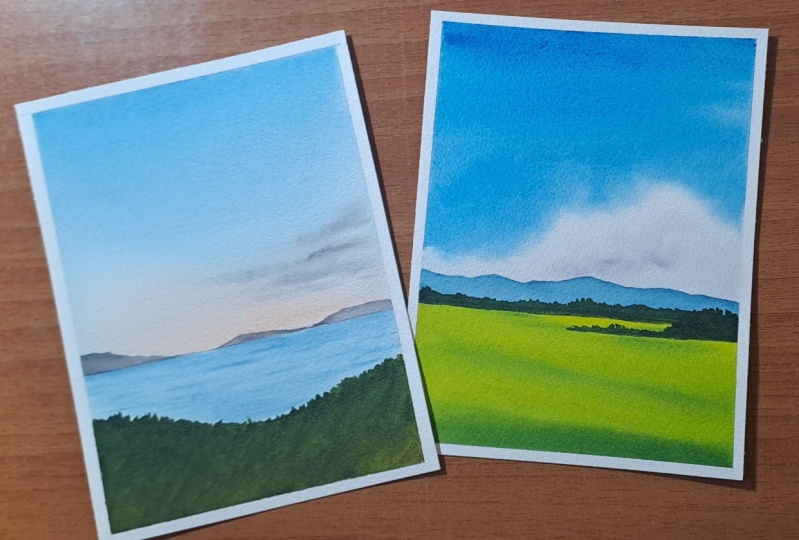
2. Class Overview: [MUSIC] First and foremost, this watercolor challenge is
not for the perfectionist, but for anyone who wants to
spend a relaxing time with watercolors without worrying
too much about the details. This class is designed in
a daily challenge format, which means starting from today, for the next 15 days, we will together paint a simple a beautiful
watercolor landscape. None of the paintings we do in this challenge are complex. For each of them,
we will only use basic techniques and
very minimum details. Right now what you
see here is some of the paintings that we'll be
doing in this challenge. As you can see here,
they are very simple, they don't have a
lot of details, but they are absolutely
beautiful and that's why this challenge
is perfect for beginners, and all those who were
previously frustrated with watercolor because they did not achieve a
satisfactory result. This is one of the painting
and you can see how clean, simple, and beautiful it is. Similarly, all the
other paintings we are doing in this challenge
are easy to achieve, for example, this one here. The sky is a simple
blend of two colors, then we have some
landscape at the bottom and some mountains
along the horizon line. When I tried this
paint at first, I was honestly very
much surprised, this is not my kind of colors. They are a little
moody and dull, but I absolutely loved the
way this has turned out. I think this is the most
simplest and beautiful painting I had ever done in
less than 15 minutes. That's a collection you
are going to create with me in this 15-day
watercolor challenge. I don't want to kill
your enthusiasm by showing all the paintings, you can see them as we progress. We are not only creating
some moody paintings, but also some bright and
bold paintings as well, but the key is we are working
with minimum details. This way, the anterior process becomes very calming
and relaxing, and you can paint them along
with me without worrying a lot about getting
the details right. I hope you all got a
rough idea about the kind of paintings that we're going
to do in this challenge. Now let me give you an idea
about the anterior class, how it is organized. The students who joins my
classes are mostly beginners, so I always make
it a point to walk you through all the
materials you will need. Starting from paper to pencil, I will explain about
each and every material you will need in detail. From this section, you
will get a clarity on the materials
you will need to use and also what to purchase in the future when you're
expanding your collection, because art supplies is a huge area and every
other day you will see a new art supply brand
popping up and you will see plenty of brands
and options available. This might be overwhelming
and also hard to resist. Don't listen to your
heart, but your brain and buy only what is needed. Coming back to the class, from material filled right away, go to the color palette. I will introduce you
to the colors I'll be using throughout
this challenge. I'll be provide you
alternate color options if you don't have the same
color that I'm using, and we'll also be trying out
some color mixing options, now from right there, we will
go to a technique section. You only need to know the basic techniques like wet-on-wet, wet-on-dry, painting a gradient
and blending the colors. We will go over the only essential techniques that is needed for this class. If these techniques
look familiar to you, you can skip this
section on techniques and go to the
predicts right away. But if you're a
complete beginner, I would recommend giving it a try especially the
last two sections, where you will learn
to blend three colors as well as adding the clouds. Once you are familiar
with the techniques, we will set off on 15 days
of watercolor painting, which is just perfect
for taking a break from the hustle and
bustle of everyday life. Every painting start
with a quick intro to the colors you will need for
that particular project, then we will get into the
process of creating a simple yet a gorgeous
watercolor landscape. This calming and relaxing journey will continue
for 15 days, [MUSIC] and at the
end of the challenge, you will have a collection
of the most simple, yet the most beautiful
painting you have ever done.
3. Materials you'll need: [MUSIC] Let's start by looking
at the materials you will need to follow
this entire class. I will start with the
watercolor paper. According to me the most
important aspect about a watercolor painting is
not really the paint, it is the paper because even if you have the most expensive
watercolor brand, if you don't have the
right right of paper you won't be able to get
a satisfying result. If you're serious
about your watercolor hobby or if you want to take your hobby into the
next level, it is really, really important to work on a great quality artist-grade
watercolor paper, otherwise you wouldn't
be able to enter the process and you will
end up hating watercolors. This is the paper I'm going
to use for this entire class. It is from a brand
called Arches, and it is specifically
made for watercolors. You can see it is 100% cotton
and the paper is 140 lb thick which means the paper is quite thick enough to handle multiple layers of water
and is also cold-pressed. When you go for a student-grade
watercolor paper, it might not be 100% cotton. That is where all the
difference comes. Working on a good-quality
artist-grade watercolor paper which is 100% cotton
and a minimum of 140 lb thick and that is cold pressed will make a huge difference in your
watercolor painting. I have cut my artist sheet into multiple pieces and the size
I'm going with is 12 by 15. This paper has a
very light texture, you can see that here, and that makes it perfect for
landscape paintings. If you go for a rough paper, it will have more texture and if you're going for a
hard press paper, it will have less texture. That's all about the
watercolor paper, now coming to the
watercolor paint. I'll be using watercolor
tubes from different brand. You can see here I have a wide collection of watercolor
from various brands. These are all artist
grade watercolor brands. I have how paint from Van Gogh, then I have from Shin Han, then Rembrandt, Mijello Mission, and I have many more
brands in my collection. It doesn't really matter which brand of paint that
you're going with, you can go with any brand
that will work with you. Now, just in case we don't have an artist grade watercolor
paint, that is totally okay. Just start out with a
student grade paint, and later as you progress, you can switch to artist
grade watercolor paint. Now to mix and
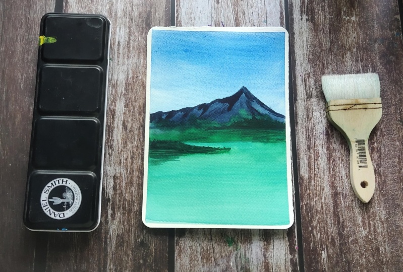
prepare your paint, you will need a palette. I'll be using the ceramic
palette throughout this class. You can go with a plastic
one or a ceramic palette, which will be the one
you have with you. That's the next
thing you will need. Then coming to the
watercolor brushes, I'll be using five different brushes throughout this class. All the brushes have
different purpose. The first one is this
one-inch wash brush. Whenever we are using wet on wet technique to apply coat
of water onto the background, I'll be using this brush. You can use any of
your wider brush, it just has to be clean when you apply water onto
the background. The next brush you will need
is a medium-size flat brush. This one's a
half-inch flat brush from the brand Silver Brush. You can go with any of your
medium-size flat brush. We'll be using this
brush mainly to apply paint onto the sky. Now comes the round brushes. I'll be using three different
size round brushes. The sizes you see here
are size number 8, size number 6, and
size number 2. The bigger one is to apply
paint onto a larger area, then size number 6 and 2 is to apply medium and
smaller sized details. That's all about the
watercolor brushes. Again, the brand of the
brush doesn't really matter. Just go with any brand
that you you have got and choose the brushes that
are nearly the same size. Next you will need two
jars of clean water. One is for rinsing
off the paint from your brush and other one
is for painting purpose. The next material you will
need is a masking tape. This one is a very
normal half-inch masking tape I got from
a stationary store. You can use a masking tape or a washi tape or any of the normal tape that
you normally use. Next, you will need a
pencil and an eraser. There is no complex sketches, but for some of the painting, we will need to add a
sketch of a mountain, the horizon line,
very basic lines. For that, you will
need a pencil and if you make any mistake to erase that you will need an eraser. Now last but not the least, you will need a paper towel or a cotton cloth to dab off the excess amount
of paint from your brush. That summarize everything you will need to follow this class. Get them ready and join me
the next section. [MUSIC]
4. Color Palette: [MUSIC] In this section
I'm going to explain about the colors you will need for this 15-day
watercolor challenge. It is absolutely
okay not to have the exact same colors
that I'm going to use. You can go with any color
that is nearly similar. The brand also doesn't matter. You can use any brand that
you have got with you and also it can be watercolor
tubes or watercolor pans. Let's start. I think I I first introduce you to
the colors that I'm going to use for the sky
because sky is the major element of
all the paintings here. The rest is just some green
landscape or some mountains. One of the color you will see me using quite a lot,
acetylene blue. You can see this painting here. That beautiful
blue you just saw, acetylene blue, is one of my most favorite color
to use for the skies. This color is just
perfect for a bright and a clear blue sky.
That's the first color. If you don't have acetylene
blue you can use cobalt blue, Prussian blue, ultramarine blue, or any other blue
of your choice. Now the next color you
will need is Indigo. You can see this
painting here for the sky as well as for the sea, I'll be using indigo. Again, if you don't have indigo, just go with Prussian blue
or any other darker blue. This is acetylene
blue I'm using. It is from ShinHan, and my
indigo is from Serie 1. I really love indigo
from Serie 1. It is more of a bluish indigo. I had an indigo from ShinHan, which is more of
a grayish indigo. I always go for
this one over that. I'll be using this color
for mountain classical, just a medium tone.
That's our second color. The next color you
will need is violet. This pen is from White Nights. If you don't have violet you can mix and create your own violet. I'm using violet for
quite a lot of paintings. That's our next color. I'll be using violet in
different tone and values. For another painting I'll use that in a very lighter tone. Then for one other painting I'll use that in
a brighter tone. That's one of the
interesting colors that we'll use to create
gorgeous skies. The next two colors
you will need this opera rose and
permanent rose. Opera pink is a bright pink, which is more like a neon pink. I'll be using opera
pink for this painting. You can see that card
just being there. Then permanent rose is more like a lighter
version of crimson. The one I was swatching out
right now is permanent rose. You can see it's
a beautiful rose, not as dark as crimson. But if you don't
have permanent rose, there is nothing to
worry just go with crimson or any other rose color. The next color I have
here is opera rose, which is not a common color. If you don't have this one
there is nothing to worry. You can just use crimson or
any other rose you have got. I'll be using this color
for only one painting. Now the next set of colors
I have here is red, orange and a yellowish orange. All of them are from
the brand ShinHan. This one spiral red. If you don't have
spiral red just go with any red you've got. The next one is
brilliant orange. It's a bright and
beautiful orange. Instead you can use vermilion. This one is permanent
yellow orange. Like the name says, it's
a yellowish orange, which is easy to create. If you don't have that color
there's nothing to worry. I will start with spiral red, which is a very bold
and beautiful red. You might have permanent red, quinacridone red
or any other red. You can use any of them. They all will work perfect. [NOISE] The next one
is brilliant orange. You might have cadmium
orange or any similar color. This one is a little
more brighter and bolder than vermilion. You can see that from
the color itself. It is quite bright and bold. But if you don't have
brilliant orange you can use vermilion or any other orange. We won't be using this
color and this consistency you'll be watering it down and will be making
it a lighter tone. Vermilion will work perfect. Now the next color I have here is permanent yellow orange. Again, as I said earlier, it's a yellowish orange. If you don't have this color, just add a little vermilion or any of the
orange into yellow, and this color can
be easily created. Next color is yellow ocher. This one is from ShinHan, and that is yellow ocher. Next you will need
brown or burnt sienna. Actually I'll be using
both of these colors. Mostly you will see me
using permanent brown. I love to use brown
for the mountains. The one you see here
is permanent brown. For this painting here to create the right tone and
value of sand, I have those burnt sienna. Here you can either use
brown or burnt sienna. I mostly prefer using brown
over burnt sienna because that one is more reddish and I feel that colors more vibrant. Burnt sienna is more
like a yellowish brown, and for some reason I don't
like using this color. Other done for some details.
That's burnt sienna. Now, I will show you
permanent brown. This one is from
ShinHan. My permanent brown as from Art Philosophy. This one is a beautiful color. I think the color is very
similar to my dress. That's the color. I
just love this color. It is very beautiful and I
love to use it for mountains. I had a brown from ShinHan, which was my absolute favorite, but this one is nearly over, I need to buy a new tube. It's a beautiful color to
add in your collection. If you want to give it a try, just try your hands-on it. Coming to the next
color, Payne's gray, which is the color
I'll be using to add the deeper tones as
well as some details. If you don't have Payne's
gray just go with black or any other
similar color. If you have neutral tint,
that also will work perfect. Payne's gray is also beautiful color to add a new collection, especially if you like
painting monochrome, and it's also wonderful
color to add the details. That's my next color. This one is from a
brand called Rembrandt. [NOISE] That was Payne's gray. Now coming to the
next set of colors, those are the greens. These are the two greens I'll
be using this challenge, saccharine and leaf green. Saccharine is a common color, leaf green is not that common, leaf cream as more like a
tender and a fresh green. It's a very light green. You can easily create
that by adding a little of saccharine
into lemon yellow. That is leaf green. The next one I have here a saccharine. I'm guessing you all
have saccharine. It is again, a very
important color that we'll be using
in this challenge. We'll be turning that
into all the green, a lighter green a darker green. We'll be turning that into
different versions of green. I actually missed
one color earlier, which is royal blue. It's a bright and
beautiful blue. Quite different from
acetylene blue. It's a little similar
to ultramarine blue. For one of the painting I'll be using this color for the sky. If you don't have royal
blue just use Prussian blue or ultramarine blue or any
other blue you have got. Now there's one last
color you will need along with all of these
colors over just white. That can be either white
gouache or white watercolor. We'll be using white to add some details onto
some of the painting. This is the one
I'm going to use. It's titanium white, it's a watercolor from ShinHan. I said earlier it can be the white gouache or
white watercolor. This is one of the painting
where we will use white to add those waves.
That's one example. In a similar way for
some of the painting, we'll be using white to add some highlights
or some textures. That summarize all the colors you will need for
this challenge. Now, there are some colors
that we will mix and create. That's what I'm going
to show you next. Maybe you might have
those colors with you already asked it to me tubes. In that case you can
use them directly. You don't need to
mix and create them. For this beach painting
here you can see that green values
for the mountain. It's more like an olive green. Similarly for the sky, the color I have used as purple, and again, for this pedicure, this is another olive green. The similar way that
are some colors that I'm going to
mix and create. This color is a mix of sap
green and a bit of orange. Along the horizon line,
I have this side color, and towards the bottom I have this model of sap green
and Payne's gray. I have some sap green here. I will mix that with a
little of brown first. Then I will choose the color. It's more like olive green, if you have olive green already you can use that directly. You don't need to
mix and create it. See that. It's a mix of sap
green and burnt sienna. Now, it is the same color
if you add a little orange, the color will look
slightly different. In the sap green, I'm
adding a bit of orange. This one is permanent
yellow orange, and that's a color I
have got. See that? It's a different olive green, very different from
the first one. In a similar way
the amount of brown or orange that you choose
to add in your sap green, the olive green that
you're creating will look slightly different,
but that's okay. It is not going to
affect your painting. That's one of the color we'll be using for quite a few paintings. [NOISE] Now the
next one is purple. To create purple
I'm going to mix a little of permanent
rose in to violet. If you shouldn't mix and create two violet if you don't have
a white watercolor too, this is quite easy. When you're mixing your color, you just need to
add more crimson or more rose into
your mix than blue. That's only difference. Here I have violet
and permanent rose. I'm just going to mix a
little of permanent rose into violet to create a
beautiful purple. I already have
those colors here. I'm picking some permanent rose and mixing that with violet. That's the purple
I'm going to use. It's a beautiful color
at the system itself, permanent rose and violet. Now coming to the next
color, it's a brown. Maybe I should call it
a motivational brown. You can see the color
high is for the sky. That's the one I'm
talking about. It is a mix of Payne's
gray and permanent brown, and then the color is
more like burnt umber. If you have burnt umber
you can use it directly, or you can mix and
create your own color. I'm taking some brown and mixing that
with Payne's green, and this is the color. That's the last collect
from the collection. We tried all the
colors you will need for this 15-day
watercolor challenge. At the end of this
section you will find all the
necessary information about the pigment number and the brand of the
color that I'm using. If you want to buy any of
these colors or if you want to know more about them,
just have a look at it. Anyways, here's a closer
look of the colors. As I mentioned at the beginning, it is not really
necessary to have the exact same color and exact
same brand that I'm using. Go with the colors which
are in your list and not the ones I'm using if you want to get a
similar result, or I can try a new color
combination as well, which is also totally up to you. [MUSIC] Grab your colors and
join me in the next section. Let's quickly try
out some techniques before we start. [MUSIC]
5. Essential Techniques : [MUSIC] All of the painting
that we're going to do throughout this class
are very simple. They are not at all complex and they don't have a
lot of details in them, but if you're an
absolute beginner, there are a few keywords that you will need
to understand, especially what is wet-on-wet, wet-on-dry, what is a flat
wash, what is blending. That is exactly what we're
going to try in this section. I have divided my paper
into six equal divisions. Now let's try only those
essential techniques which is needed for this class. I will start with a flat wash. The sections I have
here are quite small, so mostly I'll be going
with wet-on-dry technique, which means I wouldn't be
applying coat of water, but for our main paintings, we'll be applying
coat of water using this one-inch wash brush because they are a bit
more bigger than this. For now, we're not
applying water as the sections are quite small. I'm just keeping
this brush aside and I'm starting
off with violet. I'm using my
half-inch flat brush. I have taken enough of paint. Now I'm going to simply apply that color onto this
entire section. See that? The color is
quite bright and I'm simply filling up that
entire square in this color. This is exactly what a flat
wash or a solid wash means. It's just a solid color
and we're filling that section. See that? Depending on the size of the
paper that you're using, you can choose to go with
wet-on-dry or wet-on-wet. If it's a bigger scale paper to make your background
wet for a longer time, you will have to
apply coat of water. For now as I said, the section is quite small, so you can quickly
apply paint onto that entire section
before it dries off. Right here, I'm
using a flat brush and I'm actually
running my brush from left to right in a horizontal way to
get the perfect blend, but the same can be done
using a round brush as well. It doesn't need to
be a flat brush, but a bigger brush works better so that you can cover up a larger area
in a shorter time. That's the first technique. This one is called
a flat wash or a solid wash. here
in this painting, you can see I have
this flat wash for the top part of the sky and at the bottom,
we have a cloud. On the top, I had
used a flat wash and also for the field as well, I started out with a flat
wash then onto that, I added some medium
tones using some green. Those are some applications
of flat wash or solid wash. The rest you will see as we
deep dive into the class. That's the first technique. Now for the second one, I'm going with the
gradient wash, which means I'll start off with a medium tone and
as I'm coming down, I will make the color lighter. For this one, I'm
using cerulean blue. These are just some techniques
that you can either choose to watch or if you're
an absolute beginner, you can try it along with me. For this one as well, I'm
using wet-on-dry technique, I haven't applied
a coat of water. I have applied a medium
tone of cerulean blue, almost one to half
of that section. Now I'm cleaning my brush
and using a clean brush, I'm making the rest
of the area lighter. I'm just running
my brush from left to right in a
horizontal direction. This way, I will get
a perfect blend. Now I'm just cleaning it again and with some clean water, I'm making the rest of the
area lighter. See that? This is a common technique
that we use to paint skies, especially when
you want to paint a very soft and a
simple gradient sky, it can be of any color. That's our second technique. For this technique, it is
best to use a flat brush so that you'll be able to achieve a smooth and a clean gradient. Once you're happy
with the gradient, don't go over multiple times, just call it down when
you get that clean blend. That's the second technique. For these two, we have used
only one single color. For this, we made
the color lighter as we came down and
for the first one, it was a solid wash.
Now for the next, I'm going to try
blending two colors. For the first half, I will use one color and for
the bottom half, I will use another color, then I will blend them together. For this, I'm planning to
go with red and orange. Again, wet-on-dry technique. First, I'm picking some red and applying that onto the
top part of the section. I will apply this
almost in half of the section and for the rest, I will use orange. This is another common technique that everyone use
to paint the sky, especially if you want to
go for a colorful sky. We can use two or more colors. That is red. Now I'm going to clean my brush and I'm going to switch to
my second color. Now I'm picking some orange and I'm adding that
towards the bottom, then I will go towards the
top. That's a beautiful color. This one is called brilliant
orange, it is from ShinHan. Now I'm about to re-stread. I'm picking some
more paint and I'm running my brush in a horizontal
way from left to right, and I'm blending the colors. See. That's a perfect blend. We were able to blend
these colors quite easily because they
are very safe colors. Red and orange makes
a perfect blend. They are almost similar colors, but you won't get
a clean blend when you work with all colors. That is what we're
going to try next. I'm cleaning my brush. For example, if you see
this painting here, you can see I have
used a light violet on the top and a light yellow
towards the bottom. These two colors are complimentary colors
on the color wheel, which means if you blend
these two colors together, you will get a muddy paint. I'll just quickly show that. I'm taking a scrap piece
of paper and I will pick some violet. That is violet. Now I'm going to clean my brush and I will pick some
orange. See that? The moment these two
colors got mixed, I got a muddy brown there. It is not as beautiful as
red and orange. See that? It doesn't look that
great for a sky, especially when you
create a muddy color in between where these two
colors are meeting. In that case, when you are using
complimentary colors for your sky, here's
another example. On the top, I have violet and towards the bottom,
I have yellow. Where these two
colors are meeting, I have made the color lighter so that I don't get a muddy
color like the previous one. That is what we're
going to try next. For this, I will
apply coat of water. We can try wet-on-wet technique. I have applied an even coat of water onto that
entire section. Now I'm switching back to my flat brush and I'm
picking a bit of violet. I will apply that
onto the top of my sky. It's a medium tone. Now as I'm coming
towards the center, I'll wash my brush and
I will make it lighter. Clean your brush,
now make it lighter. Again, I'm running my
brush from left to right in a horizontal way
to get the best blend. On the top, we have
a medium tone, towards the center, we
have a lighter tone. Some some paint
missing on the top. I would just add that back. Then, I will make
it lighter again. Then we can go with
the second color. That part is done. They have
got a beautiful gradient. Now let's clean the brush
and go to the second color. Clean it thoroughly
and dab it on a paper towel just to be sure there's no
pain stains on it. Now pick a second color, it can be either
yellow or orange. These two are
complementary colors. Now clean my brush, again, and with a clean brush, I'm just making
this area lighter. Where are these two
colors are meeting. I'm not allowing
these two colors to meet in their strongest form. If I use a brighter orange
and a brighter violet, and if I blend them together, I will get a muddy
color in between. This way, when you make
the color lighter, it won't be a muddy mix and you can create
a gorgeous blend. Maybe we can drop in a bit more brighter orange
only at the bottom. That is our fourth section. We try two different blendings. For the first one, we tried two colors in their
strongest form, red and orange and
for the second one, as the complementary colors, we made it lighter where those
two colors were meeting. Now we have two more sections
left for the next one, I'm trying to blend
three colors together. First, we tried a
single-color gradient, then we try blending two
colors in two different ways. Now it's time to level up and
try blending three colors. I'm just taking out all the
colors onto my palette. I'm planning to go with
violet, rose, and orange. I will start with
violet, then rows, and then orange
towards the bottom. I have the colors ready. Now for the
assessment, I think I can go with the
wet-on-wet technique, which means I need
to start by applying water onto this division. When I'm applying water, we just need a shiny code. Don't add a lot of water. We don't want pools of water. Just a shiny coat
is all we need. That surface is evenly wet. Now I'm starting
off with violet. I will pick a medium tone and I will apply that
on the top part. Now cleaning my brush and
I'm picking some rose. Adding that right next to violet and I'm gently
blending them. This one is permanent
rose from Shinhan. I have applied my second color
and I'm trying to make it a clean blend by running my brush from left to right
and in a horizontal way. Now clean my brush. Now towards the bottom,
I'm picking some orange, adding that in, and
blending that with rose. It's a beautiful color
combination which can be used for dreamy evenings. If your background is still wet, you can modify the colors. You can make it more intense. There is a little paint
missing on the top. I'm just adding some
more violet onto this corner to make
it a perfect blend. That is our fifth section. I think it came out really
beautiful and we'll be trying to similar color combination
for one of our painting. We started off with violet, then rose in the middle, and orange towards the bottom. It's a clean blend
of three colors. Now for the last one, I'm
planning to go with two colors, I will blend two colors. Then onto that wet background, we'll try adding some clouds. I'm starting off with violet. I have more violet
left on my palette. I'm starting with that. I'm using a medium tone and I'm applying the wet paint
directly onto the dry paper. I haven't added a coat of water. Now I'm cleaning my brush
and I'm picking some rose. Now adding that onto
the remaining area. First I will blend
rose and violet. [NOISE] Now for the
remaining area, I will make the color lighter. All of these
exercises can be done with any color of your choice. It doesn't need to
be the same colors. You can try exploring
different color combination and you can choose the ones
that is your favorite. When you try multiple color
combination you will also get an understanding about
different color combination. The ones that works well and
the ones that doesn't work. Anyways, this one has
turned out pretty well. Now to add the clouds, I'm going to switch
to a round brush. This one is a size from
the six-round brush. It looks like the paint I
have used this quite watery. I'm going to dab my
brush on a paper towel and I'm going to continue
adding the clouds. See that, you can
keep adding them. How you want to. It can be
of any shape and any size. If you want your sky
to be really dramatic, you can add more clouds using a darker tone
and a medium tone. The only thing you need
to keep in mind is to add the clouds while the
background is still wet. Otherwise, they won't spread and they will look to prominent. You need to add in your clouds right away you have
painted your background. My background is still wet and I'm able to add
those clouds quite easily and also the pain that they're using to add the clouds
shouldn't be too watery. If it's too watery,
they will spread very fast and you wouldn't be
able to get a cloudy shape. When you're adding
a first cloud, if you feel like the paint
is spreading too fast, just dab your brush
on a paper towel add more the excess
amount of water, and then go ahead and add
the remaining clouds. I've taken some more paint
and I'm going to add few more clouds onto
this right top corner. I think have added
quite a lot of clouds. But I think it has
come out pretty nice, not too dramatic
and not to subtle. Anyways, this is all the
different washes we tried. Now before we wrap
up this section, let me quickly show you some of the paintings where we're going to try some clouds. Here's one. I have used a similar
color combination. It is violet, pink, and orange. Then onto that, I have added
some clouds using violet. To add the clouds I
used a medium tone, so that is not too dramatic. Now here's another one that
had used very little clouds. It's a soft and the simple
blend of two colors, something similar to this. Then onto that, I have added some clouds using a really
light tone of Payne's gray. See that, this one has
very little clouds. Started with a really light
tone of Payne's gray. Which means by knowing
a simple technique, you can create gorgeous sky, just by changing the
color combinations. I will show you
one more painting. This one is a little
modified version of this blue gradient sky. I started out with a gradient. Then towards the bottom, I simply added some blue
lines towards that light apart and I have created a gorgeous sky by tweaking
that technique too little. Only by knowing these
watercolor washes and these little techniques, we can create plenty
of wonderful skies, we'll be trying to set
skies in this class. The rest is all
yours to explore. Anyway, now I'm going to
split up the masking tape. [MUSIC] These are the different
watercolor washes we tried. If you're absolutely
new to watercolor, I would suggest
you give it a try, if you cannot try them all, just try the last two sections. Blending three colors and
also adding the clouds and that will make you really confident when you're
trying the class projects.
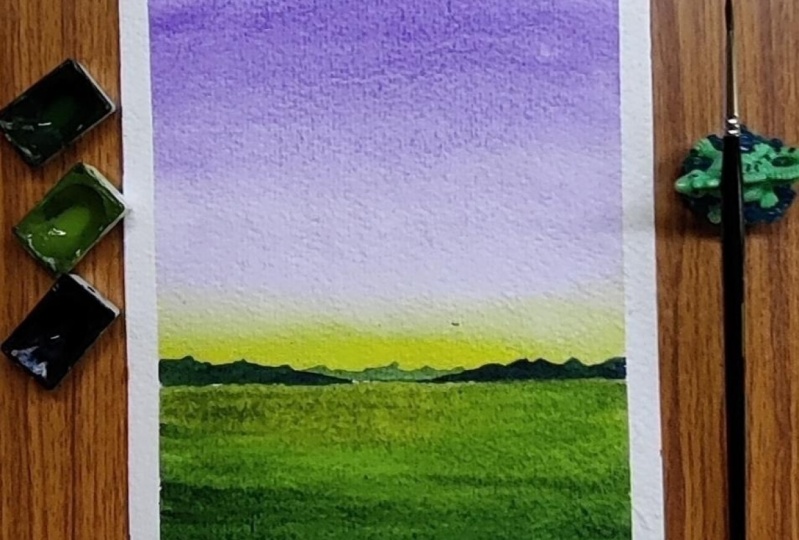
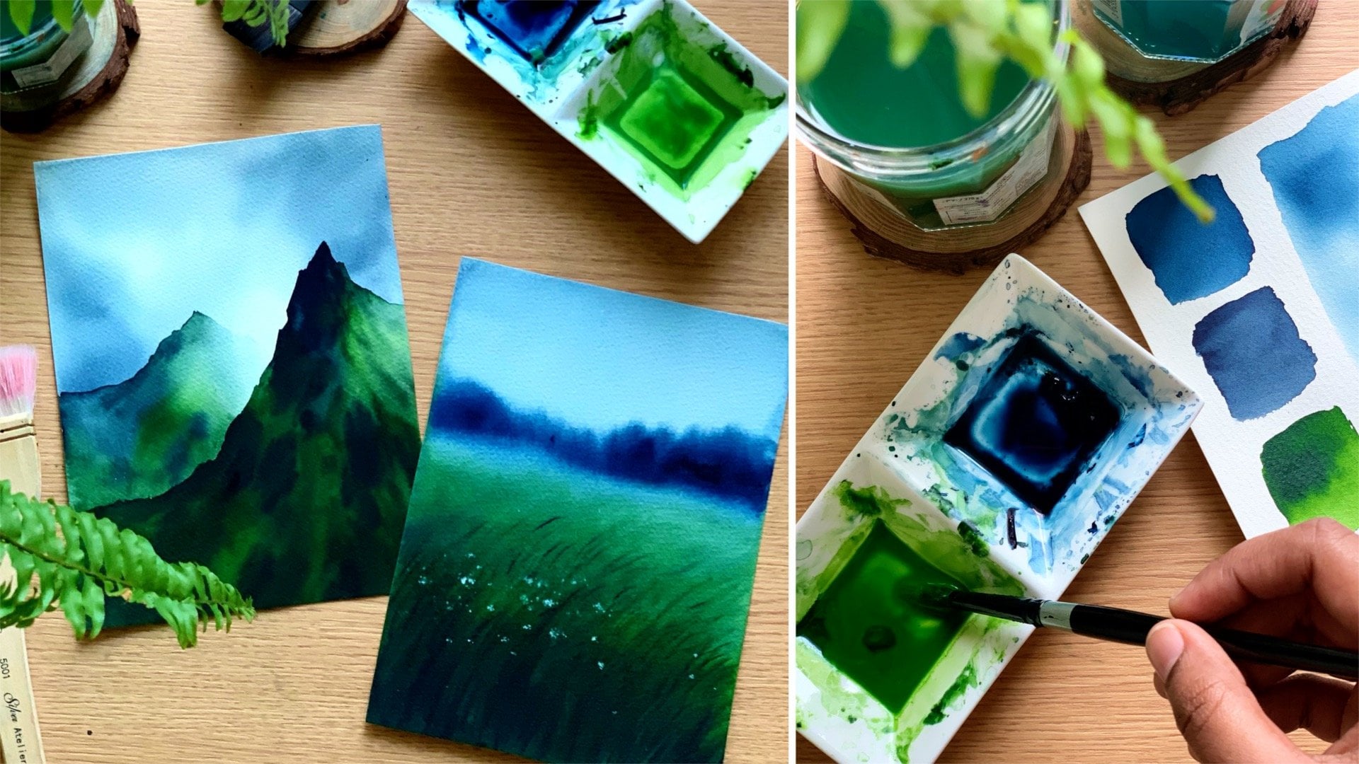
6. DAY 1 - Calm Evening: [MUSIC] Our first
project is a very calm and peaceful evening. You can see the painting here, it's simply a gorgeous one. First I will start by
introducing you to the colors. I have a scrap piece
of paper here. As you can see from here, I'll be using two
colors for the sky. On the top you can see I'll use a very light tone of violet
and towards the bottom, it's a light yellowish orange. Those are the two colors
you will need for the sky. I have them ready here.
These are the two colors. I have violet and
permanent yellow orange. This one is from White Nights and other one is from Shinhan. You can use any other
color of your choice if you don't want to go for
this color combination. We'll need a little of violet as well as yellowish
orange or yellow. I will quickly swatch
all the colors so you have a better idea. This one is violet. We just need a teeny bit of violet as the color
we're using is quite light. That's
the first color. Now just in case if you
don't have violet with you, you can mix and create
your own violet. That's not a problem.
Now the second color is permanent yellow orange. This one is a yellowish orange. Again, if you don't
have this color, you can just add a little of [inaudible] into any
of the yellow you have got and you can create a
similar color quite easily. That's our second
color. These are the two colors we'll
be using for the sky. [NOISE] Now you can see these small mountains in
the background. For that, we will need indigo. For the background mountain, I'll be using a lighter tone of indigo and for the one
in the foreground, it's going to a
slightly darker tone. That's the third
color you will need. The indigo I'm using
here is from Sennelier. You can use indigo from any other brand or you
can mix a little of Payne's gray into any
of the blue you have got to create a similar color. That's the third
color. [NOISE] Now the next color you
will need is green. You can see that middle. For that, you will
need sap green as well as Payne's gray
to add the deeper tones. Sap green is a very common color so I'm guessing you all have it. The one I'm using
here is from Shinhan. It's a beautiful green.
I just love this color. Now along with sap green, there is one more
color you will need. You can see that lighter tone
here, that yellowish green. I have created that
color by mixing a little of permanent yellow
orange and sap green. It's a mixture of
those two colors. I will show you the color. See that? It's more
like a olive green, you just need to add a little
of yellowish orange or orange into green to
create a similar color. That's the color I'm
going to use on the top. Towards the bottom, I'll
be using some sap green as well as some Payne's gray
to add the deeper tones. Those are the colors you will need for our first painting. I didn't have any space
to show Payne's gray, but this is the one I'm using. It's from the brand Rembrandt. It's a pretty simple
painting with a very simple color palette. Now it's time to give it a try. [MUSIC] I have
everything ready here. I have taped down my paper too. You can either tape
down your paper onto a drawing board or
onto your table. Now I'm starting by adding a horizon line a little below
the center of the people. Just add a straight
line and that's it. Your pencil sketch is ready. We already spoke
about the colors that I'm going to
use for the sky. I'll be using violet as well
as permanent yellow orange. Now, I'm going to squeeze out these two colors
onto my palette. As I mentioned earlier, we just need a lighter tone, which means we'll only need a little pigment and a
lot of water so don't squeeze out a lot of paint if you are working with
freshly squeezed paint. We just need a
little of violet and a little of yellowish
orange or orange, or any other color
of your choice. I have the colors ready. Now for the sky, I'm going
to use wet on wet technique, which means we need
to apply a coat of water [NOISE] and for that, I'm using my
one-inch wash brush. Pick some clean water and apply that onto your sky evenly. Don't add a lot of water, we just need a shiny coat. Keep running your
brush multiple times just to be sure the
coat of water is even and also be sure
your brush is clean. There shouldn't be any
paints tints on it as we're going to use really
light tones for the sky. Gently apply an even coat of
water onto the entire sky. Now to apply the
paint onto the sky, I'm using my
half-inch flat brush. This one is from Silver
Black Velvet brush. Now using this brush, I'm creating a lighter
tone of violet, picking some water,
adding that into the paint to create
a lighter tone. Now, I'm going to apply
that onto the sky. See the color? It
is quite light. That's the tone of
violet I'm going with. I want a really light
tone for the sky. Now apply this almost
three-fourths of your sky. It is just a flat wash so
keep applying your paint in a horizontal way so that we have a clean and smooth blend. Once you reach in your
three-fourths of your sky, try to make the color lighter. See that? I'm just running my
brush in a horizontal way. I'm not mixing any
other brush movement. This way I have a clean
blend for the sky. Now, I'm cleaning my brush and I'm dabbing my
brush on a paper towel. Now using a clean brush I'm just blending the remaining
area to make it lighter. It looks like there are some
uneven patches on the sky. I'm just adding some more
paint to make it even. There's a little paint
missing on the top as well. That's done. [NOISE] Now cleaning again, dabbing my brush and now I'm switching
to my second color, which is permanent
yellow orange. Again, go with a lighter tone. Don't make it too bold. Now I'm applying that along the horizon line and as
I go towards the top, I'm making the color
lighter. See that? That's the sky. Now just in case you want
to make it a clean blend, you can clean your brush
and run your brush in a horizontal way to
make it a better blend. If have already
got a clean blend, don't run your brush again. Because when you run your
brush multiple times, instead of making it better, it might ruin your sky. That's how it has turned out. I'm very much happy
with the blend. I'm really happy with
the colors as well. It is exactly the way
how I wanted it to be. Now using a clean paper towel, I'm just wiping off
that excess amount of paint from the masking tape. Because what happens is when
you just leave it as it is, those paint will flow back into your painting and will create some bleed along that border. To avoid that, I'm just wiping off the paint
from the boarder. That's our gorgeous sky, now we can leave this
for drying [MUSIC]. [MUSIC] The sky has
dried completely. You can see how beautiful
those colors are looking. They're very peaceful and calm. For the next step, you
will need some indigo. We'll be adding a mountain here. We'll add maybe one at the center or just
in the background, then once that dries we'll add another one for the crown
using a much more darker tone. I'm going to squeeze out
some paint onto my palette. This is the one I'm going to
use, it's from Sennelier. You can use any other
indigo you have got and if you don't have
indigo there's nothing worry. You can just mix a little
of Payne's Gray into any of the blue you have got and
create some of the color. As I have that yellowish
color in the background, the indigo that I'm going
to apply will turn into slightly greenish which
is absolutely okay. You will see that in some time. To add the mountain, I'm using my size number 6 round brush. First, I'm adding some water and I'm turning indigo
[NOISE] into a lighter tone. That's a color I'm going to
use for the first mountain, but it is in the background. Create a lighter tone
of indigo and use any of your smaller brush and
add the first mountain. You can go with
any kind of shape. I'm adding that
at the center and this is the shape I'm
going with [NOISE]. I think my paint
is quite dark so I'm picking some water and
I'm making it lighter. See that? You can
see the color I have used here it is
looking a little greenish. This is just because I have that yellowish orange
in the background, but that's absolutely okay. There is nothing to worry here. Adding a mountain and once you're done, you
leave it for drying. [MUSIC] That is right. We can add our second layer of mountain which is going
to be in the foreground. I'm planning to add this on either side leaving some gap at the center and for
this I'm using a little more darker tone of indigo and I'm going to add
the mountain on either side. Again, you can go with any
kind of shape that you prefer, but go with a low line mountain. Don't make it too huge. We are trying to
make it look like these mountains are quite far away so be really careful about the size
you are going with. Carefully add a mountain on either side using a slightly
darker tone of indigo. Don't make it too dark, it just needs to be
a little more darker than the color we
used earlier for the background layer so that we can get their
different tonal values. I'm adding a similar mountain
on the left side and that will be done with this layer and then we'll have to
wait for this to dry. After that we'll be painting our middle and with that we'll be done with
the whole painting. That's a mountain. We can
leave this for trying. [MUSIC] That has dried completely and this is how
it is looking right now. The only task left is
to paint the middle. For that, you will need some sap green and some Payne's
gray and also we need to create that olive
green color by mixing a little of permanent yellow
orange with sap green. First I will take out sap
green as well as Payne's gray. I have that yellowish orange
already on my palette. I have the colors ready. To apply the paint, you can use any of your medium-sized
round brush. The one I'm using here is a
size number 8 round brush, so first I'm going to create
that olive green color. I'm picking some orange and
mixing that with green. You can see that the color
is just a little green. It is just a mix of [inaudible] yellow orange and sap green. Depending on the amount of
orange you're adding into your green the color will look slightly different,
but that's okay. It is not going to make a huge difference
in your painting. That's the color
I'm going to use. I'm going to fill this color almost till half of my middle. You can see the color here. Carefully fill that
onto your middle. The color is pretty thick, I'm not adding a lot of water. I have applied paint
along the horizon line. I can easily fill out the rest, so I'm just adding more paint. You can see I have added paint almost till half of my middle. For the remaining area, I'm going to pick some sap green and I'm just
blending those two colors. So keep blending your color. For the remaining
area at the bottom, that little area left
I'm going to introduce some Payne's gray to
add some deeper tone, so I'm picking
some Payne's gray. I'm mixing that
with sap green to create a darker green and I'm using that at the
bottom. See that? We have that olive green
on the top then we have some fresh sap green at the center and then darker
green at the bottom. That's a base layer. We can start with
that orangy-ish green then some sap green, and towards the bottom you
can use a darker green. To give it some texture
using the same color, I'm going to add some lines
while it is still wet. Just add some random
line on the middle. I'm picking that darker green again and I'm simply
adding a few lines. See that? Don't add a lot, we need all those different
kind of tonal values of green at the background.
Just add a few. I'm trying to read
in that lighter green on the top left corner., so I'm not going to add
any lines over there. I'm just concentrating
on the right side. That's it. If you want to add in more lines or if you want to add in more darker tones
at the bottom, you could do that while the
background is still wet. But if it is starting to
dry, just leave it as it is. Don't add any more lines because we need them a
little soft and subtle. We don't want them
to be too prominent. If your background
is starting to dry, they won't spread
into the background and the lines will
be too prominent. Gouache, we don't need. Anyways, I'm just planning
to continue this mountain. I feel like there is something
missing at the center. If it happened with
your result there is no need to add that mountain, but for me for some reason I feel like connecting
that mountain. I'm just cleaning my brush and I'm going to
keep this one aside. I will switch back to indigo
to continue that mountain. This step is not
at all necessary. I just felt like it might look a bit more nice if I continue that mountain but I
might regret later, so just go with your intuition. [MUSIC] If you want
to connect it, just connect that mountain. Otherwise, just call it done, pull off your masking tape, and enjoy your painting. This is how it has turned out, I think it is
looking quite okay. I'm doing the painting. Now, it's time to beat
the masking tape. Wow, I'm in love
with this painting. To be honest, this is one of the ECF standard card
painting I have ever done. You can see there
is no much detail, but it is looking so gorgeous. I hope you all enjoyed this
calm and peaceful evening. Thank you so much for joining. [MUSIC]
7. DAY 2 - At the Beach: [MUSIC] Hello my lovely friends. I hope you all are doing great. This is what we are
painting today. It's a very calm
and simple beach, but it is absolutely
beautiful too. Anyway, I'll take you through
the colors you will need, then we can quickly
start the painting. I have a piece of paper here. Now as you can see
here for the sky, I have used a gradient
wash as a simple sky. There is no second
layer or anything. We're just going to start
with a medium tone, then we're going
to make the color lighter as we're approaching
the horizon line. This is the color
I'm going to use. It is indigo from Sennelier. You can see that gradient
wash. For the beach as well, I'll be using the same color.
That's our first color. If you don't have
indigo, you can use Prussian blue or any
other blue you have got, or if you have Payne's gray, you can add a little of that into any of the
blue you have got. Then you can easily
create indigo shade. That's the color I'm
going to use for the sky as well
as for the beach. [NOISE] The next color you
will need is burnt sienna, that is the color I'll
be using for the sand. We just need a medium tone of
burnt sienna for the sand. Then we'll also be
mixing that with sap green to create that
olive green color, which you can see here that
I had used for the mountain. We'll come to that in some time. First I will spread
out burnt sienna. Whenever there is a mountain
or any other element, I always choose to use brown
instead of burnt sienna. For some reason, I love brown
more than burnt sienna. Maybe because it
is more vibrant, or maybe it is more bright. But to paint a beach and
more of earthy tones, the perfect color
is burnt sienna. That's our second color. Now,
the next one is sap green. We won't be using
sap green as it is, we'll be adding a
little of burnt sienna into it to create an olive green color.
That's sap green. I want the colors
to be a bit muted. I don't want them
to be too bright. I already have a
little paint here that's a mix of burnt
sienna and sap green. If you have olive green
color with you already, you can use that directly or you can easily mix and create
your own olive green this way by adding either brown or burnt sienna
in the sap green. It's a beautiful color and it goes really with this color combination
we have used. Now, the last color you
will need is Payne's gray, which is the color
we'll be using to add the darker details. We'll just add a
little of Payne's gray only for the mountain. We're not going to
use it anywhere else. Those are the colors you will
need for today's painting. Indigo or any other
blue of your choice, then burnt sienna, sap green, and some
Payne's gray or black. Now, along with this, there is one more color you will need, which is obviously white, it can be the white gouache
or white watercolor. I'll be just using a little
of white watercolor. You can see those ways
I have added here. For that, I'll be
using some white. That summarized the color
palette for today's painting. Now let's give it a try. For this one, the major
element is that mountain, and that's the only sketch
you will need to add. First I will start by
adding a horizon line, which is a little bit at
the center of the paper. Now, I'm going to
add the rocks or the mountains or whatever
you want to call it somewhere over here. You can see the way how
I started the line. It's a little above
the horizon line. Now I'm bringing that down. Go with a very natural
and irregular shape and also watch out the size; don't make it too huge and don't make it
too small as well. Go with the similar size. That's a basic shape.
Now, along with that, I'm adding another smaller
mountain which is far away. This one is along
the horizon line. That's the sketch. Now
I'm going to add a line, which is a short line. We're done with the sketch. I hope it was
simple. Just in case if you want to
modify the shape of your rock, you could do that. Maybe you can go for a
little more simpler shape or any other different
kind of a shape. That's that. Now we can start preparing the paint
and we can start painting. As I mentioned earlier, this is the color I'm
going to use for the sky. We are going for a
simple gradient wash. I'm just squeezing
out some paint. I guess that would be enough for the sky as well as the beach. Now using my one
inch flat brush, I'm going to apply a coat of
water onto the entire sky. We're using wet-on-wet
technique here. Apply a coat of water
onto the entire sky. Don't add a lot. We
just need a shiny coat. My sky is evenly wet. You don't need to leave
out the mountain, you can apply water
on top of it. That's okay. My
sky is evenly wet. Now to apply the
paint onto the sky, I'm using a half-inch
flat brush. This is the one I'm using. Now I'm picking a
medium tone of indigo. Only at the top of the sky
we'll be using a medium tone. Then as you're approaching the horizon line, we
will make it lighter. Just run your brush
back and forth in a horizontal direction
to get a clean blend. We can see the color.
It's a medium tone. Now as I'm coming down, I'm not picking any more paint, I'm just making use of
the paint on the brush and I'm coming down until I feel like the color
is getting lighter. Now, I'm going to
clean my brush, and using that damp brush
and making the color lighter again. See that? On the top you can see
we have a medium tone. Towards the bottom, we have
made the color lighter. If you're happy with the blend, don't go over again and again. Because with
watercolor, when you run your brush multiple times, it won't give it
a better result. Rather, it will disturb your background layer and you might end up spoiling
your clean blend. Once you're happy
with the result, this color's done and
leave it for drying. After the sky, it's a very
simple gradient wash. You can use any blue of
your choice for this sky, start with a medium tone, then make it lighter as you're
approaching horizon line. Now, let it dry.
[MUSIC] That's our sky. The colors are looking much more softer than earlier
when it dried. Now we can start
painting the beach. For that as well,
I'll be using indigo, maybe a color similar to the one I used on the top of the sky. To paint the beach, I'm
using my round brush. Now I'm picking a
medium tone of indigo. Now I'm applying that
onto the entire sea. It just needs to
be a medium tone, don't make it too dark
and too light as well. We already have
an outline there. Simply fill that up
with a medium tone of indigo or any other
blue that you're using. Maybe we can make
it a bit lighter. It seems a bit dark. Now with that wet brush,
I'm making it lighter. Just fill it up, there is no need to put a
lot of effort here. It doesn't need to
be a clean blend or a gradient wash or anything. Simply apply a medium tone of
indigo onto the entire sea. That's it. Now we'll have to
wait for this also to dry. After that we can start
painting the sand. [MUSIC] That has dried. Now we can start
painting the sand for which I'm going to use a
medium tone of burnt sienna. Right now, our painting looks
quite flat and lifeless, but when we paint the sand part, it will start to get better. I'm going to squeeze out
some paint onto my palette. I will need a little more
because I'll be using this for the rocks as well.
The paint is ready. Now to paint the beach, I'm picking my size
number eight round brush, and I'm creating a medium
tone of burnt sienna here. Now let's apply that
onto the entire sand. See the color? It's not too light and it's not
too dark as well. We've got similar tonal value. Now apply that onto
the entire sand. You can follow the shoreline
and simply fill that area. This one is again, a solid wash. There is no need to put a lot of effort, as I said earlier. Create a medium tone of
burnt sienna and simply fill that entire sand and the
tonal value I have created. We have a shoreline here. Follow that and apply the paint. See that, simple. Now, there is one
more thing we need to do before this dries. For that as well, I'm
using the same brush, but this time I'm going to
pick a slightly darker tone. I'm picking a little more
darker tone of brown. See that? Now I'm just dropping that
onto that background. Start by adding some
small random patterns closer to the rocks. We don't need a
lot, just a little. Then maybe towards
the bottom as well, you can add a few, but
don't make it too busy. That is how much I have added. Now, I'm going to dab my
brush on a paper towel. Now with a slightly dry brush, I'm just spreading
those color into the background to give it
a bit more smoother feel. I don't want them to be
too prominent and rough. Maybe we can add a few more. That's it. Now, let the background dry. [MUSIC] [MUSIC] You can see how
beautiful it is looking already with those soft
textures on the sand, they are not too prominent, but they have added a little realistic touch to the beach. Anyway, now let's start
painting the rock for which I'm going to
squeeze out some sap green. I already have some
burnt sienna there. As I mentioned at the beginning, I'll be mixing burnt
sienna and sap green together to create earthy green, more like olive green. I'm picking some sap green and I'm picking some
burnt sienna as well. Mixing them together. It's a beautiful color. It just changes the entire
mood of the painting. We tried a similar color in the previous
painting as well. This is the color
I'm going to use. It's a very earthy green. Now, I'm going to apply
that onto the entire rock. You can modify the mix if you want more of a greenish tone, you can add more sap green, into the burnt sienna. Similarly, if you want the
color to be more brownish, reduce the amount of sap green, and increase the amount
of burnt sienna. Once you have decided
on your color, simply fill that on
the entire rock, following the outline
you have added there. Also, you can modify
the shape if needed. If you feel like you have
made it really small, or if you feel it
is really short, you can increase
the height or you can spread it out a bit more. Those things are
totally your choice. Now relax and slowly fill up that entire shape in the
color I have created. [MUSIC] Alright, so that's a base layer. Now onto those, we need
to add some texture and some patterns to make
it look more realistic. For that, we need
to darker green. To create a darker green, I'm going to mix a little of
Payne's gray with sap green. I'm going to squeeze out a
bit of paint onto my palette. Now, I'm using my
smaller-sized brush, this one is size Number 6. To create a darker green, you can either use sap
green with Payne's gray or that olive green
with Payne's gray. We just need a darker tone here. You can create that however, you want to know I'm starting by adding
a shape on the top. See that, how to separate
the top and the bottom, it has two sections. Once you have added that shape, I'm going to add some
lines on the bottom side. Honestly, this has to be done while the background
is still wet, but my background
has started to dry. It is not completely wet. But no mind. Just keep
adding those lines. See that? Just add a little
towards the bottom as well as towards the top and some darker tones along
the bottom line as well. All you need to do is just
add some random lines using a darker tone on the
rock to create some texture. That's it. Now, I'm going
to pick another brush. I have my size Number
8 round brush here. Now I'm picking a
little of olive green, just a little and I'm simply smudging the
pattern type applied here. This needs to be
done only if you feel like they're
looking too prominent. If happy with the result, you don't need to do that. I'm doing this mainly because
my background has dried. It is not wet and I feel those patterns are
a bit too prominent. Anyway, that's how
it has turned out. Now, I'm going to switch back to my smaller brush and to add
the final random details, I'm picking some Payne's green, and I'm just adding some
darker tones along the top. I already have enough patterns, so I'm not planning to add more, just a little here and there to give it
some more texture. That's it. I'm really
happy with this area. How will you paint this rock, it is going to look
really beautiful. Just apply that olive
green for the background. Then start adding
some random lines and some random shapes using a darker tone to
create some texture. Don't forget to leave
that shape on the top. That's the top flat surface
of the rock that you can sit or stand to
enjoy the beach. Towards the bottom, it's the sloping part,
which is the height. That's the first
step. Now we have a small mountain in the background along
the horizon line. I'm using the same olive green
and I'm filling this up. Maybe we can use a
slightly lighter tone than earlier to create
a sense of depth. Now fill in that shape, be really careful, we need a straight line
along the horizon. As I said earlier, if you
want to modify the shape, that's totally your choice. If you want to extend that
a little more towards the center, you could do that. Also if you want to add another one towards the right side, that is also totally possible. That is our mountain
in the background. I'm really happy with the
way it is turning out. Now onto this, I'm going to
add some darker texture. The same way how we did earlier. I'm picking my other brush. I haven't washed this, so that
is some paint left on it. I'm just adding some teeny tiny patterns on that background. For this one, I'm not going
to put a lot of effort. This one is far away, so just some teeny-tiny
patterns is all you need. That's how it has
turned out right now. Now before I add the waves, there's one last
thing I want to do, a small task which is
completely optional. I just wanted to add
some teeny tiny stones next to the bigger rock. I just felt like it will add a little more texture if we add some teeny tiny
stones over here, they're super tiny.
You can see the size. You can add three
or four of them. To be honest, I'm really
happy with this painting, especially the simplicity of this painting and yet
it is so beautiful. You know when you
start working with very limited colors and
very limited techniques, you will start to enjoy
the process a lot more. When there is a lot
of techniques and a lot of complex
details involved, you will forget that
joy of creating. You will be more concentrated on getting the details right and that's the main reason why I created this
particular challenge. Because I know there are
a lot of people who had a frustrating relationship
with watercolor before, mainly because they forgot
the joy in the process. They forgot to
enjoy the process, and they put their
whole focus and concentration in learning
every techniques, totally ignoring the
joy of creating. To be honest, watercolor
is a joy to work with, and it can also be very
frustrating at times, especially when you
have to rush and add all the details before
the background dries. That rushed part of
[inaudible] technique can be a bit
frustrating at times. Sometimes your soul needs some relaxing watercolor
projects like this. Anyway, our next task is to add the waves for which I'm going to squeeze out a bit
of white watercolor. We need some opaque white, so don't add a lot of water. It can be the white
watercolor or white gouache. Now to add the waves, I'm going to use my
smaller-sized brush, this one here is size Number 6. Now, don't add a lot of water. That is something you
have to be careful about being at a thick
and opaque paint. Now, using that I'm going
to add the first wave which is closer to the
horizon line. See that? At some places make it thicker and at some
places make it thinner. This will add a little of a realistic feeling
to your painting. Towards the right, I have
made it a bit thicker. At the center, I
made it thinner. Now again towards the left, I made it a little more thicker. See that. That's our first wave. Now if you're someone who use watercolor cakes or watercolor
pans for your painting. By any chance, if you have doable white watercolor
or white gouache, I would recommend using
that because you won't get the same consistency
and the same opacity when you're using
your watercolor pans or watercolor cakes, it is a little
difficult to achieve the same effect using
watercolor pans. But if you don't have
a watercolor tube or gouache tube,
that's totally okay. Just use your watercolor pans. But keep in mind, the result might be
a little different. Please don't get upset for
that factor. It is not you. It is just the paint. Right now I have added the
wave using my white paint. I simply follow the outline
and I have added that. Maybe at some places, we can make it a little
more thicker and more prominent. See that? Just at some places, I'm making it more thicker. Now the next step is to spread
the paint into the sea. Using the same brush, I'm
not picking any new paint, I have some leftover paint. With that, I'm just
pushing that into the sea to create some foaming
water texture. See that? You can keep adding it until you feel like you've
got the texture. But don't add a lot. We need to see that blue
color in the background as well so don't go
overboard and fill it up. That part is done. Now, I'm planning to add
one more wave, far away. When I looked at the painting, I feel like there's a
lot of space left on the side so I added a small
wave there, and that's it. Now before we wrap up,
there's one last thing to do, for which I'll need a teeny
bit of brown or burnt sienna. I don't have any
paint left there. I used it to create
that olive green. If you have burnt umber, you can use that directly
or you can mix a little of burnt sienna with Payne's
gray to create this color. It's not a medium tone,
it's not a darker tone. It's really light
on our burnt umber. Now using that color, I'm going to add a shadow for the wave, which is just a super thin line along the bottom side
of the wave. See that. It's a very small task, but it will add a three-dimensional
sphere to the wave. That's it. We're done with
our painting for the day. Now, it's time to beat
up the masking tape, an adorable, gorgeous beach. [MUSIC] You can see it's an
absolutely simple painting with the right
amount of details. I think it's a perfect one too. If you liked it, you
know what to do, give it a try and upload
them in the project gallery. I would love to see it. Thank
you so much for joining, and I hope you all
had a happy time.
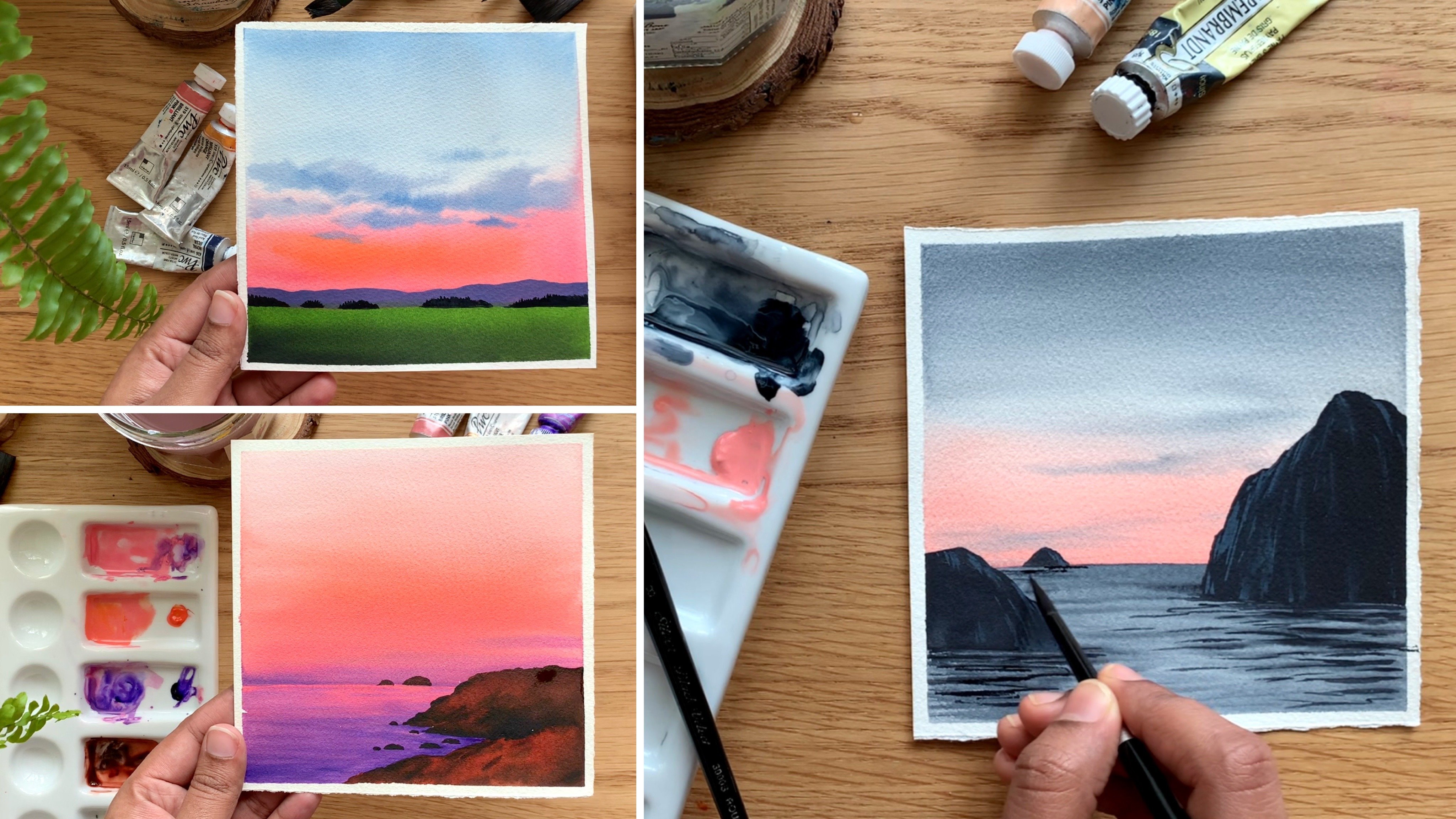
8. DAY 3 - Sunset Road: [MUSIC] Our next project is
a simple and moody evening. Honestly, I'm not someone who love to work with mute colors, but this one was an exception. I absolutely love the
way it has turned out. First, I will take you through
the colors you will need. I'll start with the
color for the sky. You can see it's a dull brown. This one is more
like burnt umber, but I've just added a little of permanent brown with Payne's
gray to create that color. If you have burnt umber,
you can use that as it is. I'm using the same color
for the mountain as well. First I will mix and
create that color. I don't have enough paint there, so I'll squeeze out some brown
as well as Payne's gray, and I will show you
how to mix that. I have taken out some permanent
brown onto my palette. Now I'm adding a little
of Payne's gray to it , just a little. It has to be more brownish, than grayish so don't
add a lot of Payne's gray and that's a color. See that it's a gorgeous
brown, a moody brown. That's a color we'll
be using for the sky. Now, the second color
that I'm going to use is permanent yellow, orange. You can see that yellowish
orange at the middle. I'm just cleaning my brush and I'll show you the second color. This is the one permanent
yellow orange from Shanghai. Just like the name says, it's a yellowish orange. If you don't have this color,
there is nothing to worry. You can just add a little
of orange to any of the yellow and create
a similar color. That's a second color. I'll be using this color towards
the bottom part of the sky. Now there's one more
color that you will need, which is red. To make the sky a bit
more interesting, I'll be adding some pyrrole
red towards the bottom. You can see that color
here, just a little. If you don't have pyrrole
red, you can use vermilion. The sky is going to be a
blend of three colors; a muddy brown, permanent yellow, orange, and some red. Those are the three colors
I'll be using for the sky. Now for the landscape, I'll
be using sap green and also some olive green color with just a mix of
orange and sap green. You can see that
towards the bottom over here and also over here. That's a mix of sap green and
permanent yellow, orange. Finally, for the road, I'll be using Payne's gray. That's our last color. We'll be applying a lighter
gray onto the entire road. Then to create that texture
and that feel of a road, we'll be adding
some deeper tones. Those are the colors you
will need for this painting. It's not a pleasant and
a vibrant color palette. They are quite moody and dull, but I think it has
its own beauty. Grab all the colors and get
ready to start painting. I'm starting by adding a sketch. We need to add the horizon line, then the road and
also the mountain. Now I'm adding a
beautiful curvy road, so that's a shape
I'm going with. It is narrow towards
the horizon line and wider towards the bottom. See that? Adding a similar road, give it a beautiful
curve like this. We can see it is wider
towards the bottom. So that's a road, now we can
start adding the mountain. Towards the left
side, I'm making it a little low-lying mountain. As I'm approaching the right
side, I will make it higher. You can go to any
shape that you prefer, it doesn't need to
be exactly like this. That's a mountain. Now, along the horizon line, we'll need to add
some landscape. You really don't need to
add a sketch right now, we can fill that up
when we are painting. We will be adding some
teeny tiny landscape along the horizon line using
a darker tone of green, something like this. That isn't really necessary, we can fix it when
we are painting. That's a sketch,
I will just erase this and we can start painting. First, I'm going to
take out the colors for the sky to create
that muddy brown. I'm going to mix a
little of permanent brown and Payne's gray. Squeezing out of the
top permanent brown as well as the Payne's gray. If you have burned umber
you can use that as it is, or you can mix and create
your own muddy brown , that's a first color. Along with that, you will also need some permanent yellow, orange or yellowish orange, any color that you prefer. Then you will also
need some red. The one I'm using
is pyrrole red. You can use permanent red or
any other red you have got. I have the colors ready. Now for the sky, I'm going to go with a bit on wet technique, which means I'll be applying cold water using my
one-inch wash brush. I'm putting some clean water and applying an even coat of water onto the entire your sky. You don't need a lot of water, we just need a shiny coat. My sky is evenly wet. Now, I'm going to start
applying the paint onto the sky before the
background layer dries. To apply the paint, I'm using my flat brush and I'm mixing a little of
brown with Payne's gray. That's the color I'm
using for the sky. It's not really a common color that everyone use for the sky. But to create a moody
and a quiet evening, I think this color
is just perfect. See that, so I'm applying that color onto the
top part of my sky. Now as I'm coming
towards the bottom, I'm making it lighter. I'm not picking any new paint. I used a medium tone. Now I'm cleaning my brush and I'm making the rest
of the area lighter. Basically we start with
a gradient wash. You can see on the top I
have a medium tone and towards the bottom,
I have made it lighter. Now with a clean
brush I'm picking some yellowish orange and I'm adding that
towards the bottom. It's again a medium tone
that I'm using here, it's not a bright color. Now using the same brush, I'm going to pick some
red and I will apply that towards the bottom
closer to the mountain. Now, gently blend that
with the yellowish orange, and that's our sky. For the sky, we used
the blending technique. We used three colors;
a muddy brown, a yellowish orange
as well as some red towards the bottom.
That's our sky. Now we can leave it for drying [MUSIC] The sky has dried completely and this is how the colors
have turned out. They are looking very
soft and subtle, I'm really happy with it. Now, the next step is
to paint a mountain. As I said earlier,
I'm going to use that muddy brown for
the mountain again. I only have a little
paint left on my palette so I'll
just make use of that. For this, I'm using my
medium-sized strong brush, and I'm picking
that muddy brown. It's the same tonal
value that I'm using. It's not a darker tone. We're trying to
make it look like this mountain is
in the background, so don't use a darker tone, go with the medium tone
or a lighter tone. The shape of the
mountain that you added earlier might not
be really visible. Go with an approximate
shape and add that in. On the right side, I
have made it a bit higher and towards the left, I'm making it lower, see that. Now fill in your mountain. When you're painting
the mountain, try to read in some of
the red color on the sky. We haven't added a lot, but that color is what makes
the sky more beautiful. Rating some of the red color, wherever you're making
your mountain lower, this can be retained. On the other side
we have no choice, we will have to
cover up that red. That's a mountain. Now we'll need to leave this for drying before we go to the
next step. [MUSIC] We have painted the sky
as well as the mountains. I'm really happy
with the colors, especially the red color here. Now the next step is
to paint the road. For that, I will need
some Payne's gray. I will start with a medium tone. Then after that,
I'll be applying some darker tones to
create some texture. I'm squeezing out some
Payne's gray onto my palette. Now using a medium-sized
tone brush, I'm going to apply paint onto the entire road adding some
water into your paint, and turn that into
a medium tone. Don't make it too dark, and don't make it
too light as well. But that's the color
I'm going with. Go to similar toner value, now apply that following the outline of your
road. Just fill it up. Try to retain that curly
shape for the road. That is what makes your
painting look more beautiful. Because we don't have a lot of elements and we don't
have a lot of details, so just try and get a
curly shape for your road, which has to be narrow towards the horizon line and
wider towards the bottom. That's the basic
shape of the road. Now onto this wet background, before it dries I'm
going to drop in some darker tones to create some texture otherwise
it will look quite plain so I'm picking up
a little darker tone. The same color is a darker
tone of Payne's gray, and I'm randomly adding some deeper tones onto
that wet background. See that? In a similar way. Just keep adding some lines, especially towards the bottom. Don't add any towards
the horizon line. You need to retain
that lighter tone closer to the horizon line. Then we have that narrow curl, within the lighter tone, and only towards the bottom
drop in some darker tones. Just drag that in and create some random deeper tones
on that wet background. When this dries, it will
leave a beautiful texture. Let's leave it for drying. [MUSIC] This is the texture we have got and I think
it looks pretty nice, especially the bottom part where we have the deeper tones. Now the final task is
to add the landscape. We have two sections here, a smaller section on the top and a wider one at the bottom. We need to paint these two
sections following the curve. For that, I'm going to
squeeze out some sap green. I already have some
orange on my palette. I'll be using that as well
to create a moody green. We are painting an evening
scene so I don't want to use a lot of bright
and bold colors. Some painters just
love yellowish orange. Then I'm adding that with sap green to create a dull
olive-green color. Now I'm going to
apply this color I created along the bottom
part of the landscape. Towards the bottom,
I'm using this color. Towards the top, I will
use a darker tone. I have just added a little. Now I'm picking
some Payne's gray, mixing that with sap green
to create a darker green, and for the rest of the area, I'm going to use
that darker tone. Towards this corner, I'm
using the darker shade. You can see here towards
further the end, I used a darker tone and towards the area
which is closer to us, I used a lighter tone. Now I'm going to fill that
top part in this color, and I will blend it. You don't need to put
a lot of effort here, start with that lighter tone, add that towards the bottom, then towards the corner, and also towards the top, switch to a darker tone, and just add that in. Now along the top part, I'm going to add a
small landscape shape. See that? It's a
very random shape. I just want to make it look
like there are some plants, or some trees over here. Now, I'm just pushing
that into the background, and I'm just merging it. Seem all right. Now to make
it a bit more interesting, what I'm going to
do is I'm going to pick that darker tone again, and at some places, I will make this landscape
a bit more higher. It's not a big detail, but that high differences will make it more realistic
and beautiful. At the center, I made
it a bit more taller. Similarly, if you want
to make this corner more taller, you could do that. I'm adding some more
landscape here using that darker tone just
to create interest. That's the top section. Now, in a similar
way, we need to paint the bottom part as well. It's a very simple step and the beauty is in those
colors we have used here. I think that green
is going very well with the color of the
sky and the mountain. Anyway, before I go
with the other section, I will just add some
teeny-tiny patterns onto this corner as well. I'm just adding some
teeny-tiny shapes using the tip of my brush. It doesn't need to have any
particular size or shape. These are quite far away so there's no need to
put a lot of effort. When you keep adding
those teeny-tiny patterns close to each other, it will automatically feel like a landscape or bushes or trees. Now in a similar way, I'm filling up this corner. I'm using that darker tone. Now I'm filling the
shape of the road. We need that beautiful curl
that needs to be retained. Be a little careful when
you're adding the shape. The rest is just filling it up. Only when you are
adding that shape when you're defining
the shape of the road, be a little careful. That's a darker tone. Now using the same brush I'm picking that olive
green I created. You don't need to wash
your brush in between, you can directly pick the paint. Anyways, we will be
matching and blending the colors so it doesn't
need to be cleaned. You can pick the paint with the same brush without washing. I have added paint
towards that outer line. I didn't follow a clean line. I wanted to make it
look more natural. I have gone with an irregular shape just to give it the feel that there are some grass or some other plants over there. Now, I'm filling that area. You can see on the top there the areas closer
to the mountain. I used a darker tone. Now towards the bottom, as it is much more closer to us, I'm using a medium
tone of green. When you don't have
a lot of elements or a lot of details
in your painting, these little things can
add a lot of value. With a sensible play of
colors and tonal values, we can add a lot of depth and
dimension to the painting. Now I'm picking some
Payne's gray and I'm adding that onto the
bottom right corner. You can see that darker green. I already have that green in my background and also
some on my brush. I didn't have to
create darker green. When I picked the Payne's gray, it automatically turned
into darker green. Technically, it has
to be a darker green. We can see the color here and you can see that
beautiful transition. We have a lighter green on
the top, then a medium green, and a darker green
towards the corner, as well as onto the top. That's it, my dear friends, we are done with our painting. Honestly, I'm really happy with the color palette I
use for this painting. When I started, I wasn't really sure whether
it will turn out great or it is just going
to be another trial. But, yeah, I feel it turned out pretty well and it's
a beautiful evening. I really want to go on a walk on that road to see that
moody and pretty sky. Anyway, so this is wrap-up time, so let's peel up
the masking tape. Peel the masking tape only
when the background has dried completely otherwise you
might rip off your paper. Give it enough time to dry and always peel it at an angle. Be very gentle, don't rush. [MUSIC] That's our painting. I hope you all enjoyed it. It's a simple yet a
beautiful sunset. Maybe to make it a
little more interesting, you can add some birds
flying off to their nests. It's a color palette that
I would have never tried. I think this challenge
is giving me opportunities to
explore new colors, which I never tried before or I wasn't really sure whether I
will be able to pull it off. It's a fun and exciting
challenge for me also. Thanks a lot for joining. I hope you all had a relaxing time. [MUSIC]
9. DAY 4 - Fresh Air: [MUSIC] Next we're
going to paint a simple bright blue
sky and a paddy field. You can see those beautiful
colors I have used too, they look really fresh and vibrant as the really simple painting
get a beautiful one. Anyway, I will take you through the colors you will
need before we start. As you could see here, I have used a blue color for the sky. Then we have a cloud
at the bottom, the white you see there,
it's a paper white. We'll be adding
some shadow here, other than that, the cloud
is your paper white. This is color I'm going
to use for the sky, it is certainly in
blue from ShinHan. It's a beautiful color
to use for the sky. I just love this color. [NOISE] Every time I'm
painting a day sky, this is the first
color I reach out for and I think you
can see that from the condition of my tube itself. That it's a very pretty blue. If you don't have cerulean blue, you can use any other
blue for the sky. We just need a medium tone, it could be cobalt
blue, Persian blue, Taylor blue, or any other blue, [NOISE] so that was color. The second color
is Payne's gray. We just need a lighter tone to add the shadow of the clouds. This one is from
Rembrandt and also I'll be using that to add
the deeper tones along the horizon line. I'll just take out a
bit of Payne's gray. For the shadow of the clouds, I'll be using a
really light tone, you can see that here so
that is Payne's gray. If you don't have Payne's gray, there's nothing to worry, go with a really light on
black to add the clouds, so that's our second color. [NOISE] The next set of colors
you will need are greens, you can see those two different tonal values
of green at the bottom. The lighter one leaf green. This is again one of my most
favorite color from ShinHan. Again, this one also
had used quite a lot. This one is leaf green from ShinHan if you don't
have leaf green, it is absolutely fine, you can create a
similar color by adding a little of sap
green into lemon yellow. We just need a light green. Then the next green you
see here is a sap green, I'll be using that to
add the medium tones. [NOISE] The beauty of this painting is those fresh
colors I have used here, so try your best to go
with similar colors. I hope you all have sap green, so that's just a matter of
creating that leaf green, if you don't have it,
you can either add some lemon yellow or
any other kind of yellow into sap green to
create a similar color. Those are four colors you
will need for this painting. Now for the mountain, I'll be using a mix of cerulean
blue, and Payne's gray. This one is more or
less like indigo, if you have indigo, you
can use it as it is. As I already had some Payne's gray and cerulean
blue on my palette, it was very easy to
create this color. I don't want to take out
indigo for that purpose. If you want to use indigo, you can use indigo as it is or you can just mix a little
of Payne's gray with any of the blue that you use for the sky to create indigo kind of color so those are the colors you'll need
for today's painting. As I said earlier,
if you have indigo, you can use that as it is
or you can mix and create this color by adding a little of cerulean
blue into Payne's gray. Now it's time to give it a try, so I have my paper ready here. First I will start by
adding horizon line, which can be a little bit
the center of the paper, just add a straight line. Now when you're
painting, we'll be adding a mountain above the horizon line but you
don't need to add right now, so it's going to be
somewhere over here. There is no need
to add the sketch, we can add that
in your painting. Now, I'm going to squeeze out
the colors onto my palette. We already spoke about the
colors and as I mentioned, for the sky, I'll be
using cerulean blue, you can use any other
blue we have got. I'm going to squeeze
out a bit of cerulean blue onto my palette. The next color you will
need is Payne's gray, which is to add the
shadow of the clouds, this is the one I'm going to use and it's from the
brand Rembrandt. I will squeeze out that as well. The colors are
ready for the sky. Now for the sky, I'm going
to use wet on wet technique, which means we need to apply
an even coat of water onto the entire sky, and for that, I'm using my one-inch
wash brush and picking some clean water and
applying that onto the sky. I'm running my brush
multiple times just to be sure the coat
of water's even. I just need a shiny coat, I don't want pools of water, so this sky's evenly wet. Now we can start
applying the paint. For that, I'm using a
medium-size round brush, this one is size Number
eight round brush. [NOISE] I'm just making
sure it is clean add a picking a medium
tone of cerulean blue. That's the color
I'm going to use. Now for the sky,
I'm planning to add one huge cloud somewhere
at the bottom. We're just going to leave that white space at the bottom, there we have the cloud
and we're going to add the paint onto
the entire top part. First, add an outline
of the cloud. I'm just going with a
random shape like this. I started from the left and it's going to be a little
higher on the right, that's just a rough shape. Now, I'm filling up
the remaining area on the top using that medium
tone of cerulean blue. Just fill it up as a solid wash, there is nothing to worry
here, just fill it up. That's the first step, this one is a very simple cloudy sky, even if you haven't
painted clouds before, I think this one
can be done quite easily. That's the first step. I have applied blue
onto that top part, living a shape of the cloud. Now, I'm going to wash
the paint from my brush, [NOISE] clean your
brush thoroughly, and try to switch to a lighter
tone of Payne's gray. Use really light tone, don't pick a lot of paint. Now using this color, I'm
going to add some shadows. If you feel your
paint is too watery, dab it on a paper towel, that seems a bit too dark, so I'm adding some more water, so that's a color
we should be using. Now simply add some random
shapes at the bottom, so just add that in. Now, dab it between
a paper towel and smudge it to make it
look a little more softer. Now if you want to add more, you could do that, otherwise,
using a clean brush, you can just match it
into the background just run a damp brush on top of those patterns to
give it a more softer feel. I'm quite happy with the sky, but I think maybe I can
drop in a bit more gray, especially onto the right side where we have this
bigger cluster. I'm dropping in a bit more gray, my background is still wet. The shadows are
not too prominent, so I'm not going to smudge it but there's one last thing
that I'm going to do. For that, I'm cleaning my brush, I'm dabbing it on a paper towel. Right now my brush is clean, it doesn't have any paint on it. Now using that brush, I'm just picking some
paint along the shape of the cloud just to give
them more prominent look. See that my brush is
absolutely clean, now I'm just picking some paint to give that
cloud a better shape. Earlier the paint
was floating down and I didn't had a proper
shape for the cloud, now they're looking
a lot better. Now there are some paint
missing on this corner, I'm just fixing
that, and that's it, that's our beautiful, cloudy
sky. It's an easy one. Right now, you might not be
able to get the real feel of that blue cloudy sky but when we paint the full cloud and we paint those green paddy field, you will see that
beautiful contrast and this will look
even more beautiful. Now let's take a quick break and leave this for
drying. [MUSIC] [MUSIC] Oh my God, look at that. You can see how
beautiful this guy has turned out and the
colors are dry. It is looking a lot more
softer than earlier. The only thing I'm not really
happy with is this Kano, that I have that
bleed, but don't mind. I'm happy with the result. I'm just going to ignore that. Now, the next step is to paint a mountain right above
the horizon line, which is below the cloud. I'm going to add that
somewhere over here. It's not a huge one. It's going to be
in the background, so we'll use a lighter tone. I have some payne's gray
and cerulean blue here, so I'm just going to
mix them together. This is an easy way to create a color which is
similar to indigo. If you have indigo, you can
use that color as it is. By mixing cerulean
blue and payne's gray, you will get a color which
is very similar to indigo. That's what I have created here. Now, I'm adding some water
because I need a lighter tone. The mountains in the background, so don't use a darker value. I want to show you the
color I have created. See that, it is very
much similar to indigo. That's a color I'm going
to use for the mountain, but it has to be a little
more lighter than this. I'm picking some water, adding that with the color
I have created here. Now, let's add in the mountain. Start by defining the
shape of the mountain. You see that color,
that's what I'm using. Now, fill that mountain. Maybe it can be a little
lighter than this. I think this is a bit darker. If you're just starting
out with your mountain, make it a little more
lighter than this. Now fill it up and add a
straight line at the bottom. There are two things you
need to be careful about, one is the tonal value. It shouldn't be too dark and it shouldn't be too light as well. If it's too light, you won't get that contrast with the sky. Go with the color
which is similar to this or a bit lighter. The second thing is the
size of the mountain. Go with a similar height, don't make it too huge. Those are the two things you
have to be careful about. Now [MUSIC] let's
leave this for drying. That has dried completely. Next we can start
painting the paddy field. For that I'm starting
now with leaf green. It's a very fresh
and tender green. First I will apply
an even wash of this color onto the
anterior field. Then onto that, introduce some
texture and some details. I will add some sap green. Now, just in case if you
don't have leaf green, there' s nothing to worry. You can just add a teeny
bit of sap green into lemon yellow and you can
create a similar color. There is nothing to worry if
you don't have leaf green. Now, I'm going to pick my
medium-sized round brush. I'm just going to
apply a flat wash of this leaf green onto the
anterior paddy field. Many brands have similar green, but the name might be different,
but that doesn't matter. Just check the color you have got and if it's a lighter green, just use that as it is. Or you can create a
similar green by adding a little of sap green
into lemon yellow. They have tried the same in
the color palette section, so if you have any doubt,
you can refer back to that. I'm going to apply
an even wash of leaf green onto the anterior
paddy field quickly. [MUSIC] That is done. Now I'm going to
quickly pick some sap green and I'm going to add that
along the bottom part, right about masking tape and I'm blending that
into the leaf green. You see that? Go with the medium tone
and apply that along the bottom part and
make it a smooth blend. Now with the same color, I'm going to add a line, an inclined line. You see that? Our background is still wet, so this way when you
apply the paint, it will have a softer
and a smoother field. You can see the difference
those medium tones made, it is looking a lot realistic
right now than earlier. Now, in a similar
way, if you want to make it more prominent, you can add some more paint. But you have to do this
before the background dries, otherwise, they won't have a softer and a smoother field. If you want to, you can add
in some more paint along the bottom or along
that inclined line. Now, the same paint, I'm adding few more lines
closer to the horizon line. See that, they're
much more thinner, not as thick as
the previous one. It's a very simple step, but to get the right result, you have to apply the lines
before the background dries. Be really quick if you feel like your
background is drying. I'm in love with those colors, the fresh blue and
the fresh green. It is already looking
really beautiful, but there is one more task left. We need to add some
more details around the horizon line to
make it look complete, but that can be done only while the background
has completely dried. [MUSIC] Now it's time to go to the last step, this one has dried completely. For that, I'm choosing my
smallest sized round brush. This one is size
number 6 hand brush. Now, we're going to
add some details along the horizon line using
a darker tone of green. To create the darker tone, I'm mixing a little payne's
gray with sap green. You can either make some
payne's gray or some indigo, we just need a darker tone. Create a darker tone using
a smaller size brush, add some teeny tiny details
along the horizon line. For this one as well,
you should be very careful about the size
that you're adding. Don't make it too huge. These are the trees and
plants that are far away. In order to get that sense of distance and depth
in your painting, it is very important to
go with the smaller size. First you can add in a line, then you can add some
random shapes on the top. It doesn't need to have any
particular shape or anything. Just simply add some
teeny tiny shapes using the tip of your brush. You see that. You can see how gorgeous that area is looking when we added those details. In a similar way, we need to add details along the horizon line. At some places maybe you
can make it a little higher and at some places
you can make it lower. This way it will have
a more realistic feel. Quickly add that in. This is the step, but this will be done
with our painting. Maybe you can add the
horizon line first, just using that darker
green, adding a line. Then right above
that you can add in those teeny-tiny shapes. You can see here I'm
adding the horizon line. Now, write about this, I'm going to add the landscape. I hope the idea is clear, it is pretty simple. You can go with any kind
of shape that you prefer, but don't make it too huge, that's the only thing you
need to keep in mind. Also go with a darker
tone of green. Using any of your
smallest size brush or a brush with a blunter tip. Keep adding those
tiny random shapes on the top and finish
your horizon line. [MUSIC] That is done. Now, using the same brush
and the same paint, I'm going to add
some more details below the horizon line. We have added these medium
tones along the paddy field. Right about that, I'm adding some teeny tiny shapes and I'm just extending this
towards the right side. This is just to
make our painting a little more interesting. If you don't want to add
those, that's totally okay. You can just add
those details along the horizon line
and call it done. I'm adding a few more. You can see the size,
they are really small. When you are adding this,
you should have a tiny gap between the horizon line
and also these patterns. If there is no gap, don't add it. See that? I have a tiny gap in between. That is the beauty
of those details. If you cannot achieve
that gap, don't add it. I'm really happy with the
way this painting has turned out, especially
the colors. The colors are
looking really fresh. Even the sky, it was a
very simple cloudy sky. I hope you-all enjoyed painting this simple bright blue
sky and the paddy field. Now I'm going to peel
off the masking tape. [MUSIC] Here's our painting. I can't tell you how much
I love those colors. They are looking so
fresh and vibrant. Thank you so much for joining. If you need to try this, do give it a try and I'm very sure you're
going to love it. [MUSIC]
10. DAY 5 - By the Seaside: [MUSIC] Today we're trying another simple beach landscape. Let's have a look at
the colors first. As you can see here for the sky, I have these two colors, a blue on the top, and an orange at the bottom. The blue is royal blue, and orange is brilliant orange. We need a medium to lighter
tone of watercolors. Then to add the shadows, I'll be using a little
of Payne's gray. I will also be
using Payne's gray to add the details
at the bottom. The darker tone you see here. Along with Payne's gray,
you will also need some sap green to finish
up the landscape. Those are the colors
you will need. Now other swatch out one by one. I will start with royal blue. It's a bright and
beautiful blue, especially if you use that and its strongest form without
adding a lot of water. Right here, I'm going with a medium tone to a lighter tone, you can see the color
on the painting. In this case, you can use any
other blue of your choice. It can be Prussian blue, cobalt blue, ultramarine blue, or any other blue. We just need a medium to lighter tone of blue for the sky. That can be any
blue, don't worry, if you don't have royal
blue That's a color if you start in its strongest form without adding a lot of water. But as you can see
here for the painting, we're not using
that strong color. It's a really lighter
tone that we're using. As I mentioned,
it doesn't really matter which blue you are using. The second color you
will need is orange. Again, a really lighter tone. You can use a lighter
tone of [inaudible] or any other kind of orange. Those are the two colors
we'll be using for the sky. This is for the
background layer. Now, along with this, we'll
also be adding few clouds, which you can see on the
right side of the sky. It's really light
tone of Payne's gray. For all the skies we did so far, we only did a gradient wash
or a blending technique. Today, we are going to
add a little of clouds onto it to make it a
ledger interesting. It's not a complicated step. I will guide you through,
so don't worry about it. Those are the three colors
we'll be using for the sky. Now come sap green, which is the color I'll be using for the landscape
at the bottom. We'll be turning back into olive green by mixing some orange. Now the color you see
for the sea here, is actually a mix of sap
green and royal blue. You'll get a beautiful
turquoise color when mixing sap
green and any blue. See that, that's a color
I'll be using for the sea. If you want to use
turquoise blue as it is, you could do that
or you can just mix any blue that I'm using for the sky with a little of sap green to create a similar color. The idea is, using
very limited colors, not squeezing out
a lot of colors on your palette, and
confusing yourself. For this painting
here, we are only using four colors technically, but we'll be mixing
sap green and royal blue to create that beautiful blue you
see at the bottom, and we'll also be mixing
some sap green with orange to create that
pretty olive green. Take out any blue, any orange, it can be lena or scarlet
or any other orange, then some Payne's gray
and also some sap green. Those are the only four
colors you will need. Now let's give it a try. I have my paper and
a clean palette. I have all the colors ready, the brushes and two
jars of clean water. Now, I'm going to start
by adding this case, which is just some simple lines. First, we need to
add a horizon line, then we need to add
those small mountains. Then we need to show that
landscape at the bottom, which is just an irregular line. That's my horizon line. Now I'm going to
add irregular line. By adding this line,
we are going to separate the sea as
well as the landscape. The area you see in-between
the horizon line, and the line we
added right now it's a sea Now we need to add some small mountains
along the horizon line, which is not really necessary. You can add them
when we're painting. But if you want to add them, you can go ahead and add them in. We want to give a feel that these mountains are really far, so go the similar size if
you're adding the sketch. That's a sketch. Now I'm going
to squeeze out the colors. For the sky, I will need two
colors for the base layer, which can be any
blue and any orange. We just need a medium
to lighter tone of those two colors. First, I'm going to squeeze
out some royal blue. Now I will squeeze out
some brilliant orange. Again, it can be any
blue and any orange, because the colors
that I'm using here are not really common. It doesn't comes in the
basic watercolor sets. The old beginner artist me. If I hear these color names, I might panic and I might not
even attempt that painting, hearing those fancy
names for the colors. That's something I wanted
to make you clear. You can use any
orange and any blue, we are just using a medium tone. It doesn't really matter which blue and
orange you're using. their reason is going
to be almost the same. Now the next color you
will need is Payne's gray. Different brands have different
names for their colors, for example, Brilliant oranges, cadmium oranges, and
some other brands. Anyway, let's start our journey. To apply a coat of
water onto the sky, I'm using a one-inch wash brush. You're trying a simple
wet on wet sky. Pick some water with
any of your clean brush and apply that evenly
onto the entire sky, add that along the horizon line. Just make it even by running
your brush multiple times. My sky is evenly wet. Now we can start
applying the paint. The base layer is a blend
of blue and orange, a lighter tone, and
to apply that colors, I'm using my flat brush. First, I'm picking a
medium tone of blue. It's not too dark and
too too light as well. Start with a medium tone, then as you're reaching
the center of the paper, I mean center of the sky, you can make it lighter.
You see the color? It is quite similar
to Prussian blue. I will apply a bit more paint, then I will make it lighter. Whenever you're
painting a clean blend, always try to run your brush
in horizontal direction. Don't mix up different
brush moments. This might leave some
brush marks in your sky, and you won't be able to get
that clean, beautiful blend. Now I'm cleaning my brush. Using some clean water, I'm making the rest
of the area lighter. Just gently run your brush back and forth in a
horizontal direction. That's the first color. Now
I'm cleaning my brush again, just to be sure there's
no blue paint on it. Now I'm picking a
lighter tone of orange. I'm adding that along
the horizon line. We just need a lighter tone. See the color? That's tonal
value I'm going with. Know where these two
colors are meeting. Try to make it a clean blend. That's a base layer. Now I'm going to keep this brush aside. I'm switching to a
smaller round brush. Just make sure that's clean. I think this one had
some yellow paint on it. Now I'm picking a lighter
tone of Payne's gray, or really lighter tone. The tonal values something has to be really careful about. We just need a lighter tone and shouldn't be
too watery as well. Once you have taken the paint, you can dab it on a paper towel to be sure it is not too watery. You can keep adding
some small clouds. See that? Keep adding them until you're
happy with the result. I'm not planning to add a lot. I don't want to make the
sky look too dramatic, so I'm just adding
a few lines towards the right side using a
lighter tone of Payne's gray. If use a darker tone, they'll be too prominent, and the sky will start
to look a bit dramatic. Depending on the sky you want, you can choose to go
to a darker tone, or a lighter tone like this. I want a soft and simple sky, that's why I'm using
a lighter tone. That's my sky. I'm
pretty happy with it. It looks really soft and simple, just the way how I
wanted it to be. Now let's leave it for drying. [MUSIC] The sky looks
even more simple and soft right now when
the colors dried. Anyway, our next step
is to paint the sea. For what I wanted
turquoise kind of a color, and to [inaudible] color, I'm going to mix sap
green with royal blue. You can make sap green with any of the blue that you
use for the sky. It doesn't need
to be royal blue, Persian blue, or any other blue. By mixing sap green
with any blue, you will create a
beautiful greenish blue. That is exactly what we're
going to do right now. Just don't worry if your
blue is different from mine. [NOISE] Now I'm picking
a little of blue, and let love sap green as well, and I'm mixing them together. I'm adding some more blue
because the color is really greenish. That looks nice. Let's factor out this
color on a scrap piece of paper so you will
have a better idea. Here is the color that I
created. Such a beautiful color. Now to the same mix, if you add more blue, the color will look
slightly different. See that? This one
has more blue in it. Now we need a lighter
tone of this. This one looks a bit brighter. I'm adding two drops of water. Let's add that color
onto the entire scene. Add it along the horizon line, and simply fill up
that entire area in a solid wash. Maybe we can
make it a bit more lighter. Now I'm just filling
that entire area. This color is a mix of
sap green and royal blue. As I mentioned earlier,
you can mix any blue with sap green to create
a similar shade. Now fill it up and leave
for drying. [MUSIC] [MUSIC] That has dried. Now our next step is to add
in some texture onto the sea. Right now, it looks
quite flat and plane. I'm using the same color
that I created earlier and I'm adding some teeny tiny
lines onto the entire sea. They are not too bold and they're not too
prominent as well. See that? Add a thin line using a medium tone of the
color we used earlier. Now simply add them in and
fill up the entire scene. This one is a very simple task, but might be a bit
time-consuming. If you want to take
a break in-between, feel free to do that. You can see the way
how I'm adding them, but it's nothing to worry here. You simply need to keep on
adding that short thin lines. See that? Keep adding them. This is just a created texture, otherwise the sea will look
quite blank and lifeless. Keep adding them until you feel like [MUSIC] it
has got a texture. Now closer to the horizon line, I'm adding a few more using a slightly darker
tone, not too dark. It is, again a medium tone,
you can see the color. That's the tonal
value you should be using because we're going to add a mountain along
the horizon line right about these areas. When we add those lines using
a slightly brighter tone, it will look like
the reflection, so we don't need to go ahead and add the reflection later. Just add few more lines and
with that, we are done. That is done. Now
using the same color, I'm going to add the
mountains, which is far away. We don't need a darker tone. Maybe you can add in a little of blue or we can use the
same color as it is. Now let's add in the mountains. I'm planning to add
one at the center and two longer mountains
on either side. You can add them
how you want to, but the only thing you
need to keep in mind is the size and the tonal value. Don't make it too huge, go with a similar size, and also a similar tonal value. That's the one on the left side. Now, I'm going to
add another one at the center, a smaller one. After this, I will add one
more towards right side. [MUSIC] Let's do it [MUSIC] That is done. Now the only task left is to paint the
landscape at the bottom for which I'm going to use the olive green color
towards the bottom. Then onto the top, I
will use Payne's Gray. I already have some orange on my palette and some
sap green as well. If you don't want
to use olive green, you can use sap green
as it is, but for me, I thought it's nice to bring
in that muted green to the painting rather than
using a bright green. You see my size
number 8 round brush. I'm mixing orange and green together to create olive green. You can see it's a
more earthy green. Now using that green, I'm going to fill
up the bottom part. Then as I go towards the top, I will use some sap green, as well as Payne's Gray to
introduce some darker tones. It's a beautiful earthy green, depending on the amount of
orange that you're adding, the color will look slightly different, but
that's totally okay. Now towards the top, I'm going to introduce
some sap green, just to give it some freshness. For this step, you can
use a medium brush or a bigger brush so that I can apply the paint onto a larger area quite quickly. When you use a smaller brush, you will have to run
your brush multiple times and that might
leave some brush marks. Anyways, now I'm going to
introduce the darker tone. I'm picking some sap
green mixing that with Payne's Gray and I'm adding
that towards the the top. Just add some teeny
tiny shapes on the top and fill up
the remaining area. We only have a little area left. Keep adding some tiny patterns
like this using the tip of your brush and fill
it up and blend that with the green. See that? Now in a similar way, we need
to finish this entire line. The color that I'm
using right now as a mix of Payne's
Gray and sap green. I just created a darker green and I'm adding that onto this
area we have on the top. The first step is to add
those different tonal values of green onto the background. Now you can pick up some olive green that
you created earlier. What we need to do is, we need to simply keep on pushing and pulling
the paint into each other to create some
texture here. See that? Just drag your brush from top to bottom and add in
some random patterns. While the background is too wet, don't wait for a lot of time. This doesn't need to look super
clean and evenly planted. You can keep adding your paint onto that wet background before it dries so that it
won't be too prominent. It will just spread into the background leaving
some soft mark. Keep adding your paint and create some random
patterns like this. Now I'm adding some grassy lines from the bottom towards the top. My background is still wet, so this won't be too prominent. Keep adding those long
curvy lines using that medium tone until you feel like you have
got a grassy texture. Mine is starting to dry, so I'm just going
to call it done. Now in-between in case if your background
is starting to dry, you can just apply a little
more olive green towards the bottom and just
one more layer of paint to make
the background wet. Then you can keep adding
those darker tones again. If your background
is starting to dry, there is nothing to worry. You can apply another layer
and repeat the same step. We're actually done
with our painting, but there is one last
thing I would like to do. I feel like those mountains
we added earlier, they are looking really dull. Into the same color, I'm
adding some blue blue and I'm going to add another
layer on top of it to make it a little
more prominent. This one is really optional. If your mountains are looking
quite prominent already, you can just skip the step. For me, I felt like it is
good to add another layer. Everyone's perception
is different. You might not feel that way, you might be happy with
the result already. In that case, don't touch it, just call it down and
fill up the [inaudible] and enjoy your painting. For me, for some reason, I felt it can be a
bit more brighter. I might be wrong, maybe you like lighter colors or maybe you already used a brighter
color like this. Just look at your painting
and decide accordingly. That's it. Here is our
painting for day 5. There are some color combinations
and some subjects which gives you a feel that you have just come back
from a vacation. I think this painting
is such a kind. By looking at the painting,
I can really feel that fresh air and the
calming sound waves. I really enjoyed painting this, I hope you all did too. Here is our painting, a relaxing day by the beach. Look at that, such a
beautiful color palette. [MUSIC] I really like the sky, especially the colors we have used and also that olive
green color we created. That also turned
out pretty nice. Anyway, that's a beautiful
color combination and a beautiful painting too. I hope you all liked it and I hope you all had
a relaxing time.
11. DAY 6 - Rocky Mountains: [MUSIC] Our next project
is a simple summer sky and gorgeous rocky mountains. I really like the color
palette for this one, especially that blue sky
against those rocky mountain. Anyway, before we start, let me show you the
colors I'm going to use. For the sky, I'm going
to use cerulean blue. I'm very sure some of you
might have guessed it already. It's a beautiful blue. I'll be starting with a
medium tone at the top, then towards the bottom, I'll be just adding some
lines. We just need a blue. It can be any blue we have got. It could be Prussian blue, cobalt blue, ultramarine
blue, or any other blue. That's the color we'll
be using for the sky. The next set of
colors you will need is the brown and oranges, which you can see from
the painting itself. For the crown part, I'll be using yellow
ocher mostly, for the base layer. I hope you-all
have yellow ocher. If you don't have yellow ocher, you can just add a little of brown or brown sienna
into any of the yellow, and you can create a
slightly earthy yellow. That is second color. Then you will need a little of orange. I'll be using orange as the base layer for
the mountains, then a little for
the ground as well. This one I'm using here
is brilliant orange. You can use any
orange you have got. I was too lazy to squeeze out more paint. That's the color. If you don't have orange,
you can use vermilion. [NOISE] Now next two colors
you will need is brown, as well as Payne's gray. I'll be using brown
for the medium tones. If you don't have brown,
go with brown sienna. Finally, we have Payne's gray, which is a color
I'll be using to add the deeper tones,
and finally tilts. If you don't have Payne's gray, you know the color to
use, you can use black. That's summarized the
colors you will need for this quick and easy
summer day painting. This is a yellow ocher I'm
using, it's is from Shanghai. Now, I think the rest of the
colors, you know already. This one is brilliant orange. Again, from Shanghai, then I have brown from
Art Philosophy, this one is permanent brown. Finally, Payne's
gray from Rembrandt. Those are the colors. As I said earlier, you can go with any other blue for the sky. Then instead of
brilliant orange, you can use vermilion
or any other orange. Then again instead of brown, you can use brown sienna. Quickly go get your colors
ready and let's start. First of all, start
by adding the sketch. I already have my paper. I'm adding the horizon line a little below the
center of the paper. The majority of the
painting is going to be the sky and we have
a little crown, and then two rocky mountains
towards right side. On the left side, I have left some space and I'm adding
them towards the right. But if you prefer adding
them on the left, that is totally your choice. Those things doesn't
really matter. Now I'm adding another
one closer to the side. You can modify the
shape if you want to. That's the shape I'm going with. I'm happy with this one, but I think I can make the
other one a little taller. If you're not really
happy with the shape of your mountains, you can tweak them
and we are painting. For now, just add
in a basic shape. We just want to
indicate the locations. The sketch is ready. Now we'll be adding
some deeper tones along these lines,
and we're painting. Over here, we'll be using
more of yellow ocher. That's the sketch.
Now for the sky, I'm going to use cerulean
blue, as I mentioned earlier. If you have been
watching my classes, you will know my love
for cerulean blue. But if you don't have cerulean blue, that
is totally okay. You can use any other
blue you have got. We just need a letter. I
have to garner the paint. Now we're going to go
for a baton wet sky, which means you will
have to wet your paper. For that, I'm picking
my wash brush. I'm applying a clean cooler
water onto the anterior sky. You don't need to
leave the mountain. You can apply your water
on top of that as well. Pick any of your clean brush
and dip your brushes on clean water and apply an even colder water
onto the anterior sky. We don't want pools of water, we just need a shiny coat. Let me brush multiple
times just to be sure there is
no pools of water. My sky is evenly wet. Now to apply the paint, I'm going to use a round brush. I'm using my size
Number 8 brush. You can use any of your
bigger sized brush or a medium-size brush. Size Number 8 or size
Number 10 is perfect. Now I'm picking a medium
tone of cerulean blue. It's a beautiful blue
to use for the skies, especially those
summer day skies. Now, I'm going to apply
that on the top of my sky. See that, such a
beautiful color. Now I'm applying this medium
tone only on the top. As I'm coming down, I'm cleaning my
brush and I'm making it lighter using
some clean water. Now, while I'm making the color lighter, along with that, I'm also adding some lines on the sky just to give it
an interesting look. If you want to pick some paint, you could do that as well. Pick a little of paint, add in some brighter
lines to that. You can see how interesting
the sky is starting to look. Now I'm adding
some more lines at the bottom closer
to the mountain. This is just a modification
of the gradient technique. I started with a medium tone, then I made the color lighter. As I'm coming down
using the same paint, I added some lines on the sky just to give it an
interesting feel. Now towards this corner,
I'm adding some blue. That's it. That's our sky. That's the basic idea. Start with a medium tone, then make your color lighter
as you're coming down. Along with that, you can
add some line also using that lighter tone of blue to make your sky look
more interesting. Now, in case if you add any paint onto the mountain,
that is totally okay. Mostly, we'll be using medium tones and darker
tones for the mountain. Even if you add any paint, it won't show up. There is nothing to
worry about that. Now, I'm just
pushing and pulling the color and I'm adding few
more lines on this side. It's a simple
technique and you can create a beautiful sky
using this technique. The technique that
we used here is actually the gradient wash. But along with making
the color lighter, we simply added some lines onto the sky just to give it
an interesting feel. You can see how gorgeous
this area has turned out. I'm really liking the sky and the color is also
really beautiful. The beauty of the sky is those
white spaces in-between. If you're happy with the sky, never go over again. Just leave it for drying. What you have is the
result. Give it a try. Maybe you can try it
on a scrap piece of paper if you're not confident. If you're not getting it right, there's nothing to worry. Just go for a simple
gradient wash and that will also be
equally beautiful. [MUSIC] The sky has dried completely and I cannot tell you how
much I like this color. It actually turned out much
beautiful than I expected. Anyway, our next task
is to paint the ground, and after that we can
paint the mountains. First, I'm going to
squeeze out the colors. I will need some orange. The orange I'm using
is brilliant orange. You can use vomelian instead. We'll be using this color
mostly for the mountain. For the ground, I'll be using a little just to
add some texture. Then you will need yellow ocher, which is going to
be the major color that we're going to
use for the ground. Along with the yellow
ocher and orange, you will also need some
brown or brown sienna, and a little of Payne's gray to add the medium tones as
well as the texture. I already have brown and
Payne's gray on my palette. Keep your colors ready. Now the first step is
to apply a flat wash of yellow ocher onto
the entire area. Just apply that onto
that entire ground. You can use any of
your medium-size brush or a bigger size brush. Apply that as an even layer. Now onto this wet layer, I'm going to introduce
some texture by adding some brown
and some orange. First, apply a flat wash of yellow ocher onto
the anterior ground. Then you can switch to
brown ceaner or brown. Pick a little of that, go with a medium tone and simply apply that towards
the bottom of the ground. It doesn't need to be perfect, it doesn't need to
be a clean blend. Just keep adding those texture. Now let's keep adding
more and more textures to make it look
more interesting. I'm picking a
slightly darker tone and I'm adding some more random patterns towards the right side. The left side, I'm
leaving as it is. I want some lighter
tones on the left side. Now, I'm just matching
that into the background. This type doesn't have a rule
or any particular order. You can keep adding those
textures as if you like. Add my sienna brown
towards the bottom. I feel like making this area
more darker and [inaudible]. Now, using the same brush, I'm just merging them
into the background. All I want is the same textures. Otherwise, it won't
look like round. Now picking some orange, and in a similar way, I'm adding some patterns
onto the ground. The only thing you need
to be careful here is to add those patterns while your
background is still wet. Otherwise they will
look to prominent. We don't want them
to be prominent. That's why we're adding
them on a wet background. Now, I'm going to introduce a little of darker tint as well. I'm picking a little
of Payne's gray. Mixing that with brown, and I'm adding few deeper tones towards this bottom corner. If you're already
happy with the result, you can just leave it as it is. You don't need to
add in more texture. I just felt like adding some deeper tones
onto this corner. Just a little only on
this right corner. That's it. Now what I'm going to do is I'm going to
clean my brush, and I'm going to dab
that on a paper towel. It's a clean damp brush. Now I'm smudging all those patterns that
have applied here. Just keep running
your damp brush on top of those patterns. Don't put a lot of pressure. Be very gentle. This will smoothen out all those patterns. See that? Keep repeating the same steps until you're
happy with your background. When you're done, leave the background
for drying. [MUSIC]. [MUSIC] The ground has dried. Next, I'm going to paint the mountains forward jump
starting with orange. As I mentioned at the beginning, if you don't have any orange, you can use Vermoline. Now, apply a medium tone of that onto the anterior mountain. You can follow the
shape we have added there and also if you
want to modify the shape, you could do that right now. Go for an interesting shape and fill that anterior shape
and orange, a medium tone. Don't make it too dark and don't make it too light as well. Go with a similar tonal
value and fill it up. Now onto this wet background, I'm going to apply some textures for Bhuj am using some brown, if you have brown, you can use brown or you can
use burnt sienna. I'm going to take
out some more paint. Now let's quickly add in some medium tone so while at
the back on the silhouette, pick a medium tone
on your brush and just keep adding some random
lines and some patterns, from the top towards the bottom, just drag your brush and add in some rough
patterns like this. Similarly, you can add them from the bottom and go
towards the top. Don't fill up that
entire orange. We need to see that orange
color also in between. We'll just add
some brown texture from the top and also
from the bottom. Now in a similar way, I'm going to paint
the other one. This is just the base layer. We'll be adding more
deeper tones onto that. I'm picking some orange again and I'm filling the other
mountain and orange. Go to medium tone and follow the shape you have added
[MUSIC] and fill it up. Now I'm picking some
brown, a medium tone, and I'm just adding
some lines onto the surface from the top
and also from the bottom. See that? Just keep adding
some lines from the bottom to the top and from the top towards the bottom and you can see how beautiful it
is looking already. I think we can add
a little more on this font using a
slightly darker tone. The background is still wet, so I'm just making yourself the time and I'm adding
few more patterns. We're just trying to
create some texture here, and for the same reason, there is no need to
put a lot of effort. Just keep adding those
medium tones onto the wet background and
just leave it for trying. There is no need to
blend it or ****** it. Just leave it as it is. [MUSIC] Let it dry. [MUSIC] The background
has dried completely. It already looks quite nice, but to make it extra beautiful, we're going to add
in some texture. For that, we will
need a darker tone of brown and I'm using my size
number 6 round brush here. I'm mixing some brown with Payne's gray to
create a darker tone. Using that color, I'm
going to add some lines. These ones are going
to be much more prominent because the
background has dried right now. Earlier the background
was completely wet when we add those patterns. Now if you look at the
shape of a mountain, you can see these little drops. Onto those areas, I'm adding a deeper tone. Choose any of your
medium-size brush or a smallest size brush and pick a darker tone of brown on your brush and add some
lines onto those oranges. Similarly, onto the
next one, asphalt, I'm going to add some deeper
tones. From this part. I'm adding a darker line towards the bottom and also towards the other side as
well so just add some irregular lines from
the top towards the bottom. Now we can add another one here. Just defining the
shape of the mountain by adding those deeper tones. Now you can see they're
looking very prominent. There's a trick to make them
look more soft and septum. Once you have added
your deeper tones, we will take out another brush. This one is my size
number 8 round brush and I'm picking a
little of orange. Very little, and on that paint and smudging
those patterns, see that they are looking much more soft and
subdued right now. Just gently submerge it
into the background. That's how we're going
to be the mountain. It's a very simple step. First, you need to add
those darker tones along those ridges and that caps
and pick up another brush, and smudge those patterns. Now in a similar way, I'm going to add
some deeper tones onto the other mountain as well. You can add in as many
deeper tones as you want. But try to read in that orange
color we have in between. Don't fill up that
entire background. We need to see
some lighter tones and medium tones
and darker tones. This all those different
tonal values which will make your model look more
realistic and more beautiful. Try to retain a lot of
orange color in between. Now, let's add some deeper
tones onto other mountain. Onto all those ridges, I'm adding the deeper tones. It is just some lines that I'm adding from the top
towards the bottom. It doesn't need to be a
perfectly shaped line. It can be a little thicker at some places and thinner
at some places. Just type them in a
very random way so I'm adding another thick line
here and maybe another one. See that? That's how I have
added the deeper tones. Now using a damp brush, I'm just matching it. I'm not putting a lot
of pressure and gently smashing them to give it
a little smarter feel. This practice doesn't
have any pain. It is just lightly turned. This magic task is
not really necessary only if you want to give it a more smoother look,
you could do that. Otherwise, you can just
leave it as it is. Now in a similar way, I'm adding few deeper
tones towards the bottom. I'm not adding a lot. I just need some patterns
at the bottom. See that? Those are our mountains. I think they're
looking quite nice. If you feel like
there's a need to add more darker tones,
you could do that. Otherwise, I think
we're in a good shape. We don't need to add
any more patterns. Everything actually come
down to your perception. Take a look at your
painting and if you feel like you need to add more
patterns, you could do that. Otherwise, you can
just call it done. You don't need to
add more details just because I'm doing it. Now there's one last
thing I want to do, which is adding some try
patterns on the ground. I'm dabbing my brush on a paper towel to remove the
excess amount of water. I want a dry paint. I'm just adding some
little patterns here and there in
a very random way. We're just trying to create
some more texture on the ground so we
don't need a lot, just add in few here and there, and also be sure to
use a dry paint. You can simply dab your brush on a paper towel and you can
easily turn your brush into a dry brush and let that dry brush keep adding some type patterns
and that's it. We are done with our painting. The most interesting part of this painting is
those mountains. You can see how beautiful
they have turned out. Those deeper tones we added
really made it a friend's. It made the mountain really
prominent and realistic and the blue sky is
really looking good against those brown mountains. Honestly, I feel this one has turned out really beautiful. I really liked this part of the sky where we had those
white lines in between. I think the simply a clear sky, which you can use in your
future paintings too. Anyway, now it's
time to peel off the masking tape and
[MUSIC] have a look at the [inaudible] painting and here is it. I'm very much happy with
the way it just turned out. I hope you guys enjoyed it too. If you haven't tried it yet, do give it a try and I'm
very sure you're going to allow the simple
summary painting. [MUSIC]
12. DAY 7 - Lighthouse: Our next project is a simple
lighthouse by the seaside. It's a simple, clean, and a very relaxing painting. There is no complicated
techniques, and there isn't a
lot of details. Still, it's a gorgeous
painting. That's what I think. Anyway, let me take you through
the colors you will need. For the sky as well
as for the sea, I'm using the same
color, which is indigo. [NOISE] I do want a
pleasant blue for the sky, that's the reason why
I'm using indigo. But you can use cobalt
blue or Prussian blue or any other blue of your choice if you want a more brighter result. That's the first color, indigo. The one I'm using
is from Sennelier. [NOISE] Now the next color
you will need is brown. You can either use
brown or burnt sienna. First, we'll be applying
a solid wash of brown onto your rocks. Then onto that to
create some texture, I will be applying
some Payne's gray. Obviously, Payne's gray
is our next color. [NOISE] If you don't have
Payne's gray, just use black. We're just trying to add some deeper tones and some textures. That is Payne's gray
from Rembrandt. Now, we need one color. I have this red color
for the lighthouse, which is pyrrole red.
This is the one. The entire painting is a
little dull and simple, so I thought of introducing a striking color onto
that lighthouse. You can either use any kind of red or crimson or vermilion. Those are the colors you will
need for today's painting. As I said earlier,
you can go for any other blue of your
choice for the sky. It doesn't need to be indigo. Then you will need
brown or burnt sienna, then black or Payne's gray, and some sort of red
or crimson or orange. You will just need four
colors for today's painting. Now it's time to give it a try. For today's painting, we need to add a pencil sketch. It's a simple one. There is nothing
complicated here. First, we need to start
by adding horizon line, which is a straight line a little below the
center of the paper. Now we need to add the rocks. On the right side,
I'm making it a bit higher and towards the left, I'm making it lower. The space you see
in-between is a sea. Now the next thing we need
to add is a lighthouse, which I'm planning to
add on the right side. For now, you just need to add that simple shape of the rock. We can add the deeper tones and textures while
we are painting. For now, simply add
a shape like this. Now, we can add the lighthouse. I'm adding an inclined
line towards either side. Now adding another
straight line on the top. That's the basic shape
of the lighthouse. Now on the top, I'm adding
that roof structure, which is a triangular shape. Now, we can add some
divisions onto this. I'm adding five divisions. Depending on the
length, you can add five or six divisions. We'll be using red and
white alternately. That's a basic sketch. Now we can add those openings
onto the alternate ones. The ones where I
have added the door, I'm planning to go for white, and for the other ones, I think I will use red.
That's the sketch. I have all the
colors ready here. Now I'm going to
start by applying a coat of water onto
the entire sky. [NOISE] Using my
one-inch wash brush, apply a clean coat of water. Whichever be the color that
you're using for the sky whether it's cobalt
blue, ultramarine blue, Prussian blue, or any
other blue just keep it ready before you apply
water onto the sky. You can add water on
top of the lighthouse. You don't need to leave it. I have applied a clean even coat of water onto the entire sky. Now to apply the paint, I'm using my size
number 8 round brush. Go for any of your medium too because I have
a round brush. It can be size
number 8 or 6 or 10. I don't have enough paint. I need to squeeze out some
more indigo onto my palette. Now, I'm starting off
with a medium tone, and I will apply that
on the top of my sky. As I'm coming down, I
will make it lighter. This sky is very much similar to the one we tried in
the previous painting. For their [inaudible], we
use the same technique. We started out with
a medium tone. Now, I'm adding some lines onto the wet background
using a lighter tone. Towards the bottom, try to go
with a similar tonal value. Don't make it too dark. Just start with a medium tone. Then onto the rest of the area, simply add some lines
using a lighter tone. That's our sky. [MUSIC] Now, we can leave this for drying. [MUSIC] The sky has dried completely and this
is how it has turned out. I'm very much happy with it. It's a simple technique,
but because of those white spaces in between, the sky will have a
very beautiful effect. Anyway, next, our
task is to paint the sea for which again, I'm starting off with indigo. First, I will apply
a medium tone of indigo onto the entire sea, and then with the horizon line, try to draw a straight line. We're not going to
add any mountain or any other details over here, so try to go for
a straight line. Now following the
outline of the rock, fill up indigo onto the entire
sea. That's a first step. Now, we'll have to
wait for this to dry before we add
the next details. But meanwhile, we can
paint the lighthouse, the base layer, for which
again, I'm using indigo. I already have some
indigo on my brush. But we don't need a medium tone, we need a lighter tone. If it's a medium tone, pick some water and make it lighter, and add that along the left
side of the lighthouse. First, add in a line. See that? Now clean your brush and make it lighter
towards the right side. [NOISE] Just make it
lighter towards the right. For the lighthouse,
we are trying to use a classic color
combination red and white. That's the reason why
I told you to make the sky lighter over this area. Otherwise, you won't
be able to create that white color effect for
the lighthouse. That's it. Now we can leave this for
drying. [MUSIC] That is dried. Now, we're going to
add the details onto the lighthouse as
the last one to the sea. I will
start with the sea. For that, I'm picking a
medium tone of indigo. Using that color, I'm
going to simply add some lines onto the entire sea. We tried the same technique in one of our previous painting. Simply add some tiny lines onto the entire sea to
create some texture. There are two things you
need to keep in mind; one is the tonal value. Don't use a darker tone
to add these lines. Go for a medium tone, which is slightly darker than the color you have used
for the background. The second thing is the
thickness of these lines. Make them as thin and
delicate as possible. Don't make it too bold. You can use a smaller
brush or a brush with a pointed tip so
that you will get those thin and delicate lines. Now quickly fill up that
entire area. [MUSIC] So that is done, you can see we have got some texture there. Now let that dry.
Meanwhile we can start adding the remaining
details onto the lighthouse. For that, you will need some
red or crimson or vermilion, any color of your choice. This is the one I'm going
to use, it is partial red. We don't need a lot, we
just need a tiny bit. So squeeze out some
paint onto your palette. So pick the color
you want to use, and which will be the
color that you'll see? Go with that intense shade, don't add a lot of water. We want the lightest to be
really bright and prominent, and also make sure the
base layer has dried. Now onto the alternate sections, we're going to add red. So the first one is white, the second one is red. Follow that outline
and add in the paint. Maybe you can use the
smaller size brush for this so that it can carefully
apply the paint. The shape is really important. So I've simply applied
red onto that section. Now using the same brush, I'm going to pick some brown. And I'm going to
add that towards the left side, see that? So start with red or
crimson or vermilion, then onto the left, add
in some deeper tones. Right now I'm using brown. Again, onto the same side, I'm adding some
Payne's gray as well, it's mix of brown
and Payne's gray. It's more like a darker tone. So simply I have a darker
tone onto the left side. Now using the same brush, I'm going to add a
deeper tone first. So I'm adding that towards the left side of
the next section. Once I'm done adding
the deeper tone, I will wash my brush and I
will switch to the right, then I will fill up
the remaining area. So you can either go with this method or you can
first add red first, then you can add in
your deeper tones. I went in the other
way because I had that leftover
paint on my brush. So the basic idea is having some deeper tones
on the left side, you can follow any
method that you like. So the deeper tone
that I have used here is a darker tone of brown. I have mixed a little
of Payne's gray and brown to create
a darker tone. I can mix Payne's gray
directly with your red, whether it's crimson
or vermilion, you can just create
a deeper tone and add that onto the left side. So that's our lighthouse. Next, I'm going to start
painting the rocks for which I'm going to use my
medium-sized round brush. Use a medium-size brush
or a bigger size brush, don't use a smaller brush. Now pick a medium tone of
brown or burnt sienna. This is the one I'm using, it is permanent brown
from Art Philosophy. Now create a medium tone
of brown or burnt sienna, which will be the color
you have with you, and fill up that medium tone onto the entire bottom section. So we have created
an outline there. For that outline and adding
a medium tone of brown or burnt sienna and fill
up that entire area. It's just a solid wash. So simply fill that up. If you're using a bigger
brush or a medium-size brush, you'll be able to
apply paint onto that entire area quite quickly. If you see a smaller brush, it might take a bit of time and by the time you have
finished adding the paint, the area you started
first might have dried. That's the main reason why
it's a great idea to use a bigger brush to apply
paint onto the background. Anyway, that's our background. Now using the same brush, I'm creating a darker
tone of brown. I'll make some Payne's
gray with brown. Using that, I'm going to drop in some deeper tone onto
this wet background. I think I might need to
take some more brown. If you're using burnt sienna, just mix a little of
Payne's gray with burnt sienna and
create a darker tone. Or you can use burnt
umber directly. But just to create a little
interesting feature, I divided that rock
into two sections. Now I'm adding deeper
tones on the top section, then we have a lighthouse. This doesn't need to have
any particular shape or any particular size. Just keep on dropping
that wet paint onto the wet background before
the backroom dries. Now I'm adding few
onto the bottom. This is a very easy technique, you just need to
keep on dropping that deeper tone before
the background dries. That's the only thing we
need to keep in mind. So keep adding that
however you want to. When you adding
those deeper tones, try to leave some
gaps in between. Now I'm adding some
at the bottom. You can see how carelessly
I'm adding that. You don't need to put
a lot of effort here. Just simply adding
new deeper tone. We're only trying to
create some texture here. We just need to see some brown
and some deeper tone and all those different tonal
values. That's only thing. So try not to cover
up the anterior area, leave some gap in-between so that we have
different tonal values. Now I'm adding a little
onto that area where we have a lighthouse and maybe I can drop in some onto this corner as well. That's it. So this one doesn't have
any particular rule or any particular order or
any particular shape. You can just drop in
those deeper tone onto the wet background until
you're happy with the result. I think I can already
see those textures here. I'm happy with the results, but I think I can add some more deeper tones
towards the bottom. But my background has started
to dry, it is not wet. So I think I will
just stop this task, and if we have got
enough textures, this is how it is
looking right now. Next, we're going to
smudge these patterns. I've cleaned my brush and I'm picking a medium
tone of brown again. Now I'm dabbing that
on a paper towel. So it is just slightly done and using that brush and
smudging the paint, I'm just pushing and
pulling the paint into each other to give those textures
a little more smoother look. Keep smudging those paint and the simple trick will
make those textures really beautiful. So no matter how we
have applied paint, once you smudge it, it will have a lovely effect. See that? Now I'm taking a little
darker tone of brown, just a little and I want to add that deeper tone
onto this section here, where we're separating
the top and the bottom. Just a little, it is
just some dry patterns. It is only to differentiate
there are two sections. You don't need to add
a lot of darker tone, just add a little by
you're separating them. So that's the rock, now there's only one task left, for which I'm taking
my smaller size brush. Now we need to add the final
details of the lighthouse. We need to add the
roof structure for which you will need
a smaller size brush or a brush with a pointed tip. Pick some Payne's gray or
a darker tone of brown. First I'm going to add
the roof structure, which is just a
triangular shape. We already have a
sketch there so simply take a darker
tone of brown or Payne's gray on any of your smaller brush and
fill that small triangle. Fill that up. Now we need to add two vertical
lines on either side. Now a horizontal line and
another one at the bottom. Now we can fill this area and some smaller vertical lines. These are the handrails. Now I'm adding another horizontal line. Now some vertical lines on the top and I'm adding some
thickness on either side. Finally, we need to
add the openings, one, two, and the last one. So that's our lighthouse. It's a pretty simple lighthouse. I haven't added a
lot of details. So that's all
painting for the day. I'm really happy with the
rocks and the lighthouse. I think the color combination
is really looking nice, especially the color of
the sea and the rock and that simple lighthouse and the process was
absolutely simple too. I hope you all enjoyed it. [MUSIC] Now it's time to
peel off the masking tape. Here is our painting
for the day. I absolutely loved it, especially the
texture of the rock. It's simple trick, you
just need to smudge the paint and create
those curly textures. Even the lighthouse, it's
a classical accomplishing. I hope you all liked it, and I hope you all
had a relaxing time.
13. DAY 8 - Calm Sea: [MUSIC] Hello dear
friends. Welcome to day 8. Today's painting is a soft, simple, and a beautiful beach. Let's start by looking at
the colors you will need. For the sky, I will
be using two colors. Major part of the sky
is going to be indigo and towards horizon line
I will use one love rose. With the indigo, I'm going
to use this from Sennelier. If you don't have indigo,
you can use Prussian blue. Then this is the rose I'm using. It is permanent
rose from Shannon. Those are the first two
colors you will need indigo and permanent rose. You can go with Prussian
blue and permanent Rose or any other color
combination of your choice. I don't want a very bright and pleasant color for the sky, that's the reason why I'm using indigo so that's
our first color. Once again, color, as I
mentioned, is permanent rose. I only have a little
color on my palette. Will just need a little. We'll be adding
that only towards the horizon line that
are very light tone. Those are the two colors
you will need for the sky. The next two colors
you will need is burnt sienna
and payne's gray. I'll be using a mix of
these two colors for the sand so that one
is burnt sienna. Then you will need payne's gray. The burnt sienna I'm
using here is from [inaudible] The final
color is payne's gray. You can see those rocky
mountains for the base color, I'll be using a medium tone. Then to add some
details and texture, I'll be using a darker tone. As I said earlier,
I'll be using a mix of burnt sienna and payne's
gray for the sand. It is just a mix of
these two colors, I have a little here. Let me show you so
that's a color. Just add a little of
burnt sienna or brown into payne's gray and
create a moody brown. Or you can use burnt
umber as it is. This color is very much
similar to burnt umber so that our final color as
you're painting a beach to add the waves
and the texture on the sea, we will need some white. It can be white watercolor
or white gouache. I'm using white watercolor. If you have gouache, you can use that because it is more opaque. Those are the colors
you will need. If you don't have
permanent rose, you can use crimson
or any other rose. If you don't have integral,
you can use Prussian blue. Now, I'm going to start
by adding the sketch. First ever need to
add the horizon line. After you add the horizon line, we need to add a wave. This is to separate
the sea and the sand. Simply add a wavy line we
can modify the shape later. For now, simply add
a line like this. Now we need to add those
huge rocks far away. Go with a medium
to smaller size, don't make it too big.
That's the first one. Now I'm adding another one. You can add as many as you want and try to cover different
shapes for them. This will make your painting
look more interesting. I'm adding another one towards the right side and that's it. I'm going to take out the
colors onto my palette. I will need indigo as well as
permanent rose for the sky. If you don't have
permanent Rose that has nothing to worry,
just go with crimson. I have the colors ready. For the sky, I'm going to
use water mark technique, which means you need
to apply a clean coat of water onto the entire sky. For that, I'm picking my one-inch wash brush and
I'm dipping my brush in clean water and I'm applying an even coat of
water onto the entire sky. As I always say, we just
need to shiny coat of water, don't add a lot of water. You can just run your brush in all directions so that the
coat of water is even. I have a plateau, shiny coat of water onto the entire sky. You don't need to leave
out those mountains, you can apply water on that. To apply the paint,
I'm going to use my half-inch flat
brush and I'm creating a medium tone of indigo
by adding some water. We need a medium tone.
Don't make it too light and too dark so just a few drops of water and turn indigo or Prussian
blue into medium tone. Let's start applying
this color onto the sky. On the top, I'm going
to apply a medium tone. I'm just running my
brush back and forth in a horizontal direction
to get a clean blend. If you have a flat brush, I would recommend
using a flat brush. This way you can
get a clean blend. Compare it to a round
brush it is much easier to create a blend
with a flat brush. But if you don't
have a flat brush, that's okay, just use a
bigger sized round brush. I have applied paint onto
the top part of the sky. You can see I have
used a medium tone. Now as I'm coming down, I'm making the color lighter. I'm not picking any more paint. To make the color lighter. I'm cleaning my brush and
with some clean water I'm making the color lighter as I'm approaching towards
horizon line. See that? Start with a medium
tone and make the color lighter as you're approaching
the horizon line. Now, we need to switch
to our second color. For that, I'm using a round brush I'm
just making sure that it's clean and I'm picking
a little of permanent Rose. Again, a medium tone. Now let's apply that
along the horizon line. As you can see here, I'm
not leaving the mountain. I'm applying paint on top of it. That's totally okay. I just applied a little arrows
along the horizon line. Now with a clean brush
and making it lighter. Also blending that with
the blue, see that. On the top and the bottom, we have a medium tone. On the top we have a
medium tone of indigo. Along the bottom we have
a medium tone of rose. We made the colors lighter where these two
colors are blending. That's our sky, it's a very
simple yet a beautiful sky. Now we can leave
this for drying. [MUSIC] This guy has
dried completely. I think it's a beautiful
color combination. I'm not 100% happy with
the plant, but never mind. Let's go the next task, which is painting the sea. For the sea as well,
I'm using indigo. If using Prussian blue
go the medium tone, and apply that along
the horizon line, then as you're coming down, you can make it a little lighter. You can see the color I'm using, the tonal value is very much similar to the one
I use for the sky. That's a medium tone of indigo. Now I'm going to clean
my brush and get some clean water and making
the rest lighter, see that. Towards the horizon line, we need a medium tone
and towards the bottom, we have to make it lighter. I think we can bring the paint down until the masking tape. We don't need to leave some cab so using some water I'm
just spreading it out. Now in case if you want to, you can add in some more
paint along the horizon line, just to give it
some more texture. I'm picking a medium tone again, and I'm adding two lines
only along the horizon line, just to give it
some more texture. I'm not adding anywhere else. Now I'm dabbing my brush
on a paper towel and I'm smudging those lines into the
background and that's it. That's our beach.
Now let that dry. [MUSIC] That has
dried completely. Next, we need to
paint these rocks, and also we need to
paint the sand as well. I think first we can
start with the rock, then we can come down
and paint the rest. Now to paint rocks, I'm going to use Payne's gray. Anyway I will keep
the colors ready. I will squeeze out some burnt sienna and Payne's gray onto my palette so that's
burnt sienna. Now we need a little of
Payne's gray as well. The colors are ready.
Now to paint the rocks, I'm going to use the
smaller size brush. This one is my size six
round brush and I'm adding two drops of water to create a medium tone
of Payne's gray. If you don't have Payne's
gray, just go with black and create a medium tone by
adding a few drops of water and simply apply that
onto the rocks we have added to get the shape right it is good to use
the smallest size brush. If using a bigger size
brush to be really careful when you're
adding the paint. Because the size of these
rocks are quite small. Simply fill that in a medium
tone of Payne's gray. Just a solid wash. We can
add the texture later. You can see the tonal
value I'm using here. It's a medium tone,
it's not that light. Now, let's fill up
the other rocks, as well, in a similar
tone and value. [MUSIC] That task is done, I have applied a medium tone of Payne's gray onto all the rocks. If you want to modify the shape, you can do that right now. Next, we're going to
apply some waves and some lines onto the sea
to create some texture. For that we're going
to use indigo, so clean your brush and
switch back to indigo. We have to use a color that is slightly darker than the color we have used otherwise,
it won't be visible. Now, I'm going to simply
add some delicate lines. It shouldn't be too thick because this one
is really far from us, so the color should be a medium tone and the line
should be really thin as well. Close to the rock,
simply add few lines. Those rocks might be still wet, so be careful when
you're adding the lines. I'm not adding a lot of lines, I'm just adding few
closer to the rock. Next, using the same color
I'm going to add some waves. This one can be a bit thick
compared to the other lines. Simply adding few
waves on the beach. I'm adding a second one. Now, I will add few more
random wavy lines like this. You can see if they're a little thick and I'm using
a medium tone. I will add one or two
lines at the bottom as well. That's it. For now, this is all
you need to do, later, we'll be adding
some white texture onto this to complete the waves. Now the next task is
to paint the sand. To paint the sand, I'm mixing some burnt sienna
with Payne's gray. This one is very much
similar to burnt umber. If you have burnt umber, you
can use that directly or just mix a little of
burnt sienna with Payne's gray to
create a muddy brown. Let me spatter the color for you so that you
have a better idea. This is the color. It's a mix of burnt sienna
and Payne's gray. Depending on the amount of burnt sienna or
Payne's gray you add, the color will be slightly
different, but that's okay. Now let's apply
that onto the sand. First, you need
to add that wave, and in a beautiful curvy line. Now the remaining area at the bottom you can
fill up in this color. This line will separate
your sea and the sand. You can modify the
line as you wish. Now let's fill up the rest. [MUSIC] I have added paint onto
that intersection. Now, onto those wet background, we need to add in some texture for which I'm going to
pick some Payne's gray. This needs to be done before
the background dries up, so you will have to
be a little quick. All you need to do is pick
up some Payne's gray, now randomly adding your lines and some random shapes onto the background so that's it. Now what I'm going to do is, I'm dabbing my brush
on a paper towel, and with that damp brush, I'm just merging those
patterns I have added. Just to get a smoother look, I don't want them to
be too prominent. See that. We have got some
beautiful texture here. Simply drop in some Payne's gray or black onto the
wet background. You can just add some
random shapes and lines and once you
have added them, smudge it with a damp brush, and that's the result we have
got some beautiful texture. Now, let this dry
and after that, we can add the final details. [MUSIC] So that has
dried completely. Next, we're going to add
the texture on the rock. Right now we have only
added a base layer, to make it look
more interesting, we need to add some texture. For that, I'm using
a smaller size brush and I'm using a dry paint. I have some Payne's gray here. I have taken that on my brush
and I'm dabbing my brush on a paper towel to remove the
excess amount of water. I need a dry paint. Now using that dry paint, I'm just adding some
texture on these rocks. The color I'm using here is the darker tone, and
it's a dry paint. That's something you have
to be careful about, it doesn't have any water, it is just dry paint. Once you have taken the
paint on your brush, you can dab your brush on
a paper towel multiple times to make sure the paint
doesn't have any water. Then simply add some
texture onto the rock. This is just some dry texture, it doesn't need to have any
particular shape or size. You can simply fill up the
anterior surface of the rock. The only thing you
have to be careful here is not to add them outside the outline so be careful when
you're adding them. Carefully, follow the outline of the rock and add them inside. I have one more left, onto that one as well, I'm just adding
some dry texture. This technique is called
dry brush technique. It is one of my most
favorite technique. You can create gorgeous textures
using this simple trick. I use it quite a
lot for mountains. You can already see those
gorgeous textures we have got. It really looks like
rock. That part is done. Next, we have one
more task left, which is adding the waves. We had tried the
painting earlier, which is similar to this one. Here we have used a
different color for the sand and for the mountains as well we
used a different color. Now we're going
to add the waves, which is very much
similar to this, so you already know
the technique. For that, I'm going to
use white watercolor. You can either use white
watercolor or white gouache. Now let's take out some
paint onto our palette. For this one as well,
we need dry paint, don't add a lot of water. We need an opaque white color. If you're using
gouache or watercolor, go to slightly dry paint. Don't add a lot of water. If you add a lot of water, it won't look opaque and it
wouldn't look like waves. Now you've seen this paint, I'm going to add a wave right above the blue line
that I have added earlier. Just watch out carefully. Using that dry paint, I'm adding a wavy line. It's a broken line. It doesn't need to be a continuous line. At some places, it can
be a little thick, and at some places,
it can be thin. This will make it
look more natural. I'm just adding that on
the other end, see that. Over here I'm making
it a bit thicker. Now I'm breaking it. Just above that line you
added earlier using indigo, simply add a white line again. What happens here
is when you add the white wave above
the blue line, the blue area will
look like the shadow. It's a very simple trick to
create a beautiful wave. Now, let's add few
closer to the rock. I'm using a dry paint here. My paint is not too watery. When you use a dry paint, it will have a natural texture and it will look
like a real wave. Now, I'm adding on the wave above the indigo
line I have added. Again, it's a broken line. As I said earlier, at
some places it can be thin and at some places
you can add a thickness. Also, it doesn't need to be
a perfect continuous line, you can break the
line in between. In a similar way, let's add
the remaining lines as well. I have two more
lines at the bottom, one towards the right and
another one towards the left. Those are the waves far away. Now we need to add
one more towards the bottom line and that is what will
define our painting. For that, you need
a opaque paint. Again, don't add a
lot of water go with a really opaque white
color and along this line, add a thick white line. This one has to be
really prominent. Pick enough of paint on your brush and add
a thick white line, add a beautiful curvy line. If you feel like the colors
aren't opaque enough, you can add one
more line on top of it and make it really
opaque and prominent. That's my wave. There's
one more thing we need to do for which I'm
dabbing my brush on a paper towel to make
the paint really dry. Using that dry paint, I'm adding some texture towards the upper
side of the wave. The bottom line has to be
clean towards the bottom, onto the blue background
just add some white texture. This is again, the
dry brush technique. We are trying to create that
foamy water texture here. Just add some white
dry brush patterns and finish off your painting. That's our painting for the day. It's a common beautiful beach. Now let's remove
the masking tape. [MUSIC] Here's some painting. We can see how beautiful
that turned out. It's a very simple painting, but very little detailed yet it has turned
out really pretty. I hope you all had a relaxing
time painting with me. Thank you so much for joining.
14. DAY 9 - Sunset Beach: [MUSIC] Our next
project is a beautiful sunset at the beach. Just like the other paintings
we have done so far, this one is also quite simple. This one also doesn't involve
any complicated techniques, and we'll start by looking
at the colors you will need. I will start with the sky. For the sky, I will be
using three colors. As you could see here, on the
top you can see a purple. This was a mix of violet
and Permanent Rose. You can create this
color in that way, or we can mix some crimson and Prussian blue
or any other blue. But remember to add
more crimson in your mix so that you
will get a purple shade, otherwise it will look
more like a violet. So that's a color I'll be using. As I mentioned,
it is just to mix of Permanent Rose and violet. These are the two
colors I'll be using. Permanent rose is from Shanahan, and violet is from White Nights. Just mix these two
colors together, or any similar colors
that you have got. The color might be
slightly different according to the mix
that you're using. If you're adding more crimson or more violet or more blue, the color might be slightly
different, but that's okay. Now the second color you
will need is orange. This one is brilliant orange. This is the one, that's again
from the branch in hand. If you don't have
brilliant orange go with any other orange or vermilion. On the top, I'll
be using purple, then towards the center, I'll be using Permanent Rose. Along the horizon line, I will be using orange. Those are the colors I'll
be using for the sky. The next color you will need
is brown or burnt sienna. I'll be using permanent
brown from Art Philosophy. Along with that, we
will also need Paynes gray or black to add
the deeper tones. You can see the colors
from the painting itself. For those huge rocks, I'll be using brown
and Payne's gray. Brown is not a common color. Most of you might have browns in other [inaudible]
but no brown. That's totally okay, I
just go with burnt sienna. This one is more reddish, and burnt sienna is more yellowish, that's
only difference. Obviously the color
will look slightly different because the
pigments are different, but then it is not going
to affect your painting. So those are the colors you will need for
today's painting. As I mentioned, we'll be using
three colors for the sky, purple, Permanent
Rose, and orange. If you don't have Permanent
Rose, go with crimson. Then you will also need brown or burnt sienna, and Payne's gray. That's it. Now let's start. So I'm going to start
by adding the sketch, which is a very simple sketch. First, we need to
add the horizon line to separate the sky and the sea. I'm adding a horizon line slightly below the
center of the paper. Now let's add those huge rocks. I'm going to add one
on the right side. It's a huge rock, you can either go with the
same size and same shape, or you can add that
how will you want to. I'm just adding some lines. We'll be adding our deeper tones when we're painting
in a similar way. Now I'm going to add
the bottom line, and after that, I need to
add a wavy line as well. This is to separate
the sea, and the sand. That's my rock. Now I'm going to
add the wavy line. For this painting, most of the area we're going
to show is the sand, not the sea, so just
add a wavy line. You can see the majority of the area is going
to be the sand. We only have a little
area on the top. So that's our sketch. We
can modify the shape later. You don't need to put a
lot of effort right now. That's the sketch, now I'm going to start
preparing the colors. The first color we
will need is purple, which is a mix of violet
and Permanent Rose. I'm going to mix and
create that color. So we'll start with purple,
then towards the center, we will be using
some Permanent Rose, which can be crimson
or any other rose. Towards the horizon line, I'll be using orange, which can be vermilion or scarlet or any other
orange you have got. I have taken out violet,
and Permanent Rose. Now, I will need
some orange as well. So the colors are ready. Now, I'm going to start by
applying a coat of water onto the entire sky using
my one-inch wash brush. You don't need to leave
out the mountain. Just apply an even coat, and you have to make sure
your brush is clean. I have applied a shiny coat of water onto the anterior sky. Now let's start
applying the paint right away onto the
wet background. For that, I'm using my
half-inch flat brush. First. I need to create
a purple for that, and picking some rose. Now picking some violet,
and mixing them together. Maybe we can add some more rose to make it a brighter purple. Now, let's start
applying that color we made on the top of the sky. You can see how
gorgeous that color is. It's a brighter tone. Now, I'm going to
clean my brush, and I'm picking
the second color, which is Permanent Rose. I only have a lovely
color left here. I think that would be enough.
That's our second color. Now clean your brush again, and pick your final
color, which is orange. I want the color to
be really bright at the bottom along
the horizon line. So I'm starting from there, and I'm going to add a top
blending that with the rose. I will pick some more rose, and I will apply
that at the center, and I'm making it a clean blend. I'm running my brush in a
horizontal way from left to right, and that's it. That's our sky. Now, I'm going to
clean my brush. Before I wrap this up, there is one more thing
that I want to do for which I'm picking a little
of a brighter orange, and I'm adding a little
along the horizon line, only the horizon line. When you add some brighter
tone along the horizon line, it will make your sky
look extra pretty. That's the reason why
I have added that. So that's the sky, before
I leave this for trying. I'm just wiping off this
paint from the border. Otherwise, this
might sip back into the painting and might create some dirty bleed
along the bottom. So that's the sky. Now I'm going to leave this for drying. [MUSIC] That's the sky. I accidentally dropped
a little of water. Never mind, I think I can
add another mountain here, and I can cover that up. Anyways, let's go
to the next task, which is painting the sea. To paint the base layer, I'll be using orange and rose. So I'm starting with orange, it's a medium tone. First I'm applying that
onto the entire sea. You can see the tonal value, it's not too bright. It's a light to medium tone. Now I'm making it lighter, along the bottom line. See that? Now in case if you don't have a proper shape right now,
that's totally okay. We can fix that when
we're painting the sand. So first apply a lighter or a medium tone of orange
onto the entire sea. Now pick some rose, and simply add some wavy lines onto the sea to create
some texture. See that? It's again a medium tone. It's not too bright. Now, let's simply
add few more lines. You can see how I'm
adding those lines. They are very simple wavy lines. For now, this is all we need. Later, we'll be adding more details using a
smaller size brush. At the moment, this
is all we need. So let's leave it
for drying. [MUSIC] [MUSIC] So that's done too. [MUSIC] Next task was
to paint the sand, for which you will need
either brown or bonsina. And some paint scree to
add the deeper tones. Along with these two colors, we will also need
a bit of orange. So if you don't have any
orange left on your palate, take out a little
of that as well. The major color is going to
be brown and paint scree. We just need a little of orange. So don't take out a lot. So I have the colors ready. Now let's start
applying the paint. Now I'm starting with
a brownish orange. So first I'm picking some brown, mixing that with a
little of orange. See that? It's not brown
and it's not orange. It's something in-between. I think it'll be better
if I use my round brush. So I'm switching
to my round brush. So that's the color
I have created. Now, I'm going to apply
that at the bottom. First, I will define
that wavy line. So the top part is the sea
and the bottom is a sand. You can see that
brownish orange. So applying this color
only onto the left. Towards the right, I'm going
to make it more darker. So I have defined the
shape of the wave. Now, I'm going to pick a much
more darker tone of brown. And we'll apply that
on the right side. You don't need to wash all
the paint from your brush. Just pick a darker tone
of brown or bonsina using the same brush and fill up the remaining area
on the right side. While you apply the paint, try to give a beautiful shape
for the wave. See that? Already it is looking
pretty defined. So it's just a matter of adding that wavy line when
you add the paint. Now, again, I'm picking a darker tone and I'm simply
adding some random lines and dots onto the
wet background to create some texture. See that? I'm not adding a
lot of patterns. I just want a little
towards the darker side. So I'm leaving the
orange part as it is. Now, I'm dabbing my
brush on a paper towel. And after that, I'm going
to smash these patterns. So my brush is just done, it doesn't have a lot of paint. And I'm dragging my brush and I'm smudging those patterns. And that's it, that's our sand. It's a pretty simple
step and you can see those collages textures
we have created. If you want to add more
deeper tones or textures, you could do that right now, if your background is still wet. Otherwise, if we're
happy with the result, just leave it for drying. [MUSIC] So this is how it has turned out.
I'm pretty happy with it. Now the next task was
to paint the rocks. I have a huge one
on the right side. Then I need to add
another one on the left to hide the
head water drop. To apply the paint I'm using my medium-sized strong trish. This one is size number eight, and I'm starting off
with a medium tone. Now let's talk about applying
that onto the entire rock. You can see the color that is quite bright. It's
not too light. First carefully apply that
paint along the outline. If you don't have brown
just go with bonsina. So first let's apply
a solid wash of brown or bonsina onto the entire rock. Now we need to quickly apply the deeper tones
while the background is still wet for which I'm
going to use some paint scree. I will simply add
some random lines onto the entire surface. I'm just starting
some incline line. I will add few from
the top to the bottom, and also from the
bottom towards the top. You can see I'm simply
dragging my brush and I'm creating some deeper tones
on the surface of the rock. See that? You can see how
pretty it is looking already. It is just a matter of adding some inclined line
using a deeper tone, on that red background
to create some texture. And this is how it
has turned out. You can see how gorgeous it is. You can use this
technique every time you're painting a
mountain or a rock, it is just a matter of adding those deeper tones while the
background is still wet. Now, using paint scree, I'm just adding some
tiny rocks as well. See that? So simply add some tiny rocks and
stones on the water. Just to make our painting
a little more interesting. Don't add a lot, we
just need a few. These are very small elements, but they will add a lot of
beauty to our painting. You can add them
wherever you want to. Now let's paint the other rock. I'm cleaning my brush and
I'm switching to brown. Right now I have a darker tone, but I want to switch to brown. If you don't want to add
this, it's totally okay. I had dropped some water on
the sky and to hide that, I'm adding on the rock here. I had no plan to
add this all here, but I messed up the sky. So this one is just
to hide my mistake. So that's a basic shape. Now, I'm picking
some paint scree. And I'm adding some
lines onto the surface of the rock to bring
in some texture. Otherwise it will look
quite flat and lifeless. So these deeper tones have a lot of impact on our painting. See that? How easily we
painted a beautiful rock. Now it's just how
we did earlier. We can add some tiny
stones or rocks as well on the sea to make our painting more
interesting. See that? They are super tiny, go
with a similar size. It just being less than 15
minutes since we started, and you can see how beautiful our painting has
turned out already. Sometimes it is not
about adding a lot of details and working with
complex techniques. It is just about picking
the right colors and playing with minimum
amount of details. And this painting is such
a great example for that. Anyways, this is how our
painting has turned out. I'm quite impressed with it. Now there's one last
thing we have to do for which I'm switching to
my smallest size brush. First I will go with
some permanent rose. And I'm going to simply add some more wavy lines on the sea. I feel like there are
some texture lacking. That's the reason why I'm
adding some more lines again. Using some permanent rose, I'm just trying to be adding some wavy lines using
a smaller brush. These lines are quite thin. They're not too
bold and prominent. So my intention is to bring in some more texture without
making them too prominent. That's the reason why I'm
using a smaller size brush. And I'm just randomly adding
some wavy curvy lines. I'm not really putting a lot of attention here. I'm
just adding them. We don't need to
add a lot of lines. If you feel like you're
happy with the result, you can just stop it there. And also, if you feel like you already have enough of texture, you can totally skip the step. I was actually about to wrap up then I looked
at the painting, I felt like there is
some texture lacking. That's the reason why
I decided to add this. It is basically some dry
texture and some thin lines. Now I'm switching to purple. I will add few more
lines, just a few. Then I think I
will call it done. I'm adding them
closer to the rocks. You don't need to put
a lot of attention. It is just that they
have to be really thin, don't make them too prominent. So simply add some wavy lines
and some curvy lines and maybe some dry texture
as well. And that's it. That's our painting for the day. I hope you all liked it. Now, I'm going to peel off the masking tape and I will show you a closer
look of the painting. It's a very quick
and easy painting. [MUSIC] And I think it has
turned out really beautiful. Here's our several painting. I absolutely love the
color combination, and those rocks, there was no complicated techniques
and too much detail. Thank you so much for
joining and I hope you all had a relaxing
time painting with me. [MUSIC]
15. DAY 10 - Bold Evening: [MUSIC] Our next project is a
bright and beautiful sunset with a lush green meadow. I love this painting for the bold and beautiful
colors I have used here. Yet, it is so simple. You don't have any
complex details there. Anyway, let me take
you through the colors you will need for this
gorgeous painting. For the sky, I will be using three colors, as
you can see here. On the top we have violet, then we have a pink,
a bright pink. Then towards the
bottom we have orange. The violet I'm going
to use is this one from White Nights. Then I have Opera
pair from Sennelier. This is a bright pink
you see at the meadow. Then we have brilliant orange
along the horizon line. Those are the three colors I'll be using for the base layer. I will start with violet. This one is from White Nights,
as I mentioned earlier. It is called violet. It's a beautiful
color. That's the one. You can use any
violet you have got or you can mix and
create your own violet. Now, the second color is opera. It's a bright neon pink, which is not a common color. It doesn't come from the
normal watercolor sets. If you don't have this
color, just go with any rose or crimson. The next one is
brilliant orange. Again, it's a bright orange. If you don't have any orange, just go with vermilion. Those are the three colors I'll be using for the base layer. Then I'll be adding
some clouds using violet on top of the base layer. The next two colors
you will need is Payne's gray and sap green. You can use sap green
or Viridian green. If you don't have Payne's
gray, you can use black. Those are the next two
colors you will need. I'll be using a
really bright one of sap green to create
that contrast. You can see the color. While I'm painting, I won't
be adding a lot of water. That is sap green.
It is from Shinhan. Now, the last color you
will need is Payne's gray. This is to add the deeper
tones for the meadow as well as to add those details
along the horizon line. Those are the colors
you will need as a simple color palette. If you want to leave out
one color from the sky, if you want to leave out orange, you could do that or
you can go with just pink and orange or
just violet and rose. Feel free to go with
the colors you like. Now, let's give it a try. I will start by adding a line, which is my horizon line, just to separate the
sky and the ground. I'm adding that a little below
the center of the paper. It is not at the center,
slightly below that. That's my sky and
that's my ground. Now, let's start
preparing the paint. If you don't have a violet,
there's nothing to worry. You can just mix and
create your own violet by adding some Prussian
blue and crimson together. Now you will need opera
pink or any kind of rose, then you will also need
some orange or vermilion. I have the colors
ready for the sky. I I I will take the
other two colors as well, and I will
keep them ready. You will need some sap green as well as some Payne's gray. All the colors are ready. Now, we can start
by applying coat of water onto the entire sky. I have my one inch
flat brush here. I'm deeping that in clean water. I'm applying that
onto the entire sky. We just need a shiny coat of
water. We don't need a lot. Do run your brush
multiple times back and forth just to be sure that
coat of water is even. My sky is evenly wet. Now, we can start
applying the paint. Now, to apply the paint, I'm going to use my
half-inch flat brush. Let's start with violet. I'm going to use a medium tone. It shouldn't be too dark and it shouldn't be
too light as well. Now, let's apply that
on the top of the sky. You can see the tonal
value. It's a medium tone. Start by applying that
on the top of the sky. Now, let's clean our brush
and go with the second color. I'm picking opera rose. You can see that bright pink. Now, let's apply that at the center and blend
that with the violet. Now, again, I'm
cleaning my brush. Let's go to the third color, which is orange, and apply that on the rest of the area and blend
that with rose. We have used three
colors for the sky. We have used medium
tones of all the colors. Now, along the bottom, I'm going to
introduce a slightly brighter tone of orange. Just dropping a brighter tone of orange along the horizon line. Blend that again.
That's our base layer. Now, what I'm going to do is, I'm going to
introduce some clouds onto this wet background. I'm keeping this brush aside and I'm picking my round brush. You can use any of your
medium-sized brush. This one is Size Number 6. Now, again, I'm
picking a medium tone. It shouldn't be too watery. If you feel like
it's too watery, just dab your brush
on a paper towel. Otherwise, when you
add those clouds, they will spread in
a very vigorous way and you won't be able to control the way
they're spreading. See that? That's the
right consistency. It is not spreading too much. Now, you can add new clouds
however you want to. If you want to make
it too dramatic, you can add a lot or if you want a very
soft and a septal sky, you can just add a few. When you drop in your
paint onto the sky, you will understand
the way to spreading. If you feel like it
is spreading a lot, dab your brush again on paper towel and keep
adding the clouds. At one point you will understand which is the right consistency. Especially, if you're a
beginner with watercolor, adding clouds can be a
little difficult task, but you will automatically
pick that in practice. If you don't get it
right in the first try, there is nothing to worry. Just keep it under the cool. Slowly but surely
you will get there. I'm going to add few
more clouds before the background dries then
I'm going to call it done. My background is nearly
starting to dry. That's it. I think that has turned
out pretty nice. I'm really happy with
the color combination as well as the clouds. Now, I'm going to
leave this for drying. [MUSIC] The sky has
dried completely. I'm really happy with it. Now, let's start
painting the meadow. First, I'm going to
apply an even layer of sap green onto the
entire background. Then we can start introducing
the deeper tones. I'm using my Size Number
8 round brush here, and then picking a brighter
tone of sap green. You can see the color,
it isn't that light. I want a bright green
for the meadow. Just apply a flat wash or a solid wash onto the
entire background. If you want to use Viridian
green instead of sap green, that is also totally okay. Just apply a solid wash off
Viridian green or sap green. Then while the
background is still wet, we can introduce a deeper tones. You can use a medium
brush or a bigger brush and apply green onto
the entire background. That's how it has turned out. Now, with the same brush, I'm going to pick a darker tone by mixing some Payne's
gray into sap green. We just need a darker tone. You can either add some Payne's
gray or some indigo into sap green or Viridian green
and create a darker shade. For this to pass well, I'm using the same brown brush. First, I will add
that at the bottom. At the bottom I
want a darker tone, and on the top I
want a medium tone. Let's keep adding that
deeper tone at the bottom. Along with that, I'm also adding some lines
on the background. I think I can make it
a bit more darker. That looks nice. First, add that deeper
tone at the bottom. Then with the same brush, gently add some lines
on the background. I'm just dragging my
brush from right to left and I'm leaving
this area as it is. You can see I haven't added
any lines over there. On the left side, I want to read in some of the lighter tones. I want the right
to be more darker. Now, if you're
background is still wet, you can make those lines more prominent by making
it more darker. Using a slightly darker tone, I'm making those lines
a bit more prominent. See that? I'm simply
running my brush again. Now, they're looking
more prominent. This is a very easy
technique to bring in some texture and some
life to your meadow. Earlier, it was just a flat wash and it was looking lifeless. Now, you can see how easily you brought in some life to it. The only thing is
you need to add these lines while your
background on this to read. Otherwise, they won't spread and they will
look too prominent. Right now they look quite soft and septum, that's what we want. Just make sure to
add these lines while your background
is still wet. That's the only thing you
need to be careful about. Now, I'm going to
leave this for drying. [MUSIC] That has dried completely and colors are looking really
fresh and vibrant. Now, we have only task
left and for that, I'm using my
smallest size brush. I'm picking a darker
tone of green, a much more darker tone. I'm adding more Payne's
gray this time. Right now we're going to
add some details far away. We're just going to
add some landscape along the horizon line. This is what will define
the horizon line. It is nothing complicated. We're simply adding
some random shapes along the horizon line. We're just trying
to show the trees and the plants far away. Go the similar size, don't make it too huge. Also you can see the
color I'm using. It is very much dark. I don't think you can see
any green shade in that. It is super dark. I think it is very much similar
to Payne's gray. Anyway, I'm just using this color and I'm going
to add the landscape. Towards the right side to
make it a little interesting, I made it a bit higher and also I have left
some gap in between. You can either run
your landscape continuously without
breaking that in-between or you can break them and add
different groups, like what I've done here. Those things are
totally up to you, You can add them
however you want to, but try to go with
varying heights. Don't make it the
same throughout. This will make your painting
look more interesting. Now, in a similar way, I'm going to add another
group on the left side. Again, I'm picking that
darker tone of green. Using the tip of my brush, I'm simply adding
a random shape. Just keep pressing the tip of your brush and keep adding
some random patterns. These are really far off, so you don't need to put
a lot of effort here. Just add a random sheet. [MUSIC] That's it. We are done with our
painting for the day. You can see how gorgeous
it has turned out. The best part is that, it took us less than 15 minutes to finish the entire painting, if you leave out
the drying time. Isn't that wonderful? I'm very much happy
with the entire look and fill of the painting. I hope you all enjoyed it too. Now, I'm going to peel
up the masking tape. Here it is. We can see how beautiful the
colors are looking. They are quite bright and prominent compared to
the other paintings we have done so far. If you want to make your
painting look more interesting, you can add some branches, just some sell-out on the top, and also maybe some birds. I just like the painting the way way is so I'm just keeping it simple. That's
all for the day. I hope you all had a lovely time painting this gorgeous sunset. Thanks a lot for joining
and happy painting. [MUSIC]
16. DAY 11 - Mountains & Meadows: [MUSIC] Our next painting is
a gorgeous green landscape, you You see that
lush green meadow and those beautiful mountains. We have only tried one
green landscape earlier, so this one is going to be
a little refreshing one. Anyway, I will start
with the colors you will need for this painting. The first color
is cerulean blue, which is the color I'm
going to use for the sky. You all know my love
for this color. It's a gorgeous blue
to use for the skies. Obviously, if you don't
have cerulean blue, you can go with any other
blue of your choice. It can be cobalt blue, Prussian blue, or
ultramarine blue, or any other blue, and will be just going with
the gradient wash. Now coming to the mountain, I'll be using some indigo. Indigo is beautiful, moody blue, which you can use for skies, cityscapes, and
even for mountains, and also I love to use it
for monochrome painting. So that's our next color. Now, coming to the next, you can see that we'll
have green here. It's again, a mix of sap green and burnt sienna, like
we tried earlier. I'll be just mixing
these two colors to get that olive green. We try the same color in
many of our other paintings. So I'm very sure you guys
are quite confident with this. That's a third color. Now, we also need some leaf
green or any lighter green. On the top of the meadow, I'll be using this color. If you don't have any kind of light green,
that's totally okay. You can just start to
love sap green into lemon yellow and create
a similar color. So that's my fourth color. Finally, you will need
two more colors with the sap green and Payne's gray. You can see that sap
here at the bottom. Along with that, to
add the deeper tones, you will also need Payne's gray. I only have a little
space left on my paper, so I will dispatch
our Payne's gray. These are the colors you will
need for today's painting. We will need any kind
of blue for the sky. Then we will need indigo
for the mountain. Then we will need
an olive green, which is a mix of sap
green and burnt sienna. Then we will need a light green, sap green, and Payne's gray
to add the deeper tones. That's it. That's a color
palette for today's painting. Now it's time to give it a try. I've all the colors
ready on my palette. So I'm starting out
with a pencil sketch. We need to add a
line for the meadow. It's going to be a sloping line. I'm planning to
make it higher on the left and a sloping
down towards the right. Just a gentle slope. Now we need to add
the mountains. We have one mountain in the
background, a snowy mountain. Then we have another green
mountain in the foreground. So we need to add two mountains. First, I'm adding the
mountain in the foreground. Now, I'm going to add
the other mountain. This is going to be right
behind the green mountain. For this, I'm going with
an interesting shape. We can see those
different wrenches. Got the similar shape with
lots of curves and wrenches. We'll be adding snow
onto all these pockets. So it's going to be
really interesting. That's the sketch, now we can
start applying the paint. I'm starting with the sky and it's going to
be wet on wet sky, which means you'll have
to apply cold water. Using my one-inch wash brush, I'm applying a clean cold
water onto the entire sky. I'm not leaving
out the mountain. You can apply water
till that middle line. Just applying even cold have
water onto the entire sky. Now we can start
applying the paint. As I mentioned earlier, I'm going to cerulean blue. To apply the paint, I'm using
my half-inch flat brush. It's a simple gradient wash, so I'm starting
with a medium tone. Apply that on the
top of the sky. I'm running my brush in a horizontal manner
from left to right. I want a smooth, even gradient. Start with a medium tone, and as you're
reaching almost the center, make it lighter. I'm just dabbing my brush on
a paper towel and just using that leftover paint and the water in the background
and making it lighter. See that, it's a
very simple sky. We always see a gradient sky like this in our daily lives. It's a very simple sky that you can use any
other paintings as well. I think the beauty of the sky
is that blue I used here. As I said earlier,
it's a beautiful blue that you can use
in your DS cards. Anyway, that's my sky, I'm just making the
color even at the top. There was some pain missing
in there. That's the sky. Now, let's do this for drying. [MUSIC] The sky has
dried completely. Next, we're going to
paint the mountain, the one in the background. For that, I'm using a
medium tone of indigo. If you don't have indigo, you can just add a little of
Payne's gray into any of the blue and you can turn your
blue into moody blue. So just don't worry, if
you don't have indigo, just add some Payne's gray
into Prussian blue or any other blue that you are
using. Now, let's begin. I'm starting with a medium tone. Looks like there are some
leftover paint on my brush. I'm just cleaning it. I'm
picking some blue again. The indigo I'm using
here is from Sennelier. It's a bluish indigo. Now I'm just following that
outline I have added there. I'm simply filling that in
a medium tone of indigo. You can see the tonal value, it is not too light. The reason is that I'll be
adding some white highlights onto the mountain
to show the snow. If there's a really light
tone for the background, the snow we're adding
won't be visible. That's the reason why I'm
using a medium tone. See that? So go the similar
tonal value and fill up the entire mountain
following the outline. That's a base layer. Now to add some texture, we can drop in some Payne's
gray towards the bottom. This is completely optional. If you don't want
to add it, you can just leave it as it is. That will also give you
a beautiful mountain. But just to give
it some texture, I'm picking a medium
tone of Payne's gray. Maybe a much more lighter,
not a medium tone. I'm adding that
onto the mountain. I'm just adding some
swoopy lines to give it some texture using a really
light tone of Payne's gray. The background is still wet, so they will spread nicely
into the background, giving some texture.
That's the background. As I said earlier, this one
is completely optional. You can just add
a medium tone off indigo onto the entire mountain. Or you can just add some lines with Payne's gray to
give it some texture. [MUSIC] Anyway, now let's
leave this for drying. The base layer has dried. Next, I'm going to
paint the meadow. After that we can
paint the mountain. Because for this we'll be using much more darker values
compared to the meadow. So we can start with the meadow. For the meadow, I'm going to use some leaf green at the top. We need lighter green. You can use any of your lighter green or you can mix
and create your own. Then towards the
bottom, we'll be adding some sap green and also a bit of Payne's gray to
add the deeper tones. Keep the colors ready and take out any of your
medium-sized round brush. Let's start with the leaf green. We have added a sloping
line on the top. Following that line, I'm
adding this leaf green. As I mentioned
earlier, on the top, I want a lighter green, and towards the bottom, I want the green
to be more darker. Let's add a lighter
green on the top. Now as you're coming down, we can switch to sap green and add that on the
remaining area. I'm picking a medium
tone of sap green and I'm adding that on the remaining area and I'm blending that with the
leaf green. See that? Right now we have two different
tonal values of green. We want to make it a bit more
darker towards the bottom. For that, I'm creating a darker green by mixing some Payne's gray
with sap green. Let's add that at the bottom. We need to make the
bottom area darker. Along with that, we'll
also need to add some lines onto this
wet background. If we don't add any lines or any texture onto the meadow, it will look quite flat. First, let's add some
darker tone at the bottom. With the same color, let's track some lines, some inclined line. This is just to give
it some texture. Otherwise, it will look
flat and lifeless. Adding this line is
a simple trick to give your meadow a
life and energy. Onto that wet background, keep adding some lines. Don't get rid of that lighter
tone and medium tone. We want to see them in between. So when you're adding the lines, try to leave some gap
in-between. Yeah, that's it. That's our lush green meadow. Now, we'll have to
wait for this to dry, and after that, we can paint
the green mountains. [MUSIC] [MUSIC] That is right too. Our next task is to
paint this mountain. For this one we're going to
use an olive green color. If you have olive green
with you you can use it directly or we can just mix a little of burnt
sienna with sap green to create a
beautiful olive green. I already have a
little of paint, but that would be enough. I have burnt sienna and
sap green ready there. Now using my medium-size
round brush, I'm going to apply the paint. Just a mix of these two colors, just take out some burnt sienna, mix that with sap green and just check out the
color that you're getting. Depending on the ratio of
sap green and burnt sienna, the color might be
slightly different. I will dispatch all
the color that I made. This is the color. This one has more
burnt sienna on it. Now into the same color, if I add more sap green, the color will be a
little different. I'm just adding some sap
green into the same color. Now, let's see the color. See that? This one is
more like olive green. We just need an earthly
green for the mountain you can just add any color
that you prefer. It can be more brownish or more greenish that is
totally your choice. Now, I'm going to
paint the mountain. I'm planning to add
that greenish color at some places and at some places I will use
that brownish color. This way I will have
different tonal values of green and brown and it will make my
mountain look more natural and realistic. See that? Right now I'm using
a brownish green and I'm just adding
that onto the mountain. There is no particular
order or role here, just simply keep switching
from one color to another and add that
onto your mountain. You can see the tonal value. It isn't that light, it's a medium tone. Now I'm adding that
along the bottom line. I only have a little space
left on the right side, with that I'll be done
with the base layer. Now onto this while the
background is still wet, we need to add in some texture
and some deeper tones. First, fill in your mountain. I have applied paint onto
the entire mountain. Now let's create
a deeper tone of green by mixing a
little of Payne's gray. Now using that
color let's add in some deeper tones and some
textures onto the mountain. I will need some more paint. Now, let's quickly add some deeper tone before
the background dries. I'm picking a little
of Payne's gray, mixing that with green
to create a darker tone. Now, I'm going to gently drop in that onto the wet background. I'm just adding some
thick and thin lines onto the wet background from the
top towards the bottom, and also from the
bottom towards the top. As the background is still wet, the color you're adding
will gently spread into the background leaving
a beautiful texture. We don't need to be
too prominent and they don't need to have any
particular shape or size. Simply dropping that deeper
tone onto the wet background. Be quick, we need to add this before the
background dries. Now, I'm going to drop in some deeper tone from
the bottom and I'll gently drag my brush
towards the top. See that? Looks like my background
has started to dry. It is not wet and the color
is not really spreading. I think I should just
stop what I'm doing right now otherwise it will
look too prominent. Before I leave it for drying, I think I can smudge
those patterns. I'm dabbing brush on a paper
towel and I'm smudging those patterns
because I feel they are too prominent as
my background dry up. I'm simply smudging it to
make it a little softer. That looks quite okay for now. Anyway, let's leave
that for drying. Meanwhile, we can add our
details on the snowy mountain. To add the snow,
obviously you will need some white watercolor
or white gouache. I'm also using my smaller
size brush to add the snow. This is the brush I'm using, it has a very nice pointer tip and I already have some
white watercolor here. I'm just using plain
white watercolor. Gouache and
watercolor both works so you can just go
with any of that. We just need a little so take out that paint
onto your palette. Now we need a thick paint, so don't add a lot of water. We want that white to
be really prominent. Once you have taken the
paint on your brush, dab it on a paper towel
to make your paint dry. We don't need a watery paint, we need a dry paint. Now let's start adding
those dry patterns onto the mountain
in an inclined way. See that? Right now we have
dry paint on our brush. We will end up getting some
beautiful dry patterns on the mountain because we have
dry paint on our brush. Keep adding them in a sloppy
way along all those ridges. We don't need a lot, I'm just adding few on the top. I won't be adding any
towards the bottom. The only thing here
is you should not be adding a lot of water
into your paint. If you add a lot of water, your paint will become loose and it will lose its opacity. Go to opaque and dry paint, and keep adding those
dry patterns onto the mountain until you feel
you're happy with the result. I can already feel
the snow here. I hope you guys are happy
with your painting too. Maybe you can take a step back and have a look
at your painting. Sometimes it's good to take
a break from what you're doing and take a look at your painting from
a different angle. You can get up from you seat and take a step back and just watch your painting from a distance
to understand whether you are getting that perspective
and the details right. It is just for you
to get an idea about how your painting
is coming together. At times it is really
important to take a break and have a look at your painting without just rushing
through the process. I'm very much happy
with the snow effect we have got here. I think I have added enough maybe I can add few
more lines towards the bottom just to give
it a continuation. I think that looks pretty nice. Here's how our painting
has turned out. Next I'm going to add some more texture onto
the green mountain. Let's clean our brush. For that as well, I'm going
with some dry patterns, but this time the
color is not white. I'm going to use a
darker tone of green. I'm mixing a little of sap green with Payne's
gray to create a darker tone and to make it dry I'm going to dab my
brush on a paper towel. Now using that dry paint, I'm going to add some texture
onto the green mountain. This is also in a similar
way I'm just adding some dry patterns from the
top towards the bottom, and also from the
bottom towards the top. Go with a darker tone of
green and dab your brush on a paper towel or a cotton
cloth to make your paint dry. Then simply add some
dry patterns onto the mountain to give
it some extra texture. You don't need to add a lot of patterns and make
your mountain busy. I couldn't really
add a lot of texture earlier because my
background dried up. That's why I'm actually adding. If I had added enough
patterns earlier, I might have skip this step
so have enough patterns, feel free to skip this. Or as I said earlier, take a step back and have a
look at your painting and just decide for yourself
whether you need to add more texture
or you have enough. I'm going to add a little
more towards the top onto this area and with that
I'm going to color down. [MUSIC] Here we are, you can see how beautiful
it has turned already. Now there is one last
thing I want to do, which is adding some
small pine trees. This is just to define
the horizon line. I'm using smaller size brush
and a darker tone of green. I'm starting by adding a
line, a straight line. Now onto either
side of the line, I'm adding some irregular lines. See that? That's my pine tree. It's a very simple one. These are far away, you don't need to put a lot of effort. Simply start by adding
a straight line. Then onto either side, just add some random lines
and that's your tree. If you don't want to
add pine trees that is totally okay you
can skip this step. But they're not difficult
at all, you can paint them. I'll just take out a scrap
piece of paper and I will show the same tree on
a bigger scale so that it is much more easy
for you to understand. Choose any of your smaller
size brush or a brush with a pointer tip and
start by adding a line. Now onto that line, I'm adding some small irregular
lines onto either side. I'm just dragging my brush
towards either side. You can see those lines
are really messy. It doesn't have any
particular size or shape. Let's try again. Add a line. Now onto either side simply keep on adding some irregular lines. See that? Overall when you look at the tree it should
have a triangular shape, so that should be the
overall shape of your tree. A long pointy triangle. Just give it a try, it isn't that difficult. I want you guys to try it if you have never painted pine trees. These ones are quite far so we don't need to put
a lot of effort. You just need to add a straight line then
onto either side, simply keep on adding
some irregular tiny lines and finish up the tree. The only thing you need
to keep in mind is that the overall shape has to
be a pointed triangle, a long pointed triangle. At the first try it
might look a little difficult but it is really easy, so don't give up
just give it a try. It is not a fine
perfect line it is just messy lines that we're
adding onto either side. Once you start adding them
you will see your pine tree. I have added 1, 2, 3, 4, 5, 6 of them. I think I will add
few more towards the left side and with that we'll be done
with our painting. Over here we have a darker
tone in the background, so the trees are
not that visible. Even then I'm just adding it. You can see how
easily I added them. Give it a try and once you add three or four of them
you will get the hang of it. As I said, it is just
some messy lines there is nothing much
complicated here. See that? They are
really messy lines but overall they look like a pine tree and that is
exactly what we need. That's it, we're done with the whole
painting for the day. Now it's time to peel
off the masking tape. [MUSIC] Here is our gorgeous
mountains and the metal. I hope you all
enjoyed the process and had a relaxing
time painting with me. Thank you so much for joining. [MUSIC]
17. DAY 12 - Evening by the Lake: [MUSIC] Our painting
for today is this timing evening by the lake. I absolutely love everything
about this painting. I cannot wait to paint this beautiful evening with you all. Anyway, let's start by looking at the colors you will need. For the sky, I will be
using three colors. On the top you can
see that is violet, then towards the
bottom I have orange, then onto that to
add some clouds, I will also be using some red. So those are the three colors
I'll be using for the sky. Violet is from White
Nights which is the color I've been using
for all the other paintings. Then orange is from ShinHan. Then this is the red,
it's called pyrrole red. Those are the three colors
I'll be using for the sky. If you have violet you can
use it as it is or you can mix and create your
own violet or purple. This one is a gorgeous
violet from White Nights. Now the second color
is brilliant orange. Again, a beautiful color. It's a bold and bright orange. If you don't have orange, just add a little of yellow into vermilion and create
a bright orange. The next color is pyrrole red, if you don't have pyrrole red, you can use scarlett or
vermilion or any other kind of red or maybe crimson as well. So that is pyrrole red
from ShinHan again. For the base layer, we'll
be using violet and orange, and then onto that, we'll be adding some
clouds using red. Now the next color you
will need is brown or burnt sienna to
paint the ground. The one I'm spreading
out right now is brown from Art Philosophy. [NOISE] If you don't
have brown, just go with burnt sienna and finally, you will need Payne's
gray or black to add the final details and also
to add those deeper tones. That's the nice colors you will need for today's painting. I think it's a beautiful
color palette, especially for a sunset but if you want to go for a different color
combination or if you want to modify the
color palette that's totally your choice
feel free to do that. Now before we start,
I want to quickly show you how to paint
the palm trees as well because that's one of
the major element for today's painting and if
you're a complete beginner, this might be a little tricky. I have a scrap piece
of paper here. I had painted some
sky some time back. Anyways, let's try
out the palm tree. First, you need to start
with the tree trunk. It can be a little irregular to make your tree
look more natural. I will add one more line. Adding the tree
trunk is very easy. The only tricky part
would be the palm trees. Anyway, let's try them out. First I'm going to add
a small thickness on the top. See that? It's like small so clashy. Add that toward the top
of your tree trunk. Now, to all of
these tree trunks, I'm going to add some curvy
lines which are going to be those guidelines for the
palm leaves. See that? So simply add some curvy lines. It can be five or six or
seven of them depending on the space you have on your palm tree.
That's the first one. Now for this one, I'm just
adding few towards the top. I'm not adding any palm
leaves hanging down for that. Now for this, let's add
some leaves hanging down. When you're painting a palm
tree, go with different kind of lines for all of the trees. This will make it
look more natural. Those are the basic lines. Now let's start filling them up. Just keep adding
some lines towards the bottom and fill it up. You don't need to fill up the
anterior line try to leave some gap in between to
make it look more natural. See that? It doesn't
need to look perfect simply keep
on filling that. I'm adding them only
towards the outer end. I'm not making it
too dense and thick. I'm just leaving some
space at the center. Want to get the hang of it, painting a palm tree
is really simple, especially the ones like this
which are into detailed. Now if you feel like there
are some gaps in between, you can fill that up and make your tree
look more beautiful. That's the first tree, I think
that looks pretty decent. Now I'm going to
paint the second one. For this, we only have some
palm leaves towards the top. It's a baby tree. There is no much
palm leaves on it. I think I like this tree even though it doesn't have a
lot of palm leaves. That's my second tree. Now we have one more left. I would recommend trying out the trees before you
start with your painting. We can just try one or
two on a scrap piece of paper just to be a little more confident and if you're
not getting it right, there is nothing to worry. Just keep adding those palm
trees on your painting and add those tiny mountains
along the horizon line. There is nothing to worry.
If you can give it a try. That will really help
when you're painting your class project otherwise there is nothing to
worry, just ignore it. The process should
not frustrate you. It should give you happiness. Just paint it the way you will feel happy throughout
the process. If you're ready,
let's give it a try. [MUSIC] Let's start
by adding the sketch. First, you need to
add the horizon line, which is a little
below the center of the paper so the top part is going to be the
sky obviously. Then over here we need to add another line
an irregular line. This one is to separate the
water body and the ground. What you see in between is the water body and
what you see at the bottom is the
ground. That's a sketch. It's a very simple one, you just need to define your sky, the lake, as well as the ground. The coconut palms we can
add when we are painting, they're going to be
somewhere over here. Maybe you can add a line or
what isn't really necessary. That is our sketch now we can
start by painting the sky. We already had a look
at the colors so for the sky I'll
be using violet. This is the color I'll
be using on the top. Then towards the bottom,
I'll be using some orange. Then to add the clouds, I'll be using a little of red. Those are the three colors
I'll be using for the sky. If you want to
modify the colors, that's totally up to you. You can go to a different
color combination and if you don't have
Pyrrole red just use Scarlette or Vermilion. Also if you don't have orange, you can just try to
lift off yellow into vermilion and create
an orangish color. I have taken out some violet. Now I will need some red
as well as some orange. This one is brilliant orange, just like the name says it is a very bright and bold orange. I love this color. I love to use that color
in my senses, guys. I have the colors
ready. Now, I'm going to start by applying a coat of water onto the anterior sky. This is my one-inch wash
brush and dipping that in clean water and applying an even coat of water
onto the entire sky. Every time you make
your background wet, just be sure your
brush is clean. It shouldn't have any stains of paint from the
previous painting. You can see that
shiny coat of water. Now let's start
applying the paint. I'm starting off
with violet using my half-inch flat brush and picking a medium tone of violet. I'm going to apply that on
the top part of my sky. You can see the color,
it is quite bright. It isn't that light. Now as I'm coming down, I'm going to make
the color lighter. Only on the top, I will have a bolder color then as I'm coming down
towards the bottom, I'm going to make
the color lighter. [NOISE] I'm cleaning my brush. Now with a clean brush, I'm going to make the
rest of the area lighter. Just run your brush
from left to right in a horizontal direction so that you have a clean
beautiful blend. Now, I'm picking orange. Again, I'm starting out
with a medium tone. Now I'm applying
that medium tone of orange along
the horizon line. As I go towards the top, I will make the color lighter. Violet and orange are
complimentary colors on the color wheel which means
if you mix them together, you will end up getting a
multi-color that's the reason why we're making a color lighter then we're blending them. When you mix these two colors
in their strongest form, they will end up creating a
muddy green so to avoid that, let's make it lighter when
we're mixing those two colors. I'm just making the bottom
a bit more brighter. Now let's blend that again. That's the base layer. Now after this, I'm
going to add in some clouds to make it
a bit more interesting. I'm going to keep
this brush aside and I'm going to
take a round brush. Any of a medium-sized
round brush. I'm going to use a size
Number 6 round brush. It can be size
Number 6 or 8 or 4, any of your medium or
a smaller size brush. If you feel like the
paint is too watery, dab it on a paper towel, and keep adding
some lines towards the bottom part of the
sky using a bright red. I wanted to create a
beautiful contrast at the bottom that's why I'm
adding those lines here. See that? Just add some lines before the
background dries. I think it's a beautiful
color combination and I'm already loving the sky. Now if you want to make
your sky more dramatic or if you want to add in more
clouds, you could do that. I think I will add
some more, but first, I will make the line
clean, that horizon line. I'm picking some more
paint and I'm adding that along the horizon line to make it a straight
line because I'm not planning to add any other
details along the horizon line. I want to make it
clean and plain. I'm happy with this sky, but I feel like adding
some more clouds. This one is completely optional. We can totally skip this. I'm just adding few more clouds where the violet and orange is meeting on either
side. See that? But the color I'm
using right now, it's a medium tone it is
not as bright as earlier. I think that looks nice. I don't want to ruin it.
That's it, that's my sky. If you're planning
to add more clouds, do it before the
background dries. That's the only thing you
need to keep in mind. Now, let's leave this
for drying. [MUSIC] The sky has dried completely, now the next step is
to paint the lake. For which I'm using my medium-sized round brush and I'm starting up with a
medium tone of violet. Start the medium tone and apply that along
the horizon line. Try to go for a straight
line as we're not going to add any other
details on the horizon line. Be careful and apply the
paint as a straight line. Now for the rest of the area, I'm going to make it lighter. I'm picking some water, and
I'm making the rest lighter. We already have an irregular
line at the bottom. Just follow that and fill it up. That's a base layer. I think right now we cannot really
see any darker tones. Before I leave this for trying, I'm going to pick a
slightly darker tone of violet and I'm going to add that right along
the horizon line. Just add a little up deeper tone and smudge that into
the background. I'm dabbing a portion
of paper towel. That's slightly dry brush. I'm smudging the paint into the background to give
it a softer look. That's a base layer.
[MUSIC] Now we can leave this for trying.
The base layer has dried. Now we're going to
add some details onto the lake to give
it some texture. Right now, it doesn't
look like a water body, it doesn't have any texture. That's our next task. Pick any of your smaller
brush or a medium-size brush, and use a medium-tone violet. Now, we're going to simply add some teeny-tiny
lines onto the lake. We have done the same step in few for other paintings as well. It is just some simple lines. Keep adding them onto
the entire lake. We are trying to add
some texture onto the lake which represents
the moment in the water. There are some thin short lines, don't make it too bold. If the lines are thick, they will become too prominent. We don't want that. We
want some soft lines. Keep adding some
teeny-tiny lines using our brush
with a pointed tip. [MUSIC] Now quickly fill
up that entire area. That's done. Here's
how it has turned out. I'm pretty happy with the
way it is progressing. Next task is to paint the crown for which I'm going
to use some brown. Along with that, I
will also be using some orange as well as Payne's gray to add
the deeper tones. I already have some orange
left on my palette. That is brown from
Art Philosophy. Now I need some Payne's gray to add the deeper tones
mostly at the bottom. If you don't have brown,
just go with burnt sienna. If you don't have Payne's
gray, just go with black and if you don't
have any orange, just use a little warming.
Keep those colors ready. Now pick any of your
medium-sized brush. This one is size number eight. I'm starting off with a bit of orange and I'm adding
that along the top line. Simply apply that. We just need some orange tone on the top part of the ground. Towards the bottom, we'll be introducing brown
and Payne's gray. Apply that on the top. Just follow the line
and add that tone. That is orange. Now
using the same brush, I'm going to pick some brown. A little bit brighter tone. I'm going to add that
onto remaining area. Leave a little of
orange on the top. In a similar way, leave
a little of orange on the top and apply brown
onto the remaining area. Towards the bottommost you can go to much more darker tone. You can see those different
tonal values clearly here. On the top, we have
a little of orange. Then right next to that, we have a brownish tone and towards the bottom we have
much more darker tone. Now, I'm going to smoothen
the background a bit. For that I'm picking a little of orange and I'm adding that
right where I applied earlier. I think this area is looking
a little rough right now. I'm just matching
the paint into each other to give it a smelter look. You can see how we have got
a glowing effect over there. That's why we retain
some of the orange and apply darker tones
towards the bottom. Now, we need to make it a bit more darker
towards the bottom. For that, I'm adding a little of Payne's gray with brown. Just to pinch off Payne's gray, add that into brown
or burnt sienna. Now, drop that onto
the bottommost area. See that? Rating
the orange part and apply some darker tones onto either side as well
as at the bottom, you can see those
beautiful tonal values of orange and brown
we have got here. You just need to add
those medium tones and deeper tones before the
background rise and that will leave a beautiful effect
there. That's the background. [MUSIC] Now we can
leave this for drying. Our next task is to
add the palm trees. I'm starting now with
the pencil line. I'm just locating them. I'm going to add one hear then another one
right next to that. You can add them either onto the left or towards the right. That's totally your choice. You can add them at any height. This one is a bit taller
than the other one. I'm just adding the
reference line. Now to paint the palm tree, I'm using a darker tone of
brown and towards the bottom, I'm using a darker tone. Towards the top, I will
use Payne's gray acidus. So use any of your
smallest brush or a brush with a pointed tip to
get the best results. Start with a darker
tone of brown. Add that towards the bottom
part of the tree trunk, we have already
added a basic shape. Just follow that line
and adding the paint. Right now you can see I'm
using a darker tone of brown and I'm adding that only till half
of the tree trunk, I'm leaving the rest acidus. Towards the top, as I said earlier, I'll be
using Payne's Gray. That's a fullscreen.
[MUSIC] In a similar way, I'm going to bring
the next one as well. So that was dark brown. Now I'm going to pick
paints, gray acidus. Using that color I'm going to paint the
remaining portion of the tree trunk so we have like one section
left on the top. I'm adding that using paints gray try to go with an interesting shape
for your palm tree. Just don't go for
a straight line. It can be a little cogwheel
so that's a tree trunk. Now, let's start adding
the palm leaves. We only tried how to paint the palm trees or even we
tried the color palette. It's going to be
the exact same way. I'm starting by adding
that thickness over here. It is those coconuts and that it doesn't need
to be too detailed just add a thickness
and it'll glow so cliched maybe do the same
for the other one as well. Now, I'm going to start
adding those curvy lines. I'm planning to
add five or six of them. Let's start with this one. You can add them
how you want to. See that, that's my
first curvy line. I'm adding second one just
start from one side and keep adding those curvy lines until you finish that
anterior circle. So I've add a tree. I'm going to add
another one here. Now I think I can add one
on the top maybe there is some space left here for now, I'm only adding that many leaves maybe we can fill
up the rest later. Now onto this I'm going to add some teeny-tiny lines
close to each other, see that, keep adding them on either side or on one side. They can have some
space in between. It doesn't need to look perfect. I've not painting a
perfect and healthy tree with all those wind and all that I don't think
the trees will look perfect it can be
a little messy. Maybe you don't need to
fill up the anterior line you can leave some
gap in between. You can see the way how
I'm adding those lines. It is just a matter of adding some thin pointy lines
onto that curvy line. When you're painting the
palm tree you will slowly understand what needs
to be done more. You can add in another palm leaf or you can fill in some caps. So here I feel like I can
add in some more lines and that's what I'm doing right now and maybe add a little
more thickness over here. The top part, I'm just adding
some teeny-tiny lines onto either side to make it a
little drop fan natural. So that's my first palm tree. In a similar way, I'm going to fill up the
other one as well. This brush has a really
nice pointed tip and it is really helping me to paint that palm leaves in case if you have a pointed brush I would recommend using that. It will help you in getting thin and delicate
lines which will make your palm tree
really beautiful. Now, I'm going to quickly
paint the second one. [MUSIC] So happy into the tree. Now, I'm just going around and making some
areas more thicker. I'm filling in those
gaps as I said earlier, once you have painted the
tree, when you look at it, you will slowly understand
what needs to be done. Now I'm thinking of adding one more tree which
I had no plans. I'm just adding that here
maybe a smaller tree. That's a tree trunk. Now I'm going to add the palm leaves. This one is completely optional if you only want to trace. Just ignore this. Partial and add one or two more that's totally
your choice too. Now I'm adding those
palm leaves onto all those curvy lines.[MUSIC] So this is how it has
turned out I'm pretty happy with it but I feel like that is some gap left in here I'm just adding one more palm leaf to
fill in the space. Only I thought it might make
it too congested when I add the second palm tree
but I think there is enough space for one
more anway that is done. Now this tree trunk can
be a little more thicker. It looks too thin I'm just
making that a bit more thicker and that we are
done with our painting. I'm really happy with
the entire painting especially the sky. I think that color
combination is really nice. I feel like adding some small mountains
along the horizon line. This one is completely optional I have some taco tones
on the lake here. I think it's nice to add a small mountain right
about that deeper tones. I'm using a darker tone
of brown and I'm adding some low mountains
right about that. I'm only adding that
what's right side. The other side, I have
a lighter tone so I'm not going to disturb
that let that be acidus so only on the right
side I'm adding one or two mountains about these
darker tones actually. That is also done now it's time to peel off
the masking tape and have a look at double
cord this evening. [MUSIC] Here's our painting for the day. I cannot tell you how
much I love the sky. The color combination
has turned out really great and loving those red streaks on the sky
and also the palm trees. That's all painting for
the day I hope you all had a lovely time painting
this gorgeous evening. Thank you so much for
joining and happy painting.
18. DAY 13 - Soft Evening: [MUSIC] Hello dear friends.
Welcome to Day 13. Our project for the day is a
soft and a simple landscape. I will start with
the color palette. For the sky, as you
could see here, I have used a peach color, which is a mix of
permanent rose and orange. If you don't have
these two colors, you can just mix
some crimson with vermilion and create
a similar color. I already have a bit of
paint left on my palette. I'm taking some permanent rose, mixing that with
brilliant orange. That's a color I'm going
to use for the sky. We'll be going for a
simple gradient wash. If you want to go for
a different color, may be you can go with
orange or purple, that's totally your choice. Now the second color you
will need is violet. We have two layer
of mountain here. For the first layer,
I'll be using purple, which is a mix of violet and a little of rose.
This is the one. Let me show you the colors. These are the two
colors I'll be using, violet and permanent rose. If you're mixing and
creating violet, you just add more rose or more crimson into the
mix to create a purple. These are the colors I'll
be using for the mountain. The next set of colors you
will need is the greens. Let's start with
the lighter green. I will be using three
different tonal values of greens for this painting. You see here the lighter
green, that is leaf green. This is the one,
it's from ShinHan. Then secondly, you
will need sap green, which is a common color. I guess you all have it. If you don't have
[inaudible] green, there's nothing to worry. You can just add a little
of [inaudible] into lemon yellow and you can
create a similar color. The next one is Payne's gray, which is the color
I'll be using to add the deeper tones,
and also the tree. That summarize the color
palette for today's painting. That peach color we created
is a gorgeous color, which you can use as a
pixel color for the sky. It is just a mix of
rose and orange, and we'll be using a
really light tone. Now let's give it a try. I have taped on my paper, and I'm starting with
the pencil sketch. For the sketch, we need to add
a grassy middle as well as two set of mountains.
This is the middle. You can either go
with a sloping line or you can go for
a straight line. Now I'm adding two
sets of mountain. You can go with any kind
of shape that you prefer, it doesn't need to be the same. That our sketch, it's a pretty simple sketch. Now, let's start
preparing the colors. As I said earlier, I'm going
to make some permanent rose with brilliant orange to
create a peach color. I had tried this
color combination, so I have some leftover paint. I'm starting by
applying a coat of water onto the entire sky. You can apply water until
the line of the middle. You don't need to leave
out the mountains. Apply an even coat of water. We are going for wet
on wet technique, but you can go for
wet on dry as well. To apply the paint, I'm
using my flat brush. This one is a half
inch flat brush. Now, I'm picking
some orange as well as rose and mixing
them together. I want a medium tone, I don't want the color
to be too bright. Depending on the
amount of orange and pink that you're
adding in your mix, your color might be
slightly different. This is the color I'm using. I have used equal parts
of orange and rose. If you want the color
to be more orangeish, you can add more orange. So that's the color I'm using. It's a gorgeous peach color. On the top, I'm making
the color more brighter. It's not too bright,
it's just a medium tone. As I'm coming down I'm
making it lighter, I'm not picking any more paint. I'm just using the leftover
paint on my brush. Maybe we can just make the
top part a bit more brighter. Because when the
background dries, the color will tend to fade a little. Let's
not take a chance. Let's make the color a bit more brighter, only on the top. Towards the bottom, I want
to retain that lighter tone. Just keep running your
brush back and forth in a horizontal direction to
get the perfect blend. Also use a flat brush. If you don't have a flat
brush and if you're using a round brush to apply
paint onto the background, I would suggest going
with a bigger brush. With a bigger brush, obviously, you can apply paint onto a
larger area quite quickly. This won't leave any brush mark when the background dries. That's the sky, now, let's
leave it for drying. [MUSIC] That's a beautiful
color and a beautiful blend. Anyways, let's go the next task which is painting the mountain. I'm starting with the
one in the background, for which I'm going
to use a purple. To create purple, I'm mixing a little of
permanent rose with violet. I only have a little
bit of permanent rose leftover here.
That's all we need. See that? That's a color I'm going to use for
the first mountain. Now, I'm going to apply that along the outline
I have added here. It's not a complicated color if you are mixing and
creating your own violet, just add more crimson into the mix and make
it a medium tone. Now using clean water, I'm going to make
the rest lighter. That is our first mountain. If you want to modify the
shape of your mountain, you can do that right now, and if you're done, just
leave it for drying. [MUSIC] That has dried too. Next I'm going to
make the middle, and after that, I will go
with the second mountain. For the middle, as
I said earlier, you will need three different
tonal values of green. I'll be using leaf
green, sap green, and to add a deeper tones, I'll also be using
some Payne's gray. Keep the colors ready
on your palette. Also use a bigger size brush or a medium-sized round
brush to apply the paint. I'm starting with
the leaf green. This one is just a light green. You can either create
a lighter green like this or you can just use
lemon yellow as it is. Go with any color
that you prefer and apply that onto the top
part of the middle. You can either go for a gradual slope like this or you can go
for a straight line. That is leaf green, now I'm picking some sap green and I'm adding that
at the bottom. I'm also adding some lines
on top of leaf green, leaving some gaps in
between, see that? While applying the paint, just leave a little of
leaf green in between, and then you can fill up
the rest in sap green. You can see that in-between
color we have here. That's what we
need, we don't need a lot of leaf green between, just a little on the top. Now let's fill up the
rest in sap green. We need to make it
even more darker. First let's start
with sap green. Now gradually we can
introduce a darker green, which is a mix of Payne's
gray and sap green. I'm just adding some
Payne's gray into sap green to create
a darker green, and I'm adding that
at the bottom. We just need a lighter
green on the top. The rest is all medium
tone and darker tone. Keep adding that darker
tone at the bottom. Now comes the fun part. Once you have added that
darker tone at the bottom, with the same brush, keep adding some lines on the meadow. See that? Just some
lines on either side. Don't add any lines at the center where we have
that lighter green. At this stage, it might look a bit messy, which
is totally okay. If your background
is starting to dry, just be a little quick
and add in the lines. That's the background. Now, I'm going to clean my brush and I'm going to
pick some leaf green again. Pick a paint which
is not too watery. If you feel like the
paint is watery, dab it on a paper towel. With that brush, keep smudging the paint to make
it look smoother. Right now you can see
those lines at the trough. This simple step will make
everything so soft and smooth. Don't put a lot of pressure. Just run your brush
back and forth until they have a softer feel. You can already see how
beautiful it has turned out, just because we retain
some of the lighter tone. For the rest we used medium
tone and darker tone. Now, if you want to add
some more deeper tones, you could do that right now, as the background is
still slightly wet. I'm just going to
make use of the time. I'm picking a darker tone and I'm adding fewer
lines over here. This is completely optional
if you're already happy with your result and your
background is starting to dry, just leave it as it is. Don't add any more deeper tones. I just felt like I
can add a few more, especially onto this side. That's a grassy meadow. I'm really happy with the
colors and the plant. Now, let's leave it for drying. [MUSIC] That has dried and you can see how beautiful
the colors are looking. Now the next task was to paint the second mountain for which
I'm using violet as it is, I'm using a medium tone. Don't go for a darker tone. It has to be a medium tone. That looks a bit bright. I think I will need to
add some more water. It can be a medium tone
of purple or violet. You can use any of these colors. Now, apply paint along the
outline and fill it up. Be sure to go with
a medium tone. Don't make it too dark. We are trying to make
it look like this. [inaudible] are quite far. If you use a darker tone, you wouldn't be able to bring in that sense of distance
in your painting. Fill it up and leave
it for drying. [MUSIC] That is dry too. Now we need to add
the final details. We need to add some landscape
far away along this line. Also we need to add a tree, a small tree far away, which I'm planning
to add on the right. You can add that
either on the left or right. That's
totally your choice. Now I'm picking some Payne's gray using my Size
6 round brush. Go with any of your
smallest size brush or a brush with a pointed tip, and add the tree trunk. This tree is far away, so go with a similar size, don't make it too huge. Now add a simple tree trunk. That's a tree trunk. Now, let's add the foliage. For that as well, I'm using the same brush and
the same paint. If your paint is too watery, dab it on a paper towel, and just keep adding
some teeny tiny patterns about the tree trunk. For the tree cover, you can go for any shape that you prefer. You can either spread it
out and make it a big tree. Or you can go for
a smaller tree. That's totally your choice. Using a darker tone, keep adding some
teeny-tiny pattern until you feel like you have
got a tree kind of shape. This one is quite far. There is no need to
put a lot of effort. You don't need to
play with different tonal values or anything. Just use Payne's gray as it
is or a darker tone of green. Using the tip of your brush, keep adding some teeny tiny
pattern to show the foliage. I'm thinking to add
a bit more leaves on the top so that I can
cover that mountain. That's my tree. Now
using the same brush, I'm going to add some
shadow on the ground. Right where the
tree is standing, we need to add some shadow. We can use a dry paint, so dab your brush
on a paper towel. Just simply add some
lines on the ground right underneath the tree. See that? We don't need a lot of pattern, just add some lines. That's it. That's a tree and
the shadow on the ground. Now there's one last
thing we need to do, which is adding some
landscape far away. For that as well, I'm using the same color and
using the same brush. You can either go with
Payne's gray as it is or you can go for a
darker tone of green. Simply add some teeny-tiny
patterns along that line of meadow to show there are some
plants and trees far away. This one also
shouldn't be too big. Go with a similar size to get the sense of
distance in your painting. You can add the landscape as a continuous line or you can break that in-between
leaving some gap. See that? You can add
them however you want to. The only thing to keep
in mind is the size. Don't make it too opaque. Go ahead and fill it up, and that's the last task. With this we'll be done
with our painting. [MUSIC] Right behind the tree, go for a much more smaller size, otherwise it will look too busy and the tree
won't be prominent. You can see the size here. Go to similar size when you're adding the landscape
behind the tree. That's it. With that, we're done with our
painting for the day. Now it's time to peel
off the masking tape. [MUSIC] Here is our soft and simple
painting for the day. I hope you all liked it. I absolutely love the
color of the sky. It's a gorgeous color that
you can create quite easily. Thank you so much
for joining and try it out if you
haven't tried it yet. [MUSIC]
19. DAY 14 - Green Lake: Our next project is a gorgeous
mountain and a green lake. It is one of my most
favorite painting from the collection so far. Anyway, let's have a look at
the colors you will need. First, I will start
with the color for the sky which is cerulean blue. You can use any other
blue you have got, we just need a lighter tone. It can be Prussian
blue or cobalt blue, or it can be turquoise
blue as well. That's the color I'm
using. That's going to settle in been
from [inaudible]. This one is nearly over. It's high time I need to get
a new tube of cerulean blue. Anyway, our next
color is indigo. I will be using indigo
for the mountain. On the top of the mountain, you can see dull
blue, that is indigo. Then towards the bottom, I'll also be using
some sap green. That is indigo. This
one is from cerulean. The next color, you
will need a sap green. Towards the bottom
of the mountain, you can see some greenish color there, that is a sap green. I will also be using
sap green to add the reflection. That's
our third color. The next one we need
is Payne's gray. I won't be using
Payne's gray as it is, I will be mixing that with green to create a darker green. That's a color I'll be using
for that tree is far away. Now comes the most interesting
color for this painting, which is cobalt green. This one is more
of a pixel color, it's a bluish green, and that's the one I'll
be using for the lake. This one is not a common color. If you're a beginner,
you might not have it but that's okay. If you have turquoise blue, add some white watercolor into your turquoise blue to
create a similar color. If you don't have
turquoise blue, the next thing you
can do is just add some Prussian blue or any
other blue with sap green, and add a little of
white into that. Try mixing those colors
and see how it is looking. As you're mixing and
creating cobalt green, the color might be
slightly different, but that's not going to
affect your paintings. Don't worry about it. Start with the colors you have with you, and slowly upgrade your
collection as you progress with your watercolor
journey. Let's begin. I have my paper ready here. I'm starting by
adding a mountain. This one is a tall mountain. There's a nice pointy tip. Then towards either side, it is sloping down. You can add small ridges
in between to look more interesting. That's the sketch. We can modify the shape
later when we are painting. We'll be adding more deeper
tones along these lines. We'll be adding some here then a little here, and also here. If you want to add
some lines like this, you can do that right now. That's really not necessary, we can add them when
we're painting. But if you want to add
some reference line, you could do that as well. Now I'm adding the horizon line. A little below that, I'm adding another line and I'm connecting that back
into the mountain, so it's just a landscape area. To get started, this
is what we need. When we are painting, we'll
be adding reflection over here and also
underneath this line. We're good to go. Now,
let's start painting. As I mentioned at the beginning, the color I'm going to use
for the sky is cerulean blue. I'm going to squeeze out
a bit onto my palette. We'll begin with a very
simple gradient sky, and we don't need
a lot of color. That is cerulean blue. I'm going to start by
applying a coat of water onto the anterior sky. For that, I'm picking
my one inch wash brush. Dip your brush in
some clean water, and apply an even coat of
water onto the entire sky. You don't need to leave
out the mountain, you can apply water on that too. My background is evenly wet, now let's start
applying the paint. I'm using a size number
eight round brush, and I'm taking a medium
tone of cerulean blue. I'll be applying this medium
tone only on the top, and as I'm coming down, I will simply apply some lines. You can either go
with a gradient wash, or you can simply apply some lines to make your sky
a bit more interesting. I'm dabbing my brush
on a paper towel. I'm just adding some lines
onto that wet background. We have some whiter
space in between, and that is the
beauty of the sky. I'm picking some more paint, and I'm adding that
brighter blue on the top. I'm adding some lines as well. I just have some whiter
space in between. But if you want to go for
a simple gradient wash, you can totally do that. That is my sky. I'm pretty happy with the
way it has turned out. It is a simple sky, there is nothing much complicated here. I started out with a
medium tone where I simply added some lines
onto that wet background. That's the sky. Let's
leave it for drying. The sky has dried completely, now we can start
painting the mountain. For the mountain,
as I said earlier, I'm going to use
indigo on the top, and towards the bottom, I'll
be adding some sap green. Keep the colors ready. First, let me take out some
indigo onto my palette. This one is from Sennelier. It's one of my favorite indigo. We need some sap green as well. For the base layer, we need these two colors:
indigo and sap green. I'm going to pick my medium
sized round brush again, and I'm going to pick a
medium tone of indigo. It shouldn't be too light and it shouldn't be
too dark as well, so go with a medium tone. We're going to apply
this medium tone on the top part of the mountain. Carefully follow that
outline you have added, and fill up almost three foot of the mountain in a
medium tone of indigo. There's nothing
complicated here. Simply fill it up.
That is indigo. Now, let's switch to sap green. I'm not washing my brush, I'm picking sap green
with the same brush, maybe we can add a bit
of indigo as well. Let's fill up the
rest in sap green. Mix up of a little of
sap green and indigo, and just merge that
into the background. Push your brush towards the top, let it blend in its own way; there is no need to put
a lot of effort here. Push your brush towards the top, and fill up the rest
in that cream color. For this section, that
section at the bottom, I'm just using that green tone. I'm not adding any blue there. That's a base layer. Before this dries,
we need to add in some more deeper tones onto this just to give
it some texture. For that, I'm picking
a bit of indigo. It can be a little darker
tone but not too dark. I'm adding that deeper tone
along all these lines. Onto all those looping area, add in some deeper tone. The background is still wet, so they will nicely spread
into the background, leaving a beautiful texture. Keep adding that sloping line
to introduce some texture. Don't add lot, just add a few here and there to bring in some texture
onto your mountain. Now, I'm adding a bit over here to separate that
foreground and background. This is actually the base layer, and we'll be adding more texture when the background dries. My background is
starting to dry, so I'm just going to
leave the way it is. I'm not going to add
any more deeper tones, but I need to smudge this area. It looks really rough. Using seen sap green, I'm merging that into
the background. Maybe I will add
some more green over here. It looks a bit weird. While this background is
not looking that perfect, that is totally fine. As I said earlier, we'll
be adding more texture, and we'll also be
adding some landscape on either side using
a darker tone. We'll be covering all that out. That's our base layer. Now, we'll have to
wait for this to dry. That has dried perfectly. Now let's start
painting the lake for which you will need
some cobalt green. This one is a pixel color, and that is what brings the
beauty of this painting. If you don't have a similar
color, as I said earlier, just add a bit of white
into turquoise blue. If you don't have
turquoise blue, just mix some green
with any of the blue that you have got and
also a little of white. Now we can start. Using my medium-sized brush, I'm picking some cobalt green. I'm not adding a lot of water, I want a thick color. See that? It's a beautiful color to
add in your collection. Now pick enough of paint on
your bigger-sized brush or a medium-sized brush and fill up that entire lake in this
beautiful cobalt green. Just apply a solid wash, then slowly we can
start applying more medium tones and some
reflection onto this. The first step is just to apply a solid wash
of this color. You can see how
beautiful that color is. It's a perfect color to paint tropical beaches and
freshwater lakes. I absolutely love this color. I also use it for
northern lights, so it's a great color to add in your collection if
you want to try it. That's a base layer. Now onto this while
it's still wet, I'm going to drop in some green. With the same brush, I'm picking some
sap green and I'm just adding that right
underneath this mountain. First I'm adding that
on the left side. Now, in a similar way, I will add a little on the right as well, right over here. You just need to add that
on the wet background. On the left end and
on the right end, you can bring it a bit lower. I'm picking a bit more green. I'm just making
this line straight. Now we need to make the
reflection a bit more prominent. For that, we need to introduce
a bit more brighter tone, and to create that, what I'm going to do is I'm going to pick a
little of cerulean blue and I'm going to
mix that with sap green. This will create a
beautiful bluish green. Just the same way
how we did earlier, we can add some reflection
right underneath the mountain. I'm focusing on either end; I'm not adding a lot
towards the center. We'll just add some lines on the left end and also
on the right end. You can see how beautiful that
reflection is turning out. Now, in case if you want
to add in more reflection, you want to introduce more
green and more bluish green, you could do that right now while your background
is still wet, so make use of the time. If you want to make your
reflection more prominent or more interesting,
this is the time. If your background dries up
and if you add more lines, it will stay too prominent. I will just add one or two lines and I will show you a trick. I have added few lines right now which is looking quite weird. they haven't really blended
into the background. If this happens,
there is a trick. Clean your brush and
pick more cobalt green and just apply
another layer on top of the base layer and smudge
the paint into each other to give it a more
softer and smoother feel. It's an easy trick to fix
your background quite easily. You can just apply
another layer and push and pull your
paint into each other. This trick will easily fix those rough lines and
make your background instantly very smooth
and soft. See that? In case if you feel
your background needs a little fix,
you know what to do. Anyways, this is how
it has turned out; that little green
freshwater lake. Now we can leave
this for drying, or maybe we don't need
to leave it for drying. In the meantime, we
can start adding the remaining texture onto
the mountain. Let's do that. For that, I'm picking my smaller-sized brush and
I'm picking some more indigo. This time I'm using a
much more deeper tone. What I'm going to do is I will tap my brush on a paper towel. Just tap it on a paper
towel two or three times just to get rid of that water
content from the brush. With some dry paint, let's add some texture onto the same area where we added
those deeper tones earlier. Go with the dry paint and just add some dry
texture onto the mountain, right about those medium tones. When you add the texture,
your mountain instantly gets a more polished and a
more finished feel. Earlier it was
looking quite dull, so when you add these deeper
tones using that dry paint, it will look
instantly beautiful. If you want to add
more deeper tones you can use Payne's
gray as well. Right now I'm using a bit
of Payne's gray to make that color much more
deeper onto those pockets. Just look at your painting and understand what needs
to be done more. If you feel you're
happy with the result and if you feel like you
have got enough texture, you don't need to
continue adding the same texture just
because I'm doing it. Those decisions
should come from you. Sometimes I used to overwork and I used
to ruin my painting, and I used to think I should
have stopped a bit earlier, so sometimes you should
not listen to your teacher and you should just listen to your guts and your intuitions. Anyways, that's the mountain. Now let's add the
remaining details. For that, we need
a deeper green, so I'm mixing some Payne's
gray with sap green. That is Payne's gray.
Now let's pick some sap green and create a darker green. Using color, I'm going
to add a line of trees. I'm planning to make the
trees higher towards the right end and the left
end. I'm starting from here. It is just a random shape; I'm adding some teeny-tiny
lines close to each other. They're literally some
lines; you can't see them. Using the tip of my brush, I'm simply adding some
lines close to each other. Some of them are a bit taller and some of them
are a bit shorter. This will automatically add
up beauty in your painting. It will look more
natural and realistic. Once you have added the lines, just fill up the bottom and
add a straight line in there. Towards this side I'm
making them shorter. See that? I want the
trees to be taller towards either end then
shorter towards the center. That's a right side. In a similar way, we need to add trees on the left side as well. This one is a very
simple technique to add trees far away. There's no need to
put a lot of effort when you add that lines
close to each other, and when you have that
little grooves on the top, it will automatically
look like trees far away. That's the right side.
Now, in a similar way, I'm going to add trees on
the left side as well. On the left end, I
will make them taller, and as I'm going
towards the center, I will make it shorter.
Let's do this. That's the trees far away. You can see how beautiful
our paint has turned out. Now before we wrap this up, there's one last
thing we need to do, which is adding some more
lines of reflection. For that, I'm just using a medium tone of that
darker green we created. Maybe we can add a pinch of
green into the same color. Now using that color, I'm just going to
add some lines onto the lake right underneath
the landscape; just some some simple line. Don't add a lot, just a few, and don't add
them too close to each other. Place some gap in-between
when you're adding them. See that? The color
I'm using here is a mix of a little of Payne's
gray and more of sap green. Using that color, simply add
some lines on either side. That's it. That's
our reflection. Now you can see it
looks more complete. Earlier it was looking like
there was something missing. With that, we're done
with our painting. But if you want to add some snow onto the mountain,
you could do that. You can take out some
white watercolor of gouache and add snow; something similar to the
one we have done here. Just go with the dry white
paint and add some snow onto your mountain to make
it a bit more interesting. I'm not going to add that, but if you want to add
it that is totally okay. Just take out some white paint and add some snow
onto your mountain. Now I'm going to peel
off the masking tape. Here's the finished
painting. I think we tried few easy techniques like
painting the mountains, adding those reflection, and painting those trees
in the background. Those things can be used in your future paintings as well. That's the painting for today. Thank you so much for joining and I hope you all
had a lovely time.
20. DAY 15 - Pastel Lake: Hello dear friends,
welcome back. We are wrapping up
this unwind with watercolor series with a
very simple mountain sky. As usual, I will start with the colors you will need
for today's painting. For this sky, I will
be using two colors, which is violet and
permanent rose. If you don't have
permanent rose, just go with crimson or
any other similar color. Those are the two colors
you will need for the sky. For those small mountains in the background as well,
I'm using violet. I will dispatch all
these two colors. The violet I'm using here
is from White Nights. It's a beautiful violet. It is highly pigmented. Do you see that? That's a color. But for this
particular painting, I'll be using a
really light tone. It's more like a medium tone. That's hopeless color. The
next one is permanent rose. This one is crimson hand. It's again a bright rose. It's not a very common color. But you might have crimson. If you don't have any
rose, that's totally okay. Just called crimson. Or if you
want a bright it yourself, you can also use opera pink
if you have that with you. Those are the two colors
we'll be using for the sky, as well
as the mountain. Now coming to the next
two colors we will need, which is brown and Payne's gray. If you don't have brown,
go with poinciana and if you don't have
Payne's gray, go with black. This is the brown I'm using. It is from art philosophy. The base color is
going to be brown. Then onto that, we'll be adding some deeper tones using Payne's gray. That is brown. At the beautiful color, I loved using colorful mountains. Now the last color we
will need is Payne's gray or black to add
the deeper tones. The Payne's gray I'm using
here is from Rembrandt. Those are the colors
you will need. Now finally to add this
teeny tiny moon here, you can either use white
watercolor or white gouache. I'll be using white watercolor, but that is completely optional. If you don't want
to add the moon, you can totally skip that. Those are the colors you will
need for today's painting. Now it's time to give it a try. First and foremost,
we need to add a pencil sketch or we need to add a mountain in the
foreground, the huge mountain. This is going to be quite high. You can go with any
shape that you prefer. It doesn't need to
be exactly the same. We'll be adding lots of
textures and deeper tones onto the mountain in a very random
way when we are painting. For now, you just need
to add our basic shape, go with an interesting shape as this is our major element. Next, I'm going to
add the mountains far away which is
somewhere over here. First I will add a line. Now we need to add
small patches of land as well as
some tiny mountain. These ones are really far away. You have to go with
a similar size, don't make it too big. If needed, you can modify the shape when you're painting. That spaces in between
is the water body. Now I'm going to
add the mountain. You can see the size
I'm going with. Try to go with the similar size, otherwise, your paint will
go out of proportion. That was the sketch. Now
we can start painting. First, I'll take out the
colors needed for the sky, which is violet and
permanent rose. We are going with a very simple variegated wash of
these two colors. Now, in case you want to go with a different color combination, maybe blue and violet, or maybe purple and violet, or purple and rose. That's totally up to you. Just go with any color
combination of HIS. Have the colors ready. Now, I'm going to
start by applying coat of water onto the entire sky. You don't need to leave
out the mountain, you can apply water
on top of that. This is my washing white brush and dipping that in clean water. I'm applying a gel to go to
water or to the entire sky. Whenever you are applying
water onto your background, just be sure not to add a lot. They shouldn't be pot water, we just need a shiny coat and run your brush
multiple times just to be sure the
coat water is even. Also, my background
is evenly wet. Now to apply paint onto the sky, I'm going to pick my
half-inch flat brush. I'm keeping this one aside
and this is the brush I'm using to paint the sky
as a half-inch brush. I'm just making sure it's clean, and I'm starting out by
picking some violet. Almost half of the
sky will be using violet then we'll
switch to pink. You can go with a medium tone and apply that until
half of your sky. You can see the color I'm using. It is not too dark and it
is not too light as well. I'm just running my brush
in a back-and-forth manner from left to right.
That is violet. Now, I'm going to clean my brush and I'm going to
switch to my second color. That looks even. Now let's wash the paint and
go with the second color. In my case, it is
permanent rose. If you're using the
same color combination, you can either use
rose or crimson. Or you can go with violet
or have a different color. I'm going with a medium
tone and I'm applying that right where I stopped
violet and I'm blending them. You see that. Now let's pick more paint and add that towards the bottom. We can apply the same color
onto the lake as well. You see that. Just
bring it down. If you want to make the
color more brighter, you can add another layer. Otherwise, we are done
with the background. I'm just continuing the paint to the top so that I
haven't even blend. That's my sky. Now, let's clean the brush and
leave it for drying. This is how the sky
has turned out. It's a perfect
blend I would say. I'm really happy with the color. What we have here
is the water body. Now around that we
have some land and some mountains and we are
going to paint that next, for which I'm using violet. I will just apply an
even washer violet onto that land and mountain. I'm using a medium tone which is the color I used
for the sky on the top. Now, let's simply flip
that land and mountain. As I said earlier,
if you want to change the shape
of your mountain, you can do that right now because the color
we're using for the mountain is a bit brighter than the color we have
in the background. That pencil sketch
won't show up. That's a mountain. Now I'm
adding those patches of land. You see that. Here I have another patch. Maybe I will add a tiny patch on the right side as well to make the shape more interesting. Just a tiny bit on the right. Maybe I will add one
more piece over here. Go the similar tonal value, don't make it too dark, and don't make it
too light as well. It has to be visible, but it
shouldn't be too prominent. I hope I'm making sense. Anyway, that's our
background mountain. Now we can leave
this for drying. Now when this layer dries, we can paint the
foreground mountain, which is going to be
more of a darker tone. I will just show you the
shape I'm going with. The sketch is not
really visible. You see that. Now we have that space leftover in-between in pink
color, that is the lake. Now, maybe we can go with the
tapering shape over here. We can modify the shape
however you want to. As we can see, a
much more Taco toner Bell for the mountain
in the foreground. If you want to cover up a little up your
wallet mountains, that can be easily done. Now, let's leave
this for drying. That has dried too. Now our final task was
to paint the mountain, for which I'm going to use
brown from Art Philosophy. As we discussed earlier,
if you don't have brown, just go with burnt sienna. Take out some paint
and let's apply a medium tone of brown on
to the anterior background. I already have some
Payne's gray over there, but I might need a bit more. Let me keep that already.
This is the one I'm using. Payne's gray isn't
a common color. The easiest alternate
you might have is black, so just go with that. To apply the paint, I'm using
a medium-sized round brush. This one is twice number eight, and I'm starting out with
a medium tone of brown. It's a beautiful color. I just love this color. Now let's apply that paint
onto the anterior mountain. The very first step is
to apply an even washing brown or poinciana onto
the anterior mountain, following the outline
you have added. Simply fill that up. Then once we have applied paint onto the
anterior mountain, we'll be adding
some deeper towards ends up textures
using Payne's gray. First, let's fill this out. That's a base layer. Now onto those, we can start
adding some deeper tones, but it is still bad. First, let us create a
deeper tone of brown by mixing some Payne's
gray, wet brown. Now let's quickly start adding the deeper tones before
the background dries up. First I'm adding the deeper
tones onto this area. Because I think it
is starting to dry, so I'm quickly adding
some on the top. I'm just dragging
my brush towards the bottom in a sloping manner. Similarly, I'm adding some
lines on the other one. All I'm doing is I'm just adding some thick lines in
a sloping manner, either from the top to bottom or from the bottom
towards the top. We can already see
those beautiful textures we have got here. Similarly, wherever you want, you can add in similar lines. They can be thick and thin, but try to go the
sloping manner, which will indicate
the mountain slopping. I'm adding more deeper
tones towards the bottom. You see that. As the background is still wet, they will spread into
the background in a very beautiful way and there is no
need to put a lot of effort in blending them. Just keep it the way it is. Let it be very natural. That's how it has turned out. To add the deeper tones, right now we used a
darker tone of brown. Now, in case you want to
make your mountain look more interesting
or more dramatic, you can add some more textures using Payne's gray or black. Let me show you how
we can add them. I'll just add few
textures here and there. But this step is
completely optional. If you feel like your mountain
is looking pretty good, and you have a curtain
of architectures, there is no need to add more. You can just leave
it the way it is. I'm just adding some
random patterns here and there using Payne's gray. Now we can add a little
behind this line. This will roughly separate
the mountain into two sections so that I
would just turn out, I'm pretty happy with that. Now before we wrap it up, there is one little
thing we can do, which is nothing, but
adding a teeny-tiny percent more using white watercolor
or white gouache. To add the moon, I'm using
a brush with a pointed tip, this one a size number two. We can also use a white
gel pen for the strip. I'm just picking some paint
directly from the tube. I don't want to
squeeze out any pain. I just need a teeny bit. Now, let me add a chrysanthemum. I'm going to add that
towards the right side. You can either go to
the right or the left. It is super tiny. I would recommend to go
with the similar size. It's good to have
one or two detailing brush or a smallest,
especially new collection. They will be really helpful at cases where you need to add some tiny details like a moon
or maybe some fine lines, but those pointed tip can get ruined easily if you don't
care for it properly. That's something you have
to be careful about. Every time you have
painted something, wash it thoroughly
and keep it clean. That's our teeny-tiny
moon and the time. We're done with our
painting for the day. Now, let's pill up
the masking tape. Here is our last painting
from the series is a small, simple, and beautiful evening. We can see those textures
on the mountain. It is just a matter of adding those deeper tones
while the background is spread and you will end up
getting a beautiful texture. That's all for the day.
Thank you so much for joining and I hope you
all have a lovely time.
21. Thank you for joining :): Thank you so much for joining. I hope you all had a relaxing and calming time
with watercolors. All the paintings have
we tried in this class, we're using a very
simple color palette and they don't have
a lot of details. If you enjoyed this
class, you could try similar paintings just by changing the color
of the sky and going for a different
subject for you for crowned. Learning new techniques and improving your skill
is really important, but it is equally
important to enjoy the process rather than
worrying about the result. At times, take out
the time to work on some simple and relaxing
watercolor landscapes. This will make you
fall in love with watercolor over again, and it will also make your
bond much more stronger. Thanks again for joining
and happy painting. Bye.
 Zaneena Nabeel, Top Teacher | Artist | Author