Transcripts
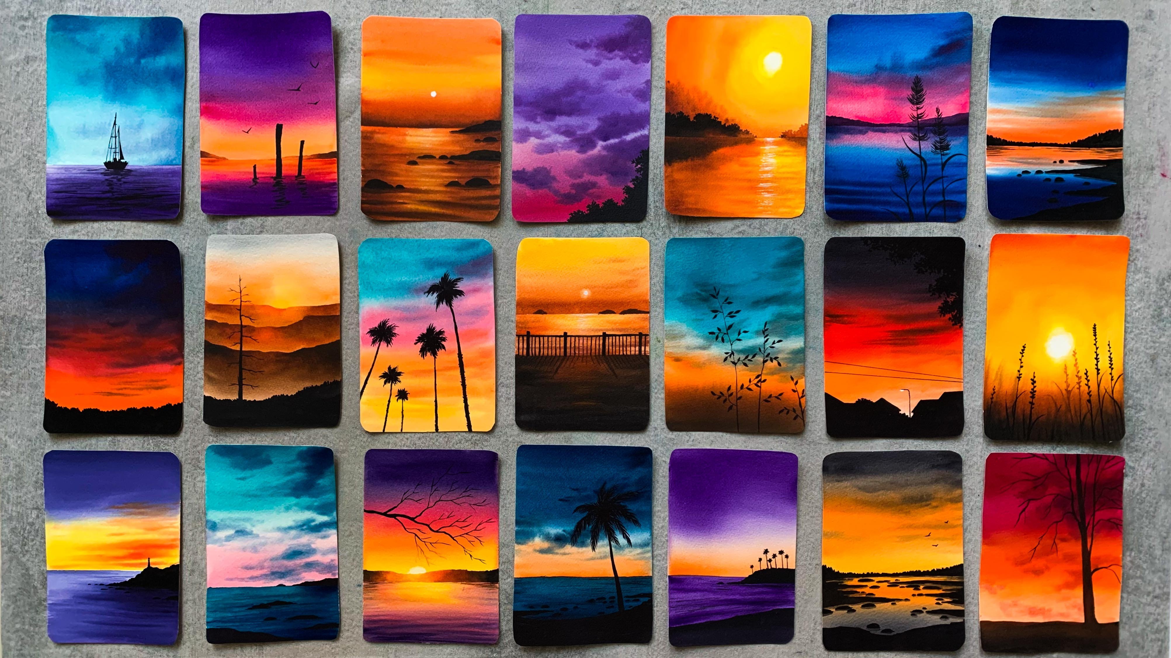
1. Let's Paint Moody Landscapes: Watercolors are truly magical
in their flexibility. They can be used
in countless ways, and it is that
quality which makes articular the ideal medium for creative exploration and
pooled artistic experiments. Hi everyone. My name
is Nina Appeal. I'm an artist, an
art instructor, and a skill set up teacher. I'm someone who
loved to work with vibrant color combinations
and intricate details. But at times it is really
important to loosen the control you have over the medium and
let it craft its own magic. This class will
guide you through the process of creating quick, articular landscapes,
mody atmosphere. Using the Rob technique, we'll be working on two
particular landscapes. The first one is specifically designed for absolute beginners, allowing you to
immerse yourself in the trot process with ease. The second painting,
featuring a moody meadow represents a more advanced
use of rot technique. Engaging with this piece will deepen your
understanding of the medium and push you to explore its full range by
embracing a challenge. This class will commence with
an in depth exploration of the materials followed by a thorough review of
essential techniques. This upfront knowledge
will equip you to tackle the painting process
with self assurance and a well informed approach. The best part is you can create these paintings in
just under 20 minutes. You see only two colors. If you're up for it, come join
me now and let's embark on a journey of painting these captivating moody at coal
landscapes together.
2. Class Overview: Thank you so much for joining. I'm so glad to
have you here now. Before we dive in, I would like to provide a
brief overview of the class so that you have a clear understanding
of what to expect. In this class,
we'll be trying out two diverticular landscapes only using the colors
indico and sap green. The two paintings that
we're going to do focuses on the Veteran Wet
technique in watercolor. The first project
is fogy mountains. It's a simple, yet a beautiful painting even a beginner can do. We will do this painting
in three different stages. First the sky, then the
back ground mountain, and after that,
the foc mountain. This painting will take you
only less than 20 minutes. The second one is a little more advanced in this painting, we will explore wet
on wet technique in a little more advanced way. It's going to be a wonderful painting where you
can come out of your comfort zone and try something which is
very interesting. Unlike the first
one, this one is going to be in a little
more fast paced. We'll have to paint the
entire background in one go. This painting will open up
a lot of possibilities. It will be a good exercise to lower and explore the medium. Before we start, we will talk about the materials
you will need. Then we will have a look at
some essential techniques which will help you
in understanding the paintings that
we're going to do. In this class, I'll
be showing you quick versions of
the same painting that we're going to try. These mini exercises
will give you a better clarity on how you
can approach your painting. Okay, so that's it, It's
a very simple class, we'll be doing two modi
articular landscapes. Both can be done in
less than 20 minutes. The best part is the only
colors you will need is sac and into and also a little of white verticlar to add some highlights for the
second painting. All right, so if
you're ready, join me right away and
let's give them a try.
4. Tips and Techniques: In this section, I'm going
to give you a rough idea about the painting and the
techniques you need to know. These are the two paintings we're going to do in this class. For both the paintings we're going to try on by technique. The first step is to apply coat of water onto
your background. You can go with any
of your wider brush. It can be a 1 " brush or a bigger one according to the size of the paper
that you're using. We're going to explore and
experiment the technique. It is very important to
make your background. Okay, that's a very first step we'll do for both the paintings. The first painting,
the foggy mountains. It's going to be a
bit more relaxing. We'll first start by
painting the sky, then we will paint the
background mountain. And after that, the found one. We'll be doing this
painting as three stages. So it's going to be in
a more relaxed piece, whereas for the other one, it's going to be
in one single go. We will start by applying
a coat of water, then we will paint the
entire background. We will start with the sky. We'll use a lighter
tone of Tico. Then we will come down
and we will paint the meadow for the entire thing. I'll be using a flat brush. Then we'll gradually
make it darker at the bottom and we'll
also introduce that foggy trees in the background to add those
trees in the background. And also to add those
grassy texture, I'll using a smaller rich
compared to the first one. This one is going
to be a bit tricky. By tricky I don't
mean the techniques, the techniques are
not complicated. The tricky part is making your background stay
wet for a longer time. The painting time
for this one will be somewhere 15-20 minutes. So you'll have to
try your best to make your background stay wet, especially for the first
ten to 12 minutes. So I would recommend going with a good quality artist
grade articular paper which is 100% cotton. That can also help in making your background stat
for a longer time. Okay, now let's try
some techniques. I will start by swatching out two different indico ha card. The one I'm swatching
out right now, it's from art philosophy. This one is more
of a bluish into, it's a beautiful color. I'll just make it lighter so
you will get a better idea. Right now, it's a
very dark tone. Okay, This one is more
like a bluish color. This is the one. It's
from art philosophy. Now I will show you
one more in Tico, which is from Shinhan
compared to art philosophy. This one is more
darker and it is more like a grayish
indigo than a bluish one. This can happen with you as
well, that's not a problem. Depending on the pigment the
manufacturers are using, the color will be
slightly different. Okay, so that's
indigo from Shinhan. The first one was
from art philosophy. Next I'm going to
show you sap cream. Unlike indigo, sap cream doesn't have a lot
of difference. It is almost the same
with most of the brands. There is no much confusion
about sap cream. You can just use
the one you have. The one I'm missing here
is again from Shinhan. I will make it lighter. It's a beautiful green. I
love this green from Shinhan. Anyways, these are the swatches, you can see the difference
between the first two indico, the first one is more bluish and the second one
is more grayish. You don't need to
worry a lot about the pigment and the
colored properties. Just go with any indico
and sap cream you have got along with these two colors. You will also need
some white water color for the second painting. To add these flowers on it, we'll be just platting
some white paint onto the It background to create
those small flowers. We just need a tiny bit
of white water color. It doesn't need to be quash. Okay, so keep the colors ready on your palette
because we're going to try some quick techniques before we start with
our first painting. My idea is to show a quicker and a smaller version of
the same painting so that you have a better
idea about what to expect when we are doing
the actual painting. This will also help
you understand which are the areas you should be focusing on and how
you can do it better. Okay, so I will start
by apply coat of water onto a small section
using my 1 " wash brush. Make sure your brushes clean and apply a coat of water
onto your background. Just take a small
piece of paper. Now this is just for us to understand the techniques
and the approach. Now the first color I'm
going to use is Indico. To apply the paint onto the sky, I'm going to use brush again. Make sure your
brushes clean first, coat the medium tone. Now I'm going to randomly apply that onto the
wet background. If you're an abstract beginner, I want you to try
these exercises. If you're an intermediate
or an advanced artist, you can just give it a watch or you can even
skip this exercise. Anyways, I have added some
paint onto the bed background. It is looking super messy, but that's totally okay. Just add that for now. You
need to trust the process. Now, I'm going to clean my brush and I'm going to dab that on a paper towel with
that clean brush. I'm just mulching
the paint right away while the
background is still wet. You don't need to wait
for a longer time. Go right in and smug the paint to give it
a more softer look. It doesn't need to be a
clean, perfect thing. You will see how it is going
to turn out when it dries. Just keep blending it. I mean, smudging it to give
it a softer look. The idea is to have
different tonal values of Interco on the background. At some places we
have a medium tone, then at some places we have a lighter tone and also
some white ******. That is exactly what we need to create that foggy,
mysterious sky. The painting that
we're going to do will be in a bit
more larger scale, so we'll have more
space to play around. Right now, it is a
very small section, so you might not be really happy blending the colors
or smudging them. Okay, I think it has
come out pretty nice. It's just a matter of
adding those paint onto the wet background and creating a very
mysterious sky like this. You can have different
tonal values, leave some white ****** in between when you're
smudging the paint. You have to be very gentle. Don't put a lot of pressure. Okay. That's how
it has turned out. We're going to use
the same technique for our main painting asphalt. I have used that grayish
indica for the sky. You can go with any
indica of your choice. It doesn't matter. Okay.
That's a first step. Now, I will use a blow dryer and I will quickly dry it off. When the background dries up, all those hard edges will go and they will start to look
very soft and fluffy. That that's why I told you, don't worry if they're looking a bit a rough ans at the beginning when it tries it all will have a very soft
and subtle look. Next we're going to try the first mountain in
the background. You can see for this I have lighter tones and I have created a fog effect
on the right side. That is what we're
going to try next. First I will mix
some sap cream with Tico to create a bluish green. I don't want to
use the green acts because it's a very fresh green. I want the green to be a
little moody and dull. That's a reason why I'm
mixing some sap cream with into right here. I don't have any sketch. I'm just adding a rough
mountain for the main painting. We'll be adding a sketch. That's the left side. I'm
adding some sap, green asphalt. Now towards the right, I'm
going to make it lighter. I'm washing off the paint from my brush with a clean brush. I'm just making this area lighter to create
that fog effect. This is the area where
we are focusing on. The rest can be
however you want. You can add some sap
cream or Indico, or any color you prefer. It doesn't matter.
But on the right we need a lighter tune to
create that fog effect. It is really important to leave that lighter
tune on the right side. That's something you
have to be very careful about. On this side. We need a lighter tune
now with a clean brush. I'm just merging it to
give it a softer look. Okay, so that's a
background mountain. You can add some
more deeper tones or green or Integ on the left side, but on the right side we have to retain those lighter values. Just take out a small
piece of paper and give it a try that will help you understand your paper
better and also you will know how fast
you should be working on. Now to make it a bit
more interesting, I'm dropping in some more
taco tones onto the left. I won't be adding any onto
the right over there. I want to retain most of the lighter tones just
onto the left side. I'm randomly dropping in some taco tone to introduce
some natural textures there. Now I'm smudging it
using some sap cream. Okay, that's a mountain. Now, there's one more
thing that you can do which is not
really necessary. You can use a paper towel. This one is a facial tissue
and you can gently dab off some paint from the mountain to give it a more soft
and unnatural look. See that the edges are
looking much more softer. Now, it's a simple trick and it will instantly
help you get rid of those hard edges and
we'll give it a softer look. Okay, That's it. That's
our back on mountain. Now I'm going to
use a blow dryer and I will quickly dry this off. Then we can go with
our focus on mountain, which is the third and the
final stage of this painting. Okay, so that is dried. You can see that beautiful
fog effect we have created. On the right, we introduce lighter tone and on the
left we have darker tones. Now for the next mountain, which is in the foreground, I'm going to use
much more taco tones of tico and sat green. Just make sure your background
has dried completely. If it hasn't dried yet, give it some more time. Proceed with your
fueground layer only after the background
has dried completely. All right, so that's ready. Now, I'm adding the mountain
on the right side for this. I'm not adding any foggy
effect or anything, I'm just adding into. First then I will introduce
some green asphalt. Go with any shape
that you prefer. That is into I'm
using a taco tone. Next we can pick
some green and add that in right next to Into. Let's create a natural blend. The basic idea here
is to play with different tonal values
for the backroom layers, go with lighter tones,
for the fog layers, go a taco tones to create
that depth in your painting. For this mountain, there
is no particular way you need to apply the paint. At some places you
can add some cream. Then to introduce
some deeper tone, you can drop in some into, in a very random way. Okay, first maybe you can define the shape
of your mountain. Then maybe you can
add some grain. Then onto that, keep dropping in some taco tune to
create some texture. Over here. The paper
is quite small. For the painting that
we're going to do, the mountain is going
to be much more bigger. I'll be using two
different brushes. One to add the paint, whether it's deeper tones
or medium tones. Then I will use another
one to smudge it to give it a more
softer look over here. The mountain is pretty small, so we can just manage
everything with a single brush. You'll need to keep switching
from one brush to another. Okay? I'm just
dropping in some into, onto that wet layer to
create some texture. This is what I'm talking about. For our main painting,
the mountain is much, much bigger than this. I will use another
brush to smudge the paint just to make the
process a bit more easier. Okay. It's the same technique. The only thing is, it's in a much more bigger scale and
the shape is also different. Okay, so that's all about
the first painting. The major thing you need
to keep in mind is to make this area lighter to
create that fog effect. The rest is quite simple, you can just drop in the paint under the sky to
create that effect. In a similar way for the
Fcrn Mountain Asphalt, you just need to drop in
your taco tones and green simultaneously to create
a very natural texture. Now it's time to have a
look at the second one. Here's the second painting. The major thing here is we're going to paint the
tier thing in one go. We won't have any trying breaks. We will start with
the sky, then add those foggy trees and the metal. Without any break, we're going to paint everything together. If you're using a good
quality of watercolor paper, your background
might stay wet for a longer time compared to
cellulose or stolen gray paper. That's a major key. Here go with a good quality
of watercolor paper. Now I will quickly show you how you can achieve that result. I'm starting by adding
a quart of water onto a small section, just
like the previous one. Again, if you're a beginner, just give it a try so that
you know how to handle your paper and also you will get an idea on how fast
your paper is drying. Okay. Have made a
small section wet. Now I'm starting off
with a lighter tone off in Tico and
I'm applying that onto a wet background using
a flat brush on the top. I want a lighter tone. Then as I'm coming
towards a horizon line, I want the color to
be a bit more darko. I'm adding that. That's where I'm going to add
my horizon line. Before we start with the green, we need to make
this area lighter. Wash out the paint
from your brush and just make it lighter. Now I'm mixing some sap, green and indico, and I'm
adding that onto the meadow. Right now, the color
I'm using is more like a lighter tone or
an a mete tone. It's not a darker tone. Now, as they come
towards the bottom, I will make the
color more darker. You can either mix
these two colors together and apply that
onto the background. Or it can go with Indico
or Sap green first. Then add in your per tone. Right now I'm using Indico here. Then to that I will drop
in some green asphalt. Then I will blend
it. Okay? We just need a darker tone
at the bottom. It has to be a mix
of into and sapling. We don't want the color to
be too fresh and bright. We want a dull and
a moody color. Okay, On the top, we have a
lighter tone, which is a sky. Then towards the middle, we made the color lighter. Then onto the middle, we
introduce a dull green. And towards the bottom, we
made this area at the center, we need to retain
those lighter tones. That is really important. Now I'm going to keep that
rush aside and I will pick around rush the
Bama size number six. And I'm picking a darker
tone off into now, right away, apply
that darker tone along the horizon line. We have made this area lighter. So write about that
at the depot values. Okay. There is no waiting
time and there is no break. We have to paint the
tier painting in one co apply your paint right away before your
background dries off. Now, I'm cleaning my brush
with a clean tampers. I'm just making it lighter. Our painting already has
that foggy, moody feel, so it's just a matter
of adding a paint onto the wet background and creating a blurry
and a moody effect. We don't want definite
ten sharp lines. Okay. Now with the same brush, I'm going to add some grassy
pattern onto the bottom. Again, we need to do this while the
background is still wet. Don't take any break, go in right away, and
add in those lines. It doesn't need to be perfect, we're just trying to add
some texture right now. Gradually we can
make it more better. For now, simply add some lines
onto the wet background, creating a very nice
natural texture. If you're an absolute beginner
or an intermediate artist, I would really recommend trying this out on a scrap
piece of paper. It will really help you
understand your paper better and it will also
help you understand how to handle better
on wet technique. Okay, now our task
is to keep on adding more grassy pattern at the bottom to introduce
more texture. Don't add any towards a
horizon line over there. We need those lighter tones. Just focus at the bottom
and keep adding more. There is nothing to worry here. Go ahead and add them in. This one is a very
quick exercise. My idea was to give you
a proper outlook about the techniques as well as the process before we
start with the painting. So that you can be prepared
and you're also well aware of every minute detail
in our main painting. We'll be adding more grassy
lines using a Daco tune. For now, I'm just
going to stop it here. I'm going to drop in
some white flowers. I already have some
white paint on my palette now Using
another brush, I'm going to tap on
the smaller brush to create some splatters. I'm adding them only at the bottom where I
have the taco tones. Just over here, I'm adding some splatters
using white paint. It's not an opaque paint,
it is a bit watery. This way, when it dries, it will have a very dull effect. I don't want them to
be too prominent now, if you don't want
to add splatters.
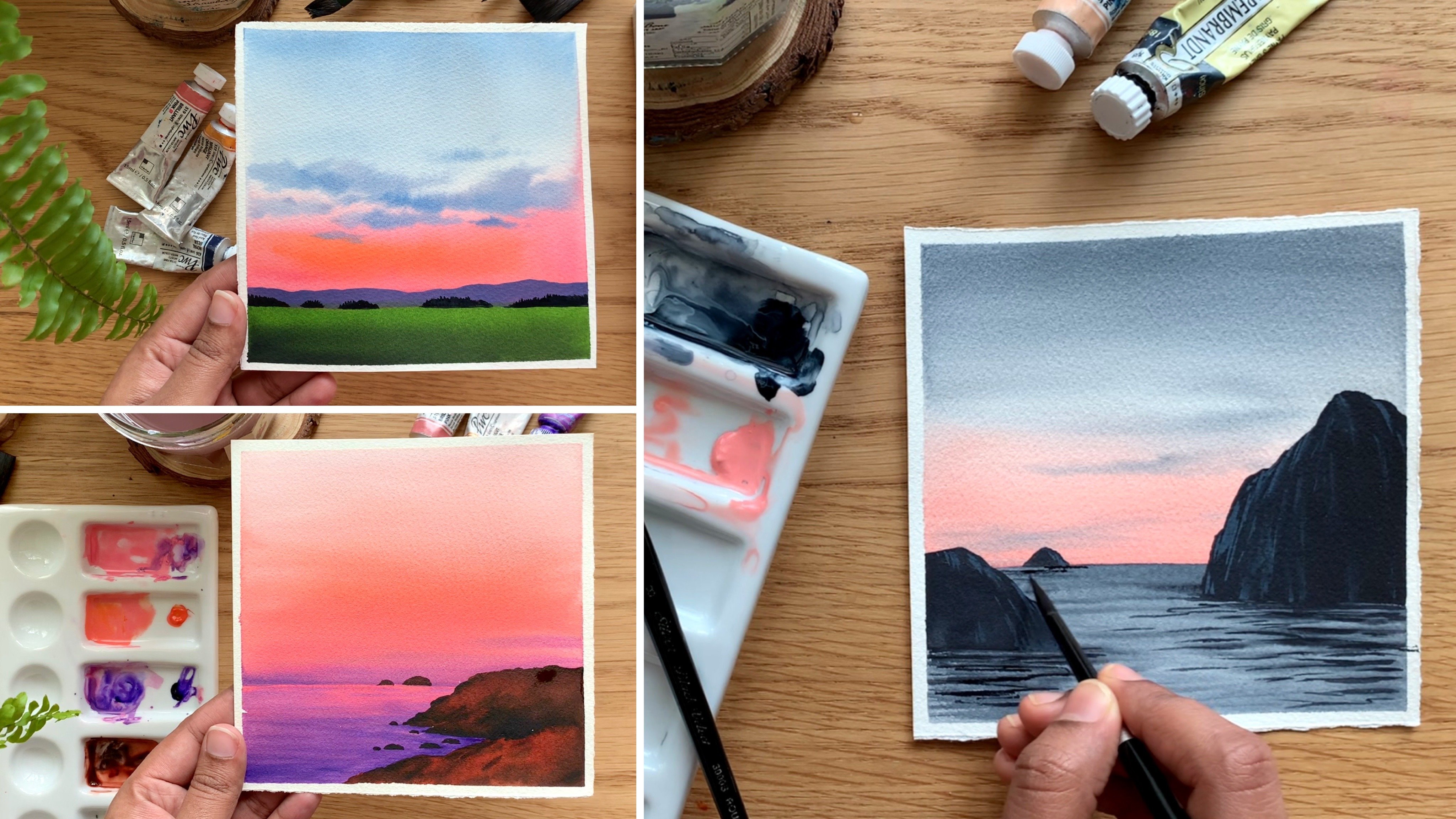
5. Painting 1 - Foggy Mountains: Now it's time to try the first painting, the foggy mountains. We already had a thorough
look at the techniques, but still I will
explain the steps quickly so that I can
refresh your mind. We will start by
adding a sketch. We have a mountain
in the background as well as one of
the foreground. My idea is to create a fog
effect onto this corner. The second step is
to paint the sky. We'll be just adding
some into onto a wet background to create
a very mysterious sky. Once the sky is done,
we will go with the first mountain, the
one in the background. Focus on the right side, that's where we need
the lighter tune to create the fog effect. Then we can go with
the Fueron Mountain. We'll be just adding some sacan and indigo randomly onto that, a mountain to create a
very natural texture. Okay, so that's
how it's going to be Now let's give it a try. All right, so I've fixed
my paper onto my table. Now I'm going to start by adding the sketch
for this painting. You will need to
add two mountains, one in the fue ground, which is going to be a taller mountain towards the right side, make it really tall,
like a pointy peak. For now, just to add a
simple shape like this, you can modify the shape
later as you paint. Now, right behind this, I'm going to add another mountain. I'm adding a very basic shape. When you're adding your sketch, try to go with a
very light pencil. Lines don't make it too
dark and prominent, especially on this corner, we'll be using light to values for this mountain
in the background. So if you add a
very dark sketch, the lines will be visible
even after you have applied the paint and
modifying the shape a little. All right, so we have
two mountains here, one in the background and
one in the foreground. Over here, we will
make the color lighter to create
a foggy effect. And that's why my sketch
is barely visible there. I don't want the
pencil lines to be visible even after I
have applied the paint. Okay, so remember to co a
very light pencil sketch Now, keep your colors ready
before you start. The only two colors you will
need for this painting, a sap, cream, and in Tico. Keep them ready on your palette. Once you have your sketch
and the colors ready, we are good to go, we can
start with our painting. Now, the very first
step is to apply a coat of water onto the
entire background. You can use any of
your wider brush, just make sure it's clean
before you apply water. You can apply water onto the mountains as well.
That's totally fine. Okay. So I've made it evenly
wet now to paint the sky, I'm going to use my size
number eight brush. I'm starting off with
a medium tone of Tic onto the right corner as
well as onto the top corner. Then over here I'm going to
introduce some medium tones. I'm just going to add them onto the wet background in
a very random way. Gradually, I will give
it a more softer look. For now, just apply a
medium tone where you feel like I'm just going to add them
onto all the corners. We can see how mess it is. Just randomly add that in. Don't worry a lot right now. Okay. Even if you add some
paint onto the mountain, it's totally fine in
a very random way. Drop in a medium tone of integral onto that
bed background. Now clean your brush
and with a dam brush, just much the paint,
the idea is to create some white ****** in between and also some
medium tone off interco. These white ****** is really important to
create that foggy effect. Now keep smudging the paint until you feel like
it is looking soft. Whenever you feel there's a
lot of paint on your brush, just clean it with a clean
tamper smudge the paint, just keep pushing and
pulling the paint into each other until you feel
have got a soft effect. Okay? I know the background is looking quite messy,
but that's tally. Okay. It will look really
beautiful when it dries. You can see over
here on this side, I have some to space, then I have some medium tones on the top right corner as
well as the bottom left. The idea is to introduce
different tonal values of Interco onto the background
to create a foggy effect. At some places you can
have a lighter tone, at some places you can
have a medium tone. Then some to space has okay, this is how the sky
has turned out. I know it still looks
a little messy, but trust me, when it tries, it's going to look a lot better. To speed up the process,
I'm using a blue trial. While it tries, you can see how soft and beautiful it
is going to turn out. Look at that, that's sky. You can see how
soft and beautiful the colors have turned
out when it dried. That's the reason why I told
you not to worry a lot. Just apply that colors onto your wet background to
create a fog effect. We just need different
tonal values of Tico. You can apply that
however you want. Now, when you start
painting the mountains, that fog effect will be more prominent without
wasting any time. Let's start with
the first mountain, the one in the background. To paint the mountain,
I'll be using two brushes. You can see have
two brushes here, two round brushes
onto this corner, we'll have to make
the color lighter. I will use one brush
to apply the paint. And I will use the other brush
to make the color lighter. Now to paint the mountain
along with Indico, you will also need
some sap green. So keep the colors ready on your palette before you start. Now I'm starting by picking
a medium tone of indico, adding a few drops of water, and go to the medium tone. Now add that onto the bottom
part of the mountain, onto this side, I'm
adding some indico. Okay, now with the same brush, I'm picking some green and I'm adding that
right next to that. Now onto the top, I'm going
to make the color light. You can add a lighter value of indico and green over here. Now towards the right side, we have to make it even more lighter by going with
some clean water. This area here, clean your
brush with some clean water. Make it lighter onto
this extreme side. This is where we are going to
introduce that fogy effect. You can still add a bit of indico and some green
onto the mountain, but try to that lighter space onto the extreme right side. You can play around, add in different tonal values
of indico and green. Those things are totally fine. The only thing you have
to keep in mind is to make it lighter
towards the right side. Other than that, it's
totally in your hands. You can add taco tones or
lighter tones as you wish. It is actually a good
idea to introduce different tonal
values of dico and green onto this background because it will make it
look more realistic. There's absolutely
nothing to worry here. Just add them while
your background as wet, then using a clean brush, you can just smug on the
top of the mountain. I have added some paint
using a clean brush. I'm gently smug that while retaining that lighter
tone on the right side. Yeah, that's a basic idea. Wherever you want to
create that foggy effect, you need to make
the color lighter onto the remaining area. You can introduce more
green and more into. Just add them however you want. We're trying to create
some texture here. There is no order or there is no particular way you have to add that at some places,
introduce some green. Then in between, switch to in Tico and add that in asphalt? Yeah, keep switching between these two colors and
create a natural blend. My background is still red. I'm thinking of adding some more into a bit more Taco tune. I'm just adding
some at the bottom, some on the top, in
a very random way. You can see here, I'm not adding any Daco tune on the right side, I'm just adding a
few onto the left. Now I'm cleaning my brush and I'm dabbing that
on a paper towel. Now with that clean brush, I will smudge the paint a little to give it a
more softer look. Be very gentle when you're
smudging the paint. Okay, that's how
it has turned out. Now there's one more trick we
can do using a paper towel, then you're done adding the
paint onto the background. Keep your brush aside and
go with a paper towel. I'm using a facial tissue here. And with that, I'm gently smudging off some paint
from that right side. When you do the step,
that line will become blurry and it will create a
beautiful foggy effect here. You can clearly see
that soft edge on the right side and a
sharp edge on the left. You can clearly see
different tonal values of green and indico here. And on the right we have retain those lighter
tones and yeah, that's how we paint
a foggy mountain. The next step is to
paint the Ford Mountain. But before that, we'll have to wait for this to
write completely. All right, so that is dried and this is how it
is looking right now you can see the
foggy effect we have created for the
mountain in the foe ground, I'm not going to add
any foggy effect. I will display with different
tonal values of green and tico and we'll create
a nice texture there. I'm starting with a
darker tone of Tico. It is a much more darker
tone than we used earlier. Any of your medium sized rush. The one I'm using here
is size number eight. I'm adding that onto the
tip of the mountain. You can see the color I'm
using. It's quite dark. Apply that, following the
outline, only on the top. Now, with another brush,
I'm picking some green. I'm adding that right next to indigo and I'm just
mudding the paint. I want to create a texture here. It doesn't need to
be a clean blend. Now let's pick some water and make the color lighter
towards the right side. This one is just optional. You can continue with
the same tonal value, or you can choose to
make it lighter at some parts to give it
a more natural look. Okay, I have made it lighter
towards the right side. Now I'm picking more Tico and I'm adding that
onto the mountain. There is no particular
order here. At some places you can use Tico. At some places you
can use green. Just keep switching
between these two colors. I'm going to say this again. There is no particular rule or order you need
to follow here. Just keep adding your
paint however you like. At some places just add some
green and wherever you like, introduce some into as well and create a very beautiful
and natural texture here. Right now I'm picking
some sap green and I'm adding that onto
the entire mountain. Then onto that I will introduce some Tico to create some
texture and some deeper tones. Okay, for now, I'm using a bigger brush so that I can apply the paint quite easily, and I'm just adding some green onto the
entire bottom part. Then I will gradually
introduce some daco tones. See that, I think I'll first apply green
onto the entire area. It's a huge mountain,
so I think it's a good idea to go
the bigger brush. Okay, first let's apply
green onto the entire area. The green doesn't need to
be a clean, fresh green. We can add some into asphalt. We want more of a
bluish green. Okay. Fill up those remaining
****** in between. Okay. Now I'm going
to keep this pressure aside and I will pick
my medium sized fresh. Let's keep adding
some taco tones. Right now it is like
a flood of green. I think some paint
dropped under the sky. Let me quickly dab it off
with a clean paper towel. If this happens to you,
there is nothing to worry. Make your paper towel a bit wet, and with that wet
paper, towel it off. Okay, so that is done. Now, let me quickly add on those taper tones before
the background dries. Just randomly adding that in, you can see the
process is messy, but there is nothing
to worry here. Keep adding that with
your bigger brush. We can smug the paint. Yeah, just keep adding
your deeper tones onto that wet background. Whenever you feel it is
quite rough and messy, go with your bigger push a damp, bigger brush and smug the paint. Okay. When you're smudging
the paint, be very gentle. Only use the tip of your brush. Don't put a lot of pressure. Okay, that's a top part. Now I'm going to add more deeper tones onto
this background before it dries
along the outline. I'm adding some deeper to, I'm just randomly
dropping that in. There is no particular
shape or anything, just keep adding that
however you want, but the tricks retain some
other green space In between, you will have some green
and some Taco tune. That is what will make your
mountain look more natural. We want these two colors
to go hand in hand. Nothing more, nothing less. You can see here when I'm
adding those deeper tunes, I'm leaving out some green in between the shape
or the pattern, or the way you're
adding the paint. Doesn't matter at all. But try to create a
natural fusion of these two colors and
that is what matters. This area looks a bit dried. Er, I'm taking out my other Ph and I'm
smudging the paint. You can pick a bit of cream
if needed and smudge it. Okay. It's a very easy process. Wherever you feel the
paint is rough and messy, you can go with your
bigger brush and maybe you can use a lighter tone
of green and smug it. Okay. Let me quickly add some more deeper tones
onto the bottom part. I'm yet to add
them. My background is almost starting to dry. I have the other
brush ready here. Wherever I feel it
is, rough and messy. I will smart the
paint right away. I'm loving those
greens and blues. I think it is looking
quite natural already. With all those tonal values, I think I can add
some more taco tones onto this bottom part. I'm really happy with the top, so I wouldn't be adding
any paint on the top. Just at the bottom, I will introduce some more taco tones. Now, before I add
any more paint, I think I should just
go ahead and smudge it. I'm switching to
my bigger brush, and I'm gently smudging the paint to give
it a softer look. Okay. So that's how
it has turned out. Now if needed, you can add in some more taco tones if the
background is still wet. Otherwise you can
just leave it Acts, I think it is looking
pretty decent already, only if your background
is still wet. And if you want to
introduce some more taco tones onto the background, add that in a very random way. One part of my mind is saying, it is good, I can stop it here. But another part of my mind is saying I can add some
more taco tones. I thought of going
with the second part. I'm adding some more taco tones. This one is completely optional. We have enough of
taco tones already. Only if you want to, you
can add in a bit more. Okay, I'm quickly adding
a little more daco tones. Then with my other
brush, I will smudge it. Okay, so that's a acco tones. Now I'm going to go
with my other brush, taking a little of green
and I'm smudging the paint. When you're smudging the paint, remember not to put a lot
of pressure. All right. So that's how it has turned out. Now I will clean my
brushes most of the time. I forget this part. I used
to leave it with the paint. Anyway, that's our painting. I had my timer on and
including the drying time, it took us less than 30 minutes, so the actual painting time
was less than 20 minutes. And I definitely think it's a beautiful painting to be
done in less than 20 minutes. We created a foggy effect by playing with only two colors. This foggy part is the
highlight of this painting. It's a very simple technique, but the kind of
impact in the mood, that little detail created
is really amazing. Anyways, now it's time to
peel off the masking tape. Before you peel off
the masking tape, make sure your pattern
has tried completely, then gently peel it at an ankle. Okay? So that's our
foggy mountains. I hope you all liked it. It's a simple, yet a
beautiful painting. We did this with only two
colors, indigo and sacre. If I get to try
to give it a try, I'm very sure you're
going to love it.
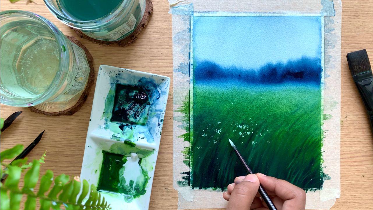
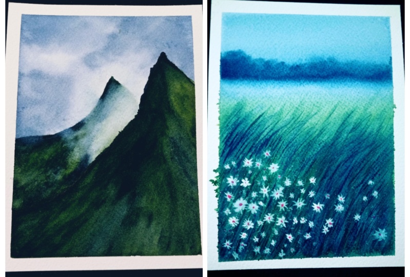
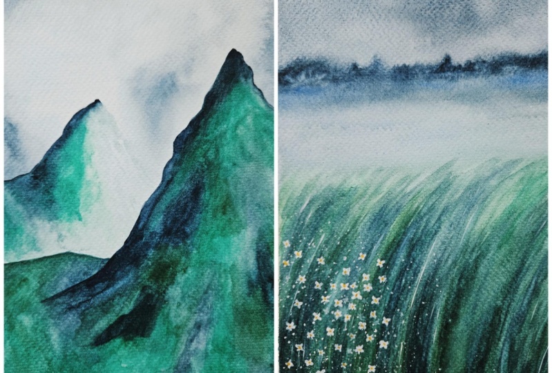
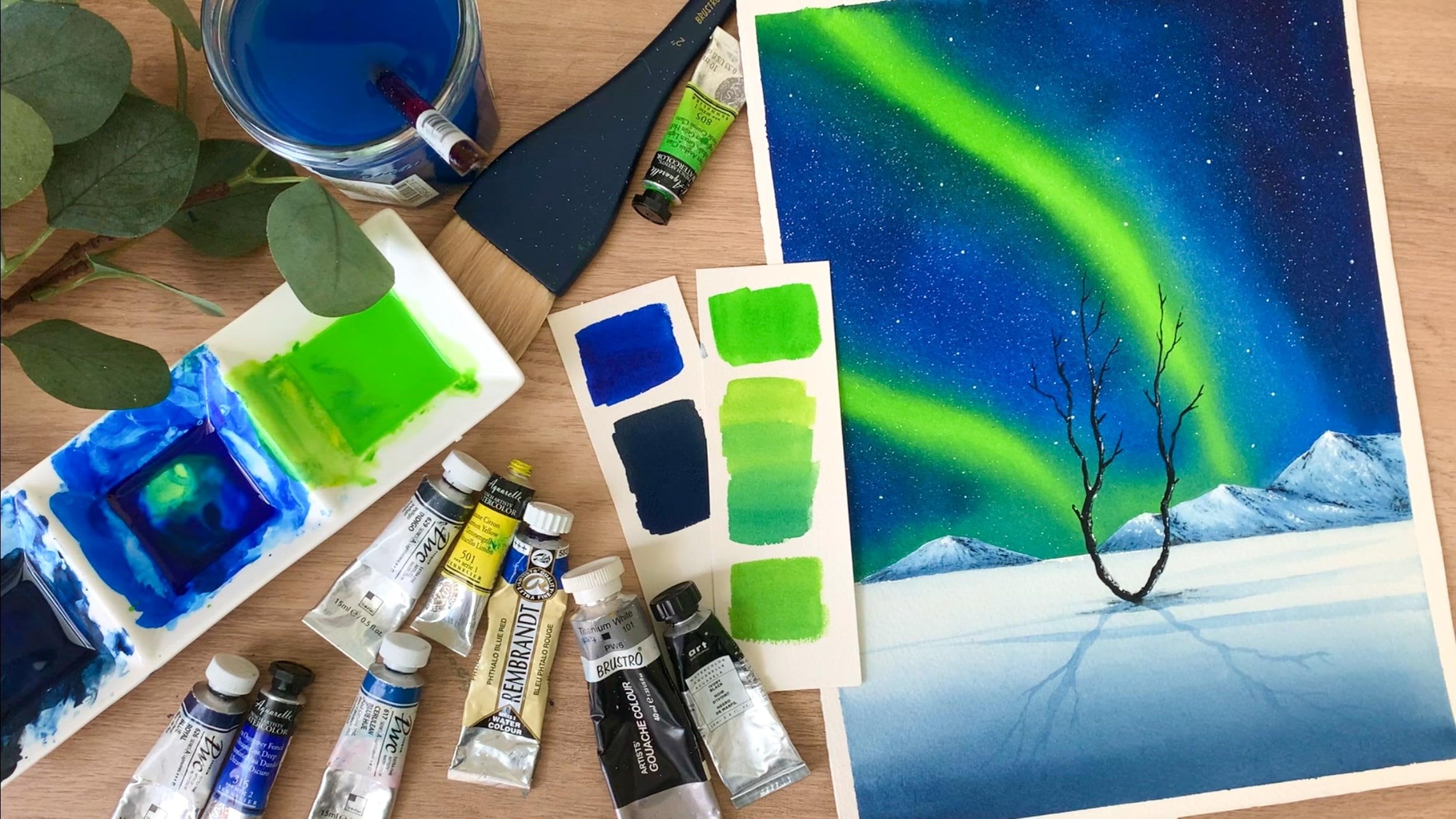
6. Painting 2 - Moody Meadows: So we tried first painting.
I hope you all liked it. Now it's time to try the
second one, the Moody Meadows. Before we start, I want to
tell you a few quick things. For the first painting, we had enough of breaks in between. We did that in three
different stages. First we painted the sky, and after that we painted
the background mountain and then the for mountain. So it was painted at
three different stages, but the painting that
we're going to do right now doesn't
have any stretches. We're going to paint the
emptier painting in one. We're going to create a
beautiful moody effect here. To create that
effect, you have to paint everything while
your background is wet. Okay, keep your paper ready and take out sap green and
into on your palette. As I said earlier, we're going to paint the entire
thing in one co, my other into from
Shinhan is almost over. I'm going to take out
some from art philosophy. This one is a bit more bluish. The other one was
a grayish into. Okay. Just go with any
into you have card, I'm going to take
out some into first. Then maybe I will take out
some sap green as well. I don't want to waste any time in between to squeeze
out the paint. Okay, keep the colors
ready on your palette. Before I start, I'm
going to add a line a little about the center of the paper, that's horizon line. And the bottom part is
going to be the meadow. Just write a simple straight
line for this painting. You will also need
some white at color. We will only need white towards the finishing
stages of this painting, so just keep it aside for now. Okay, I have
everything ready now. I'm going to start
by applying coat of water using my 1 " wash brush with clean water and
apply that onto the Ti paper. Run your brush
multiple times just to be sure the coat
of water is even. We don't need pools of water. Keep running your brush. Okay. I have applied an even coat of water
onto the ti paper. Now to apply the paint, I'm going to use a flatbush. You can use a flat brush or a arm brush. It doesn't matter. Before I start
applying the paint, I will quickly wipe off the excess amount of
water along the border. Otherwise, this might
float back into the painting and we'll create some messy blades
along the border. All right. So I have made
my background evenly wet. Now I'm going to pick
my flat brush first, Make sure your brush is clean. Now I'm going to go
with a medium tone of into not too dark
and not too light. Added a few drops of water and make your color
into a medium tone. Now apply that on the
top of the paper. As you come towards the bottom, you can make it a
bit more darker. Using a half inch
flat brush here. You can use any brush
of your choice. It can be a wider flat
brush or a round brush. Okay. Right now I'm
using a medium tone of into and I'm applying
that onto the sky. The sky is going
to be a flat wash. Just apply that paint
onto the tier sky. Okay. That's the first part. Now I'm going to pick a much
more taco tone of into. I will apply that along
the horizon line, not too dark, a bit taker than
the color we used earlier. Okay, let's apply that here. Let's blend that with
that lighter into okay, it doesn't need to
be a perfect blend. Just add that painting. We'll be adding some plants
and trees over here. Okay, that's a Sky part. Now, I will just make the cereal lighter by adding some water. Okay, Next I'm going
to pick some green. I'm not using sap green acts. I'll add a bit of Indico. Start with the lighter tone, then as you come down,
make it more darker. We're painting a
moody landscape. The colors that
we're using should also have that moody character. And that's the reason
why I'm not using that fresh, bright green. You can use sap
green or gradient green, that doesn't matter, but add a bit of
indico into it so that the color doesn't look
too bright and fresh. Okay, I'm going to add some brighter tune of
indico at the bottom. Right now, the color
is not that dark, only along the horizon line. We can go for a lighter tune, then towards the bottom, start making it more darker. Okay, that's how
it has turned out. I think we can add some
more green on the top. It looks really light over here. Just adding a bit
more, not a lot. I'm still reading that lighter
tune along the horizon. Keep in mind to reaching
that lighter tune, it is really important to
create that foggy effect. Okay, the first step is done. Now I'm going to keep
this pressure side and I'm going to pick
a smaller round rush. The one I'm using here
is size number six. Now with that brush, I'm
going to pick a daco tone. Off into with that daco tone, I'm going to add some random
shapes along the horizon. Add that onto the
wet background. Don't worry, it is going to
turn out really beautiful. We need to add all the details while the background
is still wet. That is really important to
create that moody effect, go in right away and
add in those details. Don't wait for a longer time. You can see the
weight is spreading. That's the beauty of Verticl's
very unique property, which no other medium can match. See that the key here is adding the paint onto
the wet background. You can let that spread
into the background. Worry a lot about that. That is exactly how we're going to
create that mood effect. Once you have painted
the base layer, which is your sky
and the meadow, go with the taco tone of Tico. Use any of your
medium size brush and add some random shapes like
this along the horizon. I have added those shapes. Now. I'm going to clean my
brush with that clean brush. I'm making this line lighter. See that? Gently run your brush. Don't put a lot of pressure, we just need a
blurry line there. Now in case if you want to modify the shape
or if you want to introduce some more paint onto the landscape, you can do that. Right now, we won't be touching this area
ever again over this. We will just call it down. Whatever you need to do, you
have to do it right now. Okay, So that's a
landscape far away. I will just quickly
fix this area. I think that blue and green is looking as two
separate sections. So I'm just adding
some more green here that it just looks
like one whole section. Okay, that's how it
is looking right now. Next our task is
to add enough of grassy lines onto
the wet background to introduce some texture. For that, I'm ising
a darker tone of Tico and I'm just going to randomly add some grassy lines onto the wet background. Right now, I'm not
worrying a lot. I'm just going to introduce
some texture later. We can add more refined shapes. Okay. Using any of your smaller brush or
a medium size brush, just keep adding some lines and some texture
onto the background. There's absolutely
nothing to worry here. Your background is still wet. Just make use of
the time and keep adding some messy lines
onto the background. I'm just adding
some curvy lines. You can see the
weight is turning out okay because of your
background is still wet, they might spread a little.
That's totally fine. It is part of the process. You can focus on the bottom part and adding more
lines over there. See that over there, we need more Taco lines
towards a horizon line. You don't need to add
much. Let's retain that foggy moody effect there. Okay, keep going and keep adding those lines onto
the wet background. We're only trying to
create some texture here. It doesn't need to be perfect. The only thing I want to mention is that don't go with the pain, which is too watery
because our background is still wet and we're adding
them on a wet background. If you paint is also too watery, they will start spreading
in a very vigorous way. I'm so happy with the effect we have created along the horizon. Look at that, beautiful, right? It is just a matter of adding the attacker tone onto
the wet background. It wasn't a complicated task and I think it is looking
so beautiful already. I hope you guys are happy
with your painting too now. Just in case it's not going the way you're
expecting it to be. There is nothing to worry. This is my second try.
The first one I tried, I didn't really get
that fog effect. My paper dried quickly. Now, I'm going to add some
patterns onto the top. Not a lot for this step, go. The brush with
very little paint. I tapped my brush
on a paper towel just to make sure my brush
doesn't have a lot of paint. Now, I'm adding a few
more lines over here. Just a few. I don't want
that to be too prominent. Okay. So that's how
it has turned out. Now it's time to take out
some white articular. Our background is fed, so we need to make
use of the time. It doesn't need to be gas. Just a bit of white
vertical is all we need. It's again from the
same branch, Shinhan. I will take out a bit of
white onto my palette. There are two things
I'm going to do. First, I will add
some grassy lines onto the background
using a lighter cream. First, I'm going
to mix a little of white with cream to
create a lighter cream. It doesn't need to be too thick. Okay, Now using that,
I'm going to add some grassy lines just to
create a different texture. Our background is
still a bit Ft. Okay. So just adding
a few in between. We don't need a lot of them. You can see I'm
just adding a few, just not too prominent. Just add a bit of
white with sac cream and adding a few more lines
onto your background. I'm trying to introduce
different tonal values of green onto the background to
make it look more beautiful, but this step is
completely optional. If you're already happy
with the background, you don't need to add in a lot. I'm adding them mostly at the bottom where we
have the Taco value. I won't be adding
any to at the top. I will just add a few more and then we can add
those white flowers. The speeding is
actually quite simple. The only tricky part is making a background stay wet
for a longer time. So it's best to go with 100%
cotton watercolor paper. Anyways, now I'm cleaning my brush and I'm going to
add some white flowers. So let's pick some clean
white without any green. Okay, I'm adding
few drops of water. I don't want the paint
to be too thick. Have paint on one brush. Now, using another brush,
I'm going to tap on it. Be careful, try not to add any white dots
onto the top part. Over here, We're adding
them only at the bottom. Okay. Now I'm gently tapping on the brush where I have
paint using another brush. And I'm creating few
splatters on that background. I have no plans to make
my background too busy. I will only add a little
towards the left side. I will add a few more. Okay. So, that's how
it has turned out. You can see those platters. They're quite tiny. Make sure your pain is not too watery. If it's too watery, tap
it on a paper towel, otherwise, you will end
up getting big splatters. Okay. Now, let's add a few more. I'm focusing on the side. I don't want a lot
towards the top. Okay. Now I will add few more flowers using my
brush itself without tapping. I'm just adding few
bigger flowers. As I said deli, I'm
focusing only on the left. I will add more
towards the side, then a few here
and there to make that composition
look more beautiful. Okay, The paint I'm using here, it's not 100% opaque,
it's slightly watery. I don't want them
to be too prominent creating a moody painting here. I want everything to be mody, I'm adding them as bigger
groups on the left. I'll add a few more here. If you want to use a different
color for your flowers, maybe yellow or purple or
pink, you could do that. It doesn't need to be white. Initially, I thought of
adding purple flowers, then I thought of keeping
the color palette very limited for the
previous painting, asphalt, we only use
Sac green and into. I didn't want to break that. Okay. That's how
it has turned out. Now I will clean my brush. Then I will add a few
more grassy lines onto the background
using a smaller brush. Earlier we added them
on a wet background. Everything is blurry. I thought of adding
a few more in between with a more
defined shape. I'm picking some
into a taco tone. Then I will just add
a few simple lines. I won't be adding a lot, I will just add a
few in between. They are short curvy lines. This is just to add some more
texture in the background. Earlier the lines we added
was on a wet background. They are blurry right now, just adding a few more, using a taco tone to make
it look more defined. You can see the
way it is getting dense and that is
exactly what we need. Okay, just add a few at the bottom and a few
more towards the top, but don't add any
towards a horizon line. Keep that area actus. My background is still a
bit wet. It hasn't Right. Completely. The lines
I'm adding right now, it is spreading a bit
and that's totally fine. Okay. That act, I think I have added enough and I'm really
happy with the density. It looks very lush and thick and we also have
different tonal values. If you want to add more,
you could do that. Whether with a Daco
tone or a lighter tone. You can add in a few
more grassy lines. Okay, So that's how
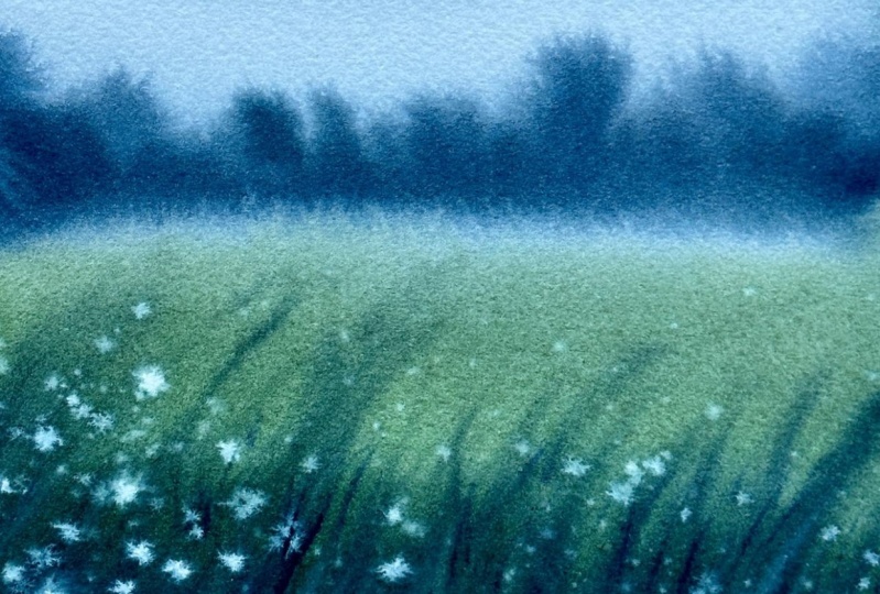
it has turned out. You can clearly feel that
foggy mood in this painting. We have a blurry background and a very defined foreground, and that's exactly what you need to create a foggy effect
in your painting. Now, before I wrap it off, I want to add few more
flowers onto the background. I have cleaned my brush and
I'm picking some white. Earlier we used a watery paint. Right now, my color
is a bit opaque. We already have enough flowers, so I won't be adding a lot. I will just add a few in
between using an opaque paint. Okay. Onto the same cluster. I'm adding few more dots
using that white paint. This one is going
to be more defined. Looks like my background
is still a bit wet. It's been nearly 15 minutes
since we have started the painting and my background
is still a bit tout. It's because I'm using 100%
cotton articular paper. If it's a sills paper, it might have dried by now. There doing articular
paintings like this where you're exploring the
properties of the metium. It is very important to
go with a good quality of aticlor paper to get
the best results. It is not just about the result. You will enjoy the
process even more. But for this
painting, we haven't taken any breaks so far. We're painting the
entire thing in one. If you're using a
cellulose paper or a student grade
articular paper, you might not be really
happy with the results. I want you to know it is not because you got the
techniques wrong, it is just because you're
using the wrong paper. If you're not really happy with your painting, give
it another try. On a good quality
articular paper. I'm very sure you'll
see a huge difference. Now, I'm going to add a few more flowers onto
the right side. Just 1.2 here and there. I'm not going to add a lot. If you want to add
more like we did on the left side,
that's rally, fine. I just don't want to
make it too busy, but if you want to add more
flowers, that's rally, fine. You are the creator
of your painting. You should go with your cuts. Okay, so that's it. That's
our second moody painting. I'm really happy with the
way it has turned out. Now it's time to peel
off the masking tape. When you're peeling
off your masking tape, make sure your background
has dried completely. Otherwise, it might rip off your paper and gently
peel it at an ankle. And here's the
finished painting. You can see how beautiful
it has turned out. I just love the fog effect
we have created here. If you're ready to
try it, do give it a try and let me know
if you liked it.
7. Thank You :): Thank you so much for
joining me in this class. I hope you all had a great
time creating these quick, moody landscapes if you didn't quite get
them as you would like on the first
try undos heart. Just give it another shot and
witness the transformation. Before you go, I would love for you to share
your projects here. If you haven't gave them a shot. Also, please take a
moment to leave a review. If you found this class in Ibo, thanks again for being
a part of this and may your painting journey ahead
be filled with happiness.
 Zaneena Nabeel, Top Teacher | Artist | Author