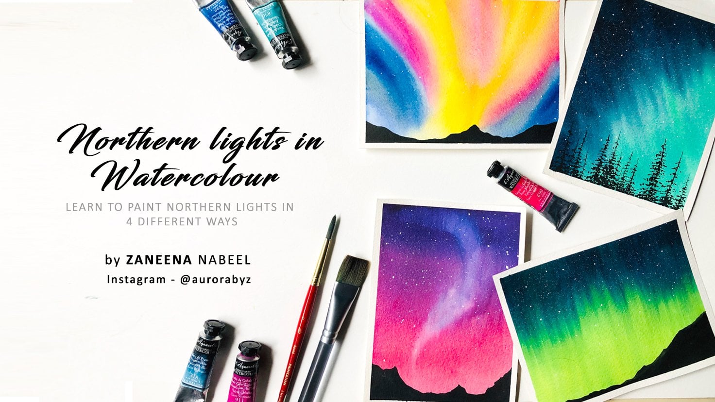
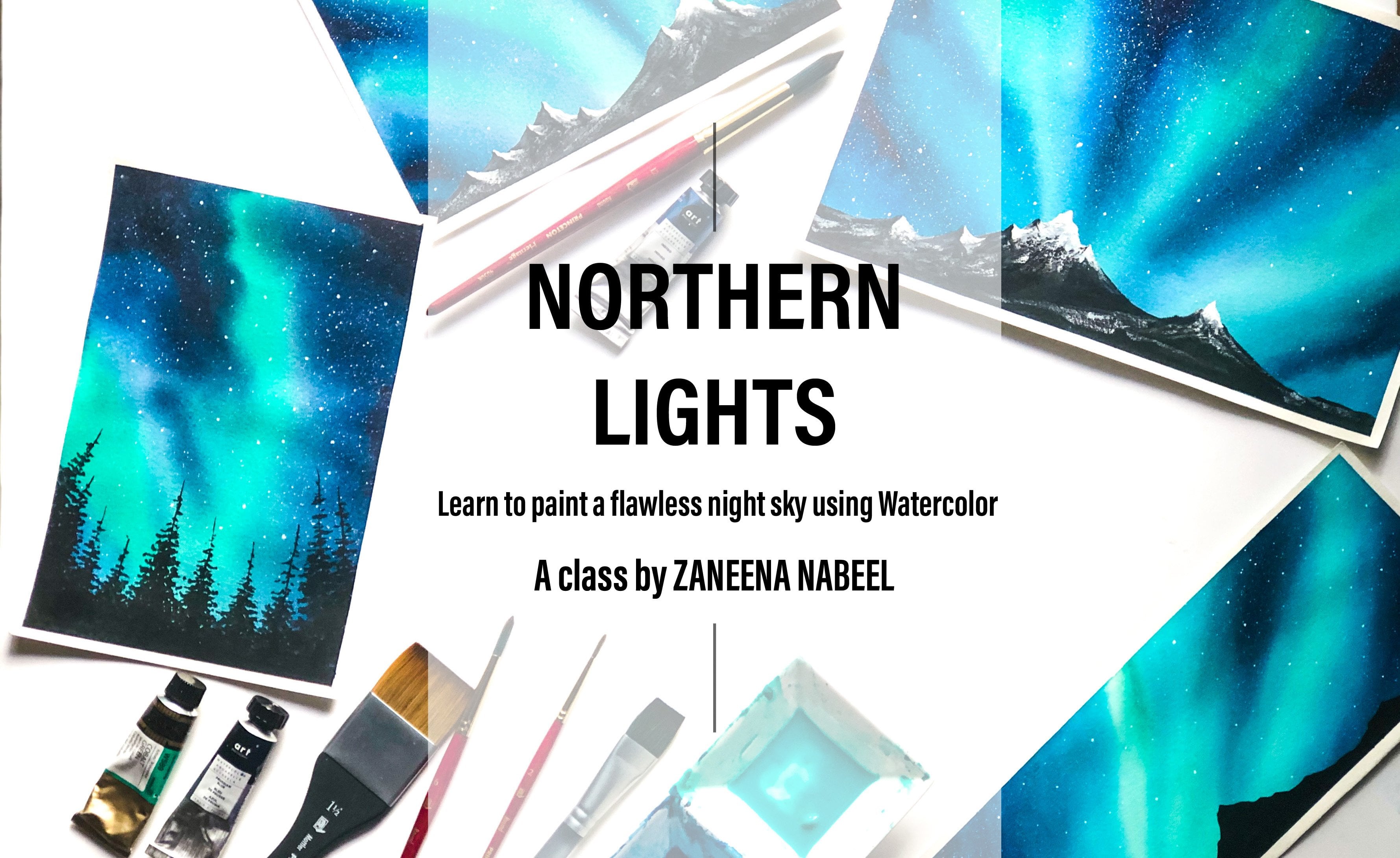
Transcripts
1. Let's go!: If you ask anyone about
what's on their bucket list, there will be one
thing in common, what else other than
watching Northern lights? I know you are also
dreaming about witnessing this magical dancing lights
one day just like me. Hello everyone. My name
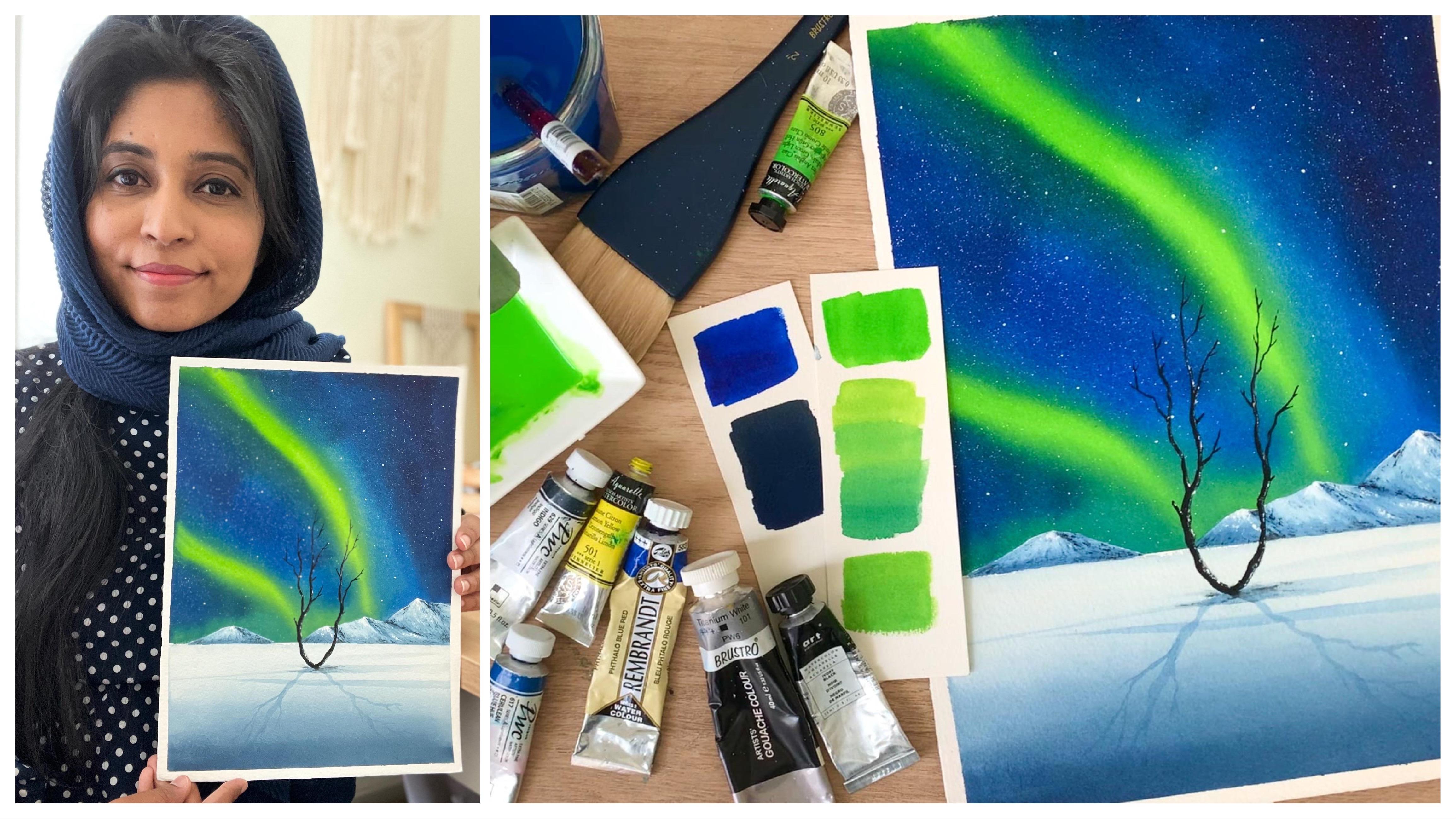
is Zaneena Nabeel. I'm a mother, an artist, an architect, and
an art instructor. I'm originally from India and I'm currently
residing in Dubai. In case you just
happened to join this class and if you
don't know much about me, I would recommend you to
follow me on Instagram. That's where I post
about my wins, my feels, and everything
that's related to art. It's been three years since I decided to quit my
architecture career, to pursue a filtering art. I think it is one of the best decisions I have
ever taken in my life. I sell my artworks, I do exhibitions
once in a while, and I also do coaching
classes for other artists. But more than all of this, I enjoy teaching art, whether it's
in-person or online. That's something I'm
really passionate about. Over the past years, I have got the opportunity
to teach more than 50,000 students from
all around the world and that's an achievement
I'm really proud of. Today, I'm here to
invite you all to a beautiful journey
where you're going to experience watercolors
like never before. We are going to let go of the control that we
have over the medium, and we are going to allow
the colors to dance on the paper and create a
colorless northern lights. It's going to be a short
and relaxing class. We will start by discussing
about the materials, and then we will take a deep
look at the color palette. Choosing the right colors
is really important to get that magical feel for
your northern lights, otherwise you won't
get bad contrast. So that's something we'll
explore in this class. Using the colors we
have chosen we'll paint a gorgeous
northern lights. If you're ready
to give it a try, come along and join me to experience this card
northern light.
2. Class Overview: [MUSIC] Now, let's take a quick look at how the class is organized. We'll start by learning about the different materials
that you will need. I will be explaining about each and every material that
you will need in detail. Then we will look at
the color palette. Again, this is also a very elaborate session
where I will explain about each and every color with their pigment number
and properties. From there we will straight
away get into the project. You don't need to master
any specific techniques to paint this course's
northern lights. I'll be teaching
everything as we go. Each and every step
will be explained in a detailed way so that
you can follow along. We will learn to paint
this turning sky, and we will also learn to
paint a gorgeous mountain, and then we'll also
learn how to add more full grown elements to make our painting look
more beautiful. In short, it's a fun and relaxing class which is packed
with the right amount of information so
that you can paint this charming northern lights
without stressing a lot. [MUSIC]
3. Before we begin: [MUSIC] Before we start pouring
the paint onto the paper, there are few quick things
that I want to talk about. The first thing is, in order to get the best results for
your northern lights, you should stop whenever you feel like you're
happy with the blend. This may sound a bit silly, but then it's absolutely true. I have spoiled many of my paintings by
overworking on the sky. Whenever you feel
like you're happy with the blend and you have got that beautiful contrast,
just leave it there. I may apply another layer or I may add some darker tones, but just ignore that. You should be the one deciding
on whether you want to apply some darker tones or whether you are
happy with a blend. That's something that you
need to keep in mind. Just because I'm adding another layer or I'm dropping
in more darker tone, it doesn't mean you
need to do the same. If you feel like your
paper's drying or if you feel like you're happy with
the result, that is it. You don't need to add
any extra paint or any extra darker tones
just because I'm doing it. You should be the one taking
decisions for your painting. That is one thing that
you need to keep in mind. Because I personally
have spoiled a lot of paintings by
overworking the sky. Literally just few
seconds back I was loving the sky and
few seconds after, just because I added a lot more paint and that
didn't blend properly, I had to discard the painting. I don't want this to
happen to you and that is the reason why I'm
telling you this earlier. Whenever you are happy with your blend and whenever you
are happy with your sky, that is it, don't
overwork on your sky. Now, the other thing
that I want to talk about is the shape for
your dancing lights. For the painting that
I'm doing today, I'm going with a
very normal shapes for the dancing lights. If you want to go with the
more swirly and curvy line, that's totally up to you. You can decide on the way you want your dancing lights to be. The last thing I want
to talk about is the color choices for
your northern lights. I have chosen a green and blue color palette for
my northern light, but it doesn't
necessarily mean that you should be going
with the same colors. You can choose the colors
that you want to work with. After all, you're
doing this painting for yourself, not for me. If you want to go with
pink or violet or purple or any other
color, just go with that. Just follow your gut and go with the colors that you
would like to work with.
4. Materials you'll need: Thank you so much for joining. I'm super thrilled
to have you in here. First of all, let
me take you through all the materials you will
need in detail and I thought, it will be easy for you guys to understand the
materials if I have the real class production
front office so that you can relate and
understand the materials. It is not really
necessary to have the exact same brand of art supplies that I'm
using in this class. You can go with whatever you
have, just kind of similar. Here you go. Start
with the paper. I'm going to use Arches cold
press watercolor paper, which is 100% cotton and
this one has 140 LB. It's an artist-grade
watercolor paper. Today I'm going to do the
painting in one whole sheet. So that means, the
painting is going to be 23 centimeter by 31 centimeter. You are free to choose
the size that you want. You can go for a much bigger
size or a much smaller size. It's totally your choice, but I would suggest
you to go with any artist-grade
watercolor paper. It can be any brand but
go with a paper with some 140 LB minimum and it is 100% cotton to get
the best results. Now for the painting that
we're going to do today, you will have to fix your
paper onto any backing board. It can be a piece
of cardboard or a writing board or
an old magazine. Anything that you can
fix your paper onto. I normally use this MDF panel, but the painting
that I'm going to do today is quite huge, so I'm just going to use the backboard of this
Arches watercolor pad. Just grab anything that you
can fix your paper onto. It can be slightly bigger, or of the same size
of your paper. Now to fix the paper
onto the board, I'll be using a masking tape. This one is a very normal
stationary board masking tape. It's not a painter's tape
or any expensive tape, as we'll be using multiple
layers of water and paint that is stone cut and with that you will get a clean border, so for today's painting
the purpose of masking tape is just to secure
the paper onto the board. Just use any of the masking
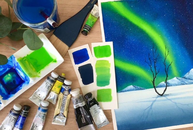
tape that you normally use. The next thing is the colors. As you can see here, the sky is going to be a combination
of green and blue. I have added details
section where I'm explaining about the colors, the brand, their pigment number, and automate shapes, if you don't have
the same color. So you will find all
the information there. Next, you will need a mixing
palette to mix the colors. So this one is a
ceramic mixing palette, which has three notions and I think it was just perfect
for the painting part we're doing today as we have
made majorly working with three colors and we need to
turn them into a liquid form. The design of this
palette is just perfect. I would suggest you too go with a palette which has
a bigger division so that you can prepare that
liquid mix of the color, if you're using a palette,
which has smaller divisions, there are chances you
may run out of paint in between and this may defect
the blending of the colors. You can go with either
ceramic or plastic. It doesn't really matter
but having bigger divisions really helps so that you can prepare enough of
paint in advance. Now just in case if you don't have a pallet with
bigger divisions, don't worry, just grab some small cups or small
bowl from your kitchen. Just be sure to clean it
properly and keep it back. Now let's talk
about the brushes. The first brush you will need is a hake brush or any
wide flat brush. As we're going to do a wet
on wet technique today, you will need a bigger brush to make the entire paper wet. If it is a wide
brush, you can apply water onto a larger
area quite easily. If it's a smaller
brush, you will have to apply multiple times. That's the only difference. If you don't have a hake brush, you can use any of your
normal flat brush, but just be sure there is
no paint on your brush. Clean it properly before you apply water on your paper and just be sure there
is no paint stains from your previous painting. That one was to make
the people wet. Now, these are the other
two brushes I'll be using to apply paint
onto the background, both of them are round brush. This one has size number 12 from silver black silver brush. I'll be using this brush to
apply this green streaks. You can use any of the mediums to bigger size
high strong brush, the brand doesn't matter. It is just to apply
those streaks. The next brush I have
here is a quill brush, size number six, and
it is from Princeton. As you could see here,
this brush is quite huge and it can hold
a lot of paint, and that means I can apply paint onto a larger
area quite easily. That is the main reason why
I'm using this brush today. I'll be using this one to apply the blue paint onto the sky. What I did is, I kept one brush for green and one
brush for blue. This way I don't need to
clean my brush in between. If you don't have two brushes
that's absolutely okay. You just need to clean
the brush in-between. That's the only task. Now, let me show you the
other brush you will need. This one is a flat brush, is a half-inch flat
brush from Princeton. So the first step is to apply green and blue onto the sky, we are just going to drop in that wet paint, and after that, we need to smoothen
those dancing lights, this flat brush uses
mainly for that. I'll be using these
brushes to paint the sky. Then to paint the snowy ground, I'll be using a
wider flat brush. This one is a three-by-four-inch
flat brush from Zen art. As the size of the
painting was quite huge, it is easier for me to paint using a vital brush and that is the main reason why I'm using a bigger brush flat to apply
paint onto the ground. This way is easier
to blend and I can apply the paint onto a
larger area quite quickly. Finally, you will need a
smaller size, strong fresh. This one is size number four, and it is from silver
black velvet brush. You can use any of your medium to
small-sized strong brush, it would be great if it has a pointed tip so that
it is easy for you to apply the details and when
you're painting the tree, it will be really helpful. Otherwise, you can use a detail brush to
add those branches. So those are the brushes you will need for today's painting. I know it is quite a lot. It is just that I don't
want to waste any time in-between washing off
the paint from my brush, I'll just quickly run through all the brushes one more time. This one is a
two-inch heck brush and I'll be using that to apply a clean coat of water onto the sky as the last
onto the bottom. Then I have these three brushes which I have kept
mainly for the sky. The first two are
two round brushes, one is to apply green and
the other one is to apply blue so that I can apply
them continuously. I don't need to
wait in-between to wash out the paint
from my brush. Then I have this flat brush. Once I apply the
green and the blue, I'll be using this brush
to clean them off. This is just to make
that colors look smooth. These are the three brushes
I'll be using for the sky. I have two more brushes. This one is a
three-by-four-inch flat brush to apply paint onto
the snowy ground. Then the last brush is a smaller-sized round brush
to apply the details. I hope now it is clear. You can choose any
similar brushes. Feel free to reduce the number of brushes if you feel like you can use the same brush
in multiple situations. The next thing you will
need is two jars of water. Whenever you're working
with watercolor, it is always recommended
to have two jars of water. One has to stay clean and the other ones are
supposed to help the paint from your brush. I normally use heavy transparent
glass jars so that I can see when the
water is getting dirty and I can
easily replace them. Because if you use muddy
water for your painting, it will affect the
freshness of the colors. So it is really recommended
to use two jars of water. One has to stay
clean, otherwise, you can keep replacing
them quite often. We need to add a simple
sketch of a mountain, for that you will need
a pencil and an eraser. Last but not least, you will need a paper
towel or a cotton cloth to dump off the excess amount of water and paint from your brush. Alright, so that summarizes all the materials
you will need to create these gorgeous
dazzling lights. Go get them ready and
let's get started.
5. Let's choose the colors: [MUSIC] We had a look at the
materials we need, but we're here to
look at the colors, so let's check them out. [MUSIC] It is quite obvious that I'm going to use
green and blue for the sky. I'm going to give you the exact pigment number, the brand, and the name of the color, so that you can get
something similar. I absolutely love this
color combination. It has a beautiful contrast, all which is what northern
light is all about. Here are the three
gorgeous colors that I'm going to use for
this dancing lights. The first one, that
gorgeous green, is phthalo green
light from Sennelier. It's a very pretty, vibrant, and intense green. I absolutely love to use
this for Northern light. Then the next color I have
here is phthalo blue red. This comes from rembrandt. This is one of my
favorite color. I use it quite a lot for skies
as well as for seascapes. Then the last color I
have here is indigo. This one is from
the brand Shinhan. I think you all may have indigo, maybe from a different brand. The other two colors
are not that common, but don't worry about that. I have alternate colors for you, just in case if you don't
have the same color. Now let's perch out
all these colors, I will start with this green. You can see here it's a
very pretty, vibrant, and intense color, which is just perfect for our
northern lights. Here is a closer
look. Look at that. Such a pretty color, right? I love to use this color
for northern lights. It brings that contrast and very magical feel
for northern lights. This one is called
phthalo green light, and the pigment
number is PG7 PY153. I'll be using green to add these dancing lights,
you can see that here. Now, just in case if you
don't have this color, you don't need to worry at all. I'm going to show
you a way you can create a similar color
using lemon yellow, and any blue you have got. First, let me
squeeze out a bit of lemon yellow onto my palette. I'll just take a little. Now, I'm going to mix a little love phthalo
blue with lemon yellow. The blue that you
are using doesn't need to be phthalo blue. I'm using phthalo blue just because I have that on
my palette already. You can use Prussian
blue, cerulean blue, or ultramarine blue, or any of the blue
that you have caught. Just mix a little of
blue with lemon yellow, you can see that
green here already. The color that I added first
looks slightly yellowish, I wanted more of
a greenish color. Keep adding more blue until you get the perfect green for
your northern lights. You can see the
variation of the color. The first one is more yellowish, and as I come down, I added more blue, and it turned out more greenish. I just use some lemon yellow, and mix that with
phthalo blue-red, and I created a green similar
to phthalo green light. Try this out using different
blues that you have got, maybe cerulean blue
or ultramarine blue gives you a much more vibrant
green and Prussian blue. So give it a try, and understand the color that you can
create by mixing them. I'm going to give
it another try. I'm just taking out some paint
directly from this tube, and I'm mixing that
with some blue. Let me swatch that out. You can't see that
gorgeous green, this is exactly what we need
for our northern lights. We'll be adding some
taco blue next to that, to bring in that contrast. The green has to be really
bright and intense. This is the color we need. If you don't have
phthalo green light, just mix some lemon yellow with any of the blue
that you have got, and create a liquid
mix of this color. I hope that is clear. Now let's take a look at the second color, which is phthalo blue-red. I'm just going to
keep this aside, and I will take another
piece of paper. Now, let's swatch out
phthalo blue-red. This one is from rembrandt. It is this blue you see here, it's a very pretty blue. It is really vibrant
and intense. You don't need to worry if you don't have phthalo blue-red, we just need an intense
and vibrant blue. It can be ultramarine
blue or Prussian blue or cerulean blue or any
other blue that I have got. Don't worry if you don't
have the exact same color. Any bright blue will work. Now, I'm going to
swatch this out. When you are painting
northern lights, you need to really work on
the contrast of the colors. It is that contrast which brings that magical feel
to your painting. It is really important to work with the contrast
of the colors. Take out a piece of paper and try out all the blues
that you have got, and go for the bright
and the intense one. Maybe you can try spelching
your blue next to green, so that you can understand which one looks better
with the green. Here's a closer
look of the color. The pigment number is PB15, and it's a color with
a single pigment. You can see how well these two
colors are going together. It has a beautiful contrast. This is what you should
be checking when you are swatching your colors. Go for the colors
which are highly pigmented and which
really stands out. [NOISE] Now we have one more color left for
the sky, which is indigo. I'm quite sure you
all may have indigo, maybe from a different brand. The one I'm using here is
from the brand Shinhan. You can use any indigo
that you have got. The brand doesn't really matter. We'll be using indigo mostly
towards the outer corners, to bring in a really
great contrast, and will be using
the same color for the snowy ground as well
as for the mountains. Here's a closer look of indigo. This one is also a color with a single pigment which is PB66. Those are the three colors
I'll be using for the sky. If you want a similar feel
for your northern lights, you can try out colors
in a similar range. Maybe just look at
the pigment number, and choose the ones which
are closer to these. But according to me, your major focus should
be on the green. Try and create a green color using different blues
and lemon yellow. So put your major focus on
the green and get that right, because it is these
dancing lights which brings that magical
feel to your painting. That green color really needs to stand out from your
entire painting. Otherwise, you won't get that
contrast in your painting. For the blues, you can use any of the blue that I
mentioned earlier, but put your major
focus on the green. There are two more colors you will need for this painting. The next one is white quash, we'll be using white
quash to splatter some stars and also to
paint the mountain. Then we'll be using the same
to add some details as well. You will need white quash. If you don't have white quash, it is absolutely okay to
use white watercolor. Then the last color you
will need is black. I'll be using black
to add this tree. If you are someone who
don't like using black, you can use Payne's
gray instead. Those are the colors you will
need for today's painting. Quickly go get them ready. I really can't wait to
pour them onto the paper. [MUSIC]
6. Prepping the Paper & Colors: [MUSIC] Now, it's time to
get into action. I have a jar of clean water here and my palette
is also ready. Now, I'm going to
take out my paper. Just like I mentioned in
the Art Supply section, I'm going to use a full sheet of paper for my watercolor pad. This one is 23-centimeter
by 31-centimeter. It's a cold-pressed
paper which is 140 lb. I'm going to use
one whole sheet. You can decide on the size
that you want to work with. It can be much more bigger or it can be
much more smaller, it's all up to you. I also mentioned
that you will need a backing board to
fix your paper. It can be a piece of cardboard, a magazine, or anything that you can fix
your paper onto. This watercolor pad just
has one paper left. I'm going to fix my paper
directly onto this board so that I don't need to run and get a board of a similar size. There is one single sheet
left in this particular pad. I'll just tear off
the front cover and I will fix my paper onto the
board using a masking tape. Depending on the size of the
paper you're going with, find a piece of cardboard or a writing board which you
can fix your paper onto. It has to be slightly larger or have the same
size of your paper. Obviously, it
shouldn't be smaller. I'm going to tear off
that front cover. I have one single sheet
left on this paper pad. Now, I'm going to
grab my masking tape and I'm going to
fix the four sides. You can use any masking
tape that you normally use. As you are using quite a
lot of water and paint, there is no guarantee that
you will get a clean border. Just don't worry about that. Anyway, I'm planning to cut the border and I'm going
to frame this painting. I'm going to do
this for my studio. For me, it doesn't really matter if I'm getting a
clean border or not. I have applied the masking tape. Now, I'm going to fold
that masking tape back and I'm going to fix this onto the backside
of the board. I'm running my
fingers along that masking tape to make it firm. Also, there won't be any gap
in between if you do this. You can also use a ruler instead of your fingers
and do the same. Get a backing board,
choose your paper, and apply a masking tape onto the four sides
of your paper. Right here, I'm
using a board which is of the same size of my paper. That is the reason why
I need to bring that masking tape to the
other side to fix it. If your board is bigger
than your sheet, you can fix it the
way you normally do. You don't need to
do it like this. Just apply masking tape
onto the four sides of your paper and firmly fix
that onto any hardboard. Just be sure not to fix your paper directly
on your table. We'll have to tilt and turn the paper to get
the best result. If you fix your
paper onto a table, this wouldn't be possible. Let me quickly fix
the other two sides. [MUSIC] My paper is ready. I have firmly fixed that
onto a backing board. Now let's take out the colors. I already mentioned
the colors that we're going to use
in today's painting. First, I'm going to
squeeze out some indigo. This one is from
the [inaudible] The next color is phthalo blue. I already gave you
alternate colors, if you don't have phthalo red. Take out any alternate blue if you don't
have phthalo blue. You can use Prussian blue, ultramarine blue, cerulean blue, or any other blue. We have taken out a dark
shade and a medium shade. Now we need to take out our lighter shade,
which is the green. The one I'm using here
is phthalo green light. This is from Sennelier. Again, if you don't
have this color, you know how to create
a similar shade using lemon yellow and any blue. Don't worry if you don't
have the exact same color. It can be any green and any blue and can be from
any plant as well. I have indigo, phthalo blue red, and
phthalo green light. Now, I'm going to squeeze
these colors onto my palette. Now, if you want to try
out the same painting with any other color combination,
that's absolutely okay. Get any lighter tone
which can be pink or yellow or any other
bright and light color. Then you need a medium tone, then you need a darker tone
to bring in that contract. Just choose a light
color, a medium tone, and a darker tone if
you want to try out the same painting with a
different color combination. I have squeezed out indigo, phthalo blue, and phthalo green. Now, we need to turn these
colors into a liquid form. I will just drop
in some water onto these colors and I will turn
that into a liquid form. Let's do that. I have a
jar of clean water here. I'm taking one of my brush and I'm simply dropping
in some water. Don't add a lot of water, just a few drops
is all you need. If you add a lot of water, the paint will look really light and it will
lose its intensity. We want the colors to be
really bright and intense, so just add a few
drops of water. Now, you can give it a
good stir and make it into a liquid form so that our task is easy
while we're painting. We don't need to spend any
time preparing the color, we can right away drop that
onto the wet background. Choose your paper, fix
that onto a board, then choose your colors, turn them into a liquid form and join me in the next section. [MUSIC]
7. Masking the Mountains: We have our paper and
colors ready here. Now, I'm going to
apply a piece of masking tape a little below
the center of the paper. Three-fourth of our paper
is going to be the sky and just one-fourth is going
to be the snowy ground. Apply a piece of masking tape a little below the
center of the paper. Once you have applied
the masking tape, just run your fingers
on top of them just to be sure there
is no gaps in between. We have differentiated between
the sky and the ground. Now, we need to add
a pencil sketch, which is a mountain. We are not going to make
the mountain too huge, we are going with some
low-lying mountain. Now, I'm going to add
the pencil sketch. You can add the mountains
however you want to. You don't need to
follow the same profile of the mountain. Maybe if you want to go
with a bigger mountain, you could do that. I have added a small
mountain on the left side. Now, I'm going to add another
one towards the right. I'm continuing that line. Towards the right,
I think I will make the mountain a bit taller. This will make our painting
look more interesting. Just be sure not to add all the mountains in a similar
shape and similar height, go with a very organic sheet, which will
automatically bring in some realistic value
to your painting. The sketch is ready. Our next task is to mask out the mountains using
a masking tape. Instead of a masking tape, we can also use a masking
fluid if you prefer that. Our intention is to retain the paper white
of the mountains. We just need to cover that up. You can either use a masking
fluid or a masking tape. There's going to be a masking
fluid from Daniel Smith. If you're having masking fluid, you can cover up your mountain, but you will need quite a lot depending on the size
of your mountain. I would prefer using
a masking tape. If you're using masking fluid, you will have to leave
your painting for drying for a couple of hours. You will use quite
a lot of time. I'm going to cover up the
mountain using a masking tape. If you have a more
wider masking tape, that would be really great. The one I'm using here
is one masking tape. I will need to use some
more for the right side. In case if you have a masking
tape off two-inch or more, you can directly use that. I have covered the mountains. I have applied masking
tape on top of it. Now, I'm going to
crop my pencil and I'm just going to
copy that outline. You see that? I have just traced that
outline onto the masking tape. Now, I will remove
the masking tape and cut it out in that shape. I can stick it back. This is a really easy method. I would prefer using
a masking tape instead of a masking fluid. I have taken out
the first piece. Now, I'm going to grab a scissors and I will
just cut that shape out. Then I will stick it back. If you're using masking fluid, you will need quiet a lot to cover up the entire mountain. With a masking tape, the
task was quite easy. You just need a small
piece of masking tape. Save up your masking fluid for some other complicated painting. For this one, we just need
a piece of masking tape. I normally use masking
fluid for the shapes which are very difficult to
cover using masking tape. Those cases, obviously, you will need to
use masking fluid. But for this one, the shape of the mountains are not
that complicated. You can see it here. I
easily cut the first piece. Now, I'm sticking that back. I will follow that outline
and I will gently press that back onto the paper.
It's on the plane. Now, I'm going to take
out the other piece. In similar way using a scissor, I will cut that mountain
and I will stick it back. Please be sure not
to put a lot of pressure when you are applying
the masking tape first. Once you have added the outline
and once you put it back, you can put more pressure. You can run your
fingers multiple times just to be sure there's
no gaps in between. This will prevent the water from seeping into the mountain. In the first round, you don't need to put a lot of pressure. I hope the idea is clear. Now, let me quickly finish this. I have one more piece left. This one has nearly done. Now, [MUSIC] I'm going
to stick it back. Our pack task is done. Now, I'm going to grab an eraser because the second mountain
I stuck onto the paper, it's not really in place. There is some table
pencil lines, I'll just erase that off. That's done. Now, it's time to
pour in the paint onto the paper and
play with them.
8. Let's dance with the brsuh: [MUSIC] Now I think it's
time to get messy, choose your colors, add
some water and turn them into a liquidy form and let's
pour them onto the paper. I have already prepared the liquid mix of
the colors here. I'm going to take out
my hake brush and I'm going to apply a clean coat
of water onto the sky. Choose any of your
bigger size brush, this way you can
apply water onto a larger area in
a single stroke, otherwise you will need to run your brush multiple times to
make the entire paper wet. Just like I mentioned in
the art supply section, I have two other brushes ready
here, two round brushes. One is for green and the
other one is for blue. This way I don't need
to wash my brush in-between and I can
save up a lot of time. According to the size of the painting that
you're doing today, choose your brushes accordingly. If you are doing a
smaller painting you don't need
such a huge brush, but if you're doing
a bigger painting like mine you'll need to have bigger brush to apply
paint onto a large area. [NOISE] First I'm going to apply a clean coat of
water onto the entire sky. We have covered up the mountain so you don't need
to worry at all. You can simply apply coat of
water onto the entire sky. Make your paper evenly wet. Run your brush multiple
times just to be sure the water has
reached everywhere. I normally use this hake
brush only for applying water onto the paper
so it is always clean. But in case if you're
using a brush that you normally use for
painting just try it on a scrap piece
of paper and be sure there's no paint still on it
from your previous painting. The paper is evenly wet, now I'm going to
grab my round brush. This one is a size
number 12 round brush from Silver Black Velvet brush, and I'm starting with green. You can see my paint
is not too watery. It is still very
intense and thick. Now, I'm going to drop on this green color onto the paper. I'm going with very
simple curvy lines. I'm not making it too swirly, but if you want to make it too swirly that's totally up to you. Now let's make it a bit more thicker because when we
add paint next to it, it will get slightly thinner. Now I'm going to
add the other line towards the left corner. That is it. I won't be
adding any more green. For the remaining
area I'll be using teal blue and to make
it more darker I will be dropping in
some indigo onto the corners. That is green. [NOISE] Now I'm going to
wash all the paint from my brush and I'm going to switch to the second
color which is teal blue. I'm using a quill brush for blue because there's quite a lot of blue that I need to apply, and with this brush, I can apply blue onto
a larger area quite quickly so that I can apply the paint before
the paper dries up. I have taken enough of
paint on my quill brush. This brush can hold
quite a lot of paint. I'm going to add this onto the area we have
in-between the green. There is nothing
complicated here it is simply to fill that
area we have in between. We have a larger area
on the right side, let's fill that up as well. Take enough of paint and
simply fill that up. Now the anterior sky
is filled with color. We have applied teal green
as well as teal blue. It looks like a lot of green on this corner so let's apply
some blue over here. So we have applied paint
onto the entire sky, now we need to add
more darker values to bring in that contrast. I'm not washing the
paint off from my brush, I'm directly going with indigo. So I'm taking out enough of
indigo on my quill brush. I'm applying this onto the corners to bring
in that contrast, you can see those bristles, it is full of paint. That's the main
reason why I took this brush for the blue part because it can hold
a lot of paint and I don't need to keep
refilling my brush. I'm going to apply
this onto the corners, some over here, add a
little over here as well. Wherever I had applied blue, I'm going to apply some indigo and I'm going to add any
onto the green part. We'll only be adding darker
values onto the blue, we won't be adding
any onto the green. We are going to
leave it as it is, we want the green to be
really fresh and vibrant. In case if you want to
add more darker values you could do that. I'm going to add a little
next to the green. This is basically
to give a shape to that dancing lights so run
your brush in a swirly way. We still need that green so
don't add a lot of blue. I'm going to keep
this brush aside and then I'm going to
grab my flat brush. We need to smoothen
those areas where we had applied blue
next to the queen. This one is a half-inch
flat brush from Princeton. It's a clean brush, it
doesn't have any paint. Our next step is to smoothen
out those dancing lights, right now it doesn't
have any shape. You need to keep a paper
towel next to you, and we are going
back with green. Take out some paint
on your brush, dab it on a paper towel, make sure it is not too watery. We have some green which
isn't that watery, using this brush I'm going to clean out
those dancing lights. So from the top I'm running my brush until I
reach the bottom. I'm not stopping in-between, this is something that
we need to keep in mind. You can see that blue
color spreading into the green creating a
feathery effect here. This is what we are getting
rid off by running our brush from top to bottom. See that? You can see the difference
from the top and the bottom. Every time you do this
clean your brush on a paper towel and go
back put some green which isn't that watery
then keep running your brush in a swirly
way from top to bottom. Don't stop it in-between. It is more like you're
dancing with your brush so take out some green
paint on your brush and run that in a swirling way but keep in mind not
to stop it in-between. You should be doing
this swirly line in a one single go from
top to bottom. You shouldn't be breaking
that in-between. So that's a smaller one, now we need to do the same thing for the bigger dancing
lights as well. Don't put a lot of pressure, gently run your class
from top to bottom in a swirly way so that it can
smoothen out those colors. Your background might be still
slightly wet so make use of the time and quickly
run your brush. We are not going to
touch the blue part, we will be leaving it as it is. We will only clean up this area where we have those
dancing lights. You can keep repeating
the step until you're happy with the result,
but don't overdo. The moment you feel
like you're happy with the result or
the moment you feel like your paper is drying that's a sign that
you need to stop. I got my sign, my paper is drying so there
is no point me repeating the same step and I think I'm happy with the
result as well. There it is, now I'm going
to leave the sky for drying. I hope you guys enjoyed painting the simple
gift card with Northern lights and I hope you guys are happy with
the result as well.
9. Splatter splatter splatter!: This guy has dried completely. Our next task is
to add some stars. I'll just clean this green area. Now I'm going to squeeze out some white gouache
onto my palette. I'm using white
gouache for the stars. If you don't have white gouache, you can also use
white watercolor. But gouache is more opaque and the color won't fade
away when it dries. That is one of the
main reasons why I always recommend
using white gouache instead of white
watercolor for adding stars as well as for
adding highlights. But if you don't have gouache, that's okay, let's
go with watercolor. No matter whether you're using white gouache or
white watercolor, squeeze a little
onto your palette. Now, I'm going to
use a smaller brush to splatter the stars. This one is a size
Number 4 round brush, add two drops of water, and turn your white paint into a slightly watery consistency. Don't add a lot of water. If you add a lot of water, the paint will become too loose and it will lose its opacity, so don't add a lot of water, just few drops is all we need. To get the right
size of the stars, it is really important
to work with the right consistency
of the paint. It shouldn't be too thick and it shouldn't be
too loose as well. It should be
something in-between. Whenever I'm not too sure
about the consistency, what I do is I take out a paper towel and I
gently dab my brush on a paper towel multiple times to remove the excess amount
of water from my brush. The simple trick is really helpful to get those tiny stars, you won't end up
creating bigger stars. Take out some paint
on your smaller brush and if you're not too sure
about the consistency, dab it on a paper towel. Now, take out another brush and gently tap on the brush
to create tiny splatters. I'm gently tapping on my smaller brush where
I have taken paint. You can see the
size of the stars, they are really tiny. If you're still not sure about the consistency of the paint, maybe you can take out any
old painting of yours and try splattering on that to
see the size of the stars. When you're really sure
about the consistency, you can splatter on
your main painting. Splattering the stars onto
your Northern lights, it is a really fun process, but it is a really
messy process as well. I would suggest you do keep away all your
expensive belongings, because this can
create a real mess. I'm going to apply
some more stars, mostly on the outer corner where we have those darker shades. Towards the bottom, we
have lighter tones, so the stars won't
be really visible. I'm focusing more
on the outer area where we have applied indigo. Looks like I have
added in enough stars. Now using the same brush, I'm going to add some
bigger stars as well, which means I'm just
adding some bigger dots. For this step instead
of your brush, you can also use a
white [inaudible]. Maybe that will be
more convenient. Anyway, just pick
some random area and add in some bigger dots. [MUSIC] I have added enough stars. I'm really happy with the
way this guy has turned out, especially the color
combination that we have used. The next step is to peel off the masking tape and paint
the snowy mountains. I will catch you in
the next section.
10. Snowy mountains: Here we are. I just feel like I should have added some more
darker tone to over here. That might have brought a more contrast to our
painting and it would have really enhanced those dancing lights,
but never mind. Anyway, our next task is
to paint the mountains. I'm going to slowly
remove the masking tape. Looks like there
were some gap and some paint has seeped
into the mountains. Never mind, we can fix
that with white gouache. The rest of it looks fine. First, we will paint
this new ground, then we can paint the mountains. I will just add a
line over here, which is the horizon line. We have a clear
separation between the mountain as
well as the ground. I will need to take clean water. Both of them has [inaudible]. First, we have to
apply a coat of water onto the snowy ground. We're going to make it wet, then we're going to
apply the paint on it. I'm going to switch
back to my hake brush. This one is a two
inch hake brush, the same one I used for the sky. I'm applying a clean coat water. Just like how I mentioned while
you are painting the sky, according to the size
of your painting, choose a bigger size brush. If it's a smaller one, you
can simply use your three by four inch brush or any of
those smaller flat brush. Just be sure not to
add any water onto the sky when you are closer
to the horizon line. At two places, we
have left some gap. At those places you will
have to be really careful. The paper is evenly wet. Now, I'm going to take our by three by four inch flat brush. This one is from Zainab supplies and three by four
inch flat brush. I'll change to a bigger
size black brush just because the area that I have
to paint is quite huge. With a bigger size brush, I'll be able to apply the paint onto the paper quite quickly. I had my other half
inch flat brush here. If I use this one, I will have to run
my brush multiple times to fill up
the entire area. That is the main reason why
I'm using a bigger brush, but depending on the
size of your paper, you can choose your
brush accordingly. For the snowy ground,
we'll be using indigo. I will just flip my palette. Now, I'm going to
grab some indigo, adding two drops of water. We're going to make the bottom medium more darker
and the top more lighter. We can see the color I'm using, it's a medium tone of indigo. Over here, I will go
with a medium tone. As I'm approaching
the horizontal line, I will make the color lighter. It's going to be a simple
gradient wash of indigo, lighter on the top and
darker at the bottom. I will just wash
out the paint from my brush and tap it
on a paper towel. I want the top area
to be really light. If possible, try to
make it a clean blend. In case if you prefer
going from top to bottom, you can start from
the lighter tone and make the color
darker as you come down. I went from bottom to top and I started off
with a darker tone. But if you prefer having the
paint the other way around, from light to dark, from top to bottom, that
is absolutely okay. We just want a gradient
wash of indigo. You can see how pretty
that color is looking, it is really light
along the horizon line. Maybe I think we can make the
bottom a bit more darker, because when the color dries, it will be slightly lighter. Maybe we can drop in a bit more darker tone just at the bottom. I'm not going to
touch the top part. I'm quite happy with
the shade over the top. That aside, now let's
wait for this to dry. The sky has dried completely. Now, it's time to paint
the snowy mountains. I have my brush which I use
for splatting the stars, it still has some white paint on it, I haven't washed it. I'm going to use
this white gouache to paint a snowy
mountain as well. What I'm going to do is,
I will just mix this with indigo to create
a lighter shade. I don't want to transfer and look for my snowy mountains, and that is the
reason why I'm mixing some white gouache with indigo. You can see the color here. I have created a light tone of indigo by adding
some white gouache. If you would like to have
that transparent feel for your snowy mountains and
through a white gouache, you can simply add some water and turn the indigo
into a lighter tone. Now, I'm going to apply this color on the
top of my mountain. You can see the color here
at a light tone of indigo. I'm using my size Number
4 brush to add the paint. Now, as I'm coming down, I'm making the color
slightly darker by adding some more indigo
into the same mix. On the top, I have
a lighter tone, and towards the bottom I have
a medium tone of indigo. Isn't that dark? It is just slightly darker than the color we have used on top. Because we need to get that
snowy feel for our mountain. If you're adding a
lot of darker values, you won't get that snowy feel. We'll be adding some details and some dry brush patterns
using a darker tone. But for the background layer, we want to make it as
light as possible. I'm going to do the same thing for the other mountain as well. I've started off
with a lighter tone. As I'm coming down closer
to the horizon line, I'm adding some darker values. I think you can get that
snowy feel already, we have just used
lighter tone of indigo and we made the color slightly darker along the horizon line. The technique that I'm
using here to paint the snowy mountain
is really easy. Trust me, you'll
be able to paint a very realistic
looking snowy mountain using this technique. I have added the base layer. Now using the same color, I'm going to add some
deeper values in between to make our mountain
look more realistic. We need to apply
this deeper tones while the background
is still wet so we can finish
the first part of the mountain on the right side. Once we are done with that, we can paint the one on the left. First, I'm adding some
deeper tones over here just to distinguish
between the two mountains. Now starting from the
tip of the mountain, I'm adding some deeper tones
towards the right side. I'll do the same thing for
the other mountain as well. You can add few over the bottom. It might look a slightly
messy at this point, but then that's absolutely okay. Will be smudging the color using a slightly wet brush and
we'll make it look better. Right from the tip
of the mountain, you can add some deeper values
towards the right side. Now tap your brush
on a paper towel, and simply smudge that
into the background. We don't want those patterns
to be too prominent. That's the reason why
I'm smudging that. I also need to fix
these spots here. I'll be taking a lighter tone of the same color and I will
simply cover that up. I'm adding some
more white gouache and creating a similar color as the background and I'm
simply cutting that up. Right now the mountains
are looking quite dull, but we'll be adding
more deeper values, will be adding some dry
brush patterns using a darker tone of indigo
as well as black. You will slowly see
how the mountain is starting to look more realistic. I have covered those spots. Now using the same color, I'm going to apply
some more deeper values towards the right side of the mountains to make those patches look
more smoother. Right now they're
looking quite prominent. I want a very smoother
look for the mountain. I'm just smudging those
colors using a lighter value. As we have used white gouache along with indigo
in the background, it will be quite easier for
you to smudge the color. If you like your paints to dry, you can add a little water to your paint and you can keep on smudging the color
until you feel like you have got
a smoother effect. Looks like this one is done. Now, we need to
do the same thing for the other mountain as well. I'm starting off with a
lighter value of indigo. I have added some white gouache, just like we did earlier. I'm applying that towards
the top of the mountain. As I'm coming down, I'm making the color
more darker by adding some more indigo
into the same mix. Now apply that, and
make it a smooth blend. This is the base layer. We'll be adding more
details onto this, just like how we did on
the previous mountain. That's the base layer.
As we have used gouache, it will be very easy for
you to blend the color. Now using a slightly
darker tone, I'm going to add
some deeper values towards the right
side of the mountain. Have taken the
paint on my brush, now starting from the
tip of the mountain, I'm adding an irregular line, and I'm adding some deeper
values towards the right side. That is it. We have applied the base layer
for both the mountains. Next, we'll need to add
some dry brush patterns onto the mountain to make
it look more realistic. I'm going with a
medium tone of indigo, which is slightly darker than
the color we used earlier. We need to turn our
brush to be really dry, so I'm dabbing my brush
on a paper towel. The brush I'm using here
is size number four. I would recommend to use a
brush of a similar size, don't use a bigger brush because the patterns that we need to
add should be really small. If you add bigger patterns, the mountain will go
out of proportion, so you should be adding really
small dry brush patterns. Take a medium tone of
indigo on your brush, dab it on a paper towel and turn that into a
really dry brush. Now, keep on adding some
dry brush patterns onto the mountain where we have
applied those medium tones. Concentrate on the areas we have applied medium
tones earlier, and over there, you can add some more dry brush patterns. But be sure not to add a lot, we are going with a minimum
look for the mountain. Concentrate more on
the right side of the mountains where we have
added those medium tones. You can see the way
I'm adding them, I'm not adding a lot. Your brush should have
bare minimum paint, so keep dabbing your brush
on a paper towel multiple times just to be sure there is no enough paint
on your brush. If there is a lot of
paint on your brush, these patterns will
look really prominent and you won't get that simple
look for your mountain. Maybe you can try scratching
on a scrap piece of paper just to be sure there's no
enough paint on your brush. Let me add few more
dry brush patterns, then I'll be done
with this mountain. Then I'll need to
do the same for the small mountain we
have on the left side. Okay, so this one is done, you can see how I have used very minimum details and still
it is looking so pretty. Now we need to do the same thing for the other mountain as well. This one is a really
small mountain, so it is going to
be comparatively easy than the other one. I'm adding some dry brush
patterns along the right side. I'm adding few on the
other side as well, but my main focus is on the right side that we have added those deeper
tones earlier. It looks like that,
is also a turn. Now we need to do the
same thing using black. If you're someone who don't
use black in your painting, you can use Payne's
gray instead. I'm going to squeeze out
some black onto my palette. Before we start adding
the details using black, there is one thing
that we need to do, we need to indicate the location of the tree that
we're going to add, and also we need to add
some shadows on the ground. Let's finish that first, then we can come
back to the mountain and add the final details. I have taken my pencil. This is where I'm
going to add the tree. It's going to be a
very interesting tree. I'm just going to add
a rough location and a rough shape. This
is just a reference. It may change into something different when I'm
adding paint on it. That's a basic shape. Now, I'm going to take out
a lighter tone of indigo, and I'm going to add some
shadows on the ground. After that, we can go back
to the snowy mountain, and when we're done with
the snowy mountain, we will be painting the tree. I'm switching back to my
size number 4 round brush, and I'm using a very
light tone of indigo. Just be sure you're
using a lighter tone. Maybe you can try scratching
on a scrap piece of paper because the color has
to be really light and I don't want you guys
to make any mistake. It's a very simple step, I'm going to add two
or three thick line using a lighter tone of indigo. One, I will add over here, which is right underneath
the tree, just a thick line. Adding the second one,
leaving some cap in between. The lines can be slightly
inclined or straight, those things doesn't
really matter, but be sure you're using
a lighter tone of indigo. Also, if you can add the
line in a single go, that will be really great. Don't break the line in between. This may spoil that
smooth flow of the lines. I have added two lines, now I'm adding another
one using a lighter tone. That looks fine. I'm not going to add anymore. Let that dry. Meanwhile, we can add the final
details onto the mountain. I'm going to go with black. Just like how we did earlier, I will add some dry
brush patterns. The time I'm just using black, that's the only difference. I'm using the same brush, this one is a size
number 4 round brush. Take some paint on your
brush and tap it on a paper towel just to turn
the paint into a dry one. On the same space we
have applied earlier, you can add some more
dry brush patterns using black or Payne's gray. These deeper tones will give a finishing touch
to your mountain, as well as it will make
it look more realistic. But we still have to retain that simple look
for the mountain. We don't want to make it too
busy with so many beetles. Don't add a lot of
dry brush patterns, just add few here and there. Just keep in mind the paint
shouldn't be too watery. Dab your bush on a
paper towel multiple types if you feel like
your paint is too watery, otherwise they will
look too prominent. We just want the
dry brush patterns. Focus mostly on
the area where we have added those medium tones, especially on the right
side of the mountain. You don't need to add a
lot on the left side. On the left side, you can retain most of the lighter values. Go ahead and add in some dry brush patterns using either black or Payne's gray. Concentrate mostly on
the area where we have added medium tones and
also along the bottom. You can see here how carefully
I'm adding those details. I'm not adding a lot. Also the size of the pattern that I'm adding are quite small, they're not too huge, so don't make your mountain too busy by adding a lot of details. You can concentrate
on the area where we have added those
medium tones, especially towards the
right side of the mountain. Just concentrate on the areas where there will be shadows. That's done. Now, I'm going to wash the
paint from my brush and I'm going to switch
to white gouache. Now, just like how
we used indigo and black to add those
dry brush patterns, I'm going to use white as well, and will just add some white
highlights here and there. I'm not going to add a lot. I'm concentrating
mostly on the left side where we have those
lighter values. Just add some white
highlights using a dry paint. Keep dabbing your
brush on a paper towel just to be sure that your
paint is not too watery. You can simply add some
highlights like this. Don't add a lot, we just need
a little here and there. Don't use very thick
white opaque paint, dab between a paper towel. If you use thick opaque paint, it will be really prominent. We don't want these
white patterns to be really prominent. We want a very subtle
look for the mountains. That is the reason why
I'm telling you to dab the brush on a paper towel and focus mostly on the left side where we have applied
those lighter values. This is it. We have added enough of details onto the
snowy mountain, their. Now, our final task
is to add the tree, and that is going to bring a lot of difference to our painting.
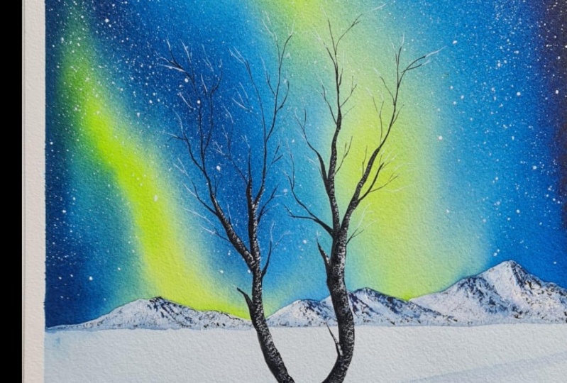
11. Adding the tree: I have already added
a reference line. Now I'm going to go
back with black. I'm taking enough of
paint on my brush. The one I'm using here is a
size number four round brush. Now I'm just running my brush over that line I
have added here. You can use a thicker line
for the main tree trunk, then the rest of the
branches that you're going to add onto this can be thinner. Also, run your brush
in a very curvy, bumpy manner so that your tree
will look more realistic. If you would like to
use a different shape for your tree, you
could do that, or if you don't want to
add any tree at all, that is also totally okay. So decide on what you want for your painting and add
your tree accordingly. If you want to push the tree onto the right side
or to the left side, even that is also okay. Now I'm going to add
the other branches onto the main tree trunk. When you're adding the branches, try to use a brush which
has a pointed tip so that you can add them in a very
delicate and thin way, otherwise, your tree will
go out of proportion. The main tree trunk has to be thicker and also
the main branches. Then the smaller
branches that you're adding onto that can be thinner. [MUSIC] I have added the overall
shape of the tree. Now, onto this, I'm going
to add plenty of branches. You can add them
however you want to. You don't really need to follow the same way I'm adding them. First, I'm going to
add a branch here. Even for that, I'm going with a very curvy and
bumpy shape just to make my tree look as
realistic as possible. At some places, I'll be
adding some longer branches, and at some places, I will
just add some small branches. Here, I'm just adding
a small branch. I'm making it a little more
thicker at the bottom, maybe a little
more here as well. Now let's add some
branches on the top. Use a brush which has
a pointed tip in order to get them really
thin and nice. Otherwise, it will look really thick and your tree will
go out of proportion. The colors we have used
for the sky is quite dark, so maybe you can make the
tree trunk a bit more thicker so that it
will really stand out, then you can go for
some thinner branches. I will make the side
also a bit more thicker, running my brush on top of the tree trunk and
making it thicker. Now I'm going to
add the branches. [MUSIC] I'm quite happy with the way
the tree has turned out. I think I won't be adding
any more branches. If you'd like to add
more, you could do that. Maybe you can use a
smaller size brush and add some more thin
and delicate branches. This will make your painting
look really beautiful. But if you don't want to add, that is also absolutely okay. Now I'm going to wash
the paint from my brush, and I'm going to add the
shadow for the tree. Our tree has a very
interesting shape. We need to somehow make a mirror image of the
tree on the ground, so that is what we're
going to do next. For that, we need a
medium tone of indigo, which isn't really dark and which isn't really
light as well. It should be visible
from the ground. Go with the medium tone, something similar
to the color we use for adding those lines. Add some water. Maybe you can try swatching on a scrap piece of paper just
to be sure the color is not really dark because this
is a really important step. It will give a lot of realistic
value to your painting, so it is very important
to get the color right. That's the kind of color
that I'm going with. I will prepare
some more color in advance so that I
won't run out of paint in-between when I'm adding
the shadows because it is really important to retain the same color
throughout the shadow. It shouldn't be
darker at some places and lighter at some places. Make enough of paint in advance
and try swatching that on a scrap piece of paper before you apply that onto
your main painting. I will swatch that again. That seems perfect. It doesn't really dark and it doesn't really light as well. For the background,
we actually have a lighter tone closer to the tree, and
towards the bottom, we have a medium tone
so the shadow that you're applying should be
visible on both the places. That is the same reason
why you shouldn't be using a light tone
for the shadow. It should be visible
over the bottom as well. Once you have the color ready, start from the bottom, right from here, and try to replicate the shape of the tree in the opposite direction. It doesn't need to
be exactly the same, just go with a similar shape. You can see here my tree and the shadow is
completely different. But if you take an overall look, it does look the same. That's the trick.
You don't need to follow each and every
curve in a similar way. Just go with the
middle image and try to make it similar
at some places, but then don't put a lot of
pressure to get them right. You can see my tree
and the shadow, they are not really the same. But once I finish
adding the branches, they are going to look okay. So don't put a lot of pressure in making
them exactly the same. You just need to look
at the overall shape, don't worry about the rest. I I added the main tree trunk, now I'm going to add
some branches onto it. I'm going to add two or three
branches on either side. I'm not really
looking at whether I'm adding them at
the correct position. Also, take a look at the
color I'm using here. It isn't really dark and it
isn't really light as well. Over the bottom, there we have that medium tone of indigo. Even over there the color
is slightly visible. This is what I said earlier. You need to prepare
enough of color in advance, otherwise, when you add those
shadows there are chances you might
run out of paint. It might look slightly weird if you use different
colors in the same shadow, so try to make a little
paint in advance. I think over here, I took a slightly darker color. I'll just smudge that, otherwise, it may
look slightly weird. Over here you can
see that joint. I'm going to make my brush
slightly wet and I'm going to smudge that so that that
joint is not visible. That's done. It isn't
really perfect, but I think it
serves the purpose. Now, I'm going to
go back with black, and I'm going to dab my
brush on a paper towel. We need to add some
dry brush patterns right underneath the tree, just a few patterns on the ground where the
tree is standing. You don't need to
add a lot of paint. Don't make it too busy. Keep dabbing your brush on a
paper towel multiple times just to be sure there is no
much paint on your brush. That is also done. Now I'm going to wash out the
paint from my brush again, and I'm going to go back
with white gouache. Our last task is to add some more white highlights onto the tree to make it
look more gorgeous. We should be using
a dried paint. Once you have taken white
paint on your brush, dab it on a paper towel. Now I'm adding them along
the right side of the tree. Just keep scratching your
brush onto the tree and add some white patterns onto the right side of the
tree and the branches. You can concentrate on
the thicker branches as well as the tree trunk. You don't need to add them for those thin and
delicate branches. You can see the
way I'm adding it. I'm focusing on the
right side of the tree, and I'm just adding some
white and dry brush patterns. We don't need a lot. Again,
don't make it too busy. Just a few highlights
onto the right side. The same can be done onto the other side of
the tree as well. Also, you don't need to add them onto the thinner branches. That may look a little weird, so just focus on the thicker
branches and the tree trunk. There's one more thing that
you need to keep in mind. Don't add them as a thick,
bold continuous line. Go with a broken pattern, and you can skip some
places in between. You don't need them everywhere. Now, in a similar
way, I'm going to add white patterns onto the
other side as well. [MUSIC] That is it. We are done with our card,
this northern lights. You can see the difference
those white highlights made. I'm really happy with
the entire painting. Now it's time to peel
off the masking tape and admire our card,
this northern lights.
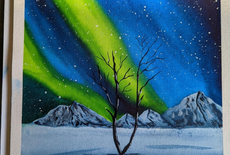
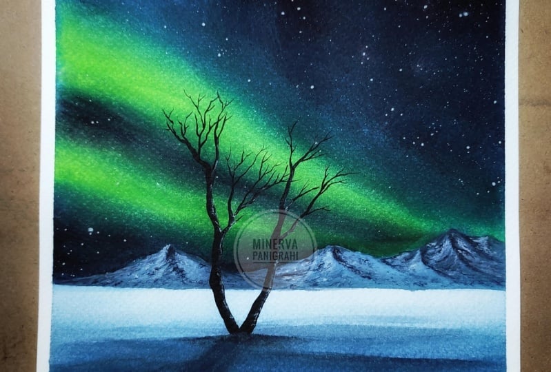
12. The final reveal: We have finished our painting. [MUSIC] Now the final task was to peel off
the masking tape. I'm not really worried about
getting a clean border as I'm going to frame this
painting for my art studio. But looks like I have got a
clean border at the bottom. Wow. Over here also I
have got a clean border. This is not fair;
whenever I don't need a clean border it happens
to be a clean border. Otherwise, when I'm craving
for that clean border, I never get it right. Anyway, no complains, that how life is. Whenever you wish for something
you will never get it, but whenever you're not looking for it life surprises you. Anyway, here's the
finished painting. I'm quite happy with the
way it has turned out. Especially that color contrast we use for the dancing light; it has come out really great. I think it is going
to be a perfect addition for my art studio.
13. Yay! You've made it to the end :) : My dear friends, we have
made it to the end. Thanks a lot for joining. I hope you all had a great
time painting with me. I don't think I will ever get bored of painting
Northern light. It is one of my most
favorite subject to paint. I love exploring the same topic with different
color combination. I really think Northern
light is a subject which has endless possibilities
when it comes to the color combination
and the subject itself. For someone who love painting Northern light just like me, I have added some referencing meters in the project section, which you can try recreating. They are mostly of the
same color combination, but the subject is
slightly different. I think you're
going to have a lot of fun recreating them. If you like my class, I
would really love if you can leave a review as well as
upload the class projects. This will really help my class
reach to a wider audience. That's something I would
really love if you can do. Thanks again for joining and
happy painting. Bye-bye.
 Zaneena Nabeel, Top Teacher | Artist