Transcripts
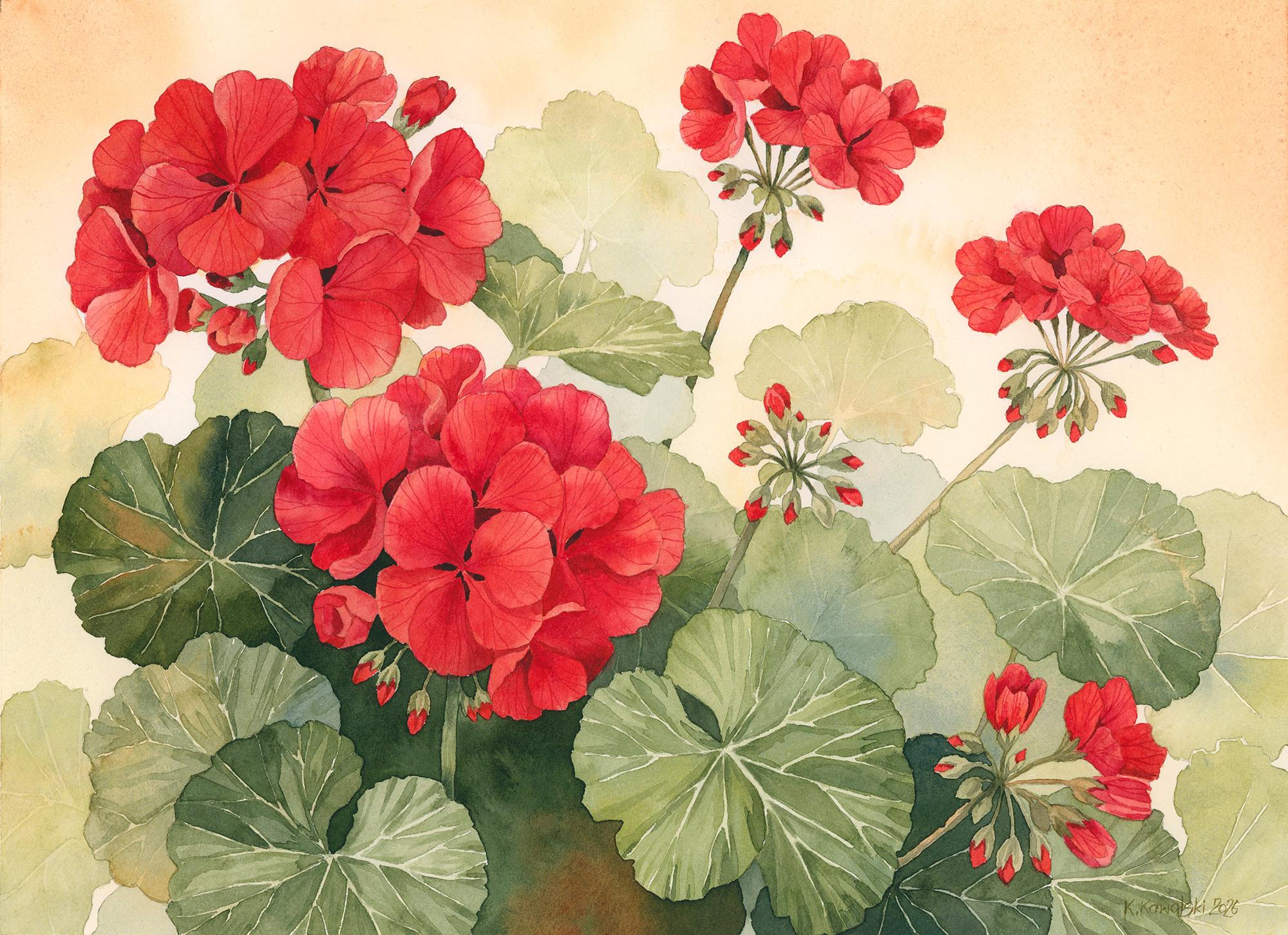
1. Introduction: Hello, and welcome to this
watercolor painting Tutorial. Today, I would like
you to join me in painting beautiful
red geranium flowers. At first sight, this may look
like a complex painting, but you will quickly realize that it's much easier
than you might think. We're going to paint it
in a very simple style that I previously used for
my Nasturtium painting. Thought the same idea
would work beautifully for geraniums and over time
for other flowers as well, creating a nice collection
of paintings in this style. The techniques we'll use
here are really simple. There is nothing unusual or
difficult in the process. The strongest aspect of
this painting is definitely decomposition and the way we are going to
handle the leaves. These two elements,
decomposition, and the fading leaves are what make this painting look
especially interesting. Color palette is
also very pleasing. We have contrasting
reds and greens softened by delicate
browns in the background. Overall, it creates a very calm, elegant and almost
sentimental mood. I hope you will enjoy
creating this painting, so prepare all the
supplies you need, and when you're ready,
let's get started.
2. Project and Resources: I've prepared a selection
of helpful resources for your project available in the projects and
resources section. You'll find a PDF file with the supply list I used
for this painting, along with a reference photo and an image of my finished
artwork for guidance. Line drawings in
various sizes are also provided so you can print and transfer them onto your watercolor paper in the size that best
fits your needs. The size of my painting
is 15 by 11 ". Additionally, there are
working progress photos to help you follow the process
and focus on specific areas. Feel free to explore
these materials and use them to create your own unique and beautiful painting. Please share your final painting in the projects and
resources section. I also encourage you to
take the time to view each other's work in the
student project gallery. It's always inspiring to
see what others create and the support of your
fellow students can be incredibly comforting. Don't forget to like and
comment on each other's work. Lastly, I highly
recommend watching each lesson before
you begin painting. This will give you a clear
understanding of what to expect at each
stage of the tutorial. If you find this class helpful, I would greatly appreciate it if you could leave
an honest review. Your feedback will help me
improve my content and assist other students in deciding whether to join the class.
Thank you in advance.
3. Painting Preparation & Plan: Really like geranium flowers and the distinctive
smell of their leaves. They are very popular
here along with petunias, and people often keep
them on their balconies. Whenever I see them blooming, I take photos to use as
references just in case. There are many
varieties of geraniums with different colors
of petals and leaves, but I think the most popular
ones are the red varieties. For this painting, I didn't use one specific reference photo because I already had
a composition in mind, but I hadn't captured it
properly in any of my photos. In situations like this, I like to use my iPad and
the Procreate app to plant the composition
and create it from scratch based on the general
appearance of the flowers. So I opened several reference
photos and based on them, created a composition
that I liked. After many layers
and refinements, I finally arrived
at a final sketch. Which I then refined
further and turned into a clean line
drawing for us to use. Just like with the nsturtiums, if you had a chance to
paint them with me, we won't be following one
particular photo here either. We won't be recreating a
specific reference image. Instead, the photos
will simply give us a general idea
of what we can do. You could say that we have
full artistic freedom here. Once we have the drawing, we can paint it in
whatever style we like. I would describe this
painting as realistic but slightly stylized because we are not copying any
specific photo. So feel free to
change anything to better suit your own
style and preferences. If you would like to paint it in a much looser style, go ahead. If you would like to change
the colors, don't hesitate. You can either follow my process closely or make this painting
completely your own. Here's what we are going
to do step by step. First, we'll paint the
entire brown background. We won't mask anything because there is no need
for that in this painting. Then we'll paint
simple silhouettes of the leaves in the background. After that, we'll paint the
leaves in the middle ground, which will be slightly darker. We'll divide the
stage into two parts. In the next step, we'll paint the leaves
in the foreground. Notice that the closer
the leaves are, the darker they become. The stonal transition from darker leaves in the front
to lighter leaves in the background will
help us create a stronger sense of depth
and a fuller composition. After painting the leaves, we'll move on to the stems
and the little buds. Next, we'll apply the
first basic layer to all the red petals. Once the first red layer
is completely dry, we'll apply a second layer. At this stage, we'll
deepen the colors, create shadows, and define the individual
petals more clearly. Finally, in the last step, we'll add the details, the darkest accents between the petals and the
veins on the petals. So those are the eight steps we'll take to complete
this painting. In the class resources, you will also find work in progress photos that I
took after each stage, and they should help you follow
the process more easily. Now let's move on to step
one, painting the background.
4. Painting the Background: I believe that the key to a successful painting in this case is a really
good pencil drawing. So before you start painting, make sure that your drawing includes all the
necessary details. I used a light pad to
transfer the line drawing, and now I can see that the
lines are a little too dark. So I'm going to use a kneaded
eraser to lighten them. A kneaded eraser
can be shaped into a roll and gently rolled
over the pencil lines. This removes the excess graphite and makes the drawing
lighter in tone. I like to keep my pencil
lines as light as possible, so I often lighten
them this way. You can immediately
see the difference. The drawing is still visible, but it won't overpower
the painting. It's best to make sure the drawing is ready
before you apply any water or paint because once the pencil
lines become wet, they may be
impossible to remove. I have a spray battle
with clean water, and first, I'm going to spray
my paints to activate them. I let the water sit in
the wells for a moment to soften the paints and make
them easier to work with. For preparing the colors, I like to use an
inexpensive flat brush. It has slightly
stiffer bristles, so it's easier to transfer more paint from the wells
to the mixing area. We're going to paint
the background now, so I would like to use
a light brown color. My base will be burnt sienna, but I will also add some Windsor yellow deep to create a warmer, more
yellowish shade. I'll also prepare some
green, and this time, I think I'll go for a mix of transparent yellow
and ultramarine blue. Although winds are
yellow deep with ultramarine blue would
also work well here. I'll also add a touch
of burnt sienna. The idea is to create a
natural looking warm green. If I used Windsor blue, it would create a very
bright vibrant green. A warm yellow mixed with ultramarine blue and even
a touch of brown creates a more muted shade
because all of these colors have a
slight red undertone. So the green doesn't
become overly vibrant. You can think of it as
mixing yellow and blue, but with a little bit of
red in the mixture as well. For painting the background, I will be using a
size 12 round brush. It's the biggest
round brush I have. As you can see, we don't mask
out the flowers or leaves. The reason for that is because the background color
is very light, much lighter than the color
of the petals or leaves. It also won't negatively affect the final colors of the
flowers and leaves. So even if we go over the petals or leaves with
this background color, nothing bad will happen. First of all, because
the brown has a very light tonal value and
we will paint over it later. Second, even if we think
about optical mixing, meaning how each layer
affects the one underneath, this light brown
underlayer beneath the red petals or green leaves
will actually work nicely. These colors will blend visually and create
one cohesive whole. I'm using a combination of wet on wet and wet on
dry techniques here, but most importantly, I'm using a very watery paint consistency. I try to apply the paint very quickly around the
flowers and leaves. I don't worry too
much about achieving a perfectly smooth
layer of color. I simply allow the paint
to flow naturally, and if there are any hard edges
or blooms, I accept them. I want the background to
feel very light and organic. If the paint flows over
the flowers or leaves, I try to remove it from
those areas with a clean, damp brush, but I'm
not stressing over it. I remove what I can,
but I also allow some of this brown to flow
slightly into those shapes. The reason for that is because later when we paint the
flowers and leaves, will already have a natural looking background
underneath them without any visible gaps between the main elements
and the background. So I'm not trying to paint
very carefully around every single shape because
it simply isn't necessary. I just try to keep the
tunnel value really light whenever the paint
reaches the flowers or leaves. A large brush and watery paint consistency
are the key elements here. They allow us to paint
the background quickly without focusing too much on
details or precise shapes. Simply don't want to see white
paper in the background. We just want to tint it gently with some browns
and touches of green. In the end, I also drop
in a little bit of the green mixture in the
areas close to the leaves. This creates a nice transition
between the leaves and the background and establishes a strong colour
connection between them. When you finish, leave
everything to dry completely. Once the background
is fully dry, we can move on to painting
the first leaves. The
5. Background Leaves: In this part, after the
background has dried completely, we will paint the first
leaves in the distance. These are only very
simple silhouettes of leaves without any details. They create a nice filler that makes the background
feel less empty while also adding depth and subtle dimensional
effect to the whole scene. To paint these leaves, we're going to use our
green mixture again. It's a mix of transparent
yellow, ultramarine blue, and a touch of burnt sienna to shift the green more
towards an olive tone. I'll be using a
slightly smaller brush now as a ten round brush. I'll start by picking up a very light tone of the background color
we used earlier. I'll apply the slight brown to the first leaf
on the left side, and while applying the paint, I will gradually switch
to the green mixture, allowing these colors to
blend naturally on the paper. I'm applying a very simple layer using the wet on dry technique, a very watery paint consistency, and two colors that mingle
together on the paper. I'm not adding any details here. I'm simply painting
a basic leaf shape. I can also pick up a
slightly different shade of green with a bit
more ultramarine blue and dap my brush in a few places to create
small spots of variation. This adds a little more interest
and variety to the leaf. I'll paint the other background leaves in exactly the same way. Notice that the tunnel
value of these leaves is only slightly darker
than the background itself. We'll eventually
have three levels of leaves in this painting. These first ones are
far in the distance, so we don't see any
details, only faint shapes. That's why we want to keep
the tones very light. We can vary the colors
inside the leaves, making some greens
slightly more bluish, which adds even more depth and suggests that the leaves
are even further away, or we can drop in some brown to connect them with the
background colors. The colors themselves are not as important as
the tonal values. So try to focus mainly on keeping these
leaves light in tone. On this leaf on the right side, I will begin
suggesting the veins. The veins will be lighter than the main color of the leaf. So to achieve that,
we have two options. We could either use a light
opaque color at the end, which is what I did in
the nsturtium painting, or we can leave lighter
lines while painting, and that's the approach
I'm going to use here. I already have the pencil lines showing me where the veins are, all I need to do now is apply the paint
around those veins. Here is a small tip that
I would like to share. Notice carefully how
I am doing this. I hope I'll be able to
explain it clearly. I don't treat the pencil line
as the center of the vein. If I did that, I would have
to paint on both sides of the pencil line while leaving a tiny
gap in the middle. In the end, I would get a light line with the pencil mark still
visible in the center. Instead, I do it in
a much simpler way. I treat the pencil line
as a wall for the paint. If I apply the paint right up to the pencil
line on one side, then I automatically leave a small gap on the
opposite side, and that gap becomes
the lighter vein. I can also do it the
other way around. I can leave a small gap just
before the pencil line. Then start applying
the green layer exactly from the pencil
line on the other side. I hope this makes sense. This way, the pencil lines still provide the structure
and guidance we need, but they also disappear naturally underneath
the watercolor paint. I'm also dropping in
slightly different shades of green here and there, especially in the
corners and along the veins just to introduce
a bit more variety. You can also see here that the background color
overlapped some of the leaves, and it's not perfect, but this is really not
something to worry about. I can still paint
the light leaf on top and everything
looks perfectly fine. That brown from the
background actually helps connect the
background with the leaf, making the whole painting
feel more cohesive. Now leave this layer of
leaves to dry completely, and in the next
part, we'll focus on the leaves that are
a bit closer to us.
6. Middle Ground Leaves: In this part, we're going to continue painting the leaves. This time we'll focus on slightly darker leaves that are placed in the middle ground. I'll continue using
the same green mixture and the same technique that I used on the
previous leaves when creating the veins. On these leaves, we also
want to suggest the veins, so I'll be painting the
sections between them. Using the pencil
lines as guidelines, but I'm also creating
new veins as I paint. I simply imagine
where a vein could be and leave a small gap between
sections of green paint. You can also lightly draw
additional veins with a pencil if you don't yet feel confident creating
them freehand. At this stage, my green has a slightly darker tonal value. We're moving one step
closer with the leaves, so we want the shapes to appear more distinct and
slightly darker. The further the leaves are, the fewer details they have and the lighter the
tonal value becomes. On some of the leaves, we don't have to create the
veins immediately. For example, on
these leaf shapes, I'm simply applying
the green colour without suggesting
any veins yet. I may add them later by
applying another layer. Painting these leaves is almost like painting
stained glass, except the lines are not
black. They are white. We paint each section
individually, but together, they create
a beautiful leaf shape. And don't strive for
perfection here. If you get unexpected
color transitions, blooms or hard edges,
that's completely fine. This painting is not about perfectly smooth washes
or flawless execution. It's much more
about composition, color harmony, and tonal values. Any imperfections
in the washes will hardly be noticeable
once the painting is finished because the contrast between the red flowers
and green leaves will attract much more attention than tiny details
in the background. Continue working
on the leaves and don't forget that you can
also vary the colors. Maybe you slightly
more yellow or a bit more brown in some
areas just to make the leaves more colorful
while still staying within the same overall palette and maintaining harmony
in the painting. When you finish, dry everything
with a hair dryer and then wait a few minutes until the paper returns
to room temperature. After that, we'll begin adding some details to the leaves
we've already painted.
7. Refining the Leaves: In this short part, we will add a few details to all the
leaves we've painted so far. The first is creating veins on the leaves
in the distance. The very first
leaves we painted. We can use a very, very
watery paint consistency and lightly suggest some veins by painting the
spaces between them. Of course, this is
completely optional. It's not necessary, but it's an additional layer that adds a bit more realism
to the painting. Although, again, this is still a stylized piece,
so technically, we could even use a black pen to draw outlines
if we wanted to. We can also create veins on the leaves that we painted
in the second stage. At this point, think of this
as an adjustment layer. We simply want to look over the leaves and decide if there is anything we can add to make them look
better in our eyes. Because we don't have one
clear reference photo, we need to rely a little
more on imagination, creativity, and
artistic intuition. We paint what we
feel will look good. Sometimes that can
be quite difficult, but it becomes much easier once we already have a
base layer like this. Now we can simply add shapes and shadows to refine the
appearance of the leaves. Another thing we can
do at this stage is refine the shadows on the
middle ground leaves. I'm using slightly
darker green tones to add gentle shadows, especially close to the veins. Nothing too dramatic,
just enough to introduce a bit
more tunnel variety. Additional brush marks that also help create
texture on the leaves. I don't want to overwork
anything or make the process more complicated
than it needs to be. I want to achieve that
characteristic watercolor look of transparent layers placed
one on top of another. You can see this especially clearly on the leaf
on the left side. We can easily notice each individual brush
marks I make and I'm not even trying to blend
them away because I know that if we repeat these
marks many times, they will naturally create
texture on their own. Once you finish adding
these little details, dry everything again,
and in the next part, we will paint the
remaining leaves. Oh
8. Foreground Leaves: I know there are many
leaves to paint, and the color palette
is mostly just greens, which may not be the most
exciting part of the process, but you knew what
you signed up for. In this part, we'll continue
painting the leaves, and now we'll focus on the
ones in the foreground, along with the large dark
area between the leaves. First, let's prepare
a big petal of a mix of transparent
yellow and paints gray. This will be our dark green. We'll also need our
main green mixture, which is transparent yellow
with ultramarine blue. On the other side
of the palette, I will also keep some
burnt sienna ready. I'll start with the
leaf on the left side. I was planning for this one to become the darkest
leaf in the painting. My general idea was that if I painted a dark leaf
behind the flowers, it would help bring
the flowers visually forward because of the
stronger contrast. So behind the flower cluster
in the bottom left corner, I placed the dark leaf, and I'm also going to paint a large dark green
area there to create a stronger contrast between the dark tunnel value and the lighter tunnel value
of the red flowers. This contrast will allow both elements to
stand out clearly. A different situation
happens with the flowers in the top left and the smaller
clusters in the top right. There the background
is lighter in tone while the
flowers are darker. So it doesn't really matter which element is darker
and which one is lighter. What matters is achieving
enough contrast between the elements so
they can both stand out. That's why tonal values
are so important, much more important than colors. I'm also using more brown in
the leaf on the left side, and I will continue using more brown in the area
between the leaves because I think it creates a beautiful color connection between the leaves
and the background. At first, I was using a size
eight brush for this leaf, but I quickly
realized it was a bit too large for painting
these small sections, so I switched to a
smaller size six brush. This process is quite repetitive and perhaps not
the most exciting, but I simply repeat it across
the three main leaves. After painting
these three leaves, I dry everything completely, and that finishes stage one. Now in stage two, once
the leaves are fully dry, I'm going to deepen the
colors and add some shallows. To do that, I will use darker tonal values of the
same greens I used earlier. At this point, my goal
is still not to create a highly realistic
representation of leaves, but rather a stylized
version of them. So I'm not following any rules regarding
shadow placement. I don't really know where
the light source is, and honestly, it
doesn't really matter. This is more of an illustration. We could even say it's a
fairly flat illustration, although it still has
some dimensionality. It's flat in the sense
that we are not describing a realistic form lit from
a specific direction. This actually makes
the painting process much easier because all we need to do is apply a few transparent brush
strokes here and there. These additional layers create more interesting shapes and also produce a lovely crinkled effect along the edges of the leaves. After that, I pick up
a light warm green and apply it to the veins so they
don't remain pure white. Now we can dry these leaves and paint one more element
to complete the stage. I'm using the same
very dark mixture of transparent yellow
and paints gray, and with a size six brush, I will carefully fill the negative spaces between
the flowers and leaves. I want to paint these
areas in one go, so my paint is very dark, but notice that it's not thick. It's still fluid enough to
move easily across the paper. Originally, I planned to create
another leaf shape here, but eventually I
decided to simply fill this area with dark green
and a touch of brown. However, we could still create
a leaf here, if you like. After this layer dries, we could paint the
negative shape around it and retrieve that
leaf form later. But in the end, I preferred the simplicity of a flat
dark wash in this area. There is also one leaf
here at the bottom, and I decided to paint it with a dark green tone instead of a light one because there will be a stem with buds
in front of it, and I knew that those elements
would be lighter in tone. So I needed stronger
contrast here. Darker green felt like
the most natural choice, and it also works
compositionally because this leaf sits behind another leaf
in the foreground, so naturally, it would
also be more shadowed. I'm also suggesting
a few veins here, which I will later paint
with a lighter green tone. Just a few final brush strokes on the leaves here and there, and this stage of the
painting is complete. In the next part, we will paint
the stems and green buds.
9. Stems: Since we still have green
colors on the palette, the natural next step is to
paint the stems and buds. These elements are smaller, so they require a bit more
attention and precision. For this stage, I'm switching
to a size four brush. This is actually a very
easy part of the painting. We don't need to do
anything complicated. We simply apply the green color to all the stems and seples. The shapes are already
very clearly defined, so this stage almost feels like working
in a coloring book. And this is exactly
why the pencil drawing at the beginning
was so important. Having a well prepared
drawing makes painting these small
shapes much easier. We don't have to think about the shapes anymore,
and honestly, we don't even need to think too much about the light
source at this stage. This is simply a flat, wet and dry layer applied to
all these small elements. Of course, we can still vary
the colors and tonel values, and I definitely
encourage you to do that. Add a little bit of brown in some areas to introduce
more variety. I'm adding more brown
to the mixture, especially on the smaller stems around the
smaller flowers. The brown creates
another shade of green by shifting it more
towards an olive tone, but it also creates a nice visual connection between the green stems
and the red flowers. Technically, we could even
mix some of the red flower color directly into the green to connect them chromatically. If you know color theory, you already know that
the resulting mixture would become brown anyway. And that's exactly why
we are using brown here. On one hand, it
connects the greens with the red petals
and on the other hand, it also connects
the green elements with the warm brown background. As a result, we end up with a very harmonious
color composition. I really can't stress enough how important the line drawing
was in this painting. In many ways, this process
actually reminds me of the work of one of
my favorite artists, Alfonsmuha and his beautiful
art nouveau illustrations. There is something
very special about that style that I've always
loved, the elegant lines, clearly defined shapes,
and simple flat colors filling those shapes while still creating
beautiful compositions. I've always admired Muha's artwork and art
nouveau style in general. Once you finish applying
this first basic wash, dry everything completely,
and then we can begin adding some shadows
to this initial layer. For this stage, I'll be using an even more precise brush
as a zero liner brush, although you really don't
need one at this stage. In fact, I think a
regular round brush would probably work even better. The idea now is simply to add some darker green shadows so these elements
don't appear too flat. You might be thinking,
how can I add shadows if I don't even know
where the light source is? And that's actually a
very valid question. But on the other hand, what would you do if the light source simply
wasn't clearly defined? In real life, it's
not unusual to have soft diffused lighting without strong highlights and
dramatic shadows. In situations like that, we still see light and shadow describing the
form of an object. They are just softer
and less obvious. And because there is no
single strong light source, there is also no one specific
direction for the shadows. This means we can paint the shadows in a
way that enhances the form rather than strictly describing the
direction of light. In other words, we'll
focus more on what are called core shadows
rather than cast shadows. Of course, we can still include some cast shadows where
they naturally make sense. For example, if a stem sits
directly underneath a petal, then a shadow would
naturally appear there, and the stem would
become darker. But more importantly, we want to create clear
distinctions between the shapes and define them more clearly by introducing
stronger contrast. And we can achieve
that simply by adding a few darker
shadow tones.
10. Flowers – Initial Layer: We have finished painting
all the green elements, and now we are going to change the color palette completely. At this stage, we will apply the initial layer
to the flowers. I changed the water
so we can work with clean reds and also
cleaned the palette. We definitely don't want to
mix greens with the red snow. I spent some time thinking about the best red to use
for the petals. Initially, I naturally
thought about quinacrodon red because
it's such a beautiful, vibrant and strong red, especially when
applied in two layers. Then I considered using a mix of Windsor yellow deep
and quinacrodon magenta. I thought this
combination would give me the warmth of
the yellow together with the coolness
of the magenta and the resulting red was
indeed very interesting, but I still wasn't
completely convinced. After that, I tried adding Windsor yellow deep
to quinacrodon red to push the color slightly more toward
the orange site. Then I moved a little
bit of that mixture to the side and
added magenta again. Finally, I tested a mix of Windsor yellow deep
with permanent rose, and that combination
looked really beautiful. So I removed the
previous mixtures and decided to use
this one instead. However, however, this mixture is actually very similar
to quinacrodon red itself. So, honestly, using
pure quinacrodon red here would also be
perfectly fine, especially since this is
only the initial layer. In fact, I think I will
probably start using quinacrodon red again
in a moment anyway. For this stage, I'll be
using a size aid brush. I'm picking up a very watery
paint consistency and applying this color to every
red element in the painting. All the flowers both fully
open blooms and buds. You may notice that shortly
after I started painting, I also reached for Windsor
Yellow deep again. That's because I was trying to adjust the red to the
surrounding colors. Once I saw the red on the paper, I realized it felt slightly too cool next to the greens and
the warm brown background. I wasn't trying to exactly recreate the color from
the reference photo. I simply wanted to
achieve a red that looked harmonious with the greens and background in this painting. And honestly, it's
not very important which exact red you choose or
what specific shade it is, as long as you like
it and feel that it works well in
the composition. Adding yellow also introduces a little more variation in the reds and that's
always a nice thing. Continue applying this
initial red layer to all the petals and buds and let me explain why
we are actually doing this. Red is generally a
very difficult color to work with in watercolor. Many people think yellow
is the nightmare color, but personally, I believe red is actually
much more challenging. For me, rule number
one with red is that it almost always needs at
least two layers to look good. You can already see it here. Once this first red layer dries, the color immediately
becomes much paler. So in my opinion, at least one
more layer is unavoidable, no matter how much
pigment you try to load into the first
wash. Rule number two, when working with red is this. Whenever you think about red, also think about yellow. Yellow is the color that makes
red appear more vibrant. A very good technique
when painting something red is to first apply a yellow underlayer because when you later place red on top, the yellow partially
shines through and makes the red glow
much more intensely. However, yellow can
also be applied as the final step once the
red is completely dry. And that's exactly what we're going to do
in this painting. Reason for applying
yellow at the end is that it gives us much more control
over the final appearance, especially if we are still unsure which red we want to use. Here, I wasn't
completely certain what red I would use
for the second layer, which is really the
most important layer. But I knew that whatever
red I eventually choose, I could always use
yellow afterward as an adjustment layer to shift the color slightly
warmer if needed. So in this painting, I will
apply the yellow later. But if I already know
from the beginning that I want a very
vibrant warm red, then I would often start with a yellow
underpainting first. There are also two
additional reasons why we are applying this
first red layer now. First, when we look at
the reference photo, we can see that within those
large masses of petals, there are lighter areas
that are still visibly red. This initial layer
will eventually become those lighter
highlights on the petals. Second and perhaps
even more importantly, this layer blocks the
whiteness of the paper, and this is extremely important. In general, if we
want to achieve a strong vibrant
color in watercolor, we usually need to
work in layers, at least two layers. The first layer removes the
bright white of the paper, and thanks to that, when
we apply the second layer, we can maintain the richness
and intensity of the color because the white paper underneath no longer shines
through so strongly. I hope that makes sense. Once you finish applying this very simple initial
layer to all the flowers, dry everything completely,
and then we'll move on to probably the most tedious
part of the painting.
11. Defining the Petals: The initial layer on the
flowers is now completely dry, and now we will
transform the pale red into much more vibrant
juicy red petals. Make sure you have some time
and patience because this is probably the most meticulous and longest part of
the whole process. For this stage, we'll
need three shades of red. The first one will be
basic quinacridone red. Next, let's mix quinacrodn
red with Windsor yellow deep and a generous amount of
permanent alizarin crimson. We could actually use just
Alizarine crimson on its own, but I wanted to introduce a little warmth with the yellow. And finally, we want to mix permanent Alizarin crimson
with ultramarine blue. Alizarine crimson alone works as the first level of
shadow for the petals. And when we add
ultramarine blue, it becomes our deepest
dark red shadow. I use ultramarine blue because it has a slight red undertone, so it works
beautifully with reds. We could also use Pain's gray, but that mixture
would become more neutral and the reds
would lose some vibrancy. For this stage, I'll be
using a Size six brush. I'll pick up quinacredon red and apply it directly
to the first petal. Then while the
paint is still wet, I will pick up the middle
red mixture and drop it closer to the center of
the flour to create a shadow. Most of the time I try to rely mainly on the
first two mixes and avoid using the
darkest red unless it's truly necessary to
create a very strong shadow. Let me explain what we
are doing at this stage. First of all, we are now
focusing on one petal at a time. Previously, we applied red
to all the flowers at once, but now we want to create clear distinctions between
individual petals. And to do that, we need to paint them separately
one by one. Yes, this takes time because
there are many petals, but patience is really
important here. Because we want each petal
to remain clearly defined, we also want to avoid painting neighboring petals while
the paint is still wet. That's why you'll see me
jumping from one petal to another and leaving
gaps in between. We don't want the paint from one petal to flow into the next one and mingle because that would soften the separation
between them too much. And since we need to skip
petals while working, we also need to divide
this process into stages. First, we paint the
petals we safely can, then we dry everything, and afterward, we continue
with the remaining petals. Either all of them or just
another group of them. Don't rush this process. It's actually not
difficult at all. In fact, it's a very relaxing
and enjoyable exercise. It simply takes time because there are so
many shapes to paint, but that's also part of the
beauty of these flowers. At first, I was painting using the wet on dry
technique because each petal is fairly small and it's easy to cover those
tiny shapes quickly. However, the day I painted
this tutorial was extremely hot and the paint started drying almost immediately
on the paper. So at some point, I switched
to the wet on wet technique. So first, I applied clean
water glaze on the petal, and then I was
dropping the colors. And honestly, that turned out to be an even better approach. Painting wet on wet allows us to create beautiful
soft transitions between the strong
red we are applying now and the lighter red
from the previous layer. This creates those subtle highlights and tunnel variations that you can see in
the finished painting. You may ask, where exactly should I place the darker reds? Where should the middle red go, and where should the
lighter red from the previous layer
remain visible? My answer would simply be
use your artistic intuition. In general, I tried to place the darker reds closer
to the centers of the flowers because
darker values naturally suggest
depth and indentation. So that felt like the
most natural placement. The outer edges of the petals, I usually try to leave lighter tones because those
areas catch more light. At the same time,
petals that sit further back naturally become
darker as well. So really, it's a combination
of artistic intuition, imagination, and following the natural form of the petals. Now, I'm not going
to show every single petal and exactly how I
painted it because honestly, that would become very repetitive and
probably quite boring. At this point, you already
understand the process, so I encourage you to continue working on your own
painting independently. And of course, you can
always refer to the work in progress photo
after this stage to see what the final
result should roughly look like and what kind of
effect we are aiming for. Once you finish painting
all the petals this way, dry everything thoroughly,
and in the next part, we'll apply the yellow
adjustment layer. So
12. Yellow Adjustment Layer: So this is how my petals look after finishing the
second red layer. As you can see, the red now
appears much more vibrant. This second layer
really did a great job. However, some petals still look slightly
cooler than others, and overall, I would like the flowers to
feel a bit warmer. So this is the stage
where I want to apply an adjustment
layer to the petals. To do that, I will
use a watery mixture of Windsor yellow deep
and transparent yellow. Using a size ten brush and a very watery
paint consistency, I will gently apply this yellow glaze
over the red petals. This layer has two purposes. First of all, it warms
up the reds by shifting them slightly toward
the warmer side of the color spectrum. And second, it helps unify all the different
shades of red. This type of adjustment
layer is actually often called a unifying glaze
because it creates a transparent overlay
on the petals and introduces a consistent color
shift across all of them, or at least across the petals
that receive this layer. You can especially notice this effect in the
lighter areas where the layer glaze really
changes the appearance of the reds and makes them feel much more
vibrant and glowing. Still a few final details
that we need to add to the petals and we'll paint
those in the next part. The order of these layers
is very important. If we had painted the
details first and then apply the yellow
unifying glaze afterward, then that glaze could soften
or blur those details. But now that the yellow
layer is already in place, we can safely add the
final details because we won't be applying
any more layers over the petals afterward.
13. Final Details: Welcome to the last painting
part of this tutorial, where we will add
the final details and complete the painting. For this stage, we'll
need two brushes, a small round size four brush, and a size zero liner brush. We'll also prepare
two red mixtures. The first one is a mix
of quinacredon red, permanent lizaen crimson
and Windsor yellow deep. The second mixture will be a very dark red made from
permanentsaren crimson and pains gray with a touch of Windsor yellow deep added to warm up the mixture slightly. This time, I decided
to use pains gray because we need a
really dark tone here. And at this stage, the color can be a little less vibrant. I'll begin with the
size four brush and the darker red mixture. Using the wet on dry technique, we now want to paint the
spaces between the petals and also add a few
darker red shadows wherever they may be needed. At this stage, try to focus
on these small dark details, but at the same time,
remember to zoom out occasionally and look at
the painting as a whole. Try to spot areas that could benefit from a bit
more contrast. Maybe there isn't enough
separation between some petals. Maybe you would like
to push one petal slightly further into the
background by darkening it, or perhaps you would like to add a shadow somewhere to define
the shapes more clearly. I also notice places
where creating a darker gap between petals would improve the
structure of the flower. These are exactly the kind
of adjustments we can make now using this dark red
mixture and the size fobush. These final dark accents add definition and clarity
to the petals. Once you finish adding
these darkest details, dry everything thoroughly
with a hair dryer. Then we can move on
to the final step, probably my favorite part
when painting flowers. At this stage, we will paint
the veins on the petals. For that, I'm going to use
the size zero liner brush. It's a very similar
to a rigor brush because it has long
thin bristles, which makes it perfect for
painting delicate lines. Using the first red mixture, I will begin painting
veins on each petal. I will also occasionally reach
for the darker red mixture in areas where I want the veins to appear
slightly more visible, especially closer to the
centers of the flowers. This is always my
favorite stage because the simple lines add so much
character to the petals. Many times, even if the real petals don't
clearly show visible veins, I still like to add them
simply because I enjoy the way they look and how much they help
define the petals. For these flowers,
I try to paint the veins as if they
are growing from the center of the flower and branching outward toward
the edges of the petals. Their direction is
important because it also describes the form and
curvature of the petals. So these shouldn't be random lines running
across the petal. Instead, you want to follow the natural form of the
petal and imagine that you are painting on a
real flower while moving your brush
outward from the center. The lines are such
simple detail, but they can completely transform the appearance
of the petals. Don't rush this stage. Keep the lines very thin, allow them to disappear
softly in some places, and if possible, taper them as they move toward the outer
edges of the petals. Once you finish
adding these lines, you can celebrate your success, and I'm celebrating with you. You can now sign
your painting and take a moment to admire
what you've created. Congratulations on finishing
this beautiful painting. I truly hope you're
happy with your result. In the final part, we'll briefly summarize what we've
learned from this tutorial.
14. Summary: Congratulations on completing
this uranium painting. This project was all about
creating depth, harmony, and atmosphere using simple
watercolor techniques and a carefully
planned composition. I hope you enjoyed
the process and feel proud of the painting
you created. Let's quickly recap the
most important things we explored in this tutorial. Instead of copying one
specific reference photo, we created a custom composition inspired by multiple references. By gradually moving from light background
leaves to darker foreground leaves we built
depth and created a fuller, more dimensional composition
using tonal values. Throughout the painting,
we slowly built up the colors using transparent
watercolor layers. This was especially
important for the flowers, where layering helped
us achieve rich, vibrant reds while still maintaining the luminous
quality of watercolor. We also worked with a harmonious
palette of reds, greens, and warm browns to create
a calm and cohesive mood. Rather than focusing
on strict realism, we simplified many
of the shapes and details to create a more
stylized and decorative look. We relied on artistic intuition, looser brushwork,
layered textures, and selective details
like veins and shadows to give the painting
character and personality. In the final stages, we strengthened the painting
by deepening shadows, separating shapes
more clearly and adding delicate veins on
the petals and leaves. These final details
helped define the forms and brought the
entire composition to life. Thank you so much for
painting along with me. I hope this tutorial helped you feel more confident with
layering tonal values, stylized floral painting, and building harmonious
watercolor compositions. Take these ideas into
your future paintings, experiment with your own
flowers and color palettes, and most importantly,
enjoy the process. Thank you again
for joining me in this tutorial and as always
happy painting. Bye.
 Krzysztof Kowalski, Watercolor artist