Transcripts
1. Introduction : Have you ever seen a
flower so beautiful? You wanted to draw it
as realistically as possible to transfer
its beauty on paper. Well, it happens to
me all the time, but I always had doubts about
even trying and doing that Because the nature and beauty of each flavor is so
complicated and unique. But then I saw this
gorgeous flower blooming in the garden. I've decided it would
be such a waste, not to at least give it a try. So this is how the idea
for this class came to me. I wanted to show you that
even if you've never tried to create a realistic drawing and it's too
overwhelming for you. You can still have
a great results if you follow certain
simple steps. So in this class, I will share one of the possible ways to attempt of drawing a
flower realistically. It's certainly not the only way or perhaps even the best one, but it's the one that
helped me to overcome This intimidation and I wanted to share it
with you today. So it will hopefully
help you to. This makes this class perfect
both for beginners and for artists who wants to try a
potentially new drawing style. So everyone is welcome
in this class. And before we start
actually drawing, I'm going to talk a bit about
the project for this class, the tools you can use. And I will also share
a few simple tips on how to choose the
flower for your drawing. After that, we will actually
draw a flower together. So bear with me till the end, and I will see you
in the next lesson.
2. Your Project: The project for this
class is to find the flavor you like to draw it realistically
by following me through each
lesson of this class. There is no limitation
regarding types of flavors, colors, shapes, or mediums. I know how
intimidating it can be to try and recreate the
object realistically. But if you give it your best effort and
your concentration, I know you will create
something beautiful. In the next lesson, I will share with
you my own list of tools and materials I will
be using in this class. Just in case if
you want to create your drawings with
oil pastels as well.
3. Tools & Materials: In this lesson, Let's go over the materials
used in this class. First and foremost,
it's the flower itself. In the next lesson,
choosing a reference, I will talk more
about how to choose a good reference image for creating a realistic
drawing of a flower. Me, I was lucky enough to have a real flower right before
my eyes as I was drawing it. Next, drawing paper. Here, I'm using colored
watercolor paper. Let's start there. The better, especially since we will be
working with oil pastels. Speaking of oil pastels, this is the next key material
to use in this class. I will be using my royal talent, Van Gogh oil pastel, which are of good
quality and affordable. They are not too waxy
and not too soft, which makes them a good
choice for beginners. I will share the detailed list of colors that we will use in this class so that it will be easier for you to follow
the drawing tutorial. Finally, a pencil that we will
use to create an outline. So it can actually be if any color that you
have at your disposal. So those are the suppliers we will be using in this class. If you have any questions
regarding art supplies, feel free to ask me in
the discussion section.
4. Flower Reference : Perfect, Now that we
have all our supplies, Let's choose the
right flower to drop. Like I told you, there's no limitation as
what you control. But in order to make this experience for you
even more enjoyable, there's just a few things I want to mention
before we start. First, avoid choosing
the fiber with too many details and
complicated texture. Otherwise, you could just stuck on trend to recreate
every single detail. And it can be too much
time and effort for you. Instead, tried to
choose the flapper with a more simple shapes
and less than tails. Second, take into account the palette you already
have at your disposal. So if you call up our lights of your medium is limited and say, you have no yellow shape. Chosen to draw a yellow tulips won't be really helpful for you. Next, you can either use a real flower you have in
your garden or at home, or if you don't
have one right now. It's not a reason to miss out. This class does
go ahead and find the reference photo you really
like and throw from it. Because you will spend some time staring at it
and working with it. So make sure you
really enjoy it and you like the flower
you're working with. And as you choose
the reference photo, remember about first
recommendations of this lesson. I just mentioned, such as
the flower you really like. So you will definitely enjoy
the process of drawing it. And these classes as well.
5. Blueprint : Welcome to the first, initial stage of the drawing, where we will start by creating our blueprint
for the flower. So all you need at this stage is a simple pencil and
you can actually use any color because later we will lay or oil
pastels on top of it, which will fully
cover the pencil. This pencil blueprint
will serve mostly as a main indicator of
the shape of our flower, as well as a general proportions
and angles of petals. The best practice to create an accurate blueprint is to start from
general to specific. That's why we began with the most general
shape of the flower. And by looking closely at all the angles and
lines of the flower, we're recreating this shape onto the paper as accurately
as possible. And after that, we are dividing the general shape into
more specific segments. The petals and the
center of the flower. We are not trying to
create a perfect copy of the flower with all the
details right away. Instead, we are building
a simple blueprint that will help us on the next
stages of the drawing. So don't pressure
yourself to make it 100% perfect and
accurate right away. And once we feel like our
blueprint is finished, they can finally move
wind with the color. And for that, I will see you in the next
lesson of this class.
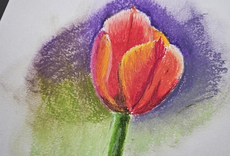
6. Base : Welcome to the next stage
of our drawing process. Now that we have created a benzyl blueprint
of our flower, we can now start on
adding color to it. So we start with the base
layer of red violet oil pastel typically recover
almost the whole flower with this base layer. As we do so, we are using
medium pressure here. We want just enough pigment to block in the color
and blend it later, but not too much, because we will add more layers of oil pastel
later on top of it. They also make sure to leave the center of the
flower untouched. Since this is the area
where we are going to layer yellow oil pastel and
darker pink oil pastel. Once we've finished
layer in the base layer of red violet, we'll blend it. I'm doing it with my finger. I still tend to think that this is one of the
best ways to blend, or the oil pastels, even though it's a bit messy. And you have to
make sure you clean the pigment of your fingers. Not too messy up the colors. If just not for you, you can always experiment by blending your oil pastels
using cotton swabs, napkins, or even blending tapes, and see which one works
the best for you.
7. Shadows: Now it's time to add the
darker shades to our flower. And we start by deep
rows, magenta oil pastel. So we're going to layer it in
the darker areas of petals. And in the areas there, those petals are overlapping. Same as we did it with the base layers of
red-violet oil pastel. Now we are using medium
pressure SVG layer magenta oil pastel. To our task here is to define the shadow
area of the flower. And later we will blend
in more pigment to make the transition are smooth and add more movement
to the fiber to after we have defined the areas. So there are battles
are overlain. We can proceed by using
the darker shades of rows to block in the darker
central area of the flower. In my case, I will be using red violet oil pastel
for this area. We are going to layer the yellow center part
of the flower later. We still leave this
part untouched. So first we layer red
violet oil bust cell starting from the center where
it will burn with yellow. We started by using
more pressure as we layer red violet pastel. And then we blend it to
the size of the fiber, blending oil pastel
together to get this gradient of the color
that we see in the flour. As we go on adding the
darker areas to the flower. We can also dark
as the petals in the area they re,
overlap once again. And where the shadows are. The central part of the
flower is the darkest one. And it has the color
close to violet. So we can lay or more darker
pigment to this area. I will be using violet
oil pastel for that, and I blend it with
underneath layers. The blending of oil pastels is crucial for us
in this drawing, for creating these elegant
gradation of color. And to achieve these movement that we see in the
flower, in its petals.
8. Details : Now we can finally block in the yellow center of the
flower that I'm using my lemon yellow oil pastel and a bit of green to
add to the flavor. And so now the main base
is pretty much finished. And we can add the
final touch of color to the petals and
more texture to it. The stage of the drawing, we look closely at
our drawing at, and at the Flavio reference to see what our drawing Clegg, what to add or to modify where it needs more
details, et cetera. I wanted to darker the center of the flower even more with
blue violet oil pastel. Since the vessels still
appear to be a bit blank. I think we should
also layer here some red violet oil pastel in the shadow areas
of the flower. As we add another layer, we try not to cover the
underneath layer of oil pastels. We just want them to
blend slightly together. By doing so, not only we will exaggerate the darker
areas of the flower, but we will also add more
texture and natural flow to it. Finally, we can now add
more finishing highlights to our drawing by using
red violet oil pastel, and even a touch of white in some of the lightest
areas of the flower. By doing so, we will create more contrast and more flow
of lights in our drawing, which will help us achieve that realistic effect
that we strive for. Now it's a good time
to add more texture and finishing lines
to add fiber. Those veins that we
see on our petals. Notice how those
marks that we add to the petals seem to radiate
out from the flower. And just like that, one final touch of oil
pastel after another, are realistic drawing of
the flower comes to an end. I hope you like the result. Our flower looks
natural and radiant. It's not too static. There's the woman in petals. The proportions of the
flower are accurate, but not too perfect. Which also adds a certain flow and elegance to
our final drawing. And to these concludes this demonstration tutorial
part of this class. I hope you enjoyed it. And I invite you to the final lesson of the class
for the final thoughts.
9. Final Thougts: Welcome back. I hope you enjoyed this class and you're happy with
your final drawing. I know, I'm really
happy with mine. I really love how it
turned out to be. Really looks like the real
flavor that we draw it from. And I'm just so happy with it. I think I'm even going to frame it will keep
it on the wall. So if you like yours
out, make sure to, first of all, take a photo of it and upload it to the project
so we can all see that. And you can also
frame your flour, your drawing of
the fiber so that it will always somewhere
there you can see it. Now. I hope next time you see a beautiful flower blooming
in your garden or elsewhere. And you get inspired to draw it. You will remember this
class and you will create just the best drawing of
this forever, realistically. Thank you so much again
for joining me in this class and I will
see you next time.
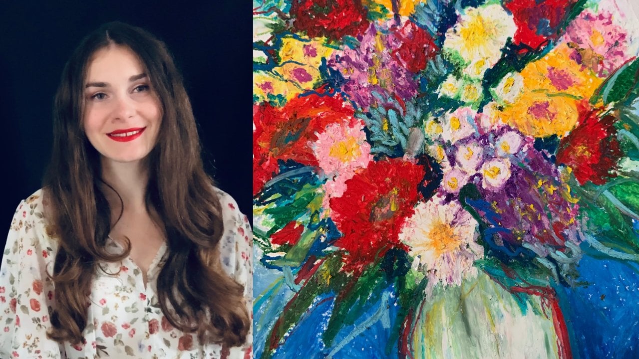
 Alina Harvi, Ukrainian Artist