Transcripts
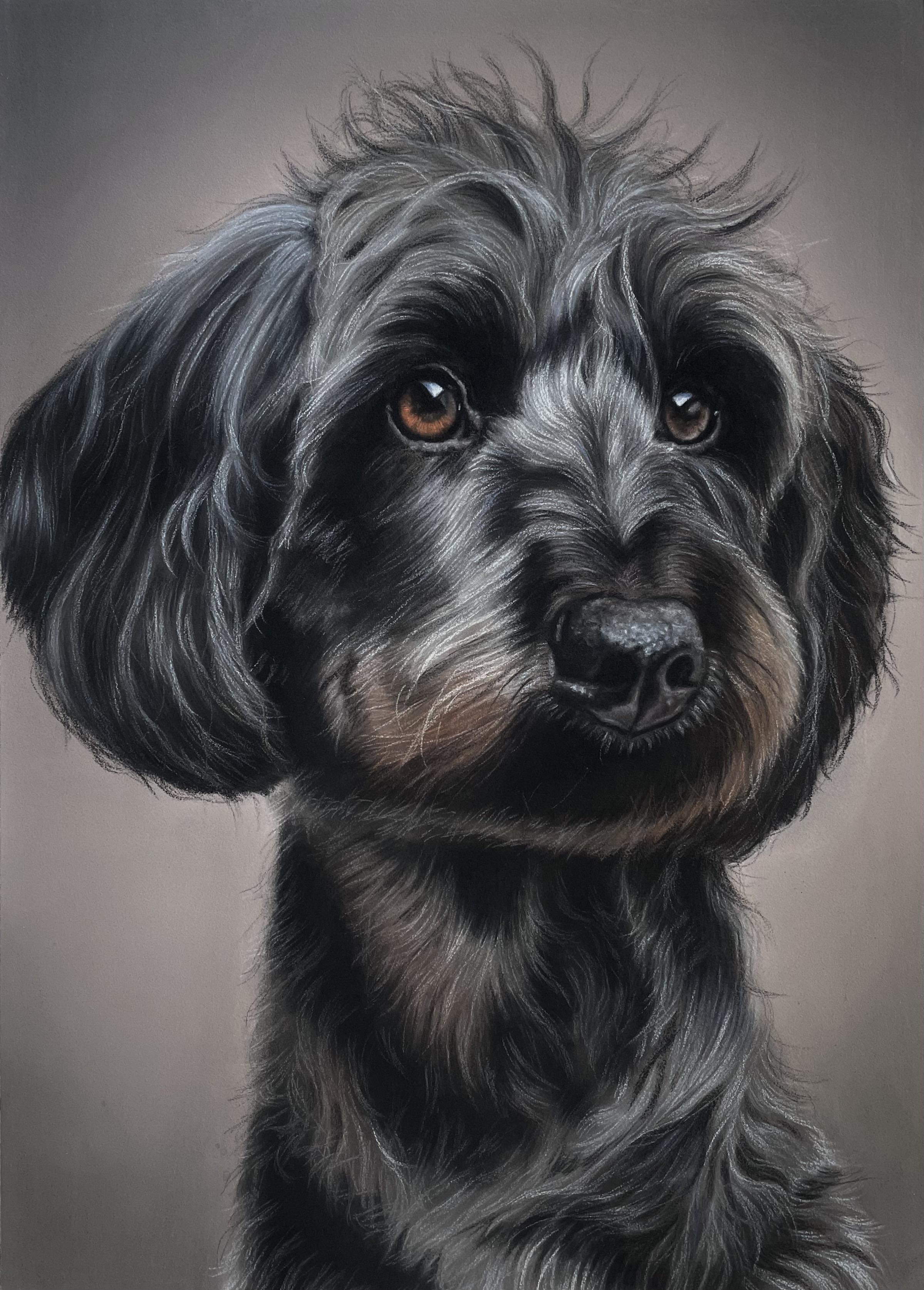
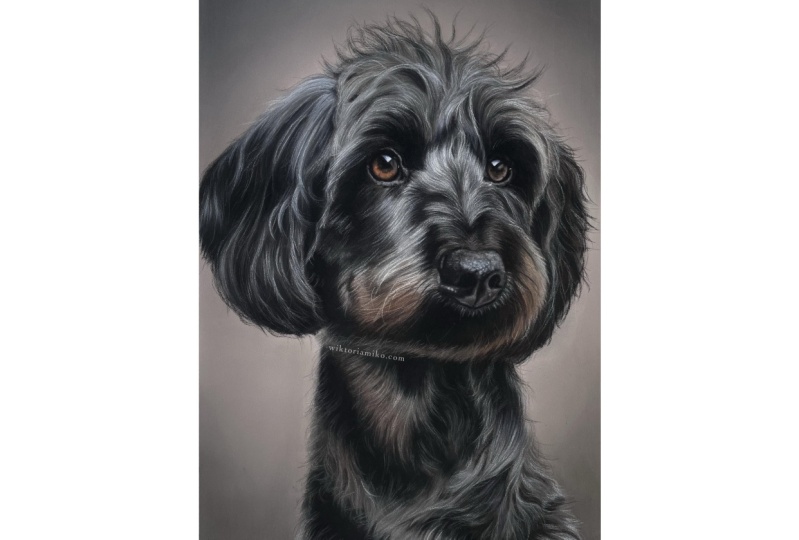
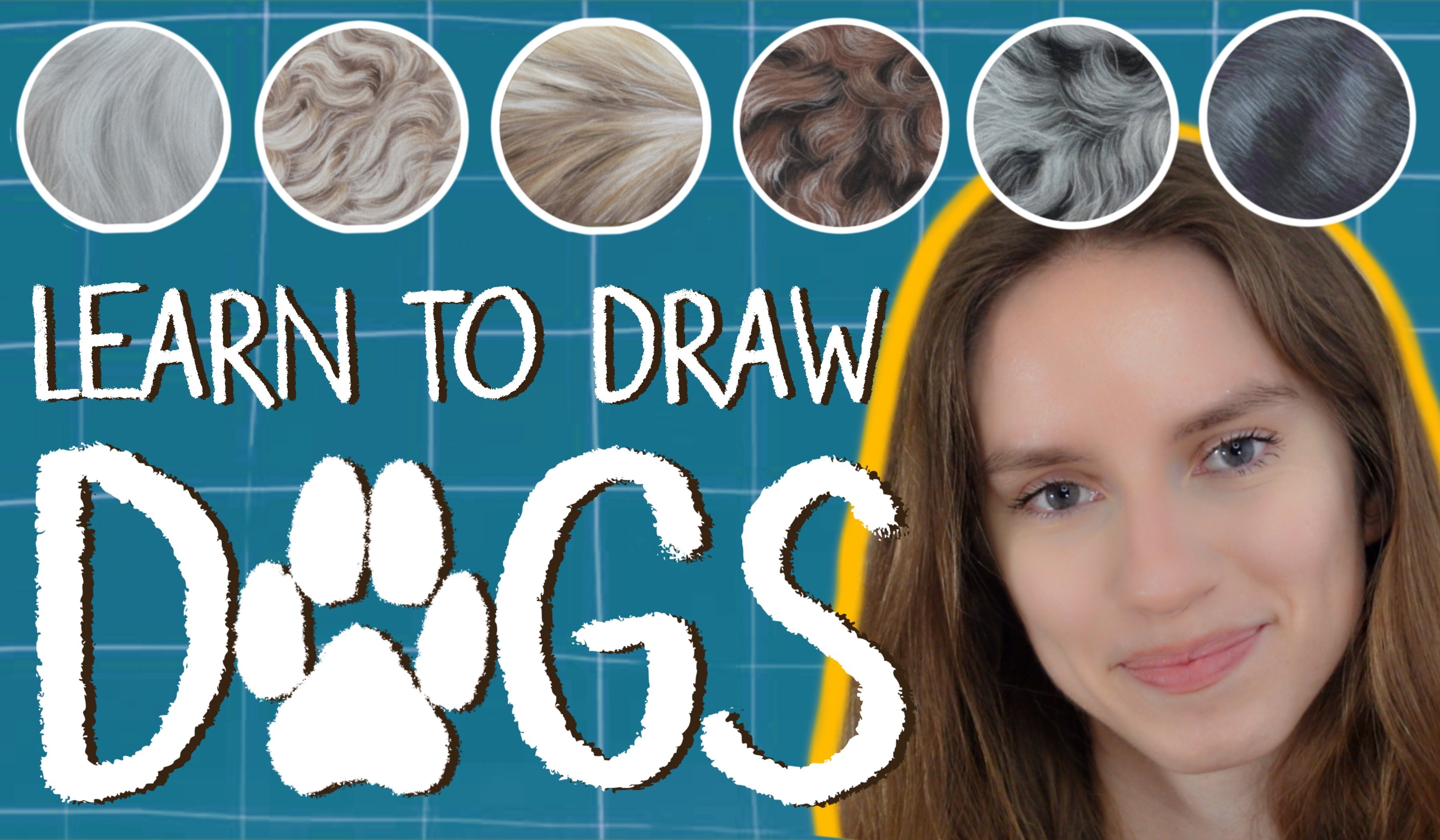
1. Welcome! : My name is Victoria
Mika and I am a portrait artists
specializing in pastel medium. This tutorial is focused on
realistic animal portraiture. We will be drawing
a subject I have created the most,
which is a dog. Specifically, we will be drawing a dog with dark
curly hair texture. This tutorial is for artists at all stages from those picking up a pastel pencil
for the first time to those Senate
commissions up their own. We will go for auto stages necessary to complete
a pet portrait. We will begin with a
sketch and continued by creating a background of soft
pastel sticks and blenders. We will work with base layers to establish fundamental values and learn how to use
pastel pencils to create a realistic
photo texture. Together we will capture the appearance and
essence of our subject. We will learn how to structure the ears, eyes, nose, head, and body of our
subject to capture and express the personality
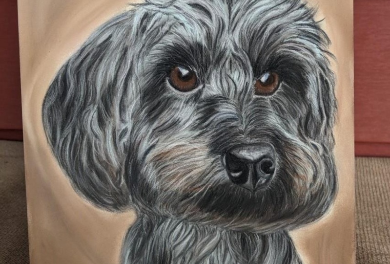
of the specific dog. Discourse is focused on dark
curly file and the palate. To complete this
portrait is extensive. We will be using blues, grays and browns and etc. We will be focusing on volume, depth and
three-dimensionality to make our subject as
realistic as possible, I am confident you
will enjoy this course and mastered the
techniques necessary to create a portrait using the beautiful pastel
technique. See you in class.
2. Materials: Hi everyone, welcome
to the class. I'm very excited
for you to be him. Before drawing, we'll
begin by looking at the tools and materials
we're going to be using. First, let's take a look at
the surface we're drawing on. I use clef on time
pastel mat in dark gray. You can get both the board
and the COD version of this. I always prefer the board, but for the perfectly, I choose the dark gray
color because it makes all the pastels or PM on natural as opposed
to white paper, which makes the colors a
bit too bright and vibrant. I also like this pipe of a pastels because
it's very grainy, almost like soft sand paper. This holds the pesto
very well and makes sure that the drawing
lasts a lifetime. This isn't a kind I like, but you can use
any paper that has enough tooth to hold
the best style. The size I'm using today is roughly ten by 14 inches or 25 by five to five centimeters. I usually buy the LOD sheets
and cut out the size I like as the size range of
this paper is quite limited. You don't have to
use the same size as I do and choose whatever
you feel comfortable with. I like to tape this paper
to my drawing board to give it a clean
professional look at the end. Next we have the soft pastels. I use these to create the background and the
base layer of the subject. These other sets I use, you do not need as many as this. I would recommend just having this site if you
are starting out. All of these are relatively inexpensive and work
perfectly for me. Next, we have the blending tool. I use this to blend the soft
pastels into the paper. This allows me to create
a very smooth layer. There are various
shapes and sizes, but this is the one that I use. It's great for blending
both small and large areas. Finally, we have the pencils. I use pesto pencils to draw
the textures and details. This is the most important tool for creating pesto portraits. I use a combination
of three brands. The stub Baylor combo seller, current dash, the phallic
pastel, pink pastel pencils. These sets kind of
get very expensive. So if you're starting out, I would absolutely
recommend that the stuff below card
with color pencils. For the first few months
of working as an artist, I only use this set
and it was perfect. There are so many natural
turns in this color range. Also, they are very
soft and easy to blend. Especially the current dash set can be particularly expensive, but the colors are
very pigmented. So if he can, I would
encourage you to buy just a few individual pencils. I would recommend
this Chinese white in particular for the
reflections in the eye. These older materials I use. Next we will be moving
onto the drawing. Can't wait to begin to see that.
3. The Background: Welcome to the first
drawing lesson. Thank you for being here. I am very excited to start. We will begin with
the background. I did not include the
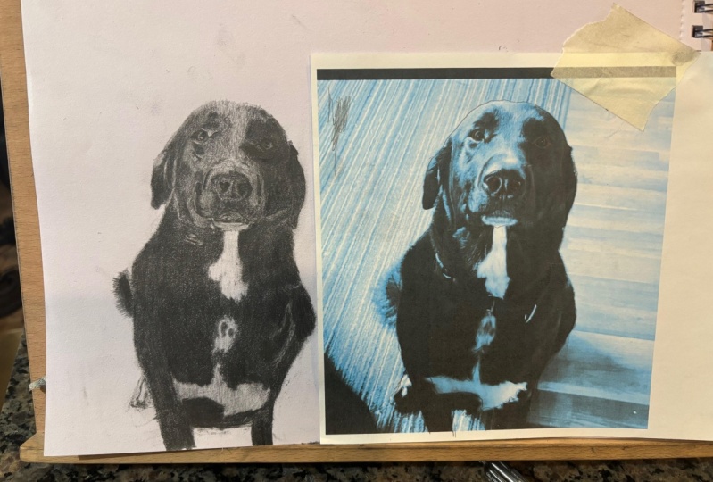
initial sketch as a part of this class because it's
a super extensive topic. And I would like to focus
just on the pastel technique. When choosing my background, I try to do something
complimentary, usually by experimenting with different color
backgrounds on my tablet. For this portrait,
the color I like most is this assay purple. It looks very
elegant and classic. When making this
kind of background, I usually use three
different colors. The dark, middle, and light. I began the background by
filling it in the midterm. In this case, it is
an assay powerful. I covered the entire
background of this color. I take extra care not to fill in the area where we
will draw the dog. I proceed to blend this into the paper with my blending tool. I take my darkest color, dark gray to fill in the
corners of the background. We are aiming for a blended
spotlight kind of look. So I applied that dark pigment
and they'd rounded way. An important thing
to keep in mind, and this applies throughout the whole drawing process is
to add your color gradually, rather than doing a
thick dark layer, it is always easier to add a little bit of darkness
than having to lighten it. Doctrines especially can
be very unforgiving. So it definitely
keep this in mind. This is not always necessary, but in this case the terrain
doesn't look dark enough. So I do this step again. You can do this
as many or as few times as you want depending
on what you like. I also like to go over the
blending again with my finger. I feel that it really
pushes the pigment into the paper and mix the
blending even more seamless, makes sure your hand is dry and clean if you are
going to do this. Finally, we arrive
at the step where we use our FAD color,
lighter stone. So here we focus the light
color right in the center. I like to keep this
color close to the dog forgot and not go towards
the edges of the paper. The closer I get to the center, the more of this
light color I apply. The essentials, we have a nice
gradual change over time. You can also use a white
soft pastel for this step, anything that
licensed the center and gives us the
spotlight effect. Again, it's better
to start with just a little later on if
it isn't lighten up, we can always add more. It is always easier to add gradually them too much
and having to erase. I go in circular
motions to ensure the blend with the dark
edges is very seamless. You could stop here. But to perfect the background
to my liking, I tend to repeat some of
these stages once more to enhance the gradual blend and make this color
change more dramatic. That is all that I do for
the background I have. This was easy to
understand and fuller. Next we're moving on to drawing. Doug is.
4. The Ears: Welcome to Lesson free. Here we are going to
learn how to run in. The first step is to create a base layer with
the soft pastels. I am using full colors, him black, gray,
brown, and light blue. I start with the
darkest color is black. We don't need to be so specific
with how we apply this. Just capture the general color
and shapes of the shadows. Once we finish applying
the dark software style, we've done this into the
paper with my blending tool. Next I pick up the gray and
the cut, the reference photo. I fill in the same
areas that I'll Greg. I tried to capture the rough
shapes of those colors. Again, I blend them
into the paper. When building the
initial pastel layer, it is important to
have a seamless blend. We will use the pesto pencils in the next step to
define the shapes. The first layer is just to
establish the on the turns. That doesn't appear
dark enough to me. So I reapplied a black soft
pastel and blend it in. Next, we use the blue soft
pastel to add more highlights. I use the light blue
instead of white for the highlights because we
are drawing a black dog. When the light hits
the Blackfoot, it bounces off
slightly blurrier. And we want to
capture this effect and make the dog look realistic. I apply this color in the
places that are lightest. These are the areas
we want to bring out. Again, I'm looking at the reference photo to see
where these light colors a PM. We don't have to be
neat blending this in. We want it to be very smooth transitions between the colors. Finally, I used
the brown Pascal. Although this dog is black sheep does have some brown accent. I am just adding a little bit of this color to reflect that. Whenever I draw, I always make the first pastel layer a
little darker than a dog. That is because once we
apply the pastel pencils, we want them to
appear as highlights against the pesto layer
we are drawing now, which will lighten the aim. Now we put our soft pastel aside and pick up
a pastel pencils. This is what we use to add the details and
the final subject, I begin with the
darkest color, black. I make pencil strokes
about the length of this dog's head to create
the effect of foam. Because the dog is fluffy, hair sticks out and is not uneven line with the
silhouette of the year. When I draw these strokes, I draw out of the line with
the background a little bit. Next, I pick up my gray pencil and continue drawing
these hash drugs. We use this color over the light regions to
add definition to them. A good trick is to leave a little bit of space
between these hair strokes. So they appear as highlights
against the base layer. We don't want them to be
too close that they blend together and don't look
like individual has tricks. Finally, we take
the lightest color, light blue to go
over the highlights. These are the
lightest hair strokes that we want to stand out. We continue with the same
technique and draw strokes. Make a note here of how
I am holding the pencil. When we hold the pencil
too close to the tip, will use much more
pressure and have less risk flexibility
to create long strokes. Holding the pencil towards
the end is much better suited for drawing delicate
long hair strands. Remember that when we
draw the first strokes, we maintain the
direction of the hair. Notice the head doesn't follow a straight line but
has unique curves. Further these lines to achieve a realistic effect on a very
high-quality lifelike image. Here's a useful photo that shows the direction of the hair. I am finishing off with
adding a few black strikes, particularly over
the background to make the east and
down against it. So this technique is what
I use for the whole fast. So a lot of steps or
repetitive route the tutorial. Next, we will be
looking at how to draw the head of
this lovely dogs. See you then.
5. The Head: Welcome to the lesson
where we will be learning how to draw the foot on
the head of our subject. The eyes and nose are a
separate upcoming lesson. For drawing the head. The
technique is very similar to the M. I am also using
the same colors. We begin by filling in the darkest areas with
the black pastel stick. This is my mouth and
around the eyes. We blend this with our tool. By the way, I haven't
been changing this bunch of this
blending tool throughout, I actually like it to have
a little bit of pigment on it because it makes the
colors blend together nicely. It creates a very
smooth transitions. Next we take the grey
pastel stick and fill out the areas of the
head which we'll see on the reference
volatile al gray. This is pretty much the
majority of the head. We blend this together with the black areas to make
the smooth transitions. Next, I add some brown accents. As we can see on the
size of the mouth, there are brown areas. I blend this together
with the rest. Next we are adding
the highlights with a light blue soft pastel. We add this in all the areas of the head that
reflect the light. This is on the forehead, the curve in the middle of
the face between the eyes. I add this initial
bilateral and blended tin. I felt that around the
areas that are brown, I wanted to add some
light brown color, so I went in with
a little bit of this color blended attend ulcer. I also felt that the head needed a little more light
blue highlights. Now is the second part of the lesson when we
will use the pencils. As with the previous lesson, I began with the darkest parts. I do this because we want to make the dark areas of paper. I'll say they are in
the background and bring forward the lighter areas. So it makes sense to
work from dark to light. We continue to keep in mind
the direction of the hair. Here is a guide of the
curves behalf follows. When we draw our hash drugs, we tried to follow these shapes. I walk in phases. I isolate just the left corner of the face I am focusing on. I am using only three pencil
colors in this section. Black, mid gray, and
very light gray, which is almost white. I drove these from dark to light to create this
effect of depth. I used the white last to add the highlights that I want to
stand out off the portrait. I am using a piece
of paper here to separate my hand from the
drawing to prevent smudging. If you rest your
hands on the drawing, you will very likely to live the best TO around and
make the drawing messy. So be careful with this and place a piece of
paper like I did. Again, we remember
to hold the pencil towards the end and not
too close to the tip, so we have more flexibility. Next, I move on to other
sections of the head. I am adding this actually
pad for just above the nose because there is a
very gentle highlight him. I would like to exaggerate
some highlights in her hair, so I pick up a very light
blue, I'm going into those. As we can see, the
strongest highlights are in the arch between the
eyes and below them. I am also adding some black
pencil again to create a bigger contrast between the
highlights and the shadows. I keep looking at
the reference and copying highlights and shadows. Notice how our
subject have locks of hair sticking out on
the top of the head, which will slightly
over the background and create these locks of hair. Do not feel discouraged
if the drawing does not look exactly
like the reference. You do not need to capture
the file exactly as it is. As long as the texture you
draw has the effect of fat, you have done a good job. The important thing to do is follow the highlights
and shadows. A contrast in the
drawing looks very good. It makes the first shiny and the animals stand out
as three-dimensional. Remember that we
can stray away from the reference photo a little and optimize certain features. The photo was not
always taken in the best lighting or pose. As long as we keep the essence and character of the animal, that is what's most important. Next, we are moving to the
brown regions of the head, which is the size of the mouth. I am using a brown which
is closely resembles the brown terms of the dog
as I have in my collection. I continue drawing the same
pattern of the hair strands following the direction
of the hair that we can see on the
reference photo. You can see the hair
and slightly curved. So we tried to capture this. I am not adding too
much of this brown as the car is quite
subtle on this dog. Either back and forth
between these steps a lot. It is very hard to do this systematically because there
are often bits that we miss. But once we apply
the next color, we realized that we
should have applied the previous color more heavily. So this is why you see
me bouncing around between the steps and you
should be doing this term. Here. Again, I am adding some more black to
exaggerate the shadows. The darker shadows of very
deep on this portrait. These areas are served black
that it almost appears as a flat color without any strands of hair
or other details. So we really tried to replicate these deep black shatters. Again, I am adding
more highlights to make them stand out. Finally, I'm adding the
strands of hair around the edges of the right
side of the head. This is actually a portion
of the other room. I make the messy as they all follow a different direction, just like in the
reference photo. I hope in this lesson I haven't been able
to show you how I draw ahead and explain
well, along the way. See you in the next
lesson where I will show you how
I choose the eyes.
6. The Eyes: Hello, welcome to the lesson. Here we will be
drawing the eyes. This is my favorite
part of the portrait, as it is what brings life and
character to our subject. So I am very excited to
show you how I do this. As opposed to the
rest of the portrait. I do not use soft pastels to make a base
layer of the eyes. Instead, I go straight
in with the pencil. That's because the eyes are very small and characteristic
to a subject, so I need a lot of control. The soft pastel is just
too big for the task, but we can still
use the pencil in the same way that we
would use the pesto. We start by outlining
the eye and filling in the eye with
the general colors. I am creating a
basic brown layer that is roughly the
color of the eye. I take my blending stump and
easy in the same way as we used a pastel sponge to blend
the colors into the paper. This time we will
try to stay within the outlines on do not mix
the brand of the black. I am reinforcing the
outline because I realized it should have
been a little darker. And again, I'm blending it in. I am taking my Ashby Pup will color to add the
highlights around the outside of the eye to separate the eye
from the eyelid. Take a look at the
reference photo to see where the highlights on. Next, I pick up my brown pencil and add a little more of that. I want the brown or pay
a little more prominent. Once that is blended,
then I move on to adding the reflection
in the top of the eye. This is the detail that makes the most powerful
difference to your drawing. It makes the IOP more realistic and adds life to
the entire subject. This reflection is rarely wide. We do not want to
over-exaggerate this reflection, so we're going to use
light blue for this. Next, we're going to add
details to the iris. We can observe that there are little lines in this
part of the eye. We take a variety of brown shades and tried
to replicate this. I am using reds to make the
brown pop a little more. I am picking up the
white pencil tool, exaggerate the reflection in
the eye just a little bit. I'm only applying this to the lower corner of
this reflection. I tend to make the eyes a
little more reflective than in the reference to make the
animal appear more lifelike. Hey, I pick up a black pencil to exaggerate the darkness around
the eyes a little more. Next, I'm moving on
to the right eye. The steps here are repetitive. I begin by drawing the outline of the eye and
filling in the pupil. Next, I add a layer of
brown to the whole iris. This eye is a little
less than the shadow, so I am adding slight
definition that is not in the reference to
make the eyes stand out. We are bending this altogether
with our blending stump. Here we are adding some white to the corner of the reflection. I decided to go back in with the brown to bring
out some more. We can see here that there is a light curve at the
bottom of the side. I am picking up a
light gray color and very gently adding this
to the inner curve. That is all for the lesson. I hope you enjoyed it
and found it useful. See you in the next one where we will learn how
to draw the nose.
7. The Nose: Welcome to the lesson. In this lesson, I will show
you how to draw the noise. With pastel portraits
of animals. I always create a base
layer with soft pastels. Though the eyes and the
nose are exceptions. They are very small
areas that are very characteristic to the
animal we are drawing. The pastel stick is
just too big to have precise control over what
each color is applied. That being said, I used the pastel pencils to
create the base layer. Instead. I pay close attention to the shapes of the shadows
and try to replicate those. Here, I'm filling in the darkest
area of the nerves being the nostrils and the
line that runs down the middle of the
front of the nerves. I also pay attention
to the colors. As we can see, the very tip of the nose is a little blurry, so I add a hint of this color. We are taking our blending stump and blending this altogether, making sure that they are very smooth transitions
between the colors. I'm adding a second layer of the highlight color
to define the nerves. Here we are taking a
gray colored pencil and the finding the shapes
of the nose and the tool. Next we take a bag, pencil, and darken the shadows
of the nostrils. This is still the
base layer also, we are going to blend this
into the paper once more. Now that we have the base layer, I tried to replicate
the textual Wagner's. This is a little tricky because the texture is very
intricate and detailed. I like to represent
this texture by drawing little dots and
appropriate colors. We are picking up our
very light blue color. Here. We are going to add
small dots to the top of the nose where the light bounces off and the nurse
texture is most visible. I picked up a light gray pencil here to add some more definition to the edges of the nose
just to enhance the shapes. Because we have the base layer, which is a little dark and
then a pencils on top, it makes it easier to
capture this texture. I'm going to take my
blending stump and gently blend the server
with a very light hand, just to make these dots a
little more turned down. Now that they are a
little less prominent, I will just draw
another self dots. I feel like it adds a nice
dimension to the nose. I have some of the
noise pause faded, and some more visible. I'm also using a lighter pencil to add light dots to
the top of the nose. To add extra dimension, it is worth using
a black pencil to add darkness
in-between the dots. I do this by creating lines that resemble little cracks you
see in the dog's nose. Here I'm adding some light
gray highlights underneath the nose to make it stand out a little more
against the firm. I am going back
and forth between different shades to add
details that I've missed. If I fill that Al-Qaeda
hasn't been applied to heavily and it looks
unnatural on the nerves. I take the blending
stump and blended another tool like
the burning sponge we used to create the phone. I liked that to be
leftover pigment on this rather than being very
clean every time I use it. That is because
it contributes to making sure that all the
colors blend together very well and they transition from light
to dark seamlessly. That concludes the lesson
on how I draw the nerves. In the next and final lesson, I will be showing you how I
draw the body of the dog.
8. The Body: Hi and welcome to the last
lesson of the course. I hope you found it helpful
and enjoyable so far. In this lesson, I
hope to teach you how to draw the foot of a dark, somewhat colleague head dog. We begin the buddy by
taking our soft pastel six and filling out the basic shapes in their appropriate colors. We remember to make
the base layer a little bit darker than the reference footer
because the details we make with pastel
pencils lighten the phone. I am starting with
a mid term here. Great Vin all the gray areas. Here we are using the
lightest color to fill in all the areas that
would be the highlights. And finally, we are taking the black soft pastel to fill
out all the darkest areas. My favorite part where
it all comes together. We take the blending sponge and blend all of the
colors very well. Again, I like the sponge to have the previous colors
on it because it makes the whole layer
better blended. We're going to reinforce
the first layer by going over it once more
with the soft pastel. Hey, I am adding a
brown soft pastel as there is a hint of brown in
these areas of the file. We repeat the step a couple of times until we are happy
with the base layer. Now we're moving on to using our pastel pencils to
create the texture. I began in the
lower right corner. I am using light blue to
begin building the light far. As with the myosin head, we are using the same technique. Can we draw a light handed lines that are roughly the
length of the hair? I continue doing this for the areas that
appear this column. Next I am taking
the black pencil to create the darkest
strands of hair. I am again drawing lines up
here, the length of the hair. We would like the darkest
and lightest hash trans to blend together a little. We will take a color
that is midterm between the black and
light blue pencil. I choose this cool gray
and I draw lines to integrate the light strands
into the dark shadows. We draw hair marks to bring
them together and make it seem as though
the highlights are coming out with
the dark shadows. I fill that in some places the highlights are
not light enough. So I take a pencil
that is almost white and they gently
add those details. Again, working with
a very gentle hand. Hey, I am picking off
the light blue pencil, wants more to draw
some more highlights. Now on the left
side of the body. We are continuing with
the same technique using a light hand to draw
individual hair shrinks. It is important to keep in mind the direction of the hair. Here is an image to help
break this down for you. It is good practice to
create one of those yourself before you
begin a pet portrait. To simplify the
direction of the hand. Again, we add the black
pencil to exaggerate the contrast between
the highlights and the deep shadows
of the file. Once more, we take
the mid gray to make the transition from highlights
to shadows more cohesive. I am using the same
color here to exaggerate the file and the bottom of the head to separate
it from the buddy. I then take my black pencil to create flash strikes
on the edges of the buddy so they
stand out against the background and make
the dog compare fluffy. I am adding final touch ups with the mid gray pencil
and that is it. In the next video we
will be summarizing the drawing process and talking
about the class project. Thank you so much for watching.
9. Summary & Class Project : Congratulations for
completing the class. I am so happy you joined
me on this journey. Drawing is not an easy task, So I want to congratulate
you for taking this. To summarize, we began with
going over the materials, followed by creating
the background. During the end. Next, the head, followed by the eyes, the nose, and finally, the body. Will begin by creating the base labeled soft pastel sticks bed without trusted blending sponge and add details of
pastel pencils. We created the file texture by drawing repetitive
strokes are very light hand keeping in mind the direction and the
color of the font. If there's one thing
I hope you take from this class is that it is very doable to create such
a realistic portrait when you break it down
into smaller steps, the end goal may seem very
overwhelming at first, but when you segment
it into first drawing the base layer
of soft pastel sticks, then blending it,
and then finally adding the details with
the pastel pencils. It is a much easier process. I hope that by showing you
how I do these free things, you feel more confident in
creating your own portrait. I would really like
to encourage you to replicate this drawing
as the class project. Feel free to make a smaller
version of this project, even an A5 or an A6 size. Especially if it is your
first time using pastels. And you just want
to get a feel of the technique and the colors
and how the blending works. I would really like
for you to have a go follow along as though
we're doing it together. Once you upload the project, I will give you constructive
feedback on your work. If you have any
questions please ask, I would genuinely be very
excited to help you. I want to congratulate and thank you again for
following along. Hey, all my social media
accounts on my website if you'd like to support me
and see more of my work, I also create portraits
of people and landscapes. So if you went to see those, That's what you will find them. I am very excited to see your projects and I will
see you in the next class. Bye.
 Wiktoria, Professional portrait artist