Transcripts
1. Introduction to Quick & Easy Watercolor Hydrangea: Paint Stunning Florals with Simple Shapes: Have you ever wanted to paint beautiful
watercolor florals, but felt overwhelmed by
all those tiny details? What if I told you that painting a stunning hydranga is
easier than you think? Hi, I'm Kelly Tassi. I'm a professional watercolor
artist and instructor. And in this class, I'm going
to show you how to paint a gorgeous pink hydranga using simple and easy
to follow techniques. Now, I have to admit florals used to be a
huge challenge for me. And for years, I struggled
to get them right, constantly overworking
my paintings. But once I let go of the perfection and embrace
that loose flowing style, everything kind of
changed for me. So if you've ever felt
stuck with your florals, check out my other skills class, loose floral techniques,
it's a great place to start. So in this class, we're going to break down everything
step by step, starting with some
loose petal shapes, layering soft washes, and adding just the
right amount of detail to really make
your florals pop. This class is perfect
for beginners and anyone that wants to loosen up their
watercolor style. By the end of this class, you're going to
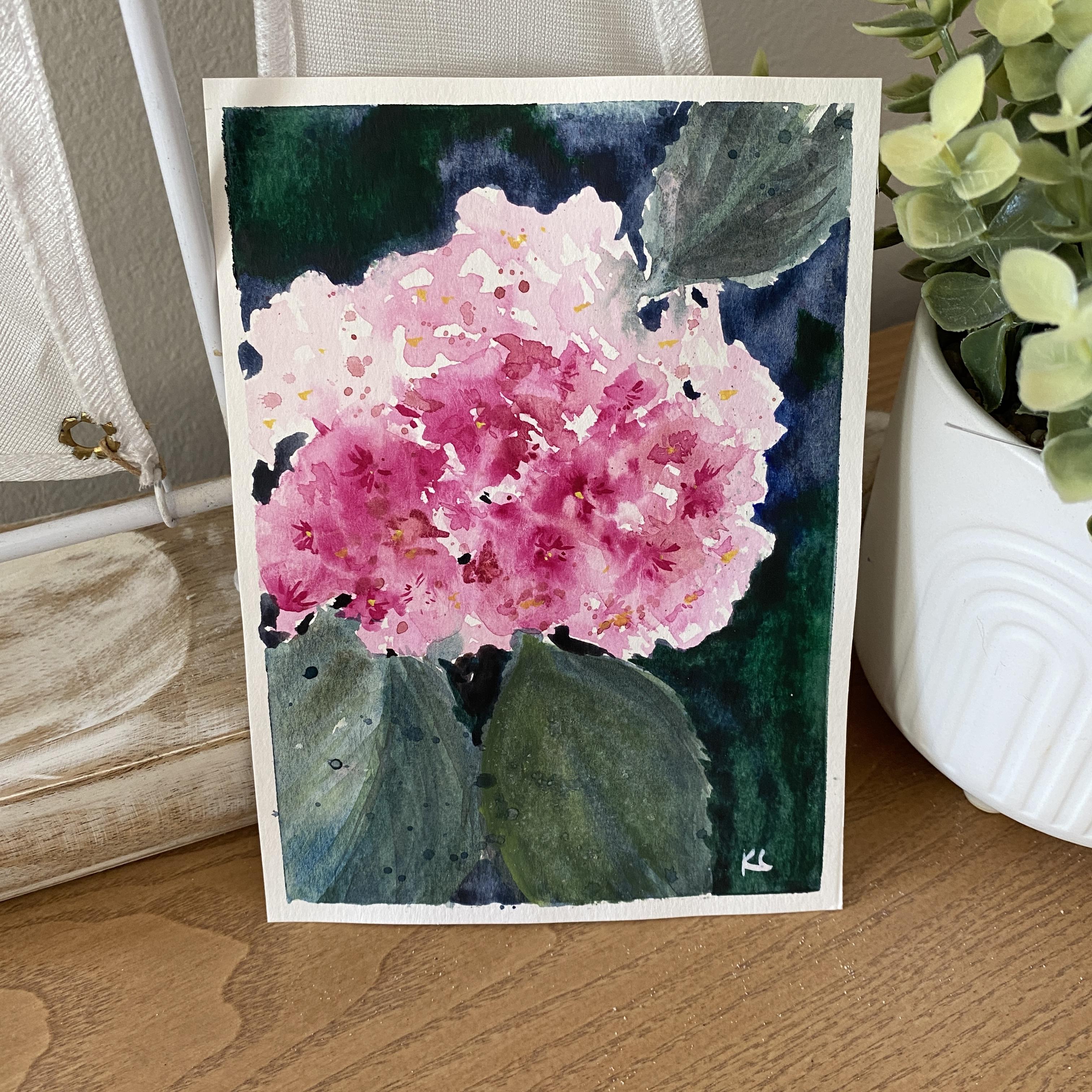
have a beautiful, delicate hydranga
painting to display, gift or even maybe turn
into a greeting card. We'll create your own project, which will be a beautiful,
delicate hydranga painting. So if you're ready, watch the next section where
we talk about materials, and you can get started paying
your own beautiful flower.
2. Materials Needed for the Hydrangea Class: All right. The first
thing we're going to need our paints,
watercolor paints. I'm just using the small
kit by Rosa Gallery. Love this little one, gives you a little area to mix
here as well as here, and this one comes
in a small set, not tuned too many colors,
but everything you need. You've got warm and
you've got cool colors. You don't have to have
the exact same colors because you can mix and match and play around with your colors depending
on what you like. I'm going to be using um the matter rose for the
pink and my hydrangea, also be using a little yellow. You could use a
lemon or you can use the cad if you want
a warmer tone. For greens, you can use
a sap green, a green. You could do a bright
green and a bright yellow. Again, depending on the
colors that you like. I tend to like those neutral,
not quite as bright. You can choose any color
for the background. Pains gray is great. If you don't have Pains gray, you could also use
an ultramarine blue, along with a ossian or burn and you can mix
your own black that way. Again, you can play
around with this. Then for brushes,
I'm actually doing this all pretty much
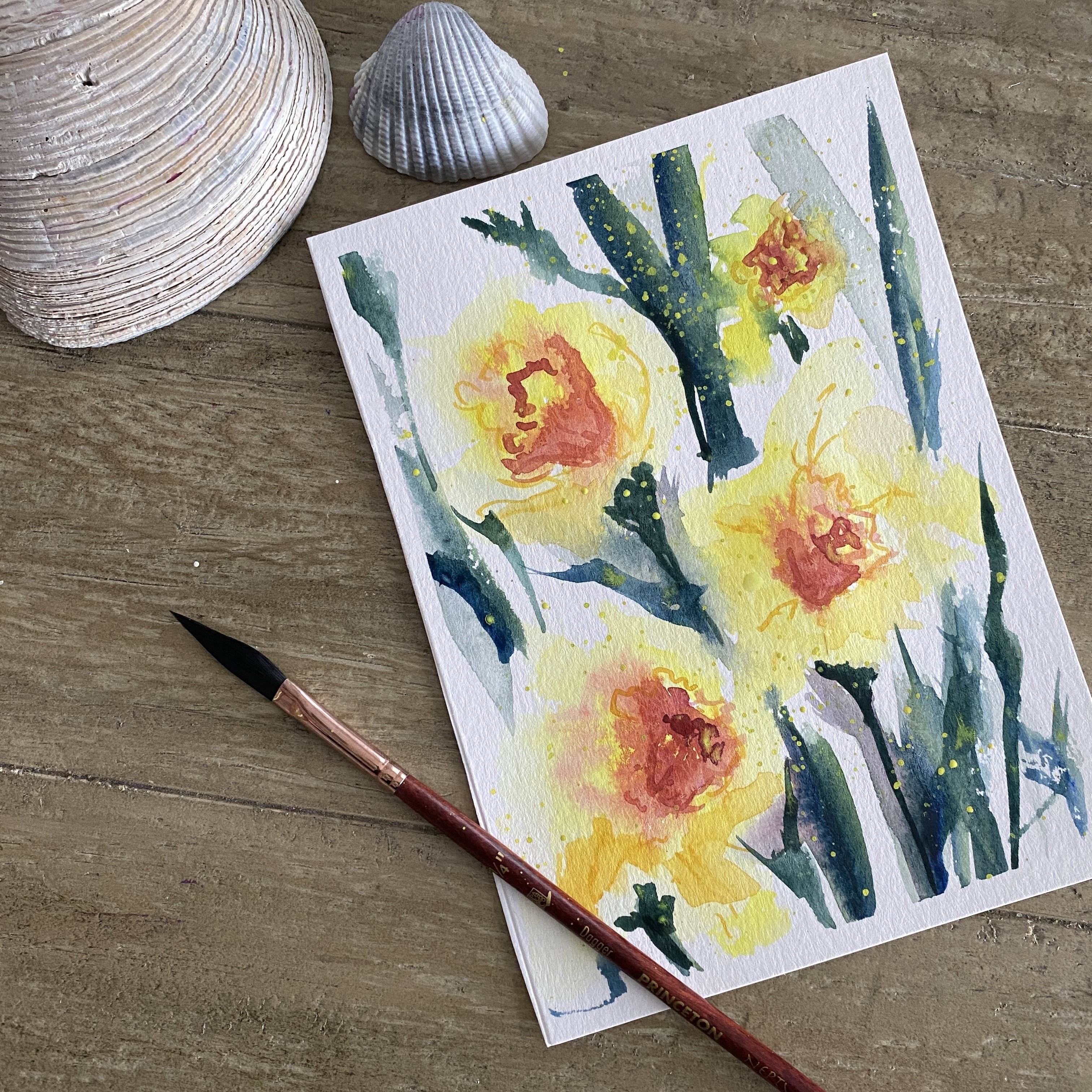
with a dagger brush. I love my dagger brush. This
is a Princeton dagger brush. It's a quarter inch, and you can see the length
in that one is pretty long. The reason I like it is
because it allows me to be very loose with my florals. It's got that nice long gated if I hold it way
back here as I'm working, sometimes I can get some
very nice little linework it's got a nice tip
on here as well, so I can do very detailed work. It's got a long area
here for dry brush, it's just a great
versatile brush. If you don't have a
dagger brush, it's okay. You can use a number six round and then get yourself
a liner brush maybe for some small detail. Again, this is not necessary.
We have clean water. You probably want to have two,
one clean, one for dirty. I've got myself a
little cloth so I can wipe my brush off or use
a paper towel napkin. And then I may or may not
use the bleed proof white. This is, again, not necessary. You can use the white
if you have white in your palette,
which we do here. This is a Chinese white usually, and you can use that. It's opaque and just get it very thick if you don't have
the bled proof white. If we decide to use that. For paper, I will recommend to use 140
pound coal pressed paper. Now, this is my favorite go to if you don't want
to spend a lot. This is actually a
Strathmore watercolor card. I cut it in half. Great way to practice. It's fairly inexpensive. But if you want to
get the good paper, you can use RSHs and
that's what this one is. You can see the little logo
here in the corner of this. This comes from a 30
by 22 full sheet and I find that's the most
inexpensive way to purchase. You can get I think
it's five pack or ten pack the full sheets and then I just cut them down to
the size that I want. This paper, you will have
really good results on that. That is real basic stuff
for this hydrangea class. I'm excited to get
started with you.
3. Breaking Down Hydrangeas into Simple Shapes: Let's start by breaking
down the hydrangea shape. Now, hydrangs are made up of these little clusters
of four petals, but we don't need
to paint each one. Instead, you can focus on
loose rounded clusters, and that's going to help give that impression of a full bloom. So we're going to start
with a single petal, and you're going to use a
round brush or if you're feeling extra special,
a dagger brush. That soft teardrop oval shape. We're gonna keep
the edges light and feathery using the wet
and wet technique. And then we're going
to form a cluster. We're gonna lightly
connect several petals in a circular shape to mimic
a loose hydrangea bloom. You're going to want to make sure we leave some white space between the petals to
avoid being overworked. Again, you can vary
the size, the opacity. Some petals should be darker, more defined or
others are going to be faded more into
the background. That's going to
create that depth and that dimension more naturally. I'm going to mix up
some very light paint. An actual hydrangea looks
somewhat like this, what we've got this
little four petal, I like to leave a
little space in there. So you can practice just
like the little four petals and you can utilize this for
more than just hydrangea. I'm going to drop in again, a little bit darker value
in some of the areas again. I almost gives the illusion of that little four petal shape. What most people do I should
show you is you'll do one, two, three, four. That's the perfect one, right? Let's drop in a little bit
of color in there too. It's like a perfect flower. For detailed flower, that's probably what
you're going to see. But for what we're going to
be doing, it's more loose. You've got some spaces in between and it's illusion of
what's happening in there. We could also get really
loose where we're just dotting around the area. Most hydrangs are
more that ball shape. You go from something
up close like this to more of a
rounded shape like this. Now that's the first layer. I would probably go in
and start dropping in some other colors in here again to give it a little
bit more dimension. Maybe a couple of darker ones
on one side or the other. Keep in mind wherever
the light's hitting it, it might be some little bit
darker areas down here, keeping the lighter up on top. You could have it more
darker in the center here. Doing it again, while
it's all nice and wet, just dropping in some color. It's just a pretty little ball. We go from something like
this up close again, that image of a four peel loose, great thing to practice. One, two, three, four, you can see how this one's
a little bit bigger. I can shape that up a little
bit more if I want to, but still have that
loose version. They come out to a
point at the end too, so look something like this. You're not really painting
that four petals, you're just scooting around making those little four blobs
and not connecting them. It's okay. The
shapes that you get, they don't all have
to be perfect. This one's a little
bit more squared off. You can do one pedal by
one pedal like this. Again, that would be a
little bit more detailed, or you can do something
like this one up here where you're just dancing around. Some of these are connecting,
some of them aren't, and creating that
little moround shape, you might find
initially you're too far off the mark, that's okay. You can adjust. Remember that when you're
working with things like this, start small because they'll
always get bigger on you. So I always start kind of in
middle with a smaller shape, and then I can expand
on that shape if I need to. Let's go back out. I'm just getting some darker
pigment here on this. Again, jarropping it in where
some of that is still wet. Doesn't have to be all of it. I can have a couple
of little petals out here that might be a
little bit more dramatic. Okay, so that's a great way
to practice your hydrangea. And then you might want to
also practice some leaves. So I love to change up
my colors for my leaves, and I'm using a
dagger brush again. I'm just kind of going
onto the side here. And you can add a little
blue to your leaf, maybe even a little yellows, kind of play around
with leaf shapes. Again, it's just a
very loose version. There's not a distinct
shape for these leaves. They're twisting and turning. And for your final
project, we're going to do a little bit
larger leaf so that we'll be able to work on our leaf shapes
a little bit more. But again, you can see it's
just basically a two sided, adding a little
yellow to it now. Lighten it up in a
couple little areas. I'd like to change it up so
it's not all the same color. So you can practice
a whole page if you wanted to on that
leaf shape as well. Remember, with your flowers, they don't necessarily have to always be the same
color if you wanted to try your hydrangea
in blues or purples. So practice and play with
that, get the shape down, try the different colors, and just have a lot
of fun with it.
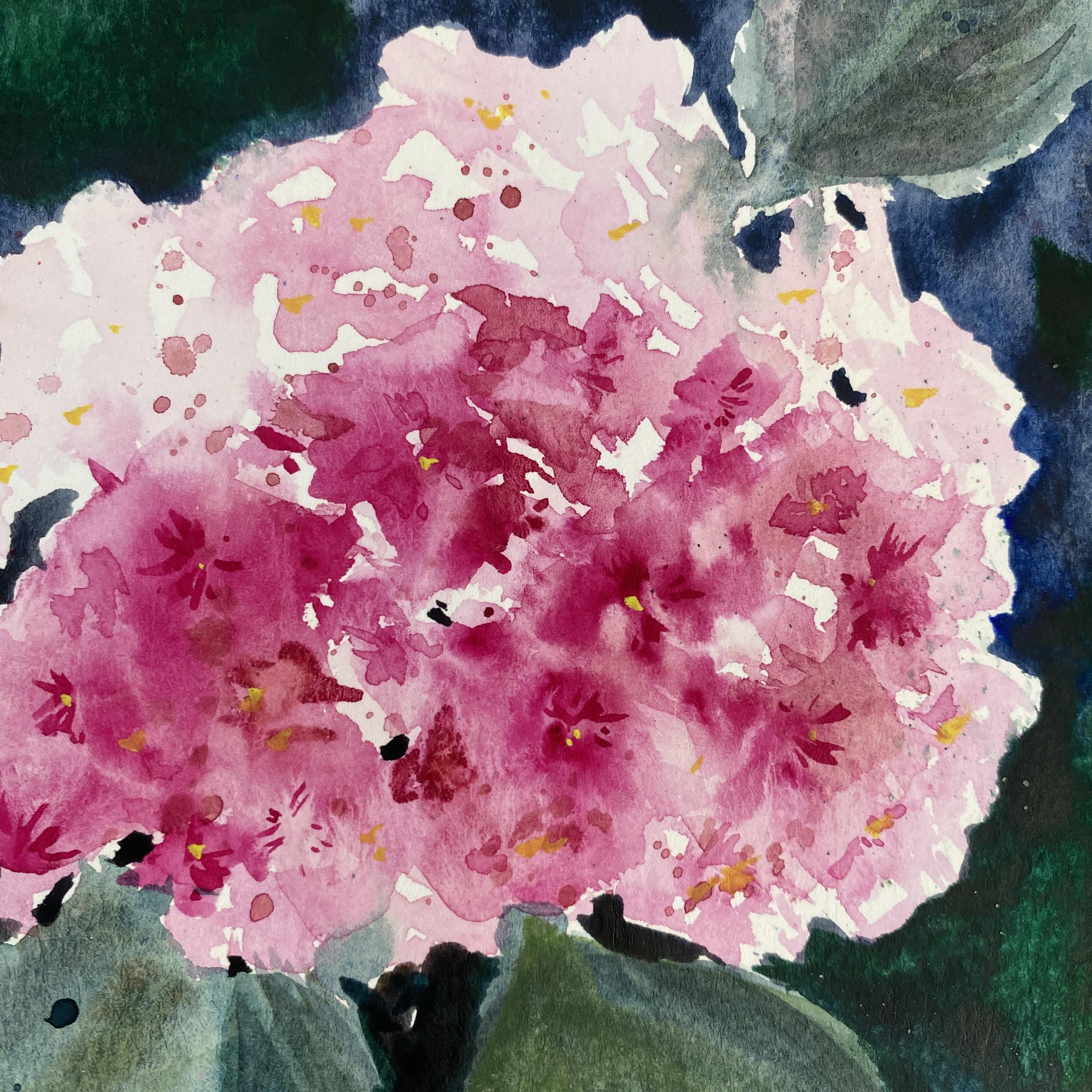
4. Build Your Hydrangea Bloom: Hey, so we've done a little
bit of practicing with our hydrna that very loose look. Key, remember, is to
leave some white space. So I'm using my quarter inch, and I'm bouncing around here with a very lightlight
shade of pink. So I'm going to try to do a big bloom right up front here and leave a little bit
of room for some petals. So you can see I'm just taking that brush and
dancing it around. Let's go ahead and
get a closer look at the brush strokes
and a slower motion so you can see that again. So I'm actually
slowing this down by 50%, if you can believe it. So you can see how
I'm just putting a little pressure,
skipping around, dancing that brush
around the paper, making sure that I leave
my little white space, just doing like
little scribbles. You can go ahead and add a
little bit of darker color. And try to build up on that. Slowly, you don't want to get too much color in
there too soon. So you can say I've got that
really nice light pink. I've got a nice
medium shade here. Again, just doing that little
scribble bouncing around. Again, this little point on the dagger brush
works really well, and it keeps you very loose because it has a
lot of give to it. So we've got that basic shape, like a little pompom
shape now happening. And this is where you
can expand a little bit, get it to fit your paper
in the composition wise, either in the top
left hand corner, but give yourself
some room down near the bottom for some leaves that we're going to
be putting in here. Look at all that
beautiful white space. This is what's going to
make this really glow. Now I'm starting to
drop in a little bit of that deeper pigment in
here, another darker value. You'll notice now I'm letting it blend in through some
of those white areas. And some of those
areas that are dry, I can actually get
a little bit of some definition of
those petals in there. Again, I can kind of tweak it. I want more of the
darker values to be down here on this
bottom right hand side, so keep in mind your light
as you're doing this. Do you want it
coming from the top? Do you want it coming from
the side, from the bottom? So it makes it look a little
bit more realistic that way, even though it's
really, really loose. So we're going to leave most
of that light up at the top, but we've also got that light
kind of peeking in through the flour here and there by just leaving
the white at the paper. And it doesn't have to be a perfect circle while
you're doing this. You can have that illusion
of somewhat rounded. And if you've looked
at hydrangas, they are like little pom
poms. So this is funny. You see the reference
photo up above here was actually taken this week. This is at my house outside. I did this painting when I
was in North Carolina of this hydranga without
looking at so it's funny. I mean, it was pretty close. I went out and I'm
like, Oh, my goodness, I actually have
these pink hydrangs in my garden right now. So I just ran outside, and I snapped the photo so I could put it
up here for you. It is actually a
rainy day today. You can see some beautiful
little dew drops on there, which would be kind of
a cool thing to do, but not necessarily
loose raindrops. I thought I would
share that with you because I thought that
was kind of funny. But you can see the
lights still bright. You've got all those
highlights in this photo, but it's an overcast day. But you can still see
all that beautiful light that you can capture. Right, I am starting now to fill in some of
those leaf shapes. I'm letting the flower up
top dry a little bit more. And again, I'm using all of those little
colors that I like, a little bit of brown tints in there, a little bit of blue. So it's not just
bright bright green. You can see in the
photo reference, those are quite bright green, but I just happen to
like the softness and I like those
cooler tones, I guess. Not quite the
brighter yellow side, but leaning more towards
the cooler colors. And these have a little bit of a jaggedness to them if
you look really close up. And they also have some
of that light veining, and I see some dark veining in this one just depending
on how the light hits it. So again, just a
nice little flip, adding some color in there, while those are nice and wet. So some of that is just
blending right in there. And you have to be
careful to kind of pump up and around some of these areas you don't want that to bleed too
much into the pink. But again, that looseness
is really pretty. So if it does, don't
worry about it. So I'm getting just a few of those little jagged
edges in here. So a lot of this, you know,
what's really fun about the loose florals is it
doesn't have to be perfect. If you're wrong about
something, it's not a big deal. Alright, I'm going to go back
in with the pinks again, and I'm going to drop in
some more definition here. And again, it's just an
illusion of definition. I'm not going in and painting
every single one of these, but you'll notice
they have, like, this little star
shape in the center. And usually they kind
of like a little dot. And I realized as I zoomed
in on this picture, it like opens up that center opens up into another little
bloom. Did you see that? I was like, Oh my
goodness, that is so cute. I have just popped in just again darker values
just a little bit. It doesn't have to
be a lot. I even have a little splattering going on here because why not? Some of it's wet in
those leaves and you can see that nice
bloom that that makes. It gives you again
that very loose feel. I didn't go too heavy
on the splatter, but just a little bit enough to make some texture in here. I ain't even in the leaves. Let's dry that and then we'll
create some more details.
5. Adding more details and layers for depth: Going to wet a
couple areas here, just let me be a little
bit too defined, and I'm going to add a little bit more of that
darker value in here. Give a couple dots.
Once you dry, I think sometimes you'll
notice that things are just too light still, and because I plan on doing a nice dark background in here, I didn't want it
to be that light. I figured it needed
just a little bit more. So this is a glazing technique, so I am going in with something I'm going
with something that's completely
dry on the paper, rewetting an area, and then
I'm dropping in color. So it shouldn't move the
color underneath of it, but it will give
it that soft look. Now, if you do scribble
back and forth quite a bit, you can start to lift some of the color that's underneath,
so you got to be careful. You don't want to
overdo it too much. And this is a little
bit more detail than what we're used to.
Little lifting here. Again, if you find that you
get too much of the color, too saturated, you can lift some of that out
while it's still wet. And I'm going to wipe
it off on the paper. And I'm going to soften a
little bit more in here. And then go in again and
add a little bit more. So see how that's blooming out, it's not staying in place like
very strong, sharp lines. Anywhere it's wet,
it's going to soften. I'm not going to touch
it too much up there. We'll put a couple little
defined areas in there. Again, I'm just going
to lift some out, so it gives it a
little shape here. In between maybe some
of those little blooms. I'm touching that with again, a little bit more water just so they're not quite as defined. It will soften them
just a little bit. And I'm kind of
thinking in the back of my head that
little star shaped, those little four petals because that's what the
hydrangea looks like. Alright, so I'm going
to dry that again. And the reason we dry
that is because if it's too wet and I continue
to add paint in there, it's going to all
turn one color. So I want to dry in between, and then I want to do
that process over again. But this time, maybe let's
cap off a little excess. Let's go in with it dry and I'm going to make
a couple little marks. Again, I want the illusion of
some little center in here. Now, this is going
to stay in place, right, because it's
not wet anymore. The first time we were using
that wet into wet process, now we are using the
wet into dry process. So we paint onto dry paper because we've gone ahead and taken the
blow dryer to it. So you can see how you can get a little bit of definition. And the great thing
about with watercolor is you don't want a
whole lot of deition. You want just enough
so that it's going to help your eye fill in
the rest of the details. So you can see how
it starts to look a little bit more realistic, but you're not actually painting in all of those perfect centers. And you'll notice I'm just using the very tip of my brush
with a light stroke. I don't want to put
too much pressure on my brush because it's
going to be too wide. Just using the tip. You remember if you are using a round
brush or using a square, you can just turn it to the side or turn it onto the top and find that part of your brush
that is the best point. So again, to add just a
little touch of details, I have taken my white with just a little dab of yellow because I don't want it
to be too too bright. And I'm just going to do little
centers just dotting here and there around where it looks like there might be that
little four petals, and then there's that center. You don't need a lot. It's
just a few of them here. And then I'm going to re wet the leaf and we're going to add a little bit more to that. I like the color,
but I think I'm just going to make it again, look sun kissed or a little highlight on here by adding a little bit
of yellow to that. So that's why I
wet it first, and I'm just going to
drop it in there. You can see if I go over
things a number of times, you can get a little
texture in there as well. You don't want to go over
too too much because again, you don't want to start
lifting the paint below. But you can create a little
texture by doing this. So I'm going to get those
little center lines in there and create a little
veining in those leaves. I go to blow dry again because I noticed it's starting to
lift some of the paint, so I'm gonna dry it,
and then go back in.
6. Finish it off with a beautiful background: So I have switched to my Digato brush and going out with a little bit
darker value on one side. Didn't the color just wanted a little bit more
definition in here. I just felt like
it was too light. I'm going to add a little
background to this. I think I'll be using
more of a pains gray. I can mix it up with
some ultramarine blue and a little bit of the umber. So I now I'm going in and I'm
going to darken up some of these little areas here because this is where the
light is not shining. You can see even
in the photograph, you've got those really dark
areas around even inside some little spots inside the flower because that's not where the light's
going to get to. Be careful as I come around
here because I don't want to lose a lot of
that luminosity. I want that nice
brightness to that. So I'm just kind of tucking
it in here and there. I remember I always remember
something my mom said to me. Wherever there's
light, there's dark, where there's dark,
there's light. So when you put
those darker colors up against those light areas, it really illuminates them
and really pops them out. Now, I am starting to do
the background again. I want a pretty good
size brush for this. That's why I'm using the
mop brush, the dagato. You can really lay on the
color really quickly. And you do have to work quickly when you're doing
your background. You don't want is areas
the two areas that meet one of those little
parts to get dry. So this one's easy
because I'm working in little small
sections, basically. But if you do have an area
that's a really large area, just make sure that you keep that area wet where you're
going to be adding that paint. In that way, it'll blend nicely. I'm just working my way around. Now, a nice color that I like to mix up is
the ultramarine blue and really dark brown to get myself
this really deep blue. It almost makes it black, but I've got a little bit more
blue in there than brown. I'm just coming around
the corner here. I had those nice spiders, but we're just going to
go right over those. But see how it really makes that flower pot right out now, leaving that white space
there. It just glows. It's the best thing for
leaving that light because you've got it right
up against some of those really bright
bright areas. And I don't want to
have any streaks. So again, I'm keeping
this nice and wet. You don't want to go back
into this area too too much, but I do like a little
bit of texture in mine. This is really pretty
if you were to add salt to this or if you
were to add, like, water droplets to it by just a little sprits your paintbrush with
some clean water. I want to darken that
a little bit more. I'm going in. Again, I want
just some areas of darker, so it almost looks like there's other little leaves
tucked underneath there. Adding a little green
to it down the bottom, I do have maybe some leaves, maybe some more leaves up here. So I'm adding that
green and letting it blend with that dark blue. And it can do that
as long as it's wet, it will mingle nicely. At this point, you need to stop. If it starts to dry, you're going to get
little separation. And then for a
final little touch, I just do a little bit more splatter and a
little bit of white, and then add a little
bit of dark blue. And that's all it needs.
I'm just covering up the actual bloom
because I don't want to have a lot of those
splatters in there. And we are complete.
Isn't that one fun? You're going to want to get
ready to start your project. Feel free to watch this
entire thing over again. Do a little practice session before you dive into
the full painting. That way you have an
idea of what to expect, and you can take your time a little bit while you are
working on your piece. Alright, so let's talk about
your project coming up next.
7. Outro: Alright, you did it. You finished watching
the whole thing. I hope you have fun painting
your beautiful pink hydranga and I hope you discover
how simple and relaxing these loose
watercolor florals can be. So I'd love to see
your painting. Don't forget to upload
your project in the class project galleries so we can celebrate your work. And if you enjoyed this class, please consider
leaving a review. That really helped other
students find the class, and it helps me
know what you like. And what I can
create next for you. If you want to dive deeper
into loose floral painting, be sure to check out
the first class here I have with loose
floral techniques. And we explore some fun
exercises that really help you loosen up and creating some stunning
effortless florals. But if you want to
really do a deep dive, please check out
my seven days to loose floral course
on my website. Thank you so much for
painting with me today. I am so excited to see
your gorgeous hydrana. Happy painting, and I'll hopefully see you
in the next class.
 Kellie Chasse, Artist + Entrepreneur + Educator